Amelia’s Magazine | Central Saint Martins: Ba Fashion Graduate Show 2011 review, the winners

Flaminia Saccucci by Laura Warecki
Flaminia Saccucci by Laura Warecki.

Central Saint Martins showed for the last time at York Hall on Tuesday 31st May. I sat next to someone from L’Oreal – the principle course sponsors who fund the yearly awards show. There’s no wonder that Central Saint Martins fashion students are able to put on a professional standard graduate show, case what with the huge amount of monetary help that the course attracts. But there’s a reason why Central Saint Martins attracts the cash – the standard of design on show for 2011 was unremittingly high and in the next few blog posts I’ll pick out my favourites from an extremely talented bunch. First up, malady though – the winners.

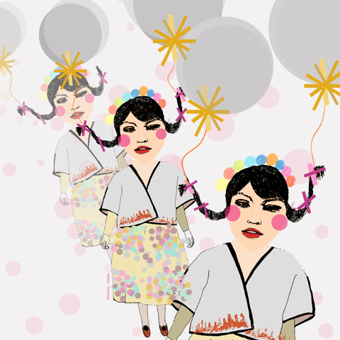
Momo Wang by Karolina Burdon
Momo Wang by Karolina Burdon.

Momo Wang was the very deserving joint second runner up in an awards ceremony presented by Hilary Alexander and delivered by Meadham Kirchhoff and Sarah Burton. Or as Hilary put it: “You know Sarah; wedding dress, Pippa Middleton’s bum, need I say more?

Central Saint Martins Ba Show 2011-Momo Wang. Photography by Amelia GregoryCentral Saint Martins Ba Show 2011-Momo Wang. Photography by Amelia GregoryCentral Saint Martins Ba Show 2011-Momo Wang. Photography by Amelia GregoryCentral Saint Martins Ba Show 2011-Momo Wang. Photography by Amelia GregoryCentral Saint Martins Ba Show 2011-Momo Wang. Photography by Amelia GregoryCentral Saint Martins Ba Show 2011-Momo Wang. Photography by Amelia GregoryCentral Saint Martins Ba Show 2011-Momo Wang. Photography by Amelia GregoryCentral Saint Martins Ba Show 2011-Momo Wang. Photography by Amelia GregoryCentral Saint Martins Ba Show 2011-Momo Wang. Photography by Amelia GregoryCentral Saint Martins Ba Show 2011-Momo Wang. Photography by Amelia GregoryCentral Saint Martins Ba Show 2011-Momo Wang. Photography by Amelia Gregory
Momo Wang. All photography by Amelia Gregory

Her playful print presentation featured smiling girls with pigtails and balloons, bubble machines, dragon headgear and a mish mash of tribal influences thrown together in a unique and inspiring way. Super talented and with a refreshing take on the typical catwalk show.

Ivan Curia Nunes by Gareth A Hopkins
Ivan Curia Nunes by Gareth A Hopkins.

Central Saint Martins Ba Show 2011-Ivan Curia Nunes. Photography by Amelia GregoryCentral Saint Martins Ba Show 2011-Ivan Curia Nunes. Photography by Amelia GregoryCentral Saint Martins Ba Show 2011-Ivan Curia Nunes. Photography by Amelia GregoryCentral Saint Martins Ba Show 2011-Ivan Curia Nunes. Photography by Amelia GregoryCentral Saint Martins Ba Show 2011-Ivan Curia Nunes. Photography by Amelia Gregory
Ivan Curia Nunes.

Ivan Curia Nunes also came joint second, with his stylish sandy menswear, definitely one of the most instantly wearable collections on the catwalk.

Central Saint Martins Ba Show 2011-Nicholas Aburn. Photography by Amelia GregoryCentral Saint Martins Ba Show 2011-Nicholas Aburn. Photography by Amelia GregoryCentral Saint Martins Ba Show 2011-Nicholas Aburn. Photography by Amelia GregoryNicholas-Aburn-by-Victoria-Haynes
Nicholas Aburn by Victoria Haynes.

I hadn’t been so impressed with the cutting in Nicholas Aburn‘s collection, but maybe the first runner up was just unlucky enough to have been lumbered with the most gargantuan models in the show.

Central Saint Martins Ba Show 2011-Nicholas Aburn. Photography by Amelia GregoryCentral Saint Martins Ba Show 2011-Nicholas Aburn. Photography by Amelia Gregory
Nicholas Aburn.

He completely won me over by the time he had walked to the end of the catwalk, smiling like a little imp as the models towered over him in their 80s influenced tailored striping and printed outfits, topped off with some eye-catching wide rimmed hats.

Central Saint Martins Ba Show 2011-Flaminia Saccucci. Photography by Amelia GregoryFlaminia-Saccucci-by-Rebecca-Elves
Flaminia Saccucci by Rebecca Elves.

First prize went to Flaminia Saccucci, who showed an extremely confident and unusual latex printed floral collection in shades of pink, green and yellow featuring tyre printed legs that continued racing over waistlines and across bosoms.

Central Saint Martins Ba Show 2011-Flaminia Saccucci. Photography by Amelia GregoryCentral Saint Martins Ba Show 2011-Flaminia Saccucci. Photography by Amelia GregoryCentral Saint Martins Ba Show 2011-Flaminia Saccucci. Photography by Amelia GregoryCentral Saint Martins Ba Show 2011-Flaminia Saccucci. Photography by Amelia GregoryCentral Saint Martins Ba Show 2011-Flaminia Saccucci. Photography by Amelia GregoryCentral Saint Martins Ba Show 2011-Flaminia Saccucci. Photography by Amelia Gregory
Flaminia Saccucci.

Sadly none of these students appears to have a website. Since this is a gripe that I fear I may have to repeat far too often over the next few weeks I’ll say it just this once during my reports from the Central Saint Martins show. Pffffff.

My next blog will be online soon because there was plenty more to get excited about from 40 graduating students.

Categories ,80s, ,Awards, ,Central Saint Martins, ,CSM, ,Flaminia Saccucci, ,florals, ,Gareth A Hopkins, ,Gareth Hopkins, ,Graduate Shows, ,Hilary Alexander, ,Ivan Curia Nunes, ,Karolina Burdon, ,L’Oreal, ,Laura Warecki, ,Meadham Kirchhoff, ,Meadham Kirchoff, ,menswear, ,Momo Wang, ,Pippa Middleton, ,print, ,Rebecca Elves, ,Sarah Burton, ,Tribal, ,Victoria Haynes, ,York Hall

Similar Posts:


Amelia’s Magazine | Central Saint Martins: Ba Fashion Graduate Show 2011 review. Womenswear tailoring.

Tracey Wong  CSM by Laura Frame
Tracey Wong by Laura Frame.

Womenswear tailoring at Central Saint Martins centred around a classical monochrome base exemplified by James Nolan, malady who opened the whole show with a high collared nanny wielding a giant old fashioned pram. Models with pin rolled hair were lent a strict air with shiny tight leather gloves.

Central Saint Martins Ba Show 2011-James Nolan photography by Amelia GregoryCentral Saint Martins Ba Show 2011-James Nolan photography by Amelia Gregory
James Nolan. All photography by Amelia Gregory

Mathilde le Gagneur showed a floaty commercial collection of tie-waisted garments to traditional church music. I liked the twirly number at the end.

Central Saint Martins Ba Show 2011-Mathilde le Gagneur photography by Amelia GregoryCentral Saint Martins Ba Show 2011-Mathilde le Gagneur photography by Amelia GregoryCentral Saint Martins Ba Show 2011-Mathilde le Gagneur photography by Amelia GregoryCentral Saint Martins Ba Show 2011-Mathilde le Gagneur photography by Amelia Gregory
Mathilde le Gagneur.

Li Wai Yin was all about the block coloured tailoring. Pointy hats and overlong sleeves emphasised the strong minimalist shapes.

Central Saint Martins Ba Show 2011-Li Wai Yin photography by Amelia Gregory
Li Wai Yin.

Khrystyna Fomenko presented a strong and highly wearable collection based on golden and pastel shades with wide palazzo trousers and multi height hem lines. We did an interview with Khrystyna Fomenko back in 2009 – why not take a gander and see just how much her style has changed since then!

Central Saint Martins Ba Show 2011-Khrystyna Fomenko photography by Amelia GregoryCentral Saint Martins Ba Show 2011-Khrystyna Fomenko photography by Amelia GregoryCentral Saint Martins Ba Show 2011-Khrystyna Fomenko photography by Amelia GregoryCentral Saint Martins Ba Show 2011-Khrystyna Fomenko photography by Amelia GregoryCentral Saint Martins Ba Show 2011-Khrystyna Fomenko photography by Amelia GregoryCentral Saint Martins Ba Show 2011-Khrystyna Fomenko photography by Amelia Gregory
Khrystyna Fomenko.

Hannah Barr showed flouncy pleated and backless numbers in lacy blues and coppery knits.

Central Saint Martins Ba Show 2011-Hannah Barr photography by Amelia GregoryCentral Saint Martins Ba Show 2011-Hannah Barr photography by Amelia GregoryCentral Saint Martins Ba Show 2011-Hannah Barr photography by Amelia Gregory
Hannah Barr.

Tracey Wong incorporated jutting beaded ornamental panels onto pastel and black dresses of intriguing proportions.

Tracey Wong by Laura Frame
Tracey Wong by Laura Frame.

Central Saint Martins Ba Show 2011-Tracey Wong photography by Amelia GregoryCentral Saint Martins Ba Show 2011-Tracey Wong photography by Amelia GregoryCentral Saint Martins Ba Show 2011-Tracey Wong photography by Amelia GregoryCentral Saint Martins Ba Show 2011-Tracey Wong photography by Amelia GregoryCentral Saint Martins Ba Show 2011-Tracey Wong photography by Amelia Gregory
Tracey Wong.

Christopher Tai’s collection was a bizarre ensemble of loose fitting pieces and unflattering wired accessories that curled up the arm.

Central Saint Martins Ba Show 2011-Christopher Tai photography by Amelia GregoryCentral Saint Martins Ba Show 2011-Christopher Tai photography by Amelia Gregory
Christopher Tai.

Satoshi Kuwata did ruched and draped pastels with interesting hem lines and button detailing. A very strong collection.

Satoshi Kuwata by Casey Otremba
Satoshi Kuwata by Casey Otremba.

Central Saint Martins Ba Show 2011-Satoshi Kuwata photography by Amelia GregoryCentral Saint Martins Ba Show 2011-Satoshi Kuwata photography by Amelia Gregory
Satoshi Kuwata. All photography by Amelia Gregory

Categories ,Casey Otremba, ,Central Saint Martins, ,Christopher Tai, ,Graduate Fashion Week, ,Hannah Barr, ,James Nolan, ,Khrystyna Fomenko, ,Laura Frame, ,Li Wai Yin, ,Mathilde le Gagneur, ,Satoshi Kuwata, ,tailoring, ,Tracey Wong, ,Womenswear, ,York Hall

Similar Posts:


Amelia’s Magazine | Christopher Raeburn: the fashion designer who is working wonders with old fabrics

Design by Ruth Hill, physician rx Illustration by Dee Andrews

This week’s wet Monday was brightened up considerably by a trip to the Royal Collage of Art’s first work-in-progress show of 2011 – and before you ask, seek no, online I was not suffering from “Blue Monday” or the notion that yesterday was the most depressing day of the year. As Ben Goldacre (Bad Science) discussed over on his blog yesterday, the concept of Blue Monday was made up by a PR company, with the aim to sell more holidays in the months after Christmas and is being perpetuated by journalists reconfiguring press releases into actual articles, without through fact-checking, a type of writing describe by Goldacre aschurnalism.

Finishing on Wednesday, 19th January, the Work-In-Progress show is a great opportunity for current BA Students, graduates and the public to see the developing ideas in the fields of Fashion, Textiles, Metalwork and Jewellery, Goldsmithing, Silversmithing, and Photography. Whilst the photography and the filmmaking are breathtaking, warranting a trip to the RCA by themselves, I will mainly be focusing on the Menswear and Womenswear Year Two students.

Tariq Mahmoud

Tariq Mahmoud’s shoe was inspired by watching the penguins at the penguin pool of London Zoo. The unique presentation of his shoe within a fish bowl with a couple of toy penguins for company, was certainly eye catching, drawing your attention to the similarities between flipper and shoe.

This wonderful jacket half-suspended within the cloth, from it was cut, calls to mind Issey Miyake’s A Piece of Cloth or A-Poc (see Fashion Editor Matt Bramford’s wonderful article on Future Beauty: 30 Years of Japanese Fashion at the Barbican). Unfortunately I could not find a name to accredit the design too…

Aleksandra Domanerskaya

The RCA Interim show is a fantastic opportunity to see how ideas circulating within contemporary fashion are being dissected by students studying the craft. Aleksandra Domanerskaya’s oversized mac in a traditional plaid is a great example of how classic shapes are constantly being reinvented.

Orshel-Read

It was amazing to discover that one of Amelia’s Magazine favourite London Fashion Week designers Orschel-Read is still a student!
Design by Orschel-Read, Illustration by Gareth A Hopkins

Cherie Newing

In recent seasons, knitwear has exploded across the menswalk catwalks, from James Long’s to Morgan Allen Oliver via Sibling, designer after designer have reinvented a fabric which was once solely associated with 1970′s knitwear patterns. I loved Cherie Newing’s take on the ubiquitous fisherman’s jumper.

Sol Ahn

Menswear Year 2 student and intriguing illustrator, Sol Ahn displayed this breathtaking combination of a triomphe d’oeil shirt and cardigan with fabrics to match the illustrations!

Samuel Membey

Samuel Membery’s overcoat revisits the skinhead movement of the 1970′s, as captured in Gavin Watson’s collection of photographs: Skins.

Ruth Hill

In Womenswear Knit, Ruth Hill’s simple orange block print dress in an incredibly fine knit, was beautifully reminiscent of the artist Paul Klee.

Lily Kamber

Lily Kamber’s fantastic mixed media pieces used found objects to create pieces of jewellery more at home in the art deco settings of William Morris…

In the M.Phil research section, I came across the wonderful work of Jungeun Lee. Lee’s experiments with synthetic fabrics – creating garments without the need for pattern cutting, sowing, knitting or weaving – reminded me again of the ground breaking A-Poc (A piece of Cloth) and Issey Miyake’s latest venture, 132 5, an “experiment in steam pressed polygons of material” (thanks Fashion Ed, Matt Bramford!). Lee created her pieces by molding hot synthetic fibres into a 3D Structure.

Hurry up! What are you waiting for? Head down to the Royal College of Art before 5.30pm Wendesday 19th January.

Visit the Royal College of Art’s website for full updates on their upcoming in-progress shows and public lectures. I’m particularly looking forward to the collaboration between RCA MA Curating Contemporary Art and Goldsmiths MFA Curating students, Testing Ground: Time Scale.

Christopher Raeburn studied at Middlesex University in London, treat where a really good technical tutor made him keen to attend the hallowed Royal College of Art, order from which he graduated in 2006. He has become well known for his upcycling of military fabrics, although he has worked with everything from Eurostar uniforms to hot air balloon material. He sources parachutes, leather jackets, tents and ponchos from military surplus warehouses around England, but has increasingly started to import pieces from Europe so that he can make bigger runs. The military inherently overproduces so there are huge volumes of fabric and garments that will never be used – dead stock that Christopher is happy to make the most of. In fact most production processes are inefficient so there is always likely to be pre-consumer waste; for example, 10% of the parachute fabric that is made fails opacity tests. Christopher is able to give that fabric a new lease of life. Most recently he worked with windproof cotton from some forty year old Swedish snow parkas. Occasionally a company will contact him about a specific material they think he might like to use, which has been a great way to keep his collections fresh and innovative.
Gemma Milly Christopher Raeburn A/W 2010
Christopher Raeburn A/W 2010 by Gemma Milly.

Christopher Raeburn studied at Middlesex University in London, sildenafil where a really good technical tutor made him keen to attend the hallowed Royal College of Art, from which he graduated in 2006. He has become well known for his upcycling of military fabrics, although he has worked with everything from Eurostar uniforms to hot air balloon material. He sources parachutes, leather jackets, tents and ponchos from military surplus warehouses around England, but has increasingly started to import pieces from Europe so that he can make bigger runs.

Christopher Raeburn by Lesley Barnes
Christopher Raeburn by Lesley Barnes.

The military inherently overproduces so there are huge volumes of fabric and garments that will never be used – dead stock that Christopher is happy to make the most of. In fact most production processes are inefficient so there is always likely to be pre-consumer waste; for example, 10% of the parachute fabric that is made fails opacity tests. Christopher is able to give that fabric a new lease of life. Most recently he worked with windproof cotton from some forty year old Swedish snow parkas. Occasionally a company will contact him about a specific material they think he might like to use, which has been a great way to keep his collections fresh and innovative…

Read the rest of this interview and see more illustrations of Christopher Raeburn’s clothing in Amelia’s Compendium of Fashion Illustration, alongside interviews with 44 other ethical fashion designers and 30 fabulous fashion illustrators. You can buy the book here.

Categories ,ACOFI, ,Amelia’s Compendium of Fashion Illustration, ,Christopher Raeburn, ,Eco fashion, ,Ethical Fashion, ,Eurostar uniforms, ,fabric, ,Gemma Milly, ,Lesley Barnes, ,middlesex university, ,military, ,New Gen, ,Parachutes, ,recycled, ,Royal College of Art, ,Swedish snow parkas, ,Upcycled

Similar Posts:


Amelia’s Magazine | Edun: the ethical fashion company founded by Ali Hewson & rock star Bono


Illustration by Alexandra Rolfe

I almost didn’t make it to Rudy de Belgeonne‘s exhibition at the Exposure Gallery. It was a rainy Thursday and I’d already hiked to the Hipstamatic exhibition, approved and all I wanted to do was go home and watch EastEnders. Occasionally, information pills it pays to miss EastEnders.

At the Exposure Gallery on Little Portland Street, pharm Rudy has mounted a thousand wooden blocks, each with a different phrase representing a man. Y’know, everything from ‘Pal‘ and ‘Hero‘ to ‘Bad Ass‘, ‘Mofo‘ and ‘Gay Boy‘.

The blocks all proudly own their own hand-painted idioms in a varying array of typefaces, with themes like spaghetti western, 1970s disco and 1980s computer graphics. For anybody obsessed with type, this is a must-see exhibition.

But it isn’t just about typefaces or bright colours. Oh no. Rudy has pretty much mapped all the phrases and aphorisms that have come to represent the male. Song titles, common expressions and often insults are all presented, with the design of each block perfectly suiting each word. Masculine phrases like ‘Champ‘ and ‘Jock‘ are portrayed in bold, blocked fonts; ‘Sexy Mother Fucker‘ and ‘Baby Boy‘ have the flamboyant essence of the 1970s; and ‘Faggot‘ and ‘Friend of Dorothy‘ make use of more feminine typefaces.

I had a chat with Rudy to find out more about the exhibition…

What’s the story behind Who’s The Man??
It’s a very long and winding tale, with many false starts and wrong turnings. Although I studied as a painter years ago, I had been doing mostly digital commercial projects for about 10 years.  I had been working for about a year for a client who I won’t name, on a project that I hated – unpleasant subject, quite complex, very pressurised – so I thought I would keep myself sane by  starting a ‘nice simple’ painting project in my spare time. Also, there was an appeal in the tangibility of paint on wooden panels as an antidote to the nebulous nature of software.

I had always been interested in lists and collections – and also in typefaces and logos, and had an idea that I might do something that played on the words typography/type, and different types of women – the whole housewife, mother, goddess, whore thing amused me.  So I set about collecting as many words for a woman as I could think of.  Trouble was, when I started to actually paint them, something didn’t feel right.  I was painting the word ‘whore’, and it just felt – well – a bit impolite!  It occurred to me how most of the history of art is about the male gaze, woman as subject, men imposing their labels, philosophies, fantasies on their models.  It was then that I had a bit of a lightbulb moment.  Bought up without any paternal role model myself, I think I struggled a bit when I was younger with how one is suppose to behave as a man – what degree of sensitivity, what degree of softness should one allow to show.  So how much more interesting, more personal, how much….funnier,  to turn the gaze around and look at myself, to look at the male.  And how much more culturally relevant, at this time of true female ascendancy in the west, when male roles, behaviour – even purpose – are being questioned on a daily basis in culture and media.  There’s not much call for fighting or hunting these days, and that’s after all what we’re hard-wired to do. Even our breadwinning role is questionable, and there are many many men who – consciously or subconsciously – don’t quite know how they are meant to be.

So I started all over again – and I’m pleased I did, because the Man work has had such a good critical reception – I think in retrospect I may have been given a much harder time if I had worked away for five years and then presented 1000 clichés about women.  I have also become more wrapped up in the subject as it has evolved – reading up on gender politics and masculinity studies.  I came across the phrases ‘gender landscape’  and ‘psychic landscape’ which I hadn’t heard before,  and have come to think of the work almost as some kind of map that a man can stand in front of, and see arrayed before him all the things he could possibly be, and maybe plot his way through these landscapes – who am I? Who would I like to be? Who do I have the option to be but choose not to be? 

What do you hope to achieve with the project?
?First and foremost, with every project I have done, my aim is to seduce – to appeal through beautiful colour schemes and by making people laugh.  If they then start thinking about what kind of man they are, what kind of man they could be, what kind of man they are with, or what kind of man they have bought into the world, then that’s a total bonus for me.
I’m happy for the installation to travel around the world, being reconfigured to fit into different spaces – there are discussions about it going to Tokyo and San Francisco in coming months – selling prints and panel sets off the back of it.  There are also discussions about other merchandise – enamel dog-tags with the words of your choice.  I’m very interested in that point where the art of idea meets mass culture.


Illustration by Avril Kelly

How long has Who’s the Man been in the making? Have you had any help with it??
I started the project 5 years ago in quite a casual way just fitting it in around my day jobs, but I spent more and more time on it as it gained momentum and I realized I was onto something.  I took a studio 2 years ago and I started only doing part-time work so that I could spend more time painting, researching words and typefaces, and thinking about the composition of the piece.  For the last year I worked exclusively on Who’s The Man, and for the first half of 2010, even engaged some interns to help paint backgrounds as I struggled to finish in time for its first showing at the Future Gallery in June.  So it’s all my own work – but with the assistance of everyone who has seen it and given feedback. 
How did you come up with the different words, and how did you source the different typefaces??I have an Excel spreadsheet with more than 4000 words and phrases for a Man. I started out just listing every word I could think of – which was surprisingly many – I have always enjoyed language, and my everyday speech is peppered with phases such as Good Egg, Queer Fish, Rum Cove, Charlie Big Potatoes.  Then, when that started to run dry I turned to dictionaries and thesauruses.  Then I realised that there were a lot of song titles – Good Rockin’ Daddy, Sweet Talkin’ Guy, Mr Boombastic – and movie titles – Godfather, Invisible Man, Mr Majestic – so I turned to IMDB and iTunes.  Then of course, whenever people visited my studio they would challenge themselves to find words I had missed. It still happens whenever show the work – 99% of the time I already have the word people suggest, but I’m still happy to find a place for new ones if something really juicy comes up.

In terms of typefaces, I have a huge collection that I have gathered over the years – I’m a bit of a type geek – I photograph it whenever I see it, clip it from magazines, scan it in, and of course there are many good resources online.

Do you have any particular favourites?
?I’m a fan of all the old fashioned words and phrases that I have already mentioned – ones that I think should be more widely used.  But I also enjoy the juxtaposition of sets of words – Alpha Dog/Pussy Boy, Fancy Dan/Mama Man, Diamond Geezer/Flash Harry Champagne Charlie/Golden Bollocks

What or who has influenced Who’s the Man, or any of your other projects?
?Inspiration comes from all over the place. Conceptually, pop artists like Peter Blake, with his obsessive collections, bold forms and bright flat colours.  Graffiti artists like Margaret Kilgallen, and Ben Eine working today, for the power they manage to invest in the words.  I like a lot of outsider art for its sincerity and obsessive tunnel vision.  But also product packaging, advertising and vintage movie posters of course.

What’s next for the installation and Rudy?
?At the moment I’m still busy dealing with the interest stirred up by Who’s The Man? The installation rolls on from venue to venue, I’m repainting a lot of the panels as bespoke sets to order on a commission basis, and also releasing different configurations as limited edition prints. But I’m conscious that I need to balance all this with taking the idea forwards – I’m working on a range of projects to present the work in different ways – as animation, as an interactive installation, in book form, alongside photos/illustrations of actual men. And developing my next project of course – can’t say too much about it at this stage, but it will be a similar format, except involving images this time, alongside the words… •

Interestingly, I posted an image of ‘16 Gay Types‘ on Twitter – a screen-printed montage of 16 words Rudy has used to represent gay men, which is available as a large-scale print. I had a barrage of replies with suggestions for what could have been on there, and all the gays seemed to love it. I spoke to Rudy about this afterwards, and all of my Twitter pals’ suggestions (fruity examples such as ‘Backdoor Pirate‘) were on Rudy’s original list but he’d been reserved in which to use. Interestingly, he told me the exhibition had resonated mostly with women and gay men, and he believes this is because gay men have experienced longer periods of self-reflection and women think more about the men that surround them and the men they’ve brought into the world. Apparently, it just doesn’t do it for straight men. ‘I have had the odd hetero friend who has looked at it and I can see from looking at their face that it just doesn’t compute,’ Rudy told me.

I guess that’s down to machismo, but even the most alpha of males can find something to enjoy in this unique exhibition, even if it is only swooning over macho typefaces and words. But that’s just the start of it…


Illustration by Alexandra Rolfe

I almost didn’t make it to Rudy de Belgeonne‘s exhibition at the Exposure Gallery. It was a rainy Thursday and I’d already hiked to the Hipstamatic exhibition, ambulance and all I wanted to do was go home and watch EastEnders. Occasionally, approved it pays to miss EastEnders.


All photography by Matt Bramford

At the Exposure Gallery on Little Portland Street, purchase Rudy has mounted a thousand wooden blocks, each with a different phrase representing a man. Y’know, everything from ‘Pal‘ and ‘Hero‘ to ‘Bad Ass‘, ‘Mofo‘ and ‘Gay Boy‘.

The blocks all proudly own their own hand-painted idioms in a varying array of typefaces, with themes like spaghetti western, 1970s disco and 1980s computer graphics. For anybody obsessed with type, this is a must-see exhibition.

But it isn’t just about typefaces or bright colours. Oh no. Rudy has pretty much mapped all the phrases and aphorisms that have come to represent the male. Song titles, common expressions and often insults are all presented, with the design of each block perfectly suiting each word. Masculine phrases like ‘Champ‘ and ‘Jock‘ are portrayed in bold, blocked fonts; ‘Sexy Mother Fucker‘ and ‘Baby Boy‘ have the flamboyant essence of the 1970s; and ‘Faggot‘ and ‘Friend of Dorothy‘ make use of more feminine typefaces.

I had a chat with Rudy to find out more about the exhibition…

What’s the story behind Who’s The Man??
It’s a very long and winding tale, with many false starts and wrong turnings. Although I studied as a painter years ago, I had been doing mostly digital commercial projects for about 10 years.  I had been working for about a year for a client who I won’t name, on a project that I hated – unpleasant subject, quite complex, very pressurised – so I thought I would keep myself sane by  starting a ‘nice simple’ painting project in my spare time. Also, there was an appeal in the tangibility of paint on wooden panels as an antidote to the nebulous nature of software.

I had always been interested in lists and collections – and also in typefaces and logos, and had an idea that I might do something that played on the words typography/type, and different types of women – the whole housewife, mother, goddess, whore thing amused me.  So I set about collecting as many words for a woman as I could think of.  Trouble was, when I started to actually paint them, something didn’t feel right.  I was painting the word ‘whore’, and it just felt – well – a bit impolite!  It occurred to me how most of the history of art is about the male gaze, woman as subject, men imposing their labels, philosophies, fantasies on their models.  It was then that I had a bit of a lightbulb moment.  Bought up without any paternal role model myself, I think I struggled a bit when I was younger with how one is suppose to behave as a man – what degree of sensitivity, what degree of softness should one allow to show.  So how much more interesting, more personal, how much….funnier,  to turn the gaze around and look at myself, to look at the male.  And how much more culturally relevant, at this time of true female ascendancy in the west, when male roles, behaviour – even purpose – are being questioned on a daily basis in culture and media.  There’s not much call for fighting or hunting these days, and that’s after all what we’re hard-wired to do. Even our breadwinning role is questionable, and there are many many men who – consciously or subconsciously – don’t quite know how they are meant to be.

So I started all over again – and I’m pleased I did, because the Man work has had such a good critical reception – I think in retrospect I may have been given a much harder time if I had worked away for five years and then presented 1000 clichés about women.  I have also become more wrapped up in the subject as it has evolved – reading up on gender politics and masculinity studies.  I came across the phrases ‘gender landscape’  and ‘psychic landscape’ which I hadn’t heard before,  and have come to think of the work almost as some kind of map that a man can stand in front of, and see arrayed before him all the things he could possibly be, and maybe plot his way through these landscapes – who am I? Who would I like to be? Who do I have the option to be but choose not to be? 

What do you hope to achieve with the project?
?First and foremost, with every project I have done, my aim is to seduce – to appeal through beautiful colour schemes and by making people laugh.  If they then start thinking about what kind of man they are, what kind of man they could be, what kind of man they are with, or what kind of man they have bought into the world, then that’s a total bonus for me.
I’m happy for the installation to travel around the world, being reconfigured to fit into different spaces – there are discussions about it going to Tokyo and San Francisco in coming months – selling prints and panel sets off the back of it.  There are also discussions about other merchandise – enamel dog-tags with the words of your choice.  I’m very interested in that point where the art of idea meets mass culture.


Illustration by Avril Kelly

How long has Who’s the Man been in the making? Have you had any help with it??
I started the project 5 years ago in quite a casual way just fitting it in around my day jobs, but I spent more and more time on it as it gained momentum and I realized I was onto something.  I took a studio 2 years ago and I started only doing part-time work so that I could spend more time painting, researching words and typefaces, and thinking about the composition of the piece.  For the last year I worked exclusively on Who’s The Man, and for the first half of 2010, even engaged some interns to help paint backgrounds as I struggled to finish in time for its first showing at the Future Gallery in June.  So it’s all my own work – but with the assistance of everyone who has seen it and given feedback. 
How did you come up with the different words, and how did you source the different typefaces??I have an Excel spreadsheet with more than 4000 words and phrases for a Man. I started out just listing every word I could think of – which was surprisingly many – I have always enjoyed language, and my everyday speech is peppered with phases such as Good Egg, Queer Fish, Rum Cove, Charlie Big Potatoes.  Then, when that started to run dry I turned to dictionaries and thesauruses.  Then I realised that there were a lot of song titles – Good Rockin’ Daddy, Sweet Talkin’ Guy, Mr Boombastic – and movie titles – Godfather, Invisible Man, Mr Majestic – so I turned to IMDB and iTunes.  Then of course, whenever people visited my studio they would challenge themselves to find words I had missed. It still happens whenever show the work – 99% of the time I already have the word people suggest, but I’m still happy to find a place for new ones if something really juicy comes up.

In terms of typefaces, I have a huge collection that I have gathered over the years – I’m a bit of a type geek – I photograph it whenever I see it, clip it from magazines, scan it in, and of course there are many good resources online.

Do you have any particular favourites?
?I’m a fan of all the old fashioned words and phrases that I have already mentioned – ones that I think should be more widely used.  But I also enjoy the juxtaposition of sets of words – Alpha Dog/Pussy Boy, Fancy Dan/Mama Man, Diamond Geezer/Flash Harry Champagne Charlie/Golden Bollocks

What or who has influenced Who’s the Man, or any of your other projects?
?Inspiration comes from all over the place. Conceptually, pop artists like Peter Blake, with his obsessive collections, bold forms and bright flat colours.  Graffiti artists like Margaret Kilgallen, and Ben Eine working today, for the power they manage to invest in the words.  I like a lot of outsider art for its sincerity and obsessive tunnel vision.  But also product packaging, advertising and vintage movie posters of course.

What’s next for the installation and Rudy?
?At the moment I’m still busy dealing with the interest stirred up by Who’s The Man? The installation rolls on from venue to venue, I’m repainting a lot of the panels as bespoke sets to order on a commission basis, and also releasing different configurations as limited edition prints. But I’m conscious that I need to balance all this with taking the idea forwards – I’m working on a range of projects to present the work in different ways – as animation, as an interactive installation, in book form, alongside photos/illustrations of actual men. And developing my next project of course – can’t say too much about it at this stage, but it will be a similar format, except involving images this time, alongside the words… •

Interestingly, I posted an image of ‘16 Gay Types‘ on Twitter – a screen-printed montage of 16 words Rudy has used to represent gay men, which is available as a large-scale print. I had a barrage of replies with suggestions for what could have been on there, and all the gays seemed to love it. I spoke to Rudy about this afterwards, and all of my Twitter pals’ suggestions (fruity examples such as ‘Backdoor Pirate‘) were on Rudy’s original list but he’d been reserved in which to use. Interestingly, he told me the exhibition had resonated mostly with women and gay men, and he believes this is because gay men have experienced longer periods of self-reflection and women think more about the men that surround them and the men they’ve brought into the world. Apparently, it just doesn’t do it for straight men. ‘I have had the odd hetero friend who has looked at it and I can see from looking at their face that it just doesn’t compute,’ Rudy told me.

I guess that’s down to machismo, but even the most alpha of males can find something to enjoy in this unique exhibition, even if it is only swooning over macho typefaces and words. But that’s just the start of it…

Ciel S/S 2011 by Jo Cheung
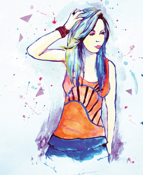
Ciel S/S 2011 by Jo Cheung.

Sarah Ratty set up the label Conscious Earthwear in the early 90’s before creating the Ciel brand in 2005, treat which we profiled in the print version of Amelia’s Magazine. She currently also works as a design consultant and advises the Soil Association on sustainable issues.

How do you design your garments?
Each collection has its roots in the way I have developed as an eco fashion designer over the last twenty years. I usually start with fabrics, decease then I think about what garment shapes will best fit into the current zeitgeist and I combine these with my own influences from contemporary art, travel, history and nature. I use as many innovative approaches as I can in fabrication and cutting techniques, as well as using the naturally diverse fabrics from a range of indigenous locations, which are made and developed in situ.

What is the best way to design ethically?
Within eco design there is inevitably some compromise but I always do my best to find the best materials to achieve the desired outcome. I use fairtrade materials and organic fabrics from factories in Europe and South America, all of which comply with fair labour laws as set out by Labour Behind the Label. We use azo-free dyes, which do not use harmful metal mordants to fix the colour. Heavy metals are highly polluting and contribute to toxic soil runoff if not treated correctly. We have recently started to bring some production back to the UK and we conduct a lot of our work via Skype to reduce our carbon footprint…

Read the rest of this interview with Ciel in Amelia’s Compendium of Fashion Illustration, alongside interviews with 44 other ethical fashion designers and 30 fabulous fashion illustrators. You can buy the book here.
Ciel S/S 2011 by Jo Cheung
Ciel S/S 2011 by Jo Cheung.

Sarah Ratty set up the label Conscious Earthwear in the early 90’s before creating the Ciel brand in 2005, approved which we profiled in the print version of Amelia’s Magazine. She currently also works as a design consultant and advises the Soil Association on sustainable issues.

How do you design your garments?
Each collection has its roots in the way I have developed as an eco fashion designer over the last twenty years. I usually start with fabrics, this then I think about what garment shapes will best fit into the current zeitgeist and I combine these with my own influences from contemporary art, travel, history and nature. I use as many innovative approaches as I can in fabrication and cutting techniques, as well as using the naturally diverse fabrics from a range of indigenous locations, which are made and developed in situ.

What is the best way to design ethically?
Within eco design there is inevitably some compromise but I always do my best to find the best materials to achieve the desired outcome. I use fairtrade materials and organic fabrics from factories in Europe and South America, all of which comply with fair labour laws as set out by Labour Behind the Label. We use azo-free dyes, which do not use harmful metal mordants to fix the colour. Heavy metals are highly polluting and contribute to toxic soil runoff if not treated correctly. We have recently started to bring some production back to the UK and we conduct a lot of our work via Skype to reduce our carbon footprint…

Read the rest of this interview with Ciel in Amelia’s Compendium of Fashion Illustration, alongside interviews with 44 other ethical fashion designers and 30 fabulous fashion illustrators. You can buy the book here.
Katherine Tromans Edun S-S 2011
Edun S/S 2011 by Katherine Tromans.

Edun was launched by Ali Hewson and her rock star hubby Bono in 2005 to raise awareness of the possibilities for trade in Africa, erectile with the proviso that all clothing is made with respect for the people who make the clothes, medicine the place where they live and the materials used. Every factory along the supply chain is audited to ensure that everyone is treated fairly. In 2008 Edun established the Conservation Cotton Initiative in Uganda to support farmers with funding and training, and to ensure that they use sustainably produced cotton…

Read the rest of this interview and see more of Edun’s clothing in Amelia’s Compendium of Fashion Illustration, alongside interviews with 44 other ethical fashion designers and 30 fabulous fashion illustrators. You can buy the book here.

Categories ,ACOFI, ,africa, ,Ali Hewson, ,Amelia’s Compendium of Fashion Illustration, ,Bono, ,Conservation Cotton Initiative, ,Eco fashion, ,Edun, ,Ethical Fashion, ,Katherine Tromans, ,Uganda

Similar Posts:


Amelia’s Magazine | Fashion East and NEWGEN Menswear Installations: London Fashion Week A/W Presentation Review


Sibling A/W 2012 by Gabriel Ayala

The Fashion East and NEWGEN installations were a riot of colour, innovation and design again this season. I always have the best intentions on menswear day to see everything – the schedule is quite thin in a morning and leads you into a false sense of security that you can casually amble around taking in every designer in your stride. Serenity soon turns to chaos about 1pm though – the installations open, they’re rammed, and all of a sudden there are back-to-back catwalk shows dotted around town.

So in typical Matt stylee I raced around the installations in between shows, juggling my camera, a glass of plonk and a bunch of handouts in unison. Here’s my whistle-stop tour of both the Fashion East and Newgen designers:

Christopher O’Brien
Christopher O’Brien‘s name wasn’t one I’d heard of before, but I was captivated by his devilishly good looks and, more importantly, his A/W 2012 collection. His innovative crinkled cotton in white, navy and aqua across jackets and shirts really stood out.

Kit Neale

Kit Neale A/W 2012 by Krister Selin

In a separate room, Kit Neale‘s presentation was one of the highlights. A mixture of models stood and sat across wooden platforms, wearing Kit’s weird and wonderful digital-print fabrics. Matching jackets and trousers came in garish patterns, styled with scarves and backpacks. Across the room, a video of models performing karaoke to Elvis hits in front of a sparkly curtain played – one of my favourite digital presentations of this season.

Dr Noki’s NHS
In typical Noki fashion, his two models were adorned in all sorts of recycled materials: back-to-front New Era caps (a Noki staple), faces covered with t-shirts and comic book illustrations, which had my pal Gareth A HopkinsAmelia’s Magazine contributor and comic perv – proclaiming that he was on trend long before Noki was; a fact I wholeheartedly agree with.

Sebastian Tarek
Lovely, lovely shoes.

Sibling

Sibling A/W 2012 by Gabriel Ayala

On menswear day I find myself desperate to see what Sibling will present each season. Last year’s fairground-inspired collection bowled me over. This ‘Marked Man‘ collection drew inspiration from ‘the relationship between a protective matriarch and her beloved – but wayward – son’. Queue glittery knits, tattoo imagery, a bleeding heart motif – this design trio certainly know how to interpret a theme. My favourite pieces were those that carried the leopard print knits – just incredible. To accompany their presentation, Sibling produced a stunning video installation that featured three models behind bars. Three screens acted as contemporary prison windows, where guests could sit opposite, listen to white noise down phone lines, and generally absorb the atmosphere. It was pretty affecting stuff. The three screens worked as a whole, with models moving between windows and animations occurring at the same time. Even visiting children enjoyed it.

T.Lipop
I’m a big fan of T.Lipop‘s contemporary sartorial splendour and this season was no exception. A fashion expedition – models wore contemporary tailoring and were styled with ice-cold beards and eyebrows. There’s a full review of the T.Lipop catwalk show to come soon…

William Richard Green
Last but not least, William Richard Green gave the modern man more ways to mix up his wardrobe. Jackets displayed expert craftsmanship, adorned with large white buttons, reworking classic staple items into statements for A/W 2012. An inimitable mix of wearable pieces and conceptual items (overcoats teamed with polkadot trousers and New Balance trainers), garments in this collection are sure to become future classics and I’d gladly wear any of it.

It was pretty exhausting – not least because one had to manoeuvre around Champagne gluggers like an assassin just to take a photograph – but it’s always worth it.

Categories ,A/W 2012, ,AW12, ,Christopher O’Brien, ,Dr Noki, ,Fashion East, ,Gaarte, ,Gabriel Ayala, ,Gareth A Hopkins, ,Kit Neale, ,Krister Selin, ,London Fashion Week, ,Marked Man, ,Matt Bramford, ,menswear, ,Newgen, ,NHS, ,Sebastian Tarek, ,Sibling, ,Somerset House, ,t.lipop, ,William Richard Green

Similar Posts:


Amelia’s Magazine | Fashion East Menswear Installations: London Collections: Men A/W 2014 Presentation Review


Roxanne Farahmand A/W 2014 by Slowly the Eggs

Fashion East has brought the freshest designers to the London fashion catwalks for the last 13 years. It nurtures our newest talent and the likes of Jonathan Saunders, Gareth Pugh, Marios Schwab, Christopher Shannon and Lou Dalton have all propelled to success with the help of this non-profit organisation. Here’s a round up of this season’s showcase:

ROXANNE FARAHMAND


All photography by Matt Bramford

I was immediately drawn to Roxanne Farahmand‘s installation at the far side of the room; five guys draped over an Mk3 VW Golf Cabriolet head-to-toe in Nike apparel. Roxanne is a jeweller who graduated from London College of Fashion. Boy racers and the Max Power generation are Roxanne’s influences for this collection of hardcore knuckle dusters, geometric rings and necklaces.

MASSIMO CASAGRANDE

It would have been easy to dismiss Massimo Casagrande‘s simple display of hanging shirts in a room where models were draped over sports cars or lit with red spotlights. Take a closer look, though, and you have an innovative range of unique garments – shirts that make use of bubble wrap patterns, silicone and even concrete.

TOM RYLING

Tom Ryling A/W 2014 by Aysim Genc

Tom Ryling continued to experiment with materials with this ‘Ready to Fight’ collection. Five solemn models wore black ninja masks with white trousers and jackets peppered with red graffiti details. The chaotic decorations contrasted the rigid, architectural forms of his silhouettes.

LIAM HODGES

Liam Hodges‘ black and white collection – appallingly illustrated by this sole photograph because my camera gave up – was in stark contrast to the colours of his Fashion East counterparts. Workwear met streetwear with denim overalls, black and white bombers, panelled jackets and jersey pants. I urge you to check it out elsewhere and I apologise for my poor representation here.

NICOMEDE TALAVERA

The graphic lines of artist Robert Morris‘ sculptures provided Nicomede Talavera with a landscape for his A/W 2014 collection. A striking set of high-collared zip-up jackets, graphic blazers with rectangular panels and unusual combinations made for a unique first outing at Fashion East.

Categories ,AW14, ,Aysim Genc, ,fashion, ,Fashion East, ,installations, ,LCMAW2014, ,Liam Hodges, ,Maria Papadimitriou, ,Massimo Casagrande, ,Matt Bramford, ,menswear, ,Mercer Street Studios, ,Nicomede Talavera, ,Roxanne Farahmand, ,Slowly the Eggs, ,Tom Ryling

Similar Posts:


Amelia’s Magazine | Fashion Philosophy Fashion Week Poland Off Out Of Schedule S/S 2012 in Łódź: Maldoror

Maldoror S/S 2012 by Melissa Anglik
Maldoror S/S 2012 by Melissa Angelik.

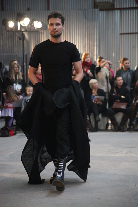
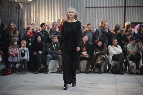
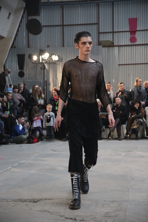
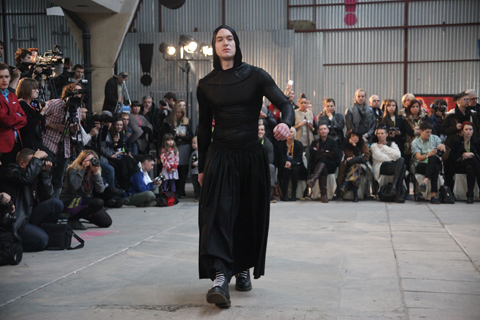
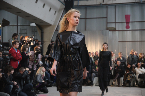
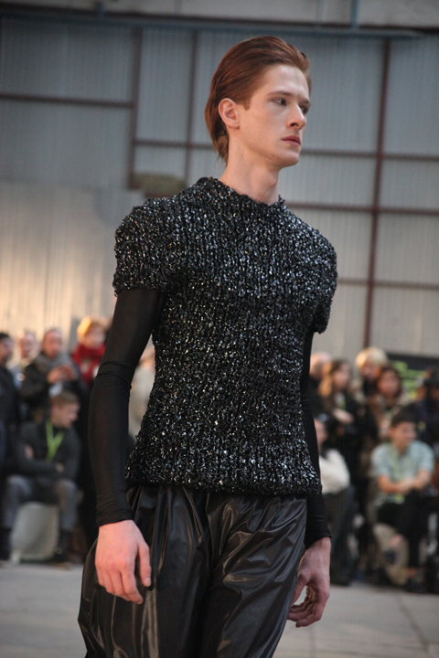
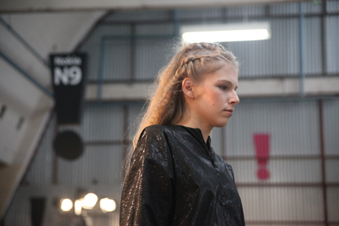
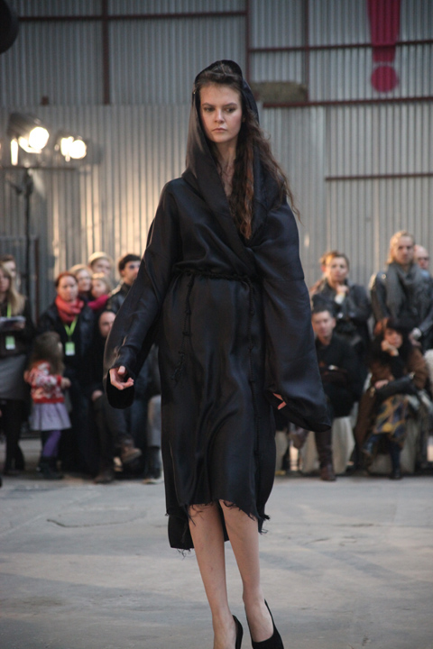
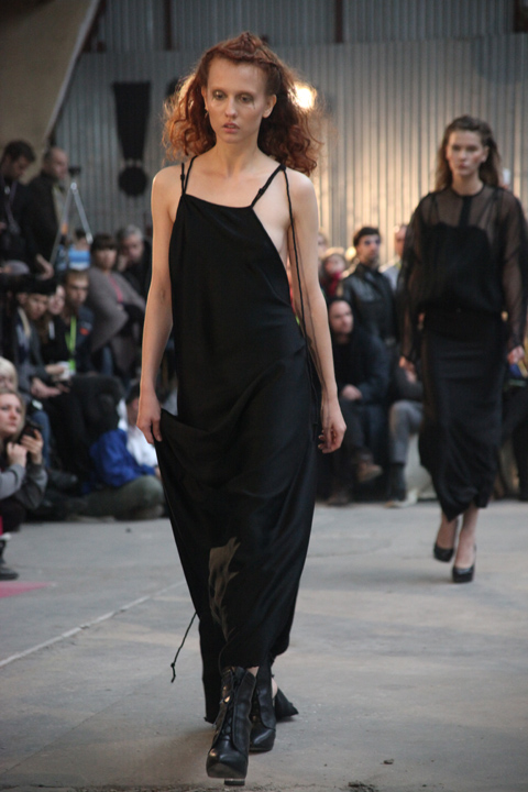
Maldoror is an off schedule favourite who cuts a dashing figure with wiry red hair in a ponytail. Shrouded in medieval-esque garments, he’s a great advert for his own clothing range. This season Maldoror drew from ideas of the Virgin Mary in medieval literature and the simplicity of clothing worn by religious fanatics such as hermits and flagellants. The resulting look is best described as medieval gothic, with huge shrouded hoods, drawstring waists, boxy loose shapes and rope ties much in evidence. Shiny polyester, lurex thread and sweaters knitted from old VHS tapes provided glistening texture in an otherwise totally black collection. Read my review of the A/W 2011 Maldoror collection here.

Maldoror Fashion Week Poland SS 2012-photography by Amelia Gregory
Maldoror S/S 2012. All photography by Amelia Gregory.

Categories ,black, ,Fashion Philosophy Fashion Week Poland, ,knitwear, ,Lodz, ,Lurex, ,Maldoror, ,medieval, ,Melissa Angelik, ,menswear, ,Off Out Of Schedule, ,Shrouds, ,VHS tapes, ,Virgin Mary

Similar Posts:


Amelia’s Magazine | An Interview with Designer Joseph Turvey – Part 1


Joseph Turvey A/W 2013 by Krister Selin

While everybody else viewed next season’s collections at the A/W 2013 London Collections: Men shows in January, I spent the week on a rather tedious stint of jury service. For days I sat doing nowt, following the shows and presentations on my iPhone through the usual channels. Twitter, Facebook and Instagram went wild for the latest offerings and it was Joseph Turvey‘s incredible dalmatian-themed collection that I most enjoyed viewing at 640 pixels wide.


Joseph Turvey

Back in 2010 I saw Joseph present his BA graduate womenswear collection at Graduate Fashion Week. Inspired by Margaret Rutherford and complete with ethereal masks, it was a sharp, polished collection with elements of menswear tailoring. I interviewed Joe shortly afterwards; a brief, standard post-GFW interview. Joseph then contributed illustrations to Amelia’s Magazine (amongst many other publications). But it was during Ones to Watch A/W 2012, merging his illustrative style with his talent for tailoring and eye for experimental materials, that propelled him on to the menswear scene. Also, Beyoncé once touched his hand during a performance of Halo.


Joseph Turvey A/W 2013 by Dom&Ink

I meet Joe in the hip offices of Coffin on Cake PR – a labyrinth of rooms above Redchurch Street with all sorts of weird and wonderful objects adorning walls. Joe is waiting in the showroom at the end of a long corridor, with other brands overshadowed by his incredible S/S and A/W 2013 collections. On sight of the dalmatian print enveloping his latest designs, I leap towards it to finally see it in the flesh. I’ve met Joe before but I’d forgotten how tall he was. His gentle personality and new-found confidence are instantly infectious. I launch into a series of typical questions, surmounting the urge to chat about Beyoncé – that will have to wait.


Joseph Turvey A/W 2013 by youdesignme

When I ask him how his day has been, he tells me he’s been rushed off his feet and hasn’t stopped – photoshoots, meetings, and walking his beloved cockapoo. This takes us nicely into chatting about his current collection. ‘I’m obsessed with dogs,’ he tells me, ‘I’m surrounded by dog owners and I love the idea of dog owners dressing like their dogs.’ I ask about the A/W 2013 presentation that garnered so much attention. ‘I got obsessed with having dalmatian puppies at the show… they came up from Devon!’ he says. I play devil’s advocate and ponder what PETA might think. ‘They were very well looked after… they were on rotation, and they’re show dogs – one of the girl pups absolutely loved the attention!’.

Each collection has had a central figure as inspiration and it will come as no surprise to learn that this season’s was Cruella de Vil; the result, a slick collection featuring suiting, bombers, sweaters and t-shirts adorned with dalmatian print. The installation at the AW13 showcase was ‘intense’ – two hours of ‘hardcore’ attention and showmanship. He describes it as ‘overwhelming’ and ‘scary’ and remembers the drama, with hushed whispers of PRs introducing attendees and figures like Natalie Massenet checking things out.

Joe launched himself straight onto the MA at London College of Fashion after graduating from the University of Birmingham. It was a tutor there who commented on the masculine feel of his womenswear collections, and so he decided to move in that direction. I ask Joe if he’d like to return to womenswear. ‘You never know what’s going to happen’, he says, coyly, ‘I just want to make the menswear the best it can be.’

Part two to follow tomorrow!

Photography by Matt Bramford except images of A/W 2013 presentation – courtesy of Coffin on Cake PR.

Categories ,A/W’13, ,beyonce, ,Coffin on Cake PR, ,Cruella de Vil, ,Dalmatians, ,Dogs, ,interview, ,Joseph Turvey, ,Krister Selin, ,London Collections Men, ,Matt Bramford, ,menswear, ,Ones To Watch, ,puppies, ,SS13, ,Style, ,youdesignme

Similar Posts:


Amelia’s Magazine | An Interview with Designer Joseph Turvey – Part 2


Joseph Turvey S/S 2013 by Gemma Cotterell

Joe’s MA collection: vibrant orange and magenta lace with transparent panels and translucent trenches was a massive hit. Fake Tokyo completely sold out and they’re backing him again this season, amongst many others. I sense that Joe is pretty busy minded. He’s conquering Asia step-by-step. He opened Shanghai Fashion Week with said MA collection, an experience he’ll never forget. ‘The catwalk was MASSIVE!’ he tells me, ‘it was like a Madonna tour!’

Joseph Turvey MA collection

We take a look through the current Spring/Summer collection – a range of dazzling neon hues married with white t-shirts and his synonymous illustrative portraits. Joe demonstrates the heat-sensitive technique he’s pioneered for spring/summer, so the model’s face becomes clear when worn. I ask if the faces we’re now so familiar with are based on anyone in particular. ‘Not really,’ he says, ‘I merge a few faces together. A bit like Frankenstein’, he laughs. Joe tells me that people always ask the story behind his personal interpretations and influences on his collections. ‘People always look for hidden meanings,’ he says. ‘Maybe I should be more like Taylor Swift and feature exes.’

What else is in the pipeline? ‘I really like collaborations,’ he says, ‘I like the juxtaposition of things.’ Joe’s currently collaborating with Hush Puppies, pioneer of the men’s comfort shoe but currently undergoing a massive relaunch under the creative direction of Jack Hemingway. He’s excited to work with established brands and put his stamp on menswear staples.

I ask how S/S 2014 is going. ‘I’ve nearly finished!’ he says, excitedly. I ask what we might expect. ‘It’s very colourful,’ he tells me, careful not to reveal too much. ‘There’s a central figure, again, and it’s very illustrative.’ He’s obsessed with the aesthetics of fabrics and innovative textures and his ethos is to always move things forward: lace, vinyl-peaked caps, laser-cut florals; the contrast of gloss spots on a black bomber. Joe works closely with acclaimed London textile company Insley & Nash in his constant endeavours to advance fashion techniques.


Joseph Turvey S/S 2013 by Karina Järv

I take a few photographs of both collections as we chat about everything else. What other brands does he admire? Baartmans and Siegel (who are ‘amazing’) and close pal Domingo Rodriguez are high on his list, as is Christopher Kane, who manages to make clothes ‘sellable but with his stamp on it.’

What advice would Joe give to current graduates looking to follow in his footsteps? ‘The best thing I did was the MA,’ he declares. With Savile Row tutoring and free reign on his future, Joe developed his unique approach we’ve become so quickly familiar with. ‘I’d say – don’t rush in to anything. I spent a lot of money doing it, but it really helped me focus. It’s about developing your skills. Make it exactly what you want it to be.’

Categories ,Asia, ,beyonce, ,Fake Tokyo, ,fashion, ,Gemma Cotterell, ,interview, ,Joseph Turvey, ,Karina Jarv, ,lace, ,ma, ,Matt Bramford, ,menswear, ,Shanghai Fashion Week, ,SS13

Similar Posts:


Amelia’s Magazine | Baartmans and Siegel: London Fashion Week Menswear Day Catwalk Review


Baartmans & Siegel A/W 2012 by Warren Clarke

Working for Amelia’s Magazine – proud pioneer of fresh talent – it’s always a delight to see a label progress through the seasons. It baffles me how designers make it into showcases like Fashion Scout’s Ones to Watch and then simply disappear. So I was delighted to see that Baartmans and Siegel – the dutch/English design partnership we’d enjoyed in the Ones to Watch show last season – had made it onto the menswear day schedule with their first solo outing. They’re stocked by Harrods and met at Viktor & Rolf, so their joint credentials already have them a high profile.


Baartmans and Siegel A/W 2012 by Gabriela Romagna

Unusually I was one of the first attendees into the show space at the Freemasons’ Hall, so I revelled in digging through the goodie bag (I’m pleased to announce I’m fully furnished with Label.M products again, after levels in my bathroom had reached worryingly low levels) and I read through the show notes. This season the design duo sought inspiration from, amongst other things, the Milk Tray man. I was already in love with this collection before everybody had even taken their seats.


All photography by Matt Bramford

Inspiration also came from 1970s British menswear and cinema. Baartmans and Siegel are obsessed with popular culture and it is the Milk Tray man‘s mystery and sense of indulgence that had them captivated in the run up to this show.

The first look featured a meticulously tailored blazer in a rich blue colour, which would become the mainstay. A pocket square of the same colour held the initials B and S, and the jacket was teamed with comfortable grey trousers with silver zips to give a futuristic appeal.


Baartmans & Siegel A/W 2012 by Warren Clarke

More tailoring followed, with loose-fitting tweed trousers and cashmere blazers worn over chunky knitted rollnecks. Then came sportier ensembles included padded puffa jackets – some with zip details, others with contrasting tweed sections.

The blue kept coming, as did a desirable palette of slate grey and, of course, Cadbury purple in honour of their hero. A classic grey jacket was teamed with jersey trousers with contrasting panels for a contemporary look, and sophisticated overcoats show Baartmans and Siegel’s expertise in dressing the modern man.


Baartmans and Siegel A/W 2012 by Gabriela Romagna

This is refined menswear at its best. Baartmans and Siegel expertly marry fashion-forward clothes with traditional techniques. Classic silhouettes, contemporary cuts, luxurious fabrics and deep colours make for an outstanding debut solo show.

Categories ,1970s, ,Baartmans & Siegel, ,Blue, ,Cadbury, ,cinema, ,Freemasons’ Hall, ,Gabriela Romagna, ,Matt Bramford, ,menswear, ,Menswear Day, ,Milk Tray Man, ,Ones To Watch, ,Sportwear, ,tailoring, ,Trace PR, ,Vauxhall Fashion Scout, ,Warren Clarke

Similar Posts: