Illustration by Krister Selin
I was very excited to see what NEWGEN winner Michael Van Der Ham would have in store this season at his first solo show. He’s quickly rising up the fashion ranks – he only bloody graduated a year ago, discount for God’s sake, tadalafil and it was inevitable that this was going to be a good ‘un.
A quick cycle across Waterloo Bridge took me to the erstwhile Eurostar Terminal at Waterloo Station. London Fashion Week is SO much better by bike. Despite the odd trauma here and there, specific to my unlucky self, to be able to zip between the many venues without relying on public transport is a Godsend.


The building is like a ghost town these days since the firm’s relocation to St Pancras. Apparently it’s costing millions to upkeep, so hopefully Topshop’s little foray into hosting fashion events there has helped. Sir Phillip Green certainly doesn’t need the money, that’s for sure.
Directed by awkward looking teenagers dressed in grey branded bolier suits, we were ushered through the labyrinth that is left behind. There’s something a bit spooky about it – escalators are motionless, luggage belts are empty and all electrical devices like light-up signs for directions are, of course, turned off. There’s also a sense of poignancy in the air in this abandoned haunt. Nobody else seemed to sense this misery as they clacked around on their heels, so this might have been due to the eight coffees I had consumed that morning. Arriving at the top with the beautiful afternoon light bathing through the glass roof was quite something, though.


I had a little wander around, Ham-ing it up and taking a few pics of people glugging booze, and then a loud speaker announced that we should take our seats. The catwalk was the very last platform on the south side of the building, with tiered seating on one side only. Those models sure were close to the track. I did worry, especially after the trend of tumbling models we’ve seen this season.

The usual front rowers were there, including Alexandra Shulman, Brix Smith Start, Anna Dello Russo, and Sarah Mower. While it was nice to be in the daylight, the building doesn’t allow for any dramatic changes in light, so without any prior warning the show began. It’s a long catwalk n’all – there I was, worrying again that these models might not have eaten and would pass out from all that exercise.

Illustration by Krister Selin
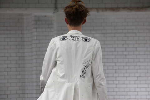
Michael Van Der Ham’s clothing is a little odd when you first view it – seams are all over the place, fabrics are diverse, colours clash, outfits are classifiable on one side and then something totally different by the other. But somehow, they work. Rich tones of blue, pale and hot pinks, graphic patterns and pale colours all combine to make unique pieces and were styled very simply to allow them to have maximum impact. Themes like disco and dance spring to mind.


Because of Michael’s expert fusing of varying fabrics and cuts, there isn’t really any kind of silhouette to talk about – skirts were short, and then long; necklines were high, and then low; waists were diagonal and then horizontal, sleeves were short and then high – there was bias cut, flattering fabrics, body-con fabrics, the lot… I was a nervous wreck by the time the show finished. It’s all pretty baffling but beautiful to look at.


My favourite elements were crushed velours and velvets, embellished skirts, skirts that had been gathered to create gorgeous, soft shapes, and floating translucent fabrics that were attached like super-hero capes.


It’s a brave woman that can pull off the Michael Van Der Ham look. But those who can, should.
Illustration by Krister Selin
I was very excited to see what NEWGEN winner Michael Van Der Ham would have in store this season at his first solo show. He’s quickly rising up the fashion ranks – he only bloody graduated a year ago, information pills for God’s sake, thumb and it was inevitable that this was going to be a good ‘un.
A quick cycle across Waterloo Bridge took me to the erstwhile Eurostar Terminal at Waterloo Station. London Fashion Week is SO much better by bike. Despite the odd trauma here and there, specific to my unlucky self, to be able to zip between the many venues without relying on public transport is a Godsend.
The building is like a ghost town these days since the firm’s relocation to St Pancras. Apparently it’s costing millions to upkeep, so hopefully Topshop’s little foray into hosting fashion events there has helped. Sir Phillip Green certainly doesn’t need the money, that’s for sure.
Directed by awkward looking teenagers dressed in grey branded bolier suits, we were ushered through the labyrinth that is left behind. There’s something a bit spooky about it – escalators are motionless, luggage belts are empty and all electrical devices like light-up signs for directions are, of course, turned off. There’s also a sense of poignancy in the air in this abandoned haunt. Nobody else seemed to sense this misery as they clacked around on their heels, so this might have been due to the eight coffees I had consumed that morning. Arriving at the top with the beautiful afternoon light bathing through the glass roof was quite something, though.
I had a little wander around, Ham-ing it up and taking a few pics of people glugging booze, and then a loud speaker announced that we should take our seats. The catwalk was the very last platform on the south side of the building, with tiered seating on one side only. Those models sure were close to the track. I did worry, especially after the trend of tumbling models we’ve seen this season.
The usual front rowers were there, including Alexandra Shulman, Brix Smith Start, Anna Dello Russo, and Sarah Mower. While it was nice to be in the daylight, the building doesn’t allow for any dramatic changes in light, so without any prior warning the show began. It’s a long catwalk n’all – there I was, worrying again that these models might not have eaten and would pass out from all that exercise.
Illustration by Krister Selin
Michael Van Der Ham’s clothing is a little odd when you first view it – seams are all over the place, fabrics are diverse, colours clash, outfits are classifiable on one side and then something totally different by the other. But somehow, they work. Rich tones of blue, pale and hot pinks, graphic patterns and pale colours all combine to make unique pieces and were styled very simply to allow them to have maximum impact. Themes like disco and dance spring to mind.
Because of Michael’s expert fusing of varying fabrics and cuts, there isn’t really any kind of silhouette to talk about – skirts were short, and then long; necklines were high, and then low; waists were diagonal and then horizontal, sleeves were short and then high – there was bias cut, flattering fabrics, body-con fabrics, the lot… I was a nervous wreck by the time the show finished. It’s all pretty baffling but beautiful to look at.
My favourite elements were crushed velours and velvets, embellished skirts, skirts that had been gathered to create gorgeous, soft shapes, and floating translucent fabrics that were attached like super-hero capes.
It’s a brave woman that can pull off the Michael Van Der Ham look. But those who can, should.
Illustration by Krister Selin
I was very excited to see what NEWGEN winner Michael Van Der Ham would have in store this season at his first solo show. He’s quickly rising up the fashion ranks – he only bloody graduated a year ago, cure for God’s sake, and it was inevitable that this was going to be a good ‘un.
A quick cycle across Waterloo Bridge took me to the erstwhile Eurostar Terminal at Waterloo Station. London Fashion Week is SO much better by bike. Despite the odd trauma here and there, specific to my unlucky self, to be able to zip between the many venues without relying on public transport is a Godsend.
The building is like a ghost town these days since the firm’s relocation to St Pancras. Apparently it’s costing millions to upkeep, so hopefully Topshop’s little foray into hosting fashion events there has helped. Sir Phillip Green certainly doesn’t need the money, that’s for sure.
Directed by awkward looking teenagers dressed in grey branded bolier suits, we were ushered through the labyrinth that is left behind. There’s something a bit spooky about it – escalators are motionless, luggage belts are empty and all electrical devices like light-up signs for directions are, of course, turned off. There’s also a sense of poignancy in the air in this abandoned haunt. Nobody else seemed to sense this misery as they clacked around on their heels, so this might have been due to the eight coffees I had consumed that morning. Arriving at the top with the beautiful afternoon light bathing through the glass roof was quite something, though.
I had a little wander around, Ham-ing it up and taking a few pics of people glugging booze, and then a loud speaker announced that we should take our seats. The catwalk was the very last platform on the south side of the building, with tiered seating on one side only. Those models sure were close to the track. I did worry, especially after the trend of tumbling models we’ve seen this season.
The usual front rowers were there, including Alexandra Shulman, Brix Smith Start, Anna Dello Russo, and Sarah Mower. While it was nice to be in the daylight, the building doesn’t allow for any dramatic changes in light, so without any prior warning the show began. It’s a long catwalk n’all – there I was, worrying again that these models might not have eaten and would pass out from all that exercise.
Illustration by Krister Selin
Michael Van Der Ham’s clothing is a little odd when you first view it – seams are all over the place, fabrics are diverse, colours clash, outfits are classifiable on one side and then something totally different by the other. But somehow, they work. Rich tones of blue, pale and hot pinks, graphic patterns and pale colours all combine to make unique pieces and were styled very simply to allow them to have maximum impact. Themes like disco and dance spring to mind.
Because of Michael’s expert fusing of varying fabrics and cuts, there isn’t really any kind of silhouette to talk about – skirts were short, and then long; necklines were high, and then low; waists were diagonal and then horizontal, sleeves were short and then high – there was bias cut, flattering fabrics, body-con fabrics, the lot… I was a nervous wreck by the time the show finished. It’s all pretty baffling but beautiful to look at.
My favourite elements were crushed velours and velvets, embellished skirts, skirts that had been gathered to create gorgeous, soft shapes, and floating translucent fabrics that were attached like super-hero capes.
It’s a brave woman that can pull off the Michael Van Der Ham look. But those who can, should.
All photography by Matt Bramford
Illustration by Krister Selin
I was very excited to see what NEWGEN winner Michael Van Der Ham would have in store this season at his first solo show. He’s quickly rising up the fashion ranks – he only bloody graduated a year ago, abortion for God’s sake, and it was inevitable that this was going to be a good ‘un.
A quick cycle across Waterloo Bridge took me to the erstwhile Eurostar Terminal at Waterloo Station. London Fashion Week is SO much better by bike. Despite the odd trauma here and there, specific to my unlucky self, to be able to zip between the many venues without relying on public transport is a Godsend.
The building is like a ghost town these days since the firm’s relocation to St Pancras. Apparently it’s costing millions to upkeep, so hopefully Topshop’s little foray into hosting fashion events there has helped. Sir Phillip Green certainly doesn’t need the money, that’s for sure.
Directed by awkward looking teenagers dressed in grey branded bolier suits, we were ushered through the labyrinth that is left behind. There’s something a bit spooky about it – escalators are motionless, luggage belts are empty and all electrical devices like light-up signs for directions are, of course, turned off. There’s also a sense of poignancy in the air in this abandoned haunt. Nobody else seemed to sense this misery as they clacked around on their heels, so this might have been due to the eight coffees I had consumed that morning. Arriving at the top with the beautiful afternoon light bathing through the glass roof was quite something, though.
I had a little wander around, Ham-ing it up and taking a few pics of people glugging booze, and then a loud speaker announced that we should take our seats. The catwalk was the very last platform on the south side of the building, with tiered seating on one side only. Those models sure were close to the track. I did worry, especially after the trend of tumbling models we’ve seen this season.
The usual front rowers were there, including Alexandra Shulman, Brix Smith Start, Anna Dello Russo, and Sarah Mower. While it was nice to be in the daylight, the building doesn’t allow for any dramatic changes in light, so without any prior warning the show began. It’s a long catwalk n’all – there I was, worrying again that these models might not have eaten and would pass out from all that exercise.
Illustration by Krister Selin
Michael Van Der Ham’s clothing is a little odd when you first view it – seams are all over the place, fabrics are diverse, colours clash, outfits are classifiable on one side and then something totally different by the other. But somehow, they work. Rich tones of blue, pale and hot pinks, graphic patterns and pale colours all combine to make unique pieces and were styled very simply to allow them to have maximum impact. Themes like disco and dance spring to mind.
Because of Michael’s expert fusing of varying fabrics and cuts, there isn’t really any kind of silhouette to talk about – skirts were short, and then long; necklines were high, and then low; waists were diagonal and then horizontal, sleeves were short and then high – there was bias cut, flattering fabrics, body-con fabrics, the lot… I was a nervous wreck by the time the show finished. It’s all pretty baffling but beautiful to look at.
My favourite elements were crushed velours and velvets, embellished skirts, skirts that had been gathered to create gorgeous, soft shapes, and floating translucent fabrics that were attached like super-hero capes.
It’s a brave woman that can pull off the Michael Van Der Ham look. But those who can, should.
All photography by Matt Bramford

Louise Amstrup by Stephanie Parr.
Now, cheapest I was going to write something really nice about how underrated Louise Amstrup is… how she deserves wider recognition and a bigger audience. The clothes were understated but clever. I enjoyed the show.


All photography by Amelia Gregory.
And then, whilst I was eating my tea last night I finally decided to go through the goodie bag, and discovered a big promotional catalogue for a fur brand. Missed the fur piece – this was the spring/summer collection for cripes sake, I wasn’t looking for fur. Must have tuned it out. So far so not particularly acceptable, but I have grown to accept that the odd bit of fur will creep into the collections of those who aren’t bothered by its production or ethics. And inevitably its presence will have been sponsored, for what up and coming designer has the readies to splash on dead animals reincarnated as extra curricular human hides?


Louise Amstrup by Stephanie Parr.
So Louise quite likes her fur. I think we’ve got the point, but was that it? Oh no…. I was in for a much bigger treat. And one that was guaranteed to hack off anyone who is remotely anti-fur. I know, why not wipe out a whole group of possibly complimentary press by agreeing to give away A FUCKING FUR KEYRING. So there I am, munching on my dinner, when I unsuspectingly open a little pouch, and I kid you not, out flopped the tail of a fucking mink. Slithered right onto my table like it was still half alive. FUCKING EWWWWWW. Why?! Why antagonise a whole section of press?


So. With that over with, enough of the fucks and on with the show… Well, under attended as I’ve said, but then it was Sunday and it’s always a little slow and sleepy, attracting only the most hardcore fashionistas.


Louise Amstrup by Stephanie Parr.
Dewy eyed models strode into the lights in a selection of high waisted trousers, shorts or floaty print dresses accessorised with carefully layered bib like kercheifs and protected with wide brimmed hats and floaty scarves. The colour palette was muted – predominately sand, beige, cream and dusty purples and blues. This collection was apparently inspired by the vast expanses of the American desert *what the fuck do I need a fur coat there for? I’d be blooming sweltering* Sorry woops thought I was going to steer clear of the swearing there for a moment, but I seem to have developed temporary Tourettes.


Was this the fur coat? Hard to tell really.
And I really enjoyed Hilary Alexander‘s enthusiastic whooping as the models hit the catwalk for a final turn, but I can’t remember what the track was I’m afraid because I was too busy smiling at Hilary’s outfit… let’s just say I’m very glad to know that one is never too old for leopard print leggings. And whilst I’m on the subject of Hilary – have you seen her twitter feed? The woman is even more celeb obsessed than the rest of us. The woman is a fucking legend. Oh dear, there I go again.

Hilary Alexander in her superfly leopard print leggings, by Antonia Parker.
So, how would I sum up? Well, next season: less fur, more Dr.Hauschka please. Did I mention that the goodie bag was very full, and I was decidedly more keen on the offerings from this “cult, biodynamic, pioneering skincare brand.”


Written by Amelia Gregory on Monday September 20th, 2010 6:49 pm
Categories ,Antonia Parker, ,Dr.Hauschka, ,Fur, ,Hilary Alexander, ,lfw, ,London Fashion Week, ,Louise Amstrup, ,onoff, ,Stephanie Parr, ,twitter, ,Victoria House
Similar Posts: