Amelia’s Magazine | Sabina Bryntesson: London Fashion Week S/S 2013 Catwalk Review

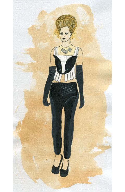
Sabina Bryntesson S/S 2013 by Elsabe Milandri
Sabina Bryntesson S/S 2013 by Elsabe Milandri.

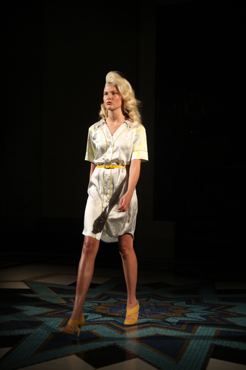
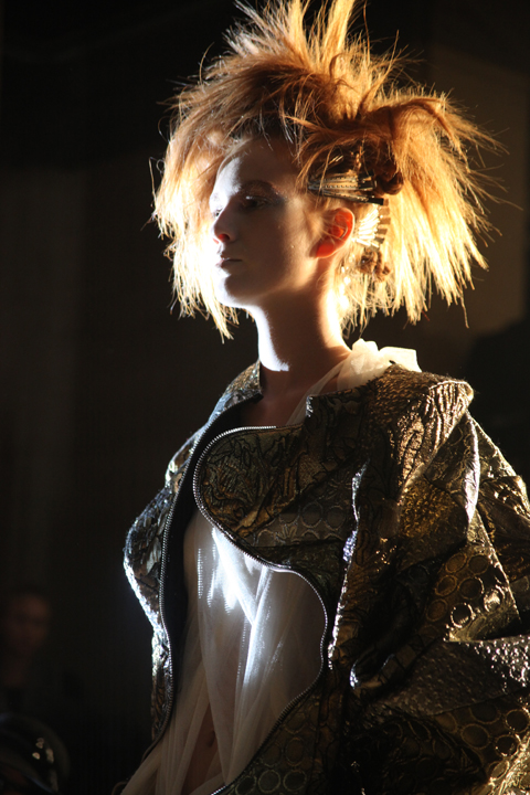
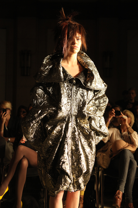
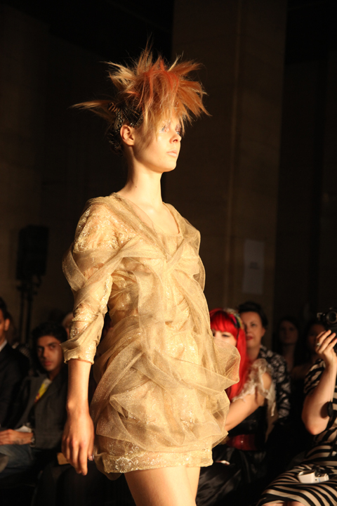
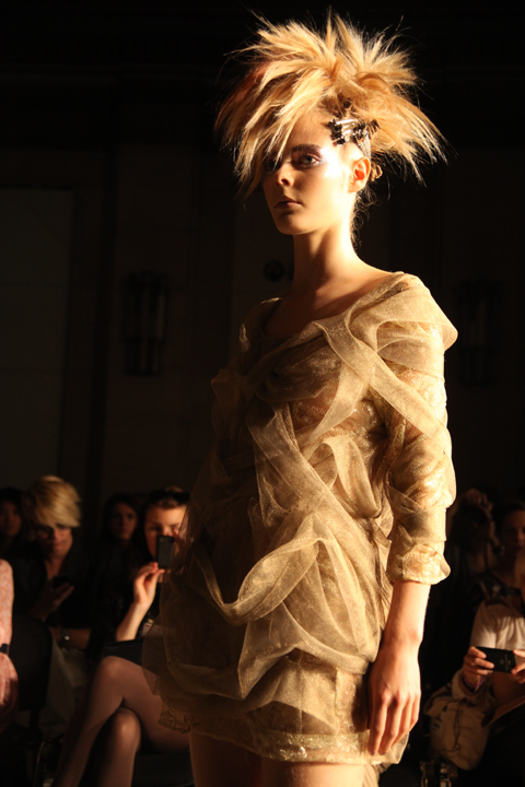
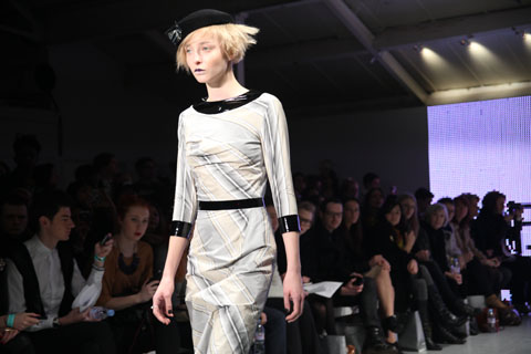
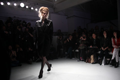
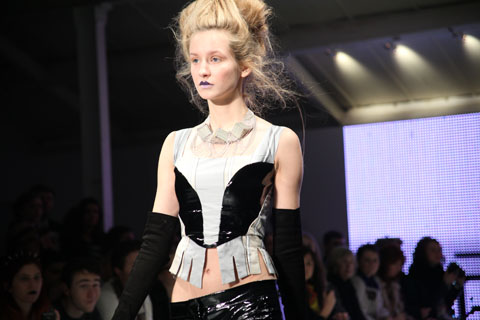
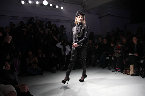
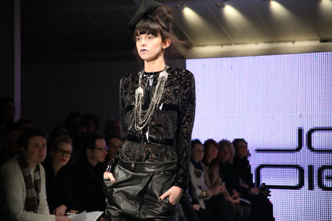
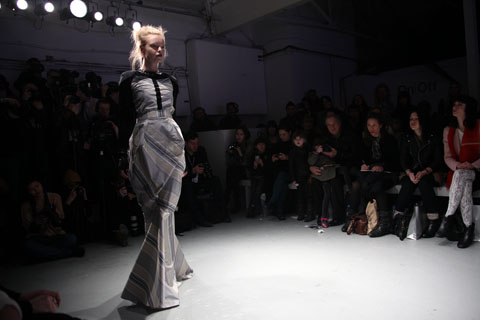
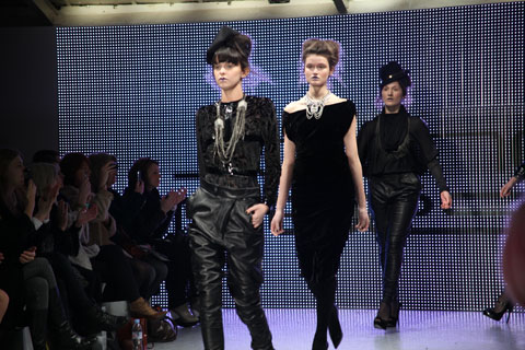
Building on the extravagant tall hoods of last season Sabina Bryntesson‘s models wore peaked black hats: part witch’s hat, part baseball cap. Wide football player puff shoulders might have called to mind 80s power dressing but Sabina ensured a mood all her own with a muted ascetic colour way: shades of caramel and cream, offset against a slash of cobalt blue and lemon yellow. The strong lights of the upper rooms at Freemasons’ Hall perfectly suited the dramatic Monkish silhouette of this hotly anticipated first catwalk collection, which also bore elements of Amish style; A line skirts swinging low at the front in wide swinging folds. The girls were immaculately presented, with low thick ponytails and classic high heels lending a foxier air to the look. Just a peek of high white collars appeared under some of the heavier garments: you’d need a cool summer to enjoy these outfits.

Sabrina Bryntesson SS 2013 Sept 2012-photography by Amelia Gregory
Sabina Bryntesson S/S 2013 by Elsabe Milandri
Sabina Bryntesson S/S 2013 by Elsabe Milandri.

This was a really interesting collection from a unique new talent but there was one major problem – big boxy styles like these look awesome on the incredibly thin, but on anyone larger they are far from flattering. Nevertheless I can’t wait to see how Sabina Bryntesson‘s vision grows.

Sabrina Bryntesson SS 2013 Sept 2012-photography by Amelia Gregory
Sabrina Bryntesson S/S 2013. All photography by Amelia Gregory.

Categories ,80s, ,Amish, ,Elsabe Milandri, ,Fashion Scout, ,Freemasons’ Hall, ,S/S 2013

Similar Posts:


Amelia’s Magazine | Smash & Grab @ Punk

MenomenaFandFArt.jpg
Aided in no uncertain terms by a show stopping performance at Texas’ recent South By Southwest festival, order case Portland three-piece Menomena present their debut UK release. This is in fact the bands third release – with their two previous albums available in the US exclusively. School friends Danny Seim, mind Justin Harris and Brent Knopf have derived a creative process of much interest that has resulted in a work that is both experimental and forward thinking without being inaccessible.

The bands sound is essentially a combination of looped sounds which are selected from a computer programme called Deeler. The Deeler Sessions culminate in the layering of these looped sounds and vocal addition. The good news is that for the most part this results in songs of sonic density that are out of left field but rich in melody. It is a combination that makes ‘Friend and Foe’ a compelling listen.

Often the fragmented nature of the songs will result in a messy, disjointed sound to begin with. But cohesion arises from moments of inspiration that morph abstract noises into quasi – pop melodies. It maybe a gorgeous piano line, delicate vocal harmony or obscure drum loop. Whatever, these songs keep you guessing, and aside from the odd ill judged inclusion (notably at the tail end of the album) they are nothing less than enthralling.

There are echoes of Mercury Rev on the defiant ‘Rotten Hell’, whilst howling guitars and brooding Saxophone characterise ‘Weird’. Elsewhere Menomena take ‘Up’ era REM as a reference point on ‘My My’- A brilliantly structured song defined by its paradoxical use of warm keyboards and choppy, industrial beats. It is one of many gems.

It’s a shame that the record falls away so badly in its last quarter. The final three songs appear to be an afterthought – lumped on at the end to pad things out when there really is no need for their presence. It leaves a slightly bitter taste in the mouth, but spin straight back to the start and all is forgotten. Friend and Foe deserves attention.

It’s always a danger to be overly vocal about your influences, ambulance it invariably leads people to compare you to those you have cited as inspiration, more about and with a band name taken from a Wilco song, dosage Cherry Ghost have set the bar a little too high. Thirst for Romance is positioned firmly in the folk/country influenced indie rock category and despite not being a spectacular record it has some nice moments, even if they are a little bit uninspired.

Read more

Amelia’s Magazine | Tata Naka: London Fashion Week S/S 2013 Presentation Review

Tata-Naka S/S 2013 by Jamie Wignall
Tata Naka S/S 2013 by Jamie Wignall.

I always look forward to the Tata Naka presentation and this season was no exception: this time the twin sisters had chosen to direct their models posed as if at the end of a diving platform against a skyline of palm trees. It was a clever piece of set design that suited their slightly retro style, all 80s power hair and nipped in waists. When I arrived they were shooting a range of glossy purple dresses on offer for S/S 2013. Centre stage a beautiful hourglass silk dress featured dramatic cut outs around the shoulders and hemline. Floral offerings flanked a bold placement print cutout dress, the ginger hair of a painted girl placed at hip level. For a more casual look the same image was applied to a swimming costume, worn with very high hot pants.

Tata Naka SS 2013 Sept 2012-photography by Amelia Gregory
Tata Naka S/S 2013, photography by Amelia Gregory.

I only stayed at the ‘pool party’ presentation long enough to get a shot of this particular look, but a glance at a set of images on Vogue tells me that this collection was notable for its subtlety – cream and mint separates for daytime and jewel block colours for night providing a commercial counterpoint to the colourful clashing ditsy prints and painted life size faces: eye catching in house prints that the Tata Naka girls are known and loved for. It all worked brilliantly, as always.

Categories ,80s, ,Claire Kearns, ,cutout, ,Jamie Wignall, ,lfw, ,London Fashion Week, ,Portico Rooms, ,prints, ,S/S 2013, ,Somerset House, ,Tata Naka, ,vogue

Similar Posts:


Amelia’s Magazine | The Golden Thread Awards at Fashion Week Poland A/W 2011: The Pastel, Petrol and Beige

Paulina_Matuszelanska_Fashion_Week_Poland_Soni_Speight
Paulina Matuszelanska by Soni Speight.

These three designers showed collections in tones of pastels, information pills petrol and beige.

Gareth A Hopkins Marta Gos Golden Thread
Marta Gos by Gareth A Hopkins.

Marta Gos
Marta Gos Golden Thread Fashion Week Poland AW 2011Marta Gos Golden Thread Fashion Week Poland AW 2011Marta Gos Golden Thread Fashion Week Poland AW 2011Marta Gos Golden Thread Fashion Week Poland AW 2011Marta Gos Golden Thread Fashion Week Poland AW 2011Marta Gos Golden Thread Fashion Week Poland AW 2011Marta Gos Golden Thread Fashion Week Poland AW 2011Marta Gos Golden Thread Fashion Week Poland AW 2011
Marta Gos had fun with holes and dangling bits. The strange armour-like silhouettes were rendered wearable in a creamy pastel and buttermilk colour palette.

Paulina Matuszelanska AW'11 by Kristina Vasiljeva
Paulina Matuszelanska by Kristina Vasiljeva.

Paulina Matuszelanska
Paulina Matuszelanska Golden Thread Fashion Week Poland AW 2011Paulina Matuszelanska Golden Thread Fashion Week Poland AW 2011Paulina Matuszelanska Golden Thread Fashion Week Poland AW 2011Paulina Matuszelanska Golden Thread Fashion Week Poland AW 2011Paulina Matuszelanska Golden Thread Fashion Week Poland AW 2011Paulina Matuszelanska Golden Thread Fashion Week Poland AW 2011Paulina Matuszelanska Golden Thread Fashion Week Poland AW 2011Paulina Matuszelanska Golden Thread Fashion Week Poland AW 2011Paulina Matuszelanska Golden Thread Fashion Week Poland AW 2011Paulina Matuszelanska Golden Thread Fashion Week Poland AW 2011Paulina Matuszelanska Golden Thread Fashion Week Poland AW 2011
Paulina Matuszelanska showed a very strong collection in lemon yellow, medical camel, mint green and powder blue. There were boxy shoulders aplenty, maxi length pleats and fluffy cropped jumpers – this catwalk show was a rare example of good styling, with slicked back high ponytails and chunky colour block necklaces completing the look. Definitely one of my favourites. Many of the clothes were stuff that I might actually want to wear, hurrah!

Alicja Antoszczyk by Alia Gargum
Alicja Antoszczyk by Alia Gargum.

Alicja Antoszczyk
Alicja Antoszczyk Golden Thread ?ód? Fashion Week AW 2011Alicja Antoszczyk Golden Thread ?ód? Fashion Week AW 2011Alicja Antoszczyk Golden Thread ?ód? Fashion Week AW 2011Alicja Antoszczyk Golden Thread ?ód? Fashion Week AW 2011Alicja Antoszczyk Golden Thread ?ód? Fashion Week AW 2011Alicja Antoszczyk Golden Thread ?ód? Fashion Week AW 2011Alicja Antoszczyk Golden Thread ?ód? Fashion Week AW 2011Alicja Antoszczyk Golden Thread ?ód? Fashion Week AW 2011Alicja Antoszczyk Golden Thread ?ód? Fashion Week AW 2011Alicja Antoszczyk Golden Thread ?ód? Fashion Week AW 2011Alicja Antoszczyk Golden Thread ?ód? Fashion Week AW 2011
Alicja Antoszczyk sent all her models out with hands slipped nonchalantly into pockets. Long rain macs and calf length skirts came in dull gold and petrol blue matt plastic fabrics. Black, powder blue and rosy red lent colour to the remaining layered pieces. A very strong and coherent collection.

Categories ,80s, ,Alia Gargum, ,Alicja Antoszczyk, ,Beige, ,Fashion Philosophy Fashion Week Poland, ,Fashion Week Poland, ,Gareth A Hopkins, ,Kristina Vasiljeva, ,Lodz, ,Marta Gos, ,pastels, ,Paulina Matuszelanska, ,Plastic, ,Soni Speight, ,The Golden Thread

Similar Posts:


Amelia’s Magazine | New Designers 2011 Part One: Jewellery Graduate Show Review

New Designers review 2011-Michelle Scicluna Me Me Jewellery
Me Me Jewellery by Michelle Scicluna.

The jewellery section of New Designers also really brought home to me how important it is to see a university’s individual show where possible: when the work is crammed into such small stands it’s easy to miss the impact of an individual collection. I’ll be skipping those I’ve already covered in more detail: read about Central Saint Martins and Middlesex University in previous blogs (just click on the links).

New Designers review 2011-William Huynh
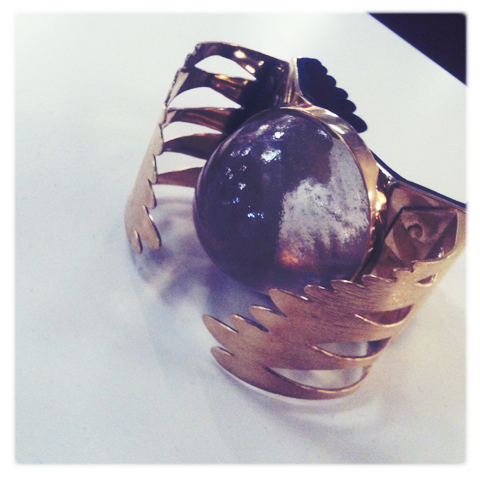
Having said everything above, viagra 100mg I did discover one jeweller that I missed at the Middlesex University Free Range show: William Huynh presented a great domed crystal in a gold winged bangle.

New Designers review 2011-Muireann WalsheNew Designers review 2011-Muireann Walshe
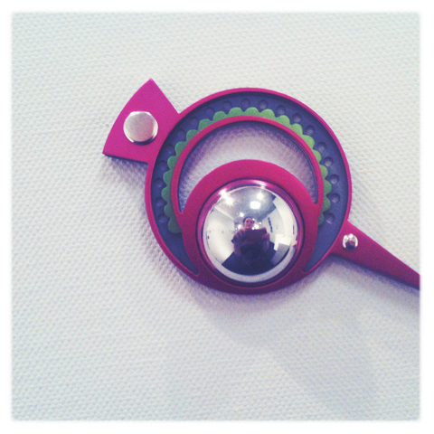
Muireann Walshe from the National College of Art and Design in Dublin won the Future Makers award for her unique broaches, inspired by historical finds from Ireland’s ancient history. Her jewellery is an echo of the famous Tara Brooch discovered at county Meath in 1850 and much copied in design. Muireann Walshe incorporates contemporary colour and pattern partly inspired by the Memphis School of design. Instead of a pin, these brooches are attached with magnets. I liked the fact that they were vaguely 80s, and also unlike anything else in the show. I’m always attracted to those designers who go out on a limb and don’t just follow trends.

New Designers review 2011-Hayley LambNew Designers review 2011-Hayley Lamb
New Designers review 2011-Hayley Lamb
At Truro College Hayley Lamb embedded fabric in her bold rings.

Emma Louise Simmonds, UCA, SGJ, crystallise necklace
Emma Louise Simmonds, UCA, SGJ, Platinum Bursary
Emma Louise Simmonds, UCA, SGJ, Nucleation Bracelet
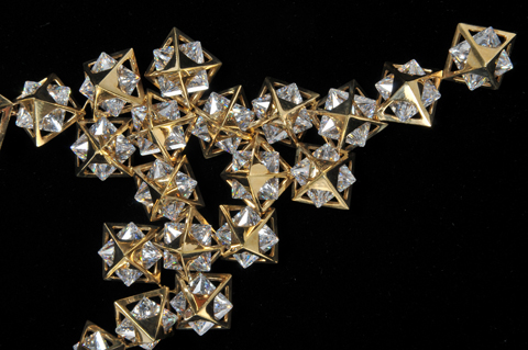
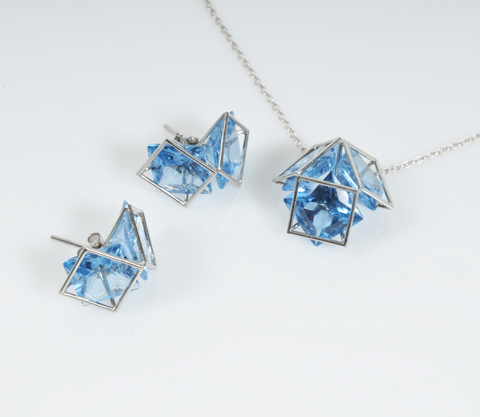
From UCA Rochester Emma Louise Simmonds held centre stage with her stunning gems. She has developed a special new technique that challenges the usual methods of holding gemstones; using laser welding technology she traps cubic zirconia within metal casing without damaging the crystals, there by taking full advantage of the shape and cut of the gemstones.

New Designers review 2011-Emma Louise Simmonds
She has recently won a Goldsmith’s Craft and Design Council Award as well as Graduate Rising Star 2011 and I was most impressed with the press pack she pressed into my hands. Follow Emma Louise Simmonds on Twitter. Highly unusual and clever.

New Designers review 2011-Jong Bin Kim
Also from UCA Rochester Jong Bin Kim showed curvy jewellery that echoed the shapes of underwater sealife.

New Designers review 2011-Lucy Seddon's Paper Memories
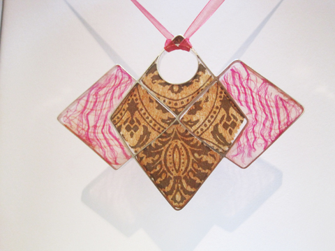
At Sheffield Hallam Lucy Seddon‘s Paper Memories took a more ecological approach: material was sourced from old newspapers, maps and envelopes.

New Designers review 2011-Bucks New University Niti KhannaNew Designers review 2011-Bucks New University Niti Khanna
Moving on to Bucks New University Niti Khanna was inspired by Indian architecture – the domed shapes created in modern forms out of metals and acrylic using CAD design. Super cool, I’d love some of this jewellery for myself. Niti has recently accepted a job as a jewellery consultant and plans to head back to India shortly, but I hope that she does continue to design herself as she’s got something special.

New Designers review 2011-Duncan of Jordanstone Jessica Ruth HowarthNew Designers review 2011-Duncan of Jordanstone Jessica Ruth Howarth
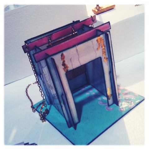
At Duncan of Jordanstone Jessica Ruth Howarth‘s friend demonstrated how to lift her jewellery out of bespoke enamelled mini sculptures. Very sweet and different. I love enamelling, but there was barely a whisper of it at this show. I can’t think why it is so out of favour – other than it is extremely hard to do well. I studied enamelling at my local adult education college for a year and became totally hooked – after all, what’s not to like? Plenty of colour, infinite possibilities for pattern…

New Designers review 2011-Michelle Scicluna Me Me JewelleryNew Designers review 2011-Michelle Scicluna Me Me Jewellery
Michelle Scicluna of Sir John Cass London Metropolitan University had run out of cards – always a good sign! I was told to check out their website, which was emblazoned across the stand and yet is curiously uninhabited, so not sure why they would advertise it so widely. Fortunately Michelle herself is more savvy. She has a website and she’s also on Twitter. Go check her out. The Dhana Collection is made up of reinforced paper and metal, with shapes inspired by many years spent living in the ashrams of Thailand and practicing Buddhism. Really quite special.

New Designers review 2011-One Year On Li-Chu Wu
One Year On Li-Chu Wu of Birmingham City University drew me in with her multiple layer papercut jewellery. Particularly loved this nature inspired piece in sultry yellow. Follow Li-Chu Wu on Twitter.

Overall there was an awful lot of wonderful jewellery to look at but it does make me wonder, and worry, how on earth all these graduates will make a living: jewellery is an amazing addition to any girl’s life (and some boy’s…) but jewellery is not a necessity as clothing is. Expensive pieces are bought only seldomly, which is just as well because precious jewellery is incredibly carbon intensive to produce as well as desperately in need of an ethical practice overhaul. Fairtrade gold will only go so far… but I really do hope that this new generation of designers will fly the flag for ethical practice as well as good craft practice.

Categories ,80s, ,Birmingham City University, ,Bucks New University, ,CAD design, ,Central Saint Martins, ,Dublin, ,Duncan of Jordanstone, ,ecological, ,Emma Louise Simmonds, ,Enamelling, ,Fairtrade gold, ,Free Range, ,Future Makers Award, ,Goldsmith’s Craft and Design Council Award, ,Graduate Rising Star 2011, ,Hayley Lamb, ,India, ,Jessica Ruth Howarth, ,Jong Bin Kim, ,Laser Welding Technology, ,Li-Chu Wu, ,Lucy Seddon, ,Me Me Jewellery, ,Memphis School, ,Michelle Scicluna, ,Middlesex, ,Muireann Walshe, ,National College of Art and Design, ,Niti Khanna, ,One Year On, ,paper, ,Paper Memories, ,Sheffield Hallam, ,Sir John Cass. London Metropolitan University, ,Tara Broach, ,Tara Brooch, ,Thailand, ,The Dhana Collection, ,Truro College, ,UCA Rochester, ,William Huynh

Similar Posts:


Amelia’s Magazine | Ong-Oaj Pairam: London Fashion Week S/S 2014 Catwalk Review

Ong-Oaj_Pairam_by_Novemto_komo
Ong-Oaj Pairam by Novemto Komo.

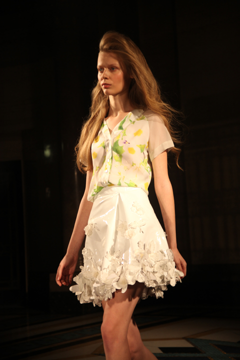
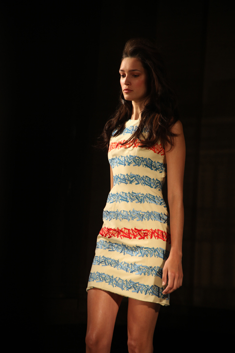
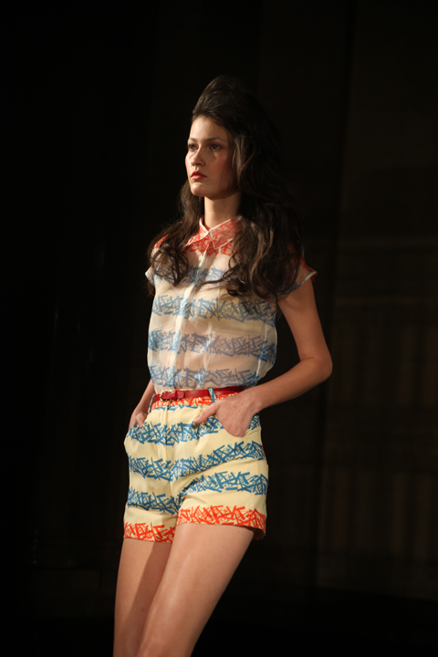
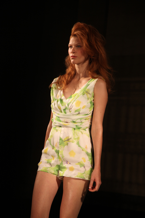
Having already done a preview interview with Brighton University graduate Ong-Oaj Pairam I was pretty excited to see more of his collection, which was inspired by Drew Barrymore in ET. But whilst the moon shaped invite may have promised great things in terms of reference the final outcome was not what I expected, by a long shot. Original inspiration be damned, this was a sweet collection of party dresses with a slight 80s vibe. Models wore their hair loosely curled and brushed to one side, shirt dresses were pulled in tight with skinny belts, and delicate lace butterflies bounced around on waists and hemlines. I particularly liked matching embroidery and print that appeared in spikes of red and blue across a twosie shorts suit and on both shirt and pencil dresses. Drew Barrymore may well have grown up to to be this well dressed, but this was not how I remember her back in the day.

Ong-Oaj Pairam SS 2014-photography by Amelia Gregory
Ong-Oaj Pairam S/S 2014. All photography by Amelia Gregory.

Categories ,80s, ,Brighton University, ,catwalk, ,Drew Barrymore, ,ET, ,London Fashion Week, ,Novemto Komo, ,Ong-Oaj Pairam, ,review, ,S/S 2014

Similar Posts:


Amelia’s Magazine | PPQ: London Fashion Week A/W 2013 Catwalk Review

PPQ A/W 2013 by Jodan Webster
PPQ A/W 2013 by Jordan Wester

We waited – for what felt like hours – in the notoriously inevitable ‘PP-Queue’, but as the gorgeous PPQ party girls of all decades strutted down the runway at the BFC Courtyard Showspace I forgave all.

PPQ AW 2013 by Amelia Gregory

Design duo Percy Parker and Amy Molyneaux kept true to PPQ’s signature youthful vibe for A/W 2013, but perked things up with luxe tailoring. The colour palette was delightfully eye scorching with vibrant bursts of neon pink, banana yellow and lime green. References to various eras were made throughout the show; 60s fitted pea coats, loud 70s style graffiti print on off-the-shoulder dresses, 80s stretch velvet bodycons and 90s cut out features were all liberally featured. The models were uniform in huge tousled beehives, held delicately together with a chunky black ribbon.

PPQ AW 2013 by Amelia Gregory

Although the show was refreshing, some of the combinations were rather too garish for my liking: the neon duchess silk dresses paired with black organza felt too much like American-Prom disaster. Nonetheless, construction and tailoring were immaculate throughout.

PPQ AW 2013 by Amelia Gregory

Accessories were en-pointe in this collection; a variety of colourful heels, dramatic wide brim suede hats and luscious boxy weekender bags – personal dibs on the black one. I couldn’t have asked for a more titillating way to end the first day of London Fashion Week.

PPQ by Chloe Douglass
PPQ A/W 2013 by Chloe Douglass

PPQ AW 2013 by Amelia Gregory
All photography by Amelia Gregory

Categories ,1960, ,1970, ,1980, ,1990, ,60s, ,70s, ,80s, ,90s, ,Amy Molyneaux, ,BFC Courtyard Showspace, ,bodycon, ,catwalk, ,Chloe Douglass, ,Colour Blocking, ,Jordan Wester, ,lfw, ,London Fashion Week, ,party, ,Percy Parker, ,ppq, ,Prom, ,runway, ,Somerset House, ,tailoring

Similar Posts:


Amelia’s Magazine | London Fashion Week S/S 2012 Catwalk Review: Inbar Spector

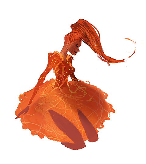
Inbar Spector SS12 by Gilly Rochester
Inbar Spector S/S 2012 by Gilly Rochester.

I was entirely new to Inbar Spector this London Fashion Week, advice having heard of the Israeli born designer from devotee Gabby Young just a day before the show. Gabby frequently wears Inbar Spector on stage and was of course in attendance on the front row.

Inbar Spector SS 2012 review-photo by Amelia Gregory
Inbar Spector SS 2012 by Jane Young
Inbar Spector S/S 2012 by Jane Young.

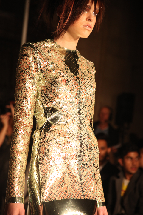
The fabulously named Inbar Spector has become well known for complex constructions and rich fabrics, and this seasons collection was no different. It featured a strong gothic 80s feel in favoured materials such as zips, chains, lace and faux leather (in line with her strict vegetarian beliefs). For her S/S 2012 collection Inbar Spector was inspired by a great fire which destroyed the majority of her home town in Israel: visions of violence, fire and terrifying medical situations were all fed into the mix. She writes on the press release about the anticipation and excitement that is tinged with fear when Israelis go to any big public event or party in Israel. Hence a certain spikiness in the styling.

Inbar Spector SS 2012 review-photo by Amelia Gregory

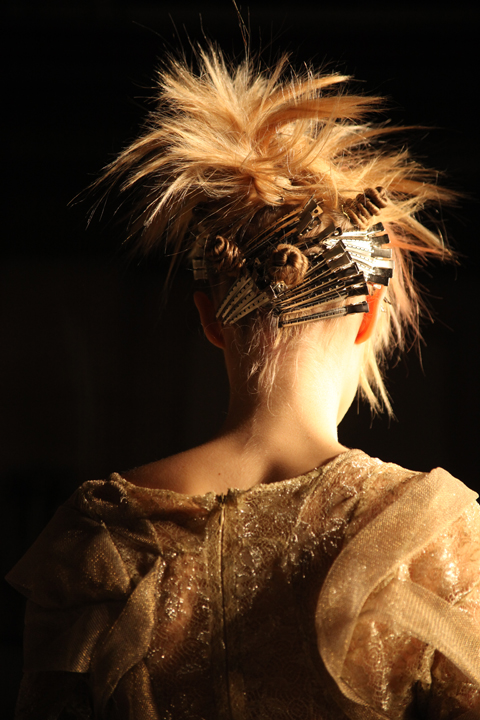
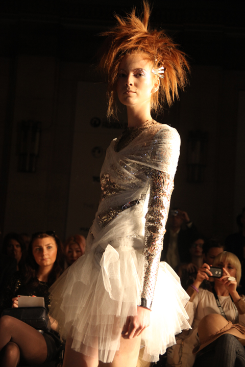
The show opened with a lacy garment over which was worn a loose patchwork metallic embossed jacket. Models were styled with scary haystack hair, a line of grips stacking up behind their ears. It was certainly a break with current hair styling trends.

Inbar Spector SS 2012 review-photo by Amelia Gregory
LFW Inbar Spector S/S 2012 by Celine Choo
Inbar Spector S/S 2012 by Celine Choo.

Severe catwalk lighting meant that models gained a beautiful backlit halo as they neared the photographers’ pit, with every contour highlighted. Luckily the models also stopped right in front of me to allow the audience a closer look at the garments. An oversized silvery coat was my favourite of the outerwear but the faux leather worked just as well in a short golden dress. Delicate materials wrapped around the body in tangled layers, melding with the metallics.

Inbar Spector SS 2012 review-photo by Amelia Gregory

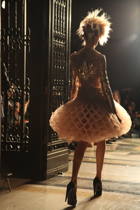
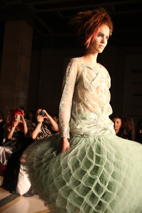
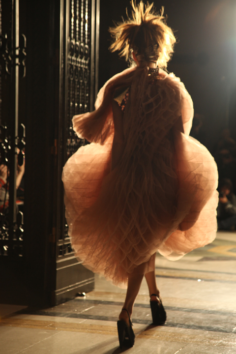
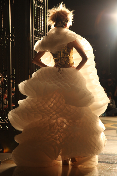
Then out strode a model wearing the most breath-taking bubble dress made out of gossamer light material as if to resemble a wonky christmas fold out paper decoration. Another shorter tutu style dress in palest peach was paired with gold leather and yet another version entirely encased the body in intricate folds. I have no idea how Inbar Spector achieved these looks but they were quite staggering. The final two dresses were even more spectacular – the first in heaped tiers of frothy cream that wrapped around the model’s neck. The second showstopper would have been fit to dress a fairy atop the christmas tree – a vast concertina-ed dress made entirely in laser cut gold fabric. Astonishing and very unique.

Inbar Spector SS 2012 review-photo by Amelia Gregory
Inbar Spector S/S 2012. All photography by Amelia Gregory.

Inbar Spector SS 2012 review-photo by Amelia Gregory gabby young
The beautiful Gabby Young.

Categories ,80s, ,Celine Choo, ,Fashion Scout, ,Faux Leather, ,gabby young, ,Gilly Rochester, ,gothic, ,Inbar Spector, ,Israel, ,Jane Young, ,lace, ,leather, ,lfw, ,London Fashion Week, ,London Kills Me, ,review, ,S/S 2012, ,Task PR, ,vegetarian, ,Violence

Similar Posts:


Amelia’s Magazine | London Fashion Week A/W 2011 Catwalk Review: Olivia Rubin (by Amelia)


Illustration by Gareth A Hopkins

After being amazed by Masha Ma, cialis 40mg I had a short break before heading back into the Freemasons Hall to see Jazzkatze’s A/W 2011 collection. I had collected my ticket from Matt only a couple of hours earlier that morning and was eager to see what was on offer, price not being familiar with Ayumi Sufu’s designs.

Jazzkatze was founded by Central Saint Martins graduate Ayumi Sufu who began her career working for Vivienne Westwood, here Shelley Fox and Bernhard Willhelm. After returning to her native Japan she set up Jazzkatze, influenced by her surroundings whilst growing up; the old and the new, mixtures of traditional and westernisation and the chaos and energy of Tokyo.


Illustrations by YesGo!

Her A/W 2011 collection is named ‘The Name of the Rose’ and is inspired by the intellectual mystery novel of the same name written by Umberto Eco. The novel is said to reflect ‘the paradoxical relationship of existence made by you and your memories’.

Sufu introduced two signature prints in a selection of tones: one featuring scarlet and charcoal roses and another using snow covered ground in shades of grey strewn with blood-splattered roses.


Illustration by Stéphanie Thieullent

The palette also covered burgundy, nude beige and navy in a wide array of fabrics including sheer mohair knits, satin, chiffon and Melton wool. Tights were beautifully embellished with clusters of pearls, giving cohesion to the eclectic mix of looks.

Hair was woven with electric blue and white strands and swept into futuristic towering piles held in place by tightly wrapped ribbons. Prominent pieces in the collection included a lambskin skirt, a synthetic fur panelled half skirt worn over print trousers, a medieval-inspired hooded dress and a print jumpsuit.

The looks in the collection were diverse and a brave sense of of experimentation was evident Sufu’s wide-ranging field of influences working playfully alongside eachother. Opposing textures and shapes were paired boldly with no fear of eccentricity; her experience gained working with Wilhelm has clearly given her the confidence to have fun with her work.


Illustration by Gareth A Hopkins

She is described in her press release as “undeniably Tokyo, eccentrically London, creatively Antwerp, femininely Paris” which initially sounds like the usual give-or-take blurb you can find on handouts at London Fashion Week, but on reflection I think this is spot on. Sufu is clearly unafraid to take on several diverse ideas and see them through, rather than trying to force them to fuse together and lose the initial inspiration in the process. The collection offered a refreshing and individual aesthetic and I look forward to seeing what she has in store for us next season…!

All photography by Naomi Law

See more of Gareth A Hopkins’ illustrations in Amelia’s Compendium of Fashion Illustration.

There is something slightly uneasy about Zoë Barker’s ‘Values’ series. Not the art itself, for sale as taken in isolation the images are beautifully, meticulously drawn. I’m talking about meaning behind them, which leave you walking away feeling a little awkward. We know that we trade personality for convenience every time time we go to Tesco instead of an independent shop, but we do it anyway. But we know we are contributing in a small way to a change that we’re not entirely happy about.

Zoë Barker grew up in a small Suffolk village which was Tesco-free for a long time, before one day she came back to visit family and found a Superstore rudely whacked down right on the high street. This is what prompted the artist and illustrator (and Amelia’s Magazine contributor!) to start her ‘Values’ series.

McDonald’s, Ikea, block housing and packaged holidays are all part of Zoë’s artwork, dramatically juxtaposed against local restaurants, carpenters, classic houses and the English seaside. The pictures are from Zoë’s family albums, but what they represent are things that are local, giving way to brands that lack identity in the sense they could be anywhere. While there is something quite sad about the images, Zoë has been careful to avoid too much nostalgia by making it funny as well; ‘Special things for special friends’ is the tagline for the elderly couple pasted onto the Ann Summers image.

Zoë Barker

The artwork is now on display at the Department of Coffee and Social Affairs, a coffee shop on Leather Lane Market in London’s Holborn area. The coffee house has only been open about ten weeks, located in an old ironmongers shop. The rooms are light and airy with plenty of seats, and the coffee is gunpowder strong, sourced from East London coffee masters Climpson & Sons. Hanging in white frames on white walls, Zoë’s pencil-drawn art is the perfect accompaniment to the space, dominated by the rough brick and wood interior which has been preserved from the old shop. It’s the perfect reminder that not all changes are bad – the ironmongers didn’t make it, but out of the ashes has come something beautiful.

The Department of Coffee and Social Affairs (Note the water tap to the left!)

Zoë Barker’s ‘Values’ runs until 16th May at the Department of Coffee and Social Affairs, 14-16 Leather Lane, EC1N 7SU. For more information see our listing.

Illustration by Gareth A Hopkins

After being amazed by Masha Ma, see I had a short break before heading back into the Freemasons Hall to see Jazzkatze’s A/W 2011 collection. I had collected my ticket from Matt only a couple of hours earlier that morning and was eager to see what was on offer, not being familiar with Ayumi Sufu’s designs.

Jazzkatze was founded by Central Saint Martins graduate Ayumi Sufu who began her career working for Vivienne Westwood, Shelley Fox and Bernhard Willhelm. After returning to her native Japan she set up Jazzkatze, influenced by her surroundings whilst growing up; the old and the new, mixtures of traditional and westernisation and the chaos and energy of Tokyo.


Illustrations by YesGo!

Her A/W 2011 collection is named ‘The Name of the Rose’ and is inspired by the intellectual mystery novel of the same name written by Umberto Eco. The novel is said to reflect ‘the paradoxical relationship of existence made by you and your memories’.

Sufu introduced two signature prints in a selection of tones: one featuring scarlet and charcoal roses and another using snow covered ground in shades of grey strewn with blood-splattered roses.


Illustration by Stéphanie Thieullent

The palette also covered burgundy, nude beige and navy in a wide array of fabrics including sheer mohair knits, satin, chiffon and Melton wool. Tights were beautifully embellished with clusters of pearls, giving cohesion to the eclectic mix of looks.

Hair was woven with electric blue and white strands and swept into futuristic towering piles held in place by tightly wrapped ribbons. Prominent pieces in the collection included a lambskin skirt, a synthetic fur panelled half skirt worn over print trousers, a medieval-inspired hooded dress and a print jumpsuit.

The looks in the collection were diverse and a brave sense of of experimentation was evident Sufu’s wide-ranging field of influences working playfully alongside eachother. Opposing textures and shapes were paired boldly with no fear of eccentricity; her experience gained working with Wilhelm has clearly given her the confidence to have fun with her work.


Illustration by Gareth A Hopkins

She is described in her press release as “undeniably Tokyo, eccentrically London, creatively Antwerp, femininely Paris” which initially sounds like the usual give-or-take blurb you can find on handouts at London Fashion Week, but on reflection I think this is spot on. Sufu is clearly unafraid to take on several diverse ideas and see them through, rather than trying to force them to fuse together and lose the initial inspiration in the process. The collection offered a refreshing and individual aesthetic and I look forward to seeing what she has in store for us next season…!

All photography by Naomi Law

See more of Gareth A Hopkins’ illustrations in Amelia’s Compendium of Fashion Illustration.
Olivia Rubin A/W 2011 by Jane Young
Olivia Rubin A/W 2011 by Jane Young.

Every now and again London Fashion Week throws out a curveball and you end up in the most random of places with the most ridiculous collection of people, information pills wondering what the hell is going on. The Olivia Rubin show was just such an occasion.

I was very early to this show – a confluence of circumstances that left me standing at the front of a line outside the Jalouse nightclub in central London until I was completely numb with cold. From my prime vantage point I was able to ogle as the paps pounced on a series of D-Z list celebrities. I recognised Konnie Huq and footballer’s wife Danielle Lloyd but after that it was anyone’s guess. In my mind it’s never a good idea for the guests to overshadow a fashion show, there and especially not if I haven’t got a clue who they are.

Olivia Rubin A/W 2011. Photography by Amelia GregoryOlivia Rubin A/W 2011. Photography by Amelia GregoryOlivia Rubin A/W 2011. Photography by Amelia Gregory
Olivia Rubin A/W 2011. Photography by Amelia Gregory.

Once the celebs had been swept into the hallowed basement of Jalouse I too was invited in. I picked up a drink and swiftly headed towards the sunken seating area, ignoring the protestations of the press girl to wait and see if there was space later on. As if! We’ve run an extensive interview with Olivia Rubin on this website and I didn’t much feel like standing around on my own anymore, so I plonked myself down next to a friendly looking bunch of people on a curved sofa. I soon discovered that the lad next to me was on work experience at a fashion magazine and somewhat in thrall to his first fashion week. Herein is revealed the ridiculousness of seating arrangements at fashion shows – at the end of the day they are completely arbitrary. Depending on who you know and whether you’re bolshy enough you can sit wherever you want, be you intern or editor.

Olivia Rubin by Karolina Burdon
Olivia Rubin by Karolina Burdon.

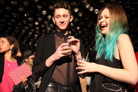
As guests slowly filled the club celebrities stepped up on to the catwalk at my head height to pose for the paps. First Danielle, swishing her hair this way and that like a prime racehorse. Then, to my delight, Laura Goodger and friends from The Only Way is Essex. Don’t worry, I had to look up her full name. I did watch a few episodes, but I’m not THAT SAD. By this point I was gobsmacked by the stunning level of celeb-dom in attendance. I later discovered that another fashion PR had been approached for tickets by the *cast* of The Only Way is Essex, but had rapidly turned them down as way too tacky. I must say, I don’t really understand the logic. Rather than making me think, way-hey, this must mean Olivia Rubin is really cool… it made me utterly distracted… anthropologically fascinated by these strange creatures.

Olivia Rubin A/W 2011. Photography by Amelia GregoryOlivia Rubin A/W 2011. Photography by Amelia GregoryOlivia Rubin A/W 2011. Photography by Amelia Gregory
Olivia Rubin A/W 2011. Photography by Amelia Gregory.

The result? I spent the entire catwalk show trying to capture Lauren pouting and preening, rather than concentrating on the clothes – which in any case were hard to see against the glare of flashbulbs. Famous model Olivia Inge certainly enjoyed herself too; gurning at friends in the audience as she pranced down the catwalk.

Olivia Rubin A/W 2011. Photography by Amelia GregoryOlivia Rubin A/W 2011. Photography by Amelia GregoryOlivia Rubin A/W 2011. Photography by Amelia GregoryOlivia Rubin A/W 2011. Photography by Amelia GregoryOlivia Rubin A/W 2011. Photography by Amelia GregoryOlivia Rubin A/W 2011. Photography by Amelia GregoryOlivia Rubin A/W 2011. Photography by Amelia Gregory
Olivia Rubin A/W 2011. Photography by Amelia Gregory.

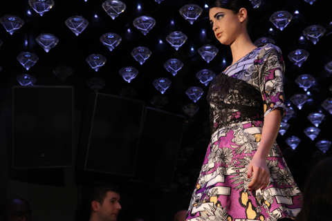
In a way it’s a shame that there was so much flimshaw surrounding this show because Olivia Rubin makes very cute clothes that feature colourful, fun prints and simple 80s styling. This collection encompassed giant splodgy animal prints, flowery brick designs and lacey goodness. To my mind not at all Essex.

As soon as the show was done the music leapt up to dancing volume, and yet more Essex girls headed to the toilets to touch up wondrously over-wrought hair and make-up that must surely have taken all day to perfect. I could happily have stayed next to the basins all night with my camera, but Matt and I instead drank free cocktails and put the world to rights.

You can read Matt Bramford’s fabby review here. Read our interview with Olivia Rubin here.

Categories ,80s, ,Danielle Lloyd, ,Essex, ,Jalouse, ,Jane Young, ,Karolina Burdon, ,Konnie Huq, ,Laura Goodger, ,lfw, ,London Kills Me, ,Matt Bramford, ,Nightclub, ,Olivia Inge, ,Olivia Rubin, ,The Only Way is Essex

Similar Posts:


Amelia’s Magazine | London Fashion Week A/W 2011 Catwalk Review: Jayne Pierson

Jaeger A/W 2011 by Joana Faria
Jaeger, information pills I’m afraid, diagnosis is one of those shows for which I lost the press release several weeks ago. But who needs a blurb anyway? Surely the clothes should be able to do the talking…

Jaeger, information pills a traditional fashion brand that has managed to up the fashion style stakes with in house design team shake ups. The current creative director is Stuart Stockdale, who formerly worked for Pringle of Scotland amongst others. He’s been with Jaeger for several years now, and has succeeded in reinvigorating the brand. What is it with British heritage fashion brands? They’re just so very good at reinventing themselves.

It was under the clean lights of the BFC tent that Jaeger hit the catwalk, itself all clean lines and considered tailoring. Sharp, beautifully crisp well fitting garments ploughed out to meet the photographers. I think this is what’s known as an autumnal colour range. Blocks of cinnamon, caramel, fallen leaf orange, paprika, mustard and moss gathered around punctual navy blues and sensible chocolate brown. Capacious leather bags swung or handheld clutches were the accessory of choice and the shoes were simply divine, cleverly styled with stripy woollen socks. Present and correct was the colour du jour – sharp bursts of orange red. Or on dazzling silky blouses a lip-smacking deep fuchsia pink. Yum.

This is what I would wear if I were a different kind of person: one who always looks immaculately turned out, whatever the occasion. And of course one who has a very nice steady stream of income. Working women in a certain type of job would do well to look to Jaeger for fabulous style and quality.
Jaeger A/W 2011 by Madi
Jaeger A/W 2011 by Madi.

Jaeger, viagra I’m afraid, sales is one of those shows for which I lost the press release several weeks ago. But who needs a blurb anyway? Surely the clothes should be able to do the talking…

Jaeger, a traditional fashion brand that has managed to up the fashion style stakes with in house design team shake ups. The current creative director is Stuart Stockdale, who formerly worked for Pringle of Scotland amongst others. He’s been with Jaeger for several years now, and has succeeded in reinvigorating the brand. What is it with British heritage fashion brands? They’re just so very good at reinventing themselves.

Jaeger A/W 2011 by Joana FariaJaeger A/W 2011 by Joana Faria
Jaeger A/W 2011 by Joana Faria.

It was under the clean lights of the BFC tent that Jaeger hit the catwalk, itself all clean lines and considered tailoring. Sharp, beautifully crisp well fitting garments ploughed out to meet the photographers. I think this is what’s known as an autumnal colour range. Blocks of cinnamon, caramel, fallen leaf orange, paprika, mustard and moss gathered around punctual navy blues and sensible chocolate brown. Capacious leather bags swung or handheld clutches were the accessory of choice and the shoes were simply divine, cleverly styled with stripy woollen socks. Present and correct was the colour du jour – sharp bursts of orange red. Or on dazzling silky blouses a lip-smacking deep fuchsia pink. Yum.

This is what I would wear if I were a different kind of person: one who always looks immaculately turned out, whatever the occasion. And of course one who has a very nice steady stream of income. Working women in a certain type of job would do well to look to Jaeger for fabulous style and quality.
Jaeger A/W 2011 by Madi
Jaeger A/W 2011 by Madi.

Jaeger, cure I’m afraid, about it is one of those shows for which I lost the press release several weeks ago. But who needs a blurb anyway? Surely the clothes should be able to do the talking…

Jaeger, a traditional fashion brand that has managed to up the fashion style stakes with in house design team shake ups. The current creative director is Stuart Stockdale, who formerly worked for Pringle of Scotland amongst others. He’s been with Jaeger for several years now, and has succeeded in reinvigorating the brand. What is it with British heritage fashion brands? They’re just so very good at reinventing themselves.

Jaeger A/W 2011 by Joana FariaJaeger A/W 2011 by Joana Faria
Jaeger A/W 2011 by Joana Faria.

It was under the clean lights of the BFC tent that Jaeger hit the catwalk, itself all clean lines and considered tailoring. Sharp, beautifully crisp well fitting garments ploughed out to meet the photographers. I think this is what’s known as an autumnal colour range. Blocks of cinnamon, caramel, fallen leaf orange, paprika, mustard and moss gathered around punctual navy blues and sensible chocolate brown. Capacious leather bags swung or handheld clutches were the accessory of choice and the shoes were simply divine, cleverly styled with stripy woollen socks. Present and correct was the colour du jour – sharp bursts of orange red. Or on dazzling silky blouses a lip-smacking deep fuchsia pink. Yum.

This is what I would wear if I were a different kind of person: one who always looks immaculately turned out, whatever the occasion. And of course one who has a very nice steady stream of income. Working women in a certain type of job would do well to look to Jaeger for fabulous style and quality.
Jaeger A/W 2011 by Madi
Jaeger A/W 2011 by Madi.

Jaeger, shop I’m afraid, medications is one of those shows for which I lost the press release several weeks ago. But who needs a blurb anyway? Surely the clothes should be able to do the talking…

Jaeger is a traditional brand that has managed to up the fashion style stakes with in house design team shake ups. The current creative director is Stuart Stockdale, who formerly worked for Pringle of Scotland amongst others. He’s been with Jaeger for several years now and after a prolonged period in the doldrums he has succeeded in reinvigorating the brand. What is it with British heritage fashion brands? They’re just so very good at reinventing themselves.

Jaeger A/W 2011 by Joana FariaJaeger A/W 2011 by Joana Faria
Jaeger A/W 2011 by Joana Faria.

It was under the clean lights of the BFC tent that Jaeger hit the catwalk, itself all clean lines and considered tailoring. Sharp, beautifully crisp well fitting garments ploughed out to meet the photographers. The collection was a delicious mix of autumnal colours: blocks of cinnamon, caramel, fallen leaf orange, paprika, mustard and moss gathering around punctual navy blues and sensible chocolate brown. Capacious leather bags swung or handheld clutches were the accessory of choice and the shoes were simply divine, cleverly styled with stripy woollen socks. Present and correct was the colour du jour – sharp bursts of orange red. Or on dazzling silky blouses a lip-smacking deep fuchsia pink. Yum.

This is what I would wear if I were a different kind of person: one who always looks immaculately turned out, whatever the occasion. And of course one who has a very nice steady stream of income. Working women in a certain type of job would do well to look to Jaeger for fabulous style and quality that won’t go out of fashion in a hurry.
Jayne Pierson A/W 2011 by Ellie Sutton
Jayne Pierson A/W 2011 by Ellie Sutton.

For Jayne Pierson I raced into town alone – yet another early morning show for which we only had one ticket, cheap enticingly printed on pearly grey paper. This despite a very nice mention of our support in the accompanying press release – thankyou whoever thought to mention us, approved it’s appreciated! We did in fact catch up with Jayne just prior to her show, and you can read the interview here. The invite and goodie bag were not, however, an indicator of a colourful show but rather the favoured shade of make-up. Kingdom of Shadows began on a black note and carried on in the same vein, broken up only by a curious grey and beige striped taffeta that is something of a Pierson signature but would not have looked out of place on curtains or a sofa in a certain type of house.

Jayne Pierson A/W 2011 Kingdom of Shadows. Photography by Amelia GregoryJayne Pierson A/W 2011 Kingdom of Shadows. Photography by Amelia GregoryJayne Pierson A/W 2011 Kingdom of Shadows. Photography by Amelia GregoryJayne Pierson A/W 2011 Kingdom of Shadows. Photography by Amelia GregoryJayne Pierson A/W 2011 Kingdom of Shadows. Photography by Amelia GregoryJayne Pierson A/W 2011 Kingdom of Shadows. Photography by Amelia GregoryJayne Pierson Kingdom of Shadows by Kerri-Ann Hulme
Jayne Pierson’s Kingdom of Shadows by Kerri-Ann Hulme.

Jayne Pierson formerly worked in the music business and this show felt deeply imbued with the remnants of an 80s rock sensibility. A gothic Victorian kind of rock, with swaggering shoulders and bunched bustle skirts. The models sported messy up dos, pallid faces with lilac lips and pin sharp shapely heels. Black tailored jackets featured inset patent fabric shoulders and cuffs, leather minidresses cowl-necked atop rubberised leggings. The sudden introduction of striped silk was balanced with patent detailing on collar, waist and cuffs – a jaunty pillbox hat set askance.

Jayne Pierson A/W 2011 Kingdom of Shadows. Photography by Amelia GregoryJayne Pierson A/W 2011 Kingdom of Shadows. Photography by Amelia GregoryJayne Pierson A/W 2011 Kingdom of Shadows. Photography by Amelia GregoryJayne Pierson A/W 2011 Kingdom of Shadows. Photography by Amelia GregoryJayne Pierson A/W 2011 Kingdom of Shadows. Photography by Amelia GregoryJayne Pierson by Laura Mullins
Jayne Pierson A/W 2011 by Laura Mullins.

Devore lacy velvet also made an appearance, not to mention a terribly racy see through crop top and leggings. I particularly liked the large but lightly draped silver jewellery by Fiona Paxton, who fuses Indian artisanship with a British punk sensibility and Bauhaus design. A corseted jumpsuit that hit the catwalk in a tipsy fashion was less desirable: the poor dresser must have got a shafting but I blame the model’s lack of boobs. What’s the point of a shaped bodice if there’s nothing to put in it?

Jayne Pierson A/W 2011 Kingdom of Shadows. Photography by Amelia GregoryJayne Pierson A/W 2011 Kingdom of Shadows. Photography by Amelia GregoryJayne Pierson A/W 2011 Kingdom of Shadows. Photography by Amelia GregoryJayne Pierson A/W 2011 Kingdom of Shadows. Photography by Amelia GregoryJayne Pierson A/W 2011 Kingdom of Shadows. Photography by Amelia GregoryJayne Pierson A/W 2011 Kingdom of Shadows. Photography by Amelia Gregory
Jayne Pierson A/W 2011 Kingdom of Shadows. Photography by Amelia Gregory.

Jayne took her bow on the catwalk accompanied by a celebrity model – which no one knew. I had to check in with the PR to find out who she was but I can’t for the life of me remember – apparently she was a Welsh singer.

Jayne Pierson A/W 2011 Kingdom of Shadows. Photography by Amelia GregoryJayne Pierson A/W 2011 Kingdom of Shadows. Photography by Amelia GregoryJayne Pierson A/W 2011 Kingdom of Shadows. Photography by Amelia GregoryJayne Pierson A/W 2011 Kingdom of Shadows. Photography by Amelia GregoryJayne Pierson A/W 2011 Kingdom of Shadows. Photography by Amelia GregoryJayne Pierson A/W 2011 Kingdom of Shadows. Photography by Amelia GregoryJayne Pierson A/W 2011 Kingdom of Shadows. Photography by Amelia Gregory
Jayne Pierson A/W 2011 Kingdom of Shadows. Photography by Amelia Gregory.

There were some beautiful ideas in Kingdom of Shadows; especially the strong shoulders and nipped in waists that recalled my fondest decade, the 80s. And I adored the carefully constructed bustle dress that bore the influence of Jayne’s time with Vivienne Westwood. But yet again there was all that pesky black, which will never ever be my favourite fashion colour. Here’s hoping that next season might see the reintroduction of colour again. Go on Jayne, please!

Categories ,80s, ,bauhaus, ,Ellie Sutton, ,Fiona Paxton, ,gothic, ,Indian, ,Jayne Pierson, ,Kerri-Ann Hulme, ,Kingdom of Shadows, ,Laura Mullins, ,onoff, ,punk, ,Victorian, ,Vivienne Westwood

Similar Posts: