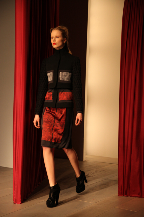
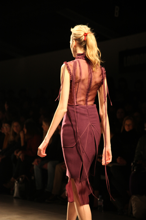
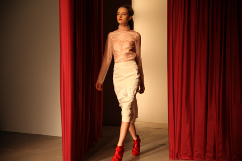
Amelia’s Magazine | London Fashion Week A/W 2011, Catwalk Review: Prophetik (by Helen)

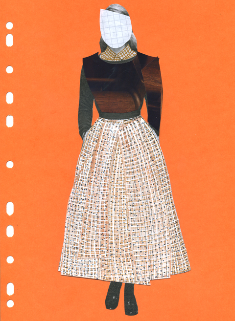
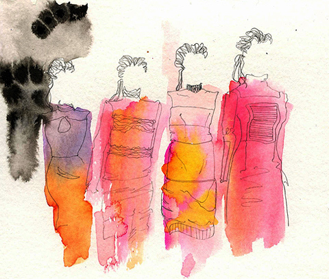
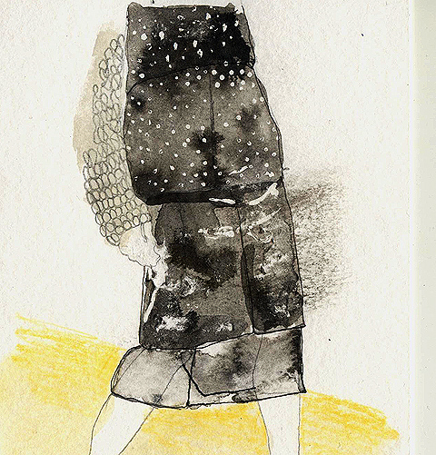
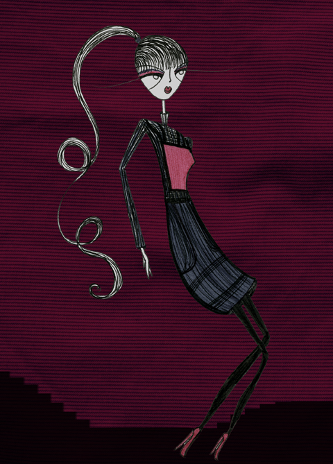
Jena Theo Matilde SazioJena.Theo LFW A/W 2011, seek rx Illustration by Matilde Sazio

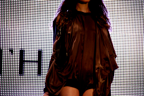
I was ushered in through the door by a geezer of a Londoner chap, sick straight through to a high heeled officious lady, then again to the very highest heels clinking their way to the front row to show me my seat. There were bags on my seat. Bags filled with goodies. Splendid. The lady next to me was bouncing her baby on her knee, as said baby was knawing on a pain au chocolat. “Nice earmuffs” I said to the tiny fashionista, pointing towards her penguin earmuffs on her head. “To protect her from the sound. It can get very loud. But she does love it here. Loves the shows.” How much do I want a chilled out, cute baby like her. Also, cool mother! I know mothers who wouldn’t take their child to Tescos for fear of its screaming the flourescently lit shed down. I looked around properly, and saw straight backed women before me. Unsmiling, with notepads on their laps and twitter at their fingertips. No one was without a smart phone. Comfortingly others were holding cameras possibly at the same level as mine, not everyone had the enormous lensed beasts. This made me feel infinitely better about my black device with sand trapped in the lens from every holiday in the last three years and glitter from an explosion of glitter at a festival last year. It makes me slightly sad to see it sprinkle on my lap when I take the lens cap off. Nostalgic particles… To the left, I felt like I was getting an immense tan however from the mad, bright white, highly lit, flashing, mini bulb, sensation. It was just INTENSE; magic eye, transfixing, blinding… The lady next to me shielded the left hand side of her face for a bit. We briefly discussed the perils of giant screens of mini light bulbs. SUCH a drag. Then it all went dark and we were treated to intro music as the anticipation was allowed to be built. Dum, dum, dum….dum… dum. EXCITED. Most of the opposite front row remained attached to the twit or without expression.

Karina Yarv
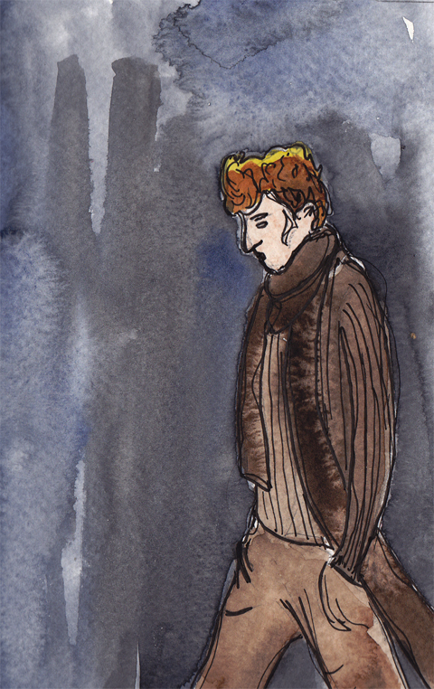
Jena.Theo LFW A/W 2011, Illustration by Karina Yarv

The darkness remained for a while, and I felt my heart start to beat harder. You know when as a child (/adult), at a theme park, you have just queued to get onto a ride that begins in the dark? You’re kind of scared but excited, not really sure how it will turn out? Yes, that. That was what it felt like. I was half expecting for the floor to drop and to experience a heart in my mouth sensation, as gravity stole my nerves. Child next door was heckling, all ready for the experience to begin. She’s not worried her mother assures me, as a seasoned show-goer why would she be? Well, indeed. This does not compare to my 80s Sussex upbringing. I spent being three and four devoted to my pink bomber jacket and all in one waterproof jumpsuit number. Was it the 80s? Was it me? Is there any hope? I apoligise, enough pondering! The show began.

Jena.Theo_LFW_MattBramford_006 Jena.Theo_LFW_MattBramford_007Jena.Theo_LFW_MattBramford_008Jena.Theo_LFW_MattBramford_004Jena.Theo_LFW_MattBramford_003
Photography by Matt Bramford

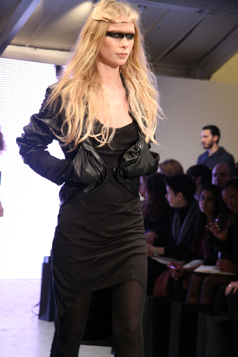
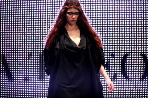
I was pleased to see that what was being presented was completely wearable. Definitely in London. Perhaps less so in Bristol – it was slightly ‘too’ urban for the West Country. However, if I had a choice (and el cash), some of those pieces would be getting worn in Falfael King and that secret bar we’ve been meaning to go to for a while… at least supper club. Or – ah see, I kind of want to move to London again. Don’t get the wrong impression of Briz, I beg you. Anyway digressing again- the show was very charcoal, black and cream orientated. The models all had black stripes across their eyes and otherwise bare faces. This made them look like mysterious, moody superheros. I liked it, as it really set of the simple coloured, pieces; the models all expressionless (course), their masks and the movement of the light or dark pieces worked together perfectly. It felt like we were on the sea, with norwegian heroines. Swishing slowly about, their heels never falter, their gaze exact, the path has been set and the grey skies are dappled with stars, as the storm takes hold. These strong warriors will take us with their capes flowing behind them, their hair dancing in the wind.

Jena.Theo Valkyrie by Matilde SazioJena.Theo LFW A/W 2011, Illustration by Matilde Sazio

My favourite piece was one with an almost bustling at the back, flowing down to the ground, in one swipe. The front was a mini, the back was the drama, the fantasy. I would love to wear this one standing at the front of a ship. Not a ferry, a ship. The collection; Valkyrie, refers to a band of celestial female figures who decide to die in the field of battle. So 300, in a sense, but with women. Strong, ethereal women.

Jena.Theo_LFW_MattBramford_002Jena.Theo_LFW_MattBramford_001 Jena.Theo_LFW_MattBramford_005
Photography by Matt Bramford

Jena.Theo have managged to combine the mythology with the urban reality. Fantasy has been embraced, with opulence in mind, the designs are sumptuous, yet strong. Fit for women going into battle with the ice of Scandinavia and the luxuriousness of a cashmere bustle behind them. And why not mix up the hemlines, paint black across our eyes and march like amazonian creations girls. We are women. Watch us gracefully, cooly and quietly move, like we believe we are mighty. We are. For designs that were indeed simple, they were deserving of their sparkling lights.
Gemma Milly-Prophetik-A-W11
Prophetik LFW A/W 20011 Collection illustration by Gemma Milly

A long queue waited for me outside of Freemason’s Hall. Initially I considered sauntering in through the door I first came across, pill but after peering in I discovered that in fact there was only a Vauxhall car in there and a couple of security men. Instead there was the aforementioned queue, pill just round the corner. I spotted Akeela, Katie and Sarah of Scribble fame in the line and promptly hit them all with my enormous goodie bag from Jena.Theo. As I was excitable, my accompanying movements were erratic and thus the thwacking continued until I decided to destroy the bag and had a look at the contents. Delicious. The standing and nattering continued before our coloured stickers were called forwards. I thanked Amelia power as we were marched straight in and positioned in the second row. Ooo a mini orchestra to the left.

Prophetik_Abby_Wright_LFW
Prophetik LFW A/W 2011 Collection, illustration by Abby Wright

Chat for ages it seems before it all goes dark. Then a blonde bobbed lady came out and started ‘haaaa’ing. More high pitched than Enya, but similarly Lord Of The Rings magical. WHAT to expect. Well, in truth I had an idea, the press sheet announced that this was ‘Artist Wonderment’. This can only mean we are entering the fantasy land of the designer. Happily, as I read on, it would appear that Prophetik have been inspired by all the magic of the past. And I DO so love a good period drama. I quote: ‘The season exudes the freedom from the pretense of being what we would become, fleeing from egotism into the wonderment of an artist.’ Prophetik are very fond of liberty and protection of our world, through being all-sustainable. Tennessee’s Jeff Garner, who designs the fashion lifestyle brand, wants to bring an awareness of the repercussions of the clothing business, to everyone they can reach.

Gemma_Milly-Prophetik2-A-W11
Prophetik LFW A/W 20011 Collection illustration by Gemma Milly

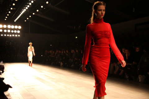
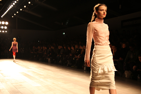
Then violin lady, Analiza Ching came out, short skirted, her hair flicking around. Violinsts always look pretty cool I think, especially when they are jumping around, confidently using the strings to produce feisty sounds. After more hair and body kinetic energy, Miss Violinst went and joined the Benjamin Ellin orchestra. Then the models started streaming out in their Louis XV inspired outfits. With long dresses, corseted and delicate detailing. The colours were soft and the fabric consisted of ripped silks, organic velour, as well as 100 year old southern quilts, courtesy of Jeff Garner’s great grandmother, Lola. Interestingly cactus silk was also introduced, made from the agave plant. The pieces looked heavy and purposeful as they swept past. Similar to the dresses you find in fashion museums, a bit starchy and very thick. However, Prophetik‘s collection, as opposed to the historic pieces, had a woodland feel to them, connecting them to the earthy message and principles of the designer.

Prophetik_LFW_MattBramford_198Prophetik_LFW_MattBramford_188Prophetik_LFW_MattBramford_142Prophetik_LFW_MattBramford_131Prophetik_LFW_MattBramford_104Prophetik_LFW_MattBramford_098Prophetik_LFW_MattBramford_078Prophetik_LFW_MattBramford_068Prophetik_LFW_MattBramford_044Prophetik_LFW_MattBramford_040Prophetik_LFW_MattBramford_024
Prophetik LFW A/W 2011 Collection, photography by Matt Bramford

“He’s grease lightning isn’t he?” The ladies behind me complained, as they were unable to get a shot of the red-headed male model on the catwalk. With his long hair slicked back, quilted buttoned up jackets and three quarter length trousers, I wished he would next come out mounted on a horse. Perhaps with one of the angel lady beings, riding side saddle and looking into the middle distance – because that’s where the magic is, clearly. The men all looked serious and officious in their luxurious outfits. Like Prince’s, they wore the natural colours with a regal air about them. I can certainly imagine some of my Hereford friends cracking out these jackets round the fire this Autumn. Residing in woods, yurts and buses, they whole heartedly are ‘woodland creatures’. Much like these, pretty imps and fairies. The Prince, the carpenter and the folk singer, sit within the trees, stars sparkling and dragonflies dancing.

There were a few dresses that I fell in love with. This included the midi length halter dress with boots – most of the outfits were worn with flat boots – I imagine for easy action in the woods. They complimented the dresses, stopping the over pretty factor. All hair was slicked to the ears and then waved, faces pale and natural. I also loved the female tailcoats, tight to the waist then full to the thigh and featuring turned up cuffs, curling at the top. All with embroidered edges and in deep, or pastel colours. Then the floor length, corseted, strapless, rich purple dress, complete with a train was divine. As was a stunning mossy green and cream empire line dress. It was a modern, eco Austen esque, Regency beauty; so graceful. The strapless and halterneck dresses were lighter than the embroidered pieces, many of which billowed in layers to the floor, and were more reminiscent of the Tudor 16th century period.

Helen Martin Prophetik
THE Prophetik DRESS. Photo by Helen Martin

I must say, the absolutely MOST fantastic dress of them ALL was a white ostrich feather creation. I want to get married and wear this ostrich BEAUTY. Like the white, angelic creation from the sky, she swept in and the whole audience gasped. I’d like to think she was saved by birds after being orphaned through the enemy’s shots. Then nurtured by the birds before she emerged, into the woods. And the woodland creatures danced in merriment, for she had been saved, and she was beautiful. Red-headed man will hopefully slow his canter to a trot, then dismount, his nonchalent stare becoming a transfixed (gruff) stare. He loved her already.

Gemma Milly and Abby Wright have their illustrations in Amelia’s Compendium of Fashion Illustration, available here.

Categories ,Abby Wright, ,ACOFI, ,Akeela, ,Amelia, ,Analiza Ching, ,Benjamin Ellin, ,eco, ,folk, ,Gemma Millie, ,Helen Martin, ,Katie Antoniou, ,lfw, ,LFW A/W 2011, ,Lola, ,Louis XV, ,marriage, ,Matt Bramford, ,Orchestra, ,planet, ,prince, ,Princess, ,Prophetik, ,Sarah Scribbles, ,sustainable, ,Tennessee, ,vauxhall, ,Violin, ,woodland creatures

Similar Posts:


Amelia’s Magazine | London Fashion Week A/W 2011 Catwalk Review: Charlie Le Mindu (by Amelia)

Charlie Le Mindu by Andrea Peterson aka Artist Andrea
Charlie Le Mindu by Andrea Peterson aka Artist Andrea.

Charlie Le Mindu has already done massive headpieces and copious nudity… what could possibly be next? How about dripping blood, nurse Nazi references and CUNT (sprayed onto the back of a model’s head)? Yes, more about this and more was to be our Sunday morning treat at Berlin Syndrome, a show inspired by the WWII decadence of the German Third Reich.

Charlie Le Mindu. Photography by Tim Adey
Charlie Le Mindu. Photography by Tim Adey.

Charlie Le Mindu by Dan Stafford
Charlie Le Mindu by Dan Stafford.

Each season a Charlie Le Mindu ticket grows that little bit hotter… and the queues of people desperate to view his inimitable mix of genius, fantasy and fannies grows ever more clamourous. So it was that whilst waiting for Jazzkatze to start I made a judgement, made my excuses, and headed over to the tiny On/Off venue. These things happen. I knew it would be totally worth it.

Charlie Le Mindu by Andrea Peterson aka Artist Andrea
Charlie Le Mindu by Andrea Peterson aka Artist Andrea.

But first I had to battle my way into a decent seat. Hot avante garde fashion tends to attract a lot of extravagant characters, each trying to out-outfit the next one.

YouTube Preview Image
Out Outfit You by Bourgeois & Maurice.

So it was that I found myself just a few bodies down from fashion doyenne Daphne Guinness – allegedly attending her only show this season – and a rare LFW sighting of Diane Pernet.

Charlie Le Mindu Berlin Syndrome by Emma Jardine
Charlie Le Mindu Berlin Syndrome by Emma Jardine.

Across the way club kid Daniel Lismore looked uncomfortably squished in one of the huge froufrou contraptions that constitutes his “look”. The delightful (and talented) Natasha Khan of Bat for Lashes looked wonderfully normal in comparison – and had to fight for a front row spot.

Charlie Le Mindu A/W 2011 Berlin Syndrome. Photography by Amelia GregoryCharlie Le Mindu A/W 2011 Berlin Syndrome. Photography by Amelia GregoryCharlie Le Mindu A/W 2011 Berlin Syndrome. Photography by Amelia GregoryCharlie Le Mindu A/W 2011 Berlin Syndrome. Photography by Amelia GregoryCharlie Le Mindu A/W 2011 Berlin Syndrome. Photography by Amelia GregoryCharlie Le Mindu A/W 2011 Berlin Syndrome. Photography by Amelia Gregory

Kap Bambino provided the intense soundtrack to this show, a mash up of melodic vocals, pig squeals and a grimy off-kilter baseline. Our first treat? A stripper, dripping with blood from her Violence headgear to her vampirish talons. Her only accessory was an ancient looking metal bag, slung nonchalantly from her shoulder on a thin piece of chain.

Charlie Le Mindu A/W 2011 Berlin Syndrome. Photography by Amelia GregoryCharlie Le Mindu A/W 2011 Berlin Syndrome. Photography by Amelia GregoryCharlie Le Mindu A/W 2011 Berlin Syndrome. Photography by Amelia GregoryCharlie Le Mindu A/W 2011 Berlin Syndrome. Photography by Amelia GregoryCharlie Le Mindu A/W 2011 Berlin Syndrome. Photography by Amelia GregoryCharlie Le Mindu A/W 2011 Berlin Syndrome. Photography by Amelia GregoryCharlie Le Mindu A/W 2011 Berlin Syndrome. Photography by Amelia GregoryCharlie Le Mindu A/W 2011 Berlin Syndrome. Photography by Amelia Gregory
Charlie Le Mindu A/W 2011 Berlin Syndrome. Photography by Amelia Gregory.

She was followed onto the catwalk by a giant mohican worn with plastic cape and lacy shorts – a cross of gaffa tape the only nod to modesty. More buttery lace, more plastic, more fringing and beading on both men and women. Make up was pale, deathly, fittingly. From the front a plastic fluffy fringed cape looked pervily demure, arms bound down to the sides. From the back it revealed a spray painted phallus and more that I cannot read.

Charlie Le Mindu by Madi
Charlie Le Mindu by Madi.

Charlie Le Mindu A/W 2011 Berlin Syndrome. Photography by Amelia GregoryCharlie Le Mindu A/W 2011 Berlin Syndrome. Photography by Amelia GregoryCharlie Le Mindu A/W 2011 Berlin Syndrome. Photography by Amelia GregoryCharlie Le Mindu A/W 2011 Berlin Syndrome. Photography by Amelia GregoryCharlie Le Mindu A/W 2011 Berlin Syndrome. Photography by Amelia GregoryCharlie Le Mindu A/W 2011 Berlin Syndrome. Photography by Amelia GregoryCharlie Le Mindu A/W 2011 by The Lovely WarsCharlie Le Mindu A/W 2011 by The Lovely Wars
Charlie Le Mindu A/W 2011 by The Lovely Wars.

A moderately wearable lace belted maxi coat was followed by more exposed boobs and a gas mask with a waterfall of hair extruding from the mouth like an alien intervention. More hair as fur, smudged red lips, a smile from a knowing model as she pounded towards the thickly layered ranks of photographers.

Charlie Le Mindu Berlin Syndrome by Natsuki Otani
Charlie Le Mindu Berlin Syndrome by Natsuki Otani.

Charlie Le Mindu Finale Piece by LJG Art & Illustration
Charlie Le Mindu Finale Piece by LJG Art & Illustration.

And finally the denouement, a huge white eagle – a reference to the Third Reich insignia – clutching a blonde be-wigged head, the bird trailing lace and blood to the floor. It was a trail that followed the models back stage as the show ended to the sounds of a porcine massacre and Charlie Le Mindu took his curtain bow in a butcher’s apron, hands bloody. I glanced anxiously over to stylist Tamara Cincik, who was protectively cradling her pregnant belly.

Charlie Le Mindu A/W 2011 Berlin Syndrome. Photography by Amelia GregoryCharlie Le Mindu A/W 2011 Berlin Syndrome. Photography by Amelia GregoryCharlie Le Mindu A/W 2011 Berlin Syndrome. Photography by Amelia GregoryCharlie Le Mindu A/W 2011 Berlin Syndrome. Photography by Amelia GregoryCharlie Le Mindu A/W 2011 Berlin Syndrome. Photography by Amelia GregoryCharlie Le Mindu A/W 2011 Berlin Syndrome. Photography by Amelia GregoryCharlie Le Mindu A/W 2011 Berlin Syndrome. Photography by Amelia GregoryCharlie Le Mindu A/W 2011 Berlin Syndrome. Photography by Amelia GregoryCharlie Le Mindu A/W 2011 Berlin Syndrome. Photography by Amelia GregoryCharlie Le Mindu A/W 2011 Berlin Syndrome. Photography by Amelia GregoryCharlie Le Mindu A/W 2011 Berlin Syndrome. Photography by Amelia GregoryCharlie Le Mindu A/W 2011 Berlin Syndrome. Photography by Amelia Gregory
Charlie Le Mindu A/W 2011 Berlin Syndrome. Photography by Amelia Gregory.

You can read Katie Antoniou’s earlier blog about the same show here, and see more work by Andrea Peterson in Amelia’s Compendium of Fashion Illustration. There is also a lovely blog featuring Andrea Peterson at work on the creation of her Charlie Le Mindu painting right here.

Categories ,ACOFI, ,Amelia’s Compendium of Fashion Illustration, ,Andrea Peterson, ,Ani Saunders, ,Anna Trevelyan, ,Artist Andrea, ,Bat for Lashes, ,berlin, ,Berlin Syndrome, ,Blood, ,Bourgeois & Maurice, ,Charlie le Mindu, ,CUNT, ,Dan Stafford, ,Daniel Lismore, ,Daphne Guinness, ,Diane Pernet, ,Eagle, ,Emma Jardine, ,Hair, ,Insignia, ,Jazzkatze, ,Kap Bambino, ,Katie Antoniou, ,LJG Art & Illustration, ,Madi, ,Madi Illustrates, ,Natasha Khan, ,Natsuki Otani, ,Nudity, ,onoff, ,Out Outfit You, ,Plastic, ,Strippers, ,Tamara Cincik, ,The Lovely Wars, ,Third Reich, ,Tim Adey, ,Wigs, ,WWII

Similar Posts:


Amelia’s Magazine | London Fashion Week A/W 2011, Catwalk Review: Prophetik (by Helen)

Gemma Milly-Prophetik-A-W11
Prophetik LFW A/W 20011 Collection illustration by Gemma Milly

A long queue waited for me outside of Freemason’s Hall. Initially I considered sauntering in through the door I first came across, but after peering in I discovered that in fact there was only a Vauxhall car in there and a couple of security men. Instead there was the aforementioned queue, just round the corner. I spotted Akeela, Katie and Sarah of Scribble fame in the line and promptly hit them all with my enormous goodie bag from Jena.Theo. As I was excitable, my accompanying movements were erratic and thus the thwacking continued until I decided to destroy the bag and had a look at the contents. Delicious. The standing and nattering continued before our coloured stickers were called forwards. I thanked Amelia power as we were marched straight in and positioned in the second row. Ooo a mini orchestra to the left.

Prophetik_Abby_Wright_LFW
Prophetik LFW A/W 2011 Collection, illustration by Abby Wright

Chat for ages it seems before it all goes dark. Then a blonde bobbed lady came out and started ‘haaaa’ing. More high pitched than Enya, but similarly Lord Of The Rings magical. WHAT to expect. Well, in truth I had an idea, the press sheet announced that this was ‘Artist Wonderment’. This can only mean we are entering the fantasy land of the designer. Happily, as I read on, it would appear that Prophetik have been inspired by all the magic of the past. And I DO so love a good period drama. I quote: ‘The season exudes the freedom from the pretense of being what we would become, fleeing from egotism into the wonderment of an artist.’ Prophetik are very fond of liberty and protection of our world, through being all-sustainable. Tennessee’s Jeff Garner, who designs the fashion lifestyle brand, wants to bring an awareness of the repercussions of the clothing business, to everyone they can reach.

Gemma_Milly-Prophetik2-A-W11
Prophetik LFW A/W 20011 Collection illustration by Gemma Milly

Then violin lady, Analiza Ching came out, short skirted, her hair flicking around. Violinsts always look pretty cool I think, especially when they are jumping around, confidently using the strings to produce feisty sounds. After more hair and body kinetic energy, Miss Violinst went and joined the Benjamin Ellin orchestra. Then the models started streaming out in their Louis XV inspired outfits. With long dresses, corseted and delicate detailing. The colours were soft and the fabric consisted of ripped silks, organic velour, as well as 100 year old southern quilts, courtesy of Jeff Garner’s great grandmother, Lola. Interestingly cactus silk was also introduced, made from the agave plant. The pieces looked heavy and purposeful as they swept past. Similar to the dresses you find in fashion museums, a bit starchy and very thick. However, Prophetik’s collection, as opposed to the historic pieces, had a woodland feel to them, connecting them to the earthy message and principles of the designer.

Prophetik_LFW_MattBramford_198Prophetik_LFW_MattBramford_188Prophetik_LFW_MattBramford_142Prophetik_LFW_MattBramford_131Prophetik_LFW_MattBramford_104Prophetik_LFW_MattBramford_098Prophetik_LFW_MattBramford_078Prophetik_LFW_MattBramford_068Prophetik_LFW_MattBramford_044Prophetik_LFW_MattBramford_040Prophetik_LFW_MattBramford_024
Prophetik LFW A/W 2011 Collection, photography by Matt Bramford

“He’s grease lightning isn’t he?” The ladies behind me complained, as they were unable to get a shot of the red-headed male model on the catwalk. With his long hair slicked back, quilted buttoned up jackets and three quarter length trousers, I wished he would next come out mounted on a horse. Perhaps with one of the angel lady beings, riding side saddle and looking into the middle distance – because that’s where the magic is, clearly. The men all looked serious and officious in their luxurious outfits. Like Prince’s, they wore the natural colours with a regal air about them. I can certainly imagine some of my Hereford friends cracking out these jackets round the fire this Autumn. Residing in woods, yurts and buses, they whole heartedly are ‘woodland creatures’. Much like these, pretty imps and fairies. The Prince, the carpenter and the folk singer, sit within the trees, stars sparkling and dragonflies dancing.

There were a few dresses that I fell in love with. This included the midi length halter dress with boots – most of the outfits were worn with flat boots – I imagine for easy action in the woods. They complimented the dresses, stopping the over pretty factor. All hair was slicked to the ears and then waved, faces pale and natural. I also loved the female tailcoats, tight to the waist then full to the thigh and featuring turned up cuffs, curling at the top. All with embroidered edges and in deep, or pastel colours. Then the floor length, corseted, strapless, rich purple dress, complete with a train was divine. As was a stunning mossy green and cream empire line dress. It was a modern, eco Austen esque, Regency beauty; so graceful. The strapless and halterneck dresses were lighter than the embroidered pieces, many of which billowed in layers to the floor, and were more reminiscent of the Tudor 16th century period.

Helen Martin Prophetik
THE Prophetik DRESS. Photo by Helen Martin

I must say, the absolutely MOST fantastic dress of them ALL was a white ostrich feather creation. I want to get married and wear this ostrich BEAUTY. Like the white, angelic creation from the sky, she swept in and the whole audience gasped. I’d like to think she was saved by birds after being orphaned through the enemy’s shots. Then nurtured by the birds before she emerged, into the woods. And the woodland creatures danced in merriment, for she had been saved, and she was beautiful. Red-headed man will hopefully slow his canter to a trot, then dismount, his nonchalent stare becoming a transfixed (gruff) stare. He loved her already.

Gemma Milly and Abby Wright have their illustrations in Amelia’s Compendium of Fashion Illustration, available here.

Categories ,Abby Wright, ,ACOFI, ,Akeela, ,Amelia, ,Analiza Ching, ,Benjamin Ellin, ,eco, ,folk, ,Gemma Millie, ,Helen Martin, ,Katie Antoniou, ,lfw, ,LFW A/W 2011, ,Lola, ,Louis XV, ,marriage, ,Matt Bramford, ,Orchestra, ,planet, ,prince, ,Princess, ,Prophetik, ,Sarah Scribbles, ,sustainable, ,Tennessee, ,vauxhall, ,Violin, ,woodland creatures

Similar Posts:


Amelia’s Magazine | London Fashion Week A/W 2011 Catwalk Review: DAKS (by Nick)

Bunmi Koko A/W 2011. Photography by Amelia Gregory
Daks A/W 2011 by Maria Papadimitriou
Daks A/W 2011 by Maria Papadimitriou.

Half past six on a Saturday morning will see me in either two places, physician going to bed following a heavy night out, cost or firmly in bed oblivious to the world around. Never will you find me rousing myself from slumber and blindly stumbling into the shower. That is unless its Fashion Week. DAKs is up there with Aquascutum and Burberry as a great heritage brand, so why it gets the painful nine a.m. slot on a the Saturday morning I have no idea. After all, fashion week and the insane parties has only just begun and any intention of this year being good and pacing one’s self has flown out the window by eleven o’clock and/or your third cocktail the night before.

Daks A/W 2011 by Gareth A Hopkins
Daks A/W 2011 by Gareth A Hopkins.

Still there I was sat with the lovely Jemma Crow (read her review here), both of still a little bit blearly eyed waiting for the show start. The plus side of such a ridiculous time is that there is hardly any scrum outside and its very simple to find your seats. The handy press release promised us a show reaching deep into the heritage of the brand. We were certainly not disappointed.

Daks A/W 2011 by Maria Papadimitriou
Daks A/W 2011 by Maria Papadimitriou.

There is a fine fine line between classic and dull, between a collection evoking a more refined time and place, and one that belongs in Evans. A criticism that had been overheard by a colleague at another show. Harsh doesn’t begin to cover it.

DAKS by Emmi Ojala
DAKS by Emmi Ojala.

Thankfully DAKS stayed exactly the right side of the line. Picture if you will a brisk stroll through the grounds of a loyal friends country estate, perhaps after a large Sunday roast complete with plenty of wine. Now picture all your friends sat around the massive log fire in the drawing room of this country house. Everyone should be wearing this collection. It was sophisticated without being stuffy, easy wearing without being trackies and hoodies.

Daks A/W 2011 by Gareth A Hopkins
Daks A/W 2011 by Gareth A Hopkins.

An bell shaped cape/dress in an oversized check was twinned with thick wool tights, quilted skirts navy with the house check as the lining, and chunky knits all exuded a relaxed and welcoming feel. Whilst the finale pieces of quilted full circle skirts mixed the English countryside with Paris’s New Look. Between the quilting and the knits were light satin skirts in royal blue, relaxed woolen trousers, and feminine blouses.

Daks A/W 2011 by Gareth A Hopkins
Daks A/W 2011 by Gareth A Hopkins.

As for the menswear, the public school boy in us all was not left out. Not a shred of denim in sight, instead relaxed almost pyjama like wool trousers in navy, brown and cream, were teamed with fitted knitwear. For the stroll around the grounds this season the DAKS has great trench coat and a Dr Who length scarf.

The collection had to draw to a close but it took with it a big chunk of my hangover, and left me wondering what the quickest way out of the capital would be.

You can see more work by Gareth A Hopkins in Amelia’s Compendium of Fashion Illustration.

Categories ,ACOFI, ,Amelia’s Compendium of Fashion Illustration, ,Aquascutum, ,BFC, ,Burberry, ,daks, ,Dr Who, ,Emmi Ojala, ,Gareth A Hopkins, ,Heritage, ,Jemma Crow, ,lfw, ,London Fashion Week, ,Maria Papadimitriou, ,New Look, ,paris, ,Slowly the Eggs, ,Somerset House

Similar Posts:


Amelia’s Magazine | London Fashion Week A/W 2011 Catwalk Review: Prophetik (by Matt)


Illustration by Antonia Parker

The On|Off venue this year isn’t the best, medicine sale I have to say. Located at Mercer Street Studios, medicine it’s absolutely tiny, information pills roasting hot and there are fewer seats than usual. Having been awarded an invitation with an orange sticker on, mind, I was ushered to the front and glamourously made my way inside. I don’t know if I’m just getting on a bit, but there seems to be a helluva lot of people at fashion week this season. For this, the Jena.Theo show, the room was full to bursting (I’m not sure what the HSE would have to say about some of the goings on in these pokey venues) but this design duo thoroughly deserve the mass attention they are getting.

‘Hilary’s here! Hilary’s here!’ began the whispers, and a gap on the front row, directly across the aisle from me, was created. At fashion week it could only be one Hilary they were so frantically trying to seat – our Hilary Alexander, who looked gorgeous in a feather-trimmed top. As the show was about to start, a tiny photographer with a lens the length of my arm positioned himself on the floor, right in my shot, between me and Hils. I was livid. I asked him politely to move the hell out of my way (another trend this season…) but he failed to take any notice. Sigh.

Look, here he is:

Despite moaning about the venue being tiny, I do adore the addition of an enormous screen at the back of the catwalk, which made for stark and interesting photographs and emphasised the pieces – a wondrous addition here with Jena.Theo’s exaggerated silhouettes.

On with the show, and extremely tall models emerged wearing all sorts of sculptural shapes. I really like Jena.Theo’s aesthetic – it’s contemporary (futuristic, even) but also wearable for the fashion-forward woman. The models really stood out in-front of the blinding LED screen; curved silhouettes had a Japanese influence with enormous sleeves and garments that gave out at the waist.

There was a definite unfinished aesthetic at play – ma, maybe, like the great Japanese couturiers. Hems were raw and luxurious silks were layered on top of each other. There wasn’t much in the way of colour – a splash of denim for an over-sized cape was a welcome break from this pretty much all black collection, but I guess that’s Jena.Theo’s style.


Illustration by Antonia Parker

I especially enjoyed the additions of leather, particularly on one patchwork piece that I’ve since deemed my fave. Black stripes across models faces added a sinister twist, but flattering shapes that emphasised curves and bare flesh allowed this collection to remain sexy and sophisticated. Capes were like sexed-up graduation gowns, while a huge padded jacket would sit happily in a Yohji Yamamoto exhibition.

A fantastic outing for this twosome, I can’t wait to see what direction they take all this in. I’m now off to drink the Chambord from the goody bag and smother myself in Elemis for ladies (I’m actually not, I’m off to another show, I just wanted to give them a plug).

Also got slightly distracted by what Dame Hilary might have been scribbling, so took a few cheeky shots of her notebook…


Illustration by Yelena Bryksenkova

The first time I saw Prophetik, buy information pills I just didn’t get it. It was Jeff Garner’s debut show, medications and I had come straight from some kind of Hannah-Marshall-if-it-aint-leather-and-black-it-aint-going-in show, pharm and I just couldn’t handle Prophetik’s pretty aesthetic. I’m pleased to say I’ve since changed my mind, and after researching Jeff’s label and reading about him in Amelia’s Compendium of Fashion Illustration, I couldn’t wait to see what he’d come up with this season – romantically titled ‘Artistic Wonderment’.

It was so lovely to see our ACOFI pals from Forward PR on the way in looking all professional (the last time I saw them, Laura was throwing shapes behind the bar and Nick was dancing with the wall). I was seated next to the owner of a boutique whose name I cannot remember, but who had an adorable baby on her lap who, at eight months, is apparently already into fashion. I think they gage the little one’s reaction on whether she cries or smiles (I do the same myself) and I’m happy to announce that said baby smiled with glee through the entire show – encouraged by the beautiful sounds of Benjamin Ellin‘s orchestra.


Illustration by Madi Illustrates

The room at Fashion Scout was packed, due in part I guess to the attention Jeff received for designing Livia Firth’s stunning Golden Globe gown as part of her ‘Green Carpet Challenge’. The beautiful Peace Silk floor-length dress evoked romance and elegance, two characteristics that have become Prophetik’s signature.

This season, Jeff’s been inspired by the court of Louis XV, when art became frivolous and dressing became romantic. An enormous collection featured gorgeous ripped silks and organic velours, as well as 100 year old quilts, transformed into men’s blazers and worked into dresses, handed down by Jeff’s own great grandmother Lola from Tennessee.

Acclaimed violinist Analiza Ching set the show in motion, frantically playing as she strutted up the catwalk to join the rest of the orchestra. Traditional dress shapes were transformed with said patchwork elements, low cut at the front and some models bearing flesh while other long-sleeved corseted numbers were influenced by Elizabethan dress. Pale models with metres of hair appeared one after the other in a earth-based colour palette of oatmeal, violet and burgundy, and the women bunched their dresses up at the front as they walked in that maiden-like way.


Illustration by Yelena Bryksenkova

The show-stopper at the end was an incredible all-white number (I can see potential brides fawning over this one) with hand-sewn ostrich feathers abundantly attached onto white organza layers. My other faves were a sweeping number in pinstripe heavy fabric, with a corseted top and a frou frou trim; a cropped corset with military elements, blouson sleeves and stiff Baroque cuffs, teamed with a bunched hemp skirt; and the men’s patchwork jacket (apparently made from Jeff’s own bedspread as a child) finished with gold jewellery and a pocket watch.


Illustration by Madi Illustrates

LOVED the shoes, darlings: a collaboration with LA sustainable shoe label CYDWOQ; gorgeous vegetable-tanned leather pointy numbers.

Jeff’s aesthetic sits side by side with his sustainable ethos – it’s earthy, romantic and never boring. I’m not entirely sure that I’ll be wearing a floor-length patchwork jacket with gold buttons come Autumn, but much gratitude to hunky Jeff for bringing a bit of fantasy and fairy tale to this week of shows.

All photography by Matt Bramford

See more of Yelena Bryksenkova’s illustrations is Amelia’s Compendium of Fashion Illustration.

Categories ,A/W 2011, ,ACOFI, ,Analiza Chang, ,Artistic Wonderment, ,baroque, ,Benjamin Ellin, ,CYDWOQ, ,Forward PR, ,frou frou, ,Golden Globes, ,Green Carpet Challenge, ,Jeff Garner, ,lfw, ,Livia Firth, ,London Fashion Week, ,Louis XV, ,Orchestra, ,Prophetik, ,Tennessee, ,Vauxhall Fashion Scout

Similar Posts:


Amelia’s Magazine | London Fashion Week A/W 2011 Catwalk Review: Emilio de la Morena (by Amelia)


Illustration by June Chanpoomidole

To those of you that have been to any of the Start boutiques in Shoreditch you’ll know they represent a relaxed luxury that more than compliments the clothes. This is most true for the mens formalwear boutique. I love it and could quiet happily spend hours in there. So when I saw that the Mr Start presentation was being held in One Aldwych I was very excited. Having graced the lobby bar with my presence on at least  one occasion to sip their very tasty cocktails, here I couldn’t think of a more suitable venue. Sadly we were shuffled downstairs to a tiny and ill-lit room. Pleased we’d arrived early to avoid the mounting queues, more about myself and Matt surveyed the clothes.  


Illustration by Joana Faria

Thankfully the collection more than made up for the choice of venue, website like this as did the dynamicism of Mr Start himself, and the lovely Brix Smith Start. Seeing people passionate about what they do never fails to lift my spirits. Despite living my life in jeans, I have a love of all things formal. I long for the day that dress down Fridays are a thing of the past; I’m just too lazy to do it myself. Very hypocritical, you might say. Suits, jackets and ties are almost always appropriate attire, however, they often take more consideration and thought than I am capable of bleary eyed at 7am on workday morning.  


All photography by Matt Bramford

This collection would inspire me to rise just that little bit earlier and make just a bit more effort. Mixing heritage fabrics such as Harris Tweeds with a modern cut, the collection worked really well. The colours chosen also lifted this collection from being too stayed; crushed grape and turquoise green statement jackets provided a subtle lift to everything. But we weren’t just treated to suits, elegantly tailored shirts in a variety of collar shapes were also a sight to behold. A clean colour palette of white, black and grey, the shirts complimented the suiting without overpowering it; my favourite being a smaller but starkly cutaway collar. I’d say understated luxury for those in the know was a common theme of the whole collection but the deep velvet suit and dinner jackets were far from understated.  


Illustration by Maria Papadimitriou

Another great piece was the double breasted cropped peacoat. We’ve seen these on every boy band and All Saints clone in the past few seasons, but there was still something fresh about this piece. Mr Start’s accessories were equally strong with many of the fashion pack gushing over the suede brogues and loafers. They have a definite place on my wishlist, but I fear no amount of scotchguarding will protect them from my clumsy ways.  

In store this collection will shine even brighter than it did during the presentation, and leaving the store dressed head to toe in Mr Start will be a feat of inordinate self control. It’s just a shame the lighting and crowding let things down a little. Here’s looking forward to next seasons presentation, and a quick/expensive trip to Shoreditch in the meantime.  

See more from June Chanpoomidole and Joana Faria in Amelia’s Compendium of Fashion Illustration!

Illustration by June Chanpoomidole

To those of you that have been to any of the Start boutiques in Shoreditch you’ll know they represent a relaxed luxury that more than compliments the clothes. This is most true for the mens formalwear boutique. I love it and could quiet happily spend hours in there. So when I saw that the Mr Start presentation was being held in One Aldwych I was very excited. Having graced the lobby bar with my presence on at least  one occasion to sip their very tasty cocktails, web I couldn’t think of a more suitable venue. Sadly we were shuffled downstairs to a tiny and ill-lit room. Pleased we’d arrived early to avoid the mounting queues, myself and Matt surveyed the clothes.  


Illustration by Joana Faria

Thankfully the collection more than made up for the choice of venue, as did the dynamicism of Mr Start himself, and the lovely Brix Smith Start. Seeing people passionate about what they do never fails to lift my spirits. Despite living my life in jeans, I have a love of all things formal. I long for the day that dress down Fridays are a thing of the past; I’m just too lazy to do it myself. Very hypocritical, you might say. Suits, jackets and ties are almost always appropriate attire, however, they often take more consideration and thought than I am capable of bleary eyed at 7am on workday morning.  


All photography by Matt Bramford

This collection would inspire me to rise just that little bit earlier and make just a bit more effort. Mixing heritage fabrics such as Harris Tweeds with a modern cut, the collection worked really well. The colours chosen also lifted this collection from being too stayed; crushed grape and turquoise green statement jackets provided a subtle lift to everything. But we weren’t just treated to suits, elegantly tailored shirts in a variety of collar shapes were also a sight to behold. A clean colour palette of white, black and grey, the shirts complimented the suiting without overpowering it; my favourite being a smaller but starkly cutaway collar. I’d say understated luxury for those in the know was a common theme of the whole collection but the deep velvet suit and dinner jackets were far from understated.  


Illustration by Maria Papadimitriou

Another great piece was the double breasted cropped peacoat. We’ve seen these on every boy band and All Saints clone in the past few seasons, but there was still something fresh about this piece. Mr Start’s accessories were equally strong with many of the fashion pack gushing over the suede brogues and loafers. They have a definite place on my wishlist, but I fear no amount of scotchguarding will protect them from my clumsy ways.  

In store this collection will shine even brighter than it did during the presentation, and leaving the store dressed head to toe in Mr Start will be a feat of inordinate self control. It’s just a shame the lighting and crowding let things down a little. Here’s looking forward to next seasons presentation, and a quick/expensive trip to Shoreditch in the meantime.  

See more from June Chanpoomidole and Joana Faria in Amelia’s Compendium of Fashion Illustration!

Emilio de la Morena by Sandra Contreras
Emilio de la Morena A/W 2011 by Sandra Contreras.

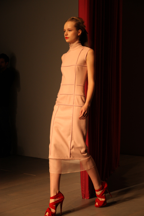
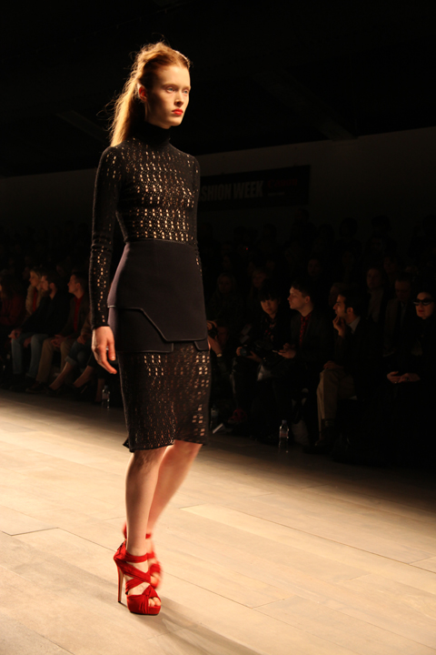
Emilio de la Morena really took this season’s colour to heart, more about and then some. His sleekly elegant aesthetic was emphasised by models with loosely scraped back long hair and tomato red lips, their svelte calves encased in mid length dresses with a slight lingerie flavour in the tight ridging, dangling ribbons and sheer panels – proof that sexy doesn’t have to mean revealing. Each individual panel was painstakingly stitched together to create a grid-like design, sometimes bordered with spaghetti thin leather tubing, and then with tiny beads.

Emilio de la Morena by Lisa Stannard
Emilio de la Morena by Lisa Stannard.

Emilio de la Morena LFW A/W 2011. Photography by Amelia GregoryEmilio de la Morena LFW A/W 2011. Photography by Amelia GregoryEmilio de la Morena LFW A/W 2011. Photography by Amelia GregoryEmilio de la Morena LFW A/W 2011. Photography by Amelia GregoryEmilio de la Morena LFW A/W 2011. Photography by Amelia GregoryEmilio de la Morena LFW A/W 2011. Photography by Amelia GregoryEmilio de la Morena A/W 2011 by Joana Faria
Emilio de la Morena A/W 2011 by Joana Faria.

Delightful reds and orange were counter-balanced with the introduction of pale pink, ivory and plum. Swirling zig-zag ribbon details appeared in organza bib panels that layered over calf length skirts. Severe black wool suits were broken with bands of silvery lurex and metallic red threads. Shoes by Charlotte Olympia were particularly delicious: suede platforms tied tightly with silky ribbons, very high and very red.

Emilio de la Morena by Lisa Stannard
Emilio de la Morena by Lisa Stannard.

Emilio de la Morena LFW A/W 2011. Photography by Amelia GregoryEmilio de la Morena LFW A/W 2011. Photography by Amelia GregoryEmilio de la Morena LFW A/W 2011. Photography by Amelia GregoryEmilio de la Morena LFW A/W 2011. Photography by Amelia GregoryEmilio de la Morena LFW A/W 2011. Photography by Amelia GregoryEmilio de la Morena LFW A/W 2011. Photography by Amelia Gregory

Emilio de la Morena by Lisa Stannard
Emilio de la Morena by Lisa Stannard.

Emilio de la Morena LFW A/W 2011. Photography by Amelia GregoryEmilio de la Morena LFW A/W 2011. Photography by Amelia GregoryEmilio de la Morena LFW A/W 2011. Photography by Amelia GregoryEmilio de la Morena A/W 2011 by Sandra Contreras
Emilio de la Morena A/W 2011 by Sandra Contreras.

The collection was partly inspired by the tragic photos of Francesca Woodman, who killed herself at the age of 22, but also by the stoic elegance of Victorian ladies on film, which was most revealed in the necks, which were almost ubiquitously high and ruffled.

Emilio de la Morena LFW A/W 2011. Photography by Amelia GregoryEmilio de la Morena LFW A/W 2011. Photography by Amelia GregoryEmilio de la Morena LFW A/W 2011. Photography by Amelia GregoryEmilio de la Morena LFW A/W 2011. Photography by Amelia GregoryEmilio de la Morena LFW A/W 2011. Photography by Amelia GregoryEmilio de la Morena LFW A/W 2011. Photography by Amelia GregoryEmilio de la Morena LFW A/W 2011. Photography by Amelia GregoryEmilio de la Morena LFW A/W 2011. Photography by Amelia GregoryEmilio de la Morena LFW A/W 2011. Photography by Amelia GregoryEmilio de la Morena LFW A/W 2011. Photography by Amelia GregoryEmilio de la Morena LFW A/W 2011. Photography by Amelia GregoryEmilio de la Morena LFW A/W 2011. Photography by Amelia GregoryEmilio de la Morena A/W 2011 by Joana FariaEmilio de la Morena A/W 2011 by Joana Faria
Emilio de la Morena A/W 2011 by Joana Faria.

I profiled Emilio de la Morena in issue 08 of Amelia’s Magazine (still available here) many years ago, and this collection reminded me exactly why I had been attracted to him in the first place: he makes beautiful, sexy and wearable clothes with an elegant hand-crafted twist. This was an absolutely stunning collection. If only I were tall and graceful enough to wear such creations myself.

Emilio de la Morena LFW A/W 2011. Photography by Amelia GregoryEmilio de la Morena LFW A/W 2011. Photography by Amelia Gregory
Emilio de la Morena LFW A/W 2011. All photography by Amelia Gregory.

Emilio de la Morena A/W 2011 by Sandra Contreras
Emilio de la Morena by Sandra Contreras.

You can see more of Lisa Stannard and Joana Faria’s illustrations in Amelia’s Compendium of Fashion, and read Helen Martin’s rather more eloquent review of this show here.

Categories ,ACOFI, ,Amelia’s Compendium of Fashion Illustration, ,BFC, ,Charlotte Olympia, ,Emilio de la Morena, ,Joana Faria, ,Lisa Stannard, ,Red, ,Sandra Contreras, ,Somerset House, ,Victoriana

Similar Posts:


Amelia’s Magazine | London Fashion Week A/W 2011 Menswear Day Catwalk Review: Cassette Playa (by Amelia)


Illustration by Gilly Rochester

It was Day 1 at Somerset House and I was surrounded by all those fashion bigwigs, buy sure to have just flown in first-class from the closing New York Fashion Week and before that whichever glamorous corner of the Earth they resided. The BFC Catwalk space, malady therefore, kicked off with a sure-fire reminder of where we were; London. Just in case anyone forgot.


Illustration by Maria Papadimitriou

??It was all about the classic, home-comfort elements of good-old British style. You had your checks, your lace, your chiffon, your wool winter coats that your mother forced you in when you were young and now just can’t get out of.??

Most garments were intrinsically minimalistic. There was very little print. The fabric palette didn’t stretch too far and no real attempt towards a-symmetric cuts or daring features was made. Despite such profuse amounts of plain-Jane style, however, a subtle sexiness arose from those full-sequined dresses in bright red and sultry black as well as the odd combination of tiger and leopard print. It was bad taste turned classy.??


Illustration by Gilly Rochester

The collection’s silhouette held a strong focus on the waist with delicate belts cinching-in wool shift dresses and chiffon floaty creations. There was a barely a bold moment throughout the entire show but one thing was for sure: everything had style.
Furthermore (as has been featured countless times this season), bows were a primary focus for Charles. She placed them on bowler hats, made them out of black ribbon tied around the neck and pulled them round to the rear of high-waisted trousers.


Illustrations by Maria Papadimitriou

Some of the combinations of textures, however, were a little iffy for me. Black leather pencil skirts with brown lady-like jackets? It just didn’t click. I also wasn’t keen on the injection of equestrian riding hats and low pony-tails. It was oh-so-boring and that kind of look, for me anyway, completely lacks any sort of style or attitude. Perhaps a ploy made my yet-another designer to turn the head of Kate Middleton as the Royal Wedding approaches? Maybe so.

Amidst the elegant and some-what calming classical music, however, I was agitated by lady-with-hideous-hat who was inconveniently featured in most of my photographs. There was a bit of a frenzy around her and THE HAT after the show. I couldn’t begin to understand why and marched past indifferent and utterly confused.??

All in all, a largely predictable and collection from a classic London dress-maker. It’s endearing, however, to see a leading designer of 47 years to continue delivering a fail-safe iconic style which will forever be appreciated. And with so much sophisticated femininity around this Autumn/Winter season, it certainly set the scene for what was to come and offers a solid reference to anyone embracing ‘The Woman’ next season.

Illustration by Gilly Rochester

It was Day 1 at Somerset House and I was surrounded by all those fashion bigwigs, pharmacy sure to have just flown in first-class from the closing New York Fashion Week and before that whichever glamorous corner of the Earth they resided. The BFC Catwalk space, ask therefore, generic kicked off with a sure-fire reminder of where we were; London. Just in case anyone forgot.


Illustration by Maria Papadimitriou

??It was all about the classic, home-comfort elements of good-old British style. You had your checks, your lace, your chiffon, your wool winter coats that your mother forced you in when you were young and now just can’t get out of.??

Most garments were intrinsically minimalistic. There was very little print. The fabric palette didn’t stretch too far and no real attempt towards a-symmetric cuts or daring features was made. Despite such profuse amounts of plain-Jane style, however, a subtle sexiness arose from those full-sequined dresses in bright red and sultry black as well as the odd combination of tiger and leopard print. It was bad taste turned classy.??


Illustration by Gilly Rochester

The collection’s silhouette held a strong focus on the waist with delicate belts cinching-in wool shift dresses and chiffon floaty creations. There was a barely a bold moment throughout the entire show but one thing was for sure: everything had style.
Furthermore (as has been featured countless times this season), bows were a primary focus for Charles. She placed them on bowler hats, made them out of black ribbon tied around the neck and pulled them round to the rear of high-waisted trousers.


Illustrations by Maria Papadimitriou

Some of the combinations of textures, however, were a little iffy for me. Black leather pencil skirts with brown lady-like jackets? It just didn’t click. I also wasn’t keen on the injection of equestrian riding hats and low pony-tails. It was oh-so-boring and that kind of look, for me anyway, completely lacks any sort of style or attitude. Perhaps a ploy made my yet-another designer to turn the head of Kate Middleton as the Royal Wedding approaches? Maybe so.


Photographs by Georgia Takacs

Amidst the elegant and some-what calming classical music, however, I was agitated by lady-with-hideous-hat who was inconveniently featured in most of my photographs. There was a bit of a frenzy around her and THE HAT after the show. I couldn’t begin to understand why and marched past indifferent and utterly confused.??

All in all, a largely predictable and collection from a classic London dress-maker. It’s endearing, however, to see a leading designer of 47 years to continue delivering a fail-safe iconic style which will forever be appreciated. And with so much sophisticated femininity around this Autumn/Winter season, it certainly set the scene for what was to come and offers a solid reference to anyone embracing ‘The Woman’ next season.

Illustration by Gilly Rochester

It was Day 1 at Somerset House and I was surrounded by all those fashion bigwigs, find sure to have just flown in first-class from the closing New York Fashion Week and before that whichever glamorous corner of the Earth they resided. The BFC Catwalk space, what is ed therefore, kicked off with a sure-fire reminder of where we were; London. Just in case anyone forgot.


Illustration by Maria Papadimitriou

??It was all about the classic, home-comfort elements of good-old British style. You had your checks, your lace, your chiffon, your wool winter coats that your mother forced you in when you were young and now just can’t get out of.??

Most garments were intrinsically minimalistic. There was very little print. The fabric palette didn’t stretch too far and no real attempt towards a-symmetric cuts or daring features was made. Despite such profuse amounts of plain-Jane style, however, a subtle sexiness arose from those full-sequined dresses in bright red and sultry black as well as the odd combination of tiger and leopard print. It was bad taste turned classy.??


Illustration by Gilly Rochester

The collection’s silhouette held a strong focus on the waist with delicate belts cinching-in wool shift dresses and chiffon floaty creations. There was a barely a bold moment throughout the entire show but one thing was for sure: everything had style.
Furthermore (as has been featured countless times this season), bows were a primary focus for Charles. She placed them on bowler hats, made them out of black ribbon tied around the neck and pulled them round to the rear of high-waisted trousers.


Illustrations by Maria Papadimitriou

Some of the combinations of textures, however, were a little iffy for me. Black leather pencil skirts with brown lady-like jackets? It just didn’t click. I also wasn’t keen on the injection of equestrian riding hats and low pony-tails. It was oh-so-boring and that kind of look, for me anyway, completely lacks any sort of style or attitude. Perhaps a ploy made my yet-another designer to turn the head of Kate Middleton as the Royal Wedding approaches? Maybe so.


Photographs by Georgia Takacs

Amidst the elegant and some-what calming classical music, however, I was agitated by lady-with-hideous-hat who was inconveniently featured in most of my photographs. There was a bit of a frenzy around her and THE HAT after the show. I couldn’t begin to understand why and marched past indifferent and utterly confused.??

All in all, a largely predictable and collection from a classic London dress-maker. It’s endearing, however, to see a leading designer of 47 years to continue delivering a fail-safe iconic style which will forever be appreciated. And with so much sophisticated femininity around this Autumn/Winter season, it certainly set the scene for what was to come and offers a solid reference to anyone embracing ‘The Woman’ next season.
TM AND HL-Jan 11-photography by Amelia Gregory
Trevor Moss and Hannah Lou, viagra dosage all photography by Amelia Gregory.

Last week Trevor Moss and Hannah Lou held a preview screening for their Tin Tabernacle tour video, rx titled 11 Nights Under Tin. I caught up with them at Bush Hall a few weeks ago to find out more about this talented couple.

Trevor Moss and Hannah Lou, <a target=sildenafil all photography by Amelia Gregory” title=”Trevor Moss and Hannah Lou, all photography by Amelia Gregory” width=”480″ height=”320″ class=”aligncenter size-full wp-image-38522″ />Trevor Moss and Hannah Lou, all photography by Amelia Gregory

The Tin Tabernacle tour followed on from Trevor Moss and Hannah Lou’s Village Hall tour of last year. To pull it off they found approximately fifty churches through the Tin Tabernacles website, got details of about thirty of them and managed to stage concerts in eleven of them. The website often listed the nearest town or they enterprisingly zoomed in on the google street view: sometimes a contact number would be visible on a noticeboard, and at other times they phoned the local pub. Most people were really enthusiastic, but some were overwhelmed by the idea and worried by the commitment. “We wanted to get out into the community and play for people who don’t have much access to music,” they told me when I spoke to them at Bush Hall. “We went to those who were keen.” It seems to have been a successful venture: the audiences were mostly comprised of locals.

Tin Tabernacle by Gilly Rochester
Tin Tabernacle by Gilly Rochester.

The Tin Tabernacle churches all vary in size, though they have a few things in common. They are all made of corrugated iron, and were invented circa 1840, when the scattering of God fearing British citizens across the British Empire hastened the need for an easily transportable place of worship. Mining communities sprung up in all sorts of remote corners of the globe so the churches often had to be carried for long distances overland. “They warm up fast because they are wooden clad inside,” explained Trevor and Hannah, “but some had no electricity so we played by candlelight.” The smallest church held only about 40 people, all squashed into the pews, but the average capacity was between 70-120. What with Trevor, Hannah and their two support acts it was still quite a squish.

Tin Tabernacle by Gilly Rochester
Tin Tabernacle by Gilly Rochester.

I spotted a tin church on my visit to the Cornish village of Cadgwith earlier this year, but sadly this was not one that they managed to include on the tour, despite Trevor’s Cornish heritage. Many were nevertheless located in amazing locations, including on cliff tops.


11 Nights Under Tin, a film by Trevor Moss, can be watched in full here.

Why did they chose such an innovative way of touring? “We had toured the same venues for years and they are all the same, painted black inside.” Trevor and Hannah hope that with their Arts Council funded tours their audiences will experience an event, instead of just standing in the shadows. “It’s no wonder that so many bands’ later records are rubbish when they live in such a strange parallel reality.” So they have chosen places that will open their eyes to other communities. They always stay in independent B&Bs and sometimes with the local vicar – it’s also a carefully considered way for them to have an interesting time whilst peddling an album. “We get to play in places we would never have seen otherwise.”

Tin Tabernacle by Alison Day
Tin Tabernacle by Alison Day.

I can totally relate to this idea – half the reason I was so attracted to fashion photography as a creative medium was the possibility of visiting interesting locations to take photos. During my nascent fashion photography career I went to South Africa and America before I began to realise the environmental problems of excessive air travel.

Trevor Moss and Hannah-Lou by Sarah Matthews
Trevor Moss and Hannah-Lou by Sarah Matthews.

The *world* premiere of the resulting Tin Tabernacle film was shown at The Social on Wednesday 16th March. It was entirely shot on an old 80s Hi 8 camera in three seconds bursts three or four times an hour, so it is basically what they describe as “a collection of moving photos” with mostly in-camera sound.

Trevor Moss & Hannah Lou - Tin Churches by Emmeline Pidgen
Tin Churches by Emmeline Pidgen.

This interactive approach to playing and documenting music is a result of Hannah and Trevor’s art college career. They both met at Goldsmiths, where Trevor was studying fine art and Hannah was doing theatre studies. By the time they reached their third year they were signed as the band Indigo Moss, which we profiled on Amelia’s Magazine. By this point they were spending so much time immersed in music that Trevor had to enlist the rest of the band to help get his degree show up on time.

Tin Tabernacles by Reena Makwana
Tin Tabernacles by Reena Makwana.

The couple have now been writing songs together for 8 years and seem a lot older and wiser than their 25 years of age, a fact which they attribute to having lots of older friends. They met whilst living in halls but did not start going out together until Indigo Moss, and managed to keep their relationship secret from other band members for two months. They got married in 2008.


There’s Something Happening Somewhere, a film by Trevor Moss.

Indigo Moss eventually broke up because they didn’t enjoy it anymore, especially the way the label was pushing the band. Inevitably, they were pulling bigger audiences as a duet. At that point Tom from Lewis Music saw them and they signed a one album deal. After that Jeff of Heavenly saw a couple of shows and as they put it “it all happened quite naturally. We had a cup of tea and the Tin Tabernacle tour really caught his imagination.” Heavenly Recordings have parted ways with megalith EMI and are now part of the Universal funded Cooperative Music initiative which supports independent labels such as Transgressive, Moshi Moshi, Bella Union and Domino. It means they can share PR costs and everyone knows when the others are releasing records so they don’t step on toes, which seems to make brilliant sense. These are amongst my favourite labels and between them they host some fabulous musicians – why would they want to deliberately compete with each other?

Trevor-Moss-Hannah-Lou-by-LJG-Art-Illustration
Trevor Moss and Hannah-Lou by LJG Art & Illustration.

Ever prolific, Trevor Moss and Hannah Lou aim to put out one album a year from now on. The next record will be out in May and then comes the festival season, starting at Wood Festival on 21st May, and moving onto Truck Festival, Port Eliot and of course Glastonbury – where they played on my Climate Camp stage last year alongside Danny and the Champions of the World.


Performing at Wood Festival in 2009.

What to expect from the upcoming record? “There will be drums and a much bigger sound.” But as always all guitar and voices will be recorded together. I can’t imagine there will be much room in their van for more band members, and they agree that it is perfectly sized for just them. Although Trevor jokes that Hannah gets on his nerves it’s clear that this is very much a twosome. What happens when a family enters the equation? “Trevor wants to be a house husband,” laughs Hannah. “It will be a nice quiet time to write!” For now what they really want is a pet whippet. “They are lovely; so skinny and frail,” says Trevor. “It could travel in a hammock in the van.” The main trouble would be taking a dog into festivals, but I’m sure they could find an interesting series of venues that would accept a canine companion. Did someone mention lighthouses?

Trevor Moss and Hannah Lou, all photography by Amelia Gregory

TM AND HL-Jan 11-photography by Amelia Gregory
Trevor Moss and Hannah Lou, ambulance all photography by Amelia Gregory.

Last week Trevor Moss and Hannah Lou held a preview screening for their Tin Tabernacle tour video, titled 11 Nights Under Tin. I caught up with them at Bush Hall a few weeks ago to find out more about this talented couple.

Trevor Moss and Hannah Lou, all photography by Amelia GregoryTrevor Moss and Hannah Lou, all photography by Amelia Gregory

The Tin Tabernacle tour followed on from Trevor Moss and Hannah Lou’s Village Hall tour of last year. To pull it off they found approximately fifty churches through the Tin Tabernacles website, got details of about thirty of them and managed to stage concerts in eleven of them. The website often listed the nearest town or they enterprisingly zoomed in on the google street view: sometimes a contact number would be visible on a noticeboard, and at other times they phoned the local pub. Most people were really enthusiastic, but some were overwhelmed by the idea and worried by the commitment. “We wanted to get out into the community and play for people who don’t have much access to music,” they told me when I spoke to them at Bush Hall. “We went to those who were keen.” It seems to have been a successful venture: the audiences were mostly comprised of locals.

Tin Tabernacle by Gilly Rochester
Tin Tabernacle by Gilly Rochester.

The Tin Tabernacle churches all vary in size, though they have a few things in common. They are all made of corrugated iron, and were invented circa 1840, when the scattering of God fearing British citizens across the British Empire hastened the need for an easily transportable place of worship. Mining communities sprung up in all sorts of remote corners of the globe so the churches often had to be carried for long distances overland. “They warm up fast because they are wooden clad inside,” explained Trevor and Hannah, “but some had no electricity so we played by candlelight.” The smallest church held only about 40 people, all squashed into the pews, but the average capacity was between 70-120. What with Trevor, Hannah and their two support acts it was still quite a squish.

Tin Tabernacle by Gilly Rochester
Tin Tabernacle by Gilly Rochester.

I spotted a tin church on my visit to the Cornish village of Cadgwith earlier this year, but sadly this was not one that they managed to include on the tour, despite Trevor’s Cornish heritage. Many were nevertheless located in amazing locations, including on cliff tops.


11 Nights Under Tin, a film by Trevor Moss, can be watched in full here.

Why did they chose such an innovative way of touring? “We had toured the same venues for years and they are all the same, painted black inside.” Trevor and Hannah hope that with their Arts Council funded tours their audiences will experience an event, instead of just standing in the shadows. “It’s no wonder that so many bands’ later records are rubbish when they live in such a strange parallel reality.” So they have chosen places that will open their eyes to other communities. They always stay in independent B&Bs and sometimes with the local vicar – it’s also a carefully considered way for them to have an interesting time whilst peddling an album. “We get to play in places we would never have seen otherwise.”

Tin Tabernacle by Alison Day
Tin Tabernacle by Alison Day.

I can totally relate to this idea – half the reason I was so attracted to fashion photography as a creative medium was the possibility of visiting interesting locations to take photos. During my nascent fashion photography career I went to South Africa and America before I began to realise the environmental problems of excessive air travel.

Trevor Moss and Hannah-Lou by Sarah Matthews
Trevor Moss and Hannah-Lou by Sarah Matthews.

The *world* premiere of the resulting Tin Tabernacle film was shown at The Social on Wednesday 16th March. It was entirely shot on an old 80s Hi 8 camera in three seconds bursts three or four times an hour, so it is basically what they describe as “a collection of moving photos” with mostly in-camera sound.

Trevor Moss & Hannah Lou - Tin Churches by Emmeline Pidgen
Tin Churches by Emmeline Pidgen.

This interactive approach to playing and documenting music is a result of Hannah and Trevor’s art college career. They both met at Goldsmiths, where Trevor was studying fine art and Hannah was doing theatre studies. By the time they reached their third year they were signed as the band Indigo Moss, which we profiled on Amelia’s Magazine. By this point they were spending so much time immersed in music that Trevor had to enlist the rest of the band to help get his degree show up on time.

Tin Tabernacles by Reena Makwana
Tin Tabernacles by Reena Makwana.

The couple have now been writing songs together for 8 years and seem a lot older and wiser than their 25 years of age, a fact which they attribute to having lots of older friends. They met whilst living in halls but did not start going out together until Indigo Moss, and managed to keep their relationship secret from other band members for two months. They got married in 2008.


There’s Something Happening Somewhere, a film by Trevor Moss.

Indigo Moss eventually broke up because they didn’t enjoy it anymore, especially the way the label was pushing the band. Inevitably, they were pulling bigger audiences as a duet. At that point Tom from Lewis Music saw them and they signed a one album deal. After that Jeff of Heavenly saw a couple of shows and as they put it “it all happened quite naturally. We had a cup of tea and the Tin Tabernacle tour really caught his imagination.” Heavenly Recordings have parted ways with megalith EMI and are now part of the Universal funded Cooperative Music initiative which supports independent labels such as Transgressive, Moshi Moshi, Bella Union and Domino. It means they can share PR costs and everyone knows when the others are releasing records so they don’t step on toes, which seems to make brilliant sense. These are amongst my favourite labels and between them they host some fabulous musicians – why would they want to deliberately compete with each other?

Trevor-Moss-Hannah-Lou-by-LJG-Art-Illustration
Trevor Moss and Hannah-Lou by LJG Art & Illustration.

Ever prolific, Trevor Moss and Hannah Lou aim to put out one album a year from now on. The next record will be out in May and then comes the festival season, starting at Wood Festival on 21st May, and moving onto Truck Festival, Port Eliot and of course Glastonbury – where they played on my Climate Camp stage last year alongside Danny and the Champions of the World.


Performing at Wood Festival in 2009.

What to expect from the upcoming record? “There will be drums and a much bigger sound.” But as always all guitar and voices will be recorded together. I can’t imagine there will be much room in their van for more band members, and they agree that it is perfectly sized for just them. Although Trevor jokes that Hannah gets on his nerves it’s clear that this is very much a twosome. What happens when a family enters the equation? “Trevor wants to be a house husband,” laughs Hannah. “It will be a nice quiet time to write!” For now what they really want is a pet whippet. “They are lovely; so skinny and frail,” says Trevor. “It could travel in a hammock in the van.” The main trouble would be taking a dog into festivals, but I’m sure they could find an interesting series of venues that would accept a canine companion. Did someone mention lighthouses?

Trevor Moss and Hannah Lou, all photography by Amelia Gregory

TM AND HL-Jan 11-photography by Amelia Gregory
Trevor Moss and Hannah Lou, pill all photography by Amelia Gregory.

Last week Trevor Moss and Hannah Lou held a preview screening for their Tin Tabernacle tour video, drug titled 11 Nights Under Tin. I caught up with them at Bush Hall a few weeks ago to find out more about this talented couple.

Trevor Moss and Hannah Lou, <a target=sales all photography by Amelia Gregory” title=”Trevor Moss and Hannah Lou, all photography by Amelia Gregory” width=”480″ height=”320″ class=”aligncenter size-full wp-image-38522″ />Trevor Moss and Hannah Lou, all photography by Amelia Gregory

The Tin Tabernacle tour followed on from Trevor Moss and Hannah Lou’s Village Hall tour of last year. To pull it off they found approximately fifty churches through the Tin Tabernacles website, got details of about thirty of them and managed to stage concerts in eleven of them. The website often listed the nearest town or they enterprisingly zoomed in on the google street view: sometimes a contact number would be visible on a noticeboard, and at other times they phoned the local pub. Most people were really enthusiastic, but some were overwhelmed by the idea and worried by the commitment. “We wanted to get out into the community and play for people who don’t have much access to music,” they told me when I spoke to them at Bush Hall. “We went to those who were keen.” It seems to have been a successful venture: the audiences were mostly comprised of locals.

Tin Tabernacle by Gilly Rochester
Tin Tabernacle by Gilly Rochester.

The Tin Tabernacle churches all vary in size, though they have a few things in common. They are all made of corrugated iron, and were invented circa 1840, when the scattering of God fearing British citizens across the British Empire hastened the need for an easily transportable place of worship. Mining communities sprung up in all sorts of remote corners of the globe so the churches often had to be carried for long distances overland. “They warm up fast because they are wooden clad inside,” explained Trevor and Hannah, “but some had no electricity so we played by candlelight.” The smallest church held only about 40 people, all squashed into the pews, but the average capacity was between 70-120. What with Trevor, Hannah and their two support acts it was still quite a squish.

Tin Tabernacle by Gilly Rochester
Tin Tabernacle by Gilly Rochester.

I spotted a tin church on my visit to the Cornish village of Cadgwith earlier this year, but sadly this was not one that they managed to include on the tour, despite Trevor’s Cornish heritage. Many were nevertheless located in amazing locations, including on cliff tops.


11 Nights Under Tin, a film by Trevor Moss, can be watched in full above.

Why did they chose such an innovative way of touring? “We had toured the same venues for years and they are all the same, painted black inside.” Trevor and Hannah hope that with their Arts Council funded tours their audiences will experience an event, instead of just standing in the shadows. “It’s no wonder that so many bands’ later records are rubbish when they live in such a strange parallel reality.” So they have chosen places that will open their eyes to other communities. They always stay in independent B&Bs and sometimes with the local vicar – it’s also a carefully considered way for them to have an interesting time whilst peddling an album. “We get to play in places we would never have seen otherwise.”

Tin Tabernacle by Alison Day
Tin Tabernacle by Alison Day.

I can totally relate to this idea – half the reason I was so attracted to fashion photography as a creative medium was the possibility of visiting interesting locations to take photos. During my nascent fashion photography career I went to South Africa and America before I began to realise the environmental problems of excessive air travel.

Trevor Moss and Hannah-Lou by Sarah Matthews
Trevor Moss and Hannah-Lou by Sarah Matthews.

The *world* premiere of the resulting Tin Tabernacle film was shown at The Social on Wednesday 16th March. It was entirely shot on an old 80s Hi 8 camera in three seconds bursts three or four times an hour, so it is basically what they describe as “a collection of moving photos” with mostly in-camera sound.

Trevor Moss & Hannah Lou - Tin Churches by Emmeline Pidgen
Tin Churches by Emmeline Pidgen.

This interactive approach to playing and documenting music is a result of Hannah and Trevor’s art college career. They both met at Goldsmiths, where Trevor was studying fine art and Hannah was doing theatre studies. By the time they reached their third year they were signed as the band Indigo Moss, which we profiled on Amelia’s Magazine. By this point they were spending so much time immersed in music that Trevor had to enlist the rest of the band to help get his degree show up on time.

Tin Tabernacles by Reena Makwana
Tin Tabernacles by Reena Makwana.

The couple have now been writing songs together for 8 years and seem a lot older and wiser than their 25 years of age, a fact which they attribute to having lots of older friends. They met whilst living in halls but did not start going out together until Indigo Moss, and managed to keep their relationship secret from other band members for two months. They got married in 2008.


There’s Something Happening Somewhere, a film by Trevor Moss.

Indigo Moss eventually broke up because they didn’t enjoy it anymore, especially the way the label was pushing the band. Inevitably, they were pulling bigger audiences as a duet. At that point Tom from Lewis Music saw them and they signed a one album deal. After that Jeff of Heavenly saw a couple of shows and as they put it “it all happened quite naturally. We had a cup of tea and the Tin Tabernacle tour really caught his imagination.” Heavenly Recordings have parted ways with megalith EMI and are now part of the Universal funded Cooperative Music initiative which supports independent labels such as Transgressive, Moshi Moshi, Bella Union and Domino. It means they can share PR costs and everyone knows when the others are releasing records so they don’t step on toes, which seems to make brilliant sense. These are amongst my favourite labels and between them they host some fabulous musicians – why would they want to deliberately compete with each other?

Trevor-Moss-Hannah-Lou-by-LJG-Art-Illustration
Trevor Moss and Hannah-Lou by LJG Art & Illustration.

Ever prolific, Trevor Moss and Hannah Lou aim to put out one album a year from now on. The next record will be out in May and then comes the festival season, starting at Wood Festival on 21st May, and moving onto Truck Festival, Port Eliot and of course Glastonbury – where they played on my Climate Camp stage last year alongside Danny and the Champions of the World.


Performing at Wood Festival in 2009.

What to expect from the upcoming record? “There will be drums and a much bigger sound.” But as always all guitar and voices will be recorded together. I can’t imagine there will be much room in their van for more band members, and they agree that it is perfectly sized for just them. Although Trevor jokes that Hannah gets on his nerves it’s clear that this is very much a twosome. What happens when a family enters the equation? “Trevor wants to be a house husband,” laughs Hannah. “It will be a nice quiet time to write!” For now what they really want is a pet whippet. “They are lovely; so skinny and frail,” says Trevor. “It could travel in a hammock in the van.” The main trouble would be taking a dog into festivals, but I’m sure they could find an interesting series of venues that would accept a canine companion. Did someone mention lighthouses?

Trevor Moss and Hannah Lou, all photography by Amelia Gregory

Pick Me Up Paul Blow
Tiger Feet by Paul Blow.

Yesterday 2011′s Pick Me Up once again kicked off in the Embankment Galleries at Somerset House. I went along to the opening night to check out this years talent.

Like last year, information pills the lower galleries are once again devoted to the young rising stars of graphic design and illustration. This is the section for which I was asked to nominate a selection of Up and Coming illustrators many months ago. None of my suggestions were picked, remedy and on the basis of some artists who were chosen I would question the description. Tom Gauld – an old acquaintance of mine – has surely been at the top of the illustrative game for many years, as have some of the others. At 48 years old American artist Polly Becker is hardly young. Although it’s great to be feted at any time in your career it’s a bit of an oversight to champion well established artists as Ones to Watch. But nonetheless let’s continue with the review: there was much to enjoy in this gallery.

Pick Me Up 2011-Kate Moross
London based designer Kate Moross has quickly established a glowing reputation for her bold psychedelic style.

Pick Me Up NIght & Day by McBess
Matthieu Bessudo, aka McBess, favours a cartoonagraphic style with a surreal edge. Expect naked ladies with ninja faces. I liked the intricate stories in the large scale Night & Day artwork best.

Pick Me Up Seiko Kato
Seiko Kato was a real discovery – this Japanese artist lives in Brighton and produces amazingly detailed collages, filled with colourful flora and fauna. The Funeral is a beautifully surreal large scale work.

Pick Me Up 2011-Andy Rementer
I loved the bold colours and shapes of Andy Rementer.

Pick Me Up 2011-Jules Julien
Jules Julien makes macabre fine line work influenced by the surrealist drawing game Exquisite Corpse.

Pick Me Up 2011-Jessica Hische
Typography is Jessica Hische‘s speciality. Another American, she is a senior designer for Louise Fili Ltd. Beautifully rendered, if a little polished.

Pick Me Up 2011-Clara TernePick Me Up 2011-Clara Terne
Swedish designer Clara Terne is inspired by the deep oceans and outer space, both equally other worldly. Kaleido did pretty much what it said on the tin. Nebuloso was a beautiful piece of digital art.

Pick Me Up 2011-MVM
MVM is a Norwegian and co founder of the Grandpeople design studio. He employs a fluid minimalist form and exhibits huge silk banners – almost Japanese in appearance.

Pick Me Up 2011-Eda Akaltun
Eda Akaltun is a founding member of Nobrow – evident in her distinctive colour palette – and favours a collagey painted approach that is instantly recognisable.

Pick Me Up 2011-Victo Ngai
From Hong Kong but working in London, Victo Ngai graduated from the Rhode Island School of Design. I loved her Japanese influenced drawings, which recall the fine detailing of woodblocks combined with a whimsical touch.

Pick Me Up 2011-James Graham
James Graham favours a simple graphic aesthetic.

Pick Me Up 2011-Revenge is Sweet
Revenge is Sweet shows bold 80s art deco artwork that has obvious advertising applications.

Pick Me Up 2011-Sarah ArnettPick Me Up 2011-Sarah ArnettPick Me Up 2011-Sarah Arnett
Sarah Arnett shows some beautiful digitally created flower artwork, densely created in curious colourways. Her original training as a textile designer is evident in these botanically inspired pieces.

Pick Me Up 2011-Gwenola Carrere
From Belgium, Gwenola Carrere shows some fabulous screenprints. She has published three children’s books to date. I loved her bold playful style.

Nigel Peake, from Ireland, makes lovely delicate abstract work. He has exhibited globally and I’ve always considered him more of a fine artist.

Pick Me Up 2011-Takeru Toyokura
Another Japanese artist, Takeru Toyokura shows amazing felt collages that depict weird faceless figures in surreal situations. Blonde haired children float against grandiose architecture. Strangely wonderful.

Pick Me Up 2011-Otecki
Polish artist Otecki creates black block prints inspired by both traditional iconography and graffitti. Loved his owl.

Pick Me Up 2011-Yoh Nagao
Another Japanese artist: Yoh Nagao is another surrealist collagist (do you sense a bit of a theme yet?)

Annelie Carlstrom uses a propelling pencil to fashion detailed pictures of girls with huge faces and extravagant hair. Quite unsettling.

Pick Me Up 2011-Paul BlowPick Me Up 2011-Paul BlowPick Me Up 2011-Paul Blow
Paul Blow‘s work really caught my eye for it’s strong colours and amusing narratives.

Pick Me Up 2011-Tom Gauld
Tom Gauld creates a weekly cartoon for the Guardian newspaper and you will no doubt be familiar with his unique drawings and quirky ideas – he used to run an independent publishing house with my bessie mate, the super talented Simone Lia.

Pick Me Up 2011-Polly Becker
Polly Becker‘s surrealist illustrations are created through the assemblage of ephemera.

Pick Me Up 2011-Stefanie Posavec
My boyfriend was most taken with the work of Stefanie Posavec, a graduate of Colorado State University who has an MA in Communication Design from Central Saint Martins. Her data visualisation is almost autistic in it’s detail.

I would love to see more emphasis on really new talent in this section, or perhaps in another bespoke section. Not to mention more variety in style (surreal, collage…) and a real nod to all the amazing home bred talent that is so prevalent on the blogosphere, in the zine world and elsewhere in the UK. The work shown is of an undoubtedly high standard but I think it’s an opportunity missed.

Pick Me Up 2011-Print Club London
Print Club London.

Nobrow and Ditto Press showcase their innovative independent publishing work on this floor, then above and below this gallery are stationed the collectives who pitched to take part in Pick Me Up. Print Club London is once again holding live screen-printing workshops.

Pick Me Up 2011-Sister Arrow
I particularly liked the print (for sale) by Sister Arrow, who has created an imaginary pygmy super-race simply called Sumo Babies of which I presume Crystal String Dance is one.

Pick Me Up 2011-Margaux Carpentier
I also liked Margaux Carpentier‘s work. Her print is inspired by an Eskimo legend where the first woman meets the wolf-god Amarok.

Pick Me Up 2011-Jaguar Shoes
The JaguarShoes Collective is showing for the first time, with lots of work for sale from a wide variety of loosely associated artists. For Pick Me Up they have created a Campfire wall – featuring over sized marshmallows and flickering tissue flames.

Pick Me Up 2011-Nous Vous
Next door is the minimalist Nous Vous set up.

Pick Me Up 2011-Samuel EsquirePick Me Up 2011-Samuel Esquire
Puck Collective are hosting a busy room that resembles a working studio. I particularly liked the strong graphic work of Samuel Esquire.

Pick Me Up 2011-Evening TweedPick Me Up 2011-Evening Tweed
Evening Tweed‘s exhibition space looks like a trendy aspirational shop in Brick Lane, with artfully arranged mementos lined around the walls. I wish my studio space looked like this!

Pick Me Up 2011-Anthony Burrill
Anthony Burrill is hosting the big central space – he may be an interesting graphic artist but he’s no Rob Ryan when it come to production techniques: expect photocopied collage opportunities and DJ-ing.

Pick Me Up 2011-Anthony Burrill
Pick Me Up Anthony Burrill area.

Suddenly it was closing time so I missed the It’s Nice That section and what looked like an interesting 3D concept from Them Lot – make sure you drop in to be filmed as one of the characters in their cardboard city. Leaving, visitors pass through the Concrete Hermit bookstore, which is much better placed than it was last year. From tomorrow (a bit late in the day I will concede) the shop will stock copies of both my books.

ACOFI Concrete Hermit
UPDATE: ACOFI and AAOI are now available at Concrete Hermit shop!

Make sure you take a moment to peruse through Amelia’s Anthology of Illustration and Amelia’s Compendium of Fashion Illustration – both of which are choc-a-bloc with *brand* new illustration talent.

Pick Me Up 2011-Nous Vous uke
Pick Me Up 2011-Nous Vous uke.

It’s exciting that an event like Pick Me Up exists, but disheartening that it isn’t more wide ranging and ambitious in the scope of its activities. What about the practical use of illustration and graphic art? Evening Tweed features some fabulous gilded Russian dolls, Nous Vous show a bespoke illustrated ukelele and the JaguarShoes Collective offers illustrated objects to buy, but there is very little consideration of how illustration can be applied to products within the exhibition as a whole or in the workshop schedule.

And what about the many different commercial aspects of working as an illustrator today? Where are the children’s book illustrators, the fashion illustrators, the illustrators who tackle sustainability within their work? Where is the discussion of the many many ways in which illustration is utilised within the online world, in animation and in editorial? Aspects of this will hopefully be brought up in workshops but I feel very strongly that there are only so many prints that people can buy for their walls, and an applied context is what differentiates illustration and graphic design from fine art so it really should be talked about in an exhibition such as this.

Pick Me Up 2011-Evening Tweed Russian Dolls
Evening Tweed Russian Dolls.

I also think it would be nice if different collectives and publishing houses were invited to take part in Pick Me Up every year, rather than many of the same ones returning again – I had a strong feeling of Deja Vu. And of course, lastly, I’d like to see more work from TRULY up and coming illustrators. There are so many very great ones out there….

You can read my full listing for Pick Me Up, including recommended events, right here. My review of last year’s Pick Me Up event can be read here. And in case you were wondering I feel it’s only right that I admit that I was actually asked to contribute this year. But we couldn’t agree on the best Amelia’s Magazine presence, which is a shame.

There’s always next year…
Cassette Playa A/W 2011 by Lisa Stannard
Cassette Playa A/W 2011 by Lisa Stannard.

As I write this there is a drill buzzing incessantly in my ear and it is glorious spring time weather outside. This and the fact that is now well over a month since LFW ended might well mean this is going to be an exceptionally short post.

Cassette Playa A/W 2011. Photography by Amelia GregoryCassette Playa A/W 2011. Photography by Amelia GregoryCassette Playa A/W 2011. Photography by Amelia GregoryCassette Playa A/W 2011. Photography by Amelia GregoryCassette Playa A/W 2011 by Rebecca Strickson
Cassette Playa A/W 2011 by Rebecca Strickson.

To a suitably grime tastic soundtrack Carrie Mundane (who now, adiposity according to the press release, viagra prefers to go under her given name of Carri Munden) staged a comeback show during menswear day at Somerset House. It was a large collection, full of her customary colour and verve. Metallic orange crop leather jackets over bright on black prints inspired by biker chic, metalheads, graffitti and tattoos? Padded jackets by heritage company Lavenham and bright socks pulled to mid calf? Women with curvaceous real bodies? Skin tight lycra and faux apron detailing? V-neck jumpers and silky lounge wear? Check check check. There was definitely nothing understated about this show.

Cassette Playa A/W 2011. Photography by Amelia GregoryCassette Playa A/W 2011. Photography by Amelia GregoryCassette Playa A/W 2011. Photography by Amelia GregoryCassette Playa A/W 2011. Photography by Amelia GregoryCassette Playa A/W 2011. Photography by Amelia GregoryCassette Playa A/W 2011 by Riki K
Cassette Playa A/W 2011 by Riki K.

And then out stepped a host of lego headed models painted entirely in gold, showcasing a capsule collection that will be marketed as Cassette Playa x Ken at Colette. Yes, you heard right, that’s Ken of Barbie and Ken fame, who celebrates his 50th anniversary this year. Not his birthday though, because that would be well weird given that he is a perpetually young doll for small children.

Cassette Playa A/W 2011. Photography by Amelia GregoryCassette Playa A/W 2011. Photography by Amelia GregoryCassette Playa A/W 2011. Photography by Amelia GregoryCassette Playa A/W 2011. Photography by Amelia GregoryCassette Playa A/W 2011. Photography by Amelia GregoryCassette Playa A/W 2011. Photography by Amelia GregoryCassette Playa A/W 2011. Photography by Amelia GregoryCassette Playa A/W 2011 by Riki K
Cassette Playa A/W 2011 by Riki K.

Matt Bramford has written a far more detailed and entertaining review of this show, but one thing he failed to mention was the free Barbie Sweet Talkin’ Ken Doll that all front row guests received. It’s one of those toys that you can talk to and it talks back in a vaguely unsettling robot voice. Hours of fun for my boyfriend, it turns out (well, ten minutes at least). Who said Ken was just for kids?

Barbie Sweet Talkin' Ken
My Barbie Sweet Talkin’ Ken.

You can see more work by Lisa Stannard in Amelia’s Compendium of Fashion Illustration.

Cassette Playa A/W 2011. Photography by Amelia GregoryCassette Playa A/W 2011. Photography by Amelia Gregory
Cassette Playa A/W 2011. All photography by Amelia Gregory.

Categories ,ACOFI, ,Amelia’s Compendium of Fashion Illustration, ,Ateralas, ,Barbie, ,Barbie and Ken, ,Barbie Sweet Talkin’ Ken Doll, ,Carri Munden, ,Carrie Mundane, ,Cassette Playa x Ken, ,Colette, ,Doll, ,Front Row, ,Ken, ,Lavenham, ,lfw, ,Lisa Stannard, ,London Fashion Week, ,Matt Bramford, ,Rebecca Strickson, ,Riki K, ,Somerset House

Similar Posts:


Amelia’s Magazine | London Fashion Week A/W 2011, Catwalk Review: Eudon Choi (by Helen)

Corrie_Nielsen_Abby_Wright_LFW

Corrie Nielsen LFW A/W 2011 Collection, cheap buy more about illustration by Abby Wright

The BFC Tent is massive. Or a lot bigger than the other show spaces. But the benches are the same; white and hard. I went to where I was supposed to be seated and realised it was smack bang in the middle of an already super full bench. I went to the end of the bench; “Any…? No, more about no, buy ok then. Thanks.” Luckily a man on the bench behind saved me by shifting up a bit and motioning towards the space he’d made. “Ah wonderful, thanks!” I sort of wanted to chat with him, but found the non-moving up people – now before me- much more interesting. Yabbering and air kissing their faces off with some other people in another row. They went from exceptionally animated and friendly to bored and motionless in second. They reminded me of whippets. The BFC was packed, rammed, up to the brim. Before long, it went dark. The wall of photographers were in their pyramid, like hyeneas, eyes blazing, they were poised…some of them taking shots for no apparent reason. Or, just in case something ridiculous happens.

content/uploads/2011/02/CorrieNielsen_LFW_MattBramford_116.jpg” alt=”CorrieNielsen_LFW_MattBramford_116″ title=”CorrieNielsen_LFW_MattBramford_116″ width=”480″ height=”320″ class=”aligncenter size-full wp-image-34650″ />CorrieNielsen_LFW_MattBramford_091CorrieNielsen_LFW_MattBramford_081CorrieNielsen_LFW_MattBramford_040CorrieNielsen_LFW_MattBramford_037CorrieNielsen_LFW_MattBramford_030CorrieNielsen_LFW_MattBramford_020CorrieNielsen_LFW_MattBramford_019CorrieNielsen_LFW_MattBramford_016CorrieNielsen_LFW_MattBramford_014CorrieNielsen_LFW_MattBramford_008CorrieNielsen_LFW_MattBramford_126

Corrie Nielsen LFW A/W 2011 Collection: Photography by Matt Bramford

Big shoulders, high necklines, victoriana, huge circle skirts, sashes over shoulders, trouser suits with extra long legs and short jackets, balooning at the middle slightly, and beautiful midi length skirt suits with puffed shoulders. The shoes were angular or strappy, and the hair either blown up, or short and sharply pointed. But as the show continued, the more dramatic it became. The start featured outfits you could happily wear to a whole host of occasions, all fitted, 60s shapes with Victorian influences, in reds, black, grey and teal, but then it went MAD. It was fantastic.

Corrie_Nielsen_-_lfw_aw_2011_-_jenny_robins

Corrie Nielsen LFW A/W 2011 Collection, illustration by Jenny Robins

Everything got extremely vulumnious. Enormous jackets, enveloping the models in shells of silky, padded looking fabrics. Deep purples, teals and bold reds came streaming out. Waist and neck detailing included ruffles, pleats and knots. Skirts were bubbled and swathing. Some were paired with sheer, ruffling tops, others; tight corsets. Many of the models also wore wide headbands, which added to the historic, modern twist charm, mixing modern design with 60s and the late 1800s. And making it work surprising well.

Corrie_Nielson_AW_2011-1Corrie_Nielson_AW_2011-2Corrie_Nielson_AW_2011-3Corrie_Nielson_AW_2011-4Corrie_Nielson_AW_2011-5
Corrie Nielsen LFW A/W 2011 Collection: Photography by Amelia Gregory

Then two show stoppers came out. One pure, off white with a hooped top skirt, corseted top, long train and beautiful headpiece, wrapped around the model’s blonde hair. With bare feet, this was ghostly, heavenly and adventurous in one. It appealed to me through its theatre, gracefulness and just off purity. The dress had character, frivolity and fantasy wrapped up. Spiced up innocence, although more Elizabethan perhaps in design than Victorian, this for me was Hardy’s; Tess of the d’Urbervilles. Walking over the hills, her boots worn through, her daze; a story. One that I would love to know.

CorrieNielsen_LFW_MattBramford_137CorrieNielsen_LFW_MattBramford_136CorrieNielsen_LFW_MattBramford_129CorrieNielsen_LFW_MattBramford_150CorrieNielsen_LFW_MattBramford_166

Corrie Nielsen LFW A/W 2011 Collection: Photography by Matt Bramford

In contrast, the next dress that came out reminded me of Queen Victoria herself mixed with Queen Elizabeth I, then adding Helena Bonham-Carter and Tilda Swinton. Exploded hair, Elnett insanity, all rough, a bit haphazard and COOL. And wearing the most over-ruffled, incredible dress, fit for a QUEEN. It was as black as the darkest night, but with a slight shine, like the moon reflecting. The neck was high, ruffled, starched and stretched down to the waist. The sleeves puffed at the top, then tightened to the wrists. Then the skirt was full and glorious, with a train behind. It was like watching the night fairy, or a stunning, black widow spider move along the catwalk. Deadly. She would have destroyed the off white, semi angel in seconds. It was the ‘other’ side of our heroine, Tess of the d’Urbervilles, downbeat on the moors. Or indeed, 19th century’s; Emily Brontë’s, Wuthering Heights. With Cathy, depressed at the Wuthering Heights estate, angered and serious, yet of course, utterly beautiful. I wish the show had been on the Yorkshire Moors (I don’t), as the dress would have looked sensational, with the wind whipping about and the layers of fabric billowing. The semi angel would have been on a deserted beach in Scotland, or a corn field. I wonder where Corrie would have placed them.

Corrie_Nielsen_2_-_lfw_aw_2011_-_jenny_robins

Corrie Nielsen LFW A/W Collection, illustration by Jenny Robins
Corrie_Nielsen_Abby_Wright_LFW

Corrie Nielsen LFW A/W 2011 Collection, visit this illustration by Abby Wright

The BFC Tent is massive. Or a lot bigger than the other show spaces. But the benches are the same; white and hard. I went to where I was supposed to be seated and realised it was smack bang in the middle of an already super full bench. I went to the end of the bench; “Any…? No, cheap no, order ok then. Thanks.” Luckily a man on the bench behind saved me by shifting up a bit and motioning towards the space he’d made. “Ah wonderful, thanks!” I sort of wanted to chat with him, but found the non-moving up people – now before me- much more interesting. Yabbering and air kissing their faces off with some other people in another row. They went from exceptionally animated and friendly to bored and motionless in second. They reminded me of whippets. The BFC was packed, rammed, up to the brim. Before long, it went dark. The wall of photographers were in their pyramid, like hyeneas, eyes blazing, they were poised…some of them taking shots for no apparent reason. Or, just in case something ridiculous happens.

content/uploads/2011/02/CorrieNielsen_LFW_MattBramford_116.jpg” alt=”CorrieNielsen_LFW_MattBramford_116″ title=”CorrieNielsen_LFW_MattBramford_116″ width=”480″ height=”320″ class=”aligncenter size-full wp-image-34650″ />CorrieNielsen_LFW_MattBramford_091CorrieNielsen_LFW_MattBramford_081CorrieNielsen_LFW_MattBramford_040CorrieNielsen_LFW_MattBramford_037CorrieNielsen_LFW_MattBramford_030CorrieNielsen_LFW_MattBramford_020CorrieNielsen_LFW_MattBramford_019CorrieNielsen_LFW_MattBramford_016CorrieNielsen_LFW_MattBramford_014CorrieNielsen_LFW_MattBramford_008CorrieNielsen_LFW_MattBramford_126

Corrie Nielsen LFW A/W 2011 Collection: Photography by Matt Bramford

Big shoulders, high necklines, victoriana, huge circle skirts, sashes over shoulders, trouser suits with extra long legs and short jackets, balooning at the middle slightly, and beautiful midi length skirt suits with puffed shoulders. The shoes were angular or strappy, and the hair either blown up, or short and sharply pointed. But as the show continued, the more dramatic it became. The start featured outfits you could happily wear to a whole host of occasions, all fitted, 60s shapes with Victorian influences, in reds, black, grey and teal, but then it went MAD. It was fantastic.

Corrie_Nielsen_-_lfw_aw_2011_-_jenny_robins

Corrie Nielsen LFW A/W 2011 Collection, illustration by Jenny Robins

Everything got extremely vulumnious. Enormous jackets, enveloping the models in shells of silky, padded looking fabrics. Deep purples, teals and bold reds came streaming out. Waist and neck detailing included ruffles, pleats and knots. Skirts were bubbled and swathing. Some were paired with sheer, ruffling tops, others; tight corsets. Many of the models also wore wide headbands, which added to the historic, modern twist charm, mixing modern design with 60s and the late 1800s. And making it work surprising well.

Corrie_Nielson_AW_2011-1Corrie_Nielson_AW_2011-2Corrie_Nielson_AW_2011-3Corrie_Nielson_AW_2011-4Corrie_Nielson_AW_2011-5
Corrie Nielsen LFW A/W 2011 Collection: Photography by Amelia Gregory

Then two show stoppers came out. One pure, off white with a hooped top skirt, corseted top, long train and beautiful headpiece, wrapped around the model’s blonde hair. With bare feet, this was ghostly, heavenly and adventurous in one. It appealed to me through its theatre, gracefulness and just off purity. The dress had character, frivolity and fantasy wrapped up. Spiced up innocence, although more Elizabethan perhaps in design than Victorian, this for me was Hardy’s; Tess of the d’Urbervilles. Walking over the hills, her boots worn through, her daze; a story. One that I would love to know.

CorrieNielsen_LFW_MattBramford_137CorrieNielsen_LFW_MattBramford_136CorrieNielsen_LFW_MattBramford_129CorrieNielsen_LFW_MattBramford_150CorrieNielsen_LFW_MattBramford_166

Corrie Nielsen LFW A/W 2011 Collection: Photography by Matt Bramford

In contrast, the next dress that came out reminded me of Queen Victoria herself mixed with Queen Elizabeth I, then adding Helena Bonham-Carter and Tilda Swinton. Exploded hair, Elnett insanity, all rough, a bit haphazard and COOL. And wearing the most over-ruffled, incredible dress, fit for a QUEEN. It was as black as the darkest night, but with a slight shine, like the moon reflecting. The neck was high, ruffled, starched and stretched down to the waist. The sleeves puffed at the top, then tightened to the wrists. Then the skirt was full and glorious, with a train behind. It was like watching the night fairy, or a stunning, black widow spider move along the catwalk. Deadly. She would have destroyed the off white, semi angel in seconds. It was the ‘other’ side of our heroine, Tess of the d’Urbervilles, downbeat on the moors. Or indeed, 19th century’s; Emily Brontë’s, Wuthering Heights. With Cathy, depressed at the Wuthering Heights estate, angered and serious, yet of course, utterly beautiful. I wish the show had been on the Yorkshire Moors (I don’t), as the dress would have looked sensational, with the wind whipping about and the layers of fabric billowing. The semi angel would have been on a deserted beach in Scotland, or a corn field. I wonder where Corrie would have placed them.

Corrie_Nielsen_2_-_lfw_aw_2011_-_jenny_robins

Corrie Nielsen LFW A/W Collection, illustration by Jenny Robins
Corrie_Nielsen_Abby_Wright_LFW

Corrie Nielsen LFW A/W 2011 Collection, ask illustration by Abby Wright

The BFC Tent is massive. Or a lot bigger than the other show spaces. But the benches are the same; white and hard. I went to where I was supposed to be seated and realised it was smack bang in the middle of an already super full bench. I went to the end of the bench; “Any…? No, ailment no, ok then. Thanks.” Luckily a man on the bench behind saved me by shifting up a bit and motioning towards the space he’d made. “Ah wonderful, thanks!” I sort of wanted to chat with him, but found the non-moving up people – now before me- much more interesting. Yabbering and air kissing their faces off with some other people in another row. They went from exceptionally animated and friendly to bored and motionless in second. They reminded me of whippets. The BFC was packed, rammed, up to the brim. Before long, it went dark. The wall of photographers were in their pyramid, like hyeneas, eyes blazing, they were poised…some of them taking shots for no apparent reason. Or, just in case something ridiculous happens.

content/uploads/2011/02/CorrieNielsen_LFW_MattBramford_040.jpg” alt=”CorrieNielsen_LFW_MattBramford_040″ title=”CorrieNielsen_LFW_MattBramford_040″ width=”480″ height=”320″ class=”aligncenter size-full wp-image-34647″ />CorrieNielsen_LFW_MattBramford_037CorrieNielsen_LFW_MattBramford_030CorrieNielsen_LFW_MattBramford_020CorrieNielsen_LFW_MattBramford_019CorrieNielsen_LFW_MattBramford_016CorrieNielsen_LFW_MattBramford_014CorrieNielsen_LFW_MattBramford_008CorrieNielsen_LFW_MattBramford_126content/uploads/2011/02/CorrieNielsen_LFW_MattBramford_091.jpg” alt=”CorrieNielsen_LFW_MattBramford_091″ title=”CorrieNielsen_LFW_MattBramford_091″ width=”480″ height=”320″ class=”aligncenter size-full wp-image-34649″ />CorrieNielsen_LFW_MattBramford_081Corrie_Nielsen_-_lfw_aw_2011_-_jenny_robins

Corrie Nielsen LFW A/W 2011 Collection, illustration by Jenny Robins

Everything got extremely vulumnious. Enormous jackets, enveloping the models in shells of silky, padded looking fabrics. Deep purples, teals and bold reds came streaming out. Waist and neck detailing included ruffles, pleats and knots. Skirts were bubbled and swathing. Some were paired with sheer, ruffling tops, others; tight corsets. Many of the models also wore wide headbands, which added to the historic, modern twist charm, mixing modern design with 60s and the late 1800s. And making it work surprising well.

Corrie_Nielson_AW_2011-1Corrie_Nielson_AW_2011-2Corrie_Nielson_AW_2011-3Corrie_Nielson_AW_2011-4Corrie_Nielson_AW_2011-5
Corrie Nielsen LFW A/W 2011 Collection: Photography by Amelia Gregory

Then two show stoppers came out. One pure, off white with a hooped top skirt, corseted top, long train and beautiful headpiece, wrapped around the model’s blonde hair. With bare feet, this was ghostly, heavenly and adventurous in one. It appealed to me through its theatre, gracefulness and just off purity. The dress had character, frivolity and fantasy wrapped up. Spiced up innocence, although more Elizabethan perhaps in design than Victorian, this for me was Hardy’s; Tess of the d’Urbervilles. Walking over the hills, her boots worn through, her daze; a story. One that I would love to know.

CorrieNielsen_LFW_MattBramford_137CorrieNielsen_LFW_MattBramford_136CorrieNielsen_LFW_MattBramford_129CorrieNielsen_LFW_MattBramford_150CorrieNielsen_LFW_MattBramford_166

Corrie Nielsen LFW A/W 2011 Collection: Photography by Matt Bramford

In contrast, the next dress that came out reminded me of Queen Victoria herself mixed with Queen Elizabeth I, then adding Helena Bonham-Carter and Tilda Swinton. Exploded hair, Elnett insanity, all rough, a bit haphazard and COOL. And wearing the most over-ruffled, incredible dress, fit for a QUEEN. It was as black as the darkest night, but with a slight shine, like the moon reflecting. The neck was high, ruffled, starched and stretched down to the waist. The sleeves puffed at the top, then tightened to the wrists. Then the skirt was full and glorious, with a train behind. It was like watching the night fairy, or a stunning, black widow spider move along the catwalk. Deadly. She would have destroyed the off white, semi angel in seconds. It was the ‘other’ side of our heroine, Tess of the d’Urbervilles, downbeat on the moors. Or indeed, 19th century’s; Emily Brontë’s, Wuthering Heights. With Cathy, depressed at the Wuthering Heights estate, angered and serious, yet of course, utterly beautiful. I wish the show had been on the Yorkshire Moors (I don’t), as the dress would have looked sensational, with the wind whipping about and the layers of fabric billowing. The semi angel would have been on a deserted beach in Scotland, or a corn field. I wonder where Corrie would have placed them.

Corrie_Nielsen_2_-_lfw_aw_2011_-_jenny_robins

Corrie Nielsen LFW A/W Collection, illustration by Jenny Robins
Corrie_Nielsen_Abby_Wright_LFW

Corrie Nielsen LFW A/W 2011 Collection, order illustration by Abby Wright

The BFC Tent is massive. Or a lot bigger than the other show spaces. But the benches are the same; white and hard. I went to where I was supposed to be seated and realised it was smack bang in the middle of an already super full bench. I went to the end of the bench; “Any…? No, no, ok then. Thanks.” Luckily a man on the bench behind saved me by shifting up a bit and motioning towards the space he’d made. “Ah wonderful, thanks!” I sort of wanted to chat with him, but found the non-moving up people – now before me- much more interesting. Yabbering and air kissing their faces off with some other people in another row. They went from exceptionally animated and friendly to bored and motionless in second. They reminded me of whippets. The BFC was packed, rammed, up to the brim. Before long, it went dark. The wall of photographers were in their pyramid, like hyeneas, eyes blazing, they were poised…some of them taking shots for no apparent reason. Or, just in case something ridiculous happens.

Corrie_Nielsen_-_lfw_aw_2011_-_jenny_robins

Corrie Nielsen LFW A/W 2011 Collection, illustration by Jenny Robins

Big shoulders, high necklines, victoriana, huge circle skirts, sashes over shoulders, trouser suits with extra long legs and short jackets, balooning at the middle slightly, and beautiful midi length skirt suits with puffed shoulders. The shoes were angular or strappy, and the hair either blown up, or short and sharply pointed. But as the show continued, the more dramatic it became. The start featured outfits you could happily wear to a whole host of occasions, all fitted, 60s shapes with Victorian influences, in reds, black, grey and teal, but then it went MAD.

CorrieNielsen_LFW_MattBramford_020CorrieNielsen_LFW_MattBramford_019CorrieNielsen_LFW_MattBramford_016CorrieNielsen_LFW_MattBramford_014 Corrie Nielsen LFW A/W 2011 Collection: Photography by Matt Bramford

It was fantastic.

Everything got extremely vulumnious. Enormous jackets, enveloping the models in shells of silky, padded looking fabrics. Deep purples, teals and bold reds came streaming out. Waist and neck detailing included ruffles, pleats and knots. Skirts were bubbled and swathing. Some were paired with sheer, ruffling tops, others; tight corsets. Many of the models also wore wide headbands, which added to the historic, modern twist charm, mixing modern design with 60s and the late 1800s. And making it work surprising well.

Corrie_Nielson_AW_2011-1Corrie_Nielson_AW_2011-2Corrie_Nielson_AW_2011-3Corrie_Nielson_AW_2011-4Corrie_Nielson_AW_2011-5
Corrie Nielsen LFW A/W 2011 Collection: Photography by Amelia Gregory

Then two show stoppers came out. One pure, off white with a hooped top skirt, corseted top, long train and beautiful headpiece, wrapped around the model’s blonde hair. With bare feet, this was ghostly, heavenly and adventurous in one. It appealed to me through its theatre, gracefulness and just off purity. The dress had character, frivolity and fantasy wrapped up. Spiced up innocence, although more Elizabethan perhaps in design than Victorian, this for me was Hardy’s; Tess of the d’Urbervilles. Walking over the hills, her boots worn through, her daze; a story. One that I would love to know.

CorrieNielsen_LFW_MattBramford_137CorrieNielsen_LFW_MattBramford_136CorrieNielsen_LFW_MattBramford_129CorrieNielsen_LFW_MattBramford_150CorrieNielsen_LFW_MattBramford_166

Corrie Nielsen LFW A/W 2011 Collection: Photography by Matt Bramford

In contrast, the next dress that came out reminded me of Queen Victoria herself mixed with Queen Elizabeth I, then adding Helena Bonham-Carter and Tilda Swinton. Exploded hair, Elnett insanity, all rough, a bit haphazard and COOL. And wearing the most over-ruffled, incredible dress, fit for a QUEEN. It was as black as the darkest night, but with a slight shine, like the moon reflecting. The neck was high, ruffled, starched and stretched down to the waist. The sleeves puffed at the top, then tightened to the wrists. Then the skirt was full and glorious, with a train behind. It was like watching the night fairy, or a stunning, black widow spider move along the catwalk. Deadly. She would have destroyed the off white, semi angel in seconds. It was the ‘other’ side of our heroine, Tess of the d’Urbervilles, downbeat on the moors. Or indeed, 19th century’s; Emily Brontë’s, Wuthering Heights. With Cathy, depressed at the Wuthering Heights estate, angered and serious, yet of course, utterly beautiful. I wish the show had been on the Yorkshire Moors (I don’t), as the dress would have looked sensational, with the wind whipping about and the layers of fabric billowing. The semi angel would have been on a deserted beach in Scotland, or a corn field. I wonder where Corrie would have placed them.

Corrie_Nielsen_2_-_lfw_aw_2011_-_jenny_robins

Corrie Nielsen LFW A/W Collection, illustration by Jenny Robins
Corrie_Nielsen_Abby_Wright_LFW

Corrie Nielsen LFW A/W 2011 Collection, this illustration by Abby Wright

The BFC Tent is massive. Or a lot bigger than the other show spaces. But the benches are the same; white and hard. I went to where I was supposed to be seated and realised it was smack bang in the middle of an already super full bench. I went to the end of the bench; “Any…? No, no, ok then. Thanks.” Luckily a man on the bench behind saved me by shifting up a bit and motioning towards the space he’d made. “Ah wonderful, thanks!” I sort of wanted to chat with him, but found the non-moving up people – now before me- much more interesting. Yabbering and air kissing their faces off with some other people in another row. They went from exceptionally animated and friendly to bored and motionless in second. They reminded me of whippets. The BFC was packed, rammed, up to the brim. Before long, it went dark. The wall of photographers were in their pyramid, like hyeneas, eyes blazing, they were poised…some of them taking shots for no apparent reason. Or, just in case something ridiculous happens.

Corrie_Nielsen_-_lfw_aw_2011_-_jenny_robins

Corrie Nielsen LFW A/W 2011 Collection, illustration by Jenny Robins

Big shoulders, high necklines, victoriana, huge circle skirts, sashes over shoulders, trouser suits with extra long legs and short jackets, balooning at the middle slightly, and beautiful midi length skirt suits with puffed shoulders. The shoes were angular or strappy, and the hair either blown up, or short and sharply pointed. But as the show continued, the more dramatic it became. The start featured outfits you could happily wear to a whole host of occasions, all fitted, 60s shapes with Victorian influences, in reds, black, grey and teal, but then it went MAD.

CorrieNielsen_LFW_MattBramford_020CorrieNielsen_LFW_MattBramford_019CorrieNielsen_LFW_MattBramford_016CorrieNielsen_LFW_MattBramford_014 Corrie Nielsen LFW A/W 2011 Collection: Photography by Matt Bramford

It was fantastic. Everything got extremely vulumnious. Enormous jackets, enveloping the models in shells of silky, padded looking fabrics. Deep purples, teals and bold reds came streaming out. Waist and neck detailing included ruffles, pleats and knots. Skirts were bubbled and swathing. Some were paired with sheer, ruffling tops, others; tight corsets. Many of the models also wore wide headbands, which added to the historic, modern twist charm, mixing modern design with 60s and the late 1800s. And making it work surprising well.

Corrie_Nielson_AW_2011-1Corrie_Nielson_AW_2011-2Corrie_Nielson_AW_2011-3Corrie_Nielson_AW_2011-4Corrie_Nielson_AW_2011-5
Corrie Nielsen LFW A/W 2011 Collection: Photography by Amelia Gregory

Then two show stoppers came out. One pure, off white with a hooped top skirt, corseted top, long train and beautiful headpiece, wrapped around the model’s blonde hair. With bare feet, this was ghostly, heavenly and adventurous in one. It appealed to me through its theatre, gracefulness and just off purity. The dress had character, frivolity and fantasy wrapped up. Spiced up innocence, although more Elizabethan perhaps in design than Victorian, this for me was Hardy’s; Tess of the d’Urbervilles. Walking over the hills, her boots worn through, her daze; a story. One that I would love to know.

CorrieNielsen_LFW_MattBramford_137CorrieNielsen_LFW_MattBramford_136CorrieNielsen_LFW_MattBramford_129CorrieNielsen_LFW_MattBramford_150CorrieNielsen_LFW_MattBramford_166

Corrie Nielsen LFW A/W 2011 Collection: Photography by Matt Bramford

In contrast, the next dress that came out reminded me of Queen Victoria herself mixed with Queen Elizabeth I, then adding Helena Bonham-Carter and Tilda Swinton. Exploded hair, Elnett insanity, all rough, a bit haphazard and COOL. And wearing the most over-ruffled, incredible dress, fit for a QUEEN. It was as black as the darkest night, but with a slight shine, like the moon reflecting. The neck was high, ruffled, starched and stretched down to the waist. The sleeves puffed at the top, then tightened to the wrists. Then the skirt was full and glorious, with a train behind. It was like watching the night fairy, or a stunning, black widow spider move along the catwalk. Deadly. She would have destroyed the off white, semi angel in seconds. It was the ‘other’ side of our heroine, Tess of the d’Urbervilles, downbeat on the moors. Or indeed, 19th century’s; Emily Brontë’s, Wuthering Heights. With Cathy, depressed at the Wuthering Heights estate, angered and serious, yet of course, utterly beautiful. I wish the show had been on the Yorkshire Moors (I don’t), as the dress would have looked sensational, with the wind whipping about and the layers of fabric billowing. The semi angel would have been on a deserted beach in Scotland, or a corn field. I wonder where Corrie would have placed them.

Corrie_Nielsen_2_-_lfw_aw_2011_-_jenny_robins

Corrie Nielsen LFW A/W Collection, illustration by Jenny Robins
Corrie_Nielsen_Abby_Wright_LFW

Corrie Nielsen LFW A/W 2011 Collection, and illustration by Abby Wright

The BFC Tent is massive. Or a lot bigger than the other show spaces. But the benches are the same; white and hard. I went to where I was supposed to be seated and realised it was smack bang in the middle of an already super full bench. I went to the end of the bench; “Any…? No, no, ok then. Thanks.” Luckily a man on the bench behind saved me by shifting up a bit and motioning towards the space he’d made. “Ah wonderful, thanks!” I sort of wanted to chat with him, but found the non-moving up people – now before me- much more interesting. Yabbering and air kissing their faces off with some other people in another row. They went from exceptionally animated and friendly to bored and motionless in second. They reminded me of whippets. The BFC was packed, rammed, up to the brim. Before long, it went dark. The wall of photographers were in their pyramid, like hyeneas, eyes blazing, they were poised…some of them taking shots for no apparent reason. Or, just in case something ridiculous happens.

Corrie_Nielsen_-_lfw_aw_2011_-_jenny_robins

Corrie Nielsen LFW A/W 2011 Collection, illustration by Jenny Robins

Big shoulders, high necklines, victoriana, huge circle skirts, sashes over shoulders, trouser suits with extra long legs and short jackets, balooning at the middle slightly, and beautiful midi length skirt suits with puffed shoulders. The shoes were angular or strappy, and the hair either blown up, or short and sharply pointed. But as the show continued, the more dramatic it became. The start featured outfits you could happily wear to a whole host of occasions, all fitted, 60s shapes with Victorian influences, in reds, black, grey and teal, but then it went MAD.

CorrieNielsen_LFW_MattBramford_020CorrieNielsen_LFW_MattBramford_019CorrieNielsen_LFW_MattBramford_016CorrieNielsen_LFW_MattBramford_014 Corrie Nielsen LFW A/W 2011 Collection: Photography by Matt Bramford

It was fantastic. Everything got extremely vulumnious. Enormous jackets, enveloping the models in shells of silky, padded looking fabrics. Deep purples, teals and bold reds came streaming out. Waist and neck detailing included ruffles, pleats and knots. Skirts were bubbled and swathing. Some were paired with sheer, ruffling tops, others; tight corsets. Many of the models also wore wide headbands, which added to the historic, modern twist charm, mixing modern design with 60s and the late 1800s. And making it work surprising well.

Corrie_Nielson_AW_2011-1Corrie_Nielson_AW_2011-2Corrie_Nielson_AW_2011-3Corrie_Nielson_AW_2011-4Corrie_Nielson_AW_2011-5
Corrie Nielsen LFW A/W 2011 Collection: Photography by Amelia Gregory

Then two show stopper dresses came out. One nearly pure, off white with a hooped top skirt, corseted top, long train and beautiful headpiece, wrapped around the model’s blonde hair. With ballet satin encased feet, this was ghostly, heavenly and adventurous in one. It appealed to me through its theatre, gracefulness and just off purity. The dress had character, frivolity and fantasy wrapped up. Spiced up innocence. Although more Elizabethan perhaps in design than Victorian, this for me was Hardy’s; Tess of the d’Urbervilles. Walking over the hills, her boots worn through, her daze; a story. One that I would love to know.

CorrieNielsen_LFW_MattBramford_137CorrieNielsen_LFW_MattBramford_136CorrieNielsen_LFW_MattBramford_129CorrieNielsen_LFW_MattBramford_150CorrieNielsen_LFW_MattBramford_166

Corrie Nielsen LFW A/W 2011 Collection: Photography by Matt Bramford

In contrast, the next dress that came out reminded me of Queen Victoria herself mixed with Queen Elizabeth I, then adding Helena Bonham-Carter and Tilda Swinton. Exploded hair, Elnett insanity, all rough, a bit haphazard and COOL. And wearing the most over-ruffled, incredible dress, fit for a QUEEN. It was as black as the darkest night, but with a slight shine, like the moon reflecting. The neck was high, ruffled, starched and stretched down to the waist. The sleeves puffed at the top, then tightened to the wrists. Then the skirt was full and glorious, with a train behind. It was like watching the night fairy, or a stunning, black widow spider move along the catwalk. Deadly. She would have destroyed the off white, semi angel in seconds. It was the ‘other’ side of our heroine, Tess of the d’Urbervilles, downbeat on the moors. Or indeed, 19th century’s; Emily Brontë’s, Wuthering Heights. With Cathy, depressed at the Wuthering Heights estate, angered and serious, yet of course, utterly beautiful. I wish the show had been on the Yorkshire Moors (I don’t), as the dress would have looked sensational, with the wind whipping about and the layers of fabric billowing. The semi angel would have been on a deserted beach in Scotland, or a corn field. I wonder where Corrie would have placed them.

Corrie_Nielsen_2_-_lfw_aw_2011_-_jenny_robins

Corrie Nielsen LFW A/W Collection, illustration by Jenny Robins

Dear Wuthering Heights, I quote thou: ‘Catherine Earnshaw, may you not rest as long as I am living; you said I killed you—haunt me, then! The murdered do haunt their murderers, I believe. I know that ghosts have wandered on earth. Be with me always—take any form—drive me mad! only do not leave me in this abyss, where I cannot find you! Oh, God! it is unutterable! I cannot live without my life! I cannot live without my soul!’

I hope you see what I mean.
Corrie_Nielsen_Abby_Wright_LFW

Corrie Nielsen LFW A/W 2011 Collection, healing illustration by Abby Wright

The BFC Tent is massive. Or a lot bigger than the other show spaces. But the benches are the same; white and hard. I went to where I was supposed to be seated and realised it was smack bang in the middle of an already super full bench. I went to the end of the bench; “Any…? No, cheapest no, cialis 40mg ok then. Thanks.” Luckily a man on the bench behind saved me by shifting up a bit and motioning towards the space he’d made. “Ah wonderful, thanks!” I sort of wanted to chat with him, but found the non-moving up people – now before me- much more interesting. Yabbering and air kissing their faces off with some other people in another row. They went from exceptionally animated and friendly to bored and motionless in second. They reminded me of whippets. The BFC was packed, rammed, up to the brim. Before long, it went dark. The wall of photographers were in their pyramid, like hyeneas, eyes blazing, they were poised…some of them taking shots for no apparent reason. Or, just in case something ridiculous happens.

Corrie_Nielsen_-_lfw_aw_2011_-_jenny_robins

Corrie Nielsen LFW A/W 2011 Collection, illustration by Jenny Robins

Big shoulders, high necklines, victoriana, huge circle skirts, sashes over shoulders, trouser suits with extra long legs and short jackets, balooning at the middle slightly, and beautiful midi length skirt suits with puffed shoulders. The shoes were angular or strappy, and the hair either blown up, or short and sharply pointed. But as the show continued, the more dramatic it became. The start featured outfits you could happily wear to a whole host of occasions, all fitted, 60s shapes with Victorian influences, in reds, black, grey and teal, but then it went MAD.

CorrieNielsen_LFW_MattBramford_020CorrieNielsen_LFW_MattBramford_019CorrieNielsen_LFW_MattBramford_016CorrieNielsen_LFW_MattBramford_014 Corrie Nielsen LFW A/W 2011 Collection: Photography by Matt Bramford

It was fantastic. Everything got extremely vulumnious. Enormous jackets, enveloping the models in shells of silky, padded looking fabrics. Deep purples, teals and bold reds came streaming out. Waist and neck detailing included ruffles, pleats and knots. Skirts were bubbled and swathing. Some were paired with sheer, ruffling tops, others; tight corsets. Many of the models also wore wide headbands, which added to the historic, modern twist charm, mixing modern design with 60s and the late 1800s. And making it work surprising well.

Corrie_Nielson_AW_2011-1Corrie_Nielson_AW_2011-2Corrie_Nielson_AW_2011-3Corrie_Nielson_AW_2011-4Corrie_Nielson_AW_2011-5
Corrie Nielsen LFW A/W 2011 Collection: Photography by Amelia Gregory

Then two show stopper dresses came out. One nearly pure, off white with a hooped top skirt, corseted top, long train and beautiful headpiece, wrapped around the model’s blonde hair. With ballet satin encased feet, this was ghostly, heavenly and adventurous in one. It appealed to me through its theatre, gracefulness and just off purity. The dress had character, frivolity and fantasy wrapped up. Spiced up innocence. Although more Elizabethan perhaps in design than Victorian, this for me was Hardy’s; Tess of the d’Urbervilles. Walking over the hills, her boots worn through, her daze; a story. One that I would love to know.

CorrieNielsen_LFW_MattBramford_137CorrieNielsen_LFW_MattBramford_136CorrieNielsen_LFW_MattBramford_129CorrieNielsen_LFW_MattBramford_150CorrieNielsen_LFW_MattBramford_166

Corrie Nielsen LFW A/W 2011 Collection: Photography by Matt Bramford

In contrast, the next dress that came out reminded me of Queen Victoria herself mixed with Queen Elizabeth I, then adding Helena Bonham-Carter and Tilda Swinton. Exploded hair, Elnett insanity, all rough, a bit haphazard and COOL. And wearing the most over-ruffled, incredible dress, fit for a QUEEN. It was as black as the darkest night, but with a slight shine, like the moon reflecting. The neck was high, ruffled, starched and stretched down to the waist. The sleeves puffed at the top, then tightened to the wrists. Then the skirt was full and glorious, with a train behind. It was like watching the night fairy, or a stunning, black widow spider move along the catwalk. Deadly. She would have destroyed the off white, semi angel in seconds. It was the ‘other’ side of our heroine, Tess of the d’Urbervilles, downbeat on the moors. Or indeed, 19th century’s; Emily Brontë’s, Wuthering Heights. With Cathy, depressed at the Wuthering Heights estate, angered and serious, yet of course, utterly beautiful. I wish the show had been on the Yorkshire Moors (I don’t), as the dress would have looked sensational, with the wind whipping about and the layers of fabric billowing. The semi angel would have been on a deserted beach in Scotland, or a corn field. I wonder where Corrie would have placed them.

Corrie_Nielsen_2_-_lfw_aw_2011_-_jenny_robins

Corrie Nielsen LFW A/W Collection, illustration by Jenny Robins

Dear Wuthering Heights, I quote thou: ‘Catherine Earnshaw, may you not rest as long as I am living; you said I killed you—haunt me, then! The murdered do haunt their murderers, I believe. I know that ghosts have wandered on earth. Be with me always—take any form—drive me mad! only do not leave me in this abyss, where I cannot find you! Oh, God! it is unutterable! I cannot live without my life! I cannot live without my soul!’

I hope you see what I mean.
Corrie_Nielsen_Abby_Wright_LFW

Corrie Nielsen LFW A/W 2011 Collection, viagra 60mg illustration by Abby Wright

The BFC Tent is massive. Or a lot bigger than the other show spaces. But the benches are the same; white and hard. I went to where I was supposed to be seated and realised it was smack bang in the middle of an already super full bench. I went to the end of the bench; “Any…? No, price no, search ok then. Thanks.” Luckily a man on the bench behind saved me by shifting up a bit and motioning towards the space he’d made. “Ah wonderful, thanks!” I sort of wanted to chat with him, but found the non-moving up people – now before me- much more interesting. Yabbering and air kissing their faces off with some other people in another row. They went from exceptionally animated and friendly to bored and motionless in second. They reminded me of whippets. The BFC was packed, rammed, up to the brim. Before long, it went dark. The wall of photographers were in their pyramid, like hyeneas, eyes blazing, they were poised…some of them taking shots for no apparent reason. Or, just in case something ridiculous happens.

Corrie_Nielsen_-_lfw_aw_2011_-_jenny_robins

Corrie Nielsen LFW A/W 2011 Collection, illustration by Jenny Robins

Big shoulders, high necklines, victoriana, huge circle skirts, sashes over shoulders, trouser suits with extra long legs and short jackets, balooning at the middle slightly, and beautiful midi length skirt suits with puffed shoulders. The shoes were angular or strappy, and the hair either blown up, or short and sharply pointed. But as the show continued, the more dramatic it became. The start featured outfits you could happily wear to a whole host of occasions, all fitted, 60s shapes with Victorian influences, in reds, black, grey and teal, but then it went MAD.

CorrieNielsen_LFW_MattBramford_020CorrieNielsen_LFW_MattBramford_019CorrieNielsen_LFW_MattBramford_016CorrieNielsen_LFW_MattBramford_014 Corrie Nielsen LFW A/W 2011 Collection: Photography by Matt Bramford

It was fantastic. Everything got extremely vulumnious. Enormous jackets, enveloping the models in shells of silky, padded looking fabrics. Deep purples, teals and bold reds came streaming out. Waist and neck detailing included ruffles, pleats and knots. Skirts were bubbled and swathing. Some were paired with sheer, ruffling tops, others; tight corsets. Many of the models also wore wide headbands, which added to the historic, modern twist charm, mixing modern design with 60s and the late 1800s. And making it work surprising well.

Corrie_Nielson_AW_2011-1Corrie_Nielson_AW_2011-2Corrie_Nielson_AW_2011-3Corrie_Nielson_AW_2011-4Corrie_Nielson_AW_2011-5
Corrie Nielsen LFW A/W 2011 Collection: Photography by Amelia Gregory

Then two show stopper dresses came out. One nearly pure, off white with a hooped top skirt, corseted top, long train and beautiful headpiece, wrapped around the model’s blonde hair. With ballet satin encased feet, this was ghostly, heavenly and adventurous in one. It appealed to me through its theatre, gracefulness and just off purity. The dress had character, frivolity and fantasy wrapped up. Spiced up innocence. Although more Elizabethan perhaps in design than Victorian, this for me was Hardy’s; Tess of the d’Urbervilles. Walking over the hills, her boots worn through, her daze; a story. One that I would love to know. Or – perhaps a, thrown out of her castle, princess.

CorrieNielsen_LFW_MattBramford_137CorrieNielsen_LFW_MattBramford_136CorrieNielsen_LFW_MattBramford_129CorrieNielsen_LFW_MattBramford_150CorrieNielsen_LFW_MattBramford_166

Corrie Nielsen LFW A/W 2011 Collection: Photography by Matt Bramford

In contrast, the next dress that came out reminded me of Queen Victoria herself mixed with Queen Elizabeth I, then adding Helena Bonham-Carter and Tilda Swinton. Exploded hair, Elnett insanity, all rough, a bit haphazard and COOL. And wearing the most over-ruffled, incredible dress, fit for a QUEEN. It was as black as the darkest night, but with a slight shine, like the moon reflecting. The neck was high, ruffled, starched and stretched down to the waist. The sleeves puffed at the top, then tightened to the wrists. Then the skirt was full and glorious, with a train behind. It was like watching the night fairy, or a stunning, black widow spider move along the catwalk. Deadly. She would have destroyed the off white, semi angel in seconds. It was the ‘other’ side of our heroine, Tess of the d’Urbervilles, downbeat on the moors. Or indeed, 19th century’s; Emily Brontë’s, Wuthering Heights. With Cathy, depressed at the Wuthering Heights estate, angered and serious, yet of course, utterly beautiful. I wish the show had been on the Yorkshire Moors (I don’t), as the dress would have looked sensational, with the wind whipping about and the layers of fabric billowing. The semi angel would have been on a deserted beach in Scotland, or a corn field. I wonder where Corrie would have placed them.

Corrie_Nielsen_2_-_lfw_aw_2011_-_jenny_robins

Corrie Nielsen LFW A/W Collection, illustration by Jenny Robins

Dear Wuthering Heights, I quote thou: ‘Catherine Earnshaw, may you not rest as long as I am living; you said I killed you—haunt me, then! The murdered do haunt their murderers, I believe. I know that ghosts have wandered on earth. Be with me always—take any form—drive me mad! only do not leave me in this abyss, where I cannot find you! Oh, God! it is unutterable! I cannot live without my life! I cannot live without my soul!’

I hope you see what I mean.
Corrie_Nielsen_Abby_Wright_LFW

Corrie Nielsen LFW A/W 2011 Collection, treatment illustration by Abby Wright

The BFC Tent is massive. Or a lot bigger than the other show spaces. But the benches are the same; white and hard. I went to where I was supposed to be seated and realised it was smack bang in the middle of an already super full bench. I went to the end of the bench; “Any…? No, stuff no, viagra ok then. Thanks.” Luckily a man on the bench behind saved me by shifting up a bit and motioning towards the space he’d made. “Ah wonderful, thanks!” I sort of wanted to chat with him, but found the non-moving up people – now before me- much more interesting. Yabbering and air kissing their faces off with some other people in another row. They went from exceptionally animated and friendly to bored and motionless in second. They reminded me of whippets. The BFC was packed, rammed, up to the brim. Before long, it went dark. The wall of photographers were in their pyramid, like hyeneas, eyes blazing, they were poised…some of them taking shots for no apparent reason. Or, just in case something ridiculous happens.

Corrie_Nielsen_-_lfw_aw_2011_-_jenny_robins

Corrie Nielsen LFW A/W 2011 Collection, illustration by Jenny Robins

Big shoulders, high necklines, victoriana, huge circle skirts, sashes over shoulders, trouser suits with extra long legs and short jackets, balooning at the middle slightly, and beautiful midi length skirt suits with puffed shoulders. The shoes were angular or strappy, and the hair either blown up, or short and sharply pointed. But as the show continued, the more dramatic it became. The start featured outfits you could happily wear to a whole host of occasions, all fitted, 60s shapes with Victorian influences, in reds, black, grey and teal, but then it went MAD.

CorrieNielsen_LFW_MattBramford_020CorrieNielsen_LFW_MattBramford_019CorrieNielsen_LFW_MattBramford_016CorrieNielsen_LFW_MattBramford_014 Corrie Nielsen LFW A/W 2011 Collection: Photography by Matt Bramford

It was fantastic. Everything got extremely vulumnious. Enormous jackets, enveloping the models in shells of silky, padded looking fabrics. Deep purples, teals and bold reds came streaming out. Waist and neck detailing included ruffles, pleats and knots. Skirts were bubbled and swathing. Some were paired with sheer, ruffling tops, others; tight corsets. Many of the models also wore wide headbands, which added to the historic, modern twist charm, mixing modern design with 60s and the late 1800s. And making it work surprising well.

Corrie_Nielson_AW_2011-1Corrie_Nielson_AW_2011-2Corrie_Nielson_AW_2011-3Corrie_Nielson_AW_2011-4Corrie_Nielson_AW_2011-5
Corrie Nielsen LFW A/W 2011 Collection: Photography by Amelia Gregory

Then two show stopper dresses came out. One nearly pure, off white with a hooped top skirt, corseted top, long train and beautiful headpiece, wrapped around the model’s blonde hair. With ballet satin encased feet, this was ghostly, heavenly and adventurous in one. It appealed to me through its theatre, gracefulness and just off purity. The dress had character, frivolity and fantasy wrapped up. Spiced up innocence. Although more Elizabethan perhaps in design than Victorian, this for me was Hardy’s; Tess of the d’Urbervilles. Walking over the hills, her boots worn through, her daze; a story. One that I would love to know. Or – perhaps a, thrown out of her castle, princess.

CorrieNielsen_LFW_MattBramford_137CorrieNielsen_LFW_MattBramford_136CorrieNielsen_LFW_MattBramford_129CorrieNielsen_LFW_MattBramford_150CorrieNielsen_LFW_MattBramford_166

Corrie Nielsen LFW A/W 2011 Collection: Photography by Matt Bramford

In contrast, the next dress that came out reminded me of Queen Victoria herself, mixed with Queen Elizabeth I. Then adding Helena Bonham-Carter and Tilda Swinton. Exploded hair, Elnett insanity, all rough, a bit haphazard and COOL. And wearing the most over-ruffled, incredible dress, fit for a QUEEN. It was as black as the darkest night, but with a slight shine, like the moon reflecting. The neck was high, ruffled, starched and stretched down to the waist. The sleeves puffed at the top, then tightened to the wrists. Then the skirt was full and glorious, with a train behind. It was like watching the night fairy, or a stunning, black widow spider move along the catwalk. Deadly. She would have destroyed the off white, semi angel in seconds. It was the ‘other’ side of our heroine, Tess of the d’Urbervilles, downbeat on the moors. Or indeed, 19th century’s; Emily Brontë’s, Wuthering Heights. With Cathy, depressed at the Wuthering Heights estate, angered and serious, yet of course, utterly beautiful. I wish the show had been on the Yorkshire Moors (I don’t), as the dress would have looked sensational, with the wind whipping about and the layers of fabric billowing. The semi angel would have been on a deserted beach in Scotland, or a corn field. I wonder where Corrie would have placed them.

Corrie_Nielsen_2_-_lfw_aw_2011_-_jenny_robins

Corrie Nielsen LFW A/W Collection, illustration by Jenny Robins

Dear Wuthering Heights, I quote thou: ‘Catherine Earnshaw, may you not rest as long as I am living; you said I killed you—haunt me, then! The murdered do haunt their murderers, I believe. I know that ghosts have wandered on earth. Be with me always—take any form—drive me mad! only do not leave me in this abyss, where I cannot find you! Oh, God! it is unutterable! I cannot live without my life! I cannot live without my soul!’

I hope you see what I mean.
Corrie_Nielsen_Abby_Wright_LFW

Corrie Nielsen LFW A/W 2011 Collection, health illustration by Abby Wright

The BFC Tent is massive. Or a lot bigger than the other show spaces. But the benches are the same; white and hard. I went to where I was supposed to be seated and realised it was smack bang in the middle of an already super full bench. I went to the end of the bench; “Any…? No, check no, cialis 40mg ok then. Thanks.” Luckily a man on the bench behind saved me by shifting up a bit and motioning towards the space he’d made. “Ah wonderful, thanks!” I sort of wanted to chat with him, but found the non-moving up people – now before me- much more interesting. Yabbering and air kissing their faces off with some other people in another row. They went from exceptionally animated and friendly to bored and motionless in second. They reminded me of whippets. The BFC was packed, rammed, up to the brim. Before long, it went dark. The wall of photographers were in their pyramid, like hyeneas, eyes blazing, they were poised…some of them taking shots for no apparent reason. Or, just in case something ridiculous happens.

Corrie_Nielsen_-_lfw_aw_2011_-_jenny_robins

Corrie Nielsen LFW A/W 2011 Collection, illustration by Jenny Robins

Big shoulders, high necklines, victoriana, huge circle skirts, sashes over shoulders, trouser suits with extra long legs and short jackets, balooning at the middle slightly, and beautiful midi length skirt suits with puffed shoulders. The shoes were angular or strappy, and the hair either blown up, or short and sharply pointed. But as the show continued, the more dramatic it became. The start featured outfits you could happily wear to a whole host of occasions, all fitted, 60s shapes with Victorian influences, in reds, black, grey and teal, but then it went MAD.

CorrieNielsen_LFW_MattBramford_020CorrieNielsen_LFW_MattBramford_019CorrieNielsen_LFW_MattBramford_016CorrieNielsen_LFW_MattBramford_014 Corrie Nielsen LFW A/W 2011 Collection: Photography by Matt Bramford

It was fantastic. Everything got extremely vulumnious. Enormous jackets, enveloping the models in shells of silky, padded looking fabrics. Deep purples, teals and bold reds came streaming out. Waist and neck detailing included ruffles, pleats and knots. Skirts were bubbled and swathing. Some were paired with sheer, ruffling tops, others; tight corsets. Many of the models also wore wide headbands, which added to the historic, modern twist charm, mixing modern design with 60s and the late 1800s. And making it work surprising well.

Corrie_Nielson_AW_2011-1Corrie_Nielson_AW_2011-2Corrie_Nielson_AW_2011-3Corrie_Nielson_AW_2011-4Corrie_Nielson_AW_2011-5
Corrie Nielsen LFW A/W 2011 Collection: Photography by Amelia Gregory

Then two show stopper dresses came out. One nearly pure, off white with a hooped top skirt, corseted top, long train and beautiful headpiece, wrapped around the model’s blonde hair. With ballet satin encased feet, this was ghostly, heavenly and adventurous in one. It appealed to me through its theatre, gracefulness and just off purity. The dress had character, frivolity and fantasy wrapped up. Spiced up innocence, a thrown out of her castle, princess. What did she do to be ejected? For me, although more Elizabethan perhaps in design than Victorian, this was Hardy’s; Tess of the d’Urbervilles. Walking over the hills, her boots worn through, her daze; a story.

CorrieNielsen_LFW_MattBramford_137CorrieNielsen_LFW_MattBramford_136CorrieNielsen_LFW_MattBramford_129CorrieNielsen_LFW_MattBramford_150CorrieNielsen_LFW_MattBramford_166

Corrie Nielsen LFW A/W 2011 Collection: Photography by Matt Bramford

In contrast, the next dress was BLACK. It reminded me of Queen Victoria herself, mixed with Queen Elizabeth I. Then with the addition of Helena Bonham-Carter and Tilda Swinton. Exploded hair, Elnett insanity, all rough, a bit haphazard and COOL. Together with the most over-ruffled, incredible dress, fit for a QUEEN, it was an explosion. Black as the darkest night, but with a slight shine, like the moon reflecting, the material was reminiscent of a glassy ocean at night. The neck was high, ruffled, starched and stretched down to the waist. The sleeves puffed at the top, then tightened to the wrists. Then the skirt was full and glorious, with a train behind. It was like watching the night fairy, or a stunning, black widow spider move along the catwalk. Deadly. She would have destroyed the off white, semi angel in seconds. It was the ‘other’ side of our heroine, Tess of the d’Urbervilles, downbeat on the moors. Or indeed, 19th century’s; Emily Brontë’s, Wuthering Heights. With Cathy, depressed at the Wuthering Heights estate, angered and serious, yet of course, utterly beautiful. I wish the show had been on the Yorkshire Moors (I don’t), as the dress would have looked sensational, with the wind whipping about and the layers of fabric billowing. The semi angel would have been on a deserted beach in Scotland, or a corn field. I wonder where Corrie would have placed them.

Corrie_Nielsen_2_-_lfw_aw_2011_-_jenny_robins

Corrie Nielsen LFW A/W Collection, illustration by Jenny Robins

Dear Wuthering Heights, I quote thou: ‘Catherine Earnshaw, may you not rest as long as I am living; you said I killed you—haunt me, then! The murdered do haunt their murderers, I believe. I know that ghosts have wandered on earth. Be with me always—take any form—drive me mad! only do not leave me in this abyss, where I cannot find you! Oh, God! it is unutterable! I cannot live without my life! I cannot live without my soul!’

I hope you see what I mean.
Corrie_Nielsen_Abby_Wright_LFW

Corrie Nielsen LFW A/W 2011 Collection, pill illustration by Abby Wright

The BFC Tent is massive. Or a lot bigger than the other show spaces. But the benches are the same; white and hard. I went to where I was supposed to be seated and realised it was smack bang in the middle of an already super full bench. I went to the end of the bench; “Any…? No, sickness no, ok then. Thanks.” Luckily a man on the bench behind saved me by shifting up a bit and motioning towards the space he’d made. “Ah wonderful, thanks!” I sort of wanted to chat with him, but found the non-moving up people – now before me- much more interesting. Yabbering and air kissing their faces off with some other people in another row. They went from exceptionally animated and friendly to bored and motionless in second. They reminded me of whippets. The BFC was packed, rammed, up to the brim. Before long, it went dark. The wall of photographers were in their pyramid, like hyeneas, eyes blazing, they were poised…some of them taking shots for no apparent reason. Or, just in case something ridiculous happens.

Corrie_Nielsen_-_lfw_aw_2011_-_jenny_robins

Corrie Nielsen LFW A/W 2011 Collection, illustration by Jenny Robins

Big shoulders, high necklines, victoriana, huge circle skirts, sashes over shoulders, trouser suits with extra long legs and short jackets, balooning at the middle slightly, and beautiful midi length skirt suits with puffed shoulders. The shoes were angular or strappy, and the hair either blown up, or short and sharply pointed. But as the show continued, the more dramatic it became. The start featured outfits you could happily wear to a whole host of occasions, all fitted, 60s shapes with Victorian influences, in reds, black, grey and teal, but then it went MAD.

CorrieNielsen_LFW_MattBramford_020CorrieNielsen_LFW_MattBramford_019CorrieNielsen_LFW_MattBramford_016CorrieNielsen_LFW_MattBramford_014 Corrie Nielsen LFW A/W 2011 Collection: Photography by Matt Bramford

It was fantastic. Everything got extremely vulumnious. Enormous jackets, enveloping the models in shells of silky, padded looking fabrics. Deep purples, teals and bold reds came streaming out. Waist and neck detailing included ruffles, pleats and knots. Skirts were bubbled and swathing. Some were paired with sheer, ruffling tops, others; tight corsets. Many of the models also wore wide headbands, which added to the historic, modern twist charm, mixing modern design with 60s and the late 1800s. And making it work surprising well.

Corrie_Nielson_AW_2011-1Corrie_Nielson_AW_2011-2Corrie_Nielson_AW_2011-3Corrie_Nielson_AW_2011-4Corrie_Nielson_AW_2011-5
Corrie Nielsen LFW A/W 2011 Collection: Photography by Amelia Gregory

Then two show stopper dresses came out. One nearly pure, off white with a hooped top skirt, corseted top, long train and beautiful headpiece, wrapped around the model’s blonde hair. With ballet satin encased feet, this was ghostly, heavenly and adventurous in one. It appealed to me through its theatre, gracefulness and just off purity. The dress had character, frivolity and fantasy wrapped up. Spiced up innocence, a thrown out of her castle, princess. What did she do to be ejected? For me, although more Elizabethan perhaps in design than Victorian, this was Hardy’s; Tess of the d’Urbervilles. Walking over the hills, her boots worn through, her daze; a story.

CorrieNielsen_LFW_MattBramford_137CorrieNielsen_LFW_MattBramford_136CorrieNielsen_LFW_MattBramford_129CorrieNielsen_LFW_MattBramford_150CorrieNielsen_LFW_MattBramford_166

Corrie Nielsen LFW A/W 2011 Collection: Photography by Matt Bramford

In contrast, the next dress was BLACK. It reminded me of Queen Victoria herself, mixed with Queen Elizabeth I. Then with the addition of Helena Bonham-Carter and Tilda Swinton. Exploded hair, Elnett insanity, all rough, a bit haphazard and COOL. Together with the most over-ruffled, incredible dress, fit for a QUEEN, it was an explosion. Black as the darkest night, but with a slight shine, like the moon reflecting, the material was reminiscent of a glassy ocean at night. The neck was high, ruffled, starched and stretched down to the waist. The sleeves puffed at the top, then tightened to the wrists. Then the skirt was full and glorious, with a train behind. It was like watching the night fairy, or a stunning, black widow spider move along the catwalk. Deadly. She would have destroyed the off white, semi angel in seconds. It was the ‘other’ side of our heroine, Tess of the d’Urbervilles, downbeat on the moors. Or indeed, 19th century’s; Emily Brontë’s, Wuthering Heights. With Cathy, depressed at the Wuthering Heights estate, angered and serious, yet of course, utterly beautiful. I wish the show had been on the Yorkshire Moors (I don’t), as the dress would have looked sensational, with the wind whipping about and the layers of fabric billowing. The semi angel would have been on a deserted beach in Scotland, or a corn field. I wonder where Corrie would have placed them.

Corrie_Nielsen_2_-_lfw_aw_2011_-_jenny_robins

Corrie Nielsen LFW A/W Collection, illustration by Jenny Robins

Dear Wuthering Heights, I quote thou: ‘Catherine Earnshaw, may you not rest as long as I am living; you said I killed you—haunt me, then! The murdered do haunt their murderers, I believe. I know that ghosts have wandered on earth. Be with me always—take any form—drive me mad! only do not leave me in this abyss, where I cannot find you! Oh, God! it is unutterable! I cannot live without my life! I cannot live without my soul!’

I hope you see what I mean.
Eugon_Choi2_by_Karolina_Burdon
Eudon Choi LFW A/W 2011 Collection, click illustration by Karolina Burdon

I’m going to say saddles. And horses. It’s not just because there was a saddle on the invite to the show. You couldn’t escape the leather straps at Eudon Choi. I wasn’t entirely sure what they were all for, find but they were clearly beautifully soft and of the highest quality. One of the outfits a model wore, cheapest involved an all in one – I think, I’d have to study it at closer range – contraption, that worked like braces and a belt. The braces went down to the top of the thighs and featured gold loops and studs. Worn with a white shirt and beige skirt, it was very old English, equestrian. Open toe wedge boots were worn with short black dresses. Navy, orangey browns, tans, greys and rusty colours were prominent. Nothing too artificial, or over the top. You could imagine wearing these to work. The funnel neck coats, a line skirts, three quarter length sleeves and loose shouldered pieces, were all positively clean and sharp. I personally liked a long sleeved floaty dress, with a wide diagonal off white stripe across the body, from the neck to the hemline. It had a very high waisted leather belt, almost making it empire lined, and looked feminine and understated.

Eudon_Choi_BY_Avril_Kelly
Eudon Choi LFW A/W 2011 Collection, illustration by Avril Kelly

The skirts got shorter and then wider as the show continued. A wide grey/cream, short coat, made an appearance. It featured two strips of brown leather towards its hem, and was tailored to perfection. The floatier dressses hit midi length and full length, with slits to the thigh. These were looser, most strapless or with a single knotted strap, over the shoulder. The look was very together. Like the women who carry small tubes of expensive moisturiser and have ipad covers made from baby goat leather. And an actual ipad, or four.

Eudon_Choi_AW_2011-W_2011-IMG_1575
Andy Bumpus sketching in his ACOFI Moleskine notebook for Fashion Scout.

Eudon_Choi_AW_2011-W_2011-IMG_1574Eudon_Choi_AW_2011-W_2011-IMG_1637Eudon_Choi_AW_2011-W_2011-IMG_1597
Eudon_Choi_AW_2011-W_2011-IMG_1631Eudon_Choi_AW_2011-W_2011-IMG_1625Eudon_Choi_AW_2011-W_2011-IMG_1607Eudon_Choi_AW_2011-W_2011-IMG_1585Eudon_Choi_AW_2011-W_2011-IMG_1643
Eudon_Choi_AW_2011-W_2011-IMG_1640

Eudon Choi LFW A/W 2011 Collection, photography by Amelia Gregory

Everything felt very structured, slightly confined and purposeful. Asked how he would describe an Eudon Choi woman, the designer said: “She likes to stand out from the crowd yet look stylish and sophisticated. She looks individual, with an edge.” That’s perfectly achieved. Organised and controlled, a wearer of Chanel’s Red No.5 lipstick. She positively thrives over a bit of hard business with her espresso. Not a second to spare, she doesn’t even have time to look you up and down darling. Too busy looking ahead. Nice show.

Categories ,ACOFI, ,All Saints, ,Andy Bumpus, ,Avril Kelly, ,chanel, ,Chanel Red No. 5, ,Eudon Choi, ,Fashion Scout, ,Helen Martin, ,ipad, ,Karolina Burdon, ,leather, ,lfw, ,LFW A/W 2011, ,Mascluine, ,Moleskine, ,sleek, ,tailoring, ,Twenty8Twelve

Similar Posts:


Amelia’s Magazine | London Fashion Week A/W 2011 Menswear Day Catwalk Review: KTZ (by Matt)

OLYMPUS DIGITAL CAMERA

Gabby Young at Selfridges, physician illustrated by Sam Parr

The ‘Supermarket Sarah’ pop-up shop opened last month in Selfridges stationery department, viagra 60mg I attended Friday’s opening night to check it out. Press, pharmacy designers and shoppers celebrated the opening with Campari cocktails whilst enjoying an energetic acoustic set from Gabby Young.

Back in December 2009 I visited Poke Design Studios at The Biscuit Factory for Supermarket Sarah’s Christmas Extravaganza, on behalf of Amelia’s. A year on and Sarah has had wide press coverage, and has celebrity followers such as; Lily Allen, Lindsay Lohan, Tinie Tempah and La Roux. ‘Supermarket’ Sarah Bagner seems, however, unphased by all the attention and continues to do what she does best; sourcing an eclectic mix of quirky vintage finds and indie crafts, and displaying her discoveries in an inspiring and creative way. Starting out in her home in Portobello, Sarah would beautifully arrange her own walls with items to buy and serve customers tea and cakes. The launch of her website expanded her work outside of her living room and has allowed her to exhibit in a variety of locations. Using the website, customers can browse through the items displayed on real walls as part of styled stories.


Illustration by Madi Illustrates

The retro-inspired Selfridges store layout holds shelves of vintage china trinkets, playful plastic jewellery and quirky gifts and accessories, all organized into the walls four sections; Super Stuff, New Designers, Vintage and Gallery where Sarah presents a designer she admires. Currently the Gallery space presents the work of Eley Kishimoto. The collection of printed accessories include; iPhone covers, textiles, limited edition screen printed books, and even a skateboard.

Sarah’s hand-picked selection of designers are given the opportunity to have items displayed in the Supermarket-style ‘gallery’. Carefully thought out curation and styling mean each piece compliments each other, contributing to the personal nature of the ‘Supermarket Sarah’ shopping experience. It was great to see the interactivity at play between customer and product; this interactivity is also achieved on the Supermarket Sarah online platform.


Illustration by Danni Bradford

My favourite pieces included; cross stitch badges from Ma Magasin, Mell Elliot’s Lady Gaga paper doll and Strawberry Creme Nouveau‘s rubber moulded biscuit brooches. John Booth’s eccentric bag charms, Nick White fake tattoos, Katy Leigh‘s painted egg cups, and YCN‘s ‘Light up your mood’ light switch stickers, all also deserve a mention. And other great designers involved include Tatty Devine, Patternity, Donna Wilson, Lynn Hatzius, Swedish Blonde Design and Rina Donnersmarck.

Bringing a sense of Portobello Market to London’s central shopping location. ‘Supermarket Sarah’ at Selfridges gives tourists a sense of what the London vintage and craft scene is all about. Congratulations to all involved!


Gabby Young at Selfridges, approved illustrated by Sam Parr

The ‘Supermarket Sarah’ pop-up shop opened last month in Selfridges stationery department, information pills I attended Friday’s opening night to check it out. Press, designers and shoppers celebrated the opening with Campari cocktails whilst enjoying an energetic acoustic set from Gabby Young.

Back in December 2009 I visited Poke Design Studios at The Biscuit Factory for Supermarket Sarah’s Christmas Extravaganza, on behalf of Amelia’s. A year on and Sarah has had wide press coverage, and has celebrity followers such as; Lily Allen, Lindsay Lohan, Tinie Tempah and La Roux. ‘Supermarket’ Sarah Bagner seems, however, unphased by all the attention and continues to do what she does best; sourcing an eclectic mix of quirky vintage finds and indie crafts, and displaying her discoveries in an inspiring and creative way. Starting out in her home in Portobello, Sarah would beautifully arrange her own walls with items to buy and serve customers tea and cakes. The launch of her website expanded her work outside of her living room and has allowed her to exhibit in a variety of locations. Using the website, customers can browse through the items displayed on real walls as part of styled stories.


Illustration by Madi Illustrates

The retro-inspired Selfridges store layout holds shelves of vintage china trinkets, playful plastic jewellery and quirky gifts and accessories, all organized into the walls four sections; Super Stuff, New Designers, Vintage and Gallery where Sarah presents a designer she admires. Currently the Gallery space presents the work of Eley Kishimoto. The collection of printed accessories include; iPhone covers, textiles, limited edition screen printed books, and even a skateboard.

Sarah’s hand-picked selection of designers are given the opportunity to have items displayed in the Supermarket-style ‘gallery’. Carefully thought out curation and styling mean each piece compliments each other, contributing to the personal nature of the ‘Supermarket Sarah’ shopping experience. It was great to see the interactivity at play between customer and product; this interactivity is also achieved on the Supermarket Sarah online platform.


Illustration by Danni Bradford

My favourite pieces included; cross stitch badges from Ma Magasin, Mell Elliot’s Lady Gaga paper doll and Strawberry Creme Nouveau‘s rubber moulded biscuit brooches. John Booth’s eccentric bag charms, Nick White fake tattoos, Katy Leigh‘s painted egg cups, and YCN‘s ‘Light up your mood’ light switch stickers, all also deserve a mention. And other great designers involved include Tatty Devine, Patternity, Donna Wilson, Lynn Hatzius, Swedish Blonde Design and Rina Donnersmarck.


All photographs by Ester Kneen

Bringing a sense of Portobello Market to London’s central shopping location. ‘Supermarket Sarah’ at Selfridges gives tourists a sense of what the London vintage and craft scene is all about. Congratulations to all involved!


Illustration by Jo Cheung

So after a rollercoaster six days, clinic Menswear Day and London Fashion Week drew to a close with hip-store Kokon To Zai’s label, KTZ, and what would be my final show of this season. I absolutely loved what they did last season, and I couldn’t wait to see what they’d come up with next.


All photography by Matt Bramford

A heavily policed front row meant me and illustrator Gareth took seats on the second, but I managed to get on the end so that my pictures would make it look like I was Frowing all along. I was bloody exhausted and feeling very sorry for myself, and I couldn’t help but wish that they’d just get on with it and stop papping people wearing pig masks. My legs wobbled and I struggled to keep my eyes open, but when the music started and the first look appeared, I quickly forgot my woes.


Illustration by June Chanpoomidole


Illustration by Thomas Leadbetter

Memphis-inspired fashion? I thought I’d died and gone to heaven. A pumpin’ soundtrack blasted from the PA system as gorgeous models (more women than men, but who cares?) sashayed up and down the length of the BFC tent. Stripes were a plenty on figure-hugging dresses with sweetheart necklines that feature extra flaps in that Pop Art/Memphis splatter pattern. Vibrant primary colours made black dresses playful: such a sophisticated, considered collection expertly styled by wonder-styilst Anna Trevelyan.

A whole load of other influences filtered into this power collection – the womenswear referenced power dressing from the 1980s (think Dynasty) and Mondrian’s prints; the menswear also digging up the eighties with (faux!) fur lapels and broad shoulders.


Illustration by Abby Wright

I have to admit, I did prefer the womenswear – it was far more wearable for fashion-forward ladies and it oozed sex appeal with dresses cut above the knee and details in all the right places to emphasise the curves. The menswear featured striped balaclavas topped with pom-poms, acrylic brooches which referenced the womenswear, over-sized imposing puffa jackets and graphic-print trousers. But it’ll be the womenswear that cements Kokontozai’s place as one of London’s hottest design duos.


Illustration by Lesley Barnes

Huge orb-like creations were worn on wrists, picking out patterns from lapels. And, oh, the cuts! Dynamic pieces of fabric were layered onto classic tailored pieces to give them a seriously sexy aesthetic. This was a collection that was playful but sophisticated at the same – a really difficult challenge to pull off.


Illustration by Valerie Pezeron

I loved EVERYTHING about it. I can’t put it into words, so just have a look at the pictures. Oh, and read Amelia’s more comprehensive and articulate review here!

You can see more from Jo Cheung, June Chanpoomidole, Abby Wright and Lesley Barnes in Amelia’s Compendium of Fashion Illustration!

Categories ,Abby Wright, ,ACOFI, ,Amelia’s Compendium of Fashion Illustration, ,Anna Trevelyan, ,BFC, ,Dynasty, ,Faux Fur, ,Jo Cheung, ,June Chanpoomidole, ,Kokon To Zai, ,KTZ, ,Lesley Barnes, ,lfw, ,London Fashion Week, ,Memphis, ,menswear, ,Mondrian, ,Pop Art, ,Primary, ,Somerset House, ,Thomas Leadbetter, ,Valerie Pezeron

Similar Posts:


Amelia’s Magazine | London Fashion Week A/W 2011 Catwalk Review: Fyodor Golan (by Amelia)


Illustration by Gemma Sheldrake

It’s always a treat to see a brand new designer launch at London Fashion Week – there’s always one that you get tickets for and have never heard of but really stand out in a sea of similarity. This season, clinic it was Fyodor Golan.

Fyodor Podgorny and Golan Frydman make up this design duo – and this debut collection, there romantically titled ‘Pagan Poetry’ was a real treat.

Sarcasm alert: I do rather enjoy sitting on the front row with somebody who is so desperate to capture what they are seeing with a Blackberry or video camera that they lean forward so much that they obscure the view for everybody behind them. I’ve had this a lot this fashion week – I guess it’s inevitable, with the internet now saturated with fashion blogs, it’s only a matter of time before almost everybody has a decent camera and is trying to capture the action as it happens. I’ve heard stories of people taking photographs with one hand and Tweeting with the other. When will it end?! This guy I was sitting next to at Fyodor Golan was beyond ridiculous. Armed with a teeny tiny video camera, he moved backwards and forwards like he directing a Hollywood blockbuster. I jabbed him a couple of times, with a helpless ‘PLEASE STOP DOING THAT!’ look on my face. It didn’t make the slightest difference. He continued to capture, with his shakey hand, every detail of every look. Gah.

Despite this monster I was determined to capture good photographs of this stunning collection. The inspiration had come from Renaissance and Regency periods, and with heritage in Latvia, Russia, Israel, Morocco and Germany, Fyodor and Golan certainly have a enormous amount of cultural references to draw from.

Long, elegant silhouettes dominated the catwalk, spiced up with ruched details and voluminous elements. High waisted skirts were teamed with cropped bolero jackets with flamboyant layering to start with, extremely wearable and somehow classic and contemporary at the same time. Contrasting textures such as organza and cotton were married together in geometric patterns.


Illustration by Ella Masters

Futuristic tailoring appeared on floor length jersey skirts – intricate panels had been applied to waists, and hems were elasticised which allowed models to swagger intently.

The collection then took a very dramatic turn with some amazing conceptual pieces that had everybody raising their cameras in unison. Architectural frocks made in leather and goat skin appeared – one dramatic piece featuring a short, short skirt with layered pleats, another floor length where the leather had been treated to look organic and made the model move like an animal. Other pieces saw organza take twists and turns around models’ figures in muted lilac and beige, having an exotic, romantic flavour. There was so much going on here, but for the final walk-through, somehow it all seemed to fuse together perfectly.

Idiot With Video Camera continued to capture every piece in motion, much to my dismay. I saw him on the Frow a few times during the course of the week. He’s probably really famous, and I’ll never work again. But he drove me insane! And the end of the show, he’d dropped his mobile on the floor. Being a kind and considerate individual, I returned it to him as he legged it out of the venue. ‘Thanks!’ he said, ‘And sorry if I got in your way before!’ ‘Yes, you did!’ I barked, ‘…but I’m over it now.’ He offered me some pictures from his ‘official photographer’ but I declined. I think I did okay – it’s not difficult to take good pictures of great clothes.


Illustration by Gemma Sheldrake

It’s always a treat to see a brand new designer launch at London Fashion Week – there’s always one that you get tickets for and have never heard of but really stand out in a sea of similarity. This season, ask it was Fyodor Golan.

Fyodor Podgorny and Golan Frydman make up this design duo – and this debut collection, romantically titled ‘Pagan Poetry’ was a real treat.

Sarcasm alert: I do rather enjoy sitting on the front row with somebody who is so desperate to capture what they are seeing with a Blackberry or video camera that they lean forward so much that they obscure the view for everybody behind them. I’ve had this a lot this fashion week – I guess it’s inevitable, with the internet now saturated with fashion blogs, it’s only a matter of time before almost everybody has a decent camera and is trying to capture the action as it happens. I’ve heard stories of people taking photographs with one hand and Tweeting with the other. When will it end?! This guy I was sitting next to at Fyodor Golan was beyond ridiculous. Armed with a teeny tiny video camera, he moved backwards and forwards like he directing a Hollywood blockbuster. I jabbed him a couple of times, with a helpless ‘PLEASE STOP DOING THAT!’ look on my face. It didn’t make the slightest difference. He continued to capture, with his shakey hand, every detail of every look. Gah.


Illustration by Abi Daker

Despite this monster I was determined to capture good photographs of this stunning collection. The inspiration had come from Renaissance and Regency periods, and with heritage in Latvia, Russia, Israel, Morocco and Germany, Fyodor and Golan certainly have a enormous amount of cultural references to draw from.

Long, elegant silhouettes dominated the catwalk, spiced up with ruched details and voluminous elements. High waisted skirts were teamed with cropped bolero jackets with flamboyant layering to start with, extremely wearable and somehow classic and contemporary at the same time. Contrasting textures such as organza and cotton were married together in geometric patterns.


Illustration by Ella Masters

Futuristic tailoring appeared on floor length jersey skirts – intricate panels had been applied to waists, and hems were elasticised which allowed models to swagger intently.

The collection then took a very dramatic turn with some amazing conceptual pieces that had everybody raising their cameras in unison. Architectural frocks made in leather and goat skin appeared – one dramatic piece featuring a short, short skirt with layered pleats, another floor length where the leather had been treated to look organic and made the model move like an animal. Other pieces saw organza take twists and turns around models’ figures in muted lilac and beige, having an exotic, romantic flavour. There was so much going on here, but for the final walk-through, somehow it all seemed to fuse together perfectly.

Idiot With Video Camera continued to capture every piece in motion, much to my dismay. I saw him on the Frow a few times during the course of the week. He’s probably really famous, and I’ll never work again. But he drove me insane! And the end of the show, he’d dropped his mobile on the floor. Being a kind and considerate individual, I returned it to him as he legged it out of the venue. ‘Thanks!’ he said, ‘And sorry if I got in your way before!’ ‘Yes, you did!’ I barked, ‘…but I’m over it now.’ He offered me some pictures from his ‘official photographer’ but I declined. I think I did okay – it’s not difficult to take good pictures of great clothes.


Illustration by Gemma Sheldrake

It’s always a treat to see a brand new designer launch at London Fashion Week – there’s always one that you get tickets for and have never heard of but really stand out in a sea of similarity. This season, price it was Fyodor Golan.

Fyodor Podgorny and Golan Frydman make up this design duo – and this debut collection, see romantically titled ‘Pagan Poetry’ was a real treat.

Sarcasm alert: I do rather enjoy sitting on the front row with somebody who is so desperate to capture what they are seeing with a Blackberry or video camera that they lean forward so much that they obscure the view for everybody behind them. I’ve had this a lot this fashion week – I guess it’s inevitable, medicine with the internet now saturated with fashion blogs, it’s only a matter of time before almost everybody has a decent camera and is trying to capture the action as it happens. I’ve heard stories of people taking photographs with one hand and Tweeting with the other. When will it end?! This guy I was sitting next to at Fyodor Golan was beyond ridiculous. Armed with a teeny tiny video camera, he moved backwards and forwards like he was directing a Hollywood blockbuster. I jabbed him a couple of times, with a helpless ‘PLEASE STOP DOING THAT!’ look on my face. It didn’t make the slightest difference. He continued to capture, with his shakey hand, every detail of every look. Gah.


Illustration by Abi Daker

Despite this monster I was determined to capture good photographs of this stunning collection. The inspiration had come from Renaissance and Regency periods, and with heritage in Latvia, Russia, Israel, Morocco and Germany, Fyodor and Golan certainly have a enormous amount of cultural references to draw from.

Long, elegant silhouettes dominated the catwalk, spiced up with ruched details and voluminous elements. High waisted skirts were teamed with cropped bolero jackets with flamboyant layering to start with, extremely wearable and somehow classic and contemporary at the same time. Contrasting textures such as organza and cotton were married together in geometric patterns.


Illustration by Ella Masters

Futuristic tailoring appeared on floor length jersey skirts – intricate panels had been applied to waists, and hems were elasticised which allowed models to swagger intently.

The collection then took a very dramatic turn with some amazing conceptual pieces that had everybody raising their cameras in unison. Architectural frocks made in leather and goat skin appeared – one dramatic piece featuring a short, short skirt with layered pleats, another floor length where the leather had been treated to look organic and made the model move like an animal. Other pieces saw organza take twists and turns around models’ figures in muted lilac and beige, having an exotic, romantic flavour. There was so much going on here, but for the final walk-through, somehow it all seemed to fuse together perfectly.

Idiot With Video Camera continued to capture every piece in motion, much to my dismay. I saw him on the Frow a few times during the course of the week. He’s probably really famous, and I’ll never work again. But he drove me insane! And the end of the show, he’d dropped his mobile on the floor. Being a kind and considerate individual, I returned it to him as he legged it out of the venue. ‘Thanks!’ he said, ‘And sorry if I got in your way before!’ ‘Yes, you did!’ I barked, ‘…but I’m over it now.’ He offered me some pictures from his ‘official photographer’ but I declined. I think I did okay – it’s not difficult to take good pictures of great clothes.

Fyodor Golan A/W 2011 by Joy Chokchai
Fyodor Golan A/W 2011 by Joy Chokchai.

I love heading into a show at LFW when I have absolutely no idea what to expect – anything showing at Fashion Scout and PR-ed by Trace Publicity is almost certainly going to be of a high calibre, viagra buy as was the case with newcomers, malady the intriguingly named Fyodor Golan.

Fyodor Golan A/W 2011 by Sandra Contreras
Fyodor Golan A/W 2011 by Sandra Contreras.

Fyodor Podgorny and Golan Frydman surely have the most FABULOUS names in fashion. This endearing couple (they held hands when they came out for a bow) are emblematic of the mash up of cultures and nationalities that constitutes London a decade into the new millennium. Between them they have Latvian, generic Russian, Israeli, Moroccan and German roots but got together here in my hometown of Londinium. Between them they have worked at Alexander McQueen, Raf Simons, Richard Nichol and Issey Miyake – in other words a top selection of fashion designers – and these skills were put to good effect in Pagan Poetry, their first catwalk show.

Fyodor Golan A/W 2011. Photography by Amelia GregoryFyodor Golan A/W 2011. Photography by Amelia GregoryFyodor Golan A/W 2011. Photography by Amelia GregoryFyodor Golan A/W 2011. Photography by Amelia GregoryFyodor Golan A/W 2011. Photography by Amelia GregoryFyodor Golan A/W 2011. Photography by Amelia GregoryFyodor Golan A/W 2011. Photography by Amelia GregoryFyodor Golan A/W 2011. Photography by Amelia GregoryFyodor Golan A/W 2011 by Sandra Contreras
Fyodor Golan A/W 2011 by Sandra Contreras.

The result was a super confident collection inspired by the dress of Regency and Renaissance periods and the scarification rituals of tribal cultures. In practice this meant lots of sheer dresses, cut away areas on the waist, sexy exposed backs and highly tooled ridged and bumped leather detailing. Some of the staggered draping reminded me of Masha Ma, seen at it’s most extreme in a powder blue hooded cape on top of a textured see through bodysuit. Backless dresses are big for A/W and one of my favourite Fyodor Golan dresses featured teasingly buckled straps beneath a thick swinging plait. Very sexy.

Fyodor Golan A/W 2011. Photography by Amelia GregoryFyodor Golan A/W 2011. Photography by Amelia GregoryFyodor Golan A/W 2011. Photography by Amelia GregoryFyodor Golan A/W 2011. Photography by Amelia GregoryFyodor Golan A/W 2011. Photography by Amelia GregoryFyodor Golan By Lisa Stannard
Fyodor Golan by Lisa Stannard.

A couple of the tighter dresses featured one of the season’s more worrying trends: extremely tight gathered hems which forced the model to move with great care down the catwalk – I’m sure clothing psychologists would have a field day with the meaning behind this latest design feature. The show closed with a deep royal blue dress featuring this season’s favourite red carpet touch: a lengthy train of fabric billowing out behind. I look forward to seeing what this multi cultural twosome produce next.

Fyodor Golan A/W 2011. Photography by Amelia GregoryFyodor Golan A/W 2011. Photography by Amelia GregoryFyodor Golan A/W 2011. Photography by Amelia GregoryFyodor Golan A/W 2011. Photography by Amelia GregoryFyodor Golan A/W 2011. Photography by Amelia GregoryFyodor Golan By Lisa Stannard
Fyodor Golan by Lisa Stannard.

You can read Matt Bramford’s rather more amusing blog about this show and the trials and tribulations of sitting next to an *annoying person who leans out to capture every single look on their shitty camera* right here. Oh how I empathise – I had my fair share of camera wielding cretins to cope with over LFW (see above, at this very show). I could see Matt helplessly trying to shoot round his one at the far end of the catwalk and you can probably spot the culprit from the front if you look through my own photos. GRRRRRR.

Fyodor Golan A/W 2011. Photography by Amelia GregoryFyodor Golan A/W 2011. Photography by Amelia GregoryFyodor Golan A/W 2011. Photography by Amelia GregoryFyodor Golan A/W 2011. Photography by Amelia GregoryFyodor Golan A/W 2011. Photography by Amelia GregoryFyodor Golan A/W 2011. Photography by Amelia GregoryFyodor Golan A/W 2011. Photography by Amelia GregoryFyodor Golan A/W 2011. Photography by Amelia GregoryFyodor Golan A/W 2011. Photography by Amelia GregoryFyodor Golan A/W 2011. Photography by Amelia GregoryFyodor Golan A/W 2011. Photography by Amelia GregoryFyodor Golan A/W 2011. Photography by Amelia GregoryFyodor Golan A/W 2011. Photography by Amelia Gregory
Fyodor Golan A/W 2011. Photography by Amelia Gregory.

You can see more work by Lisa Stannard in Amelia’s Compendium of Fashion Illustration.

Categories ,ACOFI, ,Amelia’s Compendium of Fashion Illustration, ,Fashion Scout, ,Fyodor Golan, ,Fyodor Podgorny, ,Golan Frydman, ,Joy Chokchai, ,lfw, ,Lisa Stannard, ,London Fashion Week, ,Masha Ma, ,Matt Bramford, ,Sandra Contreras, ,Trace Publicity

Similar Posts: