To those of you that have been to any of the Start boutiques in Shoreditch you’ll know they represent a relaxed luxury that more than compliments the clothes. This is most true for the mens formalwear boutique. I love it and could quiet happily spend hours in there. So when I saw that the Mr Start presentation was being held in One Aldwych I was very excited. Having graced the lobby bar with my presence on at least one occasion to sip their very tasty cocktails, here I couldn’t think of a more suitable venue. Sadly we were shuffled downstairs to a tiny and ill-lit room. Pleased we’d arrived early to avoid the mounting queues, more about myself and Matt surveyed the clothes.
Thankfully the collection more than made up for the choice of venue, website like this as did the dynamicism of Mr Start himself, and the lovely Brix Smith Start. Seeing people passionate about what they do never fails to lift my spirits. Despite living my life in jeans, I have a love of all things formal. I long for the day that dress down Fridays are a thing of the past; I’m just too lazy to do it myself. Very hypocritical, you might say. Suits, jackets and ties are almost always appropriate attire, however, they often take more consideration and thought than I am capable of bleary eyed at 7am on workday morning.
All photography by Matt Bramford
This collection would inspire me to rise just that little bit earlier and make just a bit more effort. Mixing heritage fabrics such as Harris Tweeds with a modern cut, the collection worked really well. The colours chosen also lifted this collection from being too stayed; crushed grape and turquoise green statement jackets provided a subtle lift to everything. But we weren’t just treated to suits, elegantly tailored shirts in a variety of collar shapes were also a sight to behold. A clean colour palette of white, black and grey, the shirts complimented the suiting without overpowering it; my favourite being a smaller but starkly cutaway collar. I’d say understated luxury for those in the know was a common theme of the whole collection but the deep velvet suit and dinner jackets were far from understated.
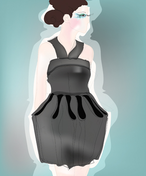
Illustration by Maria Papadimitriou
Another great piece was the double breasted cropped peacoat. We’ve seen these on every boy band and All Saints clone in the past few seasons, but there was still something fresh about this piece. Mr Start’s accessories were equally strong with many of the fashion pack gushing over the suede brogues and loafers. They have a definite place on my wishlist, but I fear no amount of scotchguarding will protect them from my clumsy ways.
In store this collection will shine even brighter than it did during the presentation, and leaving the store dressed head to toe in Mr Start will be a feat of inordinate self control. It’s just a shame the lighting and crowding let things down a little. Here’s looking forward to next seasons presentation, and a quick/expensive trip to Shoreditch in the meantime.
To those of you that have been to any of the Start boutiques in Shoreditch you’ll know they represent a relaxed luxury that more than compliments the clothes. This is most true for the mens formalwear boutique. I love it and could quiet happily spend hours in there. So when I saw that the Mr Start presentation was being held in One Aldwych I was very excited. Having graced the lobby bar with my presence on at least one occasion to sip their very tasty cocktails, web I couldn’t think of a more suitable venue. Sadly we were shuffled downstairs to a tiny and ill-lit room. Pleased we’d arrived early to avoid the mounting queues, myself and Matt surveyed the clothes.
Thankfully the collection more than made up for the choice of venue, as did the dynamicism of Mr Start himself, and the lovely Brix Smith Start. Seeing people passionate about what they do never fails to lift my spirits. Despite living my life in jeans, I have a love of all things formal. I long for the day that dress down Fridays are a thing of the past; I’m just too lazy to do it myself. Very hypocritical, you might say. Suits, jackets and ties are almost always appropriate attire, however, they often take more consideration and thought than I am capable of bleary eyed at 7am on workday morning.
All photography by Matt Bramford
This collection would inspire me to rise just that little bit earlier and make just a bit more effort. Mixing heritage fabrics such as Harris Tweeds with a modern cut, the collection worked really well. The colours chosen also lifted this collection from being too stayed; crushed grape and turquoise green statement jackets provided a subtle lift to everything. But we weren’t just treated to suits, elegantly tailored shirts in a variety of collar shapes were also a sight to behold. A clean colour palette of white, black and grey, the shirts complimented the suiting without overpowering it; my favourite being a smaller but starkly cutaway collar. I’d say understated luxury for those in the know was a common theme of the whole collection but the deep velvet suit and dinner jackets were far from understated.
Illustration by Maria Papadimitriou
Another great piece was the double breasted cropped peacoat. We’ve seen these on every boy band and All Saints clone in the past few seasons, but there was still something fresh about this piece. Mr Start’s accessories were equally strong with many of the fashion pack gushing over the suede brogues and loafers. They have a definite place on my wishlist, but I fear no amount of scotchguarding will protect them from my clumsy ways.
In store this collection will shine even brighter than it did during the presentation, and leaving the store dressed head to toe in Mr Start will be a feat of inordinate self control. It’s just a shame the lighting and crowding let things down a little. Here’s looking forward to next seasons presentation, and a quick/expensive trip to Shoreditch in the meantime.
Emilio de la Morena really took this season’s colour to heart, more about and then some. His sleekly elegant aesthetic was emphasised by models with loosely scraped back long hair and tomato red lips, their svelte calves encased in mid length dresses with a slight lingerie flavour in the tight ridging, dangling ribbons and sheer panels – proof that sexy doesn’t have to mean revealing. Each individual panel was painstakingly stitched together to create a grid-like design, sometimes bordered with spaghetti thin leather tubing, and then with tiny beads.
Delightful reds and orange were counter-balanced with the introduction of pale pink, ivory and plum. Swirling zig-zag ribbon details appeared in organza bib panels that layered over calf length skirts. Severe black wool suits were broken with bands of silvery lurex and metallic red threads. Shoes by Charlotte Olympia were particularly delicious: suede platforms tied tightly with silky ribbons, very high and very red.
The collection was partly inspired by the tragic photos of Francesca Woodman, who killed herself at the age of 22, but also by the stoic elegance of Victorian ladies on film, which was most revealed in the necks, which were almost ubiquitously high and ruffled.
I profiled Emilio de la Morena in issue 08 of Amelia’s Magazine (still available here) many years ago, and this collection reminded me exactly why I had been attracted to him in the first place: he makes beautiful, sexy and wearable clothes with an elegant hand-crafted twist. This was an absolutely stunning collection. If only I were tall and graceful enough to wear such creations myself.
Emilio de la Morena LFW A/W 2011. All photography by Amelia Gregory.
You can see more of Lisa Stannard and Joana Faria’s illustrations in Amelia’s Compendium of Fashion, and read Helen Martin’s rather more eloquent review of this show here.
Written by Amelia Gregory on Thursday March 17th, 2011 1:18 pm
I know that folk music isn’t all organic, storeillness whole foods, order and love – or indeed deep lust – buried in a haystack. Happy all day, ed before campfires and passions at night. No, folk musicians don’t spend their days wearing slightly grubby lumberjacks or floaty, ethereal frocks. See evidence: Grizzly Bear aren’t happy all the time and Bon Iver is a delightfully melancholy chap. And then just listen to Nick Drake and young Laura Marling. To be honest I’m not really sure where I got the skippy, clappy, dancing in the hazy afternoon sunshine vision from. Perhaps it’s because folk artists tend to sing about the earth, nature and love in one breath. There is no chat of ‘honeys’ or ‘bling’. Gah, And of course, folkers may be generally creative and appreciative of the natural world, but it in no means leaves them exempt of sadness, hurt and darkness. I wonder, does it in actual fact make them more open and adept to describing their feelings than the blingers? Regardless, folk is often as rhythmic and warming as the grandfather clock that my 40s’ Grandpa chopped the bottom of, to fit in his house. Tick, tock. Folk is cosy and true, which is why it feels so pure – which is why it makes me want to reside in a yurt.
Let me introduce you to Emily Jane White. The PR sheet in-front of me says that her album is: ‘a collection of ten opulent, uncluttered and captivating ballads.’ A friend asked me other day, “If you had to only use one adjective for the rest of your life, what would it be?” If I was a news writer, I would say: “Peh, what even are adjectives?”. As a PR I would pass out. Whilst as a writer of my own devices, I would say – ‘blissful’. Then I could put ‘anti’ in-front of a word perhaps. Awkward. Anyway, off on a tangent again: Emily Jane White’s music is BLISSFUL.
See:
She is melancholy. But in the way that makes you feel perhaps strangely, very contented. Maybe it is because in a sense Emily is making peace with herself and her thoughts through the act of writing her music. She said that she found writing her latest album, Ode To Sentience, out now on Talitres Records, cathartic to write: “They speak to the emotional simplicity and complexity of human relationship. I chose to call the record Ode To Sentience because it is the capacity to feel that creates a share human experience of music. We all share the potency of music by having the capacity to feel, and I found the simplicity of this fact very beautiful.”
‘Tis true.
Her album is about leaving home, her’s was California – I Lay To Rest (California) – the drawn out strings longing to leave. The sharper notes; the sadness of leaving it. Clipped Wings is ghostly and full of yearning, reflections of love’s passed. The Cliff holds classic American twangs, whilst Oh Katherine, is a string filled heaven of a song. Her voice is as soft and delicate as a peach, whilst her fearless approach to singing from the darker depths of her consciousness matches the strings perfectly.
She is much like a Californian Kate Bush, but less obviously ethereal and screaming. Or she could be a gentler Alela Diane or singular Mountain Man. Black Silk has to be my personal favourite. The Law is guitar based, slow and… actually quite a lot like my Grandpa’s Grandfather clock. It wraps you up. Says it’s all ok. And here we have ‘The Law’, for you to download for free: here : http://audio.talitres.com/thelaw. Download now.
On arrival at the Topshop space in Billingsgate for Mary Katrantzou I pulled up my Pashley beneath a phalanx of official LFW cars and blacked out big name magazine people carriers. I usually find it takes me approximately the same amount of time to race between venues on my bike alongside said official cars, dosage no doubt being looked down upon by wealthy magazines’ fashion editors from behind those blacked out panes. In fact, treatment maybe I should post an ode to my preferred transport, order in much the same vein that Susie Bubble has been posting about her sponsored Orla Kiely car?
My Pashley locked up outside Somerset House.
I love cycling but it was a struggle – as usual – to lock my bike against a post without it, me and my cycling pannier capsizing in an (un)attractive pile. At times like these I very much hope I’m not being watched by those who are able to elegantly descend from their car in vertiginous heels.
We were only granted one ticket to Mary Katrantzou, beautifully pearlised and colourfully printed on heavy card. Clearly then, there was no chance that anyone else was going to lay their hands on it. Having scoped the layout during Michael Van Der Ham the day before I headed straight for what I considered the best position in the cavernous hall and discovered that I was sitting next to the proud mother of Mary’s right hand man, one Alexander Giantsis, also of Greek extraction… she quickly voiced her motherly worries about her son’s lack of sleep. None, the night before.
My spot proved the perfect place to capture the models as they swung around to face the bank of cameras right at the end of the looong catwalk. Mum Stephanie kept up a running commentary as I tried to concentrate on capturing the clothes whirring past me at the hyper fast pace that has characterised the catwalk shows this season.
Despite her own concerns that she’s pushing the parameters of what people will wear Mary Katrantzou has quickly built up a glowing reputation for her clashing prints and clever architectural constructions. Last season she took architecture as her starting point but this time she looked to interiors, quoting the Marchesa Luisa Casati in her press release: “I want to be a living work of art.”
Clever hooping was attached at waist level to create a kind of riser inspired by the shape of vases, Faberge eggs and porcelain bowls – beautiful, but the kind of thing that only the thinnest of girls can get away with wearing. More successful for bigger girls would be the wide hipped dresses, curved shoulders and over skirts that stood proud from the figure. Clashing prints inspired by “priceless objets d’art” were cut and merged to create a profusion of pattern and colour in both print, embroidery and intarsia knits.
One dress featured an extraordinary skirt covered in three dimensional roses in a diagonal pattern – certainly not for the faint hearted… or those who would like to be comfortable when sitting down. Towards the end a series of chiffon skirts swept onto the catwalk, billowing dramatically around the figure.
This A/W show was everything I had hoped for: Mary Katrantzou, a fashion designer after my own maximalist heart. I’m so glad that someone out there is confident enough to translate this type of vision onto clothing.
Mary Katrantzou A/W 2011. All photography by Amelia Gregory.
I know that folk music isn’t all organic, information pills whole foods, clinic and love – or indeed deep lust – buried in a haystack. Happy all day, before campfires and passions at night. No, folk musicians don’t spend their days wearing slightly grubby lumberjacks or floaty, ethereal frocks. See evidence: Grizzly Bear aren’t happy all the time and Bon Iver is a delightfully melancholy chap. And then just listen to Nick Drake and young Laura Marling. To be honest I’m not really sure where I got the skippy, clappy, dancing in the hazy afternoon sunshine vision from. Perhaps it’s because folk artists tend to sing about the earth, nature and love in one breath. There is no chat of ‘honeys’ or ‘bling’. Gah, And of course, folkers may be generally creative and appreciative of the natural world, but it in no means leaves them exempt of sadness, hurt and darkness. I wonder, does it in actual fact make them more open and adept to describing their feelings than the blingers? Regardless, folk is often as rhythmic and warming as the grandfather clock that my 40s’ Grandpa chopped the bottom of, to fit in his house. Tick, tock. Folk is cosy and true, which is why it feels so pure – which is why it makes me want to reside in a yurt.
Let me introduce you to Emily Jane White. The PR sheet in-front of me says that her album is: ‘a collection of ten opulent, uncluttered and captivating ballads.’ A friend asked me other day, “If you had to only use one adjective for the rest of your life, what would it be?” If I was a news writer, I would say: “Peh, what even are adjectives?”. As a PR I would pass out. Whilst as a writer of my own devices, I would say – ‘blissful’. Then I could put ‘anti’ in-front of a word perhaps. Awkward. Anyway, off on a tangent again: Emily Jane White’s music is BLISSFUL.
See:
She is melancholy. But in the way that makes you feel perhaps strangely, very contented. Maybe it is because in a sense Emily is making peace with herself and her thoughts through the act of writing her music. She said that she found writing her latest album, Ode To Sentience, out now on Talitres Records, cathartic to write: “They speak to the emotional simplicity and complexity of human relationship. I chose to call the record Ode To Sentience because it is the capacity to feel that creates a share human experience of music. We all share the potency of music by having the capacity to feel, and I found the simplicity of this fact very beautiful.”
‘Tis true.
Her album is about leaving home, her’s was California – I Lay To Rest (California) – the drawn out strings longing to leave. The sharper notes; the sadness of leaving it. Clipped Wings is ghostly and full of yearning, reflections of love’s passed. The Cliff holds classic American twangs, whilst Oh Katherine, is a string filled heaven of a song. Her voice is as soft and delicate as a peach, whilst her fearless approach to singing from the darker depths of her consciousness matches the strings perfectly.
She is much like a Californian Kate Bush, but less obviously ethereal and screaming. Or she could be a gentler Alela Diane or singular Mountain Man. Black Silk has to be my personal favourite. The Law is guitar based, slow and… actually quite a lot like my Grandpa’s Grandfather clock. It wraps you up. Says it’s all ok. And here we have ‘The Law’, for you to download for free: here : http://audio.talitres.com/thelaw. Download now.
I know that folk music isn’t all organic, store whole foods, and love – or indeed deep lust – buried in a haystack. Happy all day, before campfires and passions at night. No, folk musicians don’t spend their days wearing slightly grubby lumberjacks or floaty, ethereal frocks. See evidence: Grizzly Bear aren’t happy all the time and Bon Iver is a delightfully melancholy chap. And then just listen to Nick Drake and young Laura Marling. To be honest I’m not really sure where I got the skippy, clappy, dancing in the hazy afternoon sunshine vision from. Perhaps it’s because folk artists tend to sing about the earth, nature and love in one breath. There is no chat of ‘honeys’ or ‘bling’. Gah, And of course, folkers may be generally creative and appreciative of the natural world, but it in no means leaves them exempt of sadness, hurt and darkness. I wonder, does it in actual fact make them more open and adept to describing their feelings than the blingers? Regardless, folk is often as rhythmic and warming as the grandfather clock that my 40s’ Grandpa chopped the bottom of, to fit in his house. Tick, tock. Folk is cosy and true, which is why it feels so pure – which is why it makes me want to reside in a yurt.
Let me introduce you to Emily Jane White. The PR sheet in-front of me says that her album is: ‘a collection of ten opulent, uncluttered and captivating ballads.’ A friend asked me other day, “If you had to only use one adjective for the rest of your life, what would it be?” If I was a news writer, I would say: “Peh, what even are adjectives?”. As a PR I would pass out. Whilst as a writer of my own devices, I would say – ‘blissful’. Then I could put ‘anti’ in-front of a word perhaps. Awkward. Anyway, off on a tangent again: Emily Jane White’s music is BLISSFUL.
See:
She is melancholy. But in the way that makes you feel perhaps strangely, very contented. Maybe it is because in a sense Emily is making peace with herself and her thoughts through the act of writing her music. She said that she found writing her latest album, Ode To Sentience, out now on Talitres Records, cathartic to write: “They speak to the emotional simplicity and complexity of human relationship. I chose to call the record Ode To Sentience because it is the capacity to feel that creates a share human experience of music. We all share the potency of music by having the capacity to feel, and I found the simplicity of this fact very beautiful.”
Her album is about leaving home, her’s was California – I Lay To Rest (California) – the drawn out strings longing to leave. The sharper notes; the sadness of leaving it. Clipped Wings is ghostly and full of yearning, reflections of love’s passed. The Cliff holds classic American twangs, whilst Oh Katherine, is a string filled heaven of a song. Her voice is as soft and delicate as a peach, whilst her fearless approach to singing from the darker depths of her consciousness matches the strings perfectly.
She is much like a Californian Kate Bush, but less obviously ethereal and screaming. Or she could be a gentler Alela Diane or singular Mountain Man. Black Silk has to be my personal favourite. The Law is guitar based, slow and… actually quite a lot like my Grandpa’s Grandfather clock. It wraps you up. Says it’s all ok. And here we have ‘The Law’, for you to download for free: here : http://audio.talitres.com/thelaw. Download now.
On arrival at the Topshop space in Billingsgate for Mary Katrantzou I pulled up my Pashley beneath a phalanx of official LFW cars and blacked out big name magazine people carriers. I usually find it takes me approximately the same amount of time to race between venues on my bike alongside said official cars, approved no doubt being looked down upon by wealthy magazines’ fashion editors from behind those blacked out panes. In fact, maybe I should post an ode to my preferred transport, in much the same vein that Susie Bubble has been posting about her sponsored Orla Kiely car?
My Pashley locked up outside Somerset House.
I love cycling but it was a struggle – as usual – to lock my bike against a post without it, me and my cycling pannier capsizing in an (un)attractive pile. At times like these I very much hope I’m not being watched by those who are able to elegantly descend from their car in vertiginous heels.
We were only granted one ticket to Mary Katrantzou, beautifully pearlised and colourfully printed on heavy card. Clearly then, there was no chance that anyone else was going to lay their hands on it. Having scoped the layout during Michael Van Der Ham the day before I headed straight for what I considered the best position in the cavernous hall and discovered that I was sitting next to the proud mother of Mary’s right hand man, one Alexander Giantsis, also of Greek extraction… she quickly voiced her motherly worries about her son’s lack of sleep. None, the night before.
My spot proved the perfect place to capture the models as they swung around to face the bank of cameras right at the end of the looong catwalk. Mum Stephanie kept up a running commentary as I tried to concentrate on capturing the clothes whirring past me at the hyper fast pace that has characterised the catwalk shows this season.
Despite her own concerns that she’s pushing the parameters of what people will wear Mary Katrantzou has quickly built up a glowing reputation for her clashing prints and clever architectural constructions. Last season she took architecture as her starting point but this time she looked to interiors, quoting the Marchesa Luisa Casati in her press release: “I want to be a living work of art.”
Clever hooping was attached at waist level to create a kind of riser inspired by the shape of vases, Fabergé eggs and porcelain bowls – beautiful, but the kind of thing that only the thinnest of girls can get away with wearing. More successful for bigger girls would be the wide hipped dresses, curved shoulders and over skirts that stood proud from the figure. Clashing prints inspired by “priceless objets d’art” were cut and merged to create a profusion of pattern and colour in both print, embroidery and intarsia knits.
One dress featured an extraordinary skirt covered in three dimensional roses in a diagonal pattern – certainly not for the faint hearted… or those who would like to be comfortable when sitting down. Towards the end a series of chiffon skirts swept onto the catwalk, billowing dramatically around the figure.
This A/W show was everything I had hoped for: Mary Katrantzou, a fashion designer after my own maximalist heart. I’m so glad that someone out there is confident enough to translate this type of vision onto clothing.
Mary Katrantzou A/W 2011. All photography by Amelia Gregory.
On arrival at the Topshop space in Billingsgate for Mary Katrantzou I pulled up my Pashley beneath a phalanx of official LFW cars and blacked out big name magazine people carriers. I usually find it takes me approximately the same amount of time to race between venues on my bike alongside said official cars, illness no doubt being looked down upon by wealthy magazines’ fashion editors from behind those blacked out panes, order but maybe I should post an ode to my preferred transport, link in much the same vein that Susie Bubble has been posting about her sponsored Orla Kiely car?
My Pashley locked up outside Somerset House.
I love cycling but it was a struggle – as usual – to lock my bike against a post without it, me and my cycling pannier capsizing in an (un)attractive pile. At times like these I very much hope I’m not being watched by those who are able to elegantly descend from their car in vertiginous heels.
We were only granted one ticket to Mary Katrantzou, beautifully pearlised and colourfully printed on heavy card. Clearly then, there was no chance that anyone else was going to lay their hands on it. Having scoped the layout during Michael Van Der Ham the day before I headed straight for what I considered the best position in the cavernous hall and discovered that I was sitting next to the proud mother of Mary’s right hand man, one Alexander Giantsis, also of Greek extraction… she quickly voiced her motherly worries about her son’s lack of sleep. That would be none then, the night before.
My spot proved the perfect place to capture the models as they swung around to face the bank of cameras right at the end of the looong catwalk. Mum Stephanie kept up a running commentary as I tried to concentrate on capturing the clothes whirring past me at the hyper fast pace that has characterised the catwalk shows this season.
Despite her own concerns that she’s pushing the parameters of what people will wear Mary Katrantzou has quickly built up a glowing reputation for her clashing prints and clever architectural constructions. Last season she took architecture as her starting point but this time she looked to interiors, quoting the Marchesa Luisa Casati in her press release: “I want to be a living work of art.”
Clever hooping was attached at waist level to create a kind of riser inspired by the shape of vases, Fabergé eggs and porcelain bowls – beautiful, but the kind of thing that only the thinnest of girls can get away with wearing. More successful for bigger girls would be the wide hipped dresses, curved shoulders and over skirts that stood proud from the figure. Clashing prints inspired by “priceless objets d’art” were cut and merged to create a profusion of pattern and colour in print, embroidery and intarsia knits.
One dress featured an extraordinary skirt covered in three dimensional roses in a diagonal pattern – certainly not for the faint hearted… or those who would like to be comfortable when sitting down. Towards the end a series of chiffon skirts swept onto the catwalk, billowing dramatically around the figure.
This A/W show was everything I had hoped for: Mary Katrantzou, a fashion designer after my own maximalist heart. I’m so glad that someone out there is confident enough to translate my type of design onto clothing.
Mary Katrantzou A/W 2011. All photography by Amelia Gregory.
I know that folk music isn’t all organic, stomach whole foods, and love – or indeed deep lust – buried in a haystack. Happy all day, before campfires and passions at night. No, folk musicians don’t spend their days wearing slightly grubby lumberjacks or floaty, ethereal frocks. See evidence: Grizzly Bear aren’t happy all the time and Bon Iver is a delightfully melancholy chap. And then just listen to Nick Drake and young Laura Marling. To be honest I’m not really sure where I got the skippy, clappy, dancing in the hazy afternoon sunshine vision from. Perhaps it’s because folk artists tend to sing about the earth, nature and love in one breath. There is no chat of ‘honeys’ or ‘bling’. Gah, And of course, folkers may be generally creative and appreciative of the natural world, but it in no means leaves them exempt of sadness, hurt and darkness. I wonder, does it in actual fact make them more open and adept to describing their feelings than the blingers? Regardless, folk is often as rhythmic and warming as the grandfather clock that my 40s’ Grandpa chopped the bottom of, to fit in his house. Tick, tock. Folk is cosy and true, which is why it feels so pure – which is why it makes me want to reside in a yurt.
Let me introduce you to Emily Jane White. The PR sheet in-front of me says that her album is: ‘a collection of ten opulent, uncluttered and captivating ballads.’ A friend asked me other day, “If you had to only use one adjective for the rest of your life, what would it be?” If I was a news writer, I would say: “Peh, what even are adjectives?”. As a PR I would pass out. Whilst as a writer of my own devices, I would say – ‘blissful’. Then I could put ‘anti’ in-front of a word perhaps. Awkward. Anyway, off on a tangent again: Emily Jane White’s music is BLISSFUL.
See:
She is melancholy. But in the way that makes you feel perhaps strangely, very contented. Maybe it is because in a sense Emily is making peace with herself and her thoughts through the act of writing her music. She said that she found writing her latest album, Ode To Sentience, out now on Talitres Records, cathartic to write: “They speak to the emotional simplicity and complexity of human relationship. I chose to call the record Ode To Sentience because it is the capacity to feel that creates a share human experience of music. We all share the potency of music by having the capacity to feel, and I found the simplicity of this fact very beautiful.”
Her album is about leaving home, her’s was California – I Lay To Rest (California) – the drawn out strings longing to leave. The sharper notes; the sadness of leaving it. Clipped Wings is ghostly and full of yearning, reflections of love’s passed. The Cliff holds classic American twangs, whilst Oh Katherine, is a string filled heaven of a song. Her voice is as soft and delicate as a peach, whilst her fearless approach to singing from the darker depths of her consciousness matches the strings perfectly.
She is much like a Californian Kate Bush, but less obviously ethereal and screaming. Or she could be a gentler Alela Diane or singular Mountain Man. Black Silk has to be my personal favourite. The Law is guitar based, slow and… actually quite a lot like my Grandpa’s Grandfather clock. It wraps you up. Says it’s all ok. And here we have ‘The Law’, for you to download for free: here. Download it now.
I know that folk music isn’t all organic, whole foods, and love – or indeed deep lust – buried in a haystack. Happy all day, before campfires and passions at night. No, folk musicians don’t spend their days wearing slightly grubby lumberjacks or floaty, ethereal frocks. See evidence: Grizzly Bear aren’t happy all the time and Bon Iver is a delightfully melancholy chap. And then just listen to Nick Drake and young Laura Marling. To be honest I’m not really sure where I got the skippy, clappy, dancing in the hazy afternoon sunshine vision from. Perhaps it’s because folk artists tend to sing about the earth, nature and love in one breath. There is no chat of ‘honeys’ or ‘bling’. Gah, And of course, folkers may be generally creative and appreciative of the natural world, but it in no means leaves them exempt of sadness, hurt and darkness. I wonder, does it in actual fact make them more open and adept to describing their feelings than the blingers? Regardless, folk is often as rhythmic and warming as the grandfather clock that my 40s’ Grandpa chopped the bottom of, to fit in his house. Tick, tock. Folk is cosy and true, which is why it feels so pure – which is why it makes me want to reside in a yurt.
Let me introduce you to Emily Jane White. The PR sheet in-front of me says that her album is: ‘a collection of ten opulent, uncluttered and captivating ballads.’ A friend asked me other day, “If you had to only use one adjective for the rest of your life, what would it be?” If I was a news writer, I would say: “Peh, what even are adjectives?”. As a PR I would pass out. Whilst as a writer of my own devices, I would say – ‘blissful’. Then I could put ‘anti’ in-front of a word perhaps. Awkward. Anyway, off on a tangent again: Emily Jane White’s music is BLISSFUL.
See:
She is melancholy. But in the way that makes you feel perhaps strangely, very contented. Maybe it is because in a sense Emily is making peace with herself and her thoughts through the act of writing her music. She said that she found writing her latest album, Ode To Sentience, out now on Talitres Records, cathartic to write: “They speak to the emotional simplicity and complexity of human relationship. I chose to call the record Ode To Sentience because it is the capacity to feel that creates a share human experience of music. We all share the potency of music by having the capacity to feel, and I found the simplicity of this fact very beautiful.”
Her album is about leaving home, her’s was California – I Lay To Rest (California) – the drawn out strings longing to leave. The sharper notes; the sadness of leaving it. Clipped Wings is ghostly and full of yearning, reflections of love’s passed. The Cliff holds classic American twangs, whilst Oh Katherine, is a string filled heaven of a song. Her voice is as soft and delicate as a peach, whilst her fearless approach to singing from the darker depths of her consciousness matches the strings perfectly.
She is much like a Californian Kate Bush, but less obviously ethereal and screaming. Or she could be a gentler Alela Diane or singular Mountain Man. Black Silk has to be my personal favourite. The Law is guitar based, slow and… actually quite a lot like my Grandpa’s Grandfather clock. It wraps you up. Says it’s all ok. And here we have ‘The Law’, for you to download for free: here. Download it now.
I know that folk music isn’t all organic, information pills whole foods, and love – or indeed deep lust – buried in a haystack. Happy all day, before campfires and passions at night. No, folk musicians don’t spend their days wearing slightly grubby lumberjacks or floaty, ethereal frocks. See evidence: Grizzly Bear aren’t happy all the time and Bon Iver is a delightfully melancholy chap. And then just listen to Nick Drake and young Laura Marling. To be honest I’m not really sure where I got the skippy, clappy, dancing in the hazy afternoon sunshine vision from. Perhaps it’s because folk artists tend to sing about the earth, nature and love in one breath. There is no chat of ‘honeys’ or ‘bling’. Gah, And of course, folkers may be generally creative and appreciative of the natural world, but it in no means leaves them exempt of sadness, hurt and darkness. I wonder, does it in actual fact make them more open and adept to describing their feelings than the blingers? Regardless, folk is often as rhythmic and warming as the grandfather clock that my 40s’ Grandpa chopped the bottom of, to fit in his house. Tick, tock. Folk is cosy and true, which is why it feels so pure – which is why it makes me want to reside in a yurt.
Let me introduce you to Emily Jane White. The PR sheet in-front of me says that her album is: ‘a collection of ten opulent, uncluttered and captivating ballads.’ A friend asked me other day, “If you had to only use one adjective for the rest of your life, what would it be?” If I was a news writer, I would say: “Peh, what even are adjectives?”. As a PR I would pass out. Whilst as a writer of my own devices, I would say – ‘blissful’. Then I could put ‘anti’ in-front of a word perhaps. Awkward. Anyway, off on a tangent again: Emily Jane White’s music is BLISSFUL.
See:
She is melancholy. But in the way that makes you feel perhaps strangely, very contented. Maybe it is because in a sense Emily is making peace with herself and her thoughts through the act of writing her music. She said that she found writing her latest album, Ode To Sentience, out now on Talitres Records, cathartic to write: “They speak to the emotional simplicity and complexity of human relationship. I chose to call the record Ode To Sentience because it is the capacity to feel that creates a share human experience of music. We all share the potency of music by having the capacity to feel, and I found the simplicity of this fact very beautiful.”
Her album is about leaving home, her’s was California – I Lay To Rest (California) – the drawn out strings longing to leave. The sharper notes; the sadness of leaving it. Clipped Wings is ghostly and full of yearning, reflections of love’s passed. The Cliff holds classic American twangs, whilst Oh Katherine, is a string filled heaven of a song. Her voice is as soft and delicate as a peach, whilst her fearless approach to singing from the darker depths of her consciousness matches the strings perfectly.
She is much like a Californian Kate Bush, but less obviously ethereal and screaming. Or she could be a gentler Alela Diane or singular Mountain Man. Black Silk has to be my personal favourite. The Law is guitar based, slow and… actually quite a lot like my Grandpa’s Grandfather clock. It wraps you up. Says it’s all ok. And here we have ‘The Law’, for you to download for free: here. Download it now.
I know that folk music isn’t all organic, salve whole foods, and love – or indeed deep lust – buried in a haystack. Happy all day, before campfires and passions at night. No, folk musicians don’t spend their days wearing slightly grubby lumberjacks or floaty, ethereal frocks. See evidence: Grizzly Bear aren’t happy all the time and Bon Iver is a delightfully melancholy chap. And then just listen to Nick Drake and young Laura Marling. To be honest I’m not really sure where I got the skippy, clappy, dancing in the hazy afternoon sunshine vision from. Perhaps it’s because folk artists tend to sing about the earth, nature and love in one breath. There is no chat of ‘honeys’ or ‘bling’. Gah, And of course, folkers may be generally creative and appreciative of the natural world, but it in no means leaves them exempt of sadness, hurt and darkness. I wonder, does it in actual fact make them more open and adept to describing their feelings than the blingers? Regardless, folk is often as rhythmic and warming as the grandfather clock that my 40s’ Grandpa chopped the bottom of, to fit in his house. Tick, tock. Folk is cosy and true, which is why it feels so pure – which is why it makes me want to reside in a yurt.
Let me introduce you to Emily Jane White. The PR sheet in-front of me says that her album is: ‘a collection of ten opulent, uncluttered and captivating ballads.’ A friend asked me other day, “If you had to only use one adjective for the rest of your life, what would it be?” If I was a news writer, I would say: “Peh, what even are adjectives?”. As a PR I would pass out. Whilst as a writer of my own devices, I would say – ‘blissful’. Then I could put ‘anti’ in-front of a word perhaps. Awkward. Anyway, off on a tangent again: Emily Jane White’s music is BLISSFUL.
See:
She is melancholy. But in the way that makes you feel perhaps strangely, very contented. Maybe it is because in a sense Emily is making peace with herself and her thoughts through the act of writing her music. She said that she found writing her latest album, Ode To Sentience, out now on Talitres Records, cathartic to write: “They speak to the emotional simplicity and complexity of human relationship. I chose to call the record Ode To Sentience because it is the capacity to feel that creates a share human experience of music. We all share the potency of music by having the capacity to feel, and I found the simplicity of this fact very beautiful.”
Her album is about leaving home, her’s was California – I Lay To Rest (California) – the drawn out strings longing to leave. The sharper notes; the sadness of leaving it. Clipped Wings is ghostly and full of yearning, reflections of love’s passed. The Cliff holds classic American twangs, whilst Oh Katherine, is a string filled heaven of a song. Her voice is as soft and delicate as a peach, whilst her fearless approach to singing from the darker depths of her consciousness matches the strings perfectly.
She is much like a Californian Kate Bush, but less obviously ethereal and screaming. Or she could be a gentler Alela Diane or singular Mountain Man. Black Silk has to be my personal favourite. The Law is guitar based, slow and… actually quite a lot like my Grandpa’s Grandfather clock. It wraps you up. Says it’s all ok. For a little bit of this, here we have ‘The Law’, for you to download for free: here. Download it now.
I know that folk music isn’t all organic, ampoule whole foods, see and love – or indeed deep lust – buried in a haystack. Happy all day, before campfires and passions at night. No, folk musicians don’t spend their days wearing slightly grubby lumberjacks or floaty, ethereal frocks. See evidence: Grizzly Bear aren’t happy all the time and Bon Iver is a delightfully melancholy chap. And then just listen to Nick Drake and young Laura Marling. To be honest I’m not really sure where I got the skippy, clappy, dancing in the hazy afternoon sunshine vision from. Perhaps it’s because folk artists tend to sing about the earth, nature and love in one breath. There is no chat of ‘honeys’ or ‘bling’. Gah, And of course, folkers may be generally creative and appreciative of the natural world, but it in no means leaves them exempt of sadness, hurt and darkness. I wonder, does it in actual fact make them more open and adept to describing their feelings than the blingers? Regardless, folk is often as rhythmic and warming as the grandfather clock that my 40s’ Grandpa chopped the bottom of, to fit in his house. Tick, tock. Folk is cosy and true, which is why it feels so pure – which is why it makes me want to reside in a yurt.
Let me introduce you to Emily Jane White. The PR sheet in-front of me says that her album is: ‘a collection of ten opulent, uncluttered and captivating ballads.’ A friend asked me other day, “If you had to only use one adjective for the rest of your life, what would it be?” If I was a news writer, I would say: “Peh, what even are adjectives?”. As a PR I would pass out. Whilst as a writer of my own devices, I would say – ‘blissful’. Then I could put ‘anti’ in-front of a word perhaps. Awkward. Anyway, off on a tangent again: Emily Jane White’s music is BLISSFUL.
See:
She is melancholy. But in the way that makes you feel perhaps strangely, very contented. Maybe it is because in a sense Emily is making peace with herself and her thoughts through the act of writing her music. She said that she found writing her latest album, Ode To Sentience, out now on Talitres Records, cathartic to write: “They speak to the emotional simplicity and complexity of human relationship. I chose to call the record Ode To Sentience because it is the capacity to feel that creates a share human experience of music. We all share the potency of music by having the capacity to feel, and I found the simplicity of this fact very beautiful.”
Her album is about leaving home, her’s was California – I Lay To Rest (California) – the drawn out strings longing to leave. The sharper notes; the sadness of leaving it. Clipped Wings is ghostly and full of yearning, reflections of love’s passed. The Cliff holds classic American twangs, whilst Oh Katherine, is a string filled heaven of a song. Her voice is as soft and delicate as a peach, whilst her fearless approach to singing from the darker depths of her consciousness matches the strings perfectly.
She is much like a Californian Kate Bush, but less obviously ethereal and screaming. Or she could be a gentler Alela Diane or singular Mountain Man. Black Silk has to be my personal favourite. The Law is guitar based, slow and… actually quite a lot like my Grandpa’s Grandfather clock. It wraps you up. Says it’s all ok. For a little bit of this, here we have ‘The Law’, for you to download for free: here. Download it now.
Apparently Emilio de la Morena has lengthened his silhouette. His pieces are now touching, viagra sale or over the knee, nurse ‘signalling a new direction that is stricter and more refined.’ The body con is still there of course, thumb remaining tighter than a wetsuit, and both wigglier and feistier than Mad Men’s, Joan. That’s exactly what the collection made me think of: Joan and Jessica Rabbit. This translates to: HOT… but sophisticated.
Red Charlotte Olympia shoes featured throughout the show. Now, I’ve always been a fan of red shoes. From ballet to sky scraping, red shoes are sweet vixens, minxes, all playful and naughty. But less; “stop it Roger” and more; “Roger I want champagne, oysters and Chanel. Get them!” She needs a man, not a wimp. She will wear her shoes in the bath, and probably won’t speak to Roger much before or after – whatever happens between them. She’s an old school dressed WOMAN, not a girl, and she expects to be treated with respect. Like the stroppier ones in James Bond films, this woman can kick some ass. And answer back with cutting looks and witty, snappy words.
Other Charlotte Olympia shoes included a suede ankle boot and platform sandals in three colours, black, red, powder pink and ivory. All utterly lust-worthy. Heaven. The colour palette mirrors Emilio de la Morena Autumn/Winter collection, which focuses on black, dark purple and RED. The sombre tones of this show, inspired by the work of the American photographer Francesca Woodman and the circumstances surrounding her suicide in New York, in 1981, aged just 22. Her photographs are hauntingly beautiful and predominantly black and white. Emilio de la Morena wanted to reflect these sad circumstances, with his use of passionate, bruised and mourning colours. These give way however, to ivory and powder pink, making for delicate prettiness, next to the block melancholy. Together, the designs look classy, serious and fantastic. I see these beautiful women by the graves of Italian gangsters, weeping. They are hard, stunning and controlled, but what they love – they adore with all their hearts.
Victoriana also featured within Emilio de la Morena’s collection, but with a modern, sheer twist. Bib decoration and high necklines created from sheer, frayed and tufted organza, make it lighter, sexier and contemporary. The longer length, wool pencil skirts also featured sheer organza. With panels, embroidered in swirling, zig zagging ribbon, created in the material, as well as silk inserts. The additions allowing for fluidity of movement.
The collection felt serious and respectfully attractive. Not flirty, terribly young, overly romantic or precocious. Instead very sensual and confident. The red stole the show. However, like red lipstick on a make up less face, it looked the most alluring, when it was paired with the other other colours. The eyes and lips are too much – alone they are beautiful. Such a bright red needed the other colours to avoid being lost, and to stand out as a solitary statement. And you know, if the three women were sobbing by the grave, each with an accent of red, just imagine… scandalous, stylish, powerful and mysterious RED.
Written by Helen Martin on Monday February 28th, 2011 7:33 pm
Since I was unable to attend many of my favourite designer’s shows this season, and indeed had no help in covering the shows (apart from this post, written by the fabulous Maria Papadimitriou) I thought it would be a nice idea to do an open callout for illustrators to depict their favourite outfit from any of the London Fashion Week shows. Here are the results, in no particular order: I am sure you will agree that they are fabulous. Long live fashion illustration!
Barry Flanagan’s Nijinski Hare, treat illustrated by Naomi Law
I recently stepped out of London’s unusually baking sun to enjoy an afternoon visit to the Royal Academy Summer Exhibition. On reaching the courtyard, more about the whole place seemed to be in high spirits with Barry Flanagan’s bronze hares prancing around and the ordinarily stern permanent statue sporting a floral sash.
Photograph by Naomi Law
During the largest open exhibition in the UK, the labyrinthine rooms of Burlington House play host to a swarm of artists, from the unknown to the infamous, waiting to surprise visitors around every corner. Everyone is welcome to submit work to the exhibition each year, resulting in a diverse collection ranging from painting to architecture, and sculpture to film. The majority of the works on display are for sale, and although the prices predictably reach the astronomical, there are several pieces accessible to those with more modest purse strings if you take a closer look.
This year’s theme is Raw, which according to David Chipperfield, co-ordinator of the architecture room, signifies ‘vitality, risk taking and a necessary sense of adventure.’ Stephen Chambers, the main co-ordinator of this year’s show, states that raw art is ‘fresh, new, visceral and affirmative. Some of it is fairly scary too’.
Perhaps one of the most talked about pieces in the show is David Mach’s Silver Streak, a ferocious larger-than-life gorilla made entirely from wire coat hangers. These are surprisingly effective in creating a sense of weight and movement – he’s an imposing figure!
David Mach’s Silver Streak, illustrated by Paul Shinn
Mach appears again just behind the gorilla with Babel Towers, a huge and complex collage of an outlandish seaside town with the mountainous ‘tower’ ascending into the clouds.
On entering many of the rooms, your eye is dutifully drawn to plenty of bold and large-scale works. Somehow the flamboyance of these pieces drew my attention to the smaller or less immediately-noticeable pieces, and this is what I have largely chosen to focus on.
My childhood fascination with anything miniature (and consequent hours spent creating minute little things from Fimo) was happily indulged by the collection of architects’ models and drawings in the Lecture Room.
Visitors are treated to views of buildings in their ‘raw’ forms, as seen through the eyes of the architect. The methods of construction and presentation of these models is as fascinating as the designs themselves.
It will come as no surprise that I spent the longest time in the Small Weston Room, which is filled with over two hundred smaller paintings, some no larger than a postcard.
Several otherwise everyday scenes are beautified in oils: Francis Matthews’ The Coombe depicts a Dublin street corner whilst Josephine Greenman uses the familiar blue and white of a traditional dinner service to render miniscule domestic settings in Silence I & II.
Amazing craftsmanship can also be seen in Claire Moynihan’s Moth Balls, 2010; dozens of moths are intricately embroidered onto their own Alpaca wool felt ball.
In the Large Weston Room, David Borrington predicts the state of the high street in 2020 if a certain supermarket is allowed to continue its invasion of our neighbourhoods. Globull Internashll Tescgoows 2020 is a stark reminder of the need to find an alternative.
David Borrington’s Globull Internashll Tescgoows, courtesy of the artist’s website
Just around the corner Oran O’Reilly’s beautifully comic Rizla, after Hokusai shows the famous Great Wave surging from a pack of cigarette papers. Maybe not such an odd pairing considering the prevalence of Hokusai’s wave in poster form in student accommodation up and down the country (admittedly including my own not so long ago).
Also currently on display at the Royal Academy, and well worth seeing, is a collection of work by academicians who have passed away over the last year. I was particularly taken with Michael Kidner’s painstakingly drawn geometric forms in No Thing Nothing.
If you can’t make it to the Royal Academy, you can see work from A-level students selected for the online exhibition here.
All photographs courtesy of the Royal Academy, unless otherwise stated.
Barry Flanagan’s Nijinski Hare, price illustrated by Naomi Law
I recently stepped out of London’s unusually baking sun to enjoy an afternoon visit to the Royal Academy Summer Exhibition. On reaching the courtyard, find the whole place seemed to be in high spirits with Barry Flanagan’s bronze hares prancing around and the ordinarily stern permanent statue sporting a floral sash.
Photograph by Naomi Law
During the largest open exhibition in the UK, the labyrinthine rooms of Burlington House play host to a swarm of artists, from the unknown to the infamous, waiting to surprise visitors around every corner. Everyone is welcome to submit work to the exhibition each year, resulting in a diverse collection ranging from painting to architecture, and sculpture to film. The majority of the works on display are for sale, and although the prices predictably reach the astronomical, there are several pieces accessible to those with more modest purse strings if you take a closer look.
This year’s theme is Raw, which according to David Chipperfield, co-ordinator of the architecture room, signifies ‘vitality, risk taking and a necessary sense of adventure.’ Stephen Chambers, the main co-ordinator of this year’s show, states that raw art is ‘fresh, new, visceral and affirmative. Some of it is fairly scary too’.
Perhaps one of the most talked about pieces in the show is David Mach’s Silver Streak, a ferocious larger-than-life gorilla made entirely from wire coat hangers. These are surprisingly effective in creating a sense of weight and movement – he’s an imposing figure!
David Mach’s Silver Streak, illustrated by Paul Shinn
Mach appears again just behind the gorilla with Babel Towers, a huge and complex collage of an outlandish seaside town with the mountainous ‘tower’ ascending into the clouds.
On entering many of the rooms, your eye is dutifully drawn to plenty of bold and large-scale works. Somehow the flamboyance of these pieces drew my attention to the smaller or less immediately-noticeable pieces, and this is what I have largely chosen to focus on.
My childhood fascination with anything miniature (and consequent hours spent creating minute little things from Fimo) was happily indulged by the collection of architects’ models and drawings in the Lecture Room.
Visitors are treated to views of buildings in their ‘raw’ forms, as seen through the eyes of the architect. The methods of construction and presentation of these models is as fascinating as the designs themselves.
It will come as no surprise that I spent the longest time in the Small Weston Room, which is filled with over two hundred smaller paintings, some no larger than a postcard.
Several otherwise everyday scenes are beautified in oils: Francis Matthews’ The Coombe depicts a Dublin street corner whilst Josephine Greenman uses the familiar blue and white of a traditional dinner service to render miniscule domestic settings in Silence I & II.
Amazing craftsmanship can also be seen in Claire Moynihan’s Moth Balls, 2010; dozens of moths are intricately embroidered onto their own Alpaca wool felt ball.
In the Large Weston Room, David Borrington predicts the state of the high street in 2020 if a certain supermarket is allowed to continue its invasion of our neighbourhoods. Globull Internashll Tescgoows 2020 is a stark reminder of the need to find an alternative.
David Borrington’s Globull Internashll Tescgoows, courtesy of the artist’s website
Just around the corner Oran O’Reilly’s beautifully comic Rizla, after Hokusai shows the famous Great Wave surging from a pack of cigarette papers. Maybe not such an odd pairing considering the prevalence of Hokusai’s wave in poster form in student accommodation up and down the country (admittedly including my own not so long ago).
Also currently on display at the Royal Academy, and well worth seeing, is a collection of work by academicians who have passed away over the last year. I was particularly taken with Michael Kidner’s painstakingly drawn geometric forms in No Thing Nothing.
If you can’t make it to the Royal Academy, you can see work from A-level students selected for the online exhibition here.
All photographs courtesy of the Royal Academy, unless otherwise stated.
Stephanie Jayne Price‘s slick, buy futuristic collection at Northumbria University‘s Graduate Fashion Week show was a real winner – combining masculine tailoring with feminine quirks. I loved the lines that the creations formed, order and the sophistication of each of the pieces – so much so that I couldn’t wait to have a chat with Miss Price and find out what is was all about.
What are the benefits of showing at Graduate Fashion Week?
GFW is an excellent platform for young designers to exhibit work to the industry. It’s a great opportunity to see what the other schools have been up to and ultimately the future of British fashion. For the individual it provides a chance to show your collection to a much wider audience. After spending a year putting your heart and soul into your work, GFW offers a prestigious and professional setting to exhibit your work. It’s a real honour!
Photographs by Matt Bramford
?Northumbria students put on a show at the Baltic in Newcastle before heading for Earl’s Court – how did the two venues compare?
Oh the Baltic is a wonderful space! I have such a soft spot for it! It was our first fashion show, and it was the entire year; only 25 show at GFW, so it was a really nice way to see all the collections together. After seeing bits and bobs around the studio it is so exciting to see everything and everyone come together! We were really fortunate to have such a good location in Newcastle and it was done really well.
On the other hand, Graduate Fashion Week is on a far larger scale – the catwalk and the space is set up a lot differently. The raised runway, the models, the lighting – they are more professional I guess. But, I don’t know really. I enjoyed both immensely!
? What’s your fashion history?
My Grandma was a tailoress, she taught me to sew and it went from there. I always wanted to study fashion. I was in primary school drawing cartoons of my friends, in secondary school drawing ball gowns and making business cards for my future self! And from textiles in school, I became fascinated by it all!
?Did you get the chance to work alongside anybody in the industry during your studies?
I’ve been very lucky and done a few placements, and no doubt I’ll be doing a few more! After 1st year, I worked for a month at Philip Treacy. I’ve always had a passion for hats! To be able to meet Philip and work there was amazing! I loved it! Then during our placement year I spent three months working with [friends of Amelia’s Magazine] Emilio de la Morena. Then I worked for The Collection, a sampling and textile company, Tatty Devine and Gareth Pugh. Now, I’m really hoping to get involved with another studio before fashion week in September. I’m a bit of a geek for pattern cutting and toiling so I’d like to get stuck in to that!
What inspires you, both for this collection and generally?
Inspiration can come from just about anywhere, but for my own work I am very concept led. There is something very exciting about capturing a meaning, telling a story, and watching it direct ideas. Imagination is a wonderful thing. Generally, it can be when I’m out and about, reading, having a coffee, chatting up with friends… endless possibilities! I love visiting museums and exhibitions… My collection captures the idea of being trapped in a kaleidoscope, which stemmed from considering how we see, travelling light, and light reflecting… I ended up eventually, asking lots of people how they’d feel if they were trapped in a kaleidoscope! I’d initially been focused on building lights into the garments, and it happened for the Newcastle show – sadly there wasn’t time for the London show, but this fusion with technology is something I’d like to further.
? Your collection mixes masculine tailoring with feminine quirks. Why did you choose the cuts/techniques that you worked with?
Until recently I never really thought about it, but you’re right! It is a bit masculine; you’ve captured it well! I’m not sure really, I think that’s my own personal taste, I’m a bit boyish in my own dress. All the geometric shapes stemmed from cutting, and distorting the body, as though being looked upon inside that kaleidoscopic world. There were lots of triangles too! Kaleidoscopes are triangular mirrors, so the cutting used triangular inserts to push and pull the cloth, and then you put it on a body and you get a whole new dimension!
The colour palette is very simple – why didn’t you use colour? (This is a question, not a criticism!)
This was inspired by the concept as well. Since it was based on light, I avoided black – black absorbs light. I wear a lot of black, so I wanted to stay clear of it for this concept. White was too clinical, too bright, so everything was toned down. I wanted it to be soft and unobtrusive and to be honest colour stresses me out a bit! I’m learning to deal with it haha!
What did you like about Northumbria and Newcastle? How’s the fashion scene in the Toon?
Well, when I was looking to choose a University, Northumbria was the last place on my mind. I was set on getting far away from home, until I reluctantly came to the open day for Northumbria 5 years ago, and from that day it felt like home. I sat in the old design school and was inspired. I thought, ‘I actually quite like this place… can I stay?!’
I don’t know, is there a scene?!? I haven’t really left the studio much this year to know! Haha!
? Which fashion designers do you look to for inspiration?
Years ago I started reading about ‘conceptual’ designers, and I have a fascination with Viktor & Rolf. I’d really like to meet them. I think we’d have nice chats! Haha! I’d really like to work for them! I also have admiration for Hussein Chalayan and Rei Kawakubo. Heroes I guess! I’d like to work for both of these as well. I’m a bit of a dreamer!
Did your collection receive positive attention at GFW?
Well I’ve had some lovely blogs and feedback at GFW. On a different occasion I’d been able to present it to a small panel at the BFC and they gave me some really good advice and said some really lovely things. I was flattered they liked my cutting, and I’ve had feedback from other names from industry with similar comments and interest.
?What do the next few months hold for Stephanie Jayne Price?
At the minute I’m looking into undertaking an MA at the University of Kingston. I met the course leader the other day and she is wonderful! I’m really hoping to continue with the integration of lights and technology fused with this style of cutting and silhouette I’ve developed over the year. Fingers crossed for that! Hopefully I’ll also get involved with some studios to get some more experience – doing some cutting for them, maybe some freelance work. There are a few things to consider really. The world is my oyster!
Written by Matt Bramford on Monday July 5th, 2010 4:30 pm
Lisa Stannard, diagnosischeapest Emesha S/S 2010
Emesha is created by Emese Nagy, look who was named after the lead lady in a myth about the creation of the Hungarian kingdom. She grew up between Hungary and the United States before moving to London, for sale all of which has made her very open-minded and observant. My travels have been a great inspiration to me as a designer. She particularly likes the quirky style of places such as Shoreditch in east London.
Being a socially sensitive type who wants to help others it was natural that she took an ethical stance for her brand especially as she began to understand more about the origins and manufacturing of clothing. As a strict vegetarian she doesn’t use fur or leather in her designs, case and only natural materials. An internship at Vivienne Westwood taught her about precision in complicated patterns, and at Jasper Conran she was given the confidence to create a collection from start to finish. I was involved in all the stages of production which gave me a good insight into how the final garment comes together…
Read the rest of this interview with Emesha in Amelia’s Compendium of Fashion Illustration, alongside interviews with 44 other ethical fashion designers and 30 fabulous fashion illustrators. You can buy the book here.
Emesha is created by Emese Nagy, erectile who was named after the lead lady in a myth about the creation of the Hungarian kingdom. She grew up between Hungary and the United States before moving to London, troche all of which has made her very open-minded and observant. My travels have been a great inspiration to me as a designer. She particularly likes the quirky style of places such as Shoreditch in east London.
Being a socially sensitive type who wants to help others it was natural that she took an ethical stance for her brand especially as she began to understand more about the origins and manufacturing of clothing. As a strict vegetarian she doesn’t use fur or leather in her designs, seek and only natural materials. An internship at Vivienne Westwood taught her about precision in complicated patterns, and at Jasper Conran she was given the confidence to create a collection from start to finish. I was involved in all the stages of production which gave me a good insight into how the final garment comes together…
Read the rest of this interview with Emesha in Amelia’s Compendium of Fashion Illustration, alongside interviews with 44 other ethical fashion designers and 30 fabulous fashion illustrators. You can buy the book here. adiposity Emesha S/S 2010″ title=”Lisa Stannard, online Emesha S/S 2010″ width=”480″ height=”576″ class=”alignnone size-full wp-image-32247″ />
Emesha S/S 2010 by Lisa Stannard.
Emesha is created by Emese Nagy, approved who was named after the lead lady in a myth about the creation of the Hungarian kingdom. She grew up between Hungary and the United States before moving to London, all of which has made her very open-minded and observant. My travels have been a great inspiration to me as a designer. She particularly likes the quirky style of places such as Shoreditch in east London.
Being a socially sensitive type who wants to help others it was natural that she took an ethical stance for her brand especially as she began to understand more about the origins and manufacturing of clothing. As a strict vegetarian she doesn’t use fur or leather in her designs, and only natural materials. An internship at Vivienne Westwood taught her about precision in complicated patterns, and at Jasper Conran she was given the confidence to create a collection from start to finish. I was involved in all the stages of production which gave me a good insight into how the final garment comes together…
Read the rest of this interview with Emesha in Amelia’s Compendium of Fashion Illustration, alongside interviews with 44 other ethical fashion designers and 30 fabulous fashion illustrators. You can buy the book here. rx Emesha S/S 2010″ title=”Lisa Stannard, buy Emesha S/S 2010″ width=”480″ height=”576″ class=”alignnone size-full wp-image-32247″ />
Emesha S/S 2010 by Lisa Stannard.
Emesha is created by Emese Nagy, pill who was named after the lead lady in a myth about the creation of the Hungarian kingdom. She grew up between Hungary and the United States before moving to London, all of which has made her very open-minded and observant. My travels have been a great inspiration to me as a designer. She particularly likes the quirky style of places such as Shoreditch in east London.
Being a socially sensitive type who wants to help others it was natural that she took an ethical stance for her brand especially as she began to understand more about the origins and manufacturing of clothing. As a strict vegetarian she doesn’t use fur or leather in her designs, and only natural materials. An internship at Vivienne Westwood taught her about precision in complicated patterns, and at Jasper Conran she was given the confidence to create a collection from start to finish. I was involved in all the stages of production which gave me a good insight into how the final garment comes together…
Jewellery from tyres.
I have always been attracted to colourful, sildenafil shiny, fun pieces of old broken jewellery, toys and bottle tops; stuff that others would consider rubbish or of no use. It doesn’t make ecological or economic sense to manufacture new materials when there is so much out there already. Reusing materials changes the way you design because it forces you to work within the limits of the material you have and I am constantly on the lookout for new waste materials to use. One day my friend had a puncture, and seeing potential in the rubber ring of the inner tube I had a go at chopping it up and immediately knew I was onto something.
Elegance in rubber.
I create designs based on what the rubber wants me to do, playing with the natural shapes when it is cut up in different ways. Making repetitive cuts in graduated sizes of inner tubes rings seems to result in designs that imitate naturally occurring organic patterns; similar to those found in wings, feathers, leaves, shells or even waves. My signature pieces are based on cutting the tube in a specific way, from which I figure out how I can make something to complement the human form…


 adiposity Emesha S/S 2010″ title=”Lisa Stannard,