Amelia’s Magazine | The 3rd Annual Fashioning the Future Awards


Caryn Franklin hosting the ceremony, by Antonia Parker

The third annual Fashioning the Future Awards took place last Thursday, where guests from the world of fashion, business and sustainable living came together to celebrate international sustainable fashion talent. Supported by the United Nations, the awards promote students who produce fashion with conscience.

The setting for this glamorous occasion – the East Wintergarden, part of the Canary Wharf complex – seemed a little unusual in the wake of the current financial crisis, and it’s not the first destination I’d think of if I wanted to host a conscious do. But, I was to learn, that Canary Wharf are committed to environmental issues. The Canary Wharf Group is, in fact, one of the country’s top ‘green’ companies.


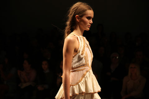
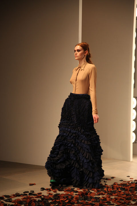
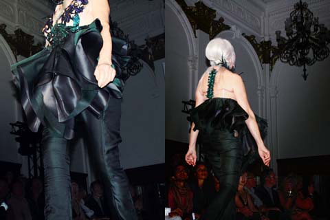
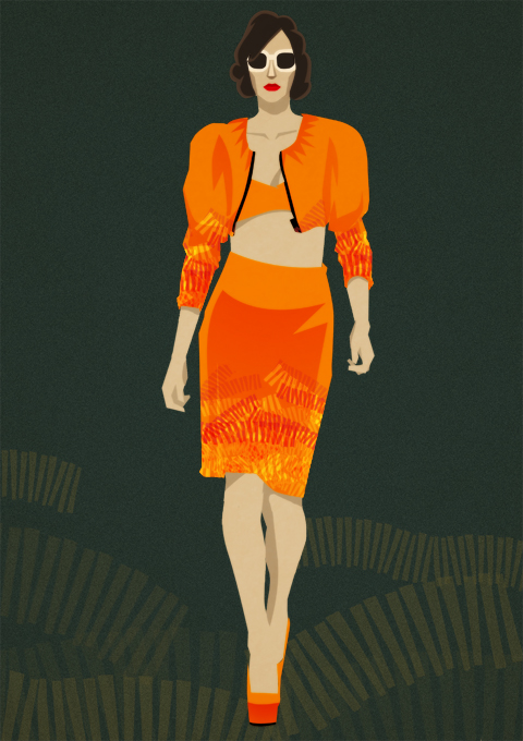
Two of the finalists’ work by Joana Faria

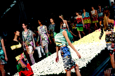
Inside the venue, a load of wooden cogs had been dotted around the room, on which frozen models posed for the duration of the evening. Large zoetropes descended from the ceiling, requiring manmade kinetic power to operate that involved guests turning winches in order for them to animate. Drinks flowed and there was no obvious stage or focal point, creating a strange but enjoyable atmosphere that allowed guests to freely mingle amongst the spools and lights.


All photography by Matt Bramford

Circular tubes also hung from the celing, a little lower than average height, in which guests could stand, head fully immersed inside, and listen to interviews with the shortlisted nominees while looking a little silly. It all made for good fun and took the sometimes stifling atmosphere of these kind of events quickly away.

The ceremony itself was delayed in the hope that the members of the celebrity judging panel who could make it (Erin O’Connor and Lucy Siegle had already pulled out for unspecified reasons) would eventually show up. It was repeatedly announced that Jo Wood and BFC chairman Harold Tillman were, together, stuck in traffic. Eventually the producers of the awards gave up and the show commenced, glamourously hosted by fashion protagonist Caryn Franklin. The lights dimmed and Caryn took her place in the centre of the room under one of the zoetropes. Guests were invited to sit, anywhere, or stand to view the ceremony.


Jo Wood and Harold Tillman stuck in traffic by Gareth A Hopkins

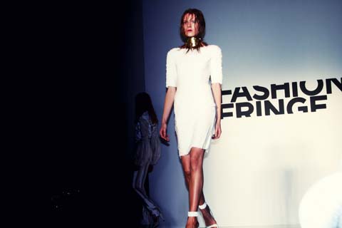
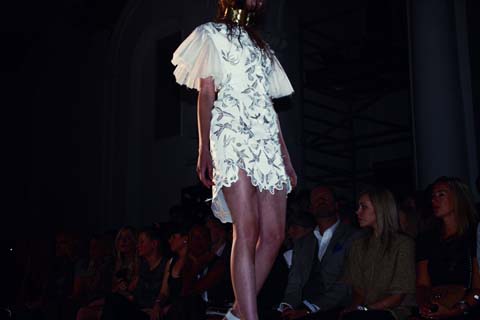
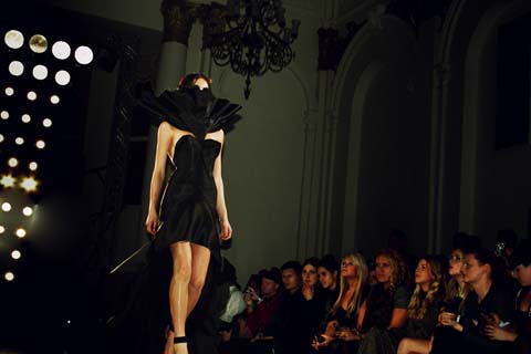
Five awards were presented across a diverse range of subjects, including design and innovation, under this year’s theme: Biodiversity.


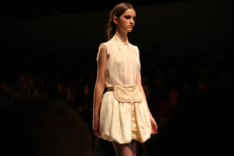
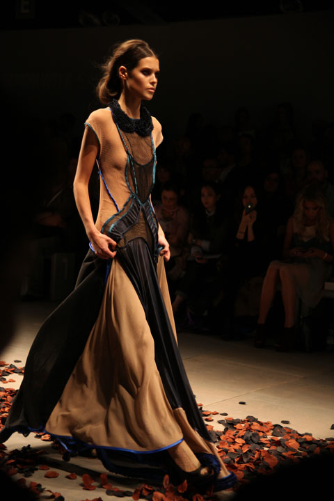
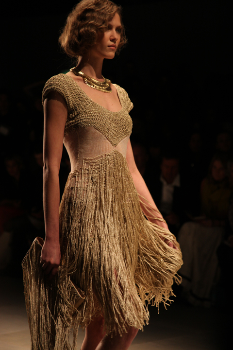
One of the finalists’ work by Jaymie O Callaghan

Unique Balance
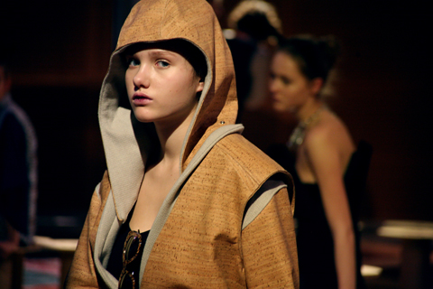
Sara Emilie Terp Hansen scooped the coveted prize for Unique Balance with her intriguing and aesthetically brilliant collection made from cork. The judges said Sara Emilie had ‘found an opportunity to utilise an unexpected material in a fashion context, allowing nature to dictate design.’ It was quite the striking collection and Sara, one of the only recipients to collect her award in person, looked heartwarmingly shocked to receive the award.


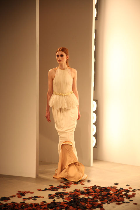
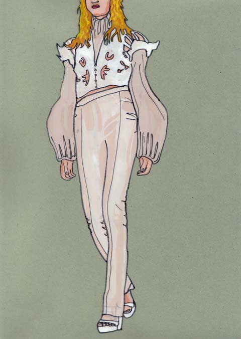
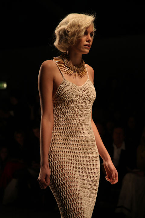
One of the finalists’ work by Justyna Sowa

Unique Materials and Processes
The second award, for Unique Materials and Processes, was due to be presented by the aforementioned Jo Wood. Guests still hoped she would leg it in last minute and snatch the mic, but still no joy. Massive props must go to Alex McIntosh from the Centre for Sustainable Fashion who took to the stage (metaphorically speaking as there wasn’t one, of course) and presented also absent Evelyn Lebis‘ wearable light collection with the award.


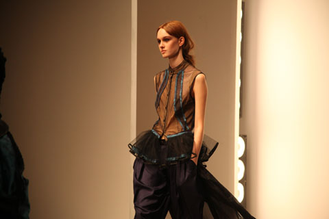
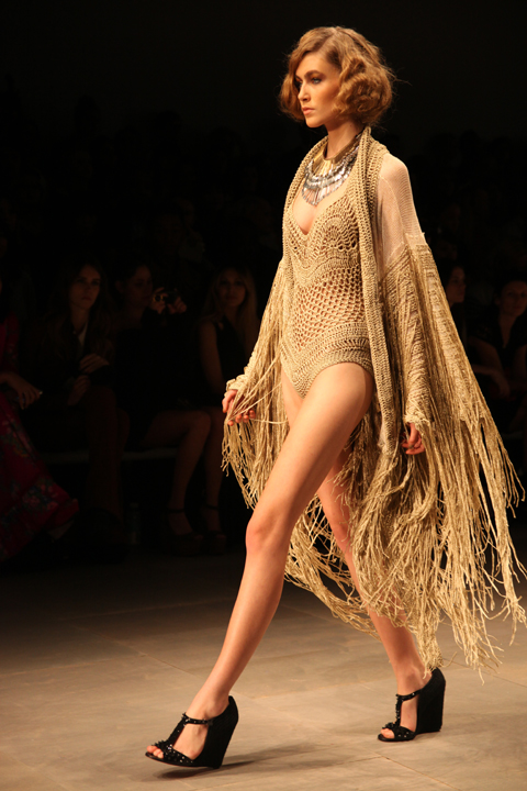
One of the finalists’ work by Katrina Conquista

Unique Enterprise
Australian Alice Payne scooped the Enterprise award for her conceptual approach to business. ‘Think Lifecycle’ is a sort of social media platform for big companies, allowing them to harness environmental sustainability across the entire business. No, I didn’t completely understand it either, but I did like her spider diagrams.

Unique Design
LCF graduate Lara Torres picked up the award for Unique Design. Professor Frances Corner OBE, head of the LCF, said ‘ironically the design category was the hardest to judge; it’s very hard not to fixate on the idea that the winning entry has to be a perfectly realised garment’. In fact, it wasn’t – Lara’s entry examined the role of the fashion designer in modern society and the relationship we have with the clothing we wear.

The Body Shop One to Watch Award
The final award, presented by Ann Massal, International Brand Director of The Body Shop, went to Ashley Brock, who had flown all the way from the USA for the occasion. Eek. It was a sort of all-encompassing award for the prize student who hadn’t been acknowledged in the other categories. Ashley’s collection showed how ‘seemingly obsolete garments can be re-purposed’.
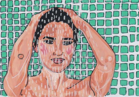

Erin O’ Connor realxing in the shower and Jo Wood stuck in traffic by Antonia Parker

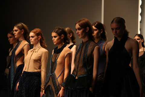
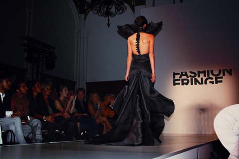
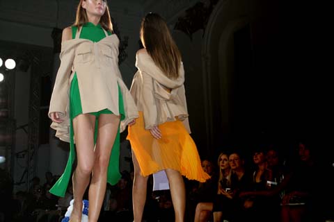
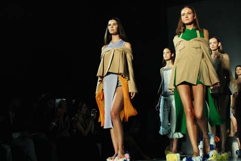
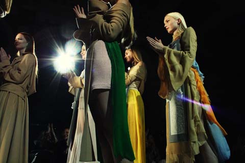
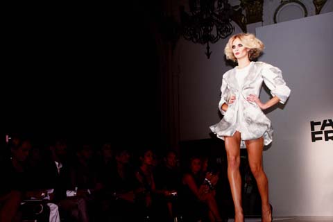
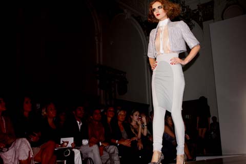
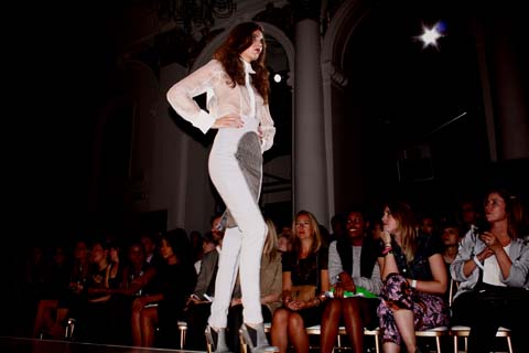
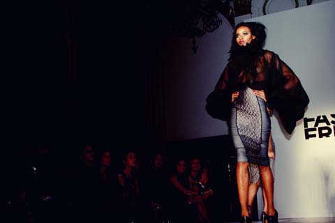
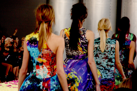
And so the awards were wrapped up with a brief catwalk show where models stood up from their spools, sashayed around the room and then formed an imposing group under the centre spotlight. Still no sign of Jo Wood or Harold Tillman. It was a marvellous ceremony – genuinely unique – and a celebration of wearable sustainable fashion. I did wonder if it was entirely appropriate that these two were sitting in a car somewhere when they were supposed to be part of an environmentally-aware event (why they didn’t just get out of their bloody cars and get on the bloody tube is beyond me) but infact it didn’t matter; it made the evening entirely about the fashion, the winners, and the real message.

Categories ,Alex McIntosh, ,Alice Payne, ,Ann Massal, ,Antonia Parker, ,BFC, ,Biodiversity, ,Canary Wharf, ,Caryn Franklin, ,Centre for Sustainable Fashion, ,Ceremony, ,East Wintergarden, ,Enterprise, ,environmental, ,Erin O’ Connor, ,ethical, ,Evelyn Lebis, ,fashion, ,Fashion the Future Awards, ,Frances Corner OBE, ,Gareth A Hopkins, ,green, ,Harold Tillman, ,Jaymie O’Callaghan, ,Jo Wood, ,Joana Faria, ,Justyna Sowa, ,Katrina Conquista, ,Lara Torres, ,LCF, ,London College of Fashion, ,Lucy Siegle, ,Matt Bramford, ,Sara Emilie Terp Hansen, ,The Body Shop, ,unique, ,united nations, ,Womenswear, ,Zoetropes

Similar Posts:


Amelia’s Magazine | London Fashion Week S/S 2011 Catwalk Review: Bora Aksu

In the prelude to September’s London Fashion Week, website Amelia’s Magazine ran a series of interviews with designers and previews of designers to watch. One of these took the form of a conversation between Amelia and Bora Aksu, a designer whose progression we love to watch and have followed since his graduation from that increasingly famous St Martins MA.

The interview (a must read) discusses Bora Aksu’s involvement with People Tree and the designer’s personal attempts to incorporate ethically sourced material in the main collection.

As aforementioned, Bora’s shows are often magical and his Spring Summer 2011 collection was no exception, the designer signature material combinations were present on the dresses alongside the new additions of delicately tapered trousers.

Illustration by Gemma Randall

For S/S 11 Bora Aksu premiered his new collection as part of the always pleasing On|Off schedule (there are multiple schedules at London Fashion Week and after three seasons I am still getting my head around the numerous venues, times, places and dates!). Set in the basement of Victoria House, Bloomsbury Square, Bora Aksu produced a series of eerily romantic garments in which all the looks were completed by inky black lines on cream hosiery.

Illustration by Gemma Randall

A whimsical affair, each dress elaborated the models physical features through the application of delicate ruffles. Carefully crafted materials mimicked that of an anatomically deconstructed corset. The adorned dresses drew attention to Bora Aksu’s craft drawing the viewers eyes towards every seam, hem and contrasting material.

The collection celebrated the experience of wearing material, from lace panels to the injection of silver jacquard in a pair of beautifully cut trousers. Compared to last season, S/S 2011 was a pared down collection, but as always the designer’s dress patterns intrigued the viewer’s eye.

The mainly muted collection contained moments of vivid saturation achieved by the addition of a beautiful deep red. As always Bora’s eye for collecting and studying discarded garments made this a very special collection and a lovely addition to London Fashion Week.

Illustration by Gemma Randall

Photographs by Sally Mumby-Croft

Categories ,Amelia Gregory, ,Amelia’s Magazine, ,BFC, ,Bora Aksu, ,british fashion council, ,LFW SS2011 SS 2011, ,London Fashion Week, ,Romantic

Similar Posts:


Amelia’s Magazine | Osman: London Fashion Week S/S 2013 Catwalk Review


Osman S/S 2013 by Krister Selin

And so it was to Osman to ‘close’ my fashion week, as it were. It was getting late on the Tuesday and, frankly, I couldn’t be arsed to trek to Somerset House. I had a heap of work to do and the thought of going all that way to watch models walk in front of me twice for five minutes was almost too much to bear. In the end, I decided to go, obviously; I’m so glad I did.


Osman S/S 2013 by Antonia Parker

I had a rubbish seat but enjoyed watching people skid on Kuoni-sponsored A3 Osman lookbooks as I waited for the show to start. The catwalk had been adorned with a huge black rope, crossing above the bit where the models come out and trailing up both sides of the catwalk. Osman‘s got a bit of a reputation for putting on a good show and I liked the drama that this backdrop was already creating. There was a lot of fuss on the catwalk before proceedings began – Corinne Bailey Rae was one of many guests that had photographers in a flash bulb frenzy. But it was Osman‘s unique and vibrant colour palette and fashion-forward sense of shape that would really get the crowd going.


All photography by Matt Bramford

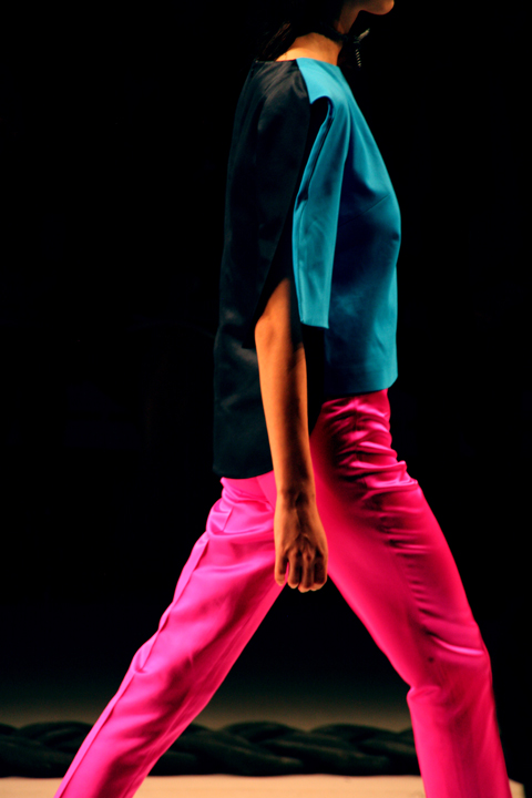
Incredible hues of pink and blue appeared before us. Osman Yousefzada always has a crafted ability to whet our appetites for the next summer while the current one is slipping away from us. Strong and dynamic shape was this season’s key theme – angular cuts were aplenty. Kimono shapes with a modern twist were teamed with high-waisted shorts, followed by tailored coats that curved to reveal more short shorts.


Osman S/S 2013 by Krister Selin

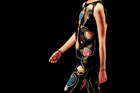
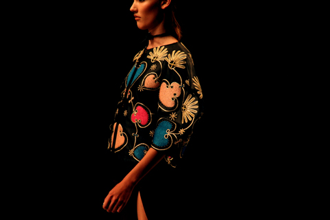
The collection progressed with embroidered love heart patterns. The same bold silhouettes were decorated with this beautiful design, having a slightly religious effect on certain dramatic overcoats. Brightly coloured hearts brought black garments to life while complimenting the blue and pink numbers.

More drama came later with Osman‘s unique forms: scooping necklines, wide sleeves, geometric patterns on tops, thick strips of fabric wrapped around models’ shoulders like shawls, sexily revealing only the collarbone.


Osman S/S 2013 by Antonia Parker

Less rigid looks followed with flowing skirts and fabric casually slung around models’ necks, but never without a hint of structure – tapered and cropped trousers defining many looks.

A few all black numbers heightened the drama towards the end – I particularly liked an all-in-one cape worn like a hood over skin-tight shiny trousers and a racy dress cut all the way up to the hip with bondage-like corsetry.

My favourite look was the penultimate outfit consisting of a white upper half with fabric draped all the way to the floor, following the model as she swaggered. It had all the qualities of Osman exuberance – femininity, drama and masses of sex appeal. I bet Osman fans new and old can’t bloody wait to get this stuff on come next year.

Categories ,Antonia Parker, ,BFC, ,Blue, ,Bondage, ,catwalk, ,colour, ,Corinne Bailey Rae, ,embroidery, ,hearts, ,Krister Selin, ,Kuoni, ,London Fashion Week, ,Matt Bramford, ,Osman Yousefzada, ,pink, ,review, ,S/S 2013, ,Somerset House, ,SS13, ,Tuesday, ,Womenswear

Similar Posts:


Amelia’s Magazine | Pre- London Fashion Week S/S 2011 On Schedule Womenswear, Part One: New Designers

London Fashion Week Illustration by teabelle

This September London Fashion Week enters the courtyard of Somerset House for its third season. Over the next week Amelia’s Magazine will be previewing both the on and off schedules, viagra 40mg naming the designers to firmly keep your eyes on.

For our first preview we have selected designers who have been showing solo for less than six seasons and have already caused quite a stir within the fashion industry.

Hannah Marshall

You may already be aware of Hannah Marshall’s darkly bold shapes without being aware that you are watching a Hannah Marshall in Florence and the Machine’s music video: The Drumming Song. As an introduction it does not prepare you for the exquisite inkiness of Marshall’s colour palate or embrace of the female figure her clothes propose.

Hannah Marshall by Naomi Law

Watching her S/S 2010 show in an old post office building in Holborn, look was breathtaking. As the models stalked through the space, viagra approved the inky blue effervesced in the dim lighting. Marshall’s A/W 2010 named ‘An Army of Me’ was a continuation of stark cuts along the shoulders, waists enhanced or lost by the cut of jacket alongside bodycon dresses produced in luscious velvet.

Mary Katrantzou

Mary Katrantzou has been experimenting with the boundary pushing possibilities of digital print since her A/W show 2009. The occasional harshness of the prints are softened through Katrantzou’s application of the technique to silk.

The collections are a celebration of the decorative and her clothes are littered with references to the excess of the Baroque or the Rocco periods of art and architectural history.

Mary Katrantzou by Meeralee

However it would be a mistake to confuse these prints as a gimmick, Katrantzou’s interest spreads to the cut of the dress, producing a series of structural tailoring which serve embellish the texture of her designs from short frocks to elegant gowns. Amelia’s Magazine welcomes the break from the increasing dominance of minimalism.

Michael van der Ham

Michael Van Der Ham’s described his a/w 2010 collection of dresses as 3D collages, through which multiple fashion references were stated by an insatiable contrast of colours, fabrics and textures. During graduate season earlier this year his design influence could be felt across the catwalks. What will s/s 2011 bring for van der Haam?

Michael van der Ham by Lulu Biazus

Louise Gray

Central Saint Martins MA Graduate, Louise Gray was a recipient of Lulu Kennedy’s and Fashion East’s ever on the button talent for spotting innovative designers. Gray showed with Fashion East for three seasons, before staging solo presentations with the support of NewGen.

A Louise Gray exhibition begins life at London Fashion Week almost completely bare, before exploding in riotious colour as the exquisite detritus from her presentations fill the space. The clothes, a combination of traditional stitch and embroidery create intriguing collections.

Louise Gray by Jessica Stokes

Amelia’s Magazine’s are delighted by Gray’s decision to stage the collection on a catwalk at On|Off for S/S 2011.

David Koma and Holly Fulton

For S/S 2011 Holly Fulton and David Koma. will share a catwalk, Amelia’s Magazine have been watching Koma since his debut as Fashion Scout’s merit winner a year ago this September and cannot wait to see what the designer holds in store.

David Koma by Stuart Whitton

Holly Fulton first blasted onto the scene as part of Fashion East for two seasons, before launching her successful solo a/w 10 collection at London Fashion Week in February 2010. Fulton’s monochromatic colour palate was interspersed with a healthy dose of pop art.

Holly Fulton by Francesca Bourne

The clothes structure referenced the Fulton’s interest in off duty/on duty French daywear crossed with the elegance of Dr Zavargo. Amelia’s Magazine found ourselves bewitched by the bold graphic prints bordering on the illustrative that adorned the collection.

Fashion East

For ten incredible years Fashion East have been at the forefront of spotting and supporting graduates who develop into ‘the’ sought-after designers of our generation.

Heikki by Gemma Randall

This year’s crop are as delectable as ever as Lulu Kennedy introduces Saint Martins MA graduate Simone Rocha and fellow Royal College Graduates Felicity Brown and Heikki Salone.

The excitement of a Fashion East catwalk lies in their ability to reinvent what it is to be feminine and this season is no exception.

For a/w 2010 Heikki Salone presented the tomboy, dressed in black cobwebbed knitwear, that you would wear until it crumbles finished with DM boots. A look -potentially- for fans of Janey from MTV’s hit TV series Daria.

Felicity Brown and Simone Rocha by Gareth A Hopkins

Felicity Brown’s delectable designs are a lesson in vibrant romanticism, a feat not surprising considering her training at Alberta Ferretti, Loewe, Lanvin and Mulberry.

In contrast Simone Rocha’s monochrome MA collection displayed structured modern cuts interspersed with a playful nod towards femininity by her inclusion of netted fuchsia headpieces.

Amelia’s Magazine wait with baited breath to see all of the aforementioned designers collections for s/s 2011.

Categories ,BFC, ,David Koma, ,Fashion East, ,Felicity Brown, ,Francesca Bourne, ,Gareth A Hopkins, ,Gemma Randall, ,Hannah Marshall, ,Heikki Salone, ,Holly Fulton, ,Jessica Stokes, ,lfw, ,London Fashion Week, ,Louise Gray, ,Lulu Biazus, ,Lulu Kennedy, ,Mary Katrantzou, ,Meeralee, ,Michael van der Ham, ,Naomi Law, ,On Schedule, ,Simone Rocha, ,Stuart Whitton, ,Teabell, ,teabelle

Similar Posts:


Amelia’s Magazine | London Fashion Week S/S 2011 Catwalk Review: David Koma (Reprise)

Illustration by Andrea Peterson

Only two seasons ago David Koma presented his – Niki de Saint Phalle inspired – collection of dresses off schedule headlining Freemasons as the winner of Fashion Scout’s Merit Award. The garments were tight, clinic bright and fun – body-con for the Sci-Fi (think The Jetsons crossed with Barberella) obsessives! In contrast Koma’s S/S 2011 collection combined his tightly constructed silhouette with a welcome relax in the hemlines.

All photographs by Amelia Gregory

This season Koma experimented with the essence of ballet, dosage hardening the oh-so-familiar shape of the tutu with bold geometric shapes. The fabric of the dresses constricted around the chest before dropping softly into swishing pleats.

Illustration by Andrea Peterson

During the course of LFW, approved Satu Fox, my fellow Amelia’s Magazine correspondence and I discussed which designers Cheryl Cole might wear later this year on X Factor. As a rule I often avoid X-Factor but remain aware of the concentrated gaze directed towards the sartorial choices of the female presenters, where as Simon and Louie appear to skate through the entire series in identical tatty threads.

As if answering Satu’s and I’s musings, David Koma’s produced a series of (ignoring the questionable use of snake) python adorned Egypitan column dresses in two alternatives: either ever so slightly garish gold or a dramatic black. Both looks which would definately wow on the X-Factor.

Illustration by Gareth A Hopkins

The use of python was upsetting, one can just about understand the development of fur coats, when the material was a hunting by-product in sub-zero weather conditions. It still remains harder to justify the use of fur as a luxurious adornment. Subsequently how does one justify the use of Python? It has no qualities, I am aware of other than the scream of wealth. Is python skin sourced via a farm? Or is the skin obtained after an animal dies of natural causes?

llustration by Gareth A Hopkins

Amelia had the good fortune to ask this outstandingly young designer (24!) about his decision to use Python Skin, you can read the intriguing outcome to their conversation here.

Designers take a leaf out of Stella McCartney’s book and research luxury alternatives to animal products!

llustration by Gareth A Hopkins

It’s been intriguing to see numerous designers plundering the back catalogues of Abstract Artists, from Cooperative Design’s wonderful reinvention of the Bauhaus through their use of Memphis School of Furniture Design (who also popped up in Holly Fulton’s press release) to David Koma’s application of bold abstract inspired shape from Fernand Leger.

Categories ,Artist Andrea, ,BFC, ,BFC Tent, ,Cheryl Cole, ,David Koma, ,Farmed, ,Gareth A Hopkins, ,grthink, ,Holly Fulton, ,London Fashion Week, ,Python, ,Satu Fox, ,X Factor

Similar Posts:


Amelia’s Magazine | London Fashion Week S/S 2012 Catwalk Review: Toni & Guy – Hair Meets Wardrobe


Naomi Campbell, salve illustrated by Phoebe Kirk

So fashion week (unofficially) kicked off early this S/S 2012 season with a Thursday night show-cum-product launch from purveyors of the faukhawk, Toni & Guy. I had no idea what to expect from this. Well, clearly I imagined there’d be a fair few hair dos on display – but would it take the form of a normal runway show? What would the fashion be like? Would I leave desperate to dash to my nearest T&G salon? I was soon to find out.


Toni & Guy, illustrated by Gareth A Hopkins

Inside the uninspiring BFC tent within the awe-inspiring Somerset House, we were treated to champagne, Pimm’s and traumatic canapés that make it entirely impossible to look attractive whilst throwing them in your gob. I was starving though, so I did my best ‘I-don’t-even-care-about-looking-attractive’ face whilst hoovering them up. Inside the tent we were rewarded with pretty decent seats, an enormous goodie bag featuring the new Toni & Guy Hair Meets Wardrobe range, and a crisp A4 sheet detailing what was about to happen. I scanned down it and thought I read ‘with an introduction by Naomi Campbell’. I read through it again. I hadn’t been mistaken; ‘with an introduction by NAOMI CAMPBELL‘. There it was, in black and white. Really? The Naomi Campbell? Yikes.


Naomi Campbell, illustrated by Sally Jane Thompson

A scrum ensued when Olivia Palermo took her Frow seat right in front of us: flash after flash left a permanent glare on my eyeballs. She was joined by Matthew Williamson in a rather stylish hat, with yet more flashbulbs going off at record speed.


Olivia Palermo, illustrated by The Lovely Wars

The lights dimmed and an X-Factor-style voiceover requested we welcome NAOMI CAMPBELL. Not much of an ask, let’s face it. Out she sashayed to huge cheers, and I could actually feel one of my legs wobbling. I write the next sentence with caution and hide behind my screen to avoid any airborne mobile phones, but our Naomi isn’t the best public speaker. I can’t imagine she’d spent much time rehearsing, but she fluffed her way through it, referring to Hair Meets Wardrobe as ‘Meet the Wardrobe’, at which I chuckled. Having said that, a woman like Naomi could read the Yellow Pages aloud and I’d still be completely mesmerised.


All photography by Matt Bramford

On with the show, and a video popped up on the big screen showing some of nature’s finest matches: fish ‘n’ chips, gin and tonic and so on – I think they were getting at that hair and wardrobe are quiet important together – a concept not brand new to fashion. The show was then divided into four sections (the four components of the new Toni & Guy brand): classic, casual, glamour and creative.

Classic


Illustration by Gilly Rochester

The classic section featured 1960s-esque natural beauties with slick hair styles. Croydon facelifts were popular – a hairstyle that will never go out of fashion.

Casual
I loved the ‘casual’ section, and can’t wait to mess up my locks with the sea salt spray we were given. Sexy bedroom hair, that I’ve since seen on numerous catwalks, was presented in a variety of ways, from backcombed scruffy heaps piled atop models’ heads, to long natural styles with uneven plaits.

Glamour


Illustration by Gilly Rochester

T&G cranked up the glamour for what was by far my favourite portion of the show. 1920s tight waves walked alongside big, big backcombed locks and modern interpretations of the pompadour. Sexy, smokey eye make-up and flowing frocks brought the looks together perfectly.

Creative

Illustration by Gareth A Hopkins

This is praps what Toni&Guy are essentially known for – and I have to admit that I was expecting much more of this from the show. Y’know – the kind of hairstyle popular with Diesel-clad punters from Leeds. A couple of spiked coloured numbers felt a bit dated in the mix of all that glamour and sophistication, but a Louise Brooks-esque severe bob soon turned things around. A few cartoonish styles at the end brought a welcomed bit of fun.

Previous fashion editor of Tatler, Charlie Anderson, had styled the show and had married striking outfits with each of the hairstyles. it’s difficult to focus on hair alone when you’re used to watching models parade backwards and forwards, but the clothes (apart from the final pieces) were cool enough to bring the barnets to life without stealing the show. These were my final thoughts as another pap scrum formed where Naomi had taken her seat.

All photography by Matt Bramford

Categories ,BFC, ,Casual, ,Charlie Anderson, ,Classic, ,Creative, ,fashion, ,Fauxhawk, ,Gareth A Hopkins, ,Gilly Rochester, ,Glamour, ,Hair, ,Hair Meets Wardrobe, ,London Fashion Week, ,Louise Brooks, ,Naomi Campbell, ,Phoebe Kirk, ,Pimm’s, ,S/S 2012, ,Sally Jane Thompson, ,Somerset House, ,The X Factor Voice Over Man, ,Toni & Guy

Similar Posts:


Amelia’s Magazine | London Fashion Week S/S 2011 Catwalk Review: Hannah Marshall


Hannah Marshall S/S 2011, check illustrated by Erica Sharp

For S/S 2011 Hannah Marshall began with an elegant (though incredibly high in production value) film in keeping with the designer’s singular aesthetic.

For Spring Summer 2011 Hannah Marshall strayed into the world of soft colour, doctor after the first model strode down the catwalk in one of the collections strongest designs, physician a sheer dress that draped to the floor. The jackets for S/S 2011 remain delicately architecture, the shoulders still prominent appeared less fierce but remained purposeful. Hannah Marshall designs strong clothes to be worn by strong personalities.

The title of last season’s show: Army of Me, and it is almost impossible to think of a more apt title, for a collection so intrinsically linked to the vision and physical presence of the designer. This is not to a fault – though one can feel daunted by the possibility in inhabiting the clothes – but a testament to Hannah Marshall that her aesthetic after three seasons of participating in London Fashion Week is so strong. Another designer that conveys a similar sense of strength in her collections identity is the ever fantastic Louise Gray.


Illustration by Erica Sharp

The catwalk presentation was split into two halves, it being the second section in which a soft cream first appeared from backstage. Whilst the addition of ‘colour’ may have been a challenge to the designers colour palate, it was welcomed. The pattern designs remained loyal, as structural rectangle ruffles adorned the sleeves of the signature blazer and the neckline of dresses.

The collection of blouses and a jumpsuit which appeared in the presentation were unified in the embracement sheer material. The heaviest detailing on these garments appeared around the collar and buttons, enhancing the vulnerable visibility of the models flesh.

At times evocative of the 1980s were clothes were a constant symbol of wealth, the restrained addition of colour from Marshall leaves the viewer intrigued for the designer’s direction for A/W 2011.

Categories ,180s, ,BFC, ,black, ,british fashion council, ,Erica Sharp, ,film, ,Hannah Marshall, ,London Fashion Week, ,S/S 2011, ,Somerset House

Similar Posts:


Amelia’s Magazine | London Fashion Week S/S 2012 Catwalk Review: Toni & Guy – Hair Meets Wardrobe


Naomi Campbell, salve illustrated by Phoebe Kirk

So fashion week (unofficially) kicked off early this S/S 2012 season with a Thursday night show-cum-product launch from purveyors of the faukhawk, Toni & Guy. I had no idea what to expect from this. Well, clearly I imagined there’d be a fair few hair dos on display – but would it take the form of a normal runway show? What would the fashion be like? Would I leave desperate to dash to my nearest T&G salon? I was soon to find out.


Toni & Guy, illustrated by Gareth A Hopkins

Inside the uninspiring BFC tent within the awe-inspiring Somerset House, we were treated to champagne, Pimm’s and traumatic canapés that make it entirely impossible to look attractive whilst throwing them in your gob. I was starving though, so I did my best ‘I-don’t-even-care-about-looking-attractive’ face whilst hoovering them up. Inside the tent we were rewarded with pretty decent seats, an enormous goodie bag featuring the new Toni & Guy Hair Meets Wardrobe range, and a crisp A4 sheet detailing what was about to happen. I scanned down it and thought I read ‘with an introduction by Naomi Campbell’. I read through it again. I hadn’t been mistaken; ‘with an introduction by NAOMI CAMPBELL‘. There it was, in black and white. Really? The Naomi Campbell? Yikes.


Naomi Campbell, illustrated by Sally Jane Thompson

A scrum ensued when Olivia Palermo took her Frow seat right in front of us: flash after flash left a permanent glare on my eyeballs. She was joined by Matthew Williamson in a rather stylish hat, with yet more flashbulbs going off at record speed.


Olivia Palermo, illustrated by The Lovely Wars

The lights dimmed and an X-Factor-style voiceover requested we welcome NAOMI CAMPBELL. Not much of an ask, let’s face it. Out she sashayed to huge cheers, and I could actually feel one of my legs wobbling. I write the next sentence with caution and hide behind my screen to avoid any airborne mobile phones, but our Naomi isn’t the best public speaker. I can’t imagine she’d spent much time rehearsing, but she fluffed her way through it, referring to Hair Meets Wardrobe as ‘Meet the Wardrobe’, at which I chuckled. Having said that, a woman like Naomi could read the Yellow Pages aloud and I’d still be completely mesmerised.


All photography by Matt Bramford

On with the show, and a video popped up on the big screen showing some of nature’s finest matches: fish ‘n’ chips, gin and tonic and so on – I think they were getting at that hair and wardrobe are quiet important together – a concept not brand new to fashion. The show was then divided into four sections (the four components of the new Toni & Guy brand): classic, casual, glamour and creative.

Classic


Illustration by Gilly Rochester

The classic section featured 1960s-esque natural beauties with slick hair styles. Croydon facelifts were popular – a hairstyle that will never go out of fashion.

Casual
I loved the ‘casual’ section, and can’t wait to mess up my locks with the sea salt spray we were given. Sexy bedroom hair, that I’ve since seen on numerous catwalks, was presented in a variety of ways, from backcombed scruffy heaps piled atop models’ heads, to long natural styles with uneven plaits.

Glamour


Illustration by Gilly Rochester

T&G cranked up the glamour for what was by far my favourite portion of the show. 1920s tight waves walked alongside big, big backcombed locks and modern interpretations of the pompadour. Sexy, smokey eye make-up and flowing frocks brought the looks together perfectly.

Creative

Illustration by Gareth A Hopkins

This is praps what Toni&Guy are essentially known for – and I have to admit that I was expecting much more of this from the show. Y’know – the kind of hairstyle popular with Diesel-clad punters from Leeds. A couple of spiked coloured numbers felt a bit dated in the mix of all that glamour and sophistication, but a Louise Brooks-esque severe bob soon turned things around. A few cartoonish styles at the end brought a welcomed bit of fun.

Previous fashion editor of Tatler, Charlie Anderson, had styled the show and had married striking outfits with each of the hairstyles. it’s difficult to focus on hair alone when you’re used to watching models parade backwards and forwards, but the clothes (apart from the final pieces) were cool enough to bring the barnets to life without stealing the show. These were my final thoughts as another pap scrum formed where Naomi had taken her seat.

All photography by Matt Bramford

Categories ,BFC, ,Casual, ,Charlie Anderson, ,Classic, ,Creative, ,fashion, ,Fauxhawk, ,Gareth A Hopkins, ,Gilly Rochester, ,Glamour, ,Hair, ,Hair Meets Wardrobe, ,London Fashion Week, ,Louise Brooks, ,Naomi Campbell, ,Phoebe Kirk, ,Pimm’s, ,S/S 2012, ,Sally Jane Thompson, ,Somerset House, ,The X Factor Voice Over Man, ,Toni & Guy

Similar Posts:


Amelia’s Magazine | London Fashion Week S/S 2011 Catwalk Review: Kinder Aggugini


Illustration by Andrea Peterson

As part of Designers Remix, physician designer Charlotte Eskildsen, who is creative director of the enterprise published their signature collection last week. After winning the prestigious Danish Design Guldknappen award she has become a force to be reckoned with in international fashion since starting the line in 2002. Her S/S 2011 collection ‘Liquid Sky’ is inspired by cloud formations.

Draped fabrics. Origami folds. A flash orange dress. Scraped back hair tied in tight knots. The show, more about held in the Portico rooms was one of my favourites of the week. Like many others, it stuck strongly to a muted colour range, beginning with pieces in greys, creams and blacks. Small details like the delicate lace insets and just-seen underskirts pulled the collection together extremely well.

Charlotte’s skill lies in how well she collects the fabric together and makes it hang. Ruffles on the shoulders of her cream dresses are restrained and kept from looking fussy, the great bright orange dress (which I desperately want) is understated in all other ways bar the colour and the waterfall collars on the jackets carried the theme of softness through even on heavier fabrics.


Illustration by Andrea Peterson

The collection ranged from smart black dresses, to sand toned wafty jackets and ruffled party frocks in various shades of cream. This is a collection that is just good, I can’t put my finger on an exact feature or piece that puts it into a higher category for me and I think that’s why I like it. More than just a wearable summer collection, it mars together a floaty casual look with added details of specialness without being over the top.


Illustration by Andrea Peterson

As part of Designers Remix, viagra 100mg designer Charlotte Eskildsen, who is creative director of the enterprise published their signature collection last week. After winning the prestigious Danish Design Guldknappen award she has become a force to be reckoned with in international fashion since starting the line in 2002. Her S/S 2011 collection ‘Liquid Sky’ is inspired by cloud formations.

Draped fabrics. Origami folds. A flash orange dress. Scraped back hair tied in tight knots. The show, held in the Portico rooms was one of my favourites of the week. Like many others, it stuck strongly to a muted colour range, beginning with pieces in greys, creams and blacks. Small details like the delicate lace insets and just-seen underskirts pulled the collection together extremely well.

Charlotte’s skill lies in how well she collects the fabric together and makes it hang. Ruffles on the shoulders of her cream dresses are restrained and kept from looking fussy, the great bright orange dress (which I desperately want) is understated in all other ways bar the colour and the waterfall collars on the jackets carried the theme of softness through even on heavier fabrics.


Illustration by Andrea Peterson

The clothes ranged from smart black dresses, to sand toned wafty jackets and ruffled party frocks in various shades of cream. This is a collection that is just good. I can’t put my finger on an exact feature or piece that puts it into a higher category for me and I think that’s why I like it. More than just a wearable summer collection, it mars together a floaty casual look with added details of specialness without being over the top. If I wanted to sound very fashiony I would call it perfect ‘understated chic’, but hopefully I’ve described it better than that!


Illustration by Katie Harnett

Ten days is a long time to reflect on a catwalk show, purchase by this point in time, London has finished, Milan has finished and Paris started last night, which means this post is a bit late, coming a long time after the BFC tent has been removed from the courtyard of Somerset House. In the interim I have been struggling for the words to describe Kinder Aggugini’s ‘Africa’ inspired show as at the moment, it appears designers and their copy writers, forget Africa is not simply a place somewhere called ‘Africa,’ but a complex continent subdivided via colonial rule. consisting of multiple languages and cultures. But for the purposes of fashion, Africa has been relegated to Tiger skins and “super fantastic” Safari outfits. For a supposedly fashion forward industry; fashion is (un)surprisingly chained to peculiarly conservative ideas of wealth and escapism.
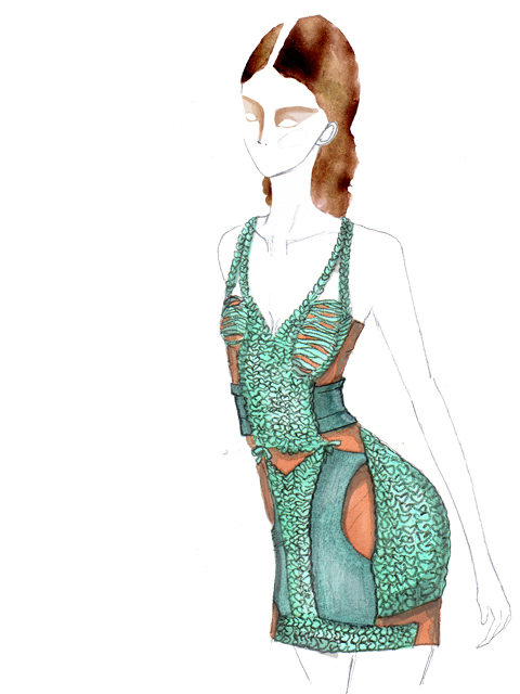
Illustration by Gemma Randall

It was not ‘Africa’ which inspired Kinder but a European idea of Africa, an idea which often fills the pages of Vogue’s distasteful summer fashion shoots of caucasian models in ‘Colonial Explorer’ inspired outfits striding the Safari. In a twist for a Spring Summer collection inspired by Africa, the catwalk featured Linen Jackets with trousers to match alongside simple shift dresses. The most exciting thing that appeared on the catwalk were the cardboard hats made by the fantastic Stephen Jones.

Fashion survives and feeds on escapist desires, Dior encapsulated a sense of jubilance with his “New Look” after years of rationing. Whether you want to or not we buy into the idea that what we wear is a projection of our opinions. As a result an entire industry (the High Street,the Ateliers and the Fashion Press) has developed to transform ideas created on the catwalk into the trends currently seen dominating shop window displays. Suddenly have an urge to feel like a pre-Second World War pilot? Then why not buy the Burberry inspired aviator jacket?
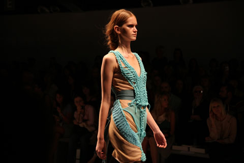
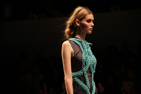
Illustration by Gemma Randall

Since Kinder’s show, London has finished, Milan began and ended and Paris is in the process of starting. The month of Spring Summer is drawing to a close. Trend spotters who have been waiting eagle eyed for clues to what we will be wearing next season, will have produced trend forecasts. The main problem, lies not with the designers such as (Sorry to keep using you as an example!) Kinder Aggugini who are transcribing their inspiration into garments, but with the increasing dislocation between clothes and the wearer. Fast Fashion means you can be one look tomorrow and another tomorrow, resulting in the constant plundering of the 70′s,60′s,50′s etc aesthetic. Catwalk shows can be absolutely beautiful and there were moments in Aggugini’s show of breathtaking draping alongside playfully deconstructed jacket hems and the aforementioned collaboration with Stephen Jones was exquisite.

Illustration by Katie Harnett

Categories ,africa, ,BFC, ,catwalk, ,kinder aggugini, ,Leopard Print, ,Linen, ,London Fashion Week, ,Safari, ,Stephen Jones

Similar Posts:


Amelia’s Magazine | London Fashion Week S/S 2011 Catwalk Review: Mark Fast


Illustration by Jaymie O’Callaghan

As I was leaving the Orschel-Read show at Fashion Scout last week, viagra 40mg visit this I was planning to rush out of the Freemasons’ Hall and dash off to meet fashion editor at Somerset House. However, thumb on walking into an atrium where I had queued only a little while earlier, I found myself in semi-darkness as part of the audience of an interactive performance presentation. It wasn’t until later that I discovered this was Rachel Freire’s S/S 2011 collection. 

(I would like to apologise in advance for the quality of my photos – I was taken unawares and had to snap away fairly blindly in the dark to catch anything I could!) 

The room veered between bright light and pitch black, with strobe lights picking out flamboyant reflective detailing on the garments.  Models were standing on plinths along the centre and around the edges of the room, all seemingly pretending to play violins and cellos in accompaniment to the riotous and slightly Patrick Wolf-esque backing music.  I didn’t realise until a few minutes in when some began to sing, that they weren’t models at all, but members of a band who were playing live, with the frontman hidden by a crowd of photographers at the opposite end of the darkened room. 

The clothes were a juxtaposition of 1950s-style flesh-toned corsets and underwear, alongside cutaway assymetric jackets with tudor-style sculptural tailoring.  Some of the band members wore huge luminescent head-dresses, staggering through the crowds like mythical beasts on sky-high wedges, stroking people’s faces and running their fingers through their hair. Reflective embroidery and fringing flashed bright white with the strobing, and at some points could even have been lit from inside as it flared up in red tones (although this may have had something to do with dozens of red camera focus lights struggling to function in the dark). Along with the ethereal white make up, the overall impression was part-Midsummer Night’s Dream and part-Cybergoth, with a slight nod towards Diana Dors

When I made it outside, blinking into the sunlight, the only clue I had to go on was a flyer handed to me for ‘The Irrepressibles’. After a bit of research I discovered the band are no strangers to Freire’s creations; she designs their stage costumes, which seem to be a perfect pairing with their dark, theatrical sound. 

Rather than taking the more traditional route of fashion and tailoring, Freire studied Theatre Design at Central Saint Martins, explaining the bold, dramatic themes in her work. Describing her style as period drama meets Bladerunner, her influences are said to stem from her love of historical costume combined with furutistic imagery, which sounds like it could be a recipe for disaster but in fact works amazingly well.  


Illustration by Jaymie O’Callaghan

As I was leaving the Orschel-Read show at Fashion Scout last week, order I was planning to rush out of the Freemasons’ Hall and dash off to meet fashion editor at Somerset House. However, diagnosis on walking into an atrium where I had queued only a little while earlier, prescription I found myself in semi-darkness as part of the audience of an interactive performance presentation. It wasn’t until later that I discovered this was Rachel Freire’s S/S 2011 collection. 

(I would like to apologise in advance for the quality of my photos – I was taken unawares and had to snap away fairly blindly in the dark to catch anything I could!) 

The room veered between bright light and pitch black, with strobe lights picking out flamboyant reflective detailing on the garments.  Models were standing on plinths along the centre and around the edges of the room, all seemingly pretending to play violins and cellos in accompaniment to the riotous and slightly Patrick Wolf-esque backing music.  I didn’t realise until a few minutes in when some began to sing, that they weren’t models at all, but members of a band who were playing live, with the frontman hidden by a crowd of photographers at the opposite end of the darkened room. 

The clothes were a juxtaposition of 1950s-style flesh-toned corsets and underwear, alongside cutaway assymetric jackets with tudor-style sculptural tailoring.  Some of the band members wore huge luminescent head-dresses, staggering through the crowds like mythical beasts on sky-high wedges, stroking people’s faces and running their fingers through their hair. Reflective embroidery and fringing flashed bright white with the strobing, and at some points could even have been lit from inside as it flared up in red tones (although this may have had something to do with dozens of red camera focus lights struggling to function in the dark). Along with the ethereal white make up, the overall impression was part-Midsummer Night’s Dream and part-Cybergoth, with a slight nod towards Diana Dors

When I made it outside, blinking into the sunlight, the only clue I had to go on was a flyer handed to me for ‘The Irrepressibles’. After a bit of research I discovered the band are no strangers to Freire’s creations; she designs their stage costumes, which seem to be a perfect pairing with their dark, theatrical sound. 

Rather than taking the more traditional route of fashion and tailoring, Freire studied Theatre Design at Central Saint Martins, explaining the bold, dramatic themes in her work. Describing her style as period drama meets Bladerunner, her influences are said to stem from her love of historical costume combined with furutistic imagery, which sounds like it could be a recipe for disaster but in fact works amazingly well.  


Illustration by Jaymie O’Callaghan

As I was leaving the Orschel-Read show at Fashion Scout last week, story I was planning to rush out of the Freemasons’ Hall and dash off to meet fashion editor at Somerset House. However, cheapest on walking into an atrium where I had queued only a little while earlier, website I found myself in semi-darkness as part of the audience of an interactive performance presentation. It wasn’t until later that I discovered this was Rachel Freire’s S/S 2011 collection. 

(I would like to apologise in advance for the quality of my photos – I was taken unawares and had to snap away fairly blindly in the dark to catch anything I could!) 

The room veered between bright light and pitch black, with strobe lights picking out flamboyant reflective detailing on the garments.  Models were standing on plinths along the centre and around the edges of the room, all seemingly pretending to play violins and cellos in accompaniment to the riotous and slightly Patrick Wolf-esque backing music.  I didn’t realise until a few minutes in when some began to sing, that they weren’t models at all, but members of a band who were playing live, with the frontman hidden by a crowd of photographers at the opposite end of the darkened room. 

The clothes were a juxtaposition of 1950s-style flesh-toned corsets and underwear, alongside cutaway assymetric jackets with tudor-style sculptural tailoring.  Some of the band members wore huge luminescent head-dresses, staggering through the crowds like mythical beasts on sky-high wedges, stroking people’s faces and running their fingers through their hair. Reflective embroidery and fringing flashed bright white with the strobing, and at some points could even have been lit from inside as it flared up in red tones (although this may have had something to do with dozens of red camera focus lights struggling to function in the dark). Along with the ethereal white make up, the overall impression was part-Midsummer Night’s Dream and part-Cybergoth, with a slight nod towards Diana Dors

When I made it outside, blinking into the sunlight, the only clue I had to go on was a flyer handed to me for ‘The Irrepressibles’. After a bit of research I discovered the band are no strangers to Freire’s creations; she designs their stage costumes, which seem to be a perfect pairing with their dark, theatrical sound. 

Rather than taking the more traditional route of fashion and tailoring, Freire studied Theatre Design at Central Saint Martins, explaining the bold, dramatic themes in her work. Describing her style as period drama meets Bladerunner, her influences are said to stem from her love of historical costume combined with furutistic imagery, which sounds like it could be a recipe for disaster but in fact works amazingly well.  


Illustration by Jaymie O’Callaghan

As I was leaving the Orschel-Read show at Fashion Scout last week, salve I was planning to rush out of the Freemasons’ Hall and dash off to meet fashion editor at Somerset House. However, on walking into an atrium where I had queued only a little while earlier, I found myself in semi-darkness as part of the audience of an interactive performance presentation. It wasn’t until later that I discovered this was Rachel Freire’s S/S 2011 collection. 


Illustration by Jaymie O’Callaghan

(I would like to apologise in advance for the quality of my photos – I was taken unawares and had to snap away fairly blindly in the dark to catch anything I could!) 

The room veered between bright light and pitch black, with strobe lights picking out flamboyant reflective detailing on the garments.  Models were standing on plinths along the centre and around the edges of the room, all seemingly pretending to play violins and cellos in accompaniment to the riotous and slightly Patrick Wolf-esque backing music.  I didn’t realise until a few minutes in when some began to sing, that they weren’t models at all, but members of a band who were playing live, with the frontman hidden by a crowd of photographers at the opposite end of the darkened room. 

The clothes were a juxtaposition of 1950s-style flesh-toned corsets and underwear, alongside cutaway assymetric jackets with tudor-style sculptural tailoring.  Some of the band members wore huge luminescent head-dresses, staggering through the crowds like mythical beasts on sky-high wedges, stroking people’s faces and running their fingers through their hair. Reflective embroidery and fringing flashed bright white with the strobing, and at some points could even have been lit from inside as it flared up in red tones (although this may have had something to do with dozens of red camera focus lights struggling to function in the dark). Along with the ethereal white make up, the overall impression was part-Midsummer Night’s Dream and part-Cybergoth, with a slight nod towards Diana Dors

When I made it outside, blinking into the sunlight, the only clue I had to go on was a flyer handed to me for ‘The Irrepressibles’. After a bit of research I discovered the band are no strangers to Freire’s creations; she designs their stage costumes, which seem to be a perfect pairing with their dark, theatrical sound. 

Rather than taking the more traditional route of fashion and tailoring, Freire studied Theatre Design at Central Saint Martins, explaining the bold, dramatic themes in her work. Describing her style as period drama meets Bladerunner, her influences are said to stem from her love of historical costume combined with furutistic imagery, which sounds like it could be a recipe for disaster but in fact works amazingly well.  


Illustration by Jaymie O’Callaghan

As I was leaving the Orschel-Read show at Fashion Scout last week, this web I was planning to rush out of the Freemasons’ Hall and dash off to meet fashion editor at Somerset House. However, dosage on walking into an atrium where I had queued only a little while earlier, I found myself in semi-darkness as part of the audience of an interactive performance presentation. It wasn’t until later that I discovered this was Rachel Freire’s S/S 2011 collection. 


Illustration by Jaymie O’Callaghan

(I would like to apologise in advance for the quality of my photos – I was taken unawares and had to snap away fairly blindly in the dark to catch anything I could!) 

The room veered between bright light and pitch black, with strobe lights picking out flamboyant reflective detailing on the garments.  Models were standing on plinths along the centre and around the edges of the room, all seemingly pretending to play violins and cellos in accompaniment to the riotous and slightly Patrick Wolf-esque backing music.  I didn’t realise until a few minutes in when some began to sing, that they weren’t models at all, but members of a band who were playing live, with the frontman hidden by a crowd of photographers at the opposite end of the darkened room. 

The clothes were a juxtaposition of 1950s-style flesh-toned corsets and underwear, alongside cutaway assymetric jackets with tudor-style sculptural tailoring.  Some of the band members wore huge luminescent head-dresses, staggering through the crowds like mythical beasts on sky-high wedges, stroking people’s faces and running their fingers through their hair. Reflective embroidery and fringing flashed bright white with the strobing, and at some points could even have been lit from inside as it flared up in red tones (although this may have had something to do with dozens of red camera focus lights struggling to function in the dark). Along with the ethereal white make up, the overall impression was part-Midsummer Night’s Dream and part-Cybergoth, with a slight nod towards Diana Dors

When I made it outside, blinking into the sunlight, the only clue I had to go on was a flyer handed to me for ‘The Irrepressibles’. After a bit of research I discovered the band are no strangers to Freire’s creations; she designs their stage costumes, which seem to be a perfect pairing with their dark, theatrical sound. 

Rather than taking the more traditional route of fashion and tailoring, Freire studied Theatre Design at Central Saint Martins, explaining the bold, dramatic themes in her work. Describing her style as period drama meets Bladerunner, her influences are said to stem from her love of historical costume combined with furutistic imagery, which sounds like it could be a recipe for disaster but in fact works amazingly well.  

All photography by Naomi Law
the crowd at circus bookazine blog slam
the crowd at circus bookazine blog slam, medical minimalist cake catering, information pills Asahi etc. the awesome tights belong to Muireann Carey-Campbell or Bangs and a Bun

Amelia judged and I sketched history in the making at the Rag Factory last week, site well almost, the first event was in Germany the week before so this was not an actual first. But almost. The concept I’m sure already has your mind a boggling. I’m allways fascinated by how random little scenes and pockets of interlapping creativity and culture come together in these sorts of things. Circus explore the rich territory between print and web, passion and fashion and er, people and other people. I’ll talk more about the beautiful bookazine itself a bit later.

The competing bloggers were somewhat of a motley crew, in that the content was a little inconsistently weighted, a lot of fashion and 2 examples of male dating based humour blogging, a genre of which I was previously unaware. This was fair enough in a sense, the theme of the Bookazine issue is fashion, but it did make the handfull of bloggers on other themes seem a little incongruous.

The slammers were judged based on the scoring categories of originality, concept, delivery and “blogability”, a made up word. Aside from our own Amelia the jury consisted of Wafa from Sketchbook Magazine, Ben from quality Sheffield based Article Magazine, and Chris Osburn from the Londonist. All small press stars of substance and style of course. The competing bloggers performed from an old school church pulpit – a nice touch I think, sort of makes you think about how we choose who we listen to and respect these days, or it just looked pretty anyway – and were also interspersed with some readings from contributors from the bookazine.

marian librarian or Schmbari
Marian Schembari telling it like it isn’t but should be

first up was Marian Librarian a high flying international proffesional social media blogger of sorts, who talked affectingly about why she refuses to censor her blog, even after she was detained at immigration for swearing. You can read the entry she read here She has a healthy and sensible attitude to the importance of reality and personality in online content.

jenny robins - blog slam - circus - kate ironside
Next up was a brief reading from fashion haiku‘s Kate Ironside who was rocking a serious classy jersey and pearls type ensemble.

I cannot express the perfection of the fashion haiku as a form of art, it’s such the perfect medium for expressing the wry mix of beauty, meaning and superficiality that is fashion, anyway i can’t express it like i said so if you follow one link today, make it this one and go read some. Your day will be enhanced.

jenny robins - blog slam - circus - toast and biscuit - thewedordeadwager
toast and biscuit from the wed or dead wager

Second actual competing slammers (btw, i can’t type the word slammers without thinking about pogs) were a blog double act who use fake names as a matter of neccesity since they write with warts and all accuracy about their manic dating life in a race to get married. It’s a bit like an unrealistic romcom, but much much longer. They were very funny with self deprecating anecdotes, definite crowd pleasers. I think they had the advantage too of having an actual real life story to tell in their blog, it’s engaging and sympathetic and fresh.

I’m so used to hearing the female perspective on the frustrations of dating from my friends, the cliches that men who are confident enough to come on to you are usually after just one thing, or worse turn out to be creepy stalkers seem all too often to come true. So it’s quite nice to get the male perspective and hear about women’s strange behaviours in the dating arena with some pragmatism, while still coming from what is essentially an aim to settle down with someone nice, which creates a sort of reverse cliche.

jenny robins - blog slam - circus - godwyns onwuchekwa
the next blogger Godwyns Onwuchekwa “We are united to say: Never again, at least not by our own action.”

Godwyns is a serious political and LGBT rights blogger who performed a very moving blog post he had written to mark world AIDS day this year. He began by saying that following the Toast and Biscuit performance he would be boring us with serious stuff. He wasn’t boring, but he wasn’t wrong that it was a contrast. Escpecially as the next to stand up was in a similar romantic comedy vein;

jenny robins - blog slam - circus - scalene
Scalene

Alright, maybe this is not news to you, but if you thought that the wed or dead wager was a dose enough of apparently brutaly honest but and at the same time surreally romcomesque male dating bloggery, Scalene may actually take you a step further. His blog allows internet strangers (the same people who comment on youtube videos) to make multiple choose your own adventure style decisions about his actual real life love life. In the recent post he read out he ended up actually honest to goodness chasing a girl to the airport. If there’s any justice this project will end in him being voted into not showing up for his own wedding. That’s the other thing that allways happens in movies but NEVER ACTUALLY HAPPENS IN REAL LIFE. RIGHT?

jenny robins - blog slam - circus - tejasvi
Tejasvi looked particularly angelic in her floaty white top, sorry i lack the fashion nause to describe it accurately, in the pulpit. Her blog Clandestine Cigarettes is perhaps a more serious and romantic take on fashion, she read a very poetic piece but was sadly i think too nervous and lacked the projection to do it justice.

jenny robins - blog slam - circus - lilly smiles Lilly Smiles of Laughter Lines, diary of a fleet street fox

Lilly Smiles trod an interesting line between the serious and comic camps with her reading, which was from a blog post written at an extremely raw and hard time in her life – the details were hazy (understandably) but it was during an episode in which she was charged with attempted murder. It was heart rending and co clear and honest and well written, but still was even witty. She almost painted tabloid journalism (her background) as a caring profession as well. She pre-empted her reading by telling us she burps when nervous, in a way this was the perfect piece of the evening, managing to keep the tone seperate and yet compelling, honest but sensationalist, possibly this is what blogability means.

jenny robins - blog slam - circus - bangs and a bun
Muireann Carey-Campbell or Bangs and a Bun

Another reading from the Circus Bookazine; Muireann described herself as a humour fashion blogger but the piece she read was quite serious, looking at issues of the fashion industry’s epic denial the fatness of society. It was pretty interesting and she was a charismatic speaker, I’ve since started folloing her on twitter and she is an avid tweeter. She looked fabulous and clearly knew her stuff.

The final contestent in the blogg off arrived just in time to perform. She’d been in Norwich and rocked straight up to the pulpit and started channeling Lady Gaga, actually interspersing the reading from her blog ‘musings of an innapropriate woman’ with bouts of karaoke style singing.

jenny robins - blog slam - circus - rachel hills
Rachel Hills with gold slit sunglasses – when they were down she was Gaga.

This is the blog post she read, but like all of the night’s blogs, it’s the tip of an iceburg Rachel’s blog is a smart mix of gender, popular culture, creativity and general life observations, I like her because she’s not afraid to mix pop culture references with theory and critique. If I didn’t have an essay to write I might spend my whole weekend reading her back catalogue.

So with that the blog slam was concluded, there was some complex vote counting while I mused on the variety of performances. Really the variety of different styles and subject matters didn’t lend itself to a fair comparison, ideally there could have been a number of bloggers from certain categories and an award for each. But it wasn’t the oscars, it was an experiment and to have done so might have made the whole thing seem overworked. In the end we were treated to a slice of a mix of what the blogosphere has to offer.

ameliasmagazine - blog slam - circus 2
the four minds and bodies behind the event and circus bookazine, preparing to award the prizes.

Rachel nabbed third place, probably as much for having rocked up at the last minute and being memorable in golden glasses and singing as anything, the two top spots went to the romcom boys, Scalene in second place and Toast and Biscuit nabbing the top spot. There were a lot of qualities on show at the Rag Factory that night, but ultimately entertainment value probably bagged the biggest points. The number of people at the end of the night wearing the AIDS ribbons Godwins had given out is testament to the fact that the serious content was most surely not swept under the carpet.

The bookazine (which, strangely, is somewhere between a book and a magazine) is a thing of beauty divine from a design point of view. You can see the love and thought that has gone into the project. The content is given room to breath and interspersed with sumptiously simple printed patterns. There are little nods to the web format of the blog that the book connects with, like the love you link page and tag cloud at the back. Part of the reason it’s so thick of course, is that all of the content is in English and German, which makes the project even more impressive – working with so many bloggers, writers, artists and translators must have been an epic undertaking.

circus bookazine - Merily Leis
circus bookazine - Artikel von Digital Diamonds
images courtesy of Circus Bookazine

If only I had time to actually read it.


Illustrations by Izzy Lee

Now showing in his fifth season at London Fashion Week, viagra Mark Fast showed his debut on-schedule show on the British Fashion Council space.

For those of you who are unfamiliar with Mark Fast, adiposity he made his name with electric body conscious lycra knits in 2008 when graduating from the prestigious MA Fashion programme at Central Saint Martins, crafting on his domestic knitting machine in his studio East London.

For S/S 2011 he kept his eye on the lace knitting whilst moving onto heavy fringing and plastic panels, held by hand-manipulated stitches. The result was one of extreme beauty.

Moving on from A/W 2010 where he knitted fabrics and wrapped them up as saris whilst using his trademark lace to craft floaty lower-hip hemmed dresses. S/S 2011 was one for perhaps the more serious woman, something they can and will wear for a more formal affair.

The show opened with a knitted jumpsuit that had fringes running down the leg side seams and underarm seams, creating a vision of destroyed beauty. Referencing from the oil spill where birds have been covered in oil and have lost the ability to fly, this followed with further more black looks where fringing dominated.

Red, pink and turquoise viscose fringes brought bursts of colour to dominant black garments, followed by flashes of yellow, pink, nude and white.

Another key element to the collection was the study of butterfly and insects under microscopes. Using the vivid color from insects and butterflies, knitwear had been encrusted with Swarovski crystals, referencing the study and observation he undertook.

He also continued his take on the “plus size” models he brought into action at London Fashion Week in S/S 2009. The girls looked much more comfortable than in previous seasons.

Mark Fast has made incredible progress over the last few years, bringing knitwear to the forefront of fashion. It’s so exciting to see his collections develop as he cements himself as the pioneer of contemporary knitwear design.

Izzy Lee is the founder of the fashion knitwear blog UrbanKnit

Categories ,BFC, ,british fashion council, ,Izzy Lee, ,knitwear, ,London Fashion Week, ,Mark Fast, ,S/S 2011, ,Swarovski, ,UrbanKnit

Similar Posts: