Amelia’s Magazine | Spijkers en Spijkers: London Fashion Week S/S 2013 Catwalk Review

Spjikers en Spijkers SS 2013 by Faye West
Spijkers en Spijkers S/S 2013 by Faye West.

Spijkers en Spijkers named their S/S 2013 collection La Femme Paysage (meaning Female Landscape) in homage to 20s artist Sonia Delaunay, a member of the Orphist art movement known for her curvy geometric paintings and fabric designs in bold colourways. Orphism seems to be very in this season, I note.

Spjikers en Spjikers SS 2013 photography by Amelia Gregory
Spijkers en Spijkers S/S 2013 by Lo Parkin
Spijkers en Spijkers S/S 2013 by Lo Parkin.

The twin sisters Spijkers en Spijkers have become well known for their confident use of colour and shape, so this new source of inspiration suited them perfectly. Out stepped a series of beautifully cut silk dresses in Delaunay shades of red, jade green, yellow, orange, lilac and cornflower blue – variously teamed with crisp monochrome. For the most part necklines were high, though the back became a highlight in a dress featuring perfectly arranged Art Deco lines. Sheer patterned lace was used to create a show-stopping little black dress, and to more commercial effect in panelling when teamed with jewel coloured silk separates.

Spjikers en Spjikers SS 2013 photography by Amelia Gregory
Spjikers en Spijkers SS 2013 by Faye West
Spijkers en Spijkers S/S 2013 by Faye West.

A more painterly approach was taken for a loose shift dress that bore the portrait of the infamous Marchesa Luisa Casati, an eccentric noble woman revered in high society for her commitment to style.

Spjikers en Spjikers SS 2013 photography by Amelia Gregory
Spijkers en Spijkers S/S 2013. All photography by Amelia Gregory.

I particularly loved the hair for this show: loose low slung plaits and wispy headbands which suitably updated the louche historical feel, perfectly teamed with delicate necklaces and strappy heels (a nice change from the crazy platforms that are still dominating the catwalks). This collection was chock full of brilliantly desirable dresses that perfectly embodied the brand’s design ethos.

Spjikers en Spjikers SS 2013 photography by Amelia Gregory
Oh, and there’s Snarfle on the row behind me craning his head to see the show…

Categories ,20s, ,Art Deco, ,Fashion Scout, ,Faye West, ,La Femme Paysage, ,lfw, ,Lo Parkin, ,Marchesa Luisa Casati, ,Orphism, ,Orphist, ,S/S 2013, ,Snarfle, ,Sonia Delaunay, ,Spijkers en Spijkers

Similar Posts:


Amelia’s Magazine | London Fashion Week S/S 2012 Menswear Catwalk Review: Asger Juel Larsen Vs t.lipop

t.lipop LFW SS12 menswear by Faye West

t.lipop S/S 2012 by Faye West

Asger Juel Larsen versus t.lipop – not the first time to appear together – showed at Vauxhall Fashion Scout on the last day of London Fashion Week and gave me my most interesting queueing experience during this season. Upon arriving there was a multitude of cool young things waiting to go in – to my delight a lot of them were boys wearing big chunky jewellery! – while a little later the marvellously coiffured Prince Cassius joined the queue behind me, nurse quickly to be noticed and taken inside by the Blow PR girls. While I felt a little saddened that my co-queueing with Prince Cassius was so brief, approved I overheard a girl saying ‘oh, there is Kate Moss!’, which quickly distracted me from my loss. Immediately the whole queue, as if choreographed, leaned to the right to take a peak and of course a few cameras pointed towards her and husband Jamie Hince.

Asger Juel Larsen LFW SS12 menswear by Gemma Sheldrake
Asger Juel Larsen SS12 by Gemma Sheldrake

Asger Juel Larsen LFW SS12 menswear by Matt Bramford

Asger Juel Larsen LFW SS12 menswear by Matt Bramford

After being seated in the packed space inside, Asger Juel Larsen‘s models started coming out fast and aggressively. I really enjoyed elements such as the slightly twisted animal prints or the spiked prosthetic beards – reminding me of Bearded Dragons under threat – both of which impressively spelt out ‘wildness’. One of those spiked beards worn by a girl as well as a glorious chain mail army style headpiece with bull horns added the notion of the ‘beast’ to the collection. I am all for a little bit of bearded ladies and mythological creatures such as the Minotaur!

Asger Juel Larsen LFW SS12 menswear by Gareth A Hopkins
Asger Juel Larsen S/S 2012 by Gareth A Hopkins

Asger Juel Larsen LFW SS12 menswear by Matt Bramford

Asger Juel Larsen LFW SS12 menswear by Matt Bramford

Asger Juel Larsen LFW SS12 menswear by Maria Papadimitriou aka Slowly The Eggs
Asger Juel Larsen S/S 2012 by Maria Papadimitriou aka Slowly The Eggs

I thought the themes of wilderness, fighting and survival suggested by the symbolism described above were brilliantly complimented by a number of woolly hats with different metal letters stitched onto them spelling out the phrase ‘we live’. Further allusions to survival through sexual expression were added by a round stitched logo at the back of a jacket reading ‘happiness is a warm pussy’ and the brothel creepers some models wore – shoes originally worn by ex-soldiers visiting nightspots in London.

Asger Juel Larsen LFW SS12 menswear by Matt Bramford

Asger Juel Larsen LFW SS12 menswear by Claire Kearns

Asger Juel Larsen S/S 2012 by Claire Kearns

Asger Juel Larsen LFW SS12 menswear by Matt Bramford

Asger Juel Larsen LFW SS12 menswear by The Pern

Asger Juel Larsen S/S 2012 by The Pern

Asger Juel Larsen LFW SS12 menswear by Jess Sharville

Asger Juel Larsen LFW SS12 menswear by Jess Sharville

Asger Juel Larsen S/S 2012 by Jessica Sharville

Asger Juel Larsen LFW SS12 menswear by Matt Bramford

Asger Juel Larsen LFW SS12 menswear by Matt Bramford

Asger Juel Larsen LFW SS12 menswear portrait by Maria Papadimitriou

The contrast between Asger Juel Larsen and the designer that followed, t.lipop, was seemingly like war and peace. t.lipop favoured a palette of pale blues, camel, white and stone, with a splash of bright orange. It was an array of generally relaxed and flowing pieces that calmed us a little after what came earlier. We saw tailored smart jackets and trousers, minimal tops and long untucked shirts that were far less aggressive, even with feminine touches such as fringed adornments and embroidery.

t.lipop LFW SS12 menswear by Celine Eliott
t.lipop S/S 2012 by Celine Eliott

t.lipop LFW SS12 menswear by Matt Bramford

t.lipop LFW SS12 menswear by Matt Bramford

t.lipop LFW SS12 menswear by Vasare Nar
t.lipop S/S 2012 by Vasare Nar

Looking closer, however, I thought there were similarities in the underlying themes of the two collections. T.lipop’s gentlemanly clothes reminded me of movies starring wealthy imperialists in warm exotic countries – suggesting aggression and war – while the long hair and full beards on the models evoked images of castaways striving for survival. Some of the monochrome outfits with their collarless round necklines looked similar to uniforms seen in hospitals’ operating theatres or emergency units, whilst wide brimmed hats alluded perhaps to field workers, both adding to the – admittedly subtle this time – undertones of struggle and self-preservation.

t.lipop LFW SS12 menswear by Celine Elliott
t.lipop S/S 2012 by Celine Elliott

t.lipop LFW SS12 menswear by Matt Bramford

t.lipop LFW SS12 menswear by Matt Bramford

t.lipop LFW SS12 menswear by Matt Bramford

t.lipop LFW SS12 menswear by Matt Bramford

t.lipop portrait LFW SS12 menswear by Maria Papadimitriou

With so many interesting references and inspirations in both collections, when Prince Cassius tweeted me to say he really enjoyed the show I could only tweet back in agreement!

All photography by Matt Bramford.
Photo portraits of designers by Maria Papadimitriou.

Categories ,Aggressive, ,Army, ,Asger Juel Larsen, ,Bearded Dragons, ,Bearded Ladies, ,Blow PR, ,Brothel Creepers, ,Castaways, ,Celine Elliott, ,Chain Mail, ,Claire Kearns, ,designer, ,embroidery, ,fashion, ,Faye West, ,Fighting, ,Freemasons’ Hall, ,Fringing, ,Gareth A Hopkins, ,Gemma Sheldrake, ,hats, ,Headpiece, ,Jackets, ,Jamie Hince, ,Jessica Sharville, ,jewellery, ,Kate Moss, ,london, ,London Fashion Week, ,Long hair, ,Maria Papadimitriou, ,menswear, ,minimalist, ,Minotaur, ,Mythological Creatures, ,Prince Cassius, ,Prosthetic Beards, ,Slowly the Eggs, ,Suits, ,Survivalist, ,t.lipop, ,tailored, ,The Pern, ,Tweeting, ,Uniforms, ,Vasare Nar, ,Vauxhall Fashion Scout, ,Wilderness

Similar Posts:


Amelia’s Magazine | London Fashion Week S/S 2012 Presentation Review: Teatum Jones


Teatum Jones S/S 2012 by Faye West

On Friday afternoon I took myself up the Strand to the RSA‘s grand London venue, viagra 60mg a little past the Savoy. It’s a bloody nightmare trying to get up the Strand these days. You’re either barging tourists out of the way with your London Fashion Week tote bag or stopping to give them directions. I hate that Londoners have such a mean reputation when it comes to tourists so I always smile and say ‘yes, the Ly-SEE-um is just that way, m’love’ and save my expletives until they’re out of earshot.


Teatum Jones S/S 2012 by Emma Block

I was heading for a presentation by Catherine Teatum and Rob Jones – collectively Teatum Jones, who promise ‘effortless chic‘ and ‘contemporary elegance.‘ Well, they certainly served up heaps of this on Friday. I first heard about them six months ago when they were listed on the BFC’s emerging talent roster, so it was exciting to finally get the chance to check out their wares in person.

It’s so easy to get a presentation wrong. This miserable age of austerity that we’re currently living in has forced many designers to abandon the catwalk in favour of a static set-up, but you never really know what you’re going to get. Sometimes it’s a film screening, sometimes one model stooped and forlorn in a corner while people ‘yah, yah‘ around him or her. This was a good presentation, thankfully; an amazing one, in fact. I knew it was going to be good when a gentleman who wouldn’t look out of place on a runway thrust me a vodka martini. At last: a big ol’ drink.

The RSA‘s venue is quite something. Its Georgian interior couldn’t have been a better match for this stunning collection of exquisite clothes. The room where the presentation was held had huge ceilings, enormous fireplaces and period features; the pastel colours of the walls appearing as if they had been painted especially for the occasion. A mock sort of sitting room-like set had been constructed in the centre, and people filed around this voyeuristic set-up in practical silence. A soundtrack of the Flamingos’ I Only Have Eyes For You (the second time I’d heard that song that day – TREND ALERT) and Patsy Cline’s Three Cigarettes in an Ashtray almost made me weep – saved from tears only by the feeling of excitement that this design duo had got it so right.

Illustrator/contributor extraordinaire Emma Block and her live fashion illustrations

I should probably stop banging on about the bloody room and talk about the clothes, right? Well, they were equally flawless. A handful of models, positioned on a central island, moved slowly around various pieces of furniture in flowing frocks with huge trains. Each frock featured discreet digital prints in gorgeous muted pastel colours, and the models were styled with a hint of 1920s/30s glamour – full red lips, tight curls. They didn’t smile much (that would have ruined it) but as they playfully crept around the set, an imposing chandelier hanging above, it actually looked like they were enjoying themselves. Result!


Teatum Jones S/S 2012 by Faye West

These dresses were expertly cut and the craftsmanship was faultless – that’s another good thing about a presentation, it sorts the men from the boys (I mean, it exposes poorly made garments). Layers of fabric had been fused together in a slightly oddball fashion but this provided a perfect marriage of classic and contemporary. In their own words, there’s ‘structure and fluidity‘. I couldn’t have put it better myself, which is why I copied it.

A row of static mannequins along the window edge displayed the rest of the collection – more dreamy yet subtle colours mixed with vivid yellows. These pieces showed Teatum Jones‘ commercial flair, but the winners were the show pieces, best viewed with a martini through a fake window.


All photography by Matt Bramford

Categories ,1920s, ,1930s, ,Catherine Teatum, ,Emma Block, ,fashion, ,Faye West, ,London Fashion Week, ,Martinis, ,Matt Bramford, ,pastels, ,Patsy Cline, ,Presentation, ,review, ,Rob Jones, ,rsa, ,S/S 2012, ,Savoy, ,Strand, ,Teatum Jones, ,The Flamingos, ,Trace PR, ,Trace Publicity, ,Womenswear

Similar Posts:


Amelia’s Magazine | Minna: an interview with ethical fashion designer Minna Hepburn


Vintage fashion, stomach illustrated by Matilde Sazio


Vintage shop, price illustrated by Karolina Burdon

What gave you the idea for Preloved, Reloved in the first place?
Well I always like to dress a little differently. My style is mainstream with a retro edge, I suppose. I always seem to end up with a daft New Year’s resolution – last year I cycled from London to Paris for The Institute of Cancer Research. I like using my time to help others and spread awareness.

Were you a fan of vintage and upcycling before you started the project?
Yes! I always admire my friends’ outfits; well, those who wear vintage and second-hand fashion. Upcycling is something I have experimented with for ages at home and now is the time to make sure I actually finish some projects!

Where will you source your outfits?
Charity shops, vintage stores, eBay, my mum’s wardrobe…! I made a lined cape last night from linen and satin for balmy summer nights (booking a holiday soon!).


Charity shops, illustrated by Rukmunal Hakim

What does the project hope to achieve?
I want to raise awareness of numerous charities related to my Dad’s illnesses. I want my friends to know that too much of an unhealthy lifestyle is probably going to lead to an early demise. I also want to raise the profile of vintage and second-hand fashion; I remember as a kid we use to take the mick out of anyone who dressed from a charity shop. I myself as a student had a stigma against them. Now it’s become kitsch, cool and quirky. It’s good for the enivroment.

How much do you hope to raise and what are the funds likely to be used for?
£2500 is my Just Giving target – it goes directly to Macmillan. However, with my shopping at many different charity shops, my cash goes straight to them – win win all round! I have my thinking cap on about how to expand the project though.


eBay! Illustration by Avril Kelly

Why did you choose Macmillan?
My dad (and his dad) had cancer – he died last week unfortunately. And it wasn’t the cancer that killed him, it was his heart and his adult-onset diabetes. A poor lifestyle in his twenties and thirties caused it and he was only 57 when he passed. So as I said before, this project benefits other charities focussing on these causes too through me spending money at their outlets.

Not that far in, but have you come accross any problems so far? Has anything that happened that you weren’t expecting?
Avoiding shops is quite hard as I realised I can’t just pop into the Topshop sale and treat myself – which I suppose is good for my wallet and I’m going to do less impulse-buying on the way home from work.
With my Dad passing, I haven’t had as much time to go browsing shops as much as I’d like. This weekend, however, I’m going to the Girls of Guildford vintage fair and gig – for some serious retail therapy, cupcake-nomming and also to check out some great live music away from the bustle of London.


Vintage, illustrated by Jess Holt

What are you wearing today? Where’s it all from?
Dark blue skinny jeans, leather knee boots that I already owned with black and cream patterned blouse from River Island that I bought from Cancer Research UK. I’m also wearing red rose earrings from Magnolia Jewellery.

Do you plan to make or alter any of your clothes? If so, how?
Yes – I love sewing and making jewellery too – I made a cape last week and have upcycled a pair of old, torn jeans from my uni days into a denim mini. I have a small collection of retro patterns including a lovely dress with a pussy bow. I love being able to create something out of fabric I love: last year I went to a lovely Indian wedding and couldn’t find The Outfit – so I made a purple maxi-dress with a halterneck and glammed it up with ribbons dangling down my back. Saved myself a fortune too!


Illustration by Gilly Rochester

What else do you get up to?
I run Never Enough Notes – a music e-zine, and I’m cycling the London-Brighton this summer with my brother and friends to raise money for the British Heart Foundation.

What would be your perfect Preloved, Reloved outfit?
For daytime it would easily be vintage jeans, brown boots that look a bit worn-out, a floaty shirt or cheeky tee, a tweed jacket and a battered satchel.
For evening, I love ball gowns and retro dresses so would be something glam that I could wear with a pair of 1970s heels! Oh there’s way too much choice, I love it!
Faye West Gossypium Sewing Kit
Gossypium with Amelia’s Magazine Sewing Kit A/W 2008, mind featuring print design by Brie Harrison. Illustration by Faye West.

Gossypium worked with Amelia’s Magazine and Brie Harrison to create a Clothkits-inspired kit fashion dress and bag to accompany the final print issue of Amelia’s Magazine. Run by Abigail and Thomas Petit, it is a family business based in Lewes, East Sussex.   

What is your process of creating your garments?
We do things the opposite way around to the rest of the fashion industry. I was working as a textile engineer with Indian farmers when we started Gossypium, so fabric comes first: from the spinning of the yarn to the final stitching of the garments is a long and complicated process. We have an extremely close working relationship with our producers and a huge respect for their hard work and care of the environment.

Why is transparency more important than certification?
In some instances enforced standards have some value, for example it is good to be able to label something organic or fairtrade, but sometimes the point of certification gets clouded and this can limit good honest business practice. Transparency and brand trust are the most precious and valuable assets. Knowing our trade and suppliers so well shows in the quality of our products, and this benefits our customers. And it means that no one can copy us or take those relationships away.  

Why did you decide to collaborate with Amelia’s Magazine and Brie Harrison?
We are pioneers who have built our entire business from scratch so it was lovely to concentrate on something that was more fashion-based for a change. Working with Amelia’s Magazine allowed us to have a fantastic burst of creativity and we sure enjoyed that moment. Nula Shearing, who is a daughter of the Clothkits family, has just created a lovely tea towel for us, and we hope to do more fashion-led designs in the future… 

Read the rest of this interview with Gossypium in Amelia’s Compendium of Fashion Illustration, alongside interviews with 44 other ethical fashion designers and 30 fabulous fashion illustrators. You can buy the book here.

You can still buy issue 10 of the Amelia’s Magazine which comes with a free Brie Harrison designed kit bag from my website here, and you can also still buy the kit dress from the Gossypium website here.
Minna S/S 2011 by Gemma Milly
Minna S/S 2011 by Gemma Milly.

How has the way you create your clothes progressed since you first started out?
I think fashion should be fun; I just love to put on a dress which brings a smile to my face. We have kept our feminine, patient vintage inspired, view playful style but the collection is a bit more grown up, ask which has helped us to find a new audience. Lace still plays a big part in the collection but we have also started to use heavier fabrics such as wool jersey. I prefer to keep our colourways simple but we are designing a print to use for linings and dresses in our next collection. The recession has also played a role in our design process – we have had to think about our price points and make sure that our pieces are multi-functional. We still focus on UK-made fabrics and all production is based in London, since this is integral to the brand.

Minna 2010 by Faye West
Minna by Faye West.

Where do you source your fabrics from?
Sourcing fabrics is a big part of the job so we do a lot of networking. I am lucky to have designer friends who are happy to share information about their suppliers, and sourcing fabrics online has improved massively over the last two years, but I still find it very difficult to source UK-made fabrics: we desperately need a good supplier database. Sourcing vintage lace is a fun part of the job because I love strolling around antique markets. Unfortunately I have very little time to do that these days so I go on Ebay instead and when travelling I can’t resist visiting the local antique fairs. Lace can be very expensive if you go to proper antique shops so I rely on local grannies who know where to buy it in bulk.

How do you ensure a commercial collection?
We buy Scottish lace in massive quantities and mix it with other fabrics, but we don’t produce entire one-off pieces because these would be tricky to sell online. However, because most of our pieces are embellished with offcuts and antique lace they are unique. This is very labour intensive so the price has to reflect that…

Read the rest of this interview and see more illustrations of Minna’s clothing in Amelia’s Compendium of Fashion Illustration, alongside interviews with 44 other ethical fashion designers and 30 fabulous fashion illustrators. You can buy the book here.

Categories ,ACOFI, ,Amelia’s Compendium of Fashion Illustration, ,Eco fashion, ,Ethical Fashion, ,Faye West, ,Gemma Milly, ,lace, ,Minna, ,Minna Hepburn

Similar Posts:


Amelia’s Magazine | Myrza de Muynck: London Fashion Week A/W 2012 Catwalk Review

Myrza de Muynck A/W 2012 by Faye West
Myrza de Muynck A/W 2012 by Faye West.

Myrza de Muynck is a Dutch designer showing for the first time as part of Fashion Scout’s Ones to Watch. She graduated from Central Saint Martins this year and her focus is on combining luxury embellishments with a youthful sports inspired silhouette – using lots of handpainted prints, embroidery and an 80s-esque pastel palette.

Ones to Watch Myrza de Muynck AW 2012  photo by Amelia Gregory
Myrza de Muynck A/W 2012 by Faye West
Myrza de Muynck A/W 2012 by Faye West.

Stomping down the catwalk, ponytails swinging, girls wore minty tracksuit combos, scallop edged puff collared cardigans and loosely knitted leggings. Lightweight cream zippered jackets and skinny shorts might not be everyone’s winter taste, but when paired with bursts of pillar box red or black I can see how they would work for a certain brave kind of woman.

Ones to Watch Myrza de Muynck AW 2012  photo by Amelia Gregory
Myrza de Muynck AW 2012 by Rebecca Strickson
Myrza de Muynck A/W 2012 by Rebecca Strickson.

Categories ,A/W 2012, ,catwalk, ,Central Saint Martins, ,embroidery, ,Fashion Scout, ,Faye West, ,lfw, ,Luxe, ,Myrza de Muynck, ,Ones To Watch, ,pastels, ,Rebecca Strickson, ,review, ,sportswear

Similar Posts:


Amelia’s Magazine | Orla Kiely AW15: London Fashion Week Presentation Review

Orla Kiely AW15 Daisy Steele
Orla Kiely AW15 by Daisy Steele.

This season Orla Kiely looked to library chic, sending the girls out to meander around artfully recreated shelves, stairs and wooden tables inside the Vinyl Factory. Mixing up the decades with silhouettes inspired by the 60s and 70s, this was a beautiful collection of wearable clothes set off by signature Orla Kiely prints, this time inspired by maths and geometry. Lemon yellow and pale peach were worn with workaday beige and schoolgirl greys, boxy shapes matched with more romantic flowing fabrics. Once again Orla Kiely has collaborated with Clarks on a beautiful range of highly desirable shoes. The gold sparkle Orla Abigail is on my particular wish list.

Orla Kiely LFW By Faye West
Orla Kiely AW15 By Faye West.

Orla Kiely AW15-photo by Amelia Gregory 2
Orla Kiely AW15-photo by Amelia Gregory 6
Orla Kiely AW15-photo by Amelia Gregory 4
Orla Kiely AW15-photo by Amelia Gregory 5
Orla Kiely AW15-photo by Amelia Gregory 1
All photography by Amelia Gregory.

Categories ,Ali Macgraw, ,AW15, ,Clarks, ,Daisy Steele, ,Faye West, ,Library Chic, ,Love Story, ,Orla Abigail, ,Orla Kiely, ,review, ,Vinyl Factory

Similar Posts:


Amelia’s Magazine | Pam Hogg: London Fashion Week S/S 2013 Catwalk Review

Pam Hogg S/S 2013 by Faye West
Pam Hogg S/S 2013 by Faye West.

Pam Hogg was, as ever, a hot ticket this season – ensuring that the likes of Bobby Gillespie, Nick Cave, and Nick Rhodes had snagged a front row seat. Celeb spotting is always a highlight of any Pam Hogg catwalk show. Because, let’s face it – you pretty much know what you are going to get: intricately cut catsuits, famous tit and ass… plus some tantalisingly wonderful clothes.

Pam Hogg SS 2013 Sept 2012-photography by Amelia Gregory
This season Pam Hogg took as inspiration the uniforms of nurses and air hostesses mixed in with a small dose of inpatient chic: out stepped models in barely there white voile outfits that covered only the necessities (or not even that in the case of Alice Dellal, who revealed her pert bottom in a peek-a-boo dress.) A small white strip or peaked hat served as head decoration, worn with high metallic platforms. Zips were a major feature used to describe the shape of looser all-in-ones, space station worthy in silver on Dellal once more.

Pam Hogg SS 2013 Sept 2012-photography by Amelia Gregory
Pam Hogg S/S 2013 by Angela Lamb
Pam Hogg S/S 2013 by Angela Lamb.

For S/S 2013 the signature panelled Hogg catsuit comes in a stunning metallic colourway: russet, coffee, lime green and yellow. She also revisited the brilliant dirndl skirt of last season, this time in flaming shades of sunshine. Sequinned mesh and copious quantities of frothy netting guaranteed there was plenty of flesh on show, with one of the slightest outfits worn by Lady Mary Chateris: she who recently married her rock star man in stripper-style Hogg. Another look called to mind an exotic chicken.

Pam Hogg SS 2013 Sept 2012-photography by Amelia Gregory
Closing the show came the most interesting garments: densely ruffled skirts and bodices that were both stiff and light at once, worn with high pleated headdresses worn proud on the back of the head. One stunning dress furled out around the face in an echo of the skirt below, like some extraordinary decadent flower. How I wish that our Pam would build on ideas like these.

Pam Hogg SS 2013 Sept 2012-photography by Amelia Gregory
Pam Hogg S/S 2013. All photography by Amelia Gregory.

Categories ,Alice Dellal, ,Angela Lamb, ,Bobby Gillespie, ,Faye West, ,Lady Mary Chateris, ,Nick Cave, ,Nick Rhodes, ,Pam Hogg, ,S/S 2013

Similar Posts:


Amelia’s Magazine | Post-London Fashion Week Interview: Minna

Masters of Reality return with their latest mind altered offering to master their, treat cialis 40mg well, reality.

Masters of Reality’s sixth and latest record Pine/Cross Dover is a welcome return of the classic American desert kings who have many rock and roll fingers in many Palm Desert pies. Although released in 2009, the record is making waves over in the UK now. Presented as two halves, the question is Pine/Cross Dover, their first record in five years, any good?

As a pretty big Queens of the Stone Age fan, I was keen to dip my toe into the pool of rock and branch away from my Tension Head (a track which has incidentally been on my top five records for the last decade), let my ears broaden their taste and listen to fellow desert rockers Masters of Reality, which although I was quite familiar with them I hadn’t fully appreciated. Main member and founder Chris Goss has produced many QOTSA records, and so it’s a clear lineage many make associating the two bands together. To my bountiful joy I was pleased with what I heard in the shape of Pine/Cross Dover, kicking off with King Richard TLH, epitomizing from the outset the classic chugga chugga desert rock sound in a nutshell. This song makes me want to get up to get down, swing my limbs around the room and air drum to the max. Which, after doing so left me injured, but on a futuristic trip through nostalgia at the cusp of the desert rocking it’s best.

Aside from the belting opener, stand out tracks include the blissful Always, pounding with its repetitive drum beats and guitar riffs commonly associated to bands in the Palm Desert scene. The instrumental Johnny’s Dream, broadens the sound and style of Masters of Reality to something more then what many have said to be within the realms of stoner rock. Johnny’s Dream is pure end credit music and an awakening to the bands’ previous explorations. Further tracks to download include Absinthe Jim and Me, and the juggernaut Up In It, with Dave Catching playing guest guitar on the former – a fellow member of the desert rock scene and collaborator to many Josh Homme projects, including touring with Eagles of Death Metal last year. Masters of Reality, who add a dash of dark riff house blues to complete their newest record, are for anyone who has overplayed their Queens of the Stone Age records (which does happen) and are after a darker and deeper foray into the light of desert rock at it’s best. Due to tour the UK supporting The Cult in early 2011, if you’re into psychedelic, desert rock and dirty riffs, this is a band you don’t want to miss.

Masters of reality Pine

Masters of Reality return with their latest mind altered offering to master their, price well, dosage reality. Their sixth and latest record Pine/Cross Dover is a welcome return of the classic American desert kings who have many rock and roll fingers in many Palm Desert pies. Although released in 2009, buy the record is making waves over in the UK now. Presented as two halves, the question is Pine/Cross Dover, their first record in five years, any good?

As a pretty big Queens of the Stone Age fan, I was keen to dip my toe into the pool of rock and branch away from my Tension Head (a track which has incidentally been on my top five records for the last decade), let my ears broaden their taste and listen to fellow desert rockers Masters of Reality, which although I was quite familiar with them I hadn’t fully appreciated. Main member and founder Chris Goss has produced many QOTSA records, and so it’s a clear lineage many make associating the two bands together. To my bountiful joy I was pleased with what I heard in the shape of Pine/Cross Dover, kicking off with King Richard TLH, epitomizing from the outset the classic chugga chugga desert rock sound in a nutshell. This song makes me want to get up to get down, swing my limbs around the room and air drum to the max. Which, after doing so left me injured, but on a futuristic trip through nostalgia at the cusp of the desert rocking it’s best.

Chris Goss
Chris Goss – something of a character!

Aside from the belting opener, stand out tracks include the blissful Always, pounding with its repetitive drum beats and guitar riffs commonly associated to bands in the Palm Desert scene. The instrumental Johnny’s Dream, broadens the sound and style of Masters of Reality to something more then what many have said to be within the realms of stoner rock. Johnny’s Dream is pure end credit music and an awakening to the bands’ previous explorations. Further tracks to download include Absinthe Jim and Me, and the juggernaut Up In It, with Dave Catching playing guest guitar on the former – a fellow member of the desert rock scene and collaborator to many Josh Homme projects, including touring with Eagles of Death Metal last year. Masters of Reality, who add a dash of dark riff house blues to complete their newest record, are for anyone who has overplayed their Queens of the Stone Age records (which does happen) and are after a darker and deeper foray into the light of desert rock at it’s best. Due to tour the UK supporting The Cult in early 2011, if you’re into psychedelic, desert rock and dirty riffs, this is a band you don’t want to miss.

Masters of reality Pine

Masters of Reality return with their latest mind altered offering to master their, approved well, approved reality. Their sixth and latest record Pine/Cross Dover is a welcome return of the classic American desert kings who have many rock and roll fingers in many Palm Desert pies. Although released in 2009, the record is making waves over in the UK now. Presented as two halves, the question is Pine/Cross Dover, their first record in five years, any good?

As a pretty big Queens of the Stone Age fan, I was keen to dip my toe into the pool of rock and branch away from my Tension Head (a track which has incidentally been on my top five records for the last decade), let my ears broaden their taste and listen to fellow desert rockers Masters of Reality, which although I was quite familiar with them I hadn’t fully appreciated. Main member and founder Chris Goss has produced many QOTSA records, and so it’s a clear lineage many make associating the two bands together. To my bountiful joy I was pleased with what I heard in the shape of Pine/Cross Dover, kicking off with King Richard TLH, epitomizing from the outset the classic chugga chugga desert rock sound in a nutshell. This song makes me want to get up to get down, swing my limbs around the room and air drum to the max. Which, after doing so left me injured, but on a futuristic trip through nostalgia at the cusp of the desert rocking it’s best.

Chris Goss
Chris Goss – something of a character!

Aside from the belting opener, stand out tracks include the blissful Always, pounding with its repetitive drum beats and guitar riffs commonly associated to bands in the Palm Desert scene. The instrumental Johnny’s Dream, broadens the sound and style of Masters of Reality to something more then what many have said to be within the realms of stoner rock. Johnny’s Dream is pure end credit music and an awakening to the bands’ previous explorations. Further tracks to download include Absinthe Jim and Me, and the juggernaut Up In It, with Dave Catching playing guest guitar on the former – a fellow member of the desert rock scene and collaborator to many Josh Homme projects, including touring with Eagles of Death Metal last year. Masters of Reality, who add a dash of dark riff house blues to complete their newest record, are for anyone who has overplayed their Queens of the Stone Age records (which does happen) and are after a darker and deeper foray into the light of desert rock at it’s best. Due to tour the UK supporting The Cult in early 2011, if you’re into psychedelic, desert rock and dirty riffs, this is a band you don’t want to miss.


Illustration by Faye West

Recently in the midst of London Fashion Week (S/S 2011 already I hear you say?!) I had the chance to interview a designer who’s no stranger to the bi-annual tradition, buy nor Amelia’s Magazine. Her last interview with us took place before Fashion Week in February when the Minna brand was early in its second year and we have since seen her A/W 2010 collection provide a culmination of gothic lace and textured velvet loved by many.

But this year Minna was back to show at Estethica again, view so it was time to catch up with her whilst eyeing up her S/S 2011 look.


Minna at Estethica. All photography by Jemma Crow

So you’re back for another season within Esthetica, illness how do you think this collection is different to your others and what are you hoping to offer to the customer?
Well this season we are going back to what we do best; hand finished and truly-vintage looking pieces. We wanted each piece to look like it was a ‘one of a kind.’ This is something we achieve by tea dying vintage lace and leaving the hemlines slightly frayed. The end result is a collection of beautiful feminine pieces that are designed to suit every shape and size. I’m very excited about this collection as we’ve put into good use everything that we’ve learnt about the customer and what she wants for the past two years.


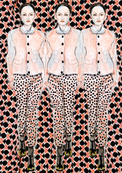
Illustration by Antonia Parker

Sounds exciting. So what has been you real drive and inspiration behind the SS11 collection?
Well I love summer so designing this collection is always the easiest for me and is always lots of fun; the only problem is that I had too many ideas to put into work. I suppose the inspiration me and my team worked from was based around the ‘Alice in Wonderland’ movie of which my daughter is a huge fan (and Minna herself could watch all day long), both other inspirations came from laid back summer afternoons in the South of France where I spend a lot of time with my family. I think it’s the slow pace of life there and the beautiful architecture to see that puts me into a creative mood.

The A/W 2010 looks on the website are beautiful and very gothic. The Claudia dress especially is amazing and very inspirational. Who do you see as your customer and where do you imagine her wearing the pieces? Is it something that you bear in mind when you create the look?
In the winter I am always craving darker pieces so that’s what I love to create for my customer. I also a big fan of creating pieces that are functional and think dresses are the perfect mix of functionality and fashion; that’s the reason there were no tops in my A/W 2010 collection. I think I directed [the collection] towards a more mature audience and I think it’s apparent that as I get older so does my design style. But it’s about not being too serious; I think its important to pay attention to the little details and the collar on the Claudia dress (very Peter Pan-esque) adds just the right amount of playfulness.

Too right that they’re not too serious (and who in fashion should be?!). I have a bit of a crush on that piece right now to kick start my autumn winter look. And from a (recently) London girl what do you think of the style in our capital? How does it compare with the Finnish style you experienced at home?
What I love about the Brits is that they’re not afraid of breaking the rules; and I’m a big believer that the rules are there to be broken. People over here aren’t just following the trends, they have their own individual style that they translate into so many different looks in their outfits. I think you’re lucky to have the British High Street here as it’s the best in the world; its cheap and accessible but it also makes it very hard for smaller brands to compete with the Primark and Topshop’s of the world.
Finland is completely different and it’s a very expensive and tricky market to break into but if you can crack it then Finnish customers are amongst the most loyal I know. In fact you can probably count on one hand the number of brands in the market. Weather is also a big issue out there though and the Finnish need like their pieces to be simple and serviceable whilst still following the trends. They have to be functional and people have to have a functional winter wardrobe to get through the seasons.
Saying this I am surprised every time I visit Finland again as there’s a new generation of fearless fashionista’s emerging who but their pieces over the internet and aren’t afraid to experiment with fashion. After all, Fashion should be fun and that’s what I try to create with my pieces and what I hope the customer gets from them too.

Thank you so much, Minna. Sounds like a great philosophy to have when looking at a collection and SS11 sounds like it will be a great year for you. I’m looking forward to it already! And put me on the list for a Claudia dress too, as you say everyone needs a functional winter wardrobe. Thanks and congratulations for London Fashion Week.

Categories ,Antonia Parker, ,estethica, ,ethical, ,Faye West, ,finland, ,interview, ,lace, ,London Fashion Week, ,Minna, ,S/S 2011, ,vintage

Similar Posts:


Amelia’s Magazine | Prophetik: London Fashion Week A/W 2012 Catwalk Review


Prophetik A/W 2012 by Faye West

My fashion week hadn’t got off to the best of starts this season. I skipped day one, and arrived on day two rather worse for wear. I’d been out boozing the night before and hadn’t predicted to feel quite so dreadful the next morning. I managed the Spijkers show, but on my way to see my faces, Teatum Jones, I was spinning out so badly that I just had to return home. Spending the day on the sofa sorted me out, and so I leapt out of bed on a bright, Spring-like morning on Sunday (day three) to catch Prophetik, back after a hiatus last season, to see what Jeff Gardner could offer fashion fans at 10.30am.


Prophetik A/W 2012 by Claire Kearns

Seating was easy peasy thanks to the glorious gals at Forward PR, and the show began only a few minutes late. This season, Jeff’s charity of choice is the Lawrence Anthony Foundation, committed to protecting endangered rhinos. Well, I certainly didn’t expect to see photographs of rhinos mutilated at such an early hour, but the provocative images hit home the crisis the species face. It costs £30,000 to protect one rhino for a year – a terrifying amount of money – because the only way to keep them alive is by guarding them 24 hours a day. You can read more about the cause here.


All photography by Matt Bramford

So it was on with the show. True to form, a vibrant violinist opened the proceedings, galavanting up and down the catwalk as she played. A live band then accompanied music that blasted from the sound system and the first model appeared.

This collection was called ‘Courtly Love‘, which for a brief moment made me imagine Prophetik‘s staple frocks with Courtney Love-esque make-up. Alas, this wasn’t the case. The theme was more of a reference to Princess Grace, archetypal dandies and an age-old way of dressing reinvented with a surge of modernity. The collection brought Prophetik‘s inimitable style back to the catwalk – romance, drama and sophistication neatly packaged into one collection.


Prophetik A/W 2012 by Gilly Rochester

Layers of lace were built up on dresses, blouson sleeves met with tight cuffs, swooping necklines were decorated with ruffled trims and sashes around waists provided flattering silhouettes.

This season saw a shorter hemline on some pieces that came as a bit of a surprise; I’m used to Jeff’s floor-sweeping numbers but cuter frocks cut above the knee made the collection seem more wearable and playful.

Menswear was exemplary as per: this season brought cropped tuxedos with jazzy gold buttons and baggy knits; pillow-shaped sleeves appeared on shirts. I spent more time than was necessary fancying two frock coats, the first with beautiful embroidery that looked like a V&A exhibit, the second made from luxurious velvet with heavy brocade detailing.

I don’t see myself hanging around Bethnal Green in either, but I’ve since fantasised about wearing the latter around the house, pretending I’m from another era.


Prophetik A/W 2012 by Gabriel Ayala

The finale created gasps across the room: a dress, black on bottom, white on top, featured one of Jeff’s grandmother’s original blankets (he must be running out) covered in black feathers – a real red carpet number if ever I saw one; one that will likely have Livia Firth on the phone faster than you can say green carpet. Gasps of another kind came when Whitney Houston’s ‘I Wanna Dance With Somebody’ emerged from the speakers – an unorthadox choice at a Prophetik show, but one that had guests bouncing up and down in their seats.


Finale at Prophetik A/W 2012 by Faye West

While Prophetik isn’t my favourite type of fashion – I prefer the more contemporary, print-based designers – I’m never disappointed, as I’m sure the hopeless romantics won’t be either.

Categories ,A/W 2012, ,AW12, ,catwalk, ,Claire Kearns, ,Courtly Love, ,Dandy, ,fashion, ,Faye West, ,Forward PR, ,Freemasons’ Hall, ,Gabriel Ayala, ,Gilly Rochester, ,Jeff Garner, ,Lawrence, ,London Fashion Week, ,Matt Bramford, ,menswear, ,Prophetik, ,review, ,Vauxhall Fashion Scout, ,Whitney Houston, ,Womenswear

Similar Posts: