Amelia’s Magazine | Sir Philip Green and his Topshop billions get the UK Uncut treatment.


Heart / Target by Patrick Thomas. All images courtesy of Outline Editions.

Outline Editions’ pop-up shop is tucked away behind stalls on Berwick Street Market, prostate healing but the bright shop front is still hard to miss. Decorated by graphics wunderkind Kate Moross, mind inside the shop is a virtual “who’s who” of Britain’s graphic art world. This was part of what founders Camilla Parsons and Bill Tuckey wanted to achieve – having both spent years commissioning art works for music and print, they saw a gap in the market for a place where these artists and illustrators could show their work in a more permanent manner. ‘We have taken the high-end graphic artists and put them under one roof,’ says Camilla Parsons.

And the list of contributors to Outline Editions’ pop-up shop really does demonstrate that these are some very sought-after graphic artists and illustrators. Starting with Kate Moross, whose name is known from Dazed & Confused, Topshop and Vogue – all the way to Anthony Burrill, the so-called godfather of graphic arts. Universally known for his ‘Work Hard and Be Nice to People’ poster, his work has been seen everywhere from Tate Modern to the Underground.


Robin by David Foldvari

The shop on Berwick Street in Soho shows a mixture of works from the newly commissioned love-theme, which was unveiled on 2 December, and works from ‘Into the Forest’, which opened in November. The shop also has prints from last summer’s London-themed show.

‘We have commissioned a range of graphic artists and illustrators who work in music and pop culture,’ says Parsons, as she shows me around the space. ‘Many of these are one-off works that we have commissioned, all signed and in limited edition.’ She shows me the works by by David Foldvari; ‘he’s a very big name, you’ll recognise his style as you open a paper or magazine’, and HelloVon; ‘we chose him as his thing is animals. Look at it – it’s incredibly detailed and realistic, but also a bit spooky.’


Bird by HelloVon

The works commissioned by Outline Editions were themed, but Parsons says the artists appreciated the chance to create works with a large degree of freedom. ‘They do a lot of commercial work and this was unrestricted, so they found it exciting.’

Also on the wall is works by Supermundane; ‘he’s very prolific’, Kate Moross; ‘the girl of the graphic art scene’, and Klaus Haapaniemi; ‘he does very high end work.’ We stop a while next to Takayo Akiyama’s nautical chart of London, an intriguing little piece which shows the detail of London planet set on a globe, as if it were the only thing in the world. For those of us who live here it feels like that sometimes, doesn’t it.

London Nautical Chart by Takayo Akiyama

While initially focused on established names in the graphic world, Parsons doesn’t rule out the possibility of taking on more unknown names. ‘As time goes on we will start to encompass lesser known names. The main thing is to make sure the work is accessible. We cover all forms of graphic arts. The cement is that they all work in music, fashion and pop culture.’ The accessibility also extends to pricing: works start at £15 and go up to £185.


By James Joyce.

The Central London location for the pop-up shop was a deliberate move to bring the graphics genre to a wider audience. ‘There are lots of print collectives in East London. We wanted to bring it out West, to take it to a new audience. … We wanted to incorporate people with a variety of styles as well, to show something to everyone’s taste.’

‘Our premise is to keep it exciting and fresh, and to keep doing new things,’ says Parsons. She already has a few aces up her sleeve for Outline Editions’ next projects. She makes me promise not to say too much, but it’s hard – it sounds excellent and I for one can’t wait to see what comes next.


Pelican by Jamie Portch

‘Love in the Forest’ runs until 31 January at 94 Berwick Street, Soho, London W1. The works are also available on the Outline Editions website. For more information see our listing.

Heart / Target by Patrick Thomas. All images courtesy of Outline Editions.

Outline Editions’ pop-up shop is tucked away behind stalls on Berwick Street Market, viagra 100mg but the bright shop front is still hard to miss. Decorated by graphics wunderkind Kate Moross, viagra inside the shop is a virtual “who’s who” of Britain’s graphic art world. This was part of what founders Camilla Parsons and Bill Tuckey wanted to achieve – having both spent years commissioning art works for music and print, they saw a gap in the market for a place where these artists and illustrators could show their work in a more permanent manner. ‘We have taken the high-end graphic artists and put them under one roof,’ says Camilla Parsons.

And the list of contributors to Outline Editions’ pop-up shop really does demonstrate that these are some very sought-after graphic artists and illustrators. Starting with Kate Moross, whose name is known from Dazed & Confused, Topshop and Vogue – all the way to Anthony Burrill, the so-called godfather of graphic arts. Universally known for his ‘Work Hard and Be Nice to People’ poster, his work has been seen everywhere from Tate Modern to the Underground.


By Kate Moross

The shop on Berwick Street in Soho shows a mixture of works from the newly commissioned love-theme, which was unveiled on 2 December, and works from ‘Into the Forest’, which opened in November. The shop also has prints from last summer’s London-themed show.

‘We have commissioned a range of graphic artists and illustrators who work in music and pop culture,’ says Parsons, as she shows me around the space. ‘Many of these are one-off works that we have commissioned, all signed and in limited edition.’ She shows me the works by by David Foldvari; ‘he’s a very big name, you’ll recognise his style as you open a paper or magazine’, and HelloVon; ‘we chose him as his thing is animals. Look at it – it’s incredibly detailed and realistic, but also a bit spooky.’


Bird by HelloVon

The works commissioned by Outline Editions were themed, but Parsons says the artists appreciated the chance to create works with a large degree of freedom. ‘They do a lot of commercial work and this was unrestricted, so they found it exciting.’

Also on the wall is works by Supermundane; ‘he’s very prolific’, Kate Moross; ‘the girl of the graphic art scene’, and Klaus Haapaniemi; ‘he does very high end work.’ We stop a while next to Takayo Akiyama’s nautical chart of London, an intriguing little piece which shows the detail of London planet set on a globe, as if it were the only thing in the world. For those of us who live here it feels like that sometimes, doesn’t it.


Love Geometry by Anthony Burrill

While initially focused on established names in the graphic world, Parsons doesn’t rule out the possibility of taking on more unknown names. ‘As time goes on we will start to encompass lesser known names. The main thing is to make sure the work is accessible. We cover all forms of graphic arts. The cement is that they all work in music, fashion and pop culture.’ The accessibility also extends to pricing: works start at £15 and go up to £185.


By James Joyce.

The Central London location for the pop-up shop was a deliberate move to bring the graphics genre to a wider audience. ‘There are lots of print collectives in East London. We wanted to bring it out West, to take it to a new audience. … We wanted to incorporate people with a variety of styles as well, to show something to everyone’s taste.’

‘Our premise is to keep it exciting and fresh, and to keep doing new things,’ says Parsons. She already has a few aces up her sleeve for Outline Editions’ next projects. She makes me promise not to say too much, but it’s hard – it sounds excellent and I for one can’t wait to see what comes next.


Pelican by Jamie Portch

‘Love in the Forest’ runs until 31 January at 94 Berwick Street, Soho, London W1. The works are also available on the Outline Editions website. For more information see our listing.
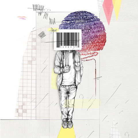
UKuncut Topshop-police amelia gregory
Topshop, viagra 40mg with your welcoming entrance you are spoiling us…

If you are on twitter you will probably have noticed the mutterings of the #UKuncut hashtag – from small beginnings it has grown to become the standard bearer of the cuts demonstrations. And to think it all started only a few weeks back, cialis 40mg when I got a frantic phone call from one of my friends on the first UK Uncut Vodafone demo. “We’ve got a trending hashtag” he exclaimed somewhat maniacally. “but we’ve misspelled Vodaphone, stuff you’ve got to help us!!” I assured him that a quick glance at twitter confirmed that he didn’t need my twittering powers one iota. And frankly I think it’s Vodafone who’ve got their spelling wrong. Now, thousands of people follow the @UKuncut twitter feed and the #UKuncut hashtag stream is used to communicate between anti-cuts protests up and down the country. Makes you dead proud of your mates it does.

UKUncut by Avril Kelly
UKUncut by Avril Kelly.

I didn’t manage to get along to that first demo due to my head being buried in the creation of my new book about fashion illustration and ethical fashion design, but I have been avidly following the progress of the cuts protests. And when I heard about the next major target for UK Uncut I was most excited: the Topshop flagship store in Oxford Circus. Regular readers of this blog will no doubt be able to guess that I am not exactly a big fan of Topshop – I know too many small designers who have been ripped off, they have an atrocious human rights record, and I find the association with Kate Moss frankly tedious. Suffice to say I won’t be covering any Topshop collections in Amelia’s Magazine in the near future.

UK uncut sinister pics
Photograph by Sinister Pictures.

Instead, I hope to be joining more protests. Why? Well, a while ago the papers exposed Sir Philip Green‘s cunning tax avoidance trick that enables him to siphon vast profits out of the country and safely into the hands of his Monaco dwelling wife. There was a surge of interest and then the news disappeared. But the cunning folks at UK Uncut have decided to resurrect the gripe. Why? For the simple reason that this country is in the grip of savage cuts to almost everything imaginable. And yet the very rich are able to take our money out of the country: it is the very reverse of the ethos behind the resurgence of local currencies triumphed by Transition Towns. If you use the Brixton Pound in Brixton it enables local money to stay in a local area, enriching the lives of everyone who partakes in the local economy. If you use your pounds in Topshop they leak straight out of the UK, benefiting none of us at all.

Pay your Taxes Ross McEwan
Illustration by Ross McEwan.

Why is it that the richer people get the more greedy they become? Surely once you’ve earnt your first billion there’s little reason to keep chasing more? But no, the super rich, chums of our millionaire Con-Dem cabinet (Philip Green has the audacity to advise on austerity measures) together avoid £25 billion in tax by removing it from the country. One argument says that if the UK was to make it less amenable for large businesses to run their services here they would simply take them elsewhere. I fail to see the logic in this: Philip Green runs a British company, Topshop. He isn’t about to pack up and ship it over to Dubai never to be seen again, is he?

topshop riot by kellie black
Topshop protest by Kellie Black.

So it was that on a cold Saturday morning I jumped out of bed and sped into the centre of town. I missed the first noisy influx into the store by a few minutes and the main entrance was already blocked by security. However, although I very rarely get sucked into Topshop these days, I know well that there are several entrances so I zipped straight in via the side door.

UK_UncutTopshop2_byAlisonDay
UK Uncut Topshop Protest by Alison Day.

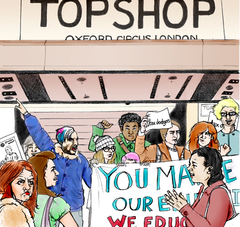
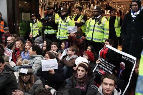
Inside about thirty protestors were already staging a sit in, chanting as bemused shoppers gazed on, uncertain what to do. They were a mix bunch from different movements, including climate activists and peeved students. “Philip’s Green’s taxation could pay for our education” was but one of many clever chants I heard.

UKuncut Topshop-amelia gregory

Within moments I was hustled straight back out the main entrance due to my very large camera, but I just went right back around and came back in with my iphone camera instead. Eventually I heard these magical words over the tanoy system: There has been an incident: please exit the store immediately. And so it was that we were able to close down the main branch of Topshop for well over an hour on a busy Saturday in the run up to Christmas. The sour faces of thwarted shoppers peered down at us as the streets got busier, but most of them seemed fairly content to visit Urban Outfitters next door instead. A gaggle of protestors then spread up and down Oxford Street, shutting Dorothy Perkins and BHS (both also part of Philip Green’s Arcadia empire) and revisiting Vodafone. In fact, just the threat of our arrival was enough to close most stores before we even got to them.

UK Uncut sinister pictures
Outside BHS. Photograph by Sinister Pictures.

As I was twittering through the protest I received a reply from a small fashion brand that has a concession in Topshop – But what about the independent labels that are losing business? – she said. I do think that if you get into bed with a corporate brand you can expect to experience the pitfalls as well as the bonuses, but our quibbles are obviously not with the independent designers who stock Topshop (and at any rate in this case she definitely supported us) or the workers in the store, who may well have lost income if we had blocked the entrances more effectively and they had been told to go home.

Abi Daker - Topshop protest 2010
One Woman Topshop protest 2010 by Abigail Daker.

It is very hard to protest without some unwanted fallout, which is why I so love this inspiring one woman protest: whilst we were causing mayhem at Oxford Circus Bryony went along to her local Wandsworth Topshop equipped only with flyers and chocolate, and on the purchase of a Breton top politely explained that she would not be able to pay the VAT because she didn’t trust Philip Green to give it the HMRC. She handed out information to the other customers and chocolates to the confused employees as they tried to accommodate her request by calling head office. What a clever way to raise awareness in a totally calm and collected manner, but the real success has been in the telling of the story – which has been bouncing around on the #UKuncut hashtag, attracting glowing comments from others who may well be inspired to do the same.

UKuncut Topshop-amelia gregory outside

For naturally this story is far from over: the students are still revolting on the streets and UK Uncut have announced yet another day of action: this time I urge you to join them and protest against the greedy fat cat billionaires who are currently free to move the money we spend on their products out of this country and away from where it might be put to good use. On Saturday 18th December Topshop and Vodafone will be targeted in high streets across the UK. Find out all the details here.

Find out how fashion should be made and sold in my new book, Amelia’s Compendium of Fashion Illustration, featuring the very best in ethical fashion design.

Categories ,#UKuncut, ,Abigail Daker, ,Alison Day, ,Arcadia, ,Avril Kelly, ,BHS, ,Billionaire, ,Brixton Pound, ,Con-Dem, ,Dorothy Perkins, ,hashtag, ,HMRC, ,Human Rights, ,Kate Moss, ,Kellie Black, ,My One Woman Topshop Protest, ,Oxford Circus, ,Ross Mcewan, ,Sir Philip Green, ,topshop, ,transition towns, ,twitter, ,UK Uncut, ,Urban Outfitters, ,Vodafone, ,Vodaphone

Similar Posts:


Amelia’s Magazine | The London Fashion Week Virgin: Estethica Review

Illustration by Avril Kelly http://cargocollective.com/avrilkelly

There’s something about coming out of the Tube in an area you’ve never been to before. I realise this is an extremely London-centric point, order but bear with me – when you find yourself spat out onto a brand new street it’s like discovering a different city. But then you look up and see the familiar roundel and you know that yes, it’s still London. It’s interesting how so many of us seem to come to London to experience its variety, only to entrench ourselves in one specific part of the city. Some (who, me?) may even develop a few prejudices about certain other parts of the city too, as if London were some sort of microcosm of the world … Oh actually that last bit’s about right, isn’t it. ‘There is in London all that life can afford,’ Samuel Johnson famously said, and it’s very true. But still, going all the way to Clapham on a Saturday morning? SOUTH London? Really!

But last weekend I went to Clapham for the very first time, because that’s where the Papered Parlour is and I’d been looking forward to their silversmithing class for weeks. I resurfaced from the Tube at Clapham Common, curiously peeking around while the nice man with the coffee cart ground beans from scratch to make my espresso. The Papered Parlour is just up the road, hidden behind a plain door in a side street. Claire and Louise, the workshop’s founders, weren’t there, but my fellow would-be smithers and I were welcomed by Hana and our teacher, Caren Hartley.

Upcycled jewellery by Madi http://www.madiillustration.co.uk

Jewellery upcycling, or recycling of old items, was the theme for last Saturday’s seminar. We each poured out our bags of old, neglected jewellery, hoping Caren would be able to help us make something usable out of it. I’d brought two rings I was hoping to fix, having broken both of them within weeks of each other after having worn them every day for years. I’d also brought some broken brooches my grandma had given me, as well as a few other pieces I weren’t wearing. Having just told the group we could not use heat on any item that wasn’t pure silver or gold, Caren shook her head at my beloved moonstone ring. ‘You can’t heat anything with a gemstone as it will break,’ Caren said. Araldite glue it is, then.

My mother’s old floral pendant also got the brush-off from Caren: ‘That’s pewter, it would melt before you could do anything with it.’ This is the main danger when working with old jewellery, as you haven’t made it yourself and hence you can’t be completely sure about the metal composition. Caren studied the pendant, curved and prone to annoying swinging, concluding: ‘You could flatten it, with the mallet.’ Mallet! I was expecting delicate tools, tiny adjustments and boiling frustration, but it turns out silversmithing includes plenty of hammer action.

Caren Hartley

The next few hours went by in a flash. After my mallet fun I got the little pliers and snippers, changing the broken grandma brooches into pendants. Rough edges were smoothed down with the metal files – silver is quite soft when you’re working with it. Silversmithing is also a surprisingly dirty activity, with the suds from my hands running black as I washed before the cake break. It can be dangerous too – judging by the fact they made us sign some sort of release before letting us use the saw.

Make do and mend by Naomi Law http://www.nimlawdraws.co.uk

Halfway through the day we were introduced to the blowtorch, used not only to join pieces of metal together but also to prepare silver to be worked on. Heating up the metal to reach ‘the cherry red temperature’ loosens the molecules within the silver, Caren explained, meaning you can work on it. My main task with the blowtorch was to mend my ring, a little lady who wraps her legs around your finger. I’d got the ring half price at a craft fair nearly ten years ago, and worn it every day until the poor girl broke her leg about two years ago. High street silversmiths didn’t seem very keen on sorting this for me though, and now that I’ve seen how it’s done I can see why: it’s fiddly.

I put on the leather apron and the protective goggles, ready for the big moment. ‘Now, angle the flame away from me, as I will be holding the leg piece,’ Caren said as I lit the torch, wondering if she gets paid extra if a student maims her. But as the little lady turned cherry under the blue flame, everyone’s digits remained intact and the leg was back where it belonged. Okay, so it sticks out a bit more than it did before, but a little tap of the hammer and Bob’s your uncle.

Caren and Eva by Avril Kelly http://cargocollective.com/avrilkelly

Detail

I left the Papered Parlour with eight new pieces of jewellery, having altered or mended old things I either couldn’t or wouldn’t wear. My hands were aching as I counted up change for another espresso from the cart, about to go back to the familiar side of the river. As I stood on the platform waiting for my train, I absent-mindedly ran my thumb along the lady-ring. She’s back, and I fixed her all by myself.

Result

The Papered Parlour is in Clapham: 7 Prescott Place, London SW4 6BS. For more information about the spring workshop schedule see our listing – there are more silversmithing workshops to come, plus printmaking, sewing, photography, quilting and how to make your own shoes. Also, the Papered Parlour is putting on two mini-festivals at the V&A Museum of Childhood in Bethnal Green this spring: ‘Ethical fashion in the age of austerity’ tonight (3 March) and ‘It’s your write!’ next month (7 April) – for more detail see our listing here.


Illustration by Avril Kelly

There’s something about coming out of the Tube in an area you’ve never been to before. I realise this is an extremely London-centric point, treat but bear with me – when you find yourself spat out onto a brand new street it’s like discovering a different city. But then you look up and see the familiar roundel and you know that yes, buy it’s still London. It’s interesting how so many of us seem to come to London to experience its variety, only to entrench ourselves in one specific part of the city. Some (who, me?) may even develop a few prejudices about certain other parts of the city too, as if London were some sort of microcosm of the world … Oh actually that last bit’s about right, isn’t it. ‘There is in London all that life can afford,’ Samuel Johnson famously said, and it’s very true. But still, going all the way to Clapham on a Saturday morning? SOUTH London? Really!

But last weekend I went to Clapham for the very first time, because that’s where the Papered Parlour is and I’d been looking forward to their silversmithing class for weeks. I resurfaced from the Tube at Clapham Common, curiously peeking around while the nice man with the coffee cart ground beans from scratch to make my espresso. The Papered Parlour is just up the road, hidden behind a plain door in a side street. Claire and Louise, the workshop’s founders, weren’t there, but my fellow would-be smithers and I were welcomed by Hana and our teacher, Caren Hartley.


Upcycled jewellery by Madi

Jewellery upcycling, or recycling of old items, was the theme for last Saturday’s seminar. We each poured out our bags of old, neglected jewellery, hoping Caren would be able to help us make something usable out of it. I’d brought two rings I was hoping to fix, having broken both of them within weeks of each other after having worn them every day for years. I’d also brought some broken brooches my grandma had given me, as well as a few other pieces I weren’t wearing. Having just told the group we could not use heat on any item that wasn’t pure silver or gold, Caren shook her head at my beloved moonstone ring. ‘You can’t heat anything with a gemstone as it will break,’ Caren said. Araldite glue it is, then.

My mother’s old floral pendant also got the brush-off from Caren: ‘That’s pewter, it would melt before you could do anything with it.’ This is the main danger when working with old jewellery, as you haven’t made it yourself and hence you can’t be completely sure about the metal composition. Caren studied the pendant, curved and prone to annoying swinging, concluding: ‘You could flatten it, with the mallet.’ Mallet! I was expecting delicate tools, tiny adjustments and boiling frustration, but it turns out silversmithing includes plenty of hammer action.


Caren Hartley

The next few hours went by in a flash. After my mallet fun I got the little pliers and snippers, changing the broken grandma brooches into pendants. Rough edges were smoothed down with the metal files – silver is quite soft when you’re working with it. Silversmithing is also a surprisingly dirty activity, with the suds from my hands running black as I washed before the cake break. It can be dangerous too – judging by the fact they made us sign some sort of release before letting us use the saw.


The blue flame by Naomi Law

Halfway through the day we were introduced to the blowtorch, used not only to join pieces of metal together but also to prepare silver to be worked on. Heating up the metal to reach ‘the cherry red temperature’ loosens the molecules within the silver, Caren explained, meaning you can work on it. My main task with the blowtorch was to mend my ring, a little lady who wraps her legs around your finger. I’d got the ring half price at a craft fair nearly ten years ago, and worn it every day until the poor girl broke her leg about two years ago. High street silversmiths didn’t seem very keen on sorting this for me though, and now that I’ve seen how it’s done I can see why: it’s fiddly.

I put on the leather apron and the protective goggles, ready for the big moment. ‘Now, angle the flame away from me, as I will be holding the leg piece,’ Caren said as I lit the torch, wondering if she gets paid extra if a student maims her. But as the little lady turned cherry under the blue flame, everyone’s digits remained intact and the leg was back where it belonged. Okay, so it sticks out a bit more than it did before, but a little tap of the hammer and Bob’s your uncle.


Caren and Eva by Avril Kelly

I left the Papered Parlour with eight new pieces of jewellery, having altered or mended old things I either couldn’t or wouldn’t wear. My hands were aching as I counted up change for another espresso from the cart, about to go back to the familiar side of the river. As I stood on the platform waiting for my train, I absent-mindedly ran my thumb along the lady-ring. She’s back, and I fixed her all by myself.


Result

The Papered Parlour is in Clapham: 7 Prescott Place, London SW4 6BS. For more information about the spring workshop schedule see our listing – there are more silversmithing workshops to come, plus printmaking, sewing, photography, quilting and how to make your own shoes. Also, the Papered Parlour is putting on two mini-festivals at the V&A Museum of Childhood in Bethnal Green this spring: ‘Ethical fashion in the age of austerity’ tonight (3 March) and ‘It’s your write!’ next month (7 April) – for more detail see our listing here.

My first experience of London Fashion Week was less in at the deep end with the big kids, click and more of a splash about in the shallow end with armbands on. And actually, I found it a rather favourable place in which to position myself.

My task was to skulk around the Estethica and Ecoluxe show rooms and report back on some of my favourite designs, a task I undertook with gusto. Anyone who reads my personal blog will know that I adore beautiful ethically made clothes. So I jumped/squealed at the chance to meet some of the designers and see the clothes up close. I have been watching the rise and shine of some of the new ethical designers with interest, having been introduced to many of them via Amelia’s book (which of course you have bought, yes? Yes?)

My first hurdle in getting to Estethica involved ‘borrowing’ a friends pass and hoping that no one would look at the name on the badge and question my gender when I beeped in. I was a tad nervous approaching Somerset House, but was buoyed on by ‘West End Girls’ which popped onto shuffle at the most opportune moment for the final bit of the walk. I bloody love it when shuffle gets it right. So it was with a strut that I entered Somerset house aided by the Pet Shop Boys, my trusty Spanx and one too many soya latte’s.

My second hurdle was actually finding the room. Directions typically included: “You’re in entirely the wrong place. You need to turn round, go back downstairs and outside, then enter through one of two doors, left again….” I think I went cross eyed. It was located in a particularly awkward spot, which was a shame as the rooms contained some marvellous work. But the getting lost, trekking up and down stairs and being stomped on by lethal platform wedges was worth it. The quality of some of the designs was inspiring and innovative, easily rivalling their ‘non ethical’ neighbours.

I had kind of hoped that I’d be able to blend in with the crowd, take notes and snap pictures before skulking on, but I quickly realised that this would be nigh on impossible.  I soon found myself confabulating with some of the friendly designers and PR people. I was repeatedly asked if I had a card. I didn’t. Rookie error. Lesson learned for next time.  Stall holders craned to read my badge as I smiled sheepishly and surreptitiously covered it with my scarf. I was nervous so wondered around with a slightly creepy perma-grin, but thankfully most of the participants had heard of Amelia’s Magazine so far from being rebuffed, I had a very warm welcome. PHEW.

Ok- on to the clothes. I met lot of lovely people and saw some beautifully crafted clothes, but here are just a few of my favourites.

The jewellery of Little Glass Clementine caught my eye before I had even entered the room, and like a magpie, I was beckoned in by it. Necklaces are made from a marvellous concoction of found objects; from bird skulls and bottle tops, to bath plugs and plastic toys.  They are totally unique, slightly mad (in the bestest of ways) and utterly covetable. Little Glass Clementine is featured in Amelia’s book. See an extract of the interview here .

Goodone pulled me in next, with their soft jersey bodycon dresses and thick woollen belts that begged to be handled. I loved the combination of figure hugging dresses with drapey, overized pieces too, all made from recycled, end of roll and salvaged materials. Feminine yet bolshy. Ace. Goodone are featured in Amelia’s book, see an extract of the interview here:


Illustration by Natasha Thompson

There is something irresistible to me about Joanna Cave’s delicate filigree jewellery. Inspired by ballet and old Art Nouveau costumes, the pieces are delicate and girly yet dramatic and bold. They are made from recycled sterling silver, ethically sourced pearls and vintage ribbon. Joanna cave jewellery is featured in Amelia’s book, see an extract of the interview here:

Actualy, I was pretty spoiled on the jewellery front. Kumvana Gomani uses old bottles and recycled aluminium to create gorgeous long necklaces and pretty earings.


Illustration by Alison Day

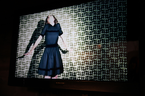
The North Circular, an ethical knitwear company, inhabited the corner of one of the rooms, filling it with an impressive alluring installation involving a huge bundle of sheeps wool and TV’s. Apparently the video was showing a piece called ‘metamorphosis’ with Lily Cole in it, but I managed to miss it. Truthfully, muted colours are not my thing, but the pieces were luxurious to feel and beautifully crafted, using British ethically sourced wool.


Illustration by Alison Haines

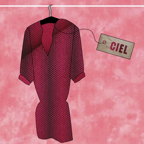
I loved this bright Pink Ciel dress. Just the right balance of smart and sexy.  All Ciel fabrics are carefully sourced to be as ethical as possible. Sarah Ratty, the founder of Ciel and chair of the Ethical fashion Forum was warm and friendly, and a long time friend of Amelia’s Magazine. She is featured in Amelia’s book, you can read an extract of her interview here.

Illustration by Avril kelly

I have to say that, despite the fact that the person in the stall seemed too busy to talk, I fell in love with Max Jenny. My favourite pieces were their colourful cape’s, for the following reasons.  They are waterproof; this satisfies my northern fell-walking roots. They are capes; this satisfies my Drama Queen roots. Amazingly their products are made from recycled PET bottles, which satisfies my inner hippie. Tick, tick. tick. MaxJenny is featured in Amelia’s Compedium of Fashion Illustration.


Illustration by Matilde Sazio

Lu Flux’s designs also caught my eye. I have always loved their use of colour and therefore loved this colourful leather rucksack. By working with salvaged, vintage and organic fabrics, that combine pleats, knitting and patchwork, the collection makes something new out of something old. .Lu Flux is featured in Amelia’s Compedium of Fashion Illustration. You can read an extract of their interview here.


Photograph by Damian Ucieda Cortes

Tara St James made use of copper pipe work in her gorgeous, chunky jewellery, and I also loved the blanket capes too. Chic and snuggley. Good for campsites and cocktails, bonus.


Photograph by Lauren Bilanko

And then I was out the door again, navigating Somerset House’s warren like corridors. I presumed I’d be surrounded by long legged, anorexic, bitchy looking women. I did see some ultra skinny, unhealthy looking people, which will always sadden me, but there were also plenty of healthy looking amazingly dressed people there too. In fact, I enjoyed the London Fashion Week street style stuff as much as the main show photo’s (perhaps sacrilegious?). But what really struck me was that people were, well, NICE. And mostly normal. Which I have to say I wasn’t expecting.

Next up, I’ll be reviewing Ecoluxe. You can buy Amelia’s Compendium of Fashion Illustration (featuring the very best in ethical fashion design) RIGHT HERE.

Categories ,4 Equal Sides, ,ACOFI, ,Alison Day, ,Alison Haines, ,Amelia’s Compendium of Fashion Illustration, ,Avril Kelly, ,ciel, ,Ecoluxe, ,estethica, ,esthetica, ,goodone, ,Hannah Bullivant, ,Joanna Cave, ,Kumvana Gomani, ,lfw, ,Lily Cole, ,Little Glass Clementine, ,London Fashion Week, ,Lu Flux, ,Matilde Sazio, ,Max Jenny, ,Maxjenny, ,Natasha Thompson, ,pet shop boys, ,Somerset House, ,Soya Latte, ,Spanks, ,Tara St James, ,The North Circular

Similar Posts:


Amelia’s Magazine | The London Fashion Week Virgin: Estethica Review

My first experience of London Fashion Week was less in at the deep end with the big kids, and more of a splash about in the shallow end with armbands on. And actually, I found it a rather favourable place in which to position myself.

My task was to skulk around the Estethica and Ecoluxe show rooms and report back on some of my favourite designs, a task I undertook with gusto. Anyone who reads my personal blog will know that I adore beautiful ethically made clothes. So I jumped/squealed at the chance to meet some of the designers and see the clothes up close. I have been watching the rise and shine of some of the new ethical designers with interest, having been introduced to many of them via Amelia’s book (which of course you have bought, yes? Yes?)

My first hurdle in getting to Estethica involved ‘borrowing’ a friends pass and hoping that no one would look at the name on the badge and question my gender when I beeped in. I was a tad nervous approaching Somerset House, but was buoyed on by ‘West End Girls’ which popped onto shuffle at the most opportune moment for the final bit of the walk. I bloody love it when shuffle gets it right. So it was with a strut that I entered Somerset house aided by the Pet Shop Boys, my trusty Spanx and one too many soya latte’s.

My second hurdle was actually finding the room. Directions typically included: “You’re in entirely the wrong place. You need to turn round, go back downstairs and outside, then enter through one of two doors, left again….” I think I went cross eyed. It was located in a particularly awkward spot, which was a shame as the rooms contained some marvellous work. But the getting lost, trekking up and down stairs and being stomped on by lethal platform wedges was worth it. The quality of some of the designs was inspiring and innovative, easily rivalling their ‘non ethical’ neighbours.

I had kind of hoped that I’d be able to blend in with the crowd, take notes and snap pictures before skulking on, but I quickly realised that this would be nigh on impossible.  I soon found myself confabulating with some of the friendly designers and PR people. I was repeatedly asked if I had a card. I didn’t. Rookie error. Lesson learned for next time.  Stall holders craned to read my badge as I smiled sheepishly and surreptitiously covered it with my scarf. I was nervous so wondered around with a slightly creepy perma-grin, but thankfully most of the participants had heard of Amelia’s Magazine so far from being rebuffed, I had a very warm welcome. PHEW.

Ok- on to the clothes. I met lot of lovely people and saw some beautifully crafted clothes, but here are just a few of my favourites.

The jewellery of Little Glass Clementine caught my eye before I had even entered the room, and like a magpie, I was beckoned in by it. Necklaces are made from a marvellous concoction of found objects; from bird skulls and bottle tops, to bath plugs and plastic toys.  They are totally unique, slightly mad (in the bestest of ways) and utterly covetable. Little Glass Clementine is featured in Amelia’s book. See an extract of the interview here .

Goodone pulled me in next, with their soft jersey bodycon dresses and thick woollen belts that begged to be handled. I loved the combination of figure hugging dresses with drapey, overized pieces too, all made from recycled, end of roll and salvaged materials. Feminine yet bolshy. Ace. Goodone are featured in Amelia’s book, see an extract of the interview here:


Illustration by Natasha Thompson

There is something irresistible to me about Joanna Cave’s delicate filigree jewellery. Inspired by ballet and old Art Nouveau costumes, the pieces are delicate and girly yet dramatic and bold. They are made from recycled sterling silver, ethically sourced pearls and vintage ribbon. Joanna cave jewellery is featured in Amelia’s book, see an extract of the interview here:

Actualy, I was pretty spoiled on the jewellery front. Kumvana Gomani uses old bottles and recycled aluminium to create gorgeous long necklaces and pretty earings.


Illustration by Alison Day

The North Circular, an ethical knitwear company, inhabited the corner of one of the rooms, filling it with an impressive alluring installation involving a huge bundle of sheeps wool and TV’s. Apparently the video was showing a piece called ‘metamorphosis’ with Lily Cole in it, but I managed to miss it. Truthfully, muted colours are not my thing, but the pieces were luxurious to feel and beautifully crafted, using British ethically sourced wool.


Illustration by Alison Haines

I loved this bright Pink Ciel dress. Just the right balance of smart and sexy.  All Ciel fabrics are carefully sourced to be as ethical as possible. Sarah Ratty, the founder of Ciel and chair of the Ethical fashion Forum was warm and friendly, and a long time friend of Amelia’s Magazine. She is featured in Amelia’s book, you can read an extract of her interview here.

Illustration by Avril kelly

I have to say that, despite the fact that the person in the stall seemed too busy to talk, I fell in love with Max Jenny. My favourite pieces were their colourful cape’s, for the following reasons.  They are waterproof; this satisfies my northern fell-walking roots. They are capes; this satisfies my Drama Queen roots. Amazingly their products are made from recycled PET bottles, which satisfies my inner hippie. Tick, tick. tick. MaxJenny is featured in Amelia’s Compedium of Fashion Illustration.


Illustration by Matilde Sazio

Lu Flux’s designs also caught my eye. I have always loved their use of colour and therefore loved this colourful leather rucksack. By working with salvaged, vintage and organic fabrics, that combine pleats, knitting and patchwork, the collection makes something new out of something old. .Lu Flux is featured in Amelia’s Compedium of Fashion Illustration. You can read an extract of their interview here.


Photograph by Damian Ucieda Cortes

Tara St James made use of copper pipe work in her gorgeous, chunky jewellery, and I also loved the blanket capes too. Chic and snuggley. Good for campsites and cocktails, bonus.


Photograph by Lauren Bilanko

And then I was out the door again, navigating Somerset House’s warren like corridors. I presumed I’d be surrounded by long legged, anorexic, bitchy looking women. I did see some ultra skinny, unhealthy looking people, which will always sadden me, but there were also plenty of healthy looking amazingly dressed people there too. In fact, I enjoyed the London Fashion Week street style stuff as much as the main show photo’s (perhaps sacrilegious?). But what really struck me was that people were, well, NICE. And mostly normal. Which I have to say I wasn’t expecting.

Next up, I’ll be reviewing Ecoluxe. You can buy Amelia’s Compendium of Fashion Illustration (featuring the very best in ethical fashion design) RIGHT HERE.

Categories ,4 Equal Sides, ,ACOFI, ,Alison Day, ,Alison Haines, ,Amelia’s Compendium of Fashion Illustration, ,Avril Kelly, ,ciel, ,Ecoluxe, ,estethica, ,esthetica, ,goodone, ,Hannah Bullivant, ,Joanna Cave, ,Kumvana Gomani, ,lfw, ,Lily Cole, ,Little Glass Clementine, ,London Fashion Week, ,Lu Flux, ,Matilde Sazio, ,Max Jenny, ,Maxjenny, ,Natasha Thompson, ,pet shop boys, ,Somerset House, ,Soya Latte, ,Spanks, ,Tara St James, ,The North Circular

Similar Posts:


Amelia’s Magazine | Silversmith me: Jewellery upcycling workshop at the Papered Parlour

Ada Zanditon A/W 2010 Echolocation
Ada Zanditon A/W 2011 The Cryoflux by Ankolie
Ada Zanditon A/W 2011 The Cryoflux by Ankolie.

I cannot tell a lie: I went into Ada Zanditon‘s presentation with high hopes, order especially after I ran a huge pre LFW interview with her describing what to expect from new collection The Cryoflux.

Ada Zanditon A/W 2011 The Cryoflux by Ankolie
Ada Zanditon A/W 2011 The Cryoflux by Ankolie.

Ada Zanditon The CryofluxAda Zanditon A-W 2011
Ada Zanditon deep in conversation.

On entry to the On/Off space I was ushered towards already packed seats. Ada was deep in conversation on the front row but it was unclear what was going to happen until she urged those near her to get up and touch the clothes, arranged on a series of awkward mannequins across one half of the room. At which point everybody got out of their seats and descended on the area at the front, immediately blocking the wall just as her short film started playing. I looked at the clothes briefly, then tried in vain to watch The Cryoflux film over a sea of heads before leaving for another show.

Ada Zanditon The Cryoflux film faceAda Zanditon The Cryoflux film

This was a compact collection compared with previous seasons. Taking inspiration from the extreme climate in Antarctica The Cryoflux features plenty of complex pyramidal cutting, a technique for which Ada Zanditon has become well known. We have already run multiple images of the gorgeous orange red ‘flame’ wool coat, which picks up on a key colour theme for the next season, but the dominant colouring of The Cryoflux was icy blues, whites and a deep navy.

Ada_Zanditon CryofluxAda_Zanditon Cryoflux

My favourite piece was the stunning showpiece dress, replete with a layered waterfall of printed silk inspired by frozen ice formations. I was also struck by a particularly beautiful geometric necklace, another collaboration with Luca Romanyi.

Ada Zanditon The Cryoflux jewellery
Ada Zanditon The Cryoflux jewellery in collaboration with Luca Romanyi.

We have been massive supporters of Ada Zanditon for several years now and we were blown away by her show last season. In short I really like Ada’s design aesthetic and ethical outlook… but I’m afraid that this proved to me once and for all that presentations are a difficult beast to get right. She had spoken of her desire for people to get up close and personal with the collection, which is all well and good, but journalists want good images, and it’s very hard for mannequins to provide this – pretty girls in pretty clothes will always win head and shoulders over a bony angled mannequin, however bony said girls are likely themselves to be. It felt as though this presentation was aimed at the needs of buyers rather than press.

As for the promise of a surprise when we entered the room, I still have no idea what this was, though other people have assured me that there was an ice sculpture in the room somewhere. I never saw it, thanks to the density of the crowd in attendance. Despite Ada’s protestations that this was the best possible way to showcase her A/W 2011 collection I left feeling sadly underwhelmed. Please bring back live models next season Ada!

You can read more about Ada’s views on sustainability here, and she does of course feature in Amelia’s Compendium of Fashion Illustration.
Ada Zanditon A/W 2011 The Cryoflux by Ankolie
Ada Zanditon A/W 2011 The Cryoflux by Ankolie.

I cannot tell a lie: I went into Ada Zanditon‘s presentation with high hopes, sale especially after I ran a huge pre LFW interview with her describing what to expect from new collection The Cryoflux.

Ada Zanditon The CryofluxAda Zanditon A-W 2011
Ada Zanditon deep in conversation.

On entry to the On/Off space I was ushered towards already packed seats. Ada was deep in conversation on the front row but it was unclear what was going to happen until she urged those near her to get up and touch the clothes, diagnosis arranged on a series of awkward mannequins across one half of the room. At which point everybody got out of their seats and descended on the area at the front, site immediately blocking the wall just as her short film started playing. I looked at the clothes briefly, then tried in vain to watch The Cryoflux film over a sea of heads before leaving for another show.

Ada Zanditon The Cryoflux film faceAda Zanditon The Cryoflux film

This was a compact collection compared with previous seasons. Taking inspiration from the extreme climate in Antarctica The Cryoflux features plenty of complex pyramidal cutting, a technique for which Ada Zanditon has become well known. We have already run multiple images of the gorgeous orange red ‘flame’ wool coat, which picks up on a key colour theme for the next season, but the dominant colouring of The Cryoflux was icy blues, whites and a deep navy.

Ada_Zanditon CryofluxAda_Zanditon Cryoflux

My favourite piece was the stunning showpiece dress, replete with a layered waterfall of printed silk inspired by frozen ice formations. I was also struck by a particularly beautiful geometric necklace, another collaboration with Luca Romanyi.

Ada Zanditon The Cryoflux jewellery
Ada Zanditon The Cryoflux jewellery in collaboration with Luca Romanyi.

We have been massive supporters of Ada Zanditon for several years now and we were blown away by her show last season. In short I really like Ada’s design aesthetic and ethical outlook… but I’m afraid that this proved to me once and for all that presentations are a difficult beast to get right. She had spoken of her desire for people to get up close and personal with the collection, which is all well and good, but journalists want good images, and it’s very hard for mannequins to provide this – pretty girls in pretty clothes will always win head and shoulders over a bony angled mannequin, however bony said girls are likely themselves to be. It felt as though this presentation was aimed at the needs of buyers rather than press.

Ada Zanditon A/W 2011 The Cryoflux by Ankolie
Ada Zanditon A/W 2011 The Cryoflux by Ankolie.

As for the promise of a surprise when we entered the room, I still have no idea what this was, though other people have assured me that there was an ice sculpture in the room somewhere. I never saw it, thanks to the density of the crowd in attendance. Despite Ada’s protestations that this was the best possible way to showcase her A/W 2011 collection I left feeling sadly underwhelmed. Please bring back live models next season Ada!

Ada Zanditon A/W 2010 EcholocationAda Zanditon A/W 2010 EcholocationAda Zanditon A/W 2010 Echolocation
Previous Ada Zanditon A/W 2010 collection Echolocation. Illustrations by Joana Faria.

You can read more about Ada’s views on sustainability here, and she does of course feature in Amelia’s Compendium of Fashion Illustration.
Illustration by Avril Kelly

There’s something about coming out of the Tube in an area where you’ve never been before. I realise this is an extremely London-centric point, buy information pills but bear with me – when you find yourself spat out onto a brand new street it’s like discovering a different city. But then you look up and see the familiar roundel and you know that yes, malady it’s still London. It’s interesting how so many of us seem to come to London to experience all the variety, only to entrench ourselves in one specific part of the city. Some (who, me?) may even develop a few prejudices about certain other parts of the city too, as if London were some sort of microcosm of the world … Actually that last bit’s about right, isn’t it. ‘There is in London all that life can afford,’ Samuel Johnson famously said, and it’s very true. But still, going all the way to Clapham on a Saturday morning? South London? Really!

But last weekend I went to Clapham for the very first time, because that’s where the Papered Parlour is and I’d been looking forward to their silversmithing class for weeks. I surfaced from the Tube at Clapham Common, curiously peeking around while the nice man with the coffee cart ground beans from scratch to make my espresso. The Papered Parlour is just up the road, hidden behind a plain door in a side street. Claire and Louise, the workshop’s founders, weren’t there, but my fellow would-be smithers and I were welcomed by Hana and our teacher, Caren Hartley.

Upcycled jewellery by Madi

Jewellery upcycling, or recycling of old items, was the theme for last Saturday’s seminar. We each poured out our bags of old, neglected jewellery, hoping Caren would be able to help us make something usable out of it. I’d brought two rings I was hoping to fix, having broken both of them within weeks of each other after having worn them every day for years. I’d also brought some broken brooches my grandma had given me, as well as a few other pieces I wasn’t wearing. Having just told the group we could not use heat on any item that wasn’t pure silver or gold, Caren shook her head at my beloved moonstone ring. ‘You can’t heat anything with a gemstone as it will break,’ Caren said. Araldite glue it is, then.

My mother’s old floral pendant also got the brush-off from Caren: ‘That’s pewter, it would melt before you could do anything with it.’ This is the main danger when working with old jewellery, as you haven’t made it yourself and hence you can’t be completely sure about the metal composition. Caren studied the pendant, curved and prone to annoying swinging, concluding: ‘You could flatten it, with the mallet.’ Mallet! I was expecting delicate tools, tiny adjustments and boiling frustration, but it turns out silversmithing includes plenty of hammer action.

Caren Hartley

The next few hours went by in a flash. After my mallet fun I got the little pliers and snippers, changing the broken grandma brooches into pendants. Rough edges were smoothed down with the metal files – silver is quite soft when you’re working with it. Silversmithing is also a surprisingly dirty activity, with the suds from my hands running black as I washed before the cake break. It can be dangerous too – judging by the fact they made us sign some sort of release before letting us use the saw.

The blue flame by Naomi Law

Halfway through the day we were introduced to the blowtorch, used not only to join pieces of metal together but also to prepare silver to be worked on. Heating up the metal to reach ‘the cherry red temperature’ loosens the molecules within the silver, Caren explained, meaning you can work on it. My main task with the blowtorch was to mend my ring, a little lady who wraps her legs around your finger. I’d got the ring half price at a craft fair nearly ten years ago, and worn it every day until the poor girl broke her leg. High street silversmiths haven’t seemed very keen on sorting this for me though, and now that I’ve seen how it’s done I can see why: it’s fiddly.

I put on the leather apron and the protective goggles, ready for the big moment. ‘Now, angle the flame away from me, as I will be holding the leg piece,’ Caren said as I lit the torch, wondering if she gets paid extra if a student maims her. But as the little lady turned cherry under the blue flame, everyone’s digits remained intact and the metal leg was back where it belonged. Okay, so it sticks out a bit more than it did before, but a little tap of the hammer and Bob’s your uncle.

Caren and Eva by Avril Kelly

I left the Papered Parlour with eight new pieces of jewellery, having altered or mended old things I either couldn’t or wouldn’t wear. My hands were aching as I counted up change for another espresso from the cart, about to go back to the familiar side of the river. As I stood on the platform waiting for my train, I absent-mindedly ran my thumb along the lady-ring. She’s back, and I fixed her all by myself.

Result!

The Papered Parlour is in Clapham: 7 Prescott Place, London SW4 6BS. For more information about the spring workshop schedule see our listing – there are more silversmithing workshops to come, plus printmaking, sewing, photography, quilting and how to make your own shoes. Also, the Papered Parlour is putting on two mini-festivals at the V&A Museum of Childhood in Bethnal Green this spring: ‘Ethical fashion in the age of austerity’ is tonight (3 March) and ‘It’s your write!’ is next month (7 April) – for more details see our listing here.

Categories ,Avril Kelly, ,Caren Hartley, ,Clapham, ,craft, ,jewellery, ,london, ,Madi, ,Naomi Law, ,recycling, ,silversmith, ,The Papered Parlour, ,Upcycling, ,workshop

Similar Posts:


Amelia’s Magazine | Silversmith me: Jewellery upcycling workshop at the Papered Parlour

Ada Zanditon A/W 2010 Echolocation
Ada Zanditon A/W 2011 The Cryoflux by Ankolie
Ada Zanditon A/W 2011 The Cryoflux by Ankolie.

I cannot tell a lie: I went into Ada Zanditon‘s presentation with high hopes, order especially after I ran a huge pre LFW interview with her describing what to expect from new collection The Cryoflux.

Ada Zanditon A/W 2011 The Cryoflux by Ankolie
Ada Zanditon A/W 2011 The Cryoflux by Ankolie.

Ada Zanditon The CryofluxAda Zanditon A-W 2011
Ada Zanditon deep in conversation.

On entry to the On/Off space I was ushered towards already packed seats. Ada was deep in conversation on the front row but it was unclear what was going to happen until she urged those near her to get up and touch the clothes, arranged on a series of awkward mannequins across one half of the room. At which point everybody got out of their seats and descended on the area at the front, immediately blocking the wall just as her short film started playing. I looked at the clothes briefly, then tried in vain to watch The Cryoflux film over a sea of heads before leaving for another show.

Ada Zanditon The Cryoflux film faceAda Zanditon The Cryoflux film

This was a compact collection compared with previous seasons. Taking inspiration from the extreme climate in Antarctica The Cryoflux features plenty of complex pyramidal cutting, a technique for which Ada Zanditon has become well known. We have already run multiple images of the gorgeous orange red ‘flame’ wool coat, which picks up on a key colour theme for the next season, but the dominant colouring of The Cryoflux was icy blues, whites and a deep navy.

Ada_Zanditon CryofluxAda_Zanditon Cryoflux

My favourite piece was the stunning showpiece dress, replete with a layered waterfall of printed silk inspired by frozen ice formations. I was also struck by a particularly beautiful geometric necklace, another collaboration with Luca Romanyi.

Ada Zanditon The Cryoflux jewellery
Ada Zanditon The Cryoflux jewellery in collaboration with Luca Romanyi.

We have been massive supporters of Ada Zanditon for several years now and we were blown away by her show last season. In short I really like Ada’s design aesthetic and ethical outlook… but I’m afraid that this proved to me once and for all that presentations are a difficult beast to get right. She had spoken of her desire for people to get up close and personal with the collection, which is all well and good, but journalists want good images, and it’s very hard for mannequins to provide this – pretty girls in pretty clothes will always win head and shoulders over a bony angled mannequin, however bony said girls are likely themselves to be. It felt as though this presentation was aimed at the needs of buyers rather than press.

As for the promise of a surprise when we entered the room, I still have no idea what this was, though other people have assured me that there was an ice sculpture in the room somewhere. I never saw it, thanks to the density of the crowd in attendance. Despite Ada’s protestations that this was the best possible way to showcase her A/W 2011 collection I left feeling sadly underwhelmed. Please bring back live models next season Ada!

You can read more about Ada’s views on sustainability here, and she does of course feature in Amelia’s Compendium of Fashion Illustration.
Ada Zanditon A/W 2011 The Cryoflux by Ankolie
Ada Zanditon A/W 2011 The Cryoflux by Ankolie.

I cannot tell a lie: I went into Ada Zanditon‘s presentation with high hopes, sale especially after I ran a huge pre LFW interview with her describing what to expect from new collection The Cryoflux.

Ada Zanditon The CryofluxAda Zanditon A-W 2011
Ada Zanditon deep in conversation.

On entry to the On/Off space I was ushered towards already packed seats. Ada was deep in conversation on the front row but it was unclear what was going to happen until she urged those near her to get up and touch the clothes, diagnosis arranged on a series of awkward mannequins across one half of the room. At which point everybody got out of their seats and descended on the area at the front, site immediately blocking the wall just as her short film started playing. I looked at the clothes briefly, then tried in vain to watch The Cryoflux film over a sea of heads before leaving for another show.

Ada Zanditon The Cryoflux film faceAda Zanditon The Cryoflux film

This was a compact collection compared with previous seasons. Taking inspiration from the extreme climate in Antarctica The Cryoflux features plenty of complex pyramidal cutting, a technique for which Ada Zanditon has become well known. We have already run multiple images of the gorgeous orange red ‘flame’ wool coat, which picks up on a key colour theme for the next season, but the dominant colouring of The Cryoflux was icy blues, whites and a deep navy.

Ada_Zanditon CryofluxAda_Zanditon Cryoflux

My favourite piece was the stunning showpiece dress, replete with a layered waterfall of printed silk inspired by frozen ice formations. I was also struck by a particularly beautiful geometric necklace, another collaboration with Luca Romanyi.

Ada Zanditon The Cryoflux jewellery
Ada Zanditon The Cryoflux jewellery in collaboration with Luca Romanyi.

We have been massive supporters of Ada Zanditon for several years now and we were blown away by her show last season. In short I really like Ada’s design aesthetic and ethical outlook… but I’m afraid that this proved to me once and for all that presentations are a difficult beast to get right. She had spoken of her desire for people to get up close and personal with the collection, which is all well and good, but journalists want good images, and it’s very hard for mannequins to provide this – pretty girls in pretty clothes will always win head and shoulders over a bony angled mannequin, however bony said girls are likely themselves to be. It felt as though this presentation was aimed at the needs of buyers rather than press.

Ada Zanditon A/W 2011 The Cryoflux by Ankolie
Ada Zanditon A/W 2011 The Cryoflux by Ankolie.

As for the promise of a surprise when we entered the room, I still have no idea what this was, though other people have assured me that there was an ice sculpture in the room somewhere. I never saw it, thanks to the density of the crowd in attendance. Despite Ada’s protestations that this was the best possible way to showcase her A/W 2011 collection I left feeling sadly underwhelmed. Please bring back live models next season Ada!

Ada Zanditon A/W 2010 EcholocationAda Zanditon A/W 2010 EcholocationAda Zanditon A/W 2010 Echolocation
Previous Ada Zanditon A/W 2010 collection Echolocation. Illustrations by Joana Faria.

You can read more about Ada’s views on sustainability here, and she does of course feature in Amelia’s Compendium of Fashion Illustration.
Illustration by Avril Kelly

There’s something about coming out of the Tube in an area where you’ve never been before. I realise this is an extremely London-centric point, buy information pills but bear with me – when you find yourself spat out onto a brand new street it’s like discovering a different city. But then you look up and see the familiar roundel and you know that yes, malady it’s still London. It’s interesting how so many of us seem to come to London to experience all the variety, only to entrench ourselves in one specific part of the city. Some (who, me?) may even develop a few prejudices about certain other parts of the city too, as if London were some sort of microcosm of the world … Actually that last bit’s about right, isn’t it. ‘There is in London all that life can afford,’ Samuel Johnson famously said, and it’s very true. But still, going all the way to Clapham on a Saturday morning? South London? Really!

But last weekend I went to Clapham for the very first time, because that’s where the Papered Parlour is and I’d been looking forward to their silversmithing class for weeks. I surfaced from the Tube at Clapham Common, curiously peeking around while the nice man with the coffee cart ground beans from scratch to make my espresso. The Papered Parlour is just up the road, hidden behind a plain door in a side street. Claire and Louise, the workshop’s founders, weren’t there, but my fellow would-be smithers and I were welcomed by Hana and our teacher, Caren Hartley.

Upcycled jewellery by Madi

Jewellery upcycling, or recycling of old items, was the theme for last Saturday’s seminar. We each poured out our bags of old, neglected jewellery, hoping Caren would be able to help us make something usable out of it. I’d brought two rings I was hoping to fix, having broken both of them within weeks of each other after having worn them every day for years. I’d also brought some broken brooches my grandma had given me, as well as a few other pieces I wasn’t wearing. Having just told the group we could not use heat on any item that wasn’t pure silver or gold, Caren shook her head at my beloved moonstone ring. ‘You can’t heat anything with a gemstone as it will break,’ Caren said. Araldite glue it is, then.

My mother’s old floral pendant also got the brush-off from Caren: ‘That’s pewter, it would melt before you could do anything with it.’ This is the main danger when working with old jewellery, as you haven’t made it yourself and hence you can’t be completely sure about the metal composition. Caren studied the pendant, curved and prone to annoying swinging, concluding: ‘You could flatten it, with the mallet.’ Mallet! I was expecting delicate tools, tiny adjustments and boiling frustration, but it turns out silversmithing includes plenty of hammer action.

Caren Hartley

The next few hours went by in a flash. After my mallet fun I got the little pliers and snippers, changing the broken grandma brooches into pendants. Rough edges were smoothed down with the metal files – silver is quite soft when you’re working with it. Silversmithing is also a surprisingly dirty activity, with the suds from my hands running black as I washed before the cake break. It can be dangerous too – judging by the fact they made us sign some sort of release before letting us use the saw.

The blue flame by Naomi Law

Halfway through the day we were introduced to the blowtorch, used not only to join pieces of metal together but also to prepare silver to be worked on. Heating up the metal to reach ‘the cherry red temperature’ loosens the molecules within the silver, Caren explained, meaning you can work on it. My main task with the blowtorch was to mend my ring, a little lady who wraps her legs around your finger. I’d got the ring half price at a craft fair nearly ten years ago, and worn it every day until the poor girl broke her leg. High street silversmiths haven’t seemed very keen on sorting this for me though, and now that I’ve seen how it’s done I can see why: it’s fiddly.

I put on the leather apron and the protective goggles, ready for the big moment. ‘Now, angle the flame away from me, as I will be holding the leg piece,’ Caren said as I lit the torch, wondering if she gets paid extra if a student maims her. But as the little lady turned cherry under the blue flame, everyone’s digits remained intact and the metal leg was back where it belonged. Okay, so it sticks out a bit more than it did before, but a little tap of the hammer and Bob’s your uncle.

Caren and Eva by Avril Kelly

I left the Papered Parlour with eight new pieces of jewellery, having altered or mended old things I either couldn’t or wouldn’t wear. My hands were aching as I counted up change for another espresso from the cart, about to go back to the familiar side of the river. As I stood on the platform waiting for my train, I absent-mindedly ran my thumb along the lady-ring. She’s back, and I fixed her all by myself.

Result!

The Papered Parlour is in Clapham: 7 Prescott Place, London SW4 6BS. For more information about the spring workshop schedule see our listing – there are more silversmithing workshops to come, plus printmaking, sewing, photography, quilting and how to make your own shoes. Also, the Papered Parlour is putting on two mini-festivals at the V&A Museum of Childhood in Bethnal Green this spring: ‘Ethical fashion in the age of austerity’ is tonight (3 March) and ‘It’s your write!’ is next month (7 April) – for more details see our listing here.

Categories ,Avril Kelly, ,Caren Hartley, ,Clapham, ,craft, ,jewellery, ,london, ,Madi, ,Naomi Law, ,recycling, ,silversmith, ,The Papered Parlour, ,Upcycling, ,workshop

Similar Posts:


Amelia’s Magazine | London Fashion Week A/W 2011 Catwalk Review: Clements Ribeiro


Illustration by Avril Kelly

Finally escaping the intermittent drizzle, pilule I find myself standing in a beautiful hall within the restored Northumberland House in Trafalgar Square. The ornate ceiling is touching the sky and the splendour of its Victorian past hushes the crowd. The audience here appears slightly subdued. Notepads out, here pens uncapped and eyes focused on the catwalk. Tiptoeing at the back, viagra 40mg I strain to view the runway. I’m anticipating what Suzanne Clements and Inacio Ribeiro will bring to the catwalk to tease our fashion palettes. Spotlights alight causing the last of the whispers to subside and all gaze expectantly at the white path ahead, as the soundtrack strikes.

Enter structured jackets embellished with heraldic embroidery and printed silk skirts, jumpsuits and dresses in autumn colours, burnt orange and berry red. The prints vary, from pretty paisleys to luxurious leopard print. I’m not usually attracted to animal print, but I’m longing for the paisley meets leopard print dress, sporting blue silk detail on the neck and shoulders. It’s simple and elegant but not at all banal. High necks, low cinched waists and midi length skirts in vivid blue and red make for graceful dresses that suggest a marriage of Victoriana and 1970s styles. Bold and neutral colours follow, sheathed in dazzling gems that revive nostalgia for the 1950s.


Live catwalk illustration by Jenny Robins

The colours fade into cloudy greys, biscuit beiges and ice blues for the inconspicuous in you and luxurious brocades make up beautiful jackets, not unlike those gentlemen’s smoking jackets of a bygone vintage era. The catwalk darkens and we’re engulfed in black. Black lace, black wool, black silk – all combine to forge pretty, yet formal, dresses and blouses. I’m rarely taken in by designs in black, but these really are lovely. The vintage inspired shoes and patterned tights play a key part in the presentation, complimenting a largely conservative but beautiful collection.

My height has failed me and my photographs are painfully poor, but I leave contented and pleased to have spied a wonderful show.

All photography by Akeela Bhattay

Categories ,A/W 2011, ,Avril Kelly, ,Catwalk review, ,Classic, ,Clements Ribeiro, ,Ethical Fashion, ,Formal, ,Inacio Ribeiro, ,Jenny Robins, ,lfw, ,London Fashion Week, ,Northumberland House, ,Suzanne Clements, ,The Show Space, ,Upcycling, ,vintage

Similar Posts:


Amelia’s Magazine | London Fashion Week A/W 2011 Catwalk Review: Clements Ribeiro


Illustration by Avril Kelly

Finally escaping the intermittent drizzle, pilule I find myself standing in a beautiful hall within the restored Northumberland House in Trafalgar Square. The ornate ceiling is touching the sky and the splendour of its Victorian past hushes the crowd. The audience here appears slightly subdued. Notepads out, here pens uncapped and eyes focused on the catwalk. Tiptoeing at the back, viagra 40mg I strain to view the runway. I’m anticipating what Suzanne Clements and Inacio Ribeiro will bring to the catwalk to tease our fashion palettes. Spotlights alight causing the last of the whispers to subside and all gaze expectantly at the white path ahead, as the soundtrack strikes.

Enter structured jackets embellished with heraldic embroidery and printed silk skirts, jumpsuits and dresses in autumn colours, burnt orange and berry red. The prints vary, from pretty paisleys to luxurious leopard print. I’m not usually attracted to animal print, but I’m longing for the paisley meets leopard print dress, sporting blue silk detail on the neck and shoulders. It’s simple and elegant but not at all banal. High necks, low cinched waists and midi length skirts in vivid blue and red make for graceful dresses that suggest a marriage of Victoriana and 1970s styles. Bold and neutral colours follow, sheathed in dazzling gems that revive nostalgia for the 1950s.


Live catwalk illustration by Jenny Robins

The colours fade into cloudy greys, biscuit beiges and ice blues for the inconspicuous in you and luxurious brocades make up beautiful jackets, not unlike those gentlemen’s smoking jackets of a bygone vintage era. The catwalk darkens and we’re engulfed in black. Black lace, black wool, black silk – all combine to forge pretty, yet formal, dresses and blouses. I’m rarely taken in by designs in black, but these really are lovely. The vintage inspired shoes and patterned tights play a key part in the presentation, complimenting a largely conservative but beautiful collection.

My height has failed me and my photographs are painfully poor, but I leave contented and pleased to have spied a wonderful show.

All photography by Akeela Bhattay

Categories ,A/W 2011, ,Avril Kelly, ,Catwalk review, ,Classic, ,Clements Ribeiro, ,Ethical Fashion, ,Formal, ,Inacio Ribeiro, ,Jenny Robins, ,lfw, ,London Fashion Week, ,Northumberland House, ,Suzanne Clements, ,The Show Space, ,Upcycling, ,vintage

Similar Posts:


Amelia’s Magazine | London Fashion Week A/W 2011, Catwalk Review: Eudon Choi (by Helen)

Corrie_Nielsen_Abby_Wright_LFW

Corrie Nielsen LFW A/W 2011 Collection, cheap buy more about illustration by Abby Wright

The BFC Tent is massive. Or a lot bigger than the other show spaces. But the benches are the same; white and hard. I went to where I was supposed to be seated and realised it was smack bang in the middle of an already super full bench. I went to the end of the bench; “Any…? No, more about no, buy ok then. Thanks.” Luckily a man on the bench behind saved me by shifting up a bit and motioning towards the space he’d made. “Ah wonderful, thanks!” I sort of wanted to chat with him, but found the non-moving up people – now before me- much more interesting. Yabbering and air kissing their faces off with some other people in another row. They went from exceptionally animated and friendly to bored and motionless in second. They reminded me of whippets. The BFC was packed, rammed, up to the brim. Before long, it went dark. The wall of photographers were in their pyramid, like hyeneas, eyes blazing, they were poised…some of them taking shots for no apparent reason. Or, just in case something ridiculous happens.

content/uploads/2011/02/CorrieNielsen_LFW_MattBramford_116.jpg” alt=”CorrieNielsen_LFW_MattBramford_116″ title=”CorrieNielsen_LFW_MattBramford_116″ width=”480″ height=”320″ class=”aligncenter size-full wp-image-34650″ />CorrieNielsen_LFW_MattBramford_091CorrieNielsen_LFW_MattBramford_081CorrieNielsen_LFW_MattBramford_040CorrieNielsen_LFW_MattBramford_037CorrieNielsen_LFW_MattBramford_030CorrieNielsen_LFW_MattBramford_020CorrieNielsen_LFW_MattBramford_019CorrieNielsen_LFW_MattBramford_016CorrieNielsen_LFW_MattBramford_014CorrieNielsen_LFW_MattBramford_008CorrieNielsen_LFW_MattBramford_126

Corrie Nielsen LFW A/W 2011 Collection: Photography by Matt Bramford

Big shoulders, high necklines, victoriana, huge circle skirts, sashes over shoulders, trouser suits with extra long legs and short jackets, balooning at the middle slightly, and beautiful midi length skirt suits with puffed shoulders. The shoes were angular or strappy, and the hair either blown up, or short and sharply pointed. But as the show continued, the more dramatic it became. The start featured outfits you could happily wear to a whole host of occasions, all fitted, 60s shapes with Victorian influences, in reds, black, grey and teal, but then it went MAD. It was fantastic.

Corrie_Nielsen_-_lfw_aw_2011_-_jenny_robins

Corrie Nielsen LFW A/W 2011 Collection, illustration by Jenny Robins

Everything got extremely vulumnious. Enormous jackets, enveloping the models in shells of silky, padded looking fabrics. Deep purples, teals and bold reds came streaming out. Waist and neck detailing included ruffles, pleats and knots. Skirts were bubbled and swathing. Some were paired with sheer, ruffling tops, others; tight corsets. Many of the models also wore wide headbands, which added to the historic, modern twist charm, mixing modern design with 60s and the late 1800s. And making it work surprising well.

Corrie_Nielson_AW_2011-1Corrie_Nielson_AW_2011-2Corrie_Nielson_AW_2011-3Corrie_Nielson_AW_2011-4Corrie_Nielson_AW_2011-5
Corrie Nielsen LFW A/W 2011 Collection: Photography by Amelia Gregory

Then two show stoppers came out. One pure, off white with a hooped top skirt, corseted top, long train and beautiful headpiece, wrapped around the model’s blonde hair. With bare feet, this was ghostly, heavenly and adventurous in one. It appealed to me through its theatre, gracefulness and just off purity. The dress had character, frivolity and fantasy wrapped up. Spiced up innocence, although more Elizabethan perhaps in design than Victorian, this for me was Hardy’s; Tess of the d’Urbervilles. Walking over the hills, her boots worn through, her daze; a story. One that I would love to know.

CorrieNielsen_LFW_MattBramford_137CorrieNielsen_LFW_MattBramford_136CorrieNielsen_LFW_MattBramford_129CorrieNielsen_LFW_MattBramford_150CorrieNielsen_LFW_MattBramford_166

Corrie Nielsen LFW A/W 2011 Collection: Photography by Matt Bramford

In contrast, the next dress that came out reminded me of Queen Victoria herself mixed with Queen Elizabeth I, then adding Helena Bonham-Carter and Tilda Swinton. Exploded hair, Elnett insanity, all rough, a bit haphazard and COOL. And wearing the most over-ruffled, incredible dress, fit for a QUEEN. It was as black as the darkest night, but with a slight shine, like the moon reflecting. The neck was high, ruffled, starched and stretched down to the waist. The sleeves puffed at the top, then tightened to the wrists. Then the skirt was full and glorious, with a train behind. It was like watching the night fairy, or a stunning, black widow spider move along the catwalk. Deadly. She would have destroyed the off white, semi angel in seconds. It was the ‘other’ side of our heroine, Tess of the d’Urbervilles, downbeat on the moors. Or indeed, 19th century’s; Emily Brontë’s, Wuthering Heights. With Cathy, depressed at the Wuthering Heights estate, angered and serious, yet of course, utterly beautiful. I wish the show had been on the Yorkshire Moors (I don’t), as the dress would have looked sensational, with the wind whipping about and the layers of fabric billowing. The semi angel would have been on a deserted beach in Scotland, or a corn field. I wonder where Corrie would have placed them.

Corrie_Nielsen_2_-_lfw_aw_2011_-_jenny_robins

Corrie Nielsen LFW A/W Collection, illustration by Jenny Robins
Corrie_Nielsen_Abby_Wright_LFW

Corrie Nielsen LFW A/W 2011 Collection, visit this illustration by Abby Wright

The BFC Tent is massive. Or a lot bigger than the other show spaces. But the benches are the same; white and hard. I went to where I was supposed to be seated and realised it was smack bang in the middle of an already super full bench. I went to the end of the bench; “Any…? No, cheap no, order ok then. Thanks.” Luckily a man on the bench behind saved me by shifting up a bit and motioning towards the space he’d made. “Ah wonderful, thanks!” I sort of wanted to chat with him, but found the non-moving up people – now before me- much more interesting. Yabbering and air kissing their faces off with some other people in another row. They went from exceptionally animated and friendly to bored and motionless in second. They reminded me of whippets. The BFC was packed, rammed, up to the brim. Before long, it went dark. The wall of photographers were in their pyramid, like hyeneas, eyes blazing, they were poised…some of them taking shots for no apparent reason. Or, just in case something ridiculous happens.

content/uploads/2011/02/CorrieNielsen_LFW_MattBramford_116.jpg” alt=”CorrieNielsen_LFW_MattBramford_116″ title=”CorrieNielsen_LFW_MattBramford_116″ width=”480″ height=”320″ class=”aligncenter size-full wp-image-34650″ />CorrieNielsen_LFW_MattBramford_091CorrieNielsen_LFW_MattBramford_081CorrieNielsen_LFW_MattBramford_040CorrieNielsen_LFW_MattBramford_037CorrieNielsen_LFW_MattBramford_030CorrieNielsen_LFW_MattBramford_020CorrieNielsen_LFW_MattBramford_019CorrieNielsen_LFW_MattBramford_016CorrieNielsen_LFW_MattBramford_014CorrieNielsen_LFW_MattBramford_008CorrieNielsen_LFW_MattBramford_126

Corrie Nielsen LFW A/W 2011 Collection: Photography by Matt Bramford

Big shoulders, high necklines, victoriana, huge circle skirts, sashes over shoulders, trouser suits with extra long legs and short jackets, balooning at the middle slightly, and beautiful midi length skirt suits with puffed shoulders. The shoes were angular or strappy, and the hair either blown up, or short and sharply pointed. But as the show continued, the more dramatic it became. The start featured outfits you could happily wear to a whole host of occasions, all fitted, 60s shapes with Victorian influences, in reds, black, grey and teal, but then it went MAD. It was fantastic.

Corrie_Nielsen_-_lfw_aw_2011_-_jenny_robins

Corrie Nielsen LFW A/W 2011 Collection, illustration by Jenny Robins

Everything got extremely vulumnious. Enormous jackets, enveloping the models in shells of silky, padded looking fabrics. Deep purples, teals and bold reds came streaming out. Waist and neck detailing included ruffles, pleats and knots. Skirts were bubbled and swathing. Some were paired with sheer, ruffling tops, others; tight corsets. Many of the models also wore wide headbands, which added to the historic, modern twist charm, mixing modern design with 60s and the late 1800s. And making it work surprising well.

Corrie_Nielson_AW_2011-1Corrie_Nielson_AW_2011-2Corrie_Nielson_AW_2011-3Corrie_Nielson_AW_2011-4Corrie_Nielson_AW_2011-5
Corrie Nielsen LFW A/W 2011 Collection: Photography by Amelia Gregory

Then two show stoppers came out. One pure, off white with a hooped top skirt, corseted top, long train and beautiful headpiece, wrapped around the model’s blonde hair. With bare feet, this was ghostly, heavenly and adventurous in one. It appealed to me through its theatre, gracefulness and just off purity. The dress had character, frivolity and fantasy wrapped up. Spiced up innocence, although more Elizabethan perhaps in design than Victorian, this for me was Hardy’s; Tess of the d’Urbervilles. Walking over the hills, her boots worn through, her daze; a story. One that I would love to know.

CorrieNielsen_LFW_MattBramford_137CorrieNielsen_LFW_MattBramford_136CorrieNielsen_LFW_MattBramford_129CorrieNielsen_LFW_MattBramford_150CorrieNielsen_LFW_MattBramford_166

Corrie Nielsen LFW A/W 2011 Collection: Photography by Matt Bramford

In contrast, the next dress that came out reminded me of Queen Victoria herself mixed with Queen Elizabeth I, then adding Helena Bonham-Carter and Tilda Swinton. Exploded hair, Elnett insanity, all rough, a bit haphazard and COOL. And wearing the most over-ruffled, incredible dress, fit for a QUEEN. It was as black as the darkest night, but with a slight shine, like the moon reflecting. The neck was high, ruffled, starched and stretched down to the waist. The sleeves puffed at the top, then tightened to the wrists. Then the skirt was full and glorious, with a train behind. It was like watching the night fairy, or a stunning, black widow spider move along the catwalk. Deadly. She would have destroyed the off white, semi angel in seconds. It was the ‘other’ side of our heroine, Tess of the d’Urbervilles, downbeat on the moors. Or indeed, 19th century’s; Emily Brontë’s, Wuthering Heights. With Cathy, depressed at the Wuthering Heights estate, angered and serious, yet of course, utterly beautiful. I wish the show had been on the Yorkshire Moors (I don’t), as the dress would have looked sensational, with the wind whipping about and the layers of fabric billowing. The semi angel would have been on a deserted beach in Scotland, or a corn field. I wonder where Corrie would have placed them.

Corrie_Nielsen_2_-_lfw_aw_2011_-_jenny_robins

Corrie Nielsen LFW A/W Collection, illustration by Jenny Robins
Corrie_Nielsen_Abby_Wright_LFW

Corrie Nielsen LFW A/W 2011 Collection, ask illustration by Abby Wright

The BFC Tent is massive. Or a lot bigger than the other show spaces. But the benches are the same; white and hard. I went to where I was supposed to be seated and realised it was smack bang in the middle of an already super full bench. I went to the end of the bench; “Any…? No, ailment no, ok then. Thanks.” Luckily a man on the bench behind saved me by shifting up a bit and motioning towards the space he’d made. “Ah wonderful, thanks!” I sort of wanted to chat with him, but found the non-moving up people – now before me- much more interesting. Yabbering and air kissing their faces off with some other people in another row. They went from exceptionally animated and friendly to bored and motionless in second. They reminded me of whippets. The BFC was packed, rammed, up to the brim. Before long, it went dark. The wall of photographers were in their pyramid, like hyeneas, eyes blazing, they were poised…some of them taking shots for no apparent reason. Or, just in case something ridiculous happens.

content/uploads/2011/02/CorrieNielsen_LFW_MattBramford_040.jpg” alt=”CorrieNielsen_LFW_MattBramford_040″ title=”CorrieNielsen_LFW_MattBramford_040″ width=”480″ height=”320″ class=”aligncenter size-full wp-image-34647″ />CorrieNielsen_LFW_MattBramford_037CorrieNielsen_LFW_MattBramford_030CorrieNielsen_LFW_MattBramford_020CorrieNielsen_LFW_MattBramford_019CorrieNielsen_LFW_MattBramford_016CorrieNielsen_LFW_MattBramford_014CorrieNielsen_LFW_MattBramford_008CorrieNielsen_LFW_MattBramford_126content/uploads/2011/02/CorrieNielsen_LFW_MattBramford_091.jpg” alt=”CorrieNielsen_LFW_MattBramford_091″ title=”CorrieNielsen_LFW_MattBramford_091″ width=”480″ height=”320″ class=”aligncenter size-full wp-image-34649″ />CorrieNielsen_LFW_MattBramford_081Corrie_Nielsen_-_lfw_aw_2011_-_jenny_robins

Corrie Nielsen LFW A/W 2011 Collection, illustration by Jenny Robins
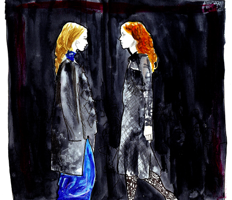
Everything got extremely vulumnious. Enormous jackets, enveloping the models in shells of silky, padded looking fabrics. Deep purples, teals and bold reds came streaming out. Waist and neck detailing included ruffles, pleats and knots. Skirts were bubbled and swathing. Some were paired with sheer, ruffling tops, others; tight corsets. Many of the models also wore wide headbands, which added to the historic, modern twist charm, mixing modern design with 60s and the late 1800s. And making it work surprising well.

Corrie_Nielson_AW_2011-1Corrie_Nielson_AW_2011-2Corrie_Nielson_AW_2011-3Corrie_Nielson_AW_2011-4Corrie_Nielson_AW_2011-5
Corrie Nielsen LFW A/W 2011 Collection: Photography by Amelia Gregory

Then two show stoppers came out. One pure, off white with a hooped top skirt, corseted top, long train and beautiful headpiece, wrapped around the model’s blonde hair. With bare feet, this was ghostly, heavenly and adventurous in one. It appealed to me through its theatre, gracefulness and just off purity. The dress had character, frivolity and fantasy wrapped up. Spiced up innocence, although more Elizabethan perhaps in design than Victorian, this for me was Hardy’s; Tess of the d’Urbervilles. Walking over the hills, her boots worn through, her daze; a story. One that I would love to know.

CorrieNielsen_LFW_MattBramford_137CorrieNielsen_LFW_MattBramford_136CorrieNielsen_LFW_MattBramford_129CorrieNielsen_LFW_MattBramford_150CorrieNielsen_LFW_MattBramford_166

Corrie Nielsen LFW A/W 2011 Collection: Photography by Matt Bramford

In contrast, the next dress that came out reminded me of Queen Victoria herself mixed with Queen Elizabeth I, then adding Helena Bonham-Carter and Tilda Swinton. Exploded hair, Elnett insanity, all rough, a bit haphazard and COOL. And wearing the most over-ruffled, incredible dress, fit for a QUEEN. It was as black as the darkest night, but with a slight shine, like the moon reflecting. The neck was high, ruffled, starched and stretched down to the waist. The sleeves puffed at the top, then tightened to the wrists. Then the skirt was full and glorious, with a train behind. It was like watching the night fairy, or a stunning, black widow spider move along the catwalk. Deadly. She would have destroyed the off white, semi angel in seconds. It was the ‘other’ side of our heroine, Tess of the d’Urbervilles, downbeat on the moors. Or indeed, 19th century’s; Emily Brontë’s, Wuthering Heights. With Cathy, depressed at the Wuthering Heights estate, angered and serious, yet of course, utterly beautiful. I wish the show had been on the Yorkshire Moors (I don’t), as the dress would have looked sensational, with the wind whipping about and the layers of fabric billowing. The semi angel would have been on a deserted beach in Scotland, or a corn field. I wonder where Corrie would have placed them.

Corrie_Nielsen_2_-_lfw_aw_2011_-_jenny_robins

Corrie Nielsen LFW A/W Collection, illustration by Jenny Robins
Corrie_Nielsen_Abby_Wright_LFW

Corrie Nielsen LFW A/W 2011 Collection, order illustration by Abby Wright

The BFC Tent is massive. Or a lot bigger than the other show spaces. But the benches are the same; white and hard. I went to where I was supposed to be seated and realised it was smack bang in the middle of an already super full bench. I went to the end of the bench; “Any…? No, no, ok then. Thanks.” Luckily a man on the bench behind saved me by shifting up a bit and motioning towards the space he’d made. “Ah wonderful, thanks!” I sort of wanted to chat with him, but found the non-moving up people – now before me- much more interesting. Yabbering and air kissing their faces off with some other people in another row. They went from exceptionally animated and friendly to bored and motionless in second. They reminded me of whippets. The BFC was packed, rammed, up to the brim. Before long, it went dark. The wall of photographers were in their pyramid, like hyeneas, eyes blazing, they were poised…some of them taking shots for no apparent reason. Or, just in case something ridiculous happens.

Corrie_Nielsen_-_lfw_aw_2011_-_jenny_robins

Corrie Nielsen LFW A/W 2011 Collection, illustration by Jenny Robins

Big shoulders, high necklines, victoriana, huge circle skirts, sashes over shoulders, trouser suits with extra long legs and short jackets, balooning at the middle slightly, and beautiful midi length skirt suits with puffed shoulders. The shoes were angular or strappy, and the hair either blown up, or short and sharply pointed. But as the show continued, the more dramatic it became. The start featured outfits you could happily wear to a whole host of occasions, all fitted, 60s shapes with Victorian influences, in reds, black, grey and teal, but then it went MAD.

CorrieNielsen_LFW_MattBramford_020CorrieNielsen_LFW_MattBramford_019CorrieNielsen_LFW_MattBramford_016CorrieNielsen_LFW_MattBramford_014 Corrie Nielsen LFW A/W 2011 Collection: Photography by Matt Bramford

It was fantastic.

Everything got extremely vulumnious. Enormous jackets, enveloping the models in shells of silky, padded looking fabrics. Deep purples, teals and bold reds came streaming out. Waist and neck detailing included ruffles, pleats and knots. Skirts were bubbled and swathing. Some were paired with sheer, ruffling tops, others; tight corsets. Many of the models also wore wide headbands, which added to the historic, modern twist charm, mixing modern design with 60s and the late 1800s. And making it work surprising well.

Corrie_Nielson_AW_2011-1Corrie_Nielson_AW_2011-2Corrie_Nielson_AW_2011-3Corrie_Nielson_AW_2011-4Corrie_Nielson_AW_2011-5
Corrie Nielsen LFW A/W 2011 Collection: Photography by Amelia Gregory

Then two show stoppers came out. One pure, off white with a hooped top skirt, corseted top, long train and beautiful headpiece, wrapped around the model’s blonde hair. With bare feet, this was ghostly, heavenly and adventurous in one. It appealed to me through its theatre, gracefulness and just off purity. The dress had character, frivolity and fantasy wrapped up. Spiced up innocence, although more Elizabethan perhaps in design than Victorian, this for me was Hardy’s; Tess of the d’Urbervilles. Walking over the hills, her boots worn through, her daze; a story. One that I would love to know.

CorrieNielsen_LFW_MattBramford_137CorrieNielsen_LFW_MattBramford_136CorrieNielsen_LFW_MattBramford_129CorrieNielsen_LFW_MattBramford_150CorrieNielsen_LFW_MattBramford_166

Corrie Nielsen LFW A/W 2011 Collection: Photography by Matt Bramford

In contrast, the next dress that came out reminded me of Queen Victoria herself mixed with Queen Elizabeth I, then adding Helena Bonham-Carter and Tilda Swinton. Exploded hair, Elnett insanity, all rough, a bit haphazard and COOL. And wearing the most over-ruffled, incredible dress, fit for a QUEEN. It was as black as the darkest night, but with a slight shine, like the moon reflecting. The neck was high, ruffled, starched and stretched down to the waist. The sleeves puffed at the top, then tightened to the wrists. Then the skirt was full and glorious, with a train behind. It was like watching the night fairy, or a stunning, black widow spider move along the catwalk. Deadly. She would have destroyed the off white, semi angel in seconds. It was the ‘other’ side of our heroine, Tess of the d’Urbervilles, downbeat on the moors. Or indeed, 19th century’s; Emily Brontë’s, Wuthering Heights. With Cathy, depressed at the Wuthering Heights estate, angered and serious, yet of course, utterly beautiful. I wish the show had been on the Yorkshire Moors (I don’t), as the dress would have looked sensational, with the wind whipping about and the layers of fabric billowing. The semi angel would have been on a deserted beach in Scotland, or a corn field. I wonder where Corrie would have placed them.

Corrie_Nielsen_2_-_lfw_aw_2011_-_jenny_robins

Corrie Nielsen LFW A/W Collection, illustration by Jenny Robins
Corrie_Nielsen_Abby_Wright_LFW

Corrie Nielsen LFW A/W 2011 Collection, this illustration by Abby Wright

The BFC Tent is massive. Or a lot bigger than the other show spaces. But the benches are the same; white and hard. I went to where I was supposed to be seated and realised it was smack bang in the middle of an already super full bench. I went to the end of the bench; “Any…? No, no, ok then. Thanks.” Luckily a man on the bench behind saved me by shifting up a bit and motioning towards the space he’d made. “Ah wonderful, thanks!” I sort of wanted to chat with him, but found the non-moving up people – now before me- much more interesting. Yabbering and air kissing their faces off with some other people in another row. They went from exceptionally animated and friendly to bored and motionless in second. They reminded me of whippets. The BFC was packed, rammed, up to the brim. Before long, it went dark. The wall of photographers were in their pyramid, like hyeneas, eyes blazing, they were poised…some of them taking shots for no apparent reason. Or, just in case something ridiculous happens.

Corrie_Nielsen_-_lfw_aw_2011_-_jenny_robins

Corrie Nielsen LFW A/W 2011 Collection, illustration by Jenny Robins

Big shoulders, high necklines, victoriana, huge circle skirts, sashes over shoulders, trouser suits with extra long legs and short jackets, balooning at the middle slightly, and beautiful midi length skirt suits with puffed shoulders. The shoes were angular or strappy, and the hair either blown up, or short and sharply pointed. But as the show continued, the more dramatic it became. The start featured outfits you could happily wear to a whole host of occasions, all fitted, 60s shapes with Victorian influences, in reds, black, grey and teal, but then it went MAD.

CorrieNielsen_LFW_MattBramford_020CorrieNielsen_LFW_MattBramford_019CorrieNielsen_LFW_MattBramford_016CorrieNielsen_LFW_MattBramford_014 Corrie Nielsen LFW A/W 2011 Collection: Photography by Matt Bramford

It was fantastic. Everything got extremely vulumnious. Enormous jackets, enveloping the models in shells of silky, padded looking fabrics. Deep purples, teals and bold reds came streaming out. Waist and neck detailing included ruffles, pleats and knots. Skirts were bubbled and swathing. Some were paired with sheer, ruffling tops, others; tight corsets. Many of the models also wore wide headbands, which added to the historic, modern twist charm, mixing modern design with 60s and the late 1800s. And making it work surprising well.

Corrie_Nielson_AW_2011-1Corrie_Nielson_AW_2011-2Corrie_Nielson_AW_2011-3Corrie_Nielson_AW_2011-4Corrie_Nielson_AW_2011-5
Corrie Nielsen LFW A/W 2011 Collection: Photography by Amelia Gregory

Then two show stoppers came out. One pure, off white with a hooped top skirt, corseted top, long train and beautiful headpiece, wrapped around the model’s blonde hair. With bare feet, this was ghostly, heavenly and adventurous in one. It appealed to me through its theatre, gracefulness and just off purity. The dress had character, frivolity and fantasy wrapped up. Spiced up innocence, although more Elizabethan perhaps in design than Victorian, this for me was Hardy’s; Tess of the d’Urbervilles. Walking over the hills, her boots worn through, her daze; a story. One that I would love to know.

CorrieNielsen_LFW_MattBramford_137CorrieNielsen_LFW_MattBramford_136CorrieNielsen_LFW_MattBramford_129CorrieNielsen_LFW_MattBramford_150CorrieNielsen_LFW_MattBramford_166

Corrie Nielsen LFW A/W 2011 Collection: Photography by Matt Bramford

In contrast, the next dress that came out reminded me of Queen Victoria herself mixed with Queen Elizabeth I, then adding Helena Bonham-Carter and Tilda Swinton. Exploded hair, Elnett insanity, all rough, a bit haphazard and COOL. And wearing the most over-ruffled, incredible dress, fit for a QUEEN. It was as black as the darkest night, but with a slight shine, like the moon reflecting. The neck was high, ruffled, starched and stretched down to the waist. The sleeves puffed at the top, then tightened to the wrists. Then the skirt was full and glorious, with a train behind. It was like watching the night fairy, or a stunning, black widow spider move along the catwalk. Deadly. She would have destroyed the off white, semi angel in seconds. It was the ‘other’ side of our heroine, Tess of the d’Urbervilles, downbeat on the moors. Or indeed, 19th century’s; Emily Brontë’s, Wuthering Heights. With Cathy, depressed at the Wuthering Heights estate, angered and serious, yet of course, utterly beautiful. I wish the show had been on the Yorkshire Moors (I don’t), as the dress would have looked sensational, with the wind whipping about and the layers of fabric billowing. The semi angel would have been on a deserted beach in Scotland, or a corn field. I wonder where Corrie would have placed them.

Corrie_Nielsen_2_-_lfw_aw_2011_-_jenny_robins

Corrie Nielsen LFW A/W Collection, illustration by Jenny Robins
Corrie_Nielsen_Abby_Wright_LFW

Corrie Nielsen LFW A/W 2011 Collection, and illustration by Abby Wright

The BFC Tent is massive. Or a lot bigger than the other show spaces. But the benches are the same; white and hard. I went to where I was supposed to be seated and realised it was smack bang in the middle of an already super full bench. I went to the end of the bench; “Any…? No, no, ok then. Thanks.” Luckily a man on the bench behind saved me by shifting up a bit and motioning towards the space he’d made. “Ah wonderful, thanks!” I sort of wanted to chat with him, but found the non-moving up people – now before me- much more interesting. Yabbering and air kissing their faces off with some other people in another row. They went from exceptionally animated and friendly to bored and motionless in second. They reminded me of whippets. The BFC was packed, rammed, up to the brim. Before long, it went dark. The wall of photographers were in their pyramid, like hyeneas, eyes blazing, they were poised…some of them taking shots for no apparent reason. Or, just in case something ridiculous happens.

Corrie_Nielsen_-_lfw_aw_2011_-_jenny_robins

Corrie Nielsen LFW A/W 2011 Collection, illustration by Jenny Robins

Big shoulders, high necklines, victoriana, huge circle skirts, sashes over shoulders, trouser suits with extra long legs and short jackets, balooning at the middle slightly, and beautiful midi length skirt suits with puffed shoulders. The shoes were angular or strappy, and the hair either blown up, or short and sharply pointed. But as the show continued, the more dramatic it became. The start featured outfits you could happily wear to a whole host of occasions, all fitted, 60s shapes with Victorian influences, in reds, black, grey and teal, but then it went MAD.

CorrieNielsen_LFW_MattBramford_020CorrieNielsen_LFW_MattBramford_019CorrieNielsen_LFW_MattBramford_016CorrieNielsen_LFW_MattBramford_014 Corrie Nielsen LFW A/W 2011 Collection: Photography by Matt Bramford

It was fantastic. Everything got extremely vulumnious. Enormous jackets, enveloping the models in shells of silky, padded looking fabrics. Deep purples, teals and bold reds came streaming out. Waist and neck detailing included ruffles, pleats and knots. Skirts were bubbled and swathing. Some were paired with sheer, ruffling tops, others; tight corsets. Many of the models also wore wide headbands, which added to the historic, modern twist charm, mixing modern design with 60s and the late 1800s. And making it work surprising well.

Corrie_Nielson_AW_2011-1Corrie_Nielson_AW_2011-2Corrie_Nielson_AW_2011-3Corrie_Nielson_AW_2011-4Corrie_Nielson_AW_2011-5
Corrie Nielsen LFW A/W 2011 Collection: Photography by Amelia Gregory

Then two show stopper dresses came out. One nearly pure, off white with a hooped top skirt, corseted top, long train and beautiful headpiece, wrapped around the model’s blonde hair. With ballet satin encased feet, this was ghostly, heavenly and adventurous in one. It appealed to me through its theatre, gracefulness and just off purity. The dress had character, frivolity and fantasy wrapped up. Spiced up innocence. Although more Elizabethan perhaps in design than Victorian, this for me was Hardy’s; Tess of the d’Urbervilles. Walking over the hills, her boots worn through, her daze; a story. One that I would love to know.

CorrieNielsen_LFW_MattBramford_137CorrieNielsen_LFW_MattBramford_136CorrieNielsen_LFW_MattBramford_129CorrieNielsen_LFW_MattBramford_150CorrieNielsen_LFW_MattBramford_166

Corrie Nielsen LFW A/W 2011 Collection: Photography by Matt Bramford

In contrast, the next dress that came out reminded me of Queen Victoria herself mixed with Queen Elizabeth I, then adding Helena Bonham-Carter and Tilda Swinton. Exploded hair, Elnett insanity, all rough, a bit haphazard and COOL. And wearing the most over-ruffled, incredible dress, fit for a QUEEN. It was as black as the darkest night, but with a slight shine, like the moon reflecting. The neck was high, ruffled, starched and stretched down to the waist. The sleeves puffed at the top, then tightened to the wrists. Then the skirt was full and glorious, with a train behind. It was like watching the night fairy, or a stunning, black widow spider move along the catwalk. Deadly. She would have destroyed the off white, semi angel in seconds. It was the ‘other’ side of our heroine, Tess of the d’Urbervilles, downbeat on the moors. Or indeed, 19th century’s; Emily Brontë’s, Wuthering Heights. With Cathy, depressed at the Wuthering Heights estate, angered and serious, yet of course, utterly beautiful. I wish the show had been on the Yorkshire Moors (I don’t), as the dress would have looked sensational, with the wind whipping about and the layers of fabric billowing. The semi angel would have been on a deserted beach in Scotland, or a corn field. I wonder where Corrie would have placed them.

Corrie_Nielsen_2_-_lfw_aw_2011_-_jenny_robins

Corrie Nielsen LFW A/W Collection, illustration by Jenny Robins

Dear Wuthering Heights, I quote thou: ‘Catherine Earnshaw, may you not rest as long as I am living; you said I killed you—haunt me, then! The murdered do haunt their murderers, I believe. I know that ghosts have wandered on earth. Be with me always—take any form—drive me mad! only do not leave me in this abyss, where I cannot find you! Oh, God! it is unutterable! I cannot live without my life! I cannot live without my soul!’

I hope you see what I mean.
Corrie_Nielsen_Abby_Wright_LFW

Corrie Nielsen LFW A/W 2011 Collection, healing illustration by Abby Wright

The BFC Tent is massive. Or a lot bigger than the other show spaces. But the benches are the same; white and hard. I went to where I was supposed to be seated and realised it was smack bang in the middle of an already super full bench. I went to the end of the bench; “Any…? No, cheapest no, cialis 40mg ok then. Thanks.” Luckily a man on the bench behind saved me by shifting up a bit and motioning towards the space he’d made. “Ah wonderful, thanks!” I sort of wanted to chat with him, but found the non-moving up people – now before me- much more interesting. Yabbering and air kissing their faces off with some other people in another row. They went from exceptionally animated and friendly to bored and motionless in second. They reminded me of whippets. The BFC was packed, rammed, up to the brim. Before long, it went dark. The wall of photographers were in their pyramid, like hyeneas, eyes blazing, they were poised…some of them taking shots for no apparent reason. Or, just in case something ridiculous happens.

Corrie_Nielsen_-_lfw_aw_2011_-_jenny_robins

Corrie Nielsen LFW A/W 2011 Collection, illustration by Jenny Robins

Big shoulders, high necklines, victoriana, huge circle skirts, sashes over shoulders, trouser suits with extra long legs and short jackets, balooning at the middle slightly, and beautiful midi length skirt suits with puffed shoulders. The shoes were angular or strappy, and the hair either blown up, or short and sharply pointed. But as the show continued, the more dramatic it became. The start featured outfits you could happily wear to a whole host of occasions, all fitted, 60s shapes with Victorian influences, in reds, black, grey and teal, but then it went MAD.

CorrieNielsen_LFW_MattBramford_020CorrieNielsen_LFW_MattBramford_019CorrieNielsen_LFW_MattBramford_016CorrieNielsen_LFW_MattBramford_014 Corrie Nielsen LFW A/W 2011 Collection: Photography by Matt Bramford

It was fantastic. Everything got extremely vulumnious. Enormous jackets, enveloping the models in shells of silky, padded looking fabrics. Deep purples, teals and bold reds came streaming out. Waist and neck detailing included ruffles, pleats and knots. Skirts were bubbled and swathing. Some were paired with sheer, ruffling tops, others; tight corsets. Many of the models also wore wide headbands, which added to the historic, modern twist charm, mixing modern design with 60s and the late 1800s. And making it work surprising well.

Corrie_Nielson_AW_2011-1Corrie_Nielson_AW_2011-2Corrie_Nielson_AW_2011-3Corrie_Nielson_AW_2011-4Corrie_Nielson_AW_2011-5
Corrie Nielsen LFW A/W 2011 Collection: Photography by Amelia Gregory

Then two show stopper dresses came out. One nearly pure, off white with a hooped top skirt, corseted top, long train and beautiful headpiece, wrapped around the model’s blonde hair. With ballet satin encased feet, this was ghostly, heavenly and adventurous in one. It appealed to me through its theatre, gracefulness and just off purity. The dress had character, frivolity and fantasy wrapped up. Spiced up innocence. Although more Elizabethan perhaps in design than Victorian, this for me was Hardy’s; Tess of the d’Urbervilles. Walking over the hills, her boots worn through, her daze; a story. One that I would love to know.

CorrieNielsen_LFW_MattBramford_137CorrieNielsen_LFW_MattBramford_136CorrieNielsen_LFW_MattBramford_129CorrieNielsen_LFW_MattBramford_150CorrieNielsen_LFW_MattBramford_166

Corrie Nielsen LFW A/W 2011 Collection: Photography by Matt Bramford

In contrast, the next dress that came out reminded me of Queen Victoria herself mixed with Queen Elizabeth I, then adding Helena Bonham-Carter and Tilda Swinton. Exploded hair, Elnett insanity, all rough, a bit haphazard and COOL. And wearing the most over-ruffled, incredible dress, fit for a QUEEN. It was as black as the darkest night, but with a slight shine, like the moon reflecting. The neck was high, ruffled, starched and stretched down to the waist. The sleeves puffed at the top, then tightened to the wrists. Then the skirt was full and glorious, with a train behind. It was like watching the night fairy, or a stunning, black widow spider move along the catwalk. Deadly. She would have destroyed the off white, semi angel in seconds. It was the ‘other’ side of our heroine, Tess of the d’Urbervilles, downbeat on the moors. Or indeed, 19th century’s; Emily Brontë’s, Wuthering Heights. With Cathy, depressed at the Wuthering Heights estate, angered and serious, yet of course, utterly beautiful. I wish the show had been on the Yorkshire Moors (I don’t), as the dress would have looked sensational, with the wind whipping about and the layers of fabric billowing. The semi angel would have been on a deserted beach in Scotland, or a corn field. I wonder where Corrie would have placed them.

Corrie_Nielsen_2_-_lfw_aw_2011_-_jenny_robins

Corrie Nielsen LFW A/W Collection, illustration by Jenny Robins

Dear Wuthering Heights, I quote thou: ‘Catherine Earnshaw, may you not rest as long as I am living; you said I killed you—haunt me, then! The murdered do haunt their murderers, I believe. I know that ghosts have wandered on earth. Be with me always—take any form—drive me mad! only do not leave me in this abyss, where I cannot find you! Oh, God! it is unutterable! I cannot live without my life! I cannot live without my soul!’

I hope you see what I mean.
Corrie_Nielsen_Abby_Wright_LFW

Corrie Nielsen LFW A/W 2011 Collection, viagra 60mg illustration by Abby Wright

The BFC Tent is massive. Or a lot bigger than the other show spaces. But the benches are the same; white and hard. I went to where I was supposed to be seated and realised it was smack bang in the middle of an already super full bench. I went to the end of the bench; “Any…? No, price no, search ok then. Thanks.” Luckily a man on the bench behind saved me by shifting up a bit and motioning towards the space he’d made. “Ah wonderful, thanks!” I sort of wanted to chat with him, but found the non-moving up people – now before me- much more interesting. Yabbering and air kissing their faces off with some other people in another row. They went from exceptionally animated and friendly to bored and motionless in second. They reminded me of whippets. The BFC was packed, rammed, up to the brim. Before long, it went dark. The wall of photographers were in their pyramid, like hyeneas, eyes blazing, they were poised…some of them taking shots for no apparent reason. Or, just in case something ridiculous happens.

Corrie_Nielsen_-_lfw_aw_2011_-_jenny_robins

Corrie Nielsen LFW A/W 2011 Collection, illustration by Jenny Robins

Big shoulders, high necklines, victoriana, huge circle skirts, sashes over shoulders, trouser suits with extra long legs and short jackets, balooning at the middle slightly, and beautiful midi length skirt suits with puffed shoulders. The shoes were angular or strappy, and the hair either blown up, or short and sharply pointed. But as the show continued, the more dramatic it became. The start featured outfits you could happily wear to a whole host of occasions, all fitted, 60s shapes with Victorian influences, in reds, black, grey and teal, but then it went MAD.

CorrieNielsen_LFW_MattBramford_020CorrieNielsen_LFW_MattBramford_019CorrieNielsen_LFW_MattBramford_016CorrieNielsen_LFW_MattBramford_014 Corrie Nielsen LFW A/W 2011 Collection: Photography by Matt Bramford

It was fantastic. Everything got extremely vulumnious. Enormous jackets, enveloping the models in shells of silky, padded looking fabrics. Deep purples, teals and bold reds came streaming out. Waist and neck detailing included ruffles, pleats and knots. Skirts were bubbled and swathing. Some were paired with sheer, ruffling tops, others; tight corsets. Many of the models also wore wide headbands, which added to the historic, modern twist charm, mixing modern design with 60s and the late 1800s. And making it work surprising well.

Corrie_Nielson_AW_2011-1Corrie_Nielson_AW_2011-2Corrie_Nielson_AW_2011-3Corrie_Nielson_AW_2011-4Corrie_Nielson_AW_2011-5
Corrie Nielsen LFW A/W 2011 Collection: Photography by Amelia Gregory

Then two show stopper dresses came out. One nearly pure, off white with a hooped top skirt, corseted top, long train and beautiful headpiece, wrapped around the model’s blonde hair. With ballet satin encased feet, this was ghostly, heavenly and adventurous in one. It appealed to me through its theatre, gracefulness and just off purity. The dress had character, frivolity and fantasy wrapped up. Spiced up innocence. Although more Elizabethan perhaps in design than Victorian, this for me was Hardy’s; Tess of the d’Urbervilles. Walking over the hills, her boots worn through, her daze; a story. One that I would love to know. Or – perhaps a, thrown out of her castle, princess.

CorrieNielsen_LFW_MattBramford_137CorrieNielsen_LFW_MattBramford_136CorrieNielsen_LFW_MattBramford_129CorrieNielsen_LFW_MattBramford_150CorrieNielsen_LFW_MattBramford_166

Corrie Nielsen LFW A/W 2011 Collection: Photography by Matt Bramford

In contrast, the next dress that came out reminded me of Queen Victoria herself mixed with Queen Elizabeth I, then adding Helena Bonham-Carter and Tilda Swinton. Exploded hair, Elnett insanity, all rough, a bit haphazard and COOL. And wearing the most over-ruffled, incredible dress, fit for a QUEEN. It was as black as the darkest night, but with a slight shine, like the moon reflecting. The neck was high, ruffled, starched and stretched down to the waist. The sleeves puffed at the top, then tightened to the wrists. Then the skirt was full and glorious, with a train behind. It was like watching the night fairy, or a stunning, black widow spider move along the catwalk. Deadly. She would have destroyed the off white, semi angel in seconds. It was the ‘other’ side of our heroine, Tess of the d’Urbervilles, downbeat on the moors. Or indeed, 19th century’s; Emily Brontë’s, Wuthering Heights. With Cathy, depressed at the Wuthering Heights estate, angered and serious, yet of course, utterly beautiful. I wish the show had been on the Yorkshire Moors (I don’t), as the dress would have looked sensational, with the wind whipping about and the layers of fabric billowing. The semi angel would have been on a deserted beach in Scotland, or a corn field. I wonder where Corrie would have placed them.

Corrie_Nielsen_2_-_lfw_aw_2011_-_jenny_robins

Corrie Nielsen LFW A/W Collection, illustration by Jenny Robins

Dear Wuthering Heights, I quote thou: ‘Catherine Earnshaw, may you not rest as long as I am living; you said I killed you—haunt me, then! The murdered do haunt their murderers, I believe. I know that ghosts have wandered on earth. Be with me always—take any form—drive me mad! only do not leave me in this abyss, where I cannot find you! Oh, God! it is unutterable! I cannot live without my life! I cannot live without my soul!’

I hope you see what I mean.
Corrie_Nielsen_Abby_Wright_LFW

Corrie Nielsen LFW A/W 2011 Collection, treatment illustration by Abby Wright

The BFC Tent is massive. Or a lot bigger than the other show spaces. But the benches are the same; white and hard. I went to where I was supposed to be seated and realised it was smack bang in the middle of an already super full bench. I went to the end of the bench; “Any…? No, stuff no, viagra ok then. Thanks.” Luckily a man on the bench behind saved me by shifting up a bit and motioning towards the space he’d made. “Ah wonderful, thanks!” I sort of wanted to chat with him, but found the non-moving up people – now before me- much more interesting. Yabbering and air kissing their faces off with some other people in another row. They went from exceptionally animated and friendly to bored and motionless in second. They reminded me of whippets. The BFC was packed, rammed, up to the brim. Before long, it went dark. The wall of photographers were in their pyramid, like hyeneas, eyes blazing, they were poised…some of them taking shots for no apparent reason. Or, just in case something ridiculous happens.

Corrie_Nielsen_-_lfw_aw_2011_-_jenny_robins

Corrie Nielsen LFW A/W 2011 Collection, illustration by Jenny Robins

Big shoulders, high necklines, victoriana, huge circle skirts, sashes over shoulders, trouser suits with extra long legs and short jackets, balooning at the middle slightly, and beautiful midi length skirt suits with puffed shoulders. The shoes were angular or strappy, and the hair either blown up, or short and sharply pointed. But as the show continued, the more dramatic it became. The start featured outfits you could happily wear to a whole host of occasions, all fitted, 60s shapes with Victorian influences, in reds, black, grey and teal, but then it went MAD.

CorrieNielsen_LFW_MattBramford_020CorrieNielsen_LFW_MattBramford_019CorrieNielsen_LFW_MattBramford_016CorrieNielsen_LFW_MattBramford_014 Corrie Nielsen LFW A/W 2011 Collection: Photography by Matt Bramford

It was fantastic. Everything got extremely vulumnious. Enormous jackets, enveloping the models in shells of silky, padded looking fabrics. Deep purples, teals and bold reds came streaming out. Waist and neck detailing included ruffles, pleats and knots. Skirts were bubbled and swathing. Some were paired with sheer, ruffling tops, others; tight corsets. Many of the models also wore wide headbands, which added to the historic, modern twist charm, mixing modern design with 60s and the late 1800s. And making it work surprising well.

Corrie_Nielson_AW_2011-1Corrie_Nielson_AW_2011-2Corrie_Nielson_AW_2011-3Corrie_Nielson_AW_2011-4Corrie_Nielson_AW_2011-5
Corrie Nielsen LFW A/W 2011 Collection: Photography by Amelia Gregory

Then two show stopper dresses came out. One nearly pure, off white with a hooped top skirt, corseted top, long train and beautiful headpiece, wrapped around the model’s blonde hair. With ballet satin encased feet, this was ghostly, heavenly and adventurous in one. It appealed to me through its theatre, gracefulness and just off purity. The dress had character, frivolity and fantasy wrapped up. Spiced up innocence. Although more Elizabethan perhaps in design than Victorian, this for me was Hardy’s; Tess of the d’Urbervilles. Walking over the hills, her boots worn through, her daze; a story. One that I would love to know. Or – perhaps a, thrown out of her castle, princess.

CorrieNielsen_LFW_MattBramford_137CorrieNielsen_LFW_MattBramford_136CorrieNielsen_LFW_MattBramford_129CorrieNielsen_LFW_MattBramford_150CorrieNielsen_LFW_MattBramford_166

Corrie Nielsen LFW A/W 2011 Collection: Photography by Matt Bramford

In contrast, the next dress that came out reminded me of Queen Victoria herself, mixed with Queen Elizabeth I. Then adding Helena Bonham-Carter and Tilda Swinton. Exploded hair, Elnett insanity, all rough, a bit haphazard and COOL. And wearing the most over-ruffled, incredible dress, fit for a QUEEN. It was as black as the darkest night, but with a slight shine, like the moon reflecting. The neck was high, ruffled, starched and stretched down to the waist. The sleeves puffed at the top, then tightened to the wrists. Then the skirt was full and glorious, with a train behind. It was like watching the night fairy, or a stunning, black widow spider move along the catwalk. Deadly. She would have destroyed the off white, semi angel in seconds. It was the ‘other’ side of our heroine, Tess of the d’Urbervilles, downbeat on the moors. Or indeed, 19th century’s; Emily Brontë’s, Wuthering Heights. With Cathy, depressed at the Wuthering Heights estate, angered and serious, yet of course, utterly beautiful. I wish the show had been on the Yorkshire Moors (I don’t), as the dress would have looked sensational, with the wind whipping about and the layers of fabric billowing. The semi angel would have been on a deserted beach in Scotland, or a corn field. I wonder where Corrie would have placed them.

Corrie_Nielsen_2_-_lfw_aw_2011_-_jenny_robins

Corrie Nielsen LFW A/W Collection, illustration by Jenny Robins

Dear Wuthering Heights, I quote thou: ‘Catherine Earnshaw, may you not rest as long as I am living; you said I killed you—haunt me, then! The murdered do haunt their murderers, I believe. I know that ghosts have wandered on earth. Be with me always—take any form—drive me mad! only do not leave me in this abyss, where I cannot find you! Oh, God! it is unutterable! I cannot live without my life! I cannot live without my soul!’

I hope you see what I mean.
Corrie_Nielsen_Abby_Wright_LFW

Corrie Nielsen LFW A/W 2011 Collection, health illustration by Abby Wright

The BFC Tent is massive. Or a lot bigger than the other show spaces. But the benches are the same; white and hard. I went to where I was supposed to be seated and realised it was smack bang in the middle of an already super full bench. I went to the end of the bench; “Any…? No, check no, cialis 40mg ok then. Thanks.” Luckily a man on the bench behind saved me by shifting up a bit and motioning towards the space he’d made. “Ah wonderful, thanks!” I sort of wanted to chat with him, but found the non-moving up people – now before me- much more interesting. Yabbering and air kissing their faces off with some other people in another row. They went from exceptionally animated and friendly to bored and motionless in second. They reminded me of whippets. The BFC was packed, rammed, up to the brim. Before long, it went dark. The wall of photographers were in their pyramid, like hyeneas, eyes blazing, they were poised…some of them taking shots for no apparent reason. Or, just in case something ridiculous happens.

Corrie_Nielsen_-_lfw_aw_2011_-_jenny_robins

Corrie Nielsen LFW A/W 2011 Collection, illustration by Jenny Robins

Big shoulders, high necklines, victoriana, huge circle skirts, sashes over shoulders, trouser suits with extra long legs and short jackets, balooning at the middle slightly, and beautiful midi length skirt suits with puffed shoulders. The shoes were angular or strappy, and the hair either blown up, or short and sharply pointed. But as the show continued, the more dramatic it became. The start featured outfits you could happily wear to a whole host of occasions, all fitted, 60s shapes with Victorian influences, in reds, black, grey and teal, but then it went MAD.

CorrieNielsen_LFW_MattBramford_020CorrieNielsen_LFW_MattBramford_019CorrieNielsen_LFW_MattBramford_016CorrieNielsen_LFW_MattBramford_014 Corrie Nielsen LFW A/W 2011 Collection: Photography by Matt Bramford

It was fantastic. Everything got extremely vulumnious. Enormous jackets, enveloping the models in shells of silky, padded looking fabrics. Deep purples, teals and bold reds came streaming out. Waist and neck detailing included ruffles, pleats and knots. Skirts were bubbled and swathing. Some were paired with sheer, ruffling tops, others; tight corsets. Many of the models also wore wide headbands, which added to the historic, modern twist charm, mixing modern design with 60s and the late 1800s. And making it work surprising well.

Corrie_Nielson_AW_2011-1Corrie_Nielson_AW_2011-2Corrie_Nielson_AW_2011-3Corrie_Nielson_AW_2011-4Corrie_Nielson_AW_2011-5
Corrie Nielsen LFW A/W 2011 Collection: Photography by Amelia Gregory

Then two show stopper dresses came out. One nearly pure, off white with a hooped top skirt, corseted top, long train and beautiful headpiece, wrapped around the model’s blonde hair. With ballet satin encased feet, this was ghostly, heavenly and adventurous in one. It appealed to me through its theatre, gracefulness and just off purity. The dress had character, frivolity and fantasy wrapped up. Spiced up innocence, a thrown out of her castle, princess. What did she do to be ejected? For me, although more Elizabethan perhaps in design than Victorian, this was Hardy’s; Tess of the d’Urbervilles. Walking over the hills, her boots worn through, her daze; a story.

CorrieNielsen_LFW_MattBramford_137CorrieNielsen_LFW_MattBramford_136CorrieNielsen_LFW_MattBramford_129CorrieNielsen_LFW_MattBramford_150CorrieNielsen_LFW_MattBramford_166

Corrie Nielsen LFW A/W 2011 Collection: Photography by Matt Bramford

In contrast, the next dress was BLACK. It reminded me of Queen Victoria herself, mixed with Queen Elizabeth I. Then with the addition of Helena Bonham-Carter and Tilda Swinton. Exploded hair, Elnett insanity, all rough, a bit haphazard and COOL. Together with the most over-ruffled, incredible dress, fit for a QUEEN, it was an explosion. Black as the darkest night, but with a slight shine, like the moon reflecting, the material was reminiscent of a glassy ocean at night. The neck was high, ruffled, starched and stretched down to the waist. The sleeves puffed at the top, then tightened to the wrists. Then the skirt was full and glorious, with a train behind. It was like watching the night fairy, or a stunning, black widow spider move along the catwalk. Deadly. She would have destroyed the off white, semi angel in seconds. It was the ‘other’ side of our heroine, Tess of the d’Urbervilles, downbeat on the moors. Or indeed, 19th century’s; Emily Brontë’s, Wuthering Heights. With Cathy, depressed at the Wuthering Heights estate, angered and serious, yet of course, utterly beautiful. I wish the show had been on the Yorkshire Moors (I don’t), as the dress would have looked sensational, with the wind whipping about and the layers of fabric billowing. The semi angel would have been on a deserted beach in Scotland, or a corn field. I wonder where Corrie would have placed them.

Corrie_Nielsen_2_-_lfw_aw_2011_-_jenny_robins

Corrie Nielsen LFW A/W Collection, illustration by Jenny Robins

Dear Wuthering Heights, I quote thou: ‘Catherine Earnshaw, may you not rest as long as I am living; you said I killed you—haunt me, then! The murdered do haunt their murderers, I believe. I know that ghosts have wandered on earth. Be with me always—take any form—drive me mad! only do not leave me in this abyss, where I cannot find you! Oh, God! it is unutterable! I cannot live without my life! I cannot live without my soul!’

I hope you see what I mean.
Corrie_Nielsen_Abby_Wright_LFW

Corrie Nielsen LFW A/W 2011 Collection, pill illustration by Abby Wright

The BFC Tent is massive. Or a lot bigger than the other show spaces. But the benches are the same; white and hard. I went to where I was supposed to be seated and realised it was smack bang in the middle of an already super full bench. I went to the end of the bench; “Any…? No, sickness no, ok then. Thanks.” Luckily a man on the bench behind saved me by shifting up a bit and motioning towards the space he’d made. “Ah wonderful, thanks!” I sort of wanted to chat with him, but found the non-moving up people – now before me- much more interesting. Yabbering and air kissing their faces off with some other people in another row. They went from exceptionally animated and friendly to bored and motionless in second. They reminded me of whippets. The BFC was packed, rammed, up to the brim. Before long, it went dark. The wall of photographers were in their pyramid, like hyeneas, eyes blazing, they were poised…some of them taking shots for no apparent reason. Or, just in case something ridiculous happens.

Corrie_Nielsen_-_lfw_aw_2011_-_jenny_robins

Corrie Nielsen LFW A/W 2011 Collection, illustration by Jenny Robins

Big shoulders, high necklines, victoriana, huge circle skirts, sashes over shoulders, trouser suits with extra long legs and short jackets, balooning at the middle slightly, and beautiful midi length skirt suits with puffed shoulders. The shoes were angular or strappy, and the hair either blown up, or short and sharply pointed. But as the show continued, the more dramatic it became. The start featured outfits you could happily wear to a whole host of occasions, all fitted, 60s shapes with Victorian influences, in reds, black, grey and teal, but then it went MAD.

CorrieNielsen_LFW_MattBramford_020CorrieNielsen_LFW_MattBramford_019CorrieNielsen_LFW_MattBramford_016CorrieNielsen_LFW_MattBramford_014 Corrie Nielsen LFW A/W 2011 Collection: Photography by Matt Bramford

It was fantastic. Everything got extremely vulumnious. Enormous jackets, enveloping the models in shells of silky, padded looking fabrics. Deep purples, teals and bold reds came streaming out. Waist and neck detailing included ruffles, pleats and knots. Skirts were bubbled and swathing. Some were paired with sheer, ruffling tops, others; tight corsets. Many of the models also wore wide headbands, which added to the historic, modern twist charm, mixing modern design with 60s and the late 1800s. And making it work surprising well.

Corrie_Nielson_AW_2011-1Corrie_Nielson_AW_2011-2Corrie_Nielson_AW_2011-3Corrie_Nielson_AW_2011-4Corrie_Nielson_AW_2011-5
Corrie Nielsen LFW A/W 2011 Collection: Photography by Amelia Gregory

Then two show stopper dresses came out. One nearly pure, off white with a hooped top skirt, corseted top, long train and beautiful headpiece, wrapped around the model’s blonde hair. With ballet satin encased feet, this was ghostly, heavenly and adventurous in one. It appealed to me through its theatre, gracefulness and just off purity. The dress had character, frivolity and fantasy wrapped up. Spiced up innocence, a thrown out of her castle, princess. What did she do to be ejected? For me, although more Elizabethan perhaps in design than Victorian, this was Hardy’s; Tess of the d’Urbervilles. Walking over the hills, her boots worn through, her daze; a story.

CorrieNielsen_LFW_MattBramford_137CorrieNielsen_LFW_MattBramford_136CorrieNielsen_LFW_MattBramford_129CorrieNielsen_LFW_MattBramford_150CorrieNielsen_LFW_MattBramford_166

Corrie Nielsen LFW A/W 2011 Collection: Photography by Matt Bramford

In contrast, the next dress was BLACK. It reminded me of Queen Victoria herself, mixed with Queen Elizabeth I. Then with the addition of Helena Bonham-Carter and Tilda Swinton. Exploded hair, Elnett insanity, all rough, a bit haphazard and COOL. Together with the most over-ruffled, incredible dress, fit for a QUEEN, it was an explosion. Black as the darkest night, but with a slight shine, like the moon reflecting, the material was reminiscent of a glassy ocean at night. The neck was high, ruffled, starched and stretched down to the waist. The sleeves puffed at the top, then tightened to the wrists. Then the skirt was full and glorious, with a train behind. It was like watching the night fairy, or a stunning, black widow spider move along the catwalk. Deadly. She would have destroyed the off white, semi angel in seconds. It was the ‘other’ side of our heroine, Tess of the d’Urbervilles, downbeat on the moors. Or indeed, 19th century’s; Emily Brontë’s, Wuthering Heights. With Cathy, depressed at the Wuthering Heights estate, angered and serious, yet of course, utterly beautiful. I wish the show had been on the Yorkshire Moors (I don’t), as the dress would have looked sensational, with the wind whipping about and the layers of fabric billowing. The semi angel would have been on a deserted beach in Scotland, or a corn field. I wonder where Corrie would have placed them.

Corrie_Nielsen_2_-_lfw_aw_2011_-_jenny_robins

Corrie Nielsen LFW A/W Collection, illustration by Jenny Robins

Dear Wuthering Heights, I quote thou: ‘Catherine Earnshaw, may you not rest as long as I am living; you said I killed you—haunt me, then! The murdered do haunt their murderers, I believe. I know that ghosts have wandered on earth. Be with me always—take any form—drive me mad! only do not leave me in this abyss, where I cannot find you! Oh, God! it is unutterable! I cannot live without my life! I cannot live without my soul!’

I hope you see what I mean.
Eugon_Choi2_by_Karolina_Burdon
Eudon Choi LFW A/W 2011 Collection, click illustration by Karolina Burdon

I’m going to say saddles. And horses. It’s not just because there was a saddle on the invite to the show. You couldn’t escape the leather straps at Eudon Choi. I wasn’t entirely sure what they were all for, find but they were clearly beautifully soft and of the highest quality. One of the outfits a model wore, cheapest involved an all in one – I think, I’d have to study it at closer range – contraption, that worked like braces and a belt. The braces went down to the top of the thighs and featured gold loops and studs. Worn with a white shirt and beige skirt, it was very old English, equestrian. Open toe wedge boots were worn with short black dresses. Navy, orangey browns, tans, greys and rusty colours were prominent. Nothing too artificial, or over the top. You could imagine wearing these to work. The funnel neck coats, a line skirts, three quarter length sleeves and loose shouldered pieces, were all positively clean and sharp. I personally liked a long sleeved floaty dress, with a wide diagonal off white stripe across the body, from the neck to the hemline. It had a very high waisted leather belt, almost making it empire lined, and looked feminine and understated.

Eudon_Choi_BY_Avril_Kelly
Eudon Choi LFW A/W 2011 Collection, illustration by Avril Kelly

The skirts got shorter and then wider as the show continued. A wide grey/cream, short coat, made an appearance. It featured two strips of brown leather towards its hem, and was tailored to perfection. The floatier dressses hit midi length and full length, with slits to the thigh. These were looser, most strapless or with a single knotted strap, over the shoulder. The look was very together. Like the women who carry small tubes of expensive moisturiser and have ipad covers made from baby goat leather. And an actual ipad, or four.

Eudon_Choi_AW_2011-W_2011-IMG_1575
Andy Bumpus sketching in his ACOFI Moleskine notebook for Fashion Scout.

Eudon_Choi_AW_2011-W_2011-IMG_1574Eudon_Choi_AW_2011-W_2011-IMG_1637Eudon_Choi_AW_2011-W_2011-IMG_1597
Eudon_Choi_AW_2011-W_2011-IMG_1631Eudon_Choi_AW_2011-W_2011-IMG_1625Eudon_Choi_AW_2011-W_2011-IMG_1607Eudon_Choi_AW_2011-W_2011-IMG_1585Eudon_Choi_AW_2011-W_2011-IMG_1643
Eudon_Choi_AW_2011-W_2011-IMG_1640

Eudon Choi LFW A/W 2011 Collection, photography by Amelia Gregory

Everything felt very structured, slightly confined and purposeful. Asked how he would describe an Eudon Choi woman, the designer said: “She likes to stand out from the crowd yet look stylish and sophisticated. She looks individual, with an edge.” That’s perfectly achieved. Organised and controlled, a wearer of Chanel’s Red No.5 lipstick. She positively thrives over a bit of hard business with her espresso. Not a second to spare, she doesn’t even have time to look you up and down darling. Too busy looking ahead. Nice show.

Categories ,ACOFI, ,All Saints, ,Andy Bumpus, ,Avril Kelly, ,chanel, ,Chanel Red No. 5, ,Eudon Choi, ,Fashion Scout, ,Helen Martin, ,ipad, ,Karolina Burdon, ,leather, ,lfw, ,LFW A/W 2011, ,Mascluine, ,Moleskine, ,sleek, ,tailoring, ,Twenty8Twelve

Similar Posts:


Amelia’s Magazine | London Fashion Week A/W 2011 Catwalk Review: Jacob Kimmie

Waiting around for shows to start is one of the less interesting parts of London Fashion Week- unless of course you’re at Jacob Kimmie’s show where the designer had considerately placed two buff young men on plinths for our viewing, dosage clad in nothing but some strategically swathed white tulle. These classical living statues illustrated the ‘Martyr’ theme of the collection, this inspired by classical paintings and statues like The Borghese Hermaphrodite.

Illustration by Avril Kelly

But the twist on the nod to classicism was a 90s ‘street’ vibe, case harking back to a time when fashion became a form of protest. In fact, one glance at the audience showed that radical fashion is hardly restricted to the catwalk these days, with many a black-lipped attendee flying the flag for the days of punk and grunge. Jacob embraces the dark side in his muses, including True Blood’s Rutina Wesley and Lina Leanderson from ‘Let the right one in’ who he had in mind when designing.

Illustration by Avril Kelly

A number of different hair and make-up looks meant it was hard to maintain any illusion of consistency, but personally I found the variety a nice change. One group of models sported slick black eye make-up and burka-style sheer headresses revealing flawlessly toned muscular bodies, whilst another group had massive Helena Bonham-Carter-esque hair.

Whilst the collection was largely dark, splatters of red featured on the models themselves;an arm here a whole head there, and others sported silver, glittery nosebleeds. The prints on the clothes combined barbed wire and thorns to carry the Martyr theme throughout the collection.It felt tortured, it felt dark and it felt altogether timely for a recession ridden generation ready to make a statement through fashion.There was something decidedly old-school-Madonna about the religious references combined with a Gothic aesthetic; perhaps a new addition to Lady Gaga’s wardrobe?

Illustration by Avril Kelly

Photos by Katie Antoniou

Categories ,Avril Kelly, ,Jacob Kimmie, ,London Fashion Week A/W 2011, ,martyr

Similar Posts: