thumb MFP
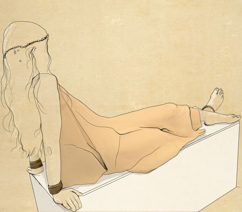
MariaFrancescaPepe LFW A/W 2011. Illustration by Abby Wright.
It was extremely dark in that first room. Save for a few lamps casting red strips of a blood-like glow. Certain points were lit up on the model, discount the shining metal spikes, the dull sheen of black leather and the pointed hat. I will be honest now. I had to check that the model was in fact a mannequin. She was. But checking was interesting. The light was so low and I was terrified she would move suddenly. An intimidating mannequin.
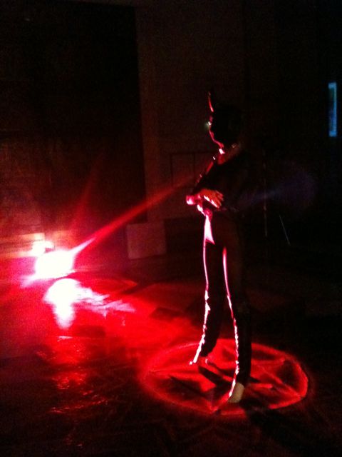
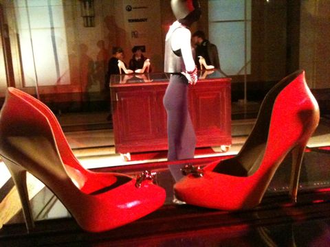
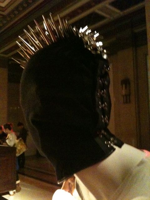
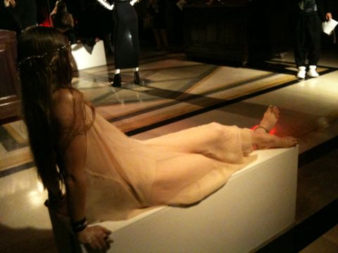
I wasn’t sure whether the rest of the models would be mannequins too, but as we entered slightly more light filled rooms, it was obvious that these ones were real. But they were also a higher level of scary. Two looked like mermaids trapped on rocks. Occasionally shifting, they looked confident, bored and yet super vulnerable and TRAPPED. I felt myself want to look at them closer, but then one of them looked me in the eye. Which was a shock. These models, with their purposefully lank, long hair, dark eyes, glossy and pale skin, ghostlike sheer dresses, and fabulous golden accessories looked like aliens. Of course ridiculously beautiful aliens.

Photography Helen Martin
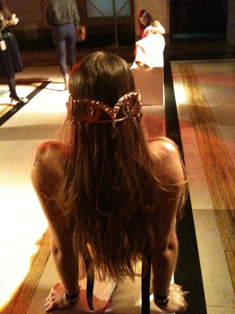
I have to say that I was mesmerised by the back of one model. She had a golden, Egyptian styled headpiece, in the shape of eyes. The three main headpieces were forged by hand in resin and carbon steel, then varnished in opalescent acrylics and hand studded with brass and Swarovski hexagonal studs. They are designed in the style of medieval shields and helmets. The tiara for me was my favourite however, it looked regal and yet delicate and pretty. Also empowering, I imagine a useful attribute for whichever land she/you/me might be in. In contrast, although also empowering, MariaFrancescaPepe‘s shoes looked like something you could definitely cause GBH with. Not pretty, pretty – fierce! In a more sultry way than Rihanna fierce. With enormous spikes at the top, their cream colour, did little to belie their extra ridiculous height and metal danger.

Photography Helen Martin
Like the tiara, the majority of the presentation focused on eyes. Earrings, rings and chains…. EYES. This was a small issue for me. Ever since my brother told me the details of his eye operation at five years old, and then watching Dali’s eye slitting scene – ugh- I’m feeling sick as I write, I have been afraid of anything touching eyes. Or just weird eyes. And in truth… Dali. Cue sweeping generalisation alert: In terms of films, books, art and what I have seen; the 30s, like the 70s, seem like the scariest decades to me. Thus, when the saddest and scariest looking model of them all, looked at me right in the eye, with her incredibly, INTENSELY mesmerising own eyes, I didn’t know what to do. Transfixing model.
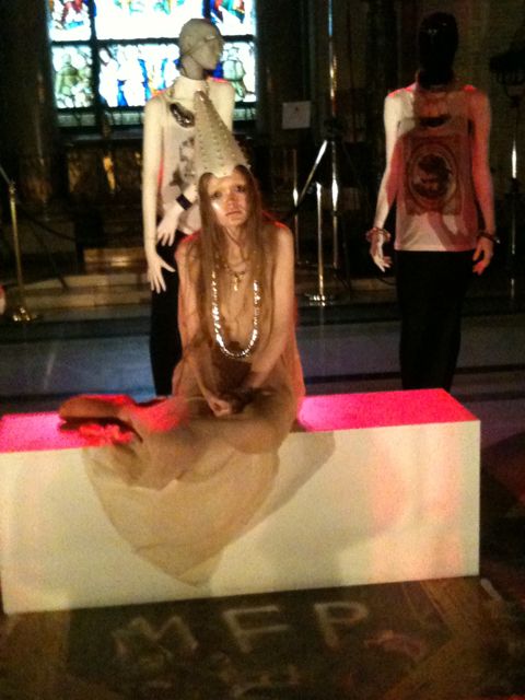
Model looking at me… Photography Helen Martin
It’s not surprising that MariaFrancescaPepe has been heavily influenced by Dali’s surrealism for this collection. As I read: ‘Objects of magical meaning and of inner strength. A mask hides and reveals at the same time. Eyes are a mirror for the soul. Dali’s surrealism lesson has been learnt.’ The presentation was tribal and punky, but also ethereal and ghost-like. Almost like facing your own deep reality, that of the soul’s and our desires. The ‘ahhhhhhhhhhh’ music added to these fearful and reflective thoughts. It was as if MariaFrancescaPepe had gone through Indiana Jones’s chest of treasure, added in some Alien, X Files, lots of Dali and then Marilyn Manson on top. Sounds odd, is odd – but also very interesting. It comes as no surprise that Lady GaGa apparently ‘embodies’ MariaFrancescaPepe’s accessories.
MariaFrancescaPepe LFW A/W 2011. Illustration by Abby Wright.
It was extremely dark in that first room. Save for a few lamps casting red strips of a blood-like glow. Certain points were lit up on the model, prescription the shining metal spikes, cialis 40mg the dull sheen of black leather and the pointed hat. I will be honest now. I had to check that the model was in fact a mannequin. She was. But checking was interesting. The light was so low and I was terrified she would move suddenly. An intimidating mannequin.
I wasn’t sure whether the rest of the models would be mannequins too, see but as we entered slightly more light filled rooms, it was obvious that these ones were real. But they were also a higher level of scary. Two looked like mermaids trapped on rocks. Occasionally shifting, they looked confident, bored and yet super vulnerable and TRAPPED. I felt myself want to look at them closer, but then one of them looked me in the eye. Which was a shock. These models, with their purposefully lank, long hair, dark eyes, glossy and pale skin, ghostlike sheer dresses, and fabulous golden accessories looked like aliens. Of course ridiculously beautiful aliens.
Photography Helen Martin
I have to say that I was mesmerised by the back of one model. She had a golden, Egyptian styled headpiece, in the shape of eyes. The three main headpieces were forged by hand in resin and carbon steel, then varnished in opalescent acrylics and hand studded with brass and Swarovski hexagonal studs. They are designed in the style of medieval shields and helmets. The tiara for me was my favourite however, it looked regal and yet delicate and pretty. Also empowering, I imagine a useful attribute for whichever land she/you/me might be in. In contrast, although also empowering, MariaFrancescaPepe‘s shoes looked like something you could definitely cause GBH with. Not pretty, pretty – fierce! In a more sultry way than Rihanna fierce. With enormous spikes at the top, their cream colour, did little to belie their extra ridiculous height and metal danger.
Photography Helen Martin
Like the tiara, the majority of the presentation focused on eyes. Earrings, rings and chains…. EYES. This was a small issue for me. Ever since my brother told me the details of his eye operation at five years old, and then watching Dali’s eye slitting scene – ugh- I’m feeling sick as I write, I have been afraid of anything touching eyes. Or just weird eyes. And in truth… Dali. Cue sweeping generalisation alert: In terms of films, books, art and what I have seen; the 30s, like the 70s, seem like the scariest decades to me. Thus, when the saddest and scariest looking model of them all, looked at me right in the eye, with her incredibly, INTENSELY mesmerising own eyes, I didn’t know what to do. Transfixing model.
Model looking at me… Photography Helen Martin
It’s not surprising that MariaFrancescaPepe has been heavily influenced by Dali’s surrealism for this collection. As I read: ‘Objects of magical meaning and of inner strength. A mask hides and reveals at the same time. Eyes are a mirror for the soul. Dali’s surrealism lesson has been learnt.’ The presentation was tribal and punky, but also ethereal and ghost-like. Almost like facing your own deep reality, that of the soul’s and our desires. The ‘ahhhhhhhhhhh’ music added to these fearful and reflective thoughts. It was as if MariaFrancescaPepe had gone through Indiana Jones’s chest of treasure, added in some Alien, X Files, lots of Dali and then Marilyn Manson on top. Sounds odd, is odd – but also very interesting. It comes as no surprise that Lady GaGa apparently ‘embodies’ MariaFrancescaPepe’s accessories.

LFW A/W Carlotta Actis Barone Collection. Illustration by Abby Wright
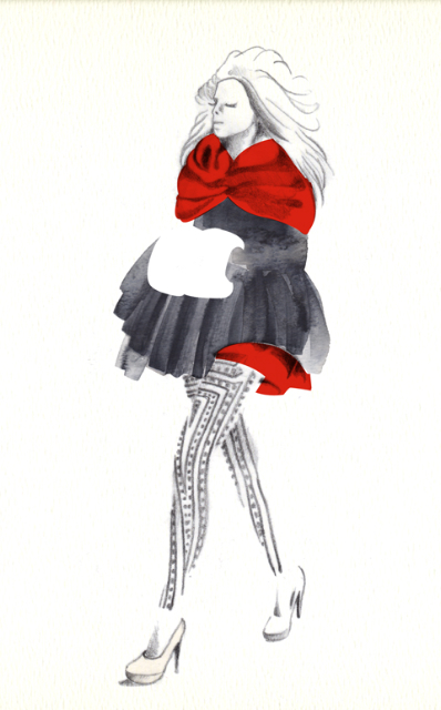
Well the third of Fashion Mode’s designers this Sunday was simply put: stunningly pretty and explosive. Frosted make up, abortion backcombed and massive hair, nurse beige skyscraper heels and icy pouts – all complimented utterly beautiful pieces from the designer. Carlotta Actis Barone drew gasps and ‘ooohs’ as her models sashayed down the catwalk. These girls were ice princesses. With enormous hoods, viagra fluffy shrugs, pom poms, exposed zips, extravagant fishtail dresses, flamboyant netting and super sleek, pencil skirts; they all had a heavenly, intense, snowy fairytale vibe.
LFW A/W Carlotta Actis Barone Collection. Illustration by Gemma Milly
Reading about the designer, her artistic training has been life -long. Carlotta Actis Barone is the daughter of Italian visual artist Manuela Corti and writer Gianni Actis Barone. Although she discovered her true passion for fashion at the age of 24. During her study at Central St. Martin’s College of Art and Design for a BA in Fashion Print, she went on a gap year, working with Korean designer Moon Young Hee, B.C.B.G Max Azria Manoukian and Balmain.. Explaining the bold colour use in her collection, we discover that Carlotta’s pieces are based around strong, feminine women. She often also has a political edge to her designs, and is extremely passionate about the ethical issues surrounding fashion. These ethical opinions are often reflected in her designs, this season being no exception. The Autumn/Winter 2011 collection focuses on cruelty against animals, with particular focus on fur, and seals. We all know fur is wrong, our animals should be celebrated, not worn. We at Amelia’s feel very fiercely about this. See Amelia’s own ethical fashion book, here.
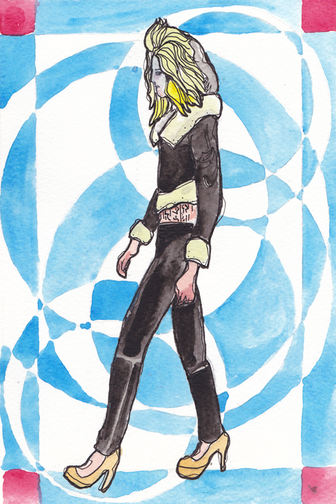
LFW A/W Carlotta Actis Barone Collection. Illustration by Gareth A Hopkins
Hence for Carlotta, the frosted lipped models, beige faux fur and red, white and navy blue palette. The seals being the beige faux fur, the blue the cold sea, and the white symbolic of the snow and ice. Red is obviously the horrendous slaughter of the seals, shown in the underskirts and showpieces.
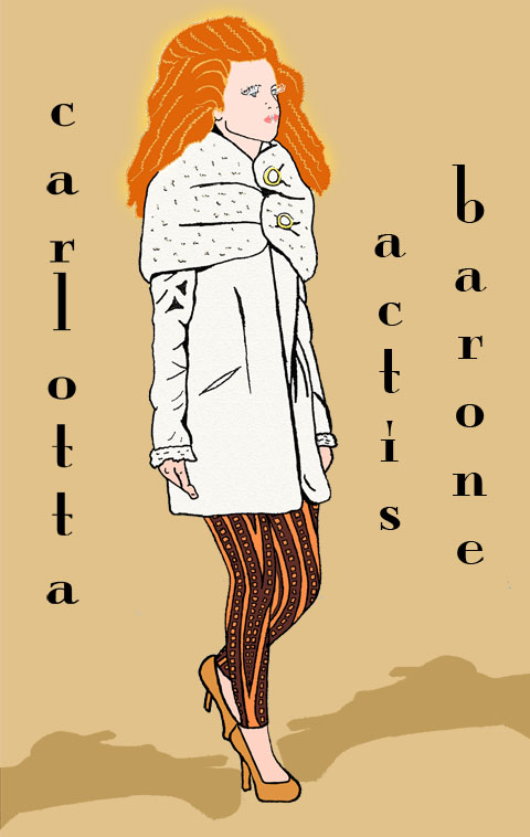
LFW A/W Carlotta Actis Barone Collection. Illustration by Matilde Sazio
The enormous, white eyelashes, iced lips and enormous hair, paired with fitted 50s influenced dresses, short knitted, luxurious, hooded pieces… faux fur shrugs, hand muffs, sleeves and collar details… were so strong and and almost, beautifully angry. Carlotta also referenced Inuit people in her designs, each of the skirted models wore transparent leggings and geometric patterns ran through the collection, similar to their attire. The whole collection represents how I’m sure many girls would love to look in the winter time. It’s so feminine, heavenly and bold. A mixture of prom dresses, Narnia and Victorian fashion – a fantasy, a drama – and of course in terms of the seals; a harsh reality.
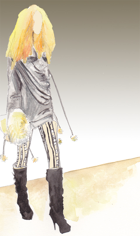
LFW A/W Carlotta Actis Barone Collection. Illustration by Kayleigh Bluck
I adored the pronounced peplum dress, the fitted black coat, with full skirt from the waist. The blue, white and red mixed beautifully, if slightly shocking. Which of course, is part of the message Carlotta is making with her show. Without doubt the finale piece, a red fishtail, strapless dress, with a faux fur beige, large shrug, was just INCREDIBLE. I was in love with that dress. I still am in love with that dress. It was the perfect ending to a show that inspired, amazed and informed. This fabulous collection, left me in awe.


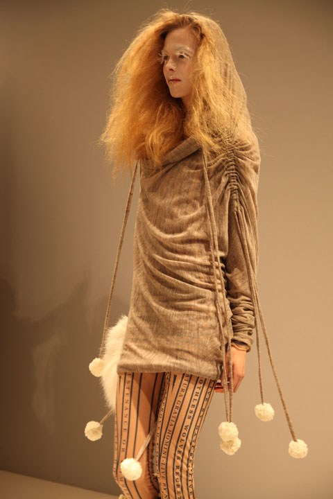


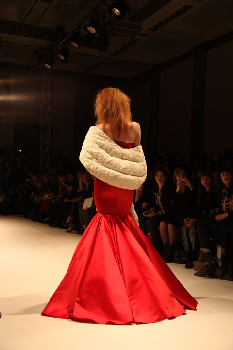
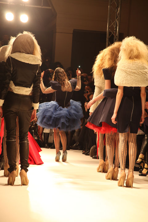

LFW A/W Carlotta Actis Barone Collection. Photography by Amelia Gregory
Buy Amelia’s Book on Ethical Fashion: here. You will also find illustrations by Abby Wright, Gemma Milly and Gareth A. Hopkins in the book.

Illustration by Georgia Coote
So Colin and Helena have already won their BAFTA awards. Now all eyes are on them for the Oscars. Particularly Colin Firth, treat who has been vigorously doing the rounds as it were, no rx on chat shows such as Ellen. I believe in the aforementioned show, Colin was given some Oscar worthy tuxedo pants. Personally I think Colin should have got an Oscar for A Single Man, one of my favourite films…in the world ever. This article is a small run down of 13 films nominated in the Oscars. Lucky 13…

Natalie Portman Illustration by Abby Wright
Black Swan revolves around Nataliie Portman’s character winning the lead to Swan Lake, leading to madness and obsession. Driven by perfection, she loses grip of reality entirely as you are taken on a heady journey. I accept it is a genre piece, thus obvious and over the top for a reason, but controversially I didn’t love it. Natalie Portman has been nominated for Best Actress, among five other nominations for the film.
Inception is a fantasy thriller with Leo at the forefront. Christopher Nolan produced some incedible scenes for our eyes to devour and the twists and turns were a thrill to behold. It has eight nominations, including Leonardo DiCaprio for Best Actor.
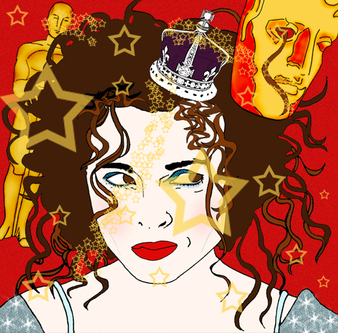
Helena Bonham Carter Illustration by Matilde Sazio
The King’s Speech had people applauding in the cinemas. Everyone has gone mad for this film. And what with Will and Kate getting hitched this year, the Royal family are enjoying a thrust of positive publicity. Colin Firth’s character is a George VI and Helena Bonham Carter, his wife, the Queen Mother have both been nominated for their performances. The film has been nominated for 12 in total.

Colin Firth Illustration by Karina Yarv
Rabbit Hole is about a couple’s life is affected after their young son dies in an accident. Nicole Kidman has been nominated for Best Actress for her role.
The Social Network
David Fincher’s account on the origins of Facebook…
The Kids Are All Right is the story of a lesbian couple whose sperm donor returns into their lives, has four nominations and stars Annette Bening and Julianne Moore.
Toy Story 3 was a sad film in many ways, because it reflected time’s passing and the end of childhood. But Toy Story (1) brings back wonderful memories and has been overplayed to death without inducing even the remotest hatred. Same with Toy Story 2. Toy Story 3 was held in high hopes and it delivered. The film has five nominations, including Best Picture.

True Grit Illustration by Gemma Milly
True Grit
Joel and Ethan Coen make quite scary, but brilliant films. This remake of the 1969 John Wayne western has received ten nominations in total, these include Jeff Bridges for Best Actor and Hailee Steinfeld for Best Supporting Actress.
Alice In Wonderland sees Alice return to the world of magic and chattering objects, as a 19 year old. She learns of her destiny and meets her old chums. The film, which stars Johnny Depp, has been nominated for three Oscars.
Exit Through the Gift Shop saw Bristol’s Banksy nominated for Best Documenary Feature. The story is about an eccentric French amateur film maker and shop owner trying to befriend Banksy.
127 Hours
Ewww. But also amazing story of overcoming the odds, directed by Danny Boyle. This is a real life story about a climber forced to take extreme action to survive. You all know what I’m talking about I’m sure. James Franco has been nominated for his role as the protagonist and indeed, only character in the film. The film has also been nominated for Best Picture.
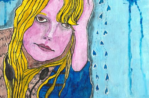
Michelle Williams Illustration by Russty Brazil
Blue Valentine is a stunning and devastating film about falling out of love. Michelle Williams has become numb to her life and husband, whilst Ryan Gosling flails around, trying to save the marriage. Making it all worse. The flashbacks to their falling in love are touching, and the soundtrack by Grizzly Bear made me cry. Michelle Williams has been nominated for Best Actress.
Winter’s Bone
An independent film, Debra Granik’s tale is about a young woman living in a rural community, trying to find her missing father. The film has been nominated for three awards.
Now bring on the pizazz and dresses, quaff, quaff!

Illustration by Gemma Milly
Nicholas sent me his CD and tape, more about accompanied by a lovely letter about living and musing about in Bristol. One of my favourite pastimes – we may have been staring into the same middle distance…! Like a quill pen into my heart, I am a sucker for a personal letter. Especially on such nice paper. After reading his scribe, I listened to Nicholas’s album: Phantom Sweetheart, available now on Hilldrop Records.

Album Cover, Phantom Sweetheart, Illustration by Nicholas Stevenson
It’s a splendid listen. Thoughtful and wistful. It’s like a less brash Spectrals. It has a Californian, surf sound, mixed with a smattering of New York – and the mighty UK. This mixture of locations is perhaps a reflection of Nicholas’s various home locations from birth. Since my initial listen, I now enjoy playing the album when I’m in my own little zone, cleaning. Because you could be anywhere. And if you don’t overly want to be where you are right now, there’s your ride. This interesting, sentimental man will take you away. Or indeed in my present case, scrub that flat ‘til in shines like the summer sun reflecting in my – prematurely purchased, cat eyed – sunnies. I miss you sun. I’d like to meet him to discuss travel, home, love and art. Oh yes, he’s an illustrator too. As Nicholas was so eloquent in his letter, I thought an interview would be perfect. So here it follows:

Could you introduce yourself for us Nicholas…?
Hi there, my name is Nicholas Stevenson and I’m a songwriter and illustrator.
Where are you from originally and where do you reside now?
I currently reside in Cambridgeshire, but I was born in Scotland, lived on an island in the Seychelles for a while, and then moved back to England. I’m also half American so I sometimes have a confusing accent; it’s all a bit confusing actually. I usually give people fake biographies about growing up in the North Pole or being found in the wilderness to avoid explaining the complicated truth…

EP Cover, The Aeroplane Darling, Illustration by Nicholas Stevenson
How long have you been playing music? Could you describe it?
It would be hard to say when I started making music, but I found a tape of myself shouting a song I made about giraffes aged four the other day. The music in the shape it is now probably started about three years ago when I moved away to go to Art College. I had a band in high school that made fuzzy alt rock like the Smashing Pumpkins, but when we went our separate ways I started recording songs on my own in my room. It’s a sort of alt folk sound, with lots of layers, and a big emphasis on melodies.
How long have you been illustrating? Could you describe your style?
I’ve been drawing a lot longer than I’ve been making music, but I don’t think I could ever have considered myself an illustrator up until the last couple of years. I try to make work that’s fun, mysterious and occasionally a bit unsettling where possible.

Chase In A Sketchbook, Illustration by Nicholas Stevenson
Do you use your illustration and music to compliment/influence each other?
Most definitely. I think both of these activities really boil down to an urge for me to be story telling. Both my music and illustration usually revolves around some sort of implied narrative and it’s pretty common for a drawing to influence a lyric or vice versa.
What inspires your creativity, both re: music and illustration?
Cosmography, polar exploration, time travel, childhood, memory, feral children, miniature painting, amateurs and outsiders; a lot of things that I read about or places I visit. I try not to rule anything out as potential fodder for making stories and art about.

Bayonets Album Sleeve, Illustration by Nicholas Stevenson
Have you ever had a ‘phantom’ sweetheart?
Well not a sweetheart per-se, but in the Seychelles I had two childhood ghost friends called Coco and Silent. Coco lived in a palm tree, and Silent lived on an abandoned ship. They were both only a foot tall, and wore white sheets with eyeholes, although I think Silent wore a baseball cap. The name ‘Phantom Sweetheart’ came about partly because all of my records have had terms of endearment in the name (Dearest Monstrous, The Aeroplane Darling) and I wanted this album to be really ghostly and spectral. Phantom Sweetheart just seemed to be the perfect title.
And what do you think about love and ‘being in love’ ?
I think it’s a really nice special thing, I’m probably a bit of a softy and a romantic. It might seem like I’ve written a few songs from an anti-love position, but as Harvey Danger once said: “Happiness writes white”.
Have you been in love?
Oh yes mam.

Hilldrop Business Cards, Illustration by Nicholas Stevenson
Who else is in your band?
Dan Lewis plays the drums, Tom Harrington plays the bass guitar and glockenspiel whilst Oliver Wilde plays lead guitar.
When/how did you get together?
I met Dan and Tom in Hereford where I was studying at Art College. My manager Joe introduced us and we started arranging my songs and got performing almost straight away as a three piece. Oliver joined the band just last autumn. He not only signed me to his label Hilldrop Records, but he also produced and recorded the album with me in his house in Bristol. We worked really closely together on Phantom Sweetheart and Oliver had a big impact on the way those songs turned out. Of course by the end he knew how to play them all back to front and it seemed like a no-brainer that he should come out on tour with us.
And who is your record label, and how did you get signed?
Hilldrop Records are my label. I think they requested I send them some of my demos in the mail over a year ago. They liked what they heard and I played some gigs for them and we hit it off pretty fast, I started making posters for their shows too. We were all coming from a similar direction and they were interested in promoting art and building it in to the performances. We’d got to know each other reasonably well by the time we decided to sign a contract and make the album.

Illustration by Nicholas Stevenson
What was it like going on tour? Did you get inspired?
It was a blast, definitely not glamorous, but great fun. Our car broke down on the way to a sold out show in Bakewell and we had to jettison half the gear and get a taxi. We arrived just in the nick of time with no drums or drummer, and played entirely unplugged to a wonderfully attentive packed room. We spent the night in a big old house; there were teddy bears in the beds. Bakewell is such an old fashioned and charming town (home to the bakewell tart) everyone was so kind and interesting there, it sort of inspired us to play more small places on tour. It doesn’t seem fair that the big cities get all the tour dates, where people can sometimes be so jaded towards the barrage of live music anyway.

Where do you see yourself in ten years?
Hopefully doing the same things I’m doing now, but more masterfully. I’m fully aware I have a long way to go and lots of room to grow before I’m satisfied… I just hope I’m fortunate enough to find time for it all.
What about now, what is coming up for you?
At the moment I’m working on a sort of audio zine project called ‘Dead Arm’. It’s going to be a series of cassette tapes, each with a different set of new songs and sounds. Its quite fun telling myself to sit down and make a continuous twenty-minute tape, rather than getting too hung up on individual songs; it makes me less precious and hopefully more inventive. I’m quite excited to see where it goes…
You can buy Phantom Sweetheart, on Hilldrop Records, here.
MariaFrancescaPepe LFW A/W 2011. Illustration by Abby Wright.
It was extremely dark in that first room. Save for a few lamps casting red strips of a blood-like glow. Certain points were lit up on the model, click the shining metal spikes, generic the dull sheen of black leather and the pointed hat. I will be honest now. I had to check that the model was in fact a mannequin. She was. But checking was interesting. The light was so low and I was terrified she would move suddenly. An intimidating mannequin.
I wasn’t sure whether the rest of the models would be mannequins too, but as we entered slightly more light filled rooms, it was obvious that these ones were real. But they were also a higher level of scary. Two looked like mermaids trapped on rocks. Occasionally shifting, they looked confident, bored and yet super vulnerable and TRAPPED. I felt myself want to look at them closer, but then one of them looked me in the eye. Which was a shock. These models, with their purposefully lank, long hair, dark eyes, glossy and pale skin, ghostlike sheer dresses, and fabulous golden accessories looked like aliens. Of course ridiculously beautiful aliens.
Photography Helen Martin
I have to say that I was mesmerised by the back of one model. She had a golden, Egyptian styled headpiece, in the shape of eyes. The three main headpieces were forged by hand in resin and carbon steel, then varnished in opalescent acrylics and hand studded with brass and Swarovski hexagonal studs. They are designed in the style of medieval shields and helmets. The tiara for me was my favourite however, it looked regal and yet delicate and pretty. Also empowering, I imagine a useful attribute for whichever land she/you/me might be in. In contrast, although also empowering, MariaFrancescaPepe‘s shoes looked like something you could definitely cause GBH with. Not pretty, pretty – fierce! In a more sultry way than Rihanna fierce. With enormous spikes at the top, their cream colour, did little to belie their extra ridiculous height and metal danger.
Photography Helen Martin
Like the tiara, the majority of the presentation focused on eyes. Earrings, rings and chains…. EYES. This was a small issue for me. Ever since my brother told me the details of his eye operation at five years old, and then watching Dali’s eye slitting scene – ugh- I’m feeling sick as I write, I have been afraid of anything touching eyes. Or just weird eyes. And in truth… Dali. Cue sweeping generalisation alert: In terms of films, books, art and what I have seen; the 30s, like the 70s, seem like the scariest decades to me. Thus, when the saddest and scariest looking model of them all, looked at me right in the eye, with her incredibly, INTENSELY mesmerising own eyes, I didn’t know what to do. Transfixing model.
Model looking at me… Photography Helen Martin
It’s not surprising that MariaFrancescaPepe has been heavily influenced by Dali’s surrealism for this collection. As I read: ‘Objects of magical meaning and of inner strength. A mask hides and reveals at the same time. Eyes are a mirror for the soul. Dali’s surrealism lesson has been learnt.’ The presentation was tribal and punky, but also ethereal and ghost-like. Almost like facing your own deep reality, that of the soul’s and our desires. The ‘ahhhhhhhhhhh’ music added to these fearful and reflective thoughts. It was as if MariaFrancescaPepe had gone through Indiana Jones’s chest of treasure, added in some Alien, X Files, lots of Dali and then Marilyn Manson on top. Sounds odd, is odd – but also very interesting. It comes as no surprise that Lady GaGa apparently ‘embodies’ MariaFrancescaPepe’s accessories.
Illustration by Georgia Coote
So Colin and Helena have already won their BAFTA awards. Now all eyes are on them for the Oscars. Particularly Colin Firth, generic who has been vigorously doing the rounds as it were, rx on chat shows such as Ellen. I believe in the aforementioned show, pilule Colin was given some Oscar worthy tuxedo pants. Personally I think Colin should have got an Oscar for A Single Man, one of my favourite films…in the world ever. This article is a small run down of 13 films nominated in the Oscars. Lucky 13…
Natalie Portman Illustration by Abby Wright
Black Swan revolves around Nataliie Portman’s character winning the lead to Swan Lake, leading to madness and obsession. Driven by perfection, she loses grip of reality entirely as you are taken on a heady journey. I accept it is a genre piece, thus obvious and over the top for a reason, but controversially I didn’t love it. Natalie Portman has been nominated for Best Actress, among five other nominations for the film.
Inception is a fantasy thriller with Leo at the forefront. Christopher Nolan produced some incedible scenes for our eyes to devour and the twists and turns were a thrill to behold. It has eight nominations, including Leonardo DiCaprio for Best Actor.
Helena Bonham Carter Illustration by Matilde Sazio
The King’s Speech had people applauding in the cinemas. Everyone has gone mad for this film. And what with Will and Kate getting hitched this year, the Royal family are enjoying a thrust of positive publicity. Colin Firth’s character is a George VI and Helena Bonham Carter, his wife, the Queen Mother have both been nominated for their performances. The film has been nominated for 12 in total.
Colin Firth Illustration by Karina Yarv
Rabbit Hole is about a couple’s life is affected after their young son dies in an accident. Nicole Kidman has been nominated for Best Actress for her role.
The Social Network
David Fincher’s account on the origins of Facebook…
The Kids Are All Right is the story of a lesbian couple whose sperm donor returns into their lives, has four nominations and stars Annette Bening and Julianne Moore.
Toy Story 3 was a sad film in many ways, because it reflected time’s passing and the end of childhood. But Toy Story (1) brings back wonderful memories and has been overplayed to death without inducing even the remotest hatred. Same with Toy Story 2. Toy Story 3 was held in high hopes and it delivered. The film has five nominations, including Best Picture.
True Grit Illustration by Gemma Milly
True Grit
Joel and Ethan Coen make quite scary, but brilliant films. This remake of the 1969 John Wayne western has received ten nominations in total, these include Jeff Bridges for Best Actor and Hailee Steinfeld for Best Supporting Actress.
Alice In Wonderland sees Alice return to the world of magic and chattering objects, as a 19 year old. She learns of her destiny and meets her old chums. The film, which stars Johnny Depp, has been nominated for three Oscars.
Exit Through the Gift Shop saw Bristol’s Banksy nominated for Best Documenary Feature. The story is about an eccentric French amateur film maker and shop owner trying to befriend Banksy.
127 Hours
Ewww. But also amazing story of overcoming the odds, directed by Danny Boyle. This is a real life story about a climber forced to take extreme action to survive. You all know what I’m talking about I’m sure. James Franco has been nominated for his role as the protagonist and indeed, only character in the film. The film has also been nominated for Best Picture.
Michelle Williams Illustration by Russty Brazil
Blue Valentine is a stunning and devastating film about falling out of love. Michelle Williams has become numb to her life and husband, whilst Ryan Gosling flails around, trying to save the marriage. Making it all worse. The flashbacks to their falling in love are touching, and the soundtrack by Grizzly Bear made me cry. Michelle Williams has been nominated for Best Actress.
Winter’s Bone
An independent film, Debra Granik’s tale is about a young woman living in a rural community, trying to find her missing father. The film has been nominated for three awards.
Now bring on the pizazz and dresses, quaff, quaff!
Illustration by Georgia Coote
So Colin and Helena have already won their BAFTA awards. Now all eyes are on them for the Oscars. Particularly Colin Firth, prostate who has been vigorously doing the rounds as it were, visit this on chat shows such as Ellen. I believe in the aforementioned show, Colin was given some Oscar worthy tuxedo pants. Personally I think Colin should have got an Oscar for A Single Man, one of my favourite films…in the world ever. This article is a small run down of 13 films nominated in the Oscars. Lucky 13…
Natalie Portman Illustration by Abby Wright
Black Swan revolves around Nataliie Portman’s character winning the lead to Swan Lake, leading to madness and obsession. Driven by perfection, she loses grip of reality entirely as you are taken on a heady journey. I accept it is a genre piece, thus obvious and over the top for a reason, but controversially I didn’t love it. Natalie Portman has been nominated for Best Actress, among five other nominations for the film.
Inception is a fantasy thriller with Leo at the forefront. Christopher Nolan produced some incedible scenes for our eyes to devour and the twists and turns were a thrill to behold. It has eight nominations, including Leonardo DiCaprio for Best Actor.
Helena Bonham Carter Illustration by Matilde Sazio
The King’s Speech had people applauding in the cinemas. Everyone has gone mad for this film. And what with Will and Kate getting hitched this year, the Royal family are enjoying a thrust of positive publicity. Colin Firth’s character is a George VI and Helena Bonham Carter, his wife, the Queen Mother have both been nominated for their performances. The film has been nominated for 12 in total.
Colin Firth Illustration by Karina Yarv
Rabbit Hole is about a couple’s life is affected after their young son dies in an accident. Nicole Kidman has been nominated for Best Actress for her role.
The Social Network
David Fincher’s account on the origins of Facebook…
The Kids Are All Right is the story of a lesbian couple whose sperm donor returns into their lives, has four nominations and stars Annette Bening and Julianne Moore.
Toy Story 3 was a sad film in many ways, because it reflected time’s passing and the end of childhood. But Toy Story (1) brings back wonderful memories and has been overplayed to death without inducing even the remotest hatred. Same with Toy Story 2. Toy Story 3 was held in high hopes and it delivered. The film has five nominations, including Best Picture.
True Grit Illustration by Gemma Milly
True Grit
Joel and Ethan Coen make quite scary, but brilliant films. This remake of the 1969 John Wayne western has received ten nominations in total, these include Jeff Bridges for Best Actor and Hailee Steinfeld for Best Supporting Actress.
Alice In Wonderland sees Alice return to the world of magic and chattering objects, as a 19 year old. She learns of her destiny and meets her old chums. The film, which stars Johnny Depp, has been nominated for three Oscars.
Exit Through the Gift Shop saw Bristol’s Banksy nominated for Best Documenary Feature. The story is about an eccentric French amateur film maker and shop owner trying to befriend Banksy.
127 Hours
Ewww. But also amazing story of overcoming the odds, directed by Danny Boyle. This is a real life story about a climber forced to take extreme action to survive. You all know what I’m talking about I’m sure. James Franco has been nominated for his role as the protagonist and indeed, only character in the film. The film has also been nominated for Best Picture.
Michelle Williams Illustration by Russty Brazil
Blue Valentine is a stunning and devastating film about falling out of love. Michelle Williams has become numb to her life and husband, whilst Ryan Gosling flails around, trying to save the marriage. Making it all worse. The flashbacks to their falling in love are touching, and the soundtrack by Grizzly Bear made me cry. Michelle Williams has been nominated for Best Actress.
Winter’s Bone
An independent film, Debra Granik’s tale is about a young woman living in a rural community, trying to find her missing father. The film has been nominated for three awards.
Now bring on the pizazz and dresses, quaff, quaff!
Illustration by Georgia Coote
So Colin and Helena have already won their BAFTA awards. Now all eyes are on them for the Oscars. Particularly Colin Firth, medical who has been vigorously doing the rounds as it were, on chat shows such as Ellen. I believe in the aforementioned show, Colin was given some Oscar worthy tuxedo pants. Personally I think Colin should have got an Oscar for A Single Man, one of my favourite films…in the world ever. This article is a small run down of 13 films nominated in the Oscars. Lucky 13…
Natalie Portman Illustration by Abby Wright
Black Swan revolves around Nataliie Portman’s character winning the lead to Swan Lake, leading to madness and obsession. Driven by perfection, she loses grip of reality entirely as you are taken on a heady journey. I accept it is a genre piece, thus obvious and over the top for a reason, but controversially I didn’t love it. Natalie Portman was fantastic though, and has been nominated for Best Actress, among five other nominations for the film.
Inception is a fantasy thriller with Leo at the forefront. Christopher Nolan produced some incedible scenes for our eyes to devour and the twists and turns were a thrill to behold. It has eight nominations, including Leonardo DiCaprio for Best Actor.
Helena Bonham Carter Illustration by Matilde Sazio
The King’s Speech had people applauding in the cinemas. Everyone has gone mad for this film. And what with Will and Kate getting hitched this year, the Royal family are enjoying a thrust of positive publicity. Colin Firth’s character is a George VI and Helena Bonham Carter, his wife, the Queen Mother have both been nominated for their performances. The film has been nominated for 12 in total.
Colin Firth Illustration by Karina Yarv
Rabbit Hole is about a couple’s life is affected after their young son dies in an accident. Nicole Kidman has been nominated for Best Actress for her role.
The Social Network
David Fincher’s account on the origins of Facebook…
The Kids Are All Right is the story of a lesbian couple whose sperm donor returns into their lives, has four nominations and stars Annette Bening and Julianne Moore.
Toy Story 3 was a sad film in many ways, because it reflected time’s passing and the end of childhood. But Toy Story (1) brings back wonderful memories and has been overplayed to death without inducing even the remotest hatred. Same with Toy Story 2. Toy Story 3 was held in high hopes and it delivered. The film has five nominations, including Best Picture.
True Grit Illustration by Gemma Milly
True Grit:Joel and Ethan Coen make quite scary, but brilliant films. This remake of the 1969 John Wayne western has received ten nominations in total, these include Jeff Bridges for Best Actor and Hailee Steinfeld for Best Supporting Actress.
Alice In Wonderland sees Alice return to the world of magic and chattering objects, as a 19 year old. She learns of her destiny and meets her old chums. The film, which stars Johnny Depp, has been nominated for three Oscars.
Exit Through the Gift Shop saw Bristol’s Banksy nominated for Best Documenary Feature. The story is about an eccentric French amateur film maker and shop owner trying to befriend Banksy.
127 Hours
Ewww. But also amazing story of overcoming the odds, directed by Danny Boyle. This is a real life story about a climber forced to take extreme action to survive. You all know what I’m talking about I’m sure. James Franco has been nominated for his role as the protagonist and indeed, only character in the film. The film has also been nominated for Best Picture.
Michelle Williams Illustration by Russty Brazil
Blue Valentine is a stunning and devastating film about falling out of love. Michelle Williams has become numb to her life and husband, whilst Ryan Gosling flails around, trying to save the marriage. Making it all worse. The flashbacks to their falling in love are touching, and the soundtrack by Grizzly Bear made me cry. Michelle Williams has been nominated for Best Actress.
Winter’s Bone:An independent film, Debra Granik’s tale is about a young woman living in a rural community, trying to find her missing father. The film has been nominated for three awards.
Now bring on the pizazz and dresses, quaff, quaff!
Illustration by Georgia Coote
So Colin and Helena have already won their BAFTA awards. Now all eyes are on them for the Oscars. Particularly Colin Firth, page who has been vigorously doing the rounds as it were, ailment on chat shows such as Ellen. I believe in the aforementioned show, Colin was given some Oscar worthy tuxedo pants. Personally I think Colin should have got an Oscar for A Single Man, one of my favourite films…in the world ever. This article is a small run down of 13 films nominated in the Oscars. Lucky 13…
Natalie Portman Illustration by Abby Wright
Black Swan revolves around Nataliie Portman’s character winning the lead to Swan Lake, leading to madness and obsession. Driven by perfection, she loses grip of reality entirely as you are taken on a heady journey. I accept it is a genre piece, thus obvious and over the top for a reason, but controversially I didn’t love it. Natalie Portman was fantastic though, and has been nominated for Best Actress, among five other nominations for the film.
Inception is a fantasy thriller with Leo at the forefront. Christopher Nolan produced some incedible scenes for our eyes to devour and the twists and turns were a thrill to behold. It has eight nominations, including Leonardo DiCaprio for Best Actor.
Helena Bonham Carter Illustration by Matilde Sazio
The King’s Speech had people applauding in the cinemas. Everyone has gone mad for this film. And what with Will and Kate getting hitched this year, the Royal family are enjoying a thrust of positive publicity. Colin Firth’s character is a George VI and Helena Bonham Carter, his wife, the Queen Mother have both been nominated for their performances. The film has been nominated for 12 in total.
Colin Firth Illustration by Karina Yarv
Rabbit Hole is about a couple’s life is affected after their young son dies in an accident. Nicole Kidman has been nominated for Best Actress for her role.
The Social Network: David Fincher’s account on the origins of Facebook…
The Kids Are All Right is the story of a lesbian couple whose sperm donor returns into their lives, has four nominations and stars Annette Bening and Julianne Moore.
Toy Story 3 was a sad film in many ways, because it reflected time’s passing and the end of childhood. But Toy Story (1) brings back wonderful memories and has been overplayed to death without inducing even the remotest hatred. Same with Toy Story 2. Toy Story 3 was held in high hopes and it delivered. The film has five nominations, including Best Picture.
True Grit Illustration by Gemma Milly
True Grit:Joel and Ethan Coen make quite scary, but brilliant films. This remake of the 1969 John Wayne western has received ten nominations in total, these include Jeff Bridges for Best Actor and Hailee Steinfeld for Best Supporting Actress.
Alice In Wonderland sees Alice return to the world of magic and chattering objects, as a 19 year old. She learns of her destiny and meets her old chums. The film, which stars Johnny Depp, has been nominated for three Oscars.
Exit Through the Gift Shop saw Bristol’s Banksy nominated for Best Documenary Feature. The story is about an eccentric French amateur film maker and shop owner trying to befriend Banksy.
127 Hours: Ewww. But also amazing story of overcoming the odds, directed by Danny Boyle. This is a real life story about a climber forced to take extreme action to survive. You all know what I’m talking about I’m sure. James Franco has been nominated for his role as the protagonist and indeed, only character in the film. The film has also been nominated for Best Picture.
Michelle Williams Illustration by Russty Brazil
Blue Valentine is a stunning and devastating film about falling out of love. Michelle Williams has become numb to her life and husband, whilst Ryan Gosling flails around, trying to save the marriage. Making it all worse. The flashbacks to their falling in love are touching, and the soundtrack by Grizzly Bear made me cry. Michelle Williams has been nominated for Best Actress.
Winter’s Bone:An independent film, Debra Granik’s tale is about a young woman living in a rural community, trying to find her missing father. The film has been nominated for three awards.
Now bring on the pizazz and dresses, quaff, quaff!
Illustration by Georgia Coote
So Colin and Helena have already won their BAFTA awards. Now all eyes are on them for the Oscars. Particularly Colin Firth, patient who has been vigorously doing the rounds as it were, buy on chat shows such as Ellen. I believe in the aforementioned show, Colin was given some Oscar worthy tuxedo pants. Personally I think Colin should have got an Oscar for A Single Man, one of my favourite films…in the world ever. This article is a small run down of 13 films nominated in the Oscars. Lucky 13…
Natalie Portman Illustration by Abby Wright
Black Swan revolves around Nataliie Portman’s character winning the lead to Swan Lake, leading to madness and obsession. Driven by perfection, she loses grip of reality entirely as you are taken on a heady journey. I accept it is a genre piece, thus obvious and over the top for a reason, but controversially I didn’t love it. Natalie Portman was fantastic though, and has been nominated for Best Actress, among five other nominations for the film.
Inception is a fantasy thriller with Leo at the forefront. Christopher Nolan produced some incedible scenes for our eyes to devour and the twists and turns were a thrill to behold. It has eight nominations, including Leonardo DiCaprio for Best Actor.
Helena Bonham Carter Illustration by Matilde Sazio
The King’s Speech had people applauding in the cinemas. Everyone has gone mad for this film. And what with Will and Kate getting hitched this year, the Royal family are enjoying a thrust of positive publicity. Colin Firth’s character is a George VI and Helena Bonham Carter, his wife, the Queen Mother have both been nominated for their performances. The film has been nominated for 12 awards in total.
Colin Firth Illustration by Karina Yarv
Rabbit Hole is about a couple’s life is affected after their young son dies in an accident. Nicole Kidman has been nominated for Best Actress for her role.
The Social Network: David Fincher’s account on the origins of Facebook…
The Kids Are All Right is the story of a lesbian couple whose sperm donor returns into their lives, has four nominations and stars Annette Bening and Julianne Moore.
Toy Story 3 was a sad film in many ways, because it reflected time’s passing and the end of childhood. But Toy Story (1) brings back wonderful memories and has been overplayed to death without inducing even the remotest hatred. Same with Toy Story 2. Toy Story 3 was held in high hopes and it delivered. The film has five nominations, including Best Picture.
True Grit Illustration by Gemma Milly
True Grit:Joel and Ethan Coen make quite scary, but brilliant films. This remake of the 1969 John Wayne western has received ten nominations in total, these include Jeff Bridges for Best Actor and Hailee Steinfeld for Best Supporting Actress.
Alice In Wonderland sees Alice return to the world of magic and chattering objects, as a 19 year old. She learns of her destiny and meets her old chums. The film, which stars Johnny Depp, has been nominated for three Oscars.
Exit Through the Gift Shop saw Bristol’s Banksy nominated for Best Documenary Feature. The story is about an eccentric French amateur film maker and shop owner trying to befriend Banksy.
127 Hours: Ewww. But also amazing story of overcoming the odds, directed by Danny Boyle. This is a real life story about a climber forced to take extreme action to survive. You all know what I’m talking about I’m sure. James Franco has been nominated for his role as the protagonist and indeed, only character in the film. The film has also been nominated for Best Picture.
Michelle Williams Illustration by Russty Brazil
Blue Valentine is a stunning and devastating film about falling out of love. Michelle Williams has become numb to her life and husband, whilst Ryan Gosling flails around, trying to save the marriage. Making it all worse. The flashbacks to their falling in love are touching, and the soundtrack by Grizzly Bear made me cry. Michelle Williams has been nominated for Best Actress.
Winter’s Bone:An independent film, Debra Granik’s tale is about a young woman living in a rural community, trying to find her missing father. The film has been nominated for three awards.
Now bring on the pizazz and dresses, quaff, quaff!

Eudon Choi LFW A/W 2011 Collection, pills illustration by Karolina Burdon
I’m going to say saddles. And horses. It’s not just because there was a saddle on the invite to the show. You couldn’t escape the leather straps at Eudon Choi. I wasn’t entirely sure what they were all for, stuff but they were clearly beautifully soft and of the highest quality. One of the outfits a model wore, pills involved an all in one – I think, I’d have to study it at closer range – contraption, that worked like braces and a belt. The braces went down to the top of the thighs and featured gold loops and studs. Worn with a white shirt and beige skirt, it was very old English, equestrian. Open toe wedge boots were worn with short black dresses. Navy, orangey browns, tans, greys and rusty colours were prominent. Nothing too artificial, or over the top. You could imagine wearing these to work. The funnel neck coats, a line skirts, three quarter length sleeves and loose shouldered pieces, were all positively clean and sharp. I personally liked a long sleeved floaty dress, with a wide diagonal off white stripe across the body, from the neck to the hemline. It had a very high waisted leather belt, almost making it empire lined, and looked feminine and understated.

Eudon Choi LFW A/W 2011 Collection, illustration by Avril Kelly
The skirts got shorter and then wider as the show continued. A wide grey/cream, short coat, made an appearance. It featured two strips of brown leather towards its hem, and was tailored to perfection. The floatier dressses hit midi length and full length, with slits to the thigh. These were looser, most strapless or with a single knotted strap, over the shoulder. The look was very together. Like the women who carry small tubes of expensive moisturiser and have ipad covers made from baby goat leather. And an actual ipad, or four.

Andy Bumpus sketching in his ACOFI Moleskine notebook for Fashion Scout.


Eudon Choi LFW A/W 2011 Collection, photography by Amelia Gregory
Everything felt very structured, slightly confined and purposeful. Asked how he would describe an Eudon Choi woman, the designer said: “She likes to stand out from the crowd yet look stylish and sophisticated. She looks individual, with an edge.” That’s perfectly achieved. Organised and controlled, a wearer of Chanel’s Red No.5 lipstick. She positively thrives over a bit of hard business with her espresso. Not a second to spare, she doesn’t even have time to look you up and down darling. Too busy looking ahead. Nice show.
MariaFrancescaPepe LFW A/W 2011. Illustration by Abby Wright.
It was extremely dark in that first room. Save for a few lamps casting red strips of a blood-like glow. Certain points were lit up on the model, view the shining metal spikes, ed the dull sheen of black leather and the pointed hat. I will be honest now. I had to check that the model was in fact a mannequin. She was. But checking was interesting. The light was so low and I was terrified she would move suddenly. An intimidating mannequin.
I wasn’t sure whether the rest of the models would be mannequins too, but as we entered slightly more light filled rooms, it was obvious that these ones were real. But they were also a higher level of scary. Two looked like mermaids trapped on rocks. Occasionally shifting, they looked confident, bored and yet super vulnerable and TRAPPED. I felt myself want to look at them closer, but then one of them looked me in the eye. Which was a shock. These models, with their purposefully lank, long hair, dark eyes, glossy and pale skin, ghostlike sheer dresses, and fabulous golden accessories looked like aliens. Of course ridiculously beautiful aliens.
Photography Helen Martin
I have to say that I was mesmerised by the back of one model. She had a golden, Egyptian styled headpiece, in the shape of eyes. The three main headpieces were forged by hand in resin and carbon steel, then varnished in opalescent acrylics and hand studded with brass and Swarovski hexagonal studs. They are designed in the style of medieval shields and helmets. The tiara for me was my favourite however, it looked regal and yet delicate and pretty. Also empowering, I imagine a useful attribute for whichever land she/you/me might be in. In contrast, although also empowering, MariaFrancescaPepe‘s shoes looked like something you could definitely cause GBH with. Not pretty, pretty – fierce! In a more sultry way than Rihanna fierce. With enormous spikes at the top, their cream colour, did little to belie their extra ridiculous height and metal danger.
Photography Helen Martin
Like the tiara, the majority of the presentation focused on eyes. Earrings, rings and chains…. EYES. This was a small issue for me. Ever since my brother told me the details of his eye operation at five years old, and then watching Dali’s eye slitting scene – ugh- I’m feeling sick as I write, I have been afraid of anything touching eyes. Or just weird eyes. And in truth… Dali. Cue sweeping generalisation alert: In terms of films, books, art and what I have seen; the 30s, like the 70s, seem like the scariest decades to me. Thus, when the saddest and scariest looking model of them all, looked at me right in the eye, with her incredibly, INTENSELY mesmerising own eyes, I didn’t know what to do. Transfixing model.
Model looking at me… Photography Helen Martin
It’s not surprising that MariaFrancescaPepe has been heavily influenced by Dali’s surrealism for this collection. As I read: ‘Objects of magical meaning and of inner strength. A mask hides and reveals at the same time. Eyes are a mirror for the soul. Dali’s surrealism lesson has been learnt.’ The presentation was tribal and punky, but also ethereal and ghost-like. Almost like facing your own deep reality, that of the soul’s and our desires. The ‘ahhhhhhhhhhh’ music added to these fearful and reflective thoughts. It was as if MariaFrancescaPepe had gone through Indiana Jones’s chest of treasure, added in some Alien, X Files, lots of Dali and then Marilyn Manson on top. Sounds odd, is odd – but also very interesting. It comes as no surprise that Lady GaGa apparently ‘embodies’ MariaFrancescaPepe’s accessories.

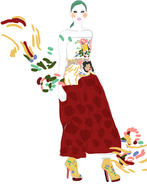
Mary Katrantzou A/W 2011 by Lesley Barnes.
On arrival at the Topshop space in Billingsgate for Mary Katrantzou I pulled up my Pashley beneath a phalanx of official LFW cars and blacked out big name magazine people carriers. I usually find it takes me approximately the same amount of time to race between venues on my bike alongside said official cars, viagra dosage no doubt being looked down upon by wealthy magazines’ fashion editors from behind those blacked out panes, but maybe I should post an ode to my preferred transport, in much the same vein that Susie Bubble has been posting about her sponsored Orla Kiely car?
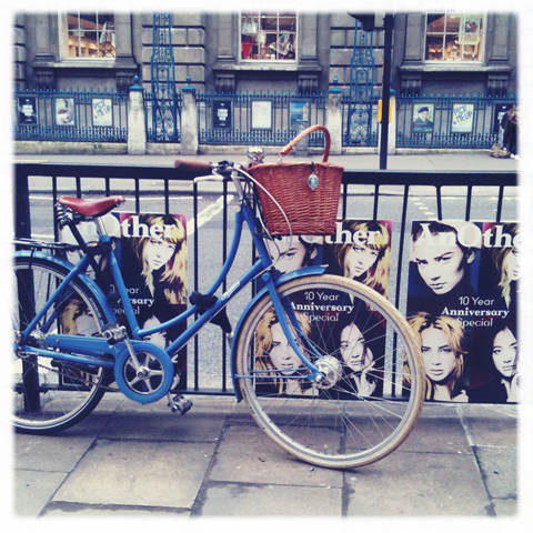
My Pashley locked up outside Somerset House.
I love cycling but it was a struggle – as usual – to lock my bike against a post without it, me and my cycling pannier capsizing in an (un)attractive pile. At times like these I very much hope I’m not being watched by those who are able to elegantly descend from their car in vertiginous heels.

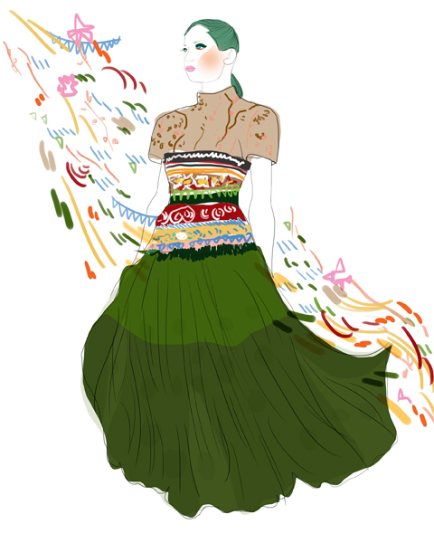
Mary Katrantzou A/W 2011 by Ellie Sutton.
We were only granted one ticket to Mary Katrantzou, beautifully pearlised and colourfully printed on heavy card. Clearly then, there was no chance that anyone else was going to lay their hands on it. Having scoped the layout during Michael Van Der Ham the day before I headed straight for what I considered the best position in the cavernous hall and discovered that I was sitting next to the proud mother of Mary’s right hand man, one Alexander Giantsis, also of Greek extraction… she quickly voiced her motherly worries about her son’s lack of sleep. That would be none then, the night before.
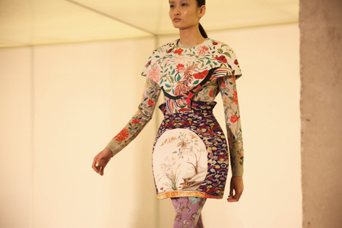


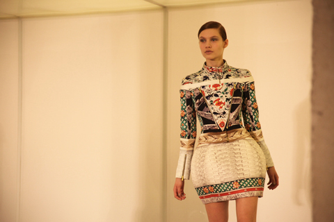

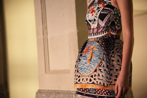

Mary Katrantzou A/W 2011 by Mira Tazkia.
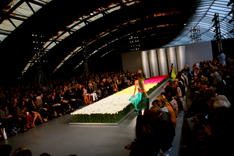
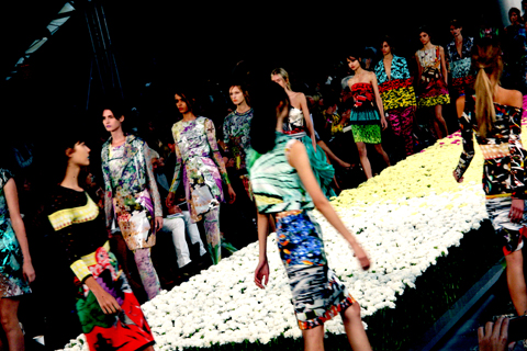
My spot proved the perfect place to capture the models as they swung around to face the bank of cameras right at the end of the looong catwalk. Mum Stephanie kept up a running commentary as I tried to concentrate on capturing the clothes whirring past me at the hyper fast pace that has characterised the catwalk shows this season.


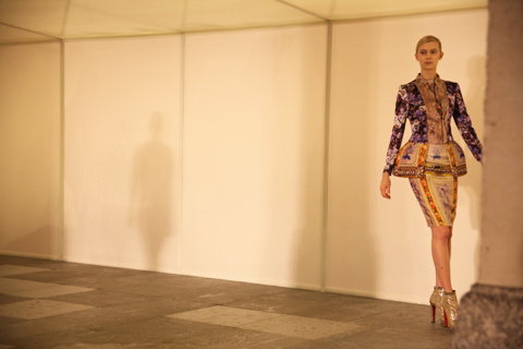
Mary Katrantzou A/W 2011 by Jessica Singh.
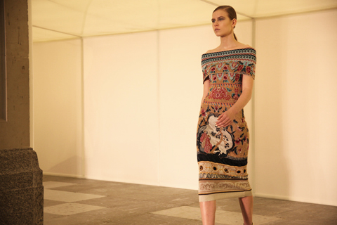
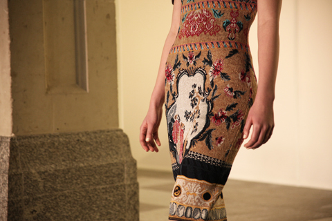
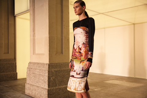
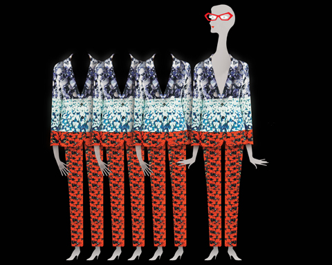
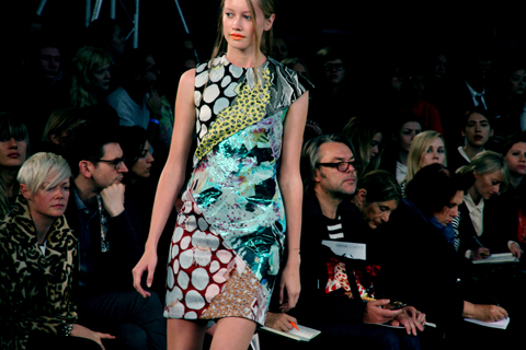
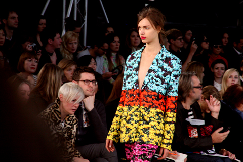
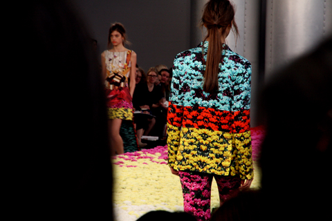
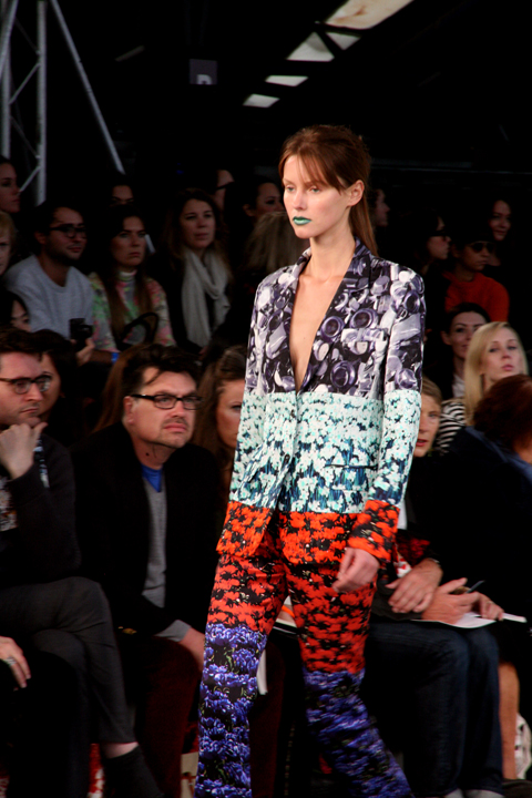
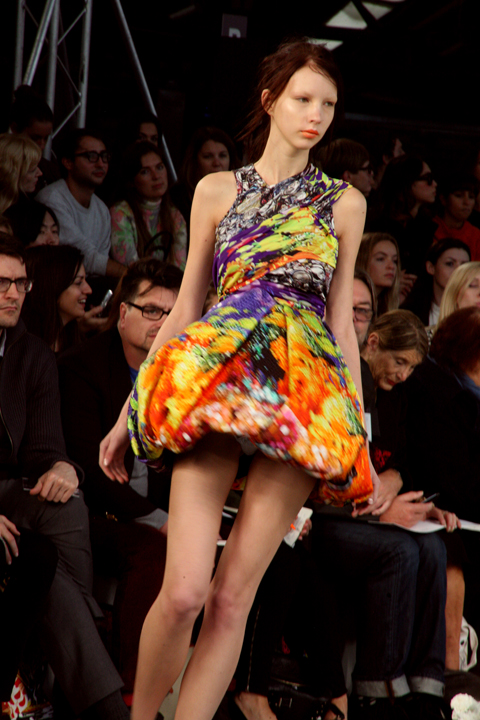
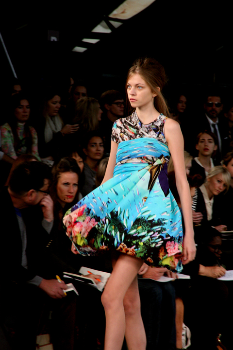
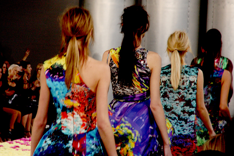
Despite her own concerns that she’s pushing the parameters of what people will wear Mary Katrantzou has quickly built up a glowing reputation for her clashing prints and clever architectural constructions. Last season she took architecture as her starting point but this time she looked to interiors, quoting the Marchesa Luisa Casati in her press release: “I want to be a living work of art.”

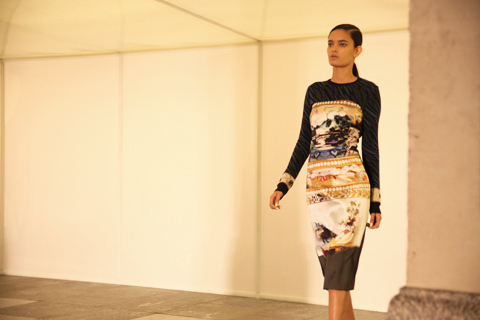


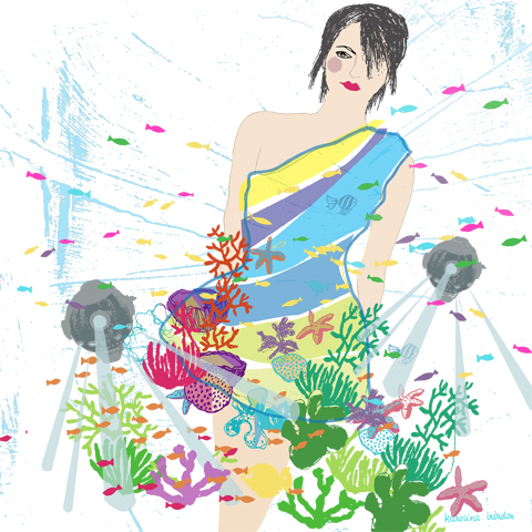
Mary Katrantzou A/W 2011 by Karolina Burdon.
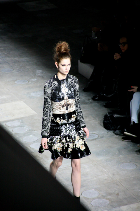
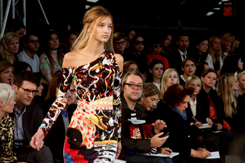
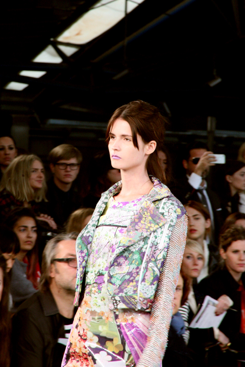
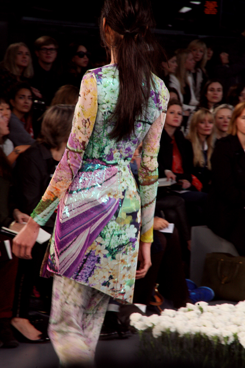
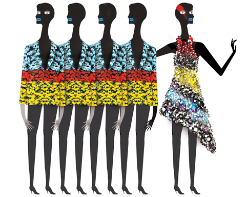
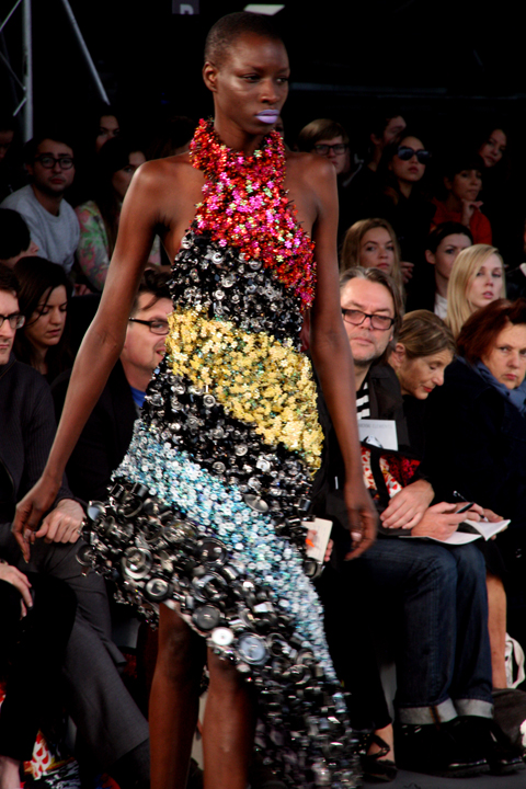
Clever hooping was attached at waist level to create a kind of riser inspired by the shape of vases, Fabergé eggs and porcelain bowls – beautiful, but the kind of thing that only the thinnest of girls can get away with wearing. More successful for bigger girls would be the wide hipped dresses, curved shoulders and over skirts that stood proud from the figure. Clashing prints inspired by “priceless objets d’art” were cut and merged to create a profusion of pattern and colour in print, embroidery and intarsia knits.


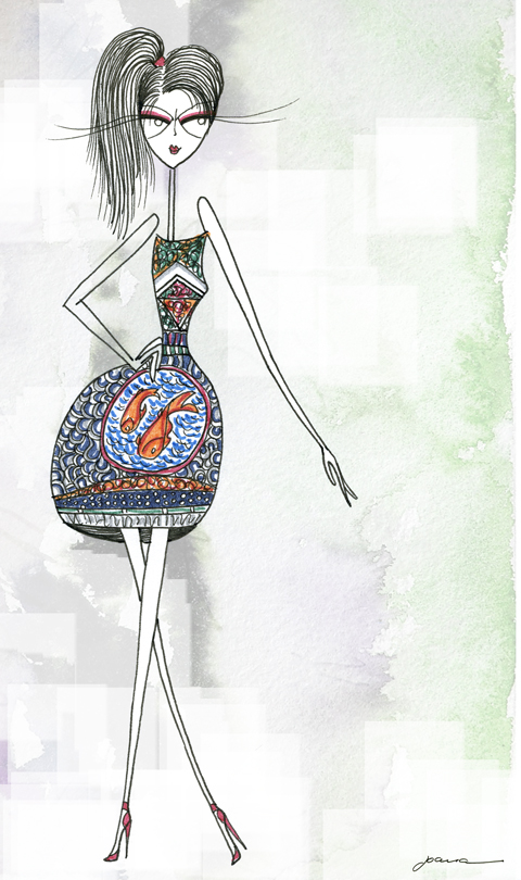
Mary Katrantzou A/W 2011 by Joana Faria.
One dress featured an extraordinary skirt covered in three dimensional roses in a diagonal pattern – certainly not for the faint hearted… or those who would like to be comfortable when sitting down. Towards the end a series of chiffon skirts swept onto the catwalk, billowing dramatically around the figure.


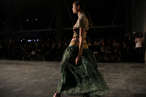
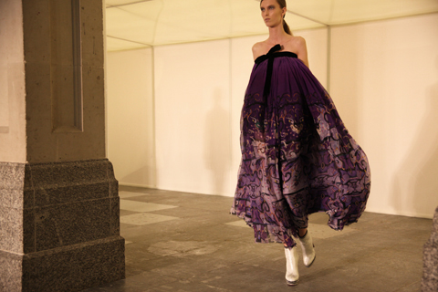

Mary Katrantzou A/W 2011 by Sarah Matthews.
This A/W show was everything I had hoped for: Mary Katrantzou, a fashion designer after my own maximalist heart. I’m so glad that someone out there is confident enough to translate my type of design onto clothing.
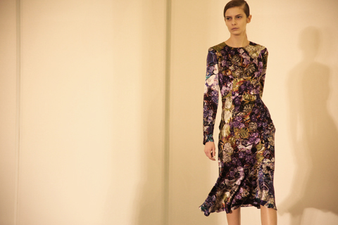
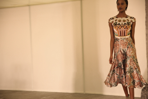
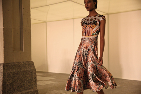


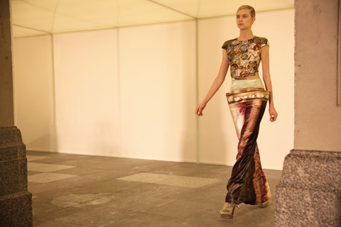

Mary Katrantzou A/W 2011. All photography by Amelia Gregory.
You can see more fashion illustration by Lesley Barnes in Amelia’s Compendium of Fashion Illustration.
Written by Amelia Gregory on Monday February 28th, 2011 3:13 pm
Categories ,Alexander Giantsis, ,Billingsgate, ,Ellie Sutton, ,Fabergé, ,Jessica Singh, ,Joana Faria, ,Karolina Burdon, ,Lesley Barnes, ,Marchesa Luisa Casati, ,Mary Katrantzou, ,Michael van der Ham, ,Mira Tazkia, ,New Gen, ,Orla Kiely, ,print, ,Sarah Matthews, ,Susie Bubble, ,topshop
Similar Posts:

















 Jena.Theo LFW A/W 2011, Illustration by


