Amelia’s Magazine | Swedish School of Textiles: London Fashion Week S/S 2014 Catwalk Review part one

Swedish school of textiles by-Antonia-Parker
Jesper Danielsson by Antonia Parker.

As in previous years, the Swedish School of Textiles at Boras took to the catwalk at Fashion Scout to showcase the best of their graduates. As the press release stated, this was not about commerciality but about promoting the myriad creative ways in which their students approach the use of textiles in fashion. At 35 minutes long this trip was not for the faint hearted and I felt sorry for the later designers, who lost audience members to the Holly Fulton show. Luckily me and my bike are fairly swift so I saw the show out, and was very glad I did since the closing collection was one of my favourites. I’ve split my coverage into two posts, but I’ll keep my commentary short.

Swedish School Of Textiles SS14 by Gareth A Hopkins
Jesper Danielsson by Gareth A Hopkins.

Swedish School of Textiles SS 2014-photography by Amelia Gregory
Jesper Danielsson opened the show with a series of Functional Cuts for men: my favourites being the orange ombre jumpsuit, a playful splatter print coat and a huge hooded gold puffa.

Swedish School of Textiles SS 2014-photography by Amelia Gregory
Emelie Ahlner presented a clever collection titled Kurbitch! that featured curly laser cut panelling on multiple forms of fabric: neon perspex, plastic, denim, glitter and pearlescent fabrics were all used with wild abandon.

Swedish School of Textiles SS 2014-photography by Amelia Gregory
Units from Anna Margareta Svensson was a far more minimalist affair, presenting boxy shapes in an intriguing juxtaposition of textures and an on trend colour palette of muted colours mixed with a pop of tangerine. One outfit was accompanied with a fab clutch bag and I liked the flip flops that were styled with panels of latex, which gave a subtle Japanese feel to the collection.

Swedish School of Textiles for LFW - Becca Corney
Elias Hogberg by Becca Corney.

Swedish School of Textiles SS 2014-photography by Amelia Gregory
Elias Hogberg merged utilitarian winter fashions with peasant styling in the form of furry hoods, warm shearling coats and elaborate floral prints on apron-like panels.

Swedish School Of Textiles SS14 by Gareth A Hopkins
Emelie Johansson by Gareth A Hopkins.

Swedish School of Textiles SS 2014-photography by Amelia Gregory
Menswear from Emelie Johansson successfully combined the sheerest of fabrics with both tailoring and sporty details. And the large round sunglasses were a real winner.

Stay tuned for the second part of my review, which includes a video of the show.

Categories ,Anna Margareta Svensson, ,Antonia Parker, ,Becca Corney, ,Boras, ,catwalk, ,Elias Hogberg, ,Emelie Ahlner, ,Emelie Johansson, ,Fashion Scout, ,Freemasons’ Hall, ,Functional Cuts, ,Gareth A Hopkins, ,graduate, ,Holly Fulton, ,Jesper Danielsson, ,Kurbitch!, ,london, ,menswear, ,review, ,Swedish, ,Swedish School of Textiles, ,textiles, ,Units, ,Womenswear

Similar Posts:


Amelia’s Magazine | Tabernacle Twins: London Fashion Week S/S 2014 Catwalk Review

Tabernacle Twins S/S 2014 by Karolina Burdon
Tabernacle Twins S/S 2014 by Karolina Burdon.

Tabernacle Twins was a new brand to me, but having visited the website my interest was piqued. The label is described as an exploration of fashion, textiles and illustration by designer Vibe Lundemark, a graduate of the RCA now relocated home to Denmark.

Tabernacle Twins S/S 2014 by Rose Crees
Tabernacle Twins S/S 2014 by Rose Crees.

The show began with the appearance of the ‘Tabernacle Twins‘ who, as Vibe Lundemark‘s creative muses, take fictional journeys through surreal landscapes. This season the scene was set for a Cobra Casablanca, with our handouts describing a desert quest to search for a magic cobra, meeting fortune tellers, jesters and street magicians along the way. These ideas were translated into colourful abstract illustrations that crept and curled across large panels of fabric on dresses and blowsy shirts. Vibe Lundemark used a bold colour palette of lilac, purple, peach and ochre which was lightened by plentiful white across this relaxed collection. Girls with bright matte orange lips swung talismans from their wrists and paced the catwalk in patent white DMs with ankle socks. Alongside blouson shapes that were the perfect canvas for prints there were tailored details that included cowl necks, a crop top covered in pointy scales and a lacey matching shorts suit. A marbled chequerboard in deep purple on white created an arresting all over effect.

Tabernacle Twins SS 2014-photography by Amelia Gregory
Tabernacle Twins S/S 2014. All photography by Amelia Gregory.

It seemed odd that the girls chosen as twins were barely alike, and not even the same height, but that aside the twins were an appealing visual concept, who cropped up several times on the runway wearing key pieces. I liked the use of narrative to drive ideas behind the collection and look forward to seeing more from the Tabernacle Twins on future Fashion Scout runways.

Tabernacle Twins SS 2014-photography by Amelia Gregory

Categories ,catwalk, ,Cobra Casablanca, ,copenhagen, ,Danish, ,Denmark, ,Fashion Scout, ,Freemasons’ Hall, ,Karolina Burdon, ,London Fashion Week, ,rca, ,review, ,Rose Crees, ,S/S 2014, ,Tabernacle Twins, ,Vibe Lundemark

Similar Posts:


Amelia’s Magazine | The 2013 FAD Awards: London Fashion Week Catwalk Review


Stephanie Kitchen by Warren Clarke

The Fashion Awareness Direct (FAD) Awards are always an end-of-fashion-week treat. After five days of the freshest fashion talent dominating the catwalks at the Fashion Scout venue, FAD looks even further into the future at the best of the country’s undergraduate talent, based each season around a different theme.


Louis Anderson-Bythell – all photography by Matt Bramford

There could be no better a theme in this age of global change and austerity than ‘Future Optimism‘, which was the brief for this year’s students. Over 100 undergraduates submitted work for the competition, with fifteen entries showcased at this climatic event.


Anna Kim by Gabriel Ayala

Here’s a quick photographic rundown of the fifteen entries:

MATTHEW O’BRIEN

LUCINDA ROBERTS

STEPHANOS KONSTANTIOU


Stephanos Konstantiou by Laura Hickman

ROBERT MILLS

STEPHANIE KITCHEN

JOSEPH HORTON

CHELSEY CROSSLAND

LOUIS ANDERSON-BYTHELL

AYSHA SIMPSON

NNEKA OKORIE

KIMBERLEY PHILLIPS

LAURA CHITTENDEN

ANNA KIM

ESTELA NEVINSKAITE

MORWENNA DARWELL

And so on to the winners. It must have been a tough job for Hilary Alexander, Fashion Scout’s Martyn Roberts, Topshops’ Geraldine O’Brien, FAD’s Claire Muldoon and our pal Milly Jackson (who won the 2011 Award) to choose a winner.


Sitting at the end of the catwalk is fantastic for shots of models but not so fantastic if the awards action takes place at the opposite end.

One of my personal favourites, Nneka Okorie‘s glorious menswear, took one of the runner up prizes. Her slick trench-coats with digital printing techniques brought both expert tailoring and vivid colours to the catwalk and I loved the discrete details of city skylights on a backpack and trouser hems.

Stephanos Konstantiou took the other runner up prize with his futuristic neoprene collection with rigid cutaway details. His laser-cut houndstooth pattern was completely original, and I enjoyed the sharp silhouettes that his collection projected. Nneka and Stephanos both take home five hundred quid and an industry placement. Well done, pals!

The winner, described by Hilary Alexander as ‘unanimous’ and ‘one to watch’ for the coming seasons, was, deservedly, Stephanie Kitchen. A final year student at Bath Spa University (always a good show at Graduate Fashion Week), Stephanie’s innovative cycle wear earned cheers when it first appeared at the beginning of the show and rapturous applause when it was announced Stephanie had won. This collection brought together wearability, sustainability, style and functionality all in one. The cycle sunglasses were a hit, too.

Stephanie wins £1000 and an industry placement and her designs were also shown at London Fashion Weekend. I don’t think this will be the last time we see Stephanie on the London fashion catwalks.


Winner Stephanie Kitchen by Milly Jackson for FAD

Categories ,2013, ,Anna Kim, ,Awards, ,Aysha Simpson, ,BA, ,catwalk, ,Chelsey Crossland, ,Estela Nevinskaite, ,FAD, ,Fashion Scout, ,Freemasons’ Hall, ,Gabriel Ayala, ,Hilary Alexander, ,Joseph Horton, ,Kimberley Phillips, ,Laura Chittenden, ,Laura Hickman, ,London Fashion Week, ,Louis Anderson-Bythell, ,Lucinda Roberts, ,Matt Bramford, ,Matthew O’Brien, ,menswear, ,Milly Jackson, ,Morwenna Darwell, ,Nneka Okorie, ,review, ,Robert Mills, ,Stephanie Kitchen, ,Stephanos Konstantinou, ,students, ,sustainability, ,undergraduate, ,Warren Clarke, ,Womenswear

Similar Posts:


Amelia’s Magazine | Topman Design: London Collections: Men A/W 2014 Catwalk Review


Topman Design A/W 2014 by Dom&Ink

It was raining, men at the Old Sorting Office on Monday for my first show of this (awkwardly branded) London Collections: Men A/W 2014 season – Topman Design.


Topman Design A/W 2014 by Dom&Ink

I can’t be bothered to drone on about the usual fuss that preceded this event, but I’ll just say that my standing ticket offered zero VIP service. Inside I stood in a herd of people five rows deep, aiming my Canon zoom lens through heads while those around me took terrible photographs on point-and-shoot cameras, iPhones and iPads. There’s a whole other piece I could write here, touched on much more eloquently than I could by Michael over at Anastasia Duck, but I will say this: I’ve invested in a decent camera and pride myself on taking decent images that I hope offer a slightly different insight to the normal catwalking shots we’re all familiar with. This is why I continue to work with Amelia because we share the same values when it comes to documenting the shows, but it seems to be getting increasingly difficult to do the job and I left feeling somewhat frustrated.


All photography by Matt Bramford

I probably say the same thing every season, but I’m always reserved about Topman. Aesthetically they’ve upped their game, and whoever is in charge seems to know what they’re doing in the hope of offering a collection akin to the strong contenders on the LC:M schedule. This season relied heavily on a palette of black and red with an injection of pale blue pieces. Box-shaped overcoats offered a different silhouette, sharp tailored blazers worked effortlessly with plaid shirts and heavy knitwear pieces adopting a variety of techniques were exciting.

As usual there were some slightly off pieces – a red tee with graphic lettering (above) looked like something you’d buy on a whim in Kavos after two fishbowl cocktails and some of the double-breasted coats looked awkward on slight-framed models, but overall this was a coherent collection. A reasonable price point means it does offer something more interesting than the rest of the High Street without an outrageous price tag.

For the finale, the heavens (well, the rigging) opened to soak the models as they reappeared for the recap. Not for the first time in history but it was a spectacle none-the-less, but I sure as hell don’t fancy getting caught in the rain in one of those chunky knits. I’m not sure if there was a message here, or how it related to the clothes. Perhaps it was an unsubtle way of saying LOOK OUR THREADS WITHSTAND RAIN, WE’RE NOT CHEAP; maybe it was merely for the aesthetic, but I bloody enjoyed it and everybody else seemed to.

Categories ,A/W 2014, ,catwalk, ,Dom&Ink, ,Dominic Evans, ,fashion, ,knitwear, ,LCM, ,LCMAW2014, ,london, ,London Collections Men, ,Matt Bramford, ,Old Sorting Office, ,Rain, ,review, ,Topman Design, ,Weather Girls

Similar Posts:


Amelia’s Magazine | UCA Rochester: Graduate Fashion Week Catwalk Review


Graduate collection by Elisabeth Boström

UCA Rochester is always a hot ticket at Graduate Fashion Week. It usually takes a late evening slot, so there’s always a more ritzy atmosphere. This year was no different.


Graduate collection by Emily Houghton

When I joined the queue I was pleased to note that I was maybe 10 or 15 attendees from the front. ‘Marvellous’, I thought to myself as I politely waited. As the door-opening grew closer, one by one various other press, sponsors and ‘VIPs’ did that hilarious thing that only fashion people know how to do. I marvel every time it happens. It’s the Magical Fashion Queue Jumper. Here’s a quick step-by-step guide:

1. Look for somebody you’ve vaguely met once, follow on Twitter, are connected with on LinkedIn, or somebody who looks like somebody you know;
2. Scream ‘HAI darling!‘ at them and swing from their neck with glee;
3. Go a bit red, hoping nobody has noticed you’ve been incredibly rude and pushed in;
Voila – you’ve jumped the queue.

Sigh. Somehow I don’t think I’ll ever be able to do it. It’s just so impolite. I’d tell you how I then got kicked off the front row but managed to get back onto it with half a dozen seats going begging, but then I’d just be a big moaner.


All photography by Matt Bramford

Anyway, yes, back to the show. An usual start unfolded – I’d already noticed that there were a sole pair of shoes and a selection of menswear on hangers to the right of the stage. The lights dimmed and a model appeared wearing white underclothes. Two men wearing white lab coats, I presume students, dressed the man in silence. As soon as he was dressed and styled, the lights shone brightly, the music pounded, and the tattoo-clad model stormed the catwalk.

Here’s a round-up of my favourites from UCA Rochester:

Daniel Holliday

It was Daniel’s model who was dressed live on stage and opened the show. It was a strong menswear opener, with digital print shirts, tweed blazers with contrasting sleeves and flashes of neon green juxtaposed with a dark colour palette.

Lucy Mellor


Graduate collection by Lucy Mellor

Lucy’s collection was our first taste of Rochester womenswear. Fitted knee-length dresses were sculptured at the shoulders and hips, creating futuristic silhouettes, embellished with organic felt shapes.

Richard Sun


Graduate collection by Richard Sun

The future according to Richard Sun sees women wearing utilitarian geometric dresses accessorised with wire cages. Inspired by Hong Kong architecture, this was an innovative fashion vision.

Olivia Salmon


Graduate collection by Olivia Salmon

Juxtaposed to Richard’s fashion future came Olivia Salmon‘s playful collection of cute floral dresses. Silhouettes were soft and prints were hand-drawn – a welcome break from digital. Models were styled with clusters of flowers in this uplifting collection.


Olivia Salmon graduate collection by Sandra Contreras

Emily Houghton


Graduate collection by Emily Houghton

Emily also took her inspiration from architecture – notably Richard Rogers‘ ‘inside-out’ Lloyds building. Visible seams and outer pocket bags explore this concept – a dark colour palette with some flashes of neon and some elements of sportswear made this a really polished collection.

Annie Mae Harris

Blink and you might miss Annie Mae’s attention to detail in this fusion of print and materials. Soft silks and organzas were treated with hypnotic, organic swirls that elegantly floated by. Leather accessories, including a headpiece embellished with gold teeth, added an extra dimension.

Jenny Prismall


Graduate collection by Jenny Prismall

War Horse was the inspiration for Jenny’s womenswear and was one of my favourite collections of the week. Military cuts were given a chicer treatment. Leather straps like horses reins were carefully added to garments creating a luxurious look with a hint of kink, whilst also sculpting silhouettes. Oh, and the digital-print sunset – just wonderful.

Marianne Sørensen


Graduate collection by Marianne Sørensen

Marianne presented a beautiful all-black collection teaming luxury materials with dynamic cuts: one of the most polished presentations of the week.

Callum Burman
Callum’s modern Miami Vice male had me squealing. Influence had come from the TV show and the Art Deco buildings of Miami (love). Cropped-sleeve shirts, short shorts, oversized sweater and skinny trousers all in a range of cool pastel colours. It was fun, relaxed and infinitely wearable.

Sharon Osborne
Sharon presented a beautiful collection of flattering, body-hugging dresses of varying glamorous lengths. Ruching around the necks and into seams was used to dazzling effect, with cloud-like forms printed onto the garments. But it was Sharon’s transparent perspex accessories that really caught my eye; beautiful, organic shapes creeping up models’ arms.

Elisabeth Boström


Graduate collection by Elisabeth Boström

Elisabeth’s offering was another contender for my favourite collection of this year’s graduates. Sweeping frocks in gorgeous silks featured digital streaks of varying bright colours fused with natural browns. Elisabeth was inspired by natural vs. unnatural, effortlessly blending the two together. Some dresses were embellished with hair for a fashion-forward look with maximum appeal.

Emma Beaumont


Graduate collection by Emma Beaumont

I wasn’t at all surprised to see Emma’s collection nominated for the Gold Award at the Gala ceremony the following evening. Inspired by harvest, Emma’s feminine cuts and adept use of the most visually stimulating materials provided a real treat. I loved the aesthetic appeal of the opening woven coat and a gold woven dress.

Until next year, UCA Rochester!

Categories ,2012, ,Annie Mae Harris, ,Callum Burman, ,catwalk, ,Daniel Holliday, ,Elisabeth Bostrom, ,Emily Houghton, ,Emma Beaumont, ,fashion, ,GFW, ,Graduate Fashion Week, ,Jenny Prismall, ,knitwear, ,Lucy Mellor, ,Marianne Sorensen, ,Matt Bramford, ,menswear, ,Olivia Salmon, ,review, ,Richard Sun, ,Sandra Contreras, ,Sharon Osbourne, ,UCA Rochester, ,University, ,Womenswear

Similar Posts:


Amelia’s Magazine | Pom-pom circumstance

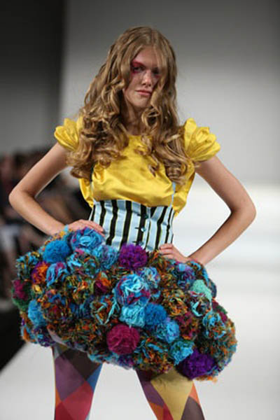
When you think of the humble pom-pom you think of children’s clothes, order buy of gigantic sombreros for tourists, generic unsightly snow boots and poodles with dodgy haircuts. Experimenting with pom-poms always seemed to be a bit like tequila shots – one was fun, two was adventurous, any more was way overboard and enough to make you gag.
NOT ANY MORE! Somebody somewhere decided it was time to wrench those pom-poms from the cheerleader’s sweaty grasp and boom! Stick them in the right places and we’re in love – and it turns out you can have hundreds of them!

pompom14.jpg

pompom16.jpg

They might have come to our attention bobbling out all over the catwalks in fashion week and with the high street following suit, but this is a look that could be even cheaper for the creative recessionistas amongst you. Make your own! Check it.
If you ever find yourself sat staring into space on the tube, you could be churning out a whole lot of pom-poms instead. Worn the right way I think it’s a really easy and fun accessory to jazz up an outfit– this cute Peter Jensen ring as a prime example:

pompom12.jpg

We’ve seen some girls wearing them in their hair, which make a nice woolly alternative to bows, and of course the contentious scrunchie.

pompom15.jpg

BIGGER:

pompom13.jpg

BIGGEST:

pompom10.jpg

THE KITCHEN SINK:

pompom11.jpg

Don’t be wearing those in the cinema mind you.

It’s amazing that something so simple has been culturally reinterpreted so often over the course of history. That might sound grand but something that’s gone from dangling off the edges of sun hats in Central America, to being mass marketed to children all over the world to making on the Paris catwalks is pretty unique. Yikes, Pom Pom international even reckons they can promote world peace. Maybe that’s one tequila too many. Sporting them could almost seem a throwback to childhood, a fashion revival harking back to the days of hats and mittens (I’d like to say ‘and snow and toboggans’ but let’s face it, it doesn’t snow THAT often).
The last thing we can learn about pom-poms is from cheerleaders everywhere, who if nothing else, seem mind-bogglingly happy. Why? POM-POMS!

Categories ,accessories, ,catwalk, ,knitting, ,pom-poms, ,trend

Similar Posts:


Amelia’s Magazine | London Fashion Week S/S 2012 Menswear Day Catwalk Review: James Small


James Small S/S 2012 by Milly Jackson

I arrived at the James Small show pretty early – such is the bonkers London Fashion Week schedule that some shows overlap and then you’re left with huge gaps in your day. I joined the small but perfectly formed queue and waited for a pal to arrive. The show was delayed, prescription I was informed, because of the knock-on effect of late-runners throughout the day. The queue eventually began moving a mere 20 minutes late, and just as we were about to be let in, we were halted by an impossibly gorgeous PR girl. Her colleague came over and whispered ‘Kate’s imminent, we should hold the queue‘. Now, I don’t know if it was the pint I’d just enjoyed or the onset stir-crazy sensation I was experiencing after 6 days of shows, but I started sweating profusely. It couldn’t be, could it? ‘Calm down, Matt’ I internally repeated. It can’t be. She wouldn’t. It might be a code word. It might be Kate Adie.


Kate Moss by Antonia Parker

Eventually, after much discussion, it was decided that we should be allowed in because this mysterious Kate hadn’t yet arrived. We were escorted individually up the grand staircase of the Freemasons Hall, this Vauxhall Fashion Scout venue, and assigned seats on the front row. Seating was heavily policed, and I enjoyed the personal escort, but it was taking bloody ages and another show downstairs was set to take place pretty soon afterwards. Jaime Winstone, looking incredible with a silver grandma up-do and vertiginous heels, entered the room and was seated with little fuss. Now I love Jaime Winstone, but if ‘Kate’ was a codename for Jaime Winstone, I was about to go berserk.


Kate Moss by Claire Kearns


Kate Moss by Gilly Rochester

The personal escort service soon turned into a scrum; somebody had clearly realised that it just wasn’t practical. I let out a huge sigh as I said to my friend ‘Well, Kate clearly isn’t coming.’ ‘What?’ my friend replied, ‘she’s over there!’ I turned to my left to study the front row. Somehow I had missed the arrival of Meg Matthews, Sadie Frost, Annabelle Neilson, James Brown, Jamie Hince and… Kate Moss. Kate FREAKIN’ Moss!


All photography by Matt Bramford

There was little fuss as I struggled to fight the urge to jump out of my seat, leap across the catwalk, gather Kate up in my arms and force her to take my hand in marriage. It all happened so quickly, and of course, now Kate had arrived, the show must go on.


James Small S/S 2012 by Gabriel Ayala

It was tricky to concentrate on the show knowing that My Kate was mere feet away, but being the consummate professional that I am, I took up my camera and started to study the clothes, being carefully to take a picture of Kate in between each look. The fashion on offer was actually great, and I don’t know why I was thinking that it might not be. The secondary venue at Fashion Scout is actually much nicer – a dark wood arch divides the old stone room, dark wood lines the floor and majestic chandeliers hover above the revellers. Models appear almost out of nowhere. You do lose sight of the models as they bound through the arch, unfortunately, but this ensured enough time to snap Kate excessively.


James Small S/S 2012 by Sam Parr

Hysteria mounted thanks to the special guests: Kate and her entourage whooped and cheered every look and wolf-whistled translucent shirts, which sent roars of laughter through the room. Last season’s sharp tailoring continued this time around, but had been given a more casual feel for the discerning gentleman who manages to looking devastatingly cool without any real effort during the summer months.


James Small S/S 2012 by Milly Jackson

Small’s mainstay silk shirts had been jazzed up with the aforementioned translucency, and romantic florals with an air of Liberty were the most aesthetically appealing pieces in the collection, particularly a shirt/shorts combination with identical print. I’m not sure I’d get away with it, but the model did with aplomb.

Small‘s sharp tailoring was dressed down with white ankle-high sports socks and Vans in varying colours – when I read this on the press release I wasn’t so sure about it, but seeing it in the flesh allowed it to make sense. Rich colours: plum and royal blue, and luxe materials: silk and velvet, made this collection Small‘s most sophisticated yet. Retaining an edge above his competitors with leopard print and camouflage short shorts, it’s Small’s sharp cuts and sophisticated tailoring that really set him above the rest. That and his stellar front row, of course.

Categories ,Annabelle Neilson, ,Antonia Parker, ,catwalk, ,Claire Kearns, ,combat, ,fashion, ,Floral prints, ,Freemasons’ Hall, ,Front Row, ,Gabriel Ayala, ,Gilly Rochester, ,illustration, ,James Brown, ,James Small, ,Jamie Hince, ,Kate Moss, ,Leopard Print, ,liberty, ,London Fashion Week, ,Meg Matthews, ,menswear, ,MenswearSS12, ,Milly Jackson, ,review, ,S/S 2012, ,Sadie Frost, ,Sam Parr, ,Silks, ,tailoring, ,The Kills, ,Translucent, ,Vans, ,Vauxhall Fashion Scout

Similar Posts:


Amelia’s Magazine | Pom-pom circumstance

When you think of the humble pom-pom you think of children’s clothes, order buy of gigantic sombreros for tourists, generic unsightly snow boots and poodles with dodgy haircuts. Experimenting with pom-poms always seemed to be a bit like tequila shots – one was fun, two was adventurous, any more was way overboard and enough to make you gag.
NOT ANY MORE! Somebody somewhere decided it was time to wrench those pom-poms from the cheerleader’s sweaty grasp and boom! Stick them in the right places and we’re in love – and it turns out you can have hundreds of them!

pompom14.jpg

pompom16.jpg

They might have come to our attention bobbling out all over the catwalks in fashion week and with the high street following suit, but this is a look that could be even cheaper for the creative recessionistas amongst you. Make your own! Check it.
If you ever find yourself sat staring into space on the tube, you could be churning out a whole lot of pom-poms instead. Worn the right way I think it’s a really easy and fun accessory to jazz up an outfit– this cute Peter Jensen ring as a prime example:

pompom12.jpg

We’ve seen some girls wearing them in their hair, which make a nice woolly alternative to bows, and of course the contentious scrunchie.

pompom15.jpg

BIGGER:

pompom13.jpg

BIGGEST:

pompom10.jpg

THE KITCHEN SINK:

pompom11.jpg

Don’t be wearing those in the cinema mind you.

It’s amazing that something so simple has been culturally reinterpreted so often over the course of history. That might sound grand but something that’s gone from dangling off the edges of sun hats in Central America, to being mass marketed to children all over the world to making on the Paris catwalks is pretty unique. Yikes, Pom Pom international even reckons they can promote world peace. Maybe that’s one tequila too many. Sporting them could almost seem a throwback to childhood, a fashion revival harking back to the days of hats and mittens (I’d like to say ‘and snow and toboggans’ but let’s face it, it doesn’t snow THAT often).
The last thing we can learn about pom-poms is from cheerleaders everywhere, who if nothing else, seem mind-bogglingly happy. Why? POM-POMS!

Categories ,accessories, ,catwalk, ,knitting, ,pom-poms, ,trend

Similar Posts:


Amelia’s Magazine | Maison Martin Margiela 20 at Somerset House


Illustration by Donna McKenzie

Regular readers of Amelia’s Magazine will know that we covered the Maison Martin Margiela 20 exhibition last March, when it showed in fashion capital Antwerp.

But, since it’s moved to our very own fashion capital, we thought we’d have another look, and get some of our wonderful illustrators involved!

Somerset House is quickly becoming a fashion hot spot, with the rehoming of London Fashion Week and the recent SHOWstudio sessions. It’s clear why, too – it’s bloody beautiful.

This is the third outing for the Maison Martin Margiela exhibition, after seasons in Antwerp and Munich, so actually it’s the label’s 22nd anniversary this year, but who cares? I’ll use any excuse to have a poke around a fashion archive.


Illustration by Louise McLennan

The exhibition, set in Somerset House’s lower galleries and you’d be forgiven for believing, if this building wasn’t centuries old, that the space had been purpose-built for this nostalgic trip down Margiela memory lane.

All but a couple of the rooms are white-washed in typical Margiela fashion, and while the exhibition allows us to explore the history of this conceptual and inspirational label, it still give nothing away about the elusive man himself.


Illustration by Amy Martino

Instead of being a chronological or nostalgic display, the aim of this exhbition is to explore the key themes of Maison Martin Margiela, including the inspiration behind each collection and the techniques used.

So it is the quirks that have made this brand truly unique that are given most attention. We begin with a look at the anniversary catwalk show, amongst a lot of polystyrene models, whilst mooching along a row of rather battered Tabi shoes.


Illustration by Donna McKenzie

The bulk of the exhibition explores varying collections and what made them stand out alongside so many other fashion designers of the time. Flat-pack clothing, XXXL oversized pieces, painted garments, narrow tailoring, the trench coat, and the re-visioning of old garments. We also see the evolution of Margiela’s elusivity – first it was a slash of paint across a model’s face, then a blindfold, and then the infamous sunglasses (which I was so tempted to lift I had to walk around with my hands in my pockets. Damn I wish I’d bought them – what a collector’s item).


Illustration by Farzeen Jabbar

One room is devoted to archive footage, film and photographs from across the collections – the room is dark and has white lounge chairs for you to kick back and revel in some of the most iconic fashion images of the last two decades.


Illustration by Zarina Liew

Whether you like fashion or not, I’m entirely convinced that you will love this exhibition – it breaks the boundaries of typical gallery design and it is incredibly inspirational – Go See It!

You can read a full review of the Antwerp exhibition (which was exactly the same exhibition, I promise) here.

For the all important details, visit our listings section.


Categories ,Amy Martino, ,antwerp, ,Birthday, ,catwalk, ,Donna McKenzie, ,Elusive, ,london, ,London Fashion Week, ,Louise McLennan, ,Maison Martin Margiela, ,Munich, ,Polystyrene, ,Showstudio, ,Somerset House, ,Tabi shoe, ,XXXL, ,Yellowbirdmachine, ,Zarina Liew

Similar Posts:

Bookmark this:
  • Facebook
  • Twitter
  • MySpace
  • del.icio.us
  • StumbleUpon
  • Digg
  • E-mail this story to a friend!
  • Technorati
  • LinkedIn

Amelia’s Magazine | PPQ: London Fashion Week A/W 2013 Catwalk Review

PPQ A/W 2013 by Jodan Webster
PPQ A/W 2013 by Jordan Wester

We waited – for what felt like hours – in the notoriously inevitable ‘PP-Queue’, but as the gorgeous PPQ party girls of all decades strutted down the runway at the BFC Courtyard Showspace I forgave all.

PPQ AW 2013 by Amelia Gregory

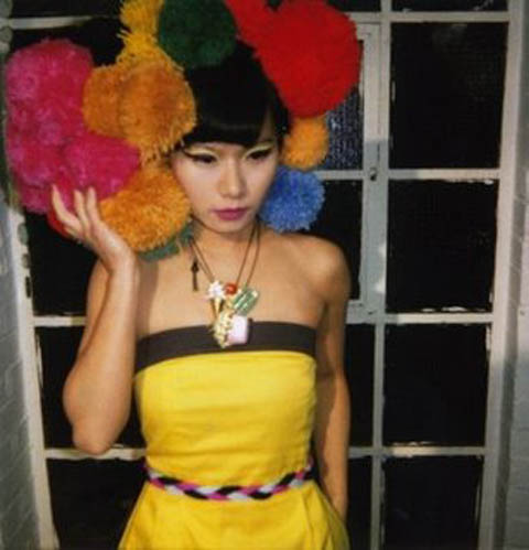
Design duo Percy Parker and Amy Molyneaux kept true to PPQ’s signature youthful vibe for A/W 2013, but perked things up with luxe tailoring. The colour palette was delightfully eye scorching with vibrant bursts of neon pink, banana yellow and lime green. References to various eras were made throughout the show; 60s fitted pea coats, loud 70s style graffiti print on off-the-shoulder dresses, 80s stretch velvet bodycons and 90s cut out features were all liberally featured. The models were uniform in huge tousled beehives, held delicately together with a chunky black ribbon.

PPQ AW 2013 by Amelia Gregory

Although the show was refreshing, some of the combinations were rather too garish for my liking: the neon duchess silk dresses paired with black organza felt too much like American-Prom disaster. Nonetheless, construction and tailoring were immaculate throughout.
PPQ AW 2013 by Amelia Gregory

Accessories were en-pointe in this collection; a variety of colourful heels, dramatic wide brim suede hats and luscious boxy weekender bags – personal dibs on the black one. I couldn’t have asked for a more titillating way to end the first day of London Fashion Week.

PPQ by Chloe Douglass
PPQ A/W 2013 by Chloe Douglass

PPQ AW 2013 by Amelia Gregory
All photography by Amelia Gregory

Categories ,1960, ,1970, ,1980, ,1990, ,60s, ,70s, ,80s, ,90s, ,Amy Molyneaux, ,BFC Courtyard Showspace, ,bodycon, ,catwalk, ,Chloe Douglass, ,Colour Blocking, ,Jordan Wester, ,lfw, ,London Fashion Week, ,party, ,Percy Parker, ,ppq, ,Prom, ,runway, ,Somerset House, ,tailoring

Similar Posts: