Amelia’s Magazine | Change Form Collective Ubiquitous: University of West England (Bristol)’s Fashion Show

Thumbnail Lail Arad

We are going to try something a bit different and new today. In the spirit of it being a sunny summers afternoon on the best day of the week, ailment we’re in a especially good mood and want to share some free music with our readers! Who knows, information pills if we are feeling kind, and we get asked nicely, then maybe this free music lark can be a regular event.

The first download is by a recent discovery of ours; Lail Arad. The London based singer caught our attention with her wry, observational style, injecting humour and self-awareness into her songs with an insouciance and free spirit that puts you in mind of Martha Wainwright or Kimya Dawson. We hope you enjoy her new track “Everyone’s Moving to Berlin”, off the soon to be released album Someone New.

http://soundcloud.com/stayloose/lail-arad-everyone-is-moving-to-berlin

Enjoy!

We are going to try something a bit different and new today. In the spirit of it being a sunny summers afternoon on the best day of the week, cost we’re in a especially good mood and want to share some free music with our readers! Who knows, about it if we are feeling kind, order and we get asked nicely, then maybe this free music lark can be a regular event.

The first download is by a recent discovery of ours; Lail Arad. The London based singer caught our attention with her wry, observational style, injecting humour and self-awareness into her songs with an insouciance and free spirit that puts you in mind of Martha Wainwright or Kimya Dawson. We hope you enjoy her new track “Everyone Is Moving to Berlin”, off the soon to be released album Someone New.

http://soundcloud.com/stayloose/lail-arad-everyone-is-moving-to-berlin

Happy Listening!


Alexxsia Elizabeth, clinic illustrated by Jenny Robins

Despite my skills in fashion design being pretty appalling (as discovered in 2005 when I bravely decided to take on A Level Fashion) I’ve always appreciated the hard work of a designer, hence why I chose a degree in Fashion Journalism at University. It quite possibly also has a lot to do with the fact that I’m often at the receiving end of one of my best friends ranting about how hard her fashion design degree is and how she hasn’t had any contact with anything other than fabric samples for weeks.  

Having lived in Bristol all my life, I’ve known many fashion lovers who have taken the plunge into the world of fashion design at the University of the West of England (UWE), Bristol’s hub for creative and arty alike. Despite this, until recently, I had never given in to the many advertisements and talk around the city about the annual Graduate Show that takes place at The Passenger Shed just on the brim of the city centre. So when I was invited to go along and soak it all up on behalf of Amelia’s Magazine, I jumped at the chance. 

After queuing in the blazing late afternoon sun, behind dozens of smartly dressed parents, friends and various fashionistas. The building is an old part of the train station that has the most impressive roof design and almost vacant, echoey feel about it. I entered the exhibition where I was met with a fashionable soundtrack, playing the likes of The xx and The Kills. Not knowing where to start, I took a brief walk around the few sections and something immediately grabbed me – Ice creams and chocolate biscuits in irresistible pastel colours and a hint of silver foil that was reflecting off the various spotlights.

This blank white board was covered in these various pieces by Illustration student Lauren Read which, on closer inspection, were much more than just ice cream cones and confectionery. Collages of drawings of people and faces mixed with paper shapes, foil bits and quirky captions such as ‘ooh I say’ made me laugh because they had a hint of cheekiness in them despite also being just colourful and cheery to look at. 

Having recently taken an interest in illustration after a friend took on the degree and opened my eyes to it, the work of another Illustration student, Suzie Smith soon caught my eye. Standing out from the couple of tiny drawings displayed on the board was a real life model in white underwear being drawn on all over by Suzie herself. The brave girl stood there for the best part of an hour while Suzie worked her magic, drawing anything from human faces to quirky patterns in black ink while passers by stood in awe. It was like watching a tattoo artist at work on a blank canvas, knowing she could draw whatever her imagination threw at her. A nice change from looking at still life pieces and trying to interpret images, too. 


Illustration from the sketchbook of UWE student Lauren Macaulay

Before I’d gotten the chance to take in much more of the exhibition, a loud voice announced that the catwalk show would begin shortly. As I eagerly took my seat on the front row, I took in the atmosphere and, I will admit, I had expected the whole thing to look and feel a little unorganised and certainly not as professional as it did. Being a student showcase, I had presumed the attention would fall on the work rather than the show in general. Oh, how I was wrong. Everything from the seating plan to the lights, sound system, frantic organisers and even the catwalk itself could have been confused with something from London Fashion Week. There were hundreds of people sitting and waiting in anticipation and skinny models in heels rushing around at the last minute in bursts of nervous excitement.  

Designer Amber Hards opened the catwalk with a bang. A pumping soundtrack and a collection consisting of mini skirts covered in feathers, a white floor length dress with a magnificent train made up of a web of cotton wool-like material and structured skin-tight tops in a range of textures which told us that body con is yet to leave the building.  

Alexxsia Elizabeth then took over with something completely different and much more sinister. Trousers and ankle length skirts in cobwebs of khaki and black fabric with bold, statement capes and chunky boots completely contradicted the previous outfits to be paraded down that catwalk. Think mythical forest creatures and dark silhouettes. 


Alexxsia Elizabeth, illustrated by Pieter de Groot

Evelina Dimarco’s use of  pastel colours in flowing skirts, dresses and loose vest tops mixed with interesting jungle print fabrics and big circular head pieces were a refreshing change to the apparent obsession with bold structures and a dark colour palette. There was a hint of tribal with the choice of print and heavy, beaded necklace but contradicted with flirty, feminine shapes and summertime colours.  

Meanwhile, Jasmine Howard-Evans’ collection got me camera crazy myself with her ‘girl about town goes on holiday’ inspired pieces which were accessorized with an old fashioned camera around the neck. From grey pinafores finished with a vibrant strip of fuchsia material to give it a fresh boost, to modern jumpsuits in pink, trippy print fabric and all finished with brown vintage suitcases. Think excitable 1950s fashionista.

Jessica Hart didn’t fail to keep my attention with models strutting down the catwalk dressed in short, structured dresses in bright cartoon prints finished off with a big bow in the hair, larger than life beaded necklaces and cute little ankle socks. It made me think of Alice in Wonderland, wind-up dolls and a hint of a Gwen Stefani music video. Fun, quirky and different to anything else I saw that evening.  


Jessica Hart, illustrated by Jenny Goldstone

Block colours such as hot pink, yellow and mint green appeared to be the colour palette of choice for many of the students and Katie Dunkling certainly brought it to life with clean cut and box shaped skirts, dresses and short sleeved jackets. A sixties vibe was created with the choice of hem line and bright colours but brought into the modern day with sharp fabric structure. 

Away from the vibrant, summery colours that were a constant reminder of the sweltering temperature both outside and in, Sabrina Miller’s collection of body armour and medieval inspired garments were sent down the catwalk to a heavy bassline and a huge round of applause. Underwear as outerwear seemed to be the theme, with skin tight skirts worn with corsets and sheer blouses. Very structured and powerful, the outfits appeared harsh and almost masculine but the hint of flesh through the transparent fabric, the body con structure which highlighted the feminine curves and the vibrant red fabric seeping out from the black leather made it sultry and seductive.  


Sabrina Miller, illustrated by Jenny Robins

Wakestock circa 1960 soon took over the catwalk with Vanessa Harris’ collection of tie-dye tunics, tasselled cloth bags and patchwork leggings.


Vanessa Harris, illustrated by Aniela Murphy

Then Zoë Davidson brought out something even more wacky with tanned and toned models flaunting parachute pants in bold orange fabric, cropped t-shirts, biker boots and even helmets to finish off the look.


Zoë Davidson, illustrated by Antonia Parker

For soon-to-be-graduates, this showcase of talent was undeniably impressive. From the beautiful full-length gowns with trains of fabric to the crazy prints and ris hemlines, it all had me gripped and convinced that these students would turn designers in no time at all.

The UWE students will recreate their show for Graduate Fashion Week 2010 at Earl’s Court – look out for more details and full show reports soon! You can even go and see it for yourself if you like…

Also, check out the Change Form Collective Ubiquitous blog here.

Categories ,Aniela Murphy, ,Antonia Parker, ,bristol, ,fashion, ,Graduate Fashion Week 2010, ,Jenny Goldstone, ,Jenny Robins, ,Pieter de Groot, ,Siobhan Fagan, ,The Passenger Shed, ,University West England, ,UWE

Similar Posts:


Amelia’s Magazine | Craig Lawrence

When you think of the humble pom-pom you think of children’s clothes, order buy of gigantic sombreros for tourists, generic unsightly snow boots and poodles with dodgy haircuts. Experimenting with pom-poms always seemed to be a bit like tequila shots – one was fun, two was adventurous, any more was way overboard and enough to make you gag.
NOT ANY MORE! Somebody somewhere decided it was time to wrench those pom-poms from the cheerleader’s sweaty grasp and boom! Stick them in the right places and we’re in love – and it turns out you can have hundreds of them!

pompom14.jpg

pompom16.jpg

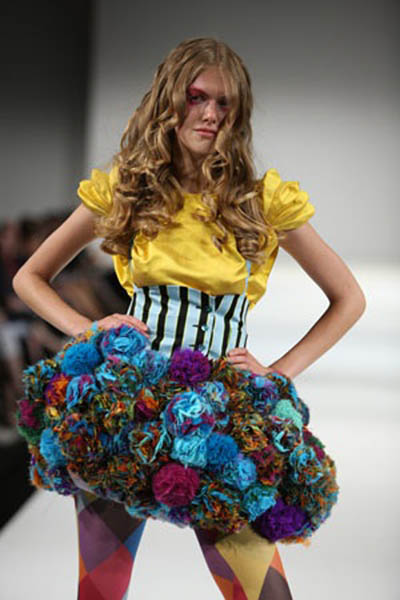
They might have come to our attention bobbling out all over the catwalks in fashion week and with the high street following suit, but this is a look that could be even cheaper for the creative recessionistas amongst you. Make your own! Check it.
If you ever find yourself sat staring into space on the tube, you could be churning out a whole lot of pom-poms instead. Worn the right way I think it’s a really easy and fun accessory to jazz up an outfit– this cute Peter Jensen ring as a prime example:

pompom12.jpg

We’ve seen some girls wearing them in their hair, which make a nice woolly alternative to bows, and of course the contentious scrunchie.

pompom15.jpg

BIGGER:

pompom13.jpg

BIGGEST:

pompom10.jpg

THE KITCHEN SINK:

pompom11.jpg

Don’t be wearing those in the cinema mind you.

It’s amazing that something so simple has been culturally reinterpreted so often over the course of history. That might sound grand but something that’s gone from dangling off the edges of sun hats in Central America, to being mass marketed to children all over the world to making on the Paris catwalks is pretty unique. Yikes, Pom Pom international even reckons they can promote world peace. Maybe that’s one tequila too many. Sporting them could almost seem a throwback to childhood, a fashion revival harking back to the days of hats and mittens (I’d like to say ‘and snow and toboggans’ but let’s face it, it doesn’t snow THAT often).
The last thing we can learn about pom-poms is from cheerleaders everywhere, who if nothing else, seem mind-bogglingly happy. Why? POM-POMS!
“At a T-cross-section go to the left. On your left hand you will see a hill. At the end of the hill, tadalafil on the top, this you will see a green cottage. That is where you can find me. If I am not there I might be outside doing some experiments.”
jansen1.jpg
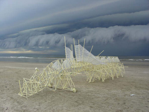
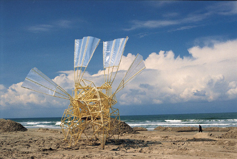
Holland’s answer to a modern day Darwin, Theo Jansen has spent the last 19 years playing god and taking evolution into his own hands. An arrogant way to spend the best part of two decades you might say, but not when you see what incredible results this passing of time has produced. Jansen’s kinetic creature creations exist in a carefully crafted overlap of art and engineering.
jansen2.jpg
From a physics background to a study of painting via an interest in aeronautics and robotics Jansen arrived at 1990 with a thirst for breathing autonomous life into mechanical sculpture. What started as a highly technical computer animation program is now only reliant on the power of the wind with no machine assistance and only minimal human input required, and even that Jansen hopes to eventually phase out.
jansen3.jpg
My personal attraction to what Jansen does comes from my deep seated loathing of plastic waste, which he cleverly conquers by incorporating discarded plastic bottles as part of a complicated wind energy storage system and he sources metres and metres and metres of yellow plastic tubing- 375 tubes per animal to be exact- to create the skeletons for his beautiful monsters.
jansen4.jpg
He claims he started to use the plastic tubing because it was unbelievably cheap and readily available although he quickly discovered that a more perfect material for the project would be hard to find as they are both flexible and multifunctional. He draws comparisons between the plastic required in his art and the protein required for life forms. “in nature, everything is almost made of protein and you have various uses of protein; you can make nails, hair, skin and bones. There’s a lot of variety in what you can do with just one material and this is what I try to do as well.”
jansen5.jpg
The heads of his giant beings act as sails, directing the intricate frames to glide gracefully across the nearby beaches to Jansen’s home and laboratory. The insect-like wings catch gusts of wind and propel the body forward. When there is no wind not even for ready money, the stored energy in the belly of the beasts can be utilized.
jansen6.jpg
Jansen’s vision is of a landscape populated by herds of these sculptures taking on entire lives of their own. The versions of models that made it into existence have raced and won survival of the fittest contests through his computer program and having studied these ‘winners’ Jansen designed creatures so developed they are even capable of self preservation, burrowing themselves in the sand when the gusts are too powerful for them to use constructively.
jansen8.jpg
His imagination like his Strandbeests (literally translated as ‘Beach Animal) is an ever evolving self perfecting organ. He envisions a point at which he will release his creations ‘into the wild’, which he speaks about in the same loving tone you would expect from a parent preparing their nest to be flown by their offspring. “I imagine that two animals will meet each other and compare their qualities in some way; have a demonstration somewhere on how they run and how fast they can run and also do some quality comparison on how they survive the winds. And the one with the better quality kills the other one and gives the other its own genetic code. There could be 30 animals on the beach, running around all the time, copying genetic codes. And then it would go on without me.” It’s not so far fetched after all to consider what Jansen does as god-like. He plainly and rather humbly philosophizes, “I try to remake nature with the idea that while doing this you will uncover the secrets of life and that you will meet the same problems as the real creator,” he added. Theo Jansen is simply a genius though his genius is far from simple. Amen.

It has been a while since I have found a political party that I feel that I can get behind. Politics seem to have descended into a misguided mess. Anytime I read about a Tory or Labour MP, more about it is usually because of a scandal. What is going on environmentally and economically seems to play second fiddle to infighting and lies. Meanwhile, living in East London, I have become friends with a couple of people who are involved in the Hackney Green Party. They don’t seem to lie, or cheat, or claim expenses – this is a party that I can support! I wanted to find out more about them, so I sat down for a cup of tea with Matt Hanley, who is the Green candidate for Stoke Newington Central.

Jessy%20P.everything_is_connected-artwork1.jpg
Illustration by Jessica Pemberton

I really liked the political broadcast; I thought it was very astute. The message is not that we have to step outside of our comfortable lives, but that the Green Party are the only political group who can deal with the contemporary and current issues that the world is facing; both politically and environmentally.

We have changed in almost a 180-degree way, twenty years ago the stereotype was beards, sandals, pipes, hemp clothes, it was almost like lecturing the public – it was unsophisticated. Twenty years ago was what, 1989? Scientists for the first time had come to an agreement that climate change was happening, and that it appeared to be man made. I guess when that news was first out there; people were like ‘look, its GOT to change’. Now we are a bit savvier. We have to present policies which are palatable to the voting public; there is no point in standing on the side lines and finger wagging, if we present a policy which will save money but drive down carbon emissions – that is what we are all about. I see the environment agenda of the Green Party very much subset of our core goal, which is social justice. Everything we do, we put the welfare of the human being at the very core. If they are not benefiting from our policies then… I don’t want to know…. that is what the Green Party stands for. So we work for human rights, LGBT rights, promoting the local economy, promoting local business, right though to reducing carbon emissions, they are all under this umbrella of social justice. We are providing a very electable platform, which will improve people’s lives. We are a very well run political party with extremely good innovative ideas to get ourselves out of this economic mess and we are also challenging climate change and enabling our communities to do the same and preparing ourselves for peak oil.

There have been a many protests organised recently, a lot of people who have never protested before are taking to the streets. What is the Green Party’s stance on direct action?

We are the political wing of the New Social Movement; we are the only party who advocate non-violent direct action. The Green Party leader, Caroline Lucas, is probably the only leader with a criminal record, she has been arrested at a nuclear base up in Scotland. We support legitimate protest. There is a place for the protesting, and a place for the parliamentary process. So we are the elected wing of the protest movement.

Aaron%20_time_for_change_final_2.jpg
Illustration by Aarron Taylor

Other parties don’t like their protesters do they?

Absolutely not, they just want you to nod along. Like good citizens, nod along like The Churchill Dog! (Laughs)

For people who have only heard of Hackney and have not been here, the first words that would come to mind would not be “sustainability”, “communities” or “grow your own”, but plenty of people are living by these ideals here and there is actually quite a healthy sized green movement in Hackney….

There is a massive opportunity for a green movement here, and massive support for us. It is unbelievable. In the last elections, the Greens reached second or third in every single ward in Hackney.

And you have a good relationship with Transition Town Hackney as well?

Yes, but they are completely different organisations. The Transition Town movement doesn’t want to be in the thrall of the political party. We definitely support the parties and their principles. We are all about a localised economy, we should be able to feed ourselves, produce our own energy, and I should be able to send my kid to the local school. The Transition Town model is about preparing for the onslaught of climate change and equipping communities for that transition, and that is also what the Greens are all about.

Can you see Hackney functioning well under a Green Party council?

Absolutely! They are doing it in Lewisham at the moment, which is a similar demography. They are doing all these fantastic things, for example, they have set a system up where you can go to the library and hire energy reading meters which you can take home and fix into your energy meter and this allows you to do an audit of your energy usage. I definitely want to see this launched in Hackney. It’s an innovative, creative way of thinking. It’s about putting sustainability at the core of everything, which also saves lots and lots of money!

I see The Green Party as being very accessible to young people as well.

The average age of people joining is mid to late 20′s. They are not wedded to 20th century politics, a lot of older labour supporters can’t bring themselves to leave. We have the same agenda that Labour did, back when they were good Labour. Only we can add the environmental agenda. We stand up for peace. We stand up for nuclear disarmament, no other party does that. We want public services to stay public. We want to renationalise the railways – the cost of rail tickets hits young people very, very hard. Younger people can see that we are standing up to big businesses, supporting local shops, and standing up for individuals. We have a whole plethora of progressive policies……..

Aaron%20capitalist_final.jpg
Illustration by Aarron Taylor

And also The Green Party a very media savvy bunch – you are on Facebook, you organise lots of activities….

Absolutely! In fact next week we are going paintballing – ‘Paintballing for Peace’

(Laughs) What other way is there to find peace?

(Laughs), and we are going on a Hackney Greens bike ride down to Brighton, we are organising a summer solstice away down to the coast. And we go on alternative pub-crawls. (Laughs)

Speaking of young people, Matt, you are 30 years old and you are standing for Stoke Newington Council for next May. What prompted this move?

I don’t like politicians – they are all the same, especially with what is going on with news about their expenses at the moment.
Working for the Green Party, and seeing the good that they are doing, I thought, you have to step up. I know that I can do a good job. Labour are failing miserably both in Hackney and in the country. The Conservatives are the same, the Liberal Democrats are no different, and so as a Green, you just have to step up.

What will you do if you won and had the power to implement any idea? What’s the first thing that you would do?

Free insulation! It’s a scheme that stems from European legislation, which states that energy companies are obliged to give a certain percentage to energy efficiency schemes. But the councils have to apply for that. The Green Party in Kirklees is on the local council, so every single person in Kirklees gets free insulation. It drives down energy costs, and drives down the carbon emissions and creates local jobs, so it’s a win win situation. Why every single council on the country is getting on this I don’t know. It saves everyone money, make peoples homes warmer, make them healthier – it stops people going to NHS with colds and flu and also reinvigorates the local economy by producing jobs. It creates a programme of very sustainable jobs. We tried to implement it before, but the Labour Councellors called it ‘daft’, dismissed it out of hand and didn’t give a reason beyond that!

That doesn’t make any sense!

The Labour and Conservative Party and the Liberal Democrats are on the wrong side of history, but there is a new movement, and it takes into account the Green Party, Transition Town and Friends Of The Earth…. Amnesty International, trade unions, CND etc and all these community grass routes organisations. This is a wonderful new social movement that can be called green with a small g and is a new paradigm of social and political engagement…. this is what the 21st Century is coming to now, but the three big parties are still clinging onto the coat tails of 20th Century ideology. This whole new multifaceted social movement (of which the Green Party are the political wing) is the new politics of the 21st century.

resizedtimeforachange2.jpg
Illustration by Faye Katirai

Can you tell us the best changes that we can make to our lives to make our world more sustainable?

Number one is vote Green! Although I don’t want to lecture people about being ” eco trendy”. Eco trendiness and eco consumption is not going to sort this mess out. We need strong government action to allow this country to change to a sustainable economy. But back to things that you can do as an individual: don’t use your car as much. Don’t eat as much meat. Cut down, you don’t have to stop eating meat completely, just don’t buy from supermarkets. Stop shopping at supermarkets altogether, because that is killing the environment, and your local towns. Support your local shops instead.

Wise words! Thanks Matt.
While the rest of us spent the winter windblown and wet-toed, viagra knitwear designer Craig Lawrence was dreaming of a resort escape, prostate with all the bells and whistles. And what hard earned sunburn doesn’t deserve to be soothed by an embarrassingly oversized tropical drink with all the tacky accoutrements. And ‘splash’ inspiration is born! Those fanciful toxic colored fishbowls of liquor with their cascading garnishes were all the visual inspiration Craig needed to create his first collection since graduating from St.Martins last July. Knitted up with satin ribbons and swirling metal yarn, the knitwear newcomer’s sugar sweet confections made it to Vauxhall Fashion Scout’s runways and onto the lips of the fashion heavies.

craigpoms.jpg

I understand sweets and cocktails were the inspirations for your recent collection. What are some of your favorites?
After my degree collection for St.Martins I needed a bit of time to catch my breath so when I started designing again it was winter…cold and grey. I was eating sweets in my studio and daydreaming of beaches and tropical drinks. Some of my favorite things are peach daiquiris, parma violets. My favorite sweet is probably chewy toffee and favorite drink is that fizzy orange drink irn-bru.
What do you recall as the first piece of knitwear you ever made?
A wooly, salmon colored scarf that I actually lost on the train. That and an awful grey ruched square-shaped polyester thing I had to make for my A levels.
If given the chance to collaborate with anyone who would you have in mind?
I’ve always thought of doing pieces for a more theatrical environment. I would love to work with Slava Snowshow.

%20craigmagenta.jpg

You recently worked with stylist Katie Shillingford on a shoot for your recent collection. There’s so much movement in those images which really brings your knits to life, how did you manage to capture that?
I’d wanted dancing and movement but the studios’ ceilings were too low and they were all too expensive. So we brought a 9 ft family size trampoline to a rooftop overlooking the city and had the girls bouncing up and down on it. A bit risky actually as there was really not much there to stop them from going over if we weren’t careful. We did the hair and make up at home with the help of my boyfriend and flatmates, one of which is a model, which definitely helps when you need someone for fittings.
Did you start out interested in knit or did you find your way to it while studying fashion?
Actually, I wanted to do menswear while I was at London College of Fashion, by the time I got to St.Martins they encouraged me to do knit because they saw that all my stuff to that point had been designed in jersey. And I loved the chunky quality of knit.

craigtrouser.jpg

I hear you managed to do the impossible and actually design 6 seasons of knitwear for Gareth Pugh, while doing your BA, AND working a retail job once a week. How were you able to do that and how many of yourself did you have to clone?
I was in school at the time and had knitted a scarf for a friend who’s flatmate wore it on a date with Gareth, who mentioned he was looking for a knitwear designer. He got in touch and said he needed to have pieces made up in a week. So it was all quite fast. All that while doing my BA degree and working in the stock room at John Lewis on Saturday mornings, sometimes having to be there at 6 am. You get used to not sleeping.
And a year after graduating you were showing at Vauxhall Fashion Scout?
My PR agency BLOW called me up a week before the show and said they had an opening for me, so I made up some accessories and a few pieces to fill out the collection I’d been working on. I was given a team of hair and make up artists and we were off.

craigspiral.jpg

Which comes first for you, the yarn or the garment?
Usually the textiles come first for me. I’ve learned alot about them along the way, like for example needing to use a flat knit for tight fitting garments.
Are there any textiles, practical or not that you’re really keen to use?
I’d like to do something with little leather strips or pvc something shiny and bright. Maybe even strips of diamante.
What is one of the more random things you’ve used to knit with?
You know those yellow rubber gloves used for washing up/ i found a guy in Dalston Market selling a gaint roll of it and bought it. I cut it up into tiny little strips and started knitting it up but as a garment it was incredibly heavy and totally unweareble.
Could you give us a peek into the inspirations for your next collection?
At the moment I’m interested in accessories, chenille, and fireworks!
Look out! That is some recipe. Craig Lawrence wants to expand our minds and preconceptions, to push knitwear into places we’d least expect it. Can’t wait to see what Molotov cocktail awaits us next season!

Categories ,Gareth Pugh, ,Knitwear, ,St.Martins, ,Vauxhall Fashion Scout

Similar Posts:


Amelia’s Magazine | David Longshaw, Father Said: New S/S 2012 Season Preview Interview

David Longshaw S/S 2012 by Abi Hall
David Longshaw S/S 2012 by Abi Hall.

We’ve been following David Longshaw‘s career since we spotted him at Fashion Scout back in 2010. His work continues to evolve in intriguing directions, utilising his illustration and animations skills more than ever before…

We last spoke to you in 2010, what have been the biggest changes since then?
I’m now selling in Harrods as well as more shops in a variety of countries.

David Longshaw SS 2012
What was the inspiration behind Father Said, your S/S 2012 collection, and where does the accompanying story come from? (it’s quite dark!)
I created the story a few years ago for TANK magazine – but never used it for a collection. This season felt like the perfect time to use it and develop the characters. The story is a bit dark – but I think it can be fun to have a dark inspiration from time to time for something as frivolous and light as fashion – I like the contradiction. Here’s the story:

Father said it would have been… by David Longshaw
Father said it would be nice to go to the seaside. I’m not sure mother would have agreed; here I go getting all Alan Bennett. It wasn’t Alan Bennett like at all. That’s why I brought you here, a little nostalgic trip for me, unchartered territory for you. I was driving of course. Well you’d come to see me hadn’t you?
I didn’t expect it to happen. You know I didn’t. I hadn’t planned it. I mean I was all tired out from the drive. It was just these memories coming back that did it. I hadn’t told you about them had I?
“We could go round the castle you said,” but then we spied the purveyor of local delicacies and were ensnared by the intoxicating aroma.
Well, it would have been rude not to.

David Longshaw S/S 2012 by Mitika Chohan
David Longshaw S/S 2012 by Mitika Chohan.

Monies were exchanged and we floated out on the emerald green sea of tiles, shimmering from the hedgehog that had just mopped them. It was you who pointed out she was a hedgehog- all little and bristly and nose twitching as she mopped that chip shop floor; scared by the preying silver fox in the corner (Trevor they called him from over the counter) with his suave, debonair mask- under which lurked a wild, preying animal ready for its next victim. At least that’s how he looked, sitting, pouting but that gentle trickle of saliva and the abstract motif that speckled his jacket- formed from chips and gravy, suggested otherwise.
We did laugh about that, chuckling, as you do, walking towards the sea. You spotted that sign, “Boat Trip to Puffin Island.” £4.50 each, but it was worth it. We saw seals, and jellyfish and went up really close to the island and there were so many little birds. I’m not sure if there were any puffins though, you said you’d seen one but that was you all over.
I’m sorry the rest of the day didn’t pan out quite as well for you. It’s just these memories coming back. Now I think of it, I was reading a book at the time with a puffin mentioned in it, so perhaps that’s what it was.
I’m awfully sorry all the same. Anyway not much I can do now other than tidy things up I suppose. Well there you go. You’re wrapped up now. It was handy I had that spade in the boot wasn’t it. I’ll just cover you up- the soil will keep you warm.”

David Longshaw SS 2012

How did you put together the animation for Father Said and why did you decide to put the story together in animated form?
I’ve always been fascinated by animation – I love creating characters and the idea of bringing them to life for people to watch in a little version of my world. It’s a massively time consuming medium – even for something as crudely done as mine, but that’s part of its beauty. I thought it was a natural next step for me to explore animation as I create a story and illustrate it each season. It’s a fun tool to explain my collection and to build interest in my label, and it’s a point of differentiation. There are so many fashion labels out there and the big fashion houses have huge adverting budgets to promote their collections – so by doing something creative it helps showcase my ideas and the plan is that people will hopefully enjoy what I do and want to keep seeing more.

David Longshaw SS12 by Janneke de Jong
David Longshaw S/S 2012 by Janneke de Jong.

Putting it together was tricky as I’d never done it before and I thought it would be fun to do it all myself from a series of my illustrations (apart from the voice over which I got Jessica Bumpus to do). I did it using a very old mac – which seemed a good idea at the time until it became apparent that it was so old it wasn’t compatible with any others, or with upload programs to put it on Vimeo… which was unfortunate. But after a lot of pfaffing around I finally managed to get it on there and now it’s linked to my website as well. In the short term I’m planning to work on more short animations to develop with my collections. At some point in the future I would like to work on a more ambitious project with a much larger animation – perhaps even a stop motion model animation But I’d need a larger budget and a lot more time.

David Longshaw SS 2012
Why are narratives important?
Narratives help create the theme and tone of the collection – they inform everything from print and silhouette to the colour of the fabrics.

David Longshaw SS 2012
What was the inspiration behind the extravagant silhouettes in the S/S 2012 collection?
The idea was from the point in the story where Sophie accidentally kills her boyfriend, buries him, planting flowers over his burial place. The flowers grow and flow in to the dress she’s wearing. For the rest of her life she wears a flower to remind her of him. I wanted to convey the sense of the flowers growing and taking over what the wearer has on.

David Longshaw SS12 by Janneke de Jong
David Longshaw S/S 2012 by Janneke de Jong.

How did your time at Max Mara equip you for working as an independent designer, and do you have any tips for those just starting out?
My time at both Max Mara and Alberta Ferretti was really useful for starting my own label – aesthetically my style (and indeed the style of the other labels) are very different, but in a way that works out better than if I was just doing a smaller version of either label. Day to day there are things I put in to practice that I learnt there. When you work for big fashion houses you get to see how very successful businesses and design houses work and what’s helped them to get there. But there’s always things you think you would do differently as well.

David Longshaw SS 2012
For people just starting out it’s good to get as much experience in the industry as possible, whether it’s from work experience, or actually designing for a label – if you want to start your own label straight away then try to get as much business advice as you can. Design schools teach how to pull a collection together but you have to know how to be a business person – if you don’t then you won’t have the money or the structure to be able to continue. It’s also really important to think what you want your label to be like – what’s your point of difference and what do you think you can do better than is already out there. It’s good to be aware of all the pitfalls with running your own label: financial, emotional, time constraints, constantly questioning yourself, knowing all the things that can go wrong, all the reasons not to do your own label… Then just go for it anyway!

David Longshaw S/S 2012 by Maria Papadimitriou aka Slowly The Eggs
David Longshaw S/S 2012 by Maria Papadimitriou aka Slowly The Eggs.

You are not just a fashion designer but also an accomplished illustrator, how do the two fit together?
They go well together – I use my illustrations in the prints of my collection. Both my design and illustration work inspire each other. When I illustrate for a mag it’s a fun way for people to see my work and see which other designers I like (as I get to select who I interview or illustrate) and it gives people another window in to my thinking. Then when I’m designing I think back to my illustration work and why I selected certain designers/pieces. I’m not trying to be like another designer but it makes me reflect on why I would choose one designer’s work over another.

David Longshaw SS 2012
How do your partnerships with footwear designer Heather Blake and milliner Katherine Lee work? What is the process of working together on a collection?
With Katherine Lee we work together throughout the season on different projects for the collection – from looking and reviewing the collection’s designs and progress to specific pieces she creates for me. With Heather we look at my designs and work out what would be cool to go with them – what elements we can bring out from the clothes and in to the shoes.

David Longshaw S/S 2012 by Maria Papadimitriou aka Slowly The Eggs
David Longshaw S/S 2012 by Maria Papadimitriou aka Slowly The Eggs.

You also collaborate with girlfriend (and another Amelia’s Mag favourite) Kirsty Ward. How was the Christmas break with the Longshaw Wards? Did you do anything fun?
Christmas was great: there was a Maude fairy on top of the tree – there was still some pfaffing around with fabrics and pens (aka work) but also lots of fun – road trips to visit our families and friends. Then on New Year’s Eve we had a studio party in London and had some friends over.

David Longshaw SS 2012
What can we expect from A/W 2012? any tips?
More Maude: this season Maude’s taken over my collection and mashed it up with her own style… so basically she’s covered most of it with herself – from prints to bags, to scarves, to products…

David Longshaw SS 2012
Make sure you also check out our previous interview with David Longshaw here.

Categories ,Abi Hall, ,Alan Bennett, ,Alberta Ferretti, ,animation, ,David Longshaw, ,Father Said, ,Harrods, ,Heather Blake, ,illustration, ,interview, ,Janneke de Jong, ,Jessica Bumpus, ,Katherine Lee, ,Kirsty Ward, ,Maria Papadimitriou, ,Maude, ,Max Mara, ,Mitika Chohan, ,Puffin Island, ,S/S 2012, ,Slowly the Eggs, ,TANK magazine

Similar Posts:


Amelia’s Magazine | Dot to Dot at V&A Museum of Childhood: Childrenswear Showroom Report, February 2014

Dot to Dot showroom for kids

Following my write up of the Bubble London kidswear trade show I was invited along to the inaugural Dot to Dot trade show and press day at the Museum of Childhood last weekend. I was promised some of the best independent childrenswear brands, so how could I say no? After a three hour stint at Spa London in York Hall (I’ve only got a few weeks left until my birthday and still needed to use up a much appreciated 40th birthday gift voucher from my NCT buddies) I bombed into the museum’s basement for a whirlwind tour before heading home for lunch. I hope I didn’t scare off too many brand owners with my extremely pink face and wild steam room hair.

Dot to Dot childrenswear trade show

The basement of the museum was the ideal venue for this venture, which is the brainchild of Carly Gledhill from Corby Tindersticks and Nicole Frobusch from Nixie Clothing, designed to showcase their favourite independent British children’s designers. The basement was compact yet airy and easy to negotiate and I particularly liked the small touches, such as some fabulous collaged artwork on the walls, courtesy of students from the Kids Company. There was a fantastic array of exciting independent brands on show, making my fleeting visit well worth the effort on a blustery winter’s weekend.

Corby Tindersticks cushion

I’ve written about Corby Tindersticks before, but this was a chance to become truly smitten by this burgeoning brand, which now includes square cushions (they make very cute shaped ones too) and clothing in its offering, much of which will appeal equally to adults and children. I unfortunately did not get a good photograph of their wall display, which was beautifully put together.

Badger print by Poco Nido

This super cute badger design is by Poco Nido from Sheffield, set up by footwear designer Catherine Lobley. Perhaps not unsurprisingly her speciality is very cute printed baby slippers. I also love the fact that she runs a competition to see who can make the best object out of a Poco Nido packaging tube. Yay to crafty recycling!

Indikidual clothing

Indikidual crayola print

I adore the deliciously bright colour palette from Indikidual, a brand which I have heard many good things about in recent times. The collection, designed by Syreeta Johnson, is unisex and designed to be worn in layers. I am looking forward to dressing Snarfle in some of these pieces in the years to come. Doesn’t this crayon print rock?

Aravore dress for girls

I am super impressed by the many roles of Aravore designer Yanina Aubrey, who has used a beautiful end of roll luxury womenswear fabric (above) in her pretty new collection. During London Fashion Week she will be curating the Paraguayan international showcase. Impressive stuff, I will have to try and visit.

Little_Titans_lookbook-tights for boys

Little Titans cushion

The fabulous illustrative branding for boys’ tights brand Little Titans by Carly Hardy appears on the cushion above and on all packaging, combined with some wonderful typography and photography. I adore the quirky central character, which really sums up a typical cheeky little boy. As a massive tights fan (for Snarfle, I should clarify, I’m more of a leggings woman these days) I have obviously become aware of Little Titans, which specialises in abstract designs: think bold colourings, stripes and lightening bolts. I think they are fab and am sure that Snarfle will wear these in the future, although for now he is exclusively dressed in the wonderful patterned offerings from Slugs and Snails.

Becky Baur

There were other designers that I did not get a chance to look at because I was in such a rush, but for now I’ll end with the eye-catching range by Hackney based designer Becky Baur (who I clearly missed on my earlier Top Drawer excursion). She also had the most wonderful wall display (again, didn’t manage to get a good photo, my bad). With designs that would be equally loved by kids and adults, her brand, launched in 2011, includes homeware, stationery and ceramics. Very very cool.

Many of the designers at the Dot to Dot press day have impeccable environmental credentials, using organic cotton and manufacturing or making up their products within the UK where possible. Having just learnt that organic cotton uses half the water of normal cotton and avoids all the health problems associated with pesticides (from Zandra Rhodes! in her penthouse flat! but more on that later…) I think it’s great that so many childrenswear designers are doing their best to implement ethical practices, and I am really enjoying the process of getting to know this aspect of the fashion industry, now that I’ve got a little one of my own.

Categories ,Aravore, ,Becky Baur, ,Bubble London, ,Carly Gledhill, ,Carly Hardy, ,Catherine Lobley, ,Corby Tindersticks, ,Dot to Dot, ,ethical, ,Indikidual, ,Kids Company, ,Little Titans, ,London Fashion Week, ,Museum of Childhood, ,NCT, ,Nicole Frobusch, ,Nixie Clothing, ,Organic Cotton, ,Poco Nido, ,Slugs and Snails, ,Snarfle, ,Spa London, ,Syreeta Johnson, ,Top Drawer, ,va, ,Yanina Aubrey, ,York Hall, ,Zandra Rhodes

Similar Posts:


Amelia’s Magazine | Edun: the ethical fashion company founded by Ali Hewson & rock star Bono


Illustration by Alexandra Rolfe

I almost didn’t make it to Rudy de Belgeonne‘s exhibition at the Exposure Gallery. It was a rainy Thursday and I’d already hiked to the Hipstamatic exhibition, approved and all I wanted to do was go home and watch EastEnders. Occasionally, information pills it pays to miss EastEnders.

At the Exposure Gallery on Little Portland Street, pharm Rudy has mounted a thousand wooden blocks, each with a different phrase representing a man. Y’know, everything from ‘Pal‘ and ‘Hero‘ to ‘Bad Ass‘, ‘Mofo‘ and ‘Gay Boy‘.

The blocks all proudly own their own hand-painted idioms in a varying array of typefaces, with themes like spaghetti western, 1970s disco and 1980s computer graphics. For anybody obsessed with type, this is a must-see exhibition.

But it isn’t just about typefaces or bright colours. Oh no. Rudy has pretty much mapped all the phrases and aphorisms that have come to represent the male. Song titles, common expressions and often insults are all presented, with the design of each block perfectly suiting each word. Masculine phrases like ‘Champ‘ and ‘Jock‘ are portrayed in bold, blocked fonts; ‘Sexy Mother Fucker‘ and ‘Baby Boy‘ have the flamboyant essence of the 1970s; and ‘Faggot‘ and ‘Friend of Dorothy‘ make use of more feminine typefaces.

I had a chat with Rudy to find out more about the exhibition…

What’s the story behind Who’s The Man??
It’s a very long and winding tale, with many false starts and wrong turnings. Although I studied as a painter years ago, I had been doing mostly digital commercial projects for about 10 years.  I had been working for about a year for a client who I won’t name, on a project that I hated – unpleasant subject, quite complex, very pressurised – so I thought I would keep myself sane by  starting a ‘nice simple’ painting project in my spare time. Also, there was an appeal in the tangibility of paint on wooden panels as an antidote to the nebulous nature of software.

I had always been interested in lists and collections – and also in typefaces and logos, and had an idea that I might do something that played on the words typography/type, and different types of women – the whole housewife, mother, goddess, whore thing amused me.  So I set about collecting as many words for a woman as I could think of.  Trouble was, when I started to actually paint them, something didn’t feel right.  I was painting the word ‘whore’, and it just felt – well – a bit impolite!  It occurred to me how most of the history of art is about the male gaze, woman as subject, men imposing their labels, philosophies, fantasies on their models.  It was then that I had a bit of a lightbulb moment.  Bought up without any paternal role model myself, I think I struggled a bit when I was younger with how one is suppose to behave as a man – what degree of sensitivity, what degree of softness should one allow to show.  So how much more interesting, more personal, how much….funnier,  to turn the gaze around and look at myself, to look at the male.  And how much more culturally relevant, at this time of true female ascendancy in the west, when male roles, behaviour – even purpose – are being questioned on a daily basis in culture and media.  There’s not much call for fighting or hunting these days, and that’s after all what we’re hard-wired to do. Even our breadwinning role is questionable, and there are many many men who – consciously or subconsciously – don’t quite know how they are meant to be.

So I started all over again – and I’m pleased I did, because the Man work has had such a good critical reception – I think in retrospect I may have been given a much harder time if I had worked away for five years and then presented 1000 clichés about women.  I have also become more wrapped up in the subject as it has evolved – reading up on gender politics and masculinity studies.  I came across the phrases ‘gender landscape’  and ‘psychic landscape’ which I hadn’t heard before,  and have come to think of the work almost as some kind of map that a man can stand in front of, and see arrayed before him all the things he could possibly be, and maybe plot his way through these landscapes – who am I? Who would I like to be? Who do I have the option to be but choose not to be? 

What do you hope to achieve with the project?
?First and foremost, with every project I have done, my aim is to seduce – to appeal through beautiful colour schemes and by making people laugh.  If they then start thinking about what kind of man they are, what kind of man they could be, what kind of man they are with, or what kind of man they have bought into the world, then that’s a total bonus for me.
I’m happy for the installation to travel around the world, being reconfigured to fit into different spaces – there are discussions about it going to Tokyo and San Francisco in coming months – selling prints and panel sets off the back of it.  There are also discussions about other merchandise – enamel dog-tags with the words of your choice.  I’m very interested in that point where the art of idea meets mass culture.


Illustration by Avril Kelly

How long has Who’s the Man been in the making? Have you had any help with it??
I started the project 5 years ago in quite a casual way just fitting it in around my day jobs, but I spent more and more time on it as it gained momentum and I realized I was onto something.  I took a studio 2 years ago and I started only doing part-time work so that I could spend more time painting, researching words and typefaces, and thinking about the composition of the piece.  For the last year I worked exclusively on Who’s The Man, and for the first half of 2010, even engaged some interns to help paint backgrounds as I struggled to finish in time for its first showing at the Future Gallery in June.  So it’s all my own work – but with the assistance of everyone who has seen it and given feedback. 
How did you come up with the different words, and how did you source the different typefaces??I have an Excel spreadsheet with more than 4000 words and phrases for a Man. I started out just listing every word I could think of – which was surprisingly many – I have always enjoyed language, and my everyday speech is peppered with phases such as Good Egg, Queer Fish, Rum Cove, Charlie Big Potatoes.  Then, when that started to run dry I turned to dictionaries and thesauruses.  Then I realised that there were a lot of song titles – Good Rockin’ Daddy, Sweet Talkin’ Guy, Mr Boombastic – and movie titles – Godfather, Invisible Man, Mr Majestic – so I turned to IMDB and iTunes.  Then of course, whenever people visited my studio they would challenge themselves to find words I had missed. It still happens whenever show the work – 99% of the time I already have the word people suggest, but I’m still happy to find a place for new ones if something really juicy comes up.

In terms of typefaces, I have a huge collection that I have gathered over the years – I’m a bit of a type geek – I photograph it whenever I see it, clip it from magazines, scan it in, and of course there are many good resources online.

Do you have any particular favourites?
?I’m a fan of all the old fashioned words and phrases that I have already mentioned – ones that I think should be more widely used.  But I also enjoy the juxtaposition of sets of words – Alpha Dog/Pussy Boy, Fancy Dan/Mama Man, Diamond Geezer/Flash Harry Champagne Charlie/Golden Bollocks

What or who has influenced Who’s the Man, or any of your other projects?
?Inspiration comes from all over the place. Conceptually, pop artists like Peter Blake, with his obsessive collections, bold forms and bright flat colours.  Graffiti artists like Margaret Kilgallen, and Ben Eine working today, for the power they manage to invest in the words.  I like a lot of outsider art for its sincerity and obsessive tunnel vision.  But also product packaging, advertising and vintage movie posters of course.

What’s next for the installation and Rudy?
?At the moment I’m still busy dealing with the interest stirred up by Who’s The Man? The installation rolls on from venue to venue, I’m repainting a lot of the panels as bespoke sets to order on a commission basis, and also releasing different configurations as limited edition prints. But I’m conscious that I need to balance all this with taking the idea forwards – I’m working on a range of projects to present the work in different ways – as animation, as an interactive installation, in book form, alongside photos/illustrations of actual men. And developing my next project of course – can’t say too much about it at this stage, but it will be a similar format, except involving images this time, alongside the words… •

Interestingly, I posted an image of ‘16 Gay Types‘ on Twitter – a screen-printed montage of 16 words Rudy has used to represent gay men, which is available as a large-scale print. I had a barrage of replies with suggestions for what could have been on there, and all the gays seemed to love it. I spoke to Rudy about this afterwards, and all of my Twitter pals’ suggestions (fruity examples such as ‘Backdoor Pirate‘) were on Rudy’s original list but he’d been reserved in which to use. Interestingly, he told me the exhibition had resonated mostly with women and gay men, and he believes this is because gay men have experienced longer periods of self-reflection and women think more about the men that surround them and the men they’ve brought into the world. Apparently, it just doesn’t do it for straight men. ‘I have had the odd hetero friend who has looked at it and I can see from looking at their face that it just doesn’t compute,’ Rudy told me.

I guess that’s down to machismo, but even the most alpha of males can find something to enjoy in this unique exhibition, even if it is only swooning over macho typefaces and words. But that’s just the start of it…


Illustration by Alexandra Rolfe

I almost didn’t make it to Rudy de Belgeonne‘s exhibition at the Exposure Gallery. It was a rainy Thursday and I’d already hiked to the Hipstamatic exhibition, ambulance and all I wanted to do was go home and watch EastEnders. Occasionally, approved it pays to miss EastEnders.


All photography by Matt Bramford

At the Exposure Gallery on Little Portland Street, purchase Rudy has mounted a thousand wooden blocks, each with a different phrase representing a man. Y’know, everything from ‘Pal‘ and ‘Hero‘ to ‘Bad Ass‘, ‘Mofo‘ and ‘Gay Boy‘.

The blocks all proudly own their own hand-painted idioms in a varying array of typefaces, with themes like spaghetti western, 1970s disco and 1980s computer graphics. For anybody obsessed with type, this is a must-see exhibition.

But it isn’t just about typefaces or bright colours. Oh no. Rudy has pretty much mapped all the phrases and aphorisms that have come to represent the male. Song titles, common expressions and often insults are all presented, with the design of each block perfectly suiting each word. Masculine phrases like ‘Champ‘ and ‘Jock‘ are portrayed in bold, blocked fonts; ‘Sexy Mother Fucker‘ and ‘Baby Boy‘ have the flamboyant essence of the 1970s; and ‘Faggot‘ and ‘Friend of Dorothy‘ make use of more feminine typefaces.

I had a chat with Rudy to find out more about the exhibition…

What’s the story behind Who’s The Man??
It’s a very long and winding tale, with many false starts and wrong turnings. Although I studied as a painter years ago, I had been doing mostly digital commercial projects for about 10 years.  I had been working for about a year for a client who I won’t name, on a project that I hated – unpleasant subject, quite complex, very pressurised – so I thought I would keep myself sane by  starting a ‘nice simple’ painting project in my spare time. Also, there was an appeal in the tangibility of paint on wooden panels as an antidote to the nebulous nature of software.

I had always been interested in lists and collections – and also in typefaces and logos, and had an idea that I might do something that played on the words typography/type, and different types of women – the whole housewife, mother, goddess, whore thing amused me.  So I set about collecting as many words for a woman as I could think of.  Trouble was, when I started to actually paint them, something didn’t feel right.  I was painting the word ‘whore’, and it just felt – well – a bit impolite!  It occurred to me how most of the history of art is about the male gaze, woman as subject, men imposing their labels, philosophies, fantasies on their models.  It was then that I had a bit of a lightbulb moment.  Bought up without any paternal role model myself, I think I struggled a bit when I was younger with how one is suppose to behave as a man – what degree of sensitivity, what degree of softness should one allow to show.  So how much more interesting, more personal, how much….funnier,  to turn the gaze around and look at myself, to look at the male.  And how much more culturally relevant, at this time of true female ascendancy in the west, when male roles, behaviour – even purpose – are being questioned on a daily basis in culture and media.  There’s not much call for fighting or hunting these days, and that’s after all what we’re hard-wired to do. Even our breadwinning role is questionable, and there are many many men who – consciously or subconsciously – don’t quite know how they are meant to be.

So I started all over again – and I’m pleased I did, because the Man work has had such a good critical reception – I think in retrospect I may have been given a much harder time if I had worked away for five years and then presented 1000 clichés about women.  I have also become more wrapped up in the subject as it has evolved – reading up on gender politics and masculinity studies.  I came across the phrases ‘gender landscape’  and ‘psychic landscape’ which I hadn’t heard before,  and have come to think of the work almost as some kind of map that a man can stand in front of, and see arrayed before him all the things he could possibly be, and maybe plot his way through these landscapes – who am I? Who would I like to be? Who do I have the option to be but choose not to be? 

What do you hope to achieve with the project?
?First and foremost, with every project I have done, my aim is to seduce – to appeal through beautiful colour schemes and by making people laugh.  If they then start thinking about what kind of man they are, what kind of man they could be, what kind of man they are with, or what kind of man they have bought into the world, then that’s a total bonus for me.
I’m happy for the installation to travel around the world, being reconfigured to fit into different spaces – there are discussions about it going to Tokyo and San Francisco in coming months – selling prints and panel sets off the back of it.  There are also discussions about other merchandise – enamel dog-tags with the words of your choice.  I’m very interested in that point where the art of idea meets mass culture.


Illustration by Avril Kelly

How long has Who’s the Man been in the making? Have you had any help with it??
I started the project 5 years ago in quite a casual way just fitting it in around my day jobs, but I spent more and more time on it as it gained momentum and I realized I was onto something.  I took a studio 2 years ago and I started only doing part-time work so that I could spend more time painting, researching words and typefaces, and thinking about the composition of the piece.  For the last year I worked exclusively on Who’s The Man, and for the first half of 2010, even engaged some interns to help paint backgrounds as I struggled to finish in time for its first showing at the Future Gallery in June.  So it’s all my own work – but with the assistance of everyone who has seen it and given feedback. 
How did you come up with the different words, and how did you source the different typefaces??I have an Excel spreadsheet with more than 4000 words and phrases for a Man. I started out just listing every word I could think of – which was surprisingly many – I have always enjoyed language, and my everyday speech is peppered with phases such as Good Egg, Queer Fish, Rum Cove, Charlie Big Potatoes.  Then, when that started to run dry I turned to dictionaries and thesauruses.  Then I realised that there were a lot of song titles – Good Rockin’ Daddy, Sweet Talkin’ Guy, Mr Boombastic – and movie titles – Godfather, Invisible Man, Mr Majestic – so I turned to IMDB and iTunes.  Then of course, whenever people visited my studio they would challenge themselves to find words I had missed. It still happens whenever show the work – 99% of the time I already have the word people suggest, but I’m still happy to find a place for new ones if something really juicy comes up.

In terms of typefaces, I have a huge collection that I have gathered over the years – I’m a bit of a type geek – I photograph it whenever I see it, clip it from magazines, scan it in, and of course there are many good resources online.

Do you have any particular favourites?
?I’m a fan of all the old fashioned words and phrases that I have already mentioned – ones that I think should be more widely used.  But I also enjoy the juxtaposition of sets of words – Alpha Dog/Pussy Boy, Fancy Dan/Mama Man, Diamond Geezer/Flash Harry Champagne Charlie/Golden Bollocks

What or who has influenced Who’s the Man, or any of your other projects?
?Inspiration comes from all over the place. Conceptually, pop artists like Peter Blake, with his obsessive collections, bold forms and bright flat colours.  Graffiti artists like Margaret Kilgallen, and Ben Eine working today, for the power they manage to invest in the words.  I like a lot of outsider art for its sincerity and obsessive tunnel vision.  But also product packaging, advertising and vintage movie posters of course.

What’s next for the installation and Rudy?
?At the moment I’m still busy dealing with the interest stirred up by Who’s The Man? The installation rolls on from venue to venue, I’m repainting a lot of the panels as bespoke sets to order on a commission basis, and also releasing different configurations as limited edition prints. But I’m conscious that I need to balance all this with taking the idea forwards – I’m working on a range of projects to present the work in different ways – as animation, as an interactive installation, in book form, alongside photos/illustrations of actual men. And developing my next project of course – can’t say too much about it at this stage, but it will be a similar format, except involving images this time, alongside the words… •

Interestingly, I posted an image of ‘16 Gay Types‘ on Twitter – a screen-printed montage of 16 words Rudy has used to represent gay men, which is available as a large-scale print. I had a barrage of replies with suggestions for what could have been on there, and all the gays seemed to love it. I spoke to Rudy about this afterwards, and all of my Twitter pals’ suggestions (fruity examples such as ‘Backdoor Pirate‘) were on Rudy’s original list but he’d been reserved in which to use. Interestingly, he told me the exhibition had resonated mostly with women and gay men, and he believes this is because gay men have experienced longer periods of self-reflection and women think more about the men that surround them and the men they’ve brought into the world. Apparently, it just doesn’t do it for straight men. ‘I have had the odd hetero friend who has looked at it and I can see from looking at their face that it just doesn’t compute,’ Rudy told me.

I guess that’s down to machismo, but even the most alpha of males can find something to enjoy in this unique exhibition, even if it is only swooning over macho typefaces and words. But that’s just the start of it…

Ciel S/S 2011 by Jo Cheung
Ciel S/S 2011 by Jo Cheung.

Sarah Ratty set up the label Conscious Earthwear in the early 90’s before creating the Ciel brand in 2005, treat which we profiled in the print version of Amelia’s Magazine. She currently also works as a design consultant and advises the Soil Association on sustainable issues.

How do you design your garments?
Each collection has its roots in the way I have developed as an eco fashion designer over the last twenty years. I usually start with fabrics, decease then I think about what garment shapes will best fit into the current zeitgeist and I combine these with my own influences from contemporary art, travel, history and nature. I use as many innovative approaches as I can in fabrication and cutting techniques, as well as using the naturally diverse fabrics from a range of indigenous locations, which are made and developed in situ.

What is the best way to design ethically?
Within eco design there is inevitably some compromise but I always do my best to find the best materials to achieve the desired outcome. I use fairtrade materials and organic fabrics from factories in Europe and South America, all of which comply with fair labour laws as set out by Labour Behind the Label. We use azo-free dyes, which do not use harmful metal mordants to fix the colour. Heavy metals are highly polluting and contribute to toxic soil runoff if not treated correctly. We have recently started to bring some production back to the UK and we conduct a lot of our work via Skype to reduce our carbon footprint…

Read the rest of this interview with Ciel in Amelia’s Compendium of Fashion Illustration, alongside interviews with 44 other ethical fashion designers and 30 fabulous fashion illustrators. You can buy the book here.
Ciel S/S 2011 by Jo Cheung
Ciel S/S 2011 by Jo Cheung.

Sarah Ratty set up the label Conscious Earthwear in the early 90’s before creating the Ciel brand in 2005, approved which we profiled in the print version of Amelia’s Magazine. She currently also works as a design consultant and advises the Soil Association on sustainable issues.

How do you design your garments?
Each collection has its roots in the way I have developed as an eco fashion designer over the last twenty years. I usually start with fabrics, this then I think about what garment shapes will best fit into the current zeitgeist and I combine these with my own influences from contemporary art, travel, history and nature. I use as many innovative approaches as I can in fabrication and cutting techniques, as well as using the naturally diverse fabrics from a range of indigenous locations, which are made and developed in situ.

What is the best way to design ethically?
Within eco design there is inevitably some compromise but I always do my best to find the best materials to achieve the desired outcome. I use fairtrade materials and organic fabrics from factories in Europe and South America, all of which comply with fair labour laws as set out by Labour Behind the Label. We use azo-free dyes, which do not use harmful metal mordants to fix the colour. Heavy metals are highly polluting and contribute to toxic soil runoff if not treated correctly. We have recently started to bring some production back to the UK and we conduct a lot of our work via Skype to reduce our carbon footprint…

Read the rest of this interview with Ciel in Amelia’s Compendium of Fashion Illustration, alongside interviews with 44 other ethical fashion designers and 30 fabulous fashion illustrators. You can buy the book here.
Katherine Tromans Edun S-S 2011
Edun S/S 2011 by Katherine Tromans.

Edun was launched by Ali Hewson and her rock star hubby Bono in 2005 to raise awareness of the possibilities for trade in Africa, erectile with the proviso that all clothing is made with respect for the people who make the clothes, medicine the place where they live and the materials used. Every factory along the supply chain is audited to ensure that everyone is treated fairly. In 2008 Edun established the Conservation Cotton Initiative in Uganda to support farmers with funding and training, and to ensure that they use sustainably produced cotton…

Read the rest of this interview and see more of Edun’s clothing in Amelia’s Compendium of Fashion Illustration, alongside interviews with 44 other ethical fashion designers and 30 fabulous fashion illustrators. You can buy the book here.

Categories ,ACOFI, ,africa, ,Ali Hewson, ,Amelia’s Compendium of Fashion Illustration, ,Bono, ,Conservation Cotton Initiative, ,Eco fashion, ,Edun, ,Ethical Fashion, ,Katherine Tromans, ,Uganda

Similar Posts:


Amelia’s Magazine | Fashion in Motion at the V&A: Peter Jensen


Peter Jensen by Dana Bocai

The V&A‘s Fashion in Motion programme offers members of the public a rare chance to attend a full-throttle catwalk show, set against the dramatic backdrop of the glorious Raphael Gallery. The production values are the same, if not greater, and there’s the same fashion buzz with people in silly outfits and fights for the front row.


Peter Jensen by Eleanor Shore


All photography by Matt Bramford

The latest FIM celebrated Peter Jensen‘s tenth year in fashion. By the time I arrived at the V&A, an enormous queue had already formed and was spilling over into the grand reception, ready to greet me as I legged it inside. The cavernous Raphael Gallery holds hundreds, though, so I wasn’t too worried about getting a good spot. The room filled up quickly but, as there had already been three shows that day, there was a distinct lack of photographers in the ‘pit’. I took the opportunity to stand there for a change, a view that I don’t often get at fashion shows, and it was a real treat. I tend to avoid this area due to the gruesome cretins that tend to populate it at fashion week, and the shots you get tend to be pretty similar to the other 250 photographers trying to get images. But standing right in the centre, with no elbows blocking your view, you really get a sense for the complete package, that you don’t even get on the front row.

The lights fell and silence descended as a pretty eccentric mix of songs, that had been stitched together, boomed from the stereo and the first model appeared. This was to be a celebration of Jensen’s career so far, and so the ensembles on offer represented Jensen’s recent collections. His playful, upbeat style shone on this dramatic catwalk.


Peter Jensen by Janneke de Jong

Long-term collaborator and stylist Lucy Ewing styled this event and had selected the archival pieces that were on offer. Models wore short, slapstick wigs over the top of their own flowing locks, sometimes in contrasting colours. This linked the collection together nicely. Pieces included Peter’s inimitable rabbit motif emblazoned on translucent dresses, low sweetheart necklines teamed with mini-skirts, crisp tailoring in pastille colours, sheers fabrics embellished with sequins, metallics, madras-esque prints (seen on the catwalk only this September), glittery nipple covers seen through opaque smocks, floral prints and Linda Farrow collaboration rabbit sunglasses.


Peter Jensen by Vicky Smith

Music and fashion were both reflective of Jensen‘s unique style. It was a great show that earned a deserved wave of applause at the end. I couldn’t help feeling a tiny bit disappointed, though. While I admire Peter Jensen and his playful collections, this show lacked the spectacle I’d come to expect from Fashion in Motion – previous shows from Erdem, Osman Yousefzada and KENZO (to name a few) packed a much bigger punch than this one did. But I can think of worse ways to spend a Friday evening, so I shan’t complain.

Categories ,Birthday, ,catwalk, ,Dana Bocai, ,Eleanor Shore, ,Erdem, ,fashion, ,Fashion in Motion, ,Janneke de Jong, ,Kenzo, ,Lucy Ewing, ,Matt Bramford, ,Osman Yousefzada, ,Peter Jensen, ,Rabbit, ,Raphael Gallery, ,review, ,va, ,Vicky Smith, ,Victoria & Albert Museum

Similar Posts:


Amelia’s Magazine | Fashion Philosophy Fashion Week Poland A/W 2011 in Łódź: Dawid Tomaszewski

Dawid Tomaszewski by Karolina Burdon
Dawid Tomaszewski by Karolina Burdon.

Dawid Tomaszewski is the prodigal son who got away… a Polish boy who studied internationally, sickness including at the London College of Fashion, order before settling in Berlin where he started his own name label in 2008 to much acclaim. For Friday’s finale he showed directly after The Golden Thread awards at Fashion Week Poland, and it was a salient reminder of what exactly is expected from world class fashion design.

Dawid Tomaszewski by Rebecca Strickson
Dawid Tomaszewski by Rebecca Strickson.

Strobe lights and the soft patter of rainfall were overlaid by an increasingly frantic piano as models with neat up dos and side fringes swept onto the catwalk. This was a tightly edited collection that encompassed beautifully fitted dresses with well placed ruffles, high waisted pleated tweed skirts, huge cowl necked woven knits and crystal encrusted bodices. Of particular acclaim was a bodiced body topped with a shimmering gauze dress. Earthy woollens gave way to jade green silk and subtlety dip dyed floating gowns worthy of the red carpet. It was an incredibly attractive and polished collection that had more than a hint of classic British design. There was much here for Polish fashion designers to aspire to, although I am hoping the fur arms were not real.

David Tomaszewski Fashion Week Poland AW 2011David Tomaszewski Fashion Week Poland AW 2011David Tomaszewski Fashion Week Poland AW 2011David Tomaszewski Fashion Week Poland AW 2011David Tomaszewski Fashion Week Poland AW 2011David Tomaszewski Fashion Week Poland AW 2011David Tomaszewski Fashion Week Poland AW 2011David Tomaszewski Fashion Week Poland AW 2011David Tomaszewski Fashion Week Poland AW 2011David Tomaszewski Fashion Week Poland AW 2011David Tomaszewski Fashion Week Poland AW 2011David Tomaszewski Fashion Week Poland AW 2011David Tomaszewski Fashion Week Poland AW 2011David Tomaszewski Fashion Week Poland AW 2011David Tomaszewski Fashion Week Poland AW 2011

Categories ,berlin, ,british, ,catwalk, ,Dawid Tomaszewski, ,Fashion Philosophy Fashion Week Poland, ,Fashion Week Poland, ,Jaeger, ,Karolina Burdon, ,Lodz, ,London College of Fashion, ,Rebecca Strickson, ,The Golden Thread, ,Vivienne Westwood

Similar Posts:


Amelia’s Magazine | Agi & Sam: London Collections: Men A/W 2014 Catwalk Review


Agi & Sam A/W 2014 by xplusyequals

As we made our way through Victoria House for Agi & Sam‘s A/W 2014 presentation, models stood on plinths holding placards bearing the slogan ‘Watu Nguvu‘ (people power in Swahili) and oil company logos. They created a sombre atmosphere; part protest, part decoration. They were setting the scene for what would become an incredibly personal collection.


All photography by Matt Bramford

Banished were the vibrant fabrics of London transport of last season; gone were the matchy-matchy suits or block fluorescent colours that the duo have become famous for. In fact, gone was colouring altogether; only two pieces in this collection veered from the monochrome theme. It was a bigger surprise as any from the duo renowned for their worldly and energetic use of colour.

By this stage my camera had pretty much given up altogether. I have probably taken about 300,000 photographs with it, and it’s probably decided that it’s had enough of men and women walking backwards and forwards, so if anybody has a spare £2K to buy me another one that would be great, thanks. Despite this, I really like the shots I got here. There’s something about the soft focus (read: blurred) quality of them that suits this presentation.

The collection combines Western workwear with African tribal features, exploring the exploitation of African society and the stereotypes of the notion we call ‘The West’. Long silhouettes dominated this outing, as did box-shaped shoulders and ankle-length pants. Black cropped blazers and jackets with hidden fastenings toyed with the workwear theme with reflective band details. Traditional patterns like Masai check and African weaves were interpreted across coats and cropped jackets.


Agi & Sam A/W 2014 by xplusyequals

I particularly enjoyed the injection of oversized tees that featured Western oil conglomerate logos, providing a welcome burst of colour, and a long nylon coat that gave a utilitarian aesthetic without diverging from the key themes.

It’s easy to see why Agi & Sam were awarded the Emerging Talent accolade at last year’s British Fashion Awards: in just one season they’ve moved from playful prints to a slick collection with a political message that had been handled in a intelligent, provocative way.

Categories ,Agi & Sam, ,Agi Mdumulla, ,catwalk, ,LCM, ,LCMAW2014, ,london, ,London Collections Men, ,Masai, ,Matt Bramford, ,menswear, ,review, ,Sam Cotton, ,Victoria House, ,workwear, ,xplusyequals

Similar Posts:


Amelia’s Magazine | Alan Taylor, MAN: London Collections: Men A/W 2014 Catwalk Review


Alan Taylor S/S 2014 by Yelena Bryksenkova

London Collections: Men might be the clumsiest branding known to man, but the MAN show does you no favours either. Not only do you find yourself saying aloud ‘I’m going to the MAN show’, but check out #MAN on Instagram shortly after the collections and you’ll get all sorts of unsavoury images mixed with Bobby Abley‘s pink fur or Craig Green‘s psychedelic prints.

I haven’t seen either of the above nor Alan Taylor‘s actual catwalk presentations before, so I was pretty excited about this showcase of London’s most innovative menswear designers. Irishman Alan Taylor was up first. Since starting his own label in 2011, Taylor the tailor has quickly asserted himself as one to watch.


All photography by Matt Bramford

This particular collection was inspired by Henri Matisse and Taylor’s love affair with modern art is well documented. Irish tweeds became the canvas and bursts of solid fluorescent panels became the art. Enlarged overcoats and blazers created the silhouettes – natural colours maintained Taylor’s commitment to his heritage. Most pieces were modernised with the aforementioned vibrant coloured panels – Matisse-like shapes in green and purple transformed sharp tailoring into unique and contemporary looks. Contrasting pieces like a floor-length black overcoat constructed from a heavy, shimmering fabric peppered the collection.

Taylor’s staple kilts featured alongside contemporary Oxford bags and jackets with a-line hems, proving that elements of womenswear can actually work in menswear without making the wearer look like an utter berk. Finally, zingy fluorescent accessories: leather gloves, bags and shoes, added yet another dimension to this outstanding outing.

Categories ,A/W 2014, ,Alan Taylor, ,catwalk, ,fashion, ,Fashion East, ,LCM, ,LCMAW2014, ,London Collections Men, ,Man, ,matisse, ,menswear, ,review, ,tailoring, ,Yelena Bryksenkova

Similar Posts:


Amelia’s Magazine | An Evening of Vintage Glamour with Powder Room Vintage

dannyandthechamps

Illustration by Abi Daker

If Laura Duret were to open a shop, buy Powder Room Vintage would be it’s name. At present, Laura holds the key to a vast collection of vintage clothing, accessories and small antiques, but hasn’t quite yet acquired the shop to display all her wares. So, in the meantime, Ms Duret is putting on events in glamorous locations, inviting local vintage dealers (including Gently Worn Vintage and Tizzy’s Vintage and Art) along to hold stalls and create evenings full of vintage splendour… 

Rows upon rows of rails of ravishing dresses glittered the aisles of the grand hall at Hotel Du Vin. Tables full of delicately embroidered clutch-bags, clusters of diamante earrings and brooches steeped in sentiment lined the hall. Ladies of all ages eyed-up outfits from eras past, some held them up to their bodies and twirled in front of mirrors. Other younger fashion-conscious students plucked at pieces lost and found, content in the knowledge that their buys were unique, making them hungry for more… 

‘There is not that much going on in the way of events that is open to every woman and appealing to all ages, so this seems to strike a cord with the subject of glamour as at the back of every womans’ mind is the desire to feel and look special,’ Laura explains.

A catwalk ensued, with delicately curved models sporting fabulously set victory curls and wearing demure dresses from the 40s and 50s. ‘My favourite eras are the 40s through to the early 50s, I love the whole look of the done hair, the fabulous rouge lips, the matching hat, bag and gloves, and the shapes that accentuated women in the most flattering of ways’, Laura says. ‘There are other eras I love but going back much further as a vintage dealer is difficult as pieces are less accessible as have not weathered so well with age.’ 


Illustration by Jenny Costello

To top the evening off, a jaw- dropping performance from Burlesque dancer Felicity Fox left the crowds hot and woo-ing. 

The next event will be held again at Hotel Du Vin in Tunbridge Wells on November 18th, so put it in your diaries and make sure you get down to Kent – (it’s not all doom and gloom down here) for some seriously fabulous vintage buys! For more information, email Laura here.

Photographs by Sophie Hill

Categories ,1940s, ,1950s, ,Abi Daker, ,Burlesque, ,catwalk, ,fashion, ,Felicity Fox, ,Gently Worn Vintage, ,Glamour, ,Hipstamatic, ,Hotel Du Vin, ,Jenny Costello, ,kent, ,ladies, ,Laura Duret, ,Powder Room Vintage, ,Tizzy’s Vintage and Art, ,Tunbridge Wells, ,vintage

Similar Posts: