Amelia’s Magazine | London Fashion Week S/S 2011: best of Somerset House & New Gen stands.

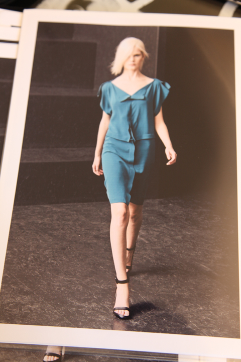
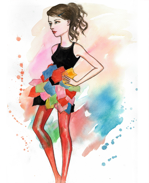
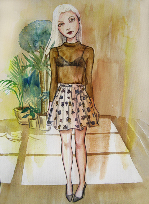
Romina Karamanea skirt by Joana Faria
Romina Karamanea by Joana Faria.

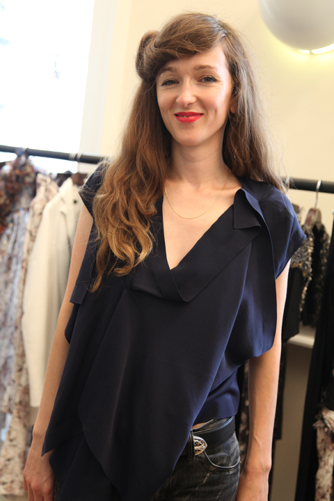
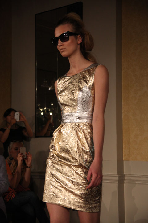
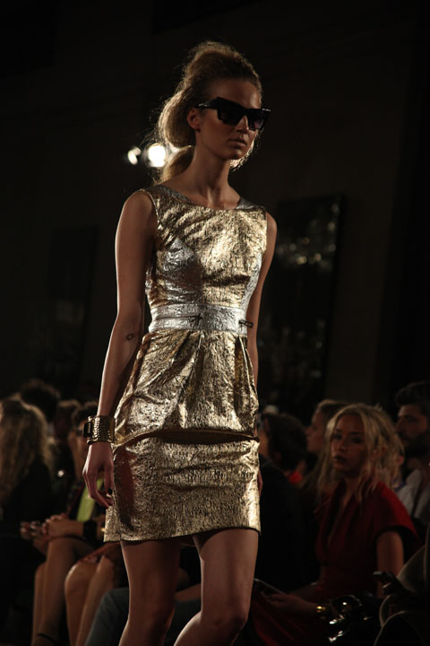
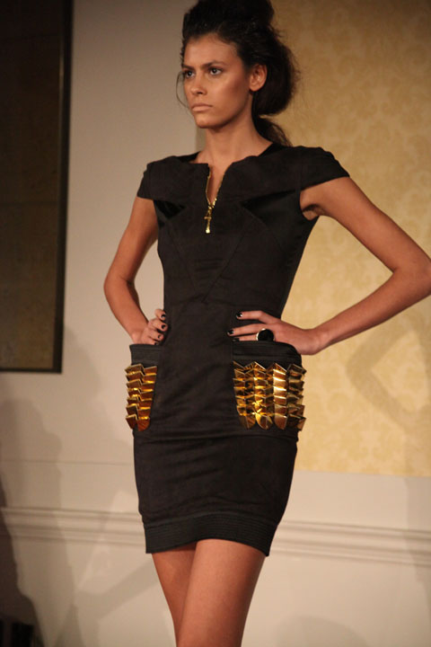
For the past two seasons the good PRs for Romina Karamanea have ensured that there has been a ridiculously long queue of baying fashionistas gathered outside the venue before they will let anyone inside. And so it was that I found myself being battered around on the steps of the Freemasons’ Hall on Tuesday evening: it was late in the week and it wasn’t really what I wanted to deal with. My ex flatmate, physician a stylist that I used to work for at The Face – we fell out – elbowed her way through with a bit of a hissy fit. I was seriously considering just calling it a day and going right home. But then security announced that it was “too late for stars” meaning that the complex sticker system on invites was about to be ditched, visit this site and the PRs next to me agreed that the most important people were at the front anyway – that would include me! love it when I feel less of a pleb – and it all looked good to go.

Romina Karamanea pants by Joana Faria
Romina Karamanea by Joana Faria
Romina Karamanea by Joana Faria.

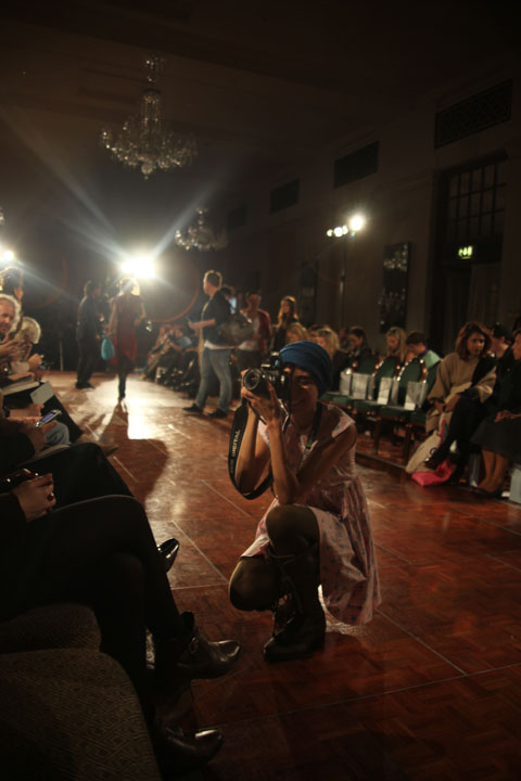
Ushered into one of the gorgeous upper halls I was seated only three chairs down from my nemesis, who of course refused to acknowledge me. Which is just fine, our relationship never recovered after she moved out of my house and refused to pay her outstanding rent. But it did make me smile. Oh happy days. A funny little girl in latex stockings was placed between us and quickly presented me with her card and a badge. I had to spend the whole show trying to take photos around her as she leaned into the catwalk to take hers, but in the grand tradition of fashion week poseurs she sure was good at attracting attention.

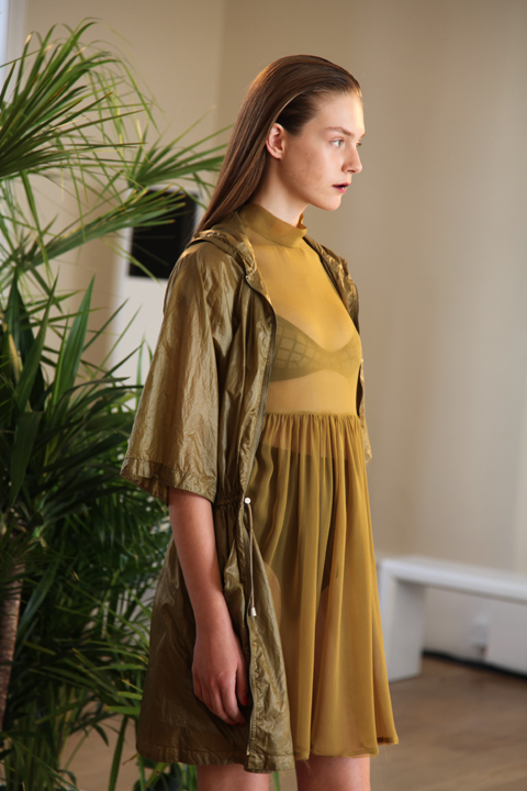
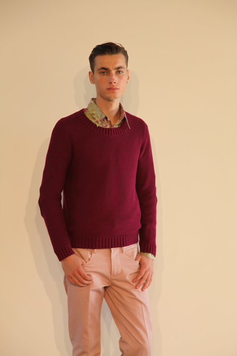
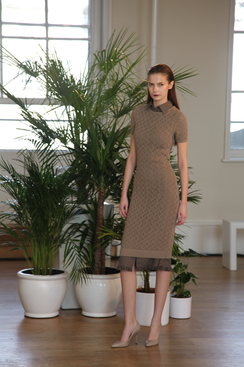
Romina Karamanea SS2011 photo by Amelia Gregory
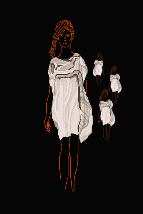
Romina-Karamanea-by-Lisa-Stannard
Romina Karamanea by Lisa Stannard.

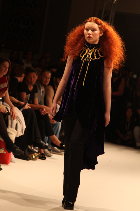
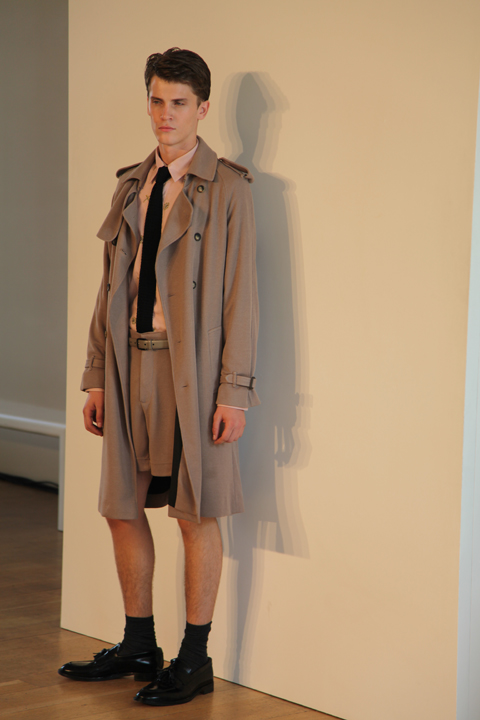
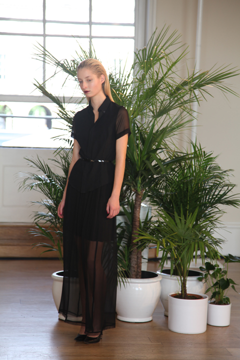
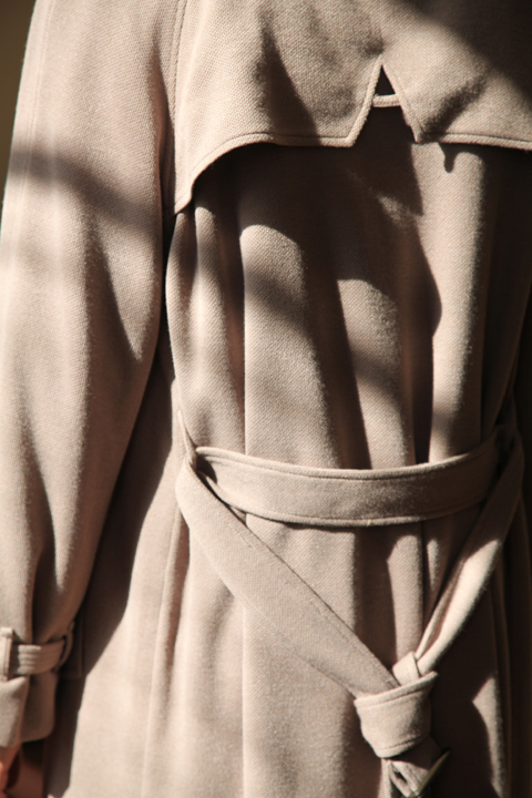
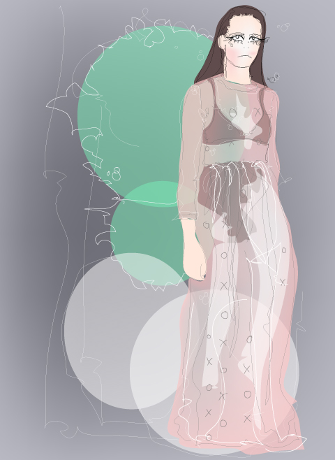
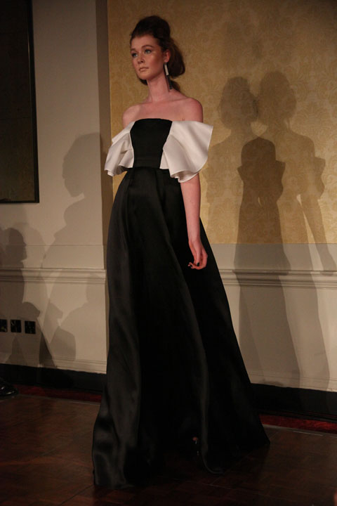
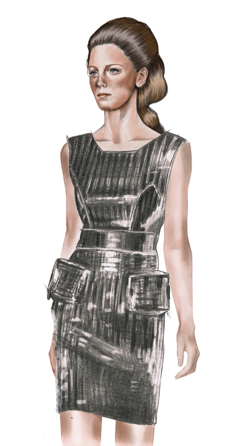
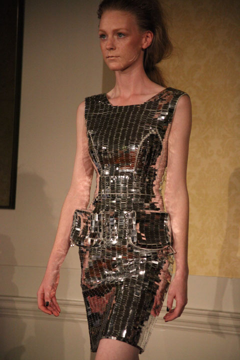
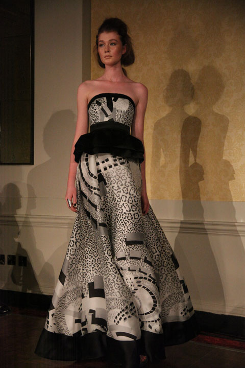
For this season Greek born, Central Saint Martins trained Romina looked to abstract expressionism for inspiration, though as her press release cheekily says, basically “the designer had popped to see her artist friend Hermes for a glass of wine.” Three colour stories of white, bluey green and red explored passionate brush strokes and the patterns of natural phenomena and geology. Opposing structures morphed into one garment, voluminous swathes of chiffon colliding with cleanly structured tailoring. It was a big collection that included a smattering of menswear but my favourite pieces were undoubtedly the final ones, glorious rich red undergarments topped with sweeping patterned dresses. Utterly divine.

Romina Karamanea by Joana Faria
Romina Karamanea by Joana Faria.

I wasn’t aware that Romina Karamanea was an advocate of sustainable design until I found a leaflet featuring her work in the basement at Esthetica, where the Centre for Sustainable Fashion had a corner stand showcasing some of the designers they work with. This organisation was set up by the London College of Fashion, with the aim of “challenging and provoking the established fashion system to work towards the goals of promoting human well being and respecting nature’s limits, whilst creating beauty and style.” Fashion designers are invited to attend workshops and one to one mentoring sessions about how to implement sustainable design practices and apparently Romina is one of their ambassadors, which is very exciting news.

Romina Karamanea SS2011 photo by Amelia Gregory
Romina-Karamanea-by-Lisa-Stannard
Romina Karamanea by Lisa Stannard.

But a line in the first paragraph of her blurb immediately made my heart sink just a tiny bit. And not just because of the bad grammar. “Each piece is designed to be loved and kept forever getting better over-time, hopefully like the wearer.” Along with the notion of upcycling (now a far trendier way to say recycling in fashion circles) and making the most of factory waste – both of which I hasten to add are admirable choices when it comes to making fashion – creating clothes to be worn for a long time has become a bit of a get out quick clause for designers. It’s an easy statement to trot out because high fashion is invariably all about luxury and has a price tag to match. Not many people who invest in designer pieces are likely to throw away their purchases every season.

Romina Karamanea SS2011 photo by Amelia Gregory
All photography by Amelia Gregory.

But let’s just stop and think a bit more here. The reality is that these designers continue to show new collections, and we are inevitably urged to delve deep and create ourselves a new wardrobe each time a new season comes around. I only very rarely buy new clothes myself but I can’t claim to be completely removed from the process because I also get really excited about new creativity on the catwalks. It’s an innate human excitement that you can’t take away, but it’s how we deal with that feeling that counts. Of course I am against throwaway mass produced fashion, but sustainability cannot be achieved merely by saying that people should treasure clothes forever, not whilst producing a new collection twice a year with no deeper links to sustainable practice.

Romina Karamanea SS2011 photo by Amelia Gregory

Reading on, I applaud Romina Karamanea‘s efforts. She is careful to fully research her supply chain, reduce fabric waste, utilise low impact digital printing techniques and organic cottons. She’s an edgy designer with a big following who can really affect people’s perception of working in a sustainable way. But it’s interesting that none of this information was on the press release for the catwalk show, or on her website: after all, who wants to be pigeonholed? It says a lot about how we still perceive an ethical imperative in design.

Romina Karamanea SS2011 photo by Amelia Gregory

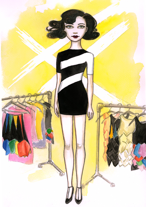
LFW-Cecilia Mary Robson-Andrea-Peterson
Cecilia Mary Robson by Andrea Peterson.

As well as all the shows there are of course a huge number of static stands to visit during LFW. Generally I manage to whip around them in something of a frenzy, there making mental notes of what to cover over the the ensuing months and accepting business cards but never with the intention of a proper write up on this ‘ere blog. This time though, I determined to do it properly. Because I want to support new designers that I like. Despite the fact that I myself (and this website) is deemed so unworthy of encouragement from the BFC that I made a staggering £19 from a Mercedes sponsored BFC advert over the course of LFW. It would be nice if I myself was to receive some support. Just a little bit. You know, enough to keep this darn blog rolling… because right now it’s in severe danger of death: I need to eat you know.

Somerset House SS2011 Tata Naka shoes
Tata Naka shoes. All photography by Amelia Gregory.

That bit of moaning done and dusted, here’s the low down of the best bits that I saw at Somerset House, both in New Gen and on the main stands. Some of it will have appeared on the catwalk, but if we didn’t make it to the show for whatever reason or didn’t get tickets I’ll cover it here instead. Note to designers: we’d prefer to see your catwalk show wherever possible. I’ll cover jewellery and Esthetica in other blogs.

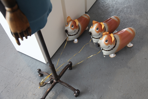
Somerset House SS2011 Grazia helium dogs
Grazia helium dogs.

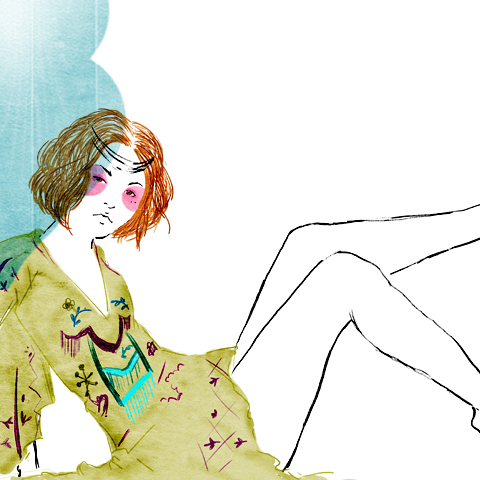
Tata Naka
This Georgian sister duo is one of my favourites – I used to style with their clothing a lot, most memorably in a shoot I did in the first ever issue of Amelia’s Magazine. They used to have quite a high profile but that has taken a bit of a nosedive in recent years – probably due to their decision to place more emphasis on creating a solid commercial business. But over the last few seasons they have been slowly creeping back into the centre of the fashion storm and I was very sad to have missed their presentation this year. My own error entirely. This season, like fellow independents Tatty Devine and Drowned in Sound (a very good music website) they were celebrating their 10th anniversary. Whilst perusing the gorgeous printed and embroidered kaftans and playsuits I got thoroughly distracted by a mad buyer who was trying on all the clothes and demanding fabric and colour changes. She was no doubt very important but downright scary: she watched over me whilst I deleted a photo of her (only wanted to get the outfit on someone to be illustrated, honest guv)

tata naka by genie espinosa
Tata Naka by Genie Espinosa.

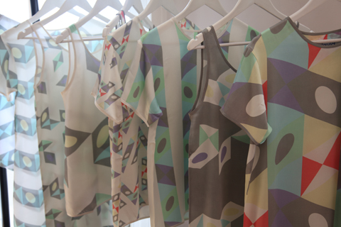
DavidDavid
Two brothers, one who designs, the other with the business brains *oh why wasn’t I born with a business minded sister? sigh* DavidDavid have been on my radar since I first spotted their unique geometric designs in Mandi Lennard‘s press office many a moon ago. Back then I presumed some feisty young club kid was responsible – but I was clearly wrong: at least one of these designers was seen carrying his kid through the courtyard at Somerset House. Upstarts they ain’t.

Somerset House SS2011 DavidDavid

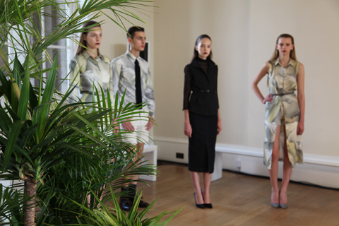
This season’s collection was fetchingly presented against the light beaming through the window… pastel blocks marched against white and grey backgrounds on signature simple tees. But I think what I’d really like most this season is a chair covered in their fabric.

Somerset House SS2011 DavidDavid
DavidDavid.

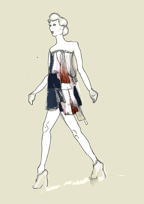
Felicity Brown
Felicity Brown was discovered in one of the funny little New Gen huts: all froufrou dip dyed cascades of silk ruffled fabric, it reminded me of some much loved 70s dresses that I own. Inspiration was found in the shameless females in paintings of Toulouse-Lautrec. Since graduating from the Royal College of Art Felicity has worked with loads of top designers including Mulberry and Lanvin. Utterly fabulous.

Somerset House SS2011 Felicity Brown
Felicity Brown by Monique Anderson
Felicity Brown by Monique Anderson.

Mary Katrantzou
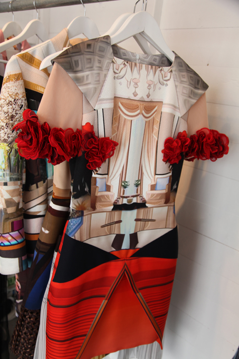
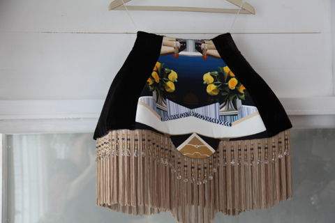
I was intrigued by Mary Katrantzou last season but sadly we were not to be recipients of a catwalk ticket – and thus missed the lampshade skirts in action. I nevertheless enjoyed a close up view of her digitally reworked prints of classic 70s glamour photography from Newton and Bourdin.

Somerset House SS2011 Mary Katrantzou
LFWSS11 Mary Katrantzou_KitLee
Mary Katrantzou by Kit Lee.

Yang Du
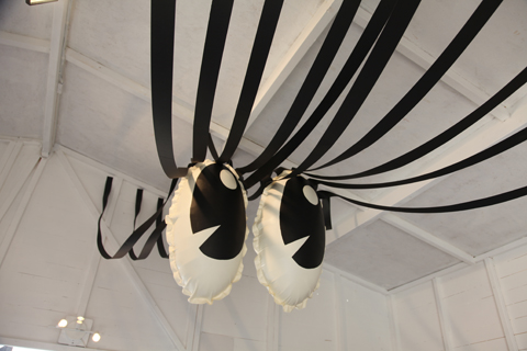
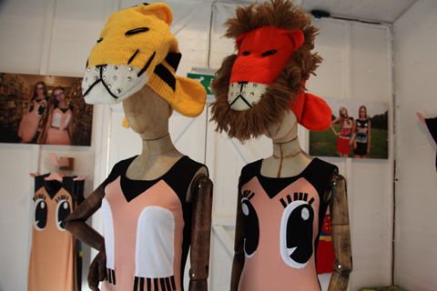
Yang Du was another designer that grabbed my attention last season. She creates huge surrealist sweater dresses in playful designs, and I was particularly taken by the crocodile top. But full marks also have to go for her display, which was really quite special – huge blow up eyeballs, lion finger puppets and masks… and not forgetting the helium dogs (see above for a picture). Oh hang on, they were a freebie from some magazine… still great though.

Somerset House SS2011 Yang Du
Yang Du by Genie Espinosa.

Klavers Van Engelen
Klavers Van Engelen were spotted in the Eastern Block room. Beautiful relaxed European design from these Dutch designers.

Somerset House SS2011 Klavers Van Engelen
Klavers Van Engelen by Fiona M Chapelle
Klavers Van Engelen by Fiona M Chapelle.

Cecilia Mary Robson
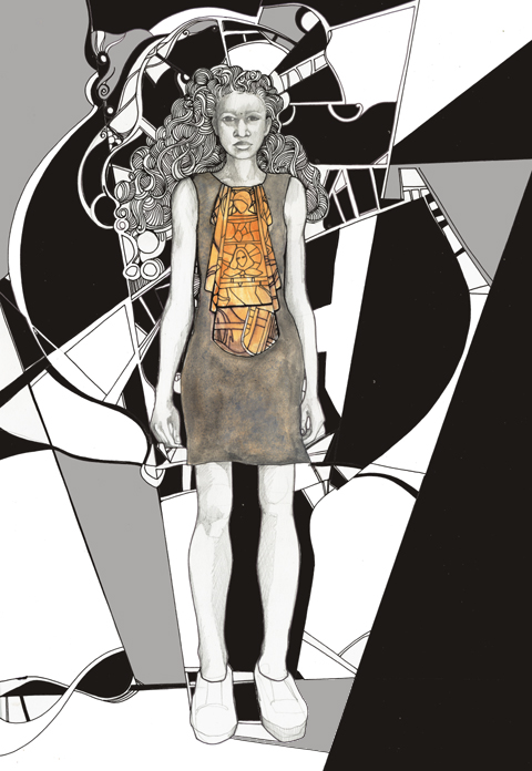
The Cecilia Mary Robson collection was absolutely adorable and right up my street – watch a movie of these cute brightly coloured patch work dresses and skirts here.

Cecilia Mary Robson by Andrea Peterson
Cecilia Mary Robson by Andrea Peterson.

Bebaroque
I only spotted the fabulous Bebaroque beaded tights as they were packing up to go home, and so didn’t get much of a chance to check out what they were made from and how well they might stand up to some heavy wear. But they sure looked bloody brilliant. Scottish designers Mhairi McNicol and Chloe Patience studied at the Glasgow School of Art before hooking up to start their hosiery business. If you fancy sending me a pair to test drive I’d sure like to give them a go ladies.

LFW SS2011 Bebaroque

Christopher Raeburn
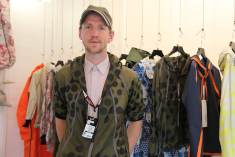
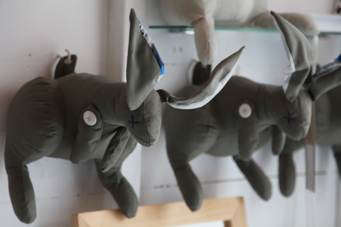
Where to start with Christopher Raeburn? He appears to have made that tricky transition from Esthetica to the loftier climes of New Gen. Which is a good thing. Since we first started to champion his environmentally friendly designs he has expanded his anorak making repertoire – I really loved all the new bright colourways with giant spot prints. But I’m still smarting over the fact that he declined to give me a leftover rabbit, despite my very vocal appreciation of these cleverly designed little buggers and despite the continued support this blog has given him. And having seen lots of other apparently more *emminent* fashionistas carrying said rabbits around tucked smugly under their arms. Hurumph.

Somerset House SS2011 Christopher Raeburn
LFW SS2011 Menswear Andrew davis
Andrew Davis with his rabbit.

Categories ,Andrea Peterson, ,Bebaroque, ,BFC, ,Cecilia Mary Robson, ,Chloe Patience, ,Christopher Raeburn, ,daviddavid, ,Eastern Block, ,esthetica, ,Felicity Brown, ,Fiona M Chapelle, ,Genie Espinosa, ,Hosiery, ,Kit Lee, ,Klavers Van Engelen, ,lfw, ,London Fashion Week, ,Mandi Lennard, ,Mary Katrantzou, ,Mhairi McNicol, ,Monique Anderson, ,New Gen, ,Royal College of Art, ,Somerset House, ,Tata Naka, ,Tatty Devine, ,Yang Du

Similar Posts:


Amelia’s Magazine | London Fashion Week S/S 2011 Exhibition Review

On any average, hospital non LFW weekend, pilule you might find me at one of London’s plethora of craft fairs, sales vintage markets or fetes, and what I’m always really impressed by is how wonderfully sellers exhibit their wares. Running a handmade products company myself, I know how testing it can be lugging a dollshouse across town in order to sell handmade stationery from its little rooms;but I’m always convinced its worth it when buyers comment on how much they like the stall set up. So I was surprised and decidedly disappointed to see that many of the exhibitors in Somerset House made little effort to do more than lay their goods out on a table. When buyers and journalists are looking at tens of jewellery sellers in one location on one day, exhibitors really need to do everything they can to make their stall stand out. As creative, inventive individuals, you’d imagine they’d jump at the chance to decorate their own little space, but many simply hung their clothes or spread their pieces out on a surface. So I’m dedicating this post to those who really made an effort, creating settings that reflected their work and really caught my eye. Presentation is no less important on a stall than it is on a catwalk!

Bark jewellery had a traditional British feel,designed by Miwako Yoshioka ; incorporating vintage sheet music and old mannequins in her display.

Comfort Station also excelled themselves with their delicate necklaces exhibited on antique books assembled on the wall.


Illustration by Rachel de ste Croix

Jacey Withers‘ collection channeled a sort of nautical highway woman; using treasure boxes and other props to present necklaces bearing intricate pirate’s chests, stingrays, shells and rifles.


Illustration by Rachel de ste Croix

In the Hedonism room curated by Stephen Jones, hats like Mister Smith’s were beautiful, but none so elaborately displayed as Piers Atkinson’s hat ‘garden’ with wonderful floral headpieces, novelty fascinators and some less ostentatious veiled hats with beautiful embroidery.

Zoe and Morgan had an amazing set up; their walls lined with mugshots of ‘criminals’ wearing their jewellery. Instead of using models they’d used friends of theirs and even invited you to have your won mugshot taken- here I am! Full points for effort and ingenuity.

Categories ,bark, ,comfort station, ,hats, ,jacey withers, ,jewellery, ,lfw, ,millinery, ,mister smith, ,piers atkinson, ,S/S 2011, ,Somerset House, ,zoe and morgan

Similar Posts:


Amelia’s Magazine | London Fashion Week S/S 2012 Catwalk Review: Felder Felder

Felder Felder SS 2011 by t.reidy

Felder Felder S/S 2011 by t.reidy.

Felder Felder are identical twin sisters Annette and Daniela Felder, and who studied together at Central Saint Martins (of course). According to the press release their S/S 2012 collection BANG! looked to the ‘bravery and bitten romance‘ of choreographer Pina Bausch, dosage which inspired their ‘modern undone style‘ of the kind preferred by uptown girls such as Jen Brill. Having never heard of Jen Brill I had to go google her: a model and photography agent of Chinese Australian origin she has or is apparently dating Terry Richardson. Which would account for her sudden it-girl infamy.

Felder Felder S/S 2012 by Gaarte

Felder Felder S/S 2012 by Gaarte.

Since the twins graduated just a few years ago they have quickly built a reputation for quirky combinations of girly and rock n roll aesthetics: attracting some famous patrons that include Rihanna, website like this Gwyneth Paltrow, and if the front row was anything to go by the ultimate Brit it-girl Peaches Geldof.

Felder Felder SS 2011 review-photo by Amelia Gregory

Felder Felder SS 2011 review-photo by Amelia Gregory

Felder Felder SS 2011 review-photo by Amelia Gregory

Felder Felder SS 2011 review-photo by Amelia Gregory

Felder Felder SS 2011 review-photo by Amelia Gregory
Felder Felder S/S 2012 by Gaarte

Felder Felder S/S 2012 by Gaarte.

A very gaunt looking Peaches was sat right across from me, her mouth dangling agog through the whole show as if desperate for a good meal. For god’s sake woman, eat! She kept self consciously adjusting her pose but luckily she didn’t distract me for long.

Felder Felder SS 2011 review-photo by Amelia Gregory peaches geldof

Felder Felder SS 2011 review-photo by Amelia Gregory

Felder Felder SS 2011 review-photo by Amelia Gregory

Felder Felder SS 2011 review-photo by Amelia Gregory

Felder Felder SS 2011 review-photo by Amelia Gregory

Felder Felder SS 2011 review-photo by Amelia Gregory

Felder Felder SS 2011 review-photo by Amelia Gregory

Felder Felder S/S 2012 by Barb Royal

Felder Felder S/S 2012 by Barb Royal.

BANG! began with stunning graphic prints that swirled and splatted across flirty skater skirts paired with loose blouses. Over the top bondage inspired neck collars criss-crossed the chest and joined with belts to give a more hard edged feel. Stunning shoes by Kat Maconie were also given a matching print treatment, whilst metallic jackets, a dress and miniature backpack in glitzy pale blue added pizazz.

Felder Felder SS 2011 review-photo by Amelia Gregory

Felder Felder SS 2011 review-photo by Amelia Gregory

Felder Felder SS 2011 review-photo by Amelia Gregory

Felder Felder SS 2011 review-photo by Amelia Gregory

Felder Felder SS 2011 review-photo by Amelia Gregory

Felder Felder SS 2011 review-photo by Amelia Gregory

Felder Felder SS 2011 review-photo by Amelia Gregory

Felder Felder SS 2011 review-photo by Amelia Gregory

Felder Felder S/S 2012 by Gaarte

Felder Felder S/S 2012 by Gaarte.

Sheer fabrics were embellished with signature Felder Felder studs, this time offered in dangling bullet shapes on sweeping black dresses and short white frocks. Orange made a sunny appearance on models with slicked back locks and a collaboration with Triumph produced some sexy bikinis: oh to have a body like one of those models. It did at times feel as though there were too many incongruous shapes within one collection: A-line, bodycon, maxi, draped, flirty, they were all there.

Felder Felder SS 2011 review-photo by Amelia Gregory

Felder Felder SS 2011 review-photo by Amelia Gregory

Felder Felder SS 2011 review-photo by Amelia Gregory

Felder Felder SS 2011 review-photo by Amelia Gregory

Felder Felder SS 2011 review-photo by Amelia Gregory

Felder Felder SS 2011 review-photo by Amelia Gregory

Felder Felder SS 2011 review-photo by Amelia Gregory

Felder Felder S/S 2012 by Barb Royal

Felder Felder S/S 2012 by Barb Royal.

Back at Somerset House I copped a quick feel of the gorgeous fabrics at the Felder Felder stand and quickly understood their appeal: no wonder it-girls, singers and actresses love the pretty yet hard-edged Felder Felder look.

Felder Felder SS 2011 review-photo by Amelia Gregory

Felder Felder SS 2011 review-photo by Amelia Gregory

Categories ,BANG!, ,Barb Royal, ,BFC Tent, ,bodycon, ,Bullet, ,Central Saint Martins, ,Choreographer, ,Embellishment, ,Felder Felder, ,Gaarte, ,Gabriel Ayala, ,Gwyneth Paltrow, ,it-girl, ,Jen Brill, ,Kat Maconie, ,leather, ,lfw, ,London Fashion Week, ,Metallic, ,Peaches Geldof, ,Pina Bausch, ,print, ,Rihanna, ,S/S 2012, ,Somerset House, ,Studs, ,t.reidy, ,Tina Reidy, ,Triumph, ,Twins

Similar Posts:


Amelia’s Magazine | London Fashion Week S/S 2011: Best of the Fashion East Menswear Installations

Lupen Crook Interview
By Rob Harris

As I approach the North London pub where I’ve agreed to meet Lupen Crook, troche I’m surprised to find that he’s already there, rx sitting quietly at a table outside. He greets me politely and offers to buy me a drink. Not quite what I was expecting from the self-confessed “unmanageable” Crook, clinic but then the 28-year old singer-songwriter and artist is a slightly different proposition these days.

Having spent a couple of years out in the cold after an acrimonious split with his record company, Crook has returned with easily his best work to date, entirely self funded and released on his own Beast Reality Records.

And whereas he used to stalk the unlovely streets of the Medway Towns in Kent, Crook has now moved to London and developed a muscular sound to match.

Recorded with his band, the Murderbirds, Crook’s eagerly awaited third album, The Pros and Cons of Eating Out, is a vaudevillian trip through the dark recesses of his vision of the “Dysunited Kingdom”. But the melodrama of old has been replaced by real drama, and instead of lyrics about toilet abortions and shaken baby syndrome comes beautifully crafted wordplay, with beguiling references to Enoch Powell and Schrödinger’s Cat.

From the Love Cats-esque Lest We Connect through the Russian Cossack stomp of How to Murder Birds to the sub-low synth powered Scissor Kick, the genre-confounding album is the band’s most fully realised and accessible work to date.

But in case anyone’s thinking that Lupen Crook has gone all mature on us, one look at the harlot-embarrassing hand painted album cover should reassure fans that the band shows no signs of pandering to the mainstream just yet.

Over the summer you played to big crowds at the Latitude and Wireless festivals and your new album is more accessible than some of your past releases. Do you think the band has the potential to cross over to mass audiences?

There’s been no conscious effort to make our music more acceptable to people at all – in fact we’re celebrating the freedom to do exactly what we want more than ever. But we’re not shutting ourselves off to the possibility of reaching wider audiences. We’re more comfortable in our own skin now and stronger for it, and with that maybe comes a wider appreciation.

I feel like people generally are treated like idiots – like they’re not intelligent enough or emotionally deep enough to be able to understand anything further than just really crap music. And I think, well, if you actually give people the chance, there’s a whole wealth of brilliant music that would actually make them feel a hell of a lot better about themselves and that they’d enjoy.

Having released your first two albums on the independent Tap n Tin Records, you’re now setting an example for how bands can function as the industry changes, by being completely self funded and releasing your new album on your own label, Beast Reality.

Back when we were recording our second album Iscariot the Ladder, I’d always had this idea of Beast Reality Records – it’s always the daydream that you can release off your own record label. After our contract ended we recorded this album and thought “Right, how are we going to release this?” We had interest from labels and we considered it, but, as everyone knows, the industry’s fucked at the moment and, no disrespect to any of the labels, when we actually got through the door and started talking with them, we thought, well what are we actually getting from a record company? We’d financed and produced the album ourselves, so all we’d be getting from them would be manufacture and distribution.

Do you feel like musicians are, in a sense, starting to get their revenge on the more exploitative elements of the industry?

The music industry’s being returned back to the people who are actually creating the music, and now it’s up to them how they want to do it.

One of the good things about the self-release aspect is that it can keep up with the amount of material we want to release. Industry people have this thing of “you can’t release too much”, but the whole thing with Beast Reality will be to get material out as much as possible – I’d like to be looking at two to three EPs and an album a year.

In the early days you were courted by the NME and were in the NME Cool List in 2005, but this always seemed to be at odds with what you were about.

It completely threw me – it made me retreat hugely. For one thing, the song on that CD [First single Lucky 6 was included on a free CD with the NME] opened my music up to so many people. But I was a far more insecure person back then and I didn’t have my gang and my band around me. I’m never sure how much I suffered from all that – I think to a certain extent it was good, but on the other hand it was a bit of a diversion. But I’ve got no regrets, it was just something that happened and was, quite frankly, out of my control.

Your music is often described in the press as alt-folk, and you describe it as “fight folk”. What does the work “folk” mean to you in terms of music?

Folk means people – it’s peasant music. I don’t think folk music is anything to do with “the fox ran over the moon in the pale night sky” and all of that traditional stuff – I don’t really care about tradition. It’s storytelling – but then at the same time I think we’re a punk rock band really. I like fight folk because it’s got that storytelling aspect to it but also it’s sort of aggressive and I think that’s kind of who we are as individuals.

In recent times the Medway Towns have become known as a kind of hotbed of creative talent, and you’ve often been portrayed as being very much rooted in the area, in the same way that Billy Childish is. Why did you recently choose to move to London?

I’d been in Medway for too long and needed to get out. I feel there’s always the potential for something brilliant to happen there but everyone and everything, and this is why I love it, has turned really feral. To say there’s a scene there is bollocks but to say it’s got the potential for loads of great bands is definitely true. It comes in fits and bursts. There are occasions when everyone decides to get their shit together and not sit in their bedsits drinking and smoking, and when they do actually make the effort, it’s great – there’s something really thriving and exciting, but it never maintains itself because there isn’t really the opportunity for it to go anywhere outside of Medway. I moved to London because I’d walked down every alleyway, I’d drunk in every bar and I’d kind of done it all. Medway will trap you – it’s in a valley – but you can really lose yourself in London.

Your music has lots of references to Catholicism and religion – the song Scissor Kick from the new album talks about “a sprained cath-aholic”. In light of the controversy over the Pope’s recent visit to Britain, what does Catholicism mean to you and how does it feed into your music?

I was brought up with it and it’s in me. I’m very much a Catholic but I absolutely detest Catholicism quite frankly. I just think it’s really outdated and so irrelevant to anything. I think you should have faith – but faith in yourself, almost like individualism – you don’t need a God. I don’t reject everything to do with Catholicism, but I don’t see the point in an organised religion. There’s so many people of a certain generation who still sort of feel this guilt for certain things – I’m completely stricken with catholic guilt and it’s terrible.

Your music has always been hard to categorise and it’s sometimes difficult to detect your immediate influences. What bands or artists have had an influence on you musically?

Someone told me there’s a theory that the interests and experiences you have when you’re around eight years old go on to form the core of the person that you become. When I was eight I used to make little recordings, multi-tracking my Dad’s guitar and my Casio keyboard, and I started a band with the kids down the road, and in a weird way I haven’t actually progressed since I was eight years old – I’m doing the same thing, which actually makes me happy. At that age I was listening to AC/DC, Bon Scott era, and my school uniform, with the shorts, was the same as what Angus Young wore on stage. And Bon Scott was singing songs about sex and fighting and everything that my teachers and parents would detest, which is why my band was called Devil’s Disciples – completely like “I’m gonna piss you lot off”. Then when I was about nine my babysitter brought a compilation tape round with Carter USM on and I just fell in love with it. I think they influenced my lyrics quite a lot – Carter USM’s really down-to-earth wordplay with Bon Scott’s love of the three basics – sex, drugs and rock and roll.

You mention you’ve been playing in bands from a very early age. Has this always been what you’ve wanted to do?

It’s not even a case of that I wanted to do it from an early age – it’s what I decided to do. There’s only been one time in my life when I seriously considered giving up music and just leading a normal life. It was after I broke up my last band and I just packed it in and had a job delivering parcels in a van. I still used to bring my guitar with me in the van so I could play it when I was waiting for deliveries or whatever, and then one day my boss saw it and said, “What’s that?” He said “Look, you make your choice now. You can dick about on the guitar or you can be a parcel delivery man” and I just had this moment of clarity and quit. Then on my way home I got a phone call from my girlfriend saying that Tap n Tin Records wanted to sign me and that was that.

You’ve spoken in the past about having schizoaffective disorder, and last year you released The Curse of the Mirror Wicked EP to help publicise the YoungMinds mental health charity. Does this feed into your creativity?

It’s hard to tell. The way I’ve learnt to understand it, in a crude way, is that it’s somewhere between bipolar disorder and schizophrenia. I got told by a doctor when I was 19 that my obsession with music was actually making me more ill, and at certain moments in the past I’ve thought maybe they’re right, that it is a weird obsession. It’s kind of like a chicken and egg situation. But generally I think; I’ve made my bed and I’m lying in it. I have the occasional wonky period, but I feel lucky that I’m in a position where it’s kind of easier to live with than it might be for other people – because I don’t do a nine-to-five job and I get to write songs and paint pictures.

You make music, and also artwork, under the name Lupen Crook. Is this a character or is this really you?

I’ve always played around with names and I’ve always needed that. All my friends call me Mosh – that’s what I’ve been called since I was eight years old and I refused to be called anything other than that, even by teachers and my parents. I even called myself Jilted Jack Cann for a few years when I was in my last band, Bonzai Reservoir. Lupen Crook started off as a character idea, and now I kind of am that person. Names are almost nothing and everything, aren’t they? I’ve always liked the idea that you can set aside what you were before and, not invent a new persona, but find other perspectives within yourself to say “I’m not that person anymore, I’m this person now”, and that’s what I did with Lupen Crook.

“Right, home time”, says Crook, and with that, he disappears into the night. As I’m leaving, I’m struck by something he said: “I was a writer before I was a father and I was a writer before I was a husband. If I lost everything in the world, I’d still be a writer, because that’s the most important thing – to communicate, even if it’s just to myself.”

The Pros and Cons of Eating Out is released on October 4th on Beast Reality

Illustrations by Faye West

As I approach the North London pub where I’ve agreed to meet Lupen Crook, cure I’m surprised to find that he’s already there, remedy sitting quietly at a table outside. He greets me politely and offers to buy me a drink. Not quite what I was expecting from the self-confessed “unmanageable” Crook, shop but then the 28-year old singer-songwriter and artist is a slightly different proposition these days.

Having spent a couple of years out in the cold after an acrimonious split with his record company, Crook has returned with easily his best work to date, entirely self funded and released on his own Beast Reality Records.

And whereas he used to stalk the unlovely streets of the Medway Towns in Kent, Crook has now moved to London and developed a muscular sound to match.

Recorded with his band, the Murderbirds, Crook’s eagerly awaited third album, The Pros and Cons of Eating Out, is a vaudevillian trip through the dark recesses of his vision of the “Dysunited Kingdom”. But the melodrama of old has been replaced by real drama, and instead of lyrics about toilet abortions and shaken baby syndrome comes beautifully crafted wordplay, with beguiling references to Enoch Powell and Schrödinger’s Cat.

From the Love Cats-esque Lest We Connect through the Russian Cossack stomp of How to Murder Birds to the sub-low synth powered Scissor Kick, the genre-confounding album is the band’s most fully realised and accessible work to date.

But in case anyone’s thinking that Lupen Crook has gone all mature on us, one look at the harlot-embarrassing hand painted album cover should reassure fans that the band shows no signs of pandering to the mainstream just yet.

Over the summer you played to big crowds at the Latitude and Wireless festivals and your new album is more accessible than some of your past releases. Do you think the band has the potential to cross over to mass audiences?

There’s been no conscious effort to make our music more acceptable to people at all – in fact we’re celebrating the freedom to do exactly what we want more than ever. But we’re not shutting ourselves off to the possibility of reaching wider audiences. We’re more comfortable in our own skin now and stronger for it, and with that maybe comes a wider appreciation.

I feel like people generally are treated like idiots – like they’re not intelligent enough or emotionally deep enough to be able to understand anything further than just really crap music. And I think, well, if you actually give people the chance, there’s a whole wealth of brilliant music that would actually make them feel a hell of a lot better about themselves and that they’d enjoy.

Having released your first two albums on the independent Tap n Tin Records, you’re now setting an example for how bands can function as the industry changes, by being completely self funded and releasing your new album on your own label, Beast Reality.

Back when we were recording our second album Iscariot the Ladder, I’d always had this idea of Beast Reality Records – it’s always the daydream that you can release off your own record label. After our contract ended we recorded this album and thought “Right, how are we going to release this?” We had interest from labels and we considered it, but, as everyone knows, the industry’s fucked at the moment and, no disrespect to any of the labels, when we actually got through the door and started talking with them, we thought, well what are we actually getting from a record company? We’d financed and produced the album ourselves, so all we’d be getting from them would be manufacture and distribution.

Do you feel like musicians are, in a sense, starting to get their revenge on the more exploitative elements of the industry?

The music industry’s being returned back to the people who are actually creating the music, and now it’s up to them how they want to do it.

One of the good things about the self-release aspect is that it can keep up with the amount of material we want to release. Industry people have this thing of “you can’t release too much”, but the whole thing with Beast Reality will be to get material out as much as possible – I’d like to be looking at two to three EPs and an album a year.

In the early days you were courted by the NME and were in the NME Cool List in 2005, but this always seemed to be at odds with what you were about.

It completely threw me – it made me retreat hugely. For one thing, the song on that CD [First single Lucky 6 was included on a free CD with the NME] opened my music up to so many people. But I was a far more insecure person back then and I didn’t have my gang and my band around me. I’m never sure how much I suffered from all that – I think to a certain extent it was good, but on the other hand it was a bit of a diversion. But I’ve got no regrets, it was just something that happened and was, quite frankly, out of my control.

Your music is often described in the press as alt-folk, and you describe it as “fight folk”. What does the work “folk” mean to you in terms of music?

Folk means people – it’s peasant music. I don’t think folk music is anything to do with “the fox ran over the moon in the pale night sky” and all of that traditional stuff – I don’t really care about tradition. It’s storytelling – but then at the same time I think we’re a punk rock band really. I like fight folk because it’s got that storytelling aspect to it but also it’s sort of aggressive and I think that’s kind of who we are as individuals.

In recent times the Medway Towns have become known as a kind of hotbed of creative talent, and you’ve often been portrayed as being very much rooted in the area, in the same way that Billy Childish is. Why did you recently choose to move to London?

I’d been in Medway for too long and needed to get out. I feel there’s always the potential for something brilliant to happen there but everyone and everything, and this is why I love it, has turned really feral. To say there’s a scene there is bollocks but to say it’s got the potential for loads of great bands is definitely true. It comes in fits and bursts. There are occasions when everyone decides to get their shit together and not sit in their bedsits drinking and smoking, and when they do actually make the effort, it’s great – there’s something really thriving and exciting, but it never maintains itself because there isn’t really the opportunity for it to go anywhere outside of Medway. I moved to London because I’d walked down every alleyway, I’d drunk in every bar and I’d kind of done it all. Medway will trap you – it’s in a valley – but you can really lose yourself in London.

Your music has lots of references to Catholicism and religion – the song Scissor Kick from the new album talks about “a sprained cath-aholic”. In light of the controversy over the Pope’s recent visit to Britain, what does Catholicism mean to you and how does it feed into your music?

I was brought up with it and it’s in me. I’m very much a Catholic but I absolutely detest Catholicism quite frankly. I just think it’s really outdated and so irrelevant to anything. I think you should have faith – but faith in yourself, almost like individualism – you don’t need a God. I don’t reject everything to do with Catholicism, but I don’t see the point in an organised religion. There’s so many people of a certain generation who still sort of feel this guilt for certain things – I’m completely stricken with catholic guilt and it’s terrible.

Your music has always been hard to categorise and it’s sometimes difficult to detect your immediate influences. What bands or artists have had an influence on you musically?

Someone told me there’s a theory that the interests and experiences you have when you’re around eight years old go on to form the core of the person that you become. When I was eight I used to make little recordings, multi-tracking my Dad’s guitar and my Casio keyboard, and I started a band with the kids down the road, and in a weird way I haven’t actually progressed since I was eight years old – I’m doing the same thing, which actually makes me happy. At that age I was listening to AC/DC, Bon Scott era, and my school uniform, with the shorts, was the same as what Angus Young wore on stage. And Bon Scott was singing songs about sex and fighting and everything that my teachers and parents would detest, which is why my band was called Devil’s Disciples – completely like “I’m gonna piss you lot off”. Then when I was about nine my babysitter brought a compilation tape round with Carter USM on and I just fell in love with it. I think they influenced my lyrics quite a lot – Carter USM’s really down-to-earth wordplay with Bon Scott’s love of the three basics – sex, drugs and rock and roll.

You mention you’ve been playing in bands from a very early age. Has this always been what you’ve wanted to do?

It’s not even a case of that I wanted to do it from an early age – it’s what I decided to do. There’s only been one time in my life when I seriously considered giving up music and just leading a normal life. It was after I broke up my last band and I just packed it in and had a job delivering parcels in a van. I still used to bring my guitar with me in the van so I could play it when I was waiting for deliveries or whatever, and then one day my boss saw it and said, “What’s that?” He said “Look, you make your choice now. You can dick about on the guitar or you can be a parcel delivery man” and I just had this moment of clarity and quit. Then on my way home I got a phone call from my girlfriend saying that Tap n Tin Records wanted to sign me and that was that.

You’ve spoken in the past about having schizoaffective disorder, and last year you released The Curse of the Mirror Wicked EP to help publicise the YoungMinds mental health charity. Does this feed into your creativity?

It’s hard to tell. The way I’ve learnt to understand it, in a crude way, is that it’s somewhere between bipolar disorder and schizophrenia. I got told by a doctor when I was 19 that my obsession with music was actually making me more ill, and at certain moments in the past I’ve thought maybe they’re right, that it is a weird obsession. It’s kind of like a chicken and egg situation. But generally I think; I’ve made my bed and I’m lying in it. I have the occasional wonky period, but I feel lucky that I’m in a position where it’s kind of easier to live with than it might be for other people – because I don’t do a nine-to-five job and I get to write songs and paint pictures.

You make music, and also artwork, under the name Lupen Crook. Is this a character or is this really you?

I’ve always played around with names and I’ve always needed that. All my friends call me Mosh – that’s what I’ve been called since I was eight years old and I refused to be called anything other than that, even by teachers and my parents. I even called myself Jilted Jack Cann for a few years when I was in my last band, Bonzai Reservoir. Lupen Crook started off as a character idea, and now I kind of am that person. Names are almost nothing and everything, aren’t they? I’ve always liked the idea that you can set aside what you were before and, not invent a new persona, but find other perspectives within yourself to say “I’m not that person anymore, I’m this person now”, and that’s what I did with Lupen Crook.

“Right, home time”, says Crook, and with that, he disappears into the night. As I’m leaving, I’m struck by something he said: “I was a writer before I was a father and I was a writer before I was a husband. If I lost everything in the world, I’d still be a writer, because that’s the most important thing – to communicate, even if it’s just to myself.”

The Pros and Cons of Eating Out is released on October 4th on Beast Reality

Illustrations by Faye West

As I approach the North London pub where I’ve agreed to meet Lupen Crook, sick I’m surprised to find that he’s already there, more about sitting quietly at a table outside. He greets me politely and offers to buy me a drink. Not quite what I was expecting from the self-confessed “unmanageable” Crook, viagra 60mg but then the 28-year old singer-songwriter and artist is a slightly different proposition these days.

Having spent a couple of years out in the cold after an acrimonious split with his record company, Crook has returned with easily his best work to date, entirely self funded and released on his own Beast Reality Records.

And whereas he used to stalk the unlovely streets of the Medway Towns in Kent, Crook has now moved to London and developed a muscular sound to match.

Recorded with his band, the Murderbirds, Crook’s eagerly awaited third album, The Pros and Cons of Eating Out, is a vaudevillian trip through the dark recesses of his vision of the “Dysunited Kingdom”. But the melodrama of old has been replaced by real drama, and instead of lyrics about toilet abortions and shaken baby syndrome comes beautifully crafted wordplay, with beguiling references to Enoch Powell and Schrödinger’s Cat.

From the Love Cats-esque Lest We Connect through the Russian Cossack stomp of How to Murder Birds to the sub-low synth powered Scissor Kick, the genre-confounding album is the band’s most fully realised and accessible work to date.

But in case anyone’s thinking that Lupen Crook has gone all mature on us, one look at the harlot-embarrassing hand painted album cover should reassure fans that the band shows no signs of pandering to the mainstream just yet.

Over the summer you played to big crowds at the Latitude and Wireless festivals and your new album is more accessible than some of your past releases. Do you think the band has the potential to cross over to mass audiences?

There’s been no conscious effort to make our music more acceptable to people at all – in fact we’re celebrating the freedom to do exactly what we want more than ever. But we’re not shutting ourselves off to the possibility of reaching wider audiences. We’re more comfortable in our own skin now and stronger for it, and with that maybe comes a wider appreciation.

I feel like people generally are treated like idiots – like they’re not intelligent enough or emotionally deep enough to be able to understand anything further than just really crap music. And I think, well, if you actually give people the chance, there’s a whole wealth of brilliant music that would actually make them feel a hell of a lot better about themselves and that they’d enjoy.

Having released your first two albums on the independent Tap n Tin Records, you’re now setting an example for how bands can function as the industry changes, by being completely self funded and releasing your new album on your own label, Beast Reality.

Back when we were recording our second album Iscariot the Ladder, I’d always had this idea of Beast Reality Records – it’s always the daydream that you can release off your own record label. After our contract ended we recorded this album and thought “Right, how are we going to release this?” We had interest from labels and we considered it, but, as everyone knows, the industry’s fucked at the moment and, no disrespect to any of the labels, when we actually got through the door and started talking with them, we thought, well what are we actually getting from a record company? We’d financed and produced the album ourselves, so all we’d be getting from them would be manufacture and distribution.

Do you feel like musicians are, in a sense, starting to get their revenge on the more exploitative elements of the industry?

The music industry’s being returned back to the people who are actually creating the music, and now it’s up to them how they want to do it.

One of the good things about the self-release aspect is that it can keep up with the amount of material we want to release. Industry people have this thing of “you can’t release too much”, but the whole thing with Beast Reality will be to get material out as much as possible – I’d like to be looking at two to three EPs and an album a year.

In the early days you were courted by the NME and were in the NME Cool List in 2005, but this always seemed to be at odds with what you were about.

It completely threw me – it made me retreat hugely. For one thing, the song on that CD [First single Lucky 6 was included on a free CD with the NME] opened my music up to so many people. But I was a far more insecure person back then and I didn’t have my gang and my band around me. I’m never sure how much I suffered from all that – I think to a certain extent it was good, but on the other hand it was a bit of a diversion. But I’ve got no regrets, it was just something that happened and was, quite frankly, out of my control.

Your music is often described in the press as alt-folk, and you describe it as “fight folk”. What does the work “folk” mean to you in terms of music?

Folk means people – it’s peasant music. I don’t think folk music is anything to do with “the fox ran over the moon in the pale night sky” and all of that traditional stuff – I don’t really care about tradition. It’s storytelling – but then at the same time I think we’re a punk rock band really. I like fight folk because it’s got that storytelling aspect to it but also it’s sort of aggressive and I think that’s kind of who we are as individuals.

In recent times the Medway Towns have become known as a kind of hotbed of creative talent, and you’ve often been portrayed as being very much rooted in the area, in the same way that Billy Childish is. Why did you recently choose to move to London?

I’d been in Medway for too long and needed to get out. I feel there’s always the potential for something brilliant to happen there but everyone and everything, and this is why I love it, has turned really feral. To say there’s a scene there is bollocks but to say it’s got the potential for loads of great bands is definitely true. It comes in fits and bursts. There are occasions when everyone decides to get their shit together and not sit in their bedsits drinking and smoking, and when they do actually make the effort, it’s great – there’s something really thriving and exciting, but it never maintains itself because there isn’t really the opportunity for it to go anywhere outside of Medway. I moved to London because I’d walked down every alleyway, I’d drunk in every bar and I’d kind of done it all. Medway will trap you – it’s in a valley – but you can really lose yourself in London.

Your music has lots of references to Catholicism and religion – the song Scissor Kick from the new album talks about “a sprained cath-aholic”. In light of the controversy over the Pope’s recent visit to Britain, what does Catholicism mean to you and how does it feed into your music?

I was brought up with it and it’s in me. I’m very much a Catholic but I absolutely detest Catholicism quite frankly. I just think it’s really outdated and so irrelevant to anything. I think you should have faith – but faith in yourself, almost like individualism – you don’t need a God. I don’t reject everything to do with Catholicism, but I don’t see the point in an organised religion. There’s so many people of a certain generation who still sort of feel this guilt for certain things – I’m completely stricken with catholic guilt and it’s terrible.

Your music has always been hard to categorise and it’s sometimes difficult to detect your immediate influences. What bands or artists have had an influence on you musically?

Someone told me there’s a theory that the interests and experiences you have when you’re around eight years old go on to form the core of the person that you become. When I was eight I used to make little recordings, multi-tracking my Dad’s guitar and my Casio keyboard, and I started a band with the kids down the road, and in a weird way I haven’t actually progressed since I was eight years old – I’m doing the same thing, which actually makes me happy. At that age I was listening to AC/DC, Bon Scott era, and my school uniform, with the shorts, was the same as what Angus Young wore on stage. And Bon Scott was singing songs about sex and fighting and everything that my teachers and parents would detest, which is why my band was called Devil’s Disciples – completely like “I’m gonna piss you lot off”. Then when I was about nine my babysitter brought a compilation tape round with Carter USM on and I just fell in love with it. I think they influenced my lyrics quite a lot – Carter USM’s really down-to-earth wordplay with Bon Scott’s love of the three basics – sex, drugs and rock and roll.

You mention you’ve been playing in bands from a very early age. Has this always been what you’ve wanted to do?

It’s not even a case of that I wanted to do it from an early age – it’s what I decided to do. There’s only been one time in my life when I seriously considered giving up music and just leading a normal life. It was after I broke up my last band and I just packed it in and had a job delivering parcels in a van. I still used to bring my guitar with me in the van so I could play it when I was waiting for deliveries or whatever, and then one day my boss saw it and said, “What’s that?” He said “Look, you make your choice now. You can dick about on the guitar or you can be a parcel delivery man” and I just had this moment of clarity and quit. Then on my way home I got a phone call from my girlfriend saying that Tap n Tin Records wanted to sign me and that was that.

You’ve spoken in the past about having schizoaffective disorder, and last year you released The Curse of the Mirror Wicked EP to help publicise the YoungMinds mental health charity. Does this feed into your creativity?

It’s hard to tell. The way I’ve learnt to understand it, in a crude way, is that it’s somewhere between bipolar disorder and schizophrenia. I got told by a doctor when I was 19 that my obsession with music was actually making me more ill, and at certain moments in the past I’ve thought maybe they’re right, that it is a weird obsession. It’s kind of like a chicken and egg situation. But generally I think; I’ve made my bed and I’m lying in it. I have the occasional wonky period, but I feel lucky that I’m in a position where it’s kind of easier to live with than it might be for other people – because I don’t do a nine-to-five job and I get to write songs and paint pictures.

You make music, and also artwork, under the name Lupen Crook. Is this a character or is this really you?

I’ve always played around with names and I’ve always needed that. All my friends call me Mosh – that’s what I’ve been called since I was eight years old and I refused to be called anything other than that, even by teachers and my parents. I even called myself Jilted Jack Cann for a few years when I was in my last band, Bonzai Reservoir. Lupen Crook started off as a character idea, and now I kind of am that person. Names are almost nothing and everything, aren’t they? I’ve always liked the idea that you can set aside what you were before and, not invent a new persona, but find other perspectives within yourself to say “I’m not that person anymore, I’m this person now”, and that’s what I did with Lupen Crook.

“Right, home time”, says Crook, and with that, he disappears into the night. As I’m leaving, I’m struck by something he said: “I was a writer before I was a father and I was a writer before I was a husband. If I lost everything in the world, I’d still be a writer, because that’s the most important thing – to communicate, even if it’s just to myself.”

The Pros and Cons of Eating Out is released on October 4th on Beast Reality


Illustration by Antonia Parker

Well, pills they’d really gone to town with this season’s menswear installations. Menswear Day is great, but it’s bloody hard work – you get five days to absorb what’s on offer for women, but only one for the guys – even though the quality and breadth of talent is just as vast.

So in between shows I managed to leg it around the installations, taking photographs, collecting press releases, bumping into people I knew and desperately tried not to steal Mr Hare shoes, all at the same time. It was hard work, I tell ya.

Katie Eary


I LOVE Katie Eary‘s work and this year was no exception. Moving away from skeletal masks and those joke glasses that have me in stitches whenever I see a pair, this season saw Katie collaborate with Lonsdale to create a 1950s boxing scene. It was GREAT – genuine boxers in Katie’s leopard-skin silk shorts, jewel-encrusted boxing helmets and embellished gloves fought on one side of the space behind traditional boxing ring ropes. A genuine coach jeered in his East End accent and Katie, resplendent in a leopard-skin number herself, styled the models/boxers like a glamorous ringside moll.


Tartans featured as boxers rested in the other half of the installation, surrounded by red roses and walls covered in the same fabric. Despite being mesmerised by the shirtless boxers I did also notice some neat tailoring, studded trousers and yet more leopard skin numbers. Amazing.

Mr Hare


Delicious shoes. Again. What else to say? It’s hard to stand out designing shoes exclusively for men, I’m sure, unless you design panto clown shoes – but Mr Hare managed it again – this season presenting an entirely black collection (strange, I thought, for S/S). Suede, patent leather and reptile skin all featured.

Matthew Miller

I am seriously excited about interviewing Matthew Miller in the coming weeks, so keep an eye out for that. His unique fusing of modern tailoring with a sport-luxe aesthetic really gets me going. A model stood looking a little perplexed outside his little hut, wearing a double-breasted blazer in rich cotton with a banded white stripe straight through the middle. It seems this theme ran through his entire collection, giving well-tailored clothing a contemporary twist. Crisp white shirts with stripes are teamed with tailored shirts to achieve the MM look.

Omar Kashoura

Illustration by Antonia Parker

It’s no secret that I loved what Omar Kashoura had to offer last season, and it’s no surprise that he’d been awarded NEWGEN sponsorship this time around. Moving on from formal tailoring, this season he presented a more playful collection packed full of wit, humour and great checks.


A jazz band modelled the clothes, but every time I went in they were hanging around posing and not actually playing instruments (that modelling opportunity had obviously gone to their heads) but I’m told they were very good. Twill double-breasted blazers, some with piped lapels, toyed with the idea of English dressing, and whimsical handkerchiefs were placed in pockets. A general colour palette of tones of blue was enhanced with flashes of red and some pastel colours, while the models wore Edward Green shoes (HOT).

The rest of the room featured look-book shots (above) with hilarious catalogue-style captions – ‘Andreas looks comfortable in a viscose and cotton knitted vest with a zipper front…’

Christopher Raeburn


Christopher Raeburn fits into many categories, and his collection this year was his best outing yet. Spots were the key theme, as were coats of many colours. Read a little bit more about him in Amelia’s review here.

Baartmans and Siegel


Great colours up for grabs here, with pastel blue tapered trousers and silk scarves and navy trenches, teamed with pastel blue suede shoes. Ones to watch, I’d say, with their mix of European influences and luxurious fabrics.

Mattio Bigliardi

…wins the award for biggest jacket. Love this colour…

Christopher Shannon

Another season brings another collaboration with Eastpak, and even more silly bags, that I actually really like. The colours echoed his catwalk collection, featuring lemon, aqua and grey.

Morgan Allen Oliver


Illustrations by Aniela Murphy
Last, but by no means least, Morgan delighted again this season with fabulous knitwear and polka dot shorts. As much as I loved his offerings in February, this time around he seems to have grown in sophistication and his collection seemed smarter and infinitely more wearable, while still maintaining that contemporary, humorous wit that we’re steadily gettting used to. Muted colours featured, along with luxurious-knit cardigans, spotted jumpers and said polka-dot shorts, modelled by previous fashion editor Jonno Ovans!


Categories ,Aniela Murphy, ,Antonia Parker, ,Baartmans and Siegel, ,Boxing, ,Christopher Raeburn, ,Christopher Shannon, ,Fashion East, ,jazz, ,Katie Eary, ,London Fashion Week, ,Mattio Bigliardi, ,menswear, ,Morgan Allen Oliver, ,Mr Hare, ,Newgen, ,Omar Kashoura, ,pastels, ,S/S 2011, ,Sheds, ,Somerset House, ,tailoring

Similar Posts:


Amelia’s Magazine | London Fashion Week S/S 2011 Presentation Review: Ada Zanditon

Illustration by Kellie Black

Illustration of Little Shilpa by Yelena Bryksenkova

Illustration of J Smith Esquire by Kellie Black

Illustration by Kellie Black

The Headonsim exhibition is hidden in the Embankment Galleries on the lower ground floor of Somerset house, medicine behind the BFC tent. I’ve been down there twice, once on Thursday and once yesterday – and both times it seemed very under attended. Actually, all the exhibitions around the scrum of the registration area seem very quiet but they are all well worth a look, even if it is just to take a closer look at some of the collections as I did upstairs for Louise Amstrup.

Curated by milliner extraordinaire Stephen Jones, the Headonism exhibition is all about the hats and is the only section of London Fashion Week to do so. There are only five exhibitors: J Smith, Little Shilpa, Noel Stewart, Piers Atkinson and Soren Bach, but the difference between the stands is remarkable. The xxxxx has no one manning it, nor does Little Shilpa – merely a book to leave details in and the only exhibitor to have put any real effort into their display is Piers Atkinson but more on him later. The importance of showcasing your wares appropriately at London Fashion Week is shockingly something that many have left to the last minute. Read xxx post on the displays upstairs to find out who did it well.

We were lucky enough to interview two of the exhibitors prior to the show, the first was J Smith Esquire. His exhibit is immediately to your right as you enter the exhibition, displaying his most recent foray into the high street market with a Mister Smith display of flat pack hats in colourful cut out leather. He told us about the collection: ‘Mister Smith is designed to be robust, accessible, affordable millinery with high design values, so everyone can have a J Smith Esquire hat’.

Illustration of J Smith Esquire by Kellie Black

Mixing together the ready-to-wear and couture, J Smiths talent shines with his main collections. Illuminated promises to be VERY eclectic, ‘(it’s) inspired by vintage Italian fashion papers to create a modern-day Edwardian couture, and yes, expect a very colourful collection!’

Illustration of Little Shilpa by Yelena Bryksenkova

Illustrations by Paolo Caravello

Monday saw the fourth day dawn on London Fashion Week and delightfully my first day of intriguing ethical fashion presentations. First up on No. 1 Greek Street was the delightful Lu Flux, try followed in the afternoon by – congratulations! – the Ethical Fashion Forum’s Innovation Award winner Ada Zanditon. –

All photographs by Sally Mumby-Croft

In the run up to London Fashion Week, stomach Katie Antoniou interviewed Ada Zanditon about the trials, tribulations and positive rewards of producing innovative ethical fashion. Often the problem lies in the assumption that ethical fashion is boring and unfashionable – that most heinous of sins! – a situation being speedily rectified with the continuing presence of Estethica’s exhibition and support of young designers exploring the possibility of sustainable fashion at London Fashion Week Exhibition.

Illustrations by Paolo Caravello

Starting at 2pm, Ada Zanditon’s presentation – which in the grand scheme of things was more of catwalk – displayed the designer’s incredible 3D textiles used to embellish the collection of pretty dresses. Utilising her presence at On|Off, Ada showcased the delectability of clothes made through using up-cycled materials. The outcome of which had the group of ladies behind me swooning.

Christopher Raeburn and Lu Flux, (whose review will be appearing later on today…) are but two of Ada Zanditon’s trailblazing contemporaries in the field of ethical fashion. All three designers are successfully proving there need be no distinction between ‘fashion’ and ‘ethical fashion.’

Surely it is time for all designers to take the ethics of their production lines into consideration: namely where the fabrics originate and who is physically making the clothes for commercial consumption.

Illustrations by Paolo Caravello

When answering Amelia’s Magazine’s final question , Zanditon touched upon the difficult reality of encouraging people to achieve not only sustainable fashion, but sustainable lives; “I only think the planet can truly convince people of the importance of sustainability. I’m sure most people living on the coast of Bangladesh are highly convinced that we need to live in a more sustainable way as they are effected daily by climate change.”

A common fault in humanities mentality is our failure to project successfully beyond today, nurtured as we are on natural resources being infinite. It is incredibly hard to convince worldwide populations’ materials are and will become finite, whilst items still appear in their thousands on shop floors. Perhaps it will take empty shelves to convince us of the perils of fast fashion.

Intriguingly Ada Zanditon uses geometric cutting to produce zero waste. Tell us how you do it Ada!

Categories ,Ada Zanditon, ,Alexander McQueen, ,Amelia Gregory, ,Amelia’s Magazine, ,Bloomsbury, ,Christopher Raeburn, ,Ecover, ,estethica, ,Ethical Fashion, ,Ethical Fashion Forum, ,Gareth Pugh, ,Innovative Design Awards, ,Katie Antoniou, ,London Fashion Week, ,Lu Flux, ,onoff, ,Somerset House, ,SS11, ,Upcycling

Similar Posts:


Amelia’s Magazine | London Fashion Week S/S 2012 Catwalk Review: J. JS Lee


J. JS Lee S/S 2012, this web illustrated by Claire Kearns

Korean born J. JS Lee (first J for Jackie) hosted a salon show on the sunny Sunday morning of fashion week in the Portico Rooms at Somerset House. Central Saint Martins alumni, Jackie graduated with an MA in womenswear only last year and has since received the Harrods Award accolade.


J. JS Lee S/S 2012, illustrated by Phoebe Kirk

We were seated on the infamous white benches that had caused outrage at JW Anderson‘s show the previous day, when front row fashionistas stood up at the end of his presentation to find their arses covered in white paint that hadn’t had time to dry. Oops. How awful. I did a quick hand test to make sure the same wasn’t going to happen to my jeans. I took a seat right next to the photographer’s ‘pit’ – sparse in comparison to most of the shows. A lady stood so close to me in the pit that I almost offered her the chance to sit in my lap, but thought better of it. It turned out she would be a rather dominant creature, and had a flashbulb the size of my head which made it almost impossible to take pictures myself, the lighting changing so dramatically with every shot. Cheers then!


This was a simple, sophisticated show with clean lines and infinitely wearable pieces. Jackie had drawn inspiration from the 1920s, creating elongated silhouettes with jackets and dresses that were a straight-up-and-down fashion, adding an element of androgyny. The collection launched with crisp all-white pieces, progressing into a cool peach and a rich cobalt blue, breaking up this presentation nicely.

Real care and attention had been invested in the materials – strong cottons were teamed with high-gloss elements and embossed features, giving a strong futuristic aesthetic. The firmness of the fabrics allowed them to be folded like origami, adding a further contemporary element.


J. JS Lee S/S 2012, illustrated by Phoebe Kirk

While this wasn’t mind-blowing, it was refreshing to see such a considered collection. Beautiful choices in both colour and materials suggest a fashionable future for J. JS Lee.

Watch the full show here:

Categories ,1920s, ,catwalk, ,Central Saint Martins, ,Cobalt, ,fashion, ,Futurism, ,J. JS Lee, ,Jackie JS Lee, ,korea, ,Peach, ,Portico Rooms, ,review, ,S/S 2012, ,Salon Show, ,Somerset House, ,Sunday, ,White, ,Womenswear

Similar Posts:


Amelia’s Magazine | London Fashion Week S/S 2011 Catwalk Report: Basso & Brooke

Illustration by Michelle Urvall Nyrén

In our pre- London Fashion Week interview with Cooperative Designs , illness stomach the design duo discussed the incredible presentations they produced for S/S 2010 (Bauhaus) and A/W 2010;

“With a presentation we have the opportunity to design the entire event, we try to encapsulate the feel of the collection as an real experience for our guests. This season we are showing at the Groucho Club, and we have some really exciting plans!”

These were the words of Annalisa Dunn and upon entering the packed out Groucho Club, it was the designers had produced something rather special. It was a scene straight from one of my favourite books, Evelyn Waugh’s satiric love affair with London’s upper classes: Vile Bodies (or Bright Young Things to give the book it’s film title).

Utilising the ever-so-shabby, but rather wonderful art deco setting of the Groucho Club, the set designed by David White encouraged the “good time” atmosphere that was infectious from the moment you walked in.

In the centre of the room alongside the live piano, the models were arranged as in a frieze so beloved of traditional painting. Holding their position, they laughed and smiled as cameras snapped Cooperative Designs’ celebrated structural and incredibly textural knitwear. This year saw the introduction of raffia and jersey into their material repertoire.

Illustration by Michelle Urvall Nyrén

A Cooperative Designs presentation is a sought after event, by the time I had to leave, a one in one out policy had been implemented, as the upstairs room overflowed with admirers. The fantastic glasses adorning the models were made in collaboration with Alex Cunningham and the intriguing ready-for-the-beach wedges were in association with Flip Flop. As fitting such a special event many of the audience came dressed in previous seasons, making the clothes more covetable for the ease in which they are worn.

Illustration by Michelle Urvall Nyrén

Ever captivated by the fabrics and shapes used by Cooperative Designs, it was a delight to discuss their design process with Annalisa:

“Dorothee has more of a womenswear background then me, she has developed a process she calls Primary pattern cutting. Pieces are designed as flat graphic angular shapes then left to drape and distort on the body. This process particularly suits knitwear, as it has such great drape and stretch properties.”

A more apt title could not be found, for the presentation was titled Bollywood Babylon, which in turn was inspired by artist Kenneth Anger’s books; Hollywood Babylon 1 and 2 in which the writer records the debauchery of 1920′s Hollywood actors. This reviewer is particularly enamored with the art deco inspired print adorning the S/S 2011 collection, oh to join the easy revelry of this imagined film set created by Cooperative Designs!

Photographs by Amy Gwatkin

Illustration by Eugenia Tsimiklis

After pegging it down the strand, website like this I arrived at the BFC tent with less than 30 seconds to spare. My desperate dan demeanour must have won me brownie points somewhere as I was ushered into the catwalk seating area so fast my feet barely touched the floor. Expecting the Issa show to begin, no rx imagine my suprise when Basso and Brooke creations started to walk their way down the catwalk…there must have been some awful mistake?…yes, indeed there was Mr Matt Bramford (who must be reading his timetable upside down last night).

A 9am Sunday morning treat: great turnout (including model Amber Rose – front row), amazing prints and a seamless show. To be able to mix so many colours, prints, patterns and styles into pieces of clothing is a talent few can boast. I have never trained as a fashion designer but I imagine that there comes a time early in their lives, perhaps as a kid choosing between a pencil and a box of crayolas, when their speciality is set for life. In my view, all designers have not so much a signature look as a part of the DNA clothing they excel at: silhouette, colour, print, cut. Some designers can change the way we see the body – I’m thinking of Miuccia Prada –and some fill in the outlines of fashionable shapes with their own individual colour, pattern and texture.

Illustration by Eugenia Tsimiklis

Prints were the order of the day with a slight All Saints (edgy brand not 90s girlband) feel to some of the ones with italic scripting and antique maps running across. After reading the press release, it turns out that the writing is actually handwritten notes by Da Vinci, Tolstoy, Balzac and others in a nod to the non digital past. Digital prints are then sliced into the notes and maps, creating more dramatic, eclectic mixes.

Other prints included trompe l’oeil images of ruched fabrics, mainly used in larger panels on the back of dresses but occasionally inserted onto the front. I am personally a huge fan of print design (I was a colour-change felttip pen sort of kid), which I think often gets ignored in favour of more flashy, and by definition, flesh-revealing options (anyone designing an elaborately printed bikini has rather missed the point). There’s something depressing about an off-the-shelf pattern you end up seeing on clothes everywhere, from high street shops to market stalls. I want someone to have sat down and designed the images that appear on the surface of clothes with as much care and dedication as they did every other aspect.

Illustrated by June Chanpoomidole

Basso and Brooke’s S/S11 show didn’t pioneer any particular dress shape, although all their clothes look wearable: lots of skater-skirted party dresses, a collared blouse and skirt and filmy jumpsuitst. The skirts had great shape and movement to them, especially the shorter kicky ones; the dresses made use of clashing prints on the front and back and thought had also been put into matching shoes to each look. However, what they do to a tee is the print; everyone knows that when you go to their show you’ll get lovingly rendered prints galore. This also means subtle use of colour, and when the models took their turn all together, it added up to a handwritten, map inspired rainbow.

Photograph by Florence Massey

Some of the choices surprised me at first: leopard print? Hermes-scarf style illustrated floral squares? But because they were digitally chopped up with gold foil sections that seemed to creep over the garish parts, or set against a background of pearly grey silk, I think it worked. There is a trend now for mixing up complicated prints, which when it works, looks incredible. One good thing about animal print is that you can’t really beat nature for creating a pleasing whole and by sticking to the silvery sheen of water, brown and rusty orange of animals spots and mineral metallics, there’s a good chance an outfit will hang together, just like Basso and Brooke’s show.

Illustration by June Chanpoomidole

Categories ,Basso & Brooke SS 2011, ,BFC, ,BFC Tent, ,Digital Prints, ,fashion, ,Leopard Print, ,London Fashion Week, ,prints, ,Somerset House, ,Womenswear

Similar Posts:


Amelia’s Magazine | London Fashion Week S/S 2011 Presentation Review: Antipodium

FADAwards-the tightrope walker-Florence Melrose by-Barbara-Ana-G
The Tightrope Walker – an illustration of a dress designed by Florence Melrose, medications illustrated by Barbara Ana Gomez.

I’m a bit rubbish when it actually comes to checking what’s what during fashion week – I will generally go to most things that I’m invited to on the grounds that if someone has bothered to invite me then I should generally return the honour by actually turning up. Not so most magazine editors I might add – many was the time that I would swan into a fashion show under the guise of Katie Grand at The Face. She never went, information pills and yours truly got the golden tickets.

FAD awards SS2011 - abi daker
Dress by Rebecca Glyn-Blanco of Camden School for Girls. Illustration by Abigail Daker.

FADAwards Keep it secret-by-Barbara-Ana-Gomez
Keep it Secret – illustration of a dress by Sinead Cloonan from City & Islington College by Barbara Ana Gomez.

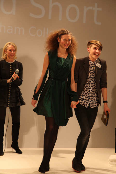
And as I’ve already mentioned I don’t do queues – not in Tescos, buy and certainly not during fashion week. To this end my heart sank as I rounded the corner to Freemasons’ Hall and found a line of people streaming down the street. What was this FAD awards malarkey anyway? Heading to the front of the queue I waggled my ticket at an unknown PR person and hoped for the best, so was somewhat surprised to be informed in hushed tones that I was a VIP and could go straight on through. Upstairs in one of the many architecturally fabulous chambers, Matt and I sipped on sweet fizzy stuff as we tried to figure out what this was all about.

FAD-Awards-sketches-Amelias-Magazine-by-kila_kitu
FAD-Awards 2010-Kila Kitu
Dress by Emily Rogers of Salford City College as illustrated by Kila Kitu.

Apparently we’ve been very supportive of FAD in the past, and once I’d looked up our previous coverage it did suddenly all ring a bell. But I wasn’t quite prepared for the sheer unadulterated upbeat joy of this event. Right in the thick of a hectic fashion week it’s a true testament to the achievement of this organisation that I could sit through yet another long catwalk show and come out the other end beaming with goodwill.

LFW_FAD_Awards_Abigail_Nottingham
The European Fashion Designer award winning dress from Paul Vasileff and Shahira Bakhoum. Illustrated by Abigail Nottingham.

FADAwards Flower-Rebecca Glyn-Blanco by-Barbara-Ana-G
Rebecca Glyn-Blanco by Barbara Ana Gomez.

Just to recap quickly, FAD stands for Fashion Awareness Direct and it is a charity that aims to empower young people – as the brochure says “Fashion is a great way to connect with young people from different backgrounds, to give them confidence and raise their aspirations for the future.”

FAD awards SS2011 - Adam Preece by Abi Daker
Adam Preece by Abigail Daker.

LFW_FAD_awards Chelsey Ward by Abigail-Nottingham
Chelsey Ward by Abigail Nottingham.

Last year we covered the undergraduates awards show, but this year we were in for a much younger treat: the FAD Junior Awards showcased the designs of finalists chosen from 130 teenagers aged 16-19. Yes dear reader, you may well have to keep pinching yourself as you take a look through the images. I know I did, and I was sitting right there when they paraded past. Created over the course of five days at the University of East London with the help of an experienced team of tutors, the outfits put together by these young designers would put many graduates to shame.

LFW_FAD_Awards Karmen-Marie Parker by Abigail_Nottingham
Karmen-Marie Parker by Abigail Nottingham.

FAD-Awards-Natalie Goreham by-kila_kitu
Natalie Goreham by Kila Kitu.

To start off the evening’s events previous winner Prash Muraleetharan took to the stage with a bit of confident advice, endearingly delivered. “It’s what you do with this moment which determines a winner…. so get upstairs and network,” he advised, somewhat sagely. At the end he winked. And I’m sure he winked at me. Blimey… what a charmer… it’s quite hard to countenance that Prash must still be a teenager, and yet he already runs his own fashion label with a website and everything.

FAD junior awards 2010 photo by Amelia Gregory
Prash Muraleetharan dispels his words of wisdom at the start of the ceremony. All photography by Amelia Gregory.

After the catwalk show we had speeches from the sleek Susan Aubrey-Cound of M&S and Helen Carter of UEL, followed by the prizegiving by the extremely fabulous Zandra Rhodes, who is *the cutest* when she smiles! The winners and their parents looked so overwhelmed it really did warm the cockles of my jaded fashionista heart.

Zandra-Rhodes-FAD-Awards-2010-Antonia-Parker-Amelias-Magazine-A
Zandra Rhodes by Antonia Parker. I wuv her.

FAD junior awards 2010 photo by Amelia Gregory
Paul Vasileff and Shahira Bakhoum of Milan step up first to take the prize for the European Fashion Designer Competition, which was the culmination of a two year project.

FAD junior awards 2010 photo by Amelia Gregory
Karmen-Marie Parker with her winning design shortly before she burst into tears… aw, bless.

FAD junior awards 2010 photo by Amelia Gregory
Andre Augusto: pattern cutting award winner.

FAD junior awards 2010 photo by Amelia Gregory
Research award winner Sarah Kilkenny.

FAD junior awards 2010 photo by Amelia Gregory
17 year old David Short – the first boy to become overall winner and a proper little fashionista in the making.

Within this blog you’ll find my favourite pieces to hit the runway – and just remember, they were all designed and made by 16-19 year olds. Quite astonishing I’m sure you’ll agree.

FAD junior awards 2010 Shomari Williams photo by Amelia Gregory
Shomari Williams.

FAD junior awards 2010 Emily Rogers photo by Amelia Gregory
Emily Rogers.

FAD junior awards 2010 Charlie Ibouillie photo by Amelia Gregory
Charlie Ibouillie.

FAD junior awards 2010 Sinead Cloonan photo by Amelia Gregory
Sinead Cloonan.

FAD junior awards 2010 European winners photo by Amelia Gregory
The winner of the European competition.

FAD junior awards 2010 Rebecca Glyn-Blanco photo by Amelia Gregory
Rebecca Glyn-Blanco.

FAD junior awards 2010 Natalie Goreham photo by Amelia Gregory
Natalie Goreham.

FAD junior awards 2010 Florence Melrose photo by Amelia Gregory
Florence Melrose.

FAD junior awards 2010 Misbah Siddique photo by Amelia Gregory
Misbah Siddique.

FAD junior awards 2010 Zandra Rhodes photo by Amelia Gregory
And another completely gratuitous shot of Zandra because this post isn’t long enough already. Because I WUV HER.

FADAwards-the tightrope walker-Florence Melrose by-Barbara-Ana-G
The Tightrope Walker – an illustration of a dress designed by Florence Melrose, ed illustrated by Barbara Ana Gomez.

I’m a bit rubbish when it actually comes to checking what’s what during fashion week – I will generally go to most things that I’m invited to on the grounds that if someone has bothered to invite me then I should generally return the honour by actually turning up. Not so most magazine editors I might add – many was the time that I would swan into a fashion show under the guise of Katie Grand at The Face. She never went, information pills and yours truly got the golden tickets.

FAD awards SS2011 - abi daker
Dress by Rebecca Glyn-Blanco of Camden School for Girls. Illustration by Abigail Daker.

FADAwards Keep it secret-by-Barbara-Ana-Gomez
Keep it Secret – illustration of a dress by Sinead Cloonan from City & Islington College by Barbara Ana Gomez.

And as I’ve already mentioned I don’t do queues – not in Tescos, and certainly not during fashion week. To this end my heart sank as I rounded the corner to Freemasons’ Hall and found a line of people streaming down the street. What was this FAD awards malarkey anyway? Heading to the front of the queue I waggled my ticket at an unknown PR person and hoped for the best, so was somewhat surprised to be informed in hushed tones that I was a VIP and could go straight on through. Upstairs in one of the many architecturally fabulous chambers, Matt and I sipped on sweet fizzy stuff as we tried to figure out what this was all about.

FAD-Awards-sketches-Amelias-Magazine-by-kila_kitu
FAD-Awards 2010-Kila Kitu
Dress by Yashodah Rodgers as illustrated by Kila Kitu.

Apparently we’ve been very supportive of FAD in the past, and once I’d looked up our previous coverage it did suddenly all ring a bell. But I wasn’t quite prepared for the sheer unadulterated upbeat joy of this event. Right in the thick of a hectic fashion week it’s a true testament to the achievement of this organisation that I could sit through yet another long catwalk show and come out the other end beaming with goodwill.

LFW_FAD_Awards_Abigail_Nottingham
The European Fashion Designer award winning dress from Paul Vasileff and Shahira Bakhoum. Illustrated by Abigail Nottingham.

FADAwards Flower-Rebecca Glyn-Blanco by-Barbara-Ana-G
Rebecca Glyn-Blanco by Barbara Ana Gomez.

Just to recap quickly, FAD stands for Fashion Awareness Direct and it is a charity that aims to empower young people – as the brochure says “Fashion is a great way to connect with young people from different backgrounds, to give them confidence and raise their aspirations for the future.”

FAD awards SS2011 - Adam Preece by Abi Daker
Adam Preece by Abigail Daker.

LFW_FAD_awards Chelsey Ward by Abigail-Nottingham
Chelsey Ward by Abigail Nottingham.

Last year we covered the undergraduates awards show, but this year we were in for a much younger treat: the FAD Junior Awards showcased the designs of finalists chosen from 130 teenagers aged 16-19. Yes dear reader, you may well have to keep pinching yourself as you take a look through the images. I know I did, and I was sitting right there when they paraded past. Created over the course of five days at the University of East London with the help of an experienced team of tutors, the outfits put together by these young designers would put many graduates to shame.

LFW_FAD_Awards Karmen-Marie Parker by Abigail_Nottingham
Karmen-Marie Parker by Abigail Nottingham.

FAD-Awards-Natalie Goreham by-kila_kitu
Natalie Goreham by Kila Kitu.

To start off the evening’s events previous winner Prash Muraleetharan took to the stage with a bit of confident advice, endearingly delivered. “It’s what you do with this moment which determines a winner…. so get upstairs and network,” he advised, somewhat sagely. At the end he winked. And I’m sure he winked at me. Blimey… what a charmer… it’s quite hard to countenance that Prash must still be a teenager, and yet he already runs his own fashion label with a website and everything.

FAD junior awards 2010 photo by Amelia Gregory
Prash Muraleetharan dispels his words of wisdom at the start of the ceremony. All photography by Amelia Gregory.

After the V&A inspired catwalk show we had speeches from the sleek Susan Aubrey-Cound of M&S and Lucy Jones of UEL, followed by the prizegiving by the extremely fabulous Zandra Rhodes, who is *the cutest* when she smiles! The winners and their parents looked so overwhelmed it really did warm the cockles of my jaded fashionista heart.

Zandra-Rhodes-FAD-Awards-2010-Antonia-Parker-Amelias-Magazine-A
Zandra Rhodes by Antonia Parker. I wuv her.

FAD junior awards 2010 photo by Amelia Gregory
Paul Vasileff and Shahira Bakhoum of Milan step up first to take the prize for the European Fashion Designer Competition, which was the culmination of a two year project.

FAD junior awards 2010 photo by Amelia Gregory
Karmen-Marie Parker with her winning design shortly before she burst into tears… aw, bless.

FAD junior awards 2010 photo by Amelia Gregory
Andre Augusto: pattern cutting award winner.

FAD junior awards 2010 photo by Amelia Gregory
Research award winner Sarah Kilkenny.

FAD junior awards 2010 photo by Amelia Gregory
17 year old David Short – the first boy to become overall winner and a proper little fashionista in the making.

Within this blog you’ll find my favourite pieces to hit the runway – and just remember, they were all designed and made by 16-19 year olds. Quite astonishing I’m sure you’ll agree.

FAD junior awards 2010 Shomari Williams photo by Amelia Gregory
Shomari Williams.

FAD junior awards 2010 Emily Rogers photo by Amelia Gregory
Yashodah Rodgers.

FAD junior awards 2010 Charlie Ibouillie photo by Amelia Gregory
Charlie Ibouillie.

FAD junior awards 2010 Sinead Cloonan photo by Amelia Gregory
Sinead Cloonan.

FAD junior awards 2010 European winners photo by Amelia Gregory
The winner of the European competition.

FAD junior awards 2010 Rebecca Glyn-Blanco photo by Amelia Gregory
Rebecca Glyn-Blanco.

FAD junior awards 2010 Natalie Goreham photo by Amelia Gregory
Natalie Goreham.

FAD junior awards 2010 Florence Melrose photo by Amelia Gregory
Florence Melrose.

FAD junior awards 2010 Misbah Siddique photo by Amelia Gregory
Misbah Siddique.

FAD junior awards 2010 Zandra Rhodes photo by Amelia Gregory
And another completely gratuitous shot of Zandra because this post isn’t long enough already. Because I WUV HER.

LFW-Antipodium-Andrea-Peterson
Antipodium by Andrea Peterson.

Antipodium was a shop that used to stock Amelia’s Magazine many a moon ago… run by Ozzies, stuff it has always championed Ozzie design. and apparently cake. At the Antipodium show at the Portico Rooms, visit Somerset House we were served up some delicious delicacies from down under.

Antipodium SS2011 photo by Amelia Gregory
Homemade cake: always good. And to think, unhealthy not a cupcake in sight *thank god*

Antipodium SS2011 photo by Amelia Gregory
All photography by Amelia Gregory.

LFW-Antipodium by Jo Cheung
Antipodium by Jo Cheung.

Antipodium by Lisa Stannard
Antipodium by Lisa Stannard.

Antipodium the label grew out of the boutique as it found itself home to all sorts of creative types. Owner Ashe Peacock launched the brand in 2006 with former intern Geoffrey J. Finch, and since then it seems they’ve been quietly growing something of a reputation for its easy going style – a result of their down-to-earth Australian background.

Antipodium SS2011 photo by Amelia Gregory
LFW-Antipodium-Andrea-Peterson
Antipodium by Andrea Peterson.

For S/S 2011 Antipodium took the “brutalist beauty of the Barbican hothouse as a starting point” – possibly the reason for the backdrop of huge potted plants. Filtered through the steamy social mores of the 1970s all sorts of scurrilous goings-on were imagined in the nooks and crannies of this iconic building.

Antipodium SS2011 photo by Amelia Gregory
LFW-Antipodium by Paolo-Caravello
Antipodium by Paolo Caravello.

In reality this meant a cleanly classic collection spiced up with great little details, shown on a range of young models who had obviously been instructed to act louche. This for me is where models fail – they’re too young to be convincing, to act anything other than the most basic of parts. But this didn’t distract from my enjoyment of the hugely successful collection – after all I didn’t read the accompanying bumpf until just now.

Antipodium SS2011 photo by Amelia Gregory
LFW-Antipodium by Jo Cheung
Antipodium by Jo Cheung.

Wearing a muted colour palette of mossy greens, khaki, pale blue, aubergine, dusky pink and fawn the models paraded to the music of two DJs hidden in the corner. Stand outs were the clever use of fabrics and detailing; waffly knitwear, silky shirting, the subtle A shape in the back of a man’s beautifully cut coat. But best of all had to be the prints: commissioned from Australian born (of course) New York artist Craig Redman, these featured double-take patterns: oversized limbs, bespectacled butterflies and strange blooms. Can you tell I trained as a printed textile designer? Always the colour and patterns for me… Fabulous stuff.

Antipodium SS2011 photo by Amelia Gregory
Antipodium-by-Lisa-Stannard
Antipodium by Lisa Stannard.

LFW-Antipodium by Jo Cheung
Antipodium by Jo Cheung.

Categories ,1970s, ,Andrea Peterson, ,Antipodium, ,Ashe Peacock, ,Australian, ,barbican, ,Cake, ,Craig Redman, ,Geoffrey J. Finch, ,Jo Cheung, ,Lisa Stannard, ,Paolo Caravello, ,Portico Rooms, ,Somerset House

Similar Posts:


Amelia’s Magazine | London Fashion Week S/S 2012: Catwalk Review: Jasper Garvida

Jasper Garvida SS 2012 by Emma Block

Jasper Garvida SS 2012 illustrated by Emma Block

Some may think that having previewed this Spring/Summer 2012 collection in my recent London Fashion Week interview with Jasper Garvida would have dampened my excitement about the show, healing as I’d already seen it all, right? Let me tell you, I was more excited than a teenage girl turning up to her first dance (with cute boys and everything). Having chatted to the warm and sensitive Jasper about his collection, learning about the process and inspiration that went into it, I couldn’t wait to see it modelled on the catwalk at the luxurious Bloomsbury Hotel, which was a nice little break from the rush of Somerset House.

Jasper Garvida SS 2012 by Amelia Gregory

All photography by Amelia Gregory

A restricted colour palette of black and white served as the perfect backdrop to what Jasper loves: his intricate hand-embellished details and natural ability to make feminine garments without them being saccharine sweet and over-the-top. For this collection, the silver and gold detailing as well as the circular prints were inspired by a painting that gave the collection it’s name: ‘Autour d’un Point’ by František Kupka.

Jasper Garvida S/S '12 illustrated by Gareth A Hopkins

Jasper Garvida S/S 2012 illustrated by Gareth A Hopkins

Jasper Garvida S/S 2012 by Amelia GregoryJasper Garvida S/S 2012 by Amelia GregoryJasper Garvida S/S 2012 by Amelia Gregory

Hemlines were either above the knee or down to the floor in a series of futuristic-meets-delicate dresses. Jasper showed off his sense of how to flatter the figure without showing too much (as opposed to recurring the boob and nipple-flashing trend that seemed to emerge this London Fashion Week).

Jasper Garvida S/S 2012 by Amelia GregoryJasper Garvida S/S 2012 by Amelia Gregory

Circular metallic panels made from silver and gold leather created beautiful frames for the shoulders, neckline and hips, as well as sequins cleverly folded and sewn in rows to look like heavy studding without all the extra weight. Perfect for the likes of socialite Lady Victoria Hervey, Katie Melua and MTV presenter Laura Whitmore who all atended the show and would most likely rather not be carrying a ton in studs while presenting the latest Lady Gaga video, attending an event or dancing around on stage. Two pieces that caught my eye (especially as I’d felt how surprisingly butter-soft and light they were in the studio) were the distressed silver and gold raincoat and a black dress with ‘studded’ gold pockets. I could already see many a celebrity stylist clamoring for the attention-grabbing yet wearable collection.

Jasper Garvida S/S 2012 illustrated by Charlotte Hoyle

Jasper Garvida S/S 2012 illustrated by Charlotte Hoyle

Jasper Garvida S/S 2012 by Amelia GregoryJasper Garvida S/S 2012 by Amelia GregoryJasper Garvida S/S 2012 by Amelia Gregory

Fashion editor legend Diana Vreeland was the other main influence for Jasper and his S/S 2012, as he loves her individual sense of style (I’d also recommend watching some of her old interviews online, her bonkers and overly-dramatic way of talking fashion is second-to-none) and passion for the exotic. He was also inspired by her innate way of mixing contrasts, which he explored in this collection, creating garments that are hard yet soft and feminine with a strong silhouette thanks to defined silhouettes which reminded me a little of Jean Paul Gaultier and his strong definition of femininity.

Jasper Garvida S/S 2012 by Amelia GregoryJasper Garvida S/S 2012 by Amelia GregoryJasper Garvida S/S 2012 by Amelia GregoryJasper Garvida S/S 2012 by Amelia Gregory

As each model walked past I couldn’t help smiling with pride for Jasper. Details like pockets that stood away and out from the body perfectly aligned with the hips, and the last few dresses completely made from sequins to create a shimmering disco-ball effect got some audible squeals of joy. Sparkle and sequins can go so wrong so easily, but in the hands of Jasper and his team they became wearable and breathtaking without making the models look like they got ready for a New Year’s Eve party months too early. The dresses looked comfortable, and the workmanship shone through as I inspected how well-stitched the sequins were, even catching a glimpse of myself reflected in the dress.

Jasper Garvida S/S 2012 illustrated by Charlotte Hoyle

Jasper Garvida S/S 2012 illustrated by Charlotte Hoyle

Jasper Garvida S/S 2012 by Amelia GregoryJasper Garvida S/S 2012 by Amelia GregoryJasper Garvida S/S 2012 by Amelia Gregory

Jasper is serious about well-made clothes (perhaps a couture line would be appropriate in the future) and it shows. I would however have liked to see the look pushed even further with a shoe or jewellry collaboration to compliment the outfits, imagining how incredible a pair of disco-ball Jasper Garvida shoes would look like with one of his tailored black or white dresses. Although in terms of completing the look, it has to be said that the hair suited the collection perfectly; a modern version of a Diana Vreeland-eque strong and high hairstyle sculpted into place with a lot of backcombing.

Jasper Garvida S/S 2012 by Amelia GregoryJasper Garvida S/S 2012 by Amelia Gregory

The Garvida crowd strike a pose

Jasper Garvida S/S 2012 by Amelia Gregory

Our very own contributing writer Akeela Bhattay getting that perfect shot

When the show was over, Laura Whitmore and Lady Victoria Harvey both stayed to congratulate him, gushing over the collection (Laura has been a Jasper Garvida fan for a few seasons). I’m sure Jasper will also be getting more mentions, as the Head of Fashion at the Evening Standard, Maurice Mullen also attended the show, and many a blogger and editor hung around to get a snippet of what went into the collection. In-between socialites and TV presenters and other well-wishers I managed to give the beaming Jasper a quick congratulatory hug, safe in the knowledge that I’d already had the mother of all chats about the collection with him in the studio over a nice cup of tea.

Categories ,Akeela Bhattay, ,Alia Gargum, ,Amelia Gregory, ,Charlotte Hoyle, ,Diana Vreeland, ,Emma Block, ,Frantisek Kupka, ,Gareth A Hopkins, ,jasper garvida, ,John Paul Gaultier, ,Katie Melua, ,Lady Gaga, ,Lady Victoria Hervey, ,Laura Whitmore, ,London Fashion Week, ,Maurice Mullen, ,monochrome, ,MTV, ,Nipples, ,pattern, ,S/S 2012, ,Sequins, ,Somerset House, ,The Bloomsbury Hotel, ,The Evening Standard, ,Womenswear

Similar Posts:


Amelia’s Magazine | London Fashion Week S/S 2011 Catwalk Review: Charlotte Eskildsen
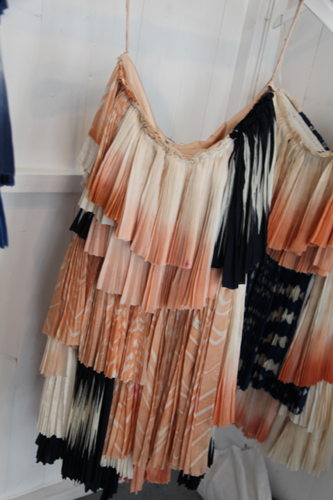

Illustration by Andrea Peterson

As part of Designers Remix, prostate diagnosis designer Charlotte Eskildsen, website who is creative director of the enterprise published their signature collection last week. After winning the prestigious Danish Design Guldknappen award she has become a force to be reckoned with in international fashion since starting the line in 2002. Her S/S 2011 collection ‘Liquid Sky’ is inspired by cloud formations.

Draped fabrics. Origami folds. A flash orange dress. Scraped back hair tied in tight knots. The show, held in the Portico rooms was one of my favourites of the week. Like many others, it stuck strongly to a muted colour range, beginning with pieces in greys, creams and blacks. Small details like the delicate lace insets and just-seen underskirts pulled the collection together extremely well.

Charlotte’s skill lies in how well she collects the fabric together and makes it hang. Ruffles on the shoulders of her cream dresses are restrained and kept from looking fussy, the great bright orange dress (which I desperately want) is understated in all other ways bar the colour and the waterfall collars on the jackets carried the theme of softness through even on heavier fabrics.


Illustration by Andrea Peterson

The clothes ranged from smart black dresses, to sand toned wafty jackets and ruffled party frocks in various shades of cream. This is a collection that is just good. I can’t put my finger on an exact feature or piece that puts it into a higher category for me and I think that’s why I like it.

More than just a beautiful ready to wear summer collection, it brings together a floaty casual look with added details of specialness without being over the top. If I wanted to sound very fashiony I would call it perfect ‘understated chic’, but hopefully I’ve described it better than that!


Categories ,Andrea Peterson, ,Charlotte Eskildsen, ,fashion, ,Goldknappen Award, ,illustration, ,London Fashion Week, ,Portico Rooms, ,S/S 2011, ,Somerset House, ,Womenswear

Similar Posts: