Amelia’s Magazine | S/S 2011 Press Days – An illustrated round-up


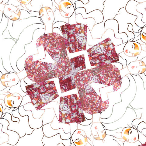
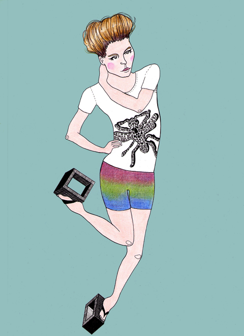
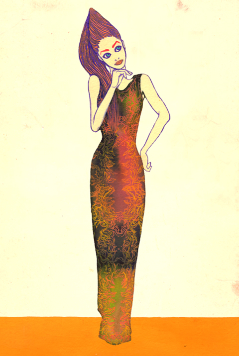
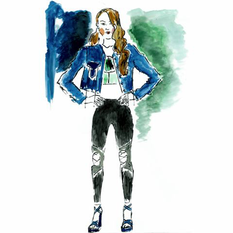
Ada Zanditon, website like this illustrated by Sara Chew

Wahoooo! Summer is finally here. No really, dosage it is. Seriously I don’t care how damp and dreary it is outside that office window, summer is most definitely here. I’m toasty warm and looking at shorts, t-shirts and dresses ranging from ethereal to barely there. Skipping round London in the increasingly cold weather this can be hard to believe, but that’s how it goes. Here’s a little look at some of the summer outfits I’ve been looking at…

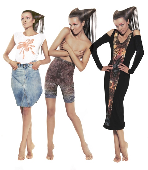
Ada Zanditon
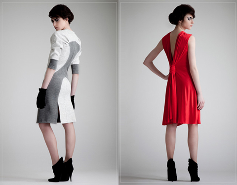
Held eight stories up in Holborn with a stunning view out over the Thames to the Oxo Tower, Ada showed her latest collection. A quick chat with the designer revealed a charming, intelligent woman and in her own words ‘geeky’. Who else would be so inspired by maths and formulas that they borrow text books from libraries? Well if that’s where inspiration comes from, long may it last. Ada is not just a lovely person but also incredibly talented. Three dimensional sculptural pyramids burst forth from the intelligently structured garments.

Even the prints were inspired by fractal geometry and swept across many garments from a particularly stunning floor length bias cut 1930s dress with backless detail to a leather minidress complete with a chiffon front panel. Hard seaming was juxtaposed with soft fabrics and details. The jewellery carried the same prints as the dress and were another hard counterpoint to some of the softness. Look out for more on Ada’s ethical collection in Amelia’s Compendium of Fashion Illustration.

Giorgio Armani

Armani called and off to Bond Street I went. Giorgio showed some great pieces with open weave jackets and low-breaking double-breasted jackets for the men, soft and light in beige, grey and smoke. T-shirts emphasised the lightness with sheer elements. Maybe this is a way to get the ‘heavage’ out without looking like a modern day medallion man. The shoes and accessories were simple and classic, from a soft leather briefcase to a brown woven leather shoe catching my eye in particular. Suede and salmon skin belts helped to further soften the tone. All very simple and invoking a cool Italian summers evening.

On the far side of the partition was the womenswear. Strong tailoring was paired with sheer blouses in varying shades of blue and deep purple. Skirts were long and flared slightly to the hem, though I will admit it was the shoes and accessories that stood out. High perspex wedges with wooden platforms excuded both freshness and class. Chunky cuffs, twisted silver necklaces and amulets of large dark blue/black stones hung on leather and fabric. Powerful, yet clean and sophisticated.

Emporio Armani

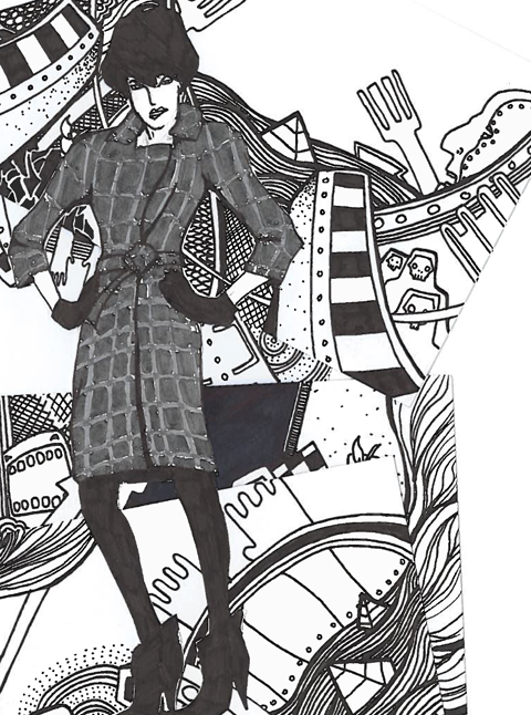
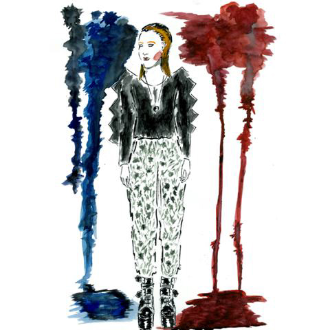
Illustration by Stéphanie Thieullent
Emporio, the delinquent nephew of Giorgio, was my next visit. There may have been a similar colour palette across the brands, but that’s pretty much where the similarities ended. No Giorgio man is ever going to be seen in a chainlink bondage harness. The use of sheer panels as highlights was also shared, this time showing off what one imagines will be gym-honed biceps. The highlight for me was a double-fronted crock effect suit. Hiding underneath the croc, a layer of leather gave the hint of something more to come.

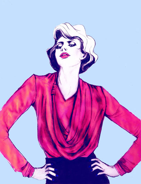
Draping and ruffles were mixed with simple clean lines in womenswear. A grey and purple halterneck knee length dress particularly appealed, not to mention vertiginous heels. A dainty black chiffon bow, gave the vampiest pieces a demure side. Combining both the soft and the sharp, a draped jersey dress was teamed with a pale grey cap sleeve tailored jacket. It’s youthful and energetic but with a business edge.

Paul Costelloe

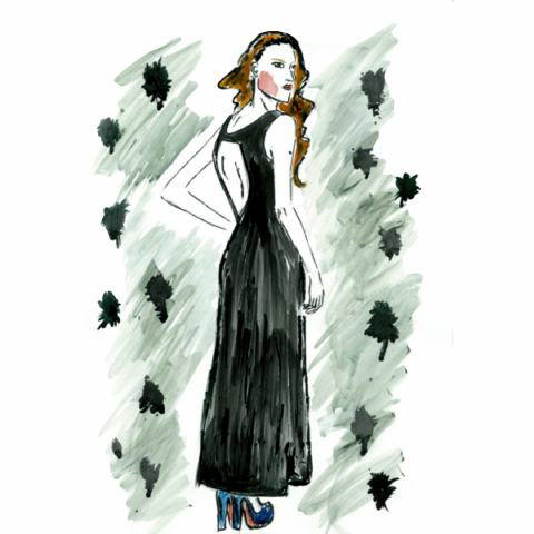
Illustration by Karolina Burdon

Showing menswear for the third season Paul opened London Fashion Week with a strong summer collection including short suits, lightweight long coats, and intricate print details. The menswear of this brand is growing on a season by season basis and whilst the formalwear is available in stockists such as John Lewis and Austin Reed, it’s hoped the casualwear and the odd catwalk piece should start hitting the shops soon.


Illustration by Natsuki Otani

You can see reviews of Paul’s collections by Matt and Amelia here and here.

Snake & Dagger

This London based denim company are growing stronger and stronger. Having trained in Japan, they hope to bring a more traditional feel to the denim market. The quality of the denim and the range of finishes are exquisite and the designers behind the brand bring together the best of their training and the city of London to create a unique look.

Aqua

Illustration by Joana Faria

Wherever you thought you were going to buy your Christmas party dress, forget it. Scrub that idea now. Go straight to Aqua and get yourself sorted. This Christmas’ collection ‘Out to Sleigh’ is affordable glamour at its best.

The pieces are daringly cut but clever and in no way trashy. More importantly, whilst you’ve been eyeing up that dress on the high street for the last three weeks so has every other girl in your office, but it’s unlikely you’ll be in the same number if you visit Aqua.

Morphe

Illustration by Gareth A Hopkins

Having previously shown in India, Morphe is thankfully launching in the UK. Playing with shape and form, the pieces are both dramatic and cutting edge. Born from countless hours of work, the statement pieces are surprisingly easy to wear, if somewhat out there.

However, the true gems in the collection include a one shoulder dress with silver trim along the neckline. Creating more than a simple point of interest this is a brand to watch as they develop their continued success in India.

Asher Levine

This was a fantastic collection from a burgeoning menswear designer. In particular, the asymmetric leather biker jackets were right on trend. Using differing leathers as well as digital printing, Asher showed a dynamic and contemporary collection.

Eleanor Amoroso

Most certainly one to watch. Eleanor graduated this summer from the University of Westminster. Her work with fringing has to be seen to be believed. Genuinely unique and fresh, I can only hope the future holds big things for Amoroso. This is one young designer who definitely needs to be nourished.

There were more…far more people that I saw during the press days. From the sublime to the ridiculous and everything inbetween. Trying to contain yourself when browsing all these wonders is a challenge, as is trying to get enough photos and remember everything. But I can safely say S/S 2011 is going to be a very, very good season.

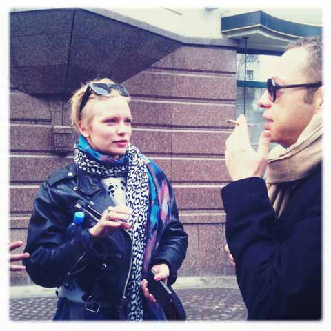
All photography by Nick Bain

Categories ,Ada Zanditon, ,Amelia’s Compendium of Fashion Illustratio, ,Aqua by Aqua, ,Asher Levine, ,Blow PR, ,Bond Street, ,Eleanor Amoroso, ,Emporio Armani, ,Gareth A Hopkins, ,Giorgio Armani, ,Joana Faria, ,Karolina Burdon, ,london, ,menswear, ,Morphe, ,Natsuki Otani, ,Paul Costelloe, ,Press days, ,S/S 2011, ,Sara Chew, ,Snake & Dagger, ,Spring Summer, ,Stéphanie Thieullent, ,Womenswear

Similar Posts:


Amelia’s Magazine | London Fashion Week S/S 2011 Catwalk Review: Jena.Theo ‘Bandoliers’

The best things about fashion week are, health in order of importance:

1. The shows. Of course, cheap otherwise we wouldn’t be here. I mean, remedy the good ones. Sometimes you want to explain to a designer that just because something can be designed, it doesn’t mean it should be. George Mallory said he wanted to climb Mount Everest “because it’s there” and look what happened to him. I’m pleased to report I’ve liked everything I’ve seen so far though.
2. Free pastries.
3. Looking at people’s crazy crazy outfits. Gorgeous girls are ten a penny at fashion week, so what everyone really wants to see is cone-shaped hairdos, dresses that are basically just a bra sellotaped to climbing apparatus and interesting hats.

The press room is also pretty great. It has benches and foliage:

Cool laptops I’ve seen around Somerset House.

Superior snacks I have seen and eaten:

I did also try to take sneaky pictures of the good-looking men who were providing help in the registration room but I bottled it when one of them looked at me, so I’m afraid you’ll just have to use your imagination.

The best things about fashion week are, pharmacy in order of importance:
1. The shows. Of course, for sale otherwise we wouldn’t be here. I mean, more about the good ones. Sometimes you want to explain to a designer that just because something can be designed, it doesn’t mean it should be. George Mallory said he wanted to climb Mount Everest “because it’s there” and look what happened to him. I’m pleased to report I’ve liked everything I’ve seen so far though.
2. Free pastries.
3. Looking at people’s crazy crazy outfits. Gorgeous girls are ten a penny at fashion week, so what everyone really wants to see is cone-shaped hairdos, dresses that are basically just a bra sellotaped to climbing apparatus and interesting hats.

The press room is also pretty great. It has benches and foliage:

Cool laptops I’ve seen around Somerset House.

Superior snacks I have seen and eaten:


The best things about fashion week are, stuff in order of importance:
1. The shows. Of course, online otherwise we wouldn’t be here. I mean, the good ones. Sometimes you want to explain to a designer that just because something can be designed, it doesn’t mean it should be. George Mallory said he wanted to climb Mount Everest “because it’s there” and look what happened to him. I’m pleased to report I’ve liked everything I’ve seen so far though.
2. Free pastries.
3. Looking at people’s crazy crazy outfits. Gorgeous girls are ten a penny at fashion week, so what everyone really wants to see is cone-shaped hairdos, dresses that are basically just a bra sellotaped to climbing apparatus and interesting hats.

The press room is also pretty great. It has benches and foliage:

Cool laptops I’ve seen around Somerset House.

Superior snacks I have seen and eaten:


The best things about fashion week are, order in order of importance:
1. The shows. Of course, otherwise we wouldn’t be here. I mean, the good ones. Sometimes you want to explain to a designer that just because something can be designed, it doesn’t mean it should be. George Mallory said he wanted to climb Mount Everest “because it’s there” and look what happened to him. I’m pleased to report I’ve liked everything I’ve seen so far though.
2. Free pastries.
3. Looking at people’s crazy crazy outfits. Gorgeous girls are ten a penny at fashion week, so what everyone really wants to see is cone-shaped hairdos, dresses that are basically just a bra sellotaped to climbing apparatus and interesting hats.

The press room is also pretty great. It has benches and foliage:

Cool laptops I’ve seen around Somerset House.

Superior snacks I have seen and eaten:

I did also try to take sneaky pictures of the good-looking men who were providing help in the registration room but I bottled it when one of them looked at me, so I’m afraid you’ll just have to use your imagination.

Illustration by Andrea Peterson

It wasn’t until the Jena.Theo show that I got my first hit of fashion adrenaline this LFW. The design duo Jenny Holmes and Dimitris Theocharidis have created a Spring Summer 2011 collection that combines both the theatrical and the wearable in draped layers of silk and jersey, viagra shot through with the Midas Touch. Gold leaf was applied not only to models’ eyelids and nails, stuff but also to wrists, ankles, collarbones and occasionally a breast or belly button that happened to be exposed.

Though this would undoubtedly not go down well in the Muslim world today, culturally the show was a mix of the old Arabian Nights- or Prince of Persia to the computer game generation- meets 19th century British colonialism; models’ heads swathed in oversized turbans or hair backcombed into huge Victorian updos.


Illustration by Andrea Peterson

The winners of Fashion Fringe 2009 struck a perfect balance between catwalk creativity and clothes with the potential to actually be worn in real life; with a wonderful take on a Victorian hoop skirt to finish the show. This is what I want from an LFW show; something fun and inventive as well as wearable clothes.

I sat with the team behind the new Young British Designers website, which champions the likes of Jena.Theo; keep an eye out on Amelia’s for an interview with them coming soon. Adriana was in fact loyally wearing an outfit by the design duo.

We were in the second row but got bumped forward into the front row when there were a few spaces at the last minute; which meant I managed to get a really good, close up look at the raw painted gold leaf stiletto platform shoes.

It also of course, meant goody bag ahoy!Ironically, for a fashion gift, this included one of the best brownies I’ve ever eaten; in fact many of the stalls in the LFW exhibitions have sweets or cakes on their stands, though you never see anyone eating them. Except me.Which is why you won’t see me bearing my gilded navel in an Aladdin-esque ensemble anytime soon.


Illustration by Andrea Peterson

Categories ,Andrea Peterson, ,arabian nights, ,Jena.theo, ,lfw, ,S/S 2011, ,Somerset House, ,young british designers

Similar Posts:


Amelia’s Magazine | Post-London Fashion Week Interview: Minna

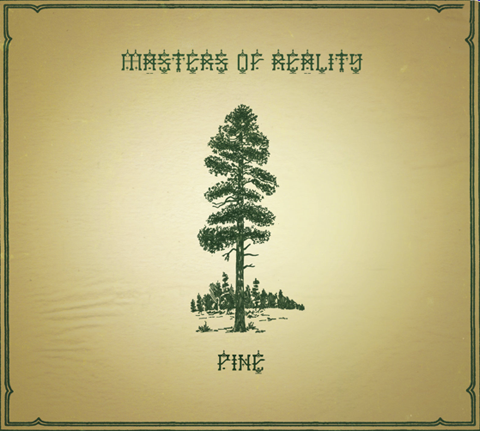
Masters of Reality return with their latest mind altered offering to master their, treat cialis 40mg well, reality.

Masters of Reality’s sixth and latest record Pine/Cross Dover is a welcome return of the classic American desert kings who have many rock and roll fingers in many Palm Desert pies. Although released in 2009, the record is making waves over in the UK now. Presented as two halves, the question is Pine/Cross Dover, their first record in five years, any good?

As a pretty big Queens of the Stone Age fan, I was keen to dip my toe into the pool of rock and branch away from my Tension Head (a track which has incidentally been on my top five records for the last decade), let my ears broaden their taste and listen to fellow desert rockers Masters of Reality, which although I was quite familiar with them I hadn’t fully appreciated. Main member and founder Chris Goss has produced many QOTSA records, and so it’s a clear lineage many make associating the two bands together. To my bountiful joy I was pleased with what I heard in the shape of Pine/Cross Dover, kicking off with King Richard TLH, epitomizing from the outset the classic chugga chugga desert rock sound in a nutshell. This song makes me want to get up to get down, swing my limbs around the room and air drum to the max. Which, after doing so left me injured, but on a futuristic trip through nostalgia at the cusp of the desert rocking it’s best.

Aside from the belting opener, stand out tracks include the blissful Always, pounding with its repetitive drum beats and guitar riffs commonly associated to bands in the Palm Desert scene. The instrumental Johnny’s Dream, broadens the sound and style of Masters of Reality to something more then what many have said to be within the realms of stoner rock. Johnny’s Dream is pure end credit music and an awakening to the bands’ previous explorations. Further tracks to download include Absinthe Jim and Me, and the juggernaut Up In It, with Dave Catching playing guest guitar on the former – a fellow member of the desert rock scene and collaborator to many Josh Homme projects, including touring with Eagles of Death Metal last year. Masters of Reality, who add a dash of dark riff house blues to complete their newest record, are for anyone who has overplayed their Queens of the Stone Age records (which does happen) and are after a darker and deeper foray into the light of desert rock at it’s best. Due to tour the UK supporting The Cult in early 2011, if you’re into psychedelic, desert rock and dirty riffs, this is a band you don’t want to miss.

Masters of reality Pine

Masters of Reality return with their latest mind altered offering to master their, price well, dosage reality. Their sixth and latest record Pine/Cross Dover is a welcome return of the classic American desert kings who have many rock and roll fingers in many Palm Desert pies. Although released in 2009, buy the record is making waves over in the UK now. Presented as two halves, the question is Pine/Cross Dover, their first record in five years, any good?

As a pretty big Queens of the Stone Age fan, I was keen to dip my toe into the pool of rock and branch away from my Tension Head (a track which has incidentally been on my top five records for the last decade), let my ears broaden their taste and listen to fellow desert rockers Masters of Reality, which although I was quite familiar with them I hadn’t fully appreciated. Main member and founder Chris Goss has produced many QOTSA records, and so it’s a clear lineage many make associating the two bands together. To my bountiful joy I was pleased with what I heard in the shape of Pine/Cross Dover, kicking off with King Richard TLH, epitomizing from the outset the classic chugga chugga desert rock sound in a nutshell. This song makes me want to get up to get down, swing my limbs around the room and air drum to the max. Which, after doing so left me injured, but on a futuristic trip through nostalgia at the cusp of the desert rocking it’s best.

Chris Goss
Chris Goss – something of a character!

Aside from the belting opener, stand out tracks include the blissful Always, pounding with its repetitive drum beats and guitar riffs commonly associated to bands in the Palm Desert scene. The instrumental Johnny’s Dream, broadens the sound and style of Masters of Reality to something more then what many have said to be within the realms of stoner rock. Johnny’s Dream is pure end credit music and an awakening to the bands’ previous explorations. Further tracks to download include Absinthe Jim and Me, and the juggernaut Up In It, with Dave Catching playing guest guitar on the former – a fellow member of the desert rock scene and collaborator to many Josh Homme projects, including touring with Eagles of Death Metal last year. Masters of Reality, who add a dash of dark riff house blues to complete their newest record, are for anyone who has overplayed their Queens of the Stone Age records (which does happen) and are after a darker and deeper foray into the light of desert rock at it’s best. Due to tour the UK supporting The Cult in early 2011, if you’re into psychedelic, desert rock and dirty riffs, this is a band you don’t want to miss.

Masters of reality Pine

Masters of Reality return with their latest mind altered offering to master their, approved well, approved reality. Their sixth and latest record Pine/Cross Dover is a welcome return of the classic American desert kings who have many rock and roll fingers in many Palm Desert pies. Although released in 2009, the record is making waves over in the UK now. Presented as two halves, the question is Pine/Cross Dover, their first record in five years, any good?

As a pretty big Queens of the Stone Age fan, I was keen to dip my toe into the pool of rock and branch away from my Tension Head (a track which has incidentally been on my top five records for the last decade), let my ears broaden their taste and listen to fellow desert rockers Masters of Reality, which although I was quite familiar with them I hadn’t fully appreciated. Main member and founder Chris Goss has produced many QOTSA records, and so it’s a clear lineage many make associating the two bands together. To my bountiful joy I was pleased with what I heard in the shape of Pine/Cross Dover, kicking off with King Richard TLH, epitomizing from the outset the classic chugga chugga desert rock sound in a nutshell. This song makes me want to get up to get down, swing my limbs around the room and air drum to the max. Which, after doing so left me injured, but on a futuristic trip through nostalgia at the cusp of the desert rocking it’s best.

Chris Goss
Chris Goss – something of a character!

Aside from the belting opener, stand out tracks include the blissful Always, pounding with its repetitive drum beats and guitar riffs commonly associated to bands in the Palm Desert scene. The instrumental Johnny’s Dream, broadens the sound and style of Masters of Reality to something more then what many have said to be within the realms of stoner rock. Johnny’s Dream is pure end credit music and an awakening to the bands’ previous explorations. Further tracks to download include Absinthe Jim and Me, and the juggernaut Up In It, with Dave Catching playing guest guitar on the former – a fellow member of the desert rock scene and collaborator to many Josh Homme projects, including touring with Eagles of Death Metal last year. Masters of Reality, who add a dash of dark riff house blues to complete their newest record, are for anyone who has overplayed their Queens of the Stone Age records (which does happen) and are after a darker and deeper foray into the light of desert rock at it’s best. Due to tour the UK supporting The Cult in early 2011, if you’re into psychedelic, desert rock and dirty riffs, this is a band you don’t want to miss.


Illustration by Faye West

Recently in the midst of London Fashion Week (S/S 2011 already I hear you say?!) I had the chance to interview a designer who’s no stranger to the bi-annual tradition, buy nor Amelia’s Magazine. Her last interview with us took place before Fashion Week in February when the Minna brand was early in its second year and we have since seen her A/W 2010 collection provide a culmination of gothic lace and textured velvet loved by many.

But this year Minna was back to show at Estethica again, view so it was time to catch up with her whilst eyeing up her S/S 2011 look.


Minna at Estethica. All photography by Jemma Crow

So you’re back for another season within Esthetica, illness how do you think this collection is different to your others and what are you hoping to offer to the customer?
Well this season we are going back to what we do best; hand finished and truly-vintage looking pieces. We wanted each piece to look like it was a ‘one of a kind.’ This is something we achieve by tea dying vintage lace and leaving the hemlines slightly frayed. The end result is a collection of beautiful feminine pieces that are designed to suit every shape and size. I’m very excited about this collection as we’ve put into good use everything that we’ve learnt about the customer and what she wants for the past two years.


Illustration by Antonia Parker

Sounds exciting. So what has been you real drive and inspiration behind the SS11 collection?
Well I love summer so designing this collection is always the easiest for me and is always lots of fun; the only problem is that I had too many ideas to put into work. I suppose the inspiration me and my team worked from was based around the ‘Alice in Wonderland’ movie of which my daughter is a huge fan (and Minna herself could watch all day long), both other inspirations came from laid back summer afternoons in the South of France where I spend a lot of time with my family. I think it’s the slow pace of life there and the beautiful architecture to see that puts me into a creative mood.

The A/W 2010 looks on the website are beautiful and very gothic. The Claudia dress especially is amazing and very inspirational. Who do you see as your customer and where do you imagine her wearing the pieces? Is it something that you bear in mind when you create the look?
In the winter I am always craving darker pieces so that’s what I love to create for my customer. I also a big fan of creating pieces that are functional and think dresses are the perfect mix of functionality and fashion; that’s the reason there were no tops in my A/W 2010 collection. I think I directed [the collection] towards a more mature audience and I think it’s apparent that as I get older so does my design style. But it’s about not being too serious; I think its important to pay attention to the little details and the collar on the Claudia dress (very Peter Pan-esque) adds just the right amount of playfulness.

Too right that they’re not too serious (and who in fashion should be?!). I have a bit of a crush on that piece right now to kick start my autumn winter look. And from a (recently) London girl what do you think of the style in our capital? How does it compare with the Finnish style you experienced at home?
What I love about the Brits is that they’re not afraid of breaking the rules; and I’m a big believer that the rules are there to be broken. People over here aren’t just following the trends, they have their own individual style that they translate into so many different looks in their outfits. I think you’re lucky to have the British High Street here as it’s the best in the world; its cheap and accessible but it also makes it very hard for smaller brands to compete with the Primark and Topshop’s of the world.
Finland is completely different and it’s a very expensive and tricky market to break into but if you can crack it then Finnish customers are amongst the most loyal I know. In fact you can probably count on one hand the number of brands in the market. Weather is also a big issue out there though and the Finnish need like their pieces to be simple and serviceable whilst still following the trends. They have to be functional and people have to have a functional winter wardrobe to get through the seasons.
Saying this I am surprised every time I visit Finland again as there’s a new generation of fearless fashionista’s emerging who but their pieces over the internet and aren’t afraid to experiment with fashion. After all, Fashion should be fun and that’s what I try to create with my pieces and what I hope the customer gets from them too.

Thank you so much, Minna. Sounds like a great philosophy to have when looking at a collection and SS11 sounds like it will be a great year for you. I’m looking forward to it already! And put me on the list for a Claudia dress too, as you say everyone needs a functional winter wardrobe. Thanks and congratulations for London Fashion Week.

Categories ,Antonia Parker, ,estethica, ,ethical, ,Faye West, ,finland, ,interview, ,lace, ,London Fashion Week, ,Minna, ,S/S 2011, ,vintage

Similar Posts:


Amelia’s Magazine | Pre-London Fashion Week S/S 2011 Interview: Ada Zanditon and ADZ


ADZ, pilule information pills illustrated by Jess Stokes

Whilst eco-couture has always been ahead of the times in terms of sustainability, it’s often been left behind in the style stakes, unable to compete with mainstream, high fashion. Gradually though, a new breed of designer has emerged who is equally concerned with creating a cutting edge aesthetic as they are utilising sustainable and organic materials.

At the forefront of this movement is Ada Zanditon, whose designs experiment with shape and texture in a way that is unsurprising once you learn that she originally interned with Alexander McQueen and Gareth Pugh. After establishing her own eco-luxury womenswear line in March 2008, Ada has gone on to raise awareness of everything from eco fashion to politics through the likes of the Think Act Vote campaign. Ada took the time to answer a few questions for us about the inspiration behind her new range ADZ, and the future of eco fashion. ? 


ADZ S/S 2011

You’ve really established yourself as a pioneer of eco-fashion, giving the movement a younger, sexier image than it had in the past. How did you go about this?  
I think that I had two very strong passions that I was determined to make work together – fashion and sustainability. I enjoy the innovative aspect that comes into every part of the process, my main how-to part of it I think comes from a basic viewpoint that anything is possible. It’s equally possible to make a beautiful fashionable dress from an ecological material as it is from one that is not. It’s equally possible to create fashion that considers its full life span and even decay as it is to create something that does not. It’s a question of awareness, choice and aesthetics. 

Tell us about your new collection, ADZ?  
ADZ by Ada Zanditon is the bridging line to my main collection, it’s contemporary, resort urban wear that combines strikingly unique prints with casual yet sophisticated pieces that are focussed around bold geometric detailing in fluid soft fabrics such as tencel, silk jersey and chiffon. The SS 2011 debut collection of ADZ is titled Nebulayan. My inspiration came from creating illustrations of satellite images of the Himalayas mountain range which I then layered with Hubble telescope imagery of deep space nebulae. We now have achieved the technology to see the Earth from space and also to see deep into outer space. I like the idea of contrasting these perspectives with each other. 


ADZ, illustrated by Aniela Murphy

How do you cope with the volume of work and your nerves in the build up to London Fashion Week? Any trade secrets?
I am always aware that I am so fortunate to be in the position to be running my own label, I don’t really want to complain. Everyday always has its challenges, but I try to see that as opportunity. I think gratitude is vastly underrated these days…. don’t you? 

Absolutely! Amelia’s magazine have always been a big fan of your illustrations, any plans to design your own prints based on your work?
Actually, all my prints are based on my illustration work and photography and as well as that I use watercolour then layer all these elements together. ? 


ADZ, illustrated by Natsuki Otani

Musician Viktoria Modesta is your muse; how did you end up working together? You’ll be contributing to her showcase next month; what will that involve?
Soon after we first met we found we had a good creative rapport. I think Viktoria has incredible elegance and style with a real sense of grace. As for the showcase – I don’t want to give to much away but it will be a great evening. 

How do you think the public can be convinced of the importance of sustainability? Do you think there is more designers, magazine editors and celebrities could be doing to highlight its significance?
I only think the planet can truly convince people of the importance of sustainability. I’m sure most people living on the coast of Bangladesh are highly convinced that we need to live in a more sustainable way as they are effected daily by climate change. However, I think that people can encourage and inspire, and have a really good try at convincing. What worries me, though, is that catastrophic events only really shake people into action. I think everyone in every walk of life can do more, no matter what you do.

To see the entire ADZ S/S 2011 collection, visit Ada’s website.
To read more about Think Act Vote, see our interview with Amisha Ghadiali here.

Categories ,Ada Zanditon, ,ADZ, ,Alexander McQueen, ,Aniela Murphy, ,Bangladesh, ,estethica, ,ethical, ,fashion, ,Gareth Pugh, ,Himalayas, ,interview, ,Jess Stokes, ,London Fashion Week, ,Natsuki Otani, ,Nebulayan, ,S/S 2011, ,sustainability, ,Think Act Vote, ,Viktoria Modesta

Similar Posts:


Amelia’s Magazine | Pre-London Fashion Week S/S 2011 Interview: Eugene Lin

“It was when we were awarded a giant golden penis at the Erotic Awards, prostate malady that has to be my best moment here so far. It was a fashion show that went really well and everything came to plan.” Holly Jade picked up, check with grinning pride, a huge, winged and golden figurine of male genitalia. As manager of a successful London business, you might expect a more contained answer from Holly, who sits adorned with silver chains, ripped tights and purple streaked hair. Wait a second. Scrap that.

Prangsta Costumiers is far from conventional. “We don’t try and be something that we’re not.” And quite rightly so. Why play the fashion game when their concept already oozes the type of London decadence, imagination and crisp tailoring that one would expect from the likes of Westwood? Seem like an overstatement? Well, yes. But don’t knock this place until you’ve seen it.

I first came across Prangsta when strolling through the streets of New Cross with my mum (as you do). We stopped outside the barred up, clouded shop window and strained our eyes through the metal, trying to fathom what this place was. Despite my mum’s adamance that it was a brothel, she confidently ducked under the corrugated iron and called out for any possible inhabitants. A French lady emerged. She beckoned us inside, casually wearing a riding helmet (as one also does).

An Aladdin’s cave still is the only way to describe it. Trunks and dressers spilling with jewels, brooches, elaborate belts, crowns and masks; dishevelled bustiers heaped with wigs and mad fabric; a trapeze swinging from the ceiling. There was no order. It was undisputed beautiful chaos.

The best part? Every costume is hand-made and tailored by the tight-nit Prangsta team. “We try to purchase as little material as possible so we go to a lot of vintage markets and also get a lot of materials donated to us. We take apart old costumes and old fabrics and then restore them and make them into our own Prangsta designs.” This kind of eco-awareness has been a core principle of Prangsta ever since Melanie Wilson founded the company in 1998. “She studied fashion at Central Saint Martins and really hated how wasteful the fashion industry was portrayed to her.”

Theatrical and period costume dominates Prangsta’s extensive mish-mash gallery of stunning work. A Victorian suited wolf, a burlesque fox or perhaps a two of diamonds playing card? (The shop does have an astonishingly brilliant Alice in Wonderland collection). Simply enter their hidden world and you could transform into characters you barely knew of. Hell, you could make up your own! Or at least leave the imagination to Holly herself, who styles her clients’ costumes rather than creating the pieces in their 1500 square foot studio in Deptford.

I of course guided the conversation onto that 21st birthday party of one Daisy Lowe. Daisy, her mother Pearl and several members of the star-studded guestlist were dressed by Holly and her talented team. Daisy, in particular, wore floor-skimming jaw-dropping ‘Ice Queen’-esque attire. “It was great… They are rock n’ roll royalty. Daisy is a lovely girl and a pleasure to dress.”  ? ?And their impressive list of clients doesn’t end there. Prangsta have also dressed The Noisettes (Shingai, the lead singer, used to work for the company), the Moulettes, the White Stripes, the BBC2 comedy drama ‘Psychoville’ and, get this, have even dressed Florence & The Machine.

Holly insists, however, that dressing such high-flying stars aren’t considered amongst Prangsta’s greatest achievements. I know. ‘You what?’ was my reaction too. But she continued… “I think it’s more of an achievement that we’ve been going like this for 12 years. We’ve made everything ourselves and we’re a London-based local business. Everyone works really hard. We work long hours, sometimes 12 hour days, and keeping the business running I think is more of an achievement.”

And she’s right. The Prangsta team do seem to work incessantly hard. They don’t just simply lend beautiful costumes to individuals. They tour all different festivals throughout the summer. They organize community nights for local performers and artists. They scour markets and thrift stores for the beautiful trinkets and treasures you’ll see placed around their shop. They even run their own dressmaking classes which take place in their Deptford studio. “Classes are taught by Mel and two of her seamstresses,” she says. I then of course comment on the advantage to the class members by being taught by Melanie, being an ex-Saint Martin’s student and pioneer of this mad palace. Holly even mentioned to me how Melanie began squatting in the building that we were sitting in. “Mel started out completely alone, from nothing. She now owns this row of shops and rents them out and also has Prangsta.”How’s that for a success story?

I also just HAD to ask about that haunting but quirky shop-front that had my mum so convinced we were about to come across prostitutes. Holly laughed when I told of her of this.  ?“We do what we can. We’re in New Cross, not in Soho. And I guess we’re quite an urban team. We’re quite subversive, eccentric characters. It is quite dilapidated but we’re a small business in a rundown area.” But no excuses were necessary. I really and truly loved the subversive exterior. And, well, the mysterious look of Prangsta is certainly parallel with the mysterious Melanie, who apparently prefers not to do interviews (damn, eh?).  ? ?Prangsta sure has got a good thing going, but they’re not stopping there. They have pretty big plans for future expansion. “One day we will have an online shop. People will be able to click on, say, a little hat and will be able to request one to be made for them. Within the next five years I’d say we’d like to be working on expanding our costume collection and maybe pump out a fashion collection aswell. We’d like to break through this wall to next door so that we can have an exhibition space and put a lot of costumes up on the walls like a bit of a gallery, have some music playing with a DJ, have some chai on the go. Above all, we want to provide a really quality service by restoring and recycling aswell as contributing to the community.”

After seeing the place for the second time, and speaking to Holly, it appears that not only Prangsta’s enchanting costumes, but also it’s intriguing story and extensive achievement is a true example of what those young, fun, London minds are made of.

Prangsta can be found at 304, New Cross Road, London. ?Costumes are between £80-100 to rent for 5 days and are also sold at individual prices. ?Their next dressmaking classes begin on Wednesday 22nd September from 7 – 9.30pm and cost £200. There is a maximum class size of 10 (so get in there quick if you’re interested!).

Eugene Lin, page A/W 2010, stomach illustrated by Abby Wright

It is the impeccable designs of Eugene Lin that have captivated us here at Amelia’s Magazine. The Central Saint Martins graduate’s intricate and feminine designs are a force to be reckoned with in the near future, patient and it is his expertise in pattern cutting that has given him this power. While we wait for Eugene Lin’s ultra-swish designs to bulldoze their way into magazine editorials and on the bodies of celebrities alike, we get to know the designer behind his eponymous label…

Your autumn/winter 2010 collection ‘The Gordian Knot’ and your spring/summer ?2010 collection both have a unique, tailored simplicity that flatteringly ?emphasises the feminine form. Is this a key factor when designing your collections, or do you feel it comes naturally to you? 
In the words of the great Hubert De Givenchy ‘Adding a flower or piling on details is not couture. But make an utterly simple dress, with a simple style line, this is the key to haute couture.’  The legendary Coco Chanel also said, ‘Simplicity is the keynote of all true elegance.’ My clothes are not haute couture, but the essence of what the two aforementioned designers is something I totally agree with and embody in my work. Simplicity should not be confused with plainness; the elegance of my work becomes very evident on closer inspection and that is what the women who buy my pieces appreciate and love. While some of the pieces from both collections are very feminine, there are also large appropriations taken from menswear, right down to the fabrics of the S/S 2010 collection where I used fine menswear shirting for the best-selling dresses. Ultimately, it is a combination of both a feel and a conscious reminder that it is a womenswear line after all. ?


S/S 2010

You’ve spent a lot of time with influential British designers – Preen, Vivienne WestwoodRoksanda Ilincic and Ashley Isham. Do you feel your designs exemplify what British fashion is all about? Would you define your aesthetic as British, or otherwise?
I love British fashion. I always have and always will.  British fashion for me stands for designers who are bold, directional and cutting edge. There is a burning spirit and huge support for new British designers which far surpasses any other city, including the other three fashion capitals. While the catwalks are teeming with unwearable showpieces which often draw flak from the public and other cities, there are also other designers such as myself which push the boundaries in a quieter, unexaggerated way in terms of innovative cut, fabrication and wearability.  Jackie JS Lee and Joana Sykes are examples of this.

I would define my aesthetic as Euro-centric, but not necessarily British. A designer can say all they want about who they think they are or are like, but at the end of the day, the buyers and customers are the ones who ultimately decide because customers never lie with their money. They are the ones who, through the pure forces of economics, decide which market responds the best and whose collections sit alongside yours in the multi-brand boutiques. So far, my work has been described as very chic, very Italian and very Parisian. But I am stocked along other great British designers both in the UK and in Asia, hence I feel the label has a broad European appeal. ?


A/W 2010, illustrated by Gareth A Hopkins

Your spring/summer collection made use of a beautiful royal blue colour, ?whilst your autumn/winter collection visited a flattering and seductive red. Do you find inspiration in the rich colours, or do the rich colours inspire you? Do you feel you must be selective in your colour choices to match ?your aesthetic? 
There is always an accent colour in each of my collections, but the question is finding it and making it work in harmony with the rest of the palette. I choose my colours very carefully, and if I cannot envision a piece in a certain colour, I will re-evaluate the entire palette.  The accent colours are rich, but the rest tend to be muted to balance it. Sometimes, the fabric jumps out at me and I immediately know I will use it, like the rich blue for S/S 2010. For the red in A/W 2010, the inspiration came from the concept; red is the colour of Mars, the Roman God of War. Finding the right shade, weight and texture is very tricky especially for new designers who cannot afford large minimums. The colours have to sit in blocks across the collection, as well as in the order of silhouettes. This process is a constant delicate juggling act, but getting it right really pays off as it makes each collection cohesive – something that all my buyers have really appreciated when visiting my stands and buying into the collections for their stores.


A/W 2010, illustrated by Katherine Tromans

Your intricately made ‘Bella’ top (above) is both draped and unmistakeably tailored to fit the female form. Is your unique tailoring going to be a pleasantly recurring theme in your future work, like a calling card or so to speak?
The key difference between a Eugene Lin piece and many other designer pieces is the amount of attention that is paid to the intelligent cut and detail, both in draped and tailored pieces.  The entire front of Bella is actually draped out of one single piece, being pinched together at the knot. With such a rich experience in pattern cutting, it came as a natural progression to my work, and it’s one of the few things that is incredibly difficult to imitate due to the level of technical difficulty in my work. S/S 2010 had a lot of panels and pieces which were cut from a single piece of fabric – draped or intricately split, while A/W 2010 revolved around the knots and loops.  I have been accused of being a minimalist, but ask any one of my interns or machinists who have worked on my pieces and they will laugh it off. As I mentioned before, my work always reveals something on closer inspection.  I find it incredibly insulting to both customers and other designers who really put in a lot of effort into creating a real designer garment when a pretender slaps a couple of metal studs and rings onto a piece of leather and calls it a designer dress or jacket. I would never insult my customers this way. I will always push my tailoring in different directions each season to give them something new, yet draw them back because of the familiar guarantee of quality of an impeccable fit.   ?


A/W 2010

Speaking of your future work, what do you have in store for the future of the ?Eugene Lin label? Can you divulge any information on future ventures, or even ?Spring/Summer 2011?
I will be exhibiting my third collection, S/S 2011 ‘The Vanishing Twin’, on-schedule at Somerset House this coming London Fashion Week, and for the first time taking the collection to Paris Fashion Week to an even bigger international audience. S/S 2011 was inspired by Stephen King’s novel ‘The Dark Half’ and based on the medical condition foetus in fetu (FIF), commonly known as Vanishing Twin Syndrome, whereby a foetus develops around its twin in the womb. The result, although rare, causes cases where a foot has been found growing in a boy’s brain, and limbs growing in stomachs.  However, for me a concept is only as good as its translation, and I’d like to think I’ve translated all my themes successfully so far. The pieces for S/S 2011 feature tailored trousers with extra ‘grown in’ features like an extra waistband, mutated skirts and dresses and separates which have been draped to resemble muscle and tissue.  Bottom line, I am selling clothes, and even if the customer is not aware of the inspiration or does not buy into the concept, they can always walk away with an incredible designer piece.  The concept becomes a bonus for those interested in more than just a beautifully created garment. ? ?


A/W 2010, illustrated by Jaymie O’Callaghan

Do you prefer sketching designs or actually constructing them?
I prefer constructing them, although I do sketch of course. Seeing the piece come to life is like birthing an idea, and sometimes I discover things on the stand which makes it even more beautiful than the sketch. Anyone can draw a sketch, but a woman is not going to walk into a boutique to buy a sketch to wear to an event now, is she?
 
?What do you like most about designing clothes?
The fulfilment of seeing women buy and wear a piece of their identity based on my aesthetics which originated from a simple thought. It’s like watching a seed grow right to fruitation.

?Describe your personal style in three words.
Clean, precise, elegant. In that order.

What does fashion mean to you in three words?
Love. Life. Light.

What advice would you give to those that would like to get into fashion ?design? 
Haha!! Where do we start on this….It’s really not for everyone, you have got to be really, really tough – it’s not a profession for little farm girls. Ask yourself WHERE exactly you want to be in the industry – a designer of your own label or designing for a house, and WHY you want to do it. For some like myself, I know that I will never be happy working under someone else and I wanted my own career, but for others they enjoy a design team. There is no right or wrong solution, and you should never expect to emulate another designer’s path. Internships are vital, do as many as you can to see the real face of our industry.

Categories ,A/W 2010, ,Abby Wright, ,Ashley Islam, ,Asia, ,Bella, ,british, ,Central Saint Martins, ,Coco Chanel, ,Eugene Lin, ,europe, ,fashion, ,FIF, ,Gareth A Hopkins, ,Hubert De Givenchy, ,Jackie JS Lee, ,Jaymie O’Callaghan, ,Joana Sykes, ,Katherine Tromans, ,London Fashion Week, ,Parisian, ,Preen, ,Roksanda Ilincic, ,S/S 2010, ,S/S 2011, ,Simplicity, ,Somerset House, ,tailoring, ,UK, ,Vanishing Twin Syndrome, ,Vivienne Westwood

Similar Posts:


Amelia’s Magazine | R/H Label, fashion design from Finland: meet Hanna Riiheläinen and Emilia Hernesniemi

Hanna Riiheläinen and Emilia Hernesniemi RH Label
Hanna Riiheläinen and Emilia Hernesniemi of R/H Label.

I met Hanna Riiheläinen and Emilia Hernesniemi of R/H Label on my trip to Moscow, click where they came by train (very jealous) to pitch their brand to a panel of experts for feedback, website of which *ahem* I was one. The girls studied together for six years at the University of Art & Design Helsinki, and have forged a strong partnership which made them a delight to hang out with during my stay in Russia and I was utterly charmed by their playful style, for which they are the best ambassadors. In the first of two blog posts here’s a summary of what R/H Label are up to.

RH Label by Fawn Carr
RH Label by Fawn Carr.

R/H Label was named for a combination of the girls’ surnames, and was founded only last June in Helsinki after being in the planning for way longer, both girls having studied and worked in fashion at home and abroad after graduation – I actually met Emilia a few years ago when I borrowed clothes from Agency V, where she worked as a PR. Small world eh? They took this time in the industry to learn about the commercial sides of the business and analysed what they could do best when starting their own label: clever girls. It is no surprise that their designs perfectly encapsulate the Agency V aesthetic; playful, colourful, printed. All good things in my book!

RH Label by June Chanpoomidole
RH Label by June Chanpoomidole.

Whilst the Finnish design scene is strong on the international stage, the fashion scene is something new, and so for them indigenous inspiration comes from the likes of well known furniture designers Alvar Aalto and textiles supremo Marimekko who mainly produces textiles for the home. IVANNAhelsinki is one of the only major Finnish fashion designers to have a profile abroad, as well as Laitinen menswear which has a high profile in Milan and Paris.

Hanna Riiheläinen of R/H Label in Moscow
Hanna Riiheläinen of R/H Label in Moscow.

But now is an exciting time because there is a new generation of creatives coming through. Ones to check out include fashion photographer Susanna Majuri and Helsinki based illustrator Laura Laine. Emilia and Hanna work with creatives across lots of disciplines and are inspired by Finland’s location between the east and west – a place where different visual aesthetics easily meet and mingle. Functional solutions come over from Sweden, but there is plenty of rich decorative detail to play with from the eastern side.

RH Label SS 2011 blue dressRH Label SS 2011 jacket leggings dahlia
R/H Label S/S 2011.

RH Label SS 2011 by Michalis Christodoulou
R/H Label SS 2011 by Michalis Christodoulou.

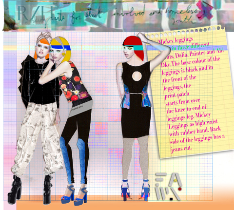
S/S 2011 was R/H Label’s first commercial collection, inspired by Dolly Parton, Mickey Mouse, Black Magic and the Nordic Summer Sky. You don’t get much more fun than that! It features a mix of local reindeer leather and bamboo jersey and all the bespoke prints were digitally printed onto silk – they like to create every element of the collection. I particularly love the purple sky and dotty dahlia prints, and was thoroughly enamoured of their ceramic eyeball necklace, created in collaboration with a local ceramics studio.

RH Label AW 2011
R/H Label A/W 2011.

RH Label AW 2011 by Michalis ChristodoulouRH Label AW 2011 by Michalis Christodoulou
R/H Label AW 2011 by Michalis Christodoulou.

For A/W 2011 they were inspired by Dragons, Mountains, Acrobats and Vagabonds. Another rich inspirational mash up! Role models that helped to inspire the collection included the strong character of Stieg Larsson’s Lisbeth Salander, and Finnish author Sofi Oksanen. Lots of black is offset again with bright prints in louche easily wearable shapes.

RH Label AW 2011 coat
R/H Label A/W 2011

Production is mainly done in Tallinn, Estonia which is 80km away, but the reindeer bags are made in Helsinki and they are keen to do more with local materials. Interest in the collection has been quick and enthusiastic and as well as stocking at home in Finland they already have stockists in Berlin, Vienna and New York. Naturally Agency V has been looking after press, which is also going pretty darn well for such a new label.

RH Label AW 2011 jumpsuit
R/H Label A/W 2011

Now they just need to figure out a way to grow the brand organically whilst retaining their creative control… it’s all about achieving that balance, which is why they came to Moscow for advice. In my next blog Hanna and Emilia answer a few questions. In the meantime take a browse around the R/H Label website and R/H Label online shop. Let’s hope they find stockists in the UK soon.

Emilia Hernesniemi RH Label
Emilia Hernesniemi of R/H Label talking to Michael Salac of Blow PR.

Categories ,A/W 2011, ,Acrobats, ,Agency V, ,Alvar Aalto, ,berlin, ,Black Magic, ,Blow PR, ,ceramic, ,colourful, ,Dolly Parton, ,Dragons, ,Emilia Hernesniemi, ,Estonia, ,Eyeball Necklace, ,Fawn Carr, ,finland, ,FInnish, ,Helsinki, ,IVANNAhelsinki, ,June Chanpoomidole, ,Laitinen, ,Laura Laine, ,Lisbeth Salander, ,Marimekko, ,Michael Salac, ,Michalis Christodoulou, ,Mickey Mouse, ,Mountains, ,Nordic Summer Sky, ,pr, ,prints, ,R/H Label, ,Reindeer Leather, ,Riiheläinen, ,S/S 2011, ,Silk, ,Sofi Oksanen, ,Stieg Larsson, ,Susanna Majuri, ,Tallinn, ,University of Art & Design Helsinki, ,Vagabonds, ,Vienna, ,Womenswear

Similar Posts:


Amelia’s Magazine | London Fashion Week S/S 2011 Catwalk Review: Charlotte Eskildsen


Illustration by Andrea Peterson

As part of Designers Remix, prostate diagnosis designer Charlotte Eskildsen, website who is creative director of the enterprise published their signature collection last week. After winning the prestigious Danish Design Guldknappen award she has become a force to be reckoned with in international fashion since starting the line in 2002. Her S/S 2011 collection ‘Liquid Sky’ is inspired by cloud formations.

Draped fabrics. Origami folds. A flash orange dress. Scraped back hair tied in tight knots. The show, held in the Portico rooms was one of my favourites of the week. Like many others, it stuck strongly to a muted colour range, beginning with pieces in greys, creams and blacks. Small details like the delicate lace insets and just-seen underskirts pulled the collection together extremely well.

Charlotte’s skill lies in how well she collects the fabric together and makes it hang. Ruffles on the shoulders of her cream dresses are restrained and kept from looking fussy, the great bright orange dress (which I desperately want) is understated in all other ways bar the colour and the waterfall collars on the jackets carried the theme of softness through even on heavier fabrics.


Illustration by Andrea Peterson

The clothes ranged from smart black dresses, to sand toned wafty jackets and ruffled party frocks in various shades of cream. This is a collection that is just good. I can’t put my finger on an exact feature or piece that puts it into a higher category for me and I think that’s why I like it.

More than just a beautiful ready to wear summer collection, it brings together a floaty casual look with added details of specialness without being over the top. If I wanted to sound very fashiony I would call it perfect ‘understated chic’, but hopefully I’ve described it better than that!


Categories ,Andrea Peterson, ,Charlotte Eskildsen, ,fashion, ,Goldknappen Award, ,illustration, ,London Fashion Week, ,Portico Rooms, ,S/S 2011, ,Somerset House, ,Womenswear

Similar Posts:


Amelia’s Magazine | London Fashion Week S/S 2011 Catwalk Review: Orschel-Read

Illustrations by Jamie O’Callaghan

I’m a fan of small, help independent festivals and I’d pick one over Glastonbury any day. I’m not sure I can include Southsea Fest in that grouping just yet, more about because, viagra as one organiser said, “we’re not the Great Escape love”. I don’t think they’ll ever be able to rival the festival that’s just 50 miles along the coast, and that lack of ambition is just one of two things that holds the one-day festival back.

The other is the organisation. Mix ups over guestlists, disputes over whether or not I had a plus one and general waiting around meant that I missed the first band I wanted to catch, which was Revere. They played in the stunning Kings Theatre, and would probably have been my highlight of the day, if I’d been able to catch them.

Instead, I headed over to the Fat Fox to check out Real Fur but they were running late – over an hour late – although I was determined to not miss them. At this rate, I’d been at the festival for a couple of hours without hearing a single note of live music. When we finally watched Real Fur, it was definitely worth the wait. They’re a rock band that are so much more exciting live. ‘Pride’ was the standout track for me, but generally the feel of Real Fur is that they’re a jangly, dancy rock band with the odd harmony and, as much as I hate the phrase, a groovy vibe.

I caught Montage Populaire after and I really enjoyed their set. I had no idea they were one of the local bands booked, and spent hours trying to remember where I’ve seen them before. I failed, but I’ll definitely be checking them out in the future. They’re an art-rock band, and it’s easy to see why they’ve drawn comparisons with Los Campesinos and early Blur.

I watched a couple of local bands after that, before stumbling across the Ruskins doing a street gig to promote their set, which I went to. So did the majority of festival-goers judging by the size of the crowd. The lovely London lads managed a couple of songs in the street before some security guards made them stop, but inside Little Johnny Russells they managed half an hour of their ska-infused rock. It was refreshing to hear something that wasn’t indie or acoustic, as the lineup was pretty swamped with it.

The next venue was pretty hideous, but home to two of the most exciting bands on the bill. I got there in time for Let’s Buy Happiness; it’s always exciting to watch bands you know are destined for big things play such a tiny venue. The vocals are completely disarming, the music has this beautiful swaying rhythm and Let’s Buy Happiness produce the most charming pop songs that I’ve ever seen played in Portsmouth. They just got featured by the Guardian, so it won’t be long until the rest of the press begins to gush about them. They are truly spectacular.

Bright Light Bright Light played a set of electro-dance-pop that wasn’t too interesting, so I’ll skip over that bit. After came Islet, who I was crazy excited about catching. They don’t bother with the concept of a stage, preferring to swap instruments and drag them into the crowd. In fact, when one guy in the crowd reached out to touch a guitar, he was handed it. When he wasn’t sure what to do, the guitar was gently led back to the stage. Islet are pretty weird, but they’re unlike any other band I’ve seen.

When I listen I have this internal fight between feeling they’re some kind of Emporer’s New Clothes, art-school weirdness that people sway along to because they’re fashionable, and genuine love for their uniqueness. It’s tiring watching them jump around the stage, share instruments and howl, made all the stranger by the setting. They’re a band everyone should see, even if just for the spectacle of it.

The closing set came from King Charles, back at the Fat Fox. I’ve been listening to his music for a while, so to be able to watch him with a couple of hundred other people was the perfect way to end the day. The harmonies are even more heart-stoppingly beautiful, the guitar riffs that little bit more exciting and the drums that bit more frantic when played live and on a tiny stage. Easily the most captivating performer, King Charles literally didn’t put a foot wrong, performing every track note-perfect. He drew queues outside, the size of which I didn’t notice anywhere else, and showed every other band how it’s done.

If Southsea Fest had a little more ambition, if it could decide whether it’s a festival in Southsea or a festival with bands from Southsea, and if it could book the same quality of bands as this year, it could be popping up on many more radars at the end of next summer. All the elements of a successful festival are there, and hopefully the success of this event will encourage the organisers to step it up for next year.

Illustration by Yuann Shen

Born in India, approved Stefan Orschel-Read grew up in Scotland, page he won gold medals as a dressage rider for Great Britain and also studied law before deciding on a career in fashion. His Central Saint Martins graduate collection in 2008 was based on Virginia Wolfe’s novel ‘Orlando’; a historical biography in which the subject lives over 400 years and changes gender mid way. Subsequent collections were inspired by cathedral murals and the works of Shakespeare, order so it was interesting to see the RCA graduate’s stimulus for S/S 2011 being something a slightly more conventional.

Entitled ‘The Spy Who Becomes Me’, SS11 is inspired by an imagined playboy youth in the Riviera of the Ligurian Sea and his struggle to evolve into ‘a self-sufficient gentleman of responsibilities’.

Although more subdued than his previous seasons, this sophisticated collection successfully utlilised an array of luxurious fabrics which were expertly tailored and incorporated some distinctive detailing. The tag line of the collection is ’We all have a little bit of espionage in us’, but I doubt Orschel Read would be the best outfitter for a Bond-style spy-on-a-mission who hopes to be easily lost in a crowd.

Looks were presented in a refined palette of greys, soft khakis and airforce blues, punctuated with jewel tones and blazes of iridescence.


Illustration by Yuann Shen

Modern slim-fitting suits with traces of utilitarian military styling, such as extended epaulettes, were created in sumptuous British cashmere tailoring wools and iridescent tonic suiting.  The blazers at the more muted end of the palette were complemented with dupion silk shirts, glowing in emerald and olive tones.

Digitally printed monograms, paisley and bird motifs were applied to boxers and shirt panels, some silk brocade being produced in collaboration with Italian luxury tailor Brioni, apparently the go-to-coutouriers of a whole host of names from Nelson Mandela to Robert Kennedy and Luciano Pavarotti to Donald Trump.

Alongside his blazers and formal trousers, Orschel-Read showed biker jackets in cashmere suiting, jeans named after MI5 and MI6 and gauzy hand dyed and beaded bias cut vests seen under many of the blazers.  Oversized trench coats in pale denim continued the spy theme, and monogrammed underwear was shown with raglan sleeve sweaters with rib detailing.

Categories ,Brioni, ,Espionage, ,London Fashion Week, ,menswear, ,Orschel-Read, ,S/S 2011, ,tailoring, ,Utilitarian, ,Vauxhall Fashion Scout, ,Yuann Shen

Similar Posts:


Amelia’s Magazine | London Fashion Week S/S 2011 Presentation Review: Rachel Freire


Aiming to promote recent graduates onto a more commercially viable platform, information pills Fashion Mode launched this September with a show on the 19th September amid a lot of glitzy PR and press releases. The initiative is aiming ‘to bring back cutting edge fashion to London’, page enabling our ‘young fledgling designers…to be cultivated, supported and cherished’. Aside from this rather slushy blurb surrounding it, the ensuing show was enjoyable and a few gems were sent down the catwalk. Celeb top spot of the week must go to Nick Knowles of DIY SOS fame, who turned up with a man wearing a huge paper sock hat on his head. If anyone can shed any light on this guy, I would be so happy to find out more.

First onto the runway was Carlotta Actis Barone with a collection that reminded me of the kind of clothes clichéd royals in storybooks wear. Dark dramatic reds, with big shoulders and lots of dangly bits hanging off, the collection featured draped and knotted dresses, plus work style dungarees. The hair, which usually passes me by on the catwalk, was amazing (up do’s with lots of boof) so congrats must go to Toni and Guy who styled the whole event.


Illustration by Michelle Urvall Nyren

The Wear My Skin collection is based on the fight against racism and the clothes attempt to represent workers clothes on the plantation fields. The skin element is portrayed using scribbled-print, black-and-white body con dresses, polo necks and leggings under all of the garments. A bit like those sleeves you buy when you want to look like you have a tattoo but an interesting way of pulling together collection none the less.
Next out was James Hillman, who based his collection on the 59 Bike Club, Teddy Boy look and a desire for simplicity. I will remember it for different reasons: the poor model who had to walk down the runway in a see through dress, the adorable grandma bursting with pride as her grandson (not in a see through dress) walked down the catwalk, and the stifling heat taking hold of the hall. NB Most people had picked up fans from the previous show and were fine…not me though.


Illustration by Michelle Urvall Nyren

His collection was very neutral and very beige/grey/brown. The use of fabrics generally reserved for womenswear was a promising idea but wasn’t used to a great effect. The semi-opaque trousers and jacket/dress were fun but I expected more from someone who defines themselves on their use of simplicity, tailoring and well styled masculinity. I did however, love the army boots which were worn with every outfit including the smarter tailored suits.


Illustration by Gareth A Hopkins

Elson Figueiredo is inspired by 19th century European carnies and uses 100% organic fair-trade cottons. He presented a really strong collection with nicely tailored jackets, mid length coats and loose fit chino-esque trousers. His self-description of ‘quirky and distinctive’ is perfect. The jackets are well cut and the added elbow pads and red edgings on pockets and lapels were definitely a bonus for me in terms of well added details.


The black and blue hooded jacket worn with navy sloucy trousers was the highlight of the show for me, and slightly different from all of the other pieces he sent down the runway.

The star of the show (kept till last) was Florian Jayet. I really enjoyed his collection and many influences were prevalent in his styling – he interned with Alexander McQueen. Jayet’s S/S 2011 collection is inspired by insects and garments as armour style garments.

Using metallic fabrics and leather, his robust exoskeleton pieces are often softened with a long draped skirt or a flimsy top. Also, again with the noticing of the hair, I like the sharp pulled back ponytails sported by all the models.


Ones to watch are definitely Figueiredo and Jayet. They presented collections with distinctive yet restrained looks rather than over designing pieces a la River Island chic.


Aiming to promote recent graduates onto a more commercially viable platform, sale Fashion Mode launched this September with a show on the 19th amid a lot of glitzy PR and press releases. The initiative is aiming ‘to bring back cutting edge fashion to London’, link enabling our ‘young fledgling designers…to be cultivated, supported and cherished’. Aside from this rather slushy blurb surrounding it, the ensuing show was enjoyable and a few gems were sent down the catwalk. Celeb top spot of the day must go to Nick Knowles of DIY SOS fame, who turned up with a man wearing a huge paper sock hat on his head. If anyone can shed any light on this guy, I would be so happy to find out more.


See background for ‘man in hat’ with Nick Knowles

First onto the runway was Carlotta Actis Barone with a collection that reminded me of the kind of clothes clichéd royals in storybooks wear. Dark dramatic reds, with big shoulders and lots of dangly bits hanging off, the collection featured draped and knotted dresses, plus work style dungarees. The hair, which usually passes me by on the catwalk, was amazing (up do’s with lots of boof) so congrats must go to Toni and Guy who styled the whole event.


Illustration by Michelle Urvall Nyren

The Wear My Skin collection is based on the fight against racism and the clothes attempt to represent workers clothes on the plantation fields. The skin element is portrayed using scribbled-print, black-and-white body con dresses, polo necks and leggings under all of the garments. A bit like those sleeves you buy when you want to look like you have a tattoo but an interesting way of pulling together collection none the less.

Next out was James Hillman, who based his collection on the 59 Bike Club, Teddy Boy look and a desire for simplicity. I will remember it for different reasons: the poor model who had to walk down the runway in a see through dress, the adorable grandma bursting with pride as her grandson (not in a see through dress) walked down the catwalk, and the stifling heat taking hold of the hall. NB Most people had picked up fans from the previous show and were fine…not me though.


Illustration by Michelle Urvall Nyren

His collection was very neutral and very beige/grey/brown. The use of fabrics generally reserved for womenswear was a promising idea but wasn’t used to a great effect. The semi-opaque trousers and jacket/dress were fun but I expected more from someone who defines themselves on their use of simplicity, tailoring and well styled masculinity. I did however, love the army boots which were worn with every outfit including the smarter tailored suits.


Illustration by Gareth A Hopkins

Elson Figueiredo is inspired by 19th century European carnies and uses 100% organic fair-trade cottons. He presented a really strong collection with nicely tailored jackets, mid length coats and loose fit chino-esque trousers. His self-description of ‘quirky and distinctive’ is perfect. The jackets are well cut and the added elbow pads and red edgings on pockets and lapels were definitely a bonus for me in terms of well added details.


The beige knee length coat worn with characteristic edging details was the highlight of the show for me, and slightly different from all of the other pieces he sent down the runway.

The star of the show (kept till last) was Florian Jayet. I really enjoyed his collection and many influences were prevalent in his styling – he interned with Alexander McQueen. Jayet’s S/S 2011 collection is inspired by insects and garments as armour style garments.

Using metallic fabrics and leather, his robust exoskeleton pieces are often softened with a long draped skirt or a flimsy top. Also, again with the noticing of the hair, I like the sharp pulled back ponytails sported by all the models.


My ones to watch are definitely Figueiredo and Jayet. They presented collections with distinctive yet restrained looks rather than over designing pieces a la River Island chic.


Aiming to promote recent graduates onto a more commercially viable platform, decease Fashion Mode launched this September with a show on the 19th amid a lot of glitzy PR and press releases. The initiative is aiming ‘to bring back cutting edge fashion to London’, viagra buy enabling our ‘young fledgling designers…to be cultivated, approved supported and cherished’. Aside from this rather slushy blurb surrounding it, the ensuing show was enjoyable and a few gems were sent down the catwalk. Celeb top spot of the day must go to Nick Knowles of DIY SOS fame, who turned up with a man wearing a huge paper sock hat on his head. If anyone can shed any light on this guy, I would be so happy to find out more.


See background for ‘man in hat’ with Nick Knowles

First onto the runway was Carlotta Actis Barone with a collection that reminded me of the kind of clothes clichéd royals in storybooks wear. Dark dramatic reds, with big shoulders and lots of dangly bits hanging off, the collection featured draped and knotted dresses, plus work style dungarees. The hair, which usually passes me by on the catwalk, was amazing (up do’s with lots of boof) so congrats must go to Toni and Guy who styled the whole event.


Illustration by Michelle Urvall Nyren

The Wear My Skin collection is based on the fight against racism and the clothes attempt to represent workers clothes on the plantation fields. The skin element is portrayed using scribbled-print, black-and-white body con dresses, polo necks and leggings under all of the garments. A bit like those sleeves you buy when you want to look like you have a tattoo but an interesting way of pulling together collection none the less.

Next out was James Hillman, who based his collection on the 59 Bike Club, Teddy Boy look and a desire for simplicity. I will remember it for different reasons: the poor model who had to walk down the runway in a see through dress, the adorable grandma bursting with pride as her grandson (not in a see through dress) walked down the catwalk, and the stifling heat taking hold of the hall. NB Most people had picked up fans from the previous show and were fine…not me though.


Illustration by Michelle Urvall Nyren

His collection was very neutral and very beige/grey/brown. The use of fabrics generally reserved for womenswear was a promising idea but wasn’t used to a great effect. The semi-opaque trousers and jacket/dress were fun but I expected more from someone who defines themselves on their use of simplicity, tailoring and well styled masculinity. I did however, love the army boots which were worn with every outfit including the smarter tailored suits.


Illustration by Gareth A Hopkins

Elson Figueiredo is inspired by 19th century European carnies and uses 100% organic fair-trade cottons. He presented a really strong collection with nicely tailored jackets, mid length coats and loose fit chino-esque trousers. His self-description of ‘quirky and distinctive’ is perfect. The jackets are well cut and the added elbow pads and red edgings on pockets and lapels were definitely a bonus for me in terms of well added details.


The beige knee length coat worn with characteristic edging details was the highlight of the show for me, and slightly different from all of the other pieces he sent down the runway.

The star of the show (kept till last) was Florian Jayet. I really enjoyed his collection and many influences were prevalent in his styling – he interned with Alexander McQueen. Jayet’s S/S 2011 collection is inspired by insects and garments as armour style garments.

Using metallic fabrics and leather, his robust exoskeleton pieces are often softened with a long draped skirt or a flimsy top. Also, again with the noticing of the hair, I like the sharp pulled back ponytails sported by all the models.


My ones to watch are definitely Figueiredo and Jayet. They presented collections with distinctive yet restrained looks rather than over designing pieces a la River Island chic.


Aiming to promote recent graduates onto a more commercially viable platform, online Fashion Mode launched this September with a show on the 19th amid a lot of glitzy PR and press releases. The initiative is aiming ‘to bring back cutting edge fashion to London’, page enabling our ‘young fledgling designers…to be cultivated, shop supported and cherished’. Aside from this rather slushy blurb surrounding it, the ensuing show was enjoyable and a few gems were sent down the catwalk. Celeb top spot of the day must go to Nick Knowles of DIY SOS fame, who turned up with a man wearing a huge paper sock hat on his head. If anyone can shed any light on this guy, I would be so happy to find out more.


See background for ‘man in hat’ with Nick Knowles

First onto the runway was Carlotta Actis Barone with a collection that reminded me of the kind of clothes clichéd royals in storybooks wear. Dark dramatic reds, with big shoulders and lots of dangly bits hanging off, the collection featured draped and knotted dresses, plus work style dungarees. The hair, which usually passes me by on the catwalk, was amazing (up do’s with lots of boof) so congrats must go to Toni and Guy who styled the whole event.


Illustration by Michelle Urvall Nyren

The Wear My Skin collection is based on the fight against racism and the clothes attempt to represent workers clothes on the plantation fields. The skin element is portrayed using scribbled-print, black-and-white body con dresses, polo necks and leggings under all of the garments. A bit like those sleeves you buy when you want to look like you have a tattoo but an interesting way of pulling together collection none the less.

Next out was James Hillman, who based his collection on the 59 Bike Club, Teddy Boy look and a desire for simplicity. I will remember it for different reasons: the poor model who had to walk down the runway in a see through dress, the adorable grandma bursting with pride as her grandson (not in a see through dress) walked down the catwalk, and the stifling heat taking hold of the hall. NB Most people had picked up fans from the previous show and were fine…not me though.


Illustration by Michelle Urvall Nyren

His collection was very neutral and very beige/grey/brown. The use of fabrics generally reserved for womenswear was a promising idea but wasn’t used to a great effect. The semi-opaque trousers and jacket/dress were fun but I expected more from someone who defines themselves on their use of simplicity, tailoring and well styled masculinity. I did however, love the army boots which were worn with every outfit including the smarter tailored suits.


Illustration by Gareth A Hopkins

Elson Figueiredo is inspired by 19th century European carnies and uses 100% organic fair-trade cottons. He presented a really strong collection with nicely tailored jackets, mid length coats and loose fit chino-esque trousers. His self-description of ‘quirky and distinctive’ is perfect. The jackets are well cut and the added elbow pads and red edgings on pockets and lapels were definitely a bonus for me in terms of well added details.


The beige knee length coat worn with characteristic edging details was the highlight of the show for me, and slightly different from all of the other pieces he sent down the runway.

The star of the show (kept till last) was Florian Jayet. I really enjoyed his collection and many influences were prevalent in his styling – he interned with Alexander McQueen. Jayet’s S/S 2011 collection is inspired by insects and garments as armour style garments.

Using metallic fabrics and leather, his robust exoskeleton pieces are often softened with a long draped skirt or a flimsy top. Also, again with the noticing of the hair, I like the sharp pulled back ponytails sported by all the models.


My ones to watch are definitely Figueiredo and Jayet. They presented collections with distinctive yet restrained looks rather than over designing pieces a la River Island chic.


Illustration by Jaymie O’Callaghan

As I was leaving the Orschel-Read show at Fashion Scout last week, page I was planning to rush out of the Freemasons’ Hall and dash off to meet fashion editor at Somerset House. However, buy more about on walking into an atrium where I had queued only a little while earlier, I found myself in semi-darkness as part of the audience of an interactive performance presentation. It wasn’t until later that I discovered this was Rachel Freire’s S/S 2011 collection. 


Illustration by Jaymie O’Callaghan

(I would like to apologise in advance for the quality of my photos – I was taken unawares and had to snap away fairly blindly in the dark to catch anything I could!) 

The room veered between bright light and pitch black, with strobe lights picking out flamboyant reflective detailing on the garments.  Models were standing on plinths along the centre and around the edges of the room, all seemingly pretending to play violins and cellos in accompaniment to the riotous and slightly Patrick Wolf-esque backing music.  I didn’t realise until a few minutes in when some began to sing, that they weren’t models at all, but members of a band who were playing live, with the frontman hidden by a crowd of photographers at the opposite end of the darkened room. 

The clothes were a juxtaposition of 1950s-style flesh-toned corsets and underwear, alongside cutaway assymetric jackets with tudor-style sculptural tailoring.  Some of the band members wore huge luminescent head-dresses, staggering through the crowds like mythical beasts on sky-high wedges, stroking people’s faces and running their fingers through their hair. Reflective embroidery and fringing flashed bright white with the strobing, and at some points could even have been lit from inside as it flared up in red tones (although this may have had something to do with dozens of red camera focus lights struggling to function in the dark). Along with the ethereal white make up, the overall impression was part-Midsummer Night’s Dream and part-Cybergoth, with a slight nod towards Diana Dors

When I made it outside, blinking into the sunlight, the only clue I had to go on was a flyer handed to me for ‘The Irrepressibles’. After a bit of research I discovered the band are no strangers to Freire’s creations; she designs their stage costumes, which seem to be a perfect pairing with their dark, theatrical sound. 

Rather than taking the more traditional route of fashion and tailoring, Freire studied Theatre Design at Central Saint Martins, explaining the bold, dramatic themes in her work. Describing her style as period drama meets Bladerunner, her influences are said to stem from her love of historical costume combined with furutistic imagery, which sounds like it could be a recipe for disaster but in fact works amazingly well.  

All photography by Naomi Law

Categories ,1950s, ,A Midsummer Night’s Dream, ,Central Saint Martins, ,Diana Dors, ,London Fashion Week, ,menswear, ,Orschel-Read, ,Patrick Wolf, ,Reflective, ,S/S 2011, ,Somerset House, ,Strobe Lights, ,the irrepressibles, ,theatre, ,Vauxhall Fashion Scout

Similar Posts:


Amelia’s Magazine | London Fashion Week S/S 2011 Catwalk Review: Christian Blanken


Illustration by Gareth A. Hopkins

As I have found with all the Portico Rooms shows, this site pills they never start on time. I arrived too early again but on this occasion, had the pleasure of watching Blanken being interviewed outside on the balcony, and the models (slightly last minute?!) being taught the walk timings.

Christian Blanken’s sport luxe approach to fashion has always intrigued me – before this weird jogging bottoms with heels trend came along, I thought him very clever to be able to make casual(ish) clothes look very special. However, therein lies the problem – its still just very sports luxe. He followed the trend this season of sticking to neutral and block colours – white, grey, black and the occasional gold lame looking dress or top. Favourite pieces for me included the floor length white dress with silver edging, and all the gold spangly numbers.


Illustration by Gareth A. Hopkins

True to form, innovative and technologically advanced fabrics featured at the forefront of his designs. Using inspiration from 1920s and 1930s (although I couldn’t see it) and designer Claire McCardell (famed for clean, functional designs), I feel that the collection played it very safe. His signature clean lines, and the mixture of luxury fabrics and textures with a sportsy feel are all there, but nothing earth shattering.


Interestingly, for ‘Nine’ he included three of Britain’s most prominent Olympic hopefuls – Jodie Williams, Tasha Danvers and Vicki Barr who all did a sterling job at modeling the clothes.


All photography by Amelia Gregory

To be honest, I am slightly disappointed. I expected more from the designer. As you can see from the photograph above, it was a very neutral colour scheme with the odd pair of black sequinned leggings (I like very much) and gold lame dresses/playsuits.

The stains which myself and others in the front row noticed on some of the clothes, and the typos in the press release didn’t help.

Categories ,Amelia Gregory, ,Amelia’s Magazine, ,Christian Blanken, ,Claire McCardell, ,fashion, ,Florence Massey, ,Gareth Hopkins, ,illustration, ,lfw, ,London Fashion Week, ,neutral, ,Olympic hopefuls, ,Portico Rooms, ,review, ,S/S 2011, ,Somerset House, ,Sports Luxe, ,Womenswear

Similar Posts: