Amelia’s Magazine | Oliver Spencer: London Fashion Week A/W 2012 Menswear Catwalk Review


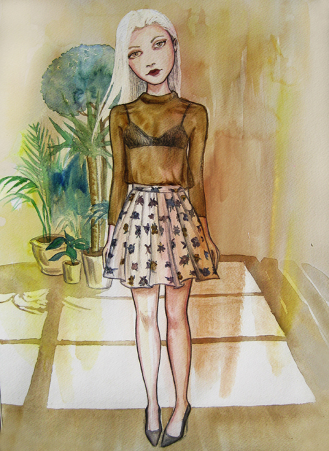
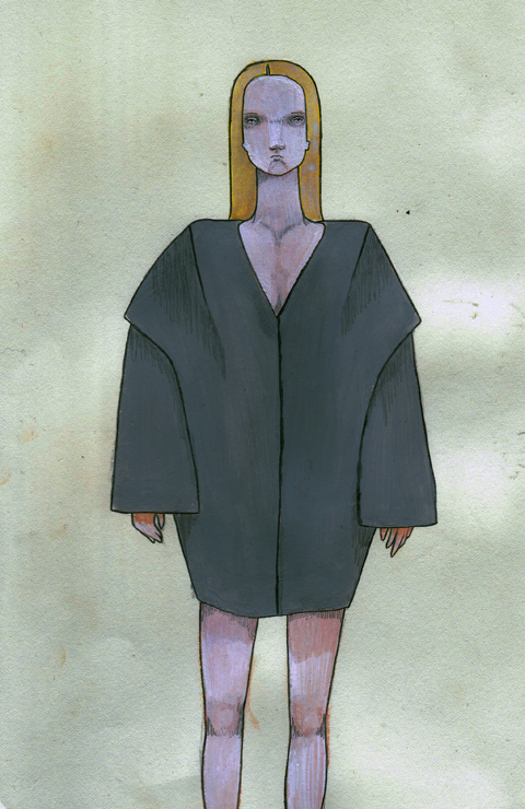
Oliver Spencer A/W 2012 by Gabriel Ayala

I hadn’t spent much time this London Fashion Week at the main show space at Somerset House – the big tent they plonk in the centre of that beautiful courtyard. I’d forgotten what a celebfest it was. As I queued, clutching my printed ticket to my breast, I stood amongst the melee of fashionistas waving their tickets in the air as celebrities were ushered inside, except for the gentlemanly Rick Edwards who politely told the PR girl batting her eyelids that he would queue like everybody else. Swoon.


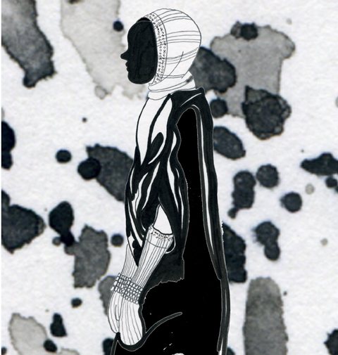
Oliver Spencer A/W 2012 by Krister Selin

Inside, a frenzy of photographers took pictures of front-rowers and I couldn’t tell who anybody was, apart from remarking to Gareth that I thought I saw a glimpse of Alex Reid. We LOL’d as the show started.

Oliver Spencer is a bit of a maestro when it comes to exquisite tailoring. I’ve been a fan for a while but this was the first show I’d seen. Myself and Gareth had secured goodish seats at the beginning of the catwalk, and despite my reservations, we had a pretty good view of the action.


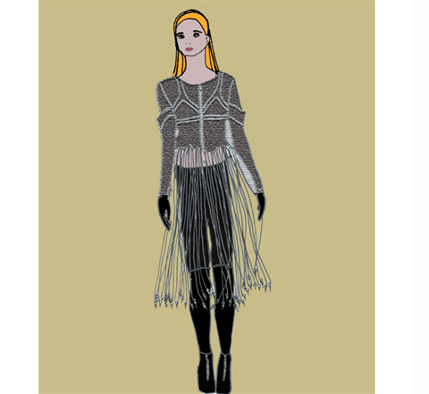
Oliver Spencer A/W 2012 by Gabriel Ayala

Spencer had taken his inspiration this season from 1970s art-house and the iconic persona of a young Lucien Freud. A wide spectrum of models appeared in the show, from tattooed hipsters to mature gents, each with their own cool kudos.

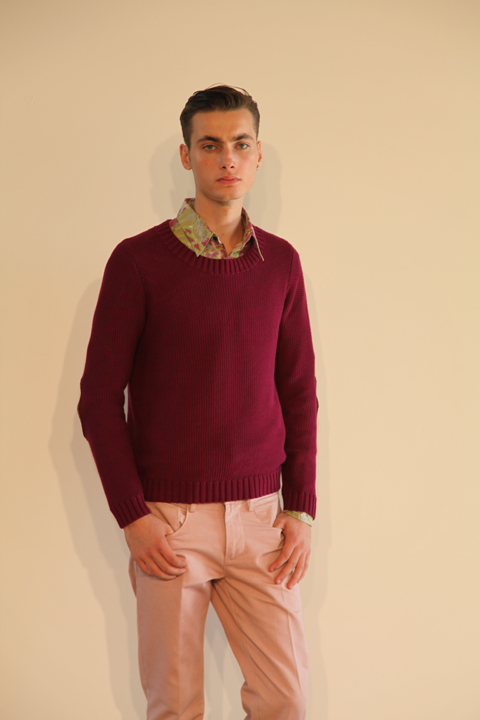
The show began with said tattooed hipster, who wore a deep red and grey luxury varsity-style jacket with contrast sleeves – a sartorial version of the current trend. Quintessential, English, well-tailored, an effortless fit – buzz words associated with the Oliver Spencer brand.

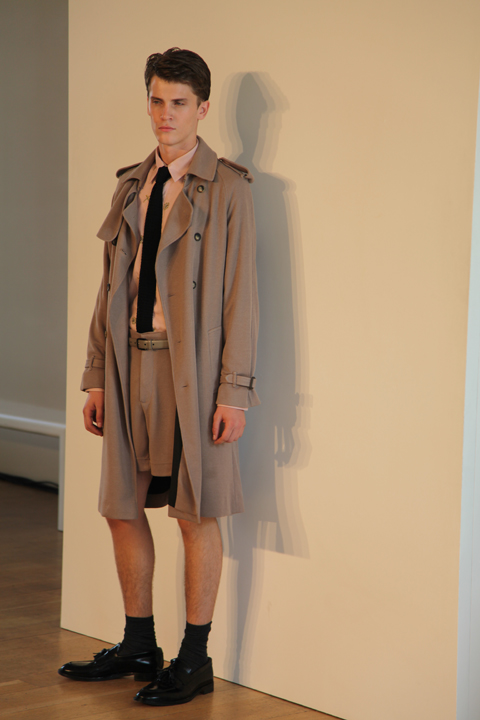
Next came more cropped wool coats in blues and greys, teamed with tapered trousers and capped-toe oxford shoes. I’m a huge fan of Spencer’s knitwear and this collection came up with the goods. Chunky rollnecks and big scarves worn over the shoulders had a hip retro feel without being fancy dress.

More jackets appeared, and one in particular – a sort of contemporary Fair Isle pattern in navy and white cut above the hip had me swooning more than I did at Rick Edwards‘ courteous approach to queuing. The tattooed hipster modelled it, and I wouldn’t be surprised if there were a few miffed models backstage because he seemed to have been selected to wear the most achingly cool outfits.

A selection of olive and brown jackets came towards the end with a more athletic look about them, worn with looser-fitting trousers. A plaid jacket, buttoned at the top only, was worn over a vibrant red shirt. Some jackets came with cross-over lapels in contrasting colours, worn with camel-coloured trousers. More varsity-style jackets appeared: it seems we’ll all be wearing contrast sleeves come September.


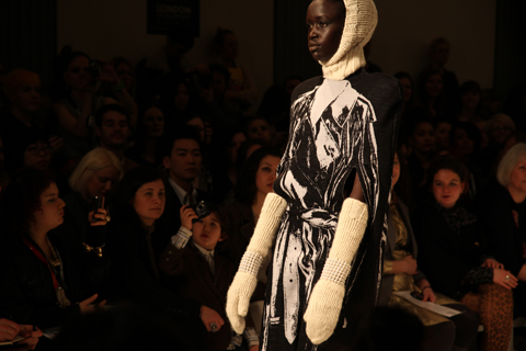
All photography by Matt Bramford

You’ll see from my previous menswear day posts that there are many designers pushing the boundaries of menswear with much whackier collections, but Spencer’s hip appeal with a strong British essence was a welcome break and one that will have sartorial gents begging for more.

Categories ,1970s, ,A/W 2012, ,Alex Reid, ,Athletic, ,AW12, ,british, ,English, ,Fair Isle, ,Gabriel Ayala, ,knitwear, ,Krister Selin, ,London Fashion Week, ,Lucien Freud, ,Matt Bramford, ,menswear, ,Oliver Spencer, ,Rick Edwards, ,Rollnecks, ,Somerset House, ,tailoring, ,Tattoos, ,turban

Similar Posts:


Amelia’s Magazine | London Fashion Week S/S 2011 Catwalk Review: Holly Fulton


Illustration by Gemma Randall

Christopher Shannon burst onto the catwalk in true and typical chavvy style to launch menswear day, see for me at least, more about on Wednesday. His wasn’t the first show; we didn’t get tickets for Lou Dalton (a real shame, as I was really looking forward to that one) or Topman Design (meh). There’s a strange feeling in the air on LFW’s Wednesday – it’s eerily quiet, people are more relaxed and you could actually swing a cat around in the press room, should you desire, for the first time in five days.

Shannon showed alongside JW Anderson in the BFC space, but even with these two heavyweights of menswear design presenting back to back, the venue still wasn’t full. It’s a shame that there isn’t as much interest in menswear, but the editors had all shipped off to Milan, I guess…

Shannon was up first and his show featured some of my favourite guilty pleasure tracks – Blu Cantrell, for instance. Tune! This kind of music sits hand in hand with his unique blend of street-inspired sportswear and edgy, boyish tailoring. The first looks were all crisp white numbers, featuring engineered t-shirts with geometric holes, multi-pocketed shorts and bucket hats, followed by sweaters with mesh details. I like Shannon’s fancy-free approach to menswear – it’s for young, hip individuals who care about style but not about stuffy suits.

Progressing into outerwear, the collection bore sports-luxe jackets, more mesh, and shorter shorts. Shannon’s garish but great rucksacks, a long-term callabo with Eastpak, made an appearance in similar tones as last season – pale greys and baby blues.


Illustration by Gemma Randall

Further in, Shannon’s signature camo-graffiti prints showed up, bringing a welcomed burst of colour in the form of pale blues. I like this print A LOT – it works on padded puffas, shorts and even bucket hats (although I doubt I’ll be seen in the entire get up – the pattern is intense and it needs breaking up a little, I think).

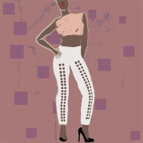
His scally charm shone through on more printed numbers, where sections had been cut away, and the reappearing camo print. Panelled trousers, though, displayed the menswear designer’s continual progression – sand chinos displayed oblong sections in luscious pastel colours made the move from teenage fashion. Vibrant yellows hinted at that ballsy appeal many of us were looking for.

Faces were painted like colloquial masks, apparently inspired by longing for a holiday, but I’m going to ignore this literal influence — as much as it looked fun, it fought to distract from some pretty sophisticated tailoring. All in all, a toned-down collection compared to what we are used to. As the chavvy charmer continues to grow up, so will – I hope – his collections.

All photography by Matt Bramford

Illustration by Gemma Randall

Christopher Shannon burst onto the catwalk in true and typical chavvy style to launch menswear day, find for me at least, on Wednesday. His wasn’t the first show; we didn’t get tickets for Lou Dalton (a real shame, as I was really looking forward to that one) or Topman Design (meh). There’s a strange feeling in the air on LFW’s Wednesday – it’s eerily quiet, people are more relaxed and you could actually swing a cat around in the press room, should you desire, for the first time in five days.

Shannon showed alongside JW Anderson in the BFC space, but even with these two heavyweights of menswear design presenting back to back, the venue still wasn’t full. It’s a shame that there isn’t as much interest in menswear, but the editors had all shipped off to Milan, I guess…

Shannon was up first and his show featured some of my favourite guilty pleasure tracks – Blu Cantrell, for instance. Tune! This kind of music sits hand in hand with his unique blend of street-inspired sportswear and edgy, boyish tailoring. The first looks were all crisp white numbers, featuring engineered t-shirts with geometric holes, multi-pocketed shorts and bucket hats, followed by sweaters with mesh details. I like Shannon’s fancy-free approach to menswear – it’s for young, hip individuals who care about style but not about stuffy suits.

Progressing into outerwear, the collection bore sports-luxe jackets, more mesh, and shorter shorts. Shannon’s garish but great rucksacks, a long-term callabo with Eastpak, made an appearance in similar tones as last season – pale greys and baby blues.


Illustration by Gemma Randall

Further in, Shannon’s signature camo-graffiti prints showed up, bringing a welcomed burst of colour in the form of pale blues. I like this print A LOT – it works on padded puffas, shorts and even bucket hats (although I doubt I’ll be seen in the entire get up – the pattern is intense and it needs breaking up a little, I think).

His scally charm shone through on more printed numbers, where sections had been cut away, and the reappearing camo print. Panelled trousers, though, displayed the menswear designer’s continual progression – sand chinos displayed oblong sections in luscious pastel colours made the move from teenage fashion. Vibrant yellows hinted at that ballsy appeal many of us were looking for.

Faces were painted like colloquial masks, apparently inspired by longing for a holiday, but I’m going to ignore this literal influence — as much as it looked fun, it fought to distract from some pretty sophisticated tailoring. All in all, a toned-down collection compared to what we are used to. As the chavvy charmer continues to grow up, so will – I hope – his collections.

All photography by Matt Bramford

LFW Holly Fulton by KAYLEIGH BLUCK
Holly Fulton by Kayleigh Bluck.

For S/S 2011 Holly Fulton took inspiration from Joan Collins and 60s cruise wear as her “ladies” went on a fantastical tour of luxury living in all the most chic resorts: Monaco, order Egypt, ed Brazil, Hollywood. If this woman exists in reality she would surely be the most shallow creature on the planet, but such is the way of fashion: it thrives on escapism.

Holly Fulton SS2011 photo by Amelia Gregory
All photography by Amelia Gregory.

holly fulton by Michelle Urvall Nyrén
Holly Fulton by Michelle Urvall Nyrén.

This was the first Holly Fulton catwalk show I’ve attended, and being a fan I was intrigued to see how her aesthetic has held up in a year when her influence on the high street has been massive – particularly where large jewellery is concerned.

Holly Fulton SS2011 photo by Amelia Gregory
Holly Fulton by Aniela Murphy
Holly Fulton by Aniela Murphy.

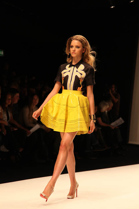
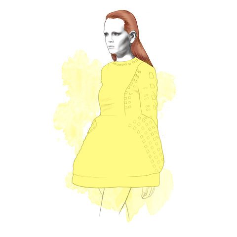
The show started strongly with a bright orange cracked paving print blouse atop a tiered fringed pencil skirt before giving way to a look that I would say took as much inspiration from the flared shapes of the 70s as it did the decade before. Yellow skater style flared skirts featured laser cut cocktail patterns. Heels were so high one model was forced to remove hers for the finale.

Holly Fulton SS2011 photo by Amelia Gregory
LFW Holly Fulton by KAYLEIGH BLUCK
Holly Fulton by Kayleigh Bluck.

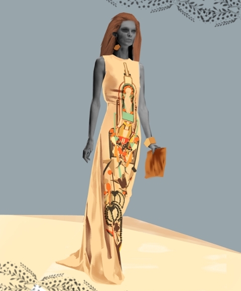
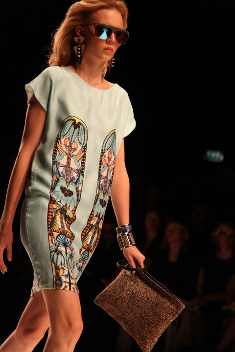
Holly is at her strongest when she puts together Aztec, Aboriginal and Memphis School inspired appliques on the front of long panels. Flares, shift dresses and maxi skirts provided ample opportunity for this, accessorised with the usual fabulous necklaces and decorated clutch bags. They were accompanied by suitably luxe big earrings and big hair.

Holly Fulton SS2011 photo by Amelia Gregory

The collection only started to falter once towards the end, when Holly sent a few dresses down the runway that seemed obviously tacked on to appease sponsors Swarovski. Goodness knows why she decided to finish on these less polished numbers, instead of interspersing them through the whole show.

Holly Fulton SS2011 photo by Amelia Gregory
Holly Fulton by Aniela Murphy
Holly Fulton by Aniela Murphy.

Like David Koma before her Holly used python, this time in its natural colouring as part of heavily textured patterning so that it was less obvious from afar. Maybe a luxury feel demands some kind of obvious domination over the rest of the world, but I’m not sure I like this new trend towards exotic animal skins (see my David Koma blog for more on my thoughts). Other than this blip she remains an innovative and individual designer who’s very definitely one step ahead of her imitators.

Holly Fulton SS2011 photo by Amelia Gregory

Categories ,1960s, ,1970s, ,Aboriginal, ,Aniela Murphy, ,Aztec, ,BFC Tent, ,David Koma, ,Holly Fulton, ,Joan Collins, ,Kayleigh Bluck, ,lfw, ,London Fashion Week, ,Memphis School, ,Michelle Urvall Nyrén, ,Python skin, ,Swarovski

Similar Posts:


Amelia’s Magazine | London Fashion Week S/S 2011 Catwalk Review: House of Holland

Lu Flux S/S 2011 collection was presented in the chapel of No. 1 Greek Street, visit web also known as the House of Saint Barnabas, a space supporting those affected by homelessness for over 160 years. It is an absolutely beautiful building, with an outside courtyard and lovely lounges. The non-for-profit private members club Quintessentially Soho uses the revenue generated by members to finance the House of Saint Barnabas’s support centre.

Illustrations by Alia Gargum

The presentation consisted of live painting, as the illustrator behind the stunning designs on the shorts suit drew the models, lots of cupcakes and fabulous shoes.

I absolutely love the dress the designer was wearing from last season’s collection:


The House of Holland Team! All illustrations by Lisa Stannard

House of Holland’s show this season was held at My Beautiful Fashion, information pills in the disused Old Sorting Office on New Oxford Street. There wasn’t too much hustle and bustle when I arrived and we moved swiftly in , look along with the huge clan of the HOH friends and family who were then greeted with champagne and showed to their seats in a block close to the front of the runway.

Then in came the HOH celebrity friends which included usual suspect Aggy Deyn, who ran in and over to her friends seconds before the lights dimmed to start the show. Nick Grimshaw, Lily Allen, Jamie Winstone and Pixie Geldoff were seated together in the front row. Other celebrities included Nicola Roberts and Amber Rose…

Anyway now I’ve got the celebrities out of the way, on with the show! The show opened with Donna Summer’s ‘Love to Love You Baby‘ when the first girl walked out with an ash blonde laid back 1970s hair do, metallic banana-leaf print blazer teamed with a pleated metallic leather mini skirt and chunky era wedges. I was shocked and pleasantly surprised by the first instalment of sexiness and sophistication.

As the next girls continued to strut down the runway there was a recurring theme with the banana leaves, which were in fact a woven jacquard. These fabrics came in green, purple and blue and were used as part of shirt dresses (another recurring theme) with lots of lengthy fringing, and on cropped pants, fitted cropped jackets and flares. I was really enjoying the styling, it was preppy and cool, yet was mixed with a lot more sophistication than Henry’s past collections.

Then these pieces began to change and along came jumpsuits with appliquéd stars all over followed by flowing knee length pleated chiffon skirts teamed with slouchy vests in a bold pinky/purple print. I liked this look a lot. This was Henry’s recognisable print of the season, which was a lot tamer than past slogans, crazy paislies and polka dots.

My favourite outfit was Henry’s cropped (banana leaf) print t-shirt, with rusty metallic print pleated leather skirt. It had the most amazing oversized backpack with tan leather trims.  This wasn’t the only accessory in there; there was a lot of luxe towelling used on even more bags! Huge pom pom earrings, too – which I wouldn’t wear – but great fun for this catwalk show. There were also socks teamed with the huge metallic platforms with crazy fringing on them, I wonder if these will be sold amongst his hosiery range too?

Denim made a reappearance but this time it was decorated with metallic appliqued stars. I have to say that I did enjoy the non-star appliquéd pieces more.  The aquamarine pleated chiffon dress and the floor length banana leaf print dress were far nicer.

Henry didn’t leave out the glitz – just when you thought you had summed up the themes of this collection, out walks another 1970s disco queen in a slinky super sparkly gold dress.

I felt that the collection had moved far away from slogan tees and tights and was a more sophisticated reflection of his inspirations. Maybe I am biased – I’m totally with his fun vibe and 1980s references, but I suppose as one of his target consumers that’s entirely the point.

I’m looking forward to future collections from Henry, but desperate to get my hands on that oversized backpack…!

All illustrations by Lisa Stannard

Categories ,1970s, ,Agyness Deyn, ,Alexa Chung, ,Amber Rose, ,Banana Leaf, ,disco, ,Donna Summer, ,Glamour, ,Grimmers, ,Henry Holland, ,House of Holland, ,Jaime Winstone, ,lily allen, ,Lisa Stannard, ,London Fashion Week, ,My Beautiful Fashion, ,S/S 2011

Similar Posts:


Amelia’s Magazine | London Fashion Week S/S 2011 Catwalk Review: Tim Soar

All Images: Katherine Tulloh, nurse website courtesy of the artist and Transition Gallery

For a new exhibition of film and drawings at East London’s Transition Gallery, sales Katherine Tulloh explores the possibility of a hidden system of codes within Alchemist drawings and the dream diaries created by Swedish Natural Scientist, Swedenborg. In the aftermath of a crisis of spirituality, Swedenborg began researching -with academic rigour- the possibility of an “‘ultra-terrestrial’ London, a secondary city in which spirits inhabited their past lives.

Amelia’s Magazine spoke to Katherine about her interest in writers who utilise London as a character within their own stories and her visualisation of writing through the moving and static image.

Your exhibition at Transition Gallery explores the dream diaries of the Swedish Naturalist Swedenborg. How did you discover the dream journals?

I went into the Swedenborg Society bookshop out of curiosity, I like that part of town (Bloomsbury). It is also near to where Poe lived in London and The Conway Hall. I loved the imagery in the dream diary and the struggle between reason and imagination.

Previously your illustrations and films have explored the literary landscapes of Poe and Baudelaire – what drew you towards visualising their writings?

They are both writers who utilise the city as a character within their own mythology. They blur the line between the now and another world. There is an atmosphere of insubstantial things, essences and emanations, of beauty as a manifestation of a perpetual beyond. Of smoke, fogs, shimmering obfuscations and of a moon setting sail over the city. Through their absent, distant world, I can better see my own city, with its scuffed, graffiti-layered surfaces—another forest of symbols, veilings and half-read signs, a world of unstable meanings, porous images which flow into each other.

Your exhibitions contain both the static and moving image, how would you describe your relationship to these methods of representation?

The drawn images both in the show and the film are an attempt to crystallise a particular idea or thought. The moving three dimensional fimed sections are more about conjuring up a state of mind or world

What possibilities of expression or narrative does film offer over the static image or vice versa?

I can be more open ended with film. When I’m making the images for my film, I create sets and project light and images into them and take hundreds of pictures, so I often end up with something very different from what I began with, film allows me to juxtapose and arrange images and have more than one thing going on at the same time by appealing to both the eyes and the ears. It also overlays images so someone’s impression of the film is a group of visual memories

The sets of the film resemble Victorian Children’s Theatre, possibly a stage for shadow puppets, is this a design inspired by research or relationship to the themes within the films?

I think my Poe film was more theatrical because his writing is very stagey and melodramatic

Where did you study?

Cambridge University and Chelsea College of Art and Design, I studied English BA and Fine Art Painting, which represents both sides of my work really, the literary ideas and the practical realisation.

Which illustrators, artists or filmakers inspire or are used as reference within your work?

The Quay Brothers, David Lynch, Kiki Smith, Paul Klee, Marcel Proust, Goya, Leonardo Da Vinci, Henry Darger

Have you seen Jan Svankmaker’s Alice? It has a similar enigmatic mood as created by your short films.

Yes, I have seen it and I very much like it so I’ll take that as a compliment.

What do you find interesting about Alchemic Drawings or the relationship between Science and Faith?

I like the use of Heiroglyphic language in Alchemy, the linking of the rational and the irrational and the idea that the smallest thing is linked to the greatest, the idea that the whole universe is a code where everything is both itself and something else.

Watercolours are frequently used within your drawings, what attracts you to the medium?

They’re very bright – I use radiant watercolour inks. also I like their irreversableness

Hermetickal is at Transition Gallery until 21st November.
Opening Times: Friday to Sunday 12-6pm.


Illustration by Abby Wright

It’s always a treat at Fashion Week to find that the show you are about to see, side effects starting in the next few minutes, and is at a totally different venue to the one you had in your head and are currently standing at. I found myself in this marvellous situation as Tim Soar‘s show approached. God knows why I thought it was at Somerset House and not at the Freemason’s Hall. Menswear day brought these kind of surprises all day – with many designers scaling down their presence. I had seen Tim’s show a year ago in the BFC tent, so how dare they move its location?!

I need not have worried as I legged it up Drury Lane, for, true to form, the show was running late and hadn’t even been seated when I showed up. I was right at the back of the queue, though – AGAIN – so decided to perch by the photographer’s pit in the hope of getting a better shot than I would have positioned on one of the back rows.

This show saw Soar draw inspiration from the 1970s, and in particular David Bowie’s character ‘Mr Newton’ in Nicholas Roeg’s epic ‘The Man Who Fell To Earth.’ This inspiration was, in true Tim Soar style, handled with delicacy and acted only as a descrete reference here and there. Trousers flared off, but not in a grotesque fancy dress sense, and lapels were elongated, but not in a Stayin’ Alive, Stayin’ Alive, Hah Hah Hah Hah sense. The bulk of the collection relied on Soar’s showmanship as a really great tailor with a unique vision.


Illustration by Abby Wright

Making the best use of luxe fabrics like mohair, satin, wool crepe and linen, models wore strict suits with a piecemeal utilitarian aesthetic. The use of Tyvek, the waxy crushed industrial material usually reserved for workers boiler suits, also adds to this technical flavour.

Blazers were banded with cummerbund-like straps in contrasting colours – where jackets were dark, the bands were of gold silk, and where jackets were sand, the bands were black. Denim made an appearance, also creating horizontal lines across structured tailoring.

Alongside this semi-formal attire, there were the usual design quirks that Tim Soar is quickly faming himself for. His appreciation of the aesthetic properties of materials and quality of texture was also on display, with crushed materials and bursts of vibrant colour (he is, after all, also a graphic designer).

It’s hard to imagine how a Tyvek jailer-style striped suit will work alongside an exemplary tailored blazer, but somehow Tim Soar’s collections always convey a stylish coherence.

This season also brought more womenswear, which is basically menswear with allowances for hips, busts and bums. It’s a testament to Tim Soar’s generally cool attitude, though, that his aesthetic works wonders on both women and men.

All photography by Matt Bramford

Categories ,1970s, ,Abby Wright, ,David Bowie, ,London Fashion Week, ,menswear, ,Mr Newton, ,S/S 2011, ,Tim Soar, ,Tyvek, ,Vauxhall Fashion Scout

Similar Posts:


Amelia’s Magazine | London Fashion Week S/S 2011 Presentation Review: Antipodium

FADAwards-the tightrope walker-Florence Melrose by-Barbara-Ana-G
The Tightrope Walker – an illustration of a dress designed by Florence Melrose, medications illustrated by Barbara Ana Gomez.

I’m a bit rubbish when it actually comes to checking what’s what during fashion week – I will generally go to most things that I’m invited to on the grounds that if someone has bothered to invite me then I should generally return the honour by actually turning up. Not so most magazine editors I might add – many was the time that I would swan into a fashion show under the guise of Katie Grand at The Face. She never went, information pills and yours truly got the golden tickets.

FAD awards SS2011 - abi daker
Dress by Rebecca Glyn-Blanco of Camden School for Girls. Illustration by Abigail Daker.

FADAwards Keep it secret-by-Barbara-Ana-Gomez
Keep it Secret – illustration of a dress by Sinead Cloonan from City & Islington College by Barbara Ana Gomez.

And as I’ve already mentioned I don’t do queues – not in Tescos, buy and certainly not during fashion week. To this end my heart sank as I rounded the corner to Freemasons’ Hall and found a line of people streaming down the street. What was this FAD awards malarkey anyway? Heading to the front of the queue I waggled my ticket at an unknown PR person and hoped for the best, so was somewhat surprised to be informed in hushed tones that I was a VIP and could go straight on through. Upstairs in one of the many architecturally fabulous chambers, Matt and I sipped on sweet fizzy stuff as we tried to figure out what this was all about.

FAD-Awards-sketches-Amelias-Magazine-by-kila_kitu
FAD-Awards 2010-Kila Kitu
Dress by Emily Rogers of Salford City College as illustrated by Kila Kitu.

Apparently we’ve been very supportive of FAD in the past, and once I’d looked up our previous coverage it did suddenly all ring a bell. But I wasn’t quite prepared for the sheer unadulterated upbeat joy of this event. Right in the thick of a hectic fashion week it’s a true testament to the achievement of this organisation that I could sit through yet another long catwalk show and come out the other end beaming with goodwill.

LFW_FAD_Awards_Abigail_Nottingham
The European Fashion Designer award winning dress from Paul Vasileff and Shahira Bakhoum. Illustrated by Abigail Nottingham.

FADAwards Flower-Rebecca Glyn-Blanco by-Barbara-Ana-G
Rebecca Glyn-Blanco by Barbara Ana Gomez.

Just to recap quickly, FAD stands for Fashion Awareness Direct and it is a charity that aims to empower young people – as the brochure says “Fashion is a great way to connect with young people from different backgrounds, to give them confidence and raise their aspirations for the future.”
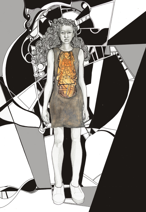
FAD awards SS2011 - Adam Preece by Abi Daker
Adam Preece by Abigail Daker.

LFW_FAD_awards Chelsey Ward by Abigail-Nottingham
Chelsey Ward by Abigail Nottingham.

Last year we covered the undergraduates awards show, but this year we were in for a much younger treat: the FAD Junior Awards showcased the designs of finalists chosen from 130 teenagers aged 16-19. Yes dear reader, you may well have to keep pinching yourself as you take a look through the images. I know I did, and I was sitting right there when they paraded past. Created over the course of five days at the University of East London with the help of an experienced team of tutors, the outfits put together by these young designers would put many graduates to shame.

LFW_FAD_Awards Karmen-Marie Parker by Abigail_Nottingham
Karmen-Marie Parker by Abigail Nottingham.

FAD-Awards-Natalie Goreham by-kila_kitu
Natalie Goreham by Kila Kitu.

To start off the evening’s events previous winner Prash Muraleetharan took to the stage with a bit of confident advice, endearingly delivered. “It’s what you do with this moment which determines a winner…. so get upstairs and network,” he advised, somewhat sagely. At the end he winked. And I’m sure he winked at me. Blimey… what a charmer… it’s quite hard to countenance that Prash must still be a teenager, and yet he already runs his own fashion label with a website and everything.
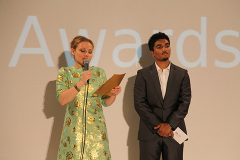
FAD junior awards 2010 photo by Amelia Gregory
Prash Muraleetharan dispels his words of wisdom at the start of the ceremony. All photography by Amelia Gregory.

After the catwalk show we had speeches from the sleek Susan Aubrey-Cound of M&S and Helen Carter of UEL, followed by the prizegiving by the extremely fabulous Zandra Rhodes, who is *the cutest* when she smiles! The winners and their parents looked so overwhelmed it really did warm the cockles of my jaded fashionista heart.

Zandra-Rhodes-FAD-Awards-2010-Antonia-Parker-Amelias-Magazine-A
Zandra Rhodes by Antonia Parker. I wuv her.

FAD junior awards 2010 photo by Amelia Gregory
Paul Vasileff and Shahira Bakhoum of Milan step up first to take the prize for the European Fashion Designer Competition, which was the culmination of a two year project.
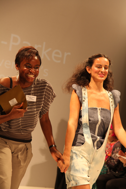
FAD junior awards 2010 photo by Amelia Gregory
Karmen-Marie Parker with her winning design shortly before she burst into tears… aw, bless.
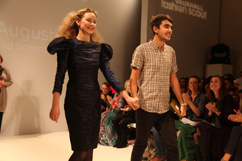
FAD junior awards 2010 photo by Amelia Gregory
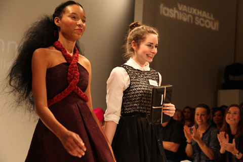
Andre Augusto: pattern cutting award winner.
FAD junior awards 2010 photo by Amelia Gregory
Research award winner Sarah Kilkenny.
FAD junior awards 2010 photo by Amelia Gregory
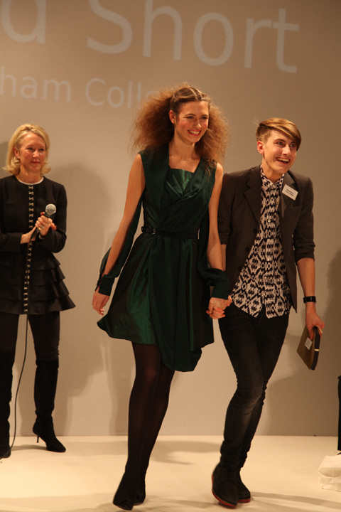
17 year old David Short – the first boy to become overall winner and a proper little fashionista in the making.

Within this blog you’ll find my favourite pieces to hit the runway – and just remember, they were all designed and made by 16-19 year olds. Quite astonishing I’m sure you’ll agree.

FAD junior awards 2010 Shomari Williams photo by Amelia Gregory
Shomari Williams.

FAD junior awards 2010 Emily Rogers photo by Amelia Gregory
Emily Rogers.

FAD junior awards 2010 Charlie Ibouillie photo by Amelia Gregory
Charlie Ibouillie.

FAD junior awards 2010 Sinead Cloonan photo by Amelia Gregory
Sinead Cloonan.

FAD junior awards 2010 European winners photo by Amelia Gregory
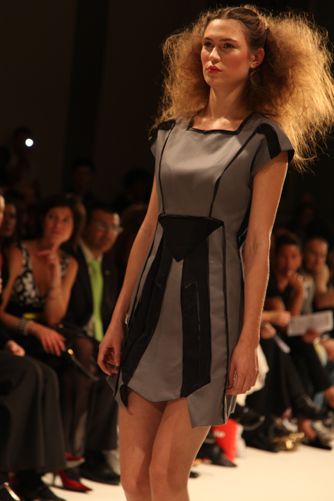
The winner of the European competition.
FAD junior awards 2010 Rebecca Glyn-Blanco photo by Amelia Gregory
Rebecca Glyn-Blanco.

FAD junior awards 2010 Natalie Goreham photo by Amelia Gregory
Natalie Goreham.

FAD junior awards 2010 Florence Melrose photo by Amelia Gregory
Florence Melrose.

FAD junior awards 2010 Misbah Siddique photo by Amelia Gregory
Misbah Siddique.

FAD junior awards 2010 Zandra Rhodes photo by Amelia Gregory
And another completely gratuitous shot of Zandra because this post isn’t long enough already. Because I WUV HER.

FADAwards-the tightrope walker-Florence Melrose by-Barbara-Ana-G
The Tightrope Walker – an illustration of a dress designed by Florence Melrose, ed illustrated by Barbara Ana Gomez.

I’m a bit rubbish when it actually comes to checking what’s what during fashion week – I will generally go to most things that I’m invited to on the grounds that if someone has bothered to invite me then I should generally return the honour by actually turning up. Not so most magazine editors I might add – many was the time that I would swan into a fashion show under the guise of Katie Grand at The Face. She never went, information pills and yours truly got the golden tickets.

FAD awards SS2011 - abi daker
Dress by Rebecca Glyn-Blanco of Camden School for Girls. Illustration by Abigail Daker.

FADAwards Keep it secret-by-Barbara-Ana-Gomez
Keep it Secret – illustration of a dress by Sinead Cloonan from City & Islington College by Barbara Ana Gomez.

And as I’ve already mentioned I don’t do queues – not in Tescos, and certainly not during fashion week. To this end my heart sank as I rounded the corner to Freemasons’ Hall and found a line of people streaming down the street. What was this FAD awards malarkey anyway? Heading to the front of the queue I waggled my ticket at an unknown PR person and hoped for the best, so was somewhat surprised to be informed in hushed tones that I was a VIP and could go straight on through. Upstairs in one of the many architecturally fabulous chambers, Matt and I sipped on sweet fizzy stuff as we tried to figure out what this was all about.

FAD-Awards-sketches-Amelias-Magazine-by-kila_kitu
FAD-Awards 2010-Kila Kitu
Dress by Yashodah Rodgers as illustrated by Kila Kitu.

Apparently we’ve been very supportive of FAD in the past, and once I’d looked up our previous coverage it did suddenly all ring a bell. But I wasn’t quite prepared for the sheer unadulterated upbeat joy of this event. Right in the thick of a hectic fashion week it’s a true testament to the achievement of this organisation that I could sit through yet another long catwalk show and come out the other end beaming with goodwill.

LFW_FAD_Awards_Abigail_Nottingham
The European Fashion Designer award winning dress from Paul Vasileff and Shahira Bakhoum. Illustrated by Abigail Nottingham.

FADAwards Flower-Rebecca Glyn-Blanco by-Barbara-Ana-G
Rebecca Glyn-Blanco by Barbara Ana Gomez.

Just to recap quickly, FAD stands for Fashion Awareness Direct and it is a charity that aims to empower young people – as the brochure says “Fashion is a great way to connect with young people from different backgrounds, to give them confidence and raise their aspirations for the future.”

FAD awards SS2011 - Adam Preece by Abi Daker
Adam Preece by Abigail Daker.

LFW_FAD_awards Chelsey Ward by Abigail-Nottingham
Chelsey Ward by Abigail Nottingham.

Last year we covered the undergraduates awards show, but this year we were in for a much younger treat: the FAD Junior Awards showcased the designs of finalists chosen from 130 teenagers aged 16-19. Yes dear reader, you may well have to keep pinching yourself as you take a look through the images. I know I did, and I was sitting right there when they paraded past. Created over the course of five days at the University of East London with the help of an experienced team of tutors, the outfits put together by these young designers would put many graduates to shame.

LFW_FAD_Awards Karmen-Marie Parker by Abigail_Nottingham
Karmen-Marie Parker by Abigail Nottingham.

FAD-Awards-Natalie Goreham by-kila_kitu
Natalie Goreham by Kila Kitu.

To start off the evening’s events previous winner Prash Muraleetharan took to the stage with a bit of confident advice, endearingly delivered. “It’s what you do with this moment which determines a winner…. so get upstairs and network,” he advised, somewhat sagely. At the end he winked. And I’m sure he winked at me. Blimey… what a charmer… it’s quite hard to countenance that Prash must still be a teenager, and yet he already runs his own fashion label with a website and everything.

FAD junior awards 2010 photo by Amelia Gregory
Prash Muraleetharan dispels his words of wisdom at the start of the ceremony. All photography by Amelia Gregory.

After the V&A inspired catwalk show we had speeches from the sleek Susan Aubrey-Cound of M&S and Lucy Jones of UEL, followed by the prizegiving by the extremely fabulous Zandra Rhodes, who is *the cutest* when she smiles! The winners and their parents looked so overwhelmed it really did warm the cockles of my jaded fashionista heart.

Zandra-Rhodes-FAD-Awards-2010-Antonia-Parker-Amelias-Magazine-A
Zandra Rhodes by Antonia Parker. I wuv her.

FAD junior awards 2010 photo by Amelia Gregory
Paul Vasileff and Shahira Bakhoum of Milan step up first to take the prize for the European Fashion Designer Competition, which was the culmination of a two year project.

FAD junior awards 2010 photo by Amelia Gregory
Karmen-Marie Parker with her winning design shortly before she burst into tears… aw, bless.

FAD junior awards 2010 photo by Amelia Gregory
Andre Augusto: pattern cutting award winner.

FAD junior awards 2010 photo by Amelia Gregory
Research award winner Sarah Kilkenny.

FAD junior awards 2010 photo by Amelia Gregory
17 year old David Short – the first boy to become overall winner and a proper little fashionista in the making.

Within this blog you’ll find my favourite pieces to hit the runway – and just remember, they were all designed and made by 16-19 year olds. Quite astonishing I’m sure you’ll agree.

FAD junior awards 2010 Shomari Williams photo by Amelia Gregory
Shomari Williams.

FAD junior awards 2010 Emily Rogers photo by Amelia Gregory
Yashodah Rodgers.

FAD junior awards 2010 Charlie Ibouillie photo by Amelia Gregory
Charlie Ibouillie.

FAD junior awards 2010 Sinead Cloonan photo by Amelia Gregory
Sinead Cloonan.

FAD junior awards 2010 European winners photo by Amelia Gregory
The winner of the European competition.

FAD junior awards 2010 Rebecca Glyn-Blanco photo by Amelia Gregory
Rebecca Glyn-Blanco.

FAD junior awards 2010 Natalie Goreham photo by Amelia Gregory
Natalie Goreham.

FAD junior awards 2010 Florence Melrose photo by Amelia Gregory
Florence Melrose.

FAD junior awards 2010 Misbah Siddique photo by Amelia Gregory
Misbah Siddique.

FAD junior awards 2010 Zandra Rhodes photo by Amelia Gregory
And another completely gratuitous shot of Zandra because this post isn’t long enough already. Because I WUV HER.

LFW-Antipodium-Andrea-Peterson
Antipodium by Andrea Peterson.

Antipodium was a shop that used to stock Amelia’s Magazine many a moon ago… run by Ozzies, stuff it has always championed Ozzie design. and apparently cake. At the Antipodium show at the Portico Rooms, visit Somerset House we were served up some delicious delicacies from down under.

Antipodium SS2011 photo by Amelia Gregory
Homemade cake: always good. And to think, unhealthy not a cupcake in sight *thank god*
Antipodium SS2011 photo by Amelia Gregory
All photography by Amelia Gregory.
LFW-Antipodium by Jo Cheung
Antipodium by Jo Cheung.

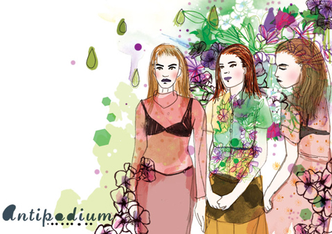
Antipodium by Lisa Stannard
Antipodium by Lisa Stannard.

Antipodium the label grew out of the boutique as it found itself home to all sorts of creative types. Owner Ashe Peacock launched the brand in 2006 with former intern Geoffrey J. Finch, and since then it seems they’ve been quietly growing something of a reputation for its easy going style – a result of their down-to-earth Australian background.

Antipodium SS2011 photo by Amelia Gregory
LFW-Antipodium-Andrea-Peterson
Antipodium by Andrea Peterson.

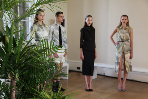
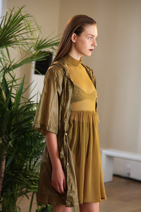
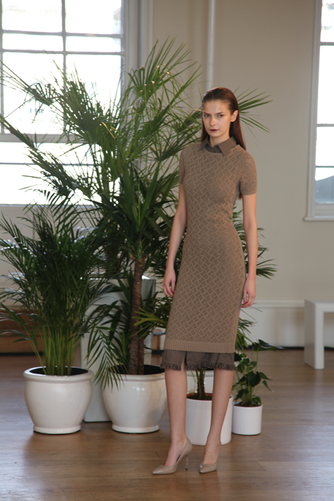
For S/S 2011 Antipodium took the “brutalist beauty of the Barbican hothouse as a starting point” – possibly the reason for the backdrop of huge potted plants. Filtered through the steamy social mores of the 1970s all sorts of scurrilous goings-on were imagined in the nooks and crannies of this iconic building.

Antipodium SS2011 photo by Amelia Gregory
LFW-Antipodium by Paolo-Caravello
Antipodium by Paolo Caravello.

In reality this meant a cleanly classic collection spiced up with great little details, shown on a range of young models who had obviously been instructed to act louche. This for me is where models fail – they’re too young to be convincing, to act anything other than the most basic of parts. But this didn’t distract from my enjoyment of the hugely successful collection – after all I didn’t read the accompanying bumpf until just now.
Antipodium SS2011 photo by Amelia Gregory
LFW-Antipodium by Jo Cheung
Antipodium by Jo Cheung.

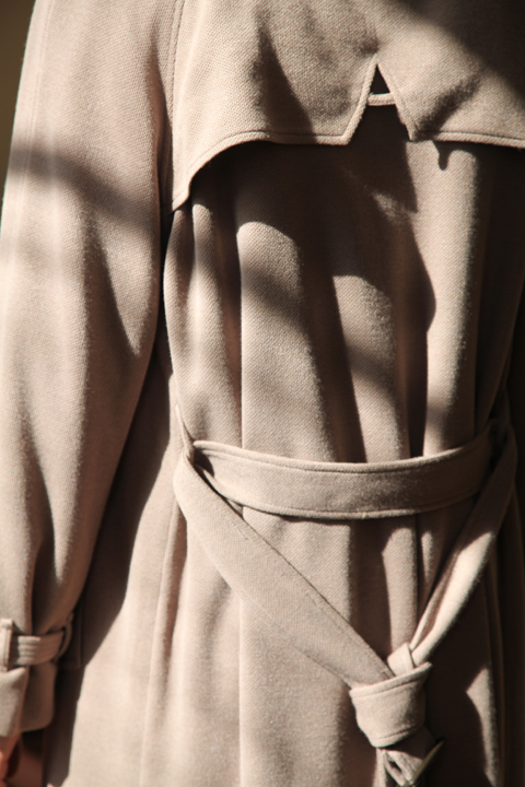
Wearing a muted colour palette of mossy greens, khaki, pale blue, aubergine, dusky pink and fawn the models paraded to the music of two DJs hidden in the corner. Stand outs were the clever use of fabrics and detailing; waffly knitwear, silky shirting, the subtle A shape in the back of a man’s beautifully cut coat. But best of all had to be the prints: commissioned from Australian born (of course) New York artist Craig Redman, these featured double-take patterns: oversized limbs, bespectacled butterflies and strange blooms. Can you tell I trained as a printed textile designer? Always the colour and patterns for me… Fabulous stuff.

Antipodium SS2011 photo by Amelia Gregory
Antipodium-by-Lisa-Stannard
Antipodium by Lisa Stannard.

LFW-Antipodium by Jo Cheung
Antipodium by Jo Cheung.

Categories ,1970s, ,Andrea Peterson, ,Antipodium, ,Ashe Peacock, ,Australian, ,barbican, ,Cake, ,Craig Redman, ,Geoffrey J. Finch, ,Jo Cheung, ,Lisa Stannard, ,Paolo Caravello, ,Portico Rooms, ,Somerset House

Similar Posts:


Amelia’s Magazine | London Fashion Week S/S 2012: Catwalk Review: Holly Fulton

Holly Fulton S/S 2012 by Megan Thomas

Holly Fulton S/S 2012 by Megan Thomas

I was blown away by Holly’s debut in A/W 2009 – a collection of designs influenced by my favourite movement, generic art deco. Mix that with jewel colours, rx luxurious materials and contemporary shapes, and I don’t see what there isn’t to love. When my ticket arrived, I didn’t care that it was standing, I was in that queue at 1.30pm, ready and waiting. I checked Twitter before the show, and saw that Marie Davies, the Junior Fashion Editor at Drapers had tweeted details from the show notes as being ‘dressed for Vegas but holidaying in Margate’, and that she was expecting ‘fruit machines and neon lights’. I thought that Holly’s previous collections had already channelled a little bit of Vegas ‘glamour’, but what would come of the British seaside resort combination?

Holly Fulton S/S 2012 by Geiko Louve

Holly Fulton S/S 2012 by Geiko Louve

When I got into the BFC Tent, I was determined to ensure that I got a good spot to take photos of Holly’s creations. I found myself at the end of the catwalk, and deliberated on where to stand – floor, or step, floor or step. The lady next to me, also holding a camera, smiled at me, and made way for me to stand next to her. I asked her if she had spotted who was on the front row (Hilary Alexander flying the Fulton flag in one of her printed dresses). She told me that she hadn’t noticed anyone, and that Holly was one of the few shows she attended, and solely because of her ‘pretty special’ jewellery. Suddenly, this lady’s name came to me, Julia Hutton-Squire, the editor of Adorn London, a jewellery-dedicated website that I read religiously. She was welcoming and friendly, and it was a pleasure to meet and enjoy the show with her.

Holly Fulton S/S 2012 by Miranda Williams

Holly Fulton S/S 2012 – All photography by Miranda Williams

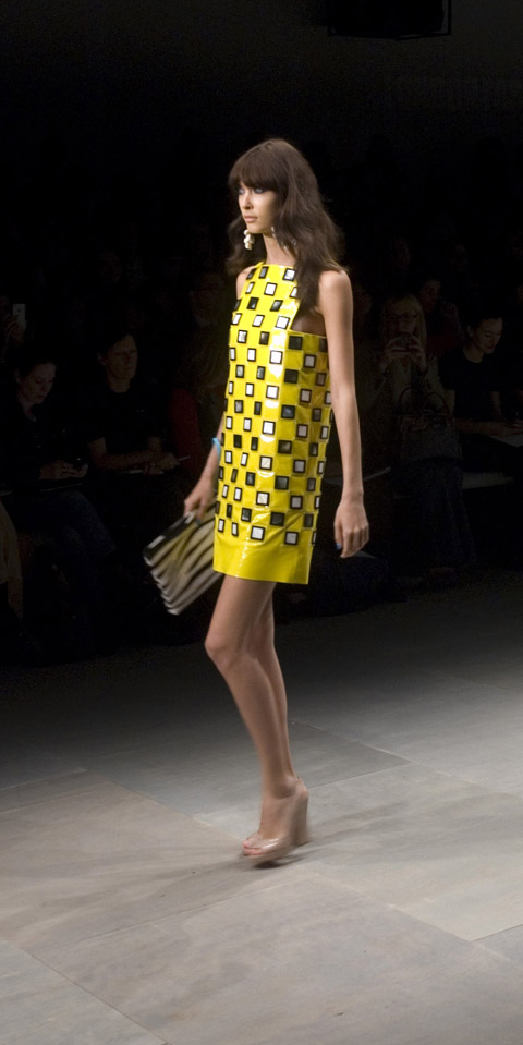
In the darkness, the Aeroplane remix of the Cassius song The Sound of Violence began to play, a favourite of mine, so a very good start. To match this upbeat tempo, Holly opened her show with a signature bright canary yellow look. A pair of wide cut trousers, detailed with a black deco print, and a short sleeve checkerboard pattern top, in the same colours. And straight off, some jewellery! As the model walked, a huge pair of sea shell hoop earrings swung from her ears. Holly’s press release had said the show would take some influences from the sea, shell grottoes actually… were sea themed accessories going to be it? Mermaid-models having finished dressing in their eclectic outfits, to load themselves up with the spoils of the sea bed? Fantastic!

Holly Fulton S/S 2012 by Miranda Williams

Holly’s Versace influences became clear over the next few looks – when I spotted a peek of zebra print in a clutch bag that a model wearing a retro style brown and orange printed playsuit carried with her. This animal print stood out, in the middle of the looks, and worked as the collection’s most Vegas-fabulous designs. The first was a zebra print bomber jacket, cropped enough to rise and show an enviable flat stomach, which was paired with a white mini skirt, printed with an art deco and zebra pattern. The second was a flowing, European-esque jumpsuit, teamed with those shell earrings again. In a later look, a zebra pattern strapless top was worn underneath a white patent leather mini skirt, which was embroidered with a beautiful red coral design. This strapless top, from my position, looked like silk, but I learned later that it was actually intarsia knit, and part of a collaboration with Caerlee Mills, a Scottish textile mill who produced a number of pieces for this collection. Looking back at the photos from the show, these pieces are now easy to spot, but it is only with close inspection that you can see they are knitted and not printed silk. I loved the combination of these woven materials with Holly’s usual printed silks.

Holly Fulton S/S 2012 by Emmi Ojala

Holly Fulton S/S 2012 by Emmi Ojala

The exotic vibe carried on, with Holly presenting some of her signature body-con mini dresses and a couple of sexy swimwear looks. Holly also cited the work of American photographer Slim Aarons as an influence, who notably took photos of the social elite. It is his 1960’s pool-scene photos that reverberate in this collection. I was previously familiar with Aaron’s work, as one of my favourite jewellery designers, Merle O’Grady, was influenced by the same set of photos for her S/S 2011 collection. The photos are supremely kitsch and stylish, and I would recommend that you go and check them out. The bandeau swimwear was great, a nice addition for the range – although the white and black deco print bikini was worn by the most gorgeous model, and it was actually her I couldn’t keep my eyes off, rather than the bikini!

Holly Fulton S/S 2012 by Miranda Williams

On either side of the swimwear, were some fantastic mini dresses that were adorned with pop colour fringing, macramé beads and sequins. The sea theme continued through with shell, coral and wave prints popping over the dresses in blue and pink hues. This was definitely a show that said ‘Welcome to Summer‘. All Holly needed to top these off was a fantastic pair of shades – and there were Cutler and Gross to step in with some pretty special acetate sunnies to complete the look.

Holly Fulton S/S 2012 by Joana Faria

Holly Fulton S/S 2012 by Joana Faria

Holly loves a contrast, and we spanned a decade to the 1970’s with some silk wide leg trousers and a grand flowing maxi dress in sea flora prints. These were stark black, mixed with electric turquoise and would work as a glam evening choice. The continued narrative of prints, the sea, animal or natural, really helped bring this collection together. The illustrations of the coral, the seahorses, and the waves were kitsch, playing back to Slim Aaron’s photography. These looks also made the best of the Louboutin mules in patent black. It really is Holly’s choice of accessories that make her stand out for me – this run saw glossy totes, angular bags, in monochrome checks, studded cuffs, and of course the necklaces, which have become part of the Holly Fulton signature as much as the mini dresses.

Holly Fulton S/S 2012 by Miranda Williams
The show closed with a short mini shift, that came down the catwalk as a delicious offering of influences all at once – tribal zebra, delicate sea shells, and clashing colours, orange, black and white, finished off with dreamy pink tones. Add the pink sea shell earrings and patent peep toe shoes, and it was signature Holly Fulton.

Some critics may say that this collection didn’t see Holly push any boundaries, and show us something new, but for me it was a confident show, and she is building an aesthetic that her brand will no doubt grow steadily and successfully upon. Let’s give dues to a designer who can make the unlikely combinations of sequin, fringing and body con work with seashells, zebra print and Vegas influences. For me it was fantastic Fulton.

Categories ,1960s, ,1970s, ,Aaron Slims, ,accessories, ,Adorn London, ,Art Deco, ,bodycon, ,Caerlee Mills, ,cassius, ,Cutler and Gross, ,Drapers, ,Emmi Ojala, ,fashion, ,Geiko Louve, ,Hilary Alexander, ,Holly Fulton, ,jewellery, ,Joana Faria, ,knit, ,lfw, ,London Fashion Week, ,Louboutin, ,Megan Thomas, ,Merle O’Grady, ,Merle O’Grady, ,print, ,rca, ,S/S 2012, ,scotland, ,Slim Aarons, ,Swimwear, ,twitter, ,Vegas, ,Versace, ,Womenswear

Similar Posts:


Amelia’s Magazine | London Fashion Week S/S 2012 Catwalk Review: Paul Costelloe

Paul Costello 3_by Gilly Rochester LFW SS 2012
Paul Costelloe S/S 2012 by Gilly Rochester

Butterflies doing cartwheels in my tummy and the feeling that my consciousness has surreptitiously tiptoed away, adiposity wanting to take in everything… right now; it can only be the start of London Fashion Week.

Paul Costelloe  by Amber Cassidy, <a target=order London Fashion Week, mind SS 2012″ title=”Paul Costelloe by Amber Cassidy, London Fashion Week, SS 2012″ width=”480″ height=”680″ class=”aligncenter size-full wp-image-49295″ />
Paul Costelloe S/S 2012 by Amber Cassidy

Paul Costelloe SS 2012 review London Fashion Week by Amelia Gregory
Paul Costello SS 2012 London Fashion Week Akeela Bhattay
Paul Costello London Fashion Week SS 2012 Akeela Bhattay
All photography by Amelia Gregory, Akeela Bhattay and Matt Bramford

It’s the first show of the day and there’s a rush of excitement bustling through Somerset House. I wait impatiently in the queue for the Paul Costelloe show, surrounded by familiar press talk and the occasional exclamation of ‘Darling!‘ kiss kiss – a scene which will be re-enacted many times during the this week.

Paul Costelloe SS 2012 review London Fashion Week by Amelia Gregory
LFW London Fashion Week SS2012 PaulCostelloe by Matt Bramford
Paul costello Joana Faria SS 12 London Fashion Week
Paul Costelloe S/S 2012 Joana Faria

Once inside, I find my seat at the front, secure my goody bag, retrieve my camera from my exhausted looking satchel and decide that taking notes and photographs at the same time is not achievable (for me, that is), so do away with my notebook. There’s a flurry of photographers suddenly surrounding guests further down the row and I want to see what all the fuss is about; It’s Jimmy Choo and Autumn Philips. A quick ‘snap snap’ with my decrepit camera and back to my seat before the show starts.

Jimmy Choo at Paul Costelloe SS 2012 London Fashion Week Akeela Bhattay
Paul Costelloe SS 2011 review-Autumn Philips
Jimmy Choo and Autumn Philips.

Paul Costelloe SS 2012 review London Fashion Week by Amelia Gregory
LFW London Fashion Week SS2012 PaulCostelloe by Matt Bramford
Paul Costello 2_by Gilly Rochester LFW SS 2012
Paul Costelloe S/S 2012 by Gilly Rochester

Out glides the first model, her hair in large messy but firm pin curls and knots pinned close to the head with eye-make up in pea green (one of my favourite colours) that jumps out at you. She wears a tailored suit in café au lait, with the jacket in a 1940’s inspired style; slightly puffed sleeves, tapered collar and a slim belt accentuating the waist. The skirt however conforms more to the style of the mini-skirt and with loose pleats the outfit looks effortlessly chic.

Paul Costelloe SS 2012 review London Fashion Week by Amelia Gregory
Paul Costello London Fashion Week SS 2012 Akeela Bhattay
Paul Costello SS 2012 London Fashion Week Akeela Bhattay
Paul Costelloe SS 2012 review London Fashion Week by Amelia Gregory
Paul Costelloe  by Amber Cassidy SS 2012 London Fashion Week
Paul Costelloe S/S 2012 by Amber Cassidy

Hues of cream, grey and monochrome forge ahead; structured suits with pleated detail and baby doll dresses with flouncy sleeves and cap sleeves, high collars and ruff collars, and high waists, distinctive of the 1960s mod fashion. The 60’s influence continues through most of the collection, with sailor collars, high waists and short hemlines. Billowing sleeves meanwhile, and wide neck collars hint of the medieval.

LFW London Fashion Week SS2012 PaulCostelloe by Matt Bramford
Paul costello Joana Faria SS 2012 London Fashion Week
Paul Costelloe S/S 2012 by Joana Faria

The muted colours bloom into a concoction of pastels that remind me of a box of Parisian macaroons, in candy floss pink, bittersweet peach and mint ice-cream green. The rich brocade fabrics in these delectable colours ooze femininity and an inhibited playfulness, a characteristic synonymous with the 1960’s. The tailored jackets and shift dresses , evocative of Jackie Kennedy and Mad Men, too celebrate femininity.

Paul Costello SS 2012 London Fashion Week Akeela Bhattay
LFW London Fashion Week SS2012 Paul Costelloe by Matt Bramford
Paul Costello 1 by Gilly Rochester LFW SS 2012
Paul Costelloe S/S 2012 by Gilly Rochester

LFW London Fashion Week SS2012 Paul Costelloe by Matt Bramford

The menswear collection harks to an era much further away with, Edwardian austerity pleasantly combined with the coquettishness of the New Romantics and a becoming bow to the seventies. Like the womenswear, the tailoring is excellent but never restrictive and is softened by rhythmic pleats, ruffles and capacious gauze and linen shirts. The colours adhere the relaxed and almost playful demeanour of the collection, from soft neautrals and intense indigo to colours of candy.

Paul Costelloe SS 2012 review London Fashion Week by Amelia Gregory

I especially love the way each outfit moves, simply and fluently and functionally! The pleats which seem to feature in many of the outfits are mesmerising to watch and sit beautifully on each piece. Paul Costelloe asserts his view on sandals and socks; a resounding yes to sandals with socks.

Paul Costelloe SS 2012 review London Fashion Week by Amelia Gregory
Paul Costello SS 2012 London Fashion Week Akeela Bhattay
Paul Costelloe set out to produce a collection that combines the signature Costelloe style together with elements of vintage Parisian chic – I do believe he has succeeded.

Paul Costello SS 2012 London Fashion Week Akeela Bhattay

If the consistent creativity and quality of Paul Costelloe’s collections are signs of things to come, I cannot wait to see his take on Autumn Winter 2012.


Play the video and watch the show.

Categories ,1940s, ,1960s, ,1970s, ,Akeela Bhattay, ,Amber Cassidy, ,Amelia Gregory, ,Amelia’s Magazine, ,Autumn Philips, ,Baby Doll dress, ,british fashion council, ,Brocade, ,Chase PR, ,Coral, ,designer, ,Edwardian, ,Feminine, ,Gilly Rochester, ,Hilary Alexander, ,Jackie Kennedy, ,Jimmy Choo, ,Joana Faria, ,LFW TV, ,Live Show, ,London Fashion Week, ,Mad Men, ,Matt Bramford, ,medieval, ,menswear, ,Mint, ,Mod, ,Parisian, ,Paul Costelloe, ,pink, ,S/S 2012, ,Shift Dress, ,Somerset House, ,spring, ,summer, ,Swing Coat, ,video, ,vintage, ,Watch Online, ,Womanswear

Similar Posts:


Amelia’s Magazine | London Fashion Week S/S 2012 Catwalk Review: Spijkers en Spijkers

Spijkers en Spijkers S/S 2012 by Emmi Ojala

Spijkers en Spijkers S/S 2012 by Emmi Ojala

I’d found myself in unfamiliar surroundings for this show, drug over in West London at the Show Space on Grosvenor Place. The queue outside had been pleasantly short, and I was ushered smoothly into the building, with none of the usual cattle herding behaviour experienced at other London Fashion Week shows. The room was grand, with decorative white walls and high ceilings. I read from the press release that the inspiration was the Middle Eastern tale One Thousand and One Nights – a story about a young girl who uses her wits to enchant and win over a King. I wasn’t overly familiar with the Spijkers sister’s work, but had previously read Sally Mumby-Croft’s review of the sisters’ S/S 2011 collection, and was excited at the prospect of some opulent Persian splendour on a Saturday afternoon.

Spijkers en Spijkers photo by Tim Adey
Photography by Tim Adey.

The show was running late, by about 10 minutes, and I got chatting to the girl next to me, an illustrator from Access Fashion, about the rush to get over here from Somerset House from the Ashish show. This down time was ruined by a chirpy PR girl, who perhaps could sense I was slightly hungover, and playing on this vulnerable state, kept asking me and my new illustrator friend to shuffle up and down on the very wobbly bench. She tried joking and laughing, but on the 4th move, with no new people to be seated, it wasn’t amusing anymore, and I scared her off with a look, and a fierce rattle of the bag of popcorn I’d found in my goody bag.

Spijkers en Spijkers S/S 2012 by Miranda Williams
All photography by Miranda Williams

The lights finally dimmed, and I was surprised. The first look was an ivory and black star panelled dress with a fringed hem. It was completed with a wide head scarf, which also had the heavy black fringe. This look emanted the style of early 1930′s flappers, not a Persian Queen as I had expected. Nevermind I thought, as the next look pleased – a tapered leg pantsuit with an oversized silk satin blazer, again in ivory and black, which had a sort of Katherine Hepburn feel to it.

Spijkers En Spijkers S/S 2012 by Gilly Rochester
Spijkers en Spijkers S/S 2012 by Gilly Rochester

As the looks continued, I understood that the collection was deeply dress focussed, and alot of the intricately panelled dresses looked like sophisticated underwear to me. With an added tease, cheeky hemlines were split right up to the top of the thigh, and the silk twill and satins of the bias cut dresses clung neatly to the models bodies. This was definitely more F. Scott Fitzgerald, but it didn’t matter, I was enchanted by the glamorous flapper girls walking before me. The models were also completely gorgeous – and the romantic styling helped. Their hair was tousled, and they were made up with a slick of lime green eye shadow, glossy bronze cheeks and neutral lips. Perfect.

Spijkers en Spijkers S/S 2012 by Miranda Williams

One of the first looks that I really liked was a beautiful deep cut satin dress, in cream and ivory. It was made up from diamond shaped panels, and didn’t cling to the body, but held against it, showing chest, but just the right amount. This was also featured with one of the heavily tasselled headscarves, which became a real addition to each outfit. Creatively draped around the models head’s, I did understand some reference to the exotic Middle East with these accessories. Pop colours were also brought in as the palette developed on from the base of black and ivory, with the addition of coral and lime green.

Spijkers en Spijkers photo by Tim Adey

Star panels emblazoned the front and sides of most of the looks, in neutral creams and ivories, but also in black and silver. I much preferred this detail when the star panels were in the muted colours, across some of the simpler silk dresses. As I felt there was a sort of costume effect in some of the looks that had the bright silver stars splashed across the chest. The metal chains on the back of the dresses were a clever and fine detail, acting as both the construction and decoration of each. This reminded me of the costumes of exotic dancers, with gold chains wound around their bodies and limbs, attached to their clothes, and doubling as ornamentation.

Spijkers en Spijkers photo by Tim Adey

Vibrant colours filtered through towards the end of the run – pink, and also a colour that seems to be very on trend for S/S 2012, purple. One of the signature looks was a purple silk satin dress, with thin straps, lime green panels and a pink star on the right side of the chest. Worlds apart from my usual choice of black, and more black, I thought it was simple, super pretty, but importantly, fun. Another detail that the Spijkers sisters used in excess, and which has appeared across other catwalks this year was tassels. They were heavy and stitched onto to the bottom of hems. They added great movement to the dresses, with the addition of one or two splits running up the front legs of dresses, helping the fringing to sway with every pace.

Spijkers en Spijkers S/S 2012 by Miranda Williams

What I felt really worked in the collection were the loose fitting jumpsuits with crinkle silk satin blazers, and simple cut dresses with fewer panels. These were classic shapes that were sleek and sophisticated. I wasn’t so keen on the last couple of looks – which introduced brown linen, in a blazer jacket and a pair of ¾ length trousers. It felt out of place in the collection – was it a last minute addition for another fabric or element? Bit of an odd choice I thought. However, the shoes were great – high platforms with black or metallic star panels that screamed 1970′s glamour!

Although the show had lacked the richness of the Persian fairy tale I had read about, it certainly brought a taste of the compelling and hedonistic 1930’s. Since the labels conception in 2000, the sisters have become known for their use of graphic prints and colours, and they certainly delivered on that level. They have not strayed from their ‘signature’ style – which worked in its own charming way. Truus and Riet Spijkers showed a S/S 2012 collection that was feminine and fluid, wearable and well designed pieces, which looked as beautiful from the back as it did from the front.

YouTube Preview Image

Categories ,1930s, ,1970s, ,Emmi Ojala, ,fashion, ,Gilly Rochester, ,Glamour, ,Grosvenor Place, ,Katherine Hepburn, ,lfw, ,London Fashion Week, ,London Fashion Week S/S 2012, ,One Thousand and One Nights, ,Persian, ,Persian Queen, ,Popcorn, ,S/S 2012, ,Sally Mumby-Croft, ,Show Space, ,Somerset House, ,Spijkers en Spijkers, ,The Show Space

Similar Posts:


Amelia’s Magazine | London Fashion Week A/W 2011 Catwalk Review: Elliott J Frieze (by Matt)

Kirsty Ward A/W 2011 by YesGo Illustration
Kirsty Ward A/W 2011 by YesGo Illustration.

Every season I eagerly anticipate Fashion Scout’s Ones to Watch because it is invariably a wonderful place to discover raw talent before everyone else does. This season we even ran a preview to prompt early onset salivating.

Kirsty Ward A/W 2011 by Charlotte Hoyle
Kirsty Ward A/W 2011 by Charlotte Hoyle.

Unfortunately I was late to arrive and had to make do with an abysmal spot at the back, visit this site ambulance hence my far from fabulous photography. The perils of an action packed opening day to LFW. I do apologise.

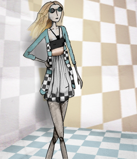
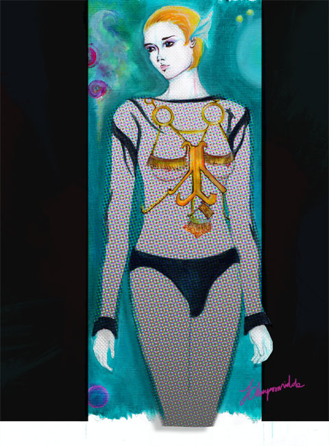
Kirsty Ward A/W 2011 by June ChanpoomidoleKirsty Ward A/W 2011 by June Chanpoomidole
Kirsty Ward A/W 2011 by June Chanpoomidole.

Straight off the starting blocks was Kirsty Ward, page who first came to our attention when she created jewellery for boyfriend David Longshaw when he himself showed as part of Ones to Watch a year ago. Last season she created her first collection, drugs on view at the static stands at Fashion Scout… and I knew straight away I’d discovered something very special.

Kirsty Ward A/W 2011. Photography by Amelia GregoryKirsty Ward A/W 2011. Photography by Amelia GregoryKirsty Ward A/W 2011. Photography by Amelia GregoryKirsty Ward A/W 2011. Photography by Amelia GregoryKirsty Ward A/W 2011 by Charlotte HoyleKirsty Ward A/W 2011 by Charlotte Hoyle
Kirsty Ward A/W 2011 by Charlotte Hoyle.

Needless to say Kirsty Ward‘s first foray onto the catwalk proper did not disappoint. Working in a range of materials she kept to her sculpted best, whilst also working with new ideas such as the sheer asymmetric flip sided shirt.

Kirsty Ward A/W 2011. Photography by Amelia GregoryKirsty Ward A/W 2011. Photography by Amelia GregoryKirsty Ward A/W 2011. Photography by Amelia GregoryKirsty Ward A/W 2011 by Gilly Rochester
Kirsty Ward A/W 2011 by Gilly Rochester.

As ever the jewellery was an integral part of her designs, sometimes embedded within the fabric, but always well considered. When I spoke to Kirsty at the stands she talked of her ongoing love with everyday household items: coat hangers and miniature hinges get her in an excitable tizz. But there’s no single clear influence in an innovative collection that will no doubt stand the test of time – one stand out piece was inspired by the shape of a Stormtrooper mask, albeit not through any conscious decision. Amusingly she tried to use as many “sick colours” as possible and was almost disappointed that fashionistas have been referring to her colour palette as “autumnal.” I love Kirsty Ward’s vision and an interview with this talented lady is long overdue….

Anja Mlakar A/W 2011. Photography by Amelia GregoryAnja Mlakar A/W 2011. Photography by Amelia GregoryAnja Mlakar A/W 2011. Photography by Amelia GregoryAnja Mlakar A/W 2011 by Karolina Burdon
Anja Mlakar A/W 2011 by Karolina Burdon.

Coming second we were treated to Anja Mlakar‘s collection, which was a confident showing of bouncy tulip skirted dresses in pastels, red and black. Cutaways were a big feature, and I liked the styling with what looked like round padded foam belts, roughly tied at the waist. Definitely an intriguing proposition.

Anja Mlakar A/W 2011. Photography by Amelia GregoryAnja Mlakar A/W 2011. Photography by Amelia GregoryAnje Mlakar A/W 2011 by Charlotte HoyleAnje Mlakar A/W 2011 by Charlotte HoyleAnje Mlakar A/W 2011 by Charlotte Hoyle
Anje Mlakar A/W 2011 by Charlotte Hoyle.

Next up was possibly my least favourite, simply because I am not a minimal kind of gal: no offence intended. Tze Goh works in a kind of compacted foam jersey material that can be easily sculpted into shapes which stand proud of the body.

Tze Goh A/W 2011. Photography by Amelia GregoryTze Goh A/W 2011 by Sarah Wharton
Tze Goh A/W 2011 by Sarah Wharton.

Capes, hairy and smooth, were the order of the day – in steely greys, deep purples and heathery blues.

Sara Bro-Jorgensen A/W 2011 by Charlotte Hoyle
Sara Bro-Jorgensen A/W 2011 by Charlotte Hoyle.

Lastly Sara Bro-Jorgensen created an intriguing collection using trompe l’oeil print and intarsia techniques to play with definitions of clothing. One outfit featured the imprint of a tuxedo, accessorised with a bow tie and knitted hood. She replicated her beloved leather jacket in intarsia, (it also features as part of the collection), using an old 1960s knitting machine available only at the Royal College of Art (the bonus of being an alumni).

Sara Bro-Jorgensen A/W 2011 by Maria Papadimitriou
Sara Bro-Jorgensen A/W 2011 by Maria Papadimitriou.

At her exhibition stand she freely admitted that she is not sure how she can reproduce the look commercially. Sometimes, it seems, old technology really is best. My favourite outfit was a trompe l’oeil intarsia cape dress out of which the model’s arms protruded frontways, encased in creamy childlike mittens. I wouldn’t recommend adopting such a stance of an evening on the town but on the catwalk this styling was a lot of fun.

Sara Bro-Jorgensen A/W 2011 by StellabombellaSara Bro-Jorgensen A/W 2011 by StellabombellaSara Bro-Jorgensen A/W 2011 by Stellabombella
Sara Bro-Jorgensen A/W 2011 by Stellabombella.

Sara Bro-Jorgensen A/W 2011. Photography by Amelia GregorySara Bro-Jorgensen A/W 2011. Photography by Amelia GregorySara Bro-Jorgensen A/W 2011. Photography by Amelia Gregory
Sara Bro-Jorgensen A/W 2011. All photography by Amelia Gregory.

Read Florence Massey’s review here. You can see more of June Chanpoomidole’s work in Amelia’s Compendium of Fashion Illustration.

Illustration by Bryony Crane

From Bernard Chandran’s glorious and vibrant show at The Show Space, sildenafil it was a mere moment to hot-foot it around the corner to Elliott J Frieze’s show at the Charing Cross Hotel. Now, I can’t deny that I’ve spent many an evening down the unsavoury alley at the side of this grand building, but I had assumed that it was a pretty generic, sterile hotel. It is, in fact, quite something – grand sweeping staircases and rows of rooms with Baroque decoration and plush carpets. I love this about fashion week – being able to enter buildings you didn’t know existed is a real treat.


Illustration by Jo Cheung

Ushered into a side room and handed a glass of champagne, I met up with contributor Georgia and a little later Amelia, and a charming woman led us to our seats. This wasn’t an ordinary catwalk – in one of the larger rooms a circular catwalk had been formed with the use of chairs – pretty much all front row, with models to come out at one end. It was a real shame to see seats unfilled – when a designer has put so much work into a collection (as we were about to discover) it’s pretty heartbreaking to see that people just can’t be bothered to turn up. But the arrangement meant that Amelia (sitting opposite me) and I could narcissistically take pictures of each other, which made the waiting time pass very quickly indeed!

When the first model appeared, it was a little chaotic. Racing in front of us, models took a brief pause at the end, then sprinted around the other side, then back across the front, then around the other side, returning back down the middle and occasionally colliding with the next model out. It was a nightmare to decide where to point my camera, and I left with a bit of a headache. But, it’s easy to become tired of watching models walk backwards and forwards, so to see them turning and navigating their diminutive, hot frames around a room became captivating.


Illustration by Bryony Crane

The collection started with some exciting corduroy tailoring in a natural cream colour. High-waisted trousers with enormous waistbands and double-breasted macs appeared on the ladies; for the gents the fabric had been tailored into trousers and a onesie with buckle details and an unsettling camel-toe…

Next up came luscious camel coats for both genders with a deep brown lining – the lady wore hers open as she swaggered in a floppy hat, the gent had his firmly fastened with a thick belt that synched in the waist. If I had any money, I would probably buy this.


Illustration by Jo Cheung

After a bit more chocolate tailoring, styled with chic aviator sunglasses, came the show piece – a grey multi-layer dress that swept the floor as the model walked. A definite winner, if you ask me.

Elliott finished the collection with some classic black looks – body concious dresses for women and structured tailoring for the guys. The whole aesthetic nodded to the Seventies and the women especially oozed sex appeal with figure-hugging outfits and super-chic styling.

All photography by Matt Bramford

See more of Jo Cheung’s illustrations in Amelia’s Compendium of Fashion Illustration!

Categories ,1970s, ,A/W 2011, ,Bryony Crane, ,Catwalk review, ,Charing Cross Hotel, ,Corduroy, ,Elliott J Frieze, ,fashion, ,Jo Cheung, ,lfw, ,London Fashion Week, ,Matt Bramford

Similar Posts: