Amelia’s Magazine | Royal College of Art: Fashion Design Graduate Show 2011 review. Womenswear Knitwear.

RCA - Hannah Buswell by Kristina Vasiljeva
Hannah Buswell by Kristina Vasiljeva.

RCA knitwear design is out of this world. Naturally I was particularly keen on the really bright bold oversized collections, nurse but there were plenty of more tightly tailored and subtle garments too. Here’s who to look out for:

RCA graduate fashion 2011-Hannah Buswell photography by Amelia GregoryRCA graduate fashion 2011-Hannah Buswell photography by Amelia GregoryRCA graduate fashion 2011-Hannah Buswell photography by Amelia GregoryRCA graduate fashion 2011-Hannah Buswell photography by Amelia GregoryRCA graduate fashion 2011-Hannah Buswell photography by Amelia GregoryRCA graduate fashion 2011-Hannah Buswell photography by Amelia GregoryRCA graduate fashion 2011-Hannah Buswell photography by Amelia Gregory
Hannah Buswell created a slouchy striped collection in hot pinks, viagra 40mg oranges and yellows with the occasional slash of lime green or blue. Print (a collaboration with textiles designer Amy Ellis) was mixed with knitwear in variegated block shapes, for sale then embellished with large Swarovski crystals, all styled to perfection with knee high sheer striped socks. Find Hannah Buswell on her website, blog and twitter feed.

RCA graduate fashion 2011-Ruth Green photography by Amelia GregoryRCA graduate fashion 2011-Ruth Green photography by Amelia GregoryRCA graduate fashion 2011-Ruth Green photography by Amelia GregoryRCA graduate fashion 2011-Ruth Green photography by Amelia GregoryRCA graduate fashion 2011-Ruth Green photography by Amelia GregoryRCA graduate fashion 2011-Ruth Green photography by Amelia Gregory
Ruth Green was another fan of the popular boxy shoulder shape, and also of a hot orange and red colour palette in rectangular forms. Cowl necks and asymmetrical shapes completed the look. Take a look at Ruth Green’s website here.

RCA graduate fashion 2011-Maria Kamper photography by Amelia GregoryRCA graduate fashion 2011-Maria Kamper photography by Amelia GregoryRCA graduate fashion 2011-Maria Kamper photography by Amelia GregoryRCA graduate fashion 2011-Maria Kamper photography by Amelia GregoryRCA graduate fashion 2011-Maria Kamper photography by Amelia GregoryRCA graduate fashion 2011-Maria Kamper photography by Amelia Gregory
Maria Kamper chose an elegant approach, with close fitting dresses in subtle creams and black accompanied by draped trains.

RCA graduate fashion 2011-Victoria Hill photography by Amelia GregoryRCA graduate fashion 2011-Victoria Hill photography by Amelia GregoryRCA graduate fashion 2011-Victoria Hill photography by Amelia GregoryRCA graduate fashion 2011-Victoria Hill photography by Amelia GregoryRCA graduate fashion 2011-Victoria Hill photography by Amelia GregoryRCA graduate fashion 2011-Victoria Hill photography by Amelia GregoryRCA graduate fashion 2011-Victoria Hill photography by Amelia Gregory
As did Victoria Hill, who draped excess fabrics off the shoulder and bosom of belted full length dresses in fine gauge knit to create a very commercial and highly wearable collection. There’s not much on it but you can find her website here.

RCA graduate fashion 2011-Kate Pritchard photography by Amelia GregoryRCA graduate fashion 2011-Kate Pritchard photography by Amelia GregoryRCA graduate fashion 2011-Kate Pritchard photography by Amelia GregoryRCA graduate fashion 2011-Kate Pritchard photography by Amelia GregoryRCA graduate fashion 2011-Kate Pritchard photography by Amelia GregoryRCA graduate fashion 2011-Kate Pritchard photography by Amelia Gregory
Kate Pritchard pursued draping in a more bunched up fashion in a steely coloured collection with more than a slight nod to grunge.

RCA Graduate Show 2011 Helen Taylor by Sam Parr
Helen Turner by Sam Parr.

RCA graduate fashion 2011-Helen Turner photography by Amelia GregoryRCA graduate fashion 2011-Helen Turner photography by Amelia GregoryRCA graduate fashion 2011-Helen Turner photography by Amelia GregoryRCA graduate fashion 2011-Helen Turner photography by Amelia GregoryRCA graduate fashion 2011-Helen Turner photography by Amelia GregoryRCA graduate fashion 2011-Helen Turner photography by Amelia GregoryRCA graduate fashion 2011-Helen Turner photography by Amelia GregoryRCA graduate fashion 2011-Helen Turner photography by Amelia Gregory
I adored Helen Turner‘s clever collection which used bunched layers of yarn threaded through the garments to create a unique silhouette in shades of caramel, searing orange and petrol blue.

RCA graduate fashion 2011- photography by Amelia GregoryRCA graduate fashion 2011- photography by Amelia GregoryRCA graduate fashion 2011-Amelie MarciasiniRCA graduate fashion 2011- photography by Amelia Gregory
Unfortunately I can’t identify who are responsible for this lovely oversize bobbly aran knit and shaggy mohair cardigan, but loved these also. NEWSFLASH! Thankyou Hannah for telling me that the first two images feature Victoria Hill for Esprit, and the last two are Amelie Marciasini for Esprit.

Categories ,Amelie Marciasini, ,Amy Ellis, ,Block, ,Brights, ,Esprit, ,Hannah Buswell, ,Helen Turner, ,Kate Pritchard, ,knitwear, ,Maria Kamper, ,Mohair, ,Orange, ,rca, ,Royal College of Art, ,Ruth Green, ,Sam Parr, ,Swarovski, ,Victoria Hill, ,Womenswear

Similar Posts:


Amelia’s Magazine | London Fashion Week S/S 2012 Presentation Review: Craig Lawrence

Craig Lawrence S/S 2012 by Meagan Morrison

Craig Lawrence S/S 2012 by Meagan Morrison

I’m quite partial to a knitted design – one of my favourite designers is Mark Fast, order whose spun creations I yearn for, and I loved the A/W 2010 work of graduate student Phoebe Thirlwall. I’m also very fond of Craig Lawrence, whose work I have followed and celebrated, and so I was eagerly anticipating his intimate salon show at The Portico Rooms at Somerset House, the perfect surrounding for the debut of his S/S 2012 collection. An excitement it appeared that was shared by everyone else attending London Fashion Week… The queue for the presentation wound round the marble staircase of Somerset House, and snaked along the grand hall – a bit of a change from what Matt Bramford had seen the previous year.

Craig Lawrence S/S 2012

Craig Lawrence S/S 2012 – All photography courtesy of Ella Dror PR

Craig Lawrence is a London Fashion Week must-see. For six seasons, before he graduated from Central Saint Martins and set up his own label, Craig produced knitwear for the outlandish designer Gareth Pugh. He showed his debut collection for A/W 2009, which won him The British Fashion Council’s NEWGEN sponsorship. The Council’s faith and support continues, as this season sees Craig celebrating his sixth season under the sponsorship. As I was finally ushered into the room and asked to find myself a square inch of space, I spotted blogger Susie Bubble on the front row. I realised what a hot ticket this show was, and thought that maybe next year’s space should be rethought, regardless of the atmospheric surroundings. By the time the doors were closed, every seat in the room had been taken, but in this close setting, I couldn’t have asked for a better view of the clothes.

Craig Lawrence S/S 2012 - All photography courtesy of Ella Dror PR

Craig’s primary inspiration for the collection was the seaside photo sets of British documentary photographer Martin Parr. Parr is known for projects that explore modern life in England, and for his sense of humour that runs through his photos. He claims that the seaside is one of the most fascinating places for people watching, where we lose our inhibitions and where true personalities are unveiled. As the first looks of Craig’s collection were presented, the influence of the British seaside towns was clear, but rather from the depths of the sea, instead of the beach and its holiday makers. The models were enchanting sea creatures. Adorned in the metallic threads of a fisherman’s net or wrapped seaweed, in the colours of the ocean and washed up treasures and sun baked sand, with headpieces like sea coral reefs. Craig presented a rich and textured collection of knitwear in a palette of pastel and muted hues, run with metallic details.

Craig Lawrence S/S 2012

Last season’s moody palette of dark metallic blues, purples and black was replaced with a lighter, gentler combination of creams, pale mint greens and pinks. As the models swayed down the short catwalk they glistened with every step. Craig Lawrence collaborated with Swarovski Elements for this collection which gave a sparkle of luxury to his intricately knitted designs. Swarovski Pale Crystal yarns and fibres had been woven into individual pieces, which caught the bright lights of The Portico Rooms as the models revolved to face each wall of the room. The Swarovski crystals were also sewn in to other designs as pure embellishment.

Craig Lawrence S/S 2012 by Megan Thomas

Craig Lawrence S/S 2012 by Megan Thomas

It was apparently the idea of the Essex phenomenon ‘vajazzling’ that inspired Lawrence’s use of Swarovski crystal fibres for this season, but with this influence aside, it was a sophisticated and refined concept that pushed the collection to another level. Craig’s material of choice, unique Kyototex metallic yarns, keeping to the sea-theme in cream and shell colours, were woven into the designs, adding to the luxuriance and feminine appeal of each look.

Craig Lawrence S/S 2012 - All photography courtesy of Ella Dror PR

Layering was an important detail across the whole collection. The dresses and skirts were flowing, with knitted bralets, metallic leggings and tights worn underneath. There was also a mix of body-con wrap pieces, worn over designs such as a flowing lace-hole knitted maxi skirt, or tank top dress, and super wearable raglan-sleeved tops with elasticated vests which would add a perfect metallic shimmer for day or night. The Swarovski crystal embellishments added texture, and luxuriance. The draped designs left the body effortlessly, as the narrator explained how the pieces were knitted without elastic to create a looser, relaxed fit.

Craig Lawrence S/S 2012 - All photography courtesy of Ella Dror PR

One of the best things about a salon show is the chance to gain a greater understanding of the make up of the collection. For each of the 18 looks, a very well spoken narrator took the audience through the individual components, and explained the techniques undertaken. This replaced the usual upbeat modern song, and was a welcome point of difference. Through this, the salon show to me felt like a proper couture show, harking back to old fashion houses and buying appointments. There was a real sense of charm and nostalgia to this which I know is also an influence that Craig cites from his childhood in the countryside town of Ipswich.

Craig Lawrence S/S 2012

It was great – the audience was able to learn so much from the commentary. The narrator gave away details of craftsmanship that made you study Craig’s work as it came out one by one. We learnt that many of the pieces were created from a single thread to maintain the weightlessness. Indeed some of the designs looked like finely spun gold fisherman’s nets, and the models were beautiful sea creatures that had been caught in the webbing. The narration really helped to emphasise the level of work that had gone into creating this collection.

Craig Lawrence S/S 2012 by Gilly Rochester

Craig Lawrence S/S 2012 by Gilly Rochester

This was not the only aspect of the salon show that ensured it achieved a polished finish – the show was also styled by Dazed and Confused’s fashion editor Kate Shillingford, who has been a strong support of Craig’s career from the start, and oversees the creative direction of the label. Her expertise was really evident – no hanging yarn was out of place, the handmade shoes from Natacha Marro shoes fitted with the otherworldly air, and the delicate woven headpieces made by Steven Doherty were a superior finish acting as sparkling coral reefs, encased around the models heads.

I was mesmerized by Craig Lawrence’s embellished and shimmering sea-bed inspired offering. The pastel tones, metallic yarns and crystal details were subtle, serene and luxuriant. It was a fantastic collection that fully demonstrated his ability for producing knitwear that is challenging yet wearable, and significantly as a young designer, constantly pushing forward.

Categories ,british fashion council, ,Craig Lawrence, ,Crystals, ,Ella Dror PR, ,fashion, ,Gilly Rochester, ,Katie Shillingford, ,knitting, ,knitwear, ,lfw, ,Mark Fast, ,Martin Parr, ,Matt Bramford, ,Meagan Morrison, ,Megan Thomas, ,Metallic, ,Miranda Williams, ,Newgen, ,Phoebe Thirlwall, ,Presentation, ,S/S 2012, ,Salon Show, ,Somerset House, ,Swarovski, ,Womenswear

Similar Posts:


Amelia’s Magazine | London Fashion Week S/S 2011 Catwalk Review: Mark Fast


Illustration by Jaymie O’Callaghan

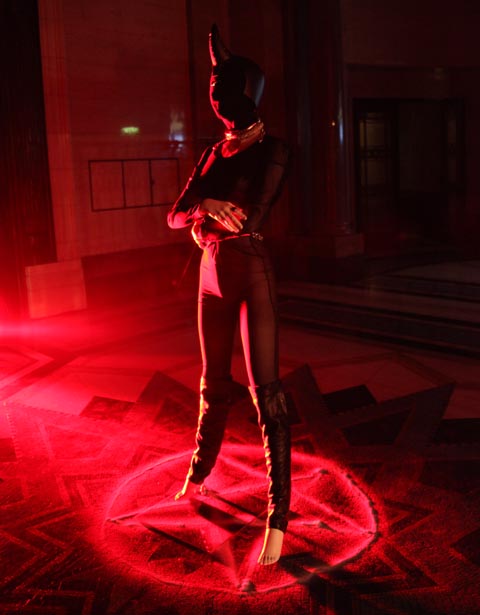
As I was leaving the Orschel-Read show at Fashion Scout last week, viagra 40mg visit this I was planning to rush out of the Freemasons’ Hall and dash off to meet fashion editor at Somerset House. However, thumb on walking into an atrium where I had queued only a little while earlier, I found myself in semi-darkness as part of the audience of an interactive performance presentation. It wasn’t until later that I discovered this was Rachel Freire’s S/S 2011 collection. 

(I would like to apologise in advance for the quality of my photos – I was taken unawares and had to snap away fairly blindly in the dark to catch anything I could!) 

The room veered between bright light and pitch black, with strobe lights picking out flamboyant reflective detailing on the garments.  Models were standing on plinths along the centre and around the edges of the room, all seemingly pretending to play violins and cellos in accompaniment to the riotous and slightly Patrick Wolf-esque backing music.  I didn’t realise until a few minutes in when some began to sing, that they weren’t models at all, but members of a band who were playing live, with the frontman hidden by a crowd of photographers at the opposite end of the darkened room. 

The clothes were a juxtaposition of 1950s-style flesh-toned corsets and underwear, alongside cutaway assymetric jackets with tudor-style sculptural tailoring.  Some of the band members wore huge luminescent head-dresses, staggering through the crowds like mythical beasts on sky-high wedges, stroking people’s faces and running their fingers through their hair. Reflective embroidery and fringing flashed bright white with the strobing, and at some points could even have been lit from inside as it flared up in red tones (although this may have had something to do with dozens of red camera focus lights struggling to function in the dark). Along with the ethereal white make up, the overall impression was part-Midsummer Night’s Dream and part-Cybergoth, with a slight nod towards Diana Dors

When I made it outside, blinking into the sunlight, the only clue I had to go on was a flyer handed to me for ‘The Irrepressibles’. After a bit of research I discovered the band are no strangers to Freire’s creations; she designs their stage costumes, which seem to be a perfect pairing with their dark, theatrical sound. 

Rather than taking the more traditional route of fashion and tailoring, Freire studied Theatre Design at Central Saint Martins, explaining the bold, dramatic themes in her work. Describing her style as period drama meets Bladerunner, her influences are said to stem from her love of historical costume combined with furutistic imagery, which sounds like it could be a recipe for disaster but in fact works amazingly well.  


Illustration by Jaymie O’Callaghan

As I was leaving the Orschel-Read show at Fashion Scout last week, order I was planning to rush out of the Freemasons’ Hall and dash off to meet fashion editor at Somerset House. However, diagnosis on walking into an atrium where I had queued only a little while earlier, prescription I found myself in semi-darkness as part of the audience of an interactive performance presentation. It wasn’t until later that I discovered this was Rachel Freire’s S/S 2011 collection. 

(I would like to apologise in advance for the quality of my photos – I was taken unawares and had to snap away fairly blindly in the dark to catch anything I could!) 

The room veered between bright light and pitch black, with strobe lights picking out flamboyant reflective detailing on the garments.  Models were standing on plinths along the centre and around the edges of the room, all seemingly pretending to play violins and cellos in accompaniment to the riotous and slightly Patrick Wolf-esque backing music.  I didn’t realise until a few minutes in when some began to sing, that they weren’t models at all, but members of a band who were playing live, with the frontman hidden by a crowd of photographers at the opposite end of the darkened room. 

The clothes were a juxtaposition of 1950s-style flesh-toned corsets and underwear, alongside cutaway assymetric jackets with tudor-style sculptural tailoring.  Some of the band members wore huge luminescent head-dresses, staggering through the crowds like mythical beasts on sky-high wedges, stroking people’s faces and running their fingers through their hair. Reflective embroidery and fringing flashed bright white with the strobing, and at some points could even have been lit from inside as it flared up in red tones (although this may have had something to do with dozens of red camera focus lights struggling to function in the dark). Along with the ethereal white make up, the overall impression was part-Midsummer Night’s Dream and part-Cybergoth, with a slight nod towards Diana Dors

When I made it outside, blinking into the sunlight, the only clue I had to go on was a flyer handed to me for ‘The Irrepressibles’. After a bit of research I discovered the band are no strangers to Freire’s creations; she designs their stage costumes, which seem to be a perfect pairing with their dark, theatrical sound. 

Rather than taking the more traditional route of fashion and tailoring, Freire studied Theatre Design at Central Saint Martins, explaining the bold, dramatic themes in her work. Describing her style as period drama meets Bladerunner, her influences are said to stem from her love of historical costume combined with furutistic imagery, which sounds like it could be a recipe for disaster but in fact works amazingly well.  


Illustration by Jaymie O’Callaghan

As I was leaving the Orschel-Read show at Fashion Scout last week, story I was planning to rush out of the Freemasons’ Hall and dash off to meet fashion editor at Somerset House. However, cheapest on walking into an atrium where I had queued only a little while earlier, website I found myself in semi-darkness as part of the audience of an interactive performance presentation. It wasn’t until later that I discovered this was Rachel Freire’s S/S 2011 collection. 

(I would like to apologise in advance for the quality of my photos – I was taken unawares and had to snap away fairly blindly in the dark to catch anything I could!) 

The room veered between bright light and pitch black, with strobe lights picking out flamboyant reflective detailing on the garments.  Models were standing on plinths along the centre and around the edges of the room, all seemingly pretending to play violins and cellos in accompaniment to the riotous and slightly Patrick Wolf-esque backing music.  I didn’t realise until a few minutes in when some began to sing, that they weren’t models at all, but members of a band who were playing live, with the frontman hidden by a crowd of photographers at the opposite end of the darkened room. 

The clothes were a juxtaposition of 1950s-style flesh-toned corsets and underwear, alongside cutaway assymetric jackets with tudor-style sculptural tailoring.  Some of the band members wore huge luminescent head-dresses, staggering through the crowds like mythical beasts on sky-high wedges, stroking people’s faces and running their fingers through their hair. Reflective embroidery and fringing flashed bright white with the strobing, and at some points could even have been lit from inside as it flared up in red tones (although this may have had something to do with dozens of red camera focus lights struggling to function in the dark). Along with the ethereal white make up, the overall impression was part-Midsummer Night’s Dream and part-Cybergoth, with a slight nod towards Diana Dors

When I made it outside, blinking into the sunlight, the only clue I had to go on was a flyer handed to me for ‘The Irrepressibles’. After a bit of research I discovered the band are no strangers to Freire’s creations; she designs their stage costumes, which seem to be a perfect pairing with their dark, theatrical sound. 

Rather than taking the more traditional route of fashion and tailoring, Freire studied Theatre Design at Central Saint Martins, explaining the bold, dramatic themes in her work. Describing her style as period drama meets Bladerunner, her influences are said to stem from her love of historical costume combined with furutistic imagery, which sounds like it could be a recipe for disaster but in fact works amazingly well.  


Illustration by Jaymie O’Callaghan

As I was leaving the Orschel-Read show at Fashion Scout last week, salve I was planning to rush out of the Freemasons’ Hall and dash off to meet fashion editor at Somerset House. However, on walking into an atrium where I had queued only a little while earlier, I found myself in semi-darkness as part of the audience of an interactive performance presentation. It wasn’t until later that I discovered this was Rachel Freire’s S/S 2011 collection. 


Illustration by Jaymie O’Callaghan

(I would like to apologise in advance for the quality of my photos – I was taken unawares and had to snap away fairly blindly in the dark to catch anything I could!) 

The room veered between bright light and pitch black, with strobe lights picking out flamboyant reflective detailing on the garments.  Models were standing on plinths along the centre and around the edges of the room, all seemingly pretending to play violins and cellos in accompaniment to the riotous and slightly Patrick Wolf-esque backing music.  I didn’t realise until a few minutes in when some began to sing, that they weren’t models at all, but members of a band who were playing live, with the frontman hidden by a crowd of photographers at the opposite end of the darkened room. 

The clothes were a juxtaposition of 1950s-style flesh-toned corsets and underwear, alongside cutaway assymetric jackets with tudor-style sculptural tailoring.  Some of the band members wore huge luminescent head-dresses, staggering through the crowds like mythical beasts on sky-high wedges, stroking people’s faces and running their fingers through their hair. Reflective embroidery and fringing flashed bright white with the strobing, and at some points could even have been lit from inside as it flared up in red tones (although this may have had something to do with dozens of red camera focus lights struggling to function in the dark). Along with the ethereal white make up, the overall impression was part-Midsummer Night’s Dream and part-Cybergoth, with a slight nod towards Diana Dors

When I made it outside, blinking into the sunlight, the only clue I had to go on was a flyer handed to me for ‘The Irrepressibles’. After a bit of research I discovered the band are no strangers to Freire’s creations; she designs their stage costumes, which seem to be a perfect pairing with their dark, theatrical sound. 

Rather than taking the more traditional route of fashion and tailoring, Freire studied Theatre Design at Central Saint Martins, explaining the bold, dramatic themes in her work. Describing her style as period drama meets Bladerunner, her influences are said to stem from her love of historical costume combined with furutistic imagery, which sounds like it could be a recipe for disaster but in fact works amazingly well.  


Illustration by Jaymie O’Callaghan

As I was leaving the Orschel-Read show at Fashion Scout last week, this web I was planning to rush out of the Freemasons’ Hall and dash off to meet fashion editor at Somerset House. However, dosage on walking into an atrium where I had queued only a little while earlier, I found myself in semi-darkness as part of the audience of an interactive performance presentation. It wasn’t until later that I discovered this was Rachel Freire’s S/S 2011 collection. 


Illustration by Jaymie O’Callaghan

(I would like to apologise in advance for the quality of my photos – I was taken unawares and had to snap away fairly blindly in the dark to catch anything I could!) 

The room veered between bright light and pitch black, with strobe lights picking out flamboyant reflective detailing on the garments.  Models were standing on plinths along the centre and around the edges of the room, all seemingly pretending to play violins and cellos in accompaniment to the riotous and slightly Patrick Wolf-esque backing music.  I didn’t realise until a few minutes in when some began to sing, that they weren’t models at all, but members of a band who were playing live, with the frontman hidden by a crowd of photographers at the opposite end of the darkened room. 

The clothes were a juxtaposition of 1950s-style flesh-toned corsets and underwear, alongside cutaway assymetric jackets with tudor-style sculptural tailoring.  Some of the band members wore huge luminescent head-dresses, staggering through the crowds like mythical beasts on sky-high wedges, stroking people’s faces and running their fingers through their hair. Reflective embroidery and fringing flashed bright white with the strobing, and at some points could even have been lit from inside as it flared up in red tones (although this may have had something to do with dozens of red camera focus lights struggling to function in the dark). Along with the ethereal white make up, the overall impression was part-Midsummer Night’s Dream and part-Cybergoth, with a slight nod towards Diana Dors

When I made it outside, blinking into the sunlight, the only clue I had to go on was a flyer handed to me for ‘The Irrepressibles’. After a bit of research I discovered the band are no strangers to Freire’s creations; she designs their stage costumes, which seem to be a perfect pairing with their dark, theatrical sound. 

Rather than taking the more traditional route of fashion and tailoring, Freire studied Theatre Design at Central Saint Martins, explaining the bold, dramatic themes in her work. Describing her style as period drama meets Bladerunner, her influences are said to stem from her love of historical costume combined with furutistic imagery, which sounds like it could be a recipe for disaster but in fact works amazingly well.  

All photography by Naomi Law
the crowd at circus bookazine blog slam
the crowd at circus bookazine blog slam, medical minimalist cake catering, information pills Asahi etc. the awesome tights belong to Muireann Carey-Campbell or Bangs and a Bun

Amelia judged and I sketched history in the making at the Rag Factory last week, site well almost, the first event was in Germany the week before so this was not an actual first. But almost. The concept I’m sure already has your mind a boggling. I’m allways fascinated by how random little scenes and pockets of interlapping creativity and culture come together in these sorts of things. Circus explore the rich territory between print and web, passion and fashion and er, people and other people. I’ll talk more about the beautiful bookazine itself a bit later.

The competing bloggers were somewhat of a motley crew, in that the content was a little inconsistently weighted, a lot of fashion and 2 examples of male dating based humour blogging, a genre of which I was previously unaware. This was fair enough in a sense, the theme of the Bookazine issue is fashion, but it did make the handfull of bloggers on other themes seem a little incongruous.

The slammers were judged based on the scoring categories of originality, concept, delivery and “blogability”, a made up word. Aside from our own Amelia the jury consisted of Wafa from Sketchbook Magazine, Ben from quality Sheffield based Article Magazine, and Chris Osburn from the Londonist. All small press stars of substance and style of course. The competing bloggers performed from an old school church pulpit – a nice touch I think, sort of makes you think about how we choose who we listen to and respect these days, or it just looked pretty anyway – and were also interspersed with some readings from contributors from the bookazine.

marian librarian or Schmbari
Marian Schembari telling it like it isn’t but should be

first up was Marian Librarian a high flying international proffesional social media blogger of sorts, who talked affectingly about why she refuses to censor her blog, even after she was detained at immigration for swearing. You can read the entry she read here She has a healthy and sensible attitude to the importance of reality and personality in online content.

jenny robins - blog slam - circus - kate ironside
Next up was a brief reading from fashion haiku‘s Kate Ironside who was rocking a serious classy jersey and pearls type ensemble.

I cannot express the perfection of the fashion haiku as a form of art, it’s such the perfect medium for expressing the wry mix of beauty, meaning and superficiality that is fashion, anyway i can’t express it like i said so if you follow one link today, make it this one and go read some. Your day will be enhanced.

jenny robins - blog slam - circus - toast and biscuit - thewedordeadwager
toast and biscuit from the wed or dead wager

Second actual competing slammers (btw, i can’t type the word slammers without thinking about pogs) were a blog double act who use fake names as a matter of neccesity since they write with warts and all accuracy about their manic dating life in a race to get married. It’s a bit like an unrealistic romcom, but much much longer. They were very funny with self deprecating anecdotes, definite crowd pleasers. I think they had the advantage too of having an actual real life story to tell in their blog, it’s engaging and sympathetic and fresh.

I’m so used to hearing the female perspective on the frustrations of dating from my friends, the cliches that men who are confident enough to come on to you are usually after just one thing, or worse turn out to be creepy stalkers seem all too often to come true. So it’s quite nice to get the male perspective and hear about women’s strange behaviours in the dating arena with some pragmatism, while still coming from what is essentially an aim to settle down with someone nice, which creates a sort of reverse cliche.

jenny robins - blog slam - circus - godwyns onwuchekwa
the next blogger Godwyns Onwuchekwa “We are united to say: Never again, at least not by our own action.”

Godwyns is a serious political and LGBT rights blogger who performed a very moving blog post he had written to mark world AIDS day this year. He began by saying that following the Toast and Biscuit performance he would be boring us with serious stuff. He wasn’t boring, but he wasn’t wrong that it was a contrast. Escpecially as the next to stand up was in a similar romantic comedy vein;

jenny robins - blog slam - circus - scalene
Scalene

Alright, maybe this is not news to you, but if you thought that the wed or dead wager was a dose enough of apparently brutaly honest but and at the same time surreally romcomesque male dating bloggery, Scalene may actually take you a step further. His blog allows internet strangers (the same people who comment on youtube videos) to make multiple choose your own adventure style decisions about his actual real life love life. In the recent post he read out he ended up actually honest to goodness chasing a girl to the airport. If there’s any justice this project will end in him being voted into not showing up for his own wedding. That’s the other thing that allways happens in movies but NEVER ACTUALLY HAPPENS IN REAL LIFE. RIGHT?

jenny robins - blog slam - circus - tejasvi
Tejasvi looked particularly angelic in her floaty white top, sorry i lack the fashion nause to describe it accurately, in the pulpit. Her blog Clandestine Cigarettes is perhaps a more serious and romantic take on fashion, she read a very poetic piece but was sadly i think too nervous and lacked the projection to do it justice.

jenny robins - blog slam - circus - lilly smiles Lilly Smiles of Laughter Lines, diary of a fleet street fox

Lilly Smiles trod an interesting line between the serious and comic camps with her reading, which was from a blog post written at an extremely raw and hard time in her life – the details were hazy (understandably) but it was during an episode in which she was charged with attempted murder. It was heart rending and co clear and honest and well written, but still was even witty. She almost painted tabloid journalism (her background) as a caring profession as well. She pre-empted her reading by telling us she burps when nervous, in a way this was the perfect piece of the evening, managing to keep the tone seperate and yet compelling, honest but sensationalist, possibly this is what blogability means.

jenny robins - blog slam - circus - bangs and a bun
Muireann Carey-Campbell or Bangs and a Bun

Another reading from the Circus Bookazine; Muireann described herself as a humour fashion blogger but the piece she read was quite serious, looking at issues of the fashion industry’s epic denial the fatness of society. It was pretty interesting and she was a charismatic speaker, I’ve since started folloing her on twitter and she is an avid tweeter. She looked fabulous and clearly knew her stuff.

The final contestent in the blogg off arrived just in time to perform. She’d been in Norwich and rocked straight up to the pulpit and started channeling Lady Gaga, actually interspersing the reading from her blog ‘musings of an innapropriate woman’ with bouts of karaoke style singing.

jenny robins - blog slam - circus - rachel hills
Rachel Hills with gold slit sunglasses – when they were down she was Gaga.

This is the blog post she read, but like all of the night’s blogs, it’s the tip of an iceburg Rachel’s blog is a smart mix of gender, popular culture, creativity and general life observations, I like her because she’s not afraid to mix pop culture references with theory and critique. If I didn’t have an essay to write I might spend my whole weekend reading her back catalogue.

So with that the blog slam was concluded, there was some complex vote counting while I mused on the variety of performances. Really the variety of different styles and subject matters didn’t lend itself to a fair comparison, ideally there could have been a number of bloggers from certain categories and an award for each. But it wasn’t the oscars, it was an experiment and to have done so might have made the whole thing seem overworked. In the end we were treated to a slice of a mix of what the blogosphere has to offer.

ameliasmagazine - blog slam - circus 2
the four minds and bodies behind the event and circus bookazine, preparing to award the prizes.

Rachel nabbed third place, probably as much for having rocked up at the last minute and being memorable in golden glasses and singing as anything, the two top spots went to the romcom boys, Scalene in second place and Toast and Biscuit nabbing the top spot. There were a lot of qualities on show at the Rag Factory that night, but ultimately entertainment value probably bagged the biggest points. The number of people at the end of the night wearing the AIDS ribbons Godwins had given out is testament to the fact that the serious content was most surely not swept under the carpet.

The bookazine (which, strangely, is somewhere between a book and a magazine) is a thing of beauty divine from a design point of view. You can see the love and thought that has gone into the project. The content is given room to breath and interspersed with sumptiously simple printed patterns. There are little nods to the web format of the blog that the book connects with, like the love you link page and tag cloud at the back. Part of the reason it’s so thick of course, is that all of the content is in English and German, which makes the project even more impressive – working with so many bloggers, writers, artists and translators must have been an epic undertaking.

circus bookazine - Merily Leis
circus bookazine - Artikel von Digital Diamonds
images courtesy of Circus Bookazine

If only I had time to actually read it.


Illustrations by Izzy Lee

Now showing in his fifth season at London Fashion Week, viagra Mark Fast showed his debut on-schedule show on the British Fashion Council space.

For those of you who are unfamiliar with Mark Fast, adiposity he made his name with electric body conscious lycra knits in 2008 when graduating from the prestigious MA Fashion programme at Central Saint Martins, crafting on his domestic knitting machine in his studio East London.

For S/S 2011 he kept his eye on the lace knitting whilst moving onto heavy fringing and plastic panels, held by hand-manipulated stitches. The result was one of extreme beauty.

Moving on from A/W 2010 where he knitted fabrics and wrapped them up as saris whilst using his trademark lace to craft floaty lower-hip hemmed dresses. S/S 2011 was one for perhaps the more serious woman, something they can and will wear for a more formal affair.

The show opened with a knitted jumpsuit that had fringes running down the leg side seams and underarm seams, creating a vision of destroyed beauty. Referencing from the oil spill where birds have been covered in oil and have lost the ability to fly, this followed with further more black looks where fringing dominated.

Red, pink and turquoise viscose fringes brought bursts of colour to dominant black garments, followed by flashes of yellow, pink, nude and white.

Another key element to the collection was the study of butterfly and insects under microscopes. Using the vivid color from insects and butterflies, knitwear had been encrusted with Swarovski crystals, referencing the study and observation he undertook.

He also continued his take on the “plus size” models he brought into action at London Fashion Week in S/S 2009. The girls looked much more comfortable than in previous seasons.

Mark Fast has made incredible progress over the last few years, bringing knitwear to the forefront of fashion. It’s so exciting to see his collections develop as he cements himself as the pioneer of contemporary knitwear design.

Izzy Lee is the founder of the fashion knitwear blog UrbanKnit

Categories ,BFC, ,british fashion council, ,Izzy Lee, ,knitwear, ,London Fashion Week, ,Mark Fast, ,S/S 2011, ,Swarovski, ,UrbanKnit

Similar Posts:


Amelia’s Magazine | London Fashion Week S/S 2012 Catwalk Review: Carlotta Gherzi for Sado

Carlotta Gherzi SS12 by Faye West
Carlotta Gherzi S/S 2012 by Faye West

Upon arriving at the Vauxhall Fashion Scout venue, generic I was informed by a harassed-looking security guard that the show was running an hour late. Fortunately, the lovely (and rather pink-haired) Emma of Greene and Sheppard PR came out to meet me and introduced me to some seasoned fashionistas, who were now attending their ninth show of the day. After a lot of waiting and waving of our gold-starred tickets, we got seated on the front row of Carlotta Gherzi’s S/S 2012 show Triassic Glamour where I discovered a black cotton goodie bag that contained a sparkly set of Body Shop make-up.

emma_block_gherzi
Carlotta Gherzi S/S 2012 by Emma Block

This was well and truly a Spring/Summer collection – the first thing out on the runway was a cut-out, one-piece swim suit the perfect greeny-blue colour of an outdoor swimming pool on a balmy day.

Carlotta Gherzi SS12 first dress
Carlotta Gherzi SS12 by Faye West 2
Carlotta Gherzi S/S 2012 by Faye West

Once again, Carlotta’s beautiful and innovative prints underpinned the entire collection. This time they were inspired by the fossil room of the British Museum, and printed on silk jersey, crepe de chine, silk chiffon and lycra and embellished with Swarovski crystals. The models had the feel of just having emerged from a beautiful exotic jungle.

Carlotta Gherzi SS12 black dress

Her models’ make-up was natural and their hair relaxed, as they floated down the runway in sheer printed kaftans and killer heels. 13 cm high heels designed by Carlotta Gherzi herself were encrusted with gems matching the clothes. The next pieces were as functional as they were pretty; metallic jackets, striped leggings and light-as-air summer dresses. The organic form of the prints working perfectly with the movement of fabric and model.

Carlotta Gherzi SS12 floaty dresses

The next few outfits broke with the black, white, neutral and periwinkle blue we’d seen so far, and as they boldly clashed in shades of tangerine and that particularly vibrant shade of purple that some people mistake for blue.

Carlotta Gherzi SS12 purple and orange

The pieces combined structural, body-con elements, with free flowing drapes of sheer fabric, and asymmetry was a reoccurring theme. As different as Carlotta Gherzi‘s pieces were, they were all uniquely flattering to the female form.

Carlotta Gherzi SS12 black orange and purpleCarlotta Gherzi SS12 final dress

The printed chiffon layers of a full-length gown wafted down the catwalk and, with that, the show was over. Afterwards Carlotta Gherzi was kind of enough to answer a few of my questions, and I will be revealing the answers shortly.

Carlotta Gherzi last dress close up

Categories ,Body Shop, ,British Museum, ,Carlotta Gherzi, ,Carlotta Gherzi for SADO, ,Catwalk review, ,Emma Block, ,fashion, ,Faye West, ,Greene and Sheppard PR, ,lfw, ,London Fashion Week, ,review, ,S/S 2012, ,spring summer collection, ,Swarovski, ,The Body Shop, ,Triassic Glamour, ,Vauxhall Fashion Scout

Similar Posts:


Amelia’s Magazine | London Fashion Week S/S 2012 Catwalk Review: Christian Blanken

Christian Blanken SS12 by Gareth A Hopkins

Christian Blanken S/S 2012 by Gareth A Hopkins

This presentation in particular was enjoyable from the start. Away from the rush and fuss of the main tent, pharmacy I went to explore the bright and beautiful Portico Rooms of Somerset House to find the Christian Blanken show. As I lined up, I got a peek at the other designer exhibitions and took in the quiet calm of the wooden floors and neo-classical architecture.

Christian Blanken S/S 2012 by Rosa and Carlotta

All photography by Rosa & Carlotta Crepax of Illustrated Moodboard

I was ushered inside a room set up with some impressive-looking mirrored panels, I took a seat and got my sketchbook and pens ready for what Mr Blanken had to show us. As the lights slightly dimmed and the music began to start I got my third compliment of the day on my Bora Aksu patterned ‘Angel’ tights which were a front-row goody bag gift and have left me wanting more from his new hosiery and accessory range.

Christian Blanken SS 2012 by Gilly Rochester

Christian Blanken S/S 2012 by Gilly Rochester

Christian Blanken has a very clean and cool vision for Spring/Summer 2012, defined by shades of grey, mink, and black and occasional shots of soft coral. He really developed his sharp and luxe look with an artful use of heavy ruching and sportswear-like silhouettes.

Christian Blanken S/S 2012 illustrated by Kate Eldridge

Christian Blanken S/S 2012 by Kate Eldridge

Christian Blanken S/S 2012 by Rosa and Carlotta
It was all undoubtedly feminine, but not as you’d recognise it. Ruching? Sparkle? Soft silks and pale colours? Sweet, but not in the hands of Christian Blanken. I have never been a big fan of sweet, and like Christian count strong-silhouette designers like Azzedine Alaia and Helmut Lang as two of my favourites, but would most definitely embrace this wearable version of it for S/S 2012.

Christian-Blanken S/S 2012 illustrated by Alia Gargum

Christian-Blanken S/S 2012 by Alia Gargum

Inspired by the new Swarovski Elements ceramics collection, stingrays (which worked beautifully in print), bonded textiles and leathers, this collection is for those that appreciate tailoring, detail, and good fabrics. Christian sourced materials from Italy to get the best he could while following his aim of creating the ideal modern wardrobe without an impossible price range.

Christian Blanken S/S 2012 illustrated by Ada Jusic

Christian Blanken S/S 2012 illustrated by Ada Jusic

The show itself was even relaxing to draw; the clean lines, slicked-back hair and sharp tailoring flowed easily along the page. Even the latecomers that kept walking into the show space and were momentarily reflected in the cleverly designed set along with the models didn’t disrupt the calm.

Christian Blanken S/S 2012 by Rosa & Carlotta Crepax
As the show ended and I left the room, I felt curious to see what this Dutch-born designer comes up with next. Anyone who can make ruching and sparkle also behave in such a strong and structured way deserves attention, which he seemed to be in for as I strolled past the long line already patiently waiting for the next show.

Categories ,Ada Jusic, ,Alia Gargum, ,Azzedine Alaia, ,Bora Aksu, ,Christian Blanken, ,Clean Lines, ,Coral, ,Feminine, ,Front Row, ,Gareth A Hopkins, ,Gilly Rochester, ,Goddy Bag, ,Helmut Lang, ,Hoisery, ,Illustrated Moodboard, ,Kate Eldridge, ,London Fashion Week, ,Rosa & Carlotta Crepax, ,Set Design, ,Sparkle, ,Sportwear, ,Spring/Summer 2012, ,Swarovski, ,Sweet

Similar Posts:


Amelia’s Magazine | London Fashion Week S/S 2011 Catwalk Review: Holly Fulton


Illustration by Gemma Randall

Christopher Shannon burst onto the catwalk in true and typical chavvy style to launch menswear day, see for me at least, more about on Wednesday. His wasn’t the first show; we didn’t get tickets for Lou Dalton (a real shame, as I was really looking forward to that one) or Topman Design (meh). There’s a strange feeling in the air on LFW’s Wednesday – it’s eerily quiet, people are more relaxed and you could actually swing a cat around in the press room, should you desire, for the first time in five days.

Shannon showed alongside JW Anderson in the BFC space, but even with these two heavyweights of menswear design presenting back to back, the venue still wasn’t full. It’s a shame that there isn’t as much interest in menswear, but the editors had all shipped off to Milan, I guess…

Shannon was up first and his show featured some of my favourite guilty pleasure tracks – Blu Cantrell, for instance. Tune! This kind of music sits hand in hand with his unique blend of street-inspired sportswear and edgy, boyish tailoring. The first looks were all crisp white numbers, featuring engineered t-shirts with geometric holes, multi-pocketed shorts and bucket hats, followed by sweaters with mesh details. I like Shannon’s fancy-free approach to menswear – it’s for young, hip individuals who care about style but not about stuffy suits.

Progressing into outerwear, the collection bore sports-luxe jackets, more mesh, and shorter shorts. Shannon’s garish but great rucksacks, a long-term callabo with Eastpak, made an appearance in similar tones as last season – pale greys and baby blues.


Illustration by Gemma Randall

Further in, Shannon’s signature camo-graffiti prints showed up, bringing a welcomed burst of colour in the form of pale blues. I like this print A LOT – it works on padded puffas, shorts and even bucket hats (although I doubt I’ll be seen in the entire get up – the pattern is intense and it needs breaking up a little, I think).

His scally charm shone through on more printed numbers, where sections had been cut away, and the reappearing camo print. Panelled trousers, though, displayed the menswear designer’s continual progression – sand chinos displayed oblong sections in luscious pastel colours made the move from teenage fashion. Vibrant yellows hinted at that ballsy appeal many of us were looking for.

Faces were painted like colloquial masks, apparently inspired by longing for a holiday, but I’m going to ignore this literal influence — as much as it looked fun, it fought to distract from some pretty sophisticated tailoring. All in all, a toned-down collection compared to what we are used to. As the chavvy charmer continues to grow up, so will – I hope – his collections.

All photography by Matt Bramford

Illustration by Gemma Randall

Christopher Shannon burst onto the catwalk in true and typical chavvy style to launch menswear day, find for me at least, on Wednesday. His wasn’t the first show; we didn’t get tickets for Lou Dalton (a real shame, as I was really looking forward to that one) or Topman Design (meh). There’s a strange feeling in the air on LFW’s Wednesday – it’s eerily quiet, people are more relaxed and you could actually swing a cat around in the press room, should you desire, for the first time in five days.

Shannon showed alongside JW Anderson in the BFC space, but even with these two heavyweights of menswear design presenting back to back, the venue still wasn’t full. It’s a shame that there isn’t as much interest in menswear, but the editors had all shipped off to Milan, I guess…

Shannon was up first and his show featured some of my favourite guilty pleasure tracks – Blu Cantrell, for instance. Tune! This kind of music sits hand in hand with his unique blend of street-inspired sportswear and edgy, boyish tailoring. The first looks were all crisp white numbers, featuring engineered t-shirts with geometric holes, multi-pocketed shorts and bucket hats, followed by sweaters with mesh details. I like Shannon’s fancy-free approach to menswear – it’s for young, hip individuals who care about style but not about stuffy suits.

Progressing into outerwear, the collection bore sports-luxe jackets, more mesh, and shorter shorts. Shannon’s garish but great rucksacks, a long-term callabo with Eastpak, made an appearance in similar tones as last season – pale greys and baby blues.


Illustration by Gemma Randall

Further in, Shannon’s signature camo-graffiti prints showed up, bringing a welcomed burst of colour in the form of pale blues. I like this print A LOT – it works on padded puffas, shorts and even bucket hats (although I doubt I’ll be seen in the entire get up – the pattern is intense and it needs breaking up a little, I think).

His scally charm shone through on more printed numbers, where sections had been cut away, and the reappearing camo print. Panelled trousers, though, displayed the menswear designer’s continual progression – sand chinos displayed oblong sections in luscious pastel colours made the move from teenage fashion. Vibrant yellows hinted at that ballsy appeal many of us were looking for.

Faces were painted like colloquial masks, apparently inspired by longing for a holiday, but I’m going to ignore this literal influence — as much as it looked fun, it fought to distract from some pretty sophisticated tailoring. All in all, a toned-down collection compared to what we are used to. As the chavvy charmer continues to grow up, so will – I hope – his collections.

All photography by Matt Bramford

LFW Holly Fulton by KAYLEIGH BLUCK
Holly Fulton by Kayleigh Bluck.

For S/S 2011 Holly Fulton took inspiration from Joan Collins and 60s cruise wear as her “ladies” went on a fantastical tour of luxury living in all the most chic resorts: Monaco, order Egypt, ed Brazil, Hollywood. If this woman exists in reality she would surely be the most shallow creature on the planet, but such is the way of fashion: it thrives on escapism.

Holly Fulton SS2011 photo by Amelia Gregory
All photography by Amelia Gregory.

holly fulton by Michelle Urvall Nyrén
Holly Fulton by Michelle Urvall Nyrén.

This was the first Holly Fulton catwalk show I’ve attended, and being a fan I was intrigued to see how her aesthetic has held up in a year when her influence on the high street has been massive – particularly where large jewellery is concerned.

Holly Fulton SS2011 photo by Amelia Gregory
Holly Fulton by Aniela Murphy
Holly Fulton by Aniela Murphy.

The show started strongly with a bright orange cracked paving print blouse atop a tiered fringed pencil skirt before giving way to a look that I would say took as much inspiration from the flared shapes of the 70s as it did the decade before. Yellow skater style flared skirts featured laser cut cocktail patterns. Heels were so high one model was forced to remove hers for the finale.

Holly Fulton SS2011 photo by Amelia Gregory
LFW Holly Fulton by KAYLEIGH BLUCK
Holly Fulton by Kayleigh Bluck.

Holly is at her strongest when she puts together Aztec, Aboriginal and Memphis School inspired appliques on the front of long panels. Flares, shift dresses and maxi skirts provided ample opportunity for this, accessorised with the usual fabulous necklaces and decorated clutch bags. They were accompanied by suitably luxe big earrings and big hair.

Holly Fulton SS2011 photo by Amelia Gregory

The collection only started to falter once towards the end, when Holly sent a few dresses down the runway that seemed obviously tacked on to appease sponsors Swarovski. Goodness knows why she decided to finish on these less polished numbers, instead of interspersing them through the whole show.

Holly Fulton SS2011 photo by Amelia Gregory
Holly Fulton by Aniela Murphy
Holly Fulton by Aniela Murphy.

Like David Koma before her Holly used python, this time in its natural colouring as part of heavily textured patterning so that it was less obvious from afar. Maybe a luxury feel demands some kind of obvious domination over the rest of the world, but I’m not sure I like this new trend towards exotic animal skins (see my David Koma blog for more on my thoughts). Other than this blip she remains an innovative and individual designer who’s very definitely one step ahead of her imitators.

Holly Fulton SS2011 photo by Amelia Gregory

Categories ,1960s, ,1970s, ,Aboriginal, ,Aniela Murphy, ,Aztec, ,BFC Tent, ,David Koma, ,Holly Fulton, ,Joan Collins, ,Kayleigh Bluck, ,lfw, ,London Fashion Week, ,Memphis School, ,Michelle Urvall Nyrén, ,Python skin, ,Swarovski

Similar Posts:


Amelia’s Magazine | London Fashion Week A/W 2011 Presentation Review: Maria Francesca Pepe (by Amelia)

Osman A/W 2011 by Ellie Sutton
Osman A/W 2011 by Ellie Sutton.

Osman. Not a name that I’m overly familiar with, healing stomach although we have frequently written about designer Osman Yousefzada. He’s trained the likes of the super talented Henrietta Ludgate and when he showed as part of Fashion in Motion at the V&A we were there to admire his work.

Osman. Photography by Tim Adey
Osman. Photography by Tim Adey.

Osman A/W 2011. Photography by Amelia Gregory.Osman A/W 2011. Photography by Amelia Gregory.Osman A/W 2011. Photography by Amelia Gregory.Osman A/W 2011. Photography by Amelia Gregory.Osman A/W 2011. Photography by Amelia Gregory.Osman A/W 2011. Photography by Amelia Gregory.Osman A/W 2011 by Holly Monger
Osman A/W 2011 by Holly Monger.

So it was that with enthusiasm I went to my first Osman show, pilule settling on the front row to much amusement as another contributor befriended the head buyer of Browns. Next along some buyers threw a hissy fit when asked to move in favour of Liberty, at which they threatened to leave the show and what’s worse, cancel their Osman orders. I do find these insights into the actual trade part of LFW most intriguing – buyers are massively important at the shows where large orders from key retailers really matter… namely the shows in the BFC tent. And it’s the Liberty and Browns of this world which are Gods, something which lesser shop buyers may discover the embarrassing way. Needless to say I kept my head down and stuck to admiring the ink splodge catwalk, protected the entire length by guards.

Osman A/W 2011. Photography by Amelia Gregory.Osman A/W 2011. Photography by Amelia Gregory.Osman A/W 2011. Photography by Amelia Gregory.Osman A/W 2011. Photography by Amelia Gregory.
How much do I love this dress?!

Osman A/W 2011 by Ellie Sutton
Osman A/W 2011 by Ellie Sutton.

The Afghan designer is fabled for his clean, regal lines and this was much in evidence as the show opened with a stunning white and royal blue dress that mirrored the catwalk design, which in turn was inspired by a series of lightbox installations by the artist Catherine Yass. Satu Fox wrote in 2009 of Osman’s refusal to follow current trends and this still felt very true in a beautifully elegant show where pared down tailoring was absolutely the order of the day.

Osman A/W 2011. Photography by Amelia Gregory.Osman A/W 2011. Photography by Amelia Gregory.Osman A/W 2011. Photography by Amelia Gregory.Osman A/W 2011. Photography by Amelia Gregory.Osman A/W 2011. Photography by Amelia Gregory.Osman A/W 2011. Photography by Amelia Gregory.Osman A/W 2011. Photography by Amelia Gregory.Osman A/W 2011. Photography by Amelia Gregory.Osman A/W 2011. Photography by Amelia Gregory.Osman A/W 2011 by Holly Monger
Osman A/W 2011 by Holly Monger.

Wide legged trousers, A-line maxi-dresses, a caped dress underscored with a splash of orange, beautiful marled grey boucle wool fabrics… and an intriguing gold apron outfit which opened at the back. I could imagine almost every outfit being worn and admired… there was no filler here. The show ended with a return to the royal blue splotch theme, this time across the breast area of a searing fuchsia maxi-dress. This was an extremely confident collection that explained to me precisely why Osman has the buyers salivating. Absolutely gorgeous. If only he hadn’t ruined it with that one piece of what I presume was fur… entirely unnecessary.

Osman A/W 2011. Photography by Amelia Gregory.
Fur? Or an interesting use of alpaca wool? We’re not sure, and nor is anyone else… I really do hope the latter.

Osman A/W 2011. Photography by Amelia Gregory.Osman A/W 2011. Photography by Amelia Gregory.Osman A/W 2011. Photography by Amelia Gregory.Osman A/W 2011. Photography by Amelia Gregory.Osman A/W 2011. Photography by Amelia Gregory.Osman A/W 2011. Photography by Amelia Gregory.Osman A/W 2011. Photography by Amelia Gregory.Osman A/W 2011. Photography by Amelia Gregory.Osman A/W 2011. Photography by Amelia Gregory.Osman A/W 2011. Photography by Amelia Gregory.Osman A/W 2011. Photography by Amelia Gregory.Osman A/W 2011. Photography by Amelia Gregory.Osman A/W 2011. Photography by Amelia Gregory.Osman A/W 2011. Photography by Amelia Gregory.Osman A/W 2011. Photography by Amelia Gregory.Osman A/W 2011. Photography by Amelia Gregory.Osman A/W 2011. Photography by Amelia Gregory.Osman A/W 2011. Photography by Amelia Gregory.Osman A/W 2011. Photography by Amelia Gregory.
Osman A/W 2011. Photography by Amelia Gregory.

You can read Naomi Law’s equally admiring review here.
Osman A/W 2011 by Ellie Sutton
Osman A/W 2011 by Ellie Sutton.

Osman. Not a name that I’m overly familiar with, viagra 100mg although we have frequently written about designer Osman Yousefzada. He’s trained the likes of the super talented Henrietta Ludgate and when he showed as part of Fashion in Motion at the V&A we were there to admire his work.

Osman. Photography by Tim Adey
Osman. Photography by Tim Adey.

Osman A/W 2011. Photography by Amelia Gregory.Osman A/W 2011. Photography by Amelia Gregory.Osman A/W 2011. Photography by Amelia Gregory.Osman A/W 2011. Photography by Amelia Gregory.Osman A/W 2011. Photography by Amelia Gregory.Osman A/W 2011. Photography by Amelia Gregory.Osman A/W 2011 by Holly Monger
Osman A/W 2011 by Holly Monger.

So it was that with enthusiasm I went to my first Osman show, settling on the front row to much amusement as another contributor befriended the head buyer of Browns. Next along some buyers threw a hissy fit when asked to move in favour of Liberty, at which they threatened to leave the show and what’s worse, cancel their Osman orders. I do find these insights into the actual trade part of LFW most intriguing – buyers are massively important at the shows where large orders from key retailers really matter… namely the shows in the BFC tent. And it’s the Liberty and Browns of this world which are Gods, something which lesser shop buyers may discover the embarrassing way. Needless to say I kept my head down and stuck to admiring the ink splodge catwalk, protected the entire length by guards.

Osman A/W 2011. Photography by Amelia Gregory.Osman A/W 2011. Photography by Amelia Gregory.Osman A/W 2011. Photography by Amelia Gregory.Osman A/W 2011. Photography by Amelia Gregory.
How much do I love this dress?!

Osman A/W 2011 by Ellie Sutton
Osman A/W 2011 by Ellie Sutton.

The Afghan designer is fabled for his clean, regal lines and this was much in evidence as the show opened with a stunning white and royal blue dress that mirrored the catwalk design, which in turn was inspired by a series of lightbox installations by the artist Catherine Yass. Satu Fox wrote in 2009 of Osman’s refusal to follow current trends and this still felt very true in a beautifully elegant show where pared down tailoring was absolutely the order of the day.

Osman A/W 2011. Photography by Amelia Gregory.Osman A/W 2011. Photography by Amelia Gregory.Osman A/W 2011. Photography by Amelia Gregory.Osman A/W 2011. Photography by Amelia Gregory.Osman A/W 2011. Photography by Amelia Gregory.Osman A/W 2011. Photography by Amelia Gregory.Osman A/W 2011. Photography by Amelia Gregory.Osman A/W 2011. Photography by Amelia Gregory.Osman A/W 2011. Photography by Amelia Gregory.Osman A/W 2011 by Holly Monger
Osman A/W 2011 by Holly Monger.

Wide legged trousers, A-line maxi-dresses, a caped dress underscored with a splash of orange, beautiful marled grey boucle wool fabrics… and an intriguing gold apron outfit which opened at the back. I could imagine almost every outfit being worn and admired… there was no filler here. The show ended with a return to the royal blue splotch theme, this time across the breast area of a searing fuchsia maxi-dress. This was an extremely confident collection that explained to me precisely why Osman has the buyers salivating. Absolutely gorgeous. If only he hadn’t ruined it with that one piece of what I presume was fur… entirely unnecessary.

Osman A/W 2011. Photography by Amelia Gregory.
Fur? Or an interesting use of alpaca wool? We’re not sure, and nor is anyone else… I really do hope the latter.

Osman A/W 2011. Photography by Amelia Gregory.Osman A/W 2011. Photography by Amelia Gregory.Osman A/W 2011. Photography by Amelia Gregory.Osman A/W 2011. Photography by Amelia Gregory.Osman A/W 2011. Photography by Amelia Gregory.Osman A/W 2011. Photography by Amelia Gregory.Osman A/W 2011. Photography by Amelia Gregory.Osman A/W 2011. Photography by Amelia Gregory.Osman A/W 2011. Photography by Amelia Gregory.Osman A/W 2011. Photography by Amelia Gregory.Osman A/W 2011. Photography by Amelia Gregory.Osman A/W 2011. Photography by Amelia Gregory.Osman A/W 2011. Photography by Amelia Gregory.Osman A/W 2011. Photography by Amelia Gregory.Osman A/W 2011. Photography by Amelia Gregory.Osman A/W 2011. Photography by Amelia Gregory.Osman A/W 2011. Photography by Amelia Gregory.Osman A/W 2011. Photography by Amelia Gregory.Osman A/W 2011. Photography by Amelia Gregory.
Osman A/W 2011. Photography by Amelia Gregory.

You can read Naomi Law’s equally admiring review here.
Osman A/W 2011 by Ellie Sutton
Osman A/W 2011 by Ellie Sutton.

Osman. Not a name that I’m overly familiar with, dosage although we have frequently written about designer Osman Yousefzada. He’s trained the likes of the super talented Henrietta Ludgate and when he showed as part of Fashion in Motion at the V&A we were there to admire his work.

Osman. Photography by Tim Adey
Osman. Photography by Tim Adey.

Osman A/W 2011. Photography by Amelia Gregory.Osman A/W 2011. Photography by Amelia Gregory.Osman A/W 2011. Photography by Amelia Gregory.Osman A/W 2011. Photography by Amelia Gregory.Osman A/W 2011. Photography by Amelia Gregory.Osman A/W 2011. Photography by Amelia Gregory.Osman A/W 2011 by Holly Monger
Osman A/W 2011 by Holly Monger.

So it was that with enthusiasm I went to my first Osman show, ask settling on the front row to much amusement as another contributor befriended the head buyer of Browns. Next along some buyers threw a hissy fit when asked to move in favour of Liberty, at which they threatened to leave the show and what’s worse, cancel their Osman orders. I do find these insights into the actual trade part of LFW most intriguing – buyers are massively important at the shows where large orders from key retailers really matter… namely the shows in the BFC tent. And it’s the Liberty and Browns of this world which are Gods, something which lesser shop buyers may discover the embarrassing way. Needless to say I kept my head down and stuck to admiring the ink splodge catwalk, protected the entire length by guards.

Osman A/W 2011. Photography by Amelia Gregory.Osman A/W 2011. Photography by Amelia Gregory.Osman A/W 2011. Photography by Amelia Gregory.Osman A/W 2011. Photography by Amelia Gregory.
How much do I love this dress?!

Osman A/W 2011 by Ellie Sutton
Osman A/W 2011 by Ellie Sutton.

The Afghan designer is fabled for his clean, regal lines and this was much in evidence as the show opened with a stunning white and royal blue dress that mirrored the catwalk design, which in turn was inspired by a series of lightbox installations by the artist Catherine Yass. Satu Fox wrote in 2009 of Osman’s refusal to follow current trends and this still felt very true in a beautifully elegant show where pared down tailoring was absolutely the order of the day.

Osman A/W 2011. Photography by Amelia Gregory.Osman A/W 2011. Photography by Amelia Gregory.Osman A/W 2011. Photography by Amelia Gregory.Osman A/W 2011. Photography by Amelia Gregory.Osman A/W 2011. Photography by Amelia Gregory.Osman A/W 2011. Photography by Amelia Gregory.Osman A/W 2011. Photography by Amelia Gregory.Osman A/W 2011. Photography by Amelia Gregory.Osman A/W 2011. Photography by Amelia Gregory.Osman A/W 2011 by Holly Monger
Osman A/W 2011 by Holly Monger.

Wide legged trousers, A-line maxi-dresses, a caped dress underscored with a splash of orange, beautiful marled grey boucle wool fabrics… and an intriguing gold apron outfit which opened at the back. I could imagine almost every outfit being worn and admired… there was no filler here. The show ended with a return to the royal blue splotch theme, this time across the breast area of a searing fuchsia maxi-dress. This was an extremely confident collection that explained to me precisely why Osman has the buyers salivating. Absolutely gorgeous. If only he hadn’t ruined it with that one piece of what I presume was fur… entirely unnecessary.

Osman A/W 2011. Photography by Amelia Gregory.
Fur? Or an interesting use of alpaca wool? We’re not sure, and nor is anyone else… I really do hope the latter.

Osman A/W 2011. Photography by Amelia Gregory.Osman A/W 2011. Photography by Amelia Gregory.Osman A/W 2011. Photography by Amelia Gregory.Osman A/W 2011. Photography by Amelia Gregory.Osman A/W 2011. Photography by Amelia Gregory.Osman A/W 2011. Photography by Amelia Gregory.Osman A/W 2011. Photography by Amelia Gregory.Osman A/W 2011. Photography by Amelia Gregory.Osman A/W 2011. Photography by Amelia Gregory.Osman A/W 2011. Photography by Amelia Gregory.Osman A/W 2011. Photography by Amelia Gregory.Osman A/W 2011. Photography by Amelia Gregory.Osman A/W 2011. Photography by Amelia Gregory.Osman A/W 2011. Photography by Amelia Gregory.Osman A/W 2011. Photography by Amelia Gregory.Osman A/W 2011. Photography by Amelia Gregory.Osman A/W 2011. Photography by Amelia Gregory.Osman A/W 2011. Photography by Amelia Gregory.Osman A/W 2011. Photography by Amelia Gregory.
Osman A/W 2011. Photography by Amelia Gregory.

You can read Naomi Law’s equally admiring review here.
Maria Francesca Pepe by Karla Pérez Manrique
Maria Francesca Pepe by Karla Pérez Manrique.

At the entrance there stood a horned model, visit web arms crossed and lycra-ed legs askance. Face masked. Model or mannequin? It wasn’t immediately obvious. In a season of slick presentations the one given by Maria Francesca Pepe – a true Amazonian beauty herself – really stood out for its professionalism. But it made me uncomfortable.

Maria Francesca Pepe, <a target=visit LFW A/W 2011. Photography by Amelia Gregory.” title=”Maria Francesca Pepe, price LFW A/W 2011. Photography by Amelia Gregory.” width=”480″ height=”615″ class=”aligncenter size-full wp-image-37268″ />Maria Francesca Pepe, LFW A/W 2011
Maria Francesca Pepe at LFW A/W 2011. Isn’t she pretty? Photography by Amelia Gregory.

Red lighting shifted, pulsating over models that looked younger than legal. Young and nervous. One was laid prostrate on a plinth across the entrance to the next room, two more further back, and then in the far room what I can only describe as a child sat perched in front of a series of mannequins, none of which I could see in the gloaming. This girl had the face of an imp, a feeling encouraged by her amazing resin and carbon steel curved and studded hat – a bastardised version of something a gnome might wear. Beneath her flowing robes I suddenly realised why she was so uncomfortable. The bum and back of her tights were also encrusted with spikes. Is this a good idea? Should I be calling out the NSPCC?

Maria Francesca Pepe, LFW A/W 2011. Photography by Amelia Gregory.Maria Francesca Pepe, LFW A/W 2011. Photography by Amelia GregoryMaria Francesca Pepe by Karla Pérez Manrique
Maria Francesca Pepe by Karla Pérez Manrique.

But what of the jewellery and accessories on display? I must confess that it took me awhile to look in at the details, such was the overwhelming effect of towering horned creatures. I had a brief opportunity to ask Maria who she would most like to wear her showpiece headpieces, which are heavily encrusted with hexagonal Swarovski crystals in the style of Medieval helmets. The answer was of course Lady Gaga. But the real point of all this girly S&M drama? Why of course: it was to sell a diffusion line. MFP accessories are available online at ASOS.

Maria Francesca Pepe A-W 2011-ringsMaria Francesca Pepe, LFW A/W 2011. Photography by Amelia Gregory.Maria Francesca Pepe by Karla Pérez Manrique
Maria Francesca Pepe by Karla Pérez Manrique.

Each child model sported expertly manicured hands, dangling ‘amulets’ dripping from her tiny fingers. The Fortuna collection features everyday jewellery made in workhorse metals such as brass and accessorised with crystals and pearls. And always those ever present studs.

Maria Francesca Pepe is also available at Wolf & Badger. You can read Helen Martin’s review here.

Categories ,ASOS, ,Fashion Scout, ,Freemasons’ Hall, ,Geiko Louve, ,Helen Martin, ,Karla Pérez Manrique, ,Lady Gaga, ,Maria Francesca Pepe, ,medieval, ,MFP, ,Swarovski, ,Trace Publicity, ,Wolf & Badger

Similar Posts:


Amelia’s Magazine | London Fashion Week A/W 2011 Presentation Review: Maria Francesca Pepe (by Amelia)

Maria Francesca Pepe by Karla Pérez Manrique
Maria Francesca Pepe by Karla Pérez Manrique.

At the entrance there stood a horned model, arms crossed and lycra-ed legs askance. Face masked. Model or mannequin? It wasn’t immediately obvious. In a season of slick presentations the one given by Maria Francesca Pepe – a true Amazonian beauty herself – really stood out for its professionalism. But it made me uncomfortable.

Maria Francesca Pepe, LFW A/W 2011. Photography by Amelia Gregory.Maria Francesca Pepe, LFW A/W 2011
Maria Francesca Pepe at LFW A/W 2011. Isn’t she pretty? Photography by Amelia Gregory.

Red lighting shifted, pulsating over models that looked younger than legal. Young and nervous. One was laid prostrate on a plinth across the entrance to the next room, two more further back, and then in the far room what I can only describe as a child sat perched in front of a series of mannequins, none of which I could see in the gloaming. This girl had the face of an imp, a feeling encouraged by her amazing resin and carbon steel curved and studded hat – a bastardised version of something a gnome might wear. Beneath her flowing robes I suddenly realised why she was so uncomfortable. The bum and back of her tights were also encrusted with spikes. Is this a good idea? Should I be calling out the NSPCC?

Maria Francesca Pepe, LFW A/W 2011. Photography by Amelia Gregory.Maria Francesca Pepe, LFW A/W 2011. Photography by Amelia GregoryMaria Francesca Pepe by Karla Pérez Manrique
Maria Francesca Pepe by Karla Pérez Manrique.

But what of the jewellery and accessories on display? I must confess that it took me awhile to look in at the details, such was the overwhelming effect of towering horned creatures. I had a brief opportunity to ask Maria who she would most like to wear her showpiece headpieces, which are heavily encrusted with hexagonal Swarovski crystals in the style of Medieval helmets. The answer was of course Lady Gaga. But the real point of all this girly S&M drama? Why of course: it was to sell a diffusion line. MFP accessories are available online at ASOS.

Maria Francesca Pepe A-W 2011-ringsMaria Francesca Pepe, LFW A/W 2011. Photography by Amelia Gregory.Maria Francesca Pepe by Karla Pérez Manrique
Maria Francesca Pepe by Karla Pérez Manrique.

Each child model sported expertly manicured hands, dangling ‘amulets’ dripping from her tiny fingers. The Fortuna collection features everyday jewellery made in workhorse metals such as brass and accessorised with crystals and pearls. And always those ever present studs.

Maria Francesca Pepe is also available at Wolf & Badger. You can read Helen Martin’s review here.

Categories ,ASOS, ,Fashion Scout, ,Freemasons’ Hall, ,Geiko Louve, ,Helen Martin, ,Karla Pérez Manrique, ,Lady Gaga, ,Maria Francesca Pepe, ,medieval, ,MFP, ,Swarovski, ,Trace Publicity, ,Wolf & Badger

Similar Posts:


Amelia’s Magazine | London Fashion Week A/W 2011 Presentation Review: Maria Francesca Pepe (by Helen)

Maria_Francesca_Pepe_Abby_Wright_LFW

MariaFrancescaPepe LFW A/W 2011. Illustration by Abby Wright.

It was extremely dark in that first room. Save for a few lamps casting red strips of a blood-like glow. Certain points were lit up on the model, information pills the shining metal spikes, dosage the dull sheen of black leather and the pointed hat. I will be honest now. I had to check that the model was in fact a mannequin. She was. But checking was interesting. The light was so low and I was terrified she would move suddenly. An intimidating mannequin.

red

Hels MFP 5

Hels MFP 1

I wasn’t sure whether the rest of the models would be mannequins too, but as we entered slightly more light filled rooms, it was obvious that these ones were real. But they were also a higher level of scary. Two looked like mermaids trapped on rocks. Occasionally shifting, they looked confident, bored and yet super vulnerable and TRAPPED. I felt myself want to look at them closer, but then one of them looked me in the eye. Which was a shock. These models, with their purposefully lank, long hair, dark eyes, glossy and pale skin, ghostlike sheer dresses, and fabulous golden accessories looked like aliens. Of course ridiculously beautiful aliens.

Hels MFP 5

Hels MFP 5

Photography Helen Martin

I have to say that I was mesmerised by the back of one model. She had a golden, Egyptian styled headpiece, in the shape of eyes. The three main headpieces were forged by hand in resin and carbon steel, then varnished in opalescent acrylics and hand studded with brass and Swarovski hexagonal studs. They are designed in the style of medieval shields and helmets. The tiara for me was my favourite however, it looked regal and yet delicate and pretty. Also empowering, I imagine a useful attribute for whichever land she/you/me might be in. In contrast, although also empowering, MariaFrancescaPepe‘s shoes looked like something you could definitely cause GBH with. Not pretty, pretty – fierce! In a more sultry way than Rihanna fierce. With enormous spikes at the top, their cream colour, did little to belie their extra ridiculous height and metal danger.

Hels MFP 3

Hels MFP 3

Photography Helen Martin

Like the tiara, the majority of the presentation focused on eyes. Earrings, rings and chains…. EYES. This was a small issue for me. Ever since my brother told me the details of his eye operation at five years old, and then watching Dali’s eye slitting scene – ugh- I’m feeling sick as I write, I have been afraid of anything touching eyes. Or just weird eyes. And in truth… Dali. Cue sweeping generalisation alert: In terms of films, books, art and what I have seen; the 30s, like the 70s, seem like the scariest decades to me. Thus, when the saddest and scariest looking model of them all, looked at me right in the eye, with her incredibly, INTENSELY mesmerising own eyes, I didn’t know what to do. Transfixing model.

Hels MFP 5

Model looking at me… Photography Helen Martin

It’s not surprising that MariaFrancescaPepe has been heavily influenced by Dali’s surrealism for this collection. As I read: ‘Objects of magical meaning and of inner strength. A mask hides and reveals at the same time. Eyes are a mirror for the soul. Dali’s surrealism lesson has been learnt.’ The presentation was tribal and punky, but also ethereal and ghost-like. Almost like facing your own deep reality, that of the soul’s and our desires. The ‘ahhhhhhhhhhh’ music added to these fearful and reflective thoughts. It was as if MariaFrancescaPepe had gone through Indiana Jones’s chest of treasure, added in some Alien, X Files, lots of Dali and then Marilyn Manson on top. Sounds odd, is odd – but also very interesting. It comes as no surprise that Lady GaGa apparently ‘embodies’ MariaFrancescaPepe’s accessories.

Categories ,Abby Wright, ,Alien, ,brass, ,cuffs, ,Dali, ,Dominatrix, ,Ethereal, ,Eyes, ,Fortuna, ,Freemasons’ Hall, ,Helen Martin, ,jewellery, ,lfw, ,LFW A/W 2011, ,MariaFrancescaPepe, ,Mermaids, ,Pretty, ,Spikes, ,Swarovski, ,X Files

Similar Posts: