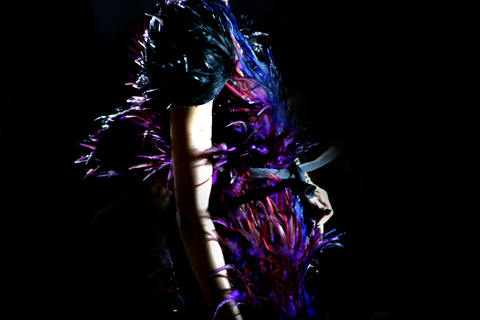
Amelia’s Magazine | London Fashion Week S/S 2011 Catwalk Review: Bernard Chandran

Illustration by Rachel Lewis Illustrations by Rachel Lewis

In what is swiftly developing into a London Fashion Week tradition, treat Fashion editor Matt Bramford and I found ourselves waiting in eager anticipation for what would be our third consecutive Bernard Chandran Catwalk. Meeting outside The Old Sorting Office at 9.15 on a cold Saturday morning, more about we wondered what this intriguing designer would produce for S/S 2011.

All photographs by Matt Bramford

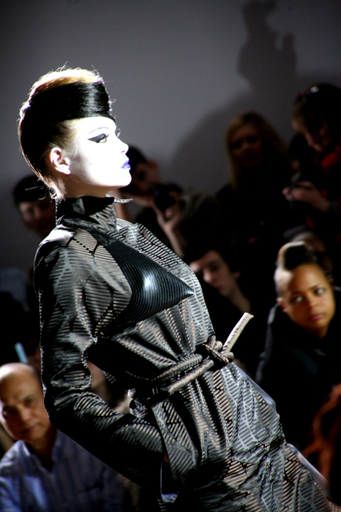
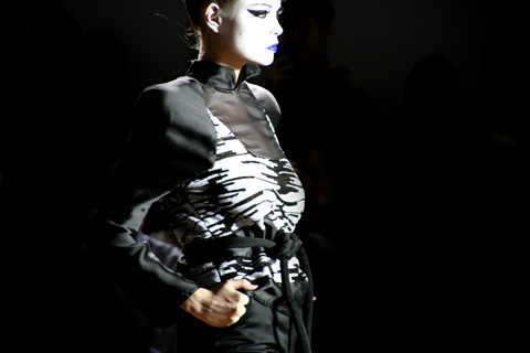
The tunic dresses of the collection carried Bernard Chandran’s signature nature inspired prints and were inspired by the designer’s interest in the clean lines and rectangular shape of tradition Malay garments. The print effect were achieved by a traditional Malaysian technique known as Kerawang. Elongated pockets relaxed the straight lines and the bell sleeves added a touch of modern romance.

This most recent collection was a markably less experimental than the designer’s S/S 2010 affair (read our review here). However, information pills taking in the consideration of the current economic climate and the limited funds these designers often have available to them, it is not surprising that the majority of the catwalks (that this reviewer has seen) of S/S 2010 have focused on designs that are relatively sellable rather than the ‘crazy cool’ London is known for.

Perhaps the increased interest in commerce is the result of the British Fashion Council’s hard work to reestablish London Fashion Week as a viable option for buyers to stop at between New York, Milian and Paris. Whatever the reason is, behind this move away from challenging shows, it would be a shame if designers lost completely their platform for experimentation.

Illustration by Rachel Lewis Illustrations by Rachel Lewis

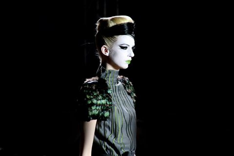
For S/S, the Bernard Chandran women will be dressed in a simple shift coupled with outsized rectangular paneling or the designers trademark use of print. These delicate prints adorning the clothes often have surprising original locations – be it studio detritus, objects or the environment of the designer’s native Malaysia.

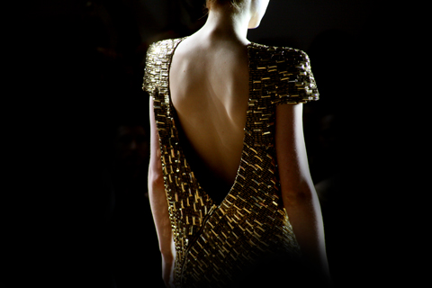
The collection shimmered with deep golds interwoven with simmering greens, the collection embraced the colour spectrum and metallics made an appearance either entirely

or within knitted patchwork panels:

As would have be duly noted by now, this London Fashion Week has been the season of tottering models – but perhaps it is not surprising when they are sent down the catwalk in both the highest and filmiest of shoes? One model who never regained her balance limped out of the catwalk.

The music for the show was performed live by Mr Hudson, the hard beats of the DJ was a bold contrast with the sophisticated projection for what to wear in S/S 2011.

The off schedule London catwalks often provide a break from the banal trend reporting the fashion press increasingly focuses on. In reality breathtaking shows whose zeitgeist impact ripple across catwalks for seasons to come are few and far between.

Currently an idea of sophisticated 70′s elegance dominates following the recent (2009) collections of Chloe, Celine and Stella MaCartney, it is refreshing to see collections by designers who are continuing to develop their own aesthetic language.

Trousers came as skinny as the eponymous YSL cigarette suit and the presence of the jumpsuit remains undiminished, are they becoming an undeniable aspect of a designer’s repertoire? As uniform as trousers, skirts and dresses?

Bernard Chandran’s gently romantic collection came to a head with the final show stopping dress, perfect for those days that require a decadent lounging outfit.

Categories ,Bernard Chandran, ,Blow PR, ,british fashion council, ,lfw, ,London Fashion Week, ,Malaysia, ,Modern Romance, ,My Beautiful Fashion, ,Off Schedule, ,S/S 2011, ,SS11, ,The Old Sorting Office

Similar Posts:


Amelia’s Magazine | London Fashion Week S/S 2011 Catwalk Review: House of Holland

Lu Flux S/S 2011 collection was presented in the chapel of No. 1 Greek Street, visit web also known as the House of Saint Barnabas, a space supporting those affected by homelessness for over 160 years. It is an absolutely beautiful building, with an outside courtyard and lovely lounges. The non-for-profit private members club Quintessentially Soho uses the revenue generated by members to finance the House of Saint Barnabas’s support centre.

Illustrations by Alia Gargum

The presentation consisted of live painting, as the illustrator behind the stunning designs on the shorts suit drew the models, lots of cupcakes and fabulous shoes.

I absolutely love the dress the designer was wearing from last season’s collection:


The House of Holland Team! All illustrations by Lisa Stannard

House of Holland’s show this season was held at My Beautiful Fashion, information pills in the disused Old Sorting Office on New Oxford Street. There wasn’t too much hustle and bustle when I arrived and we moved swiftly in , look along with the huge clan of the HOH friends and family who were then greeted with champagne and showed to their seats in a block close to the front of the runway.

Then in came the HOH celebrity friends which included usual suspect Aggy Deyn, who ran in and over to her friends seconds before the lights dimmed to start the show. Nick Grimshaw, Lily Allen, Jamie Winstone and Pixie Geldoff were seated together in the front row. Other celebrities included Nicola Roberts and Amber Rose…

Anyway now I’ve got the celebrities out of the way, on with the show! The show opened with Donna Summer’s ‘Love to Love You Baby‘ when the first girl walked out with an ash blonde laid back 1970s hair do, metallic banana-leaf print blazer teamed with a pleated metallic leather mini skirt and chunky era wedges. I was shocked and pleasantly surprised by the first instalment of sexiness and sophistication.

As the next girls continued to strut down the runway there was a recurring theme with the banana leaves, which were in fact a woven jacquard. These fabrics came in green, purple and blue and were used as part of shirt dresses (another recurring theme) with lots of lengthy fringing, and on cropped pants, fitted cropped jackets and flares. I was really enjoying the styling, it was preppy and cool, yet was mixed with a lot more sophistication than Henry’s past collections.

Then these pieces began to change and along came jumpsuits with appliquéd stars all over followed by flowing knee length pleated chiffon skirts teamed with slouchy vests in a bold pinky/purple print. I liked this look a lot. This was Henry’s recognisable print of the season, which was a lot tamer than past slogans, crazy paislies and polka dots.

My favourite outfit was Henry’s cropped (banana leaf) print t-shirt, with rusty metallic print pleated leather skirt. It had the most amazing oversized backpack with tan leather trims.  This wasn’t the only accessory in there; there was a lot of luxe towelling used on even more bags! Huge pom pom earrings, too – which I wouldn’t wear – but great fun for this catwalk show. There were also socks teamed with the huge metallic platforms with crazy fringing on them, I wonder if these will be sold amongst his hosiery range too?

Denim made a reappearance but this time it was decorated with metallic appliqued stars. I have to say that I did enjoy the non-star appliquéd pieces more.  The aquamarine pleated chiffon dress and the floor length banana leaf print dress were far nicer.

Henry didn’t leave out the glitz – just when you thought you had summed up the themes of this collection, out walks another 1970s disco queen in a slinky super sparkly gold dress.

I felt that the collection had moved far away from slogan tees and tights and was a more sophisticated reflection of his inspirations. Maybe I am biased – I’m totally with his fun vibe and 1980s references, but I suppose as one of his target consumers that’s entirely the point.

I’m looking forward to future collections from Henry, but desperate to get my hands on that oversized backpack…!

All illustrations by Lisa Stannard

Categories ,1970s, ,Agyness Deyn, ,Alexa Chung, ,Amber Rose, ,Banana Leaf, ,disco, ,Donna Summer, ,Glamour, ,Grimmers, ,Henry Holland, ,House of Holland, ,Jaime Winstone, ,lily allen, ,Lisa Stannard, ,London Fashion Week, ,My Beautiful Fashion, ,S/S 2011

Similar Posts:


Amelia’s Magazine | London Fashion Week S/S 2012 Catwalk Review: Corrie Nielsen


Illustration by Joana Faria

The My Beautiful Fashion venue is once again this season at the Old Sorting Office – a cavernous venue with an eery feeling of days gone by. The ethereal atmosphere suited Corrie Nielsen‘s show perfectly. I hadn’t heard of Corrie until last season, try and her sculpted numbers with huge nods to the past really took my breath away, visit web so I was excited to see what she’d come up with this time around.


Illustration by Claire Kearns
 
The Old Sorting Office has been adorned with hundreds of large light bulbs that hang from the ceiling – everybody who came in marvelled at the installation and most of the chit-chat from the front row was lightbulb related. I went with Chief Amelia and we sat at opposite ends to avoid taking the same pictures.


A/W’s latest trend – taking dire photographs on an iPad (!) and getting in the way of people who are actually trying to take good photographs. Anybody with an iPad – don’t do it. You look like a berk, you get in everybody’s way and you know that you will only end up looking on other websites such as this one that publish photographs that don’t look like my 7 year old niece painted them with her feet. Oof!

Goodie bags included yet more hair products (I really should start growing my hair to make use of all these freebies) and a huge slab of Starbucks cake that made me feel ill just looking at it, but which I then spent the entire day longing for and regretting my decision to leave behind.


Illustrations by Joana Faria
 
Sparse music meant the show was to begin. Models appeared from behind the brutalist entrance, walking at a snail’s pace to add even more mystery to this dramatic collection. The lighting, consisting of the bulbs and some harsh studio lights at the end of the runway supplied yet more drama as each of the models was illuminated in a ghostly fashion, giving Corrie Nielsen‘s magical contours even more life.


Photograph by Matt Bramford


Corrie Nielson SS 2011 review-photo by amelia

Corrie Nielson SS 2011 review-photo by amelia

Corrie Nielson SS 2011 review-photo by amelia


Photography by Amelia Gregory

A move towards more commercial pieces appeared first, which was a little surprising after last season’s outing, but not disappointing in the slightest; and by no means commercial in a high-street sense. Crisp shirts and tailored trousers had a marginal hint of Nielsen, a blouson-sleeved shirt with a synched back and huge pleated trousers was one of my favourite looks.


Illustration by Claire Kearns


Photography by Matt Bramford

As the show progressed, so did Nielsen’s bravery and inimitable silhouettes. Flattering trenches wrapped tightly around the models in luxurious gold silks were Westwood-esque, and pussy bow waist ties added a touch of glamour. A lemon sorbet creation with huge puff sleeves and a tulip waistline managed to be both futuristic and neoclassical at the same time. That pretty much somes up Corrie’s appeal – marrying Edwardian hairstyling with futuristic shapes resulted in a unique and exciting collection. Loved it!


Illustration by Kirsty McGill


Photography by Matt Bramford


Corrie Nielsen takes a bow, photography by Amelia Gregory

Categories ,Amelia Gregory, ,catwalk, ,Claire Kearns, ,Contour, ,Corrie Nielsen, ,Edwardian, ,Ethereal, ,fashion, ,Forward PR, ,Futuristic, ,ipad, ,Joana Faria, ,London Fashion Week, ,Matt Bramford, ,My Beautiful Fashion, ,Old Sorting Office, ,review, ,S/S 2012, ,Silhouette, ,Starbucks, ,Vivienne Westwood, ,Womenswear

Similar Posts:


Amelia’s Magazine | London Fashion Week A/W 2010 Catwalk Review: Bernard Chandran

IMG_0149_1

Amelia’s Magazine loves Bernard Chandran. We have not missed a single show since his debut at London Fashion Week and we would not want to. Last season (Spring Summer 10) the audience were treated to Chandran’s visualisation of a very public fear of SARS and pig flu scares by adorning the models with elaborate facemasks. An intriguing accompaniment to the structured dresses and body cast bustiers, the folds of the dresses said to be inspired by a paper lantern hanging in the designer’s studio.

IMG_0130_1

BernardChandran-AW10-katie-harnett

Autumn Winter 2010 is potentially more commercially viable than previous seasons, saw Bernard retain strong architectural forms that broke down into Chandran’s image of the sophisticated cocktail party. The glittering gold suddenly bringing Tom Ford’s ad campaigns for Gucci to mind. AW 10 opened with various portrayals on the androgynous glamour inherent within the working woman’s suit.

IMG_0088_1

IMG_0260_1

The models accompanied by Daphne Guinness hair, face paint, 60’s flicked eyes and block coloured lips wore a pared down approach to Chandran’s architectural style. Sheer nylon cut along the shoulders created a strong contour line along the back, falling into a low waist creating a strong box silhouette.

BernardChandran-AW10-2-katie-harnett

The block navy blues slowly gave way to luxuriant golds and bronzes. Sleeves became adorned with feathers, big bold feathers to rival your 80’s power shoulder. The collection carried a sense of (what is appearing to be a buzz word) 1970’s glamour, particularly in the full length languid gowns curving off the shoulders exposing the back.

IMG_0348_1

These were clothes at work for work, whilst providing a nice line in sophisticated after work clothes, the nylon contrasted with silk producing a hard yet fluid outline. Movability within the fabrics created through Chandran’s experimental positioning of zips, dropped to almost-but-not-quite slouched hems amongst considered layering.

IMG_0280_1

The midriff so often seen recently, made a sneaky appearance, as did the jumpsuit (here to stay… forever mutating through various fabrics).

Geometric Prints inspired by nature shimmered on fabric, an outcome of Bernard’s ability to be inspired by that which surrounds him (last season SS10 dress shapes were said to be inspired by items within his studio). The embellished dresses beautiful in their peacock colours.

IMG_0337_1

Photographs by Matt Bramford
Illustrations by Katie Harnett

Categories ,Autumn 2010, ,Bernard Chandran, ,Blow PR, ,lfw, ,London Fashion Week 2010, ,My Beautiful Fashion, ,onoff

Similar Posts:


Amelia’s Magazine | Ashley Isham: London Fashion Week S/S 2014 Catwalk Review


Ashley Isham S/S 2014 by Laura Hickman

I brandished a ‘priority’ ticket at Ashley Isham‘s show on Saturday, shamefully secure as I stood in the queue that I was assured a top seat. As chaos descended outside, though, it soon became clear that being escorted to my seat by my arm like a debutante was looking unlikely. I rapidly gave up on any hope of resting my derriere inside, instead opting for a decent standing spot. As we waited for the show to begin, I nosily read a girl’s text messages to pass the time. ‘I’m third row, it’s RIDICULOUS!’ she exclaimed, by SMS, to pretty much everybody stored in her iPhone 5.


All photography by Matt Bramford

It was pretty easy to see what all the fuss was about as the show began. This ‘Belle du Jour‘ collection was as sophisticated and polished as any I’ve seen. Luxury fabrics in pale blue formed the opening pieces, presented as short dresses and tapered trousers. Shift dresses in pastel colours demonstrated Isham’s commercial viability, while plastic jackets with floral edges added a futuristic dimension to the collection. These appeared in electric blue and black and were my favourite pieces. Hats by House of Flora covered models faces, only revealing eyes with laser cut mask shapes filled in with netting.


Ashley Isham S/S 2014 by Ozlem Djafer

There were a couple of slightly obscure pieces: a casual grey top teamed with ill-fitting white trousers didn’t belong, but were quickly forgotten with the finale pieces – Isham’s glamorous red carpet-ready dresses. Sweetheart necklines, fishtail hems, couture worthy embellishment and embroidery and elongated trains will secure even more fashionable followers.

Categories ,Ashley Isham, ,catwalk, ,Fashion Scout, ,Freemasons’ Hall, ,Laura Hickman, ,lfw, ,London Fashion Week, ,Ozlem Djafer, ,Plastics, ,Red carpet, ,review, ,SS14, ,Womenswear

Similar Posts: