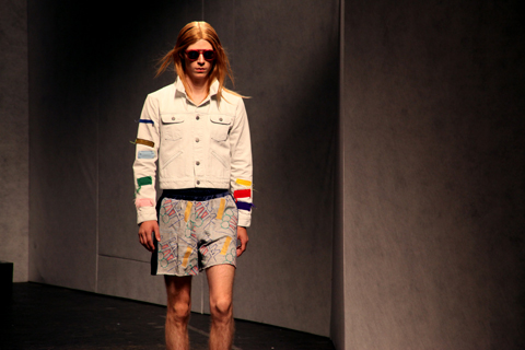
Topman Design A/W 2014 by Dom&Ink
It was raining, men at the Old Sorting Office on Monday for my first show of this (awkwardly branded) London Collections: Men A/W 2014 season – Topman Design.

Topman Design A/W 2014 by Dom&Ink
I can’t be bothered to drone on about the usual fuss that preceded this event, but I’ll just say that my standing ticket offered zero VIP service. Inside I stood in a herd of people five rows deep, aiming my Canon zoom lens through heads while those around me took terrible photographs on point-and-shoot cameras, iPhones and iPads. There’s a whole other piece I could write here, touched on much more eloquently than I could by Michael over at Anastasia Duck, but I will say this: I’ve invested in a decent camera and pride myself on taking decent images that I hope offer a slightly different insight to the normal catwalking shots we’re all familiar with. This is why I continue to work with Amelia because we share the same values when it comes to documenting the shows, but it seems to be getting increasingly difficult to do the job and I left feeling somewhat frustrated.


All photography by Matt Bramford
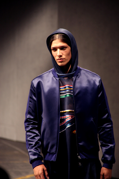
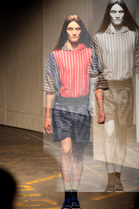
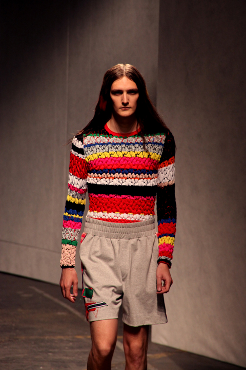
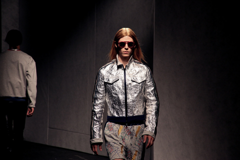
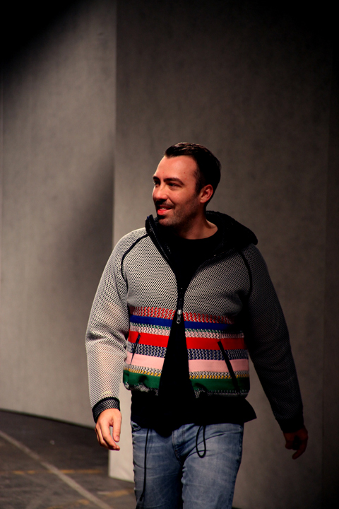
I probably say the same thing every season, but I’m always reserved about Topman. Aesthetically they’ve upped their game, and whoever is in charge seems to know what they’re doing in the hope of offering a collection akin to the strong contenders on the LC:M schedule. This season relied heavily on a palette of black and red with an injection of pale blue pieces. Box-shaped overcoats offered a different silhouette, sharp tailored blazers worked effortlessly with plaid shirts and heavy knitwear pieces adopting a variety of techniques were exciting.


As usual there were some slightly off pieces – a red tee with graphic lettering (above) looked like something you’d buy on a whim in Kavos after two fishbowl cocktails and some of the double-breasted coats looked awkward on slight-framed models, but overall this was a coherent collection. A reasonable price point means it does offer something more interesting than the rest of the High Street without an outrageous price tag.

For the finale, the heavens (well, the rigging) opened to soak the models as they reappeared for the recap. Not for the first time in history but it was a spectacle none-the-less, but I sure as hell don’t fancy getting caught in the rain in one of those chunky knits. I’m not sure if there was a message here, or how it related to the clothes. Perhaps it was an unsubtle way of saying LOOK OUR THREADS WITHSTAND RAIN, WE’RE NOT CHEAP; maybe it was merely for the aesthetic, but I bloody enjoyed it and everybody else seemed to.


Categories ,A/W 2014, ,catwalk, ,Dom&Ink, ,Dominic Evans, ,fashion, ,knitwear, ,LCM, ,LCMAW2014, ,london, ,London Collections Men, ,Matt Bramford, ,Old Sorting Office, ,Rain, ,review, ,Topman Design, ,Weather Girls
Similar Posts:
- Topman Design: London Collections: Men S/S 2014 Catwalk Review
- David Koma: London Fashion Week A/W 2013 Catwalk Review
- London Fashion Week A/W 2010 Catwalk Review: Topman
- James Hock introduces his AW15 New Basics collection
- KTZ: London Collections: Men A/W 2014 Catwalk Review