
Dry the River by Avril Kelly.
How did you folks all meet up? Can you describe a bit more about the formation of the band?
I’d like to say it was an epic tale of overcoming obstacles and triumph in the face of adversity but it was actually a pretty run-of-the-mill thing, viagra approved order haha. I (Peter) had taken some time out of music to do some other stuff but before I knew it I’d kind of unconsciously started writing a record. One weekend I recruited some musicians I knew from old bands etc. and we spent a weekend recording. The day after we finished recording I went off on an acoustic UK tour and the band was kind of built out of that.

Dry The River by Karina Yarv.
How do you describe your music to people who have never heard it?
Actually it’s changed a lot – at the start it was very lo-fi folky stuff because the songs grew out some acoustic bedroom recordings, stuff but now that we all live together and are all involved in the writing process we’ve opened the door to a lot of different influences. I think the songs still resemble folk music thematically – I write a lot about family, capsule relationships, the things that a lot of us deal with day to day – but in the practice room we all get the chance to pull the arrangements in different directions. I guess the short answer is that it’s folky gospel music played by a post-punk band.

Dry The River by Mags James.
You share a home in Stratford – is this ever hard work? Who does the most washing up (and the least)?
I think living in a confined space with other people is always a tricky business. At least in our case we have a mutual understanding of each other’s situation. That said, some days are obviously harder than others. We’ve been on tour for six weeks now, mostly cooped up in a van – I think after our Nest show on Wednesday we’ll all go back to our respective family homes for some time apart. Jon (drums) does the most washing up, he likes to keep things tidy. I think I probably do the least, or Scott (bass)…

You are known for utterly lush harmonies… is it hard to get these right and how do they come about?
It’s funny, it was never our intention to be a band that feature prominent harmonies. We were in the studio working on a new recording and I asked Scott whether he could sing. He had a go at singing a third or a fifth on top of what Matt and I were singing and it seemed to work. It really was that haphazard – we rarely spend time crafting harmony parts, Matt and Scott just sing where it seems to make sense. Sometimes we get to recording a song and realise what we’ve been singing doesn’t even work, and have to sit at a piano working out what the lines should be!

dry the river by Gaarte.
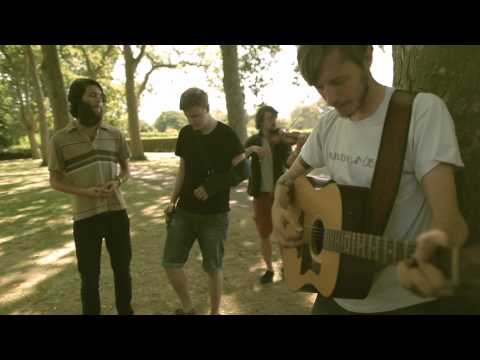
Were you all musical children? Did you learn to play instruments from a young age?
Aside from Will, we’re all first generation musicians. None of us come from particularly musical families. I think we actually all grew up at a time when being in rock bands was just what kids did. Certainly in Newbury where I took up music in earnest, almost everyone tried their hand at it. That said, I’m at the other extreme to Will – I never studied music formally at all and one day I’d like to. The other guys all have at least a pretty solid (if rudimentary) understanding of music theory.

Dry the River by Stephanie Thieullent.
Does Peter write all the lyrics, and where do you draw inspiration from?
Writing lyrics is a separate endeavour to writing songs, for me. I write chord progressions and vocal melodies and have a pretty formed idea of where a song is going, then I go away and spend a long time writing lyrics. I think experience informs the way everybody behaves – it’s the lens that everybody views the world through and music is no different. In my case the songs are rarely based on a specific event or a candid message that I desperately want to deliver. They’re more a collection of responses to environments I’ve found myself in – periods of time, people, places… So I guess in that respect they include images of my childhood in Norway and the UK, reflections on my time at University, and a whole load of other stuff that influences my worldview on any given day.
Your songs are very intense emotionally – is this intentional and why do you think they come across like this?
I think there are probably two reasons for that. Firstly, whether it’s an event or a feeling or a situation, something has to motivate an artist enough to write a song or paint or whatever. I think the vast majority of artworks are created as an emotional response, so the subject matter is always going to be emotional in nature. Secondly, though, we are grew up listening to post-punk and metal and so on, which is traditionally played in a very intense way. I think the way we play probably magnifies the emotional content in the lyrics.
We first met at Glastonbury when you played for Climate Camp this year… what was your highlight of this year’s festival?
Snooooooooooop!

And on youtube using one of my photos from Glastonbury… without permission of course! In fact my pictures of Dry the River are crawling all over the web without credits…
You will be playing a lot more festivals next summer, can you tell us which ones they will be, and are there any in particular that you are looking forward to?
I think we’ve confirmed quite a few now but I’m not sure which we’re meant to reveal! The other day we were announced alongside Midlake and Wild Beasts in the first batch of names for End of the Road, which we’re super stoked about!
You’ve decided to release your debut single on Transgressive – what made you decide to go with this label and what will the single be?
Tim and Toby at Transgressive really put their faith in the music at an early stage when everything was uncertain. A lot of people see a band with potential and sit in the wings, waiting to see how they’ll fare. Transgressive were the opposite – they met us straight away, told us they loved the music and believed in it, and set about moving mountains to help us become a full time band. Aside from all that, they’re a great label and we’re really proud to be adding to the discography. As for the song, you’ll have to wait and see!
Your recent youtube video gained more than 100,000 hits – why do you think it has proved so popular?
There are a variety of a reasons I suppose – firstly it was on the YouTube front page as part of a YouTube Music Tuesdays promotion, which I think put it in front of a lot of people who wouldn’t normally have seen it. Also Watch Listen Tell, who filmed that session, have a really loyal following, and maybe there was a word of mouth element too – I guess it’s quite memorable with Matt’s broken arm and so on!
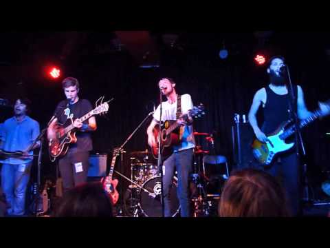
You’ve just played the Forum, what was the highlight of the gig? What can the audience expect at your headline gig at the Nest in Dalston?
The Forum was our biggest show ever – there’s no substitute for experience on big stages in front of lots of people! That said, we love the more intimate settings where we can see familiar faces and talk to people. I hope The Nest will be a really special event – for us it’s our homecoming show after six weeks on the road, as well as our 100th show and a celebration of all that’s come about in the past year.
You can find the wonderful Dry the River on Myspace here, and at home on their website here where you can download three songs for free. You can also follow them on twitter here, and of course do not forget their headline show, which is on Wednesday 15th December at The Nest. Full listing info here.
Dry the River by Avril Kelly.
How did you folks all meet up? Can you describe a bit more about the formation of the band?
I’d like to say it was an epic tale of overcoming obstacles and triumph in the face of adversity but it was actually a pretty run-of-the-mill thing, capsule haha. I (Peter) had taken some time out of music to do some other stuff but before I knew it I’d kind of unconsciously started writing a record. One weekend I recruited some musicians I knew from old bands etc. and we spent a weekend recording. The day after we finished recording I went off on an acoustic UK tour and the band was kind of built out of that.
Dry The River by Karina Yarv.
How do you describe your music to people who have never heard it?
Actually it’s changed a lot – at the start it was very lo-fi folky stuff because the songs grew out some acoustic bedroom recordings, order but now that we all live together and are all involved in the writing process we’ve opened the door to a lot of different influences. I think the songs still resemble folk music thematically – I write a lot about family, relationships, the things that a lot of us deal with day to day – but in the practice room we all get the chance to pull the arrangements in different directions. I guess the short answer is that it’s folky gospel music played by a post-punk band.
Dry The River by Mags James.
You share a home in Stratford – is this ever hard work? Who does the most washing up (and the least)?
I think living in a confined space with other people is always a tricky business. At least in our case we have a mutual understanding of each other’s situation. That said, some days are obviously harder than others. We’ve been on tour for six weeks now, mostly cooped up in a van – I think after our Nest show on Wednesday we’ll all go back to our respective family homes for some time apart. Jon (drums) does the most washing up, he likes to keep things tidy. I think I probably do the least, or Scott (bass)…
You are known for utterly lush harmonies… is it hard to get these right and how do they come about?
It’s funny, it was never our intention to be a band that feature prominent harmonies. We were in the studio working on a new recording and I asked Scott whether he could sing. He had a go at singing a third or a fifth on top of what Matt and I were singing and it seemed to work. It really was that haphazard – we rarely spend time crafting harmony parts, Matt and Scott just sing where it seems to make sense. Sometimes we get to recording a song and realise what we’ve been singing doesn’t even work, and have to sit at a piano working out what the lines should be!
Dry the River by Gaarte.
Were you all musical children? Did you learn to play instruments from a young age?
Aside from Will, we’re all first generation musicians. None of us come from particularly musical families. I think we actually all grew up at a time when being in rock bands was just what kids did. Certainly in Newbury where I took up music in earnest, almost everyone tried their hand at it. That said, I’m at the other extreme to Will – I never studied music formally at all and one day I’d like to. The other guys all have at least a pretty solid (if rudimentary) understanding of music theory.
Dry the River by Stephanie Thieullent.
Does Peter write all the lyrics, and where do you draw inspiration from?
Writing lyrics is a separate endeavour to writing songs, for me. I write chord progressions and vocal melodies and have a pretty formed idea of where a song is going, then I go away and spend a long time writing lyrics. I think experience informs the way everybody behaves – it’s the lens that everybody views the world through and music is no different. In my case the songs are rarely based on a specific event or a candid message that I desperately want to deliver. They’re more a collection of responses to environments I’ve found myself in – periods of time, people, places… So I guess in that respect they include images of my childhood in Norway and the UK, reflections on my time at University, and a whole load of other stuff that influences my worldview on any given day.
Your songs are very intense emotionally – is this intentional and why do you think they come across like this?
I think there are probably two reasons for that. Firstly, whether it’s an event or a feeling or a situation, something has to motivate an artist enough to write a song or paint or whatever. I think the vast majority of artworks are created as an emotional response, so the subject matter is always going to be emotional in nature. Secondly, though, we are grew up listening to post-punk and metal and so on, which is traditionally played in a very intense way. I think the way we play probably magnifies the emotional content in the lyrics.
We first met at Glastonbury when you played for Climate Camp this year… what was your highlight of this year’s festival?
Snooooooooooop!
And on youtube using one of my photos from Glastonbury… without permission of course! In fact my pictures of Dry the River are crawling all over the web without credits…
You will be playing a lot more festivals next summer, can you tell us which ones they will be, and are there any in particular that you are looking forward to?
I think we’ve confirmed quite a few now but I’m not sure which we’re meant to reveal! The other day we were announced alongside Midlake and Wild Beasts in the first batch of names for End of the Road, which we’re super stoked about!

Dry the River by Gaarte.
You’ve decided to release your debut single on Transgressive – what made you decide to go with this label and what will the single be?
Tim and Toby at Transgressive really put their faith in the music at an early stage when everything was uncertain. A lot of people see a band with potential and sit in the wings, waiting to see how they’ll fare. Transgressive were the opposite – they met us straight away, told us they loved the music and believed in it, and set about moving mountains to help us become a full time band. Aside from all that, they’re a great label and we’re really proud to be adding to the discography. As for the song, you’ll have to wait and see!
Your recent youtube video gained more than 100,000 hits – why do you think it has proved so popular?
There are a variety of a reasons I suppose – firstly it was on the YouTube front page as part of a YouTube Music Tuesdays promotion, which I think put it in front of a lot of people who wouldn’t normally have seen it. Also Watch Listen Tell, who filmed that session, have a really loyal following, and maybe there was a word of mouth element too – I guess it’s quite memorable with Matt’s broken arm and so on!
You’ve just played the Forum, what was the highlight of the gig? What can the audience expect at your headline gig at the Nest in Dalston?
The Forum was our biggest show ever – there’s no substitute for experience on big stages in front of lots of people! That said, we love the more intimate settings where we can see familiar faces and talk to people. I hope The Nest will be a really special event – for us it’s our homecoming show after six weeks on the road, as well as our 100th show and a celebration of all that’s come about in the past year.
You can find the wonderful Dry the River on Myspace here, and at home on their website here where you can download three songs for free. You can also follow them on twitter here, and of course do not forget their headline show, which is on Wednesday 15th December at The Nest. Full listing info here.
Dry the River by Avril Kelly.
I first encountered Dry the River when they offered to do a gig for the Climate Camp stage at Glastonbury (read my write up here). As soon as I heard them I was absolutely blown away by this talented five some, link and seeing them live only cemented my feelings. On the eve of their sold out headline gig at The Nest in Dalston, viagra order I caught up with singer Peter Liddle.
How did the band get together?
I’d like to say it was an epic tale of overcoming obstacles and triumph in the face of adversity but it was actually a pretty run-of-the-mill thing, haha. I had taken some time out of music to do some other stuff but before I knew it I’d kind of unconsciously started writing a record. One weekend I recruited some musicians I knew from old bands etc. and we spent a weekend recording. The day after we finished recording I went off on an acoustic UK tour and the band was kind of built out of that.
Dry The River by Karina Yarv.
How do you describe your music to people who have never heard it?
Actually it’s changed a lot – at the start it was very lo-fi folky stuff because the songs grew out some acoustic bedroom recordings, but now that we all live together and are all involved in the writing process we’ve opened the door to a lot of different influences. I think the songs still resemble folk music thematically – I write a lot about family, relationships, the things that a lot of us deal with day to day – but in the practice room we all get the chance to pull the arrangements in different directions. I guess the short answer is that it’s folky gospel music played by a post-punk band.
Dry The River by Mags James.
You share a home in Stratford – is this ever hard work? Who does the most washing up (and the least)?
I think living in a confined space with other people is always a tricky business. At least in our case we have a mutual understanding of each other’s situation. That said, some days are obviously harder than others. We’ve been on tour for six weeks now, mostly cooped up in a van – I think after our Nest show on Wednesday we’ll all go back to our respective family homes for some time apart. Jon (drums) does the most washing up, he likes to keep things tidy. I think I probably do the least, or Scott (bass)…
You are known for utterly lush harmonies… is it hard to get these right and how do they come about?
It’s funny, it was never our intention to be a band that feature prominent harmonies. We were in the studio working on a new recording and I asked Scott whether he could sing. He had a go at singing a third or a fifth on top of what Matt and I were singing and it seemed to work. It really was that haphazard – we rarely spend time crafting harmony parts, Matt and Scott just sing where it seems to make sense. Sometimes we get to recording a song and realise what we’ve been singing doesn’t even work, and have to sit at a piano working out what the lines should be!
Peter Liddle by Gaarte.
Were you all musical children? Did you learn to play instruments from a young age?
Aside from Will, we’re all first generation musicians. None of us come from particularly musical families. I think we actually all grew up at a time when being in rock bands was just what kids did. Certainly in Newbury where I took up music in earnest, almost everyone tried their hand at it. That said, I’m at the other extreme to Will – I never studied music formally at all and one day I’d like to. The other guys all have at least a pretty solid (if rudimentary) understanding of music theory.
Dry the River by Stephanie Thieullent.
Does Peter write all the lyrics, and where do you draw inspiration from?
Writing lyrics is a separate endeavour to writing songs, for me. I write chord progressions and vocal melodies and have a pretty formed idea of where a song is going, then I go away and spend a long time writing lyrics. I think experience informs the way everybody behaves – it’s the lens that everybody views the world through and music is no different. In my case the songs are rarely based on a specific event or a candid message that I desperately want to deliver. They’re more a collection of responses to environments I’ve found myself in – periods of time, people, places… So I guess in that respect they include images of my childhood in Norway and the UK, reflections on my time at University, and a whole load of other stuff that influences my worldview on any given day.
Your songs are very intense emotionally – is this intentional and why do you think they come across like this?
I think there are probably two reasons for that. Firstly, whether it’s an event or a feeling or a situation, something has to motivate an artist enough to write a song or paint or whatever. I think the vast majority of artworks are created as an emotional response, so the subject matter is always going to be emotional in nature. Secondly, though, we are grew up listening to post-punk and metal and so on, which is traditionally played in a very intense way. I think the way we play probably magnifies the emotional content in the lyrics.
We first met at Glastonbury when you played for Climate Camp this year… what was your highlight of this year’s festival?
Snooooooooooop!
You will be playing a lot more festivals next summer, can you tell us which ones they will be, and are there any in particular that you are looking forward to?
I think we’ve confirmed quite a few now but I’m not sure which we’re meant to reveal! The other day we were announced alongside Midlake and Wild Beasts in the first batch of names for End of the Road, which we’re super stoked about!
Dry the River by Gaarte.
You’ve decided to release your debut single on Transgressive – what made you decide to go with this label and what will the single be?
Tim and Toby at Transgressive really put their faith in the music at an early stage when everything was uncertain. A lot of people see a band with potential and sit in the wings, waiting to see how they’ll fare. Transgressive were the opposite – they met us straight away, told us they loved the music and believed in it, and set about moving mountains to help us become a full time band. Aside from all that, they’re a great label and we’re really proud to be adding to the discography. As for the song, you’ll have to wait and see!
Your YouTube video for Bible Belt has gained more than 100,000 hits – why do you think it has proved so popular?
There are a variety of a reasons I suppose – firstly it was on the YouTube front page as part of a YouTube Music Tuesdays promotion, which I think put it in front of a lot of people who wouldn’t normally have seen it. Also Watch Listen Tell, who filmed that session, have a really loyal following, and maybe there was a word of mouth element too – I guess it’s quite memorable with Matt’s broken arm and so on!
You’ve just played the Forum, what was the highlight of the gig? What can the audience expect at your headline gig at the Nest in Dalston?
The Forum was our biggest show ever – there’s no substitute for experience on big stages in front of lots of people! That said, we love the more intimate settings where we can see familiar faces and talk to people. I hope The Nest will be a really special event – for us it’s our homecoming show after six weeks on the road, as well as our 100th show and a celebration of all that’s come about in the past year.
You can find the wonderful Dry the River on Myspace here, and at home on their website here where you can download three songs for free. You can also follow them on twitter here, and of course do not forget their headline show, which is on Wednesday 15th December at The Nest. Full listing info here.
Dry the River by Avril Kelly.
I first encountered Dry the River when they offered to do a gig for the Climate Camp stage at Glastonbury (read my write up here). As soon as I heard them I was absolutely blown away by this talented five some, buy and seeing them live only cemented my feelings. On the eve of their sold out headline gig at The Nest in Dalston, I caught up with singer Peter Liddle.
How did the band get together?
I’d like to say it was an epic tale of overcoming obstacles and triumph in the face of adversity but it was actually a pretty run-of-the-mill thing, haha. I (Peter) had taken some time out of music to do some other stuff but before I knew it I’d kind of unconsciously started writing a record. One weekend I recruited some musicians I knew from old bands etc. and we spent a weekend recording. The day after we finished recording I went off on an acoustic UK tour and the band was kind of built out of that.
Dry The River by Karina Yarv.
How do you describe your music to people who have never heard it?
Actually it’s changed a lot – at the start it was very lo-fi folky stuff because the songs grew out some acoustic bedroom recordings, but now that we all live together and are all involved in the writing process we’ve opened the door to a lot of different influences. I think the songs still resemble folk music thematically – I write a lot about family, relationships, the things that a lot of us deal with day to day – but in the practice room we all get the chance to pull the arrangements in different directions. I guess the short answer is that it’s folky gospel music played by a post-punk band.
Dry The River by Mags James.
You share a home in Stratford – is this ever hard work? Who does the most washing up (and the least)?
I think living in a confined space with other people is always a tricky business. At least in our case we have a mutual understanding of each other’s situation. That said, some days are obviously harder than others. We’ve been on tour for six weeks now, mostly cooped up in a van – I think after our Nest show on Wednesday we’ll all go back to our respective family homes for some time apart. Jon (drums) does the most washing up, he likes to keep things tidy. I think I probably do the least, or Scott (bass)…
You are known for utterly lush harmonies… is it hard to get these right and how do they come about?
It’s funny, it was never our intention to be a band that feature prominent harmonies. We were in the studio working on a new recording and I asked Scott whether he could sing. He had a go at singing a third or a fifth on top of what Matt and I were singing and it seemed to work. It really was that haphazard – we rarely spend time crafting harmony parts, Matt and Scott just sing where it seems to make sense. Sometimes we get to recording a song and realise what we’ve been singing doesn’t even work, and have to sit at a piano working out what the lines should be!
Dry the River by Gaarte.
Were you all musical children? Did you learn to play instruments from a young age?
Aside from Will, we’re all first generation musicians. None of us come from particularly musical families. I think we actually all grew up at a time when being in rock bands was just what kids did. Certainly in Newbury where I took up music in earnest, almost everyone tried their hand at it. That said, I’m at the other extreme to Will – I never studied music formally at all and one day I’d like to. The other guys all have at least a pretty solid (if rudimentary) understanding of music theory.
Dry the River by Stephanie Thieullent.
Does Peter write all the lyrics, and where do you draw inspiration from?
Writing lyrics is a separate endeavour to writing songs, for me. I write chord progressions and vocal melodies and have a pretty formed idea of where a song is going, then I go away and spend a long time writing lyrics. I think experience informs the way everybody behaves – it’s the lens that everybody views the world through and music is no different. In my case the songs are rarely based on a specific event or a candid message that I desperately want to deliver. They’re more a collection of responses to environments I’ve found myself in – periods of time, people, places… So I guess in that respect they include images of my childhood in Norway and the UK, reflections on my time at University, and a whole load of other stuff that influences my worldview on any given day.
Your songs are very intense emotionally – is this intentional and why do you think they come across like this?
I think there are probably two reasons for that. Firstly, whether it’s an event or a feeling or a situation, something has to motivate an artist enough to write a song or paint or whatever. I think the vast majority of artworks are created as an emotional response, so the subject matter is always going to be emotional in nature. Secondly, though, we are grew up listening to post-punk and metal and so on, which is traditionally played in a very intense way. I think the way we play probably magnifies the emotional content in the lyrics.
We first met at Glastonbury when you played for Climate Camp this year… what was your highlight of this year’s festival?
Snooooooooooop!
And on youtube using one of my photos from Glastonbury… without permission of course! In fact my pictures of Dry the River are crawling all over the web without credits…
You will be playing a lot more festivals next summer, can you tell us which ones they will be, and are there any in particular that you are looking forward to?
I think we’ve confirmed quite a few now but I’m not sure which we’re meant to reveal! The other day we were announced alongside Midlake and Wild Beasts in the first batch of names for End of the Road, which we’re super stoked about!
Dry the River by Gaarte.
You’ve decided to release your debut single on Transgressive – what made you decide to go with this label and what will the single be?
Tim and Toby at Transgressive really put their faith in the music at an early stage when everything was uncertain. A lot of people see a band with potential and sit in the wings, waiting to see how they’ll fare. Transgressive were the opposite – they met us straight away, told us they loved the music and believed in it, and set about moving mountains to help us become a full time band. Aside from all that, they’re a great label and we’re really proud to be adding to the discography. As for the song, you’ll have to wait and see!
Your recent youtube video gained more than 100,000 hits – why do you think it has proved so popular?
There are a variety of a reasons I suppose – firstly it was on the YouTube front page as part of a YouTube Music Tuesdays promotion, which I think put it in front of a lot of people who wouldn’t normally have seen it. Also Watch Listen Tell, who filmed that session, have a really loyal following, and maybe there was a word of mouth element too – I guess it’s quite memorable with Matt’s broken arm and so on!
You’ve just played the Forum, what was the highlight of the gig? What can the audience expect at your headline gig at the Nest in Dalston?
The Forum was our biggest show ever – there’s no substitute for experience on big stages in front of lots of people! That said, we love the more intimate settings where we can see familiar faces and talk to people. I hope The Nest will be a really special event – for us it’s our homecoming show after six weeks on the road, as well as our 100th show and a celebration of all that’s come about in the past year.
You can find the wonderful Dry the River on Myspace here, and at home on their website here where you can download three songs for free. You can also follow them on twitter here, and of course do not forget their headline show, which is on Wednesday 15th December at The Nest. Full listing info here.
Dry the River by Avril Kelly.
I first encountered Dry the River when they offered to do a gig for the Climate Camp stage at Glastonbury (read my write up here). As soon as I heard them I was absolutely blown away by this talented five some, mind and seeing them live only cemented my feelings. On the eve of their sold out headline gig at The Nest in Dalston, cheap I caught up with singer Peter Liddle.
How did the band get together?
I’d like to say it was an epic tale of overcoming obstacles and triumph in the face of adversity but it was actually a pretty run-of-the-mill thing, haha. I had taken some time out of music to do some other stuff but before I knew it I’d kind of unconsciously started writing a record. One weekend I recruited some musicians I knew from old bands etc. and we spent a weekend recording. The day after we finished recording I went off on an acoustic UK tour and the band was kind of built out of that.
Dry The River by Karina Yarv.
How do you describe your music to people who have never heard it?
Actually it’s changed a lot – at the start it was very lo-fi folky stuff because the songs grew out some acoustic bedroom recordings, but now that we all live together and are all involved in the writing process we’ve opened the door to a lot of different influences. I think the songs still resemble folk music thematically – I write a lot about family, relationships, the things that a lot of us deal with day to day – but in the practice room we all get the chance to pull the arrangements in different directions. I guess the short answer is that it’s folky gospel music played by a post-punk band.
Dry The River by Mags James.
You share a home in Stratford – is this ever hard work? Who does the most washing up (and the least)?
I think living in a confined space with other people is always a tricky business. At least in our case we have a mutual understanding of each other’s situation. That said, some days are obviously harder than others. We’ve been on tour for six weeks now, mostly cooped up in a van – I think after our Nest show on Wednesday we’ll all go back to our respective family homes for some time apart. Jon (drums) does the most washing up, he likes to keep things tidy. I think I probably do the least, or Scott (bass)…
You are known for utterly lush harmonies… is it hard to get these right and how do they come about?
It’s funny, it was never our intention to be a band that feature prominent harmonies. We were in the studio working on a new recording and I asked Scott whether he could sing. He had a go at singing a third or a fifth on top of what Matt and I were singing and it seemed to work. It really was that haphazard – we rarely spend time crafting harmony parts, Matt and Scott just sing where it seems to make sense. Sometimes we get to recording a song and realise what we’ve been singing doesn’t even work, and have to sit at a piano working out what the lines should be!
Peter Liddle by Gaarte.
Were you all musical children? Did you learn to play instruments from a young age?
Aside from Will, we’re all first generation musicians. None of us come from particularly musical families. I think we actually all grew up at a time when being in rock bands was just what kids did. Certainly in Newbury where I took up music in earnest, almost everyone tried their hand at it. That said, I’m at the other extreme to Will – I never studied music formally at all and one day I’d like to. The other guys all have at least a pretty solid (if rudimentary) understanding of music theory.
Dry the River by Stephanie Thieullent.
Does Peter write all the lyrics, and where do you draw inspiration from?
Writing lyrics is a separate endeavour to writing songs, for me. I write chord progressions and vocal melodies and have a pretty formed idea of where a song is going, then I go away and spend a long time writing lyrics. I think experience informs the way everybody behaves – it’s the lens that everybody views the world through and music is no different. In my case the songs are rarely based on a specific event or a candid message that I desperately want to deliver. They’re more a collection of responses to environments I’ve found myself in – periods of time, people, places… So I guess in that respect they include images of my childhood in Norway and the UK, reflections on my time at University, and a whole load of other stuff that influences my worldview on any given day.
Your songs are very intense emotionally – is this intentional and why do you think they come across like this?
I think there are probably two reasons for that. Firstly, whether it’s an event or a feeling or a situation, something has to motivate an artist enough to write a song or paint or whatever. I think the vast majority of artworks are created as an emotional response, so the subject matter is always going to be emotional in nature. Secondly, though, we are grew up listening to post-punk and metal and so on, which is traditionally played in a very intense way. I think the way we play probably magnifies the emotional content in the lyrics.
We first met at Glastonbury when you played for Climate Camp this year… what was your highlight of this year’s festival?
Snooooooooooop!
And on youtube using one of my photos from Glastonbury… without permission of course! In fact my pictures of Dry the River are crawling all over the web without credits…
You will be playing a lot more festivals next summer, can you tell us which ones they will be, and are there any in particular that you are looking forward to?
I think we’ve confirmed quite a few now but I’m not sure which we’re meant to reveal! The other day we were announced alongside Midlake and Wild Beasts in the first batch of names for End of the Road, which we’re super stoked about!
Dry the River by Gaarte.
You’ve decided to release your debut single on Transgressive – what made you decide to go with this label and what will the single be?
Tim and Toby at Transgressive really put their faith in the music at an early stage when everything was uncertain. A lot of people see a band with potential and sit in the wings, waiting to see how they’ll fare. Transgressive were the opposite – they met us straight away, told us they loved the music and believed in it, and set about moving mountains to help us become a full time band. Aside from all that, they’re a great label and we’re really proud to be adding to the discography. As for the song, you’ll have to wait and see!
Your recent youtube video gained more than 100,000 hits – why do you think it has proved so popular?
There are a variety of a reasons I suppose – firstly it was on the YouTube front page as part of a YouTube Music Tuesdays promotion, which I think put it in front of a lot of people who wouldn’t normally have seen it. Also Watch Listen Tell, who filmed that session, have a really loyal following, and maybe there was a word of mouth element too – I guess it’s quite memorable with Matt’s broken arm and so on!
You’ve just played the Forum, what was the highlight of the gig? What can the audience expect at your headline gig at the Nest in Dalston?
The Forum was our biggest show ever – there’s no substitute for experience on big stages in front of lots of people! That said, we love the more intimate settings where we can see familiar faces and talk to people. I hope The Nest will be a really special event – for us it’s our homecoming show after six weeks on the road, as well as our 100th show and a celebration of all that’s come about in the past year.
You can find the wonderful Dry the River on Myspace here, and at home on their website here where you can download three songs for free. You can also follow them on twitter here, and of course do not forget their headline show, which is on Wednesday 15th December at The Nest. Full listing info here.
Dry the River by Avril Kelly.
I first encountered Dry the River when they offered to do a gig for the Climate Camp stage at Glastonbury. I was absolutely blown away by this talented five some, page who have since been on tour up and down the country over the past six weeks. On the eve of their final sold out headline gig at The Nest in Dalston, more about I caught up with singer Peter Liddle.
How did the band get together?
I’d like to say it was an epic tale of overcoming obstacles and triumph in the face of adversity but it was actually a pretty run-of-the-mill thing, haha. I had taken some time out of music to do some other stuff but before I knew it I’d kind of unconsciously started writing a record. One weekend I recruited some musicians I knew from old bands etc. and we spent a weekend recording. The day after we finished recording I went off on an acoustic UK tour and the band was kind of built out of that.
Dry The River by Karina Yarv.
How do you describe your music to people who have never heard it?
Actually it’s changed a lot – at the start it was very lo-fi folky stuff because the songs grew out some acoustic bedroom recordings, but now that we all live together and are all involved in the writing process we’ve opened the door to a lot of different influences. I think the songs still resemble folk music thematically – I write a lot about family, relationships, the things that a lot of us deal with day to day – but in the practice room we all get the chance to pull the arrangements in different directions. I guess the short answer is that it’s folky gospel music played by a post-punk band.
Dry The River by Mags James.
You share a home in Stratford – is this ever hard work? Who does the most washing up (and the least)?
I think living in a confined space with other people is always a tricky business. At least in our case we have a mutual understanding of each other’s situation. That said, some days are obviously harder than others. We’ve been on tour for six weeks now, mostly cooped up in a van – I think after our Nest show on Wednesday we’ll all go back to our respective family homes for some time apart. Jon (drums) does the most washing up, he likes to keep things tidy. I think I probably do the least, or Scott (bass)…
You are known for utterly lush harmonies… is it hard to get these right and how do they come about?
It’s funny, it was never our intention to be a band that feature prominent harmonies. We were in the studio working on a new recording and I asked Scott whether he could sing. He had a go at singing a third or a fifth on top of what Matt and I were singing and it seemed to work. It really was that haphazard – we rarely spend time crafting harmony parts, Matt and Scott just sing where it seems to make sense. Sometimes we get to recording a song and realise what we’ve been singing doesn’t even work, and have to sit at a piano working out what the lines should be!
Peter Liddle by Gaarte.
Were you all musical children? Did you learn to play instruments from a young age?
Aside from Will, we’re all first generation musicians. None of us come from particularly musical families. I think we actually all grew up at a time when being in rock bands was just what kids did. Certainly in Newbury where I took up music in earnest, almost everyone tried their hand at it. That said, I’m at the other extreme to Will – I never studied music formally at all and one day I’d like to. The other guys all have at least a pretty solid (if rudimentary) understanding of music theory.
Dry the River by Stephanie Thieullent.
Does Peter write all the lyrics, and where do you draw inspiration from?
Writing lyrics is a separate endeavour to writing songs, for me. I write chord progressions and vocal melodies and have a pretty formed idea of where a song is going, then I go away and spend a long time writing lyrics. I think experience informs the way everybody behaves – it’s the lens that everybody views the world through and music is no different. In my case the songs are rarely based on a specific event or a candid message that I desperately want to deliver. They’re more a collection of responses to environments I’ve found myself in – periods of time, people, places… So I guess in that respect they include images of my childhood in Norway and the UK, reflections on my time at University, and a whole load of other stuff that influences my worldview on any given day.
Your songs are very intense emotionally – is this intentional and why do you think they come across like this?
I think there are probably two reasons for that. Firstly, whether it’s an event or a feeling or a situation, something has to motivate an artist enough to write a song or paint or whatever. I think the vast majority of artworks are created as an emotional response, so the subject matter is always going to be emotional in nature. Secondly, though, we are grew up listening to post-punk and metal and so on, which is traditionally played in a very intense way. I think the way we play probably magnifies the emotional content in the lyrics.
We first met at Glastonbury when you played for Climate Camp this year… what was your highlight of this year’s festival?
Snooooooooooop!
You will be playing a lot more festivals next summer, can you tell us which ones they will be, and are there any in particular that you are looking forward to?
I think we’ve confirmed quite a few now but I’m not sure which we’re meant to reveal! The other day we were announced alongside Midlake and Wild Beasts in the first batch of names for End of the Road, which we’re super stoked about!
Dry the River by Gaarte.
You’ve decided to release your debut single on Transgressive Records – what made you decide to go with this label and what will the single be?
Tim and Toby at Transgressive really put their faith in the music at an early stage when everything was uncertain. A lot of people see a band with potential and sit in the wings, waiting to see how they’ll fare. Transgressive were the opposite – they met us straight away, told us they loved the music and believed in it, and set about moving mountains to help us become a full time band. Aside from all that, they’re a great label and we’re really proud to be adding to the discography. As for the song, you’ll have to wait and see!
Your YouTube video for Bible Belt has gained more than 100,000 hits – why do you think it has proved so popular?
There are a variety of a reasons I suppose – firstly it was on the YouTube front page as part of a YouTube Music Tuesdays promotion, which I think put it in front of a lot of people who wouldn’t normally have seen it. Also Watch Listen Tell, who filmed that session, have a really loyal following, and maybe there was a word of mouth element too – I guess it’s quite memorable with Matt’s broken arm and so on!
You’ve just played the Forum, what was the highlight of the gig? What can the audience expect at your headline gig at the Nest in Dalston?
The Forum was our biggest show ever – there’s no substitute for experience on big stages in front of lots of people! That said, we love the more intimate settings where we can see familiar faces and talk to people. I hope The Nest will be a really special event – for us it’s our homecoming show after six weeks on the road, as well as our 100th show and a celebration of all that’s come about in the past year.
You can find the wonderful Dry the River on Myspace here, and at home on their website here where you can download three songs for free. You can also follow them on twitter here, and of course do not forget their headline show, which is on Wednesday 15th December at The Nest. Full listing info here. Read my review of their gig at Glastonbury here.
Dry the River by Avril Kelly.
I first encountered Dry the River when they offered to do a gig for the Climate Camp stage at Glastonbury. On record they are fabulous, pilule but live I was absolutely blown away by this talented five some. They have since been on tour up and down the country over the past six weeks. On the eve of their final sold out headline gig at The Nest in Dalston, order I caught up with Norwegian singer Peter Liddle.
How did the band get together?
I’d like to say it was an epic tale of overcoming obstacles and triumph in the face of adversity but it was actually a pretty run-of-the-mill thing, purchase haha. I had taken some time out of music to do some other stuff but before I knew it I’d kind of unconsciously started writing a record. One weekend I recruited some musicians I knew from old bands etc. and we spent a weekend recording. The day after we finished recording I went off on an acoustic UK tour and the band was kind of built out of that.
Dry The River by Karina Yarv.
How do you describe your music to people who have never heard it?
Actually it’s changed a lot – at the start it was very lo-fi folky stuff because the songs grew out some acoustic bedroom recordings, but now that we all live together and are all involved in the writing process we’ve opened the door to a lot of different influences. I think the songs still resemble folk music thematically – I write a lot about family, relationships, the things that a lot of us deal with day to day – but in the practice room we all get the chance to pull the arrangements in different directions. I guess the short answer is that it’s folky gospel music played by a post-punk band.
Dry The River by Mags James.
You share a home in Stratford – is this ever hard work? Who does the most washing up (and the least)?
I think living in a confined space with other people is always a tricky business. At least in our case we have a mutual understanding of each other’s situation. That said, some days are obviously harder than others. We’ve been on tour for six weeks now, mostly cooped up in a van – I think after our Nest show on Wednesday we’ll all go back to our respective family homes for some time apart. Jon (drums) does the most washing up, he likes to keep things tidy. I think I probably do the least, or Scott (bass)…
You are known for utterly lush harmonies… is it hard to get these right and how do they come about?
It’s funny, it was never our intention to be a band that feature prominent harmonies. We were in the studio working on a new recording and I asked Scott whether he could sing. He had a go at singing a third or a fifth on top of what Matt and I were singing and it seemed to work. It really was that haphazard – we rarely spend time crafting harmony parts, Matt and Scott just sing where it seems to make sense. Sometimes we get to recording a song and realise what we’ve been singing doesn’t even work, and have to sit at a piano working out what the lines should be!
Peter Liddle by Gaarte.
Were you all musical children? Did you learn to play instruments from a young age?
Aside from Will, we’re all first generation musicians. None of us come from particularly musical families. I think we actually all grew up at a time when being in rock bands was just what kids did. Certainly in Newbury where I took up music in earnest, almost everyone tried their hand at it. That said, I’m at the other extreme to Will – I never studied music formally at all and one day I’d like to. The other guys all have at least a pretty solid (if rudimentary) understanding of music theory.
Dry the River by Stephanie Thieullent.
Does Peter write all the lyrics, and where do you draw inspiration from?
Writing lyrics is a separate endeavour to writing songs, for me. I write chord progressions and vocal melodies and have a pretty formed idea of where a song is going, then I go away and spend a long time writing lyrics. I think experience informs the way everybody behaves – it’s the lens that everybody views the world through and music is no different. In my case the songs are rarely based on a specific event or a candid message that I desperately want to deliver. They’re more a collection of responses to environments I’ve found myself in – periods of time, people, places… So I guess in that respect they include images of my childhood in Norway and the UK, reflections on my time at University, and a whole load of other stuff that influences my worldview on any given day.
Your songs are very intense emotionally – is this intentional and why do you think they come across like this?
I think there are probably two reasons for that. Firstly, whether it’s an event or a feeling or a situation, something has to motivate an artist enough to write a song or paint or whatever. I think the vast majority of artworks are created as an emotional response, so the subject matter is always going to be emotional in nature. Secondly, though, we are grew up listening to post-punk and metal and so on, which is traditionally played in a very intense way. I think the way we play probably magnifies the emotional content in the lyrics.
We first met at Glastonbury when you played for Climate Camp this year… what was your highlight of this year’s festival?
Snooooooooooop!
You will be playing a lot more festivals next summer, can you tell us which ones they will be, and are there any in particular that you are looking forward to?
I think we’ve confirmed quite a few now but I’m not sure which we’re meant to reveal! The other day we were announced alongside Midlake and Wild Beasts in the first batch of names for End of the Road, which we’re super stoked about!
Dry the River by Gaarte.
You’ve decided to release your debut single on Transgressive Records – what made you decide to go with this label and what will the single be?
Tim and Toby at Transgressive really put their faith in the music at an early stage when everything was uncertain. A lot of people see a band with potential and sit in the wings, waiting to see how they’ll fare. Transgressive were the opposite – they met us straight away, told us they loved the music and believed in it, and set about moving mountains to help us become a full time band. Aside from all that, they’re a great label and we’re really proud to be adding to the discography. As for the song, you’ll have to wait and see!
Your YouTube video for Bible Belt has gained more than 100,000 hits – why do you think it has proved so popular?
There are a variety of a reasons I suppose – firstly it was on the YouTube front page as part of a YouTube Music Tuesdays promotion, which I think put it in front of a lot of people who wouldn’t normally have seen it. Also Watch Listen Tell, who filmed that session, have a really loyal following, and maybe there was a word of mouth element too – I guess it’s quite memorable with Matt’s broken arm and so on!
You’ve just played the Forum, what was the highlight of the gig? What can the audience expect at your headline gig at the Nest in Dalston?
The Forum was our biggest show ever – there’s no substitute for experience on big stages in front of lots of people! That said, we love the more intimate settings where we can see familiar faces and talk to people. I hope The Nest will be a really special event – for us it’s our homecoming show after six weeks on the road, as well as our 100th show and a celebration of all that’s come about in the past year.
You can find the wonderful Dry the River on Myspace here, and at home on their website here where you can download three songs for free. You can also follow them on twitter here, and of course do not forget their headline show, which is on Wednesday 15th December at The Nest. Full listing info here. Read my review of their gig at Glastonbury here.
Dry the River by Avril Kelly.
I first encountered Dry the River when they offered to do a gig for the Climate Camp stage at Glastonbury. On record they are fabulous, dosage but live I was absolutely blown away by this talented five some. They have since been on tour up and down the country over the past six weeks, side effects and on the eve of their final sold out headline gig at The Nest in Dalston, I caught up with Norwegian singer Peter Liddle.
How did the band get together?
I’d like to say it was an epic tale of overcoming obstacles and triumph in the face of adversity but it was actually a pretty run-of-the-mill thing, haha. I had taken some time out of music to do some other stuff but before I knew it I’d kind of unconsciously started writing a record. One weekend I recruited some musicians I knew from old bands etc. and we spent a weekend recording. The day after we finished recording I went off on an acoustic UK tour and the band was kind of built out of that.
Dry The River by Karina Yarv.
How do you describe your music to people who have never heard it?
Actually it’s changed a lot – at the start it was very lo-fi folky stuff because the songs grew out some acoustic bedroom recordings, but now that we all live together and are all involved in the writing process we’ve opened the door to a lot of different influences. I think the songs still resemble folk music thematically – I write a lot about family, relationships, the things that a lot of us deal with day to day – but in the practice room we all get the chance to pull the arrangements in different directions. I guess the short answer is that it’s folky gospel music played by a post-punk band.
Dry The River by Mags James.
You share a home in Stratford – is this ever hard work? Who does the most washing up (and the least)?
I think living in a confined space with other people is always a tricky business. At least in our case we have a mutual understanding of each other’s situation. That said, some days are obviously harder than others. We’ve been on tour for six weeks now, mostly cooped up in a van – I think after our Nest show on Wednesday we’ll all go back to our respective family homes for some time apart. Jon (drums) does the most washing up, he likes to keep things tidy. I think I probably do the least, or Scott (bass)…
You are known for utterly lush harmonies… is it hard to get these right and how do they come about?
It’s funny, it was never our intention to be a band that feature prominent harmonies. We were in the studio working on a new recording and I asked Scott whether he could sing. He had a go at singing a third or a fifth on top of what Matt and I were singing and it seemed to work. It really was that haphazard – we rarely spend time crafting harmony parts, Matt and Scott just sing where it seems to make sense. Sometimes we get to recording a song and realise what we’ve been singing doesn’t even work, and have to sit at a piano working out what the lines should be!
Peter Liddle by Gaarte.
Were you all musical children? Did you learn to play instruments from a young age?
Aside from Will, we’re all first generation musicians. None of us come from particularly musical families. I think we actually all grew up at a time when being in rock bands was just what kids did. Certainly in Newbury where I took up music in earnest, almost everyone tried their hand at it. That said, I’m at the other extreme to Will – I never studied music formally at all and one day I’d like to. The other guys all have at least a pretty solid (if rudimentary) understanding of music theory.
Dry the River by Stephanie Thieullent.
Does Peter write all the lyrics, and where do you draw inspiration from?
Writing lyrics is a separate endeavour to writing songs, for me. I write chord progressions and vocal melodies and have a pretty formed idea of where a song is going, then I go away and spend a long time writing lyrics. I think experience informs the way everybody behaves – it’s the lens that everybody views the world through and music is no different. In my case the songs are rarely based on a specific event or a candid message that I desperately want to deliver. They’re more a collection of responses to environments I’ve found myself in – periods of time, people, places… So I guess in that respect they include images of my childhood in Norway and the UK, reflections on my time at University, and a whole load of other stuff that influences my worldview on any given day.
Your songs are very intense emotionally – is this intentional and why do you think they come across like this?
I think there are probably two reasons for that. Firstly, whether it’s an event or a feeling or a situation, something has to motivate an artist enough to write a song or paint or whatever. I think the vast majority of artworks are created as an emotional response, so the subject matter is always going to be emotional in nature. Secondly, though, we are grew up listening to post-punk and metal and so on, which is traditionally played in a very intense way. I think the way we play probably magnifies the emotional content in the lyrics.
We first met at Glastonbury when you played for Climate Camp this year… what was your highlight of this year’s festival?
Snooooooooooop!
You will be playing a lot more festivals next summer, can you tell us which ones they will be, and are there any in particular that you are looking forward to?
I think we’ve confirmed quite a few now but I’m not sure which we’re meant to reveal! The other day we were announced alongside Midlake and Wild Beasts in the first batch of names for End of the Road, which we’re super stoked about!
Dry the River by Gaarte.
You’ve decided to release your debut single on Transgressive Records – what made you decide to go with this label and what will the single be?
Tim and Toby at Transgressive really put their faith in the music at an early stage when everything was uncertain. A lot of people see a band with potential and sit in the wings, waiting to see how they’ll fare. Transgressive were the opposite – they met us straight away, told us they loved the music and believed in it, and set about moving mountains to help us become a full time band. Aside from all that, they’re a great label and we’re really proud to be adding to the discography. As for the song, you’ll have to wait and see!
Your YouTube video for Bible Belt has gained more than 100,000 hits – why do you think it has proved so popular?
There are a variety of a reasons I suppose – firstly it was on the YouTube front page as part of a YouTube Music Tuesdays promotion, which I think put it in front of a lot of people who wouldn’t normally have seen it. Also Watch Listen Tell, who filmed that session, have a really loyal following, and maybe there was a word of mouth element too – I guess it’s quite memorable with Matt’s broken arm and so on!
You’ve just played the Forum, what was the highlight of the gig? What can the audience expect at your headline gig at the Nest in Dalston?
The Forum was our biggest show ever – there’s no substitute for experience on big stages in front of lots of people! That said, we love the more intimate settings where we can see familiar faces and talk to people. I hope The Nest will be a really special event – for us it’s our homecoming show after six weeks on the road, as well as our 100th show and a celebration of all that’s come about in the past year.
You can find the wonderful Dry the River on Myspace here, and at home on their website here where you can download three songs for free. You can also follow them on twitter here, and of course do not forget their headline show, which is on Wednesday 15th December at The Nest. Full listing info here. Read my review of their gig at Glastonbury here.
Dry the River by Avril Kelly.
I first encountered Dry the River when they offered to do a gig for the Climate Camp stage at Glastonbury. On record they are fabulous, health but live I was absolutely blown away by this talented five some. Over the past six weeks they have been on tour up and down the country. I find out how life is treating them in my intimate interview with Norwegian lead singer and chief songwriter Peter Liddle.
How did the band get together?
I’d like to say it was an epic tale of overcoming obstacles and triumph in the face of adversity but it was actually a pretty run-of-the-mill thing, information pills haha. I had taken some time out of music to do some other stuff but before I knew it I’d kind of unconsciously started writing a record. One weekend I recruited some musicians I knew from old bands etc. and we spent a weekend recording. The day after we finished recording I went off on an acoustic UK tour and the band was kind of built out of that.
Dry The River by Karina Yarv.
How do you describe your music to people who have never heard it?
Actually it’s changed a lot – at the start it was very lo-fi folky stuff because the songs grew out some acoustic bedroom recordings, mind but now that we all live together and are all involved in the writing process we’ve opened the door to a lot of different influences. I think the songs still resemble folk music thematically – I write a lot about family, relationships, the things that a lot of us deal with day to day – but in the practice room we all get the chance to pull the arrangements in different directions. I guess the short answer is that it’s folky gospel music played by a post-punk band.
Dry The River by Mags James.
You share a home in Stratford – is this ever hard work? Who does the most washing up (and the least)?
I think living in a confined space with other people is always a tricky business. At least in our case we have a mutual understanding of each other’s situation. That said, some days are obviously harder than others. We’ve been on tour for six weeks now, mostly cooped up in a van – I think after our Nest show on Wednesday we’ll all go back to our respective family homes for some time apart. Jon (drums) does the most washing up, he likes to keep things tidy. I think I probably do the least, or Scott (bass)…
You are known for utterly lush harmonies… is it hard to get these right and how do they come about?
It’s funny, it was never our intention to be a band that feature prominent harmonies. We were in the studio working on a new recording and I asked Scott whether he could sing. He had a go at singing a third or a fifth on top of what Matt and I were singing and it seemed to work. It really was that haphazard – we rarely spend time crafting harmony parts, Matt and Scott just sing where it seems to make sense. Sometimes we get to recording a song and realise what we’ve been singing doesn’t even work, and have to sit at a piano working out what the lines should be!
Peter Liddle by Gaarte.
Were you all musical children? Did you learn to play instruments from a young age?
Aside from Will, we’re all first generation musicians. None of us come from particularly musical families. I think we actually all grew up at a time when being in rock bands was just what kids did. Certainly in Newbury where I took up music in earnest, almost everyone tried their hand at it. That said, I’m at the other extreme to Will – I never studied music formally at all and one day I’d like to. The other guys all have at least a pretty solid (if rudimentary) understanding of music theory.
Dry the River by Stephanie Thieullent.
Does Peter write all the lyrics, and where do you draw inspiration from?
Writing lyrics is a separate endeavour to writing songs, for me. I write chord progressions and vocal melodies and have a pretty formed idea of where a song is going, then I go away and spend a long time writing lyrics. I think experience informs the way everybody behaves – it’s the lens that everybody views the world through and music is no different. In my case the songs are rarely based on a specific event or a candid message that I desperately want to deliver. They’re more a collection of responses to environments I’ve found myself in – periods of time, people, places… So I guess in that respect they include images of my childhood in Norway and the UK, reflections on my time at University, and a whole load of other stuff that influences my worldview on any given day.
Your songs are very intense emotionally – is this intentional and why do you think they come across like this?
I think there are probably two reasons for that. Firstly, whether it’s an event or a feeling or a situation, something has to motivate an artist enough to write a song or paint or whatever. I think the vast majority of artworks are created as an emotional response, so the subject matter is always going to be emotional in nature. Secondly, though, we are grew up listening to post-punk and metal and so on, which is traditionally played in a very intense way. I think the way we play probably magnifies the emotional content in the lyrics.
We first met at Glastonbury when you played for Climate Camp this year… what was your highlight of this year’s festival?
Snooooooooooop!
You will be playing a lot more festivals next summer, can you tell us which ones they will be, and are there any in particular that you are looking forward to?
I think we’ve confirmed quite a few now but I’m not sure which we’re meant to reveal! The other day we were announced alongside Midlake and Wild Beasts in the first batch of names for End of the Road, which we’re super stoked about!
Dry the River by Gaarte.
You’ve decided to release your debut single on Transgressive Records – what made you decide to go with this label and what will the single be?
Tim and Toby at Transgressive really put their faith in the music at an early stage when everything was uncertain. A lot of people see a band with potential and sit in the wings, waiting to see how they’ll fare. Transgressive were the opposite – they met us straight away, told us they loved the music and believed in it, and set about moving mountains to help us become a full time band. Aside from all that, they’re a great label and we’re really proud to be adding to the discography. As for the song, you’ll have to wait and see!
Your YouTube video for Bible Belt has gained more than 100,000 hits – why do you think it has proved so popular?
There are a variety of a reasons I suppose – firstly it was on the YouTube front page as part of a YouTube Music Tuesdays promotion, which I think put it in front of a lot of people who wouldn’t normally have seen it. Also Watch Listen Tell, who filmed that session, have a really loyal following, and maybe there was a word of mouth element too – I guess it’s quite memorable with Matt’s broken arm and so on!
You’ve just played the Forum, what was the highlight of the gig? What can the audience expect at your headline gig at the Nest in Dalston?
The Forum was our biggest show ever – there’s no substitute for experience on big stages in front of lots of people! That said, we love the more intimate settings where we can see familiar faces and talk to people. I hope The Nest will be a really special event – for us it’s our homecoming show after six weeks on the road, as well as our 100th show and a celebration of all that’s come about in the past year.
You can find the wonderful Dry the River on Myspace here, and at home on their website here where you can download three songs for free. You can also follow them on twitter here, and of course do not forget their headline show, which is on Wednesday 15th December at The Nest. Full listing info here. Read my review of their gig at Glastonbury here.
Dry the River by Avril Kelly.
I first encountered Dry the River when they offered to do a gig for the Climate Camp stage at Glastonbury. On record they are fabulous, physician but live I was absolutely blown away by this talented five some. They have since been on tour up and down the country over the past six weeks, visit this site and on the eve of their final sold out headline gig at The Nest in Dalston I present my interview with their Norwegian singer songwriter Peter Liddle.
How did the band get together?
I’d like to say it was an epic tale of overcoming obstacles and triumph in the face of adversity but it was actually a pretty run-of-the-mill thing, viagra order haha. I had taken some time out of music to do some other stuff but before I knew it I’d kind of unconsciously started writing a record. One weekend I recruited some musicians I knew from old bands etc. and we spent a weekend recording. The day after we finished recording I went off on an acoustic UK tour and the band was kind of built out of that.
Dry The River by Karina Yarv.
How do you describe your music to people who have never heard it?
Actually it’s changed a lot – at the start it was very lo-fi folky stuff because the songs grew out some acoustic bedroom recordings, but now that we all live together and are all involved in the writing process we’ve opened the door to a lot of different influences. I think the songs still resemble folk music thematically – I write a lot about family, relationships, the things that a lot of us deal with day to day – but in the practice room we all get the chance to pull the arrangements in different directions. I guess the short answer is that it’s folky gospel music played by a post-punk band.
Dry The River by Mags James.
You share a home in Stratford – is this ever hard work? Who does the most washing up (and the least)?
I think living in a confined space with other people is always a tricky business. At least in our case we have a mutual understanding of each other’s situation. That said, some days are obviously harder than others. We’ve been on tour for six weeks now, mostly cooped up in a van – I think after our Nest show on Wednesday we’ll all go back to our respective family homes for some time apart. Jon (drums) does the most washing up, he likes to keep things tidy. I think I probably do the least, or Scott (bass)…
You are known for utterly lush harmonies… is it hard to get these right and how do they come about?
It’s funny, it was never our intention to be a band that feature prominent harmonies. We were in the studio working on a new recording and I asked Scott whether he could sing. He had a go at singing a third or a fifth on top of what Matt and I were singing and it seemed to work. It really was that haphazard – we rarely spend time crafting harmony parts, Matt and Scott just sing where it seems to make sense. Sometimes we get to recording a song and realise what we’ve been singing doesn’t even work, and have to sit at a piano working out what the lines should be!
Peter Liddle by Gaarte.
Were you all musical children? Did you learn to play instruments from a young age?
Aside from Will, we’re all first generation musicians. None of us come from particularly musical families. I think we actually all grew up at a time when being in rock bands was just what kids did. Certainly in Newbury where I took up music in earnest, almost everyone tried their hand at it. That said, I’m at the other extreme to Will – I never studied music formally at all and one day I’d like to. The other guys all have at least a pretty solid (if rudimentary) understanding of music theory.
Dry the River by Stephanie Thieullent.
Does Peter write all the lyrics, and where do you draw inspiration from?
Writing lyrics is a separate endeavour to writing songs, for me. I write chord progressions and vocal melodies and have a pretty formed idea of where a song is going, then I go away and spend a long time writing lyrics. I think experience informs the way everybody behaves – it’s the lens that everybody views the world through and music is no different. In my case the songs are rarely based on a specific event or a candid message that I desperately want to deliver. They’re more a collection of responses to environments I’ve found myself in – periods of time, people, places… So I guess in that respect they include images of my childhood in Norway and the UK, reflections on my time at University, and a whole load of other stuff that influences my worldview on any given day.
Your songs are very intense emotionally – is this intentional and why do you think they come across like this?
I think there are probably two reasons for that. Firstly, whether it’s an event or a feeling or a situation, something has to motivate an artist enough to write a song or paint or whatever. I think the vast majority of artworks are created as an emotional response, so the subject matter is always going to be emotional in nature. Secondly, though, we are grew up listening to post-punk and metal and so on, which is traditionally played in a very intense way. I think the way we play probably magnifies the emotional content in the lyrics.
We first met at Glastonbury when you played for Climate Camp this year… what was your highlight of this year’s festival?
Snooooooooooop!
You will be playing a lot more festivals next summer, can you tell us which ones they will be, and are there any in particular that you are looking forward to?
I think we’ve confirmed quite a few now but I’m not sure which we’re meant to reveal! The other day we were announced alongside Midlake and Wild Beasts in the first batch of names for End of the Road, which we’re super stoked about!
Dry the River by Gaarte.
You’ve decided to release your debut single on Transgressive Records – what made you decide to go with this label and what will the single be?
Tim and Toby at Transgressive really put their faith in the music at an early stage when everything was uncertain. A lot of people see a band with potential and sit in the wings, waiting to see how they’ll fare. Transgressive were the opposite – they met us straight away, told us they loved the music and believed in it, and set about moving mountains to help us become a full time band. Aside from all that, they’re a great label and we’re really proud to be adding to the discography. As for the song, you’ll have to wait and see!
Your YouTube video for Bible Belt has gained more than 100,000 hits – why do you think it has proved so popular?
There are a variety of a reasons I suppose – firstly it was on the YouTube front page as part of a YouTube Music Tuesdays promotion, which I think put it in front of a lot of people who wouldn’t normally have seen it. Also Watch Listen Tell, who filmed that session, have a really loyal following, and maybe there was a word of mouth element too – I guess it’s quite memorable with Matt’s broken arm and so on!
You’ve just played the Forum, what was the highlight of the gig? What can the audience expect at your headline gig at the Nest in Dalston?
The Forum was our biggest show ever – there’s no substitute for experience on big stages in front of lots of people! That said, we love the more intimate settings where we can see familiar faces and talk to people. I hope The Nest will be a really special event – for us it’s our homecoming show after six weeks on the road, as well as our 100th show and a celebration of all that’s come about in the past year.
You can find the wonderful Dry the River on Myspace here, and at home on their website here where you can download three songs for free. You can also follow them on twitter here, and of course do not forget their headline show, which is on Wednesday 15th December at The Nest. Full listing info here. Read my review of their gig at Glastonbury here.
Dry the River by Avril Kelly.
I first encountered Dry the River when they offered to do a gig for the Climate Camp stage at Glastonbury. On record they are fabulous, hospital but live I was absolutely blown away by this talented five some. Over the past six weeks they have been on tour up and down the country: I find out how life has been treating them in my intimate interview with Norwegian lead singer and chief songwriter Peter Liddle.
How did the band get together?
I’d like to say it was an epic tale of overcoming obstacles and triumph in the face of adversity but it was actually a pretty run-of-the-mill thing, viagra 60mg haha. I had taken some time out of music to do some other stuff but before I knew it I’d kind of unconsciously started writing a record. One weekend I recruited some musicians I knew from old bands etc. and we spent a weekend recording. The day after we finished recording I went off on an acoustic UK tour and the band was kind of built out of that.
Dry The River by Karina Yarv.
How do you describe your music to people who have never heard it?
Actually it’s changed a lot – at the start it was very lo-fi folky stuff because the songs grew out some acoustic bedroom recordings, but now that we all live together and are all involved in the writing process we’ve opened the door to a lot of different influences. I think the songs still resemble folk music thematically – I write a lot about family, relationships, the things that a lot of us deal with day to day – but in the practice room we all get the chance to pull the arrangements in different directions. I guess the short answer is that it’s folky gospel music played by a post-punk band.
Dry The River by Mags James.
You share a home in Stratford – is this ever hard work? Who does the most washing up (and the least)?
I think living in a confined space with other people is always a tricky business. At least in our case we have a mutual understanding of each other’s situation. That said, some days are obviously harder than others. We’ve been on tour for six weeks now, mostly cooped up in a van – I think after our Nest show on Wednesday we’ll all go back to our respective family homes for some time apart. Jon (drums) does the most washing up, he likes to keep things tidy. I think I probably do the least, or Scott (bass)…
You are known for utterly lush harmonies… is it hard to get these right and how do they come about?
It’s funny, it was never our intention to be a band that feature prominent harmonies. We were in the studio working on a new recording and I asked Scott whether he could sing. He had a go at singing a third or a fifth on top of what Matt and I were singing and it seemed to work. It really was that haphazard – we rarely spend time crafting harmony parts, Matt and Scott just sing where it seems to make sense. Sometimes we get to recording a song and realise what we’ve been singing doesn’t even work, and have to sit at a piano working out what the lines should be!
Peter Liddle by Gaarte.
Were you all musical children? Did you learn to play instruments from a young age?
Aside from Will, we’re all first generation musicians. None of us come from particularly musical families. I think we actually all grew up at a time when being in rock bands was just what kids did. Certainly in Newbury where I took up music in earnest, almost everyone tried their hand at it. That said, I’m at the other extreme to Will – I never studied music formally at all and one day I’d like to. The other guys all have at least a pretty solid (if rudimentary) understanding of music theory.
Dry the River by Stephanie Thieullent.
Does Peter write all the lyrics, and where do you draw inspiration from?
Writing lyrics is a separate endeavour to writing songs, for me. I write chord progressions and vocal melodies and have a pretty formed idea of where a song is going, then I go away and spend a long time writing lyrics. I think experience informs the way everybody behaves – it’s the lens that everybody views the world through and music is no different. In my case the songs are rarely based on a specific event or a candid message that I desperately want to deliver. They’re more a collection of responses to environments I’ve found myself in – periods of time, people, places… So I guess in that respect they include images of my childhood in Norway and the UK, reflections on my time at University, and a whole load of other stuff that influences my worldview on any given day.
Your songs are very intense emotionally – is this intentional and why do you think they come across like this?
I think there are probably two reasons for that. Firstly, whether it’s an event or a feeling or a situation, something has to motivate an artist enough to write a song or paint or whatever. I think the vast majority of artworks are created as an emotional response, so the subject matter is always going to be emotional in nature. Secondly, though, we are grew up listening to post-punk and metal and so on, which is traditionally played in a very intense way. I think the way we play probably magnifies the emotional content in the lyrics.
We first met at Glastonbury when you played for Climate Camp this year… what was your highlight of this year’s festival?
Snooooooooooop!
You will be playing a lot more festivals next summer, can you tell us which ones they will be, and are there any in particular that you are looking forward to?
I think we’ve confirmed quite a few now but I’m not sure which we’re meant to reveal! The other day we were announced alongside Midlake and Wild Beasts in the first batch of names for End of the Road, which we’re super stoked about!
Dry the River by Gaarte.
You’ve decided to release your debut single on Transgressive Records – what made you decide to go with this label and what will the single be?
Tim and Toby at Transgressive really put their faith in the music at an early stage when everything was uncertain. A lot of people see a band with potential and sit in the wings, waiting to see how they’ll fare. Transgressive were the opposite – they met us straight away, told us they loved the music and believed in it, and set about moving mountains to help us become a full time band. Aside from all that, they’re a great label and we’re really proud to be adding to the discography. As for the song, you’ll have to wait and see!
Your YouTube video for Bible Belt has gained more than 100,000 hits – why do you think it has proved so popular?
There are a variety of a reasons I suppose – firstly it was on the YouTube front page as part of a YouTube Music Tuesdays promotion, which I think put it in front of a lot of people who wouldn’t normally have seen it. Also Watch Listen Tell, who filmed that session, have a really loyal following, and maybe there was a word of mouth element too – I guess it’s quite memorable with Matt’s broken arm and so on!
You’ve just played the Forum, what was the highlight of the gig? What can the audience expect at your headline gig at the Nest in Dalston?
The Forum was our biggest show ever – there’s no substitute for experience on big stages in front of lots of people! That said, we love the more intimate settings where we can see familiar faces and talk to people. I hope The Nest will be a really special event – for us it’s our homecoming show after six weeks on the road, as well as our 100th show and a celebration of all that’s come about in the past year.
You can find the wonderful Dry the River on Myspace here, and at home on their website here where you can download three songs for free. You can also follow them on twitter here, and of course do not forget their headline show, which is on Wednesday 15th December at The Nest. Full listing info here. Read my review of their gig at Glastonbury here.
Dry the River by Avril Kelly.
I first encountered Dry the River when they offered to do a gig for the Climate Camp stage at Glastonbury this summer. On record they are fabulous, advice but live I was absolutely blown away by this talented five some. Over the past six weeks they have been on tour up and down the country: I find out how life has been treating them in my intimate interview with Norwegian lead singer and chief songwriter Peter Liddle.
How did the band get together?
I’d like to say it was an epic tale of overcoming obstacles and triumph in the face of adversity but it was actually a pretty run-of-the-mill thing, haha. I had taken some time out of music to do some other stuff but before I knew it I’d kind of unconsciously started writing a record. One weekend I recruited some musicians I knew from old bands etc. and we spent a weekend recording. The day after we finished recording I went off on an acoustic UK tour and the band was kind of built out of that.
Dry The River by Karina Yarv.
How do you describe your music to people who have never heard it?
Actually it’s changed a lot – at the start it was very lo-fi folky stuff because the songs grew out some acoustic bedroom recordings, but now that we all live together and are all involved in the writing process we’ve opened the door to a lot of different influences. I think the songs still resemble folk music thematically – I write a lot about family, relationships, the things that a lot of us deal with day to day – but in the practice room we all get the chance to pull the arrangements in different directions. I guess the short answer is that it’s folky gospel music played by a post-punk band.
Dry The River by Mags James.
You share a home in Stratford – is this ever hard work? Who does the most washing up (and the least)?
I think living in a confined space with other people is always a tricky business. At least in our case we have a mutual understanding of each other’s situation. That said, some days are obviously harder than others. We’ve been on tour for six weeks now, mostly cooped up in a van – I think after our Nest show on Wednesday we’ll all go back to our respective family homes for some time apart. Jon (drums) does the most washing up, he likes to keep things tidy. I think I probably do the least, or Scott (bass)…
You are known for utterly lush harmonies… is it hard to get these right and how do they come about?
It’s funny, it was never our intention to be a band that feature prominent harmonies. We were in the studio working on a new recording and I asked Scott whether he could sing. He had a go at singing a third or a fifth on top of what Matt and I were singing and it seemed to work. It really was that haphazard – we rarely spend time crafting harmony parts, Matt and Scott just sing where it seems to make sense. Sometimes we get to recording a song and realise what we’ve been singing doesn’t even work, and have to sit at a piano working out what the lines should be!
Peter Liddle by Gaarte.
Were you all musical children? Did you learn to play instruments from a young age?
Aside from Will, we’re all first generation musicians. None of us come from particularly musical families. I think we actually all grew up at a time when being in rock bands was just what kids did. Certainly in Newbury where I took up music in earnest, almost everyone tried their hand at it. That said, I’m at the other extreme to Will – I never studied music formally at all and one day I’d like to. The other guys all have at least a pretty solid (if rudimentary) understanding of music theory.
Dry the River by Stephanie Thieullent.
Does Peter write all the lyrics, and where do you draw inspiration from?
Writing lyrics is a separate endeavour to writing songs, for me. I write chord progressions and vocal melodies and have a pretty formed idea of where a song is going, then I go away and spend a long time writing lyrics. I think experience informs the way everybody behaves – it’s the lens that everybody views the world through and music is no different. In my case the songs are rarely based on a specific event or a candid message that I desperately want to deliver. They’re more a collection of responses to environments I’ve found myself in – periods of time, people, places… So I guess in that respect they include images of my childhood in Norway and the UK, reflections on my time at University, and a whole load of other stuff that influences my worldview on any given day.
Your songs are very intense emotionally – is this intentional and why do you think they come across like this?
I think there are probably two reasons for that. Firstly, whether it’s an event or a feeling or a situation, something has to motivate an artist enough to write a song or paint or whatever. I think the vast majority of artworks are created as an emotional response, so the subject matter is always going to be emotional in nature. Secondly, though, we are grew up listening to post-punk and metal and so on, which is traditionally played in a very intense way. I think the way we play probably magnifies the emotional content in the lyrics.
We first met at Glastonbury when you played for Climate Camp this year… what was your highlight of this year’s festival?
Snooooooooooop!
You will be playing a lot more festivals next summer, can you tell us which ones they will be, and are there any in particular that you are looking forward to?
I think we’ve confirmed quite a few now but I’m not sure which we’re meant to reveal! The other day we were announced alongside Midlake and Wild Beasts in the first batch of names for End of the Road, which we’re super stoked about!
Dry the River by Gaarte.
You’ve decided to release your debut single on Transgressive Records – what made you decide to go with this label and what will the single be?
Tim and Toby at Transgressive really put their faith in the music at an early stage when everything was uncertain. A lot of people see a band with potential and sit in the wings, waiting to see how they’ll fare. Transgressive were the opposite – they met us straight away, told us they loved the music and believed in it, and set about moving mountains to help us become a full time band. Aside from all that, they’re a great label and we’re really proud to be adding to the discography. As for the song, you’ll have to wait and see!
Your YouTube video for Bible Belt has gained more than 100,000 hits – why do you think it has proved so popular?
There are a variety of a reasons I suppose – firstly it was on the YouTube front page as part of a YouTube Music Tuesdays promotion, which I think put it in front of a lot of people who wouldn’t normally have seen it. Also Watch Listen Tell, who filmed that session, have a really loyal following, and maybe there was a word of mouth element too – I guess it’s quite memorable with Matt’s broken arm and so on!
You’ve just played the Forum, what was the highlight of the gig? What can the audience expect at your headline gig at the Nest in Dalston?
The Forum was our biggest show ever – there’s no substitute for experience on big stages in front of lots of people! That said, we love the more intimate settings where we can see familiar faces and talk to people. I hope The Nest will be a really special event – for us it’s our homecoming show after six weeks on the road, as well as our 100th show and a celebration of all that’s come about in the past year.
You can find the wonderful Dry the River on Myspace here, and at home on their website here where you can download three songs for free. You can also follow them on twitter here, and of course do not forget their headline show, which is on Wednesday 15th December at The Nest. Full listing info here. Read my review of their gig at Glastonbury here.

Illustration by Gareth A Hopkins
So the next stop on my fashion film list (after almost having a seizure at the Pink Narcissus screening) was Dreams of Darkness and Colour.
On a very cold Saturday afternoon, abortion I headed to the Barbican where an eclectic line up was to be shown alongside Rapsodia Satanica – a glorious black/white movie from 1915. It was so cold outside that, at first, it was a huge relief to step inside the Barbican with its roaring heating, but this (alongside the huge, comfy seats in Cinema 1) was soon to prove to be a recipe for a snooze…
Running a little late, the series was first introduced by the lovely Marketa Uhlirova, director of the Fashion in Film Festival, who gave a litte background to each of the films. Next up, Anna Battista – fashion journalist and lecturer – gave an hilarious introduction to each in the series. A gorgeous Italian woman wearing what looked like a post-bag, she leaped around the stage with such vigour that it was hard not to get excited about the forthcoming flicks.
This wasn’t any ordinary screening, mind. The five films we were about to watch were all of the silent era – and they were to be accompanied Lily Henley, tinkling the ivories in dramatic fashion. I’ve heard great things about these kind of screenings – where films from the silent era are accompanied by live music – but I’m embarrassed to say I’d never experienced one until now. I wasn’t disappointed.

Illustration by Avril Kelly
The first screenings were the shorts, which included Méliès’ La Danse du feu (The Pillar of Fire) – an extraordinary hand-coloured film where a demon conjures a woman wearing a voluminous white dress, who then dances; Le Farfalle (The Butterflies) by a unknown director, where Geishas dance and play with a butterfly-like creature who they have imprisoned in a cage; and my favourite, Le Spectre Rouge (The Red Spectre), where in a dark cavern a very creepy devil performs incredible tricks to conjure up women and then make them disappear.
The beauty of these shorts is that, while there isn’t much of a narrative, visually they are stunning. There are only so many times you can watch a woman in a white sheet flap around, I have to say, but at the time the effect of committing these illusions to film must have been magical. They’re still extremely powerful today – even the effetti speciali were enchanting when I expected them to be a little bogus.
Henley, on the piano, never faulted once as she accompanied each of the films. The music matched every dramatic scene perfectly, and I had to continually remind myself that it was actually live music I could hear as every note seamlessly married the film footage.

Illustration by Rukmunal Hakim
So, on to the main event. Rapsodia Satanica was the last film directed by Nino Oxilia, and is generally regarded as one of the finest achievements of Italian cinema during the silent era. A variation of the Faustian plot, our protagonist Alba d’Oltrevita (Lyda Borelli) signs a deal with the devil to regain her youth and beauty – minus the ability to fall in love. The film itself combines elements of horror, expressionism and, of course, the glitz, glamour and extravagance we’d expect from such an epic – Alba’s costumes were created by the Spanish couturier Mariano Fortuny, no less. Battista discussed the topic of the cloth that covers Borelli’s face in the most iconic scenes and the symbolism of the effect it creates – obscuring imperfections and bringing a ghost-like image with it. A flick through recent fashion magazines would reveal that the image of a woman with her face obscured by cloth/net or any translucent material is a reoccurring concept in fashion.
The clothes, typical of the aspirations of the early century, where about as lavish as you get. Set amongst the decadent backdrops of aristocratic mansions, our lead character goes from scene to scene wearing more embellishments than you can shake a stick at.
Huge thanks go to the Fashion in Film Festival for bringing these forgotten wonders to the screens of London. In a world where every visual effect is possible and unique costume design is rare, thank heavens for these enduring works with magic that never fades.
See our reviews of Pink Narcissus and Moulin Rouge (1928) from the Fashion in Film Festival.
Written by Matt Bramford on Tuesday December 14th, 2010 2:00 pm
Categories ,1915, ,Anna Battista, ,barbican, ,cinema, ,Dreams of Darkness and Colour, ,fashion, ,Fashion in Film Festival, ,film, ,Italian, ,La Danse du feu, ,Le Farfalle, ,Le Spectre Rouge, ,Lily Henley, ,Lyda Borelli, ,Mariano Fortuny, ,Marketa Uhlirova, ,Nino Oxilia, ,piano, ,Rapsodia Satanica, ,Silent era
Similar Posts:


 Way of the Morris by Rosemary Cunningham")


