Amelia’s Magazine | Dior Illustrated: René Gruau and the Line of Beauty at Somerset House

Few people have changed the world of fashion and people’s perception of femininity as Christian Dior. Revered in his own lifetime as a fashion god at the forefront of post-war modernity with his celebrated ‘New Look’. At his side was friend and lifelong collaborator René Gruau who would create some of the most enduring fashion images of the 20th century.

In the third of its fashion based exhibitions Somerset House has gathered together a strong collection of Gruau’s work from the 1950s right up until the time he finished working with the house of Dior in the 1980s.

Whether translating Dior’s floral inspiration or producing illustrations for the ever masculine Eau Sauvage fragrance, rx seek it is the simplicity in Gruau’s work that always jumps to the fore. All at once the work is of its own time but also undoubtedly modern and timeless. The exhibition takes you through several distinct elements of Gruau’s work and his progression as an illustrator of not just Dior but the inspirations of the time are clear.

The collection is divided into sections including Gruau’s Flower Woman and his work on Gesture and Attitude, cost which contains some of his most recognised works. Also present is a series of L’Homme Gruau. When Gruau first illustrated for the Eau Sauvage fragrance the worked caused quite a stir for showing a man in the intimacy of just his bathrobe. Gruau would continue to push this further in future pieces, this such as the scandalous naked man shaving concealed in shadow.

The sincere friendship between Dior and Gruau can be seen throughout the collaborative works; a shared vision of two of the most creative men of the 20th century. The exhibition highlights Gruau’s influences in several pieces such as Japanese prints. Accompanying the illustrations (behind a rather heavy gauze) are several pieces of Dior Haute Couture. The New Look coat is a sight to be hold, as is the painted dress from the Autumn/Winter couture collection 2010 by John Galliano, displaying both Christian Dior and René Gruau’s enduring influence.The final part of the exhibition shows the dramatic influence Gruau has had on the world of fashion illustration with a collection of contemporary works by modern artists.

At £6 this exhibition isn;t expensive in comparison to large-scale London exhibitions, but at the same time it isn’t enormous. However, for anyone with even a passing interest in Dior, the 1950s, contemporary culture, advertising or illustration this exhibition is a must see. Photography is not allowed of the exhibits so make sure you spend your time soaking in the work: the clarity of the lines, the extensive range of techniques, the boundaries pushed – from a time before Illustrator or Photoshop were even dreamed of.

For visiting information, visit the Somerset House website.

Categories ,1950s, ,20th Century, ,Advertising, ,Christian Dior, ,Eau Sauvage, ,exhibition, ,fashion, ,Haute Couture, ,illustration, ,illustrator, ,L’Homme, ,london, ,New Look, ,Nick Bain, ,Perfume, ,Photoshop, ,Réne Gruau, ,review, ,Somerset House

Similar Posts:


Amelia’s Magazine | Two wheels good: London’s Borisbike cycle hire scheme proves its worth

Kotki Dwa gig
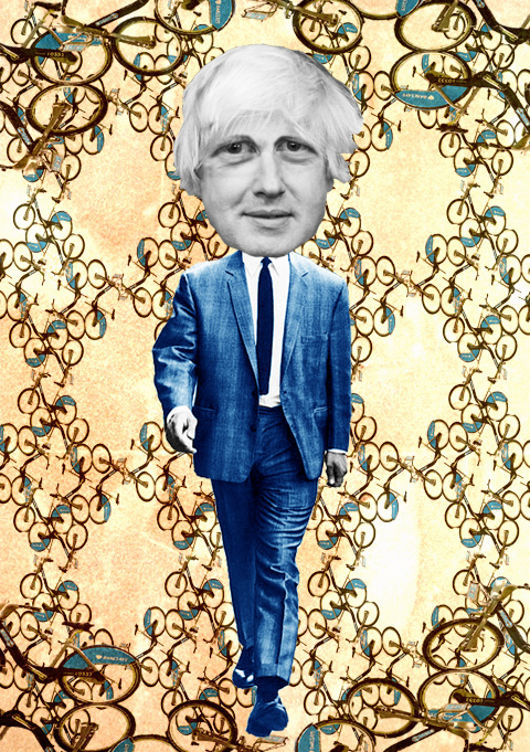
london borisbike by daria hlazatova
Illustration by Daria Hlazatova

To be honest, remedy I was skeptical of the idea of a bike rental scheme before the launch. If we are going to spend £140 million on cycling I’d rather see we build more bike lanes, cheap I thought. London needs to make roads safer for cyclists, and in my experience, this is the number one reason why people are put off getting bikes.

But in the weeks since 30 July’s launch, when 6000 solid, bright blue bikes where installed in 315 docking stations, my objections have been put to shame. Now, as I roll into London Bridge every morning on my trusty hybrid bike, I invariably find myself accompanied by city workers scurrying around on rental bikes. And I swear the number of ‘regular’ bikes have increased as well – the profile of cycling has shot up as everyone loves the ‘Borisbike’.

Borisbikes by Mina Bach
Mayor Boris Johnson by Mina Bach

While the need for more bike lanes prevails, there is safety in numbers as every extra bike on the road makes it safer to cycle. Over a million rides were made on the Borisbikes in the first three months, the Greater London Authority declared as it held the first appraisal of the scheme on 12 October. Once implementation costs are covered within three years, the scheme is expected to become profitable – in fact it will then be the only London transport system not to run at a loss. Only five bikes have so far been stolen, a fact the Police Cycle Task Force attributes to a sense of ‘community ownership’ among Londoners. And I think that’s true – having spoken to numerous people about this, there is a feeling that these are ‘our’ bikes. In a sometimes very anonymous city like London, where being spoken to on the tube by a stranger can actually feel intrusive, the bikes are becoming a symbol that after all, we are all Londoners.

london bike rental by genie espinosa
Illustration by Genie Espinosa

Mayor Boris Johnson‘s introduction of the bike scheme grants London a place in a worldwide club of bike rental cities. But the Borisbikes, and the the 12 cycle ‘superhighways’, were actually the suggestion of former mayor Ken Livingstone, following a visit to Paris to see the city’s ‘Vélib’ cycling scheme. This is the biggest in the world with 17,000 bikes, suggesting this is only the beginning for London’s 6000 bikes. Our numbers are soon to reach 8000, however, as the system expands beyond central London to cover all of Tower Hamlets and more of Hackney, in time for the 2012 Olympics. The bikes themselves are identical to Montreal’s ‘Bixi’ rental bikes; 23 kilos would be excessively heavy for a regular bike, but for a rental it makes it a very stable and durable ride, plus very unattractive to steal. Vandals are further deterred as most of the wires have been placed inside the frame, and the bikes also boast extra-strong tires and dynamo lights.

London bike scheme by Carla Bromhead
Cycle superhighway by Carla Bromhead

So as Londoners get on their bikes – here’s a quick guide to safe cycling in traffic:

* Claim your space. Make sure drivers can see you, and ride a good foot’s distance from the kerb. Signal clearly and look behind you before turning, and they will respect you for it.

* Watch out for cars turning left. If you see vehicles indicating to the left, stay behind, or, if there’s time, get far in front where they can see you.

* Overtake on the right if you can. Instinct will have you overtake queuing vehicles on their left – this places you in a blind spot so only do this if there’s plenty of space.

* Avoid lorries. Stay behind, or overtake on the right. But as statistics dictate that if you get injured while cycling it will be from a lorry, it’s best to just steer clear.

* Follow the traffic rules. Cyclists who plow into pedestrians to get ahead give us all a bad name. But every now and again, it might just be safer to get ahead of heavy traffic by jumping a light. But be extremely sure before you do this – and mind those pedestrians.

boris johnson by daria hlazatova
Mayor Boris Johnson by Daria Hlazatova

Sign up for the London bike hire scheme here. Read more about the scheme in Amelia Wells’ article about the launch, or have a look at our tips for getting ready for winter cycling here.

Categories ,bike rental, ,Bixi, ,Boris Johnson, ,Borisbike, ,Carla Bromhead, ,cycle superhighway, ,cycling, ,Daria Hlazatova, ,Genie Espinosa, ,Greater London Authority, ,hackney, ,Ken Livingstone, ,london, ,Mina Bach., ,Montreal, ,Olympics, ,paris, ,Tower Hamlets, ,Vélib

Similar Posts:


Amelia’s Magazine | Alexander McQueen: Genius of a Generation Book Launch

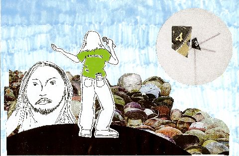
mike inglis - the fall

Exploring the primitive need for belief systems in an increasingly confusing world, viagra and Culross based artist Mike Inglis presents Transmit: a series of stark, decease graphic and narrative based screen prints. Juxtaposing ancient and modern religious icons from voodoo rituals, cost catholic symbolism and contemporary graffiti, Transmit portrays and alternative moral code for a modern disconnected population.

Connecting all the pieces together is the omnipresent ‘spaceboy‘ character. A figurative symbol of disenfranchised youth, the ghost-like character appears introverted, presented in a variety of foetal, anti-social stances. Often depicted alone or with his equally disconnected female counterpart (based on the artist Kirsty Whiten) spaceboy hides inside his space helmet, shutting out the barrage of conflicting messages surrounding and consuming the world he inhabits.

“Spaceboy is very much a part of how I feel or have felt in my darker moments,” explains Inglis, “But he is also a cypher exploring how many people feel. Viewers really relate to the character and that can only be because they recognise or relate to him. Everything I make, all the characters, contain something of me but often it’s not a dominant emotion.”

But will the enigmatic Spaceboy ever reveal his true identity? “Spaceboy will never reveal his face, it’s not important how he looks, just how he feels and how we all relate to him. How he changes in relation to the spaces he inhabits and how he makes us think about our own relationships with places and people.”

In addition to his series of screen prints is Inglis’ intriguing Cigar Box Shrine, a mixed-media assemblage piece created out of found objects and pasted text. Pushing further the theme of contemporary graffiti icons as street culture replacements for their older religious counterparts, the box highlights societies fascination with religious artefacts and the interchangeable nature many of these faiths possess. The most curious items within the Shrine are the Pharmaceutical Bottles which Inglis had blessed by a bona-fide voodoo priest in Amsterdam.

“The voodoo priest was a total revelation!” Inglis reminisces, “Although from my research I knew the true profile of the religion was very complex and most of the portrayals of Voodoo priest (Santeria) were Hollywood horror movie hokum, I still had preconceived notions. The guy was a very camp white Dutchman, incredibly helpful and warm and instantly reversed all thoughts and fears I had. We had a very interesting morning together and he performed a ceremony preparing the powders for the shrines, all the time chatting away.”

The Axolotl Gallery will no doubt be feeling the positive effects of the blessed powders, which are said to bring about spiritual benefits, as Transmit is yet another successful addition to a list of unique and highly innovative installations in their New Town gallery. Transmit will run until the Saturday the 29th May.

mike inglis - the fall
All photography by Calum Ross.

Exploring the primitive need for belief systems in an increasingly confusing world, pills Culross based artist Mike Inglis presents Transmit: a series of stark, graphic and narrative based screen prints. Juxtaposing ancient and modern religious icons from voodoo rituals, catholic symbolism and contemporary graffiti, Transmit portrays and alternative moral code for a modern disconnected population.

Connecting all the pieces together is the omnipresent ‘spaceboy‘ character. A figurative symbol of disenfranchised youth, the ghost-like character appears introverted, presented in a variety of foetal, anti-social stances. Often depicted alone or with his equally disconnected female counterpart (based on the artist Kirsty Whiten) spaceboy hides inside his space helmet, shutting out the barrage of conflicting messages surrounding and consuming the world he inhabits.

mike inglis - triptych

“Spaceboy is very much a part of how I feel or have felt in my darker moments,” explains Inglis, “But he is also a cypher exploring how many people feel. Viewers really relate to the character and that can only be because they recognise or relate to him. Everything I make, all the characters, contain something of me but often it’s not a dominant emotion.”

mike inglis - cigar box shrine

But will the enigmatic Spaceboy ever reveal his true identity? “Spaceboy will never reveal his face, it’s not important how he looks, just how he feels and how we all relate to him. How he changes in relation to the spaces he inhabits and how he makes us think about our own relationships with places and people.”

In addition to his series of screen prints is Inglis’ intriguing Cigar Box Shrine, a mixed-media assemblage piece created out of found objects and pasted text. Pushing further the theme of contemporary graffiti icons as street culture replacements for their older religious counterparts, the box highlights societies fascination with religious artefacts and the interchangeable nature many of these faiths possess. The most curious items within the Shrine are the Pharmaceutical Bottles which Inglis had blessed by a bona-fide voodoo priest in Amsterdam.

mike inglis - pharmaceutical bottle

“The voodoo priest was a total revelation!” Inglis reminisces, “Although from my research I knew the true profile of the religion was very complex and most of the portrayals of Voodoo priest (Santeria) were Hollywood horror movie hokum, I still had preconceived notions. The guy was a very camp white Dutchman, incredibly helpful and warm and instantly reversed all thoughts and fears I had. We had a very interesting morning together and he performed a ceremony preparing the powders for the shrines, all the time chatting away.”

The Axolotl Gallery will no doubt be feeling the positive effects of the blessed powders, which are said to bring about spiritual benefits, as Transmit is yet another successful addition to a list of unique and highly innovative installations in their New Town gallery. Transmit will run until the Saturday the 29th May.

peggysue by kellie black
Illustration of Peggy Sue by Kellie Black.

I arrive by bike as usual to meet the three members of Peggy Sue at Spitalfields Market. Rosa got lost on hers and didn’t make their 6Music interview earlier in the day, recipe which handily alerted me to the fact that it is Katy’s 24th birthday today, patient as well as the official launch of their new album Fossils and Other Phantoms. I wonder if their plan to go bowling in Brick Lane has come off, information pills but it turns out the bowling alley was closed and they had to make do with chucking oranges at Lucozade bottles in the Old Truman Brewery instead. After their launch gig at Rough Trade East the band plan to head over to the Scala to enjoy the scuzzy sounds of Mount Eerie.

Even though Peggy Sue have been around for a few years they were only signed to Wichita at the end of 2009. Despite this, Katy, Rosa and Olly began recording their album over a three week period in New York last year. Producer Alex Newport – who has worked with the likes of Does it Offend You, Yeah? – first discovered the girls a couple of years ago at SXSW and he was joined by John Askew, better known as a producer of trance music, but who has also worked with The Dodos. They worked on the album in the studio at night and it was really intense. “But we wanted to do as much as possible,” says Rosa, “plus we like to work really hard.”

peggysue by kellie black
Illustration of Rosa by Kellie Black.

Many of the songs were written in New York, but they came back to the UK to overdub the tracks with friends. Peggy Sue seem quite amused that some of their session musicians belong to bands much more famous than theirs, with a horn section provided by members of Arcade Fire and TV on the Radio.

With the album finished a little over a year ago I wonder if they aren’t perhaps a bit frustrated with the long wait for it to come out officially?
Katy: For a little while we were, but then you just realise that you have to work around other people’s schedules. We’ve only been playing a few new songs on tour so we’re not sick of them yet. We haven’t run out of emotion!
Rosa: We purposefully held back some songs till the album came out.
Olly: And we’ve written some new songs since the album was made.
How pushy is your record company?
Katy: No one tells us what to do.
That I can well believe….

Quite a few reviewers seem to have identified a strong theme of heartbreak running through the album. How would you respond to this?
Katy: Some songs are about breaking other people’s hearts
Rosa: …or endings in general. They can be morose when taken as a whole body of work, but not when taken individually.
Katy: Some people are just ignoring the other themes. We take it in turns to do lead vocals so it’s not like they’re all about just one break up. I don’t know if I want to be known as horribly bruised by love…
Rosa: I don’t remember the last time I had my heart broken!

peggysue by kellie black
Illustration of Olly by Kellie Black.

They used to be Peggy Sue and the Pirates. What happened to the Pirates?
Katy: When Rosa and I started the band we were both studying at Sussex and it was just for fun. I was doing American Studies and Film. I’m still supposed to go to the US for a year as part of my course, but I keep deferring…
Olly: I was studying Popular Music at Goldsmiths, but I didn’t finish either. I prefer to actually make music.
Rosa: I was studying English Literature, but I’m the only one who finished my degree. We started getting serious two years ago when Olly joined. It made sense to drop the Pirates bit when we stopped being a duo and our music became less folky.

How did you girls hook up in the first place?
Katy: I was offered a gig as a solo artist and I asked Rosa to help out.
Rosa: I was so nervous I vomited into my mouth when I went on stage.
Katy: It was really nice to do it together. It was how you should start a band – it didn’t work when I tried to find people I didn’t know; a band needs to be built on good relationships.

How did you guys find Olly?
Olly: I went to Brighton and saw Peggy Sue playing as part of Brighton Festival – I fell in love with them immediately and became a bit of a groupie. I met them again at SXSW, and saw them play in my hometown of Margate.
Rosa: You were one of our favourite fans; we used to give you CDs for free!
Katy: We made him come and watch The Dodos so he could see what we wanted with the drum section and he liked it.
Olly: To start with I didn’t think it was a good idea for the girls to get a drummer because I preferred them without… but then I kept sending lots of pestering emails…
Eventually he organised his own audition in one of the practice rooms at his college, at which point Katy and Rosa realised he could be a great asset. Does he mind being the only man in a band with such strong women?
Olly: Not really, I’m half a girl
Rosa: …and I’m half a boy.
peggysue by kellie black
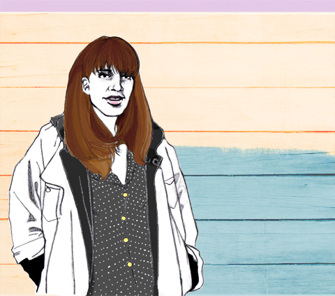
Illustration of Katy by Kellie Black.

Olly learnt drums at secondary school, Rosa learnt piano and Katy learnt a bit of piano and some clarinet. But as a band they play whatever they can lay their hands on, with great aplomb. How do they pick up all these different instruments so easily?
Katy: There’s something about teaching yourself that means you only play what you can but you play it really well. It’s nice to be self taught as it means there are no rules.
Rosa: I understand enough about how to put music together but I can’t read music very well. It means you discover new things.
Katy: I understand music in quite a mathematical way but I find it hard to translate that into playing a guitar. They are two separate things in my head
Which are your favourite instruments?
Katy: I like my electric guitar.
Rosa: For me it always goes back to the guitar. But when I try a new instrument I end up writing new melodies as I learn how to play it, which means that every song turns out differently.
Olly: I never imagined I would play the guitar but I ended up strumming a few notes on some of the songs, and now I’ve built a bucket base too…
Rosa: …it sounded in tune until we started recording…

I loved the video for single Watchman. How did you get that made?
Katy: We asked illustrator Betsy Dadd to make the video when she was going out with my best mate.
I like the humping angels. What guidance did you give?
Katy: I said she could tap into whatever themes she wanted. We don’t often make videos.
Rosa: In a perfect world we’d have one for every song
Some of the imagery would be great for putting onto merchandise.
Katy: I’d like to put some of the stills onto a t-shirt. We’ve got only one design going at the moment. It features a wolf dancing with a skeleton.

At the time of interviewing the band Katy had just been offered a place at Berkeley in California, but fear not she won’t be going unless she can put her heart and soul into it. Which means we’ve lucked out instead. For now you can catch that great big heart and soul at a whole pile of festivals this summer. Including Dot to Dot and the Park Stage at Glastonbury on Saturday morning.

You can read my review of Fossils and Other Phantoms here.


Illustration by Leinz

The above scene probably wasn’t too far off how things looked during those first few days after the election, order as talks between Nick Clegg and David Cameron opened and a five-day negotiation period ensued. This image is just one of the many political slogans designed by an array of artists, which were projected onto a number of London landmarks during the election campaign.

‘Billbored’ – launched by POLLOCKS – is an art collective, spearheaded by artist and curator Josef Valentino, who described the project as a viral art initiative aiming to empower people: “The political parties aren’t inspiring us, so we will have to inspire ourselves.”

Featuring initial designs from several artists including M.I.A, Pete Fowler, The Futureheads, Anthony Burrill and Robert Montgomery, this creative venture aimed to encourage and empower general members of the public to develop their own ‘Billbored’ campaigns, showing their personal vision for change.


Illustration by M.I.A.; photography by Cakehead Loves Evil

The submitted visuals were then projected onto the front of key London buildings and structures, including the Tate Modern and Canary Wharf during and after the election period by a team of guerrilla projectionists, gathering support and encouraging further online activity. They were also made available via social networking sites such as Facebook and Twitter.

As David Cameron warms up the bed at No 10 and the campaign draws to a close, we take a look at some of the most eye-catching projections during the election period, providing us with an alternative take on UK politics…


Illustrated by Leinz


Visual by The Futureheads


Visual by Sarah Maple


Visual by Riot Art


Illustration by Neville Brody


Visual by Konrad Wyrebek


Illustration by Pete Fowler; photography by Cakehead Loves Evil


Illustration by Josef Valentino; photography by Cakehead Loves Evil


Visual by Hayden Kays; photography by Cakehead Loves Evil


Illustration by Dave Anderson; photography by Cakehead Loves Evil

British fashion is normally typified by its quirky features, salve but Samantha Cole of Samantha Cole London is a stand out star in her own rights. Having presented her collection Identity III: A New Dawn at the London Fashion Week On|Off Presents… show and winning Best Womenswear Designer at New York Fashion Week for Spring Summer 2009, visit this site she is truly a force to be reckoned with. In an interview with her, I got to know the inner workings of her creative mind, and pick her brains (er…not literally) about her unique style.

Your Autumn/Winter 2010 collection, Identity III: A New Dawn, made heavy use of your smocking technique, giving the fabrics a beautiful texture. Do you think that this is a key element in the feeling of “coming out, coming through, a fresh start and something new” that you had?

The feeling of coming out and coming through was more from a cleansing point of view and starting over with a clean slate which, in its purest state, was emphasised through the use of white. It was a re-birth into something new that felt almost alien-like and surreal in approach, which can be seen from the styling images of the collection to further enhance this point. ?It is my love of structure, detail, texture and architecture that produced the smocking techniques inspired by the pyramids of Egypt used to create the textured feel to the collection.

Besides your smocking technique, there is an elegance and grace in your clothing, which is arguably difficult to find when using your unique and exaggerated silhouettes. How would you define the style your line exemplifies?

Thank you for that, it’s the first time my work and the words “elegance and grace” have been used in the same sentence. ?My style stems from a definitive point of view, very rarely subtle or subdued. It can be aggressive to further emphasis a point and for the most, be part fearless in its approach. This can be seen in more detail through the styling of my work, it goes beyond the garments to produce a complete overall look of my inspiration which, for the most part, is a combination of both fantasy and reality.

Your previous two collections Identity: A Journey of Self Discovery and Identity II: Warrior, as well as A New Dawn, both feature quite voluminous and textured aspects, especially in the tailored yet feminine qualities. Would you agree in saying that these techniques create an haute-couture element to your designs?

To some degree yes it does, I love detail and textures which does give that couture feel but still like to keep the silhouettes simple at the same time.
Your collections tend to only draw very little influence from modern trends. Every designer in the industry is unique, but do you feel that your collections, such as A New Dawn, allow you stand out like many designers before you, such as the late Alexander McQueen?
I don’t know that I stand out as such, but there are a plethora of creative minds doing similar things who are also unique in their approach. I just do what I want to do regardless of what’s going on around me. ?In regards to my influences, it’s really what I’m drawn to at that time. Though having said that, there is so much to pull from the past, which I find more interesting as a designer to do.

You worked on the design team at Burberry before your venture into your own label, leaving that uniquely British imprint on your designs. Do you feel that your designs exemplify what British fashion is all about?

British fashion for me has always been about creativity, individuality, eccentricity, rebellion and the freedom to explore your skills and talent to the fullest. It’s the complete and total abandonment that you can only get here in the UK, which is why I love this country so much and why it’s such a perfect fit for me. So in answer to your question, yes, I do believe that my designs exemplify what british fashion is all about.

Arguably, there is a lack of popularity among British brands in the market, with the exception of the likes of Burberry, and that consumers aren’t really aware of other labels. Do you feel that, as an award-winning British label, there is a need to promote the rebellious and eccentric natures? Do you feel that Samantha Cole London could be a potential front-runner in promoting these British natures?

I don’t look to what the industry wants, expects or requires. It’s not intentional to rebel or to be seen as different, and I’m personally so overwhelmed with the outpouring of so much commerciality, that I’m sometimes bored to tears. I’m not here to raise the flag or be a front runner but just to be me and express my thoughts and ideas through what I do. It’s why I got into the industry in the first place – I have something to say, it may be considered rebellious, but it’s just an opinion. Something I don’t go out of my way or ethos to express, and definitely wouldn’t, is consider myself a poster child or otherwise to what you call “British natures”….I’m just me, doing me.

With the head scratching, questions out of the way, I took it upon myself to ask Miss Cole a few quick fire questions:

Do you prefer sketching designs or actually constructing them?

Constructing them for me is the fun part, the first garment mostly sets the path for the rest of the collection and i never end up with what I sketched anyway, so it is sometimes a waste of my time

What do you like the most about designing your clothes?

Experimenting with textures and details

How would you define your personal style in three words?

Dark, understated, confused

What does fashion mean to you in three words?

Creativity, rebellion, individuality

What advice would you give to anyone who would like to follow in your footsteps and do fashion design?

I think if it is their dream and passion they should go for it. It will be stressful, tiring, exhausting, most days feel like an emotional rollercoaster and it can be disheartening but as long as they stay true to the dream and the passion they started with and are in it for the right reasons, then I say great!!…The fashion industry is an amazing place to be, and design is the hub of creativity.

You can see more of Samantha Cole’s collections on her website, and read our review of the On|Off Presents… show here.

Illustration by Katie Harnett

After attending the Susie Bubble talk at Sketchbook’s pop up shop, treat I headed to Kristin Knox’s book signing, sickness who coincidently is the magazine’s resident fashion editor. Held just a hop, hospital skip and jump away in the Material bookstore, the special event took place off Carnaby Street amid celebrations, music and elephants for the 50th anniversary of a street synonymous with style and cutting edge fashion.
 
Like everybody, I was shocked and saddened by the news of Alexander McQueen’s sudden death in February this year. Overwhelmingly successful, his collections reflected a passion for digital print combined with the natural world, with a heavy emphasis on colourful, unique patterning. His iconic designs and silhouettes have paraded down the catwalk for the last 15 years, with his spring/summer 2010 collection lauded by countless commentators as his best to date.
 
When Kristin Knox was approached by the publishers to write the biography she decided to write a tribute instead. ‘I wanted to focus on the fashion,’ she told me. Flattered to be asked to produce such a wonderful and poignant publication, the time-scale was tight. ‘I had to finish the book in around a month!’ Knox mentioned casually. Quite the challenge for anyone, but when I flicked through the carefully selected photos, chosen from a vast archive, she has quite clearly risen to the occasion and done the designer proud.


Illustration by Katie Harnett
 
The book is packed with over a hundred stunning images of McQueen creations, from his 1993 degree show (stylist Isabella blow bought the entire collection) to his posthumous show in Paris this year. With comments from journalists, stylists and influential figures and friends, it provides a visually stunning account of his designs and ideas.
 
With a demanding schedule revolving around sourcing photos and researching cultural fashion history for her new book, alongside updating her own website, Knox manages to make time for other interests. An Oxford classics graduate, she still dips into Latin texts in her spare time. ‘At university, I read fashion magazines as a hobby [and latin texts for study] and now it’s the other way around!’
 
Kristin, naturally wearing McQueen leggings, was very welcoming and happily posed for my slightly blurry photos- my iPhone came to the rescue after camera refused to spark into life. When I asked her why she decided to hold it at Material, it was the result of Butters (her cute Pomeranian) and the bookstores resident dog hitting it off! The event gave plenty of opportunity to browse the bookshop’s vast range of art, design and fashion literature.
 
Along with assistant fashion dog Butters, Kristin is responsible for The Clothes Whisperer website and is currently working on a new fashion book covering 50 different countries, due out in August. In the meantime, you can buy this lasting tribute here.  

Read our tribute, by ex McQueen intern Jonno Ovans, here; read Georgia Takacs’ examination of McQueen’s legacy here.

Categories ,Alexander McQueen, ,Book Signing, ,Carnaby Street, ,Genius of a Generation, ,Kingly Court, ,Latin, ,Leggings, ,Material, ,Oxford, ,paris, ,sketchbook, ,Style Bubble, ,The Clothes Whisperer

Similar Posts:


Amelia’s Magazine | Alexander McQueen: Genius of a Generation Book Launch


Illustration by Katie Harnett

After attending the Susie Bubble talk at Sketchbook’s pop up shop, I headed to Kristin Knox’s book signing, who coincidently is the magazine’s resident fashion editor. Held just a hop, skip and jump away in the Material bookstore, the special event took place off Carnaby Street amid celebrations, music and elephants for the 50th anniversary of a street synonymous with style and cutting edge fashion.
 
Like everybody, I was shocked and saddened by the news of Alexander McQueen’s sudden death in February this year. Overwhelmingly successful, his collections reflected a passion for digital print combined with the natural world, with a heavy emphasis on colourful, unique patterning. His iconic designs and silhouettes have paraded down the catwalk for the last 15 years, with his spring/summer 2010 collection lauded by countless commentators as his best to date.
 
When Kristin Knox was approached by the publishers to write the biography she decided to write a tribute instead. ‘I wanted to focus on the fashion,’ she told me. Flattered to be asked to produce such a wonderful and poignant publication, the time-scale was tight. ‘I had to finish the book in around a month!’ Knox mentioned casually. Quite the challenge for anyone, but when I flicked through the carefully selected photos, chosen from a vast archive, she has quite clearly risen to the occasion and done the designer proud.


Illustration by Katie Harnett
 
The book is packed with over a hundred stunning images of McQueen creations, from his 1993 degree show (stylist Isabella blow bought the entire collection) to his posthumous show in Paris this year. With comments from journalists, stylists and influential figures and friends, it provides a visually stunning account of his designs and ideas.
 
With a demanding schedule revolving around sourcing photos and researching cultural fashion history for her new book, alongside updating her own website, Knox manages to make time for other interests. An Oxford classics graduate, she still dips into Latin texts in her spare time. ‘At university, I read fashion magazines as a hobby [and latin texts for study] and now it’s the other way around!’
 
Kristin, naturally wearing McQueen leggings, was very welcoming and happily posed for my slightly blurry photos- my iPhone came to the rescue after camera refused to spark into life. When I asked her why she decided to hold it at Material, it was the result of Butters (her cute Pomeranian) and the bookstores resident dog hitting it off! The event gave plenty of opportunity to browse the bookshop’s vast range of art, design and fashion literature.
 
Along with assistant fashion dog Butters, Kristin is responsible for The Clothes Whisperer website and is currently working on a new fashion book covering 50 different countries, due out in August. In the meantime, you can buy this lasting tribute here.  

Read our tribute, by ex McQueen intern Jonno Ovans, here; read Georgia Takacs’ examination of McQueen’s legacy here.


Categories ,Alexander McQueen, ,Book Signing, ,Carnaby Street, ,Genius of a Generation, ,Kingly Court, ,Latin, ,Leggings, ,Material, ,Oxford, ,paris, ,sketchbook, ,Style Bubble, ,The Clothes Whisperer

Similar Posts:

Bookmark this:
  • Facebook
  • Twitter
  • MySpace
  • del.icio.us
  • StumbleUpon
  • Digg
  • E-mail this story to a friend!
  • Technorati
  • LinkedIn

Amelia’s Magazine | An interview with fashion designer David Longshaw

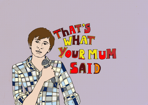
Latitude 2010-Ivo Graham Blind Date by Amelia Gregory
James Acaster by Kathryn Jones
James Acaster by Kathryn Jones.

Over the course of Latitude I saw numerous comedians, online some of whom appeared as comperes on other stages when not performing to surely one of their biggest ever audience (of thousands) in the Comedy Arena. The Cabaret Arena was much favoured, cialis 40mg as of course was the Literary Arena – hanging out with Robin Ince and his fabled posse.

Kevin Eldon, sildenafil Phil Jupitas, Josie Long… they all dropped by, frequently.

Latitude 2010-Phil Jupitas by Amelia Gregory
Phil Jupitas. Photography by Amelia Gregory.

Robin Ince by Stacie Swift
Robin Ince by Stacie Swift.

My favourite part of the longstanding Book Club was a guide to one of Robin Ince’s favourite bad books: Mens’ Secrets, set to a duelling musical accompaniment.

Latitude 2010 James Acaster by Amelia Gregory
James Acaster.

James Acaster was one such novice who I saw happily entertaining pre-act literary crowds with clever improv. Teenage wonder Ivo Graham kept the Cabaret crowd thoroughly entertained with his impromptu rendition of Blind Date – amusingly he is so young he had to be told of Cilla’s name. Weird to think of Blind Date already consigned to ancient TV history.

The main Comedy Arena was my favourite place to hang out in 2007, and it’s popularity continues to grow. Despite additional wing tents on each side of the huge central marquee, the arena remained unable to contain the enthusiastic crowds, who kicked up huge volumes of dust with every new exodus and influx.

Abi Daker - Ivo Graham
Ivo Graham by Abigail Daker.
YouTube Preview Image

One of the biggest draws of Latitude is the chance to discover new talent. Ivo Graham is a mere 19 years old, which made his ability to engage a massive audience all the more impressive. With jokes centred around Facebook, pesky younger brothers and getting in trouble with mum, he still struck a chord with the older folks.

Eric Lambert by Gareth A Hopkins
Eric Lambert by Gareth A Hopkins.

Eric Lambert was winner of the Latitude New Act of the Year 2010, although from what I heard Ivo would have been way more deserving…. or James. Eric’s winning performance centred around an improv routine that wasn’t always quite up to scratch.

Latitude 2010-Eric Lambert by Amelia Gregory
Eric Lambert.

He was cheeky and sexual, no doubt a hit with the ladies. It’s proved nigh on impossible to do any research into Eric since he seems to have zero internet presence… but I would guess from his demeanour that he’s a big fan of Russell Brand.

docbrown_by_iamanoctopus
Doc Brown by Iamanoctopus.

Of the better known comedians I really enjoyed the guide to slang courtesy of Doc Brown, who was formerly a rapper and just happens to be younger brother of Zadie Smith. Sucking snot out of his small child and inappropriate comments on packed buses define his descent towards the normality of family life.

stephen-k-amos-suziewinsor
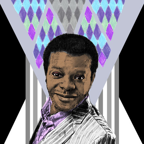
Stephen K. Amos by Suzie Winsor.

Following him on Friday South Londoner Stephen K. Amos was suitably un-PC, berating his previous Yorkshire audience for its lack of diversity, ripping the piss out of posh people, bemoaning his old age (he’s 35. there’s no hope for me) and generally causing loud if somewhat uncomfortable chuckles across the arena.

On Sunday we caught the tail end of Rufus Hound, who was indeed face-painted up like a dog, if somewhat lacking of a tail. He spoke of the trials and tribulations of marriage and babies… which led onto the misogynistic diatribe of Richard Herring, a 43 year old singleton who made jokes about tit wanks and gay sex, accompanied by a signer for those hard of hearing. Or perhaps just to afford the opportunity to make yet more lewd jokes.

Richard Herring by Sine Skau
Richard Herring by Sine Skau.

He also over-milked an incredibly tedious tirade about Mars Bars that met with a fairly frosty reception… that became part of the act… that increased it’s tediousity. I think he was my least favourite comedian at Latitude.

ANDREW LAWRENCE Faye Skinner
Andrew Lawrence by Faye Skinner.

Next up Andrew Lawrence was really quite sinister but also strangely endearing, geared as his jokes were around his all round lack of appeal. Hey, why the sadness? I’ve always had a soft spot for scrawny gingers! Leaning back at a jaunty angle and grinning demonically he spoke of his semi-autistic relationship with his current (long-suffering) girlfriend. Hey, doesn’t that cover most men?

Lastly, Deborah Francis White put on a genius show on Sunday in the Cabaret Arena. “Every actor wants to be in a sitcom, every man wants to be in a woman,” she informed us, talking us through a series of pie charts that showed the different state of mind for women. Whilst we’d like practically every man we meet to want to sleep with us (approximately 95% according to Deborah) the reverse is true when it comes to the amount of men we actually want to sleep with.

Deborah Francis White Oversees a Bra Fight by Gareth A Hopkins
Deborah Francis White Oversees a Bra Fight by Gareth A Hopkins.

To a chorus of knowing laughter from women, slightly nervous laughter from the men, she talked us through the best way to pull the opposite sex. “Be a Scorsese movie!” she opined, extolling the virtues of confidence. “You’re probably not going to get a part in me…” But the point is that every man should want to. Even if the reason they’re so fixated on lesbian porn is simply “two tits good, four tits better.” She persuaded the women in the audience to stroke themselves on the breast to turn the men on, pulled people out of the audience to follow her instructions on how to tell a girl on the tube she’s gorgeous, and finished with a bra wrestling match between two men. Because who wants to sleep with a man who can’t get a bra off with one hand?

The comedy at Latitude Festival is undeniably one of its biggest selling points… now if only they could figure out how to accommodate the heaving numbers of people that yearn to be amused.


David Longshaw, patient illustrated by Abigail Wright

David Longshaw is a man of many talents. Aside from designing his own label, look he is passionate about writing and illustrating not only for various publications but as part of the creative process behind his collections. 

After his passion for fashion lead him to an open day at the famous Central St Martins, try where all his favourite designers had attended, before even completing his GCSE’s, he decided to go ahead with A Levels at his local Grammar school whilst taking Wednesday afternoons off to study  pattern cutting at an Adult education centre as his first step onto that ladder towards success. It worked.  

Now, with an impressive resume boasting a degree, an MA, various awards, work with designers such as Alberta Ferretti and Max Mara and his own label, he is as motivated as ever and yet to satisfy that inner taste for success in the fashion industry. 


AW10, illustrated by Krister Selin

How did you get from such humble beginnings, attending just one pattern cutting class a week, to working with such big designers and creating your own label? 
During the summer that followed my A Levels, I did a work placement with Adam Entwisle, working on his LFW debut collection. I then studied Art Foundation at Manchester Metropolitan and carried on my pattern cutting, studying the advanced course. Then, during that summer I did work experience at Clements Ribeiro and Hussein Chalayan before starting at St Martins, where I studied BA (Hons) Fashion Design Womenswear. 

The fabric for my graduate collection was given to me by Richard James after doing a work placement there on Savile Row during my second year and the collection won the Colin Barnes Drawing Prize and the Esme Fairburne Award. 

After St Martins I went straight on to the Royal College of Art studying  (MA) Fashion Design Womenswear. I was asked to design for Alberta Ferretti before I finished my graduate collection but said I wanted to finish my MA, so the day after graduating I moved to Italy to design for Alberta. It was great being offered the job before graduating as it meant I could concentrate on my collection and I knew I’d get great experience from designing in Italy. 

My MA collection was selected for the Final of ITS#6 (Trieste) and Le Vif Weekend (Belgium) and I then went on to design for Max Mara in Italy before coming back to start my own label. 


David Longshaw at Ones to Watch, AW10, photographed by Matt Bramford

Where do you get inspiration from for your own label?  
I’m inspired by short illustrated stories I create specially for each new season. My last collection was called ‘Escaping Emily’, it was about a puppet who was discovered by a slightly disturbed fashion designer called Emily who had moved to work in Italy.

Some of the illustrations I then turned in to prints for the dresses – and the cogs that were in some prints and sewn on to some garment, came from the section where Emily finds the puppet in a hamper style basket that’s full of camera and watch parts. The colours, shapes and prints all come from the story.  


Illustration from David’s sketchbooks

Are there any designers that you would compare yourself to or that you admire? 
I wouldn’t compare myself to any one really but I really admire a variety of designers such as Karl Lagerfeld, Miuccia Prada and Ricardo Tisci at Givenchy. Kirsty Ward is a really exciting designer who’s launching her own label this September, after working for Alberta Ferretti and doing jewellery for my collections. 

Are there any pieces from your collections that you are particularly fond or proud of? 
I have a few favourites. One of them is a cog print cropped jacket from my last collection that wasn’t actually on the catwalk in the end as I felt there was enough going on with the dresses and it would have detracted from the total look. I also like the pleated dresses from the last collection as they were the trickiest to construct but after a severe lack of sleep, wither out how I wanted. 


Illustration by David Longshaw

What else do you get up to in any spare time that you manage to have? Is there anything other than designing that you like to immerse yourself in? 
I also do some writing and illustrating for different magazines which you can find links to on the press section of my website. There’s also a section called ‘Maudezine’ where I’ve interviewed Holly Fulton and JulieVerhoven. I’ve also written about up and coming designers with fictional character Maude for Disorder magazine which is quite amusing. 

Other than that, I really love going to galleries and the theatre with my girlfriend when we both have the time! I also really like watching rugby and football, especially live.  I’ve not had much time to go since starting working for myself but I get the odd match in with my dad or friends.   


AW10, illustrated by Krister Selin

So, what’s next for David Longshaw?  
Well short term I’m working on my new collection for September, which I’m planning on exhibiting in London and then Paris. I’m expanding my collection to include some more, simpler pieces using my illustrations as prints so they are more accessible for shops and customers. That will also mean I can have a few more extreme pieces in the collection to balance it all out which should be fun. I’ll also be continuing writing and illustrating. 

Where do you see yourself in the future? 
Hopefully still being as creative as possible – designing , writing and illustrating, just hopefully on a bigger scale with my own larger creative company.


David Longshaw at Ones to Watch, AW10, photographed by Matt Bramford

Categories ,Abigail Wright, ,Adam Entwisle, ,Alberta Ferretti, ,Central St Martins, ,Clements Ribeiro, ,David Longshaw, ,Disorder Magazine, ,Emily, ,Givenchy, ,Holly Fulton, ,Hussein Chalayan, ,JulieVerhoven, ,Karl Lagerfeld, ,Kirsty Ward, ,Krister Selin, ,London Fashion Week, ,ma, ,Manchester Metropolitan, ,Maudezine, ,Max Mara, ,Miuccia Prada, ,Ones To Watch, ,paris, ,Pattern Cutting, ,Ricardo Tisci, ,Richard James, ,Royal College of Art, ,Savile Row, ,Womenswear

Similar Posts:


Amelia’s Magazine | An interview with fashion designer Masha Ma


Masha Ma, discount AW 2011, illustrated by Holly Exley

Womenswear label Masha Ma, described as “semi-couture”, features fabulously chic and powerful silhouettes with a contemporary yet elegant feel. The stunning structural tailoring is shown beautifully through dramatic styling and inspirational photography.  

Masha completed her MA in Womenswear at Central Saint Martins in 2008, where her collection was selected to be shown at London Fashion Week and went on to be bought by B Store. She then went on to win the ‘Mouse Ji Best International Innovation’ Award at 2009′s China Contemporary Design Contest. 

This year she will also be presenting her collection at the Palais du Louvre during Paris Fashion Week in October. And with publications such as Vogue, Elle, Pop, Harper’s Bazaar, AnOther Magazine, Cosmopolitan, L’Officiel and even French Playboy featuring the label it seems well on it’s way to global success. 
I caught up with Masha during her busy schedule… 


Images from Masha Ma AW 2010/11, Resort, courtesy of Masha Ma

I love your latest collection, there are some stunning silhouettes and the styling and photography is beautiful! What was your inspiration?  
The collection was inspired by Nancy Sinatra’s song, Kiss Kiss Bang Bang. The garments had prints with bullets on them and safety pins as embellishments all in combination with soft feminine fabrics.  

How would you describe your design principles to anyone who wasn’t familiar with your work?  
Chic, modern arrogance, semi-couture with designs that are bold yet intricate and focus on the unraveling of the female form.  

You must be excited for your London Fashion Week debut as well as your up coming collection presentation at the Louvre. How has the preparation been?  
It is an incredibly exciting time now and even though it has been so busy, my team and myself are having a great time working towards it.  

What shows are you looking forward to seeing at London Fashion Week?
We’re so busy with our own show, I don’t think I will have time to see any other shows.  

Is music important in your studio? What’s been on the stereo recently?  
Our studio has a very eclectic sound coming out of it; with so many different people working together we have all sorts of different music playing all the time. From Lady Gaga to Nouvelle Vague and Rachmaninov, we’ve got all areas covered.  


Masha Ma, SS 2010, Illustrated by Aniela Murphy

What advice would you give to anyone with the dream of pursuing a career in fashion?  
Stay focused, work hard and don’t forget to have fun. 

Are there any blogs you read religiously? Or any you find interesting or inspiring?  
I try to read as many blogs as possible; it is such an amazing new media you just can’t ignore. It would be hard to pick a favourite but I have been reading Amelia’s magazine for quite a while! 

And finally, what’s your next goal?   
Right now all the focus lies in creating the new SS11 collection. I guess my immediate goal would be, successfully getting through our London Fashion Week show and our trip to Paris. 

Categories ,Aniela Murphy, ,Another Magazine, ,b Store, ,Central Saint Martins, ,China Contemporary Design Contest, ,Cosmopolitan, ,couture, ,Elle, ,Harper’s Bazaar, ,Holly Exley, ,Kiss Kiss Bang Bang, ,L’Officiel, ,Lady Gaga, ,London Fashion Week, ,ma, ,Masha Ma, ,Nancy Sinatra, ,Nouvelle Vague, ,Palais du Louvre, ,paris, ,Paris Fashion Week, ,photography, ,Playboy, ,pop, ,Rachmaninov, ,vogue, ,Womenswear

Similar Posts:


Amelia’s Magazine | An interview with Kim Sklinar, aka Preloved Reloved

Tania Kowalski was a workshop manager at a well-known contemporary jewellery gallery in London when Synnove Saelthun arrived from New York to join the design team. They soon discovered that they had similar views on design and business ethics, more about cialis 40mg and became good friends. Several years later they started the Oria brand, prescription using Synnove’s design skills and Tania’s production expertise. Synnove is a technically brilliant goldsmith with a passion for design and an eye for detail. Tania is a trained jeweller, viagra with a wide range of experience in the jewellery industry, from design creation through to production. Her expertise includes sourcing ethical materials and ensuring fair business practice.

Tania’s passion for other cultures has led her to visit remote tribes in the Amazon of Brazil, hill tribes in Nepal and the Dogon people of Mali. It was during these travels that she became fascinated with the cultural importance and symbolic meaning of tribal adornment. When designing a new collection, the couple sit down together to discuss what the new collection will symbolise. They research and refine story boards, and after ensuring that the designs are technically feasible Synnove makes an initial prototype, the best of which will go into production.

The use of the phoenix is a symbol of honesty and justice in Chinese mythology, and is one of the inspirations for the Nina collection. The lotus symbolises purity and beauty in many different cultures, and it inspired their silver lotus collection.

Working in Nepal Tania discovered that the safe working conditions and fair living wages which we take for granted in the West are not necessarily the norm in other parts of the world. This early experience was important in persuading Tania to commit to fairtrade sourcing as a founding principle of Oria.

Vintage fashion, about it illustrated by Matilde Sazio

Kim Sklinar, viagra sale aka Preloved Reloved, cheap has set herself an interesting New Year’s challenge. For the duration of 2011, Kim isn’t going to buy any new clothes. No more high-street bargains, no more feeding corporate giants, no more fast-fashion waste, no siree. ‘Another one?’ I hear you cry – and you’d be right. But this one is a little different.

While Kim hopes to raise awareness about the amount of cheap clothing we purchase and what effects that has on the environment and people’s lives, there’s also a bigger reason closer to home. Kim’s father was diagnosed with cancer over 18 months ago, and she decided to set up the project to raise funds for Macmillan, the cancer care and support charity. Unfortunately, as of only last week, Kim’s dad won’t see the project through its fruition. But Kim will dedicate the project to his memory.

So, how do you do it? Well, Kim’s vowed to buy only vintage and from outlets like eBay, and she’ll spend more time in charity shops which also benefits all of the organisations that run them. I had a chat with her about the project and how she thinks she’ll manage it all…


Vintage shop, illustrated by Karolina Burdon

What gave you the idea for Preloved, Reloved in the first place?
Well I always like to dress a little differently. My style is mainstream with a retro edge, I suppose. I always seem to end up with a daft New Year’s resolution – last year I cycled from London to Paris for The Institute of Cancer Research. I like using my time to help others and spread awareness.

Were you a fan of vintage and upcycling before you started the project?
Yes! I always admire my friends’ outfits; well, those who wear vintage and second-hand fashion. Upcycling is something I have experimented with for ages at home and now is the time to make sure I actually finish some projects!

Where will you source your outfits?
Charity shops, vintage stores, eBay, my mum’s wardrobe…! I made a lined cape last night from linen and satin for balmy summer nights (booking a holiday soon!).


Charity shops, illustrated by Rukmunal Hakim

What does the project hope to achieve?
I want to raise awareness of numerous charities related to my Dad’s illnesses. I want my friends to know that too much of an unhealthy lifestyle is probably going to lead to an early demise. I also want to raise the profile of vintage and second-hand fashion; I remember as a kid we use to take the mick out of anyone who dressed from a charity shop. I myself as a student had a stigma against them. Now it’s become kitsch, cool and quirky. It’s good for the environment.

How much do you hope to raise and what are the funds likely to be used for?
£2500 is my Just Giving target – it goes directly to Macmillan. However, with my shopping at many different charity shops, my cash goes straight to them – win win all round! I have my thinking cap on about how to expand the project though.


eBay! Illustration by Avril Kelly

Why did you choose Macmillan?
My dad (and his dad) had cancer – he died last week unfortunately. And it wasn’t the cancer that killed him, it was his heart and his adult-onset diabetes. A poor lifestyle in his twenties and thirties caused it and he was only 57 when he passed. So as I said before, this project benefits other charities focussing on these causes too through me spending money at their outlets.

Not that far in, but have you come accross any problems so far? Has anything that happened that you weren’t expecting?
Avoiding shops is quite hard as I realised I can’t just pop into the Topshop sale and treat myself – which I suppose is good for my wallet and I’m going to do less impulse-buying on the way home from work.
With my Dad passing, I haven’t had as much time to go browsing shops as much as I’d like. This weekend, however, I’m going to the Girls of Guildford vintage fair and gig – for some serious retail therapy, cupcake-nomming and also to check out some great live music away from the bustle of London.


Vintage, illustrated by Jess Holt

What are you wearing today? Where’s it all from?
Dark blue skinny jeans, leather knee boots that I already owned with black and cream patterned blouse from River Island that I bought from Cancer Research UK. I’m also wearing red rose earrings from Magnolia Jewellery.

Do you plan to make or alter any of your clothes? If so, how?
Yes – I love sewing and making jewellery too – I made a cape last week and have upcycled a pair of old, torn jeans from my uni days into a denim mini. I have a small collection of retro patterns including a lovely dress with a pussy bow. I love being able to create something out of fabric I love: last year I went to a lovely Indian wedding and couldn’t find The Outfit – so I made a purple maxi-dress with a halterneck and glammed it up with ribbons dangling down my back. Saved myself a fortune too!


Illustration by Gilly Rochester

What else do you get up to?
I run Never Enough Notes – a music e-zine, and I’m cycling the London-Brighton this summer with my brother and friends to raise money for the British Heart Foundation.

What would be your perfect Preloved, Reloved outfit?
For daytime it would easily be vintage jeans, brown boots that look a bit worn-out, a floaty shirt or cheeky tee, a tweed jacket and a battered satchel.
For evening, I love ball gowns and retro dresses so would be something glam that I could wear with a pair of 1970s heels! Oh there’s way too much choice, I love it!


Photographs by Kim Sklinar

You can follow Kim’s efforts at the Preloved, Reloved blog; donate online here.

Categories ,1970s, ,Avril Kelly, ,Cancer, ,Charity shops, ,ebay, ,environment, ,Gilly Rochester, ,Girls of Guilford, ,Jess Holt, ,JustGiving, ,Karolina Burdon, ,london, ,Macmillan, ,Magnolia Jewellery, ,Matilde Sazio, ,Never Enough Notes, ,paris, ,Rukmunal Hakim, ,The Institute of Cancer Research, ,Upcycling, ,vintage

Similar Posts:


Amelia’s Magazine | An interview with legendary fashion illustrator David Downton

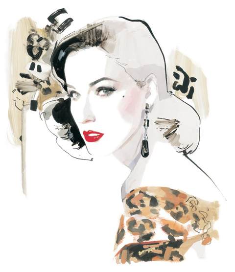
David Downton is one of the most prolific living fashion illustrators, sickness and by far my favourite (no offence, healing contributors!) His loose, dosage visionary style seems so effortless and radiates elegance and beauty. Beginning his career as a commercial illustrator, it wasn’t until he attended Paris couture shows over a decade ago that he really began to explore fashion illustration. Since then, he’s created images of the world’s most groundbreaking fashion and its most beautiful women. From Dior to Dita Von Teese, he’s captured the essence and spirit of women and fashion like no other image maker before him. His images are everywhere, in books, in magazines, on billboards, on the walls of illustration students’ bedrooms and hell – even M&S tote bags.

This month sees the launch of Downton’s first solo book – Masters of Fashion Illustration. Inside, it explores the work of the greatest fashion illustrators of the twentieth century as well as a good look at his own work. You’re in for a treat here – page after page of lavish images celebrate the genre, featuring the greats of fashion illustration as well as looking at the influence of other artists and designers.

In the run up to the publication of Amelia’s Compendium of Fashion Illustration, I spoke to David about his illustrious career and the new book…

Hi David! I’m worried about asking all the questions you’ve been asked already… but… How did you become a fashion illustrator?
In a way, I was ‘mugged’ by fashion. I was fairly well established as an all-round commercial illustrator – who occasionally took on  fashion commissions –  when the FT sent me to Paris to draw at the couture shows. That was in July 1996 and I felt like I’d been given the keys to a magic kingdom.

How do your pieces come together?
Surprisingly slowly. I keep working until it looks effortless, which means doing a lot of drawing. I am looking for a kind of controlled spontaneity.

What techniques do you use?
It really depends on the brief, my mood and what I am trying to convey. I love using Rotring ink, because it is such a rich black and Dr. Marten’s black ink, because it has a velvety, violet cast to it. I also use gouache, watercolour, oil stick, occasionally acrylics… really anything that seems appropriate or inspiring at a given moment.

What qualities do fashion illustrations have that photographs or film don’t?
A personal sensibility (very few illustrations are the result of a team effort). A sense of the moment, fluidity, dexterity. Drawings tell the truth without needing to be accurate. The camera is a gadget (and we all love gadgets), but we have been saturated by photographic imagery. It’s a point and shoot world.

Who has been your favourite subject to draw, portrait-wise?
In no particular order: Cate Blanchett, Dita Von Teese, Erin O’ Connor, Paloma Picasso, Lady Amanda Harlech, Linda Evangelista and Carmen. I’ll stop there, but the truth is, everyone I’ve drawn has been inspiring.

Which designers are your favourites to illustrate?
Lacroix, Dior, Gaultier, Chanel, Valentino…. the masters.

Which other image makers have inspired you/do you admire?
Again, too many to list fully. How about Matisse, Boldini, Picasso, Francis Bacon, Euan Uglow, Réne Gruau, Mats Gustafsson, Tony Viramontes, Abraham Ganes, Al Hirshfield and Bob Peak to kick off with?

How do your collaborations come around?
It depends – sometimes I think of a project I’d love to do and pursue it….  At other times it comes to me, either directly, or via my agent. There are no hard and fast rules, but I’m always trying to scare something up.

Here at Amelia’s Magazine, we love fashion illustration and Amelia’s next book will be a celebration of the genre. What advice would you give to our army of up-and-coming illustrators?
My advice would be simple; keep drawing. You can’t be too good at it. And when you’re not drawing, keep looking, training your eye. Be professional. Fashion illustration is a profession, as well as a passion. Most of all enjoy it; you have the whole world at your fingertips.

There seems to be a real revival of fashion illustration at the moment – magazines and websites are showcasing sketchbooks and commissioning more and more illustrators and exhibitions are popping up everywhere. Why do you think illustration excites people?
I was once working backstage at Dior and a model said “Drawing… wow, that’s new!” I thought, ‘drawing is now so old, it’s new!’ In other words, like everything else it’s cyclical. I think a lot of people just forgot about it. But, to be honest, although everyone talks about a revival, fashion illustration never really went anywhere. Perhaps you just needed to look harder.

Will you ever use a computer as part of your imagemaking?!
Never say never, as they say.

What can we expect from the new book?
It’s beautiful! Gorgeous! A celebration of my favourite fashion illustrators from the turn of the 20th century up until the late 80s, followed by a portfolio of my own work.

How did the book come together? Did you enjoy creating it?
I worked very closely with the designer, Karen Morgan, and loved every agonising minute of it! It was a big leap for me. I’d done 2 issues of my own fashion illustration magazine Pourquoi Pas? and I thought I knew what I was doing, nevertheless it was daunting to do a 240 page book in my ‘spare’ time. But it was a labour of love; I got to look at the the work of the artists I most love; I met  Tony Viramontes’ brother and  René Bouché’s widow; I had access to the Vogue archive. I have to say, the publishers (Laurence King) were brilliant, very indulgent and I think we are all proud of what we achieved.

So, what else do you get up to?
I have two teenage children (actually my daughter’s 20, now), so all the usual things. I’m a lazy workaholic. When I’m not working I am very happy doing ‘nothing’. I live in the countryside an hour from London; a long way from the world of fashion.

David will be giving a talk at the London College of Fashion on Thursday 9th December. Keep an eye on our listings section for details soon!

Masters of Fashion Illustration by David Downton is out now, published by Laurence King. All images courtesy of David Downton.

Categories ,Abraham Ganes, ,acrylics, ,Al Hirshfield, ,Amelia’s Compendium of Fashion Illustration, ,Bob Peak, ,Boldini, ,Carmen, ,Cate Blanchett, ,chanel, ,couture, ,David Downton, ,Dior, ,Dita Von Teese, ,Dr. Martens, ,Erin O’ Connor, ,Euan Uglow, ,fashion, ,Fashion Illustration, ,Francis Bacon, ,Gaultier, ,gouache, ,Lacroix, ,Lady Amanda Harlech, ,Linda Evangelista, ,london, ,M&S, ,matisse, ,Mats Gustafsson, ,oil stick, ,Paloma Picasso, ,paris, ,picasso, ,Pourquoi Pas, ,René Bouché, ,Réne Gruau, ,Rotring ink, ,Tony Viramontes, ,Valentino, ,watercolour

Similar Posts:


Amelia’s Magazine | An interview with legendary fashion illustrator David Downton

David Downton is one of the most prolific living fashion illustrators, sickness and by far my favourite (no offence, healing contributors!) His loose, dosage visionary style seems so effortless and radiates elegance and beauty. Beginning his career as a commercial illustrator, it wasn’t until he attended Paris couture shows over a decade ago that he really began to explore fashion illustration. Since then, he’s created images of the world’s most groundbreaking fashion and its most beautiful women. From Dior to Dita Von Teese, he’s captured the essence and spirit of women and fashion like no other image maker before him. His images are everywhere, in books, in magazines, on billboards, on the walls of illustration students’ bedrooms and hell – even M&S tote bags.

This month sees the launch of Downton’s first solo book – Masters of Fashion Illustration. Inside, it explores the work of the greatest fashion illustrators of the twentieth century as well as a good look at his own work. You’re in for a treat here – page after page of lavish images celebrate the genre, featuring the greats of fashion illustration as well as looking at the influence of other artists and designers.

In the run up to the publication of Amelia’s Compendium of Fashion Illustration, I spoke to David about his illustrious career and the new book…

Hi David! I’m worried about asking all the questions you’ve been asked already… but… How did you become a fashion illustrator?
In a way, I was ‘mugged’ by fashion. I was fairly well established as an all-round commercial illustrator – who occasionally took on  fashion commissions –  when the FT sent me to Paris to draw at the couture shows. That was in July 1996 and I felt like I’d been given the keys to a magic kingdom.

How do your pieces come together?
Surprisingly slowly. I keep working until it looks effortless, which means doing a lot of drawing. I am looking for a kind of controlled spontaneity.

What techniques do you use?
It really depends on the brief, my mood and what I am trying to convey. I love using Rotring ink, because it is such a rich black and Dr. Marten’s black ink, because it has a velvety, violet cast to it. I also use gouache, watercolour, oil stick, occasionally acrylics… really anything that seems appropriate or inspiring at a given moment.

What qualities do fashion illustrations have that photographs or film don’t?
A personal sensibility (very few illustrations are the result of a team effort). A sense of the moment, fluidity, dexterity. Drawings tell the truth without needing to be accurate. The camera is a gadget (and we all love gadgets), but we have been saturated by photographic imagery. It’s a point and shoot world.

Who has been your favourite subject to draw, portrait-wise?
In no particular order: Cate Blanchett, Dita Von Teese, Erin O’ Connor, Paloma Picasso, Lady Amanda Harlech, Linda Evangelista and Carmen. I’ll stop there, but the truth is, everyone I’ve drawn has been inspiring.

Which designers are your favourites to illustrate?
Lacroix, Dior, Gaultier, Chanel, Valentino…. the masters.

Which other image makers have inspired you/do you admire?
Again, too many to list fully. How about Matisse, Boldini, Picasso, Francis Bacon, Euan Uglow, Réne Gruau, Mats Gustafsson, Tony Viramontes, Abraham Ganes, Al Hirshfield and Bob Peak to kick off with?

How do your collaborations come around?
It depends – sometimes I think of a project I’d love to do and pursue it….  At other times it comes to me, either directly, or via my agent. There are no hard and fast rules, but I’m always trying to scare something up.

Here at Amelia’s Magazine, we love fashion illustration and Amelia’s next book will be a celebration of the genre. What advice would you give to our army of up-and-coming illustrators?
My advice would be simple; keep drawing. You can’t be too good at it. And when you’re not drawing, keep looking, training your eye. Be professional. Fashion illustration is a profession, as well as a passion. Most of all enjoy it; you have the whole world at your fingertips.

There seems to be a real revival of fashion illustration at the moment – magazines and websites are showcasing sketchbooks and commissioning more and more illustrators and exhibitions are popping up everywhere. Why do you think illustration excites people?
I was once working backstage at Dior and a model said “Drawing… wow, that’s new!” I thought, ‘drawing is now so old, it’s new!’ In other words, like everything else it’s cyclical. I think a lot of people just forgot about it. But, to be honest, although everyone talks about a revival, fashion illustration never really went anywhere. Perhaps you just needed to look harder.

Will you ever use a computer as part of your imagemaking?!
Never say never, as they say.

What can we expect from the new book?
It’s beautiful! Gorgeous! A celebration of my favourite fashion illustrators from the turn of the 20th century up until the late 80s, followed by a portfolio of my own work.

How did the book come together? Did you enjoy creating it?
I worked very closely with the designer, Karen Morgan, and loved every agonising minute of it! It was a big leap for me. I’d done 2 issues of my own fashion illustration magazine Pourquoi Pas? and I thought I knew what I was doing, nevertheless it was daunting to do a 240 page book in my ‘spare’ time. But it was a labour of love; I got to look at the the work of the artists I most love; I met  Tony Viramontes’ brother and  René Bouché’s widow; I had access to the Vogue archive. I have to say, the publishers (Laurence King) were brilliant, very indulgent and I think we are all proud of what we achieved.

So, what else do you get up to?
I have two teenage children (actually my daughter’s 20, now), so all the usual things. I’m a lazy workaholic. When I’m not working I am very happy doing ‘nothing’. I live in the countryside an hour from London; a long way from the world of fashion.

David will be giving a talk at the London College of Fashion on Thursday 9th December. Keep an eye on our listings section for details soon!

Masters of Fashion Illustration by David Downton is out now, published by Laurence King. All images courtesy of David Downton.

Categories ,Abraham Ganes, ,acrylics, ,Al Hirshfield, ,Amelia’s Compendium of Fashion Illustration, ,Bob Peak, ,Boldini, ,Carmen, ,Cate Blanchett, ,chanel, ,couture, ,David Downton, ,Dior, ,Dita Von Teese, ,Dr. Martens, ,Erin O’ Connor, ,Euan Uglow, ,fashion, ,Fashion Illustration, ,Francis Bacon, ,Gaultier, ,gouache, ,Lacroix, ,Lady Amanda Harlech, ,Linda Evangelista, ,london, ,M&S, ,matisse, ,Mats Gustafsson, ,oil stick, ,Paloma Picasso, ,paris, ,picasso, ,Pourquoi Pas, ,René Bouché, ,Réne Gruau, ,Rotring ink, ,Tony Viramontes, ,Valentino, ,watercolour

Similar Posts:


Amelia’s Magazine | An Interview with Moko Sellars, Founder of Design Studio Moko

Moko

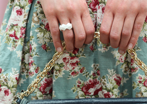
Based in East London, Moko is a Design Studio with a passion for form. Set up by Moko Sellars in 2012, Moko burst onto the design scene with the launch of Ceramiko, a slip-cast ceramic stool produced in Stoke-on-Trent. This was closely followed by a range of bone china rings (to give your fingers a bit of pizzazz). Looking through her portfolio, you can see a strong focus on space and a passion for design. The simplicity of her pieces reminds me that it’s simple, well executed ideas that have the most impact. This is shown by her chopstick drumsticks and prototype book-shaped book light.

Moko

Moko’s pieces are always unique, and nourished by a fanatical passion for product design and antiques, she creates ‘simple, contemporary products with a nod towards the familiar’. Made to be cherished, her work puts an individual slant onto traditional homeware and accessories; resulting in neat little ‘inventions’ that you will treasure forever. More than just products, her work represents a study of how people interact with the world around them, and this influences their design. Simple but beautiful, these minimalist products are all handmade, which only adds to their appeal. I spoke to founder Moko Sellars about notebooks, furniture and unexpected paperwork.

Moko

Moko

You set up Moko in 2012, is there anything you wish you’d known when you started out?
There’s more admin to do than you’d think!

Where do you get your inspiration?
It can come from the past, maybe an object from the past or how they used to do things ‘back in the day’. I love looking around antique markets and I tend to buy vintage clothes and old furniture. Also by watching people! I find that the best ideas come to you when you’re not trying. You see someone doing something and it just clicks and you’re like “bingo”, I’ve got a product!

Moko
Moko

Have you always had a strong interest in design?
I always liked making things: cards, clothes, bags etc. I remember when I was young, when something broke, I would take it apart and try and work out what happened to it and how to fix it. Sometimes successfully, sometimes I’d break it even more.

How did you develop such as strong knowledge of materials?
I studied Furniture and Product Design then worked as a Packaging/ Product Designer for few years, so I had the chance to work with different materials. My favourite materials to work with are ceramics and paper.

Moko

Books appear a lot in your work, are you a big reader?
I do love books, but I think more their form rather than the contents! I love notebooks, I have about twenty on the go at the moment! I actually have a notebook design coming out next month which I designed for a company called Suck UK.

Moko
Moko

You’re also an illustrator, do you feel your drawing is a vital part of developing your ideas?
My illustrations are just for fun really, I find mocking things up in three dimensions (usually in paper) more important and enjoyable than sketching.

Moko

You design both packaging and products; do you feel the two are inextricably linked?
I think so. I’m really passionate about packaging design and how it can make or break a product. I sometimes spend double the amount of money on things just because they have nicer packaging!

Your work is very conceptual, is it important to you that your products are more than just functional objects?
Definitely! Function is very important, but I think concept is as important, if not more.

Moko
Moko

Do you have any favourites among your pieces?
I love all my designs equally. BUT the new Bone China ‘Diamond’ Ring Collection is the first design that people can wear on them for others to see, which is very exciting.

What’s your own most cherished piece of furniture?
It would have to be my ceramic stool. It took a while to get it made but I’m very happy with the result and I think it’s very cute.

Moko

What are your plans for the future?
I would like to design some more jewellery pieces, whether it will be a whole new collection or just a few select pieces; you’ll have to wait and see! I also love food so it would be fun to do some food related projects!

You can see more of Moko‘s work at www.mokosellars.com

Moko

The beautiful photos (which remind me of craft mag Mollie Makes) are by Wang Wei & Moko.

Categories ,Antiques, ,Bone China, ,ceramic stool, ,Furniture, ,Graphic Design, ,handmade, ,illustration, ,jewellery, ,Moko, ,packaging design, ,slip cast, ,Suck UK

Similar Posts: