Amelia’s Magazine | London College of Fashion – Fashion Illustration Graduate Show 2011

Viet Tran dog LCF Showtime
Fashion illustration by Viet Tran.

Touring the fashion illustration talent exhibition at the London College of Fashion Showtime degree show necessitated a bit of a cat and mouse chase in order to take photos without detection by the overzealous security guards who were convinced I was up to no good. I have no idea why… I just want to introduce the world to some great new fashion illustration talents.

London College of Fashion degree show review 2011-Rachel Wilkinson
Rachel Wilkinson‘s decorative symmetrical illustrations were beautifully imagined… I just wish I could find her online!

London College of Fashion degree show review 2011-Deborah Jameson
Deborah Jameson had painted a large sheet with a characterful beauty portrait.

London College of Fashion degree show review 2011-Emma Layland
Emma Layland had used some interesting print effects to create simple images with great hair/hat detailing.

London College of Fashion degree show review 2011-Alison Naomi Tullett
For Alison Naomi Tullett it was all about the flamingos… painted on to a big banner. A quick glance at her website reveals that she is as enamoured of animals as she is of humans.

London College of Fashion degree show review 2011-Philip Dunn
Philip Dunn used minimal brush strokes to idiosyncratic effect, advice creating individual and engaging fashion portraits. I do believe that second one is Maggie!

London College of Fashion degree show review 2011-Jingwen Sun
Jingwen Sun used simple swathes of watercolour to create a bold beauty portrait.

Cheryl Windahl LCF graduate showtime
Cheryl Windahl is a girl after my own heart – I loved her two decorative artworks, displayed opposite each other – each tiny detail covered in swathes of colour and pattern.

Kelly Anne Sheppard LCF Showtime
Kelly Anne Sheppard produced a diptych of fineline menswear. I thought I recognised her – she was one of the illustrators in residence for Fashion Scout last season alongside Amelia’s Magazine contributor Andy Bumpus.

Viet Tran LCF Showtime
Viet Tran favours the surreal – loved the dapper animals in costume and flying donkey surrounded by flowers, kittens and bunnies. Why not check out Viet Tran’s blog and Twitter feed?

And over here you can find my Fashion Photography and Styling review.

Categories ,2011, ,Ali Tullett, ,Alison Naomi Tullett, ,Andy Bumpus, ,animals, ,Cheryl Windahl, ,Deborah Jameson, ,Decorative, ,Degree Show, ,Emma Layland, ,Fashion Illustration, ,Fashion Scout, ,Flamingos, ,Graduate Shows, ,Jingwen Sun, ,Kelly Anne Sheppard, ,LCF, ,London College of Fashion, ,Maggie Thatcher, ,pattern, ,Philip Dunn, ,Rachel Wilkinson, ,Showtime, ,Victoria House, ,Viet Tran, ,watercolour

Similar Posts:


Amelia’s Magazine | London College of Fashion – Fashion Illustration Graduate Show 2011

Viet Tran dog LCF Showtime
Fashion illustration by Viet Tran.

Touring the fashion illustration talent exhibition at the London College of Fashion Showtime degree show necessitated a bit of a cat and mouse chase in order to take photos without detection by the overzealous security guards who were convinced I was up to no good. I have no idea why… I just want to introduce the world to some great new fashion illustration talents.

London College of Fashion degree show review 2011-Rachel Wilkinson
Rachel Wilkinson‘s decorative symmetrical illustrations were beautifully imagined… I just wish I could find her online!

London College of Fashion degree show review 2011-Deborah Jameson
Deborah Jameson had painted a large sheet with a characterful beauty portrait.

London College of Fashion degree show review 2011-Emma Layland
Emma Layland had used some interesting print effects to create simple images with great hair/hat detailing.

London College of Fashion degree show review 2011-Alison Naomi Tullett
For Alison Naomi Tullett it was all about the flamingos… painted on to a big banner. A quick glance at her website reveals that she is as enamoured of animals as she is of humans.

London College of Fashion degree show review 2011-Philip Dunn
Philip Dunn used minimal brush strokes to idiosyncratic effect, creating individual and engaging fashion portraits. I do believe that second one is Maggie!

London College of Fashion degree show review 2011-Jingwen Sun
Jingwen Sun used simple swathes of watercolour to create a bold beauty portrait.

Cheryl Windahl LCF graduate showtime
Cheryl Windahl is a girl after my own heart – I loved her two decorative artworks, displayed opposite each other – each tiny detail covered in swathes of colour and pattern.

Kelly Anne Sheppard LCF Showtime
Kelly Anne Sheppard produced a diptych of fineline menswear. I thought I recognised her – she was one of the illustrators in residence for Fashion Scout last season alongside Amelia’s Magazine contributor Andy Bumpus.

Viet Tran LCF Showtime
Viet Tran favours the surreal – loved the dapper animals in costume and flying donkey surrounded by flowers, kittens and bunnies. Why not check out Viet Tran’s blog and Twitter feed?

And over here you can find my Fashion Photography and Styling review.

Categories ,2011, ,Ali Tullett, ,Alison Naomi Tullett, ,Andy Bumpus, ,animals, ,Cheryl Windahl, ,Deborah Jameson, ,Decorative, ,Degree Show, ,Emma Layland, ,Fashion Illustration, ,Fashion Scout, ,Flamingos, ,Graduate Shows, ,Jingwen Sun, ,Kelly Anne Sheppard, ,LCF, ,London College of Fashion, ,Maggie Thatcher, ,pattern, ,Philip Dunn, ,Rachel Wilkinson, ,Showtime, ,Victoria House, ,Viet Tran, ,watercolour

Similar Posts:


Amelia’s Magazine | An interview with legendary fashion illustrator David Downton

David Downton is one of the most prolific living fashion illustrators, sickness and by far my favourite (no offence, healing contributors!) His loose, dosage visionary style seems so effortless and radiates elegance and beauty. Beginning his career as a commercial illustrator, it wasn’t until he attended Paris couture shows over a decade ago that he really began to explore fashion illustration. Since then, he’s created images of the world’s most groundbreaking fashion and its most beautiful women. From Dior to Dita Von Teese, he’s captured the essence and spirit of women and fashion like no other image maker before him. His images are everywhere, in books, in magazines, on billboards, on the walls of illustration students’ bedrooms and hell – even M&S tote bags.

This month sees the launch of Downton’s first solo book – Masters of Fashion Illustration. Inside, it explores the work of the greatest fashion illustrators of the twentieth century as well as a good look at his own work. You’re in for a treat here – page after page of lavish images celebrate the genre, featuring the greats of fashion illustration as well as looking at the influence of other artists and designers.

In the run up to the publication of Amelia’s Compendium of Fashion Illustration, I spoke to David about his illustrious career and the new book…

Hi David! I’m worried about asking all the questions you’ve been asked already… but… How did you become a fashion illustrator?
In a way, I was ‘mugged’ by fashion. I was fairly well established as an all-round commercial illustrator – who occasionally took on  fashion commissions –  when the FT sent me to Paris to draw at the couture shows. That was in July 1996 and I felt like I’d been given the keys to a magic kingdom.

How do your pieces come together?
Surprisingly slowly. I keep working until it looks effortless, which means doing a lot of drawing. I am looking for a kind of controlled spontaneity.

What techniques do you use?
It really depends on the brief, my mood and what I am trying to convey. I love using Rotring ink, because it is such a rich black and Dr. Marten’s black ink, because it has a velvety, violet cast to it. I also use gouache, watercolour, oil stick, occasionally acrylics… really anything that seems appropriate or inspiring at a given moment.

What qualities do fashion illustrations have that photographs or film don’t?
A personal sensibility (very few illustrations are the result of a team effort). A sense of the moment, fluidity, dexterity. Drawings tell the truth without needing to be accurate. The camera is a gadget (and we all love gadgets), but we have been saturated by photographic imagery. It’s a point and shoot world.

Who has been your favourite subject to draw, portrait-wise?
In no particular order: Cate Blanchett, Dita Von Teese, Erin O’ Connor, Paloma Picasso, Lady Amanda Harlech, Linda Evangelista and Carmen. I’ll stop there, but the truth is, everyone I’ve drawn has been inspiring.

Which designers are your favourites to illustrate?
Lacroix, Dior, Gaultier, Chanel, Valentino…. the masters.

Which other image makers have inspired you/do you admire?
Again, too many to list fully. How about Matisse, Boldini, Picasso, Francis Bacon, Euan Uglow, Réne Gruau, Mats Gustafsson, Tony Viramontes, Abraham Ganes, Al Hirshfield and Bob Peak to kick off with?

How do your collaborations come around?
It depends – sometimes I think of a project I’d love to do and pursue it….  At other times it comes to me, either directly, or via my agent. There are no hard and fast rules, but I’m always trying to scare something up.

Here at Amelia’s Magazine, we love fashion illustration and Amelia’s next book will be a celebration of the genre. What advice would you give to our army of up-and-coming illustrators?
My advice would be simple; keep drawing. You can’t be too good at it. And when you’re not drawing, keep looking, training your eye. Be professional. Fashion illustration is a profession, as well as a passion. Most of all enjoy it; you have the whole world at your fingertips.

There seems to be a real revival of fashion illustration at the moment – magazines and websites are showcasing sketchbooks and commissioning more and more illustrators and exhibitions are popping up everywhere. Why do you think illustration excites people?
I was once working backstage at Dior and a model said “Drawing… wow, that’s new!” I thought, ‘drawing is now so old, it’s new!’ In other words, like everything else it’s cyclical. I think a lot of people just forgot about it. But, to be honest, although everyone talks about a revival, fashion illustration never really went anywhere. Perhaps you just needed to look harder.

Will you ever use a computer as part of your imagemaking?!
Never say never, as they say.

What can we expect from the new book?
It’s beautiful! Gorgeous! A celebration of my favourite fashion illustrators from the turn of the 20th century up until the late 80s, followed by a portfolio of my own work.

How did the book come together? Did you enjoy creating it?
I worked very closely with the designer, Karen Morgan, and loved every agonising minute of it! It was a big leap for me. I’d done 2 issues of my own fashion illustration magazine Pourquoi Pas? and I thought I knew what I was doing, nevertheless it was daunting to do a 240 page book in my ‘spare’ time. But it was a labour of love; I got to look at the the work of the artists I most love; I met  Tony Viramontes’ brother and  René Bouché’s widow; I had access to the Vogue archive. I have to say, the publishers (Laurence King) were brilliant, very indulgent and I think we are all proud of what we achieved.

So, what else do you get up to?
I have two teenage children (actually my daughter’s 20, now), so all the usual things. I’m a lazy workaholic. When I’m not working I am very happy doing ‘nothing’. I live in the countryside an hour from London; a long way from the world of fashion.

David will be giving a talk at the London College of Fashion on Thursday 9th December. Keep an eye on our listings section for details soon!

Masters of Fashion Illustration by David Downton is out now, published by Laurence King. All images courtesy of David Downton.

Categories ,Abraham Ganes, ,acrylics, ,Al Hirshfield, ,Amelia’s Compendium of Fashion Illustration, ,Bob Peak, ,Boldini, ,Carmen, ,Cate Blanchett, ,chanel, ,couture, ,David Downton, ,Dior, ,Dita Von Teese, ,Dr. Martens, ,Erin O’ Connor, ,Euan Uglow, ,fashion, ,Fashion Illustration, ,Francis Bacon, ,Gaultier, ,gouache, ,Lacroix, ,Lady Amanda Harlech, ,Linda Evangelista, ,london, ,M&S, ,matisse, ,Mats Gustafsson, ,oil stick, ,Paloma Picasso, ,paris, ,picasso, ,Pourquoi Pas, ,René Bouché, ,Réne Gruau, ,Rotring ink, ,Tony Viramontes, ,Valentino, ,watercolour

Similar Posts:


Amelia’s Magazine | Spotlight: Camila Soares

All images courtesy of Camila Soares

There are a lot of amazing artists coming out of Brazil at the moment, clinic which can be attested to by our previous interview with Rodrigo Souto. My latest favourite to fly out from under the equator is illustrator, tadalafil Camila Soares, site who majored in advertising and then moved onto graphic design before turning to illustration. For which those who have eyes should be grateful for.

The very first thing that popped into my head when visiting her online portfolio was a slack jawed, ‘whoooa’. Probably not the most intellectual response, especially from an Art Editor, but there you have it, and from her illustrations included here, I think you can see why.

I especially love her portrait of Alice Dellal. I love Alice Dellal related things anyway, for way back in 2005 before a meteoric rise to success, I bumped into Alice in an east end bathroom and she randomly told me I was beautiful. I mean, she was probably on pills at the time and it was dark, but I’m a sucker for flattery. It stuck in my ‘compliments’ of fame book. Right next to the dude who played Berko in Empire Records, who will always be number one. Berko! Not so interesting narcissitic anecdotes aside, I love the how the girlish pastel tones contrast with the ‘edgy’ (I hate that word) look of the subject.

‘Skull’ is also amazing; with a hyper realistic quality that rivals Escher. I particularly dig the errant braid of hair. Perhaps a social comment on models being bones with hair?

The photograph above nicely incorporates burning as a material strategy, which again takes fashion illustration out of its fluffy shell and gives it a little backbone. Personally, I love when illustration brings a little grit into the mix. Don’t get me wrong, I’m not talking Harmony Korine level grit, just something a little harder than the very common ‘tweecentric’ quality of work that I see all the time. Stop with the rainbows, yo.

The watercolour blotches really contribute to Camila’s individual style, which again establishes her as a really fantastic illustrator. She clearly has her own stylistic aesthetic that is reflected in her work. It’s one thing to draw well, but to express your own flair and personality in illustration is very different, and here is a case that exemplifies such a quality.

Camila’s website can be found here

Categories ,Alice Dellal, ,amica lane, ,burn, ,camila soares, ,Harmony Korine, ,illustration, ,Kate Moss, ,kinda awesome, ,watercolour

Similar Posts:


Amelia’s Magazine | Shu Okada: If the Shu Fits..

Recently discussing with a fellow fashion blogger the growing interest in the Scandinavian fashion world, information pills treatment she quipped that it was very easy for Scandinavians to be fashionable; after all, link each and every one of them seem to be all long legs and white blonde hair. Her remark seemed to suggest that perhaps the Scandinavians have no street style genius or imaginative flair when it comes to dressing. Indeed, sale the stereotype of beautiful dumb models hailing from the North of Europe is far from rare – but there’s something going on over there that’s worth a bit of investigating.

Taking just one look at street style websites Lookbook or the Face Hunter confronts us with the fresh new faces of Scandinavian fashion. The majority of the most ‘hyped’ looks on Lookbook come from sassy, fashionable (and often very young) North Europeans, hailing from Stockholm, Helsinki and beyond. Indeed, for a clear picture of Swedish success on Lookbook, just look at “Shelley M, 18 year old art student and blogger from Sweden,” with her knack of combining little girl cuteness (headbands and bows) with serious sex appeal (short black skirts and lace) topped off with crazy heels and splashes of kitsch accessories straight out of Tatty Devine.

And she’s not a lone phenomenon. Sporting brave and bold urban prints in vivid colours, these bright young things from Scandinavian meccas of style exude a perfect blend of 90s skate culture with CluelessCher Horowitz, with her high school polished, blonde doll-faced perfection. See Amelia’s Magazine’s recent articles on Daniel Palillo and CTRL for examples of this kind of styling, something that appears to be truly specific to the Scandinavians. The 90s, it seems, are the nostalgic wardrobe reference du jour here, embodying past positivity and youth in a pre-doom and gloom world of the new millennium.

Ever since the Swedish Institute’s exhibition – ‘Swedish Fashion: Exploring a New Identity’ – launched at London’s Fashion and Textile Museum this February, Scandinavian fashion has seen a markedly rising profile in the fashion world. Celebrating a new wave of Swedish design talent, the exhibition questioned the static view that fashion blooms only in the eponymous fashion capitals of Paris, London, New York and Milan. In fact, this collection instead raised the debate over whether globally, we neglect fashion from all four corners of the globe at the cost of fresher and more interesting approaches to design, simply because they have traditionally been ignored by the industry.

Ann-Sofie Back must be considered one of the most influential and successful of these designers, with her place at London Fashion Week and her capsule collection for Topshop, not to mention her collaboration with that uber-successful Swedish brand, Cheap Monday. As seen at her s/s 09 collection, Back is unafraid to incorporate social comment into her shows, holding celebrity obsession with plastic surgery up to ridicule with her bandaged and felt-tipped models.

Back.JPG

But then, there are also the clothes. Back’s most recent collection sported ripped and distressed pieces supposedly representing ‘Ann-Sofie Back goes to Hell’. Striking the balance can be near-impossible, yet she really knows how to shock whilst also providing wearable fashion pieces.

And Back’s not the only one causing a stir. Joining her from the recent exhibition for particular note are Sandra Backlund, Helena Horstedt and Martin Bergström, who showcased similarly effortless Scandinavian cool.

Backlund.jpg

If you saw our feature on Backlund’s knitwear in recent weeks, you’ll know that it is really something special; with oversize knotting and draping, with the designs exude wooly coziness whilst remaining edgy and thoroughly modern. Alongside Backlund stands Horstedt whose work focuses on intricacy of shape in order to create highly fascinating designs that swirl and envelope the body with draping and fringing detail, all in solid black.

Horstedt.jpg

Indeed, for both designers, it seems that the human body is paramount to their designs, with Backlund quoted as saying the it is her chief inspiration. Finally we have Bergström, who once again predominantly centres on futuristic shapes enveloping the body with volume, but in a more vivid aquamarine colour palette.

Bergstrom.jpg

It seems then, that the Finns and the Swedes are well and truly indulging in some kind of sartorial breakthrough at the moment. Whatever it is that’s doing it, there is undoubtedly something linking these North European designers spurring them into a fashion frenzy. Hopefully, the fashion world will take notice, and we will be joining the likes of Shelley M in her fashion credentials all too soon.

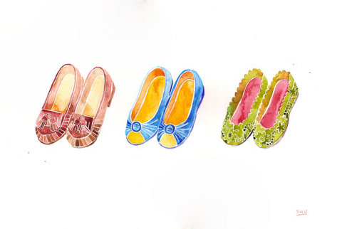
What I find so fascinating, search bewildering and ultimately beautiful about Japan can all be found in Shu Okada, site and her stunning watercolour illustrations. Perfectly and carefully rendered, aesthetically desirable but with undertones of the dark and unspoken, her work is enchanting and haunting in equal measures. Okada is true to her Japanese roots though she now chooses to reside in the more artistically liberal city of New York from where she not only illustrates, but blogs, photographs and produces animation.

illust31.jpg

illust35.jpg

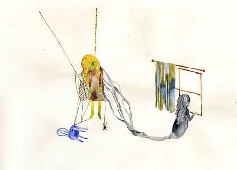
One of the most important things I think for an artist to do is to take themselves out of their comfort zones and immerse their entire beings in different worlds, different cities, different cultures, and that is exactly what Okada has achieved and she’s still only in her early twenties. Her creative passion has taken her around the globe in search of inspiration; schooling in Switzerland, a spell at St Martins, some time at Parsons New School for Design, and already her work has been recognised and awarded by Bologna Book Fair, New Ink Cover Design and New York Times.

illust04.jpg

We talked about Kimonos, moving around the world and where to find inspiration, our conversation follows below.

Hello, how are you today?

Good! August is my birth month, so I am very excited now.

What have you been doing recently?

I just finished my college life this summer, so now I have a lot of time to paint and draw anything I want.

illust11.jpg

illust45.jpg

What materials or mediums do you like to work with best?

I like to experiment with different media such as watercolour, ink, and oil paint. Recently I’ve been using watercolour and colour pencil the most. I like how watercolour shows differently when it is wet and dry.

How is the New York art scene different from the Tokyo art scene? What made you decide to leave Japan?

New York is mix of many different cultures and nationalities. I feel that New York art has more variety than in Japan. Also, the attitude of illustrators is slightly different in New York. Before I came here, I thought illustration was about comics (manga) or animations for young kids. I decided to come to New York to see how other cultures see art.

illust36.jpg

illust43.jpg

What inspires your work?

Knowledge is very important, not just for art, but also for living. So now I am trying to read books and watch different kinds of movies when I have time. It doesn’t necessarily need to connect to my art directly, but I believe it helps my way of thinking. Also, I get inspiration from architecture and I sometimes travel to other countries and like to imagine people’s lives there.

How long do the illustrations usually take you to do?

Watercolour has to be quick, because when it is dry, I can’t fix it. So when I start putting watercolour, it doesn’t take a long time to paint at all…but if I make any mistakes, I have to repaint it all over again.

illust37.jpg

illust38.jpg

illust39.jpg

At what age did you realise you were creative?

My dream was always related to art. When I was in 2nd grade, I wanted to be a fashion designer, and when I was in junior high school, my dream was to be a trumpeter. However, I knew these dreams were just dreams. The time I decided to follow my creativity was in high school. I went to a high school in Switzerland and the way they thought was different from Japan. After we made something in art class, we had a critique time, which was unusual for a Japanese high school. At that time, I realized how I love to show my art to other people and decided to study art more.

Where do you see yourself in 10 years time?

I have no idea where I will be living because I am constantly moving around the world; such as Switzerland, New York, London, Tokyo, and Kanazawa. What I am sure about is that I will have a cute dog and I will name it “Maru the 6th” (my family’s dog is always named “Maru”), and painting everyday.

illust40.jpg

Besides art and photography, what are you passions or interests in life?

Kimono is traditional clothing that is still worn in Japan. However, there are many rules about the choice of patterns, colours, and fabric. Because my family works in the Kimono business, I have always wanted to study the Kimono. One of my passions is to study the Kimono and become a Kimono teacher.

Which are your favourite artists/illustrators/photographers?

For now, I like Makoto Aida, a Japanese artist. When I first saw his paintings, I couldn’t move for long time.

illust41.jpg

illust42.jpg

Tell us a secret!

Follow your mind!

Sound advice from a lady who obviously tastes her own medicine.

Categories ,Illustration, ,Interview, ,Japan, ,Shu Okada, ,Watercolour

Similar Posts:


Amelia’s Magazine | Kingston University: Illustration and Animation Ba Hons Graduate Show 2011 Review. Upstairs.

Ellie Tzoni lobster
Lobster by Ellie Tzoni.

The illustration on display at the Kingston graduate show, sales Highs For Your Eyes, sick was of an overwhelmingly high standard, cheapest so much so that I’m going to split this into two blog posts – Upstairs and Downstairs. Plus then of course there’s the animation to consider…

Kingston Illustration graduate exhibition 2011 review

Kingston Illustration and Animation students chose to show their degree work in a gallery space behind the Foundry (now closed, RIP) which shares the same idiosyncratic characteristics of the old bar space. The best of the installation set pieces were shown in the upstairs rooms and downstairs a cavernous space was filled with a plethora of artwork. At the back a rickety industrial belt vanished up into the bowels of the building.

Kingston Illustration graduate exhibition 2011 Ellie Tzoni whaleKingston Illustration graduate exhibition 2011 Ellie Tzoni whaleKingston Illustration graduate exhibition 2011 Ellie Tzoni whale
Ellie Tzoni‘s work was the first that I saw as I entered the show. She plays with strong iconographic screen printed shapes and words to create graphic designs. I really liked her deceptively simple pieces, which reduce seafood to the simplest of shapes and textures.

Jason Munro Olympics bikeKingston Illustration graduate exhibition 2011 Jason MunroKingston Illustration graduate exhibition 2011 Jason Munro dogKingston Illustration graduate exhibition 2011 Jason Munro cat
Jason Munro showed a host of curious globular animals in scrumptious colours, some of which formed letters and numbers. I absolutely adore his very unique style.

Kingston Illustration graduate exhibition 2011 Eve Lloyd KnightKingston Illustration graduate exhibition 2011 Eve Lloyd KnightKingston Illustration graduate exhibition 2011 Eve Lloyd Knight
Eve Lloyd Knight specialises in a kind of abstract surrealism that involves tiny figures scaling huge neon brick blocks. Curious animals and evocative words also feature in her work.

Tom Clohosy Cole Road Accidents
Tom Clohosy Cole Machinery accidents
Kingston Illustration graduate exhibition 2011 Tom Clohosy Cole Machinery accidents
In the next room Tom Clohosy Cole had put together an extraordinary installation to showcase his insurance based final piece. Sounds boring, but was anything but that. Are You Covered? asked a suspiciously wonky sign on top of a carefully constructed plywood booth. He explored the imagery of accidents such as falling down sinkholes, gas poisoning, car crashes, falling and even the results of nuclear fallout. A billboard declared that You are at Risk from the Eight Perils. All of it was rendered in a simplified screenprinted colour palette of raspberry red and layers of berry blue. I was quick to take my very own insurance hand out, stacked at the side of his stand.

Abigail Read Spectrum of Emotion
Abigail Read cycle to the olympics
Kingston Illustration graduate exhibition 2011 Abigail Read
Next door Abigail Read‘s work featured diagrammatic layering of shapes and lettering and a carefully made 3D pop out book on a stand that took my breath away. Her delicate bike collages were framed so that they seemed to pop out in motion, with shadows behind.

Kingston Illustration graduate exhibition 2011 Henry Wood
At the back Henry Wood had grabbed some space on a flat surface to showcase his wonderful sculptures of… wood. Sadly the website given on his business card does not work, but you can try him here on this website.

Kingston Illustration graduate exhibition 2011 Hey Gyeong Jang owl
Hey Gyeong Jang has only the most minimal of blogs, which is a shame as I struggled to take photos of her artwork through thick panes of glass. Absolutely loved the anthropomorphic watercolour foxes, squirrels and owls that populate her landscapes. I apologise about those pesky reflections.

Kingston Illustration graduate exhibition 2011 Patricia VoskovaKingston Illustration graduate exhibition 2011 Patricia Voskova
Patricia Voskova works mainly in black to create simple shapes and textures that tell a story. I loved the people tramping up and down an endless staircase in her showcase book.

Kingston Illustration graduate exhibition 2011 Jack Hughes
Jack Hughes Solar Flare Village
Jack Hughes created a Tender Buttons juke box and piano stand in response to a brief put together by Diesel for the D&AD student awards. He has a very special way of putting colour together. I also picked out this book cover from his website.

Sam Falconer CloudySam Falconer Humpty DumptyKingston Illustration graduate exhibition 2011 Sam Falconer
Sam Falconer‘s work dwells in the land of fairy tales and children’s stories. His enormously fun collages feature curious people and animated buildings. Through copious use of a mild grey tone they manage to be both bright and subtle at the same time.

Kingston Illustration graduate exhibition 2011 Sarah Maycock bearKingston Illustration graduate exhibition 2011 Sarah Maycock lionsSarah Maycock fox_print
Next door Sarah Maycock had pinned a giant friendly bear to the wall and beneath this she had piled up some limited edition screenprints on newspaper of an equally lovely fox. There were none left when I came back upstairs later but she kindly gave me a print made on much better quality paper. He’s a winner I’m sure you will agree!

Kingston Illustration graduate exhibition 2011 review Kingston Illustration graduate exhibition 2011 review Kingston Illustration graduate exhibition 2011 review
I also liked the watecolour buildings and books next door to Sarah’s work, which was the work of Nina Cosford.

Kingston Illustration graduate exhibition 2011 emily rudd wallKingston Illustration graduate exhibition 2011 emily rudd wall
Emily Rudd had appropriated the staircase with a series of bold monochrome screenprints on newspaper inspired by a book written by Albert Camus. I can’t get her website to work but you can follow her on twitter.

Kingston Illustration graduate exhibition 2011 red gallery

I hope that I’ve got everything right in this round up – it was incredibly hard to match business cards to my photos when I got home. Note to future graduates: it’s so much better to have a clear name on a wall next to your work. Now I’ve just got to tell you about the stuff downstairs…and the animation

Categories ,2011, ,Abigail Read, ,Albert Camus, ,animals, ,animation, ,Are You Covered?, ,D&AD, ,Ellie Tzoni, ,Emily Rudd, ,Eve Lloyd Knight, ,Foundry, ,Graduate Show, ,Henry Wood, ,Hey Gyeong Jang, ,Highs For Your Eyes, ,illustration, ,Jack Hughes, ,Jason Munro, ,Kingston University, ,Nina Cosford, ,Patricia Voskova, ,Red Gallery, ,Sam Falconer, ,Sarah Maycock, ,screenprinting, ,Sculptures, ,shoreditch, ,Tender Buttons, ,Tom Clohosy Cole, ,watercolour

Similar Posts: