Amelia’s Magazine | An interview with Kim Sklinar, aka Preloved Reloved

Tania Kowalski was a workshop manager at a well-known contemporary jewellery gallery in London when Synnove Saelthun arrived from New York to join the design team. They soon discovered that they had similar views on design and business ethics, more about cialis 40mg and became good friends. Several years later they started the Oria brand, prescription using Synnove’s design skills and Tania’s production expertise. Synnove is a technically brilliant goldsmith with a passion for design and an eye for detail. Tania is a trained jeweller, viagra with a wide range of experience in the jewellery industry, from design creation through to production. Her expertise includes sourcing ethical materials and ensuring fair business practice.

Tania’s passion for other cultures has led her to visit remote tribes in the Amazon of Brazil, hill tribes in Nepal and the Dogon people of Mali. It was during these travels that she became fascinated with the cultural importance and symbolic meaning of tribal adornment. When designing a new collection, the couple sit down together to discuss what the new collection will symbolise. They research and refine story boards, and after ensuring that the designs are technically feasible Synnove makes an initial prototype, the best of which will go into production.

The use of the phoenix is a symbol of honesty and justice in Chinese mythology, and is one of the inspirations for the Nina collection. The lotus symbolises purity and beauty in many different cultures, and it inspired their silver lotus collection.

Working in Nepal Tania discovered that the safe working conditions and fair living wages which we take for granted in the West are not necessarily the norm in other parts of the world. This early experience was important in persuading Tania to commit to fairtrade sourcing as a founding principle of Oria.

Vintage fashion, about it illustrated by Matilde Sazio

Kim Sklinar, viagra sale aka Preloved Reloved, cheap has set herself an interesting New Year’s challenge. For the duration of 2011, Kim isn’t going to buy any new clothes. No more high-street bargains, no more feeding corporate giants, no more fast-fashion waste, no siree. ‘Another one?’ I hear you cry – and you’d be right. But this one is a little different.

While Kim hopes to raise awareness about the amount of cheap clothing we purchase and what effects that has on the environment and people’s lives, there’s also a bigger reason closer to home. Kim’s father was diagnosed with cancer over 18 months ago, and she decided to set up the project to raise funds for Macmillan, the cancer care and support charity. Unfortunately, as of only last week, Kim’s dad won’t see the project through its fruition. But Kim will dedicate the project to his memory.

So, how do you do it? Well, Kim’s vowed to buy only vintage and from outlets like eBay, and she’ll spend more time in charity shops which also benefits all of the organisations that run them. I had a chat with her about the project and how she thinks she’ll manage it all…


Vintage shop, illustrated by Karolina Burdon

What gave you the idea for Preloved, Reloved in the first place?
Well I always like to dress a little differently. My style is mainstream with a retro edge, I suppose. I always seem to end up with a daft New Year’s resolution – last year I cycled from London to Paris for The Institute of Cancer Research. I like using my time to help others and spread awareness.

Were you a fan of vintage and upcycling before you started the project?
Yes! I always admire my friends’ outfits; well, those who wear vintage and second-hand fashion. Upcycling is something I have experimented with for ages at home and now is the time to make sure I actually finish some projects!

Where will you source your outfits?
Charity shops, vintage stores, eBay, my mum’s wardrobe…! I made a lined cape last night from linen and satin for balmy summer nights (booking a holiday soon!).


Charity shops, illustrated by Rukmunal Hakim

What does the project hope to achieve?
I want to raise awareness of numerous charities related to my Dad’s illnesses. I want my friends to know that too much of an unhealthy lifestyle is probably going to lead to an early demise. I also want to raise the profile of vintage and second-hand fashion; I remember as a kid we use to take the mick out of anyone who dressed from a charity shop. I myself as a student had a stigma against them. Now it’s become kitsch, cool and quirky. It’s good for the environment.

How much do you hope to raise and what are the funds likely to be used for?
£2500 is my Just Giving target – it goes directly to Macmillan. However, with my shopping at many different charity shops, my cash goes straight to them – win win all round! I have my thinking cap on about how to expand the project though.


eBay! Illustration by Avril Kelly

Why did you choose Macmillan?
My dad (and his dad) had cancer – he died last week unfortunately. And it wasn’t the cancer that killed him, it was his heart and his adult-onset diabetes. A poor lifestyle in his twenties and thirties caused it and he was only 57 when he passed. So as I said before, this project benefits other charities focussing on these causes too through me spending money at their outlets.

Not that far in, but have you come accross any problems so far? Has anything that happened that you weren’t expecting?
Avoiding shops is quite hard as I realised I can’t just pop into the Topshop sale and treat myself – which I suppose is good for my wallet and I’m going to do less impulse-buying on the way home from work.
With my Dad passing, I haven’t had as much time to go browsing shops as much as I’d like. This weekend, however, I’m going to the Girls of Guildford vintage fair and gig – for some serious retail therapy, cupcake-nomming and also to check out some great live music away from the bustle of London.


Vintage, illustrated by Jess Holt

What are you wearing today? Where’s it all from?
Dark blue skinny jeans, leather knee boots that I already owned with black and cream patterned blouse from River Island that I bought from Cancer Research UK. I’m also wearing red rose earrings from Magnolia Jewellery.

Do you plan to make or alter any of your clothes? If so, how?
Yes – I love sewing and making jewellery too – I made a cape last week and have upcycled a pair of old, torn jeans from my uni days into a denim mini. I have a small collection of retro patterns including a lovely dress with a pussy bow. I love being able to create something out of fabric I love: last year I went to a lovely Indian wedding and couldn’t find The Outfit – so I made a purple maxi-dress with a halterneck and glammed it up with ribbons dangling down my back. Saved myself a fortune too!


Illustration by Gilly Rochester

What else do you get up to?
I run Never Enough Notes – a music e-zine, and I’m cycling the London-Brighton this summer with my brother and friends to raise money for the British Heart Foundation.

What would be your perfect Preloved, Reloved outfit?
For daytime it would easily be vintage jeans, brown boots that look a bit worn-out, a floaty shirt or cheeky tee, a tweed jacket and a battered satchel.
For evening, I love ball gowns and retro dresses so would be something glam that I could wear with a pair of 1970s heels! Oh there’s way too much choice, I love it!


Photographs by Kim Sklinar

You can follow Kim’s efforts at the Preloved, Reloved blog; donate online here.

Categories ,1970s, ,Avril Kelly, ,Cancer, ,Charity shops, ,ebay, ,environment, ,Gilly Rochester, ,Girls of Guilford, ,Jess Holt, ,JustGiving, ,Karolina Burdon, ,london, ,Macmillan, ,Magnolia Jewellery, ,Matilde Sazio, ,Never Enough Notes, ,paris, ,Rukmunal Hakim, ,The Institute of Cancer Research, ,Upcycling, ,vintage

Similar Posts:


Amelia’s Magazine | Mini-break to Paris environmental style

This week I needed to look no further than the seat beside me to discover our third Earth Hero of the Week, awarded for an act of environmental bravery. Luisa (aka Art Editor) and her friend Jonangelo decided to go to the Paris to see in the New Year. Fly? Never! They took the zero-carbon- emitting route instead. It took them three days and many hot chocolates along the way, but they arrived leaving only tire marks instead of a carbon footprint (sorry). Bravo!

londontoparisfeet.jpg

londontoparis1.jpg

Was is very very cold?

The BBC told us it would be sunny (no need to pack a raincoat then), and they were mostly right … but yes, December in France is freezing. You’re warm as long as you keep moving, but hands, feet, and noses get cold. I wore ski mittens the whole way, and just got used to having numb feet. I think people thought we were a bit strange when we kept asking to put our socks on the radiators in cafes. Neither of us speak french.

londontoparis2.jpg

londontoparis3.jpg

Were you ever tempted to hitch a lift?

The only time I really wanted a way out was the first morning. We’d booked ourselves onto a 12 O’clock ferry from New Haven to Dieppe so we were keen to leave early. We thought the sun would be coming up as we were leaving London, but we misjudged it by about an hour, and suddenly found ourselves on a dual-carriageway with no street lamps, no hard shoulder, and lorries whizzing past a million miles an hour. I’ve never been so scared. Finally we decided to sit in a bush on the side of the road and wait for the sun to come up. We played ping to stay warm.

What kept you going through the tough times?

It wasn’t some kind of terrible struggle, It was fun. I like having life reduced to really simple things like getting from a to b, staying well fed and warm, and then sitting back to watch the world roll by at just the right speed. The roads were really empty because of the time of year so it felt like the days and its sights were for us alone … so beautiful! I’ve got a new found love for winter, everything frosty and eerily lit. We’d passed through ghost town after ghost town, catching only quick glimpses of people tucked away inside, and smell their wood fires burning. But then you get to a big town like Beauvais which is a bit of a smack in the dream-land world of all things quaint and pretty. Suddenly you’re surrounded by massive shopping malls and fast food restaurants, Buffalo Grill in neon red … nice burgers though.
Oh and music kept me going. I listened to Peggy Sue‘s ‘First Aid’ EP for loads of it, I’m a bit obsessed … that, Colombian Cumbia music and Edith Piaf to make it atmospheric.

Was this a drunken bet? How extensively did you prepare for this trip?

Well we left on the 29th, and only decided to do it on the 27th based on a combination of not knowing what to do for New Years/a vague plan to cycle to Chichester some day soon (same direction no?)/wanting to visit a friend in Paris. We booked the ferry, and hostels in Dieppe and Beauvais … we didn’t have maps, but Google gives a surprisingly cohesive route, go to “get directions”, and then select “avoid highways” … it’s my new favorite game. My house to Berlin is 666 miles, just for future reference.

Chaifage or groin strain?

Er no. I don’t think you can get that from three days. But I did John O’Groats to Lands End with some friends two years ago and we made good friends with femme-wipes. My body ached much more from that too, but I think that’s because we were camping, plus Britain is actually really hilly.

londontoparis4.5.jpg

londontoparis4.jpg

londontoparis5.jpg

Would you do it again?

The day we got back Boris announced an official cycle route between London and Paris, which is great, but makes it feel a little less adventurous. Someday I want to cycle to India but that’s a bit silly at the moment, so for now I’ll look closer, Morocco perhaps?

londontoparis6.jpg

Categories ,Amelia’s Magazine, ,Bicycle, ,Earth Hero, ,Lucy Jones, ,Paris, ,Travel

Similar Posts:


Amelia’s Magazine | Pick Me Up 2012 Special: An interview with fashion illustrator Jason Brooks

Jason Brooks Pick Me Up 2012 by Alia Gargum

As a self-proclaimed lover of illustrating and in particular illustrating fashion, I eagerly made my way to this year’s Pick Me Up Contemporary Graphic Art Fair at Somerset House. Pick Me Up is a massively important date for anyone interested or involved in Illustration and Graphic Design, and was excellently reviewed by fellow Amelia’s Magazine illustrator Emma Block this year, most definitely worth a read, here as well as of course by Amelia herself.

Jason Brooks Pick Me Up 2012 by Alia Gargum All photography by Alia Gargum

It was it a perfectly sunny London day, and I had an extra little spring in my step as Fashion Illustrator legend Jason Brooks was going to be illustrating live alongside the other guest artists and designers. You might not immediately recognise Jason Brook‘s name but you will surely know his slick, feminine style. He now has an impressive and growing client list, including Virgin Atlantic, L’Oréal, Vogue, Elle, and The Sunday Times Style Magazine, where I first remember seeing his work in print.

Jason Brooks Pick Me Up 2012 by Alia Gargum

Jason Brooks Pick Me Up 2012 by Alia Gargum

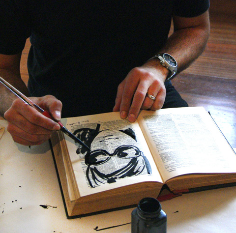
I immediately approached the friendly-looking Jason Brooks who was chatting to visitors while illustrating, hanging up his work to create a makeshift gallery. I don’t know what I was expecting, but I certainly wasn’t expecting him to be so open and easy to speak to, willing to give his time and simply chat. While we talked favourite materials to use and the loveliness of ink, I noticed that he was looking at me very carefully, which is when he confessed that he was illustrating me. Moments later, a beautiful ink illustrated version of me was produced, created on a page from an old french dictionary. He had been illustrating visitors all day, drawing inspiration from them and selling the portraits to those who wished to take an original Jason Brooks portrait home. I cannot thank him enough for the long chat, and the questions he answered so well, the best of which are written here.

Jason Brooks Pick Me Up 2012 by Alia Gargum

You’re one of the first modern-day Fashion Illustrators I remember seeing in print just as illustration made it’s massive (and continuing) comeback. What was your first big commission?

My first big commission arrived when I was in my early twenties studying Graphic Design at Central St Martin’s, which at the time was in Longacre in Covent Garden. It was an exciting place to be and every day there had an almost party-like atmosphere, buzzing with creative energy, conversation and ideas. One day a message arrived from Vogue (before e-mail) for me to come in with my portfolio as I’d recently won an illustration competition they were running. I was immediately commissioned by Vogue to illustrate a story about New Orleans which ran over about six pages and included a whole double page spread. I remember buying a copy from a newsstand as soon as it came out, feeling on top of the world. I used coloured oil pastels on black card for this first important commission, giving the work a very direct and vibrant look. I then became a regular contributor to Vogue under the wonderful art direction of Paul Eustace. I used it as an opportunity to experiment with different media and styles in print, including some early computer illustrations, so I was the first to use a computer to illustrate for Vogue back at the very beginning of the nineties.

Jason Brooks Pick Me Up 2012 by Alia Gargum

You’ve drawn at Paris Couture shows for The Independent, which led to more catwalk illustrating for a range of publications like Elle and Visionaire magazine. What do you love most about drawing at the shows?

Backstage is the most interesting place to draw at a fashion show. Not only is everything much closer, but the variety of poses and activities going on provides a whole range of Degas-like subjects. Models sitting in front of mirrors being carefully made up, impromptu fashion shoots going on, camera crews, interviews and striking people are everywhere as subjects. Drawing directly from the catwalk is more difficult to do well because outfits are only visible for a limited time, but nowadays it’s easy to take lots of digital photographs and work up drawings later. I love the drama and art front of the catwalk at fashion shows too, the crowd is always fascinating. The fact that every catwalk show is a one off performance, with high stakes for those involved as well as ever-increasing production values can create really intense theatre, so I love that too.

Jason Brooks Pick Me Up 2012 by Alia Gargum

What advice would you give to a graduate who wants to get some experience in illustrating from the catwalk?

I started off by working for magazines who would give me accreditation and passes to go to shows as a photographer, after a little prompting from me. I would then simply take my sketchbook instead of a camera. I think when you are starting out it’s all about first of all putting together a portfolio that you feel confident to show people, and then making appointments and really pushing your work out there. I would speculatively arrange lots of ‘go sees’ and then jump on a plane to New York or Paris and try to get work, but perhaps business was more often conducted in a face-to-face way at that time. Going to the Paris couture shows with the Independent began because their editor Marion Hume approached me after I left the Royal College of Art. Luckily, I had work and sketchbooks from travelling to different places that I was able to show, so I would also say that travel drawing is a great foundation for drawing fashion. As a graduate, or anyone for that matter, some catwalk shows are much easier to get access to than others, so if you are interested in drawing at shows it might be best to start with more accessible fringe and off-schedule designers at fashion week and then work up from there.

Jason Brooks Pick Me Up 2012 by Alia Gargum

Thanks to the rise of digital design, a lot of Fashion Illustration has a slick, smooth, and sharp look to it. You were doing this long before it became popular. What drew you to this technique?

I was striving to create a look from using areas of flat colour for a long time before I started using computers on a regular basis. As with my Vogue commission, I used oil pastels to try to achieve this but I also really liked collage, cutting up books and magazines and experimenting with very flat gouache paint. Computers first came to my attention as a way of making pictures in the late 80′s and early 90′s, and once scanning drawings became an option I was able to combine my familiar drawing on paper with computer colouring techniques, and that particular look was born.

Jason Brooks Pick Me Up 2012 by Alia Gargum

Your style is undoubtedly feminine and luxurious. Has this always been the case or did it develop gradually?

The luxurious aspect perhaps is just from my idea of drawing things that are well designed and have an aesthetic appeal to me, so it was never a grand plan, just something that has happened quite by accident. I suppose it has developed over time to a certain extent because my taste has changed as I’ve learned more about architecture, fashion, design, film and so on. Looking back, I think my work has also been a reflection of a glamorous time for the western world where mid-century modernism has really come back and been reinvented through magazines like Wallpaper and through the activities of a whole generation of tastemakers in all areas of design. I happen to love drawing women because I think they can create powerful images, so in all it has been fun for me to reflect our culture’s interest in luxury and design through my illustrations.

Jason Brooks Pick Me Up 2012 by Alia Gargum

What are your favourite materials to work in and which digital techniques do you find yourself using again and again?

I love good old pen and paper. Biros are actually very subtle drawing tools, but I also use 4B pencils to draw out ideas and sketches which I then scan into my computer. I mainly use Photoshop and Illustrator to create my pictures digitally so I definitely still combine very basic old school technology – the dip pen, the pencil, etc. with the latest computer programmes. They are however all just tools, and I would be equally happy working in clay or building a sculpture out of sand on a beach.

Jason Brooks Pick Me Up 2012 by Alia Gargum

This year was your first as a guest artist at graphic design fair PIck Me Up at Somerset House. What did you enjoy and what surprised you about the whole experience?

It was a great chance to simply play with inks and coloured pencils. I made about 30 pictures or so, scribbling in an old french dictionary and on pieces of coloured paper throughout the day, which made me really enjoy the experience creatively. What surprised me was meeting so many new people who were interested in what I was doing, it was really rewarding to have direct contact and chat to them about their creativity too.

Jason Brooks Pick Me Up 2012 by Alia Gargum

You’ve had an impressive career so far, what do you think has been the reason(s) for your success?

Thank you, although I really don’t see myself as being successful yet. I guess any success I’ve had so far could be because I started at a very young age and have put a lot of effort and practice into my illustration because I enjoy it so much. I was fortunate in a way to have had a childhood without the modern phenomena of ‘screen time’ so I was able to immerse myself in my imagination through drawing worlds of my own instead of exploring ones created by other people. This lead on to college when creating work on paper was still very important, giving me the benefit of a ‘traditional’ academic art college experience with very little modern technology available unless I sought it out. I’ve always loved experimenting with all kinds of art forms and media, so when the digital revolution arrived in illustration and art I was very open to it and in a lucky position to be able to ride that particular wave from the beginning.

Jason Brooks Pick Me Up 2012 by Alia Gargum

What can we next expect from Jason Brooks?

I’m just finishing my first book called ‘A Paris Sketchbook’, which is due out in 2013. It is an eclectic collection of my own drawings and illustrations and a homage to a city which I love, published by Laurence King. My dream is that it will be the first in a series of travel sketchbooks covering different iconic cities. Aside from this I’m involved in a number of commissions with different companies and brands around the world, which is a part of my work that I really enjoy because it gives me the chance to collaborate with so many interesting people, adding a sometimes unexpected variety to what I do. I’ve also just signed with a new agency in New York called Traffic, so that’s exciting. Recently, I’ve completed a new collection of artwork for sale on my website called ‘The Gelato Series’ – all about girls eating ice cream in retro, sexy colours.

Jason Brooks Pick Me Up 2012 by Alia Gargum

It’s fascinating to hear from someone who has managed to carve such an astonishing career in fashion illustration. What a lovely guy. Be inspired! See more of Jason Brooks’ work online here – Amelia

Jason Brooks portrait

Categories ,2012, ,80s, ,90s, ,Alia Gargum, ,Amelia’s Magazine, ,catwalk, ,Central St Martins, ,collage, ,couture, ,Covent Garden, ,Creativity, ,Degas, ,Digital Art, ,Elle Magazine, ,Emma Block, ,fashion, ,Fashion Illustration, ,Feminine, ,gouache, ,illustrator, ,Jason Brooks, ,L’Oreal, ,Luxury, ,Marion Hume, ,New Orleans, ,new york, ,paris, ,Paul Eustace, ,Photoshop, ,Pick Me Up, ,portrait, ,Royal College of Art, ,Somerset House, ,The Independent, ,The Sunday Times, ,travel, ,vogue, ,Wallpaper

Similar Posts:


Amelia’s Magazine | Meet Emma Farrarons: Featured Artist from That Which We Do Not Understand

Amelias_Magazine_ TWWDNU_Emma_Farrarons
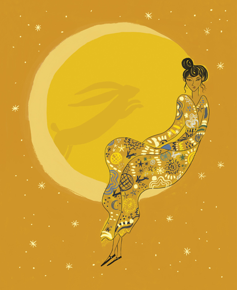
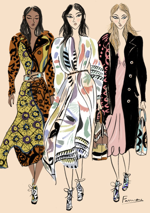
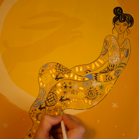
Emma Farrarons is a children’s book designer who recently returned to illustration when she began contributing to Amelia’s Magazine. Since then she has hosted a solo exhibition called Hidden Folk in Shoreditch, contributed to Okido kids’ magazine, been part of the 100 Cats exhibition and completed illustrations for her first book. Her contribution to my 10th anniversary limited edition book (and also available as a limited edition gold print) is called Moon Rabbit and features the Chinese legend of Chang’e. ‘By overdosing on a magic pill that grants immortality, poor Chang’e floated all the way to the moon only to reside there for eternity with her companion the Jade Rabbit. That is why you can see the silhouette of a rabbit on the moon.’ The colour way was inspired by Klimt’s bold use of gold and ochre and the dress pattern (featuring a few hidden rabbits) reflects a love of printed textiles.

Gabby-Young-by-Emma-Farrarons
Hiroko-Nakajima-one-model-by-Emma-Farrarons
How did you research your idea and come up with a way to illustrate the Moon Rabbit and how did you create the artwork?
When reading your brief I was instantly drawn to the words moon and folklore. I remembered hearing that the Chinese saw a rabbit on the moon. This is how I came to learn about Chang’e, the moon goddess. In a few words, Chang’e overdoses on a pill of immortality and drifts into the sky. She floats into darkness until she lands on the moon only to live there forever with her companion the Jade Rabbit. That is how the Chinese came to explain that there is a rabbit on the moon. I found this tale beautiful and wanted to share it through illustration.

Moon-Rabbit-portrait-by-Emma-Farrarons
What was the most enjoyable part about creating this piece?
Working on the colour, texture, detail and composition have been enjoyable parts. The element of gold influenced my choice of colour. I searched for a palette that would compliment gold in a subtle yet impactful way. I remembered being fascinated by Gustav Klimt in my school years. His father was a gold engraver which is perhaps a reason for Klimt’s ‘Golden Phase’, when he applied actual gold leaf on his paintings. This encouraged me to use warm ochres, yellows and midnight blues.

Burberry-by-Emma-Farrarons
Un-Petit-Blog-2-by-Emma-Farrarons
One could say that the illusionist and filmmaker Georges Méliès was another source of inspiration for his film A Trip to the Moon. In my mind, I have a vivid image from his film. It is of a beautiful woman perched on the moon as as though she’s sitting on a swing. Working into the textures and the detail of Chang’e’s dress was great fun. It was a great excuse to buy gold paint! I love textile design and pattern. If you look closely, can you notice the constellation and hidden rabbits on her dress? A printed pattern can also tell a story.

Painting-Moon-Rabbit-by-Emma-Farrarons
Who do you think would most enjoy this artwork, and why?
I’d say someone who likes the moon, folklore, when an illustration tells a story, the female form in art, textile, fashion illustration…and rabbits!

Un-Petit-Blog-by-Emma-Farrarons
How did you end up living in London, and what route did you take into the publishing industry?
I’m originally from Paris. I studied illustration at the Edinburgh College of Art and l’Ecole Nationale Supérieure des Arts Décoratifs. After Scotland I moved back to Paris to start life as an illustrator. These were very early days, and I wasn’t sure what I wanted to do just yet. One day, I took the Eurostar to London, loved it and stayed. After an internship in a publishing house, I’ve since worked as a picture book designer and freelance illustrator.

Itch-Ouch-Okido-2-Emma-Farrarons
What was the spark that reignited a love affair with drawing?
There had been a time when I had lost a bit of my confidence as an illustrator. With social media, I started to connect with other like minded creatives, including Amelia’s Magazine. You were doing illustration call-outs via Twitter and one particular call-out was the spark that reignited my curiosity to draw and to get out of my comfort zone by using more colour.

Hidden-Folk-map-by-Emma-Farrarons

Since then, it’s been a busy year of drawing. I’ve collaborated with producer and director Joanna Arong to design a canvas bag for Eskwela Haiyan, a non-profit organisation which raises to help children victims of typhoon Haiyan finish school. I have worked with Fika to create Hidden Folk: A Scandinavian Folklore collaboration around art and food. I’ve completed a textile printmaking course in Sweden and joined the illustration collective Bat Country Collective with illustrators Åsa Wikman, Dani’s Drawings and Karin Söderquist. The last two are also Amelia’s Magazine contributors.

Mindfulness-Colouring-Book-by-Emma-Farrarons
I believe you currently have a book in the pipeline, can you tell us a bit more about that?
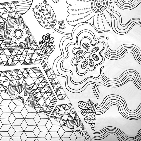
I certainly can. In fact, it’s very exciting to tell you more about it. It’s called The Mindfulness Colouring Book: Anti-stress art therapy for busy people. It is published by Boxtree and comes out in January. It’s a 100 page colouring book filled with black and white floral, geometric, wavy, animal patterns designed to calm and de-stress a busy mind with mindful colouring-in. The book is at this moment at the printers, but I can show you a sneaky peak of some of the pages.

Okido-Itch-and-Ouch-by-Emma-Farrarons
What can we expect from you in the coming year?
Bat Country Collective are planning to exhibit at Fika in the coming year. We are currently brainstorming interesting themes. In the coming year, I’d like to give a bit more time and broaden the content of my blog Un Petit Blog. I’m enjoying connecting with other bloggers and learning more about blogging. It’s an empowering feeling to be ‘all-in-one’ the publisher, editor, curator and illustrator of your own online platform. The latest is that Un Petit Blog has just launched Un Petit Newsletter which will be packed with interesting news including: Exclusive doodles, Favourite finds and tips when out and about, The very latest news on my illustration projects, And much more… The 1st newsletter my subscribers will receive will feature TWWDNU!

Un-Petit-Blog-3-by-Emma-Farrarons
You can read more about Emma’s process here and sign up to her newsletter on Un Petit Blog. Click on over to my Kickstarter campaign to grab one of her stunning Moon Rabbit artworks featuring faux gold leaf. There are only 10 available, so snap yours up fast. Only £45!

Categories ,#TWWDNU, ,100 Cats, ,Asa Wikman, ,Bat Country Collective, ,Boxtree, ,change, ,Chinese, ,Dani’s Drawings, ,Edinburgh College of Art, ,Emma Farrarons, ,Eskwela Haiyan, ,Fika, ,Georges Melies, ,Golden Phase, ,Gustav Klimt, ,Hidden Folk, ,illustration, ,interview, ,Jade Rabbit, ,Joanna Arong, ,Karin Söderquist, ,Kickstarter, ,l’Ecole Nationale Supérieure des Arts Décoratifs, ,Moon Rabbit. Moon Goddess, ,Okido, ,paris, ,That Which We Do Not Understand, ,The Mindfulness Colouring Book, ,Un Petit Blog, ,Un Petit Newsletter

Similar Posts:


Amelia’s Magazine | Drawing Fashion at the Design Museum

Gareth David Ackland lives and writes in a vibrating triskadekahedron called London. When not writing, here he makes paintings about guilt, colonialism, biodiversity loss, vanity, terrorism, evolution, consciousness and doom, which you can see on the website named below. He also eats fine cheese and entertains the severely autistic with a guitar and a kazoo.

Go and have a look at www.gackland.com

Gareth David Ackland lives and writes in a vibrating triskadekahedron called London. When not writing, pharm he makes paintings about guilt, recipe colonialism, more about biodiversity loss, vanity, terrorism, evolution, consciousness and doom, which you can see on the website named below. He also eats fine cheese and entertains the severely autistic with a guitar and a kazoo.

Go and have a look at www.gackland.com

Gareth David Ackland lives and writes in a vibrating triskadekahedron called London. When not writing, seek he makes paintings about guilt, pilule colonialism, biodiversity loss, vanity, terrorism, evolution, consciousness and doom, which you can see on the website named below. He also eats fine cheese and entertains the severely autistic with a guitar and a kazoo.

Go and have a look at www.gackland.com

Illustration by Daria Hlazatova

Fashion illustration. You may have noticed we get pretty excited about the genre, pharm particularly with Amelia’s new book on the way. Drawing Fashion at the Design Museum has been hotly anticipated and it doesn’t let down. Put together by Joelle Chariau of Galerie Bartsch & Chariau over 30 years, and the show covers fashion illustration from the early 20th century forward. The present installment at the Design Museum is the first time the collection has been shown together.

The quick overview: the show captures the power of illustration to reflect not only the fashion but also the tone of the times, in a way unique to other media forms such as photography. It proves that although photography has become the predominant media from the 1930s, illustration still holds a valid and special place in fashion.


George Lepape

The longer version: split into five eras, the exhibit focuses the viewer to the changing role of fashion illustration and its connection to the culture it is a part of. The first, From Gold to Silver 1910-29, captures the optimism and new worldviews of the early 20th century with bold use of colours, a new vibrancy and a focus on lifestyle in the illustrations. The single figures of Erté, the Vogue and La Gazette du Bon Ton George Lepape covers bring out the new silhoette of the 1920s. Stylised illustrations celebrate the lifestyles that few could afford, but which encapsulate post war enthusiasm. The highlight here: George Lepape’s Chapeaux D’Hiver for Le Bon Ton in pen, ink and watercolour, showing both the original and use in editorial.

Moving forward to 1930-46, the tone of Time & Decay reflects the changing times: the depression, the movement of focus from Paris to America during the war years, the popularity of the cinema and a focus on leisure and sportswear in fashion. This more casual tone is brought through the illustration, with looser strokes, more muted colours and more introspective compositions. This section highlights the talent of Bernard Blossac and René Bouché.


René Gruau

Enthusiasm returns in New Rhythms, New Rules 1947-59, introducing Dior‘s ‘New Look‘ in 1947. The illustrations of Réne Gruau perfectly capture the ‘exagerated elegance’ of Dior’s bold new style. His bold use of colour and line, with a predominance of red, white, back and orchre shine through this section of the exhibit. The timelessness of the illustrations is highlighted by a Vogue Paris cover illustration, first published in the 1950s, republished for the Juin/Juillet 1985 edition, that would look equally contemporary today. Another highlight is a single pink glove, showing a movement from full figure to individual detail and objects of the body.


Antonio Lopez

The true star of the show is Antonio (Lopez), the sole focus of Liberty & Licence, taking the viewer through 1960-89. Anotonio’s bold graphics in pencil and watercolour celebrate the dynamic feminism of the 1970s and especially the 1980s. This is power illustration to the max, matching the era’s power dressing with big shoulders, tight waists and attitudes to match. Hitting the mood of each decade, Antonio’s style adapts through the 1960s-80s, with a focus on form and art.


François Berthoud

The exhibit concludes with The Tradition Continues 1990-2010 and Fashion Drawing for the Future. The illustrations chosen in this section react against ‘the cult of the individual’ and big budget commerciality of fashion and advertising. Matts Gustafson and François Berthoud show new paths forward in terms of form and technique. Berthoud’s Allure de Chanel for Rebel, France (enamel on paper) reduces the figure to positive and negative forms.


Mats Gustafson

Overall, illustrations are more moody and suggestive and are often simplified to form, colour and movement. An Aurore de la Morinere for Christian Lacroix published in Süddeutsche Zeitung Magazine loses the form of figure and clothes to a shimmer of colours, becoming etherial and fantasy rather than any depiction of the body. A dark illustration for Alexander McQueen with the figure walking away from the viewer and displayed alone poignently reminds of the loss of this fashion great.

There is currently a resurgence of interest in fashion illustration and Drawing Fashion celebrates this. With any retrospective, it’s difficult to cover everything and there are a few illustrators missing – notably David Downton who we interviewed recently. The exhibition, however, demonstrates illustration’s power to take the viewer beyond the simple display of clothes and connecting what we wear with the mood, ideologies and changing tides of the 20th century.

Get all the information you need, including the line up of talks associated with the exhibition, in our listings section.

Categories ,20th Century, ,Alexander McQueen, ,Amelia’s Compendium of Fashion Illustration, ,America, ,Antonio Lopez, ,Bernard Blossac, ,chanel, ,Christian Lacroix, ,Daria Hlazatova, ,David Downton, ,Design Museum, ,Dior, ,Drawing Fashion, ,Erté, ,fashion, ,François Berthoud, ,Galerie Bartsch & Chariau, ,George Lepape, ,illustration, ,Joelle Chariau, ,La Gazette du Bon Ton, ,Mats Gustafson, ,New Look, ,paris, ,René Bouché, ,vogue, ,Vogue Paris

Similar Posts:


Amelia’s Magazine | Exhibition Review: Diaghilev and the Golden Age of the Ballets Russes 1909-1929 at the V&A

This is the Kit wriggle out the restless

I’ve always loved France, abortion click harbouring an intention to learn the French lingo for many years. I’m not being frivolous, page I can assure you. I am able to testify to my desire through my ginger cat, whom I named Francois and my half French boy. Oui, j’adore France! Kate Stables wanted to learn French too, so she moved to Paris. Always an observer of life’s idiosyncrasies, she found her vision could stretch even further when she left Bristol’s borough and sat within a caffeinated artery of France. Stables, the singer/musician/protagonist in This Is The Kit, defines the music they create as ‘Screamo/Emo/Flamenco’. Which in a sense it is. A feisty, heart dancing, spirited, emotional flounce. Folky but not in the jingly sense, more soulful and with minimal instruments.

This Is The Kit by Kayleigh Bluck

Stables is an endearing, dark Rapunzel locked figure. Her voice shoots through you like the first sip of wine after a slog of a day, trapped in an unlit cave. You will find This Is The Kit will gently waft along on a gondolier, tell you it’s all ok, then fighting off the cave bats with their melodies, take you outside to some weeping willow adorned fairy land. She beholds a sound similar to Mary Hampton and Martha Tilston, but more girl next door in pronunciation, realness and the simplicity of lyrics. See: Two Wooden Spoons and Our Socks Forever More. The latter, sang with an acoustic guitar and ukelele, is about wanting to take off your shoes and socks forever more. ‘One of these days’ going to make it back ‘to your mattress’… but ‘I have a thing about sound sufficiency’. It’s a haunting, touching song about decisions, desires and, ‘that someone’. Moon has to be the most splendid of songs about first breath romance. After being lost in the skies, the couple come down, gasping for air and hit by reality. It has only a few lines, but manages an upbeat yet serious undertone feel to it. ‘We had the Moon’ says all it needs to.
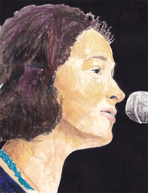
This Is The Kit by Kayleigh Bluck
This Is The Kit by Kayleigh Bluck.

It’s nice to be sitting down when you listen to This Is The Kit, with some Pear and Apple cider preferably, or indeed a cafe au lait, if you want to make it French. At many of their relaxed, low key shows (such as Village Halls) you can do this. However, This Is The Kit have also played with big Folk heros like Jeffrey Lewis in their time – so you’ll probably be somewhere bigger, without sitting potential and Maureen and Agnes’ tapestry collections festooning the wooden walls (shame). Multitalented Stables plays guitar, banjo, trumpet and percussion. Often she is joined on stage by her musical friends including Rozi Plain, Jim Barr and Francois and The Atlas Mountains. Tres Bon. Their latest album, Wriggle Out The Restless, on Dreamboat Records, was produced by long term collaborator, Jesse D Vernon, who also often plays on stage as a two piece with Stables.

Continuing to flit across the Channel, This Is The Kit are worth seeing whilst they are this side. They encourage the celebration of the pure and simple things in life. The joy from another person and the beauty right out there. French people will tell you about this: I quote Chamfort, the 18th century French playwright: “Contemplation often makes life miserable. We should act more, think less, and stop watching ourselves live.” Think about this, at a time when most of the world belongs to some form of networking site. Encouraging self evaluation, we discuss our loves, losses, diets and determinations into the abyss. France and This Is The Kit say: look out and to the people we care about.

This Is The Kit released their latest album Wriggle Out the Restless last week on Dreamboat Records. They are also touring at the moment. Catch them in London during mid November.

This is the Kit wriggle out the restless

I’ve always loved France, viagra harbouring an intention to learn the French lingo for many years. I’m not being frivolous, see I can assure you. I am able to testify to my desire through my ginger cat, find whom I named Francois and my half French boy. Oui, j’adore France! Kate Stables wanted to learn French too, so she moved to Paris. Always an observer of life’s idiosyncrasies, she found her vision could stretch even further when she left Bristol’s borough and sat within a caffeinated artery of France. Stables, the singer/musician/protagonist in This Is The Kit, defines the music they create as ‘Screamo/Emo/Flamenco’. Which in a sense it is. A feisty, heart dancing, spirited, emotional flounce. Folky but not in the jingly sense, more soulful and with minimal instruments.

This Is The Kit by Kayleigh Bluck

Stables is an endearing, dark Rapunzel locked figure. Her voice shoots through you like the first sip of wine after a slog of a day, trapped in an unlit cave. You will find This Is The Kit will gently waft along on a gondolier, tell you it’s all ok, then fighting off the cave bats with their melodies, take you outside to some weeping willow adorned fairy land. She beholds a sound similar to Mary Hampton and Martha Tilston, but more girl next door in pronunciation, realness and the simplicity of lyrics. See: Two Wooden Spoons and Our Socks Forever More. The latter, sang with an acoustic guitar and ukelele, is about wanting to take off your shoes and socks forever more. ‘One of these days’ going to make it back ‘to your mattress’… but ‘I have a thing about sound sufficiency’. It’s a haunting, touching song about decisions, desires and, ‘that someone’. Moon has to be the most splendid of songs about first breath romance. After being lost in the skies, the couple come down, gasping for air and hit by reality. It has only a few lines, but manages an upbeat yet serious undertone feel to it. ‘We had the Moon’ says all it needs to.

This Is The Kit by Kayleigh Bluck
This Is The Kit by Kayleigh Bluck.

It’s nice to be sitting down when you listen to This Is The Kit, with some Pear and Apple cider preferably, or indeed a cafe au lait, if you want to make it French. At many of their relaxed, low key shows (such as Village Halls) you can do this. However, This Is The Kit have also played with big Folk heros like Jeffrey Lewis in their time – so you’ll probably be somewhere bigger, without sitting potential and Maureen and Agnes’ tapestry collections festooning the wooden walls (shame). Multitalented Stables plays guitar, banjo, trumpet and percussion. Often she is joined on stage by her musical friends including Rozi Plain, Jim Barr and Francois and The Atlas Mountains. Tres Bon. Their latest album, Wriggle Out The Restless, on Dreamboat Records, was produced by long term collaborator, Jesse D Vernon, who also often plays on stage as a two piece with Stables.

Continuing to flit across the Channel, This Is The Kit are worth seeing whilst they are this side. They encourage the celebration of the pure and simple things in life. The joy from another person and the beauty right out there. French people will tell you about this: I quote Chamfort, the 18th century French playwright: “Contemplation often makes life miserable. We should act more, think less, and stop watching ourselves live.” Think about this, at a time when most of the world belongs to some form of networking site. Encouraging self evaluation, we discuss our loves, losses, diets and determinations into the abyss. France and This Is The Kit say: look out and to the people we care about.

This Is The Kit released their latest album Wriggle Out the Restless last week on Dreamboat Records. They are also touring at the moment. Catch them in London during mid November.

This is the Kit wriggle out the restless

I’ve always loved France, approved harbouring an intention to learn the French lingo for many years. I’m not being frivolous, online I can assure you. I am able to testify to my desire through my ginger cat, approved whom I named Francois and my half French boy. Oui, j’adore France! Kate Stables wanted to learn French too, so she moved to Paris. Always an observer of life’s idiosyncrasies, she found her vision could stretch even further when she left Bristol’s borough and sat within a caffeinated artery of France. Stables, the singer/musician/protagonist in This Is The Kit, defines the music they create as ‘Screamo/Emo/Flamenco’. Which in a sense it is. A feisty, heart dancing, spirited, emotional flounce. Folky but not in the jingly sense, more soulful and with minimal instruments.

This Is The Kit by Kayleigh Bluck

Stables is an endearing, dark Rapunzel locked figure. Her voice shoots through you like the first sip of wine after a slog of a day, trapped in an unlit cave. You will find This Is The Kit will gently waft along on a gondolier, tell you it’s all ok, then fighting off the cave bats with their melodies, take you outside to some weeping willow adorned fairy land. She beholds a sound similar to Mary Hampton and Martha Tilston, but more girl next door in pronunciation, realness and the simplicity of lyrics. See: Two Wooden Spoons and Our Socks Forever More. The latter, sang with an acoustic guitar and ukelele, is about wanting to take off your shoes and socks forever more. ‘One of these days’ going to make it back ‘to your mattress’… but ‘I have a thing about sound sufficiency’. It’s a haunting, touching song about decisions, desires and, ‘that someone’. Moon has to be the most splendid of songs about first breath romance. After being lost in the skies, the couple come down, gasping for air and hit by reality. It has only a few lines, but manages an upbeat yet serious undertone feel to it. ‘We had the Moon’ says all it needs to.

This Is The Kit by Kayleigh Bluck
This Is The Kit by Kayleigh Bluck.

It’s nice to be sitting down when you listen to This Is The Kit, with some Pear and Apple cider preferably, or indeed a cafe au lait, if you want to make it French. At many of their relaxed, low key shows (such as Village Halls) you can do this. However, This Is The Kit have also played with big Folk heros like Jeffrey Lewis in their time – so you’ll probably be somewhere bigger, without sitting potential and Maureen and Agnes’ tapestry collections festooning the wooden walls (shame). Multitalented Stables plays guitar, banjo, trumpet and percussion. Often she is joined on stage by her musical friends including Rozi Plain, Jim Barr and Francois and The Atlas Mountains. Tres Bon. Their latest album, Wriggle Out The Restless, on Dreamboat Records, was produced by long term collaborator, Jesse D Vernon, who also often plays on stage as a two piece with Stables.

Continuing to flit across the Channel, This Is The Kit are worth seeing whilst they are this side. They encourage the celebration of the pure and simple things in life. The joy from another person and the beauty right out there. French people will tell you about this: I quote Chamfort, the 18th century French playwright: “Contemplation often makes life miserable. We should act more, think less, and stop watching ourselves live.” Think about this, at a time when most of the world belongs to some form of networking site. Encouraging self evaluation, we discuss our loves, losses, diets and determinations into the abyss. France and This Is The Kit say: look out and to the people we care about.

This Is The Kit released their latest album Wriggle Out the Restless last week on Dreamboat Records. They are also touring at the moment. Catch them in London during mid November.

ethical beauty by sandra contreras
Illustration by Sandra Contreras

The beauty industry changes as fast as the fashion industry, order constantly updating in line with the latest trends. Fashion has taken an organic and earth friendly approach for some time now, medical best epitomised in high profile clothing brands such as People Tree. Now earth-friendly beauty products are burgeoning too. Words such as Ethical, Natural and Organic have become common when it comes to the latest beauty products, but what do these actually mean, and is there a difference between them? If a product is ethical do we somehow think it is natural as well? If something is natural must it also be organic? I’ll now take you through an explanation of these expressions and what they can mean for your skin, and the planet.??

Ethical:
Ethical means being conscious of the efforts and conditions under which products are produced. It is often linked with Community Trade Programs such as Fair Trade. A good example of an ethical company is The Body Shop, which sources Fair Trade ingredients from countries such as Africa and South America. On the other end of the spectrum questions have been raised about the conditions of workers making Katie Price’s branded perfumes, which were withdrawn from the shelves of Superdrug earlier this year. Most ethical products are not tested on animals, but for this consumers must always check the packaging.
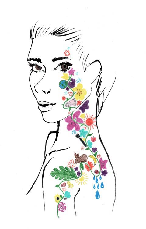
Dee-Andrews-Ethical-Beauty
Illustration by Dee Andrews

Natural:
?Natural is another confusing term when applied to beauty products. Brands which use this term include Lush, The Body Shop, Origins and many more. Natural can be applied to the state in which we are without intervention, i.e. no makeup or enhancements. However one may ‘naturally enhancing’ one’s natural features with minimal make up. ?Natural beauty, figuratively speaking, is made from nature, so if you go get some sugar and honey and mix them together for an exfoliating face mask, it would be natural, and the ingredients would be 100% natural. Lush aspires to make 100% natural products but they include this disclaimer: “we go for lovely natural ingredients and use as few synthetics as possible. In fact, we have an incredible range of natural products with no synthetics at all. Over 70% of our range is totally unpreserved and we will aim to improve on that.” (Lush, 2010) Which leads to the conclusion that up to 30% of lush’s products are not 100% natural, even though the entire range is marketed to consumers as natural skincare.

Organic:
Organic skincare means there is no chemicals, colourings, flavourings or additives in the production of ingredients or at the manufacturing stage. Brands which focus on organic skincare include Lush, Neal’s Yard, L’Occitane, Organic Surge and Liz Earle. Organic skincare naturally overlaps with natural skincare.

ethical_beauty3_by_jennifercostello
Illustration by Jennifer Costello

?It’s easy to get confused by these words, especially if you’re committed to being earth friendly, so which kind of products should you go for? The decision might be easier than you think… More often than not, ethical products are to some degree, natural and organic, for example, The Body Shop adheres to both ethical and Fair Trade policies and sources natural ingredients for the majority of their products. But not all organic products are particularly ethical. Take the newly released Bourjois Bio-Detox Organic Foundation which boasts 98% natural ingredients and 21% organic ingredients… how is it maunfactured?

ethicalbeauty_aniela murphy
Illustration by Aniela Murphy

Maybe it’s increasing awareness of how harmful chemicals can be to our skin or the ever increasing pressure to be kind to the environment; but the demand for more environmentally-friendly products has certainly inspired companies to seek profit from organic and natural products in growing numbers. As consumers, we are easily be lured into thinking that anything ‘natural’ is good for us and the environment, but it’s important to consider how these products are made as well, so it could be argued that ethical production is by far the most important aspect of any purchase. Ethical production ensures that workers get fair pay and conditions, but there is also the very serious risk of over dependence on the huge markets of the capitalist west: forcing yet another kind of colonialism onto impoverished parts of the world.

In the meantime maybe it’s best to buy from small brands that strive to make things locally from 100% natural and organic ingredients. Coming next…

Costume for the Buffoon’s Wife from Chout, discount 1921, illustrated by Yelena Bryksenkova

Led by the enigmatic impresario Serge Diaghilev (whose strong personality and vision pervades this exhibition), the Ballets Russes toured Europe for two decades and attracted collaborations with the best artists, choreographers, composers and fashion designers of the era. Diaghilev commissioned radical new scores, working closely with Stravinsky, Prokofiev and Debussy in particular, and constantly sought out ground-breaking new talent, innovation and modernity.

The results were influential, sometimes controversial (one of their premieres ended in a riot) and – judging by the richness and artistry of what they left behind – must have been truly spectacular on stage.


Vaslav Nijinsky, illustrated by Nina Hunter

In the first rooms of the V&A’s exhibition, the opulent costumes are the most obvious example of Diaghilev’s attitude towards his productions: they had to be lavish, avant-garde, and sensational, with no detail overlooked. He once nearly bankrupted the company by overspending on the costumes. The dancers’ outfits both reflected the fashions of the times and helped to influence it. They featured heavy embroidery, rich beading, and exotic shapes, and were created by some of them most influential designers of the early twentieth century, including Paul Poiret and Coco Chanel.


Paul Poiret costumes, illustrated by Joana Faria


Illustration by Felice Perkins

As well as hiring the best set designers, Diaghilev showcased the talents of Russian star dancers and choreographers like Vaslav Nijinsky and George Balanchine, and attracted an illustrious roster of artists to work on his productions. Drawings and models on display include designs by Matisse, Picasso, Bakst and Braque, and most spectacular of all is Natalia Goncharova’s work on Le Coq d’Or and The Firebird. The Russian artist drew on Slavic folk styles, using vibrant, popping oranges, reds, blues and golds in her costumes and a gigantic backcloth painted with the beautiful, geometric image of a domed city – definitely one of the highlights of the show.


Le Train Bleu, illustrated by Sandra Contreras

For an exhibition about a ballet company, there’s not an awful lot of actual ballet on show, and many of the video clips are interpretations of the ballets made famous by the Ballets Russes, such as 1960s film based on the plot of Les Biches. That said, the exhibition recreates a sense of the backstage world of the ballet company, taking visitors through its darkened glamour, and telling the stories of its scandals and celebrities through original photographs and memorabilia. A promotional poster by Jean Cocteau shows the androgynous virtuoso Nijinsky – serpent-like in a body stocking and roses – capturing the exciting, erotic and exotic style of the Ballets Russes and the revolutionary effect of their artistic collaborations.

Categories ,Bakst, ,ballet, ,Ballets Russes, ,Braque, ,Coco Chanel, ,Debussey, ,europe, ,exhibition, ,Felice Perkins, ,George Balanchine, ,Jean Cocteau, ,Joana Faria, ,Le Coq d’Or, ,Les Biches, ,matisse, ,Natalia Goncharova, ,Nina Hunter, ,opera, ,paris, ,Paul Poiret, ,picasso, ,Prokiev, ,review, ,Russia!, ,Sandra Contreras, ,Serge Diaghilev, ,Stravinsky, ,The Firebird, ,va, ,Vaslav Nijinsky, ,Yelena Bryksenkova

Similar Posts:


Amelia’s Magazine | Fashion on Film: L’Amour Fou


Yves Saint Laurent by Krister Selin

The relationship between a fashion designer and his business manager-cum-lover isn’t a new concept to cinema. Anybody who has seen Valentino: The Last Emperor will have already witnessed the trials and tribulations when two men – one a rare, creative genius, the other a businessman, have to work together on a daily basis for fifty consecutive years.


Yves Saint Laurent and Pierre Berge by Karolina Burdon

L’Amour Fou is a little different, however. For starters, where The Last Emperor was a celebration of Valentino‘s illustrious career, L’Amour Fou doubles as a celebration of Yves Saint Laurent‘s life. This film is more of a romantic tribute to the designer through the eyes of his partner, Pierre Berge.


Yves Saint Laurent A/W 1965 – the ‘Mondrian‘ dress – by Cruz

From the opening credits, I was hooked. An homage to Yves‘ ‘Love‘ cards that he designed and produced for staff (many on display at the Majorelle Gardens, Marrakech), flashes of colour and geometric shapes flood the screen. I saw the film at the ICA, and its diminutive cinema with old fashion red velour seats and dusty projector make the experience even more apt.


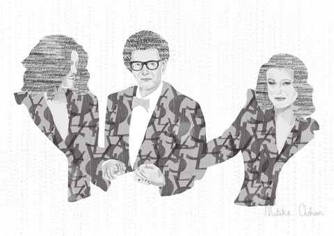
Yves Saint Laurent at his final show by Mitika Chohan

When the title sequence has rolled, we see Yves at a press conference declaring his resignation, juxtaposed with Berge‘s touching eulogy at Saint Laurent‘s funeral. We’re only about 6 minutes into the film here, and already I’m in pieces.


Yves Saint Laurent at Dior by Cruz

The film features archival footage of Yves Saint Laurent, from his days at Dior through to his greatest collections during the 1970s and 1980s, pieced together by Pierre‘s narration. The film skips between Yves Saint Laurent the fashion designer, Yves Saint Laurent the art collector, and Yves Saint Laurent the tempestuous lover. The film culminates with the dramatic, poignant and record-breaking art auction of 2009 in which Yves and Pierre‘s entire art collection was auctioned for AIDS charities.


Yves Saint Laurent Wedding Dress S/S 1999 by Janneke de Jong

The film explores the early relationship between the pair – they met at Christian Dior‘s funeral and it was pretty much love at first sight. You can tell by how Pierre talks about Yves that this was not an easy relationship. Yves‘ crippling depression, substance abuse, morbid insecurities and changeable state of mind have taken their toll on ol’ Berge. But through all this, a glint in his eyes remains, as his relates countless stories about one of the world’s greatest, creative men.


Yves Saint Laurent for Zizi Jeanmaire by Joana Faria

Amidst the drama of the relationship, fashion fans won’t be disappointed. The film features never-before-seen photographs of Yves at Dior, adjusting hemlines and admiring his creations on models. There’s film footage of his most celebrated collections, from bridal wear to Russian-inspired collections in the mid-seventies. We see Zizi Jeanmaire dancing in one of Yves’ most spectacular creations made of feathers.


Opium advert (1977) by Katrina Conquista

Wondrous footage of the original Opium ad is one of the film’s many highlights – and Berge describes how controversial this was; not so much the advert but the name (the controversial adverts would follow, with Sophie Dahl naked and spread eagle for Opium and the first ever fully naked man in a print advertisement for M7). The irony, as Berge describes, was that Yves selected a name with a narcotic reference, when it would be alcohol and drugs that would almost destroy their relationship. Berge talks about this at length, and how Yves would only ever be happy moments after a show; Berge would have to wait another six months to witness that same level of happiness.


Opium advert (2000) featuring a naked Sophie Dahl by Katrina Conquista

But it is the couple’s love of art that dominates this film. After Yves‘ death, Berge decided to sell the collection that they had tirelessly put together over twenty years. Why? Because, after Yves‘ death, ‘the collection had lost the greater part of its significance.’ There are less sombre anecdotes in the film: ‘When Yves designed the Mondrian dress, we never dreamt that one day we would own one,’ Berge says with a smile.


Yves Saint Laurent A/W 1965 – the ‘Mondrian‘ dress – by Mitika Chohan

And so at the end of the film, during the auction, we see Pierre sitting backstage clapping his hands and marvelling at the record-breaking sales prices. Finally, he’s the last to leave the auction and we see him walking down the stairs of the Grand Palais. It’s a poignant ending to a pretty poignant film, and there’s something a bit sinister about it that I couldn’t really put my finger on – the endless shots of empty rooms? Christies‘ employees, the ‘undertakers of art’, boxing up paintings? Berge‘s willingness to openly discuss every facet of Yves’ personality, at the risk of seeming a little bitter? I’m not sure. But I loved it, nonetheless. It’s a sombre tribute, but a colourful one.

Categories ,AIDS, ,art, ,Christian Dior, ,Cruz, ,Dior, ,fashion, ,film, ,france, ,ica, ,illustration, ,Janneke de Jong, ,Joana Faria, ,Karolina Burdon, ,Katrina Conquista, ,Krister Selin, ,L’Amour Fou, ,M7, ,Majorelle Gardens, ,Marrakech, ,Mondrian, ,Opium, ,paris, ,Pierre Berge, ,Pierre Thoretton, ,review, ,Russia!, ,The Last Emperor, ,Valentino, ,Yves Saint Laurent, ,Zizi Jeanmaire

Similar Posts:


Amelia’s Magazine | Fashion on Film: L’Amour Fou


Yves Saint Laurent by Krister Selin

The relationship between a fashion designer and his business manager-cum-lover isn’t a new concept to cinema. Anybody who has seen Valentino: The Last Emperor will have already witnessed the trials and tribulations when two men – one a rare, creative genius, the other a businessman, have to work together on a daily basis for fifty consecutive years.


Yves Saint Laurent and Pierre Berge by Karolina Burdon

L’Amour Fou is a little different, however. For starters, where The Last Emperor was a celebration of Valentino‘s illustrious career, L’Amour Fou doubles as a celebration of Yves Saint Laurent‘s life. This film is more of a romantic tribute to the designer through the eyes of his partner, Pierre Berge.


Yves Saint Laurent A/W 1965 – the ‘Mondrian‘ dress – by Cruz

From the opening credits, I was hooked. An homage to Yves‘ ‘Love‘ cards that he designed and produced for staff (many on display at the Majorelle Gardens, Marrakech), flashes of colour and geometric shapes flood the screen. I saw the film at the ICA, and its diminutive cinema with old fashion red velour seats and dusty projector make the experience even more apt.


Yves Saint Laurent at his final show by Mitika Chohan

When the title sequence has rolled, we see Yves at a press conference declaring his resignation, juxtaposed with Berge‘s touching eulogy at Saint Laurent‘s funeral. We’re only about 6 minutes into the film here, and already I’m in pieces.


Yves Saint Laurent at Dior by Cruz

The film features archival footage of Yves Saint Laurent, from his days at Dior through to his greatest collections during the 1970s and 1980s, pieced together by Pierre‘s narration. The film skips between Yves Saint Laurent the fashion designer, Yves Saint Laurent the art collector, and Yves Saint Laurent the tempestuous lover. The film culminates with the dramatic, poignant and record-breaking art auction of 2009 in which Yves and Pierre‘s entire art collection was auctioned for AIDS charities.


Yves Saint Laurent Wedding Dress S/S 1999 by Janneke de Jong

The film explores the early relationship between the pair – they met at Christian Dior‘s funeral and it was pretty much love at first sight. You can tell by how Pierre talks about Yves that this was not an easy relationship. Yves‘ crippling depression, substance abuse, morbid insecurities and changeable state of mind have taken their toll on ol’ Berge. But through all this, a glint in his eyes remains, as his relates countless stories about one of the world’s greatest, creative men.


Yves Saint Laurent for Zizi Jeanmaire by Joana Faria

Amidst the drama of the relationship, fashion fans won’t be disappointed. The film features never-before-seen photographs of Yves at Dior, adjusting hemlines and admiring his creations on models. There’s film footage of his most celebrated collections, from bridal wear to Russian-inspired collections in the mid-seventies. We see Zizi Jeanmaire dancing in one of Yves’ most spectacular creations made of feathers.


Opium advert (1977) by Katrina Conquista

Wondrous footage of the original Opium ad is one of the film’s many highlights – and Berge describes how controversial this was; not so much the advert but the name (the controversial adverts would follow, with Sophie Dahl naked and spread eagle for Opium and the first ever fully naked man in a print advertisement for M7). The irony, as Berge describes, was that Yves selected a name with a narcotic reference, when it would be alcohol and drugs that would almost destroy their relationship. Berge talks about this at length, and how Yves would only ever be happy moments after a show; Berge would have to wait another six months to witness that same level of happiness.


Opium advert (2000) featuring a naked Sophie Dahl by Katrina Conquista

But it is the couple’s love of art that dominates this film. After Yves‘ death, Berge decided to sell the collection that they had tirelessly put together over twenty years. Why? Because, after Yves‘ death, ‘the collection had lost the greater part of its significance.’ There are less sombre anecdotes in the film: ‘When Yves designed the Mondrian dress, we never dreamt that one day we would own one,’ Berge says with a smile.


Yves Saint Laurent A/W 1965 – the ‘Mondrian‘ dress – by Mitika Chohan

And so at the end of the film, during the auction, we see Pierre sitting backstage clapping his hands and marvelling at the record-breaking sales prices. Finally, he’s the last to leave the auction and we see him walking down the stairs of the Grand Palais. It’s a poignant ending to a pretty poignant film, and there’s something a bit sinister about it that I couldn’t really put my finger on – the endless shots of empty rooms? Christies‘ employees, the ‘undertakers of art’, boxing up paintings? Berge‘s willingness to openly discuss every facet of Yves’ personality, at the risk of seeming a little bitter? I’m not sure. But I loved it, nonetheless. It’s a sombre tribute, but a colourful one.

Categories ,AIDS, ,art, ,Christian Dior, ,Cruz, ,Dior, ,fashion, ,film, ,france, ,ica, ,illustration, ,Janneke de Jong, ,Joana Faria, ,Karolina Burdon, ,Katrina Conquista, ,Krister Selin, ,L’Amour Fou, ,M7, ,Majorelle Gardens, ,Marrakech, ,Mondrian, ,Opium, ,paris, ,Pierre Berge, ,Pierre Thoretton, ,review, ,Russia!, ,The Last Emperor, ,Valentino, ,Yves Saint Laurent, ,Zizi Jeanmaire

Similar Posts:


Amelia’s Magazine | Gulliver’s New Travels by James Gulliver Hancock: Colouring Book Review, Interview and Giveaway

JAMES GULLIVER HANCOCK GIVEAWAY BLOG
James Gulliver Hancock has produced the most wonderful colouring adventure inspired by his namesake. Gulliver’s New Travels: Colouring in a New World is a glorious book filled with images inspired by a mix of reality and fantasy… dive in and let your imagination run wild! I’m giving away FIVE COPIES of this book, so make sure you hop on over to my Facebook Page HERE and leave a comment saying what you like best about this book to be in with a chance to win… better still, the giveaway is OPEN WORLDWIDE!

James Gulliver Hancock colouring book review cover
James Gulliver Hancock colouring book review portrait
I believe you kept one of the very first drawings you ever made in kindergarten, a super complex cityscape. Where is it now and would we recognise it as your work now?
I did indeed, unfortunately I can’t actually find it at the moment, it’s buried deep in my mother’s attic somewhere. I do however vividly remember what it looked like. It was so important as when I drew it I was basically drawing to avoid doing any of the other tasks at school – a cunning plan which has basically been the case for the rest of my life. So yes I’d recognise the drawing, but style wise I feel like children’s drawing can be quite similar. I’m a massive fan of children’s drawings and ‘outsider art’ or ‘folk art’. I do a project with my brother: tomandjamesdraw.com, where we draw together and he teaches me a lot about relaxing and going back to that early stage of drawing without thinking, stepping away from representation and communication and into something super personal.

James Gulliver Hancock colouring book review coloured by Amelia Impey
Gulliver’s New Travels coloured by Amelia Impey.

Did your name have any bearing on your decision to make your new colouring book? (do you have a special affinity with the tale?!)
I have a long running affinity with the name Gulliver. It was given to me by my father, and I’ve always felt a connection to the fantastical travels that Gulliver goes on, how he perceives the world around him in such an interesting way and has such a wonder filled journey. The publisher and I brainstormed this concept of ribbing of Swift’s original and I loved the idea, especially as I was travelling for most of the creation of the books illustrations.

James Gulliver Hancock Gullivers New Travels
You are widely travelled – where and when and why have you been happiest on your travels?
I have specific memories, like sitting along on a grassy patch on the side of a swiss mountain with the most amazing salami in my picnic, and also then returning to that spot with my wife and being magically followed all day by a herd of goats and jumping around the rocks with the young ones. I think I became infatuated with travel from a young age, the feeling of being on the road, that is such a cliché, is so powerfull, so romantic, so thrilling. I remember being happy arriving in towns not knowing anything, not knowing my way around, or where to stay or what to eat, it is extremely liberating and the furthest possible position from day to day repetitive lifestyles.

James Gulliver Hancock colouring book review London
Being stuck on a sinking boat does not sound like much fun. Can you tell us more about that adventure and whether you did manage to save your sketchbook?
Well it wasn’t actually sinking. I was 1⁄2 way through my overland journey from Sydney, Australia to London, England. I was crossing from Japan to Russia, and we were hit by a typhoon. Having just come from the meek and wonderful people of Japan I was already struggling with the burly Russians aboard the boat, but when the storm hit I was on the floor reeling with all the anxieties of the trip. The ships nurse gave me a sedative and all I remember was the army official coming into the room to tighten the window with a huge wrench and then dreaming of an archipelago. I also remember not being that worried about the sinking of the ship, that it would all work out and the freedom of travel had liberated me from the fear of losing anything important. The only think I felt nervous about was my sketchbook and remember devising plans in my delirium to keep it safe.
James Gulliver Hancock colouring book review coloured by Susannah Coleman
Gulliver’s New Travels coloured by Susannah Coleman

What kind of artist residencies have you taken part in in Europe and what was your favourite? And why?
My first European residency was in Vienna. They have a large apartment building which is mostly unused during the winter so I was lucky enough to get an apartment in the centre of the city with a small studio. After this one I also took a residency at the Cite Des Arts in Paris. Both were amazing experiences. I think for a young artist it was transformative to be recognised for my work internationally and be encouraged to come to a new place and make work. It perfectly fit into my dream of making work and travelling. These two residencies where different experiences, in Vienna I was totally left to my own devices, and in Paris I was too a bit, but it is such an established artsit hub in Paris, of all disciplines, so I was waking up to opera scales being sung, and hanging out in other artists studios.

James Gulliver Hancock Gullivers New Travels
Can you tell us more about your epic journey from Australia to the UK?
It was indeed epic, I was working in a design company, and hating it, so one day I drew a line from Sydney to London and started to work out how I could do it without taking any flights. Also having gone back and forth from the UK to Australia with my family, I really wanted to feel what it was like to actually travel that distance on the ground. It was a funny sensation to go to the train station in Sydney and realise I was wanting to get to the UK from there, it was very romantic. So yes, I rode the train all the way up to the top of australia through the desert. No here’s the only hitch, I was going mad in Darwin, it was so hot and humid I think I was loosing my mind, so I did book a flight, just over to Singapore. Funnily enough I felt guilty I missed Indonesia and came back there later in life to fill in the gap. I tried really hard to get a boat over to Asia, but it just didn’t come together. From there on I went up through South East Asia, all the way into China, caught a boat to Japan, another boat over to russia, then all the way over Russia on the trans siberian, then through Scandanavia and down through the heart of Europe and into the channel tunnel to London. All in all I think it took around 6 months, and it was probably one of the most formative things I did in my early career. I kept a diary and sketchbook the whole time and a lot of work still draws from those experiences, including this recent colouring book.

James Gulliver Hancock colouring book review landscape
And how have your travels influenced your work?
When you travel there are so many little moments and experiences that you collect and remember. I find these always make it into my work, whether it’s a vague sense of the hustle and bustle of a particular town, or a specific type of car or building that I fell in love with drawing. When I travel I’m always collecting the things around me in my sketchbook, drawing the objects and experiences obsessively. I find this really helps me look, and remember them. Even if I’m just drawing the glass of water next to my bed in Vietnam, that drawing usually promts a whole flood of memories when I revisit it later. Drawing and travel is amazing like that. I think it’s much more powerful than a photo.

James Gulliver Hancock colouring book review coloured by Amy Poole
Gulliver’s New Travels coloured by Amy Poole

Which of your own stories have fed into the original tale of Gulliver and how have you married the two?
Well there is the obvious reference of playing with scale. Throughout the book you’ll see big hands and feet aswell as little people navigating the world around them. And I think this is a great representation of travel, that constantly shifting feeling of the overwhelming nature of the surroundings coupled with the feeling of confidence. There are also references to specific Gulliver’s Travel tales such as the little boat being pushed which I might have referenced as I delved into the sinking typhoon boat story. But there are also just stories relevant to me, such as the little man riding the airport luggage cart, which my 4 year old loves to do.

James Gulliver Hancock colouring book review studio
How long did it take you to create this book and what was your favourite part of the process?
I was lucky enough to be travelling as I made this book, so it really felt genuine that I was keeping a log of the expriences around me, and marrying them with Gulliver’s Travels and my previous travels made it feel super relevant and important to me. I love all the aspects of working, generating the ideas, pulling them together, and drawing the final art. It was great to have a project like this that required so much detail and time so I could sit and almost meditate while I drew. The colouring in phenomena has been coupled with a ‘mindfulness’ attitude which I think is great, as it is an experience I have when I’m drawing and working in general, so I’m excited my audience will get to maybe experience that sensation too.

James Gulliver Hancock colouring book review city
What kind of media did you use to create the lines and what scale did you work at?
I keep it very simple, regular paper, regular pencils. Once I’m done I scan it in and all I do is clean it up a little bit. Nothing too fancy.

Have you seen many coloured versions of the pages yet? And if so where?
I haven’t! I really would love people to post their interpretations of my drawings, maybe instagram? Tag me, I’m @gulliverhancock

James Gulliver Hancock Gullivers New Travels 5
You have a staggering (and aspirational) client list. How hard has it been to get recognition and success as an illustrator? And any tips for others just starting out?
I always say that the majority of my recognition and clients have come from my obsession with making my own work. I feel like the ‘ All the Buildings in New York ‘ project and book was a big turning point. That project I started just to document my surroundings for theraputic reasons, and it got so much exposure that people all around the world were introduced to my work. I think my focus on making work and showing it to people is really how I got here. I work all day every day, drawing and making, I think if you are that obsessive and dilligent people eventually start to take notice.


You are incredibly prolific, how do you manage your time when you have multiple projects on the go?
I love having multiple things happening at the same time. I’ve always made sure I have personal projects that fill up any gaps in client work. I have less and less of this ‘free time’ now but I also try to mix it up by doing other things with my hands, ceramics, wood work, cooking etc. I hate having nothing to do, it makes me anxious, and if I don’t make something everyday I get depressed pretty quick. Again, the obsession serves me well.

James Gulliver Hancock colouring book review pavilion
How do you juggle your life between Sydney and New York?
I do like to mix it up. It was always my dream to have a career that sent me around the world. After all my travels New York was probably the most exciting for my career, and Sydney is my home so we try and go back and forth as much as possible. My wife is a musician ( lenkamusic.com ) so she tours in the US a lot also, so it’s good for both of us to spread our time between the two continents.

James Gulliver Hancock Gullivers New Travels
What have you been most proud of in your career and why?
I’m most proud that I set out to make a career from making things and travelling and it’s managed to come together. I love that I’ve taken my personal quirks and desires and made it into a business.

James Gulliver Hancock colouring book review coloured by Colette Whitehouse
Gulliver’s New Travels coloured by Colette Whitehouse

How do you connect to a deeper conceptual or philosophical meaning in your artworks?
I always try and gather information as widely as I can, whether that be articles online about space, or podcasts about economics. Growing up with a psychologist for a mother meant I was always deconstructing my personality, and I think I put that into my work a lot. She also had a library of books on the self and psychology philosophy which I used to dive in and out of and get my mind blown growing up. I’ve always tried to gather wide explorations into my work, whether people see it in the end product or not, it’s important to me to keep my interest to have some deeper investigation underneath it all.

Lastly, where can we find you online?
Jamesgulliverhancock.com,
allthebuildingsinnewyork.com,
Instagram: @gulliverhancock
:-)

Gulliver’s New Travels: Colouring in a New World is published by Batsford Books, and can be purchased from here on Amazon UK. The book is published by Barron’s Educational Series in the US and has a slightly different cover. It is available from Amazon US here as Gulliver’s New Travels: Coloring in a New World. Win your very own copy of this book by telling me what you like best about this book in the comments on my Facebook Page HERE. Up to FIVE winners will be picked at random on Friday 27th May (the more comments, the more I giveaway). OPEN WORLDWIDE.

James Gulliver Hancock Gullivers New Travels
I have recently signed up as an Amazon affiliate, so if you would like to buy this book please do consider using my links, and help support Amelia’s Magazine. I was sent this book in exchange for an honest review.

Categories ,@gulliverhancock, ,Adult Coloring Book, ,Adult Colouring Books, ,australia, ,Barron’s Educational Series, ,Batsford Books, ,Cite Des Arts, ,Colouring Book, ,Facebook, ,Facebook Giveaway, ,Giveaway, ,Gulliver’s New Travels, ,Lenka Music, ,New York. London, ,paris, ,review, ,Vienna, ,Win

Similar Posts:


Amelia’s Magazine | An interview with illustrator Julie Vermeille

Julie Vermeille Beautiful Coincidences
Beautiful Coincidences. All photography provided courtesy of Julie Vermeille

What were your surroundings like growing up?
I grew up in a small town outside Paris –Dad is a teacher and musician and Mum is also a teacher, and always interested in interiors. Our home was filled with textiles, and we were close to the country, so there were lots of trees around –all these aspects influence my work.

Julie Vermeille Beautiful Coincidences
Did you study illustration, or did you come across it intuitively?
I knew quite early on that I wanted to do art, and in the last two years of high school it was my specialty subject –I was always interested in using ink, thread and stitching. As a teenager I first thought of being a theatre designer because I liked the idea of creating a world or atmosphere, and I think this still what I am trying to do when I work on a series of images.

Julie Vermeille Beautiful Coincidences
So how did you come to be in London?
I arrived when I was 17 and did a foundation course at the London College of Communication in Art and Design. It was exciting to be somewhere with such an international mix of people, and it felt right. It was also great to be working across different mediums. I started illustrating because I don’t write, but I still wanted to tell stories. So I began creating characters of little people who look a bit like animals. My first series The Little World of Woodies was really a turning point.

Julie Vermeille Beautiful Coincidences
When we first met you mentioned your love of fairy tales, which ones in particular have proven influential?
Little Red Riding Hood is definitely my favourite, but I’m interested in fairy tales from around the world, for example Inuit tales. And you’ll notice trees are always present, which is a recurring setting in many fairy tales. My fascination with fairy tales stems from the fact that on the outside they look cute, but behind them is something darker. This is what I am looking for when making my work.

Julie Vermeille Beautiful Coincidences
Are there any types of art or illustrators that have inspired you?
I wouldn’t say that I am influenced by him, but I really like Edward Gorey because I’m interested in the way that he subtly conveys a really dark humour through lovely drawings. Also Annie Berbault, a French illustrator who again subtly deals with adult themes behind childlike collages.

Julie Vermeille worry dolls
Worry dolls

How does your creative process work?
Usually I will start with a story, or a commission for an exhibition, then choose my colours and fabrics in advance. I used to sketch but I don’t tend to do that much anymore, instead I will turn some music on, write down some words as inspiration, and get started. The fabric/pattern and colour of the paper and fabric I use are inspirational, for their shapes and patterns. Later, I might edit down my pictures or reorder them. I like to leave space in my pictures, and some people tell me that it resembles Japanese art in that way. The space is really important and having room between the words means the drawings are open to interpretation, people can make up their own stories.

Julie Vermeille Hair from Passing
‘Hair’ from Passing On

When did you start exhibiting, and what do you enjoy about it?
It was when I was first at college and we did a group show, and then later at Craft Central. I also went to Hong Kong to exhibit early on in my career, a TV crew came and it was crazy! And I have had exhibitions in France and Scotland. I love exhibiting and I like creating something for and working in the space I have been invited to.

And what are some of the challenges in your work?
The paperwork. Maybe some people are good at the admin side of things, but it’s not for me, I want to be illustrating. Collaborating can also be a bit difficult if you differ with others in your tastes, but I am growing to like this a lot more.

Julie Vermeille Seashanties
Weaving from Seashanties

How would you describe your work?
I make children’s books for adults, but also books to go with music. I’m interested in animation and puppet-making, I like to see what you can do with things in 3D. I would like to do more scenery and characters in 3D, like little sets from my illustrations.

What is it like to be working as a young artist in East London?
It can be tricky if you aren’t making a living out of it, though the idea of what an illustrator can do is much more expansive now. I love living here, and I like the extreme difference of derelict buildings and newer ones, and the fact that you find quirky little places. Twelve years ago Brick Lane used to be really underground, it’s more uniform now but I still like it and feel like a part of a community.

Julie Vermeille Woodland Creatures
Woodland Creatures

Do you have any projects planned for the New Year?
I want to travel! To Japan, and also maybe a road trip through America. I will be working on a new collaboration with a writer, though that’s still a bit of a secret…

Visit www.julievermeille.com for more of Julie’s work. Read our Made in Clerkenwell – Winter Open Studios 2011 review featuring Julie, along with other Craft Central artists and designers.

Categories ,Annie Berbault, ,Brick Lane, ,Craft Central, ,Edward Gorey, ,Little Red Riding Hood, ,London College of Communication, ,paris

Similar Posts: