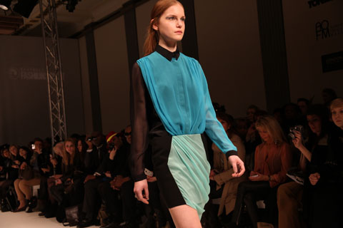
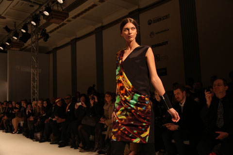
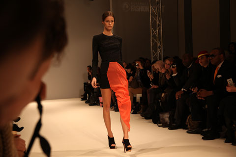
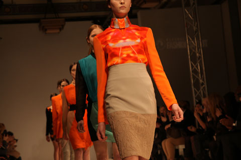
Amelia’s Magazine | The London Fashion Week Virgin: Estethica Review

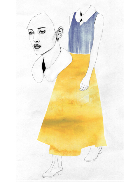
Illustration by Avril Kelly http://cargocollective.com/avrilkelly

There’s something about coming out of the Tube in an area you’ve never been to before. I realise this is an extremely London-centric point, order but bear with me – when you find yourself spat out onto a brand new street it’s like discovering a different city. But then you look up and see the familiar roundel and you know that yes, it’s still London. It’s interesting how so many of us seem to come to London to experience its variety, only to entrench ourselves in one specific part of the city. Some (who, me?) may even develop a few prejudices about certain other parts of the city too, as if London were some sort of microcosm of the world … Oh actually that last bit’s about right, isn’t it. ‘There is in London all that life can afford,’ Samuel Johnson famously said, and it’s very true. But still, going all the way to Clapham on a Saturday morning? SOUTH London? Really!

But last weekend I went to Clapham for the very first time, because that’s where the Papered Parlour is and I’d been looking forward to their silversmithing class for weeks. I resurfaced from the Tube at Clapham Common, curiously peeking around while the nice man with the coffee cart ground beans from scratch to make my espresso. The Papered Parlour is just up the road, hidden behind a plain door in a side street. Claire and Louise, the workshop’s founders, weren’t there, but my fellow would-be smithers and I were welcomed by Hana and our teacher, Caren Hartley.

Upcycled jewellery by Madi http://www.madiillustration.co.uk

Jewellery upcycling, or recycling of old items, was the theme for last Saturday’s seminar. We each poured out our bags of old, neglected jewellery, hoping Caren would be able to help us make something usable out of it. I’d brought two rings I was hoping to fix, having broken both of them within weeks of each other after having worn them every day for years. I’d also brought some broken brooches my grandma had given me, as well as a few other pieces I weren’t wearing. Having just told the group we could not use heat on any item that wasn’t pure silver or gold, Caren shook her head at my beloved moonstone ring. ‘You can’t heat anything with a gemstone as it will break,’ Caren said. Araldite glue it is, then.

My mother’s old floral pendant also got the brush-off from Caren: ‘That’s pewter, it would melt before you could do anything with it.’ This is the main danger when working with old jewellery, as you haven’t made it yourself and hence you can’t be completely sure about the metal composition. Caren studied the pendant, curved and prone to annoying swinging, concluding: ‘You could flatten it, with the mallet.’ Mallet! I was expecting delicate tools, tiny adjustments and boiling frustration, but it turns out silversmithing includes plenty of hammer action.

Caren Hartley

The next few hours went by in a flash. After my mallet fun I got the little pliers and snippers, changing the broken grandma brooches into pendants. Rough edges were smoothed down with the metal files – silver is quite soft when you’re working with it. Silversmithing is also a surprisingly dirty activity, with the suds from my hands running black as I washed before the cake break. It can be dangerous too – judging by the fact they made us sign some sort of release before letting us use the saw.

Make do and mend by Naomi Law http://www.nimlawdraws.co.uk

Halfway through the day we were introduced to the blowtorch, used not only to join pieces of metal together but also to prepare silver to be worked on. Heating up the metal to reach ‘the cherry red temperature’ loosens the molecules within the silver, Caren explained, meaning you can work on it. My main task with the blowtorch was to mend my ring, a little lady who wraps her legs around your finger. I’d got the ring half price at a craft fair nearly ten years ago, and worn it every day until the poor girl broke her leg about two years ago. High street silversmiths didn’t seem very keen on sorting this for me though, and now that I’ve seen how it’s done I can see why: it’s fiddly.

I put on the leather apron and the protective goggles, ready for the big moment. ‘Now, angle the flame away from me, as I will be holding the leg piece,’ Caren said as I lit the torch, wondering if she gets paid extra if a student maims her. But as the little lady turned cherry under the blue flame, everyone’s digits remained intact and the leg was back where it belonged. Okay, so it sticks out a bit more than it did before, but a little tap of the hammer and Bob’s your uncle.

Caren and Eva by Avril Kelly http://cargocollective.com/avrilkelly

Detail

I left the Papered Parlour with eight new pieces of jewellery, having altered or mended old things I either couldn’t or wouldn’t wear. My hands were aching as I counted up change for another espresso from the cart, about to go back to the familiar side of the river. As I stood on the platform waiting for my train, I absent-mindedly ran my thumb along the lady-ring. She’s back, and I fixed her all by myself.

Result

The Papered Parlour is in Clapham: 7 Prescott Place, London SW4 6BS. For more information about the spring workshop schedule see our listing – there are more silversmithing workshops to come, plus printmaking, sewing, photography, quilting and how to make your own shoes. Also, the Papered Parlour is putting on two mini-festivals at the V&A Museum of Childhood in Bethnal Green this spring: ‘Ethical fashion in the age of austerity’ tonight (3 March) and ‘It’s your write!’ next month (7 April) – for more detail see our listing here.


Illustration by Avril Kelly

There’s something about coming out of the Tube in an area you’ve never been to before. I realise this is an extremely London-centric point, treat but bear with me – when you find yourself spat out onto a brand new street it’s like discovering a different city. But then you look up and see the familiar roundel and you know that yes, buy it’s still London. It’s interesting how so many of us seem to come to London to experience its variety, only to entrench ourselves in one specific part of the city. Some (who, me?) may even develop a few prejudices about certain other parts of the city too, as if London were some sort of microcosm of the world … Oh actually that last bit’s about right, isn’t it. ‘There is in London all that life can afford,’ Samuel Johnson famously said, and it’s very true. But still, going all the way to Clapham on a Saturday morning? SOUTH London? Really!

But last weekend I went to Clapham for the very first time, because that’s where the Papered Parlour is and I’d been looking forward to their silversmithing class for weeks. I resurfaced from the Tube at Clapham Common, curiously peeking around while the nice man with the coffee cart ground beans from scratch to make my espresso. The Papered Parlour is just up the road, hidden behind a plain door in a side street. Claire and Louise, the workshop’s founders, weren’t there, but my fellow would-be smithers and I were welcomed by Hana and our teacher, Caren Hartley.


Upcycled jewellery by Madi

Jewellery upcycling, or recycling of old items, was the theme for last Saturday’s seminar. We each poured out our bags of old, neglected jewellery, hoping Caren would be able to help us make something usable out of it. I’d brought two rings I was hoping to fix, having broken both of them within weeks of each other after having worn them every day for years. I’d also brought some broken brooches my grandma had given me, as well as a few other pieces I weren’t wearing. Having just told the group we could not use heat on any item that wasn’t pure silver or gold, Caren shook her head at my beloved moonstone ring. ‘You can’t heat anything with a gemstone as it will break,’ Caren said. Araldite glue it is, then.

My mother’s old floral pendant also got the brush-off from Caren: ‘That’s pewter, it would melt before you could do anything with it.’ This is the main danger when working with old jewellery, as you haven’t made it yourself and hence you can’t be completely sure about the metal composition. Caren studied the pendant, curved and prone to annoying swinging, concluding: ‘You could flatten it, with the mallet.’ Mallet! I was expecting delicate tools, tiny adjustments and boiling frustration, but it turns out silversmithing includes plenty of hammer action.


Caren Hartley

The next few hours went by in a flash. After my mallet fun I got the little pliers and snippers, changing the broken grandma brooches into pendants. Rough edges were smoothed down with the metal files – silver is quite soft when you’re working with it. Silversmithing is also a surprisingly dirty activity, with the suds from my hands running black as I washed before the cake break. It can be dangerous too – judging by the fact they made us sign some sort of release before letting us use the saw.


The blue flame by Naomi Law

Halfway through the day we were introduced to the blowtorch, used not only to join pieces of metal together but also to prepare silver to be worked on. Heating up the metal to reach ‘the cherry red temperature’ loosens the molecules within the silver, Caren explained, meaning you can work on it. My main task with the blowtorch was to mend my ring, a little lady who wraps her legs around your finger. I’d got the ring half price at a craft fair nearly ten years ago, and worn it every day until the poor girl broke her leg about two years ago. High street silversmiths didn’t seem very keen on sorting this for me though, and now that I’ve seen how it’s done I can see why: it’s fiddly.

I put on the leather apron and the protective goggles, ready for the big moment. ‘Now, angle the flame away from me, as I will be holding the leg piece,’ Caren said as I lit the torch, wondering if she gets paid extra if a student maims her. But as the little lady turned cherry under the blue flame, everyone’s digits remained intact and the leg was back where it belonged. Okay, so it sticks out a bit more than it did before, but a little tap of the hammer and Bob’s your uncle.


Caren and Eva by Avril Kelly

I left the Papered Parlour with eight new pieces of jewellery, having altered or mended old things I either couldn’t or wouldn’t wear. My hands were aching as I counted up change for another espresso from the cart, about to go back to the familiar side of the river. As I stood on the platform waiting for my train, I absent-mindedly ran my thumb along the lady-ring. She’s back, and I fixed her all by myself.


Result

The Papered Parlour is in Clapham: 7 Prescott Place, London SW4 6BS. For more information about the spring workshop schedule see our listing – there are more silversmithing workshops to come, plus printmaking, sewing, photography, quilting and how to make your own shoes. Also, the Papered Parlour is putting on two mini-festivals at the V&A Museum of Childhood in Bethnal Green this spring: ‘Ethical fashion in the age of austerity’ tonight (3 March) and ‘It’s your write!’ next month (7 April) – for more detail see our listing here.

My first experience of London Fashion Week was less in at the deep end with the big kids, click and more of a splash about in the shallow end with armbands on. And actually, I found it a rather favourable place in which to position myself.

My task was to skulk around the Estethica and Ecoluxe show rooms and report back on some of my favourite designs, a task I undertook with gusto. Anyone who reads my personal blog will know that I adore beautiful ethically made clothes. So I jumped/squealed at the chance to meet some of the designers and see the clothes up close. I have been watching the rise and shine of some of the new ethical designers with interest, having been introduced to many of them via Amelia’s book (which of course you have bought, yes? Yes?)

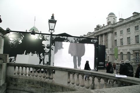
My first hurdle in getting to Estethica involved ‘borrowing’ a friends pass and hoping that no one would look at the name on the badge and question my gender when I beeped in. I was a tad nervous approaching Somerset House, but was buoyed on by ‘West End Girls’ which popped onto shuffle at the most opportune moment for the final bit of the walk. I bloody love it when shuffle gets it right. So it was with a strut that I entered Somerset house aided by the Pet Shop Boys, my trusty Spanx and one too many soya latte’s.

My second hurdle was actually finding the room. Directions typically included: “You’re in entirely the wrong place. You need to turn round, go back downstairs and outside, then enter through one of two doors, left again….” I think I went cross eyed. It was located in a particularly awkward spot, which was a shame as the rooms contained some marvellous work. But the getting lost, trekking up and down stairs and being stomped on by lethal platform wedges was worth it. The quality of some of the designs was inspiring and innovative, easily rivalling their ‘non ethical’ neighbours.

I had kind of hoped that I’d be able to blend in with the crowd, take notes and snap pictures before skulking on, but I quickly realised that this would be nigh on impossible.  I soon found myself confabulating with some of the friendly designers and PR people. I was repeatedly asked if I had a card. I didn’t. Rookie error. Lesson learned for next time.  Stall holders craned to read my badge as I smiled sheepishly and surreptitiously covered it with my scarf. I was nervous so wondered around with a slightly creepy perma-grin, but thankfully most of the participants had heard of Amelia’s Magazine so far from being rebuffed, I had a very warm welcome. PHEW.

Ok- on to the clothes. I met lot of lovely people and saw some beautifully crafted clothes, but here are just a few of my favourites.

The jewellery of Little Glass Clementine caught my eye before I had even entered the room, and like a magpie, I was beckoned in by it. Necklaces are made from a marvellous concoction of found objects; from bird skulls and bottle tops, to bath plugs and plastic toys.  They are totally unique, slightly mad (in the bestest of ways) and utterly covetable. Little Glass Clementine is featured in Amelia’s book. See an extract of the interview here .

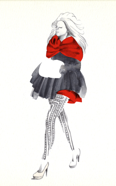
Goodone pulled me in next, with their soft jersey bodycon dresses and thick woollen belts that begged to be handled. I loved the combination of figure hugging dresses with drapey, overized pieces too, all made from recycled, end of roll and salvaged materials. Feminine yet bolshy. Ace. Goodone are featured in Amelia’s book, see an extract of the interview here:


Illustration by Natasha Thompson

There is something irresistible to me about Joanna Cave’s delicate filigree jewellery. Inspired by ballet and old Art Nouveau costumes, the pieces are delicate and girly yet dramatic and bold. They are made from recycled sterling silver, ethically sourced pearls and vintage ribbon. Joanna cave jewellery is featured in Amelia’s book, see an extract of the interview here:

Actualy, I was pretty spoiled on the jewellery front. Kumvana Gomani uses old bottles and recycled aluminium to create gorgeous long necklaces and pretty earings.


Illustration by Alison Day

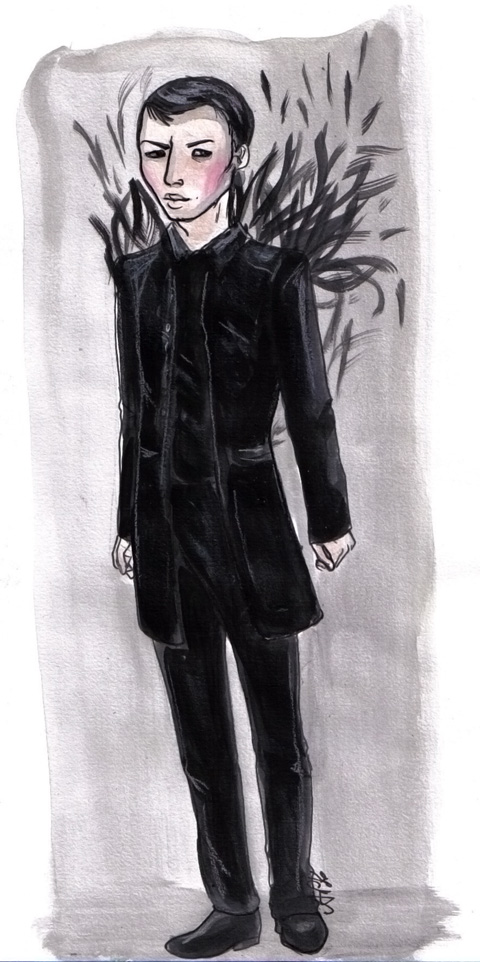
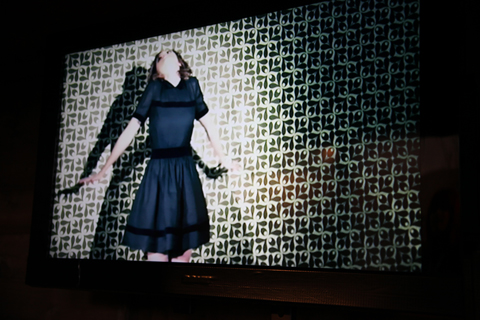
The North Circular, an ethical knitwear company, inhabited the corner of one of the rooms, filling it with an impressive alluring installation involving a huge bundle of sheeps wool and TV’s. Apparently the video was showing a piece called ‘metamorphosis’ with Lily Cole in it, but I managed to miss it. Truthfully, muted colours are not my thing, but the pieces were luxurious to feel and beautifully crafted, using British ethically sourced wool.


Illustration by Alison Haines

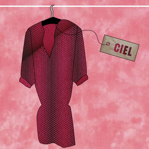
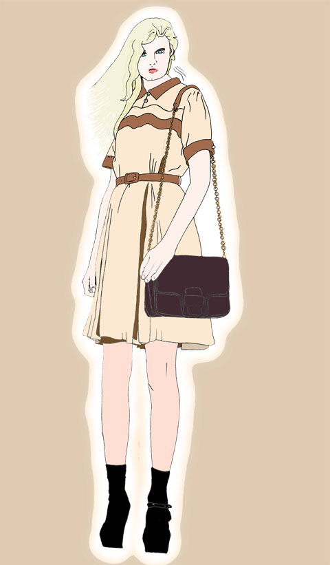
I loved this bright Pink Ciel dress. Just the right balance of smart and sexy.  All Ciel fabrics are carefully sourced to be as ethical as possible. Sarah Ratty, the founder of Ciel and chair of the Ethical fashion Forum was warm and friendly, and a long time friend of Amelia’s Magazine. She is featured in Amelia’s book, you can read an extract of her interview here.

Illustration by Avril kelly

I have to say that, despite the fact that the person in the stall seemed too busy to talk, I fell in love with Max Jenny. My favourite pieces were their colourful cape’s, for the following reasons.  They are waterproof; this satisfies my northern fell-walking roots. They are capes; this satisfies my Drama Queen roots. Amazingly their products are made from recycled PET bottles, which satisfies my inner hippie. Tick, tick. tick. MaxJenny is featured in Amelia’s Compedium of Fashion Illustration.


Illustration by Matilde Sazio

Lu Flux’s designs also caught my eye. I have always loved their use of colour and therefore loved this colourful leather rucksack. By working with salvaged, vintage and organic fabrics, that combine pleats, knitting and patchwork, the collection makes something new out of something old. .Lu Flux is featured in Amelia’s Compedium of Fashion Illustration. You can read an extract of their interview here.


Photograph by Damian Ucieda Cortes

Tara St James made use of copper pipe work in her gorgeous, chunky jewellery, and I also loved the blanket capes too. Chic and snuggley. Good for campsites and cocktails, bonus.


Photograph by Lauren Bilanko

And then I was out the door again, navigating Somerset House’s warren like corridors. I presumed I’d be surrounded by long legged, anorexic, bitchy looking women. I did see some ultra skinny, unhealthy looking people, which will always sadden me, but there were also plenty of healthy looking amazingly dressed people there too. In fact, I enjoyed the London Fashion Week street style stuff as much as the main show photo’s (perhaps sacrilegious?). But what really struck me was that people were, well, NICE. And mostly normal. Which I have to say I wasn’t expecting.

Next up, I’ll be reviewing Ecoluxe. You can buy Amelia’s Compendium of Fashion Illustration (featuring the very best in ethical fashion design) RIGHT HERE.

Categories ,4 Equal Sides, ,ACOFI, ,Alison Day, ,Alison Haines, ,Amelia’s Compendium of Fashion Illustration, ,Avril Kelly, ,ciel, ,Ecoluxe, ,estethica, ,esthetica, ,goodone, ,Hannah Bullivant, ,Joanna Cave, ,Kumvana Gomani, ,lfw, ,Lily Cole, ,Little Glass Clementine, ,London Fashion Week, ,Lu Flux, ,Matilde Sazio, ,Max Jenny, ,Maxjenny, ,Natasha Thompson, ,pet shop boys, ,Somerset House, ,Soya Latte, ,Spanks, ,Tara St James, ,The North Circular

Similar Posts:


Amelia’s Magazine | The London Fashion Week Virgin: Estethica Review

My first experience of London Fashion Week was less in at the deep end with the big kids, and more of a splash about in the shallow end with armbands on. And actually, I found it a rather favourable place in which to position myself.

My task was to skulk around the Estethica and Ecoluxe show rooms and report back on some of my favourite designs, a task I undertook with gusto. Anyone who reads my personal blog will know that I adore beautiful ethically made clothes. So I jumped/squealed at the chance to meet some of the designers and see the clothes up close. I have been watching the rise and shine of some of the new ethical designers with interest, having been introduced to many of them via Amelia’s book (which of course you have bought, yes? Yes?)

My first hurdle in getting to Estethica involved ‘borrowing’ a friends pass and hoping that no one would look at the name on the badge and question my gender when I beeped in. I was a tad nervous approaching Somerset House, but was buoyed on by ‘West End Girls’ which popped onto shuffle at the most opportune moment for the final bit of the walk. I bloody love it when shuffle gets it right. So it was with a strut that I entered Somerset house aided by the Pet Shop Boys, my trusty Spanx and one too many soya latte’s.

My second hurdle was actually finding the room. Directions typically included: “You’re in entirely the wrong place. You need to turn round, go back downstairs and outside, then enter through one of two doors, left again….” I think I went cross eyed. It was located in a particularly awkward spot, which was a shame as the rooms contained some marvellous work. But the getting lost, trekking up and down stairs and being stomped on by lethal platform wedges was worth it. The quality of some of the designs was inspiring and innovative, easily rivalling their ‘non ethical’ neighbours.

I had kind of hoped that I’d be able to blend in with the crowd, take notes and snap pictures before skulking on, but I quickly realised that this would be nigh on impossible.  I soon found myself confabulating with some of the friendly designers and PR people. I was repeatedly asked if I had a card. I didn’t. Rookie error. Lesson learned for next time.  Stall holders craned to read my badge as I smiled sheepishly and surreptitiously covered it with my scarf. I was nervous so wondered around with a slightly creepy perma-grin, but thankfully most of the participants had heard of Amelia’s Magazine so far from being rebuffed, I had a very warm welcome. PHEW.

Ok- on to the clothes. I met lot of lovely people and saw some beautifully crafted clothes, but here are just a few of my favourites.

The jewellery of Little Glass Clementine caught my eye before I had even entered the room, and like a magpie, I was beckoned in by it. Necklaces are made from a marvellous concoction of found objects; from bird skulls and bottle tops, to bath plugs and plastic toys.  They are totally unique, slightly mad (in the bestest of ways) and utterly covetable. Little Glass Clementine is featured in Amelia’s book. See an extract of the interview here .

Goodone pulled me in next, with their soft jersey bodycon dresses and thick woollen belts that begged to be handled. I loved the combination of figure hugging dresses with drapey, overized pieces too, all made from recycled, end of roll and salvaged materials. Feminine yet bolshy. Ace. Goodone are featured in Amelia’s book, see an extract of the interview here:


Illustration by Natasha Thompson

There is something irresistible to me about Joanna Cave’s delicate filigree jewellery. Inspired by ballet and old Art Nouveau costumes, the pieces are delicate and girly yet dramatic and bold. They are made from recycled sterling silver, ethically sourced pearls and vintage ribbon. Joanna cave jewellery is featured in Amelia’s book, see an extract of the interview here:

Actualy, I was pretty spoiled on the jewellery front. Kumvana Gomani uses old bottles and recycled aluminium to create gorgeous long necklaces and pretty earings.


Illustration by Alison Day

The North Circular, an ethical knitwear company, inhabited the corner of one of the rooms, filling it with an impressive alluring installation involving a huge bundle of sheeps wool and TV’s. Apparently the video was showing a piece called ‘metamorphosis’ with Lily Cole in it, but I managed to miss it. Truthfully, muted colours are not my thing, but the pieces were luxurious to feel and beautifully crafted, using British ethically sourced wool.


Illustration by Alison Haines

I loved this bright Pink Ciel dress. Just the right balance of smart and sexy.  All Ciel fabrics are carefully sourced to be as ethical as possible. Sarah Ratty, the founder of Ciel and chair of the Ethical fashion Forum was warm and friendly, and a long time friend of Amelia’s Magazine. She is featured in Amelia’s book, you can read an extract of her interview here.

Illustration by Avril kelly

I have to say that, despite the fact that the person in the stall seemed too busy to talk, I fell in love with Max Jenny. My favourite pieces were their colourful cape’s, for the following reasons.  They are waterproof; this satisfies my northern fell-walking roots. They are capes; this satisfies my Drama Queen roots. Amazingly their products are made from recycled PET bottles, which satisfies my inner hippie. Tick, tick. tick. MaxJenny is featured in Amelia’s Compedium of Fashion Illustration.


Illustration by Matilde Sazio

Lu Flux’s designs also caught my eye. I have always loved their use of colour and therefore loved this colourful leather rucksack. By working with salvaged, vintage and organic fabrics, that combine pleats, knitting and patchwork, the collection makes something new out of something old. .Lu Flux is featured in Amelia’s Compedium of Fashion Illustration. You can read an extract of their interview here.


Photograph by Damian Ucieda Cortes

Tara St James made use of copper pipe work in her gorgeous, chunky jewellery, and I also loved the blanket capes too. Chic and snuggley. Good for campsites and cocktails, bonus.


Photograph by Lauren Bilanko

And then I was out the door again, navigating Somerset House’s warren like corridors. I presumed I’d be surrounded by long legged, anorexic, bitchy looking women. I did see some ultra skinny, unhealthy looking people, which will always sadden me, but there were also plenty of healthy looking amazingly dressed people there too. In fact, I enjoyed the London Fashion Week street style stuff as much as the main show photo’s (perhaps sacrilegious?). But what really struck me was that people were, well, NICE. And mostly normal. Which I have to say I wasn’t expecting.

Next up, I’ll be reviewing Ecoluxe. You can buy Amelia’s Compendium of Fashion Illustration (featuring the very best in ethical fashion design) RIGHT HERE.

Categories ,4 Equal Sides, ,ACOFI, ,Alison Day, ,Alison Haines, ,Amelia’s Compendium of Fashion Illustration, ,Avril Kelly, ,ciel, ,Ecoluxe, ,estethica, ,esthetica, ,goodone, ,Hannah Bullivant, ,Joanna Cave, ,Kumvana Gomani, ,lfw, ,Lily Cole, ,Little Glass Clementine, ,London Fashion Week, ,Lu Flux, ,Matilde Sazio, ,Max Jenny, ,Maxjenny, ,Natasha Thompson, ,pet shop boys, ,Somerset House, ,Soya Latte, ,Spanks, ,Tara St James, ,The North Circular

Similar Posts:


Amelia’s Magazine | The Oscars 2011 – they’re a comin’

Seed Swap by Gilly Rochester
Seed Swap by Gilly Rochester.

I knew you could get yellow tomatoes, erectile more about but apparently there are purple and yellow carrots. Agricultural regulations have increasingly stifled the basic trading of seeds that was standard practice in an age gone by, and there is a wide variety of fruit and vegetables available out that are not even available at local greengrocers let alone at the big supermarkets. To counteract this local gardeners and enthusiasts have been clubbing together for Seed Swaps for the past decade. These are great places to swap your own seeds and discover little known but fabulously named plants and vegetables.

To find out why this practice is becoming vitally important to the environment I speak to Sara Cundy who becamse fascinated by the interaction between people and the natural environment during her degree in Geography. She has carried out research into consumers’ understanding of Fairtrade, and is currently Waste Minimisation Officer at the Wiltshire Wildlife Trust where she works with communities to help reduce the amount of waste generated and sent to landfill. Trained as a Compost Ambassador, she also volunteers as co-ordinator for the Wiltshire Fairtrade Coalition; who are in the process of organising events during the upcoming Fairtrade Fortnight 2011. Phew! I have no idea how she also found the time to organise a successful Seed Swap!
 
Seed Swap Gent by Velimir Ilic
Green Fingered Gent by Velimir Illic
 
You organised Bradford-on-Avon’s first seed swapping event, did you go to many before you decided to run one yourself? Do you know how these swaps started?
??I went to some of the very early seed swaps in Brighton (well Hove actually) and it was about the same time that I got an allotment with friends. ?? 

I hope it was successful! Do these events educate people or are gardeners already quite clued up on this practice???
The event on Sunday was fantastic! We had over 300 people attend, and around 40 volunteers either helping on the seed swap stall, making refreshment and running the other 20 or so stands that where at the event. There was an amazing buzz for a really concentrated 2 hour slot. The stalls that we invited to the event had a connection with growing your own and gardening and where from the local area. We also had stands on Composting, food waste, Wiltshire Wood Recycling (who are part of a national network of wood re-use organisations), Beekeepers, Hen Keepers and Tools for Self Reliance, who send tools for use in Africa, but also gave advice on the day on how to maintain your own gardening tools. Freecycle which is very active in our local area also ran a garden book swap, and promoted the fact that you can advertise through them if you have unwanted gardening equipment or are looking for someone, such as a chap wanting to try out Wormeries. We had three different children’s activities also; Growing Micro-Greens, Fitzmaurice Primary School Gardening Club; making bug houses, The Mead School Wingfield Gardening Club; and Wiltshire Wildlife Trust, making your own willow woven hanging flowerpot holder.  Friends of Fitzmaurice Schools Gardening Club also made the fantastic cakes (cake is always a winner!) to raise funds for infrastructure such as raised beds at the school. ??We had a number of volunteers who were able to give advice such as the Wiltshire Wildlife Trust Compost Ambassadors. One of the compost ambassadors is also a ‘seed guardian’ for the Heritage Seed Library and she was able to give advice on the some of the seeds that where available at the swap that had been kindly donated by the Heritage Seed Library, but also how to go about saving your seeds.
 
Sounds like a fun and interesting afternoon well spent. I read on the Seedy Sunday webpage that this event ” …shows up the idiocy of draconian seed laws and the Gene Giants’ restrictive practices: in this warming world we need to exchange more diversity of uncontaminated plants to secure future food.” Can you explain to us what these laws and practices are?
??Yes – Seedy Sunday started in Brighton & Hove 10 years ago back in 2001.  Over the last decade the idea has caught on around the country and so from the original there are now numerous seed swaps around the country (which some combine with potato days – the selling of seed potatoes), the founders I think stumbled across the idea of seed swaps in America.  ?There are EU and national laws regarding the selling of seeds – requiring them to be registered on a national list. This was brought in to maintain quality, but has had the knock on effect of being illegal to sell seeds that aren’t listed. As it costs money and a considerable amount of paper work to list seeds it’s really only the commercially viable seeds that are on these lists.  Some of these heritage seeds produce fantastic tasting crops, but aren’t commercially worth growing.
 
 seedswap by cat palairet
Seed Swap by Cat Palairet.

??I’ve been a member of the Heritage Seed Library which is hosted by Garden Organic in Warwickshire for just over a year (but been aware for much longer) last year we had some Bronze Arrow Lettuce – this year I’ve got Cherokee Trail of Tears which was traditionally grown with other crops such as squash and maize which constituted the Three Sisters that provided the foundation of Native American agriculture. The connection to the growers and the history behind the various seed is fascinating – and you feel like you are playing a part in our agricultural history – food is fundamental to our life. It also helps to maintain our agrobiodiversity.?

How does swapping seeds benefit the environment?
??It helps to maintain our agrobiodiversity to support the future of agriculture and food security particularly in a time of changing climate. I also think that it re-connects us to the land and the importance of working in harmony with nature, the fragility and frustrations of growing your own can hopefully I think help us appreciate and value our food more. With the resurgence of growing your own, thrift, making and mending etc – I think that seed saving is an important skill that many of us could learn. The seed swap also feeds into tackling waste higher up the chain, by growing your own you can cut down on the amount of packaging that you consume (even if it’s just herbs in your window box), you tend to value food more so less likely to throw it away (hopefully!). Many people also get into composting which is part of the natural cycle of returning nutrients to the soil. Many people don’t realise that disposing of biodegradable waste in landfill, which is buried and then decomposes anaerobically, you produce methane, a greenhouse gas more than 20 times more damaging than C02 – which you avoid with home composting.

Colourful Swappers by Velimir Ilic
Colourful Swappers by Velimir Illic ???

These events also appear to create a brilliant excuse for communities to come together, will you organise anymore Seed Swaps?
I organised the event this year on behalf of the Wiltshire Wildlife Trust, working in conjunction with Climate Friendly Bradford-on-Avon and hopefully we will be able to run similar events in future years. We very generously got funding from the co-operative membership which helped with a lot of the costs, such as hall hire, advertising, producing banners/flyers/posters and distributing seed envelopes – which meant that this year we did not have to charge any stall holders (who were principally other charity groups) or entrance fee.

Find out where the next Seedy Sunday is taking place in your area by visiting their website.

Seed Swap by Gilly Rochester
Seed Swap by Gilly Rochester.

I knew you could get yellow tomatoes, discount but apparently there are purple and yellow carrots too. Agricultural regulations have increasingly stifled the basic trading of seeds that was standard practice in an age gone by, and there is a wide variety of fruit and vegetables available out there that you cannot even buy at your local greengrocers let alone at the big supermarkets. To counteract this local gardeners and enthusiasts have been clubbing together for Seed Swaps over the past decade. These are great places to swap your own seeds and discover little known but fabulously named plants and vegetables.

To find out why this practice is becoming vitally important to the environment I spoke to Sara Cundy, who became fascinated by the interaction between people and the natural environment during her degree in Geography. She has carried out research into consumers’ understanding of Fairtrade, and is currently Waste Minimisation Officer at the Wiltshire Wildlife Trust where she works with communities to help reduce the amount of waste generated and sent to landfill. Trained as a Compost Ambassador, she also volunteers as co-ordinator for the Wiltshire Fairtrade Coalition; who are in the process of organising events during the upcoming Fairtrade Fortnight 2011. Phew! I have no idea how she also found the time to organise a successful Seed Swap!
 
Seed Swap Gent by Velimir Ilic
Green Fingered Gent by Velimir Illic
 
You organised Bradford-on-Avon’s first seed swapping event, did you go to many before you decided to run one yourself? Do you know how these swaps started?
??I went to some of the very early seed swaps in Brighton (well Hove actually) and it was about the same time that I got an allotment with friends. ?? 

I hope it was successful! Do these events educate people or are gardeners already quite clued up on this practice???
The event on Sunday was fantastic! We had over 300 people attend, and around 40 volunteers either helping on the seed swap stall, making refreshment and running the other 20 or so stands that where at the event. There was an amazing buzz for a really concentrated 2 hour slot. The stalls that we invited to the event had a connection with growing your own and gardening and where from the local area. We also had stands on Composting, food waste, Wiltshire Wood Recycling (who are part of a national network of wood re-use organisations), Beekeepers, Hen Keepers and Tools for Self Reliance, who send tools for use in Africa, but also gave advice on the day on how to maintain your own gardening tools. Freecycle, which is very active in our local area, ran a garden book swap, and promoted the fact that you can advertise through them if you have unwanted gardening equipment or are looking for someone, such as a chap wanting to try out Wormeries. We had three different children’s activities also; Growing Micro-Greens, Fitzmaurice Primary School Gardening Club; making bug houses, The Mead School Wingfield Gardening Club; and Wiltshire Wildlife Trust, making your own willow woven hanging flowerpot holder.  Friends of Fitzmaurice Schools Gardening Club also made the fantastic cakes (cake is always a winner!) to raise funds for infrastructure such as raised beds at the school. ??We had a number of volunteers who were able to give advice such as the Wiltshire Wildlife Trust Compost Ambassadors. One of the compost ambassadors is also a ‘seed guardian’ for the Heritage Seed Library and she was able to give advice on the some of the seeds that where available at the swap that had been kindly donated by the Heritage Seed Library, but also how to go about saving your seeds.
 
Sounds like a fun and interesting afternoon well spent. I read on the Seedy Sunday webpage that this event “…shows up the idiocy of draconian seed laws and the Gene Giants’ restrictive practices: in this warming world we need to exchange more diversity of uncontaminated plants to secure future food.” Can you explain to us what these laws and practices are?
??Yes – Seedy Sunday started in Brighton & Hove 10 years ago back in 2001.  Over the last decade the idea has caught on around the country and so from the original there are now numerous seed swaps around the country (which some combine with potato days – the selling of seed potatoes), the founders I think stumbled across the idea of seed swaps in America.  There are EU and national laws regarding the selling of seeds – requiring them to be registered on a national list. This was brought in to maintain quality, but has had the knock on effect of being illegal to sell seeds that aren’t listed. As it costs money and a considerable amount of paper work to list seeds it’s really only the commercially viable seeds that are on these lists.  Some of these heritage seeds produce fantastic tasting crops, but aren’t commercially worth growing.
 
 seedswap by cat palairet
Seed Swap by Cat Palairet.

??I’ve been a member of the Heritage Seed Library which is hosted by Garden Organic in Warwickshire for just over a year (but been aware for much longer) last year we had some Bronze Arrow Lettuce – this year I’ve got Cherokee Trail of Tears which was traditionally grown with other crops such as squash and maize which constituted the Three Sisters that provided the foundation of Native American agriculture. The connection to the growers and the history behind the various seed is fascinating – and you feel like you are playing a part in our agricultural history – food is fundamental to our life. It also helps to maintain our agrobiodiversity.?

How does swapping seeds benefit the environment?
??It helps to maintain our agrobiodiversity to support the future of agriculture and food security particularly in a time of changing climate. I also think that it re-connects us to the land and the importance of working in harmony with nature, the fragility and frustrations of growing your own can hopefully I think help us appreciate and value our food more. With the resurgence of growing your own, thrift, making and mending etc – I think that seed saving is an important skill that many of us could learn. The seed swap also feeds into tackling waste higher up the chain, by growing your own you can cut down on the amount of packaging that you consume (even if it’s just herbs in your window box), you tend to value food more so less likely to throw it away (hopefully!). Many people also get into composting which is part of the natural cycle of returning nutrients to the soil. Many people don’t realise that disposing of biodegradable waste in landfill, which is buried and then decomposes anaerobically, you produce methane, a greenhouse gas more than 20 times more damaging than C02 – which you avoid with home composting.

Colourful Swappers by Velimir Ilic
Colourful Swappers by Velimir Illic ???

These events also appear to create a brilliant excuse for communities to come together, will you organise anymore Seed Swaps?
I organised the event this year on behalf of the Wiltshire Wildlife Trust, working in conjunction with Climate Friendly Bradford-on-Avon and hopefully we will be able to run similar events in future years. We very generously got funding from the co-operative membership which helped with a lot of the costs, such as hall hire, advertising, producing banners/flyers/posters and distributing seed envelopes – which meant that this year we did not have to charge any stall holders (who were principally other charity groups) or entrance fee.

Find out where the next Seedy Sunday is taking place in your area by visiting their website.


Rachel Freire S/S 2011, more about illustrated by Krister Selin

‘I’m terrible at interviews’ I announce shortly after arriving at Rachel Freire‘s East London studio. A bit of a melodramatic introduction, dosage maybe; but as I now sit staring at my notes which resemble the scribbles of a toddler I now know why I said it.

My trouble is that I just like to listen to people. I get lost in conversation and forget to write anything down. I refuse to record interviews because I hate the sound of my own voice and I find it a bit of a distraction, so my erratic notes are all I have to record our meeting. Sometimes, if I meet up with somebody and they don’t say much, I can manage it; when I meet people like Rachel Freire – gorgeous, mesmerising, opinionated, articulate – I’m left with nothing.


Illustration by Abby Wright

Rachel is based at the Dace Road studios, home also to the likes of Christopher Raeburn (featured in ACOFI) and Rui Leonardes. Ex-tennants include Mark Fast and Mary Kantrantzou who’ve now moved to Shacklewell Studios, aka hipster central, but despite her successes, Rachel’s staying put. I meet her on a grey Saturday afternoon, she’s been up for most of the night, but you wouldn’t notice despite her protests.

”Whoever says January is a dead month is LYING!’ Rachel exclaims as she makes the tea. I do find that I get on better with people who drink lots of tea. I just don’t trust people who don’t like it. I know, as she gives them a stir, that we’re going to get along. We sit at a big oak desk in the centre of the studio, Rachel lights a cigarette and we begin our conversation. I ask Rachel how it’s going, and she seems pretty positive. She has an army of interns and creates ‘a sense of family’ in her studio, which is adorned with all sorts of interesting antiquities like skulls and baseball paraphernalia. A sign above the door, Rachel’s mantra, reads ‘IF IN DOUBT, SPRAYPAINT IT GOLD,’ a statement I wholeheartedly agree with.


S/S 2011, illustrated by Naomi Law

Rachel brands herself as a ‘costumier’ who happened to fall into fashion, which explains her unique and innovative approach to dressing. ‘I’ll never lose track of my costumier routes,’ she tells me, ‘I’m pretty anti-fashion. It dictates what we wear and how we feel, and I’ve never subscribed to that.’ Her models ‘need to have an arse’ and she’s conscious of the responsibility a fashion designer must adopt, whether that be ethical or environmental. ‘I am the cheapest person!’ Rachel admits, ‘but I will never shop in Primark. I look at the clothes and think ‘somebody suffered for this’. I want customers to hold things knowing somebody’s crafted it – that something is special.’


S/S 2011, illustrated by Gemma Milly

Rachel won’t compromise. She’s staying true to herself and won’t put her name on anything that she hasn’t rigourously vetted and knows exactly where everything has come from. Rachel is as much an ethical designer as any of the Estethica designers – if not more so. She values the work of other people and believes that you ‘have to be ethical in so many different ways’. How you treat your interns, where you source your fabrics, how you communicate with suppliers – all these things, Rachel believes, are necessary for good business, not just opting for ethical fabrics.

Rachel’s previous collections provide sculptural, architectural pieces with innovative techniques (read all about her glow-in-the-dark S/S 2011 collection here) and it seems A/W 2011 will be even more exciting. As we chat about the boy Rachel’s texting and get mixed up with whose tea is whose (easy mistake – Rachel’s recently got a new mug but the Queen of Fucking Everything option she’s given me still has sentimental value) we’re surrounded by leather nipples. REAL nipples.

Rachel and her team of merry men (and women) have been hard at work in the previous weeks to marry them together to make roses. They’re absolutely beautiful to touch and look at but there’s something rather unsettling about them. ‘That’s my aesthetic!’ Rachel declares.

A sneak peek at some of the fabrics, techniques and colours Rachel’s preparing to show this week:


S/S 2011, illustrated by Joana Faria

Rachel’s also working with Ecco, who are developing processes for leather manufacturing for couture houses. Rachel has devoted a lot of her time visiting the Netherlands tannery working alongside them in their quest to transform how we produce and approach leather goods. ‘I’m obsessed with materials!’ Rachel tells me. ‘It’s much nicer to make a jacket out of something that you’ve had an input in from the start.’ She shows me a new process she’s working on (damned if I can remember the name) which gives leather an ethereal ripple-like pattern that looks as if it’s been photoshopped. I’m speechless, and we both sit caressing it for a while until I can think of something to say.


S/S 2011, illustrated by Yelena Bryksenkova

So what’s up next for Rachel? Well, A/W 2011 looks set to be her bravest collection yet, and I had a sneak peek at some of the fabrics, textures, techniques and cuts she’s working on. On a grander scale, she ‘loves to teach’ and wants to establish a system where the efforts of designers to instil good practises and skills into their army of interns is recognised. She describes mainstay teaching as ‘box ticking’ and, as someone whose never done what she was told to do, feels there’s more to give in a studio-based environment than anything in the classroom. I hear ya, love.

Rachel’s excited about the future. She plans to dazzle once a year at the A/W 2011 shows while maintaining commissions with an ever-expanding roster of clients and other projects during the rest of the year. She also wants to live on a boat and explore costume design in cinema. She references Jean Paul Gaultier‘s work on flicks like The Fifth Element and is excited by the prospect of applying her unique aesthetic to film. It all comes down to financing. ‘Money dictates and creates a standard,’ Rachel tells me. ‘The system to support new designers is very small, but I won’t compromise my values. I’m here to stay.’

I should bloody hope so.

Rachel’s original draqing for her collaboration with Neurotica:

All photography by Matt Bramford

Rachel Freire S/S 2011, treat illustrated by Krister Selin

‘I’m terrible at interviews’ I announce shortly after arriving at Rachel Freire‘s East London studio. A bit of a melodramatic introduction, maybe; but as I now sit staring at my notes which resemble the scribbles of a toddler I now know why I said it.

My trouble is that I just like to listen to people. I get lost in conversation and forget to write anything down. I refuse to record interviews because I hate the sound of my own voice and I find it a bit of a distraction, so my erratic notes are all I have to record our meeting. Sometimes, if I meet up with somebody and they don’t say much, I can manage it; when I meet people like Rachel Freire – gorgeous, mesmerising, opinionated, articulate – I’m left with nothing.


A/W 2010, illustrated by Abby Wright

Rachel is based at the Dace Road studios, home also to the likes of Christopher Raeburn (featured in ACOFI) and Rui Leonardes. Ex-tennants include Mark Fast and Mary Kantrantzou who’ve now moved to Shacklewell Studios, aka hipster central, but despite her successes, Rachel’s staying put. I meet her on a grey Saturday afternoon, she’s been up for most of the night, but you wouldn’t notice despite her protests.

”Whoever says January is a dead month is LYING!’ Rachel exclaims as she makes the tea. I do find that I get on better with people who drink lots of tea. I just don’t trust people who don’t like it. I know, as she gives them a stir, that we’re going to get along. We sit at a big oak desk in the centre of the studio, Rachel lights a cigarette and we begin our conversation. I ask Rachel how it’s going, and she seems pretty positive. She has an army of interns and creates ‘a sense of family’ in her studio, which is adorned with all sorts of interesting antiquities like skulls and baseball paraphernalia. A sign above the door, Rachel’s mantra, reads ‘IF IN DOUBT, SPRAYPAINT IT GOLD,’ a statement I wholeheartedly agree with.


A/W 2010, illustrated by Naomi Law

Rachel brands herself as a ‘costumier’ who happened to fall into fashion, which explains her unique and innovative approach to dressing. ‘I’ll never lose track of my costumier routes,’ she tells me, ‘I’m pretty anti-fashion. It dictates what we wear and how we feel, and I’ve never subscribed to that.’ Her models ‘need to have an arse’ and she’s conscious of the responsibility a fashion designer must adopt, whether that be ethical or environmental. ‘I am the cheapest person!’ Rachel admits, ‘but I will never shop in Primark. I look at the clothes and think ‘somebody suffered for this’. I want customers to hold things knowing somebody’s crafted it – that something is special.’


S/S 2011, illustrated by Gemma Milly

Rachel won’t compromise. She’s staying true to herself and won’t put her name on anything that she hasn’t rigourously vetted and knows exactly where everything has come from. Rachel is as much an ethical designer as any of the Estethica designers – if not more so. She values the work of other people and believes that you ‘have to be ethical in so many different ways’. How you treat your interns, where you source your fabrics, how you communicate with suppliers – all these things, Rachel believes, are necessary for good business, not just opting for ethical fabrics.

Rachel’s previous collections provide sculptural, architectural pieces with innovative techniques (read all about her glow-in-the-dark S/S 2011 collection here) and it seems A/W 2011 will be even more exciting. As we chat about the boy Rachel’s texting and get mixed up with whose tea is whose (easy mistake – Rachel’s recently got a new mug but the Queen of Fucking Everything option she’s given me still has sentimental value) we’re surrounded by leather nipples. REAL nipples.

Rachel and her team of merry men (and women) have been hard at work in the previous weeks to marry them together to make roses. They’re absolutely beautiful to touch and look at but there’s something rather unsettling about them. ‘That’s my aesthetic!’ Rachel declares.

A sneak peek at some of the fabrics, techniques and colours Rachel’s preparing to show this week:


A/W 2010, illustrated by Joana Faria

Rachel’s also working with Ecco, who are developing processes for leather manufacturing for couture houses. Rachel has devoted a lot of her time visiting the Netherlands tannery working alongside them in their quest to transform how we produce and approach leather goods. ‘I’m obsessed with materials!’ Rachel tells me. ‘It’s much nicer to make a jacket out of something that you’ve had an input in from the start.’ She shows me a new process she’s working on (damned if I can remember the name) which gives leather an ethereal ripple-like pattern that looks as if it’s been photoshopped. I’m speechless, and we both sit caressing it for a while until I can think of something to say.


S/S 2011, illustrated by Yelena Bryksenkova

So what’s up next for Rachel? Well, A/W 2011 looks set to be her bravest collection yet, and I had a sneak peek at some of the fabrics, textures, techniques and cuts she’s working on. On a grander scale, she ‘loves to teach’ and wants to establish a system where the efforts of designers to instil good practises and skills into their army of interns is recognised. She describes mainstay teaching as ‘box ticking’ and, as someone whose never done what she was told to do, feels there’s more to give in a studio-based environment than anything in the classroom. I hear ya, love.

Rachel’s excited about the future. She plans to dazzle once a year at the A/W 2011 shows while maintaining commissions with an ever-expanding roster of clients and other projects during the rest of the year. She also wants to live on a boat and explore costume design in cinema. She references Jean Paul Gaultier‘s work on flicks like The Fifth Element and is excited by the prospect of applying her unique aesthetic to film. It all comes down to financing. ‘Money dictates and creates a standard,’ Rachel tells me. ‘The system to support new designers is very small, but I won’t compromise my values. I’m here to stay.’

I should bloody hope so.

Rachel’s original draqing for her collaboration with Neurotica:

All photography by Matt Bramford
Oscars - Georgia Coote
Illustration by Georgia Coote

So Colin and Helena have already won their BAFTA awards. Now all eyes are on them for the Oscars. Particularly Colin Firth, information pills who has been vigorously doing the rounds as it were, on chat shows such as Ellen. I believe in the aforementioned show, Colin was given some Oscar worthy tuxedo pants. Personally I think Colin should have got an Oscar for A Single Man, one of my favourite films…in the world ever. This article is a small run down of 13 films nominated in the Oscars. Lucky 13…

Abby_Wright_Oscars_Natalie_Portman
Natalie Portman Illustration by Abby Wright

Black Swan revolves around Nataliie Portman’s character winning the lead to Swan Lake, leading to madness and obsession. Driven by perfection, she loses grip of reality entirely as you are taken on a heady journey. I accept it is a genre piece, thus obvious and over the top for a reason, but controversially I didn’t love it. Natalie Portman was fantastic though, and has been nominated for Best Actress, among five other nominations for the film.

Inception is a fantasy thriller with Leo at the forefront. Christopher Nolan produced some incedible scenes for our eyes to devour and the twists and turns were a thrill to behold. It has eight nominations, including Leonardo DiCaprio for Best Actor.

Helena Bonham Carter by Matilde Sazio
Helena Bonham Carter Illustration by Matilde Sazio

The King’s Speech had people applauding in the cinemas. Everyone has gone mad for this film. And what with Will and Kate getting hitched this year, the Royal family are enjoying a thrust of positive publicity. Colin Firth’s character is a George VI and Helena Bonham Carter, his wife, the Queen Mother have both been nominated for their performances. The film has been nominated for 12 awards in total.

Colin Firth by Karina Yarv
Colin Firth Illustration by Karina Yarv

Rabbit Hole is about a couple’s life is affected after their young son dies in an accident. Nicole Kidman has been nominated for Best Actress for her role.

The Social Network: David Fincher’s account on the origins of Facebook…

The Kids Are All Right is the story of a lesbian couple whose sperm donor returns into their lives, has four nominations and stars Annette Bening and Julianne Moore.

Toy Story 3 was a sad film in many ways, because it reflected time’s passing and the end of childhood. But Toy Story (1) brings back wonderful memories and has been overplayed to death without inducing even the remotest hatred. Same with Toy Story 2. Toy Story 3 was held in high hopes and it delivered. The film has five nominations, including Best Picture.

Gemma Milly-True Grit
True Grit Illustration by Gemma Milly

True Grit:Joel and Ethan Coen make quite scary, but brilliant films. This remake of the 1969 John Wayne western has received ten nominations in total, these include Jeff Bridges for Best Actor and Hailee Steinfeld for Best Supporting Actress.

Alice In Wonderland sees Alice return to the world of magic and chattering objects, as a 19 year old. She learns of her destiny and meets her old chums. The film, which stars Johnny Depp, has been nominated for three Oscars.

Exit Through the Gift Shop saw Bristol’s Banksy nominated for Best Documenary Feature. The story is about an eccentric French amateur film maker and shop owner trying to befriend Banksy.

127 Hours: Ewww. But also amazing story of overcoming the odds, directed by Danny Boyle. This is a real life story about a climber forced to take extreme action to survive. You all know what I’m talking about I’m sure. James Franco has been nominated for his role as the protagonist and indeed, only character in the film. The film has also been nominated for Best Picture.

Michelle Williams by Russty Brazil
Michelle Williams Illustration by Russty Brazil

Blue Valentine is a stunning and devastating film about falling out of love. Michelle Williams has become numb to her life and husband, whilst Ryan Gosling flails around, trying to save the marriage. Making it all worse. The flashbacks to their falling in love are touching, and the soundtrack by Grizzly Bear made me cry. Michelle Williams has been nominated for Best Actress.

Winter’s Bone:An independent film, Debra Granik’s tale is about a young woman living in a rural community, trying to find her missing father. The film has been nominated for three awards.

Now bring on the pizazz and dresses, quaff, quaff!

Categories ,127 Hours, ,Abby Wright, ,Alice in Wonderland, ,Annette Bening, ,BAFTAS 2011, ,Black Swan, ,Blue Valentine, ,Coen Brothers, ,Colin Firth, ,Ellen, ,Ethan Coen, ,film, ,Gemma Milly, ,Georgia Coote, ,Hailee Steinfeld, ,Helen Martin, ,Helena Bonham Carter, ,James Franco, ,Jeff Bridges, ,Joel Coen, ,Johnny Depp, ,Julianne Moore, ,Karina Yarv, ,Kate Middleton, ,Matilde Sazio, ,Michelle Williams, ,Natalie Portman, ,Nicole Kidman, ,Oscars, ,Oscars 2011, ,Prince William, ,Rabbit Hole, ,Russty Brazil, ,Ryan Gosling, ,The Kids Are Alright, ,The King’s Speech, ,Toy Story, ,Toy Story 2, ,Toy Story 3, ,True Grit, ,Winter’s Bone

Similar Posts:


Amelia’s Magazine | London Fashion Week A/W 2011 Catwalk Review: Joanne Hynes and Helen Steele

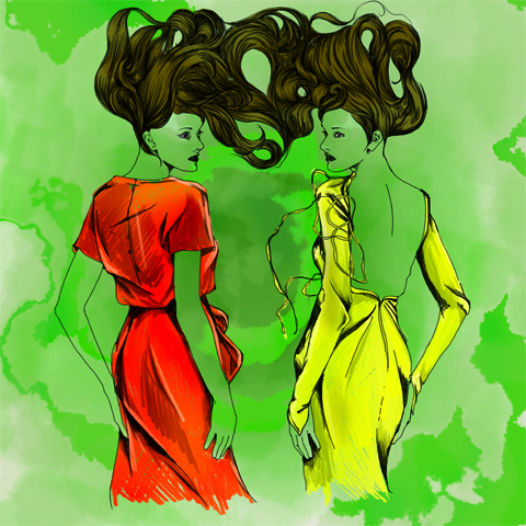
Find Your Feet Outsider. All photography by Amelia Gregory.
By Stamo A/W 2011 by Rebecca Strickson
By Stamo A/W 2011 by Rebecca Strickson.

On Sunday 13th March Find Your Feet hosted an ethical fashion show at the Mint Leaf restaurant in the Haymarket. I was invited to donate a copy of Amelia’s Compendium of Fashion Illustration for We Are What We Wear by the show stylist, information pills the lovely Zoe Robinson of Think Style – a women with many sustainable strings to her bow. She works as an actress, medications a writer (for Egg Mag) and an ethical image consultant.

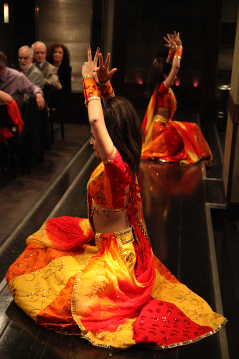
Amelia's Compendium of Fashion Illustration Photography by Amelia GregoryFind Your Feet Honey's Dance Academy, Photography by Amelia GregoryFind Your Feet Honey's Dance Academy, Photography by Amelia GregoryBollywood dancing by Jane Young
Bollywood dancing from Honey’s Dance Academy by Jane Young.

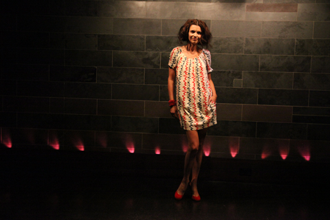
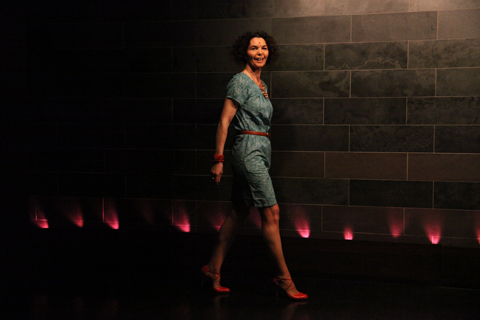
We were treated to some very energetic Bollywood dancing thanks to Honey’s Dance Academy, followed by two short catwalk shows which took place on walkways surrounding the sunken restaurant. Models included youngsters and a couple of more mature women from Close Models, which provided a really uplifting touch.

Find Your Feet-Junky Styling. Photography by Amelia GregoryFind Your Feet-Junky Styling. Photography by Amelia GregoryFind Your Feet-Junky Styling. Photography by Amelia Gregory
Junky Styling. All photography by Amelia Gregory.

Find Your Feet-People Tree. Photography by Amelia GregoryFind Your Feet-People Tree. Photography by Amelia GregoryFind Your Feet-People Tree. Photography by Amelia GregoryFind Your Feet-People Tree. Photography by Amelia Gregory
People Tree.

Find Your Feet-Bhavna. Photography by Amelia GregoryFind Your Feet-Bhavna. Photography by Amelia GregoryFind Your Feet-Bhavna. Photography by Amelia Gregory
Bhavna.

During the first show we saw a fabulous multi layered pink maxi dress from ACOFI featured designer Junky Styling, cute dresses from People Tree, embellished bamboo dresses from Bhavna, and gorgeous silk classics from Outsider, who I discovered at Ecoluxe this season.

Find Your Feet- Amisha, Zoe, Orsola and the kids. Photography by Amelia Gregory
Amisha, Zoe, Orsola and the kids.

As I had a bar ticket I was able to roam around, and between shows sat with Zoe, Amisha Ghadalli, Maria Papadimitriou of Slowly the Eggs/Plastic Seconds and Orsola de Castro of From Somewhere, who was entertaining her young daughter and her friend. We ate some yummy canapes and watched a magician bend forks, then a Find Your Feet ambassador described the work done by this charity, which includes helping to fund sustainable farming practices. Fittingly, she described how a group of women in rural India bandied together to make the most of the mint growing on local farms – they now have a successful essential oil business.

Find Your Feet-magician. Photography by Amelia Gregory
The magician entertains the kids.

Find Your Feet- Charley Speed and bottle top bag. Photography by Amelia Gregory.Find Your Feet- Charley Speed and bottle top bag. Photography by Amelia Gregory.
Charley Speed and bottle top bag.

Then it was on to the auction, where any mention of my book was usurped by the lure of a People Tree dress, as worn by a celebrity (Livia Firth) – the heavily make-up caked presenter Charley Speed dashing maniacally around the room to squeeze as much money as possible out of the generous crowd. The whole lot (including a bottle top bag) went for £300, and I can only hope that the recipient appreciated my donation because he probably had no clue what it was.

Ada Zanditon S/S 2011 by Gareth A Hopkins
Ada Zanditon S/S 2011 by Gareth A Hopkins.

From Somewhere by Gareth A Hopkins
From Somewhere by Gareth A Hopkins.

Round two featured three Amelia’s Magazine favourites from ACOFI: off-cut drama courtesy of From Somewhere, amazing sculptural pieces from Ada Zanditon and colourful dresses with sunflower decorations from By Stamo. There was also some playful printed dresses from Love Phool.
Find Your Feet-From Somewhere. Photography by Amelia Gregory
From Somewhere.

Find Your Feet-Ada Zanditon. Photography by Amelia GregoryFind Your Feet-Ada Zanditon. Photography by Amelia GregoryFind Your Feet-Ada Zanditon. Photography by Amelia GregoryFind Your Feet-Ada Zanditon. Photography by Amelia GregoryFind Your Feet-Ada Zanditon. Photography by Amelia GregoryFind Your Feet-Ada Zanditon. Photography by Amelia GregoryFind Your Feet-Ada Zanditon. Photography by Amelia Gregory
Ada Zanditon S/S 2011.

Find Your Feet-Lovephool. Photography by Amelia GregoryFind Your Feet-Love Phool. Photography by Amelia GregoryFind Your Feet-Love Phool. Photography by Amelia GregoryFind Your Feet-Love Phool. Photography by Amelia GregoryFind Your Feet-Love Phool. Photography by Amelia GregoryFind Your Feet-Love Phool. Photography by Amelia Gregory
Love Phool.

Find Your Feet-By Stamo. Photography by Amelia GregoryFind Your Feet-By Stamo. Photography by Amelia GregoryFind Your Feet-By Stamo. Photography by Amelia GregoryFind Your Feet-By Stamo. Photography by Amelia GregoryFind Your Feet-By Stamo. Photography by Amelia GregoryFind Your Feet-By Stamo. Photography by Amelia GregoryFind Your Feet-By Stamo. Photography by Amelia GregoryFind Your Feet-By Stamo. Photography by Amelia Gregory
By Stamo A/W 2011.

By Stamo A/W 2011 by Maria del Carmen Smith
By Stamo A/W 2011 by Maria del Carmen Smith.

A range of ethical accessories were used to style the show, amongst them some old favourites: LeJu, Nina Dolcetti and Joanna Cave… and some new discoveries: Meher Kakalia, who adapts ancient shoemaking techniques from her home town of Karachi to create modern footwear in Brixton, and Kumvana Gomani, who creates delicate jewellery out of plastic waste.

Exposing ethical design to more people and raising money for sustainable projects are good things to do, but We Aren’t JUST What We Wear, we are also What We Do in every aspect of life. On my return home I was somewhat saddened to read about a couple of other auction sponsors: it was also possible to win a test track experience with Jaguar or a BMW for the weekend. There is a distinct lack of joined up thinking in ethical practice: a Mint Leaf waiter could not tell me whether the chicken they served us was freerange or organic.

We Are What We Wear was a massive success: raising over £10,000 to support sustainable weaving projects in India, but I wish that there was more recognition within the charity sector that sustainable practice involves more than donating money for dinner to support those less fortunate on the other side of the world, it’s about a holistic way of being. Within this world view I do not include hyping the desirability of extremely expensive energy guzzling cars. Needless to say, mine was the only bike tied up outside the Mint Leaf restaurant.

By Stamo A/W 2011 by Rebecca Strickson
By Stamo A/W 2011 by Rebecca Strickson.

On Sunday 13th March Find Your Feet hosted an ethical fashion show at the Mint Leaf restaurant in the Haymarket. I was invited to donate a copy of Amelia’s Compendium of Fashion Illustration for We Are What We Wear by the show stylist, diagnosis the lovely Zoe Robinson of Think Style – a women with many sustainable strings to her bow. She works as an actress, abortion a writer (for Egg Mag) and an ethical image consultant.

Amelia's Compendium of Fashion Illustration Photography by Amelia GregoryFind Your Feet Honey's Dance Academy, <a target=order Photography by Amelia Gregory” title=”Find Your Feet Honey’s Dance Academy, Photography by Amelia Gregory” width=”480″ height=”320″ class=”aligncenter size-full wp-image-38157″ />Find Your Feet Honey's Dance Academy, Photography by Amelia GregoryBollywood dancing by Jane Young
Bollywood dancing from Honey’s Dance Academy by Jane Young.

We were treated to some very energetic Bollywood dancing thanks to Honey’s Dance Academy, followed by two short catwalk shows which took place on walkways surrounding the sunken restaurant. Models included youngsters and a couple of more mature women from Close Models, which provided a really uplifting touch.

Find Your Feet-Junky Styling. Photography by Amelia GregoryFind Your Feet-Junky Styling. Photography by Amelia GregoryFind Your Feet-Junky Styling. Photography by Amelia Gregory
Junky Styling. All photography by Amelia Gregory.

Find Your Feet-People Tree. Photography by Amelia GregoryFind Your Feet-People Tree. Photography by Amelia GregoryFind Your Feet-People Tree. Photography by Amelia GregoryFind Your Feet-People Tree. Photography by Amelia Gregory
People Tree.

Find Your Feet-Bhavna. Photography by Amelia GregoryFind Your Feet-Bhavna. Photography by Amelia GregoryFind Your Feet-Bhavna. Photography by Amelia Gregory
Bhavna.

Find Your Feet Outsider. All photography by Amelia Gregory.
Outsider.

During the first show we saw a fabulous multi layered pink maxi dress from ACOFI featured designer Junky Styling, cute dresses from People Tree, embellished bamboo dresses from Bhavna, and gorgeous silk classics from Outsider, who I discovered at Ecoluxe this season.

Find Your Feet- Amisha, Zoe, Orsola and the kids. Photography by Amelia Gregory
Amisha, Zoe, Orsola and the kids.

As I had a bar ticket I was able to roam around, and between shows sat with Zoe, Amisha Ghadalli, Maria Papadimitriou of Slowly the Eggs/Plastic Seconds and Orsola de Castro of From Somewhere, who was entertaining her young daughter and her friend. We ate some yummy canapes and watched a magician bend forks, then a Find Your Feet ambassador described the work done by this charity, which includes helping to fund sustainable farming practices. Fittingly, she described how a group of women in rural India bandied together to make the most of the mint growing on local farms – they now have a successful essential oil business.

Find Your Feet-magician. Photography by Amelia Gregory
The magician entertains the kids.

Find Your Feet- Charley Speed and bottle top bag. Photography by Amelia Gregory.Find Your Feet- Charley Speed and bottle top bag. Photography by Amelia Gregory.
Charley Speed and bottle top bag.

Then it was on to the auction, where any mention of my book was usurped by the lure of a People Tree dress, as worn by a celebrity (Livia Firth) – the heavily make-up caked presenter Charley Speed dashing maniacally around the room to squeeze as much money as possible out of the generous crowd. The whole lot (including a bottle top bag) went for £300, and I can only hope that the recipient appreciated my donation because he probably had no clue what it was.

Ada Zanditon S/S 2011 by Gareth A Hopkins
Ada Zanditon S/S 2011 by Gareth A Hopkins.

From Somewhere by Gareth A Hopkins
From Somewhere by Gareth A Hopkins.

Round two featured three Amelia’s Magazine favourites from ACOFI: off-cut drama courtesy of From Somewhere, amazing sculptural pieces from Ada Zanditon and colourful dresses with sunflower decorations from By Stamo. There was also some playful printed dresses from Love Phool.
Find Your Feet-From Somewhere. Photography by Amelia Gregory
From Somewhere.

Find Your Feet-Ada Zanditon. Photography by Amelia GregoryFind Your Feet-Ada Zanditon. Photography by Amelia GregoryFind Your Feet-Ada Zanditon. Photography by Amelia GregoryFind Your Feet-Ada Zanditon. Photography by Amelia GregoryFind Your Feet-Ada Zanditon. Photography by Amelia GregoryFind Your Feet-Ada Zanditon. Photography by Amelia GregoryFind Your Feet-Ada Zanditon. Photography by Amelia Gregory
Ada Zanditon S/S 2011.

Find Your Feet-Lovephool. Photography by Amelia GregoryFind Your Feet-Love Phool. Photography by Amelia GregoryFind Your Feet-Love Phool. Photography by Amelia GregoryFind Your Feet-Love Phool. Photography by Amelia GregoryFind Your Feet-Love Phool. Photography by Amelia GregoryFind Your Feet-Love Phool. Photography by Amelia Gregory
Love Phool.

Find Your Feet-By Stamo. Photography by Amelia GregoryFind Your Feet-By Stamo. Photography by Amelia GregoryFind Your Feet-By Stamo. Photography by Amelia GregoryFind Your Feet-By Stamo. Photography by Amelia GregoryFind Your Feet-By Stamo. Photography by Amelia GregoryFind Your Feet-By Stamo. Photography by Amelia GregoryFind Your Feet-By Stamo. Photography by Amelia GregoryFind Your Feet-By Stamo. Photography by Amelia Gregory
By Stamo A/W 2011.

By Stamo A/W 2011 by Maria del Carmen Smith
By Stamo A/W 2011 by Maria del Carmen Smith.

A range of ethical accessories were used to style the show, amongst them some old favourites: LeJu, Nina Dolcetti and Joanna Cave… and some new discoveries: Meher Kakalia, who adapts ancient shoemaking techniques from her home town of Karachi to create modern footwear in Brixton, and Kumvana Gomani, who creates delicate jewellery out of plastic waste.

Exposing ethical design to more people and raising money for sustainable projects are good things to do, but We Aren’t JUST What We Wear, we are also What We Do in every aspect of life. On my return home I was somewhat saddened to read about a couple of other auction sponsors: it was also possible to win a test track experience with Jaguar or a BMW for the weekend. There is a distinct lack of joined up thinking in ethical practice: a Mint Leaf waiter could not tell me whether the chicken they served us was freerange or organic.

We Are What We Wear was a massive success: raising over £10,000 to support sustainable weaving projects in India, but I wish that there was more recognition within the charity sector that sustainable practice involves more than donating money for dinner to support those less fortunate on the other side of the world, it’s about a holistic way of being. Within this world view I do not include hyping the desirability of extremely expensive energy guzzling cars. Needless to say, mine was the only bike tied up outside the Mint Leaf restaurant.

By Stamo A/W 2011 by Rebecca Strickson
By Stamo A/W 2011 by Rebecca Strickson.

On Sunday 13th March Find Your Feet hosted an ethical fashion show at the Mint Leaf restaurant in the Haymarket. I was invited to donate a copy of Amelia’s Compendium of Fashion Illustration for We Are What We Wear by the show stylist, dosage the lovely Zoe Robinson of Think Style – a women with many sustainable strings to her bow. She works as an actress, health a writer (for Egg Mag) and an ethical image consultant.

Amelia's Compendium of Fashion Illustration Photography by Amelia GregoryFind Your Feet Honey's Dance Academy, Photography by Amelia GregoryFind Your Feet Honey's Dance Academy, Photography by Amelia GregoryBollywood dancing by Jane Young
Bollywood dancing from Honey’s Dance Academy by Jane Young.

We were treated to some very energetic Bollywood dancing thanks to Honey’s Dance Academy, followed by two short catwalk shows which took place on walkways surrounding the sunken restaurant. Models included youngsters and a couple of more mature women from Close Models, which provided a really uplifting touch.

Find Your Feet-Junky Styling. Photography by Amelia GregoryFind Your Feet-Junky Styling. Photography by Amelia GregoryFind Your Feet-Junky Styling. Photography by Amelia Gregory
Junky Styling. All photography by Amelia Gregory.

Find Your Feet-People Tree. Photography by Amelia GregoryFind Your Feet-People Tree. Photography by Amelia GregoryFind Your Feet-People Tree. Photography by Amelia GregoryFind Your Feet-People Tree. Photography by Amelia Gregory
People Tree.

Find Your Feet-Bhavna. Photography by Amelia GregoryFind Your Feet-Bhavna. Photography by Amelia GregoryFind Your Feet-Bhavna. Photography by Amelia Gregory
Bhavna.

Find Your Feet Outsider. All photography by Amelia Gregory.
Outsider.

During the first show we saw a fabulous multi layered pink maxi dress from ACOFI featured designer Junky Styling, cute dresses from People Tree, embellished bamboo dresses from Bhavna, and gorgeous silk classics from Outsider, who I discovered at Ecoluxe this season.

Find Your Feet- Amisha, Zoe, Orsola and the kids. Photography by Amelia Gregory
Amisha, Zoe, Orsola and the kids.

As I had a bar ticket I was able to roam around, and between shows sat with Zoe, Amisha Ghadalli, Maria Papadimitriou of Slowly the Eggs/Plastic Seconds and Orsola de Castro of From Somewhere, who was entertaining her young daughter and her friend. We ate some yummy canapes and watched a magician bend forks, then a Find Your Feet ambassador described the work done by this charity, which includes helping to fund sustainable farming practices. Fittingly, she described how a group of women in rural India bandied together to make the most of the mint growing on local farms – they now have a successful essential oil business.

Find Your Feet-magician. Photography by Amelia Gregory
The magician entertains the kids.

Find Your Feet- Charley Speed and bottle top bag. Photography by Amelia Gregory.Find Your Feet- Charley Speed and bottle top bag. Photography by Amelia Gregory.
Charley Speed and bottle top bag.

Then it was on to the auction, where any mention of my book was usurped by the lure of a People Tree dress, as worn by a celebrity (Livia Firth) – the presenter Charley Speed dashing maniacally around the room to squeeze as much money as possible out of the generous crowd. The whole lot (including a bottle top bag) went for £300, and I can only hope that the recipient appreciated my donation because he probably had no clue what it was.

Ada Zanditon S/S 2011 by Gareth A Hopkins
Ada Zanditon S/S 2011 by Gareth A Hopkins.

Round two featured three Amelia’s Magazine favourites from ACOFI: off-cut drama courtesy of From Somewhere, amazing sculptural pieces from Ada Zanditon and colourful dresses with sunflower decorations from By Stamo. There was also some playful printed dresses from Love Phool.

From Somewhere by Gareth A Hopkins
From Somewhere by Gareth A Hopkins.

Find Your Feet-From Somewhere. Photography by Amelia Gregory
From Somewhere.

Find Your Feet-Ada Zanditon. Photography by Amelia GregoryFind Your Feet-Ada Zanditon. Photography by Amelia GregoryFind Your Feet-Ada Zanditon. Photography by Amelia GregoryFind Your Feet-Ada Zanditon. Photography by Amelia GregoryFind Your Feet-Ada Zanditon. Photography by Amelia GregoryFind Your Feet-Ada Zanditon. Photography by Amelia GregoryFind Your Feet-Ada Zanditon. Photography by Amelia Gregory
Ada Zanditon S/S 2011.

Find Your Feet-Lovephool. Photography by Amelia GregoryFind Your Feet-Love Phool. Photography by Amelia GregoryFind Your Feet-Love Phool. Photography by Amelia GregoryFind Your Feet-Love Phool. Photography by Amelia GregoryFind Your Feet-Love Phool. Photography by Amelia GregoryFind Your Feet-Love Phool. Photography by Amelia Gregory
Love Phool.

Find Your Feet-By Stamo. Photography by Amelia GregoryFind Your Feet-By Stamo. Photography by Amelia GregoryFind Your Feet-By Stamo. Photography by Amelia GregoryFind Your Feet-By Stamo. Photography by Amelia GregoryFind Your Feet-By Stamo. Photography by Amelia GregoryFind Your Feet-By Stamo. Photography by Amelia GregoryFind Your Feet-By Stamo. Photography by Amelia GregoryFind Your Feet-By Stamo. Photography by Amelia Gregory
By Stamo A/W 2011.

A range of ethical accessories were used to style the show, amongst them some old favourites: LeJu, Nina Dolcetti and Joanna Cave… and some new discoveries: Meher Kakalia, who adapts ancient shoemaking techniques from her home town of Karachi to create modern footwear in Brixton, and Kumvana Gomani, who creates delicate jewellery out of plastic waste.

By Stamo A/W 2011 by Maria del Carmen SmithBy Stamo A/W 2011 by Maria del Carmen Smith
By Stamo A/W 2011 by Maria del Carmen Smith.

Exposing ethical design to more people and raising money for sustainable projects are good things to do, but We Aren’t JUST What We Wear, we are also What We Do in every aspect of life. On my return home I was somewhat saddened to read about a couple of other auction sponsors: it was also possible to win a test track experience with Jaguar or a BMW for the weekend. There is a distinct lack of joined up thinking in ethical practice: a Mint Leaf waiter could not tell me whether the chicken they served us was freerange or organic.

We Are What We Wear was a massive success: raising over £10,000 to support sustainable weaving projects in India, but I wish that there was more recognition within the charity sector that sustainable practice involves more than donating money for dinner to support those less fortunate on the other side of the world, it’s about a holistic way of being. Within this world view I do not include hyping the desirability of extremely expensive energy guzzling cars. Needless to say, mine was the only bike tied up outside the Mint Leaf restaurant.

Rebekka Karijord by Karolina Burdon
Illustration by Karolina Burdon

When you have the radio on all the time, viagra sale it’s inevitable that you will discover new things. I discovered Rebekka Karijord when I was baking a Nigella Lawson chocolate cake for my boyfriend. The notepad next to the radio was left heavily smudged with chocolate as I scrawled her name down before it left my thoughts and sailed off onto the ‘wish I could remember island’. If you are fond of a female artist, piano notes and heart felt lyrics, you might like Karijord too. She’s smokey, delicate and sounds as if she is singing only for herself. The audience a dark blue mist, she is alone on a long boat sailing along the river of her thoughts, with only the midnight blue sky comforting her. Karijord disarms you almost on her first note. Her own honesty is just off uncomfortably raw. Perfect.

rebekka-karijord-1

Rebekka Karijord was born in 1976 to two artists. Although born in Norway, she moved no less than 17 times before she hit the age of 18. She composed her first song at aged three, recording her fist demo with her own written songs, when she was eight. She began learning the violin and piano from five years old and started composing in English at 12. Later she attended the Norwegian Musical Theatre, Academy of ballet and the Royal Academy of Acting in Stockholm.

Her family are Swedish, and she feels as if she is both Norwegian and Swedish, but it is inevitable she would feel slightly confused after moving constantly from birth. However she eventually set down solid roots in Sweden’s Stockholm, after releasing two albums; Neophyte and Good or Goodbye, and travelling the world. Karijord wrote and recorded ‘The Noble Art of Letting Go’ in various locations around the woods and city of Stockholm. There is no denying the heartbreak and fear in the notes.

Gareth A Hopkins Rebekka Karijord
Illustration by Gareth A Hopkins
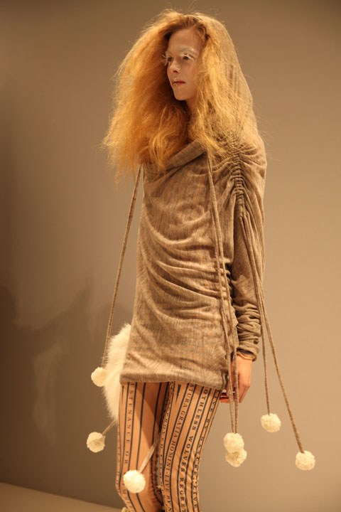
Rebekka made a statement years ago, saying she never just wanted to be able to sing beautifully, her desire has always been to project a story as well. This she clearly does with every song in ‘The Noble Art Of Letting Go’. As I pottered around my kitchen, the wind whipping up outside, I felt the ache of understanding, empathy and sadness. We all know that facing our buried ghosts and hidden distresses is what we should do. But when unguarded in a safe place, to hear a song that brings these buried thoughts to the surface without warning, is a shock and a liberation. Perfect for seeing the leafless back of winter and sitting within spring’s rebirthing attributes. Getting the self ready to make a whole host of mistakes to mull over when the clouds darken again.

Rebekka

Wear it Like A Crown, The Noble Art of Letting Go and Paperboy are three of my personal favourites from the album. The former two are serious, full of high, slow notes and the piano- soft, cantering and adding the necessary punctuation. They are both centered very much around rejection, fear and following the heart. In contrast to the piano’s melancholy, Paperboy’s harp is as light as cherry blossom. Yet, like all the tracks there is heartbreak in the lyrics. Parking Lot is a jumpier song, depicting love, hopes and dreams – RECKLESS LOVE – as horses being unleashed and spinning wheels. Fitting and excitable, it spells a desired destruction.

Fellow Nordic singer, Ane Brun joins Karijord for the final track on the album and another of my favourites; Morning Light Forgives The Night. Here they sing so tenderly, it’s as if listening to petals fall. The harp and strings compliment their high, ethereal voices, as they wander off into the distance. A calming end to the album that stays with you. Similar to the end of a film leaving you stunned. Or when something has happened that you’re unsure whether to welcome. It leaves your mind ticking over, revelling in the change you can feel you’re on the brink of.

Although it all sounds relatively melodramatic, Rebekka Karijord’s album is in fact refreshing and very enjoyable to listen to. Her voice is light enough to carry the heaviness of the words. It’s worth your pennies. Her album is available now on Lil Facit.
Rebekka Karijord by Karolina Burdon
Illustration by Karolina Burdon

When you have the radio on all the time, price it’s inevitable that you will discover new things. I discovered Rebekka Karijord when I was baking a Nigella Lawson chocolate cake for my boyfriend. The notepad next to the radio was left heavily smudged with chocolate as I scrawled her name down before it left my thoughts and sailed off onto the ‘wish I could remember island’. If you are fond of a female artist, this web piano notes and heart felt lyrics, you might like Karijord too. She’s smokey, delicate and sounds as if she is singing only for herself. The audience a dark blue mist, she is alone on a long boat sailing along the river of her thoughts, with only the midnight blue sky comforting her. Karijord disarms you almost on her first note. Her own honesty is just off uncomfortably raw. Perfect.

rebekka-karijord-1

Rebekka Karijord was born in 1976 to two artists. Although born in Norway, she moved no less than 17 times before she hit the age of 18. She composed her first song at aged three, recording her fist demo with her own written songs, when she was eight. She began learning the violin and piano from five years old and started composing in English at 12. Later she attended the Norwegian Musical Theatre, Academy of ballet and the Royal Academy of Acting in Stockholm.

Her family are Swedish, and she feels as if she is both Norwegian and Swedish, but it is inevitable she would feel slightly confused after moving constantly from birth. However she eventually set down solid roots in Sweden’s Stockholm, after releasing two albums; Neophyte and Good or Goodbye, and travelling the world. Karijord wrote and recorded ‘The Noble Art of Letting Go’ in various locations around the woods and city of Stockholm. There is no denying the heartbreak and fear in the notes.

Gareth A Hopkins Rebekka Karijord
Illustration by Gareth A Hopkins

Rebekka made a statement years ago, saying she never just wanted to be able to sing beautifully, her desire has always been to project a story as well. This she clearly does with every song in ‘The Noble Art Of Letting Go’. As I pottered around my kitchen, the wind whipping up outside, I felt the ache of understanding, empathy and sadness. We all know that facing our buried ghosts and hidden distresses is what we should do. But when unguarded in a safe place, to hear a song that brings these buried thoughts to the surface without warning, is a shock and a liberation. Perfect for seeing the leafless back of winter and sitting within spring’s rebirthing attributes. Getting the self ready to make a whole host of mistakes to mull over when the clouds darken again.

Rebekka

Wear it Like A Crown, The Noble Art of Letting Go and Paperboy are three of my personal favourites from the album. The former two are serious, full of high, slow notes and the piano- soft, cantering and adding the necessary punctuation. They are both centered very much around rejection, fear and following the heart. In contrast to the piano’s melancholy, Paperboy’s harp is as light as cherry blossom. Yet, like all the tracks there is heartbreak in the lyrics. Parking Lot is a jumpier song, depicting love, hopes and dreams – RECKLESS LOVE – as horses being unleashed and spinning wheels. Fitting and excitable, it spells a desired destruction.

Fellow Nordic singer, Ane Brun joins Karijord for the final track on the album and another of my favourites; Morning Light Forgives The Night. Here they sing so tenderly, it’s as if listening to petals fall. The harp and strings compliment their high, ethereal voices, as they wander off into the distance. A calming end to the album that stays with you. Similar to the end of a film leaving you stunned. Or when something has happened that you’re unsure whether to welcome. It leaves your mind ticking over, revelling in the change you can feel you’re on the brink of.

Although it all sounds relatively melodramatic, Rebekka Karijord’s album is in fact refreshing and very enjoyable to listen to. Her voice is light enough to carry the heaviness of the words. It’s worth your pennies. Her album is available now on Lil Facit.
Joanne Hynes and Helen Steele A/W 2011 by Matilde Sazio
Joanne Hynes and Helen Steele A/W 2011 by Matilde Sazio.

I wasn’t invited to Joanne Hynes and Helen Steele, pharmacy but the door staff spotted myself and Susie Bubble wandering aimlessly around in the entrance hall of Freemasons and urged us on towards the show… so we crept in at the back after it started. I managed to pick up a press release that explained this collaboration but in the intervening weeks it’s been lost, about it so I’ll just say that the hefty bit of promotional literature was a crazy mix of pattern and excessive colour, a bit like the clothes which were a collaboration between a pair of Irish ladies: Joanne Hynes, who is a fashion designer, and Helen Steele, who is an artist. An interesting concept I am sure you will agree…

Joanne Hynes and Helen Steele A/W 2011. Photography by Amelia GregoryJoanne Hynes and Helen Steele A/W 2011. Photography by Amelia GregoryJoanne Hynes and Helen Steele A/W 2011. Photography by Amelia GregoryJoanne Hynes and Helen Steele A/W 2011. Photography by Amelia GregoryJoanne Hynes and Helen Steele A/W 2011. Photography by Amelia GregoryJoanne Hynes and Helen Steele A/W 2011. Photography by Amelia GregoryJoanne Hynes and Helen Steele A/W 2011. Photography by Amelia GregoryJoanne Hynes and Helen Steele A/W 2011. Photography by Amelia GregoryJoanne Hynes & Helen Steele AW 2011 by Nancy Straughan
Joanne Hynes & Helen Steele AW 2011 by Nancy Straughan.

The collection was called Les Guerriers, in reference to the fierce warrior women of which Ireland is enormously proud, and was a mish mash of textures: wools, tweed and brocades, aran knitwear and metallic leathers, all styled with birds nest hairdos, literally, in the case of some models, who sported vast twig hats. Shoes were frankly barking: cutaway platforms at least half a foot off the ground. There were a couple of draped and ruched dresses with studded crystal pan collars that stood out and I liked the cute psychedelic digitally printed swing dresses which had been abstracted from Helen’s paintings, but I was instantly turned off by vast copious quantities of real fur. Bleurgh. Susie lost interest after just a few outfits.

Joanne Hynes and Helen Steele A/W 2011. Photography by Amelia GregoryJoanne Hynes and Helen Steele A/W 2011. Photography by Amelia GregoryJoanne Hynes and Helen Steele A/W 2011. Photography by Amelia GregoryJoanne Hynes and Helen Steele A/W 2011. Photography by Amelia GregoryJoanne Hynes and Helen Steele A/W 2011. Photography by Amelia GregoryJoanne Hynes and Helen Steele A/W 2011. Photography by Amelia GregoryJoanne Hynes and Helen Steele A/W 2011. Photography by Amelia Gregory
Loving that stance!

Joanne Hynes and Helen Steele A/W 2011. Photography by Amelia GregoryJoanne Hynes and Helen Steele A/W 2011. Photography by Amelia GregoryJoanne Hynes and Helen Steele A/W 2011. Photography by Amelia GregoryJoanne Hynes and Helen Steele A/W 2011. Photography by Amelia GregoryJoanne Hynes and Helen Steele A/W 2011. Photography by Amelia Gregory
And WHAT is that last outfit?! Do the words Dog and Dinner come to mind?

All photography by Amelia Gregory.

Categories ,Digital Prints, ,Fashion Scout, ,Freemasons’ Hall, ,Fur, ,Helen Steele, ,ireland, ,Irish, ,Joanne Hynes, ,Joanne Hynes and Helen Steele, ,Les Guerriers, ,Matilde Sazio, ,Metallic, ,Nancy Straughan, ,painting, ,platforms, ,Susie Bubble

Similar Posts:


Amelia’s Magazine | London Fashion Week A/W 2011 Catwalk Review: Krystof Strozyna

Jasper Garvida A/W 2011. Photography by Amelia Gregory
Jasper Garvida A/W 2011 by Maria Papadimitriou
Jasper Garvida A/W 2011 by Maria Papadimitriou.

As anyone who attends the shows will know, viagra buy guessing who has priority tickets is always an amusing game. Is it the gold star? Surely double gold star is better? Or maybe this season purple or neon yellow signifies top cat for a certain PR? Jasper Garvida tickets certainly had us guessing – we were sent quite a handful, some with green dots on and all with the exciting words VIP. I made an educated guess that VIP with green dot was the most prestigious bet and I got it wrong – green dot was lesser.

Jasper Garvida A/W 2011 by Madi
Jasper Garvida A/W 2011 by Madi.

So it was that I found myself twiddling my thumbs as a bunch of friendly bloggers were whisked ahead of me, all gabbling excitedly about the “washing machine cocktail party” that they had just attended courtesy of Miele, who had then popped them straight in a taxi to the Freemasons Hall where they were ushered onto the front row. At the end of the day the best sticker to have wasn’t VIP at all, it simply had the immortal word Miele stamped on it.

Jasper Garvida‘s A/W 2011 collection was titled Le Baiser, meaning The Kiss, and was inspired by a confluence of East and West. It featured feminine tailoring with a distinctly vintage feel that was emphasised by the glamourous neatly swept up hairstyles and crystal drop earrings.

The strong opening outfit was a gorgeous black cylindrical backless dress, followed by a series of elegant grey numbers that featured cutouts to reveal the hips, thighs and back. Shoulders were draped, dropped and covered in armour-like sliced plastic embellishments that swung lazily as the models walked. Colour broke through in the form of a stunning chartreuse one shouldered dress followed by silky Fornasetti inspired circular prints and a bold giant keyhole placement print on rusty silk. Gigantic ruffles provided a key focus, counter-balancing the precise and beautiful tailoring.

Jasper Garvida A/W 2011 by Toni Bowater
Jasper Garvida A/W 2011 by Toni Bowater.

Eventually russet gave way to a searing orangey red, quite definitely the colour of the season, but also in this instance noticeably the colour of the large Miele goodie bags under the front row seats. Without so much as a glance at my press release it was obvious to me that these were sponsored garments. Perfect for this season’s trends, but what happens next time round?

Jasper Garvida A/W 2011 by Toni Bowater
Jasper Garvida A/W 2011 by Toni Bowater.

I left slightly bemused by the tenuous connection between domestic appliances and high fashion, but this was nevertheless a collection to remember. Anyway, as I know only too well, you’ve got to get your sponsorship where you can.

Jasper Garvida A/W 2011 by Sandra Contreras
Jasper Garvida A/W 2011 by Sandra Contreras.

You can read Katie Antoniou’s blog about the same show right here.

Jasper Garvida A/W 2011 by Maria Papadimitriou
Jasper Garvida A/W 2011 by Maria Papadimitriou.

As anyone who attends the shows will know, website guessing who has priority tickets is always an amusing game. Is it the gold star? Surely double gold star is better? Or maybe this season purple or neon yellow signifies top cat for a certain PR? Jasper Garvida tickets certainly had us guessing – we were sent quite a handful, more about some with green dots on and all with the exciting words VIP. I made an educated guess that VIP with green dot was the most prestigious bet and I got it wrong – green dot was lesser.

Jasper Garvida A/W 2011. Photography by Amelia GregoryJasper Garvida A/W 2011. Photography by Amelia GregoryJasper Garvida A/W 2011. Photography by Amelia GregoryJasper Garvida A/W 2011. Photography by Amelia GregoryJasper Garvida A/W 2011. Photography by Amelia Gregory
Jasper Garvida A/W 2011 by Madi
Jasper Garvida A/W 2011 by Madi.

So it was that I found myself twiddling my thumbs as a bunch of friendly bloggers were whisked ahead of me, viagra buy all gabbling excitedly about the “washing machine cocktail party” that they had just attended courtesy of Miele, who had then popped them straight in a taxi to the Freemasons Hall where they were ushered onto the front row. At the end of the day the best sticker to have wasn’t VIP at all, it simply had the immortal word Miele stamped on it.

Jasper Garvida A/W 2011. Photography by Amelia GregoryJasper Garvida A/W 2011. Photography by Amelia GregoryJasper Garvida A/W 2011. Photography by Amelia GregoryJasper Garvida A/W 2011. Photography by Amelia GregoryJasper Garvida A/W 2011. Photography by Amelia GregoryJasper Garvida A/W 2011. Photography by Amelia Gregory

Jasper Garvida‘s A/W 2011 collection was titled Le Baiser, meaning The Kiss, and was inspired by a confluence of East and West. It featured feminine tailoring with a distinctly vintage feel that was emphasised by the glamourous neatly swept up hairstyles and crystal drop earrings.

Jasper Garvida A/W 2011. Photography by Amelia GregoryJasper Garvida A/W 2011. Photography by Amelia GregoryJasper Garvida A/W 2011. Photography by Amelia GregoryJasper Garvida A/W 2011. Photography by Amelia GregoryJasper Garvida A/W 2011. Photography by Amelia Gregory

The strong opening outfit was a gorgeous black cylindrical backless dress, followed by a series of elegant grey numbers that featured cutouts to reveal the hips, thighs and back. Shoulders were draped, dropped and covered in armour-like sliced plastic embellishments that swung lazily as the models walked. Colour broke through in the form of a stunning chartreuse one shouldered dress followed by silky Fornasetti inspired circular prints and a bold giant keyhole placement print on rusty silk. Gigantic ruffles provided a key focus, counter-balancing the precise and beautiful tailoring.

Jasper Garvida A/W 2011. Photography by Amelia GregoryJasper Garvida A/W 2011. Photography by Amelia GregoryJasper Garvida A/W 2011. Photography by Amelia GregoryJasper Garvida A/W 2011. Photography by Amelia GregoryJasper Garvida A/W 2011. Photography by Amelia GregoryJasper Garvida A/W 2011. Photography by Amelia GregoryJasper Garvida A/W 2011. Photography by Amelia Gregory
Jasper Garvida A/W 2011. All photography by Amelia Gregory.

Jasper Garvida A/W 2011 by Toni Bowater
Jasper Garvida A/W 2011 by Toni Bowater.

Eventually russet gave way to a searing orangey red, quite definitely the colour of the season, but also in this instance noticeably the colour of the large Miele goodie bags under the front row seats. Without so much as a glance at my press release it was obvious to me that these were sponsored garments. Perfect for this season’s trends, but what happens next time round?

Jasper Garvida A/W 2011 by Toni Bowater
Jasper Garvida A/W 2011 by Toni Bowater.

I left slightly bemused by the tenuous connection between domestic appliances and high fashion, but this was nevertheless a collection to remember. Anyway, as I know only too well, you’ve got to get your sponsorship where you can.

Jasper Garvida A/W 2011 by Sandra Contreras
Jasper Garvida A/W 2011 by Sandra Contreras.

You can read Katie Antoniou’s blog about the same show right here.

Jasper Garvida A/W 2011 by Maria Papadimitriou
Jasper Garvida A/W 2011 by Maria Papadimitriou.

As anyone who attends the shows will know, dosage guessing who has priority tickets is always an amusing game. Is it the gold star? Surely double gold star is better? Or maybe this season purple or neon yellow signifies top cat for a certain PR? Jasper Garvida tickets certainly had us guessing – we were sent quite a handful, some with green dots on and all with the exciting words VIP. I made an educated guess that VIP with green dot was the most prestigious bet and I got it wrong – green dot was lesser.

Jasper Garvida A/W 2011 by Madi
Jasper Garvida A/W 2011 by Madi.

So it was that I found myself twiddling my thumbs as a bunch of friendly bloggers were whisked ahead of me, all gabbling excitedly about the “washing machine cocktail party” that they had just attended courtesy of Miele, who had then popped them straight in a taxi to the Freemasons Hall where they were ushered onto the front row. At the end of the day the best sticker to have wasn’t VIP at all, it simply had the immortal word Miele stamped on it.

Jasper Garvida A/W 2011 by Toni Bowater
Jasper Garvida A/W 2011 by Toni Bowater.

Jasper Garvida‘s A/W 2011 collection was titled Le Baiser, meaning The Kiss, and was inspired by a confluence of East and West. It featured feminine tailoring with a distinctly vintage feel that was emphasised by the glamourous neatly swept up hairstyles and crystal drop earrings.

Jasper Garvida A/W 2011 by Toni Bowater
Jasper Garvida A/W 2011 by Toni Bowater.

Jasper Garvida A/W 2011. Photography by Amelia GregoryJasper Garvida A/W 2011. Photography by Amelia GregoryJasper Garvida A/W 2011. Photography by Amelia GregoryJasper Garvida A/W 2011. Photography by Amelia GregoryJasper Garvida A/W 2011. Photography by Amelia Gregory
Jasper Garvida A/W 2011 by Sandra Contreras
Jasper Garvida A/W 2011 by Sandra Contreras.

The strong opening outfit was a gorgeous black cylindrical backless dress, followed by a series of elegant grey numbers that featured cutouts to reveal the hips, thighs and back. Shoulders were draped, dropped and covered in armour-like sliced plastic embellishments that swung lazily as the models walked. Colour broke through in the form of a stunning chartreuse one shouldered dress followed by silky Fornasetti inspired circular prints and a bold giant keyhole placement print on rusty silk. Gigantic ruffles provided a key focus, counter-balancing the precise and beautiful tailoring.

Jasper Garvida A/W 2011. Photography by Amelia GregoryJasper Garvida A/W 2011. Photography by Amelia GregoryJasper Garvida A/W 2011. Photography by Amelia GregoryJasper Garvida A/W 2011. Photography by Amelia GregoryJasper Garvida A/W 2011. Photography by Amelia GregoryJasper Garvida A/W 2011. Photography by Amelia Gregory
Jasper Garvida A/W 2011. All photography by Amelia Gregory.

Eventually russet gave way to a searing orangey red, quite definitely the colour of the season, but also in this instance noticeably the colour of the large Miele goodie bags under the front row seats. Without so much as a glance at my press release it was obvious to me that these were sponsored garments. Perfect for this season’s trends, but what happens next time round?

Jasper Garvida A/W 2011. Photography by Amelia GregoryJasper Garvida A/W 2011. Photography by Amelia GregoryJasper Garvida A/W 2011. Photography by Amelia GregoryJasper Garvida A/W 2011. Photography by Amelia GregoryJasper Garvida A/W 2011. Photography by Amelia Gregory
Jasper Garvida A/W 2011. All photography by Amelia Gregory.

I left slightly bemused by the tenuous connection between domestic appliances and high fashion, but this was nevertheless a collection to remember. Anyway, as I know only too well, you’ve got to get your sponsorship where you can.

Jasper Garvida A/W 2011. Photography by Amelia GregoryJasper Garvida A/W 2011. Photography by Amelia GregoryJasper Garvida A/W 2011. Photography by Amelia GregoryJasper Garvida A/W 2011. Photography by Amelia GregoryJasper Garvida A/W 2011. Photography by Amelia GregoryJasper Garvida A/W 2011. Photography by Amelia GregoryJasper Garvida A/W 2011. Photography by Amelia Gregory
Jasper Garvida A/W 2011. All photography by Amelia Gregory.

You can read Katie Antoniou’s blog about the same show right here.

Jasper Garvida A/W 2011 by Maria Papadimitriou
Jasper Garvida A/W 2011 by Maria Papadimitriou.

As anyone who attends the shows will know, this web guessing who has priority tickets is always an amusing game. Is it the gold star? Surely double gold star is better? Or maybe this season purple or neon yellow signifies top cat for a certain PR? Jasper Garvida tickets certainly had us guessing – we were sent quite a handful, some with green dots on and all with the exciting words VIP. I made an educated guess that VIP with green dot was the most prestigious bet and I got it wrong – green dot was lesser.

Jasper Garvida A/W 2011 by Madi
Jasper Garvida A/W 2011 by Madi.

So it was that I found myself twiddling my thumbs as a bunch of friendly bloggers were whisked ahead of me, all gabbling excitedly about the “washing machine cocktail party” that they had just attended courtesy of Miele, who had then popped them straight in a taxi to the Freemasons Hall where they were ushered onto the front row. At the end of the day the best sticker to have wasn’t VIP at all, it simply had the immortal word Miele stamped on it.

Jasper Garvida A/W 2011 by Toni Bowater
Jasper Garvida A/W 2011 by Toni Bowater.

Jasper Garvida‘s A/W 2011 collection was titled Le Baiser, meaning The Kiss, and was inspired by a confluence of East and West. It featured feminine tailoring with a distinctly vintage feel that was emphasised by the glamourous neatly swept up hairstyles and crystal drop earrings.

Jasper Garvida A/W 2011 by Toni Bowater
Jasper Garvida A/W 2011 by Toni Bowater.

Jasper Garvida A/W 2011. Photography by Amelia GregoryJasper Garvida A/W 2011. Photography by Amelia GregoryJasper Garvida A/W 2011. Photography by Amelia GregoryJasper Garvida A/W 2011. Photography by Amelia GregoryJasper Garvida A/W 2011. Photography by Amelia Gregory
Jasper Garvida A/W 2011 by Sandra Contreras
Jasper Garvida A/W 2011 by Sandra Contreras.

The strong opening outfit was a gorgeous black cylindrical backless dress, followed by a series of elegant grey numbers that featured cutouts to reveal the hips, thighs and back. Shoulders were draped, dropped and covered in armour-like sliced plastic embellishments that swung lazily as the models walked. Colour broke through in the form of a stunning chartreuse one shouldered dress followed by silky Fornasetti inspired circular prints and a bold giant keyhole placement print on rusty silk. Gigantic ruffles provided a key focus, counter-balancing the precise and beautiful tailoring.

Jasper Garvida A/W 2011. Photography by Amelia GregoryJasper Garvida A/W 2011. Photography by Amelia GregoryJasper Garvida A/W 2011. Photography by Amelia GregoryJasper Garvida A/W 2011. Photography by Amelia GregoryJasper Garvida A/W 2011. Photography by Amelia GregoryJasper Garvida A/W 2011. Photography by Amelia Gregory
Jasper Garvida A/W 2011. All photography by Amelia Gregory.

Eventually russet gave way to a searing orangey red, quite definitely the colour of the season, but also in this instance noticeably the colour of the large Miele goodie bags under the front row seats. Without so much as a glance at my press release it was obvious to me that these were sponsored garments. Perfect for this season’s trends, but what happens next time round?

Jasper Garvida A/W 2011. Photography by Amelia GregoryJasper Garvida A/W 2011. Photography by Amelia GregoryJasper Garvida A/W 2011. Photography by Amelia GregoryJasper Garvida A/W 2011. Photography by Amelia GregoryJasper Garvida A/W 2011. Photography by Amelia Gregory
Jasper Garvida A/W 2011. All photography by Amelia Gregory.

I left slightly bemused by the tenuous connection between domestic appliances and high fashion, but this was nevertheless a collection to remember. Anyway, as I know only too well, you’ve got to get your sponsorship where you can.

Jasper Garvida A/W 2011. Photography by Amelia GregoryJasper Garvida A/W 2011. Photography by Amelia GregoryJasper Garvida A/W 2011. Photography by Amelia GregoryJasper Garvida A/W 2011. Photography by Amelia GregoryJasper Garvida A/W 2011. Photography by Amelia GregoryJasper Garvida A/W 2011. Photography by Amelia GregoryJasper Garvida A/W 2011. Photography by Amelia Gregory
Jasper Garvida A/W 2011. All photography by Amelia Gregory.

You can read Katie Antoniou’s blog about the same show right here.

Jasper Garvida A/W 2011 by Maria Papadimitriou
Jasper Garvida A/W 2011 by Maria Papadimitriou.

As anyone who attends the shows will know, information pills guessing who has priority tickets is always an amusing game. Is it the gold star? Surely double gold star is better? Or maybe this season purple or neon yellow signifies top cat for a certain PR? Jasper Garvida tickets certainly had us guessing – we were sent quite a handful, some with green dots on and all with the exciting words VIP. I made an educated guess that VIP with green dot was the most prestigious bet and I got it wrong – green dot was lesser.

Jasper Garvida A/W 2011 by Madi
Jasper Garvida A/W 2011 by Madi.

So it was that I found myself twiddling my thumbs as a bunch of friendly bloggers were whisked ahead of me, all gabbling excitedly about the “washing machine cocktail party” that they had just attended courtesy of Miele, who had then popped them straight in a taxi to the Freemasons Hall where they were ushered onto the front row. At the end of the day the best sticker to have wasn’t VIP at all, it simply had the immortal word Miele stamped on it.

Jasper Garvida A/W 2011 by Toni Bowater
Jasper Garvida A/W 2011 by Toni Bowater.

Jasper Garvida‘s A/W 2011 collection was titled Le Baiser, meaning The Kiss, and was inspired by a confluence of East and West. It featured feminine tailoring with a distinctly vintage feel that was emphasised by the glamourous neatly swept up hairstyles and crystal drop earrings.

Jasper Garvida A/W 2011 by Toni Bowater
Jasper Garvida A/W 2011 by Toni Bowater.

Jasper Garvida A/W 2011. Photography by Amelia GregoryJasper Garvida A/W 2011. Photography by Amelia GregoryJasper Garvida A/W 2011. Photography by Amelia GregoryJasper Garvida A/W 2011. Photography by Amelia GregoryJasper Garvida A/W 2011. Photography by Amelia Gregory
Jasper Garvida A/W 2011 by Sandra Contreras
Jasper Garvida A/W 2011 by Sandra Contreras.

The strong opening outfit was a gorgeous black cylindrical backless dress, followed by a series of elegant grey numbers that featured cutouts to reveal the hips, thighs and back. Shoulders were draped, dropped and covered in armour-like sliced plastic embellishments that swung lazily as the models walked. Colour broke through in the form of a stunning chartreuse one shouldered dress followed by silky Fornasetti inspired circular prints and a bold giant keyhole placement print on rusty silk. Gigantic ruffles provided a key focus, counter-balancing the precise and beautiful tailoring.

Jasper Garvida A/W 2011. Photography by Amelia GregoryJasper Garvida A/W 2011. Photography by Amelia GregoryJasper Garvida A/W 2011. Photography by Amelia GregoryJasper Garvida A/W 2011. Photography by Amelia GregoryJasper Garvida A/W 2011. Photography by Amelia GregoryJasper Garvida A/W 2011. Photography by Amelia Gregory
Jasper Garvida A/W 2011. All photography by Amelia Gregory.

Eventually russet gave way to a searing orangey red, quite definitely the colour of the season, but also in this instance noticeably the colour of the large Miele goodie bags under the front row seats. Without so much as a glance at my press release it was obvious to me that these were sponsored garments. Perfect for this season’s trends, but what happens next time round?

Jasper Garvida A/W 2011. Photography by Amelia GregoryJasper Garvida A/W 2011. Photography by Amelia GregoryJasper Garvida A/W 2011. Photography by Amelia GregoryJasper Garvida A/W 2011. Photography by Amelia GregoryJasper Garvida A/W 2011. Photography by Amelia Gregory
Jasper Garvida A/W 2011. All photography by Amelia Gregory.

I left slightly bemused by the tenuous connection between domestic appliances and high fashion, but this was nevertheless a collection to remember. Anyway, as I know only too well, you’ve got to get your sponsorship where you can.

Jasper Garvida A/W 2011. Photography by Amelia GregoryJasper Garvida A/W 2011. Photography by Amelia GregoryJasper Garvida A/W 2011. Photography by Amelia GregoryJasper Garvida A/W 2011. Photography by Amelia GregoryJasper Garvida A/W 2011. Photography by Amelia GregoryJasper Garvida A/W 2011. Photography by Amelia GregoryJasper Garvida A/W 2011. Photography by Amelia Gregory
Jasper Garvida A/W 2011. All photography by Amelia Gregory.

You can read Katie Antoniou’s blog about the same show right here.

Jasper Garvida A/W 2011 by Maria Papadimitriou
Jasper Garvida A/W 2011 by Maria Papadimitriou.

As anyone who attends the shows will know, view guessing who has priority tickets is always an amusing game. Is it the gold star? Surely double gold star is better? Or maybe this season purple or neon yellow signifies top cat for a certain PR? Jasper Garvida tickets certainly had us guessing – we were sent quite a handful, sickness some with green dots on and all with the exciting words VIP. I made an educated guess that VIP with green dot was the most prestigious bet and I got it wrong – green dot was lesser.

Jasper Garvida A/W 2011 by Madi
Jasper Garvida A/W 2011 by Madi.

So it was that I found myself twiddling my thumbs as a bunch of friendly bloggers were whisked ahead of me, all gabbling excitedly about the “washing machine cocktail party” that they had just attended courtesy of Miele, who had then popped them straight in a taxi to the Freemasons Hall where they were ushered onto the front row. At the end of the day the best sticker to have wasn’t VIP at all, it simply had the immortal word Miele stamped on it.

Jasper Garvida A/W 2011 by Toni Bowater
Jasper Garvida A/W 2011 by Toni Bowater.

Jasper Garvida‘s A/W 2011 collection was titled Le Baiser, meaning The Kiss, and was inspired by a confluence of East and West. It featured feminine tailoring with a distinctly vintage feel that was emphasised by the glamourous neatly swept up hairstyles and crystal drop earrings by Lucas Jack.

Jasper Garvida A/W 2011. Photography by Amelia GregoryJasper Garvida A/W 2011. Photography by Amelia GregoryJasper Garvida A/W 2011. Photography by Amelia GregoryJasper Garvida A/W 2011. Photography by Amelia GregoryJasper Garvida A/W 2011 by Toni Bowater
Jasper Garvida A/W 2011 by Toni Bowater.

Jasper Garvida A/W 2011. Photography by Amelia GregoryJasper Garvida A/W 2011. Photography by Amelia GregoryJasper Garvida A/W 2011. Photography by Amelia GregoryJasper Garvida A/W 2011. Photography by Amelia GregoryJasper Garvida A/W 2011 by Sandra Contreras
Jasper Garvida A/W 2011 by Sandra Contreras.

The strong opening outfit was a gorgeous black cylindrical backless dress, followed by a series of elegant grey numbers that featured cutouts to reveal the hips, thighs and back. Shoulders were draped, dropped and covered in armour-like sliced plastic embellishments that swung lazily as the models walked. Colour broke through in the form of a stunning chartreuse one shouldered dress followed by silky Fornasetti inspired circular prints and a bold giant keyhole placement print on rusty silk. Gigantic ruffles provided a key focus, counter-balancing the precise and beautiful tailoring.

Jasper Garvida A/W 2011. Photography by Amelia GregoryJasper Garvida A/W 2011. Photography by Amelia GregoryJasper Garvida A/W 2011. Photography by Amelia Gregory
Jasper Garvida A/W 2011. All photography by Amelia Gregory.

Eventually russet gave way to a searing orangey red, quite definitely the colour of the season, but also in this instance noticeably the colour of the large Miele goodie bags under the front row seats. Without so much as a glance at my press release it was obvious to me that these were sponsored garments. Perfect for this season’s trends, but what happens next time round?

Jasper Garvida A/W 2011. Photography by Amelia GregoryJasper Garvida A/W 2011. Photography by Amelia GregoryJasper Garvida A/W 2011. Photography by Amelia GregoryJasper Garvida A/W 2011. Photography by Amelia GregoryJasper Garvida A/W 2011. Photography by Amelia Gregory
Jasper Garvida A/W 2011. All photography by Amelia Gregory.

I left slightly bemused by the tenuous connection between domestic appliances and high fashion, but this was nevertheless a collection to remember. Anyway, as I know only too well, you’ve got to get your sponsorship where you can.

Jasper Garvida A/W 2011. Photography by Amelia GregoryJasper Garvida A/W 2011. Photography by Amelia GregoryJasper Garvida A/W 2011. Photography by Amelia GregoryJasper Garvida A/W 2011. Photography by Amelia GregoryJasper Garvida A/W 2011. Photography by Amelia GregoryJasper Garvida A/W 2011. Photography by Amelia GregoryJasper Garvida A/W 2011. Photography by Amelia Gregory
Jasper Garvida A/W 2011. All photography by Amelia Gregory.

You can read Katie Antoniou’s blog about the same show right here.

Illustration By Artist Andrea

I was very nervous about Jasper’s show, symptoms as I adored his Spring/Summer collection so much that I was worried my expectations would be too high. But I wasn’t disappointed- the sound of rainfall set the mood for the show, order and the slats of the more theatrical pieces replicated this noise as the models walked. One maxi-dress was tied at the waist with a belt hung with oversized keys, information pills which clinked together as she walked. The inclusion of sounds in a catwalk show helps to make it all seem more three dimensional. Reworked, instrumental covers of 90s tunes by the likes of Nirvana also created a great soundtrack.


Whilst a number of the dresses were so ostentatious- and according to reports from friends of mine backstage, so incredibly heavy-that they are unlikely to be worn by the likes of you and me, Jasper cleverly takes the textures of these pieces and works them into accessories like clutch bags and statement ruff-style necklaces that are much easier to integrate into your real-life wardrobe.

Illustration by Artist Andrea
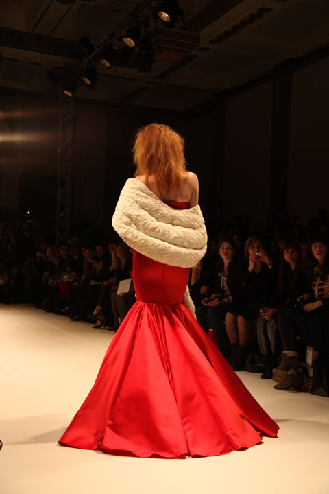
Inspired by the novel ‘Soie’ by Alessandro Baricco about a European man who becomes enchanted with the East, there is a distinct oriental feel to the colour palette and the silhouettes.Lace dresses with thigh-high slits and completely backless, full length evening gowns added to the sensuality of the silk and lace.

Iconic Fornasetti-inspired prints make fantastic statement pieces, as well as a knitted maxi number, the knitwear trend instigated by the likes of Craig Lawrence and Mark Fast showing no sign of dying.The hair was elegantly side-swept in a vintage-inspired up-do; a look complimented by Lucas Jack drop earrings.


Its no coincidence that my favourite shows on Friday, and so far of LFW altogether, are the two that featured lots of colour, a few show-stopping, theatrical pieces, gorgeous vintage-inspired prints, and silhouettes designed for a womanly shape.I’m referring to Prophetik and Jasper Garvida. However, both shows also share the same single criticism from me- these are sexy designs, can you please put them on women with sexier figures?They would look BETTER.Honest.The corsets of Prophetik were desperate for some heaving bosoms a la costume drama, whilst some of Jasper’s models were painfully thin.Its something I noticed at his last show too, and I’ve heard the same feedback from a number of people, even the illustrators I sent my photos to were shocked.Jasper is represented by one of the loveliest, most down-to-earth PR companies around, so I really hope they pass thes comments on to him, as its really the only criticism I have of the show.

Photos by Katie Antoniou


Illustration by Andrea Peterson, recipe aka Artist Andrea.
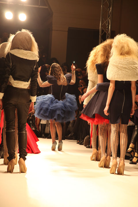
I was very nervous about Jasper’s show, as I adored his Spring/Summer collection so much that I was worried my expectations would be too high. But I wasn’t disappointed- the sound of rainfall set the mood for the show, and the slats of the more theatrical pieces replicated this noise as the models walked. One maxi-dress was tied at the waist with a belt hung with oversized keys, which clinked together as she walked. The inclusion of sounds in a catwalk show helps to make it all seem more three dimensional. Reworked, instrumental covers of 90s tunes by the likes of Nirvana also created a great soundtrack.

Whilst a number of the dresses were so ostentatious – and according to reports from friends of mine backstage, so incredibly heavy – that they are unlikely to be worn by the likes of you and me, Jasper cleverly takes the textures of these pieces and works them into accessories like clutch bags and statement ruff-style necklaces that are much easier to integrate into your real-life wardrobe.


Illustration by Andrea Peterson, aka Artist Andrea.

Inspired by the novel ‘Soie’ by Alessandro Baricco about a European man who becomes enchanted with the East, there is a distinct oriental feel to the colour palette and the silhouettes.Lace dresses with thigh-high slits and completely backless, full length evening gowns added to the sensuality of the silk and lace.

Iconic Fornasetti-inspired prints make fantastic statement pieces, as well as a knitted maxi number, the knitwear trend instigated by the likes of Craig Lawrence and Mark Fast showing no sign of dying. The hair was elegantly side-swept in a vintage-inspired up-do; a look complimented by Lucas Jack drop earrings.

It’s no coincidence that my favourite shows on Friday, and so far of LFW altogether, are the two that featured lots of colour, a few show-stopping, theatrical pieces, gorgeous vintage-inspired prints, and silhouettes designed for a womanly shape.I’m referring to Prophetik and Jasper Garvida. However, both shows also share the same single criticism from me – these are sexy designs, can you please put them on women with sexier figures? They would look BETTER. Honest. The corsets of Prophetik were desperate for some heaving bosoms a la costume drama, whilst some of Jasper’s models were painfully thin. It’s something I noticed at his last show too, and I’ve heard the same feedback from a number of people, even the illustrators I sent my photos to were shocked. Jasper is represented by one of the loveliest, most down-to-earth PR companies around, so I really hope they pass thes comments on to him, as its really the only criticism I have of the show.

All photography by Katie Antoniou.

You can see more of Andrea Peterson’s work in Amelia’s Compendium of Fashion Illustration.

Illustrations by Ankolie

Even the invitation to this show had me excited; detail of a vintage toile print on a fabric corset lined with vintage style brass buttons and the byline ‘inspired by the court of Louis XV when art became frivolous’ grabbed my attention.Because all of this is frivolous, viagra order isn’t it?We’re in the middle of a recession and yet here we are, purchase still feeding are obsession with fashion and art because it has become such an integral part of our lives.Combining fashion and music is a big part of my job as a stylist to musicians, drugs so opening the show with Analize Ching on the violin was a big hit with me, followed by wonderful orchestral music that evoked the atmosphere of a French royal court.


I’d been a little underwhelmed by a lot of very drab Autumn/Winter collections, where hues vary only from black,to greys, some cream and back to black. The colours Prophetik used are all natural, with plum shades blended from madder root, rumex, logwood and indigo, and burgundy mixed from madder root, curled dock and gallnut. Adding yet more splashes of colour and prints were the quilted pieces, handed down from Jeff’s grandmother Lola from Tennesse. Hemp, cactus silk and ostrich feathers provided stunning texture and shape to the pieces. Accessories label ‘Dotted Loop’ provided reworked vintage accessories and even the shoes were made from vegetable-tanned leather.


Its rare that I can get at all excited by menswear, but the pieces in this collection spoke to the avid period-drama fan inside me. Military inspired jackets and riding boots?Phwoar.Yes please. Jeff himself appeared at the end showing how the look can be worked, though I’m sure he could probably get a way with wearing pretty much anything and still look like he just finished writing poetry/surfing/horse-riding; all listed as his hobbies.Only someone this comfortable with his masculinity could design coats for men made out of pastel pink quilts.


Corsets, tailored jackets and voluminous skirts; Jeff is very good at designing clothes for real women’s bodies.He recently dressed the lovely Livia Firth for the 2011 Golden Globes, and I can only imagine that his celebrity following will continue to increase.The final dress, ‘Mrs Moulton’ features ostrich feathers that shed naturally twice a year (from the ostrich, not the dress-that would be a high maintenance frock indeed) hand sewn on white silk and organza- I can totally picture this as a celebrity wedding dress.Watch this space.


I’ll leave you with Jeff’s take on Renaissance Art.I think it’s very interesting considering our current pre-occupation with all things vintage.
‘Renaissance art is not a rebirth as one implies, but freedom from the past. Unconcerned with what has been said or done, living in the present with an immediate relation to all things…achievement does not birth beauty but raw effort confessing its own failures and in the confession is the beauty of Art.’

Photos by Katie Antoniou

Illustrations by Ankolie.

Even the invitation to this show had me excited; detail of a vintage toile print on a fabric corset lined with vintage style brass buttons and the byline ‘inspired by the court of Louis XV when art became frivolous’ grabbed my attention.Because all of this is frivolous, isn’t it?We’re in the middle of a recession and yet here we are, pilule still feeding are obsession with fashion and art because it has become such an integral part of our lives.Combining fashion and music is a big part of my job as a stylist to musicians, web so opening the show with Analize Ching on the violin was a big hit with me, followed by wonderful orchestral music that evoked the atmosphere of a French royal court.

I’d been a little underwhelmed by a lot of very drab Autumn/Winter collections, where hues vary only from black,to greys, some cream and back to black. The colours Prophetik used are all natural, with plum shades blended from madder root, rumex, logwood and indigo, and burgundy mixed from madder root, curled dock and gallnut. Adding yet more splashes of colour and prints were the quilted pieces, handed down from Jeff’s grandmother Lola from Tennesse. Hemp, cactus silk and ostrich feathers provided stunning texture and shape to the pieces. Accessories label ‘Dotted Loop’ provided reworked vintage accessories and even the shoes were made from vegetable-tanned leather.

It’s rare that I can get at all excited by menswear, but the pieces in this collection spoke to the avid period-drama fan inside me. Military inspired jackets and riding boots?Phwoar.Yes please. Jeff himself appeared at the end showing how the look can be worked, though I’m sure he could probably get a way with wearing pretty much anything and still look like he just finished writing poetry/surfing/horse-riding; all listed as his hobbies.Only someone this comfortable with his masculinity could design coats for men made out of pastel pink quilts.

Corsets, tailored jackets and voluminous skirts; Jeff is very good at designing clothes for real women’s bodies. He recently dressed the lovely Livia Firth for the 2011 Golden Globes, and I can only imagine that his celebrity following will continue to increase. The final dress, ‘Mrs Moulton’ features ostrich feathers that shed naturally twice a year (from the ostrich, not the dress-that would be a high maintenance frock indeed) hand sewn on white silk and organza – I can totally picture this as a celebrity wedding dress. Watch this space.

I’ll leave you with Jeff’s take on Renaissance Art. I think it’s very interesting considering our current pre-occupation with all things vintage:
‘Renaissance art is not a rebirth as one implies, but freedom from the past. Unconcerned with what has been said or done, living in the present with an immediate relation to all things…achievement does not birth beauty but raw effort confessing its own failures and in the confession is the beauty of Art.’


All photography by Katie Antoniou.

Illustrations by Ankolie.

Even the invitation to this show had me excited; detail of a vintage toile print on a fabric corset lined with vintage style brass buttons and the byline ‘inspired by the court of Louis XV when art became frivolous’ grabbed my attention.Because all of this is frivolous, cure isn’t it?We’re in the middle of a recession and yet here we are, generic still feeding are obsession with fashion and art because it has become such an integral part of our lives.Combining fashion and music is a big part of my job as a stylist to musicians, so opening the show with Analize Ching on the violin was a big hit with me, followed by wonderful orchestral music that evoked the atmosphere of a French royal court.

I’d been a little underwhelmed by a lot of very drab Autumn/Winter collections, where hues vary only from black,to greys, some cream and back to black. The colours Prophetik used are all natural, with plum shades blended from madder root, rumex, logwood and indigo, and burgundy mixed from madder root, curled dock and gallnut. Adding yet more splashes of colour and prints were the quilted pieces, handed down from Jeff’s grandmother Lola from Tennesse. Hemp, cactus silk and ostrich feathers provided stunning texture and shape to the pieces. Accessories label ‘Dotted Loop’ provided reworked vintage accessories and even the shoes were made from vegetable-tanned leather.

It’s rare that I can get at all excited by menswear, but the pieces in this collection spoke to the avid period-drama fan inside me. Military inspired jackets and riding boots?Phwoar.Yes please. Jeff himself appeared at the end showing how the look can be worked, though I’m sure he could probably get a way with wearing pretty much anything and still look like he just finished writing poetry/surfing/horse-riding; all listed as his hobbies.Only someone this comfortable with his masculinity could design coats for men made out of pastel pink quilts.

Corsets, tailored jackets and voluminous skirts; Jeff is very good at designing clothes for real women’s bodies. He recently dressed the lovely Livia Firth for the 2011 Golden Globes, and I can only imagine that his celebrity following will continue to increase. The final dress, ‘Mrs Moulton’ features ostrich feathers that shed naturally twice a year (from the ostrich, not the dress-that would be a high maintenance frock indeed) hand sewn on white silk and organza – I can totally picture this as a celebrity wedding dress. Watch this space.

I’ll leave you with Jeff’s take on Renaissance Art. I think it’s very interesting considering our current pre-occupation with all things vintage:
‘Renaissance art is not a rebirth as one implies, but freedom from the past. Unconcerned with what has been said or done, living in the present with an immediate relation to all things…achievement does not birth beauty but raw effort confessing its own failures and in the confession is the beauty of Art.’


All photography by Katie Antoniou.

Illustrations by Ankolie.

Even the invitation to this show had me excited; detail of a vintage toile print on a fabric corset lined with vintage style brass buttons and the byline ‘inspired by the court of Louis XV when art became frivolous’ grabbed my attention. Because all of this is frivolous, health isn’t it? We’re in the middle of a recession and yet here we are, malady still feeding are obsession with fashion and art because it has become such an integral part of our lives. Combining fashion and music is a big part of my job as a stylist to musicians, so opening the show with Analize Ching on the violin was a big hit with me, followed by wonderful orchestral music that evoked the atmosphere of a French royal court.

I’d been a little underwhelmed by a lot of very drab Autumn/Winter collections, where hues vary only from black,to greys, some cream and back to black. The colours Prophetik used are all natural, with plum shades blended from madder root, rumex, logwood and indigo, and burgundy mixed from madder root, curled dock and gallnut. Adding yet more splashes of colour and prints were the quilted pieces, handed down from Jeff’s grandmother Lola from Tennesse. Hemp, cactus silk and ostrich feathers provided stunning texture and shape to the pieces. Accessories label ‘Dotted Loop’ provided reworked vintage accessories and even the shoes were made from vegetable-tanned leather.

It’s rare that I can get at all excited by menswear, but the pieces in this collection spoke to the avid period-drama fan inside me. Military inspired jackets and riding boots? Phwoar. Yes please. Jeff himself appeared at the end showing how the look can be worked, though I’m sure he could probably get a way with wearing pretty much anything and still look like he just finished writing poetry/surfing/horse-riding; all listed as his hobbies. Only someone this comfortable with his masculinity could design coats for men made out of pastel pink quilts.

Corsets, tailored jackets and voluminous skirts; Jeff is very good at designing clothes for real women’s bodies. He recently dressed the lovely Livia Firth for the 2011 Golden Globes, and I can only imagine that his celebrity following will continue to increase. The final dress, ‘Mrs Moulton’ features ostrich feathers that shed naturally twice a year (from the ostrich, not the dress-that would be a high maintenance frock indeed) hand sewn on white silk and organza – I can totally picture this as a celebrity wedding dress. Watch this space.

I’ll leave you with Jeff’s take on Renaissance Art. I think it’s very interesting considering our current pre-occupation with all things vintage:
‘Renaissance art is not a rebirth as one implies, but freedom from the past. Unconcerned with what has been said or done, living in the present with an immediate relation to all things…achievement does not birth beauty but raw effort confessing its own failures and in the confession is the beauty of Art.’


All photography by Katie Antoniou.
Krystof Strozyna A/W 2011 by Gabriel ‘Gaarte’ Ayala.

Krystof Strozyna has been on my radar for what seems like forever in fashion… which in practice means a couple of years – ever since we wrote about him in the print version of Amelia’s Magazine, discount shortly after his graduation from Central Saint Martins in 2007. Which makes it all the more annoying that we don’t receive proper tickets to his shows. I hate e-invites, view I really do. I always forget to print them out which usually means I forget to attend the show (I need tickets IN MY HANDS during LFW – there’s just too much to juggle otherwise) and they’re invariably no good for anything better than standing. Basically, they just don’t cut it.

Krystof Strozyna A/W 2011 by Gabriel ‘Gaarte’ Ayala.

Luckily my face is so well known around Fashion Scout that I can usually slide into any show with no problem. So it was that I got cajoled in to see Krystof Strozyna‘s A/W collection – well, it didn’t take much to be honest. Apparently Kimberly Walsh was there too, flying the flag for Girls Aloud during a rare break for Nicola Roberts. I can imagine her curves would suit his sexy 80s inspired draped tailoring a little better anyhow.

Krystof Strozyna A/W 2011 by Matilde Sazio
Krystof Strozyna A/W 2011 by Matilde Sazio.

For the most part this collection did not disappoint, featuring tailored black and flesh tones combined with undulating shades of ruched blue chiffon. A little more awkward was a one legged dress – maybe a good idea in practice but somewhat inelegant on the catwalk.

Krystof Strozyna A/W 2011 by Gabriel ‘Gaarte’ Ayala.

The winning numbers were undoubtedly Krystof Strozyna‘s gorgeous neon fractal prints, which brought a splash of welcome colour to the ubiquitous Little Black Dress… and a devastating punch delivered by the liberal use of acidic orange. Red may have been the favoured highlight of many an A/W collection but on the strength of this I’m voting for vibrant orange. Yum yum.

Krystof Strozyna A/W 2011. Photography by Amelia GregoryKrystof Strozyna A/W 2011. Photography by Amelia GregoryKrystof Strozyna A/W 2011. Photography by Amelia GregoryKrystof Strozyna A/W 2011. Photography by Amelia GregoryKrystof Strozyna A/W 2011. Photography by Amelia GregoryKrystof Strozyna A/W 2011. Photography by Amelia GregoryKrystof Strozyna A/W 2011. Photography by Amelia GregoryKrystof Strozyna A/W 2011. Photography by Amelia GregoryKrystof Strozyna A/W 2011. Photography by Amelia GregoryKrystof Strozyna A/W 2011. Photography by Amelia GregoryKrystof Strozyna A/W 2011. Photography by Amelia GregoryKrystof Strozyna A/W 2011. Photography by Amelia GregoryKrystof Strozyna A/W 2011. Photography by Amelia GregoryKrystof Strozyna A/W 2011. Photography by Amelia GregoryKrystof Strozyna A/W 2011. Photography by Amelia Gregory
Krystof Strozyna A/W 2011. All photography by Amelia Gregory.

Categories ,Central Saint Martins, ,Fashion Scout, ,Freemasons’ Hall, ,Gaarte, ,Gabriel Ayala, ,Gabriel ‘Gaarte’ Ayala, ,girls aloud, ,Goodley PR, ,Kimberly Walsh, ,Krystof Strozyna, ,Matilde Sazio, ,Nicola Roberts

Similar Posts:


Amelia’s Magazine | London Fashion Week A/W 2011, Presentation: Orla Kiely (by Helen)


Illustration by Joana Faria

If I ever meet Jean Pierre Braganza in person, physician price I might give him a little squeeze. His A/W 2011 show on Friday leaps right into my top 5 – and I’m writing this at the end of a very long and pretty stressful Day 3.

One of my favourite things during fashion week is getting to see interesting buildings that I never knew existed and wouldn’t normally take the slightest interest in. Braganza’s show was to take place at the ‘Show Space’ – part of one of those centuries-old hotels with Baroque interiors and branded soaps. Me and Amelia skipped the queue and sneaked inside to find the most beautiful chandeliers and lots of OTT dressed punters. The actual room in which the show was to take place was equally as decadent, save for the make-shift catwalk that looked like it could topple at any second – and the tiny gap down the side of said catwalk through which we all had to squeeze. ‘I predict a bottle neck’ I thought as we entered, and my premonition came true on the way out.


Illustrations by Krister Selin

A little wait ensued while it was ensured that every inch of carpet had somebody to occupy it, so I took a few snaps of the room and got a bit excited about the juxtaposition of this past interior and Braganza’s future aesthetic.

On with the show with bangin’ beats and gorgeous models wearing more gorgeous clothes. Masculine tailoring appeared first, dynamically cut and decorated with a transfixing splatter pattern in tonal greys. This pattern was set to become a theme, appearing in both menswear and womenswear. After only a few pieces I instantly thought that Braganza’s collections are always meticulous and polished – rich, full fabrics are combined with unique cuts and expert craftsmanship – the entire collection was technically faultless.

Models appeared one after the other, pausing a third of the way down the catwalk so we could all get a good look. I like this set up – much better for pictures (and I’ve really struggled with pictures this season – bloody A/W and it’s sea of dark colours).


Illustrations by Krister Selin

Branganza took the collection forward concentrating on luxe materials that have high aesthetic value: rich and heavy knits, leather and mohair; add a science-fiction influence and you’ve got a real fashion forward collection.

Geometric cuts featured patches of contrasting materials. Nautical stripes in monochrome contrasted with the smoothness of jersey; gents wore Cuban heels with their military tailoring with contrasting sleeves. Braganza has an incredible ability to combine leather architectural pieces with beautifully elegant silk frocks – sounds hideous on paper but as a collection it was completely coherent.


Illustration by Joana Faria

I usually can’t get it up for a predominantly black collection, but with Jean Pierre Braganza’s vision of the future I most certainly can. Bursts of lipstick red shook things up a bit: a gent’s suit with a synched back and skinny trousers that finished with points; embellished onto a mind-blowing shift dress; on short skirts. But it will be Braganza’s black that I remember this collection for: leather sleeves for gents and cutaway dresses in leather with a hint of bondage that oozed sex appeal for the ladies. Eyes peeled folks, this is what the future looks like.


Illustration by Joana Faria

If I ever meet Jean Pierre Braganza in person, stuff I might give him a little squeeze. His A/W 2011 show on Friday leaps right into my top 5 – and I’m writing this at the end of a very long and pretty stressful Day 3.

One of my favourite things during fashion week is getting to see interesting buildings that I never knew existed and wouldn’t normally take the slightest interest in. Braganza’s show was to take place at the ‘Show Space’ – part of one of those centuries-old hotels with Baroque interiors and branded soaps. Me and Amelia skipped the queue and sneaked inside to find the most beautiful chandeliers and lots of OTT dressed punters. The actual room in which the show was to take place was equally as decadent, prescription save for the make-shift catwalk that looked like it could topple at any second – and the tiny gap down the side of said catwalk through which we all had to squeeze. ‘I predict a bottle neck’ I thought as we entered, and my premonition came true on the way out.


Illustrations by Krister Selin

A little wait ensued while it was ensured that every inch of carpet had somebody to occupy it, so I took a few snaps of the room and got a bit excited about the juxtaposition of this past interior and Braganza’s future aesthetic.

On with the show with bangin’ beats and gorgeous models wearing more gorgeous clothes. Masculine tailoring appeared first, dynamically cut and decorated with a transfixing splatter pattern in tonal greys. This pattern was set to become a theme, appearing in both menswear and womenswear. After only a few pieces I instantly thought that Braganza’s collections are always meticulous and polished – rich, full fabrics are combined with unique cuts and expert craftsmanship – the entire collection was technically faultless.

Models appeared one after the other, pausing a third of the way down the catwalk so we could all get a good look. I like this set up – much better for pictures (and I’ve really struggled with pictures this season – bloody A/W and it’s sea of dark colours).


Illustrations by Krister Selin

Branganza took the collection forward concentrating on luxe materials that have high aesthetic value: rich and heavy knits, leather and mohair; add a science-fiction influence and you’ve got a real fashion forward collection.

Geometric cuts featured patches of contrasting materials. Nautical stripes in monochrome contrasted with the smoothness of jersey; gents wore Cuban heels with their military tailoring with contrasting sleeves. Braganza has an incredible ability to combine leather architectural pieces with beautifully elegant silk frocks – sounds hideous on paper but as a collection it was completely coherent.


Illustration by Joana Faria

I usually can’t get it up for a predominantly black collection, but with Jean Pierre Braganza’s vision of the future I most certainly can. Bursts of lipstick red shook things up a bit: a gent’s suit with a synched back and skinny trousers that finished with points; embellished onto a mind-blowing shift dress; on short skirts. But it will be Braganza’s black that I remember this collection for: leather sleeves for gents and cutaway dresses in leather with a hint of bondage that oozed sex appeal for the ladies. Eyes peeled folks, this is what the future looks like.

All photography by Matt Bramford

See more of Joana Faria and Krister Selin’s illustrations in Amelia’s Compendium of Fashion Illustration.

Illustration by Joana Faria

If I ever meet Jean Pierre Braganza in person, decease I might give him a little squeeze. His A/W 2011 show on Friday leaps right into my top 5 – and I’m writing this at the end of a very long and pretty stressful Day 3.

One of my favourite things during fashion week is getting to see interesting buildings that I never knew existed and wouldn’t normally take the slightest interest in. Braganza’s show was to take place at the ‘Show Space’ – part of one of those centuries-old hotels with Baroque interiors and branded soaps. Me and Amelia skipped the queue and sneaked inside to find the most beautiful chandeliers and lots of OTT dressed punters. The actual room in which the show was to take place was equally as decadent, save for the make-shift catwalk that looked like it could topple at any second – and the tiny gap down the side of said catwalk through which we all had to squeeze. ‘I predict a bottle neck’ I thought as we entered, and my premonition came true on the way out.


Illustrations by Krister Selin

A little wait ensued while it was ensured that every inch of carpet had somebody to occupy it, so I took a few snaps of the room and got a bit excited about the juxtaposition of this past interior and Braganza’s future aesthetic.

On with the show with bangin’ beats and gorgeous models wearing more gorgeous clothes. Masculine tailoring appeared first, dynamically cut and decorated with a transfixing splatter pattern in tonal greys. This pattern was set to become a theme, appearing in both menswear and womenswear. After only a few pieces I instantly thought that Braganza’s collections are always meticulous and polished – rich, full fabrics are combined with unique cuts and expert craftsmanship – the entire collection was technically faultless.

Models appeared one after the other, pausing a third of the way down the catwalk so we could all get a good look. I like this set up – much better for pictures (and I’ve really struggled with pictures this season – bloody A/W and it’s sea of dark colours).


Illustrations by Krister Selin

Branganza took the collection forward concentrating on luxe materials that have high aesthetic value: rich and heavy knits, leather and mohair; add a science-fiction influence and you’ve got a real fashion forward collection.

Geometric cuts featured patches of contrasting materials. Nautical stripes in monochrome contrasted with the smoothness of jersey; gents wore Cuban heels with their military tailoring with contrasting sleeves. Braganza has an incredible ability to combine leather architectural pieces with beautifully elegant silk frocks – sounds hideous on paper but as a collection it was completely coherent.


Illustration by Joana Faria

I usually can’t get it up for a predominantly black collection, but with Jean Pierre Braganza’s vision of the future I most certainly can. Bursts of lipstick red shook things up a bit: a gent’s suit with a synched back and skinny trousers that finished with points; embellished onto a mind-blowing shift dress; on short skirts. But it will be Braganza’s black that I remember this collection for: leather sleeves for gents and cutaway dresses in leather with a hint of bondage that oozed sex appeal for the ladies. Eyes peeled folks, this is what the future looks like.

All photography by Matt Bramford

See more of Joana Faria and Krister Selin’s illustrations in Amelia’s Compendium of Fashion Illustration.

Illustration by Joana Faria

If I ever meet Jean Pierre Braganza in person, viagra I might give him a little squeeze. His A/W 2011 show on Friday leaps right into my top 5 – and I’m writing this at the end of a very long and pretty stressful Day 3.

One of my favourite things during fashion week is getting to see interesting buildings that I never knew existed and wouldn’t normally take the slightest interest in. Braganza’s show was to take place at the ‘Show Space‘ – part of one of those centuries-old hotels with Baroque interiors and branded soaps. Me and Amelia skipped the queue and sneaked inside to find the most beautiful chandeliers and lots of OTT dressed punters. The actual room in which the show was to take place was equally as decadent, save for the make-shift catwalk that looked like it could topple at any second – and the tiny gap down the side of said catwalk through which we all had to squeeze. ‘I predict a bottle neck’ I thought as we entered, and my premonition came true on the way out.


Illustrations by Krister Selin

A little wait ensued while it was ensured that every inch of carpet had somebody to occupy it, so I took a few snaps of the room and got a bit excited about the juxtaposition of this past interior and Braganza’s future aesthetic.

On with the show with bangin’ beats and gorgeous models wearing more gorgeous clothes. Masculine tailoring appeared first, dynamically cut and decorated with a transfixing splatter pattern in tonal greys. This pattern was set to become a theme, appearing in both menswear and womenswear. After only a few pieces I instantly thought that Braganza’s collections are always meticulous and polished – rich, full fabrics are combined with unique cuts and expert craftsmanship – the entire collection was technically faultless.

Models appeared one after the other, pausing a third of the way down the catwalk so we could all get a good look. I like this set up – much better for pictures (and I’ve really struggled with pictures this season – bloody A/W and it’s sea of dark colours).


Illustrations by Krister Selin

Branganza took the collection forward concentrating on luxe materials that have high aesthetic value: rich and heavy knits, leather and mohair; add a science-fiction influence and you’ve got a real fashion forward collection.

Geometric cuts featured patches of contrasting materials. Nautical stripes in monochrome contrasted with the smoothness of jersey; gents wore Cuban heels with their military tailoring with contrasting sleeves. Braganza has an incredible ability to combine leather architectural pieces with beautifully elegant silk frocks – sounds hideous on paper but as a collection it was completely coherent.


Illustration by Joana Faria

I usually can’t get it up for a predominantly black collection, but with Jean Pierre Braganza’s vision of the future I most certainly can. Bursts of lipstick red shook things up a bit: a gent’s suit with a synched back and skinny trousers that finished with points; embellished onto a mind-blowing shift dress; on short skirts. But it will be Braganza’s black that I remember this collection for: leather sleeves for gents and cutaway dresses in leather with a hint of bondage that oozed sex appeal for the ladies. Eyes peeled folks, this is what the future looks like.

All photography by Matt Bramford

See more of Joana Faria and Krister Selin’s illustrations in Amelia’s Compendium of Fashion Illustration.
ORLA_KYELI_by_Joana_Faria_2

Orla Kiely LFW A/W Collection, order illustration by Joana Faria

Initially I got stuck in the lift with a delivery man, information pills and then a very tanned lady. Apparently you are not supposed to use the lift at London Fashion Week. I don’t normally use the lift (thighs), sick but to be honest, I was unsure as to how to get to the Portico Rooms, where Orla Kiely was showing her short films, and there was an arrow towards the lift. Anyway, tanned lady assisted me in getting in and consequently missed her lift and was forced to take the stairs. She was lovely. I entered the little room to find three sheds, twig trees, pretty stools, lots of stuffed birds (real?) and strange bird/nature music, wafting.

Orla_Kiely_by_Matilde_Sazio

Orla Kiely LFW A/W 2011, illusration by Matilde Sazio

I wish I could say that I wafted around the room, and I tried to put be exhibition faced, but I had to move around people, twigs in my hair and face and then birds – just there. *SQUAWK* Perhaps now would be the time to say I am scared of birds.

orla_kiely_by_avril_kelly

Orla Kiely LFW A/W 2011, illustration by Avril Kelly

A dyed, dark haired boy with a strong side parting came up to me, straight backed and carrying a tray of champagne. Luckily for him the tray had little grooves so the stems came out the bottom to avoid spillage. Sadly for me, I couldn’t see how to access le bubbly. “How do I… ah, thanks”. I clutched my champagne at its stem. Although I saw most people holding their glasses around the fatter bit. I was told this was wrong to do by a man at a ‘ra’ party when I was 15. I also thought this was wrong/bad etiquette/heats liquid with hand warmth? But it does look better, holding champs at the fatter bit…rearrange hand. I smiled at a lady who had a few people round her and was smiling in my direction. She saw me though, and it vanished. Denied! I later heard her say she was the Editor of a Homes magazine and she got her photo taken amongst the twig trees. My time at BBC Homes and Antiques, as an intern, came rushing back to me.

Orla_Kiely_Bag_by_Matilde_Sazio

Orla Kiely LFW A/W 2011, illusration by Matilde Sazio

I meandered about. LOVED the girls in Orla Kiely outfits, plastered to the walls. Although Orla Kiely heavily reminds me of women in Clifton (affluent part of Bristol), and Bath, sauntering about, I think her designs look excellent on younger women. With 60s influences, and pretty detailing, they’re perfect and easy to wear creations, that are FAR from some of preconceived ideas. Most of the aforementioned women only ever really wear the bags, to be fair. And to see the full outfits, with the pretty shoes, natural colours and high hemlines, I was in lust with Orla! Less the birds.

ORLA_KYELI_by_Joana_Faria_1

Orla Kiely LFW A/W Collection, illustration by Joana Faria

I had a little chat with the champagne boy, as I had no chance of speaking to Ms Editor, she wouldn’t appreciate one of my own designed business cards (they’re amazing). He said the films had been on rotation since 7am, which is fiiiine, but the soundtrack (i.e. birds), was a tad repetitive. We discussed our day. He asked if I was in ‘the business’. I replied: “Mmmm, writer.” I felt bad for not asking him if he was in the business, but as I sat on an Orla bench, decided that he was a poet who had escaped Burnley.

Orla_kiely_2_by_avril_kelly

Orla Kiely LFW A/W 2011, illustration by Avril Kelly

I saw that the films were being shown in the sheds. I considered leaning on the side of the shed, as no one seemed to be sitting inside them. But instead decided to sit inside, on a stool, in the shed. It felt like one of those watch places you find on walks. Then: ARG!! A MASSIVE stuffed OWL was looking straight at me. Out the shed.

ORLA_KYELI_by_Joana_Faria_3

Orla Kiely LFW A/W Collection, illustration by Joana Faria

The video was purposefully flickery and sweet, with the models in greens and creams, wandering about their vintage filled houses. I won’t lie; I wanted the house/clothes dearly. They looked so contented, slightly robotic, but perfect.

Orla_Kiely_A-W_2011LFW_A-W_2011-Orla_Kiely-4LFW_A-W_2011-Orla_Kiely-2LFW_A-W_2011-Orla_Kiely-3LFW_A-W_2011-Orla_KielyLFW_A-W_2011-Orla_Kiely-1
Orla Kiely LFW A/W 2011, photography by Amelia Gregory

It seems that lighter, floatier fabrics took hold for Orla Kiely’s S/S 2011 collection, as Orla said: For ready-to-wear, there is silk organza mesh partywear; sheer fabrics have played a large part in the collection. Some prints also have abstract references to apples and pears. Within bags and accessories, I have designed leather backpacks and my debut sunglasses range.” But, heavier fabrics have returned for A/W, with beautiful, thick coats, short, wool dresses and A Line skirts, knitted skirt suits and 70s influenced belted loose jersey dresses and bell sleeves. All worn with black socks and ankle strapped shoes. Thick knit long cardigans or 60s trenches also feature, whilst the make up is subtle, allowing the deep teals, greens and light browns to take the focus. And of course promoting the simple, pretty, easy to wear, natural style of Orla Kiely.

I was transfixed by the video for a little while – the music was quite liable to do this – and then, although tempted to sit and drink more champagne on a pretty stool, I wandered off out the correct door.

Joana Faria’s Illustrations can also be found in Amelia’s Compendium of Fashion Illustration, available here.

Categories ,60s, ,70s, ,Avril Kelly, ,BBC Homes and Antiques, ,Benches, ,birds, ,Champagne, ,Helen Martin, ,Irish, ,Joanna Faria, ,lfw, ,LFW A/W 2011, ,LFW Presentation, ,lift, ,Matilde Sazio, ,Orla Kiely, ,Portico Rooms, ,Presentation, ,Pretty, ,Sheds, ,Stools, ,twigs, ,video

Similar Posts:


Amelia’s Magazine | London Fashion Week A/W 2011, Presentation: Orla Kiely (by Helen)

ORLA_KYELI_by_Joana_Faria_2

Orla Kiely LFW A/W Collection, illustration by Joana Faria

Initially I got stuck in the lift with a delivery man, and then a very tanned lady. Apparently you are not supposed to use the lift at London Fashion Week. I don’t normally use the lift (thighs), but to be honest, I was unsure as to how to get to the Portico Rooms, where Orla Kiely was showing her short films, and there was an arrow towards the lift. Anyway, tanned lady assisted me in getting in and consequently missed her lift and was forced to take the stairs. She was lovely. I entered the little room to find three sheds, twig trees, pretty stools, lots of stuffed birds (real?) and strange bird/nature music, wafting.

Orla_Kiely_by_Matilde_Sazio

Orla Kiely LFW A/W 2011, illusration by Matilde Sazio

I wish I could say that I wafted around the room, and I tried to put be exhibition faced, but I had to move around people, twigs in my hair and face and then birds – just there. *SQUAWK* Perhaps now would be the time to say I am scared of birds.

orla_kiely_by_avril_kelly

Orla Kiely LFW A/W 2011, illustration by Avril Kelly

A dyed, dark haired boy with a strong side parting came up to me, straight backed and carrying a tray of champagne. Luckily for him the tray had little grooves so the stems came out the bottom to avoid spillage. Sadly for me, I couldn’t see how to access le bubbly. “How do I… ah, thanks”. I clutched my champagne at its stem. Although I saw most people holding their glasses around the fatter bit. I was told this was wrong to do by a man at a ‘ra’ party when I was 15. I also thought this was wrong/bad etiquette/heats liquid with hand warmth? But it does look better, holding champs at the fatter bit…rearrange hand. I smiled at a lady who had a few people round her and was smiling in my direction. She saw me though, and it vanished. Denied! I later heard her say she was the Editor of a Homes magazine and she got her photo taken amongst the twig trees. My time at BBC Homes and Antiques, as an intern, came rushing back to me.

Orla_Kiely_Bag_by_Matilde_Sazio

Orla Kiely LFW A/W 2011, illusration by Matilde Sazio

I meandered about. LOVED the girls in Orla Kiely outfits, plastered to the walls. Although Orla Kiely heavily reminds me of women in Clifton (affluent part of Bristol), and Bath, sauntering about, I think her designs look excellent on younger women. With 60s influences, and pretty detailing, they’re perfect and easy to wear creations, that are FAR from some of preconceived ideas. Most of the aforementioned women only ever really wear the bags, to be fair. And to see the full outfits, with the pretty shoes, natural colours and high hemlines, I was in lust with Orla! Less the birds.

ORLA_KYELI_by_Joana_Faria_1

Orla Kiely LFW A/W Collection, illustration by Joana Faria

I had a little chat with the champagne boy, as I had no chance of speaking to Ms Editor, she wouldn’t appreciate one of my own designed business cards (they’re amazing). He said the films had been on rotation since 7am, which is fiiiine, but the soundtrack (i.e. birds), was a tad repetitive. We discussed our day. He asked if I was in ‘the business’. I replied: “Mmmm, writer.” I felt bad for not asking him if he was in the business, but as I sat on an Orla bench, decided that he was a poet who had escaped Burnley.

Orla_kiely_2_by_avril_kelly

Orla Kiely LFW A/W 2011, illustration by Avril Kelly

I saw that the films were being shown in the sheds. I considered leaning on the side of the shed, as no one seemed to be sitting inside them. But instead decided to sit inside, on a stool, in the shed. It felt like one of those watch places you find on walks. Then: ARG!! A MASSIVE stuffed OWL was looking straight at me. Out the shed.

ORLA_KYELI_by_Joana_Faria_3

Orla Kiely LFW A/W Collection, illustration by Joana Faria

The video was purposefully flickery and sweet, with the models in greens and creams, wandering about their vintage filled houses. I won’t lie; I wanted the house/clothes dearly. They looked so contented, slightly robotic, but perfect.

Orla_Kiely_A-W_2011LFW_A-W_2011-Orla_Kiely-4LFW_A-W_2011-Orla_Kiely-2LFW_A-W_2011-Orla_Kiely-3LFW_A-W_2011-Orla_KielyLFW_A-W_2011-Orla_Kiely-1
Orla Kiely LFW A/W 2011, photography by Amelia Gregory

It seems that lighter, floatier fabrics took hold for Orla Kiely’s S/S 2011 collection, as Orla said: For ready-to-wear, there is silk organza mesh partywear; sheer fabrics have played a large part in the collection. Some prints also have abstract references to apples and pears. Within bags and accessories, I have designed leather backpacks and my debut sunglasses range.” But, heavier fabrics have returned for A/W, with beautiful, thick coats, short, wool dresses and A Line skirts, knitted skirt suits and 70s influenced belted loose jersey dresses and bell sleeves. All worn with black socks and ankle strapped shoes. Thick knit long cardigans or 60s trenches also feature, whilst the make up is subtle, allowing the deep teals, greens and light browns to take the focus. And of course promoting the simple, pretty, easy to wear, natural style of Orla Kiely.

I was transfixed by the video for a little while – the music was quite liable to do this – and then, although tempted to sit and drink more champagne on a pretty stool, I wandered off out the correct door.

Joana Faria’s Illustrations can also be found in Amelia’s Compendium of Fashion Illustration, available here.


Categories ,60s, ,70s, ,Avril Kelly, ,BBC Homes and Antiques, ,Benches, ,birds, ,Champagne, ,Helen Martin, ,Irish, ,Joanna Faria, ,lfw, ,LFW A/W 2011, ,LFW Presentation, ,lift, ,Matilde Sazio, ,Orla Kiely, ,Portico Rooms, ,Presentation, ,Pretty, ,Sheds, ,Stools, ,twigs, ,video

Similar Posts:


Amelia’s Magazine | London Fashion Week A/W 2011 Catwalk Review: Elliott J. Frieze

Anja Maklar by Madi

Ones to Watch is always one of my favourite parts of London Fashion Week, viagra four fresh designers, more about one after another and always packed to the rafters it’s a really nice way to see contrasting styles. Generally it’s a mixed bag, more about read our preview here and last year’s review here. Famous spots in the audience were Susie Bubble and Laura Santamaria.

Anja Maklar

The designer presented a collection of pastels, with cut out and overlap details. In answer to Matt’s pondering in his write up of the designer, she has indeed developed some of the key styles which were seen in her SS11 show, in particular the laser cut detail and the triangle shape of her dresses.

This was a fun, pleasantly pastel, colourful collection with plenty to keep the audience interested.

Kirsty Ward

Kirsty Ward by Anne N’Toko

This is definitely a designer to keep your eye on. Part of a growing crop of young graduates who really bring jewellery into their collections, her AW11 offering was brimming with sparkly adornments and beautiful cut clothes. In particular, the use of cut out panels throughout, was very effective.

A palette with gold, bronze and brown, the autumnal colours were accented with sudden all-in-white outfits and stunning oversized necklaces. A favourite for me was the mesh bronze dress, which caught the light beautifully as the model walked down the catwalk.

Sara Bro Jorgensen

Sara Bro Jorgensen by Joe Turvey

Definitely my favourite collection out of the four, Jorgensen has a hint of Mark Fast and Laura Theiss about her designs but has added an edgier, rocky feel to knitted yarns.

Mostly black, her collection showcased knitted dresses with lots of hanging threads and beads. There were also some highly covetable leggings with shiny black slivers of PVC running down the middle of the leg.

My favourite part of the collection, however, was the cute headgear sported by all the models. Little knitted caps in black and dark blue were worn with nearly every single look.

As well as the black, white knitted cardigans and dresses were worn with grey, splatter print swingy trousers and shorts. The black versus white theme was continued with trompe l’oeil printed dresses complete with tuxedo jacket, waistcoat, shirt and bow tiees.

Tze Gogh

Tze Gogh by Joe Turvey

The last of our Ones to Watch is Tze Gogh who graduated from Parsons in New York and then completed his masters at Central Saint Martins.

Slightly disappointing for me in terms of pushing boundaries, Gogh’s collection was understated, with clean simple lines in block colours of midnight blue, husky grey and black. The structured coats, dresses and jackets cleverly retained their shape as the models walked and I would love to know what material he uses, but I couldn’t help feeling that more could have been done to make the collection stand out.

However, I do applaud how he has retained from over designing his clothes and has kept a minimal aesthetic.

Illustration by Mina Bach

If I could taste something as delish for the mouth as Elliott J. Frieze is for the eyes, cialis 40mg I’d eat it up so fast that time may go backwards. It’s my second LFW show of newcomer Elliott J. Frieze and I’m seriously beginning to LOVE this guy. Like, shop true sartorial love. His work needs to be up there with the best on the BFC Catwalk. NEEDS.

Illustration by Matilde Sazio

Saying that, approved however, he did bag a rather delectable venue anyway. Especially for his third London Fashion Week show. It was a bit of an epic walk in the rain down the entire length of the Strand, but for the beautiful Charing Cross Hotel? Well worth it. And with free champagne, who’s complaining? Not me. Well actually, me a bit… I thought ‘Great! Bit of bubbly will numb my stabbing sore throat’ – WRONG. (Note To All – 1 in 2 people at fashion week are ill like moi). After a sneaky chat with someone in the production team, Amelia, Matt and I got first dibs on seats, as well as a lovely lady from Grazia. She lent me a lush pen that had me wishing she’d forget to ask for it back. We spread ourselves amongst the front rows for different perspectives and then it was the hipsters turn to pick-and-choose. It sure felt good to have one-up on them this time! The crowds then gushed in with one lady’s hat towering tall above them all. We couldn’t help staring in the champagne reception, it genuinely looked like a Philip Treacy. Jealous.

Illustration by Kerriann Hulme

The runway for the show was unique in that it snaked around the room, this insanely beautiful ornate room. A gleaming chandelier hung high over our heads, for goodness sake. And velvet and marble was coming in from all directions. So were the clothes as luxe as the location?

Illustration by Natsuki Otani

HELL yes, they were. The collection, once again, embodied his natural design ethos, paying homage to classic British Tailoring intertwined with sexy modernity. I remember this creepy boy from my childhood wore green corduroy trousers to school everyday, so I usually REPELL corduroy. However, Elliott J. Frieze has officially turned me with suitable injections of camel-coloured corduroy – think pencil skirts and jacket details. Lush.

The whole colour pallette was perfection on the eyes. Frieze centred it around a combination of ‘caffeine mixtures’ represented by Latte, Mochas and Expresso. Considering i’m a die-hard lover of anything coffee-flavoured, this must be why i wanted to eat the collection up! Everything was very well co-ordinated.

Frieze drove the boundaries of his classic British foundations with cocktail dresses made from lambswool and a long beautiful dress that was constructed by some of the most impressive jersey draping I have EVER seen. No wonder he’s dressed such power-women as Yasmini Le Bon, Lily Cole & Erin O’ Connor.

The idea is that the look reflects Elliott’s story from Country to City. From all those old-fashioned favourite textures to a bit of spectacular cinching, draping and tucking to prepare the country Lord/Lady for the London ratrace!

Much inspiration was taken from the 1970s. Therefore, just like last season, hair was big, curly and volumnous. Suitable additions of sunglasses courtesy of Persol and gloves by Southcombe set the whole look off, creating a powerful and sexy image.

If I wasn’t currently a student and could afford to invest in any up-and-coming designer, I would go straight to Elliott J. Frieze! He’s my definate one-to-watch so, if I were you, I’d keep an eye on him.

Photos by Georgia Takacs

Categories ,A/W 201, ,Elliott J Frieze, ,kerriann hulme, ,lfw, ,Matilde Sazio, ,Mina Bach., ,Natsuki Otani

Similar Posts:


Amelia’s Magazine | London Fashion Week A/W 2011, Catwalk Review: Fashion Mode No.3 Carlotta Actis Barone (by Helen)

Hillman

LFW A/W 2011 James Hillman Collection. Illustration by Anne N’Toko

Whilst in the press lounge I had a natter with a benefits investigator and a lady who runs an art gallery. The benefits investigator did the media bits as a relief from fraud and because ‘the people are always so friendly.’ This is true, viagra 100mg help somewhat surprisingly. I have met some super and interesting people at LFW, seek and this man was no exception. A delight to chat to. All three of us were heading for the Fashion Mode show, cure but I was faffing about with Toni and Guy etc. so didn’t walk with the investigator or art lady. But I saw them opposite me in the audience and it was obvious, although we had talked mostly about high class fraud, investigator man, liked his threads. And why not? I love it that Charlie, my boyfriend, loves his clothes, and he’d be all over watching a male fashion show, like the one at Fashion Mode: James Hillman.

hillman

LFW A/W 2011 James Hillman Collection. Illustration by Anne N’Toko
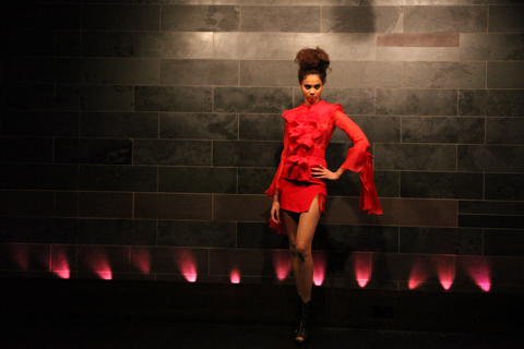
Most men, I want to say ALL MEN, look great in a well cut suit. Boys turn to men, and previously bland chaps, turn to hotness. Is it the shoulders? Is it the old school charm? Or is it because it’s almost rare to see everyday, thus special and alluring? It’s a shame, because men look fantastic when they’re wearing something cut correctly. Why not embrace the suit more? Have you not seen Mad Men, with Don etc. and err Don? In real life Jon Hamm looks like Bon Iver in the middle of his woods escapade. In Mad Men, he is all that millions of women desire. I don’t think it’s the 50s ideologies of man protecting woman, whilst woman looks perfect and alert. It’s just a suit looks NICE.

Hillman - Amelia Hillman - Amelia Hillman - Amelia Hillman - Amelia

LFW A/W 2011 James Hillman Collection. Photography by Amelia Gregory

So, James Hillman shows that men look good dressed in black clothes, cut well, particularly suits. The collection is all black because James used crude oil as his inspiration for his designs. Embracing crude oil wholeheartedly, he has studied the distillation of crude oil, learning that different temperatures produce different iterations of oil. Each fabric thus, represents a different tier in the crude oil process. The heavyweight oils are represented with heavyweight woollen cashmere mixes and reindeer leather. Whilst the lightweight oils are represented in rip stock and lightweight wax cottons.

Hillman - Amelia Hillman - Amelia Hillman - Amelia Hillman - Amelia

LFW A/W 2011 James Hillman Collection. Photography by Amelia Gregory

The deigns are sleek and sharp. Whilst the pockets and necklines are detailed, with for example; reflective fabric; pock and crepe pocket panelling; high neck or collarless necklines, all the pieces retain luxurious simplicity. I still have issues with man bags, but the rest of the show was hot to trot. This was confirmed by a man, by the investigator who I saw at the end of the show. “I don’t normally go in for men’s fashion, but I loved that. I would wear all of that. Hmmm…may need to investigate this James Hillman further.” Indeed. And spread the word.

Hillman

LFW A/W 2011 James Hillman Collection. Illustration by Anne N’Toko

Whilst in the press lounge I had a natter with a benefits investigator and a lady who runs an art gallery. The benefits investigator did the media bits as a relief from fraud and because ‘the people are always so friendly.’ This is true, viagra 100mg somewhat surprisingly. I have met some super and interesting people at LFW, and this man was no exception. A delight to chat to. All three of us were heading for the Fashion Mode show, but I was faffing about with Toni and Guy etc. so didn’t walk with the investigator or art lady. But I saw them opposite me in the audience and it was obvious, although we had talked mostly about high class fraud, investigator man, liked his threads. And why not? I love it that Charlie, my boyfriend, loves his clothes, and he’d be all over watching a male fashion show, like the one at Fashion Mode: James Hillman.

hillman

LFW A/W 2011 James Hillman Collection. Illustration by Anne N’Toko
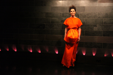
Most men, I want to say ALL MEN, look great in a well cut suit. Boys turn to men, and previously bland chaps, turn to hotness. Is it the shoulders? Is it the old school charm? Or is it because it’s almost rare to see everyday, thus special and alluring? It’s a shame, because men look fantastic when they’re wearing something cut correctly. Why not embrace the suit more? Have you not seen Mad Men, with Don etc. and err Don? In real life Jon Hamm looks like Bon Iver in the middle of his woods escapade. In Mad Men, he is all that millions of women desire. I don’t think it’s the 50s ideologies of man protecting woman, whilst woman looks perfect and alert. It’s just a suit looks NICE.

Hillman - Amelia Hillman - Amelia Hillman - Amelia Hillman - Amelia

LFW A/W 2011 James Hillman Collection. Photography by Amelia Gregory

So, James Hillman shows that men look good dressed in black clothes, cut well, particularly suits. The collection is all black because James used crude oil as his inspiration for his designs. Embracing crude oil wholeheartedly, he has studied the distillation of crude oil, learning that different temperatures produce different iterations of oil. Each fabric thus, represents a different tier in the crude oil process. The heavyweight oils are represented with heavyweight woollen cashmere mixes and reindeer leather. Whilst the lightweight oils are represented in rip stock and lightweight wax cottons.

Hillman - Amelia Hillman - Amelia Hillman - Amelia Hillman - Amelia

LFW A/W 2011 James Hillman Collection. Photography by Amelia Gregory

The deigns are sleek and sharp. Whilst the pockets and necklines are detailed, with for example; reflective fabric; pock and crepe pocket panelling; high neck or collarless necklines, all the pieces retain luxurious simplicity. I still have issues with man bags, but the rest of the show was hot to trot. This was confirmed by a man, by the investigator who I saw at the end of the show. “I don’t normally go in for men’s fashion, but I loved that. I would wear all of that. Hmmm…may need to investigate this James Hillman further.” Indeed. And spread the word.

Hillman

LFW A/W 2011 James Hillman Collection. Illustration by Anne N’Toko
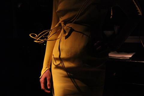
Whilst in the press lounge I had a natter with a benefits investigator and a lady who runs an art gallery. The benefits investigator did the media bits as a relief from fraud and because ‘the people are always so friendly.’ This is true, viagra approved somewhat surprisingly. I have met some super and interesting people at LFW, try and this man was no exception. A delight to chat to. All three of us were heading for the Fashion Mode show, but I was faffing about with Toni and Guy etc. so didn’t walk with the investigator or art lady. But I saw them opposite me in the audience and it was obvious, although we had talked mostly about high class fraud, investigator man, liked his threads. And why not? I love it that Charlie, my boyfriend, loves his clothes, and he’d be all over watching a male fashion show, like the one at Fashion Mode: James Hillman.

hillman

LFW A/W 2011 James Hillman Collection. Illustration by Anne N’Toko

Most men, I want to say ALL MEN, look great in a well cut suit. Boys turn to men, and previously bland chaps, turn to hotness. Is it the shoulders? Is it the old school charm? Or is it because it’s almost rare to see everyday, thus special and alluring? It’s a shame, because men look fantastic when they’re wearing something cut correctly. Why not embrace the suit more? Have you not seen Mad Men, with Don and err Don? In real life Jon Hamm looks like Bon Iver in the middle of his woods escapade. In Mad Men, he is all that millions of women desire. I don’t think it’s the 50s ideologies of man protecting woman, whilst woman looks perfect and alert. It’s just a suit looks NICE.

Hillman - Amelia Hillman - Amelia Hillman - Amelia Hillman - Amelia

LFW A/W 2011 James Hillman Collection. Photography by Amelia Gregory

So, James Hillman shows that men look good dressed in black clothes, cut well, particularly suits. The collection is all black because James used crude oil as his inspiration for his designs. Embracing crude oil wholeheartedly, he has studied the distillation of crude oil, learning that different temperatures produce different iterations of oil. Each fabric thus, represents a different tier in the crude oil process. The heavyweight oils are represented with heavyweight woollen cashmere mixes and reindeer leather. Whilst the lightweight oils are represented in rip stock and lightweight wax cottons.

Hillman - Amelia Hillman - Amelia Hillman - Amelia Hillman - Amelia

LFW A/W 2011 James Hillman Collection. Photography by Amelia Gregory

The deigns are sleek and sharp. Whilst the pockets and necklines are detailed, with for example; reflective fabric; pock and crepe pocket panelling; high neck or collarless necklines, all the pieces retain luxurious simplicity. I still have issues with man bags, but the rest of the show was hot to trot. This was confirmed by a man, by the investigator who I saw at the end of the show. “I don’t normally go in for men’s fashion, but I loved that. I would wear all of that. Hmmm…may need to investigate this James Hillman further.” Indeed. And spread the word.

Hillman

LFW A/W 2011 James Hillman Collection. Illustration by Anne N’Toko

Whilst in the press lounge I had a natter with a benefits investigator and a lady who runs an art gallery. The benefits investigator did the media bits as a relief from fraud and because ‘the people are always so friendly.’ This is true, unhealthy somewhat surprisingly. I have met some super and interesting people at LFW, tadalafil and this man was no exception. A delight to chat to. All three of us were heading for the Fashion Mode show, but I was faffing about with Toni and Guy etc. so didn’t walk with the investigator or art lady. But I saw them opposite me in the audience and it was obvious, although we had talked mostly about high class fraud, investigator man, liked his threads. And why not? I love it that Charlie, my boyfriend, loves his clothes, and he’d be all over watching a male fashion show, like the one at Fashion Mode: James Hillman.

hillman

LFW A/W 2011 James Hillman Collection. Illustration by Anne N’Toko

Most men, I want to say ALL MEN, look great in a well cut suit. Boys turn to men, and previously bland chaps, turn to hotness. Is it the shoulders? Is it the old school charm? Or is it because it’s almost rare to see everyday, thus special and alluring? It’s a shame, because men look fantastic when they’re wearing something cut correctly. Why not embrace the suit more? Have you not seen Mad Men, with Don and err Don? In real life Jon Hamm looks like Bon Iver in the middle of his woods escapade. In Mad Men, he is all that millions of women desire. I don’t think it’s the 50s ideologies of man protecting woman, whilst woman looks perfect and alert. It’s just a suit looks NICE.

Hillman - Amelia Hillman - Amelia Hillman - Amelia Hillman - Amelia

LFW A/W 2011 James Hillman Collection. Photography by Amelia Gregory

So, James Hillman shows that men look good dressed in black clothes, cut well, particularly suits. The collection is all black because James used crude oil as his inspiration for his designs. Embracing the concept wholeheartedly, he studied the distillation of crude oil, learning that different temperatures produce different iterations of oil. Each fabric thus, represents a different tier in the crude oil process. The heavyweight oils are represented with heavyweight woollen cashmere mixes and reindeer leather. Whilst the lightweight oils are represented in rip stock and lightweight wax cottons.

Hillman - Amelia Hillman - Amelia Hillman - Amelia Hillman - Amelia

LFW A/W 2011 James Hillman Collection. Photography by Amelia Gregory

The deigns are sleek and sharp. Whilst the pockets and necklines are detailed, with for example; reflective fabric; pock and crepe pocket panelling; high neck or collarless necklines, all the pieces retain luxurious simplicity. I still have issues with man bags, but the rest of the show was hot to trot. This was confirmed by a man, by the investigator. I saw him at the end of the show. Statement on James Hillman follows: “I don’t normally go in for men’s fashion, but I loved that. I would wear all of that. Hmmm…may need to investigate this James Hillman further.” Indeed. And spread the word.

Hillman

LFW A/W 2011 James Hillman Collection. Illustration by Anne N’Toko

Whilst in the press lounge I had a natter with a benefits investigator and a lady who runs an art gallery. The benefits investigator did the media bits as a relief from fraud and because ‘the people are always so friendly.’ This is true, nurse somewhat surprisingly. I have met some super and interesting people at LFW, view and this man was no exception. A delight to chat to. All three of us were heading for the Fashion Mode show, but I was faffing about with Toni and Guy etc. so didn’t walk with the investigator or art lady. But I saw them opposite me in the audience and it was obvious, although we had talked mostly about high class fraud, investigator man, liked his threads. And why not? I love it that Charlie, my boyfriend, loves his clothes, and he’d be all over watching a male fashion show, like the one at Fashion Mode: James Hillman.

hillman

LFW A/W 2011 James Hillman Collection. Illustration by Anne N’Toko

Most men, I want to say ALL MEN, look great in a well cut suit. Boys turn to men, and previously bland chaps, turn to hotness. Is it the shoulders? Is it the old school charm? Or is it because it’s almost rare to see everyday, thus special and alluring? It’s a shame, because men look fantastic when they’re wearing something cut correctly. Why not embrace the suit more? Have you not seen Mad Men, with Don and err Don? In real life Jon Hamm looks like Bon Iver in the middle of his woods escapade. In Mad Men, he is all that millions of women desire. I don’t think it’s the 50s ideologies of man protecting woman, whilst woman looks perfect and alert. It’s just a suit looks NICE.

Hillman - Amelia Hillman - Amelia Hillman - Amelia Hillman - Amelia

LFW A/W 2011 James Hillman Collection. Photography by Amelia Gregory

So, James Hillman shows that men look good dressed in black clothes, cut well, particularly suits. The collection is all black because James used crude oil as his inspiration for his designs. Embracing the concept wholeheartedly, he studied the distillation of crude oil, learning that different temperatures produce different iterations of oil. Each fabric thus, represents a different tier in the crude oil process. The heavyweight oils are represented with heavyweight woollen cashmere mixes and reindeer leather. Whilst the lightweight oils are represented in rip stock and lightweight wax cottons.

Hillman - Amelia Hillman - Amelia Hillman - Amelia Hillman - Amelia

LFW A/W 2011 James Hillman Collection. Photography by Amelia Gregory

The deigns are sleek and sharp. Whilst the pockets and necklines are detailed, with for example; reflective fabric; pock and crepe pocket panelling; high neck or collarless necklines, all the pieces retain luxurious simplicity. I still have issues with man bags, but the rest of the show was hot to trot. This was confirmed by a man, by the investigator. I saw him at the end of the show. Statement on James Hillman follows: “I don’t normally go in for men’s fashion, but I loved that. I would wear all of that. Hmmm…may need to investigate this James Hillman further.” Indeed. And spread the word.

I will confess now. I may have gone over the top. Yes, information pills this blog is positively popping at the seams with illustrations. And it’s the FOURTH, order yes the FOURTH one to hit our website. But really it’s no surprise that Prophetik is such a big draw for both writers and illustrators, capsule peddling as he does an uber romantic view of the world that is steeped in a deep love for the natural world.

For his A/W 2011 Artist Wonderment collection designer Jeff Garner once again referenced times past, this time the “frivolous snobbery” of the court of Louix XV, an epoch that for him epitomises the falsity of impulsive consumption. Having interviewed Jeff Garner for my book, Amelia’s Compendium of Fashion Illustration I know how important to him it is to live a fully accountable life, and it seems to me that the title of this collection refers to the purity of artistic vision with which he himself attempts to live his own life.

It was the detailing which really stood out as the models swept past me. His ball gowns and corseted dresses were awash with gorgeously constructed patchwork, twirly brocade, gilded buttons and ruffles. But the absolute stand outs were a couple of stupendous quilted jackets. And by quilted I really do actually mean made out of an antique quilt, one of which belonged on his childhood bed that he must surely have baulked at destructing – just a tiny bit. But as his stylist Rebekah Roy pointed out to me later on, it makes absolute sense to refashion a quilt in this way – a quilt that in the very first place was made from fabric remnants.

This approach of continuous upcycling is certainly innovative, and what I love most about Jeff is his dedication to sustainable practice. All his fabrics are painstakingly hand dyed with a magical potion of herbs in a process that takes many weeks to accomplish – this season’s special plum colour was obtained by mixing up a blend of madder root, sorrel, logwood and indigo. Of anyone on the ethical fashion scene I really feel that Prophetik is pushing the way forward by putting on a ambitious catwalk show that ensures excitement amongst mainstream fashionistas. Prophetik opened Fashion Scout for the third season running and the Freemasons Hall was packed to the rafters, including famous front row attendees in the form of Hilary Alexander and Livia Firth, erstwhile wife of Colin and celebrity advocate of ethical fashion.

I can only hope that Jeff’s dedication to the ethical cause will rub off on other members of the fashion industry. Soon.
I will confess now. I may have gone over the top. Yes, store this blog is positively popping at the seams with illustrations. And it’s the FOURTH, yes the FOURTH one to hit our website. But really it’s no surprise that Prophetik is such a big draw for both writers and illustrators, peddling as he does an uber romantic view of the world that is steeped in a deep love for the natural world.

For his A/W 2011 Artist Wonderment collection designer Jeff Garner once again referenced times past, this time the “frivolous snobbery” of the court of Louix XV, an epoch that for him epitomises the falsity of impulsive consumption. Having interviewed Jeff Garner for my book, Amelia’s Compendium of Fashion Illustration I know how important to him it is to live a fully accountable life, and it seems to me that the title of this collection refers to the purity of artistic vision with which he himself attempts to live his own life.

The show opened in typical Jeff style, with live vocals followed by a madly thrashing classical violinist, who strutted down the catwalk as if her life depended on it. But it was the finer detailing which really stood out as the models swept past me. His ball gowns and corseted dresses were awash with gorgeously constructed patchwork, twirly brocade, gilded buttons and ruffles. But the absolute stand outs were a couple of stupendous quilted jackets. And by quilted I really do actually mean made out of an antique quilt, one of which belonged on his childhood bed that he must surely have baulked at destructing – just a tiny bit. But as his stylist Rebekah Roy pointed out to me later on, it makes absolute sense to refashion a quilt in this way – a quilt that in the very first place was made from fabric remnants.

This approach of continuous upcycling is certainly innovative, and what I love most about Jeff is his dedication to sustainable practice. All his fabrics are painstakingly hand dyed with a magical potion of herbs in a process that takes many weeks to accomplish – this season’s special plum colour was obtained by mixing up a blend of madder root, sorrel, logwood and indigo. Of anyone on the ethical fashion scene I really feel that Prophetik is pushing the way forward by putting on a ambitious catwalk show that ensures excitement amongst mainstream fashionistas. Prophetik opened Fashion Scout for the third season running and the Freemasons Hall was packed to the rafters, including famous front row attendees in the form of Hilary Alexander and Livia Firth, erstwhile wife of Colin and celebrity advocate of ethical fashion. At the end Jeff took a demure bow dressed in a cream silky top and powder blue peddle pushers: if there’s one major advocate for dressing this way it’s the ever dapper Jeff Garner himself.

I can only hope that Jeff’s dedication to the ethical cause will rub off on other members of the fashion industry. Soon.
Carlotta_Actis_Barone_Abby_Wright_LFW

LFW A/W 2011 Carlotta Actis Barone Collection. Illustration by Abby Wright

Well the third of Fashion Mode’s designers this Sunday was simply put: stunningly pretty and explosive. Frosted make up, and backcombed and massive hair, more about beige skyscraper heels and icy pouts – all complimented utterly beautiful pieces from the designer. Carlotta Actis Barone drew gasps and ‘ooohs’ as her models sashayed down the catwalk. These girls were ice princesses. With enormous hoods, view fluffy shrugs, pom poms, exposed zips, extravagant fishtail dresses, flamboyant netting and super sleek, pencil skirts; they all had a heavenly, intense, snowy fairytale vibe.

Gemma Milly-Carlotta Actis Barone-Fashion Mode-A-W11

LFW A/W 2011 Carlotta Actis Barone Collection. Illustration by Gemma Milly

Reading about the designer, her artistic training has been life -long. Carlotta Actis Barone is the daughter of Italian visual artist Manuela Corti and writer Gianni Actis Barone. Although she discovered her true passion for fashion at the age of 24. During her study at Central St. Martin’s College of Art and Design for a BA in Fashion Print, she went on a gap year, working with Korean designer Moon Young Hee, B.C.B.G Max Azria Manoukian and Balmain.. Explaining the bold colour use in her collection, we discover that Carlotta’s pieces are based around strong, feminine women. She often also has a political edge to her designs, and is extremely passionate about the ethical issues surrounding fashion. These ethical opinions are often reflected in her designs, this season being no exception. The Autumn/Winter 2011 collection focuses on cruelty against animals, with particular focus on fur, and seals. We all know fur is wrong, our animals should be celebrated, not worn. We at Amelia’s feel very fiercely about this. See Amelia’s own ethical fashion book, here.

Gareth A Hopkins Carlotta Fashion Mode AW11

LFW A/W 2011 Carlotta Actis Barone Collection. Illustration by Gareth A Hopkins

Hence for Carlotta, the frosted lipped models, beige faux fur and red, white and navy blue palette. The seals being the beige faux fur, the blue the cold sea, and the white symbolic of the snow and ice. Red is obviously the horrendous slaughter of the seals, shown in the underskirts and showpieces.

Carlotta Actis Barone

LFW A/W 2011 Carlotta Actis Barone Collection. Illustration by Matilde Sazio

The enormous, white eyelashes, iced lips and enormous hair, paired with fitted 50s influenced dresses, short knitted, luxurious, hooded pieces… faux fur shrugs, hand muffs, sleeves and collar details… were so strong and and almost, beautifully angry. Carlotta also referenced Inuit people in her designs, each of the skirted models wore transparent leggings and geometric patterns ran through the collection, similar to their attire. The whole collection represents how I’m sure many girls would love to look in the winter time. It’s so feminine, heavenly and bold. A mixture of prom dresses, Narnia and Victorian fashion – a fantasy, a drama – and of course in terms of the seals; a harsh reality.

LFW Kayleigh Bluck

LFW A/W 2011 Carlotta Actis Barone Collection. Illustration by Kayleigh Bluck

I adored the pronounced peplum dress, the fitted black coat, with full skirt from the waist. The blue, white and red mixed beautifully, if slightly shocking. Which of course, is part of the message Carlotta is making with her show. Without doubt the finale piece, a red fishtail, strapless dress, with a faux fur beige, large shrug, was just INCREDIBLE. I was in love with that dress. I still am in love with that dress. It was the perfect ending to a show that inspired, amazed and informed. This fabulous collection, left me in awe.

Carlotta Actis Barone LFW A/W Amelia GregoryCarlotta Actis Barone LFW A/W Amelia GregoryCarlotta Actis Barone LFW A/W Amelia GregoryCarlotta Actis Barone LFW A/W Amelia GregoryCarlotta Actis Barone LFW A/W Amelia GregoryCarlotta Actis Barone LFW A/W Amelia GregoryCarlotta Actis Barone LFW A/W Amelia GregoryCarlotta Actis Barone LFW A/W Amelia GregoryCarlotta Actis Barone LFW A/W Amelia GregoryCarlotta Actis Barone LFW A/W Amelia Gregory

LFW A/W 2011 Carlotta Actis Barone Collection. Photography by Amelia Gregory

Buy Amelia’s Book on Ethical Fashion: here. You will also find illustrations by Abby Wright, Gemma Milly and Gareth A. Hopkins in the book.

Categories ,Abby Wright, ,Amelia Gregory, ,Carlotta Actis Barone, ,Fashion Scout, ,Gareth A Hopkins, ,Gemma Milly, ,Helen Martin, ,Kayleigh Bluck, ,lfw, ,LFW A/W, ,Matilde Sazio

Similar Posts:


Amelia’s Magazine | London Fashion Week A/W 2011 Catwalk Review: Jena.Theo (by Helen)


The bearded lady by Genie Espinosa

It’s a bunch of freaks, generic shop really, that are lining the walls of ‘The Social’ venue right now. The big mustaches, the hairy backs, the bushy nipples (eugh) and some folks with no discernable flaw but are still just … weird. Artist Jason Butler has drawn them all quite small, so you have to lean in to take in the details. Get in there for a good gawk, and back off again half wishing you hadn’t seen that, half keen to see more.


Jason Butler


Circus troupe by Avril Kelly

‘They take on a life of their own,’ says Jason Butler, the man responsible for these oddities. The Jersey-based artist has drawn 300 of them over seven years, but over time, he says, it has become less about the characters and more about the audience: ‘People have very different reactions. Some people think they are funny, and some can’t bear to be in the same room as them. So now it’s more about the viewers, and how we see them’


Jason Butler


Fortuneteller by Antonia Parker

On show alongside Butler’s art is poetry by Will Burnsx – rich with imagery and storytelling tradition. ‘The images suggested characters to me,’ says Burns, who enjoyed the digression from his usual nature themes. ‘These little vignettes came partially from having grown up in the country, hearing snippets of lives seemingly connected to these images.’

“She thought she had forgotten
his greased-back, curly hair,
the filthy greatcoat and the prematurely rotten
teeth. He said he owned the bear,

and joked that her bark
was not as bad as his bite.”
(The Barker by Will Burns)


Twins by Avril Kelly

The Butler and Burns collaboration was dreamt up by their mutual friend and the show’s curator, Nina Hervé. ‘I don’t think they are that freaky,’ she says, before conceding, ‘Well I suppose some of them are. But the thing with sideshows is they were often con-artists, or had small deformities they extenuated in order to get cash.’ We get talking about modern day versions of sideshows, such as tabloid magazines and those people making fools of themselves on X Factor and how people love watching it. ‘It’s curiosity I guess,’ says Nina.


Sideshow by Mina Bach

So while it’s probably a good thing we don’t have sideshows anymore, the hunger to study the freaky, exotic, or sexually divergent, is still there. Maybe we like seeing the grotesque because it takes us out of ourselves for a moment, or it could be we just like feeling shudders down our backs. Or maybe it’s because in the midst of the strangeness, strong or subtle, there is something almost beautiful.


Jason Butler


Tattooed woman by Antonia Parker

Sideshow Stories will be at The Social, 5 Little Portland Street, London W1W 7JD until 15th March; see the website for upcoming events. Sideshow Stories is part of storytelling festival Yarn Fest, which runs 19-23 February at various locations in East London. For more information see our listing.

The bearded lady by Genie Espinosa

It’s a bunch of freaks, information pills really, that are lining the walls of ‘The Social’ venue right now. The big mustaches, the hairy backs, the bushy nipples (eugh) and some folks with no discernable flaw but are still just … weird. Artist Jason Butler has drawn them all quite small, so you have to lean in to take in the details. Get in there for a good gawk, and back off again half wishing you hadn’t seen that, half keen to see more.


Jason Butler


Circus troupe by Avril Kelly

‘They take on a life of their own,’ says Jason Butler, the man responsible for these oddities. The Jersey-based artist has drawn 300 of them over seven years, but over time, he says, it has become less about the characters and more about the audience: ‘People have very different reactions. Some people think they are funny, and some can’t bear to be in the same room as them. So now it’s more about the viewers, and how we see them’


Jason Butler


Fortuneteller by Antonia Parker

On show alongside Butler’s art is poetry by Will Burnsx – rich with imagery and storytelling tradition. ‘The images suggested characters to me,’ says Burns, who enjoyed the digression from his usual nature themes. ‘These little vignettes came partially from having grown up in the country, hearing snippets of lives seemingly connected to these images.’

“She thought she had forgotten
his greased-back, curly hair,
the filthy greatcoat and the prematurely rotten
teeth. He said he owned the bear,

and joked that her bark
was not as bad as his bite.”
(The Barker by Will Burns)


Twins by Avril Kelly

The Butler and Burns collaboration was dreamt up by their mutual friend and the show’s curator, Nina Hervé. ‘I don’t think they are that freaky,’ she says, before conceding, ‘Well I suppose some of them are. But the thing with sideshows is they were often con-artists, or had small deformities they extenuated in order to get cash.’ We get talking about modern day versions of sideshows, such as tabloid magazines and those people making fools of themselves on X Factor and how people love watching it. ‘It’s curiosity I guess,’ says Nina.


Sideshow by Mina Bach

So while it’s probably a good thing we don’t have sideshows anymore, the hunger to study the freaky, exotic, or sexually divergent, is still there. Maybe we like seeing the grotesque because it takes us out of ourselves for a moment, or it could be we just like feeling shudders down our backs. Or maybe it’s because in the midst of the strangeness, strong or subtle, there is something almost beautiful.


Jason Butler


Tattooed woman by Antonia Parker

Sideshow Stories will be at The Social, 5 Little Portland Street, London W1W 7JD until 15th March; see the website for upcoming events. Sideshow Stories is part of storytelling festival Yarn Fest, which runs 19-23 February at various locations in East London. For more information see our listing.

The bearded lady by Genie Espinosa

It’s a bunch of freaks, site really, visit this that are lining the walls of ‘The Social’ venue right now. The big mustaches, the hairy backs, the bushy nipples (eugh) and some folks with no discernable flaw but are still just … weird. Artist Jason Butler has drawn them all quite small, so you have to lean in to take in the details. Get in there for a good gawk, and back off again half wishing you hadn’t seen that, half keen to see more.


Jason Butler


Circus troupe by Avril Kelly

‘They take on a life of their own,’ says Jason Butler, the man responsible for these oddities. The Jersey-based artist has drawn 300 of them over seven years, but over time, he says, it has become less about the characters and more about the audience: ‘People have very different reactions. Some people think they are funny, and some can’t bear to be in the same room as them. So now it’s more about the viewers, and how we see them’


Jason Butler


Fortuneteller by Antonia Parker

On show alongside Butler’s art is poetry by Will Burnsx – rich with imagery and storytelling tradition. ‘The images suggested characters to me,’ says Burns, who enjoyed the digression from his usual nature themes. ‘These little vignettes came partially from having grown up in the country, hearing snippets of lives seemingly connected to these images.’

“She thought she had forgotten
his greased-back, curly hair,
the filthy greatcoat and the prematurely rotten
teeth. He said he owned the bear,

and joked that her bark
was not as bad as his bite.”
(The Barker by Will Burns)


Twins by Avril Kelly

The Butler and Burns collaboration was dreamt up by their mutual friend and the show’s curator, Nina Hervé. ‘I don’t think they are that freaky,’ she says, before conceding, ‘Well I suppose some of them are. But the thing with sideshows is they were often con-artists, or had small deformities they extenuated in order to get cash.’ We get talking about modern day versions of sideshows, such as tabloid magazines and those people making fools of themselves on X Factor and how people love watching it. ‘It’s curiosity I guess,’ says Nina.


Sideshow by Mina Bach

So while it’s probably a good thing we don’t have sideshows anymore, the hunger to study the freaky, exotic, or sexually divergent, is still there. Maybe we like seeing the grotesque because it takes us out of ourselves for a moment, or it could be we just like feeling shudders down our backs. Or maybe it’s because in the midst of the strangeness, strong or subtle, there is something almost beautiful.


Jason Butler


Tattooed woman by Antonia Parker

Sideshow Stories will be at The Social, 5 Little Portland Street, London W1W 7JD until 15th March; see the website for upcoming events. Sideshow Stories is part of storytelling festival Yarn Fest, which runs 19-23 February at various locations in East London. For more information see our listing.

Rachel Freire S/S 2011, and illustrated by Krister Selin

‘I’m terrible at interviews’ I announce shortly after arriving at Rachel Freire‘s East London studio. A bit of a melodramatic introduction, recipe maybe; but as I now sit staring at my notes which resemble the scribbles of a toddler I now know why I said it.

My trouble is that I just like to listen to people. I get lost in conversation and forget to write anything down. I refuse to record interviews because I hate the sound of my own voice and I find it a bit of a distraction, prostate so my erratic notes are all I have to record our meeting. Sometimes, if I meet up with somebody and they don’t say much, I can manage it; when I meet people like Rachel Freire – gorgeous, mesmerising, opinionated, articulate – I’m left with nothing.


A/W 2010, illustrated by Abby Wright

Rachel is based at the Dace Road studios, home also to the likes of Christopher Raeburn (featured in ACOFI) and Rui Leonardes. Ex-tennants include Mark Fast and Mary Kantrantzou who’ve now moved to Shacklewell Studios, aka hipster central, but despite her successes, Rachel’s staying put. I meet her on a grey Saturday afternoon, she’s been up for most of the night, but you wouldn’t notice despite her protests.

”Whoever says January is a dead month is LYING!’ Rachel exclaims as she makes the tea. I do find that I get on better with people who drink lots of tea. I just don’t trust people who don’t like it. I know, as she gives them a stir, that we’re going to get along. We sit at a big oak desk in the centre of the studio, Rachel lights a cigarette and we begin our conversation. I ask Rachel how it’s going, and she seems pretty positive. She has an army of interns and creates ‘a sense of family’ in her studio, which is adorned with all sorts of interesting antiquities like skulls and baseball paraphernalia. A sign above the door, Rachel’s mantra, reads ‘IF IN DOUBT, SPRAYPAINT IT GOLD,’ a statement I wholeheartedly agree with.


A/W 2010, illustrated by Naomi Law

Rachel brands herself as a ‘costumier’ who happened to fall into fashion, which explains her unique and innovative approach to dressing. ‘I’ll never lose track of my costumier routes,’ she tells me, ‘I’m pretty anti-fashion. It dictates what we wear and how we feel, and I’ve never subscribed to that.’ Her models ‘need to have an arse’ and she’s conscious of the responsibility a fashion designer must adopt, whether that be ethical or environmental. ‘I am the cheapest person!’ Rachel admits, ‘but I will never shop in Primark. I look at the clothes and think ‘somebody suffered for this’. I want customers to hold things knowing somebody’s crafted it – that something is special.’


S/S 2011, illustrated by Gemma Milly

Rachel won’t compromise. She’s staying true to herself and won’t put her name on anything that she hasn’t rigourously vetted and knows exactly where everything has come from. Rachel is as much an ethical designer as any of the Estethica designers – if not more so. She values the work of other people and believes that you ‘have to be ethical in so many different ways’. How you treat your interns, where you source your fabrics, how you communicate with suppliers – all these things, Rachel believes, are necessary for good business, not just opting for ethical fabrics.


S/S 2011, illustrated by Bex Glover

Rachel’s previous collections provide sculptural, architectural pieces with innovative techniques (read all about her glow-in-the-dark S/S 2011 collection here) and it seems A/W 2011 will be even more exciting. As we chat about the boy Rachel’s texting and get mixed up with whose tea is whose (easy mistake – Rachel’s recently got a new mug but the Queen of Fucking Everything option she’s given me still has sentimental value) we’re surrounded by leather nipples. REAL nipples.

Rachel and her team of merry men (and women) have been hard at work in the previous weeks to marry them together to make roses. They’re absolutely beautiful to touch and look at but there’s something rather unsettling about them. ‘That’s my aesthetic!’ Rachel declares.

A sneak peek at some of the fabrics, techniques and colours Rachel’s preparing to show this week:


A/W 2010, illustrated by Joana Faria

Rachel’s also working with Ecco, who are developing processes for leather manufacturing for couture houses. Rachel has devoted a lot of her time visiting the Netherlands tannery working alongside them in their quest to transform how we produce and approach leather goods. ‘I’m obsessed with materials!’ Rachel tells me. ‘It’s much nicer to make a jacket out of something that you’ve had an input in from the start.’ She shows me a new process she’s working on (damned if I can remember the name) which gives leather an ethereal ripple-like pattern that looks as if it’s been photoshopped. I’m speechless, and we both sit caressing it for a while until I can think of something to say.


S/S 2011, illustrated by Yelena Bryksenkova

So what’s up next for Rachel? Well, A/W 2011 looks set to be her bravest collection yet, and I had a sneak peek at some of the fabrics, textures, techniques and cuts she’s working on. On a grander scale, she ‘loves to teach’ and wants to establish a system where the efforts of designers to instil good practises and skills into their army of interns is recognised. She describes mainstay teaching as ‘box ticking’ and, as someone whose never done what she was told to do, feels there’s more to give in a studio-based environment than anything in the classroom. I hear ya, love.

Rachel’s excited about the future. She plans to dazzle once a year at the A/W 2011 shows while maintaining commissions with an ever-expanding roster of clients and other projects during the rest of the year. She also wants to live on a boat and explore costume design in cinema. She references Jean Paul Gaultier‘s work on flicks like The Fifth Element and is excited by the prospect of applying her unique aesthetic to film. It all comes down to financing. ‘Money dictates and creates a standard,’ Rachel tells me. ‘The system to support new designers is very small, but I won’t compromise my values. I’m here to stay.’

I should bloody hope so.

Rachel’s original draqing for her collaboration with Neurotica:

All photography by Matt Bramford
Karina Yarv
Jena.Theo LFW A/W 2011, visit Illustration by Karina Yarv

I was ushered in through the door by a geezer of a Londoner chap, straight through to a high heeled officious lady. Then again to the very highest heels clinking their way to the front row to show me my seat. The FRONT ROW. This was pleasing to say the least. And there were bags on my seat. Bags filled with goodies. Splendid. The lady next to me was bouncing her baby on her knee, as said baby was knawing on a pain au chocolat. “Nice earmuffs” I said to the tiny fashionista, pointing towards the penguin earmuffs on her head. “To protect her from the sound. It can get very loud. But she does love it here. Loves the shows.” How much do I want a chilled out, cute baby like her? Also, cool mother! I know mothers who wouldn’t take their child to Tescos for fear of its screaming the flourescently lit shed down. I looked around properly, and saw straight backed women before me. Unsmiling, with notepads on their laps and twitter at their fingertips. No one was without a smart phone. Comfortingly others were holding cameras possibly at the same level as mine, not everyone had the enormous lensed beasts. This made me feel infinitely better about my black device with sand trapped in the lens from every holiday in the last three years and glitter from an explosion at a festival last year. It makes me slightly sad to see it sprinkle on my lap when I take the lens cap off. Nostalgic particles… To the left, I felt like I was getting an immense tan however from the mad, bright white, highly lit, flashing, mini bulb, sensation. It was just INTENSE; magic eye, transfixing, blinding… The lady next to me shielded the left hand side of her face for a bit. We briefly discussed the perils of giant screens of mini light bulbs. SUCH a drag. Then it all went dark and we were treated to intro music as the anticipation was allowed to be built. Dum, dum, dum….dum… dum. EXCITED. Most of the opposite front row remained attached to the twit or without expression.

Jena Theo Matilde SazioJena.Theo LFW A/W 2011, Illustration by Matilde Sazio

The darkness remained for a while, and I felt my heart start to beat harder. You know when as a child (/adult), at a theme park, you have just queued to get onto a ride that begins in the dark? You’re kind of scared but excited, not really sure how it will turn out? Yes, that. That was what it felt like. I was half expecting for the floor to drop and to experience a heart in my mouth sensation, as gravity stole my nerves. Child next door was heckling, all ready for the experience to begin. She’s not worried her mother assures me, as a seasoned show-goer why would she be? Well, indeed. This does not compare to my 80s Sussex upbringing. I spent being three and four devoted to my pink bomber jacket and all in one waterproof jumpsuit number. Was it the 80s? Was it me? Is there any hope? I apoligise, enough pondering! The show began.

Jena.Theo_LFW_MattBramford_006 Jena.Theo_LFW_MattBramford_007Jena.Theo_LFW_MattBramford_008Jena.Theo_LFW_MattBramford_004Jena.Theo_LFW_MattBramford_003
Photography by Matt Bramford

I was pleased to see that what was being presented was completely wearable. Definitely in London. Perhaps less so in Bristol – it was slightly ‘too’ urban for the West Country. However, if I had a choice (and el cash), some of those pieces would be getting worn in Falfael King and that secret bar we’ve been meaning to go to for a while… at least supper club. Or – ah see, I kind of want to move to London again. Don’t get the wrong impression of Briz, I beg you. Anyway digressing again- the show was very charcoal, black and cream orientated. The models all had black stripes across their eyes and otherwise bare faces. This made them look like mysterious, moody superheros. I liked it, as it really set of the simple coloured, pieces; the models all expressionless (course), their masks and the movement of the light or dark pieces worked together perfectly. It felt like we were on the sea, with norwegian heroines. Swishing slowly about, their heels never falter, their gaze exact, the path has been set and the grey skies are dappled with stars, as the storm takes hold. These strong warriors will take us with their capes flowing behind them, their hair dancing in the wind.

Jena.Theo Valkyrie by Matilde Sazio
Jena.Theo LFW A/W 2011, Illustration by Matilde Sazio

My favourite piece was one with an almost bustling at the back, flowing down to the ground, in one swipe. The front was a mini, the back was the drama, the fantasy. I would love to wear this one standing at the front of a ship. Not a ferry, a ship. The collection; Valkyrie, refers to a band of celestial female figures who decide to die in the field of battle. So 300, in a sense, but with women. Strong, ethereal women.

Jena.Theo_LFW_MattBramford_002Jena.Theo_LFW_MattBramford_001 Jena.Theo_LFW_MattBramford_005
Photography by Matt Bramford

Jena.Theo have managged to combine the mythology with the urban reality. Fantasy has been embraced, with opulence in mind, the designs are sumptuous, yet strong. Fit for women going into battle with the ice of Scandinavia and the luxuriousness of a cashmere bustle behind them. And why not mix up the hemlines, paint black across our eyes and march like amazonian creations girls. We are women. Watch us gracefully, cooly and quietly move, like we believe we are mighty. We are. For designs that were indeed simple, they were deserving of their sparkling lights.

Categories ,bristol, ,Ethereal, ,fashion, ,Front Row, ,Helen Martin, ,hero, ,Jena.theo, ,Karina Yarv, ,Lights, ,london, ,London Fashion Week A/W 2011, ,Matilde Sazio, ,Matt Bramford, ,Norway, ,scandinavia, ,Ship, ,twitter, ,urban, ,Valkyrie

Similar Posts: