Amelia’s Magazine | Space Beads: Ancient Egyptian Artefacts Made From An Iron Meteorite

Egyptian-Meteor-by-Kit-Wags
Space Beads by Kit Wags.

It’s been awhile since I last had the opportunity to attend a lecture, but last weekend I went to the Royal Observatory in Greenwich for a talk about Space Beads – the title alone being enough to tickle my fancy.

Sarah-Gillett-I-think-I-am-an-ominous-decoration-2014
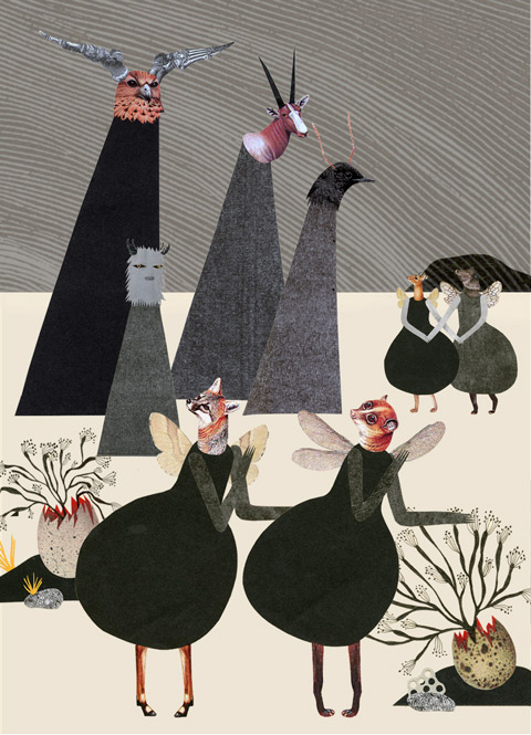
Tapestry by Sarah Gillett.

egyptian-meteroite-jewelry-space beads
The space beads in question are ancient Egyptian beads dug up from the graves in Gerzeh in 1911, the same year that a large and notable meteorite fell to the earth in the same area of Egypt. The Gerzeh beads have long fascinated archaeologists and scientists as the are made of iron, yet date from the Pre-Dynastic period some 5,000 years ago, long before the earliest example of iron work in Egypt. It has recently been confirmed that these curious beads were made from thin sheets or iron taken from just such a meteorite.

Leonid Meteor Shower over Niagara Falls, 1833
Leonid Meteor Shower over Niagara Falls, 1833.

Meteorite shower engraving, 1848
Meteorite shower engraving, 1848.

Meteor_Crater_Near_Winslow_Arizona
The afternoon opened with a wonderful talk about meteorites given by Marek Kukula, public astronomer at the Royal Observatory. I was chuffed to discover that I was the only one in the room who has visited the giagantic Meteor Crater in Arizona, on a road trip with my parents in the 80s when I lived in the USA. Our visit was notable for our idiocy – we decided to walk the enormous rim in the midday sun, not a good idea in a desert. The most exciting thing I learnt from Marek was that on very rare occasions the tail of a comet will shed a glorious meteorite shower across the entire sky as it grazes the earth’s atmosphere, as happened in 1860, and have since discovered the wood cuts to prove it (great inspiration for my open brief, That Which We Do Not Understand) Apparently we can never know when this will happen again until the occasion is upon us. I am now hoping and praying to see such a wondrous sight in my lifetime! I can only imagine how other worldly it must have appeared to more ancient peoples.

Meteoriten 1838-Keller
egpytian_museum_cairo_Bat-goddess
Which brings me back to our Space Beads. Our next speaker was Alice Stevenson, who has a PhD in the study of the graveyard where the beads were found. She talked about what life was like during the Pre-dynastic era, and the possible meaning and use of the beads, which were obviously worn by someone of some repute. They were found alongside a depiction of the horned cow god Bat with stars above her head: pure speculation could lead us to believe that the beads themselves a very special representation of the heavens.

pallasite meteor
Glorieta-Pallasite Meteor
During a break we were invited to hold sections of different meteorites, some of them older than the planets themselves (gulp, how does one even process such information?) Some of these lumps of rock were exceptionally heavy – I particularly marvelled at the sample of Pallasite Meteor, which contains fragments of Olivine gems (otherwise known as Peridot).

Engraving of the Ochansk meteorite over Perm
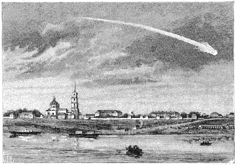
Engraving of the Ochansk meteorite over Perm.

Diane Johnson experimental archaeology predynastic space beads
Diane Johnson’s experimental archaeology, making predynastic space beads.

Thirdly we were introduced to planetary scientist Diane Johnson of the Open University, who has combined her love of meteorites and Egypt in an intensive study of the beads. Experimental archaeology has led her to conclude that the beads were made using thin slices of iron that were banged out of the meteorite and then rolled into tubes, rather than forged in a furnace (which shatters the delicate meteorite structure). Her modern day space bead, worn on a simple cord, was beautiful and unusual.

Matthew Luck Galpin meteorite-space beads
Lastly artist Matthew Luck Galpin talked about the use of meteorites in his series of Anvilled Stars. He agreed with Diane that the process of banging them into flattened shapes was a highly therapeutic process that was as important as the final outcome, a highly tactile object reminiscent of an astrolabe, some of which are scattered without explanation around the observatory galleries.

Meteor over Shetland Isles
Meteor over Shetland Isles.

At the end of the chat we had a chance to visit the galleries to view some amazing examples of meteorite. It was great to hear an expert talk about treasures such as the Nakhla Meteorite, which is actually a piece of Mars. The space beads themselves are housed in the Petrie Museum, which I have never even heard of. This is an Egyptian museum attached to UCL, with a super interesting roster of events. I wonder when I can get away to my next lecture…

Categories ,#TWWDNU, ,1860, ,Alice Stevenson, ,Anvilled Stars, ,Arizona, ,Astrolabe, ,Bat, ,Diane Johnson, ,Egypt, ,egyptian, ,Experimental Archaeology, ,Gerzeh, ,Kit Wags, ,Lecture, ,Marek Kukula, ,Mars, ,Matthew Luck Galpin, ,Meteor Crater, ,Meterorites, ,Nakhla Meteorite, ,Ochansk meteorite, ,Olivine, ,Open University, ,Pallasite Meteor, ,Peridot, ,Petrie Museum, ,Pre-Dynastic, ,Royal Observatory, ,Sarah Gillett, ,Shooting Stars, ,Space Beads, ,That Which We Do Not Understand, ,UCL, ,Year of Meteors

Similar Posts:


Amelia’s Magazine | The Many Sides: An interview with founder Rita Sheth

The Many Sides Fashion Illustration By Toni Morris
The Many Sides Fashion Illustration By Toni Morris.

You come from a corporate background – why did you decide to branch out and set up The Many Sides and what were you able to bring to the process from your former career?
I set up the business because I found I was no longer excited by what was on offer on the high street – I wanted to bring more unique, well made clothes to people that were also frustrated by the high street as well as the ‘slap on a monogram’ ethos which we see from established labels. As such it was kind of a labour of love! Basically I wanted to connect creative designers with women who wanted to express themselves through creative fashion!
I think from my former career I am able to bring a level of professionalism and attention to detail which is important. It also helps to be able to structure a deal which is important when thinking about different ways you can do business.

The Many Sides Swim
I like the thinking behind your name, can you explain a bit more about what The Many Sides means to you?
The Many Sides references the many sides of a woman. I found as a corporate professional I would have a persona at work and then lots of different other sides for all the other roles I play and the many interests I have. I wanted to develop a brand that resonated with a similar kind of woman. A woman that has many sides and many interests – one of which desires creative self expression and uses fashion as a vehicle to do that.

The Many Sides floral lookbook
Where are your designers from and how do you discover them and bring them on board?
My designers come from a variety of countries from South Korea, Denmark, Greece and the UK among others. I discover them through various means, trade shows, desk based research, instagram…. and now designers get in touch with me too as they like what I am doing and want to be featured on a platform that is selective and well curated. I won’t sell anything I don’t like or where the quality is sub par. I always look for a story behind the designers inspiration that cohesively carries through to their aesthetic. Though each collection may vary, there needs to be something distinctive and ‘signature’ about the designers concept.

The Many Sides Spring Sterling Silver Neckpiece
The Many Sides sterling silver lookbook
Please could you introduce us to a few of your designers…. and let us know a bit about why you have chosen them.
The designers are an eclectic bunch – each with their own distinctive style. A few of the designers we stock are:

The Many Sides Chichia Jumpsuit
The Many Sides ChichiaJacketandTrousers copy
Chichia – Her designs are influenced by African print and in particular she uses the local Khanga fabric to make the clothes. She makes the clothes using local labour in Tanzania to give back to her homeland. I really like the colour and the unique use of cut outs as well as the representation of the culture via the fabrics used.

The Many Sides leather skirt yohan kim
Yohan Kim – Our South Korean designer. He has a rock and roll, gothic style. He uses a lot of leather, studs and heavy detailing, embellishment and embroidery. I really love the intricacy of the pieces. The pictures online don’t do the items enough justice! The pieces are very handcrafted and deeply worked – for example one of the leather skirts is texturised on one side and has studs on the other side. No regular leather skirt!

Tuxedo Jacket
Alice’s Pig – Our London based designer who is influenced by Alice in Wonderland and girly vintage tea party looks. Lots of 50′s style dresses and feminine cuts. I love this designer as the pieces are very wearable but have a subtle twist that still makes the items unique. The kimono trousers and tuxedo jacket are a case in point – they are both staple pieces but not boring and each have a little something extra to make them memorable.

The Many Sides kimono lookbook
What have been the biggest difficulties and triumphs in setting up your own business?
The biggest difficulty is in bridging the gap between online and offline. I am currently looking at ways to make the clothes more accessible offline as its still important to some customers be able to touch and feel the clothes. The main thing I am proud of has been in getting so much positive feedback from customers, bloggers and designers. People in the industry as well as the customer seem to really like the clothes and more importantly are willing to spend their hard earned money buying them – its so rewarding when someone genuinely loves a purchase.

The Many Sides - Spring Edit Bag2
Can you tell us more about your spring edit selection and what informed your choices?
It is a mixture of clothes good for the current weather – florals and light weight fabrics. However as the weather in England is so changeable there are also some jackets on there too. Having said that all of the clothes can be worn any time of year – I don’t approve of the fast fashion movement and want to slow things down by always having clothing on there for all occasions and all weather.

The Many Sides Spring Edit Ceramin Necklace
I also included some colourful accessories including some contemporary jewellery pieces that would go well with day time spring/summer looks to reflect the new season and hopefully the beginning of sunshine! Looking ahead we also have a great new swimwear designer that does very unique designs to flatter every shape which also comes in made to measure sizes.

The Many Sides slate_crag_ring_on_hand
The Many Sides Spring Ceramic_Ring
What next for the Many Sides?
As I mentioned I want to explore different ways to bring the clothes to customers in a more direct way. This is something I am looking at right now. I also want to carry on delighting customers with the unique product offering which I intend to keep growing with time. Essentially, I hope to grow the business through word of mouth – that’s the dream!

Check out Rita Sheth‘s unique selection of clothing and accessories for yourself on The Many Sides. Rita Sheth was a contributor to my 10th anniversary book That Which We Do Not Understand.

Categories ,#TWWDNU, ,Alice’s Pig, ,Chichia, ,fashion, ,Global Fashion, ,Indie Fashion, ,interview, ,Rita Sheth, ,That Which We Do Not Understand, ,The Many Sides, ,Toni Morris, ,Yohan Kim

Similar Posts:


Amelia’s Magazine | Tent London 2014: Lighting, Furniture, Jewellery and Interior Design

melanie porter sheep
Continuing my very late review of the 2014 edition of Tent London, here is some wonderful furniture, lighting, jewellery and other finds.

Melanie Porter
First of all, Snarfle astride a knitted rocking sheep (top) by Melanie Porter, who is also responsible for these sophisticated shadow lights woven with metallic thread.

Haidee Drew
These lovely ceramic ducks are by Haidee Drew.

Sevak Zargarian
Sevak Zargarian made these beautiful porcelain bowls, and has recently completed some awesome pendant lights for Heals.

turner furniture
These stunning inlaid wood cabinets are by Turner Furniture.

Christine Meyer-Eaglestone
More amazing marquetry in a mirror surround by Christine Meyer-Eaglestone.

Dan Heath studio
Daniel Heath created this Memphis inspired printed wood coffee table using a new printing process. I just love the pattern and what an innovative idea!

Nicholas Collins
And now for something pretty unique: Tumbling Blocks glass plates by Nicholas Collins.

Korinna Mei Veropoulou
The London Met University took a stand at Tent, and I particularly liked this fluoro illustration by Korinna Mei Veropoulou.

Melody Rose
Flying acrobats featured on the new range of Melody Rose china mugs.

Chromatic jewellery
Chromatic jewellery by Inca Starzinksy gives a new twist to perspex.

Kolormundo
On a similar tip are these colour wheel balls by Kolormondo, created to help designers.

Summer will be back
I first met the lovely Lisa of Summer Will Be Back when I visited her studio in Copenhagen. These origami mobiles are a beautiful addition to her print based ranges. I am very impressed by how prolific Lisa is.

Manufract
Manufract jewellery from Germany features some unusual broken maple and resin pendants.

Andrew Luddick
At the Irish showcase I was drawn to playful ceramics by Andrew Luddick.

Woodenleg
These fun ‘Chalet’ tables are by Woodenleg.

Louise tucker
Cardiff based Louise Tucker makes gorgeous woven lampshades.

Clare Millard
This geometric optical jewellery is by Clare Willard, currently stocked in the Design Museum.

Claire Loderheads
Humorous ceramics by Claire Loder stood out as hand made craft objects in a more design orientated show.

From Africa
These stylish monochrome woven lampshades (I sense a theme) are From Africa.

Glassmania czech
glassmania
Glassmania was a fun stand featuring unusual and playful designs by students from the Academy of Arts in Prague.

Korean metal gongs
These giant metal gong balls were an eye catcher at the Korean showcase.

Alfred and Wilde
Finally, I absolutely love the Platonic Solids inspired collection by new brand Alfred and Wilde from designer Simon Mitchell. These mugs come in 5 designs and are fired with dishwasher safe 9ct gold. I had a great chat with Simon, who still works two days a week in a marketing job to support his dream to run his own design brand. Simon contributed writing about the Platonic Solids for my 10th anniversary book That Which We Do Not Understand, and I recently interviewed him here.

All of these images were first shared on my instagram feed.

Categories ,2014, ,Academy of Arts, ,Alfred and Wilde, ,Andrew Luddick, ,Christine Meyer-Eaglestone, ,Claire Loder, ,Clare Willard, ,Daniel Heath, ,From Africa, ,Furniture, ,Glassmania, ,Haidee Drew, ,Inca Starzinksy, ,Irish showcase, ,jewellery, ,Kolormondo, ,Korinna Mei Veropoulou, ,Lighting, ,London Met University, ,Louise Tucker, ,Manufract, ,Melanie Porter, ,Melody Rose, ,Nicholas Collins, ,Platonic Solids, ,Prague, ,review, ,Sevak Zargarian, ,Simon Mitchell, ,Summer Will Be Back, ,Tent London, ,That Which We Do Not Understand, ,Truman Brewery, ,Tumbling Blocks, ,Turner Furniture, ,Woodenleg

Similar Posts:


Amelia’s Magazine | Tent London 2014: Textiles and Surface Design

Zoe Murphy
Yes yes it’s been 6 months since the 2014 edition of Tent London but straight after the show I became ridiculously busy with my 10th anniversary Kickstarter project, That Which We Do Not Understand. I have always wanted to share my finds properly, some of whom I have already profiled at length on this website, and I’m sure this little collection will offer some refreshing and exciting inspiration.

Zoe murphy cushions
From Mexico to Margate was inspired by Zoe Murphy’s summer travels, and is the perfect vehicle for her zingy colour ways. Used to great effect on these cacti fabric designs on cushions. Spot also the Snarfle ghost hand.

Seven Gauge Studios
I love the new geometric woven fabric designs by Seven Gauge Studios.

Room 39
This wonderful new bedding and cushion collection is by Room 39. Designer Petra was also very helpful on the subject of crowdfunding, having funded the fragment bedding range through this method herself.

Sian Elin
Sian Elin excels in the creation of upbeat geometric designs such as these wonderful duotone cushions.

Louise Wilkinson
Louise Wilkinson cushion
As always I adore the designs of Louise Wilkinson, whose new fabrics are a touch folkloric, a touch Scandinavian and a touch of chintz: lots of fruits, vegetables and strange little animals.

Louise Wilkinson hedgehog
I think this gold hedgehog wall decal is out of this world, but she only made them as one offs for Tent. Don’t you reckon they would sell like hot cakes?!

Lorna Syson
It was great to see new designs by Lorna Syson mixing up birds and geometric designs: I’ve since discovered her new Broom and Bee design, which is absolutely magic – check her website to see it.

Otago Design mat
We spent some time admiring coir circle mats made in Africa for Otago Design.

Sonya rugs
Amazing crazy cool bright rugs are by Sonya Winner.

Rose sharp jones
I adore the subtle crochet cushion designs of Rose Sharp Jones: one of a new wave of crafters bringing this traditional technique into the 21st century.

Occipinti
occipinti textiles
Embroidery hoops are a wonderful showcase for fabrics by Occipinti. Find out more about the designer in my recent interview.

Tracey Tubb
These very clever and original origami wall coverings are by Tracey Tubb.

Natalia Yanez
Natalia Yanez utilises a combination of crochet and local Chilean basketweave techniques in her beautiful and unusual structures. Very clever!

candid fabric
These fabulous tropical fruit fabrics are by Hannah Rampley for Candid Fabric – a new project to support emerging graduate textile designers.

Beldi rugs
Beldi rug vintage
I am just a little bit in love with vintage Moroccan Beldi Rugs. These rag rugs cost a fortune but are ever so glorious.

Parris Wakefield additions
Paris Wakefield Additions has released a stunning new fabric design. Since last September I have had the honour of working with Sarah Parris, who produced a beautiful print for my special That Which We Do Not Understand 10th anniversary gold leaf range, available here.

Fanny Shorter
Fanny Shorter skirt
As always I love tropical loveliness by Fanny Shorter, looking wonderful in a pencil skirt made with her fabric.

Kitty McCall
Last but not least, I am enthralled by the colourful abstract designs of Kitty McCall. This fabric looks like a surreal mountainscape.

Read about furniture, lighting and other odds and sods here! All of these images were first shared on my instagram feed.

Categories ,2014, ,Beldi Rugs, ,Broom and Bee, ,Candid Fabric, ,craft, ,crochet, ,Fanny Shorter, ,From Mexico to Margate, ,Hannah Rampley, ,instagram, ,Interior Design, ,Kitty McCall, ,Lorna Syson, ,Louise Wilkinson, ,Natalia Yanez, ,Occipinti, ,Otago Design, ,Paris Wakefield Additions, ,review, ,Room 39, ,Rose Sharp Jones, ,Sarah Parris, ,Seven Gauge Studios, ,Sian Elin, ,Snarfle, ,Sonya Winner, ,surface design, ,Tent London, ,textiles, ,That Which We Do Not Understand, ,Tracey Tubb, ,Truman Brewery, ,Zoe Murphy

Similar Posts:


Amelia’s Magazine | OPEN BRIEF for ARTISTS: Amelia’s Magazine Colourful Colouring Companion

Amelia's Magazine issue 4 cover colouring in
Have you noticed the huge trend for colouring books aimed at adults? It hasn’t escaped my notice: I included a series of colouring in pages in issue 4 of Amelia’s Magazine way back in 2005, complete with a scratch ‘n’ sniff cover and a free set of smelly branded pens to colour in those pages (above). 10 years on the concept has gone mainstream, and the time is right to contribute something a bit different to the market: a beautifully curated colouring book that features the work of multiple contributors who are working in diversely different but appealing styles. I will include artwork that features a wide range of themes, creating a book that goes beyond the feel of most pretty decorative colouring books. I want this book to appeal as much to men as it does to women! (and I therefore encourage lots of male artists to contribute).

Amelia's Magazine issue 4 Zakee Shariff colouring in pages
Zakee Shariff, Amelia’s Magazine issue 4.

Amelia's Magazine issue 4 Birgitte Lund colouring in pages
Birgitte Lund, Amelia’s Magazine issue 4.

And the most exciting part about this project? Each artist will get two opposing pages to play with, just as they did back in 2005. One side of the book will showcase a fully coloured image, and the opposite page will showcase a similar or related image designed for colouring in. It’s a great chance for artists to get their work seen and admired by a wide new audience – all images will be credited and there will be a back section where short bios and links for all featured artists are shared. Let your imagination run riot.

Amelia's Magazine issue 4 Serge Seidlitz colouring in pages
Serge Seidlitz, Amelia’s Magazine issue 4.

Amelia's Magazine issue 4 Colin Henderson colouring in pages
Colin Henderson, Amelia’s Magazine issue 4.

I have already conducted a bit of market research on my social media feeds to gauge enthusiasm for a colouring in book and here are just a few of the responses: I think we’re onto a winner!

‘Sounds so fun’
‘I’d buy it for sure’
‘Heck yes, I’d love to be involved’
‘I’d love to draw something! I would also love to buy a copy!’
‘Yes! I loved this back in 2005. And would love another similar issue today! x’
‘I’ve just completed two commissions for adult colouring books, they’re so popular right now go for it, I’d love to contribute!’
‘Would love to pop five on my Christmas gift list!’
‘I remember this! Great idea!’
‘Definitely, great idea! Would tick two of my obsession boxes…’
‘definitely! Perfect idea!’
‘sounds like a fantastic idea. I hope you decide to go for it, it would be a great project & I’d love to buy one.’
‘It’s a brilliant concept. Like a colouring compendium of up and coming artists.’

Amelia's Magazine issue 4 Jim Stoten colouring in pages
Jim Stoten, Amelia’s Magazine issue 4.

Technical Details:
Please read before you start your artwork! I cannot include artwork that is not correctly put together for the book.

Specifications:
The full colour page of your artwork should be designed to appear on the left hand side of the book (so please remember that some of the artwork may disappear into the gutter on the right hand side). Please note that this is the reverse of how it appeared in issue 4.

The colouring in page should be designed to appear on the right hand side of the book (ditto, some of the artwork may disappear into the gutter at the left side). Please make sure you create this page using a fine liner pen and make sure your lines are solid and can be coloured in easily (no pencil or brush lines please). Lots of small intricate spaces to colour in are good, but it’s okay to intersperse these with larger areas of plain ground.

Please make sure your pages work together: they could make up one large image when viewed together, or tell some kind of story next to each other. They should not be based on the exact same image. Please have fun with this concept; this will not be a twee colouring in book, so please get inspired by ideas beyond the usual. And of course, have fun with colour…

Size, Bleed, File type:
This book will be the same size as all my publications: 200mm wide x 245mm high. However you should produce your original artwork so it would fit an A2 sheet; 400mm x 490mm at a 300 dpi resolution.

Please also include a 3mm area of bleed around your artwork, as it will be printed full bleed in the book. This is a 3mm zone that you do not mind losing parts of when the pages are cut to size (so don’t include anything important).

Each of your two images should therefore be sized 406mm wide x 496mm high at 300 dpi, which includes the 3mm bleed zone around each side.

Create your colour artwork using the CYMK colour mode for lithograph printing and save as a tiff or psd file. Please create the line art for your colouring in page using the Grayscale mode in Photoshop or as an Illustrator file. The line art should be very black please.

Exclusivity:
Your artwork should be created exclusively for this project: please share tasters on social media using the hashtag #ameliasccc but do not share the full piece online until the book is published if you are chosen for inclusion.

Amelia's Magazine issue 4 Luke Best colouring in pages
Luke Best, Amelia’s Magazine issue 4.

Send Me:
Please title your email ARTWORK FOR AMELIA’S MAGAZINE COLOURING BOOK.

Please ensure your artworks are labelled with your name or I may lose them.

Please send me a small version of your artwork: my Gmail account cannot cope with large files, so please ensure you resize each page to be no larger than 1MB. If you are shortlisted I will ask you to send a larger file via Wetransfer.

Website and Social Media:
You must have a professional active presence on social media channels, preferably on at least twitter, facebook and instagram.

Please include all relevant links in your email, including a link to the personal website which best showcases your work.

Please do start sharing news on the project using the hashtag #ameliasccc. I’d love to see your progress on twitter and instagram.

Words:
Please send me a 100 word description of your artwork: including inspiration, process and meaning if applicable.

Please also send me 100 word biography.

Amelia's Magazine issue 4 Babak Ganjei colouring in pages
Babak Ganjei, Amelia’s Magazine issue 4.

Credit:
All artists will receive a complimentary copy of the book. If the book is taken up by a publisher I will endeavour to agree some kind of payment for all featured artists: but please note that if I self publish this book I will not be able to offer any payment. *So I can’t promise anything at this stage.*

Deadlines:
You have all summer long to work on your images, but please submit your artwork to art@ameliasmagazine.com by Friday 28th August 2015. My plan is to publish this book before Christmas, making it the perfect gift item for all those who have recently discovered (or rediscovered) the joy of colouring in, but are looking for something a bit different from the average offering.

Publishing Plans:
At present I anticipate self-publishing this book through Kickstarter in the same way as I did with my limited edition 10th anniversary celebration book That Which We Do Not Understand: now sold out. However I am also actively looking for a publisher who understands my vision and is able to better promote and distribute this book once it is published. I don’t know which way it will go at this stage, but suffice to say that if you are a publisher or work for one and would be interested in chatting with me then do get in touch: I’d love to talk.

Disclaimer:
I am nearly 38 weeks pregnant and hopeful this birth will go well and I can get back to work as soon as possible, but there’s always the potential for unforeseen problems, and if something does happen then I will have to postpone this project. So I am just putting that thought out there: I could not wait to post this brief and look forward to seeing what you produce.

Categories ,#ameliasccc, ,Adult Coloring Book, ,Adult Colouring, ,Adult Colouring Book, ,Amelia’s Magazine, ,Babak Ganjei, ,Birgitte Lund, ,Colin Henderson, ,Coloring, ,Coloring In, ,Colourful Colouring Companion, ,Colouring, ,Colouring Book, ,Colouring In, ,illustration, ,Jim Stoten, ,Kickstarter, ,Luke Best, ,Open brief, ,Serge Seidlitz, ,Special Colouring Companion, ,That Which We Do Not Understand, ,Wetransfer, ,Zakee Shariff

Similar Posts:


Amelia’s Magazine | OPEN BRIEF for ARTISTS: Amelia’s Magazine Colourful Colouring Companion

Amelia's Magazine issue 4 cover colouring in
Have you noticed the huge trend for colouring books aimed at adults? It hasn’t escaped my notice: I included a series of colouring in pages in issue 4 of Amelia’s Magazine way back in 2005, complete with a scratch ‘n’ sniff cover and a free set of smelly branded pens to colour in those pages (above). 10 years on the concept has gone mainstream, and the time is right to contribute something a bit different to the market: a beautifully curated colouring book that features the work of multiple contributors who are working in diversely different but appealing styles. I will include artwork that features a wide range of themes, creating a book that goes beyond the feel of most pretty decorative colouring books. I want this book to appeal as much to men as it does to women! (and I therefore encourage lots of male artists to contribute).

Amelia's Magazine issue 4 Zakee Shariff colouring in pages
Zakee Shariff, Amelia’s Magazine issue 4.

Amelia's Magazine issue 4 Birgitte Lund colouring in pages
Birgitte Lund, Amelia’s Magazine issue 4.

And the most exciting part about this project? Each artist will get two opposing pages to play with, just as they did back in 2005. One side of the book will showcase a fully coloured image, and the opposite page will showcase a similar or related image designed for colouring in. It’s a great chance for artists to get their work seen and admired by a wide new audience – all images will be credited and there will be a back section where short bios and links for all featured artists are shared. Let your imagination run riot.

Amelia's Magazine issue 4 Serge Seidlitz colouring in pages
Serge Seidlitz, Amelia’s Magazine issue 4.

Amelia's Magazine issue 4 Colin Henderson colouring in pages
Colin Henderson, Amelia’s Magazine issue 4.

I have already conducted a bit of market research on my social media feeds to gauge enthusiasm for a colouring in book and here are just a few of the responses: I think we’re onto a winner!

‘Sounds so fun’
‘I’d buy it for sure’
‘Heck yes, I’d love to be involved’
‘I’d love to draw something! I would also love to buy a copy!’
‘Yes! I loved this back in 2005. And would love another similar issue today! x’
‘I’ve just completed two commissions for adult colouring books, they’re so popular right now go for it, I’d love to contribute!’
‘Would love to pop five on my Christmas gift list!’
‘I remember this! Great idea!’
‘Definitely, great idea! Would tick two of my obsession boxes…’
‘definitely! Perfect idea!’
‘sounds like a fantastic idea. I hope you decide to go for it, it would be a great project & I’d love to buy one.’
‘It’s a brilliant concept. Like a colouring compendium of up and coming artists.’

Amelia's Magazine issue 4 Jim Stoten colouring in pages
Jim Stoten, Amelia’s Magazine issue 4.

Technical Details:
Please read before you start your artwork! I cannot include artwork that is not correctly put together for the book.

Specifications:
The full colour page of your artwork should be designed to appear on the left hand side of the book (so please remember that some of the artwork may disappear into the gutter on the right hand side). Please note that this is the reverse of how it appeared in issue 4.

The colouring in page should be designed to appear on the right hand side of the book (ditto, some of the artwork may disappear into the gutter at the left side). Please make sure you create this page using a fine liner pen and make sure your lines are solid and can be coloured in easily (no pencil or brush lines please). Lots of small intricate spaces to colour in are good, but it’s okay to intersperse these with larger areas of plain ground.

Please make sure your pages work together: they could make up one large image when viewed together, or tell some kind of story next to each other. They should not be based on the exact same image. Please have fun with this concept; this will not be a twee colouring in book, so please get inspired by ideas beyond the usual. And of course, have fun with colour…

Size, Bleed, File type:
This book will be the same size as all my publications: 200mm wide x 245mm high. However you should produce your original artwork so it would fit an A2 sheet; 400mm x 490mm at a 300 dpi resolution.

Please also include a 3mm area of bleed around your artwork, as it will be printed full bleed in the book. This is a 3mm zone that you do not mind losing parts of when the pages are cut to size (so don’t include anything important).

Each of your two images should therefore be sized 406mm wide x 496mm high at 300 dpi, which includes the 3mm bleed zone around each side.

Create your colour artwork using the CYMK colour mode for lithograph printing and save as a tiff or psd file. Please create the line art for your colouring in page using the Grayscale mode in Photoshop or as an Illustrator file. The line art should be very black please.

Exclusivity:
Your artwork should be created exclusively for this project: please share tasters on social media using the hashtag #ameliasccc but do not share the full piece online until the book is published if you are chosen for inclusion.

Amelia's Magazine issue 4 Luke Best colouring in pages
Luke Best, Amelia’s Magazine issue 4.

Send Me:
Please title your email ARTWORK FOR AMELIA’S MAGAZINE COLOURING BOOK.

Please ensure your artworks are labelled with your name or I may lose them.

Please send me a small version of your artwork: my Gmail account cannot cope with large files, so please ensure you resize each page to be no larger than 1MB. If you are shortlisted I will ask you to send a larger file via Wetransfer.

Website and Social Media:
You must have a professional active presence on social media channels, preferably on at least twitter, facebook and instagram.

Please include all relevant links in your email, including a link to the personal website which best showcases your work.

Please do start sharing news on the project using the hashtag #ameliasccc. I’d love to see your progress on twitter and instagram.

Words:
Please send me a 100 word description of your artwork: including inspiration, process and meaning if applicable.

Please also send me 100 word biography.

Amelia's Magazine issue 4 Babak Ganjei colouring in pages
Babak Ganjei, Amelia’s Magazine issue 4.

Credit:
All artists will receive a complimentary copy of the book. If the book is taken up by a publisher I will endeavour to agree some kind of payment for all featured artists: but please note that if I self publish this book I will not be able to offer any payment. *So I can’t promise anything at this stage.*

Deadlines:
You have all summer long to work on your images, but please submit your artwork to art@ameliasmagazine.com by Friday 28th August 2015. My plan is to publish this book before Christmas, making it the perfect gift item for all those who have recently discovered (or rediscovered) the joy of colouring in, but are looking for something a bit different from the average offering.

UPDATE: DEADLINE EXTENDED until midnight Monday 14th Sept 2015. Thank you so much to over 60 artists who have submitted work so far, I have received some wonderful colouring in pages. My baby girl arrived 18 days after her due date so she is only 4 weeks old at the time of writing, and in order to ensure this book showcases a diverse range of styles I am keeping the brief open for a further two weeks. I am especially keen to receive innovative and thought provoking narrative artwork with lots of decorative detail to colour in: think landscapes, surreal, buildings, gardens, outer space, tattoo art, underwater, fashion, people, dinosaurs, monsters, stories. And if you are a guy please do get involved! I can’t promise anything but I will be showing the top entries to a major colouring book publisher who is interested in working with me.

Publishing Plans:
At present I anticipate self-publishing this book through Kickstarter in the same way as I did with my limited edition 10th anniversary celebration book That Which We Do Not Understand: now sold out. However I am also actively looking for a publisher who understands my vision and is able to better promote and distribute this book once it is published. I don’t know which way it will go at this stage, but suffice to say that if you are a publisher or work for one and would be interested in chatting with me then do get in touch: I’d love to talk.

Disclaimer:
I am nearly 38 weeks pregnant and hopeful this birth will go well and I can get back to work as soon as possible, but there’s always the potential for unforeseen problems, and if something does happen then I will have to postpone this project. So I am just putting that thought out there: I could not wait to post this brief and look forward to seeing what you produce.

Categories ,#ameliasccc, ,Adult Coloring Book, ,Adult Colouring, ,Adult Colouring Book, ,Amelia’s Magazine, ,Babak Ganjei, ,Birgitte Lund, ,Colin Henderson, ,Coloring, ,Coloring In, ,Colourful Colouring Companion, ,Colouring, ,Colouring Book, ,Colouring In, ,illustration, ,Jim Stoten, ,Kickstarter, ,Luke Best, ,Open brief, ,Serge Seidlitz, ,Special Colouring Companion, ,That Which We Do Not Understand, ,Wetransfer, ,Zakee Shariff

Similar Posts:


Amelia’s Magazine | Meet Karin Soderquist: Featured Artist from That Which We Do Not Understand

K Soderquist - The Magicians Assistant
Karin Soderquist studied at Camberwell College of Art and first captured my attention at her 2011 graduate show. She is currently based in Stockholm, Sweden, has contributed to numerous exhibitions and publications, and is a member of Bat Country Collective with Emma Farrarons. The Magician’s Assistant was guided by a subconscious instinct to make an image with a little bit of magic. ‘As I started working on the image the woman turned into a cyclops. I added more details such as the pigeon, the gloves and the apple, but the final question remains: who’s the magician and who’s the assistant?

K Soderquist - Mermaid
Your artwork is the result of a conversation with your subconscious… is this a common way for you to work and if not why were you inspired to work in this way?
When working on illustration commissions there are usually a lot of planning before sitting down and actually making the illustration. You have to send sketches and roughs to the client to show them your idea so that they can say if they like it or not. Therefore, when working on personal projects, I sometimes like to take a different approach where I don’t plan ahead as much. I usually start out with just a rough idea of what I want to do and start drawing. I find it a very relaxing way of working. That’s how I created my submission for That Which We Do Not Understand. And I felt like letting my subconscious guide me was very much in keeping with the theme of the brief.

K Soderquist - Dancing Cats
How do you put your illustrations together?
Over the past couple of years I’ve developed a way of working that I really enjoy. I start off by drawing the image out in pencil. Then I cut out all the pieces of the image in coloured paper, scan them and reassemble them in Photoshop where I add the colours. I like the hand made feel that working with paper and scissors gives the illustrations and finishing the work digitally gives me a lot of freedom to play around with colours and composition.

K Soderquist - Akademikern
You have done a lot of work for Akademikern, what kind of magazine is this?
It’s a magazine for the members of the union SSR. It’s for people who’s studied HR, economics and behavioral sciences etc. It’s always a lot fun getting commissioned by them, the art director and the editor are great to work with and the articles are always interesting to read. I love the challenges that doing editorial illustration can bring!

K Soderquist - sexy pastries
I adore your Lets Fika pastry images… can you tell us more about the deserts featured? what is your favourite?
They’re all traditional Swedish pastries, I did them for an exhibition at the swedish cafe Fika on Brick Lane about two years ago. It’s a chocolate ball, a princess cake, a semla and a cinnamon bun. I made them into pin-ups to add a bit of swedish sin. My favourite Swedish pastry is actually not included. It’s called a Dammsugare (which means vacuum cleaner) or Punchrulle. It’s flavoured with arrack and covered in bright green marzipan, yummy!

K Soderquist -Atomic Love
Why did you decide to study in the UK?
I wanted an adventure and I’d been daydreaming of living in a big city for a while, so studying was a good excuse to move there! It’s probably one of the best decisions I’ve made. After about four years I got home sick and moved back to Sweden but now I feel home sick for London!

K Soderquist - Marie
I first came across your work at your graduate show, what is the most important thing you have learnt about working in illustration since leaving uni?
Everything, haha! In hindsight I think there are a lot of really important things you don’t learn at art school (at least not on the course I did). I’m still figuring a lot of stuff out. But I think the most important thing I’ve learnt is how to work quickly and how to make an illustration I’m happy with in a couple of days or sometimes a couple of hours!

K Soderquist - Freak Fruits
You can read more about Karin’s work here and buy her fabulous gold leaf art print on my Kickstarter campaign page here.

Categories ,#TWWDNU, ,Akademikern, ,Bat Country Collective, ,Camberwell College of Art, ,Dammsugare, ,Emma Farrarons, ,Fika, ,illustration, ,illustrator, ,interview, ,Karin Söderquist, ,Kickstarter, ,Punchrulle, ,stockholm, ,Swedish, ,That Which We Do Not Understand

Similar Posts:


Amelia’s Magazine | Meet Katie Ponder: Featured Artist from That Which We Do Not Understand

Amelias_Magazine_TWWDNU_Katie_Ponder_Weather_Witches
Katie Ponder graduated from Falmouth University and was one of my favourite new illustrators discovered at New Designers this year. She was the winner of the 2014 AOI book category award and took part in the recent exhibition at Somerset House. The Weather Witches was inspired by the change of seasons, and the design of tarot cards. In this image the tempestarii (who control the weather) exchange summer for winter, as the leaves fall and the starry nights draw in.

Katie_Ponder-Rite-of-Spring---growth
Rite of Spring, Growth.

Your illustration was inspired by ideas you first discovered in childhood… can you remember how you came across them and what effect they had on you then?
Whilst considering the theme of That Which We Do Not Understand, the seasons changed from summer to a very sudden winter. Dramatic changes in the weather always bring to mind a song I learnt at primary school about a weather witch, when she was happy she would make the sun shine, but when she was angry there would be thunder and lightening. There is a lot of folklore about witches some times referred to as tempestarii, who control the weather. Inspired by this, I imagined the seasons personified by two witches, who are sisters. The changing of the seasons happens when one sister passes her reign onto the other sister, so that she may rule for her share of time. My image is about autumn, when the sisters exchange places and the weather changes from summer to winter, the leaves fall off the trees and dark starry nights draw in. I am interested in how changes in seasons and the lunar cycle impact the world and also our physical and mental wellbeing.

Katie_Ponder-Titantia-and-Bottom
Titania & Bottom

What in particular appeals to you about Tarot?
I read my own tarot cards on a regular basis, and collect different packs. I find it intriguing me how a picture can reflect some kind of personal truth, and can inspire different ways of thinking about a situation. I also love the symbolism within tarot cards; in particular I love the Rider Waite deck, which has very bold graphic colors, and mysterious symbolic landscapes and scenarios.

Katie_Ponder-Reflection
Reflection.

How did you put together The Weather Witches?
To create my image The Weather Witches, I started of collaging using old papers, self made textures and found images. I then scanned the collage into Photoshop and played around with the composition until I felt there was an aesthetic balance. I added new textures and tweaked the colors and contrasts to create the final image.

Katie_Ponder-Rite-of-Spring---Arrival
Rite of Spring, Arrival.

What was the most challenging part of the process and what was the most satisfying?
I found it a very enjoyable project to work in response to ‘that which we do not understand’ as mysticism and the occult fascinate me and have inspired a lot of my work. Composition is really important to me, and I really like an image to feel balanced. The idea of portraying two sister witches allowed for me to make a fairly symmetrical image, which I find very satisfying to work with.

Katie_Ponder-Pisces
Pisces.

Falmouth University consistently turns out top illustrators, why do you think that is?
The illustration course at Falmouth is well known, the tutors are available to talk to all the time and they are absolutely amazing, and very inspiring, I miss them so much! All the people I studied alongside were very ambitious and had lots of drive, which created a very motivating atmosphere in the studio. I also think what makes Falmouth a really good course is how they prepare you for industry. As part of the course we had to arrange meetings with leading professionals in the industry to have our portfolios reviewed. Knowing that the best art directors and agencies are going to look through your portfolio pushes you to work at the highest standard you can. Also attending these meetings teaches you how to handle and be confident in intimidating professional scenarios.

Katie_Ponder-Words-have-wings
Words have wings.

You only recently graduated this summer, what has happened since then?
I was very lucky to be awarded the new talent award for books by the Association of Illustrators as I finished university. Over October my work was exhibited at Somerset House in London, which was a wonderful experience, and now my work is on a touring exhibition at different venues around the UK. Since graduating, I have moved back to central London where I am originally from and I have been really enjoying being back in the city, seeing lots of art and ballet. I have set up a small studio to work from, and I have been working on commissions as well as meeting people to talk about projects to work on in the future.

Katie Ponder Women Who Run With The Wolves
Women Who Run With The Wolves.

What are you currently working on?
I am working on a couple of ideas in between commissions. The project closest to my heart is some work that has been inspired by ballet and classical music, and is the catalyst behind a book I am developing at the moment.

Kaite_Ponder_Heart of Darkness by Joseph Conrad
Heart of Darkness by Joseph Conrad.

What are you most looking forward to in the coming year?
In December I am taking part in a stop motion animation course, which I am very excited about. I did a project in 3D whilst I was at university and I am eager to see how that might translate into stop motion animation. I am also pursuing my other long-standing passion next year and training to be a yoga teacher, which I plan to have as a companion job alongside being an illustrator. There is also some travelling I really want to do that I am currently working towards and dreaming about.

Visit Katie Ponder‘s website here and pledge for a limited edition gold leaf fine art print of the The Weather Witches on my Kickstarter campaign page here.

Categories ,#TWWDNU, ,Association of Illustrators, ,Falmouth College of Art, ,Falmouth University, ,illustration, ,illustrator, ,interview, ,Katie Ponder, ,New Designers, ,Rider Waite, ,Somerset House, ,Tarot, ,tempestarii, ,That Which We Do Not Understand, ,The Weather Witches, ,Weather Witch

Similar Posts:


Amelia’s Magazine | Meet Laura Wilson: Featured Artist from That Which We Do Not Understand

Amelias_Magazine_TWWDU_Laura_Wilson_FORTUNAAmelias_Magazine_TWWDU_Laura_Wilson_FORTUNA
Laura Wilson is a recent graduate who runs a collaborative creative blog and illustrates for online feminist magazine Bitchtopia. She has a deep interest in neo-Paganism and ancient symbols of the divine feminine. Fortuna was inspired by the use of tarot cards for divination, and the Pagan triple Goddess of the Moon. ‘I wanted to depict the ways in which opening our minds to mystery can enhance our souls and enable us to embrace a fuller spiritual life. As a feminist, womanhood and matriarchal ideas have a big influence on my life and my art.

Laura Wilson-Do No Harm
Where did you source the imagery used in Fortuna, and what inspired your choice of what to include?
I was inspired by divination, particularly tarot cards, and had a look through my own deck for some ideas. The artwork on tarot cards is always so beautiful, even if you don’t believe they hold any kind of power, they’re still a gorgeous collector’s item. I wanted to illustrate the idea of divination opening a person’s ‘third eye’ to the possibility of magic, and allowing them to access their spiritual intuition. I was also inspired by images of Hindu deities such as Vishnu and Kali, which prompted the many-armed character.

Laura Wilson-Pastel I
How do you create your illustrations? What processes do you use?
I like to use both traditional and digital methods in my work – for Fortuna, I started with an ink and watercolour painting, which I then added more colour to digitally. I tend to use a lot of pencil, inks and watercolours in most of my illustrations, but recently have been pushing myself to create more work just digitally, as it can be a lost less time consuming! I think I’m still in a phase of experimentation with my art; I haven’t found the process that works best for me yet, so I’m still trying out new things and finding my feet.

Laura Wilson-Pastel II
You describe yourself as a Neo-Pagan, how would you define this?
I’m not sure if I would really call myself a Neo-Pagan, but I am definitely very interested in and inspired by the culture of Paganism. It was something that I was very involved in for a while, but over time I’ve moved away from believing in one thing and I’m now in a state of just being very open to the possibilities of spirituality while at the same time being aware that we can’t really be sure of much in this world. That’s one of the things I admire most about Paganism; it acknowledges the mystery and mysticism of the universe and never tries to claim that it has the one right way of thinking; Paganism accepts all beliefs and understands that there’s no single right path through life. Generally speaking, it just believes in the importance of Nature and our ties to the earth, and that everything in the universe is connected.

Laura Wilson-GEEKED cover
What do you most like to illustrate and why?
One thing that shows up a lot in my work is mermaids; I think of them as sort of my creative muse. I’ve always loved the idea of these beautiful, terrifying creatures, who can be so alluring but use their appeal to cause shipwrecks and drown sailors. The femme fatale is a very interesting concept to me. I also tend to work with fashion illustration; but in a way that is body positive and inclusive. I think that fashion has got stuck in this rut of only representing this tiny demographic of skinny white people, when that doesn’t accurately represent society at all. I want to push for more diversity in fashion illustration, and depict more variety in body shapes and sizes, skin colours, disabilities and people outside of the gender binary.

Laura Wilson-2cute 2care
As a recent graduate of illustration what is the biggest thing you have learnt since leaving university?
That you have to keep pushing yourself to create new work and keep looking for opportunities. And that you have to force yourself to make time for art! It’s been a bit of a shock suddenly being away from art school and not having the support of my tutors and classmates anymore, and having to fit creating work around a job. But I’m very lucky to live with two of my ex classmates, and share a studio together, which helps keep me motivated. The three of us also run a blog together, theonethreethree.com, to keep us creating new work every week.

Laura Wilson-Whispers
What kind of work do you contribute to Bitchtopia?
Bitchtopia is an awesome feminist culture magazine which covers current events, art, music, fashion… and loads more. It’s written by an amazing community of women from around the globe, and I’m really honoured to be a part of it. I create feminist artwork for them to post, as well as illustrations to go alongside their articles, and have recently designed some prints for them which will be going up for sale in their store.

Laura Wilson-The Deep
What are your hopes for the future?
I’m looking forward to hopefully more collaboration with Bitchtopia and other feminist collectives, as well as working on some personal projects. I’ve also been meaning to create a zine for a while, so will hopefully get that moving forward soon – it will be a visual mash-up of feminist fashion illustration, alternative culture and Neo-Paganism.

Read more about Laura’s work here and buy her stunning limited edition Fortuna print here. It would be so inspiring to have you on your wall!

Categories ,#TWWDNU, ,Bitchtopia, ,Feminist, ,Fortuna, ,Goddess of the Moon, ,illustration, ,illustrator, ,interview, ,Laura Wilson, ,neo-Paganism, ,Pagan, ,That Which We Do Not Understand

Similar Posts: