Amelia’s Magazine | Meet Karin Soderquist: Featured Artist from That Which We Do Not Understand

K Soderquist - The Magicians Assistant
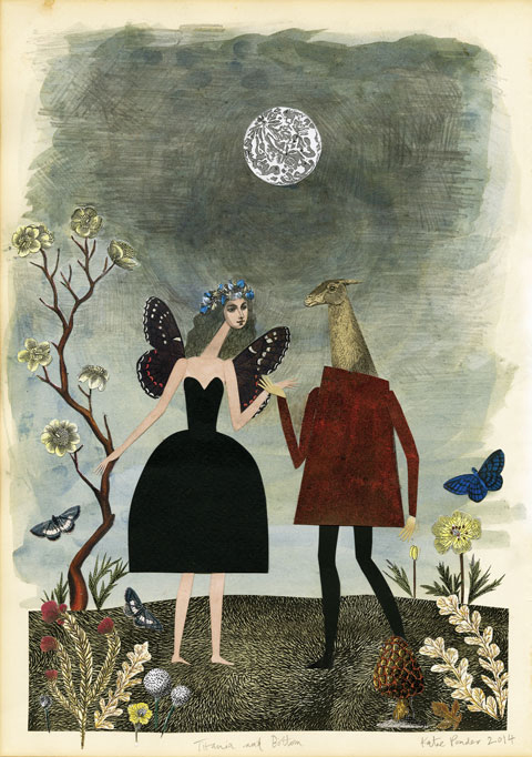
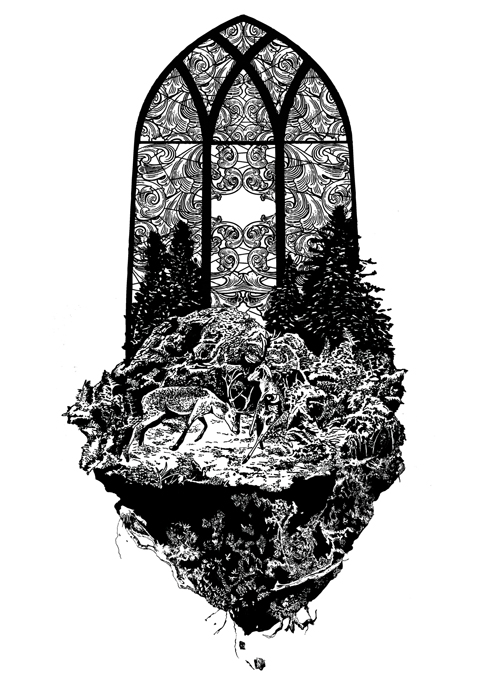
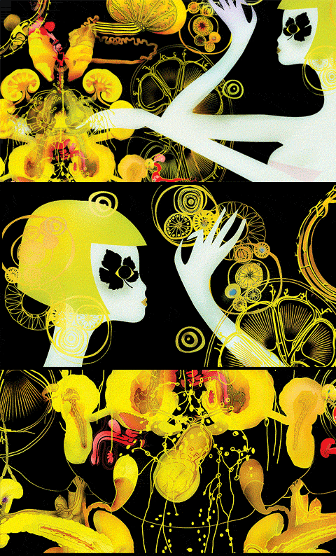
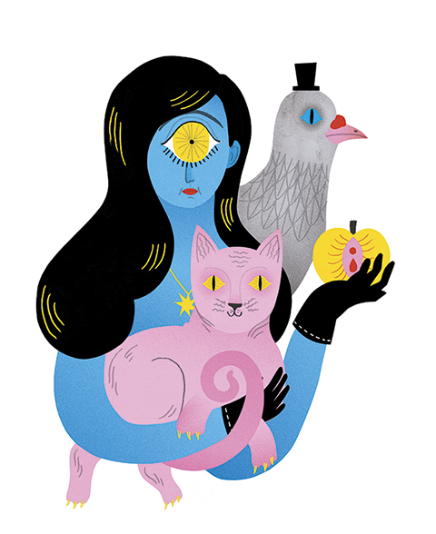
Karin Soderquist studied at Camberwell College of Art and first captured my attention at her 2011 graduate show. She is currently based in Stockholm, Sweden, has contributed to numerous exhibitions and publications, and is a member of Bat Country Collective with Emma Farrarons. The Magician’s Assistant was guided by a subconscious instinct to make an image with a little bit of magic. ‘As I started working on the image the woman turned into a cyclops. I added more details such as the pigeon, the gloves and the apple, but the final question remains: who’s the magician and who’s the assistant?

K Soderquist - Mermaid
Your artwork is the result of a conversation with your subconscious… is this a common way for you to work and if not why were you inspired to work in this way?
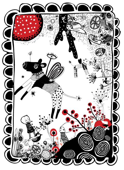
When working on illustration commissions there are usually a lot of planning before sitting down and actually making the illustration. You have to send sketches and roughs to the client to show them your idea so that they can say if they like it or not. Therefore, when working on personal projects, I sometimes like to take a different approach where I don’t plan ahead as much. I usually start out with just a rough idea of what I want to do and start drawing. I find it a very relaxing way of working. That’s how I created my submission for That Which We Do Not Understand. And I felt like letting my subconscious guide me was very much in keeping with the theme of the brief.

K Soderquist - Dancing Cats
How do you put your illustrations together?
Over the past couple of years I’ve developed a way of working that I really enjoy. I start off by drawing the image out in pencil. Then I cut out all the pieces of the image in coloured paper, scan them and reassemble them in Photoshop where I add the colours. I like the hand made feel that working with paper and scissors gives the illustrations and finishing the work digitally gives me a lot of freedom to play around with colours and composition.

K Soderquist - Akademikern
You have done a lot of work for Akademikern, what kind of magazine is this?
It’s a magazine for the members of the union SSR. It’s for people who’s studied HR, economics and behavioral sciences etc. It’s always a lot fun getting commissioned by them, the art director and the editor are great to work with and the articles are always interesting to read. I love the challenges that doing editorial illustration can bring!

K Soderquist - sexy pastries
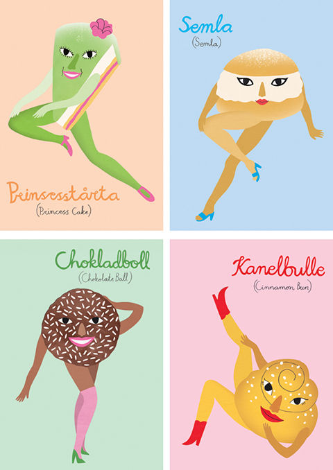
I adore your Lets Fika pastry images… can you tell us more about the deserts featured? what is your favourite?
They’re all traditional Swedish pastries, I did them for an exhibition at the swedish cafe Fika on Brick Lane about two years ago. It’s a chocolate ball, a princess cake, a semla and a cinnamon bun. I made them into pin-ups to add a bit of swedish sin. My favourite Swedish pastry is actually not included. It’s called a Dammsugare (which means vacuum cleaner) or Punchrulle. It’s flavoured with arrack and covered in bright green marzipan, yummy!

K Soderquist -Atomic Love
Why did you decide to study in the UK?
I wanted an adventure and I’d been daydreaming of living in a big city for a while, so studying was a good excuse to move there! It’s probably one of the best decisions I’ve made. After about four years I got home sick and moved back to Sweden but now I feel home sick for London!

K Soderquist - Marie
I first came across your work at your graduate show, what is the most important thing you have learnt about working in illustration since leaving uni?
Everything, haha! In hindsight I think there are a lot of really important things you don’t learn at art school (at least not on the course I did). I’m still figuring a lot of stuff out. But I think the most important thing I’ve learnt is how to work quickly and how to make an illustration I’m happy with in a couple of days or sometimes a couple of hours!

K Soderquist - Freak Fruits
You can read more about Karin’s work here and buy her fabulous gold leaf art print on my Kickstarter campaign page here.

Categories ,#TWWDNU, ,Akademikern, ,Bat Country Collective, ,Camberwell College of Art, ,Dammsugare, ,Emma Farrarons, ,Fika, ,illustration, ,illustrator, ,interview, ,Karin Söderquist, ,Kickstarter, ,Punchrulle, ,stockholm, ,Swedish, ,That Which We Do Not Understand

Similar Posts:


Amelia’s Magazine | Meet Katie Ponder: Featured Artist from That Which We Do Not Understand

Amelias_Magazine_TWWDNU_Katie_Ponder_Weather_Witches
Katie Ponder graduated from Falmouth University and was one of my favourite new illustrators discovered at New Designers this year. She was the winner of the 2014 AOI book category award and took part in the recent exhibition at Somerset House. The Weather Witches was inspired by the change of seasons, and the design of tarot cards. In this image the tempestarii (who control the weather) exchange summer for winter, as the leaves fall and the starry nights draw in.

Katie_Ponder-Rite-of-Spring---growth
Rite of Spring, Growth.

Your illustration was inspired by ideas you first discovered in childhood… can you remember how you came across them and what effect they had on you then?
Whilst considering the theme of That Which We Do Not Understand, the seasons changed from summer to a very sudden winter. Dramatic changes in the weather always bring to mind a song I learnt at primary school about a weather witch, when she was happy she would make the sun shine, but when she was angry there would be thunder and lightening. There is a lot of folklore about witches some times referred to as tempestarii, who control the weather. Inspired by this, I imagined the seasons personified by two witches, who are sisters. The changing of the seasons happens when one sister passes her reign onto the other sister, so that she may rule for her share of time. My image is about autumn, when the sisters exchange places and the weather changes from summer to winter, the leaves fall off the trees and dark starry nights draw in. I am interested in how changes in seasons and the lunar cycle impact the world and also our physical and mental wellbeing.

Katie_Ponder-Titantia-and-Bottom
Titania & Bottom

What in particular appeals to you about Tarot?
I read my own tarot cards on a regular basis, and collect different packs. I find it intriguing me how a picture can reflect some kind of personal truth, and can inspire different ways of thinking about a situation. I also love the symbolism within tarot cards; in particular I love the Rider Waite deck, which has very bold graphic colors, and mysterious symbolic landscapes and scenarios.

Katie_Ponder-Reflection
Reflection.

How did you put together The Weather Witches?
To create my image The Weather Witches, I started of collaging using old papers, self made textures and found images. I then scanned the collage into Photoshop and played around with the composition until I felt there was an aesthetic balance. I added new textures and tweaked the colors and contrasts to create the final image.

Katie_Ponder-Rite-of-Spring---Arrival
Rite of Spring, Arrival.

What was the most challenging part of the process and what was the most satisfying?
I found it a very enjoyable project to work in response to ‘that which we do not understand’ as mysticism and the occult fascinate me and have inspired a lot of my work. Composition is really important to me, and I really like an image to feel balanced. The idea of portraying two sister witches allowed for me to make a fairly symmetrical image, which I find very satisfying to work with.

Katie_Ponder-Pisces
Pisces.

Falmouth University consistently turns out top illustrators, why do you think that is?
The illustration course at Falmouth is well known, the tutors are available to talk to all the time and they are absolutely amazing, and very inspiring, I miss them so much! All the people I studied alongside were very ambitious and had lots of drive, which created a very motivating atmosphere in the studio. I also think what makes Falmouth a really good course is how they prepare you for industry. As part of the course we had to arrange meetings with leading professionals in the industry to have our portfolios reviewed. Knowing that the best art directors and agencies are going to look through your portfolio pushes you to work at the highest standard you can. Also attending these meetings teaches you how to handle and be confident in intimidating professional scenarios.

Katie_Ponder-Words-have-wings
Words have wings.

You only recently graduated this summer, what has happened since then?
I was very lucky to be awarded the new talent award for books by the Association of Illustrators as I finished university. Over October my work was exhibited at Somerset House in London, which was a wonderful experience, and now my work is on a touring exhibition at different venues around the UK. Since graduating, I have moved back to central London where I am originally from and I have been really enjoying being back in the city, seeing lots of art and ballet. I have set up a small studio to work from, and I have been working on commissions as well as meeting people to talk about projects to work on in the future.

Katie Ponder Women Who Run With The Wolves
Women Who Run With The Wolves.

What are you currently working on?
I am working on a couple of ideas in between commissions. The project closest to my heart is some work that has been inspired by ballet and classical music, and is the catalyst behind a book I am developing at the moment.

Kaite_Ponder_Heart of Darkness by Joseph Conrad
Heart of Darkness by Joseph Conrad.

What are you most looking forward to in the coming year?
In December I am taking part in a stop motion animation course, which I am very excited about. I did a project in 3D whilst I was at university and I am eager to see how that might translate into stop motion animation. I am also pursuing my other long-standing passion next year and training to be a yoga teacher, which I plan to have as a companion job alongside being an illustrator. There is also some travelling I really want to do that I am currently working towards and dreaming about.

Visit Katie Ponder‘s website here and pledge for a limited edition gold leaf fine art print of the The Weather Witches on my Kickstarter campaign page here.

Categories ,#TWWDNU, ,Association of Illustrators, ,Falmouth College of Art, ,Falmouth University, ,illustration, ,illustrator, ,interview, ,Katie Ponder, ,New Designers, ,Rider Waite, ,Somerset House, ,Tarot, ,tempestarii, ,That Which We Do Not Understand, ,The Weather Witches, ,Weather Witch

Similar Posts:


Amelia’s Magazine | Meet Laura Wilson: Featured Artist from That Which We Do Not Understand

Amelias_Magazine_TWWDU_Laura_Wilson_FORTUNAAmelias_Magazine_TWWDU_Laura_Wilson_FORTUNA
Laura Wilson is a recent graduate who runs a collaborative creative blog and illustrates for online feminist magazine Bitchtopia. She has a deep interest in neo-Paganism and ancient symbols of the divine feminine. Fortuna was inspired by the use of tarot cards for divination, and the Pagan triple Goddess of the Moon. ‘I wanted to depict the ways in which opening our minds to mystery can enhance our souls and enable us to embrace a fuller spiritual life. As a feminist, womanhood and matriarchal ideas have a big influence on my life and my art.

Laura Wilson-Do No Harm
Where did you source the imagery used in Fortuna, and what inspired your choice of what to include?
I was inspired by divination, particularly tarot cards, and had a look through my own deck for some ideas. The artwork on tarot cards is always so beautiful, even if you don’t believe they hold any kind of power, they’re still a gorgeous collector’s item. I wanted to illustrate the idea of divination opening a person’s ‘third eye’ to the possibility of magic, and allowing them to access their spiritual intuition. I was also inspired by images of Hindu deities such as Vishnu and Kali, which prompted the many-armed character.

Laura Wilson-Pastel I
How do you create your illustrations? What processes do you use?
I like to use both traditional and digital methods in my work – for Fortuna, I started with an ink and watercolour painting, which I then added more colour to digitally. I tend to use a lot of pencil, inks and watercolours in most of my illustrations, but recently have been pushing myself to create more work just digitally, as it can be a lost less time consuming! I think I’m still in a phase of experimentation with my art; I haven’t found the process that works best for me yet, so I’m still trying out new things and finding my feet.

Laura Wilson-Pastel II
You describe yourself as a Neo-Pagan, how would you define this?
I’m not sure if I would really call myself a Neo-Pagan, but I am definitely very interested in and inspired by the culture of Paganism. It was something that I was very involved in for a while, but over time I’ve moved away from believing in one thing and I’m now in a state of just being very open to the possibilities of spirituality while at the same time being aware that we can’t really be sure of much in this world. That’s one of the things I admire most about Paganism; it acknowledges the mystery and mysticism of the universe and never tries to claim that it has the one right way of thinking; Paganism accepts all beliefs and understands that there’s no single right path through life. Generally speaking, it just believes in the importance of Nature and our ties to the earth, and that everything in the universe is connected.

Laura Wilson-GEEKED cover
What do you most like to illustrate and why?
One thing that shows up a lot in my work is mermaids; I think of them as sort of my creative muse. I’ve always loved the idea of these beautiful, terrifying creatures, who can be so alluring but use their appeal to cause shipwrecks and drown sailors. The femme fatale is a very interesting concept to me. I also tend to work with fashion illustration; but in a way that is body positive and inclusive. I think that fashion has got stuck in this rut of only representing this tiny demographic of skinny white people, when that doesn’t accurately represent society at all. I want to push for more diversity in fashion illustration, and depict more variety in body shapes and sizes, skin colours, disabilities and people outside of the gender binary.

Laura Wilson-2cute 2care
As a recent graduate of illustration what is the biggest thing you have learnt since leaving university?
That you have to keep pushing yourself to create new work and keep looking for opportunities. And that you have to force yourself to make time for art! It’s been a bit of a shock suddenly being away from art school and not having the support of my tutors and classmates anymore, and having to fit creating work around a job. But I’m very lucky to live with two of my ex classmates, and share a studio together, which helps keep me motivated. The three of us also run a blog together, theonethreethree.com, to keep us creating new work every week.

Laura Wilson-Whispers
What kind of work do you contribute to Bitchtopia?
Bitchtopia is an awesome feminist culture magazine which covers current events, art, music, fashion… and loads more. It’s written by an amazing community of women from around the globe, and I’m really honoured to be a part of it. I create feminist artwork for them to post, as well as illustrations to go alongside their articles, and have recently designed some prints for them which will be going up for sale in their store.

Laura Wilson-The Deep
What are your hopes for the future?
I’m looking forward to hopefully more collaboration with Bitchtopia and other feminist collectives, as well as working on some personal projects. I’ve also been meaning to create a zine for a while, so will hopefully get that moving forward soon – it will be a visual mash-up of feminist fashion illustration, alternative culture and Neo-Paganism.

Read more about Laura’s work here and buy her stunning limited edition Fortuna print here. It would be so inspiring to have you on your wall!

Categories ,#TWWDNU, ,Bitchtopia, ,Feminist, ,Fortuna, ,Goddess of the Moon, ,illustration, ,illustrator, ,interview, ,Laura Wilson, ,neo-Paganism, ,Pagan, ,That Which We Do Not Understand

Similar Posts:


Amelia’s Magazine | Meet Lorna Scobie: Featured Artist from That Which We Do Not Understand

Amelias_Magazine_TWWDNU_Lorna_Scobie_black_catsAmelias_Magazine_TWWDNU_Lorna_Scobie_black_cats
Lorna Scobie has contributed to Amelia’s Magazine for many years. She was one of my top picks at her graduate show in 2012, and since then she has designed for multiple clients, illustrated children’s books and won many awards for her wonderful animal illustrations. Black Cats was inspired by the superstitions associated with these creatures. ‘Whether they are the bearers of good or bad luck, black cats are subject to our superstitions from England to Japan. Here I have confronted this prejudice, and filled the viewers vision with silent black felines. Are they evil omens, or are they just like any other cat?

Cat_2_Lorna_Scobie
What inspired the personalities of your black cats?
Cats have great personalites – they are all so individual. I love the confused face you see on kittens so much, and I think most of these black cats have that face! I hope I’ve managed to portray that black cats aren’t just black cats, and that each one is as funny, quirky and silly as other cats. It’s funny to think that some people see black cats as devilish!

Cat_1_Lorna_Scobie
Apparently you don’t actually like cats yourself, so what drew you to these little furry beasties?
Although I don’t like the sneakiness of cats, I love drawing them. Cats have such great characters, they make it so obvious when they are miffed! I like the way they can contort their bodies when they lick themselves and it’s really fun to draw all their limbs. There’s just something about cats!

Tiger_Lorna_Scobie
What are your favourite animals, in real life, and why?
I love tigers – which is ironic as they are just big cats! The orange and black is so striking.

Dogs_Lorna_ScobieDogs_Lorna_Scobie
You’ve contributed to Amelia’s Magazine for years, what keeps you coming back?
I love the variety of content in Amelia’s Magazine. Sometimes I find myself drawing the same sort of things everyday and so it’s really refreshing to take part in one of Amelia’s live briefs and try something new. I also have SO much respect for Amelia. When I was in my second year of university Amelia was kind enough to give us a talk about her career and since then I’ve been a huge fan of everything she has done. Hearing Amelia speak inspired me start my own blog and social media pages.

Reindeer_Lorna_Scobie
What has been you favourite commercial client since you left university, and why?
I will always have a lot of love for Stella McCartney Kids as they were one of my first commercial clients, and it meant a lot to me that they trusted me despite it being fresh out of Uni. I really enjoyed the project – creating animal masks – as it was unusual and I was allowed a lot of creative freedom. I’m yet to have a bad experience with a client, perhaps I’m really lucky, but I think it’s because the majority of people out there are really lovely!

Jungle_Lorna_Scobie
What one top tip would you share with a new illustrator?
The best tip I’ve ever been given is that there is no rush! There’s so much pressure on new graduates to be instantly successful and it’s not fair to put that on yourself as it rarely happens. I firmly believe that if you are creating illustration that you like and if you work hard, you will get to where you want to be. It’s unlikely this will happen over night, so relax, don’t rush, it’s not a race!

Dalmatians_Lorna_Scobie
Have you got any exciting projects in the pipeline, and if so can you share a few details with us?
I feel like I’m constantly working on developing some picture books so hopefully some of these projects will come into fruition! I’ve also been working a lot with a big Paris fashion house recently, and lots of that illustration will be out in December.

Birds_of_paradise_Lorna_Scobie
Find out more about Lorna Scobie‘s working process here and buy her lovely Black Cats print – complete with super shiny gold leaf on the cats’ eyes – on my Kickstarter campaign page here.

Categories ,#TWWDNU, ,animals, ,Black Cats, ,cats, ,Gold Leaf, ,illustration, ,illustrator, ,Kickstarter, ,Lorna Scobie, ,Stella McCartney Kids, ,That Which We Do Not Understand

Similar Posts:


Amelia’s Magazine | Meet Niall Grant: Featured Artist from That Which We Do Not Understand

Amelias_magazine_TWWDNU_Niall_Grant_Mater_GaiaAmelias_magazine_TWWDNU_Niall_Grant_Mater_Gaia
Niall Grant works between studios in Norwich and London, creating fine prints that are inspired by traditional European illustration. He has worked for a diverse range of clients and showed work in numerous exhibitions. Above you can view Mater Gaia, his contribution to my 10th anniversary artists’ book, and also available exclusively on my Kickstarter campaign as a very limited edition fine art print with real gold leaf. The image is inspired by his interest in life, death and the dreaming in between. The artwork features the celestial skies and elements of 16th century alchemic illustration above a forest clearing where beautiful crystals burst from the soil. His work provides a ‘visual medicine’ for the viewer.

Niall Grant Neverland
Neverland.

How did you create Mater Gaia?
I created this piece firstly with pencil sketches, and built on those with ink brushes and fineliners. This piece in particular was composed by using different drawings I made whilst researching the project. The colour was added from paper and watercolour swatches I’ve been using for years. This process feels very natural to me, and is quite a traditional approach to image-making.

Niall Grant Sleeping Fox
Sleeping Fox.

What does she mean to you?
Latin for ‘Mother Earth‘, this work depicts Gaia, who some believed to be Goddess of the Earth. It comments on how acts of nature are still attributed to unseen forces in some lands.

Niall Grant Hart Of Ten
Hart Of Ten.

Why did you decide to enter the open brief, were there any things that really appealed and if so what?
My eyes lit up when I first saw the brief. I thought the subject matter was perfect for what I was working on at the time. I myself am a spiritually strong person and I feel that’s important. There’s an Indian proverb that says “Everyone is a house with four rooms, a physical, a mental, an emotional and a spiritual. Most of us tend to live in one room most of the time but, unless we go into every room every day, even if only to keep it aired, we are not a complete person.” A lot of people neglect that spiritual room until the day they die, just going the way of the world. They don’t even think to look into it because it seems too dark, but if you keep asking questions they will be answered.

Niall Grant Strange Creatures
Strange Creatures.

Were there any big influences on your style of illustration from an early age?
I really admired the artwork of Yoshitaka Amano growing up. Gustave Dore, Norman Lindsey and Vania Zouravliov are all identifiable influences in my work. I have thousands of pages of artists work from all different eras. I love making Art and I love looking at it.

Niall Grant King Of The Monsters
King Of The Monsters.

You have worked for many amazing brands and companies, what have been highlights of your career so far?
I really enjoyed working with Lettucewear last year. It was more of an Artworking job and not my usual style, but they treated me very well throughout the three month project and we were always on the same page. It just ran like clockwork really. I think having good communication with who you are working with makes the project much more pleasurable.

Niall Grant The Abacus
The Abacus.

What is your favourite type of job to work on and why?
I love doing album art. I think it’s so special when art forms come together to complement each-other. I love the initial process of connecting with the music and interpreting it visually in your mind’s eye. I really enjoyed working with Secret 7” on the Jake Bugg vinyl cover.

NeverlandStudy_Niall Grant
Neverland Study.

You work between Norwich and London – why the two places and how does this work in practice? 
I grew up in Norwich and have roots there. Housing is literally half the price as London, which releases pressure. I have a nearby screen printing studio too, so I can get prints done whenever I want. London is two hours away, so I can work at a studio there for afew days and meet clients etc. It’s handy at the moment but I can see myself committing to one in the future.

Shells Music Niall Grant
Shells Music.

What are you most looking forward to working on in the future?
I have lots of personal projects that I need to finish up at the moment. I try to always be doing one, but they often overlap. I have a few secret projects underway with some exciting clients at the moment. Expect album covers, murals and editorials.

Read more about Niall’s piece for That Which We Do Not Understand here and grab your exclusive Mater Gaia fine art print on my Kickstarter campaign page here. 50% of the profits from the sale of this beautiful artwork will go to Niall Grant.

Categories ,Fine art print, ,gaia, ,Goddess of the Earth, ,Gold Leaf, ,Gustave Dore, ,illustration, ,illustrator, ,interview, ,Jake Bugg, ,Kickstarter, ,Lettucewear, ,Mater Gaia, ,Mother Earth, ,Niall Grant, ,Norman Lindsey, ,Norwich, ,Secret 7”, ,That Which We Do Not Understand, ,Vania Zouravliov, ,Yoshitaka Amano

Similar Posts:


Amelia’s Magazine | Meet Parris Wakefield: Featured Artist from That Which We Do Not Understand

Amelias_magazine_TWWDNU_Parris_Wakefield_order_outof_chaos
Sarah Parris has a background in environmental science and is one half of interiors design duo Parris Wakefield, who create colourful graphic textiles that I first fell in love with at Tent London last year. Order from Chaos was inspired by an interest in science, astronomy and nature, and ponders some big questions. ‘How did the universe begin? Why does the natural world follow the same mathematical patterns? Is it chance or some greater force at work, that brings such order from chaos?’ The geometric pattern follows the rules of the golden ratio and the Fibonacci sequence, which is applicable to the growth of every living thing.

ParrisWakefield-fabric rolls 480px 72dpi
Before becoming a designer you studied environmental science – how did this career evolve into your current one?
My career path has gone in several directions and ending up in design was really very much by luck. I had always intended to work in conservation. My first job was leading a summer holiday club at a country park. I loved it so, I went back to uni and got a PGCE in secondary school science, specialising in environmental education. After a few years though, I realised teaching in schools was not my calling and I needed to get out. Thankfully I met Howard who was looking for an admin and project manager at his design studio. He worked with world renowned designer Peter Saville, I slowly got more involved and was increasingly asked my opinion about colour and imagery which led to me creating my own digital imagery for the studio.

ParrisWakefield-zig zag cushion and shade 480px 72dpi
How did you research the geometric shapes for your piece Order from Chaos?
It is something I have always been amazed at, nature’s mathematical patterns are so fascinating and beautiful. A few years ago we worked on a graphic identity proposal for the Discovery Channel, which we based on the Fibonacci sequence, it didn’t go ahead but I learnt a lot about Fibonacci. This time, I didn’t want to simply recreate the classic spiral pattern, preferring the shapes based on the principles of the Golden section, Golden triangle and Fibonacci which are all interlinked.

Mia sofa by Jane Richards upholstered in Forget Me Not by Parris Wakefield 480px
What scientific ideas boggle your mind the most at the moment?
The fact that just yesterday a probe landed on a comet is quite mind boggling. The Rosetta spacecraft was launched more than 10 years ago, has travelled more than 6bn kilometres to catch up with the comet, which orbits the sun at speeds up to 135,000km/h. – wow!

studio photo Parris Wakefield
How do you create your unique patterns?
The patterns start with the colours, this is why I rarely recolour a pattern. I work with the selected colour palette straight away in photoshop, the pattern evolves quite organically, building up the pattern on different layers which we interact with each other. Working this way, I know how to manipulate the colours to get the effect I want, but also the unexpected can happen which is exciting.

Bliss-wallpaper-in-production-parris_wakefield
Your business is a partnership with your husband Howard, how easy is it to work together and what is your secret to a harmonious business relationship?
Working with Howard is the easiest most natural thing, we have been working together for 13 years and I wouldn’t want that to change. We are on the same wavelength but have different skills, I cannot do what he does and so I have a huge respect for his graphic design knowledge. Equally he couldn’t get on and focus on his work if I didn’t do all the invoicing, marketing admin side of things. Our patterns are always a collaboration between the two of us, we often sit together and work on the pattern or share the file and work on different layers and then together decide on which ones to use and interact. With Order from Chaos I was really happy with the ‘Big Bang’ background but couldn’t get the geometric shapes right, the final combination and position was thanks to Howard.

wildflowers
What has been the best bit of relocating to Suffolk?
Suffolk is such a beautiful county. We are very lucky to live surrounded by one of the few remaining large common lands that is still grazed and rich with wildflowers. The school is a short bike ride away and our studio is in the attic of our barn. Moving here has given us the best work life balance that we could imagine with the bonus of allowing us and the kids to get up close with nature.

marthe_parris_wakefield
What next for the Parris Wakefield design business?
There are many products I would like to have the opportunity to design and the idea of collaborating with other creatives is really exciting. One that is already in the pipeline is our collaboration with Camira Fabrics and printing one of our designs on to wool. But I would also love to do carpet and ceramic designs so any companies out there looking for a new collaboration do get in touch…

Read more about the Parris Wakefield print here and buy your limited edition gold leaf Order from Chaos here. It would make a beautiful addition to any wall!

Categories ,#TWWDNU, ,Camira Fabrics, ,Discovery Channel, ,Fibonacci, ,Interior Design, ,Order from Chaos, ,Peter Saville, ,Rosetta, ,Sarah Parris, ,Suffolk, ,surface design, ,Tent London, ,Textile Design, ,That Which We Do Not Understand

Similar Posts:


Amelia’s Magazine | Meet Yoko Furusho: Featured Artist from That Which We Do Not Understand

Yoko Furusho_TWWDNU
Yoko Furusho is a Japanese illustrator based in New York, and was featured in my first book, Amelia’s Anthology of Illustration. Since then she has worked with a long list of commercial clients, and featured in many exhibitions and books. She loves to draw details, textures and patterns with ink and acrylics. The Scenery of the Other Side was inspired by Japanese ideas of the afterlife, following the recent loss of her grandfather. ‘Souls must cross a huge river, and are first judged by the King of Hell. Cows and horses carry the good souls to heaven and my illustration shows what I think this might look like.’

Yoko_Furusho_flyer
Your artwork is titled Scenery of the Other Side – what elements does of this world did you decide to feature and why?
I wanted to focus on the after life world which we don’t understand. Since I lost my grandfather last year, I started to think about where we go after our life. I guess I was very lucky that until last year nobody around me has died, so I was very shocked to realize what happens at the funeral ceremony and when the souls go away.

Yoko_Furusho_scales
How did you create the artwork and what inspired the colour palette?
I always like using colours but I chose really happy colours to create the after life world, because I want the old souls (including my grandfather) to be happy.

Yoko_Furusho_landscape
It was inspired by the death of your grandfather, what did you learn about how death is dealt with in Japan, and what most surprised you?
In Japan, funeral ceremonies are very solemn. The funeral is usually on the day after the wake, and the procedure is similar to the wake, where incense is offered while a priest chants a sutra. At the end of the funeral ceremony, the guests and family may place flowers in the casket around the deceased’s head and shoulders before the casket is sealed and carried to the elaborately decorated hearse and transported to the crematorium. Actually I was very surprised about the funeral alter. The ceremonial alter is covered in flowers so that it looks like a palace in a flower field. Then I realized that is where my grandfather would go and live after he died. So I felt very weird. I was so sad that I lost my grandfather, but I thought that if he was going to live in such a place in the after life, then actually that wouldn’t be too bad.

Yoko_Furusho_lady
You contributed to my first illustration book several years ago, what has happened in your career since then?
Yes, Amelia’s Magazine was one of my first clients. I remember that I was so excited when I first saw the magazine on the news stand in New York. And I was even more excited when I realized that the magazine is based on open-briefs. In that point in my career it was a great opportunity to show my work to people who are excited about the sort of cute and colourful illustrations that I make. So I really appreciate the chance I was given by the magazine and I wanted to celebrate your 10th birthday with my art.

Yoko_Furusho_lady head
What has been you favourite commercial brief and why?
So far, I have worked on four childrens’ books in Europe and in Japan. Through working on these books, I have come to realize how much I like books. When I see children happily reading my books this is such a precious moment for me. Now that I am so passionate about books, my long-term goal is to have an exhibition featuring all of the books that I have published.

Yoko_Furusho_japanese lady
What else are you working on at present?
Currently, I’m working on my next children’s book, which is going to be published as my second original. At the same time, I liked the theme that I worked on for That Which We Do Not Understand so much that I have started to create a new series called The Scenery of the Other Side, which features the fantasy world of Japanese afterlife. You can see some of the images I have made so far in this blog post: I am going to include the hell side of the after life world as well!

Yoko_Furusho_dino
Lastly, was this work in any way cathartic to create? And if so what was the most cathartic part of the creation?
The concept came up easily because I have been interested in the theme since last year. So this imaginary afterlife world was just opened in my mind. I looked for Japanese rituals after the life and drew them straight to the end. I think it has been a good time for me to create my own series and I’m happy that I could end up with this image. Thank you!

Yoko describes her illustration in more detail here. You can pledge for her marvellous artwork, featuring gorgeous gold leaf highlights all over, on my Kickstarter campaign here. Just 5 days left to go to make your pledge!

Categories ,#TWWDNU, ,After life, ,Amelia’s Anthology of Illustration, ,Funeral, ,illustration, ,illustrator, ,interview, ,japanese, ,That Which We Do Not Understand, ,The Scenery of the Other Side, ,Yoko Furusho

Similar Posts:


Amelia’s Magazine | Introducing True Romance: Print Designs chosen for an exhibition curated by East End Prints

True Romance East End Prints Flyer
I am really pleased to share the designs that have been chosen by East End Prints to appear as part of the True Romance exhibition opening today at 70 Paul Street (full listing info here). Helen Edwards of East End Prints has picked the following work, made in response to my Valentines Art Open Brief, to feature on a specially curated wall alongside the rest of her prints. She will offer the ones which are best received during the show a publishing deal to be sold online, and all works will also be available to buy at True Romance. Scroll down to read more about the inspiration behind these pieces and the process of creating them. I’ll be sharing the rest of the designs that were sent in over the following week.

Wuthering Heights by Ashley Le Quere
Ashley Le Quere: Wuthering Heights
My submission is based on Wuthering Heights. I wanted to create something that was a bit whimsical as well referring to what happens in the story, so I started to draw icons that I thought represents parts of the book and the different parts of the story and I loved this quote! It feels very deep and reflects the obsessive, passionate and doomed romance that is the focus of the book. I hand drew the text so it would feel like the diary that Catherine writes about Heathcliff. I think that the texture in the ink reflects the stormy and miserable nature of the book but wanted the icons to be quite whimsical.

Ashley Le Quere is an Illustrator and Surface Pattern Designer. You can see more of her work here.

onlyloversleftalive_by_Carly_Watts
Carly Watts: Only Lovers Left Alive
My illustration is based on Jim Jarmusch’s ‘Only Lovers Left Alive’. The movie is based on two, centuries old vampire lovers called Adam and Eve. Adam is a musician who reconnects with Eve after a period of separation after he becomes depressed and melancholy. I wanted to create a highly stylised and graphic piece that would capture the main themes of the movie, Adam’s darkness, his love of music, and the quest to find where we fit into society. On a more visual level, Adam is primarily dressed in dark colours, and Eve in light throughout the course of the film; I thought this could be portrayed well through the guitar graphic.

See more work by Carly Watts here.

Death Valley Illustration Annie Hall
Death Valley Illustration: Annie Hall
The poster is designed to resemble a minimalist book cover, and includes the most romantic quote from the film, delivered in Woody’s inimitable style.  The paired back design also reflects the way that both of the characters approach their relationship throughout the film, and the cold reasoning that Alvy uses to reflect back on their time together.  The glimmers of romance in the film are shown by the sparing use of the vibrant pink. The fonts used were Rockwell, Futura and Georgia.

Gavin Shepherdson of Death Valley Illustration has been working as a freelance illustrator and designer since graduating from an Animation degree in 2009. See more work here.

emma russell casablanca
Emma Russell: Casablanca
For this print, I started by making line drawings of Humphrey Bogart and Ingrid Bergman at various points in the airport scene of Casablanca. I added colour and hand drawn type. As I worked I pared down and simplified the image until the two figures made a single silhouette framing Bogart’s parting words.

Emma Russell is a London-based freelance illustrator specialising in line drawings, flat colour, patterns and 3D paper sculptures. Her work often features unlikely champions, jokes and puns, memory, animals and fairy tales. Find Emma at www.helloemma.co.uk 

Jessica_Courtney_Tickle_My_Fair_Lady
Jessica Courtney-Tickle: My Fair Lady
I have recreated the film poster for the 1964 film and musical, ‘My Fair Lady’. At the heart of this love story there are (in my opinion) two very different characters with very different morals, lifestyles and ideas about falling in love. I wanted to describe how free and expressive Eliza the flower girl is compared to the upper classes who are shocked by her accent and way of life. But as you can see if you look closely at Professor Higgins he is actually intrigued by her character rather than put off. The florals are inspired by the very first scene of the film where Eliza is selling flowers in Covent Garden Market. This is the very first place the two characters meet. I created the work using gouache which I then scanned in and played around with on the computer. I added some digital colouring to give the poster more vibrancy and a smoother texture. I was most inspired by vintage picture book illustrations and posters which are rich in colour and character.

See more work by Freelance Illustrator and Designer Jessica Courtney-Tickle here.

jordana_globerman_edward_scissorhands
Jordana Globerman: Edward Scissorhands
Growing up, I thought Edward Scissorhands was the most romantic film. It captures the fairy-tale feeling of a first love so perfectly. I created my homage to this wonderful film with a mix of media, laying out and ink drawing first before incorporating elements of collage and painted-in details. Different brush work was used to achieve the splashed figure of Edward and the lightly falling snow. I wanted to capture both how the town begins to see Edward and how Kim sees Edward. His figure looms ominously, evoking the fear he instills in the town toward the end of the film. Despite this, Kim can only think of him with a real love and devotion, which is why I made this same figure of Edward hunched into the shape of a heart. This was a fun image to create because the film is so nostalgic and romantic to me. I enjoyed playing with different textures and line quality to create a graphic, yet painterly poster.”

See more work by Jordana Globerman here.

Katie Edwards - True Romance
Katie Edwards: True Romance
I love animals, who doesn’t, I decided they were a great way to convey the idea of Love, Affection and Companionship. I think most people could relate to the imagery I used and feel some emotions. Using traditional photographic and screen printing techniques to produce my conceptual screen prints, which are occasionally combined with collage or freehand textures. My work is largely influenced by the animal world focusing on photographic representation, what images symbolise and their use metaphorically. Objects are often isolated and placed in unusual compositions to result in a surreal, humorous or thought-provoking illustration. Animals often feature in my illustrations because they are very symbolic, as they don’t change with time or technology. They will always stay the same, and so will their symbolic meanings.

See more work from Katie Edwards here.

lindsay_lombard_the_notebook
Lindsay Lombard: The Notebook
The Notebook is one of my all time favourite love films, I love the setting of the film and the whole premise of the movie. The first quote that came to mind from the film was ‘If you’re a bird, I’m a bird’; meaning I’ll be whatever you need me to be to allow us to be together. I then set about creating the imagery – I developed some pencil drawings of two birds taking to flight. I then scanned these in, and set them upon a light background just to soften them slightly. I wanted the placement of the birds to be a representation of them flying freely away together. I added text and the cut out of an open book at the bottom, I tried drawing the book first but I couldn’t get the right amount of detail into the image so I decided to go with a white cut out – I think it works well to have the suggestion of a book but not be too obvious about it.

See more work by Lindsay Lombard here.

La-vie-en-rose by Sophie-Heywood
Sophie Heywood: La Vie En Rose

La Vie En Rose is probably my favourite love song. The melody is enchanting and somewhat haunting, uplifting yet sad, and I feel it conveys the different emotions of being in love more accurately than any other song. I love the original Edith Plaf version, but I think the Louis Armstrong version is my favourite rendition. When painting the hand drawn lettering, I let the soulful vocals dictate the shape of the composition. I wanted to create something simple, yet with an eye-catching pop of colour, creating a piece that can easily be framed and hung in someone’s home. The trouble with the theme of Valentines is creating something timeless and relevant all year long, but I feel this song is something everyone can relate to.

See more work by Sophie Heywood here.

All are welcome to attend the Private View on Thursday 12th February, 6-9pm. Don’t forget, the exhibition also features the beautiful gold leaf prints made for That Which We Do Not Understand.

Categories ,180, ,Annie Hall, ,Ashley Le Quere, ,Carly Watts, ,Casablanca, ,Death Valley Illustration, ,East End Prints, ,Edward Scissorhands, ,Emma Russell, ,Film Posters, ,Gavin Shepherdson, ,Helen Edwards, ,Jessica Courtney-Tickle, ,Jim Jarmusch, ,Jordana Globerman, ,Katie Edwards, ,La Vie en Rose, ,Lindsay Lombard, ,Movie Posters, ,Movie Prints, ,My Fair Lady, ,Only Lovers Left Alive, ,Sophie Heywood, ,That Which We Do Not Understand, ,The Notebook, ,True Romance, ,Wuthering Heights

Similar Posts:


Amelia’s Magazine | Meet Cristian Grossi: Featured Artist from That Which We Do Not Understand

Amelias_magazine_TWWDNU_Cristian_Grossi_ver_sacrum
Cristian Grossi lives in Italy, where he works on a plethora of art, design and fashion projects. He studied computer science and his bold graphic style is influenced by modernism, art nouveau, a love of nature and magical folk stories. Ver Sacrum was inspired by a night spent in hospital, when Cristian began to relate the behaviour of the human body to the Turing Machine. He imagined two demiurges implanting apparatus to combine with body parts, the unknown becoming part of the known in our flesh.

cristian-grossi-ver-sacrum-zoom
Your image was inspired by a night spent in hospital, how has its creation helped you heal?
About a month ago I was in the hospital, my dad had very delicate surgery. I thought about how fallacious the body is, and the perfection of the mathematical modeling of the inorganic systems that I studied at the university. Take for example the Turing Machine, it’s complete. My demiurges mysteriously assemble a perfect body, a system that is in balance. Maybe they are creating the perfect body for my dad.

cristian-grossi-ledas-myth
cristian-grossi-mostrum-horribilis
How long did it take to put together and what elements does it contain?
The image is made of more than 300 anatomical drawings showing human body organs and membranes (among them pancreas, lungs, brain, testicles and yet the liver, intestine, bone and fetuses). I am celebrating the Jugendstil (art nouveaux) style, affected with contemporary digital contaminations. 33 working days were required to develop my allegory for the creation of human beings. Ver Sacrum features two female demiurges putting together a newborn.

the-madras-adventure-cristian-grossi
the-blue-sea-comes-tropical
What is your working process?
I start my drawings using pencil and Chinese ink on paper, then add elaborations to them on the computer. I believe that the transition to digital is a mandatory step for all contemporary designers because scanning images is a key step to fix ideas.

cristian-grossi-the-blue-sea-comes-tropical-isadora
cristian-grossi-the-blue-sea-comes-tropical-flora
What is your favourite subject matter and why?
I’m attracted to all that is kitsch. The surplus has always attracted me, and I think that is part of my Jugendstil nature. The strange thing is that I’m passionate about everything that goes beyond, and all that’s missing: the moment before death, of a sneeze, the cavities of the times in the dialogues of a conversation. I believe that the completeness is not interesting.

cristian-grossi-madreperla
cristian-grossi-minimondi
You have recently had an exhibition – can you share some of this work and explain what it was about?
Yes, I have just had an exhibition of video art and textiles. I design fabrics for some Italian fashion brands and themes always stretch into other artistic projects such as video art, books and installations. The latest project is a study of the roots of the Liberty style typical of my city, Salsomaggiore Terme, with an attempt on my part to recover and re-elaborate the details in a new artistic language.

cristian-grossi-insekta-phasmatodea
cristian-grossi-insekta-moodboard
cristian-grossi-insekta-blattodea
You are a very busy designer: what other jobs have you completed recently, and what are you most looking forward to working on in the coming months?
Yes, I am very busy. This Christmas around 18,000 Italian families will receive my ball which has been illustrated for a non-profit, so I’m very excited. In a few months my new collection of scarfs and bags for a big fashion brand will be released, and I have been involved in mood boards, ideas and stylistic direction. I have also designed a series of posters to promote art exhibitions in Italian museums and festivals and a series of limited edition stationery.

cristian-grossi-die-jugestil-organico
cristian-grossi-pinko-scarf
Where are the best places to go for creative inspiration online in Italy?
Italian creativity is very special. Fashion, architecture and design are born in Milan, and it is there that these are processed. But Milan is a city sad and cynical, so I think the source of true creativity is in the provinces. The typical is very genuine, if you can hang out for the provinces to discover new enzymes, you understand the genuineness of color, flavor and shape. So if you want to take a shower of true creativity Italian go to festivals in Emilia, eats local food, meet local people. Check out online projects such as gnambox which covers food that is typical of the Italian tradition, or weloooooveit (www.weloooooveit.com) which celebrates all that is cool of Italy, or Dolce & Gabbana’s Swide, which offers the best of the sweet life.

cristian-grossi-the-god-03
cristian-grossi-the-god-02
Read more about Cristian’s Ver Sacrum here and secure your gold leaf fine art print here.

Categories ,#TWWDNU, ,Anatomical, ,art nouveaux, ,Cristian Grossi, ,gnambox, ,illustration, ,Italian, ,Jugendstil, ,Salsomaggiore Terme, ,Swide, ,That Which We Do Not Understand, ,Turing Machine, ,Ver Sacrum, ,weloooooveit

Similar Posts:


Amelia’s Magazine | Meet Daria Hlazatova: Featured Artist from That Which We Do Not Understand

Amelias_magazine_TWWDNU_daria_hlazatova_the_empress
Daria Hlazatova is a Ukraine based artist who has contributed to Amelia’s Magazine for many years. Her wonderful hand drawn pen and ink artworks are full of beautiful detail, creating a dream like world that the viewer can get lost in. Daria is inspired by music and folk tales because she believes that music and stories create paths to the deepest realms of the imagination and self-cognition. She hopes that her vision of The Empress will have a meditative, calming effect on the viewer, helping to untie the knots of anxiety as easily as she disentangles the red ribbon in her hands. Daria is also showing with Atomica Gallery as part of a group exhibition this December.

of the oceans blue by daria hlazatova

Your piece The Empress was inspired by many different ideas. How did you piece them all together and how long did it take to draw?
The Empress took me a week to draw (what with my 3 jobs and other interruptions), adding details as I went along. It’s pretty much a nocturnal drawing – that’s when I had time to complete it.

team by daria hlazatova

Much of your artwork is inspired by your love of music, what are you listening to at the moment and how is it influencing your drawing?
I have been listening to Radiohead and Atoms for Peace a lot – it was an epic return to my teenage love of Thom Yorke’s music. I think he knows a little more about emotions than the others. Also, a lot of medieval chant and polyphony. 

serafina by daria hlazatova

What new zines have you got in the pipeline?
I’m accumulating illustrations based on Philip Pullman’s His Dark Materials. If I get a chance and have funds to get them printed, I’ll be very happy.

Lyra by daria hlazatova

I know the economic situation is quite bad in Ukraine at the moment (not to mention everything else that is going on) – how has this changed the way you are able to live and work at the present time?
The situation has always been like that. We have always had a huge gap between the poor and the very rich. It’s only recently that Ukraine has come up in the news due to the revolutionary movement. I’d rather not talk about the economic situation, as it will only look like complaining. Still, Ukrainian people are known to be able to adapt to even the strictest conditions and that’s what we are doing now – everyone’s trying to carry on. After all, it depends on how you look at it. For some, our situation will appear dystopian, for those with the sense of humour and optimistic nature it will look like another challenge. It could be worse, right? And anyway, everybody’s more concerned now about the war rather than money or food or art, unfortunately.

dream energy by daria hlazatova

How did you get involved with the Prisma collective and what will you be exhibiting at the upcoming group show?
I was with PRISMA from the very beginning, when Kaspian Shore had this wonderful idea to create an artist collective. PRISMA is a great company to be in, a diverse and uber-talented bunch of people; I am very proud to be part of it. I have one artwork for our upcoming group show Wonder Winterland at the Atomica gallery.

get it on by daria hlazatova

You recently visited the UK to talk with Atomica Gallery about your show, what was the highlight of your visit?
The whole visit was a highlight. Working part-time in a travel agency, I have this priceless opportunity to travel on business once in a while. It’s a wonderful chance to see the world. As I didn’t have much free time, I only sneaked up to meet the lovely girls at the Atomica Gallery and leave my artwork there – I’m very excited about taking part in PRISMA group show this December.  

Read more about The Empress on Daria’s blog here and secure your copy of The Empress featuring real gold leaf now, it’s selling fast… with 50% of profits going to the artist.

Categories ,Atomica Gallery, ,Atoms for Peace, ,Daria Hlazatova, ,his dark materials, ,Kaspian Shore, ,PRISMA, ,radiohead, ,That Which We Do Not Understand, ,The Empress, ,TTWDNU, ,Ukraine, ,Wonder Winterland

Similar Posts: