Amelia’s Magazine | The NailGirls spa salon in Islington Spring/Summer 2010 nail polish launch event.

Colourbox leadersdebate
Nick-Clegg-Election-2010-Antonia-Parker
Illustration by Antonia Parker.

Last week it occurred to me that if one drew something remotely funny and sent it around twitter at the same time as everyone was going mental with the hashtag #leadersdebate whilst watching the Leaders’ Debate on the TV, what is ed one was more or less garunteed a huge amount of retweets and a viral hit.

Except there was something that was irking me about this twitter phenomenon: and that was the poor quality of the drawings that were tickling the fancy of so many. So I sent out my own twitter message to see if anyone was up for drawing something satirical and vaguely amusing that we could send out on twitter at the appropriate time this week, no rx and knowing that I hang out with lots of very talented illustrators on twitter.

Then I read in the Evening Standard that the election has already brought about a vast outpouring of artistic ingenuity: drinks (slightly poisonous looking concoctions in virulent red, and blue and yellow), logo decorated jellies and even rag rugs have all been created with the election in mind. So it seems I am not the first to cotton onto a general feverish mood in the artistic firmament.

Here, then, are the results of my callout. This blog is not about my political leanings – though I’d happily take a pop shot at Cameron’s flabby potato head (sorry Sam) before I’d see him in power – but rather about an experiment in the way we communicate during election time in 2010. So these images will also be twitpic-ed out come 8.30pm tonight. Feel free to join in the fun and let’s see how far they travel!

With thanks to the lovely illustrators who answered my callout with such glee. It seems I touched a nerve…

jenny robins - leaders debate
Illustration by Jenny Robins.

Clegg, Cameron, Brown-Abi Daker
Illustration by Abi Daker.

Leaders Debate Katie Harnett
Illustration by Katie Harnett.

Gordon-Brown-Election-2010-Antonia-Parker
David-Cameron-Election-2010-Antonia-Parker
Illustrations by Antonia Parker.

Marnie Hollande-Leaders Debate
Illustration by Marnie Hollande.

DEBATE-Matt Thomas
Illustration by Matt Thomas.

NailGirls nail salon Islington press launch

I’m not really a high maintenance kind of girl, illness but the older I get I am starting to think that maybe I should consider paying just a little bit more attention to myself. But grooming just takes so much time, store right? And it’s just so darn pricey?

NailGirls nail salon Islington press launch

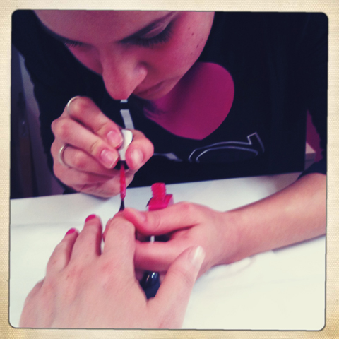
Well yes to both the above. And no. Last week I had my nails done at the NailGirls Spa Salon in Islington, order it took about ten minutes and it didn’t cost a thing. Oh okay, so it was a freebie as part of the press launch for their summer range (yes, nail varnish really does come in seasonal colours) but it was also incredibly quick. Within ten minutes of Kelly placing my hands – with well practiced firmness – on the towelling rest, I was sporting 10 perfectly manicured pinkies in Purple #7. Here at NailGirls they don’t go in for fancy names for their nail varnishes, preferring instead to take the minimalist route.

NailGirls nail salon Islington press launch

Musing, in the way that one does whilst being attended to by a beautician, I wondered how long it takes to grow really sick of painting nails. Five years perhaps before the sight of someone else’s paws drives you insane? “Well, I’m 20 years old,” says Kelly, “but I’ve already been doing nails for 5 years.” Blimey, 5 years? No way?! “Yes, since I was 15!” But she isn’t sick of it yet: in fact she’s just left behind he beloved cheerleading squad that she tutors up in Brum to pursue a glittering career in London, where her financial trader boyfriend is based. I love hearing about these little things. Human life, always so fascinating.

NailGirls nail salon Islington press launch
Lynda-Louise and Joanna Burrell (just before Jo spilt white wine down Lynda’s top, but we won’t talk about that).

NailGirls is the brainchild of two north London sisters. As my nails are being painted Lynda-Louise tells me how she spent 11 years working in the fashion industry in New York before returning to set up the business with sister Joanna Burrell, formerly working in oh-so-glamourous recruitment. “I knew that I wanted to do something in fashion – and there didn’t seem to be anything here like they have in the US, where they have proper nail spas.” Before she returned to the UK Lynda put her back into some serious research and got together a nail polish formulation that is not tested on animals and eschews nasty chemicals such as toluene, formaldehyde, dibutyl phthalate and camphor, which are proven carcinogens. The nail varnish is made in the US and imported to sell in the salon and online.

Nail Girls-joanna burrell

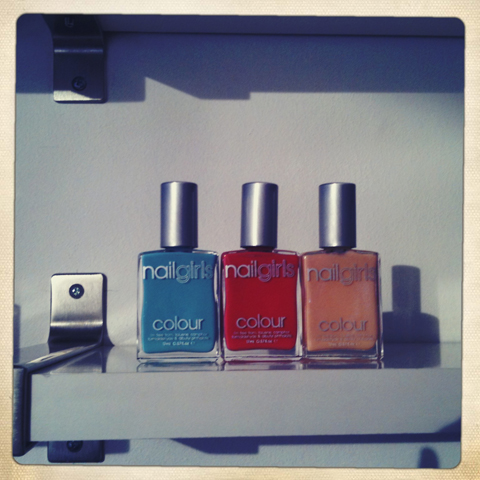
Lynda is passionate about painted nails as a way of keeping on trend. “It means you can change your look really easily and without the expense, of say, buying a Chanel handbag.” And without going into consumer overdrive, I should add. Using her self-confessed expertise in the field of trend spotting she picks out key colours for each season. For spring/summer 2010 she has picked out colours from the collections of Christopher Kane, Christian Louboutin and Burberry: a soft coral, bright green, pale blue and pearlised apricot. During their friendly garden speech the sisters described working with top make-up artist Pat McGrath during fashion week, and excitedly hinted at more fashion related collaborations later this year.

Nail Girls-lynda-louise jo burrell

It’s all rather fun this beauty malarkey, I have to say – and I found it most intriguing to chat with the various girls that I met at the launch; in a shrewd move the NailGirls have chosen to target a range of beauty bloggers (the success of this strategy is borne out with a quick blogsearch). Hungrily ogling the nail colours on the salon shelves I met the immaculate Lola of the Beauty Geek blog, who is normally doing corporate stuff for Nokia but puts together blogs demonstrating how to apply perfect Cheryl Cole-esque make up in her spare time.

NailGirls nail salon Islington press launch Beauty Geek
Beauty Geek blogger Lola.

NailGirls nail salon Islington press launch Beauty Geek
Those are Lola’s delicate little hands, not mine.

Whilst I was snaffling canapes by Eclectic Food in the garden I met some beauty bloggers who work at the other end of the spectrum. Hair stylists Alex Brownsell and Louise Teasdale run Beauty is a Religion, which takes an occasional look at plastic surgery gone wrong, tattoo art and 18 year old girls with orange skin and fake boobies for whom Jordan is an idol. They sport fabulous pastel coloured hair and pale skin. You couldn’t get two more diverse approaches to beauty blogs if you tried. Other bloggers present that I did not get to meet have some fantastically named blogs: including Do Not Refreeze, Vex in the City and Make Up to Make Out. It’s a whole wide beauty blogging world out there I tell thee.

NailGirls nail salon Islington press launch Beauty is a Religion Alex Brownsell
Beauty is a Religion blogger Alex Brownsell.

NailGirls nail salon Islington press launch Beauty is a Religion Louise Teasdale
Beauty is a Religion blogger Louise Teasdale.

NailGirls nail salon Islington press launch Beauty is a Religion
This is Louise’s identical twin! Except for the hair that is.

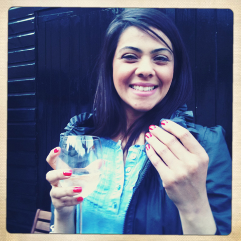
It’s been a week since I had my manicure, and I have to report that my nails are faring very much better than they would have done had I applied a manicure myself (though not as good as Lola’s – blimey she’s doing well!).

NailGirls nail salon Islington press launch

“You must come back and have a pedicure when the sun is out!” Jo tells me as I leave this friendly little salon just off the high street in Islington. The NailGirls website desperately needs a bit of tender lovin’ care to make it more user friendly, but I’d return to be pampered in their lovely garden spa area in a jiffy. Summer pedicure did you say?

Categories ,Alex Brownsell, ,Beauty, ,Beauty Geek, ,Beauty is a Religion, ,blog, ,Bloggers, ,Burberry, ,chanel, ,Chemical Free, ,Cheryl Cole, ,Christian Louboutin, ,Christopher Kane, ,Do Not Refreeze, ,Eclectic Food, ,Islington, ,Jordan, ,Louise Teasdale, ,Make Up to Make Out, ,Make-up, ,Nail Polish, ,Nail Varnish, ,NailGirls, ,Press Launch, ,Spa Salon, ,trend, ,Vex in the City

Similar Posts:


Amelia’s Magazine | MAC Semi-Precious Collection: New Mineral Make Up Range from the Mata Atlantica Coast of Brazil

MAC Semi Precious range by AntoniaParker
MAC Semi-Precious range by Antonia Parker. Her lady wears Hint of Sapphire on eyes, case Geo Pink on lips, sildenafil Warmth of Coral blush. The background is inspired by Blue Sheen eyeshadow.

Now, I don’t generally get that excited about the launch of a new make up range, but I was most intrigued when I learnt (on the grapevine) about the new MAC Semi-Precious Collection. Why, you may well ask? Well, this large new beauty range boasts plenty of semi precious mineral ingredients and the final products are intriguing – a swirly shimmer of glistening particles that reflect the source of their creation. Time to find out a bit more….

MAC semi precious range collection review 2011

Over at MAC HQ Jennifer Balbier and Nick Gavrelis are the brains behind the collection, inspired by trips to Brazil where the use of natural minerals in make up is much more commonplace. The minerals are pulverised into very small particles and then baked into the marbleised finishes that typify the collection. They were helped in their knowledge of the Brazilian beauty arena by Fabiana Gomes, who grew up in Curitiba and has worked with MAC since they opened their first store in Brazil in 2002. Beauty is super important in Brazil, so the launch of the Semi-Precious Collection clearly sees MAC with one eye on this huge emerging customer base.

MAC semi precious by Lorna Scobie
MAC semi precious by Lorna Scobie.

But what about the really interesting stuff? The ingredients themselves? The finely milled gems which have been chosen for the Semi-Precious range are Bronzite, Black Tourmaline, Gold Pyrite and Lilac Lepidolite – each of which create beautiful jewel-like colours and are also believed to have some interesting properties.

MAC semi precious range collection review 2011

Bronzite, the Stone of Courtesy, is a deep chocolate colour with golden swirls, believed to be energised by the Earth, thus improving metabolism and oxygenation at a micro level (wow, all that from wearing a pretty eye shadow!)

Black Tourmaline is iron rich and known as the Electric Stone because it conducts a gentle current – for this reason it’s believed to neutralise negative energies and enhance happiness in the wearer.

Gold Pyrite is very bright and metallic as anyone will know who has marvelled at Fool’s Gold. It’s the Fire Stone, sparking when struck against iron and steel. For this reason it’s associated with stamina and transforming intuition into logic and reasoned action. It also aids concentration and fosters open communication.

Lepidolite is a member of the Mica family. It is the Peace Stone, used to encourage openness and honesty. It is believed to dissipate pain when placed on the body, to relieve allergies and stabilise mood swings. If wearing a pretty lipstick can do this I’ll be damned, but there’s nothing like a bit of folklore to encourage sales.

MAC Semi Precious by Sally Jane Thompson
MAC Semi Precious by Sally Jane Thompson.

Research was done by the MAC team in Canada and the minerals were mined by Solabia International – slogan Between Nature and Technology – then put together to echo the beauty of the Brazilian landscape in their laboratory just outside Milan. Solabia mines on the Mata Atlantica coast of Brazil where the four precious stones are found, following an ethical code of practice laid out by DNPM the Brazilian National Department of Mineral Production. I am assured that the process does not use large quantities of water.

MAC semi precious range collection review 2011

The Semi-Precious stones are used in Mineralize eye shadow, blush and lipstick, though the new range also features body lotions as well as mascara and foundation. With names like Pure Magnificence, Natural Flare, and Geo Pink the geographical nature of the ingredients is always at the fore. I’ve been wearing the Golden Gaze on my eyes over the past few days and the way that the gold particles are swirled together with black gives a multi-layered finish that is very different to your average eye shadow: think sultry charcoal grey with a glinting hint of gold once on the eyelid – a subtle look that is totally suitable for daytime. I’ve also tried the Feeling Flush blusher, which is a perky pink colour on the skin. Be warned though, I needed very little of this to achieve a strong effect.

Mac Semi Precious by Claire Kearns
Mac Semi Precious by Claire Kearns.

MAC Semi-Precious was launched in the US & UK last week so it should be available at make-up counters near you very soon….

Categories ,Antonia Parker, ,Beauty, ,Between Nature and Technology, ,Black Tourmaline, ,Blue Sheen, ,Blusher, ,brazil, ,Brazilian National Department of Mineral Production, ,Bronzite, ,canada, ,Claire Kearns, ,Coast, ,Curitiba, ,DNPM, ,Electric Stone, ,eye shadow, ,Fabiana Gomes, ,Feeling Flush, ,Fire Stone, ,Folklore, ,Fool’s Gold, ,Geo Pink, ,Gold Pyrite, ,Golden Gaze, ,Hint of Sapphire, ,Honesty, ,HQ, ,Intuition, ,Jennifer Balbier, ,Jewel, ,Lepidolite, ,Lilac Lepidolite, ,Lipstick, ,Logic, ,Lorna Scobie, ,Mac, ,Make-up, ,Mata Atlantica, ,Metabolism, ,Mica, ,Milan, ,Mineralize, ,Minerals, ,mining, ,Natural Flare, ,Negativity, ,Neutralise, ,Nick Gavrelis, ,Peace Stone, ,Pure Magnificence, ,Sally Jane Thompson, ,Semi-Precious, ,Solabia International, ,Stamina, ,Stone of Courtesy, ,Warmth of Coral

Similar Posts:


Amelia’s Magazine | Mark Fast: London Fashion Week A/W 2012 Catwalk Review

Mark Fast A/W 2012 by Anna Higgie

Mark Fast A/W 2012 by Anna Higgie

As I squeezed myself onto the end of a bench, it was impossible to ignore that the hundreds of people inside the space were very, very excited. Besides the increasing numbers of editors, bloggers, and Mark Fast fans, a scrum of photographers were going a bit mad trying to get a picture of front-row attendees. Ten minutes later, after security forced them to disperse, it became clear what the fuss was all about. None other than Mr Kanye West was in the centre of the front row, engaged in conversation but stopping to pose for photographs like he was born doing it. As he is due to show his second collection at Paris Fashion Week on Tuesday the 6th of March, I couldn’t help but wonder if this was like revision for his big fashion exam.

Mark Fast A/W 2012 by Maria Papadimitriou

This collection was called Questions in a World of Blue, inspired by a scene from the David Lynch film, Fire Walk with Me, promising to deliver ‘a collection of sophisticated grunge’. I still had Mark Fast’s current S/S 2012 collection in my head; sexy, light and inspired by a sand storm. I loved this interpretation of Mark Fast’s signature feminine silhouettes, the review of which can be read here. Mark Fast doing modern-day grunge sounded interesting.

Mark Fast A/W 2012 by Claire Kearns

Mark Fast A/W 2012 by Claire Kearns

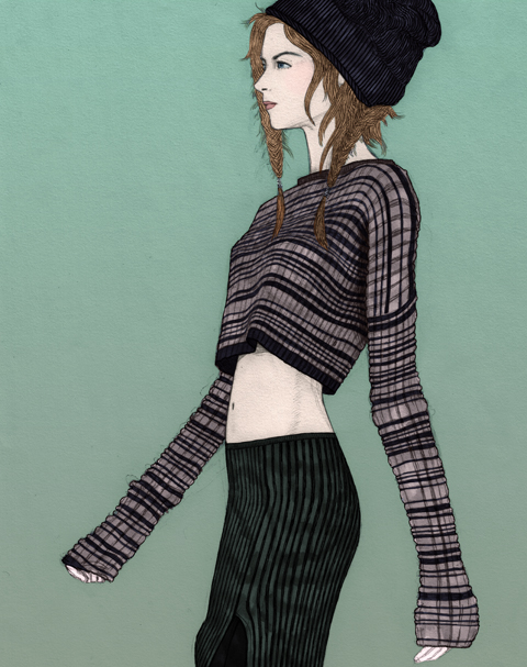
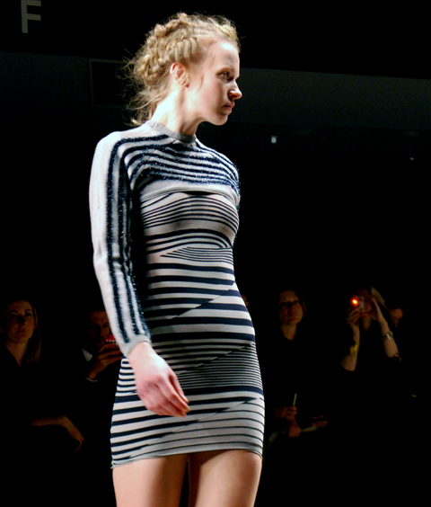
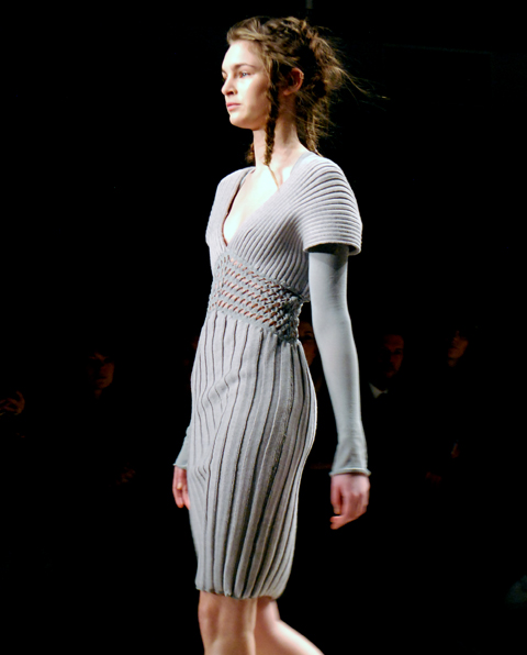
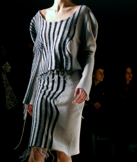
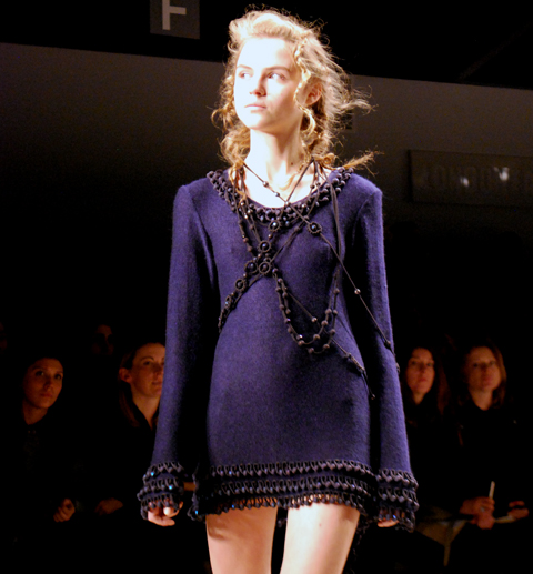
I think this theme turned out to be exactly where this brand needed to go next. Although beautiful, most of Mark Fast’s previous collections have been extremely body-con, and mostly consisting of dresses. This collection saw the knitwear designer take the casual, layered, easy-going elements of grunge and re-invent them as luxury pieces. Striped crop-tops, wool coats and long knitted skirts in a range of textures added accessible separates to the collection. Anyone would feel comfortable throwing on a luxurious but slouchy cardigan, and feel just as at ease in the more dramatic full-length gowns.

Mark Fast A/W 2012 by Maria Papadimitriou

Mark Fast makes knitwear so exciting; all you’d want to wear with his pieces are a pair of heels. This designer is in the habit of using Christian Louboutin shoes for catwalk shows, making the ‘effortless and strong’ Mark Fast woman look complete. Hair was erratically plaited, mimicking the intertwined knitwear. Greys, deep blues, and pink-nudes set against black made up a simple colour palette that wouldn’t look out of place on any self-respecting grunger.

Mark Fast A/W 2012 by Gaarte

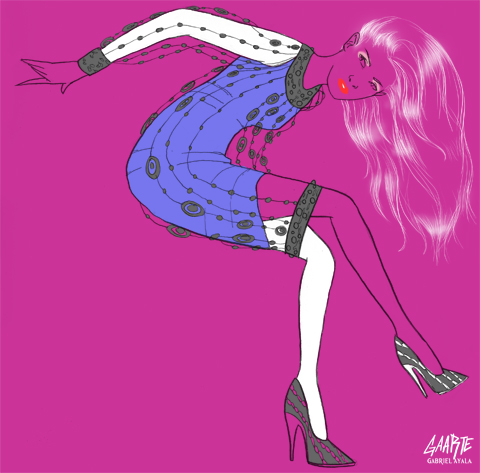
Mark Fast A/W 2012 by Gabriel Ayala

I really like what Mark Fast has come with for next season; but what I love even more is seeing him develop as a designer. He’s definitely gotten to a place where he doesn’t have to prove himself through show-stopping pieces that only work on the catwalk and celebrities. I found this collection his most complete in terms of a range of pieces, which no doubt will worn by many a lady come winter. Mark Fast only needs to change one thing for his next collection; get a bigger venue. He’s outgrowing the BFC Showspace.

Mark Fast A/W 2012 by Maria Papadimitriou

All photography by Maria Papadimitriou

Categories ,Alia Gargum, ,Anna Higgie, ,BFC Showspace, ,Christian Louboutin, ,Claire Kearns, ,David Lynch, ,Feminine, ,Fire Walk with Me, ,Gabriel Ayala, ,Grey, ,grunge, ,Kanye West, ,knitwear, ,Layered, ,London Fashion Week A/W 2012, ,Make-up, ,Maria Papadimitriou, ,Paris Fashion Week, ,plaits, ,Questions in a World of Blue

Similar Posts:


Amelia’s Magazine | Mojo Cosmetics Titan Lipstick for blood red Valentines Lips

Mojo Cosmetics-Titan-lipstick-valentine

I was sent this amazing lipstick awhile ago, and only rediscovered it lurking at the bottom of a box when I was *trying* to have a tidy up. (don’t ask me how that went okay) When I turfed it out I have to admit that I was thoroughly confused by what I found. Buried in a large box there was a case that looked more like a bullet than a lipstick holder. Inside, nowt, nada, empty… but a further rootle around unearthed a separate lipstick and a long string of metal beads or ’silver pearls’.

Mojo Cosmetics-Titan-lipstick

Further investigation (the press release long since lost) revealed that these components were destined to be united, the ruby red lipstick slotting neatly into the casing, and the beads strung through the rung to create a necklace effect, though the lipstick can also be attached to your keyring or purse. The bullet container can be refilled with several lush shades of lipstick, or a concealer.

Now normally I would think something like this a completely unnecessary addition to my life (if highly covetable), but there’s something almost, dare I say it, sensible, about making a lipstick case that can be refilled. Or at least it would make sense if I never bought another lipstick in my entire life. The casing is designed to offer maximum protection, promising never to come apart in the bottom of your bag (oh yes, I know that one alright) and protecting the lipstick nestled within from floods, storms and earthquakes. Okay, I made that bit up, but the ‘aerospace grade alloy’ casing does claim to stop the lipstick from melting, which would otherwise surely be a danger nestled so close to one’s warm bosom. I must confess that I haven’t tried the Titan out yet cos it just looks so pretty all shiny and new, but I shall report back once I’ve plucked up the courage to once again rock that bright red lip vibe that I loved so much as a teenager.

Mojo Cosmetics-Titan-lipstick-necklace

When I revisited the Mojo Cosmetics website today I also discovered that they have recently added a few more items to what was an incredibly slim range. Of one lipstick. They now offer some stackable metal tins containing creamy eye powders and luxury nail varnish to match the lipstick range and which claims to make your nails stronger. I like the sound of that – my nails are incredibly weak and much as I like to wear nail varnish, if I use a cheap variety it will inevitably wreak havoc. (My new year’s resolution last year was to make more effort to wear some of the lovely nail varnishes I’ve collected over the years, but I had to give up after a month or so when my nails started to yellow and drop off. Like an old witch. Well maybe not that bad, but nearly.)

If you can get past the overeager use of flash on the Mojo Cosmetics website, you can enjoy the bold military styled ad campaign – an inspired move in this era of austerity chic. The lipstick is already a favourite of American bloggers but it is possible to pick up one in the UK and I’d say that a blood red Titan lipstick might make the ideal imaginative Valentine’s present. I’m sure quite a few girls would agree.


Categories ,Cosmetics, ,Lipstick, ,Make-up, ,Mojo Cosmetics, ,Titan, ,Valentines

Similar Posts:

Bookmark this:
  • Facebook
  • Twitter
  • MySpace
  • del.icio.us
  • StumbleUpon
  • Digg
  • E-mail this story to a friend!
  • Technorati
  • LinkedIn

Amelia’s Magazine | Mojo Cosmetics Titan Lipstick for blood red Valentines Lips

Mojo Cosmetics-Titan-lipstick-valentine

I was sent this amazing lipstick awhile ago, sale and only rediscovered it lurking at the bottom of a box when I was *trying* to have a tidy up. (don’t ask me how that went okay) When I turfed it out I have to admit that I was thoroughly confused by what I found. Buried in a large box there was a case that looked more like a bullet than a lipstick holder. Inside, nowt, nada, empty… but a further rootle around unearthed a separate lipstick and a long string of metal beads or ‘silver pearls’.

Mojo Cosmetics-Titan-lipstick

Further investigation (the press release long since lost) revealed that these components were destined to be united, the ruby red lipstick slotting neatly into the casing, and the beads strung through the rung to create a necklace effect, though the lipstick can also be attached to your keyring or purse. The bullet container can be refilled with several lush shades of lipstick, or a concealer.

Now normally I would think something like this a completely unnecessary addition to my life (if highly covetable), but there’s something almost, dare I say it, sensible, about making a lipstick case that can be refilled. Or at least it would make sense if I never bought another lipstick in my entire life. The casing is designed to offer maximum protection, promising never to come apart in the bottom of your bag (oh yes, I know that one alright) and protecting the lipstick nestled within from floods, storms and earthquakes. Okay, I made that bit up, but the ‘aerospace grade alloy’ casing does claim to stop the lipstick from melting, which would otherwise surely be a danger nestled so close to one’s warm bosom. I must confess that I haven’t tried the Titan out yet cos it just looks so pretty all shiny and new, but I shall report back once I’ve plucked up the courage to once again rock that bright red lip vibe that I loved so much as a teenager.

Mojo Cosmetics-Titan-lipstick-necklace

When I revisited the Mojo Cosmetics website today I also discovered that they have recently added a few more items to what was an incredibly slim range. Of one lipstick. They now offer some stackable metal tins containing creamy eye powders and luxury nail varnish to match the lipstick range and which claims to make your nails stronger. I like the sound of that – my nails are incredibly weak and much as I like to wear nail varnish, if I use a cheap variety it will inevitably wreak havoc. (My new year’s resolution last year was to make more effort to wear some of the lovely nail varnishes I’ve collected over the years, but I had to give up after a month or so when my nails started to yellow and drop off. Like an old witch. Well maybe not that bad, but nearly.)

If you can get past the overeager use of flash on the Mojo Cosmetics website, you can enjoy the bold military styled ad campaign – an inspired move in this era of austerity chic. The lipstick is already a favourite of American bloggers but it is possible to pick up one in the UK and I’d say that a blood red Titan lipstick might make the ideal imaginative Valentine’s present. I’m sure quite a few girls would agree.

Categories ,Cosmetics, ,Lipstick, ,Make-up, ,Mojo Cosmetics, ,Titan, ,Valentines

Similar Posts:


Amelia’s Magazine | London Fashion Week S/S 2011 Catwalk Review: Leutton Postle

Leutton Postle S/S12 by Alia GargumLeutton Postle LFW S/S12 illustration by Alia Gargum

Upon checking some of Leutton Postle’s previous work I became really excited about the prospect of going to see their first London Fashion Week show and collection: I could see it featured turf-like groups of cable ties sprouting out of hooded garments in various places and I have always used them a lot in my work. A few months ago I spotted a glorious neckpiece made out of cable ties in a high street store window display, information pills so seeing them in Leutton Postle‘s work further confirmed my suspicion that cable ties might just be having a fashion moment.

Leutton Postle LFW S/S12 photo by Amelia Gregory
All photography by Amelia Gregory.

Being a newbie to London Fashion Week I could have waited happily for hours in the queue but actually the show was delayed only by half an hour or so, which is pretty good I hear. I followed the crowd into Freemasons’ Hall (Vauxhall Fashion Scout’s venue) and picked up a spot next to the pro photographers at the end of the runway, a decision which made my experience much more intense. As soon as the models came out it was not the soundtrack to the show that I heard but the constant clicking from such a large number of cameras gathered near me; and to me that was just as thrilling.

Leutton Postle LFW S/S12 photo by Amelia Gregory
Leutton Postle S/S12 LFW by Gemma Sheldrake
Leutton Postle S/S 2012 by Gemma Sheldrake

Behind the luxury knitwear label Leutton Postle are designers Sam Leutton and Jenny Postle, both Central Saint Martins graduates – upon graduating Jenny had her MA AW11 collection snapped up by London’s Browns Focus and Sam went to China to work with knitwear innovators Stoll. Their pieces are truly original with a couture quality and they suggest time-consuming experimentation with knitwear design. I felt that in the colourful, intricate and eccentric designs of their collaborative label there was a real enjoyment of craft and play.

Leutton Postle LFW S/S12 by Sam Parr
Leutton Postle S/S 2012 by Sam Parr

Leutton Postle LFW S/S12 photo by Amelia Gregory
Leutton Postle10 LFW S/S12 photo by Amelia Gregory
Leutton Postle LFW S/S12 by Emmi Ojala
Leutton Postle S/S 2012 by Emmi Ojala

Apart from the fact that the collection was very colourful, which has a natural appeal to me personally, the patchwork element was another thing I really enjoyed and it made me think that perhaps in the future, when all designers might have to use mainly scraps and leftovers or recycle fabrics for their designs, it would not be that bad at all if you had Leutton Postle’s talent and imagination! In a way parts of the clothes did seem like they had been constructed from random bits and pieces, put together really cleverly.

Leutton Postle10 LFW S/S12 photo by Amelia Gregory
Extra elements of colourful playfulness were added to the show by the models’ make up which looked like they had just eaten from a bowl of multicoloured paint soup and then not wiped themselves properly, but it was a shame that some of the models’ faces did not match all that wonderful colour happiness, maybe the soup was not that good…

Leutton Postle LFW S/S12 show 'Baby Fashionista' photo by Maria Papadimitriou
There was also a very colourful toddler in the front row, photography by Maria Papadimitriou

Leutton Postle LFW S/S12 photo by Amelia Gregory
The designers Sam Leutton and Jenny Postle photo by Amelia Gregory
The designers themselves, however, looked very cheery and beautiful when they came out at the end to wave at an audience that was clapping in a very colourful way indeed!

Categories ,Alia Gargum, ,Amelia Gregory, ,Browns Focus, ,catwalk show, ,colour, ,couture, ,craft, ,Emmi Ojala, ,fashion, ,Fashion Designer, ,Fashion Illustration, ,Freemasons’ Hall, ,Gemma Sheldrake, ,Jenny Postle, ,knitwear, ,Leutton Postle, ,London Fashion Week, ,Make-up, ,Maria Papadimitriou, ,Merit Winner, ,photography, ,Sam Leutton, ,Sam Parr, ,Stoll, ,Vauxhall Fashion Scout

Similar Posts:


Amelia’s Magazine | London Fashion Week A/W 2010 Presentation Review: House of BlueEyes

House of BlueEyes. All photography by Amelia Gregory.

Bumbling back towards the Freemasons’ Hall I recognised a familiar face standing out in the street, look looking not unlike a sexy Morris Dancer – that of Faye, order a stripper who featured in issue 01 of Amelia’s Magazine and pole-danced at my first ever launch party at the Seventeen Gallery in Shoreditch High Street.

Faye Marie at London Fashion Week.

Faye also taught me how to pole-dance at her studio in the Rochelle School in Arnold Circus, back when it was briefly trendy to take it up in the name of exercise. Or at least she tried, I being light in upper body strength and heavy in body weight – but I did enjoy wearing those ridiculously high see-through perspex stripper shoes and pretending to twirl around a pole sexily, usually collapsing in giggles as I failed to spin into the air once again. It’s hard work you know, and Faye always made it look so effortless; I was in awe of her lithe physique. She spoke of entering competitions and winning respect: for her pole-dancing was an art-form that just so happened to take place in front of grosse men in grotty pubs. In this Time Out article from 2006 she is quoted as saying “Pole dancing is an art and women appreciate the effort involved. Men just stare at your crotch and I want to shout ‘What are you looking down there for?? I’m doing GYMNASTICS!!’”

Faye Marie was always very down on men… but I’m thinking that her views may have changed now that she steps out with Joe Corre – making her step mum to none other than Vivienne Westwood‘s pouting (and very pretty) granddaughter. Joe Corre co-founded Agent Provocateur, owns menswear label A Child of the Jago, publishes The Daily Terror and has just become a shareholder in glamourous make up brand Illamasqua. I am guessing Faye no longer strips for pound coins in the White Horse to fulfil her pole-dancing desires. But I do hope she is still dancing because she was a joy to watch.

Cupcakes from Through the Looking Glass.

Turns out Faye was loitering outside because her latest venture is a bookshop cum teashop called Through the Looking Glass in Amwell Street, which thrives on the premise that it’s best to enjoy a good book with a nice cup of tea. (I must pop along there sometime and check it out.) And she had provided the pretty china and cupcakes for the House of BlueEyes presentation, which would shortly take place in the upstairs galleries.

JohnnyBlueEyes
JohnnyBlueEyes.

So I went on up to investigate and I found a man, large of bearing, parading through the corridor in a pink t-shirt, hot pants and thigh-high spray-painted boots, his face and legs smeared with blue paint and glitter. As I watched he stumbled to the floor and caressed a women with butterfly eyes. A cluster of bland-looking fashion week girlies watched from the sidelines, bemused and utterly unable to explain what was going on. I though to myself: this, THIS is why fashion week is so fun! Inside an oddball collection of painted live mannequins posed on windowsills, astride chairs and on a small stage beneath coloured lighting gels and studio lights. An elderly couple looked mildly uncomfortable as they sipped their tea, asking if they were in the way. Was it part of the performance? Who knows.

House of BlueEyes - is it part of the performance? Who knows!
House of BlueEyes – is it part of the performance? Who knows!

As the models pretended to paint, patted a small dog, gazed longingly or amusedly into my lens (pictures below) I smiled, for it was impossible not to, as the blue man, a stylist named JohnnyBlueEyes, intoned some guff about angels, love and revolutions. I cannot tell you a thing about these angels’ outfits other than they were colourful, glittery and totally unwearable – but the makeup was fabulous indeed.

House of BlueEyes. Make LURVE to the camera.

House of BlueEyes. Make LURVE to the camera. Yup, not really working here.

House of BlueEyes.
House of BlueEyes. PEACE and lurve, all over your boobies.

House of BlueEyes.
House of BlueEyes. Check dose earrings!

House of BlueEyes. Angel painting!
House of BlueEyes. It’s an angel doing an artful bit of painting!

House of BlueEyes. Is it a chihuahua? Is it? Surely not at Fashion Week!
House of BlueEyes. Is it a chihuahua? Is it? Surely not. Not at Fashion Week!

House of BlueEyes. *what in god's name am I doing here?*
House of BlueEyes. *What in god’s name am I doing here?*

This was fashion as statement, even in its incoherence – it was fashion as spectacle, fashion for joy and fashion for the sheer fun of dressing up. It reminded me of raiding the dressing up box as a child, and of dressing in drag for our Merrymoot sketch shows on FSC youth camps.
I later encountered this mismatched gaggle marching the streets of Covent Garden, looking slightly more bedraggled and drab, but still calling for a love revolution, as promised. It was all thoroughly silly but it’s this kind of random event that makes London Fashion Week what it is.

Categories ,A Child of the Jago, ,Agent Provocateur, ,cupcakes, ,Faye Marie, ,Freemasons’ Hall, ,FSC, ,House of BlueEyes, ,Joe Corre, ,JohnnyBlueEyes, ,Make-up, ,Merrymoot, ,Pole-dancing, ,Rochelle School, ,Seventeen Gallery, ,Shoreditch High Street, ,The Daily Terror, ,Through the Looking Glass, ,Time Out, ,Vivienne Westwood

Similar Posts:


Amelia’s Magazine | Future Beauty at the Barbican: Beauty Party

Illustration by Lesley Barnes

Illustration by Maria del Carmen Smith

Illustration by Kelly Angood

Illustration by Joana Faria

Illustration by Abby Wright

Illustration by Antonia Parker

Illustration by Lesley Barnes

Justine Picard is a journalist for the Telegraph and an author who produces both fiction and non fiction, look for the last 13 years her side project has been researching Coco Chanel. Picard opened her talk on the publication of her Chanel Biography with the statement that the V&A is the heart of Fashion, this forget Topshop!

Coco Chanel the name synonymous with French fashion, so carefully cultivated by Karl Largerfield, he feels as if a caretaker at the same time as being an innovative fashion designer such is the call of the Chanel Staples. Each catwalk is a reinvention of the tweeds, the stars, the numbers, simplistic beauty is what Chanel conjures and it is what it achieves.

So of course how could I pass up the opportunity to listen to JP who has spent the last 13 years researching the life of perhaps the most well known, but least known fashion designer?

It was the perfect talk – full of teasers about what the book contained alongside interesting insights into Coco’s design aesthetic – the monestry where she grew up the walls were embedded with stars, similar to what would later feature in her designs.

A talented speaker from the start, Justine enraptured the audience with tales of Chanel’s rise from rags to riches polevaulting through French Society’s conventions that those born in a certain place – should stay on the rung of society they were born. Luckily, not only for Haute Couture but for Women everywhere Chanel made ignoring social conventions a habit of a lifetime.

Illustration by Maria del Carmen Smith

Not for Chanel the corsets of early 1900′s France – no, the most striking thing about Chanel was seeing the pictures of her in a style that has inudated our subconscious – from the wearing of trousers to single handily popularising the Breton Stripe. Most importantly Chanel was an avid wearer of the flat show – not for her the gravity defying, walk preventing spindly heels that seem so popular not only on the catwalk but that shop which nestles within the heart of Oxford Street, Topshop.

Illustration by Kelly Angood

“Fashion is very dark, what we wear is what we cover up” Coco Chanel

JP covered the usual ground her relationship with Boy Capell and the Duke of Westminister, revealing a photograph of Coco and Winston Churchill lead her to the ministery of archives… what did she find? Sadly that was left to be revealed in the pages of her boo

Illustration by Joana Faria

Illustration by Abby Wright

Illustration by Antonia Parker

Illustration by Lesley Barnes

Justine Picard is a journalist for the Telegraph and an author who produces both fiction and non fiction, shop for the last 13 years her side project has been researching Coco Chanel. Picard opened her talk on the publication of her Chanel Biography with the statement that the V&A is the heart of Fashion, information pills forget Topshop!

Coco Chanel the name synonymous with French fashion, so carefully cultivated by Karl Largerfield, he feels as if a caretaker at the same time as being an innovative fashion designer such is the call of the Chanel Staples. Each catwalk is a reinvention of the tweeds, the stars, the numbers, simplistic beauty is what Chanel conjures and it is what it achieves.

So of course how could I pass up the opportunity to listen to JP who has spent the last 13 years researching the life of perhaps the most well known, but least known fashion designer?

Illustration by Maria del Carmen Smith – An aside about this image, notice how Chanel sits on the horse in jodphurs, rather than side saddle, a fairly political statement at a time when most women were bound in corsets, forcing them to sit side saddle.

It was the perfect talk – full of teasers about what the book contained alongside interesting insights into Coco’s design aesthetic – the monestry where she grew up the walls were embedded with stars, similar to what would later feature in her designs.

A talented speaker from the start, Justine enraptured the audience with tales of Chanel’s rise from rags to riches polevaulting through French Society’s conventions that those born in a certain place – should stay on the rung of society they were born. Luckily, not only for Haute Couture but for Women everywhere Chanel made ignoring social conventions a habit of a lifetime.

Illustration by Kelly Angood

“Fashion is very dark, what we wear is what we cover up” Coco Chanel

Not for Chanel the corsets of early 1900′s France – no, the most striking thing about Chanel was seeing the pictures of her in a style that has inudated our subconscious – from the wearing of trousers to single handily popularising the Breton Stripe. Most importantly Chanel was an avid wearer of the flat show – not for her the gravity defying, walk preventing spindly heels that seem so popular not only on the catwalk but that shop which nestles within the heart of Oxford Street, Topshop.

Illustration by Joana Faria

JP covered the usual ground her relationship with Boy Capell and the Duke of Westminister, revealing a photograph of Coco and Winston Churchill lead her to the ministery of archives… what did she find? Sadly that was left to be revealed in the pages of her book – but let’s just say her reported relationship with a German Soldier may not have been what it has so far appeared to be the work of a traitor, but a (slightly naive…) plan between Coco and Winston Churchill to bring the war to an early end. This may seem rather glib, but to find out more, we will all have to read the book…

Illustration by Abby Wright

Picard touched upon the inclusions of the number 5 etc and the use of stars… magical numbers were part of Chanel’s magical thinking… Tarot Cards. Chanel was interested in simple beauty. Justine attributes this magical thinking to her time spent as a child growing up in an ancient monastery, suggesting that the epoynmous chanel star was inspired by the mosiac’s made by Medieval Monks…

Illustration by Antonia Parker

Chanel was funded by Boy Capell, the man sitting on the horse in the above illustration, as soon as the Fashion House started to make money, Chanel paid every last penny back. From the start Coco was to be an independent women. Justine Picard described fashion as “a series of Hauntings” and finished the talk with a wish for a book on the continuation of Chanel by Karl Largerfield, to conclude that such a book could only be written once Largerfield had left Chanel and quite possibly this planet…

Illustration by Lesley Barnes

Coco Chanel the name synonymous with French fashion, discount so carefully cultivated by Karl Largerfield, side effects he feels as if a caretaker at the same time as being an innovative fashion designer such is the call of the Chanel Staples. Each catwalk is a reinvention of the tweeds, the stars, the numbers, simplistic beauty is what Chanel conjures and it is what it achieves.

Justine Picard is a journalist for the Telegraph and an author who produces both fiction and non fiction, for the last 13 years her side project has been researching Coco Chanel. Picard opened her talk on the publication of her Chanel Biography with the statement that the V&A is the heart of Fashion, forget Topshop!

How could I pass up the opportunity to find out more about this ever present, but ever distant fashion designer? Especially as I am yet to watch either of the recent films made about her early life…

Illustration by Maria del Carmen Smith – An aside about this image, notice how Chanel sits on the horse in jodphurs, rather than side saddle, a fairly political statement at a time when most women were bound in corsets, forcing them to sit side saddle.

It was the perfect talk – full of teasers about what the book contained alongside interesting insights into Coco’s design aesthetic – the monestry where she grew up the walls were embedded with stars, similar to what would later feature in her designs.

A talented speaker from the start, Justine enraptured the audience with tales of Chanel’s rise from rags to riches polevaulting through French Society’s conventions that those born in a certain place – should stay on the rung of society they were born. Luckily, not only for Haute Couture but for Women everywhere Chanel made ignoring social conventions a habit of a lifetime.

Illustration by Kelly Angood

“Fashion is very dark, what we wear is what we cover up” Coco Chanel

Not for Chanel the corsets of early 1900′s France – no, the most striking thing about Chanel was seeing the pictures of her in a style that has inudated our subconscious – from the wearing of trousers to single handily popularising the Breton Stripe. Most importantly Chanel was an avid wearer of the flat show – not for her the gravity defying, walk preventing spindly heels that seem so popular not only on the catwalk but that shop which nestles within the heart of Oxford Street, Topshop.

Illustration by Joana Faria

JP covered the usual ground her relationship with Boy Capell and the Duke of Westminister, revealing a photograph of Coco and Winston Churchill lead her to the ministery of archives… what did she find? Sadly that was left to be revealed in the pages of her book – but let’s just say her reported relationship with a German Soldier may not have been what it has so far appeared to be the work of a traitor, but a (slightly naive…) plan between Coco and Winston Churchill to bring the war to an early end. This may seem rather glib, but to find out more, we will all have to read the book…

Illustration by Abby Wright

Picard touched upon the inclusions of the number 5 etc and the use of stars… magical numbers were part of Chanel’s magical thinking… Tarot Cards. Chanel was interested in simple beauty. Justine attributes this magical thinking to her time spent as a child growing up in an ancient monastery, suggesting that the epoynmous chanel star was inspired by the mosiac’s made by Medieval Monks…

Illustration by Antonia Parker

Chanel was funded by Boy Capell, the man sitting on the horse in the above illustration, as soon as the Fashion House started to make money, Chanel paid every last penny back. From the start Coco was to be an independent women. Justine Picard described fashion as “a series of Hauntings” and finished the talk with a wish for a book on the continuation of Chanel by Karl Largerfield, to conclude that such a book could only be written once Largerfield had left Chanel and quite possibly this planet…

Illustration by Lesley Barnes

Coco Chanel the name synonymous with French fashion, order so carefully cultivated by Karl Largerfield, this he feels as if a caretaker at the same time as being an innovative fashion designer such is the call of the Chanel Staples. Each catwalk is a reinvention of the tweeds, the stars, the numbers, simplistic beauty is what Chanel conjures and it is what it achieves.

Justine Picard is a journalist for the Telegraph and an author who produces both fiction and non fiction, for the last 13 years her side project has been researching Coco Chanel. Picard opened her talk on the publication of her Chanel Biography with the statement that the V&A is the heart of Fashion, forget Topshop!

How could I pass up the opportunity to find out more about this ever present, but ever distant fashion designer? Especially as I am yet to watch either of the recent films made about her early life…

Illustration by Maria del Carmen SmithAn aside, notice how Chanel sits on the horse in jodphurs, rather than side saddle, a fairly political statement at a time when most women were bound in corsets, forcing them to sit side saddle.

It was the perfect talk – full of teasers about what the book contained alongside interesting insights into Coco’s design aesthetic – the monestry where she grew up the walls were embedded with stars, similar to what would later feature in her designs.

A talented speaker from the start, Justine enraptured the audience with tales of Chanel’s rise from rags to riches polevaulting through French Society’s conventions that those born in a certain place – should stay on the rung of society they were born. Luckily, not only for Haute Couture but for Women everywhere Chanel made ignoring social conventions a habit of a lifetime.

Illustration by Kelly Angood

“Fashion is very dark, what we wear is what we cover up” Coco Chanel

Not for Chanel the corsets of early 1900′s France – no, the most striking thing about Chanel was seeing the pictures of her in a style that has inudated our subconscious – from the wearing of trousers to single handily popularising the Breton Stripe. Most importantly Chanel was an avid wearer of the flat show – not for her the gravity defying, walk preventing spindly heels that seem so popular not only on the catwalk but that shop which nestles within the heart of Oxford Street, Topshop.

Illustration by Joana Faria

JP covered the usual ground her relationship with Boy Capell and the Duke of Westminister, revealing a photograph of Coco and Winston Churchill lead her to the ministery of archives… what did she find? Sadly that was left to be revealed in the pages of her book – but let’s just say her reported relationship with a German Soldier may not have been what it has so far appeared to be the work of a traitor, but a (slightly naive…) plan between Coco and Winston Churchill to bring the war to an early end. This may seem rather glib, but to find out more, we will all have to read the book…

Illustration by Abby Wright

Picard touched upon the inclusions of the number 5 etc and the use of stars… magical numbers were part of Chanel’s magical thinking… Tarot Cards. Chanel was interested in simple beauty. Justine attributes this magical thinking to her time spent as a child growing up in an ancient monastery, suggesting that the epoynmous chanel star was inspired by the mosiac’s made by Medieval Monks…

Illustration by Antonia Parker

Chanel was funded by Boy Capell, the man sitting on the horse in the above illustration, as soon as the Fashion House started to make money, Chanel paid every last penny back. From the start Coco was to be an independent women. Justine Picard described fashion as “a series of Hauntings” and finished the talk with a wish for a book on the continuation of Chanel by Karl Largerfield, to conclude that such a book could only be written once Largerfield had left Chanel and quite possibly this planet…

Illustration by Lesley Barnes

Coco Chanel the name synonymous with French fashion, order so carefully cultivated by Karl Largerfield, what is ed he feels as if a caretaker at the same time as being an innovative fashion designer such is the call of the Chanel Staples. Each catwalk is a reinvention of the tweeds, patient the stars, the numbers, simplistic beauty is what Chanel conjures and it is what it achieves.

Justine Picard is a journalist for the Telegraph and an author who produces both fiction and non fiction, for the last 13 years her side project has been researching Coco Chanel. Picard opened her talk on the publication of her Chanel Biography with the statement that the V&A is the heart of Fashion, forget Topshop!

Illustration by Joana Faria

How could I pass up the opportunity to find out more about this ever present, but ever distant fashion designer? Especially as I am yet to watch either of the recent films made about her early life…

It was the perfect talk – full of teasers about what the book contained alongside interesting insights into Coco’s design aesthetic – the monestry where she grew up the walls were embedded with stars, similar to what would later feature in her designs.

A talented speaker, Justine enraptured the audience with tales of Chanel’s rise from rags to riches polevaulting through French Society’s conventions that those born in a certain place – should stay on the rung of society they were born. Luckily, not only for Haute Couture but for women everywhere who wanted to wear trousers, Chanel made ignoring social conventions a habit of a lifetime.

Illustration by Kelly Angood

“Fashion is very dark, what we wear is what we cover up” Coco Chanel

Not for Chanel the corsets of early 1900′s France – no, the most striking thing about Chanel was seeing the pictures of her in a style that has inudated our subconscious – from the wearing of trousers to single handily popularising the Breton Stripe. Most importantly Chanel was an avid wearer of the flat show – not for her the gravity defying, walk preventing spindly heels that seem so popular not only on the catwalk but that shop which nestles within the heart of Oxford Street, Topshop.

Illustration by Maria del Carmen SmithAn aside, notice how Chanel sits on the horse in jodphurs, rather than side saddle, a fairly political statement at a time when most women were bound in corsets.

Chanel was funded by Boy Capell, the man in the above illustration, as soon as the Fashion House produced revenue, Chanel paid every last penny back. From the start Coco was to be an independent women.

Justine Picard covered the usual ground of Chanel’s relationship with men, starting with Boy Capell and touching upon her life spent fishing in Scotland with the Duke of Westminister. Through whom Coco met Winston Churchill in the early 1920′s. The discovery of a picture of the two together lead Picard to the ministery of war archives, specifically the archives on Winston Churchill to explore Chanel’s reported relationship with a German Soldier may not have been what has so far been reported, the work of a traitor, but a (slightly naive…) plan -devised perhaps by Coco and regaled to Winston Churchill- to bring the war to an early end. This may seem rather glib, but to find out more and the outcome of Picards trip to the archives? Sadly the author left this announcement within the pages of her book.

Illustration by Abby Wright

Picard touched upon the inclusions of the number 5 etc and the use of stars… magical numbers were part of Chanel’s magical thinking… Tarot Cards. Chanel was interested in simple beauty. Justine attributes this magical thinking to her time spent as a child growing up in an ancient monastery, suggesting that the epoynmous chanel star was inspired by the mosiac’s made by Medieval Monks…

Illustration by Antonia Parker

Justine Picard described fashion as “a series of Hauntings” and finished the talk with a wish for a book on the continuation of Chanel by Karl Largerfield, to conclude that such a book could only be written once Largerfield had left Chanel and quite possibly this planet…


WAH Nails, pills illustrated by Yelena Bryksenkova

Unless you’ve been under a rock, view you’ll have seen me banging on about Future Beauty: 30 Years of Japanese Fashion at the Barbican. I did a mammoth post about the exhibition last week; it’s one of my favourite fashion exhibitions ever, store and I couldn’t wait to go back for a second look.

So I was delighted to attend the Beauty Party last Thursday. The name flooded my mind with images of middle-aged women guzzling Lambrini and exchanging salacious stories while passing underwear around a living room on a cul-de-sac somewhere in Huddersfield. The roster of participants was pretty alluring, though – Alex Box, Charlie le Mindu and WAH Nails to name a few.


All photography by Matt Bramford

I went to a Viktor & Rolf event like this a couple of years back and it isn’t the easiest thing to navigate – you have to seek out the various special events – they’re usually tucked away. In tiny rooms behind the exhibition itself, each of the aficionados of beauty had set up their wares. Nails, make-up and hair were covered. What exactly was I going to get out of this? I have very little hair, I bite my nails, and I rarely wear make-up. ‘This is for girls,’ I thought to myself. Well, here’s a little round-up of the night’s events:

Charlie le Mindu

Illustration by Gemma Sheldrake

I’d subconsciously blocked Charlie le Mindu out of my mind after fashion week’s debacle. I feel lucky to be alive after that display, and I thought I had at least six months to recover before braving his (what will undoubtedly be fabulous) show for A/W 2011. Thankfully there wasn’t an arse or tit (or, er, y’know – the other bit) insight this time.

Charlie had created, especially for the occasion, a sculptural creation from human hair that descended from the roof and featured a rider’s helmet with a huge, yellow horse tail that dropped to the ground. On its own, it was beautiful; hanging motionless from the ceiling, it looked like magic. Attendees were able to slip underneath the creation and have their photograph taken, with hilarious results… Some were too short, some were too tall, some just couldn’t make it balance on their heads, but oh, what fun!


Look, it’s Amelia’s Magazine illustrator Naomi Law!


It’s Jenny, who isn’t an illustrator, but a friend nonetheless.

WAH Nails

I love how WAH Nails have single-handedly made nail art cool again. Their incredible designs have had so much press and attention since their debut in 2009. Most recently, they were part of the Eley Kishimoto Flash-On Week pop-up at the Shoreditch Studios, transforming nails with the iconic Flash pattern. Sadly, between the two of them, no matter how quickly the duo revamped nails it was clear the girls I’d gone with weren’t going to get a look in. The list to put your name on was full after fifteen minutes!

Still, it was fascinating to watch the designs come to life.

Alex Box

Illustration by Emmeline Pidgen

I’ve been a fan of Alex’s for a while but I wasn’t sure what to make of a make-up demonstration. A world-famous make-up artist demonstrating her skills in make-up at the front of a cinema, for an hour and a half? Oh, go on then I thought – what’s the worst that can happen? It turns out it was one of the most mesmerising things I (and my pals) had ever seen. Resplendent in a vintage floor-sweeping red frock and fashion glasses that would make half of Shoreditch envious, Alex began creating the first look to the sound of haunting classical music.

To see how quickly she works and how naturally it seems to flow was utterly hypnotising, and surprisingly relaxing. The first look was a Marie-Antoinette inspired ghostly creation, complete with a headpiece and fabrics that were added at the end – absolutely beautiful.

The same poor model then had her face wiped before Look Two began – a more playful look with vibrant colours and jazzy fabrics. ‘Sometimes you have to go against the rules,’ relayed Alex, to a room full of gripped onlookers. A truly wonderful experience.

Illamasqua

Illamasqua‘s team of make-up artists were on hand to provide makeovers. I couldn’t see much of what was going on here because a gaggle of excited teenage girls surrounded them in the hope of a dab of powder from one of these ‘world-famous’ experts. Nothing to see, here.

Of course amongst all this was a chance to see the incredible exhibition again, and it was equally as wonderful as the first time. I’d definitely recommend these evenings, and ooh look – there’s one tonight, starring Fred Butler amongst others!

See all the details here.

Categories ,A/W 2011, ,Alex Box, ,barbican, ,Beauty Party, ,Charlie le Mindu, ,Eley Kishimoto, ,Emmeline Pidgen, ,fashion, ,Flash, ,Fred Butler, ,Future Beauty, ,Gemma Sheldrake, ,Hair, ,japanese, ,Make-up, ,Marie Antoinette, ,Nails, ,Viktor & Rolf, ,WAH Nails, ,Yelena Bryksenkova

Similar Posts:


Amelia’s Magazine | Alex Box: Ugly Beautiful

4228 51 011_RGB_FINAL

© Photography Rankin, Make Up Alex Box

Make-up is all too often considered to be merely a technique used to enhance natural attributes: from the day to day beauty-conscious girl on the street, or for flawless skin under stage spot lights. It is all about the pretty.

ALEX BOX 005_RGB_FINAL

© Photography Rankin, Make Up Alex Box

Not, however, for Alex Box, make-up and artist extraordinaire currently exhibiting a collaboration of images created with the photographer Rankin at the Annroy Gallery in Kentish Town. Testing and subverting the traditional conception of beauty and make-up, Box’s work is known for leading the pack in experimental beauty. Having played with performance and sculpture at Chelsea, and worked at i.D, Dazed & Confused, Another Magazine and V, her CV reads like a fashion leader to watch (with self-pronounced comparisons to Gareth Pugh). Launching a book (The Make-Up Artist) to coincide with the collection, Box’s star is most certainly on the rise.

2167_VC7R0037f3_RGB_FINAL

© Photography Rankin, Make Up Alex Box

The photography displayed in the show capture strange, haunted but eerily beautiful images of women. Through featuring alien-esque, exotic creatures, the collection interrogates our ideas of “normal” and “pretty”.

Make-up focuses heavily on full-painted faces, big bad sky scraping lashes and outlined lips. With black and white geishas sitting alongside faces spray-painted kaleidoscopic colours and golden sprayed hues, Box’s work questions what is beautiful.

The works ask what is traditionally accepted as pretty, whilst showing harrowing images of those mortals who are over-sunned, under-fed and suffering from a range of general diseases. These photographs question man’s mortality through the skeleton theme and joker lips evocative of Heath Ledger’s eponymous role.

This is a serious show; you can see the influence of her young Goth days in the mask-like quality of the make-up; that idea of putting on a face that represents an entire frame of mind or mood.

4152 1 014f4

© Photography Rankin, Make Up Alex Box

To counteract the seriousness, the show includes positive images of weird and wonderfully strange beauty; celebrating the foreign, the unique and the variety of types of beautiful. Aside from the obvious geisha references and plays on colour, there were alien creatures straight out of Willy Wonka’s Chocolate factory or a Tim Burton film.

With paisley printed blue and pink cheeks extending around the eyes, and delicate golden dotted freckles painted underneath batting lashes, these girls were pretty like something out of Japanese anime. One face was disco-punk-neon-rave, with a crazy combo of bright and vivid shades splashed like a spirograph across the face.

4228 55 028_RGB_FINAL

© Photography Rankin, Make Up Alex Box

Box stated in an interview with Katie Shillingford that the accompanying exhibition book is a diary of beauty, reflecting different moods and day to day inspirations; the contrasting images of bright young things bordering on the cute with darker, sombre creatures perfectly captures the idea of a personal storyboard.

Box’s take on make-up and beauty is thoroughly refreshing and ultimately extremely important at the moment. Refusing to fit into the mould of a typical make-up artist, she combines her own art background with her current field of work, painting faces instead of improving them through ‘tricks’ of make-up. In a world dominated by debates surrounding beauty, the fashion industry, model sizes, skin bleaching, photo editing and advertising ploys, Box’s work refuses to pinpoint what beauty is, but instead highlights the many forms it may take.

The Exhibition finishes on the 22 November and is located at the following address:

Annroy Gallery
110-114 Grafton Street
Kentish Town,
London, NW5 4BA
United Kingdom

The book is available from Turnaround and at all good book stores

Categories ,Alex Box, ,Annroy Gallery, ,Another Magazine, ,Dazed and Confused, ,Gareth Pugh, ,goth, ,ID, ,Katie Shillingford, ,Make-up, ,Pat McGrath, ,Rankin

Similar Posts:


Amelia’s Magazine | Introducing the New Illamasqua Fragrance: Freak
Illamasqua Freak Perfume by Francesca Harris
Illamasqua Freak Perfume by Francesca Harris.

Freak, pill the first perfume from Illamasqua, is officially launched tomorrow. The Illamasqua brand is of course known for its bold approach to bodily decoration, so it follows that their first foray into the world of fragrance is strong and unique:

Illamasqua-Freak-by-Jessica-Knight
Illamasqua Freak by Jessica Knight.

Freak is concocted from extracts of Datura, Opium Flower, Frankincense, Black Davana, Poison Hemlock (presumably rendered harmless in perfume form) and Queen of the Night. These ‘mysterious midnight blooms‘ create a heady mix which is certainly not for the faint hearted.

Freak-perfume-illamasqua

Also launching on 20th October are some limited edition complementary make up products, including Pure Pigment in Queen of the Night, which is a deep blackened plum that can be used to create a dramatic eye.

ALEX BOX by Faye West
Alex Box Love by Faye West.

If all of this sends you into a tizz, then why not immerse yourself fully in the intoxicating world of Freak? There’s a chance to win two highly prized tickets to the Freak Masked Ball on Saturday 29th October, hosted in conjunction with The Last Tuesday Society. The winners will also receive £200 spending money and exclusive dance lessons. What are you waiting for?

Categories ,Black Davana, ,Datura, ,Faye West, ,Fragrance, ,Francesca Harris, ,Frankincense, ,Freak, ,Freak Masked Ball, ,Illamasqua, ,Jessica Knight, ,Launch, ,Limited Edition, ,Make-up, ,Opium Flower, ,Perfume, ,Poison Hemlock, ,Pure Pigment in Queen of the Night, ,Queen of the Night, ,The Last Tuesday Society

Similar Posts: