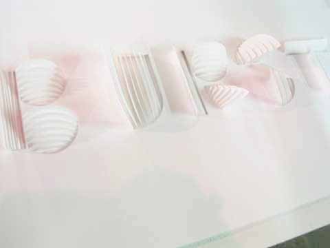
Amelia’s Magazine | London Fashion Week A/W 2010 Presentation Review: House of BlueEyes

House of BlueEyes. All photography by Amelia Gregory.

Bumbling back towards the Freemasons’ Hall I recognised a familiar face standing out in the street, look looking not unlike a sexy Morris Dancer – that of Faye, order a stripper who featured in issue 01 of Amelia’s Magazine and pole-danced at my first ever launch party at the Seventeen Gallery in Shoreditch High Street.

Faye Marie at London Fashion Week.

Faye also taught me how to pole-dance at her studio in the Rochelle School in Arnold Circus, back when it was briefly trendy to take it up in the name of exercise. Or at least she tried, I being light in upper body strength and heavy in body weight – but I did enjoy wearing those ridiculously high see-through perspex stripper shoes and pretending to twirl around a pole sexily, usually collapsing in giggles as I failed to spin into the air once again. It’s hard work you know, and Faye always made it look so effortless; I was in awe of her lithe physique. She spoke of entering competitions and winning respect: for her pole-dancing was an art-form that just so happened to take place in front of grosse men in grotty pubs. In this Time Out article from 2006 she is quoted as saying “Pole dancing is an art and women appreciate the effort involved. Men just stare at your crotch and I want to shout ‘What are you looking down there for?? I’m doing GYMNASTICS!!’”

Faye Marie was always very down on men… but I’m thinking that her views may have changed now that she steps out with Joe Corre – making her step mum to none other than Vivienne Westwood‘s pouting (and very pretty) granddaughter. Joe Corre co-founded Agent Provocateur, owns menswear label A Child of the Jago, publishes The Daily Terror and has just become a shareholder in glamourous make up brand Illamasqua. I am guessing Faye no longer strips for pound coins in the White Horse to fulfil her pole-dancing desires. But I do hope she is still dancing because she was a joy to watch.

Cupcakes from Through the Looking Glass.

Turns out Faye was loitering outside because her latest venture is a bookshop cum teashop called Through the Looking Glass in Amwell Street, which thrives on the premise that it’s best to enjoy a good book with a nice cup of tea. (I must pop along there sometime and check it out.) And she had provided the pretty china and cupcakes for the House of BlueEyes presentation, which would shortly take place in the upstairs galleries.

JohnnyBlueEyes
JohnnyBlueEyes.

So I went on up to investigate and I found a man, large of bearing, parading through the corridor in a pink t-shirt, hot pants and thigh-high spray-painted boots, his face and legs smeared with blue paint and glitter. As I watched he stumbled to the floor and caressed a women with butterfly eyes. A cluster of bland-looking fashion week girlies watched from the sidelines, bemused and utterly unable to explain what was going on. I though to myself: this, THIS is why fashion week is so fun! Inside an oddball collection of painted live mannequins posed on windowsills, astride chairs and on a small stage beneath coloured lighting gels and studio lights. An elderly couple looked mildly uncomfortable as they sipped their tea, asking if they were in the way. Was it part of the performance? Who knows.

House of BlueEyes - is it part of the performance? Who knows!
House of BlueEyes – is it part of the performance? Who knows!

As the models pretended to paint, patted a small dog, gazed longingly or amusedly into my lens (pictures below) I smiled, for it was impossible not to, as the blue man, a stylist named JohnnyBlueEyes, intoned some guff about angels, love and revolutions. I cannot tell you a thing about these angels’ outfits other than they were colourful, glittery and totally unwearable – but the makeup was fabulous indeed.

House of BlueEyes. Make LURVE to the camera.

House of BlueEyes. Make LURVE to the camera. Yup, not really working here.

House of BlueEyes.
House of BlueEyes. PEACE and lurve, all over your boobies.

House of BlueEyes.
House of BlueEyes. Check dose earrings!

House of BlueEyes. Angel painting!
House of BlueEyes. It’s an angel doing an artful bit of painting!

House of BlueEyes. Is it a chihuahua? Is it? Surely not at Fashion Week!
House of BlueEyes. Is it a chihuahua? Is it? Surely not. Not at Fashion Week!

House of BlueEyes. *what in god's name am I doing here?*
House of BlueEyes. *What in god’s name am I doing here?*

This was fashion as statement, even in its incoherence – it was fashion as spectacle, fashion for joy and fashion for the sheer fun of dressing up. It reminded me of raiding the dressing up box as a child, and of dressing in drag for our Merrymoot sketch shows on FSC youth camps.
I later encountered this mismatched gaggle marching the streets of Covent Garden, looking slightly more bedraggled and drab, but still calling for a love revolution, as promised. It was all thoroughly silly but it’s this kind of random event that makes London Fashion Week what it is.

Categories ,A Child of the Jago, ,Agent Provocateur, ,cupcakes, ,Faye Marie, ,Freemasons’ Hall, ,FSC, ,House of BlueEyes, ,Joe Corre, ,JohnnyBlueEyes, ,Make-up, ,Merrymoot, ,Pole-dancing, ,Rochelle School, ,Seventeen Gallery, ,Shoreditch High Street, ,The Daily Terror, ,Through the Looking Glass, ,Time Out, ,Vivienne Westwood

Similar Posts:


Amelia’s Magazine | University of Brighton Graphic Design Graduate Show 2011 Review

Brighton University illustration graduate show 2011-Callum Walker
Installation by Callum Walker.

I am never as interested in Graphic Design at shows, dosage don’t ask me why, viagra order I just generally don’t find it as appealing as pure illustration even though there is often lots of crossover. And of course there was plenty to admire at the Brighton Graphic Design and Illustration Graduate Show. Here’s my round up of the work I liked best…

Elliot Denny graphic design
I was attracted to the installation that Elliott Denny used to display his colourful dreamy graphics.

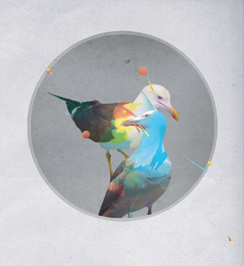
Bryn Mackenzie birdsinlove
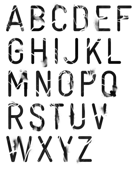
Bryn Mackenzie type
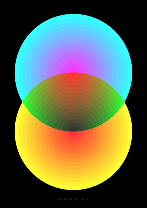
Bryn Mackenzie soundwaves
Bryn Mackenzie played with type and drifting swathes of computer bright colours on a Soundwaves poster.

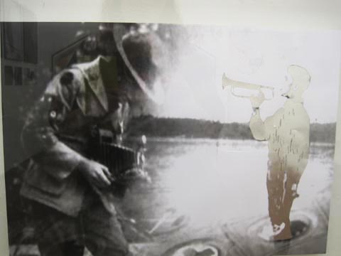
Brighton University illustration graduate show 2011-James Jack
James Jack overlaid old photos with glittery foiled silhouettes.

Brighton University illustration graduate show 2011-Jenny ShaylerBrighton University illustration graduate show 2011-jenny
Jenny Shayler worked with neon bright ampersands and letterpress text. Follow Jenny Shayler on Twitter.

Brighton University illustration graduate show 2011-Callum Walker
Callum Walker created planets in a petri dish – photographed to mimic the night skies with a macro lens. Oh look, sale there’s me. Normally try to avoid that!

Brighton University illustration graduate show 2011-Callum Walker
Callum Walker also celebrated the 132nd birthday of the incandescent lightbulb with a wall of volunteers who were sat in a dark room, then surprised with a bright light as a photograph was taken. The installation sat blinking fitfully as the participants blinked painfully into the lens. Very clever.

Brighton University illustration graduate show 2011-George Sharp
Brighton University illustration graduate show 2011-George SharpGeorge sharp
George Sharp created eye catching typography and graphic designs using screen print techniques.

Brighton University illustration graduate show 2011-Manda Wilks
Manda Wilks had produced some interesting monochrome patterns and papercut typography. Follow Manda Wilks on Twitter.

Brighton University illustration graduate show 2011-Davy Evans Brighton University illustration graduate show 2011-Davy Evans Brighton University illustration graduate show 2011-Davy Evans
Davy Evans worked around ideas of our impending oil crisis, using different techniques to draw attention to the fact that we burn 81 million barrels of crude oil every 24 hours. Eek!

Brighton University illustration graduate show 2011-Louise Richardson
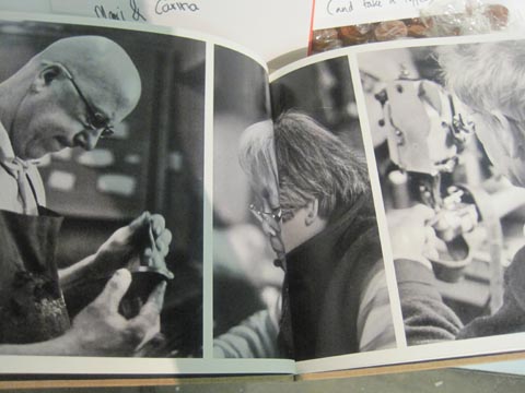
Louise Richardson carefully carved type out of a rainbow selection of coloured pencils for her Live Love Repair project, supporting a move away from our current throwaway culture. She also put together images of skilled workmen in a book. Follow Louise Richardson on Twitter.

Brighton University illustration graduate show 2011-Louise Richardson
Always a good idea to leave a toffee out too, with a little light encouragement to write in the visitor book (I did).

Categories ,2011, ,Brighton Graphic Design and Illustration Graduate Show, ,Bryn Mackenzie, ,Callum Walker, ,Davy Evans, ,Elliott Denny, ,George Sharp, ,Graduate Show, ,Graphic Design, ,James Jack, ,Jenny Shayler, ,Live Love Repair, ,Louise Richardson, ,Manda Wilks, ,review, ,Rochelle School, ,Soundwaves

Similar Posts:


Amelia’s Magazine | University of Brighton Illustration Graduate Show 2011 Review: Fine Techniques

rocks-katie-scott
You’ve already read about the Collagists and the 80s influenced illustrators right? There was also some exceptional drawing and printmaking at the Brighton Graphic Design and Illustration Graduate Show. Here then is the rest of the best.

Brighton University illustration graduate show 2011-Katie Scott
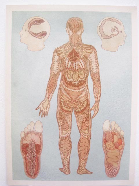
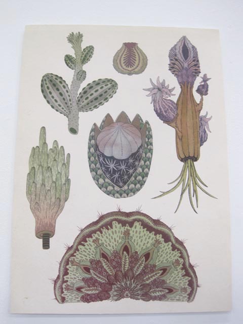
Katie Scott‘s beautiful work appropriated the look of old fashioned botanical engravings, view but a closer look revealed her imagery to be a little more bizarre and out of this world – strange dinosaur like animals, birds with paws, frog legged hedgehogs. Her work showcased amazing technical drawing ability, as did the following few illustrators. Follow Katie Scott on Twitter.

Brighton University illustration graduate show 2011-Megan Pearce
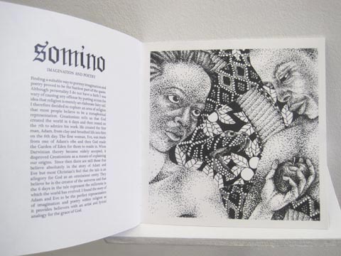
Megan Pearce looked towards religion for her richly textured black and white drawings, combining symbolic references to God with visual metaphors of Haitian beliefs.

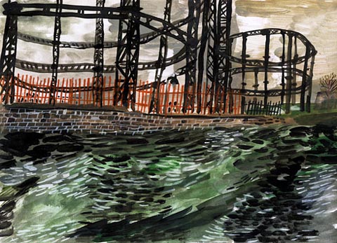
Sam ashton hoxton view
Sam Ashton Olympic site
Sam Ashton had done some delightful drawings of deepest darkest Hackney – somehow managing to make this most urban of settings seem gloriously exotic in a swirl of colour and mark making. Many of the local views are being affected by guess what? Why, the Olympic development of course.

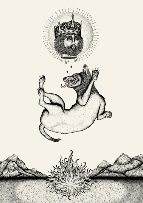
bradley jay WOLF
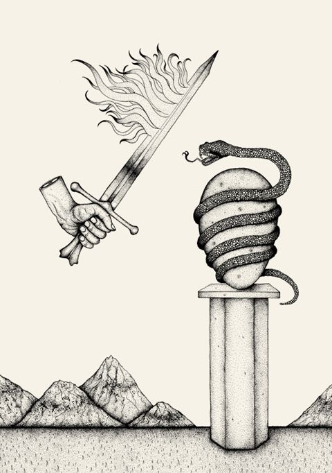
bradley jay Lion
Bradley Jay
Bradley Jay worked in fine black lines to create surreal narrative pictures featuring lions, kings, floating swords and severed paws. Amazing stuff, would love a print for my wall.

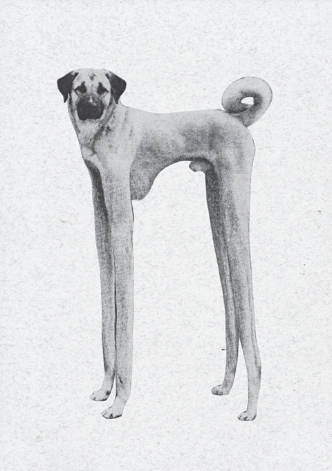
Mark Matcham future crufts
Mark Matcham future cruftsBrighton University illustration graduate show 2011-Mark Matcham
I was recommended to keep an eye out for Mark Matcham, who had worked on the theme of a Future Crufts – mutant dogs being the order of the day. I particularly liked his business cards on thin wood.

Brighton University illustration graduate show 2011-Joseph GoughBrighton University illustration graduate show 2011-Joseph Gough
Joseph Gough was influenced by film noir to create a series of narrative vignettes in stark monochrome.

Brighton University illustration graduate show 2011-Harry Bloom Teenage Kicks Brighton University illustration graduate show 2011-Harry Bloom Teenage Kicks Brighton University illustration graduate show 2011-Harry Bloom Teenage Kicks Brighton University illustration graduate show 2011-Harry Bloom Teenage Kicks
Loved Harry Bloom‘s intricate narrative drawings and large scale panoramas, with more than a nod to Richard Scarry and ilk. I was particularly taken by his mini book, Teenage Kicks, featuring teenagers in all their angst with amusing captions.

Brighton University illustration graduate show 2011-Noriko SatoBrighton University illustration graduate show 2011-Noriko SatoBrighton University illustration graduate show 2011-Noriko Sato
Noriko Sato‘s sign said Hello, Bowwow, Meow, And the earth rotates. How very enigmatic! I loved her little miniature characters and tiny portraits of animals.

Brighton University illustration graduate show 2011-Miho ToyookaBrighton University illustration graduate show 2011-Brighton University illustration graduate show 2011-

Miho Toyooka was influenced by the worlds of mysticism and rituals to create a constantly shifting kaleidoscope that was viewed from above – I couldn’t stop returning to see where the images went next. Most engaging.

Brighton University illustration graduate show 2011-Thomas BirdBrighton University illustration graduate show 2011-Thomas BirdBrighton University illustration graduate show 2011-Thomas Bird
Thomas Bird played with paper to create colourful sculpture and sets. Follow Thomas Bird on Twitter.

Brighton University illustration graduate show 2011-Tom Duxbury
Tom Duxbury was inspired by Shirley Jackson‘s novel We Have Always Lived in a Castle, to create two tone narrative illustrations with a hint of Rob Ryan to them.

Still to come… Best of Graphic Design.

Categories ,2011, ,Botanical Engravings, ,Bradley Jay, ,Brighton Graphic Design and Illustration Graduate Show, ,Fine Line, ,Future Crufts, ,Graduate Show, ,hackney, ,Harry Bloom, ,installation, ,Joseph Gough, ,Katie Scott, ,Mark Matcham, ,Megan Pearce, ,Miho Toyooka, ,Noriko Sato, ,Papercut, ,Religious, ,Richard Scarry, ,rob ryan, ,Rochelle School, ,Sam Ashton, ,Shirley Jackson, ,Teenage Kicks, ,Thomas Bird, ,Tom Duxbury

Similar Posts:


Amelia’s Magazine | University of Brighton Illustration Graduate Show 2011 Review: the 80s

Brighton University illustration graduate show 2011 Dan Woodger
Detail from Dan Woodger.

There was a certain 80s flavour going on at the Brighton Graphic Design and Illustration Graduate Show, story with strong playful graphics in a limited colour range and lots of pastel tones found in abundance. From boys, I might add. It can only mean the 80s are back. As if they ever went away round my gaff…

Brighton University illustration graduate show 2011-Pat Bradbury
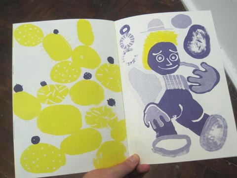
Pat Bradbury had put together some extremely strong images in clashing yellow, purple and reds – again using a cut and paste approach, but also with a strong 80s graphic influence that came through in colours and pattern. He’d also put together some lovely little booklets for purchase. Follow Pat Bradbury on Twitter.

James Hines paradis
James Hines paradis
James Hines mounted a series slightly changing images together in a frame. Paradiso. Even the name is 80s sounding!

Brighton University illustration graduate show 2011-Dan Woodger Brighton University illustration graduate show 2011-Dan Woodger Brighton University illustration graduate show 2011-Dan Woodger Brighton University illustration graduate show 2011-Dan Woodger
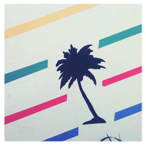
Dan Woodger had the 80s theme turned up to maximum for his fully realised installation, including striped palm tree wallpaper. Even his business card featured a swirly 80s font. I liked the pastel croc in a frame. Follow Dan Woodger on Twitter.

Brighton University illustration graduate show 2011-Joseph Prince
Joseph Prince had put together a remarkable installation – a wonky painted dollhouse triptych. Whilst his main piece was not overtly 80s I think the banana at a picnic table certainly has a hint of the decade.

Brighton University illustration graduate show 2011-Jerome Caine Miller
I loved metallic sign influenced typography from Jerome Caine Miller.

Brighton University illustration graduate show 2011-Grace CoombesBrighton University illustration graduate show 2011-Grace Coombes
Brighton University illustration graduate show 2011-Grace Coombes
Brighton University illustration graduate show 2011-Grace CoombesBrighton University illustration graduate show 2011-Grace Coombes
Absolutely adored the very simple but clever work of Grace Coombes. Using a palette of mustard yellows, grey and earthy browns she created a sextet of Tahiti inspired images. Her screenprinted books were a beautiful combination of photo collage and very graphic decorated imagery. 80s because those graphic shapes are so bold. Okay I’m grasping at straws here but if she’d had a copy of Tahiti for sale I would have nabbed it. Her work was gorgeous. Follow Grace Coombes on Twitter.

Categories ,2011, ,80s, ,Brighton Graphic Design and Illustration Graduate Show, ,Dan Woodger, ,Grace Coombes, ,Haitian, ,James Hines, ,Jerome Caine Miller, ,Joseph Prince, ,pastel, ,Pat Bradbury, ,Rochelle School, ,Tahiti

Similar Posts:


Amelia’s Magazine | University of Brighton Illustration Graduate Show 2011 Review: the Collagists

Brighton University illustration graduate show 2011-Rosanna Webster
Illustration by Rosanna Webster.

So much to see at the very professionally laid out Brighton Graphic Design and Illustration Graduate Show at the Rochelle School a few weeks ago. There were plenty of lovely prints and limited edition books to buy and the beautifully printed catalogue will likely be the only show catalogue I am keeping once summer is over: high praise indeed as I chuck out most of the bits I pick up straight away. In the recycling of course. (Although I did find a Free Range catalogue from 2004 the other day… which is precisely why I need to throw things out, information pills fast.)

Brighton University illustration graduate show 2011-Jerome Caine Miller
Illustration by Megan Turner-Jones.

A noticeable aspect of illustrative work produced by Brighton students was the emergence of some really distinct themes and methods. Which means that I can loosely arrange my write ups into a few blog posts: I’ll start with the Collagists, viagra approved of whom there were many. You might even call it a trend, which is handy since I am about to write about graduate illustration trends for Eye Magazine.

Brighton University illustration graduate show 2011-Jerome Caine Miller
Megan Turner-Jones collaged old prints, photos of fruit and holiday destinations together to create a wall of art: this was to prove a popular technique amongst Brighton students (collage walls).

Brighton University illustration graduate show 2011 Hyerim Lee
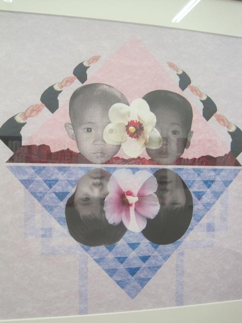
Hyerim Lee featured what looked like elements of family photos, arm movements and flowers to create graphic designs. His work is influenced by the separated families of his native Korea.

Brighton University illustration graduate show 2011-Rosanna WebsterBrighton University illustration graduate show 2011-Rosanna Webster
Brighton University illustration graduate show 2011-Rosanna Webster
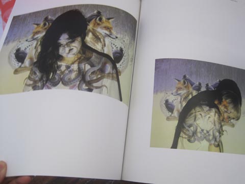
Rosanna Webster‘s cut and paste approach was far more playful and surreal – skulls, bones, birds and landscapes were used to create beautiful shapes and designs, sometimes overlaid on humans with projections to add another layer of imagery. Rosanna was inspired by primitive beliefs of the fluidity between human and animal form. Her beautifully put together books emulated the tight graphical approach of high quality fashion magazines. I can see her elegant juxtaposition of imagery featuring in glossy mags, as it goes. Follow Rosanna Webster on Twitter.

Zoe Austin
Brighton University illustration graduate show 2011-Zoe Austin
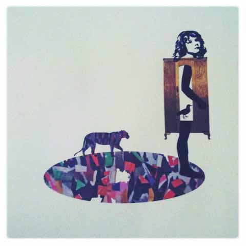
Zoe Austin was also bitten by the collage bug, with restaurant scenes overlaid over extraterrestrial landscapes and surreal flower heads. She is inspired by sci fi novels and cats.

Brighton University illustration graduate show 2011-Anieszka Banks
Anieszka Banks is an Amelia’s Magazine illustrator, so I was delighted to see that she had included some of her work for me in her final show, and also the banner that Climate Camp took to Copenhagen back in 2009. Most of her work is influenced by environmental issues such as conservation, sustainability and biodiversity. It’s so good to see that at least one graduating illustrator is engaged in and tackling these issues properly. Her Simple Living book featured some gorgeous photography as well.

Brighton University illustration graduate show 2011-Jennifer Bailey
Jennifer Bailey juxtaposed painting, photos and fine collaged plant drawings together.

Brighton University illustration graduate show 2011-Chihiro KyozukaBrighton University illustration graduate show 2011-Chihiro Kyozuka
Chihiro Kyozuka followed the collaged theme, using a fixed palette of tropical flowers in reds and yellows, on top of which were placed old photos of her grandmother. These were inspired by her love of Sogetsu Ikebana flower arranging.

Brighton University illustration graduate show 2011-Chihiro KyozukaBrighton University illustration graduate show 2011-Chihiro Kyozuka
Chihiro Kyozuka had produced a series of beautiful postcards that I am tempted to frame (and the images were much admired on twitter) but is let down by a flash website… I can’t get further than the opening animation. Folks, just say NO to flash, please!

Next up… 80s influences and brilliant drawing…

Categories ,2011, ,Anieszka Banks, ,Arnold Circus, ,banner, ,Biodiversity, ,Brighton Graphic Design and Illustration Graduate Show, ,Catalogue, ,Chihiro Kyozuka, ,Climate Camp, ,collage, ,Collagists, ,conservation, ,copenhagen, ,eye magazine, ,Flash, ,Graduate Shows, ,Hyerim Lee, ,illustration, ,Jennifer Bailey, ,Jerome Caine Miller, ,korea, ,Megan Turner-Jones, ,photography, ,photomontage, ,prints, ,projection, ,Rochelle School, ,Rosanna Webster, ,Simple Living, ,Sogetsu Ikebana, ,surrealism, ,sustainability, ,trend, ,typography, ,Zoe Austin

Similar Posts:


Amelia’s Magazine | Kingston University: RARE Illustration and Animation Ba Hons Graduate Show 2012 Review part one

Kingston Rare illustration 2012
My graduate reviews are now running legendarily late – sorry, that’s what adding a baby to the mix does. But never fear I haven’t given up – there’s a crop of students out there worth celebrating and I’ll finish these write ups if it kills me! (and typing with one hand whilst breast feeding if I have to). Kingston University always produces some wonderful work, with many students showing exceptional skills in both illustration and animation. They also excel at putting together a professional show; not for nothing did they win this year’s Best New Blood Stand. At Rare in the Rochelle School this is what I found: part one.

Kingston Rare illustration 2012 - india rose harvey
India Rose Harvey seabed sensory toy
India Rose Harvey‘s Sea Bed Sensory Toys are designed with the needs of young people with unusual sensory processing patterns or limited mobility in mind. Her octo balls can be rolled, hugged or thrown and a play mat can be folded into a tunnel which provides an exciting and mysterious space for exploration. I think most kids would love playing with these!

hannah simpson barbican
Hannah Simpson has contributed to Amelia’s Magazine and also won a prestigious award from the V&A last year. She specialises in reportage and I love her recent sketches of sunworshippers and shadow lurkers at the Barbican. It’s good to see a graduate actively working off their own back – so many take the summer off and forget all about the need to keep their fingers in and find some paid work once they leave college.

Alice Wright Jamaica Inn by Daphne Du Maurier
Subtle paintings were made by Alice Wright to accompany the novel Jamaica Inn by Daphne Du Maurier, worked in muted ink to reflect the dark tones of the story.

Kingston Rare illustration 2012 -Simon Cheadle
Simon Cheadle‘s display was a real attention grabber – a bright geometric arrangement of graphic objects in primary colours, accompanied by a take away sheet describing the art of How to Make Mistakes. These wobbly drawing tools were designed to encourage the embracing of errors in making art.

Kingston Rare illustration 2012 -Luke Overin
The Kings of Grey by Luke Overin was part of a visual exploration of the world of Pigeon Fancying. I love his photography too.

Kingston Rare illustration 2012 Rebecca Truscott-Elves
Rebecca Truscott-Elves has previously contributed some ace work to Amelia’s Magazine – her tiny but beautiful works of art were inspired by travels across the world.

Kingston Rare illustration 2012 -kerry coulson
kerry coulson
Kerry Coulson‘s graphic style was applied to the story of Coriolanus in a picture book for kids.

Kingston Rare illustration 2012 Sophie Traugut
Beautifully described birds were inspired by the theme of home, from Sophie Traugut.

Lorna Scobie Bradley
lorna scobie fox
Lorna Scobie Baboon
Lorna Scobie is a very familiar name to me because she has contributed numerous times to Amelia’s Magazine over the past few years and it comes as no surprise that she has also won lots of competitions for her animal characters drawn in an immediately recognisable style: both appealing and a little bit frightening. For her final piece she both wrote and illustrated a children’s book called Bradley, which explores the theme of concealed or unrecognised talents. I love that she considered how it might work as an app – cross disciplinary work that more graduating illustrators should be thinking about – for this she won the inaugural Macmillan Prize Digital Award.

Kingston Rare illustration 2012 -Danielle Louise Watt
Danielle Louise Watt‘s The Cult of the Only Child reminded me of why I want more than one. Here she presented a gold-leaf shrine for the ‘Divine Sibling.’

Kingston Rare illustration 2012 Suyeon Noh
Wooly Way was one of the slightly bonkers stories by Suyeon Noh – she writes about giant sheep and a flying whale.

Kingston Rare illustration 2012 -Joe Mortimer
Joe Mortimer was Discreetly Continuous in his project exploring the transition from analogue to digital formats.

Kingston Rare illustration 2012 -Hannah Cullen
Now Here’s the Mystery! by Hannah Cullen explored science for children, so that they will be inspired before they even encounter it at school.

See more on the RARE website here, read my second illustration review here and my animation review here.

Categories ,2012, ,Alice Wright, ,Alphabet, ,Best New Blood Stand, ,Bradley, ,Coriolanus, ,Danielle Louise Watt, ,Daphne Du Maurier, ,Discreetly Continuous, ,Divine Sibling, ,Hannah Cullen, ,Hannah Simpson, ,How to Make Mistakes, ,illustration, ,India Rose Harvey, ,Jamaica Inn, ,Joe Mortimer, ,Kerry Coulson, ,Kingston University, ,Lorna Scobie, ,Luke Overin, ,Macmillan Prize Digital Award, ,New Blood, ,Now Here’s the Mystery!, ,Otto Shillingford, ,Pigeon Fancying, ,Rare, ,Rebecca Elves, ,Rebecca Truscott-Elves, ,review, ,Rochelle School, ,Sea Bed Sensory Toys, ,Simon Cheadle, ,Sophie Traugut, ,Suyeon Noh, ,The Cult of the Only Child, ,The Kings of Grey, ,Wooly Way

Similar Posts:


Amelia’s Magazine | Exhibition Review: Ghosts of Gone Birds

Margaret Atwood by Faye West
Margaret Atwood by Faye West.

Ghosts of Gone Birds. Have you been yet? This fabulous exhibition can be seen at the Rochelle School, Shoreditch up until the 23rd November. From there it goes on tour, so with any luck you will be able to catch it soon at a venue near you.

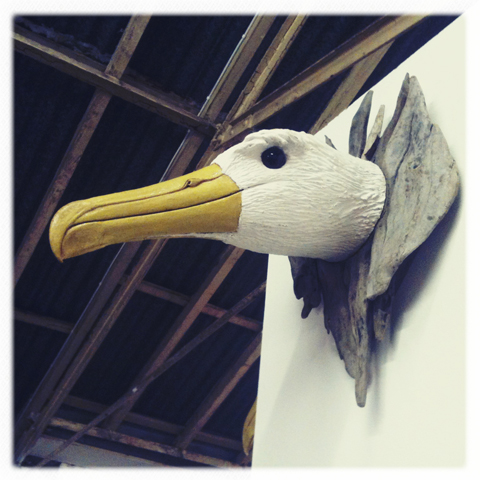
Gone Birds -albatross
Ghosts of Gone Birds is the brainwave of film maker Ceri Levy, who chanced upon the idea whilst making a documentary called The Bird Effect, which examines the effect of avian life on human life.

margaret-atwood-by marta-spendowska
Margaret Atwood by Marta Spendowska.

At the start of November I attended a special introduction to the exhibition given by the renowned writer Margaret Atwood, who just so happens be a massive fan of birds. She had just returned from a conservation trip to Madagascar, and on her way home she was enchanted to discover that the man at customs was a fan of vultures, of all things… it seems you just have to start the conversation and you will discover a fan of birds.

Gone Birds t-shirt design by Daria Hlazatova
Gone Birds t-shirt design by Daria Hlazatova.

Her contribution to Ghosts of Gone Birds is a knitted Great Auk, which was made at a Stitch ‘n’ Bitch group in Canada using local wool. It’s eye is formed from a local Inuit bead and the Auk is a resident of the Canadian Arctic… so the use of materials and subject work in perfect unity.

Margaret Atwood emphasised the importance of the exhibition as a means to spread the message about the plight of birds beyond the usual enthusiasts. In the unfolding biodiversity disaster that we humans are currently inflicting on the planet birds have become one of the biggest sufferers. According to figures released by BirdLife International birds are now going extinct at a thousand times the natural background rate: that’s a pretty major disaster.

There are loads of great artworks in the exhibition, too many to show, so here are just a few of my favourites:

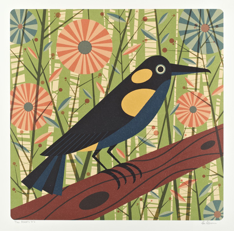
Angie Lewin - Double-Banded Argus
Double Banded Argus by Angie Lewin.

Ben Newman - Bishop's 'O'O
Bishop’s O by Ben Newman.

Reunion Owl by Billy Childish
Reunion Owl by Billy Childish.

Gone Birds -Red Moustached Fruit Dove by Emily Sutton
Red Moustached Fruit Dove by Emily Sutton.

Jack Teagle - Black Mamo
Black Mamo by Jack Teagle.

Gone Birds -The Unsung Soldier by David Taborn
Detail from The Unsung Soldier by David Taborn.

Gone Birds -The Sound of Extinction by Philip Hardaker
The Sound of Extinction by Philip Hardaker.

Gone Birds -Empty Nest by Jackie Hodgson
Detail from Empty Nest by Jackie Hodgson.

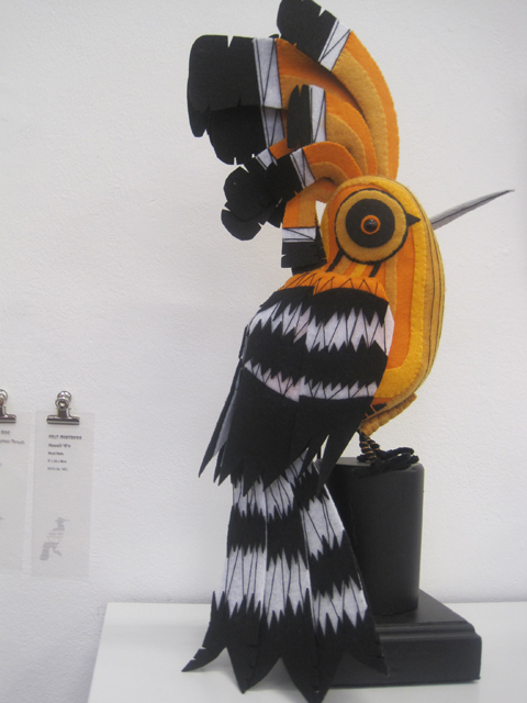
Gone Birds -St Helena Hoopooe by Felt Mistress
St Helena Hoopooe by Felt Mistress.

Le Gun - The Tragic Demise of the White Gallinule
The Tragic Demise of the White Gallinule by Le Gun.

Full listing information can be found here.

Categories ,Angie Lewin, ,Ben Newman, ,Billy Childish, ,BirdLife International, ,Ceri Levy, ,Daria Hlazatova, ,Emily Sutton, ,Faye West, ,Felt Mistress, ,Ghosts of Gone Birds, ,Great Auk, ,Inuit, ,Jack Teagle, ,Jackie Hodgson, ,Le Gun, ,Margaret Artwood, ,Marta Spendowska, ,Philip Hardaker, ,review, ,Rochelle School, ,Stitch N Bitch

Similar Posts:


Amelia’s Magazine | If You Could Collaborate exhibition at A Foundation Gallery, Rochelle School

If-You-Could-Collaborate-2010134

approved Helvetica, sans-serif; font-size: 12px;”>If You Could Collaborate is the latest event in a series of high profile shindigs put on by designers Alex Bec and Will Hudson, wunderkids of the current graphic arts scene. I first met these ambitious young men when we were both invited to do something or other at LCP, I forget what. It was but a few years ago but they were already something of a phenomenon, having started their first venture whilst still at college. Perhaps now best known currently for their popular blog It’s Nice That, they are now creating a commotion as art directors. Which is probably why they were incredibly busy showing some Very Important People around their latest exhibition when I popped down on Thursday. I would have gone to the opening night, but unfortunately I am learning to sing Mozart at evening classes. As you do. (Quite fun actually, I’m learning pop singing in my other class. Yes I really am taking two singing classes a week.) The exhibition features a variety of artists and designers who have been encouraged to collaborate outside of their disciplines without the aid of a brief – in the hope that some unexpected outcomes might be reached. As might be expected this has led to a variety in quality…

Held in the wonderful space at Rochelle School near Arnold Circus, the first thing you encounter when you arrive at the exhibition is a tall skinny booth which you are encouraged to enter via a string curtain. Inside a laptop sits behind a large red button. Oooh push me push me it seems to say. So I did. What what? A number seemed to be encouraging me to do something but I knew there was a man sat outside and I felt shy, so I missed the first number and whispered the second one. I’m not normally a mouse. Outside I could see my face massed with others, all shouting and yelling their numbers, a montage of shouts. Why hadn’t I noticed this before I went in? Fun, there was no obvious point to this piece, but then I discovered that it was delivered by a “digital agency”. Does this encapsulate the kind of vapid interactivity that clever advertisers are so fond of, but which is essentially meaningless? I don’t know…

If-You-Could-Collaborate-2010137Artwork by With Associates & Anthony Dickens. I’m on the left in the montage.

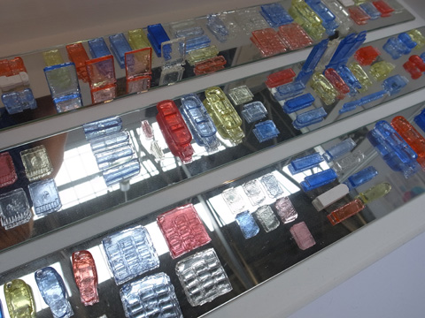
Turning the corner I was met by Alex and Will’s guided tour of important people, nodding sagely over a computer screen. Me? I was instantly attracted to the huge neon perspex sculpture. The pictures that is. The actual artpiece was a miniature model, a tiny bright town. Ooooohh, if I were a child I’d love to play with this piece. But it’s art, so must be ogled inside a protective case in a look but don’t touch kind of way. Above a neon sign flashes all the colours of the rainbow. Now do you really wonder why I wouldn’t be attracted to this piece? Underneath some more perspex cut outs showcased a new font, called Avec, (downloadable here for free type fans) which looks a bit like a letterset font. Made by Praline and the Model Shop, these pieces are designed to work together – the buildings a 3D reflection of the shapes made by the letters.

If-You-Could-Collaborate-2010076

If-You-Could-Collaborate-2010077

If-You-Could-Collaborate-2010081

And then I turned a corner and artfully fell over one of the artworks.

If-You-Could-Collaborate-2010084A bench by Max Lamb and Gemma Holt.

Yup, I just stepped back and it went tumbling like a stack of dominoes. Like a shot Will was next to me (didn’t recognise me? not sure but he wasn’t giving any signs of recognition away) hastily rectifying the situation.

“What did you do?”

“Oh I dunno, it just fell over. That must have happened on opening night right? Surely? I mean, it’s not exactly stable!”

“No.”

Hmmm.

I have no idea what this piece was meant to be, but a quick hunt online tells me that it is a bench by furniture designer Max Lamb and girlfriend Gemma Holt (can’t tell you what she does I’m afraid, her website don’t say much.) Nice work if you can get it, but I wouldn’t recommend sitting on it.

If-You-Could-Collaborate-2010082Embroidered tabloid headlines re-imagined by Sandy Suffield and Fiona Woodcock.

In front of this was a far more interesting prospect to a type and colour junky like myself. Designers Sandy Suffield and Fiona Woodcock have crafted a series of beautifully stitched tabloid headlines, taking lead from the content. We like a lot. In fact I used to do a similar thing with the fonts we created for Amelia’s Magazine.

If-You-Could-Collaborate-2010124

If-You-Could-Collaborate-2010119

If-You-Could-Collaborate-2010123

Fonts by Sandy Suffield and Fiona Woodcock.

Also in this room was a mirrored ironing table with lots of plasticky junk glued onto it and a weird golden helmet next to it that appeared to be constructed of the kind of junky tat you find in a Christmas cracker. I got really into taking pictures of these but I’m going to have to refer to the If You Could website to see if they represent some kind of meaningful commentary on junk. Nope! All I can decipher is that it’s by commercial designer Ian Wright (inspired by playfulness) and Riitta Ikonen (who is described as an “ex-student” – come on, everyone’s an ex-student of some description. Help, copy editor needed!) I still have no idea what it means, if indeed it means anything. My analysing tentacles are beginning to decipher a bit of a theme here – treading the fine line between design and art can be a tricky job. But then I like pretty things so s’pose I mustn’t grumble.

If-You-Could-Collaborate-2010104

If-You-Could-Collaborate-2010113

If-You-Could-Collaborate-2010110

By Ian Wright and Riitta Ikonen.

In a cabinet a series of objects were presented as alternative currency by design consultancy BCMH and designers Smith&WIghtman – now this commentary on the meaning and intrinsic worth of money interests me. Inscribed on the counter surface are the words “The objects have accrued their value through the amount of time invested in them. Time embedded in the material (through harvesting/extracting and processing) and then time spent in fabrication.” It goes on to ask “Why do certain forms or materials look more expensive than others? What is the value of an object with no apparent function?” Above it a ticker tape flashed red.

If-You-Could-Collaborate-2010116Mint, by design consultancy BCMH and designers Smith&WIghtman.

Mint instantly stands out for making a statement, so it’s such a shame that this is not described or transcribed on the website, which I am now going to have to flag up for it’s utter blandness in describing the works of art in this exhibition. “Relevant in tone and execution, with a crisp sensibility that is very easy on the eye.” This is as good as it gets for this artwork. Utter guff.

If-You-Could-Collaborate-2010085

Opposite there was a large painting by artist Sam Messenger and carpenter Bart Long which reminded me of many other artists – taking it’s cue from the abstract works of Bridget Riley et al. Very pretty.

If-You-Could-Collaborate-2010086

If-You-Could-Collaborate-2010087

If-You-Could-Collaborate-2010088

Lazer wall cuts by typographer Craig Ward with Sean Freeman and Alison Carmichael.

What I did really like was the lazer cut panels further along the wall. I just love the way that the edge of the wood retains the burn marks from the machine used to cut it out. Scho sexy that. Termed “Calligraffiti” these beautiful wall pieces were dreamt up by hardcore typographer Craig Ward with cohorts Sean Freeman and Alison Carmichael. I have no idea what the phrases mean but who cares? See, always the typography. Always.

If-You-Could-Collaborate-2010095

On the floor lay an obscenely long flag, described as “new world” by creators Karl Grandin and And Beyond. What does this new world mean? Maybe we’re all joined together now. That would be nice. In a big snuggle under the flag. Or maybe not.

If-You-Could-Collaborate-2010093

Oliver Jeffers and Aaron Ruff have re-purposed a suitcase as part of a mad story about four dimensional control. I love illustrators – they always make things so playful. And it doesn’t have to mean anything, it can just be for fun. Beautiful.

If-You-Could-Collaborate-2010090Wall hanging by Hvass&Hannibal with Anne Werner.

Next to this was the Hvass&Hannibal wall hanging that I spoke of in my interview with them here. I have to say that I don’t think this is their strongest work – as we know  over the past few weeks they were really super busy with putting together their solo exhibition and I suspect that they didn’t devote a huge amount of time to this. When I spoke to them they expressed an urge to branch out of their comfort zone when it comes to colour, but actually I don’t think that they should – their use of colour is a big part of what makes their work so special. And the meagreness of colour in this piece lets it down. Just a thought girls, if you’re reading.

If-You-Could-Collaborate-2010131

If-You-Could-Collaborate-2010130By Sara Fanelli, George Hardie and Leonardo Sonnoli.

Now, don’t get me started on Sara Fanelli, or I might be forced into a confession…. When I was fresh out of college, trying to be an illustrator (yeah, it didn’t work out, alright) I wanted to be just like her…. you can see her influence heavily in my work of this period – lots of mashed up type, weird animals created out of collage, etc. Anyway, she has teamed up with George Hardie and Leonardo Sonnoli to produce some delicate numerals (which they describe as the bargain version of the alphabet as there are only 10).

If-You-Could-Collaborate-2010091

If-You-Could-Collaborate-2010092Jim Stoten with Andy Rementer.

Oh, and there’s Jim Stoten, collaborating with Andy Rementer (I’m not sure which is which – they seem to have merged successfully). And he STILL hasn’t learned how to produce artwork for digital output (unless he has decided to embrace this particular ‘look’ intentionally). Yes, as the blurb on the website states, Jim can really draw – I absolutely love his work (he’s appeared in my magazine several times and did the cover for issue 6) but boy is he hard to work with – and I remember one of the biggest problems was that he could never produce work at a high enough resolution for decent print reproduction. He scans his drawings at one resolution and then blows them up to fill them in at another. It’s such a shame that once again, his lines look so fuzzy and just a bit, well, crappy. This image has also been printed on low quality gloss paper. It just could have all been so much more beautifully executed.

If-You-Could-Collaborate-2010097

If-You-Could-Collaborate-2010098Artwork by Jesse Auersalo and Jesse Pietila.

The low quality of this production was highlighted by the wonderful execution of the huge hanging by Jesse Auersalo and Jesse Pietila in the next room. Here a surreal juxtaposition of outsize everyday objects; top hat and band aid, were printed in fine monochrome detail on what looked like carpet tile. Just wonderful, and a perfect example of how an exhibition like this should be approached when attempting to merge the disciplines of art and illustration.

If-You-Could-Collaborate-2010099

Next to this (not sure they were best suited to such proximity) was a brightly coloured piece by the lovely Fred Butler (championed in issue 10), jewellery designer extraordinaire. And now I am being visited by the green eyed monster because I’ve seen on the website that THERE WERE BADGES. But not when I got there. Hurumph. Together with No Days Off she has created a wall piece jokingly based around a campaign to get more days in the week. Offbeat and fun. Love it.

Then onto the darkened room, where an animation, Black Lake, by fabulous American illustrator Jon Klassen and video director David OReilly was showing in a loop. Ducks swim away from the viewer towards high rounded mountains and a lone house, then appear to swim back at you upside down and back to front. Coupled with a hypnotic soundtrack this was a really beautiful piece and you can view it here.

Another lovely video came courtesy of Michael Maloney and photographer John Hopper – taken by standing on a peak in the Lake District for 24 hours and rotating a camera 360 degrees to watch the sun rise then set over the hikers who come to stand and have their picture taken in front of the wonderful view. Mesmerising.

If-You-Could-Collaborate-2010126

If-You-Could-Collaborate-2010127Rob Ryan’s decorated chair.

Rob Ryan gets everywhere these days – and for this exhibition he has created a decorated flat pack rocking chair with Michael Marriott which I paused to look at on my way out. Very cute but unfortunately the recipient of another dreadful bit of description on the website: “There are a thousand words we could use to describe Rob Ryan’s work, and all of them are superlatives.” Folks, next time hire a decent writer!

I left the Rochelle School with a lot to mull over in my mind, which can only be a good thing when viewing art. Alex and Will have pulled together a really interesting exhibition, even if at times it felt as if there was something missing – decent explanations of the artworks for example. But I am not really sure how successful an idea it is to shoehorn the work of such obviously commercial designers into an artistic space like this – it felt a little vapid in places. Some of the work obviously considered deeper content but much of it was just pretty for it’s own sake, with an obvious eye to a lucrative advertising contract not far down the line. Of course I really enjoy pattern and type and I absolutely believe there is a place to produce art for beauty’s sake, but I don’t think it works so well to try and be all things to all people. I suppose I also think that if you have the chance to create something more meaningful you should grab it with everything you’ve got (this exhibition had prominent Arts Council funding) instead of adding to the vast canon of superficiality that many contributors to the exhibition must surely work with on a daily basis. To be honest I would like to unremittingly champion Alex and Will but with their eye so clearly set on their own commercial future I felt their choice of collaborators too often produced work that felt a bit empty and soulless. I also think you’ve got to decide what audience you’re aiming for, and this wasn’t obvious.

Having said that there was much to enjoy in this exhibition and I do really admire the zeal with which Alex and Will are are able to pull together such a large project. I was just about to tell you the good news that If You Could Collaborate is on for another week, but I’ve checked the website and instead have discovered that it closed at the weekend, which is a real shame because if you have any kind of interest in the murky ground where art meets design this is a must see exhibition. What a shame it wasn’t given a longer run.

Categories ,A Foundation Gallery, ,Alex Bec, ,art blog, ,Bridget Riley, ,Fred Butler, ,Hvass&Hannibal, ,If You Could, ,If You Could Collaborate, ,It’s Nice That, ,rob ryan, ,Rochelle School, ,shoreditch, ,Will Hudson

Similar Posts:


Amelia’s Magazine | Best of D&AD New Blood Illustration & Graphic Design Graduates 2012: part one

New Blood graduate show 2012 -Ivana Thomas
Image by Ivana Thomas.

This year the New Blood graduate talent show eschewed the lofty halls of Free Range at the Truman Brewery and relocated to a cramped custom built exhibition space in Spitalfields Market. I popped down to do a bit of talent spotting on the night the awards winners were announced so it was immensely busy, making it hard enough for the average punter to get around and doubly so for me since I had brought Snarfle in his pram. As usual this was a huge show so I have left out the work by colleges whose stand alone exhibitions I visited at a later date but this still leaves me with a huge amount to share… and it’s taking me forever to get these blogs online (Snarfle, again). It also takes ages to get everything together but I think it’s really important to include as much information about the designers and illustrators as possible, so that any prospective employers can track them down should they want to.

Because illustration and graphic design are becoming ever more entwined I’ve decided to blog about them together. Here we go….

New Blood graduate show 2012 -Richard Sweeney
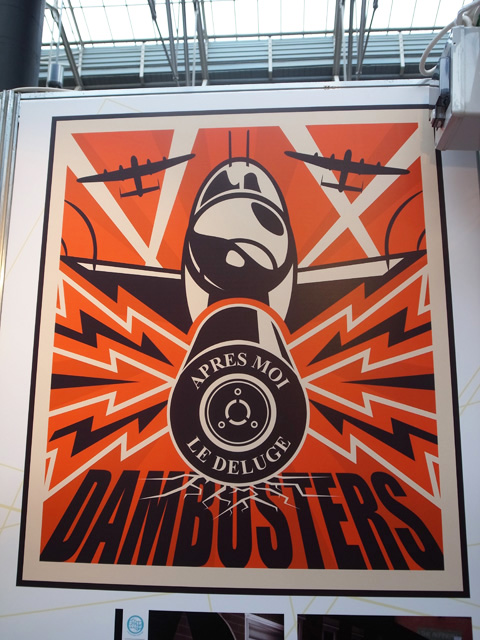
At Burton and South Derbyshire College Richard Sweeney showcased his branding skills with this confident piece of artwork for the Dam Busters, created for the Derwent Dam Museum.

New Blood graduate show 2012 -Melissa Preston
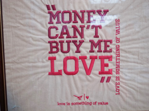
The crafting influence on graphic design continues apace at this year’s shows: at Edinburgh Napier University graphic designer Melissa Preston embroidered Money Can’t Buy Me Love and other slogans on cotton.

New Blood graduate show 2012 -chris cole
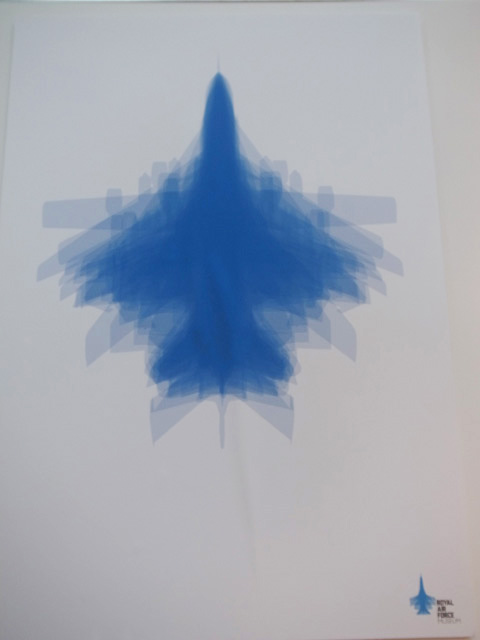
Loved this multi image plane print for the RAF Museum by Chris Cole from Norwich University of the Arts.

New Blood graduate show 2012 -joe smith
There was some live action at Cardiff Metropolitan University in the form of a twitter message chalk board by Joe Smith, graphic communicator.

New Blood graduate show 2012 -Alex Johnson
Beautiful typography on old fashioned packaging by Alex Johnson.

New Blood graduate show 2012 -Eliot Wyatt
There was some very promising artwork on display at Bath Spa University so I was very sad to see that I missed their stand alone show at the Rochelle School. Eliot Wyatt asked whether gangs are defined by what they do or the way they look? Delightful illustrations in very fashionable slightly off neon colours (the risograph influence).

New Blood graduate show 2012 Tess Redburn
Tess Redburn‘s colourful lithographic print also caught my eye.

New Blood graduate show 2012 -Melissa Leiva
I liked expressionistic portraits by Melissa Leiva at the American Intercontinental University.

New Blood graduate show 2012 -Hannah Bartlett
Paper cutting was alive and well with Hannah Bartlett at Carmarthenshire College. Check out also her jellybean poster!

New Blood graduate show 2012 -Ruth Wood
More 3D paper cutting on a poster at Nottingham Trent by Ruth Wood.

New Blood graduate show 2012 Maddy Crampton
Sussex Coast College Hastings showcased typographic interpretations of bird sounds by Maddy Crampton.

New Blood graduate show 2012 -Kirsty Turpie
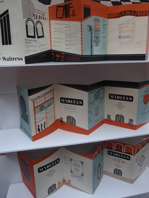
The Waitress by Kirsty Turpie at University of Dundee was a worthy winner of a Best New Blood award.

New Blood graduate show 2012 -Megan Elizabeth Taylor
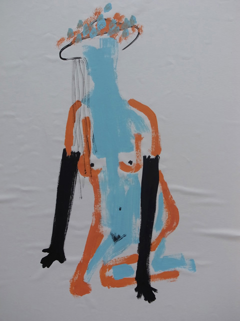
Megan Elizabeth Taylor painted these intriguing figures at Glasgow School of Art. So badly mounted though… tut tut.

New Blood graduate show 2012 Gabriella Marcella DiTano
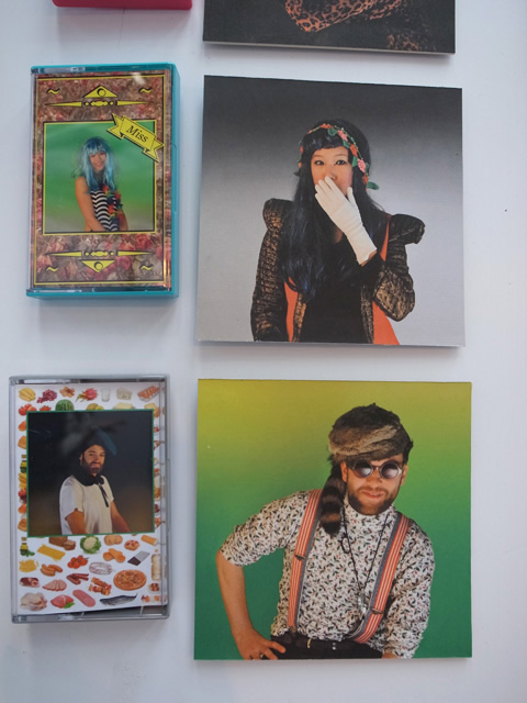
Gabriella Marcella DiTano won Best New Blood with her outstanding display of 80s influenced artworks. Love that cassette tape packaging vibe she’s got going on.

New Blood graduate show 2012 -Megan Brooks
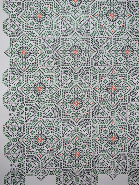
At University College Falmouth Megan Brooks created a response to the humanitarian crisis in Syria – a decorative pattern that on closer inspection was revealed to bbe 10,000 hands raised in the V for Victory sign – each representing a protestor who has died in the crackdown. She has projected 10,000 Syrians onto buildings to raise awareness and is another Best New Blood winner. NB – I love a description next to a piece of work, makes it so much easier to understand (and to describe to my readers).

New Blood graduate show 2012 -Joanna Halpin
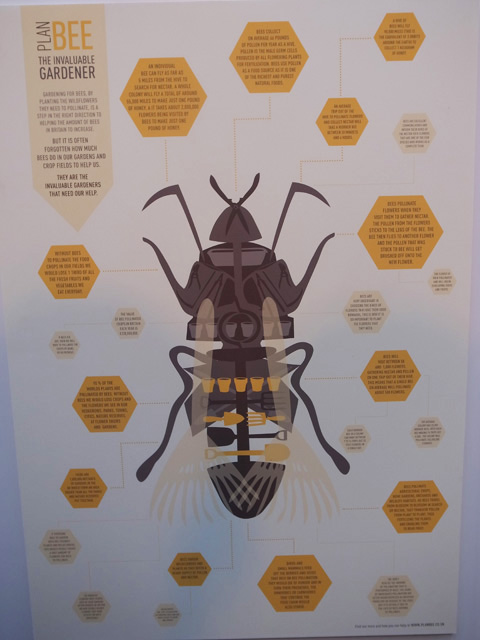
Joanna Halpin chose the decline of bees in Britain as the subject of her appealing graphic poster.

New Blood graduate show 2012 -Kudzai Dyirakumunda
Kudzai Dyirakumunda london riots news block New Blood graduate show 2012 -Kudzai Dyirakumunda
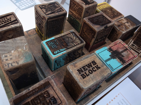
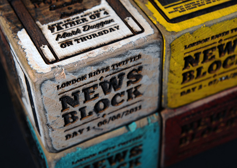
I was immediately drawn in by Kudzai Dyirakumunda‘s work, London Riots, on the stand from The Arts University College at Bournemouth – inspired by egalitarian commentary gleaned from twitter and featuring wooden blocks engraved with quotes, shattered glass, riot helmeted police, and stunning typography – another deserving New Blood winner.

New Blood graduate show 2012 Blaire Frame
Blaire Frame created this lovely graphic collaged poster at University of Wolverhampton.

New Blood graduate show 2012 Juliet Bankes
Yet another one of my picks chimed with the New Blood judging panel: Juliet Bankes at Oxford & Cherwell Valley College (part of De Montfort University) displayed Memory and Preserving V. In these she deconstructed the meaning of simple objects – spatulas and serving spoons from a manor house are embedded with lives past: home produce grown on an allotment, the old village ways.

New Blood graduate show 2012 -Ivana Thomas
I also absolutely adored curvaceous illustrations by Ivana Thomas, who took inspiration from Slovak proverbs which have an equivalent in English such as ‘Don’t count your chickens before they hatch.’

More coming up soon!
Read my second blog review of New Blood 2012 here.
Read my third blog review of New Blood 2012 here.

Categories ,2012, ,Alex Johnson, ,American Intercontinental University, ,Bath Spa University, ,Bees, ,Blaire Frame, ,Burton and South Derbyshire College, ,Cardiff Metropolitan University, ,Carmarthenshire College, ,Chris Cole, ,D&AD, ,Dam Busters, ,De Montfort University, ,Derwent Dam Museum, ,Edinburgh Napier University, ,Eliot Wyatt, ,embroidery, ,Free Range, ,Gabriella Marcella DiTano, ,Glasgow School of Art, ,Graphic Design, ,Hannah Bartlett, ,illustration, ,Ivana Thomas, ,Joanna Halpin, ,Joe Smith, ,Kirsty Turpie, ,Kudzai Dyirakumunda, ,London Riots, ,Megan Brooks, ,Megan Elizabeth Taylor, ,Melissa Leiva, ,Melissa Preston, ,Memory, ,Money Can’t Buy Me Love, ,New Blood, ,Norwich University of the Arts, ,Nottingham Trent University, ,Oxford & Cherwell Valley College, ,Preserving V, ,Proverbs, ,RAF Museum, ,review, ,Richard Sweeney, ,Risograph, ,Rochelle School, ,Ruth Wood, ,Slovak, ,Spitalfields Market, ,Sussex Coast College Hastings, ,Syria, ,Tess Redburn, ,The Arts University College at Bournemouth, ,The Waitress, ,University College Falmouth, ,University of Dundee, ,University of Wolverhampton, ,Visual Communication

Similar Posts:


Amelia’s Magazine | Central Saint Martins MA in Communication Design Graduate Show 2011: Review

Central Saint Martins Communication Design Degree Show 2011 Su Kyung Lee's The Imaginative Battle
Detail from Su Kyung Lee’s The Imaginative Battle.

The Central Saint Martins MA in Communication Design graduate show was held earlier this summer in the spacious rooms of the high ceilinged Rochelle School. The quality was of an exceptional standard throughout, site and there were informative descriptions helpfully placed next to all the work.

Central Saint Martins Communication Design Degree Show 2011 Su Kyung Lee's The Imaginative BattleCentral Saint Martins Communication Design Degree Show 2011 Su Kyung Lee's The Imaginative BattleCentral Saint Martins Communication Design Degree Show 2011 Su Kyung Lee's The Imaginative Battle
Central Saint Martins Communication Design Degree Show 2011 Su Kyung Lee's The Imaginative Battle
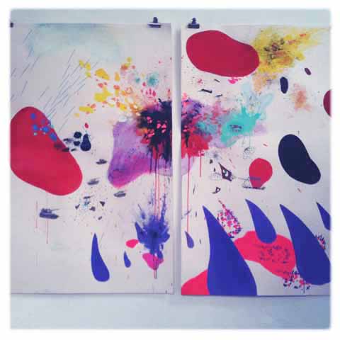
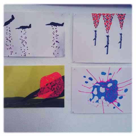
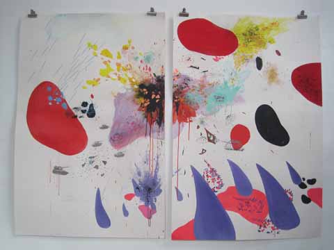
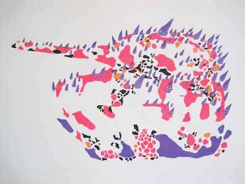
Su Kyung Lee‘s The Imaginative Battle explored patterns of protection and destruction, website focusing on the visual aesthetics of destruction and chaos through patterns. Cells and germs became the camouflage, web splattered across and fired from tanks, rendered in glorious neon brights. An apt subject in these difficult times.

Central Saint Martins Communication Design Degree Show 2011 Matt NicholsonCentral Saint Martins Communication Design Degree Show 2011 Matt NicholsonCentral Saint Martins Communication Design Degree Show 2011 Matt NicholsonCentral Saint Martins Communication Design Degree Show 2011 Matt Nicholson
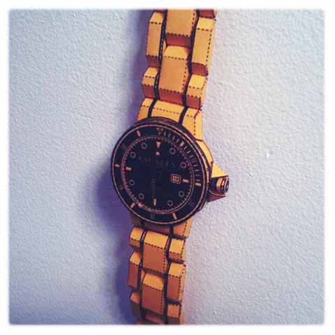
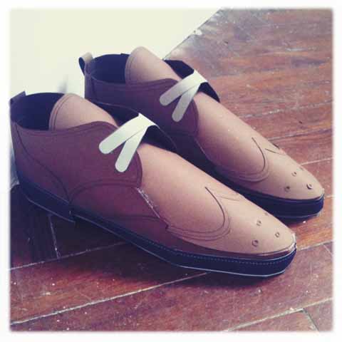
Matt Nicholson showed his work half spat out of a digital printer. Inspired by his desire for high status objects he can’t afford Matt reproduced them for free, using printed paper patterns to create giant wall sculptures. They even retain functionality: the Lieca camera takes photos via a pinhole. Follow Matt Nicholson on Twitter.

Kanitta Meechubot six feet under yew treeCentral Saint Martins Communication Design Degree Show 2011 Kanitta MeechubotKanitta Meechubot searchingCentral Saint Martins Communication Design Degree Show 2011 Kanitta MeechubotCentral Saint Martins Communication Design Degree Show 2011 Kanitta Meechubot
Central Saint Martins Communication Design Degree Show 2011 Kanitta Meechubot
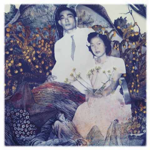
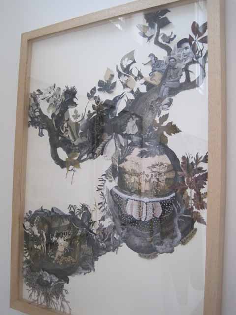
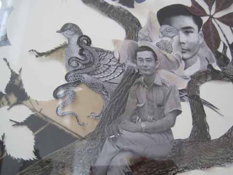
I was totally enraptured by Kanitta Meechubot‘s enchanting collages. A Garden of Illuminating Existence repeated and matched the branching nerves and veins of the body in trees and natural forms: merging memories and landscape. ‘To produce a map of experience through the internal landscape which changes with the seasons, is to capture the beauty of the illimitable renewals and decays of our existence.’ The real beauty of these pieces, with names like Six Feet Under Yew Tree and The Season of The Soul, was the fine detail used to build delicate pictures in 3D, including not only old photos and engravings, but real dried flowers and paint splats.

Central Saint Martins Communication Design Degree Show 2011 Sarah LangfordCentral Saint Martins Communication Design Degree Show 2011 Sarah LangfordCentral Saint Martins Communication Design Degree Show 2011 Sarah LangfordCentral Saint Martins Communication Design Degree Show 2011 Sarah LangfordCentral Saint Martins Communication Design Degree Show 2011 Sarah Langford
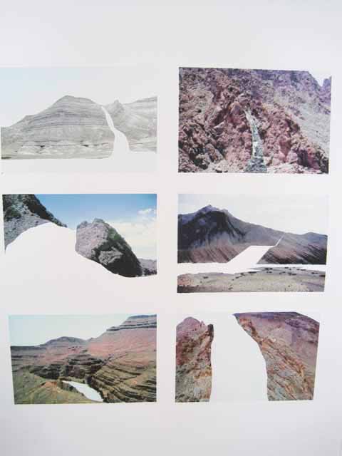
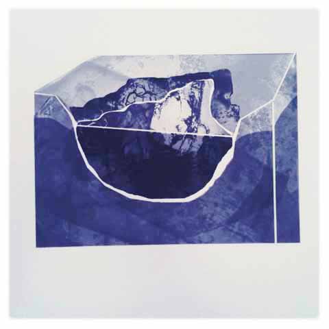
Sarah Langford was inspired by the movement of water, it’s necessity and destructive capabilities. Using scientific measurements she created beautiful textures to produce abstracts: parts and fragments of rock formations, shells, glimpses of the landscape being ripped and shredded by the passage of time.

Central Saint Martins Communication Design Degree Show 2011 Gareth BarnettCentral Saint Martins Communication Design Degree Show 2011 Gareth BarnettCentral Saint Martins Communication Design Degree Show 2011 Gareth Barnett
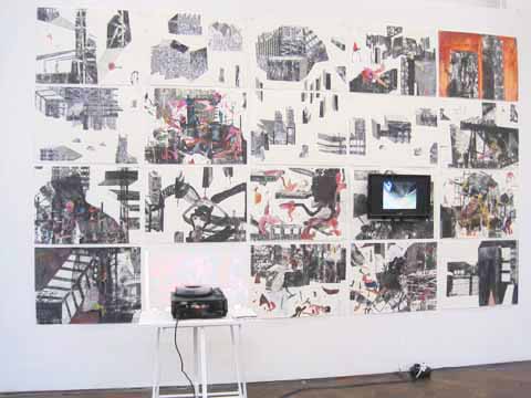
Gareth Barnett was inspired by Brutalist architecture (my favourite, though not to live in myself…) and the hellish writings of the Marquis de Sade to create an investigation into the power structures and systems of control within an urban environment. The resulting 20 pictures were splayed across the wall, interlaced with projections. With names like Climax in Concrete and Fuck Me Building there was no escaping the ruptured baseness of his conclusions.

Central Saint Martins Communication Design Degree Show 2011 Carl PartridgeCentral Saint Martins Communication Design Degree Show 2011 Carl PartridgeCentral Saint Martins Communication Design Degree Show 2011 Carl PartridgeCentral Saint Martins Communication Design Degree Show 2011 Carl Partridge
Carl Partridge looked to a place he’s never visited: America, believing that it’s easier to buy into the idealisation of America if you’ve never been. Using tiny shreds of paper and stickers, holographic beads, parts of adverts and marbled plastic he created delicate collages that seemed to question our love of consumerism. Follow Carl Partridge on Twitter.

Beth Salter CSMCentral Saint Martins Communication Design Degree Show 2011 Beth Salter CSMCentral Saint Martins Communication Design Degree Show 2011 Beth Salter CSMCentral Saint Martins Communication Design Degree Show 2011 Beth Salter CSM
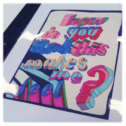
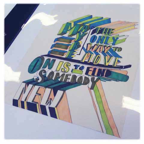
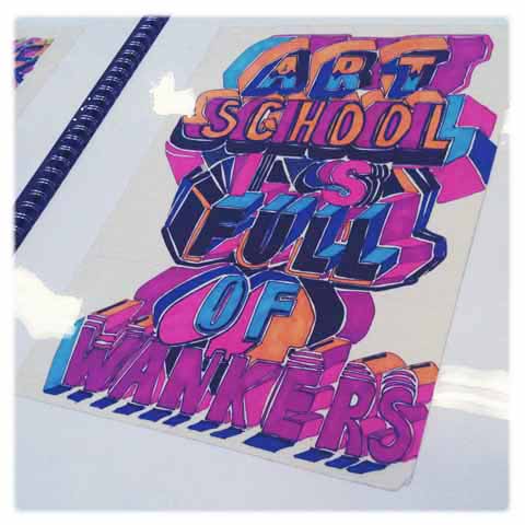
For marvellous hand done typography look no further than Beth Salter. She was inspired by private conversations overheard in public surroundings. Me too, I love them! But mainly her bright letters were just a lot of fun. Follow Beth Salter on Twitter.

Central Saint Martins Communication Design Degree Show 2011 Ann-Kathrin SchubertCentral Saint Martins Communication Design Degree Show 2011 Ann-Kathrin SchubertCentral Saint Martins Communication Design Degree Show 2011 Ann-Kathrin Schubert
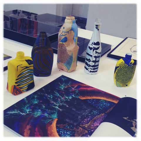
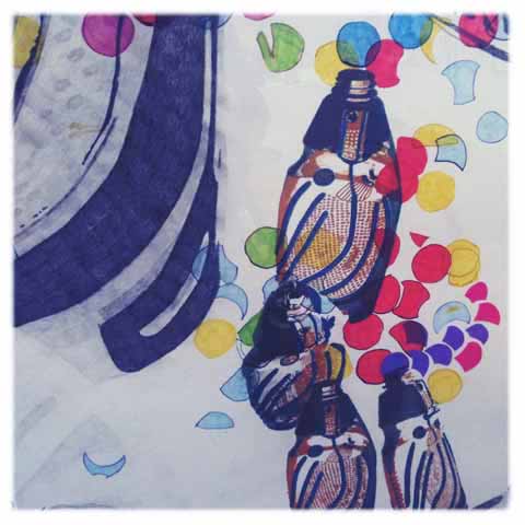
For The Fear of Life Ann-Kathrin Schubert had decorated discarded plastic bottles to become the most tropical of fish, tribal in their boldness.

Central Saint Martins Communication Design Degree Show 2011 Jesus Madrinan Central Saint Martins Communication Design Degree Show 2011 Jesus Madrinan
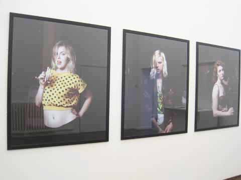
Jesus Madrinan had taken a series of portraits in London nightclubs: Good Night London featured some suitably inebriated yet oddly disillusioned creatures.
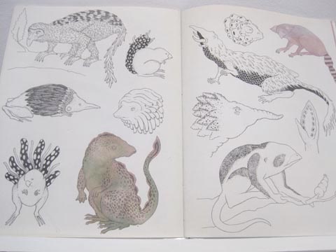
Central Saint Martins Communication Design Degree Show 2011 Golbanou Moghaddas
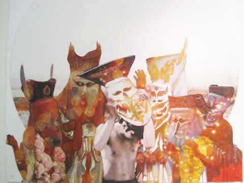
Golbanou Moghaddas was influenced by Arthur Schopenhauer‘s philosophy of existence typified by unrest. Strange fattened figures tumbled from a bony etched pelvis filled with birds. Painterley strokes combined with fine etching skills.

Central Saint Martins Communication Design Degree Show 2011 Alexa Galea
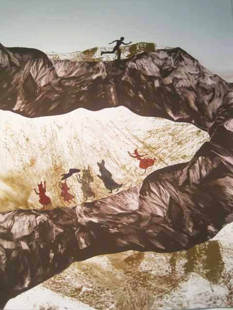
Alexa Galea was inspired by human desire to control and tame nature and the wild, particular with reference to European folk art and ritual.

Central Saint Martins Communication Design Degree Show 2011 Oat Montien
Oat Montien explored the relation between ritual and identity in contemporary interpretations of Thai traditions.

Central Saint Martins Communication Design Degree Show 2011 Paraskevi FerentinouCentral Saint Martins Communication Design Degree Show 2011 Paraskevi Ferentinou
Paraskevi Ferentinou explored the ‘agency of furniture‘ in the role of children’s growth.

Central Saint Martins Communication Design Degree Show 2011 Ying-Chen LuCentral Saint Martins Communication Design Degree Show 2011 Ying-Chen Lu
Central Saint Martins Communication Design Degree Show 2011 Ying-Chen Lu
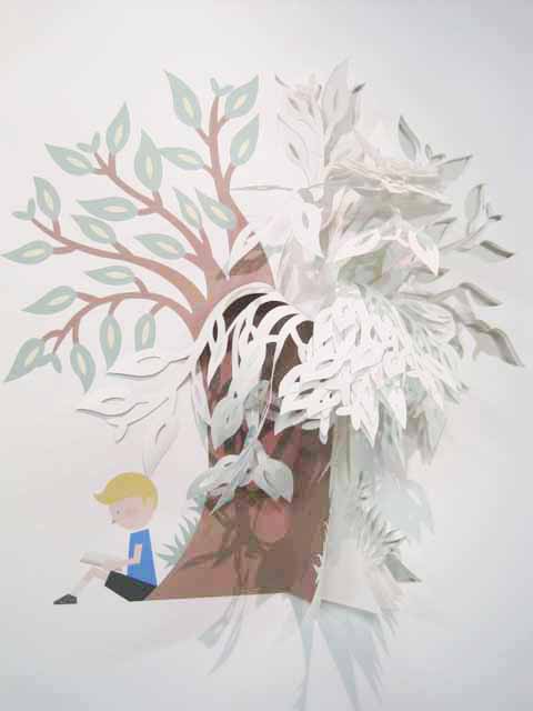
Ying-Chen Lu worked with 3D papercutting to create exploding type and depth in landscapes.

Central Saint Martins Communication Design Degree Show 2011 Aindri ChakrabortyCentral Saint Martins Communication Design Degree Show 2011 Aindri Chakraborty
Central Saint Martins Communication Design Degree Show 2011 Aindri Chakraborty
I could easily have missed Aindri Chakraborty‘s work which was nestled in a grimy corner, but I’m glad I didn’t as it was really rather wonderful: Heritage through Glass explored how the glass cabinets in museums separate the tangible object from the intangible visitor, and how stories are passed down the generations. People Tree and Conversations with Baba featured frantic truncated shapes, fire people and vomiting heads.

Categories ,3D Papercutting, ,A Garden of Illuminating Existence, ,Agency of Furniture, ,Alexa Galea, ,America, ,Ann-Kathrin Schubert, ,Arthur Schopenhauer, ,Beth Salter, ,Brutalism, ,Camera, ,Carl Partridge, ,Central Saint Martins, ,Climax in Concrete, ,collage, ,Communication Design, ,consumerism, ,Conversations with Baba, ,Folk Art, ,Fuck Me Building, ,Gareth Barnett, ,Golbanou Moghaddas, ,Good Night London, ,Graduate Shows, ,Heritage through Glass, ,illustration, ,Jesus Madrinan, ,Kanitta Meechubot, ,Last and Found, ,Leica, ,ma, ,Marquis de Sade, ,Matt Makes Stuff, ,Matt Nicholson, ,Oat Montien, ,Paraskevi Ferentinou, ,People Tree, ,Ritual, ,Rochelle School, ,Sarah Langford, ,Six Feet Under Yew Tree, ,Su Kyung Lee, ,Thailand, ,The Fear of Life, ,The Imaginative Battle, ,The Season of The Soul, ,typography, ,Ying-Chen Lu

Similar Posts: