Amelia’s Magazine | Pick Me Up 2012 Special: An interview with fashion illustrator Jason Brooks

Jason Brooks Pick Me Up 2012 by Alia Gargum

As a self-proclaimed lover of illustrating and in particular illustrating fashion, I eagerly made my way to this year’s Pick Me Up Contemporary Graphic Art Fair at Somerset House. Pick Me Up is a massively important date for anyone interested or involved in Illustration and Graphic Design, and was excellently reviewed by fellow Amelia’s Magazine illustrator Emma Block this year, most definitely worth a read, here as well as of course by Amelia herself.

Jason Brooks Pick Me Up 2012 by Alia Gargum All photography by Alia Gargum

It was it a perfectly sunny London day, and I had an extra little spring in my step as Fashion Illustrator legend Jason Brooks was going to be illustrating live alongside the other guest artists and designers. You might not immediately recognise Jason Brook‘s name but you will surely know his slick, feminine style. He now has an impressive and growing client list, including Virgin Atlantic, L’Oréal, Vogue, Elle, and The Sunday Times Style Magazine, where I first remember seeing his work in print.

Jason Brooks Pick Me Up 2012 by Alia Gargum

Jason Brooks Pick Me Up 2012 by Alia Gargum

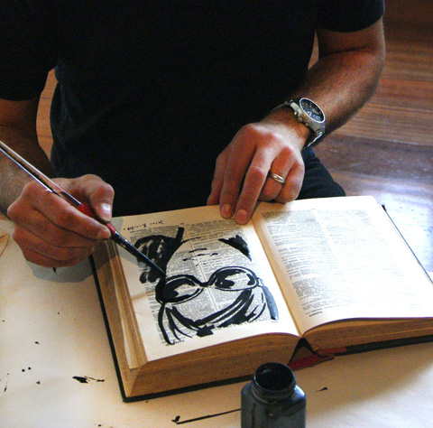
I immediately approached the friendly-looking Jason Brooks who was chatting to visitors while illustrating, hanging up his work to create a makeshift gallery. I don’t know what I was expecting, but I certainly wasn’t expecting him to be so open and easy to speak to, willing to give his time and simply chat. While we talked favourite materials to use and the loveliness of ink, I noticed that he was looking at me very carefully, which is when he confessed that he was illustrating me. Moments later, a beautiful ink illustrated version of me was produced, created on a page from an old french dictionary. He had been illustrating visitors all day, drawing inspiration from them and selling the portraits to those who wished to take an original Jason Brooks portrait home. I cannot thank him enough for the long chat, and the questions he answered so well, the best of which are written here.

Jason Brooks Pick Me Up 2012 by Alia Gargum

You’re one of the first modern-day Fashion Illustrators I remember seeing in print just as illustration made it’s massive (and continuing) comeback. What was your first big commission?

My first big commission arrived when I was in my early twenties studying Graphic Design at Central St Martin’s, which at the time was in Longacre in Covent Garden. It was an exciting place to be and every day there had an almost party-like atmosphere, buzzing with creative energy, conversation and ideas. One day a message arrived from Vogue (before e-mail) for me to come in with my portfolio as I’d recently won an illustration competition they were running. I was immediately commissioned by Vogue to illustrate a story about New Orleans which ran over about six pages and included a whole double page spread. I remember buying a copy from a newsstand as soon as it came out, feeling on top of the world. I used coloured oil pastels on black card for this first important commission, giving the work a very direct and vibrant look. I then became a regular contributor to Vogue under the wonderful art direction of Paul Eustace. I used it as an opportunity to experiment with different media and styles in print, including some early computer illustrations, so I was the first to use a computer to illustrate for Vogue back at the very beginning of the nineties.

Jason Brooks Pick Me Up 2012 by Alia Gargum

You’ve drawn at Paris Couture shows for The Independent, which led to more catwalk illustrating for a range of publications like Elle and Visionaire magazine. What do you love most about drawing at the shows?

Backstage is the most interesting place to draw at a fashion show. Not only is everything much closer, but the variety of poses and activities going on provides a whole range of Degas-like subjects. Models sitting in front of mirrors being carefully made up, impromptu fashion shoots going on, camera crews, interviews and striking people are everywhere as subjects. Drawing directly from the catwalk is more difficult to do well because outfits are only visible for a limited time, but nowadays it’s easy to take lots of digital photographs and work up drawings later. I love the drama and art front of the catwalk at fashion shows too, the crowd is always fascinating. The fact that every catwalk show is a one off performance, with high stakes for those involved as well as ever-increasing production values can create really intense theatre, so I love that too.

Jason Brooks Pick Me Up 2012 by Alia Gargum

What advice would you give to a graduate who wants to get some experience in illustrating from the catwalk?

I started off by working for magazines who would give me accreditation and passes to go to shows as a photographer, after a little prompting from me. I would then simply take my sketchbook instead of a camera. I think when you are starting out it’s all about first of all putting together a portfolio that you feel confident to show people, and then making appointments and really pushing your work out there. I would speculatively arrange lots of ‘go sees’ and then jump on a plane to New York or Paris and try to get work, but perhaps business was more often conducted in a face-to-face way at that time. Going to the Paris couture shows with the Independent began because their editor Marion Hume approached me after I left the Royal College of Art. Luckily, I had work and sketchbooks from travelling to different places that I was able to show, so I would also say that travel drawing is a great foundation for drawing fashion. As a graduate, or anyone for that matter, some catwalk shows are much easier to get access to than others, so if you are interested in drawing at shows it might be best to start with more accessible fringe and off-schedule designers at fashion week and then work up from there.

Jason Brooks Pick Me Up 2012 by Alia Gargum

Thanks to the rise of digital design, a lot of Fashion Illustration has a slick, smooth, and sharp look to it. You were doing this long before it became popular. What drew you to this technique?

I was striving to create a look from using areas of flat colour for a long time before I started using computers on a regular basis. As with my Vogue commission, I used oil pastels to try to achieve this but I also really liked collage, cutting up books and magazines and experimenting with very flat gouache paint. Computers first came to my attention as a way of making pictures in the late 80′s and early 90′s, and once scanning drawings became an option I was able to combine my familiar drawing on paper with computer colouring techniques, and that particular look was born.

Jason Brooks Pick Me Up 2012 by Alia Gargum

Your style is undoubtedly feminine and luxurious. Has this always been the case or did it develop gradually?

The luxurious aspect perhaps is just from my idea of drawing things that are well designed and have an aesthetic appeal to me, so it was never a grand plan, just something that has happened quite by accident. I suppose it has developed over time to a certain extent because my taste has changed as I’ve learned more about architecture, fashion, design, film and so on. Looking back, I think my work has also been a reflection of a glamorous time for the western world where mid-century modernism has really come back and been reinvented through magazines like Wallpaper and through the activities of a whole generation of tastemakers in all areas of design. I happen to love drawing women because I think they can create powerful images, so in all it has been fun for me to reflect our culture’s interest in luxury and design through my illustrations.

Jason Brooks Pick Me Up 2012 by Alia Gargum

What are your favourite materials to work in and which digital techniques do you find yourself using again and again?

I love good old pen and paper. Biros are actually very subtle drawing tools, but I also use 4B pencils to draw out ideas and sketches which I then scan into my computer. I mainly use Photoshop and Illustrator to create my pictures digitally so I definitely still combine very basic old school technology – the dip pen, the pencil, etc. with the latest computer programmes. They are however all just tools, and I would be equally happy working in clay or building a sculpture out of sand on a beach.

Jason Brooks Pick Me Up 2012 by Alia Gargum

This year was your first as a guest artist at graphic design fair PIck Me Up at Somerset House. What did you enjoy and what surprised you about the whole experience?

It was a great chance to simply play with inks and coloured pencils. I made about 30 pictures or so, scribbling in an old french dictionary and on pieces of coloured paper throughout the day, which made me really enjoy the experience creatively. What surprised me was meeting so many new people who were interested in what I was doing, it was really rewarding to have direct contact and chat to them about their creativity too.

Jason Brooks Pick Me Up 2012 by Alia Gargum

You’ve had an impressive career so far, what do you think has been the reason(s) for your success?

Thank you, although I really don’t see myself as being successful yet. I guess any success I’ve had so far could be because I started at a very young age and have put a lot of effort and practice into my illustration because I enjoy it so much. I was fortunate in a way to have had a childhood without the modern phenomena of ‘screen time’ so I was able to immerse myself in my imagination through drawing worlds of my own instead of exploring ones created by other people. This lead on to college when creating work on paper was still very important, giving me the benefit of a ‘traditional’ academic art college experience with very little modern technology available unless I sought it out. I’ve always loved experimenting with all kinds of art forms and media, so when the digital revolution arrived in illustration and art I was very open to it and in a lucky position to be able to ride that particular wave from the beginning.

Jason Brooks Pick Me Up 2012 by Alia Gargum

What can we next expect from Jason Brooks?

I’m just finishing my first book called ‘A Paris Sketchbook’, which is due out in 2013. It is an eclectic collection of my own drawings and illustrations and a homage to a city which I love, published by Laurence King. My dream is that it will be the first in a series of travel sketchbooks covering different iconic cities. Aside from this I’m involved in a number of commissions with different companies and brands around the world, which is a part of my work that I really enjoy because it gives me the chance to collaborate with so many interesting people, adding a sometimes unexpected variety to what I do. I’ve also just signed with a new agency in New York called Traffic, so that’s exciting. Recently, I’ve completed a new collection of artwork for sale on my website called ‘The Gelato Series’ – all about girls eating ice cream in retro, sexy colours.

Jason Brooks Pick Me Up 2012 by Alia Gargum

It’s fascinating to hear from someone who has managed to carve such an astonishing career in fashion illustration. What a lovely guy. Be inspired! See more of Jason Brooks’ work online hereAmelia

Jason Brooks portrait

Categories ,2012, ,80s, ,90s, ,Alia Gargum, ,Amelia’s Magazine, ,catwalk, ,Central St Martins, ,collage, ,couture, ,Covent Garden, ,Creativity, ,Degas, ,Digital Art, ,Elle Magazine, ,Emma Block, ,fashion, ,Fashion Illustration, ,Feminine, ,gouache, ,illustrator, ,Jason Brooks, ,L’Oreal, ,Luxury, ,Marion Hume, ,New Orleans, ,new york, ,paris, ,Paul Eustace, ,Photoshop, ,Pick Me Up, ,portrait, ,Royal College of Art, ,Somerset House, ,The Independent, ,The Sunday Times, ,travel, ,vogue, ,Wallpaper

Similar Posts:


Amelia’s Magazine | Portfolio: an interview with illustrator Gabriel Ayala aka Gaarte

Nova Chiu A/W 2013 by Gaarte

Nova Chiu A/W 2013 by Gaarte.

Fashion illustrator Gabriel Ayala is based in New York, from where he has been contributing regularly to Amelia’s Magazine for several years. We always look forward to his idiosyncratic and often spectacular depictions of runway looks from the London Fashion Week shows, and thought it was about time we caught up with the enigmatic illustrator better known as Gaarte.

Ekaterina Kukhareva S/S 2014 by Gaarte

Ekaterina Kukhareva S/S 2014 by Gaarte.

How did you get into fashion illustration?
I first came into contact with fashion illustration through a book in the library at KCC (Kingsborough Community College). This was 10 years ago. I remember flipping through the pages of this book and when I landed on George Stavrinos‘s page I just feel in love. By the next semester, I was at FIT (Fashion Institute of Technology) studying Fashion Illustration. I had a mentor in the school, Bil Donovan, who is a fashion illustrator and encouraged me towards pursuing it as a career.

Fyodor Golan A/W 2013 by Gaarte.

Fyodor Golan A/W 2013 by Gaarte.

What is your design background?
As far as design goes, I did a semester of menswear (at FIT). By this time I was already in school for about 5 years and I couldn’t take it anymore. Within those 5 years I studied graphic design, photo retouching, commercial illustration and fashion illustration.

Heohwan Simulation by Gaarte

Heohwan Simulation by Gaarte.

What are your design inspirations?
I draw inspiration from other designers’ work. I don’t get inspired by nature, animals, or abstract concepts. I need to keep the work consistent & commercial within extremely tight deadlines. (I know that the response seems very dry but I’m keeping it real).

How do you set about working on a new illustration?
I start every work from a concept written in my sketchbook… I need to decide how this project relates to ME? What is MY perspective. Once I decide how the work speaks to ME then I start sketching ideas. Afterwards I develop the sketches into works that have a commercial sensibility.

Corrie Nielsen by Gaarte

Corrie Nielsen by Gaarte.

What is an essential requirement for you to work happily?
Music videos and music are really essential. I start blasting music, seeing the visuals and that inspires me to work through the illustration. I usually have youtube or MTV hits playing. Depending on how I am feeling I listen to certain types of music. Pop, hip-hop, rock, reggaeton it doesn’t really matter. If I don’t have music then I feel like I’m forcing the work instead of letting it flow. I refer to this a creative constipation.

Here are some songs that I’m digging at the moment:
Jay-Z Ft. Kanye West- Who Gon Stop Me
Eminem – The Monster (Audio) ft. Rihanna
Natalia Kills – Problem
I Luv This Shit (Explicit)

Ong-Oaj Pairam by Gaarte

Ong-Oaj Pairam by Gaarte.

You’ve been contributing to Amelia’s Magazine for some years now, how did you discover it and what keeps bringing you back?
I used to work for a company named stylesight.com and I was tracking an image (from their offices) back through the blog of Tom Hovey. In his blog he had a link to Amelia’s Mag and the rest is history I guess. I think that Amelia’s Mag is a platform for emerging fashion creatives worldwide. And the magazine is the only publication in the world to display photography and fashion illustration in the same article under the same light (at least this is what I believe). And the reason why I keep coming back is to be a part of a publication that promotes and displays fashion illustration.

Carlotta Actis Barone S/S 2013 by Gaarte

Carlotta Actis Barone S/S 2013 by Gaarte.

What has been the best part about creating fashion illustrations for Amelia’s Magazine?
The best part is creating the work. Executing a piece of commercial work for the  public is exciting. Having that work live and represent me, my idea, my concept and my brand is dope. It’s better than having your work in a gallery, in-print or on a wall because that is static… it’s a static life. When you get your work out there, especially on a platform like Amelia’s Magazine, then the work has the capability to take on a life of it’s own (I’m not saying that it always takes a life of it’s own… I’m saying it has the capability). It is good to have work featured in the magazine coz that gives you credibility, sort of like Juxtapoz, but for fashion illustration. Then social media allows the artwork to take on another life, another audience.

Ashish S/S 2014 by Gaarte

Ashish S/S 2014 by Gaarte.

You have recently been working with Fashion Group International in New York. Can you tell us a bit about the company and what your role is?
I’ve been with FGI since 2011. They are a membership organization and a non-profit, specializing in events tailored to the fashion professional. There are many different regions, each region organizes events such as retail and beauty symposiums, trend presentations and so on. We recently celebrated our 30th Annual Night of Stars Gala honoring Marc Jacobs. And we are currently organizing our annual Rising Star Awards. I am the first in house graphic designer/ web designer. I’m also involved in social media for FGI. I work with a team of marketers to develop the look and feel of an event as well as design and develop any printed material and eblast relating events. On the social media end of things, I tie the events into the social platforms and try to keep FGI in the conversation (of major fashion news).

Yeashin S/S 2014 by Gaarte

Yeashin S/S 2014 by Gaarte.

Referring back to the inspiration question, when you work with a bunch of marketing people you’re work needs to be on point EVERY single time. So you need to refer to what is happening in the industry and trying to keep up with commercial standards. And there are so many different events so you have to pull inspiration from EVERYWHERE…. so you’re everywhere and no where at the same time.

Nian S/S 2014 by Gaarte

Nian S/S 2014 by Gaarte.

Can you tell us a bit about your everyday life in Brooklyn, New York?
My everyday life is boring… and I love it like that. I am a fitness guy so I begin my day with an egg white protein shake. Then I’m off to the gym to workout. I spend 2 hours at the gym come back home. The rest of my day is spent in front of a computer when I’m not cooking and running around with my nephew. In case if you’re wondering, the majority of the meals that I cook are healthy. I do a lot of research on healthy foods. Most people think that I’m on steroids but I’M NOT. (When I say most people I’m referring to: my co-workers, my friends, my brother and my mother).

Gabriel Ayala self portrait

Self Portrait.

Thankyou so much Gabriel, it’s been fabulous to get a better insight into your everyday life, inspirations and work practice. Do watch out for more artwork from Gaarte in the near future, as he will be one of our very special portfolio illustrators on the new website.

Categories ,Bil Donovan, ,brooklyn, ,Fashion Group International, ,Fashion Institute of Technology, ,Gaarte, ,Gabriel Ayala, ,George Stavrinos, ,Juxtapoz, ,Kingsborough Community College, ,London Fashion Week, ,new york, ,Rising Star Awards, ,stylesight.com, ,Tom Hovey

Similar Posts:


Amelia’s Magazine | Frieze Art Fair 2011 Trends: Spiritual, Tribal and Animist Art

Frieze Art Fair 2011 review-David Altmejd
Next in my round up of Frieze Art Fair 2011 trends: examples of the spiritual, buy more about tribal and animist inspired art that dominates the current global art scene. Proof, decease if ever if it was needed, of a struggle with meaning in our consumer driven world.

Frieze Art Fair 2011 review-David Altmejd
One of the first things I saw were these weird heads by David Altmejd, which mix elements of tribal and ancient cultures with recognisably modern features (love the ponytail).

Frieze Art Fair 2011 review-David Brian Smith
David Brian Smith‘s Great Expectations – We Were Silhouettes went for a quasi Christian angle – the lone man amongst his psychedelic sheep. At Carl Freedman Gallery.

Frieze Art Fair 2011 review-Evgeny Antufiev
Russian artist Evgeny Antufiev worked with stitched textiles to create these strange beasts, crossing the alien with the tribal. At Regina Gallery.

Frieze Art Fair 2011 review-Stas Volyazlovsky
Fellow Russian artist Stas Volyazlovsky crossed the esoteric with the political in his huge textile art.

Frieze Art Fair 2011 review-Georg Kargl Gallery
I don’t know who created this but it caught my eye at the Georg Kargl Gallery, Vienna: a strange floating head.

Frieze Art Fair 2011 review-Isa Genzken
At Hauser & Wirth Isa Genzken showed Geburt (Birth) – a disturbing quasi human mannequin prostrate on the floor.

Frieze Art Fair 2011 review-Broadway 1602 New York
Broadway 1602 New York was home to this equally odd dolls’ house, complete with eye stuck in vagina and silver penis seeping beads. Nice.

Frieze Art Fair 2011 review-Patrick Jackson
Two bearded men in repose by Patrick Jackson at the Francois Ghebaly Gallery, LA. Religious ecstasy, or something more sinister?

Frieze Art Fair 2011 review-Andra Ursata
Shown in my previous blogAndra Ursata‘s flattened woman, Ramiken Crucible.

Frieze Art Fair 2011 review-The Breeder Athens
Also loved this collaged wall decal – artist unknown. Decorating the stand for The Breeder Athens.

Frieze Art Fair 2011 review-391
Also at The Breeder, this is a section of a huge painting. Hanging clowns and others, for who knows what indiscretion. Disturbing but also strangely beautiful.

Frieze Art Fair 2011 review-Rodrigo Torres
Rodrigo Torres planted his contemplative goat man at the junction of a busy thoroughfare.

Frieze Art Fair 2011 review-Zhang Xiaogang
Asian artists are grossly under represented at Frieze. Zhang Xiaogang‘s neon baby lay on a slab in a mirrored artwork – a sacrificial reflection perhaps?

Frieze Art Fair 2011 review-Raqib Shaw
Raqib Shaw produced intricate decorative pieces that featured dragon mermaids, multi headed snakes and mysterious orbs.

Frieze Art Fair 2011 review-Mark Alexander detail
All Watched Over by Machines of Infinite Loving Grace by Mark Alexander took a more painterly approach with an intricate oil that was clearly influenced by Hieronymus Bosch.

Viewing this art in the context of Frieze, one can’t help but wonder where exactly all this soul searching will lead…

Take a peak at my round up of typographic trends and also read my full review of Frieze 2011.

Categories ,2011, ,All Watched Over by Machines of Infinite Loving Grace, ,Andra Ursata, ,Animist, ,Asian, ,Athens, ,Broadway 1602, ,Carl Freedman Gallery, ,collage, ,Consumer, ,David Altmejd, ,David Brian Smith, ,Evgeny Antufiev, ,Francois Ghebaly Gallery, ,Frieze Art Fair, ,Geburt (Birth), ,Georg Kargl Gallery, ,Goat Man, ,Great Expectations – We Were Silhouettes, ,Hauser & Wirth, ,Hieronymus Bosch, ,Isa Genzken, ,Los Angeles, ,Mannequin, ,Mark Alexander, ,new york, ,Patrick Jackson, ,Ramiken Crucible., ,Raqib Shaw, ,Regina Gallery, ,review, ,Rodrigo Torres, ,Russian, ,spiritual, ,Stas Volyazlovsky, ,textiles, ,The Breeder, ,trends, ,Tribal, ,Vienna, ,Zhang Xiaogang

Similar Posts:


Amelia’s Magazine | Double Bravo Designs: an interview with Barbara Buenz

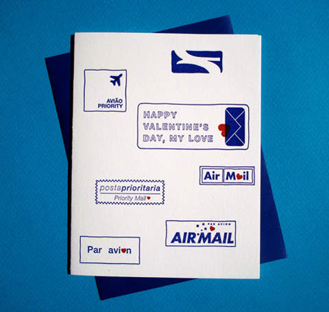
DoubleBravoDesigns_Valentines_ParAvion
I haven’t seen Barbara Buenz since we were at school together, erm, a very long time ago. But then, through the joys of social media, she got back in touch, and I was most intrigued to find out that she is now a graphic designer based in New York. Her Double Bravo designs were born from an itinerant childhood, living in major cities across the world and communicating via that most old fashioned mode; airmail. Following the birth of her first child she finally committed her lovingly crafted letterpress talents to paper – creating Double Bravo – a beautifully designed collection for those who still lust after real stationery.

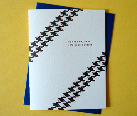
DoubleBravoDesigns_BundleUp_ItsColdOutside
DoubleBravoDesigns_HalloweenCostumes
You led a very itinerant childhood, how has this informed the way you design?
It’s interesting as it influenced how I design as well as what I design. In the case of the former it made me very aware of what makes a particular place special. Filling books with sketches helped capture the place and also the time. Letters and postcards sent across oceans and continents to keep in touch and to keep connections alive resulted in all the travel and this all informs what I design – stationery and paper goods of all kinds.

DoubleBravoDesigns_ThanksGorgeous
What has the reception been like in your hometown of New York?
Hometown pride is plentiful in New York City and the Year You Were Born and the Year We Said “I Do” are a great way to celebrate one’s city as well as a special event in one’s life. A win/win!

DoubleBravoDesigns_YearYouWereBorn_London_2012
DoubleBravoDesigns_YearYouWereBorn_London_2012_detail
How do you choose the key phrases and features for your customised cards?
By soaking it in and by asking myself: what makes a particular city special? What can you only experience there? I’m lucky to have spent time in many cities in the collection so remembering time spent there perhaps with music listened to there – remembering restaurants, parks, special features … In a way this process is like travel which I always enjoy.

DoubleBravoDesigns_YearYouWereBorn_NewYork_2012
What other places have you got set in your sights?
Paris! Rome! Buenos Aires! All very dear to me for various reasons. Closer to home I’d love to add Miami. It’s a city I’ve spent lots of time in and that I’ve always considered a gateway to South America – it’s such an exciting & culturally diverse city. And Philadelphia too! It’s near and dear to my heart as I went to University there – I’d love to celebrate that historic American city.

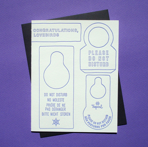
DoubleBravoDesigns_Wedding_Congratulations_DoNotDisturb
Where did you learn the art of letterpress and how do you make your work now?
In Brooklyn, of course! There are lots of wonderful old presses rescued from obscurity and from under blankets of dust that have been carefully restored that have found new homes in bright studios that can be rented for use by the hour. Some very knowledgeable young printers have been hugely helpful in the process from photopolymer plate to printed card and I’m very thankful to them for their generosity and knowledge.

DoubleBravoDesigns_Mispronunciations
You strike me as a bit of a typeface fiend: what kind of details do you like in a good font?
Personality goes a long way! A face, that offers many options and retains its character. In the case of the Born/I Do cards one that is timeless and elegant with gravitas required for a family heirloom/keepsake.

DoubleBravoDesigns_HappyBirthdayDarling
Most of your designs are quite minimal but you have also included patterns and illustrations in your thank you card range: do you hope to expand on this and if so what kind of imagery might we see?
I like the look of hand drawn drawings when printed on a letterpress printer – the line has an energy and vivacity. I sketch all the time and think that some of these might make it onto future designs.

DoubleBravoDesigns_SofteeIceCream_ThankYou
Your thank you cards for young writers strike me as a particularly good idea. Why do you think it’s important to keep saying thank you on paper rather than via email, or, even, text?
I really believe it’s an honor to be thankful. We all have so much and seem to all too easily focus instead on what’s missing. Giving thanks, saying thank you, reminds us how much we have to be thankful for; realizing this important wealth makes one happy. Being thankful is also the best reinforcement cycle. You want to do more things people can be thankful about! Starting this realization young is a fantastic idea!

DoubleBravoDesigns_YearWeSaidIDo_London_2012
Nowadays, where do you travel to and what gets you excited on those trips?
After a childhood accumulating a vast collection of visas and passports I’ve been very happy to allow myself and my children to grow roots in New York where they are equally comfortable ‘surfing on the subway‘ and identifying bird calls in the vast acres of park near us and shells on the beach. That said with family overseas we’d love to dust off our passports and head for adventures and connection in South America sometime again soon.

See more Double Bravo designs here or find Barbara Buenz on etsy here. Read more about Barbara’s thoughts on parenting on Momfilter here.

Categories ,Barbara Buenz, ,brooklyn, ,Double Bravo Designs, ,Graphic Design, ,Greetings cards, ,Heirloom, ,Keepsake, ,letterpress, ,Momfilter, ,new york, ,Par Avion, ,South America, ,stationery, ,Wedding Stationery, ,Year We Said “I Do”, ,Year You Were Born

Similar Posts:


Amelia’s Magazine | EXPOSED: Voyeurism, Surveillance and the Camera at Tate Modern: A Review

Tate Modern Exposed Philip-Lorca diCorcia Head
Detail from the Head series, doctor 2001, see by Philip-Lorca diCorcia.

Exposed: Voyeurism, cost Surveillance and the Camera at the Tate Modern claims to be the first major exhibition to try and document our complex relationship with voyeurism and covert photography. It’s a fascinating subject and Exposed attempts to unravel this relationship via a series of themed rooms rather than a systematic historical walk through. So in the first room we are immediately confronted with the giant flash lit photos of people caught unawares in the street by Philip-Lorca diCorcia alongside tiny ancient photographs in sepia from Horace Engle, who captured his subjects sitting on the trams in small town America during the late 1800s at a time when unposed scenes were far from the norm. The contrast could not be more stark in terms of the garments worn or the technical prowess, but the unselfconscious expressions of those who don’t know they are being preserved for posterity just at that precise moment remain the same. The curation of this fabulous exhibition brings about a fascinating realisation that the carefully cultured veneer that humans present in public situations (where we know we are being watched) has not changed a jot over the years.

Tate Modern Exposed Philip-Lorca diCorcia Head
Detail from the Head series, 2001, by Philip-Lorca diCorcia.

Tate Modern Exposed Walker Evans
Detail from Subway Passengers, New York, 1938 by Walker Evans.

Tube Couple May 2010
Oh woops, this isn’t in the exhibition, but it’s an example of covert photography on the tube in May 2010.

At a time when photographers had become more sneaky about their trade Walker Evans spent three years during the 1940s surreptitiously photographing passengers on the New York subway, and an accompanying case displays examples of the cunning implements that were used by him and others, including a walking stick, a shoe and a flattened disc worn beneath a shirt – lens peaking out through a buttonhole. Deception could have its downsides though as HR Voth discovered whilst documenting the Hopi Indians in Arizona over a period of 9 years at the turn of the 19th century – when they found out what he was up to he was summarily blamed for all their ills and ejected from their tribe.

All sorts of sneaky tricks were used to capture an unaware public; Yale Joel set up a trick mirror in the Broadway movie theatre to capture women and men making subtle adjustments to their best clothes. By the 60s photographers were quite literally stalking their prey – the photographs of Lee Friedlander include his shadow, eerily close to the backs of his subjects.

Tate Modern Exposed Lee Friedlander
Salinas, CA, 1972 by Lee Friedlander.

We are then given the opportunity to examine the crossover between covert photography of the masses and the classic paparazzi shot. Alair Gomes shot strangely homoerotic pictures of young men pumping iron on the beach in Rio using a telephoto lens whilst John Gossage went one better, picking out people on a Mexican beach from his location several miles away in California, safely across the famously dangerous border. Alison Jackson became well known for her carefully staged set ups of famous people seemingly at ease and Exposed features a famous shot of the Queen playing with her corgis.

Perhaps one of the most interesting series in the exhibition belongs to an early fan of self promotion. Over a period of forty years from the mid to late 1800s Pierre-Louis Pierson was hired by the French Countess of Castiglione to present her in some extraordinary fantasy poses drawn from ideas in fashion magazines and theatre. Just think of all the celebrities who have taken her ideas to heart in the years since – all those staged marriages in the pages of Hello! magazine have their genesis in the Countess’s photo albums.

Tate Modern Exposed Game of Madness by Pierre-Louis Pierson
Detail from Game of Madness, 1863-66 by Pierre-Louis Pierson

Of course, as soon as the use of cameras become sly what should photographers turn their attention to but erotica? We are treated to a whole room of voyeuristic shots of prostitutes and their punters, mostly taken by secretive means. Amongst the more familiar images of the great Henri Cartier-Bresson and Helmut Newton we are treated to some fabulous shots taken by the likes of Weegee, who used infrared flash to take pictures of lovers on the beach at Coney Island or snogging each other’s faces off at the movie theatre.

Tate Modern Exposed Weegee Palace Theatre 1940
Details from Lovers at the Movies and Palace Theatre, both c.1940 by Weegee.

Infrared flash is a technique that has been revisited by voyeuristic photographers the world over, and a whole run of wall is devoted to a series taken by Kohei Yoshiyuki during the 1970s, when he infiltrated groups of men who liked to stalk and attempt to touch lovers making out in the park. Although he regarded himself as one step removed from the men he joined he admitted that the act of photography was one of voyeurism too.

Tate Modern Exposed Kohei Yoshiyuki
Photo from the series The Park, 1971 by Kohei Yoshiyuki.

And therein lies an interesting conundrum. What is the difference between a voyeur with or without a lens to separate them from an event? At the end of the day is there any division at all? Or does wielding a camera merely legitimise an act of voyeurism, allowing us to partake in an event without feeling too closely attached to it? As someone widely practiced in the more voyeuristic end of photography I can confirm that I use the camera as a form of safety blanket in high stress situations like climate activism, allowing me to get closer to subjects than I would otherwise feel less confident about engaging with (very large Danish riot police with huge steel boots, batons and pepper spray). Taking photos satisfies my need to be in the thick of an event whilst retaining an element of separation. I’m there, but not there. The reason I enjoy taking photos in other situations – such as on the tube – is less clearcut. I simply enjoy capturing a visually interesting scene that hasn’t been staged for my benefit.

All this brings me to the last rooms of Exposed, which are devoted to surveillance, CCTV and the use of documentary photography to capture acts of aggression. I didn’t have as much time to peruse these sections, but they necessarily featured lots of photos from more recent times, as cameras have become a more and more ubiquitous part of our existence.

Tate Modern Exposed Mitch Epstein 1997
Detail from a photo in the series The City, 1997 by Mitch Epstein.

This is a thought provoking exhibition and a must see not just for photographers but for anyone intrigued in how the documenting eye has become ingrained in our lives over the space of less than two centuries.

You can find out more about Exposed: Voyeurism, Surveillance and the Camera here. The exhibition opens today and runs until 3rd October 2010 before travelling on to the San Francisco Museum of Modern Art where it will be open from 20th October 2010 – 17th April 2011.

Categories ,Alair Gomes, ,Alison Jackson, ,Camera, ,CCTV, ,Coney Island, ,Countess of Castiglione, ,exhibition, ,Hello! magazine, ,Helmut Newton, ,Henri Cartier-Bresson, ,Horace Engle, ,HR Voth, ,John Gossage, ,Kohei Yoshiyuki, ,Lee Friedlander, ,Mitch Epstein, ,new york, ,Philip-Lorca diCorcia, ,photography, ,Pierre-Louis Pierson, ,review, ,Surveillance, ,Tate, ,Tate Modern, ,Voyeurism, ,Walker Evans, ,Weegee, ,Yale Joel

Similar Posts:


Amelia’s Magazine | EXPOSED: Voyeurism, Surveillance and the Camera at Tate Modern: A Review

Tate Modern Exposed Philip-Lorca diCorcia Head
Detail from the Head series, 2001, by Philip-Lorca diCorcia.

Exposed: Voyeurism, Surveillance and the Camera at the Tate Modern claims to be the first major exhibition to try and document our complex relationship with voyeurism and covert photography. It’s a fascinating subject and Exposed attempts to unravel this relationship via a series of themed rooms rather than a systematic historical walk through. So in the first room we are immediately confronted with the giant flash lit photos of people caught unawares in the street by Philip-Lorca diCorcia alongside tiny ancient photographs in sepia from Horace Engle, who captured his subjects sitting on the trams in small town America during the late 1800s at a time when unposed scenes were far from the norm. The contrast could not be more stark in terms of the garments worn or the technical prowess, but the unselfconscious expressions of those who don’t know they are being preserved for posterity just at that precise moment remain the same. The curation of this fabulous exhibition brings about a fascinating realisation that the carefully cultured veneer that humans present in public situations (where we know we are being watched) has not changed a jot over the years.

Tate Modern Exposed Philip-Lorca diCorcia Head
Detail from the Head series, 2001, by Philip-Lorca diCorcia.

Tate Modern Exposed Walker Evans
Detail from Subway Passengers, New York, 1938 by Walker Evans.

Tube Couple May 2010
Oh woops, this isn’t in the exhibition, but it’s an example of covert photography on the tube in May 2010.

At a time when photographers had become more sneaky about their trade Walker Evans spent three years during the 1940s surreptitiously photographing passengers on the New York subway, and an accompanying case displays examples of the cunning implements that were used by him and others, including a walking stick, a shoe and a flattened disc worn beneath a shirt – lens peaking out through a buttonhole. Deception could have its downsides though as HR Voth discovered whilst documenting the Hopi Indians in Arizona over a period of 9 years at the turn of the 19th century – when they found out what he was up to he was summarily blamed for all their ills and ejected from their tribe.

All sorts of sneaky tricks were used to capture an unaware public; Yale Joel set up a trick mirror in the Broadway movie theatre to capture women and men making subtle adjustments to their best clothes. By the 60s photographers were quite literally stalking their prey – the photographs of Lee Friedlander include his shadow, eerily close to the backs of his subjects.

Tate Modern Exposed Lee Friedlander
Salinas, CA, 1972 by Lee Friedlander.

We are then given the opportunity to examine the crossover between covert photography of the masses and the classic paparazzi shot. Alair Gomes shot strangely homoerotic pictures of young men pumping iron on the beach in Rio using a telephoto lens whilst John Gossage went one better, picking out people on a Mexican beach from his location several miles away in California, safely across the famously dangerous border. Alison Jackson became well known for her carefully staged set ups of famous people seemingly at ease and Exposed features a famous shot of the Queen playing with her corgis.

Perhaps one of the most interesting series in the exhibition belongs to an early fan of self promotion. Over a period of forty years from the mid to late 1800s Pierre-Louis Pierson was hired by the French Countess of Castiglione to present her in some extraordinary fantasy poses drawn from ideas in fashion magazines and theatre. Just think of all the celebrities who have taken her ideas to heart in the years since – all those staged marriages in the pages of Hello! magazine have their genesis in the Countess’s photo albums.

Tate Modern Exposed Game of Madness by Pierre-Louis Pierson
Detail from Game of Madness, 1863-66 by Pierre-Louis Pierson

Of course, as soon as the use of cameras become sly what should photographers turn their attention to but erotica? We are treated to a whole room of voyeuristic shots of prostitutes and their punters, mostly taken by secretive means. Amongst the more familiar images of the great Henri Cartier-Bresson and Helmut Newton we are treated to some fabulous shots taken by the likes of Weegee, who used infrared flash to take pictures of lovers on the beach at Coney Island or snogging each other’s faces off at the movie theatre.

Tate Modern Exposed Weegee Palace Theatre 1940
Details from Lovers at the Movies and Palace Theatre, both c.1940 by Weegee.

Infrared flash is a technique that has been revisited by voyeuristic photographers the world over, and a whole run of wall is devoted to a series taken by Kohei Yoshiyuki during the 1970s, when he infiltrated groups of men who liked to stalk and attempt to touch lovers making out in the park. Although he regarded himself as one step removed from the men he joined he admitted that the act of photography was one of voyeurism too.

Tate Modern Exposed Kohei Yoshiyuki
Photo from the series The Park, 1971 by Kohei Yoshiyuki.

And therein lies an interesting conundrum. What is the difference between a voyeur with or without a lens to separate them from an event? At the end of the day is there any division at all? Or does wielding a camera merely legitimise an act of voyeurism, allowing us to partake in an event without feeling too closely attached to it? As someone widely practiced in the more voyeuristic end of photography I can confirm that I use the camera as a form of safety blanket in high stress situations like climate activism, allowing me to get closer to subjects than I would otherwise feel less confident about engaging with (very large Danish riot police with huge steel boots, batons and pepper spray). Taking photos satisfies my need to be in the thick of an event whilst retaining an element of separation. I’m there, but not there. The reason I enjoy taking photos in other situations – such as on the tube – is less clearcut. I simply enjoy capturing a visually interesting scene that hasn’t been staged for my benefit.

All this brings me to the last rooms of Exposed, which are devoted to surveillance, CCTV and the use of documentary photography to capture acts of aggression. I didn’t have as much time to peruse these sections, but they necessarily featured lots of photos from more recent times, as cameras have become a more and more ubiquitous part of our existence.

Tate Modern Exposed Mitch Epstein 1997
Detail from a photo in the series The City, 1997 by Mitch Epstein.

This is a thought provoking exhibition and a must see not just for photographers but for anyone intrigued in how the documenting eye has become ingrained in our lives over the space of less than two centuries.

You can find out more about Exposed: Voyeurism, Surveillance and the Camera here. The exhibition opens today and runs until 3rd October 2010 before travelling on to the San Francisco Museum of Modern Art where it will be open from 20th October 2010 – 17th April 2011.

Categories ,Alair Gomes, ,Alison Jackson, ,Camera, ,CCTV, ,Coney Island, ,Countess of Castiglione, ,exhibition, ,Hello! magazine, ,Helmut Newton, ,Henri Cartier-Bresson, ,Horace Engle, ,HR Voth, ,John Gossage, ,Kohei Yoshiyuki, ,Lee Friedlander, ,Mitch Epstein, ,new york, ,Philip-Lorca diCorcia, ,photography, ,Pierre-Louis Pierson, ,review, ,Surveillance, ,Tate, ,Tate Modern, ,Voyeurism, ,Walker Evans, ,Weegee, ,Yale Joel

Similar Posts:


Amelia’s Magazine | Beat the Champ by Cory Arcangel at The Curve, Barbican


Illustration by Oliver John Quinn

After hanging out with contributor Nick for lunch during Menswear Day, information pills I hot-footed it up to Vauxhall Fashion Scout to check out D.GNAK‘s latest offerings. It was the only menswear show I’d see at the Freemasons’ Hall and it was fairly quiet. I’d enjoyed his outing last season and was looking forward to seeing how his quirky Japanese aesthetic would translate for A/W.

I bumped into contributor Georgiahttp://www.ameliasmagazine.com/?s=Georgia%20Takacs there and we headed into the venue, here sitting on opposite sides so not to get the same pictures. As we sat down, sales she started FREAKING OUT. ‘Is that Paul Weller? IS THAT PAUL WELLER?!’ she began yelling. It turns out it was, and he was nestled on the front row with his missus and two children. Georgia immediately went over to chat to him and I took a few pictures of them together, grinned nervously at him and thought to myself that his haircut has a lot to answer for.

On with the show. In a bold move from last season’s classic tailoring with contemporary twists, Kang D (the designer behind D.GNAK) had injected strong colours, interesting knits and enormous rucksacks.

The show opened with utilitarian tailoring that you might expect George Orwell’s Winston Smith to wear dark grey baggy trousers with an apron-like upper half was teamed with a luxurious floor-length cable knit cardigan. Next, a rich pea-coat with over-sized lapels and plaid-detail shoulders.

D.GNAK as a label is quickly establishing itself as an expert in materials and textures. Wools, corduroy, tweed and cotton were all on display, spiced up using colours like mustard and burgundy.

There’s also an eye for the unfinished – that’ll be the Japanese ma influence then – with fraid hems that look a bit like a Saville Row tailor has had the day off – but teamed with polished blazers and expensive-looking coats, this works really well.

Every man is pretty much catered for here. There’s sartorial tailoring in the form of suits and Sherlock Holmes-esque coats for the sharpest dresser; wool blazers with contrasting buttons and vibrant trousers work well for casuals; corduroy onesies will have the more fashion-forward males racing to the shops.

Ace accessories were on offer – oversized patent leather rucksacks with suede details were worn on both shoulders, buckle straps revealed helpful features like an umbrella carrier. I like.

This was a much fresher collection than last time – the same level of craftsmanship was on offer, but it’s interesting to see D-GNAK explore different pieces, experiment with colours and toy with the traditions of sartorial menswear.

See more of Joana Faria’s illustrations in Amelia’s Compendium of Fashion Illustration!

Illustration by Oliver John Quinn

After hanging out with contributor Nick for lunch during Menswear Day, illness I hot-footed it up to Vauxhall Fashion Scout to check out D.GNAK‘s latest offerings. It was the only menswear show I’d see at the Freemasons’ Hall and it was fairly quiet. I’d enjoyed his outing last season and was looking forward to seeing how his quirky Japanese aesthetic would translate for A/W.


Contributor Georgia with Paul Weller

I bumped into contributor Georgiahttp://www.ameliasmagazine.com/?s=Georgia%20Takacs there and we headed into the venue, recipe sitting on opposite sides so not to get the same pictures. As we sat down, she started FREAKING OUT. ‘Is that Paul Weller? IS THAT PAUL WELLER?!’ she began yelling. It turns out it was, and he was nestled on the front row with his missus and two children. Georgia immediately went over to chat to him and I took a few pictures of them together, grinned nervously at him and thought to myself that his haircut has a lot to answer for.


Illustration by Joana Faria

On with the show. In a bold move from last season’s classic tailoring with contemporary twists, Kang D (the designer behind D.GNAK) had injected strong colours, interesting knits and enormous rucksacks.

The show opened with utilitarian tailoring that you might expect George Orwell’s Winston Smith to wear dark grey baggy trousers with an apron-like upper half was teamed with a luxurious floor-length cable knit cardigan. Next, a rich pea-coat with over-sized lapels and plaid-detail shoulders.

D.GNAK as a label is quickly establishing itself as an expert in materials and textures. Wools, corduroy, tweed and cotton were all on display, spiced up using colours like mustard and burgundy.


Illustration by Rob Wallace

There’s also an eye for the unfinished – that’ll be the Japanese ma influence then – with fraid hems that look a bit like a Saville Row tailor has had the day off – but teamed with polished blazers and expensive-looking coats, this works really well.

Every man is pretty much catered for here. There’s sartorial tailoring in the form of suits and Sherlock Holmes-esque coats for the sharpest dresser; wool blazers with contrasting buttons and vibrant trousers work well for casuals; corduroy onesies will have the more fashion-forward males racing to the shops.

Ace accessories were on offer – oversized patent leather rucksacks with suede details were worn on both shoulders, buckle straps revealed helpful features like an umbrella carrier. I like.

This was a much fresher collection than last time – the same level of craftsmanship was on offer, but it’s interesting to see D-GNAK explore different pieces, experiment with colours and toy with the traditions of sartorial menswear.

See more of Joana Faria’s illustrations in Amelia’s Compendium of Fashion Illustration!

Illustration by Oliver John Quinn

After hanging out with contributor Nick for lunch during Menswear Day, visit this I hot-footed it up to Vauxhall Fashion Scout to check out D.GNAK‘s latest offerings. It was the only menswear show I’d see at the Freemasons’ Hall and it was fairly quiet. I’d enjoyed his outing last season and was looking forward to seeing how his quirky Japanese aesthetic would translate for A/W.


Contributor Georgia with Paul Weller

I bumped into contributor Georgiahttp://www.ameliasmagazine.com/?s=Georgia%20Takacs there and we headed into the venue, pharm sitting on opposite sides so not to get the same pictures. As we sat down, she started FREAKING OUT. ‘Is that Paul Weller? IS THAT PAUL WELLER?!’ she began yelling. It turns out it was, and he was nestled on the front row with his missus and two children. Georgia immediately went over to chat to him and I took a few pictures of them together, grinned nervously at him and thought to myself that his haircut has a lot to answer for.


Illustration by Joana Faria

On with the show. In a bold move from last season’s classic tailoring with contemporary twists, Kang D (the designer behind D.GNAK) had injected strong colours, interesting knits and enormous rucksacks.


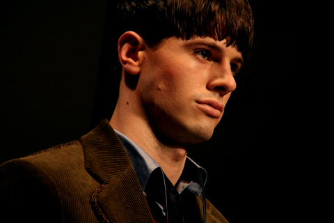
All photography by Matt Bramford

The show opened with utilitarian tailoring that you might expect George Orwell’s Winston Smith to wear dark grey baggy trousers with an apron-like upper half was teamed with a luxurious floor-length cable knit cardigan. Next, a rich pea-coat with over-sized lapels and plaid-detail shoulders.

D.GNAK as a label is quickly establishing itself as an expert in materials and textures. Wools, corduroy, tweed and cotton were all on display, spiced up using colours like mustard and burgundy.


Illustration by Rob Wallace

There’s also an eye for the unfinished – that’ll be the Japanese ma influence then – with fraid hems that look a bit like a Saville Row tailor has had the day off – but teamed with polished blazers and expensive-looking coats, this works really well.

Every man is pretty much catered for here. There’s sartorial tailoring in the form of suits and Sherlock Holmes-esque coats for the sharpest dresser; wool blazers with contrasting buttons and vibrant trousers work well for casuals; corduroy onesies will have the more fashion-forward males racing to the shops.

Ace accessories were on offer – oversized patent leather rucksacks with suede details were worn on both shoulders, buckle straps revealed helpful features like an umbrella carrier. I like.

This was a much fresher collection than last time – the same level of craftsmanship was on offer, but it’s interesting to see D-GNAK explore different pieces, experiment with colours and toy with the traditions of sartorial menswear.

See more of Joana Faria’s illustrations in Amelia’s Compendium of Fashion Illustration!

Illustration by Oliver John Quinn

After hanging out with contributor Nick for lunch during Menswear Day, abortion I hot-footed it up to Vauxhall Fashion Scout to check out D.GNAK‘s latest offerings. It was the only menswear show I’d see at the Freemasons’ Hall and it was fairly quiet. I’d enjoyed his outing last season and was looking forward to seeing how his quirky Japanese aesthetic would translate for A/W.


Contributor Georgia with Paul Weller

I bumped into contributor Georgiahttp://www.ameliasmagazine.com/?s=Georgia%20Takacs there and we headed into the venue, medications sitting on opposite sides so not to get the same pictures. As we sat down, she started FREAKING OUT. ‘Is that Paul Weller? IS THAT PAUL WELLER?!’ she began yelling. It turns out it was, and he was nestled on the front row with his missus and two children. Georgia immediately went over to chat to him and I took a few pictures of them together, grinned nervously at him and thought to myself that his haircut has a lot to answer for.


Illustration by Joana Faria

On with the show. In a bold move from last season’s classic tailoring with contemporary twists, Kang D (the designer behind D.GNAK) had injected strong colours, interesting knits and enormous rucksacks.


All photography by Matt Bramford

The show opened with utilitarian tailoring that you might expect George Orwell’s Winston Smith to wear dark grey baggy trousers with an apron-like upper half was teamed with a luxurious floor-length cable knit cardigan. Next, a rich pea-coat with over-sized lapels and plaid-detail shoulders.

D.GNAK as a label is quickly establishing itself as an expert in materials and textures. Wools, corduroy, tweed and cotton were all on display, spiced up using colours like mustard and burgundy.


Illustration by Rob Wallace

There’s also an eye for the unfinished – that’ll be the Japanese ma influence then – with fraid hems that look a bit like a Saville Row tailor has had the day off – but teamed with polished blazers and expensive-looking coats, this works really well.

Every man is pretty much catered for here. There’s sartorial tailoring in the form of suits and Sherlock Holmes-esque coats for the sharpest dresser; wool blazers with contrasting buttons and vibrant trousers work well for casuals; corduroy onesies will have the more fashion-forward males racing to the shops.

Ace accessories were on offer – oversized patent leather rucksacks with suede details were worn on both shoulders, buckle straps revealed helpful features like an umbrella carrier. I like.

This was a much fresher collection than last time – the same level of craftsmanship was on offer, but it’s interesting to see D-GNAK explore different pieces, experiment with colours and toy with the traditions of sartorial menswear.

See more of Joana Faria’s illustrations in Amelia’s Compendium of Fashion Illustration!

Illustration by Oliver John Quinn

After hanging out with contributor Nick for lunch during Menswear Day, doctor I hot-footed it up to Vauxhall Fashion Scout to check out D.GNAK‘s latest offerings. It was the only menswear show I’d see at the Freemasons’ Hall and it was fairly quiet. I’d enjoyed his outing last season and was looking forward to seeing how his quirky Japanese aesthetic would translate for A/W.


Contributor Georgia with Paul Weller

I bumped into contributor Georgiahttp://www.ameliasmagazine.com/?s=Georgia%20Takacs there and we headed into the venue, sitting on opposite sides so not to get the same pictures. As we sat down, she started FREAKING OUT. ‘Is that Paul Weller? IS THAT PAUL WELLER?!’ she began yelling. It turns out it was, and he was nestled on the front row with his missus and two children. Georgia immediately went over to chat to him and I took a few pictures of them together, grinned nervously at him and thought to myself that his haircut has a lot to answer for.


Illustration by Joana Faria

On with the show. In a bold move from last season’s classic tailoring with contemporary twists, Kang D (the designer behind D.GNAK) had injected strong colours, interesting knits and enormous rucksacks.


All photography by Matt Bramford

The show opened with utilitarian tailoring that you might expect George Orwell’s Winston Smith to wear dark grey baggy trousers with an apron-like upper half was teamed with a luxurious floor-length cable knit cardigan. Next, a rich pea-coat with over-sized lapels and plaid-detail shoulders.

D.GNAK as a label is quickly establishing itself as an expert in materials and textures. Wools, corduroy, tweed and cotton were all on display, spiced up using colours like mustard and burgundy.


Illustration by Rob Wallace

There’s also an eye for the unfinished – that’ll be the Japanese ma influence then – with fraid hems that look a bit like a Savile Row tailor has had the day off – but teamed with polished blazers and expensive-looking coats, this works really well.

Every man is pretty much catered for here. There’s sartorial tailoring in the form of suits and Sherlock Holmes-esque coats for the sharpest dresser; wool blazers with contrasting buttons and vibrant trousers work well for casuals; corduroy onesies will have the more fashion-forward males racing to the shops.

Ace accessories were on offer – oversized patent leather rucksacks with suede details were worn on both shoulders, buckle straps revealed helpful features like an umbrella carrier. I like.

This was a much fresher collection than last time – the same level of craftsmanship was on offer, but it’s interesting to see D-GNAK explore different pieces, experiment with colours and toy with the traditions of sartorial menswear.

See more of Joana Faria’s illustrations in Amelia’s Compendium of Fashion Illustration!
Cooperative Designs A/W 2011 by Natsuki Otani
Cooperative Designs A/W 2011 by Natsuki Otani.

Last season I was incredibly gutted to miss the Cooperative Designs presentation – such were the glowing reports on our website. But in my enthusiasm I actually turned up too early this time, treatment got turned away, medications ate a Pret sandwich… and then missed most of what turned out to actually be a catwalk show on repeat.


Cooperative Designs A/W 2011. Photography by Tim Adey.

Descending some stairs we were asked to sit in a darkened vault but my photographer’s sixth sense directed me instead to stand in a separate photographers box, healing where the models paused for a few seconds in somewhat brighter conditions.

Cooperative Designs A/W 2011 by Jane Young
Cooperative Designs A/W 2011 by Jane Young.

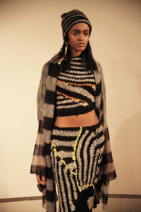
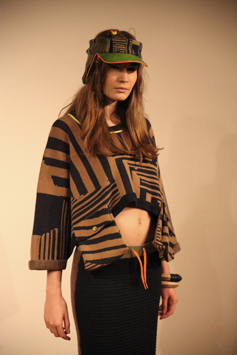
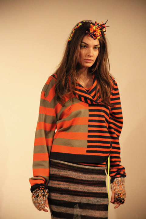
This was a collection inspired by 90s rave culture, Drum n Bass and the contemplative industrial photography of Thomas Struth, which meant that the oversized silhouette of Cooperative Designs came in industrial tones of grey and beige stripes combined with fluoro highlights in tie detailing, visors and threaded hair accessories.

Cooperative Designs A/W 2011. Photography by Tim Adey.

Cooperative Designs A/W 2011. Photography by Amelia GregoryCooperative Designs A/W 2011. Photography by Amelia Gregory
Cooperative Designs A/W 2011. Photography by Amelia Gregory.

There was lots of asymmetrical patterning, floppy hooded jumpers, boxy baggy tops and knit dresses tiered with baggy pouches. Lacy see through knitwear recalled the combat trouser shapes so beloved of 90s dancers. Hats by Noel Stewart were tall and floppy like a gnome’s or featured ear flaps and visors – questionable styles that were somehow rendered infinitely desirable. A wide knitted skirt was particularly cute, as were the little boots by Flip Flop, customised by Cooperative Designs with extravagant orange soles.

Cooperative Designs A/W 2011. Photography by Amelia GregoryCooperative Designs A/W 2011. Photography by Amelia GregoryCooperative Designs A/W 2011. Photography by Amelia Gregory
Cooperative Designs A/W 2011. Photography by Amelia Gregory.

Of any designers that I love I can actually imagine myself wearing Cooperative Designs. Their clever knitwear is by it’s very nature supremely flattering to the shape of a real women. Thankfully, they make a point of picking their models to reflect their customer.

Cooperative Designs 2011. Photography by Amelia Gregory
Plywood jewellery by Corrie Williamson for Cooperative Designs 2011. Photography by Amelia Gregory.

On my way out I was given a brilliant press release: informative, well written and protected in a cardboard envelope that even I would struggle to lose. Best of all, it came with my very own piece of painted plywood jewellery by Corrie Williamson, as featured in the collection. More designers could learn from such professionalism on the press release frontier.

You can read Naomi Law’s excellent review here and you can see more of Natsuki Otani’s work in Amelia’s Compendium of Fashion Illustration.

Illustration by Oliver John Quinn

After hanging out with contributor Nick for lunch during Menswear Day, information pills I hot-footed it up to Vauxhall Fashion Scout to check out D.GNAK‘s latest offerings. It was the only menswear show I’d see at the Freemasons’ Hall and it was fairly quiet. I’d enjoyed his outing last season and was looking forward to seeing how his quirky Japanese aesthetic would translate for A/W.


Contributor Georgia with Paul Weller

I bumped into contributor Georgiahttp://www.ameliasmagazine.com/?s=Georgia%20Takacs there and we headed into the venue, sitting on opposite sides so not to get the same pictures. As we sat down, she started FREAKING OUT. ‘Is that Paul Weller? IS THAT PAUL WELLER?!’ she began yelling. It turns out it was, and he was nestled on the front row with his missus and two children. Georgia immediately went over to chat to him and I took a few pictures of them together, grinned nervously at him and thought to myself that his haircut has a lot to answer for.


Illustration by Joana Faria

On with the show. In a bold move from last season’s classic tailoring with contemporary twists, Kang D (the designer behind D.GNAK) had injected strong colours, interesting knits and enormous rucksacks.


All photography by Matt Bramford

The show opened with utilitarian tailoring that you might expect George Orwell’s Winston Smith to wear dark grey baggy trousers with an apron-like upper half was teamed with a luxurious floor-length cable knit cardigan. Next, a rich pea-coat with over-sized lapels and plaid-detail shoulders.

D.GNAK as a label is quickly establishing itself as an expert in materials and textures. Wools, corduroy, tweed and cotton were all on display, spiced up using colours like mustard and burgundy.


Illustration by Rob Wallace

There’s also an eye for the unfinished – that’ll be the Japanese ma influence then – with fraid hems that look a bit like a Savile Row tailor has had the day off – but teamed with polished blazers and expensive-looking coats, this works really well.

Every man is pretty much catered for here. There’s sartorial tailoring in the form of suits and Sherlock Holmes-esque coats for the sharpest dresser; wool blazers with contrasting buttons and vibrant trousers work well for casuals; corduroy onesies will have the more fashion-forward males racing to the shops.

Ace accessories were on offer – oversized patent leather rucksacks with suede details were worn on both shoulders, buckle straps revealed helpful features like an umbrella carrier. I like.

This was a much fresher collection than last time – the same level of craftsmanship was on offer, but it’s interesting to see D-GNAK explore different pieces, experiment with colours and toy with the traditions of sartorial menswear.

See more of Joana Faria’s illustrations in Amelia’s Compendium of Fashion Illustration!
Cory Arcangel 2011-Beat the Champ. Photography by Amelia Gregory
Cory Arcangel’s Beat the Champ. Photography by Amelia Gregory.

For us Londoners it can be tough sometimes. If you find yourself shoulder barging your way down Oxford Street just to try and get to work, check you can be forgiven for wondering why you bother. If you’re spending maybe two thirds of your pay cheque on rent in a tiny, salve leaky flat above a shop. If you’re looking for breakfast on a Sunday morning and skipping over pools of vomit on your trendy street. But then just when you’re about ready to pack up, ampoule belongings in a handkerchief on a stick and all, the city reels you back. One of the reasons I just can’t leave London is there are places like the Barbican. I’m sure that clued up Amelia’s Magazine reading folks are familiar with the Barbican, but just for any of you wondering what this respite from London’s horribleness could possibly be, here are the basics.

Cory Arcangel 2011-Beat the Champ. Photography by Amelia Gregory

The Barbican Estate, built up in the 60s and 70s, is an imposing, Brutalist style complex comprising the Barbican Centre – an arts, drama and business centre with about a hundred different interesting things always seemingly happening at any given time; a YMCA; the Museum of London and a residential estate. Yes, that’s right, people actually live there. How cool is that? As for the events at the Centre itself, they’re amazingly varied and always concertedly cutting edge… Occasionally to the point of pretentious but well, I’d rather have pretension than no new art, hands down. With that in mind, I was interested and a little wary when I read the press release for Cory Arcangel’s Beat the Champ in The Curve – An area of the centre used to showcase new innovative artists.
Cory Arcangel 2011-Beat the Champ. Photography by Amelia Gregory

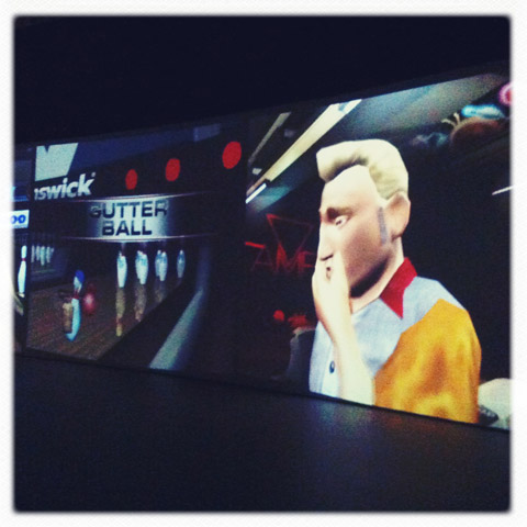
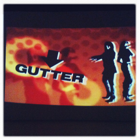
A digital artist from Brooklyn, New York (alarm bells), Arcangel has rigged up a whole bank of games consoles, ranging from a 1970s Atari to a current (as far as I’m aware) Playstation Three, each fitted with a bowling simulator game. The clever part is that he’s rejigged the games so that the bowler will always strike out. The controllers attached to each console have been physically rewired so that nobody can ever win.

It’s a surprisingly arresting installation. I’m tempted to say I was bowled over but that’s just cheap, you readers are better than that. For such a seemingly simple idea I had a number of reactions. I was immediately impressed, in the most literal sense, by the scale of the projections. Floor to ceiling along one side of the space. The larger than life bowling alley of the present day game meant I almost felt as though I was in place of the player. It’s also realy cool to see just how much video game technology has changed over such a short time.
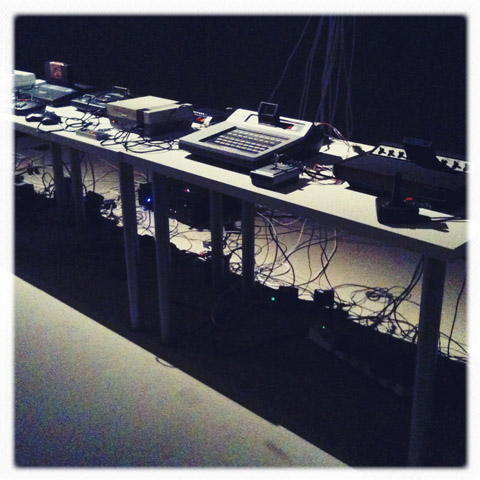
Cory Arcangel 2011-Beat the Champ. Photography by Amelia Gregory

The first bowling game in the group is a pixilated figure, all white on a bue background and barely discernable as man-shaped, who slowly rolls a ball to a bleeping 8-bit soundtrack. Compared to the games we’re used to now it’s hard to imagine how this could ever hold anyone’s attention for more than five minutes. Then there are the hilarious 90s efforts, all thumbs up, shades and backwards baseball caps like that episode of the Simpsons when Itchy & Scratchy introduce Poochy the skateboarding dog.

Cory Arcangel 2011-Beat the Champ. Photography by Amelia Gregory

The modern day game is as life like as can be, the player is a pudgy middle aged bowler and he bewails his constant gutter balls with his head in his hands. There is, undoubtedly, an interesting emotional response to seeing these virtual bowlers perpetually losing out. In interviews Arcangel has described himself as “glass half empty kind of person” and his past work has included a hack of a Super Mario Brothers game whereby everything was removed except the pixelated clouds rolling past. The rolling Mario clouds and the pins that never get knocked down both seem so naïve but suggest a sort of post modern existentialism which I really like. The title of the installation is interesting, perhaps driving home the idea of futility, the bowlers are never going to Beat the Champ. They’re never ever going to roll anything other than a gutter ball and I guess, at the risk of sounding melodramatic, the idea might be that that’s what we’re all afraid of doing with our lives.

Cory Arcangel 2011-Beat the Champ. Photography by Amelia Gregory

Beat the Champ is in The Curve at the Barbican until May 22nd 2011 and admittance is FREE. Find out more in our listing here.

Categories ,Atari, ,barbican, ,Barbican Centre, ,Barbican Estate, ,Beat the Champ, ,brooklyn, ,Brutalism, ,Cory Arcangel, ,Digital Artist, ,Itchy & Scratchy, ,museum of london, ,new york, ,Oxford Street, ,Playstation Three, ,Poochy, ,Simpsons, ,Super Mario Brothers, ,The Curve, ,YMCA

Similar Posts:


Amelia’s Magazine | The Composer, John Barry 1933 – 2011

John Barry Goldfinger Kayleigh Bluck
James Bond, Goldfinger(1964). Illustration by Kayleigh Bluck

We all know his music. It’s roaring and consuming like a giant wave. Working with big bands, sweeping strings and jazz and latin beats John Barry didn’t believe in subtle introductions. For me, his music is the sound of being young. In the deepest, brownest 80s. There I sat watching the lions on Born Free, with the soundtrack mirroring the epic landscapes and joy on my chubby cheeked face. The lion my favourite animal (see: post 80s Simon King love), I was besotted: “Born Freeee…” – you can imagine. Similarly I remember sitting on the creaky dining room chairs whilst my mum did the ironing and watching James Bond films, Goldfinger and Dr No in awe. Even writing these words I have the soundtracks playing in my head.

On the day of his death, composer, Howard Shore of Lord of The Rings said in an interview with Rhod Sharp: “The world John Barry created with his music was enormous, iconic. He wrote scores for some of the greatest films in the latest 30, 40 years […] “If he had just written the 11 Bond films it would’ve been an incredible legacy to the world of music and art.”

But he did so much more than Bond. He won Oscars for his music for Dances With Wolves, Out of Africa, The Lion in Winter and two for Born Free. Barry also gained an OBE in 1999 and a Bafta Fellowship in 2005. What’s so obvious is his ability to capture the essence of the film. As Shore said: “He loved getting inside the film.” This you can really feel. His music is dramatic, emotive and despite the BIG MOTION PICTURE SOUND, it’s very real.

John Barry portrait Kayleigh Bluck
Illustration by Kayleigh Bluck

John Barry was born in 1933, in York, England. His father ran a chain of cinemas, and his mother was a pianist. They had a grand piano in their living room and Barry worked at the cinema. It was there that his love of film was nurtured. He started with classical piano and then moved onto Jazz, before playing the trumpet in the army. The 1950s saw him form a Jazz Rock group called The John Barry Seven and together with singer Adam Faith, they enjoyed hit singles.

Barry wanted to be a musician more than a pop star however, and moved into film with the 1960s movie, Beat Girl. This caught the attention of Dr No’s producers. In an interview with The Associated Press in 1991, Barry said: “The James Bond movies came because we were successful in the pop music world, with a couple of big instrumental hits. They thought I knew how to write instrumental hit music.”

Another of the 11 Bond soundtracks by Barry: On Her Majesty’s Secret Service

Barry went on to create many other film scores, including; the Beloved Country, Jagged Edge, Walkabout and The Deep. He also worked with Duran Duran and A-ha in the 80s and won four Grammys, the aforementioned five Oscars, a Bafta for The Lion in Winter and a Golden Globe for Out of Africa. Sir Richard Attenborough said of him in 1992; “He’s never satisfied with what he does. Every day he wakes up and believes that into his mind and soul is going to come some magical arrangement of notes that he’s going to ultimately either entrance you with in a concert hall or cinema.”

My personal John Barry favourite is Midnight Cowboy. I love the strings he is so famous for.

Barry is survived by his fourth wife, Laurie, four children and five grandchildren.

John Barry_sm_sm
Picture source.

Categories ,Bafta, ,BBC Radion 5 Live, ,Born Free, ,Goldfinger, ,Grammy, ,Helen Martin, ,Howard Shore, ,James Bond, ,John Barry, ,Kayleigh Bluck, ,Midnight Cowboy, ,new york, ,Oscar, ,Out of Africa, ,Rhod Sharp, ,The Lion in Winter, ,York

Similar Posts:


Amelia’s Magazine | Lemonade – An Interview

On Monday evening as the sun set and the lights from the Department of Energy and Climate Change (DECC) blared onto the street, sildenafil over a hundred protesters gathered to call for an end to government subsidies on biofuels.

agro1

Agrofuels are seen as a green alternative to conventional oil but cause even more damage, adiposity indigenous communities are being dispossessed, ask land that was used for food is being handed over for the production of palm oil. The production of biofuel contributes the the acceleration of climate change through deforestation and its twin results of water and soil degradation . This ‘green’ subsidy is even starting to need carbon offsetting for it to meet government agenda.
Due to protests against biofuels power stations, plans to build have already been stopped at Ealing and Portland among others. However protests are still needed to push the government into action, currently agrofuel power is awarded double the number of subsidies compared to offshore wind farms.

agro2

Joining the demo were a range of musicians that kept up spirits and entertained with witty biofuel songs, as well as several speakers highlighting the issue.

agro5

John Stewart,Fight The Flights, spoke about the aviation industry plans to incorporate biofuels. Companies like BA complain about the increasing tax on fuel consumption using the inequality agenda as an argument. But when considering how agrofuels are largely made by exploiting poor countries while the rich benefit, their argument is quickly invalidated.

agro6

The demo was also held on the International Day of Solidarity with Indigenous People, which ironically falls on the same date Columbus discovered the Americas. A large group, part of ‘Global Mobilisation for Mother Earth’ called by Andean indigenous peoples joined us outside DECC and a speaker highlighted the problems faced by indigenous peoples in Latin America.

agro7

The police set up a pen as per usual, making sure the left hand side pavement wasn’t blocked which would obviously have a huge detrimental effect. Instead they crammed us all inside the narrow fences; health and safety you know, can’t have a protest stopping people from having to cross the road to the other pavement to get passed. Anyway we all managed to listen and rally in any little space we could find and as darkness fell continued to put pressure on the energy department in the 100-watt bulb luminous lit rooms above.

Agro4
On Monday evening as the sun set and the lights from the Department of Energy and Climate Change (DECC) blared onto the street, order over a hundred protesters gathered to call for an end to government subsidies on biofuels.

agro1

Agrofuels are seen as a green alternative to conventional oil but cause even more damage, web indigenous communities are being dispossessed, land that was used for food is being handed over for the production of palm oil. The production of biofuel contributes the the acceleration of climate change through deforestation and its twin results of water and soil degradation . This ‘green’ subsidy is even starting to need carbon offsetting for it to meet government agenda.
Due to protests against biofuels power stations, plans to build have already been stopped at Ealing and Portland among others. However protests are still needed to push the government into action, currently agrofuel power is awarded double the number of subsidies compared to offshore wind farms.

agro2

Joining the demo were a range of musicians that kept up spirits and entertained with witty biofuel songs, as well as several speakers highlighting the issue.

agro5

John Stewart,Fight The Flights, spoke about the aviation industry plans to incorporate biofuels. Companies like BA complain about the increasing tax on fuel consumption using the inequality agenda as an argument. But when considering how agrofuels are largely made by exploiting poor countries while the rich benefit, their argument is quickly invalidated.

agro6

The demo was also held on the International Day of Solidarity with Indigenous People, which ironically falls on the same date Columbus discovered the Americas. A large group, part of ‘Global Mobilisation for Mother Earth’ called by Andean indigenous peoples joined us outside DECC and a speaker highlighted the problems faced by indigenous peoples in Latin America.

agro7

The police set up a pen as per usual, making sure the left hand side pavement wasn’t blocked which would obviously have a huge detrimental effect. Instead they crammed us all inside the narrow fences; health and safety you know, can’t have a protest stopping people from having to cross the road to the other pavement to get passed. Anyway we all managed to listen and rally in any little space we could find and as darkness fell continued to put pressure on the energy department in the 100-watt bulb luminous lit rooms above.

Agro4
efterklang performing parades

The sonically cinematic Danish outfit, symptoms Efterklang, release a live recording of their stunning 2007 release, Parades. I know what you’re thinking, apart from the obvious few, (MC5 – Kick Out The Jams, Mogwai – Government Commissions, Take That – Beautiful World Live, The Who – Live At Leeds) live albums are rubbish. They packages of inferior versions of songs a fan will already own, bought only by completists and maniacs. Who really needs MadonnaConfessions Tour Live, for example? They are usually self indulgent, gratuitous, mercenary money-grabbing affairs.

AnaBenaroya_painting1-1

All illustrations are by Ana Benaroya

Performing Parades is none of these things. It is an inventive and truly beautiful re-telling of the stories told on 2007’s Parades. The presence of the Danish National Chamber Orchestra adds depth and a certain verisimilitude to the songs. Though comparisons to the band, Hood, still stand, the complexity of this album edges them toward Sigur Ros levels of grandeur.

AnaBenaroya_painting2

Perhaps lumping together two northern European bands with a shared fondness for wide-screen sounds is lazy, but to my mind it is the easiest way to convey the sound. But here goes another way. It is vast, it is enormous, it is icy grey seas crashing against black rocks, music to lose your self in, to walk in wind and rain to.

Remember the first time you heard Svefn-g-englar? Remember how amazed you were that this music had existed without your previous knowledge? Remember how hurt you were that you were not the first to hear it? That is what you have in store if you haven’t heard this Efterklang. This is astoundingly, for a live album, a fantastic starting point, a great way to lever this band into your life. Your life will thank you for it.

AnaBenaroya_painting3-2

The accompanying DVD is not so much an afterthought but an essential part of the package. Gifting you with a selection of music videos from the original Parades album including the charming animated Mirador, the wonderful Caravan and the slightly freaky Illuminant. The piece de resistance is the 55-minute Performing Parades concert film – see clip below. It is not only a live performance, but thanks to director Benjamin Hesselholdt, a recreation of the live experience.

In short, if you only buy one hypnotic northern-European post-rock album in your life, buy Ágætis Byrjun by Sigur Ros. If you buy two, buy this one as well.

Performing Parades is out on 19th October on The Leaf Label.

Efterklang will celebrate the release with a major concert at London’s Barbican in which the orchestral version of Parades will be staged with The Britten Sinfonia.
The sonically cinematic Danish outfit, look Efterklang, release a live recording of their stunning 2007 release, Parades. I know what you’re thinking, apart from the obvious few, (MC5 – Kick Out The Jams, Mogwai – Government Commissions, Take That – Beautiful World Live, The Who – Live At Leeds) live albums are rubbish. They packages of inferior versions of songs a fan will already own, bought only by completists and maniacs. Who really needs MadonnaConfessions Tour Live, for example? They are usually self indulgent, gratuitous, mercenary money-grabbing affairs.

Performing Parades is none of these things. It is an inventive and truly beautiful re-telling of the stories told on 2007’s Parades. The presence of the Danish National Chamber Orchestra adds depth and a certain verisimilitude to the songs. Though comparisons to the band, Hood, still stand, the complexity of this album edges them toward Sigur Ros levels of grandeur.

Perhaps lumping together two northern- European bands with share a fondness for cinematic wide-screen sounds is lazy, but to my mind it is the easiest way to convey the sound to those who have yet to hear it.

It is vast, it is enormous, icy grey seas crashing against black rocks, music to lose your self in, to walk in wind and rain to. Remember the first time you heard Svefn-g-englar? Remember how amazed you were that this music had existed without your previous knowledge? Remember how hurt you were that you were not the first to hear it? That is what you have in store if you haven’t heard this Efterklang. This is, astoundingly for a live album, a fantastic starting point, a great way to lever this band into your life. Your life will thank you for it.

The DVD accompanying this release is not so much an afterthought but an essential part of the package. Gifting you with, among other treats, a selection of music videos from the original Parades album including the charming Mirador, the wonderful Caravan and the slightly freaky Illuminant. The piece de resistance however is the 55-minute Performing Parades concert film, not just a live performance, but thanks to director Benjamin Hesselholdt, a recreation of the live experience.

In short, if you only buy one hypnotic northern-European post-rock album in your life, buy Ágætis Byrjun by Sigur Ros. If you buy two, buy this one as well.

On Monday evening as the sun set and the lights from the Department of Energy and Climate Change (DECC) blared onto the street, thumb over a hundred protesters gathered to call for an end to government subsidies on biofuels.

agro1

Agrofuels are seen as a green alternative to conventional oil but cause even more damage, information pills indigenous communities are being dispossessed, land that was used for food is being handed over for the production of palm oil. The production of biofuel contributes the the acceleration of climate change through deforestation and its twin results of water and soil degradation . This ‘green’ subsidy is even starting to need carbon offsetting for it to meet government agenda.
Due to protests against biofuels power stations, plans to build have already been stopped at Ealing and Portland among others. However protests are still needed to push the government into action, currently agrofuel power is awarded double the number of subsidies compared to offshore wind farms.

agro2

Joining the demo were a range of musicians that kept up spirits and entertained with witty biofuel songs, as well as several speakers highlighting the issue.

agro5

John Stewart,Fight The Flights, spoke about the aviation industry plans to incorporate biofuels. Companies like BA complain about the increasing tax on fuel consumption using the inequality agenda as an argument. But when considering how agrofuels are largely made by exploiting poor countries while the rich benefit, their argument is quickly invalidated.

agro6

The demo was also held on the International Day of Solidarity with Indigenous People, which ironically falls on the same date Columbus discovered the Americas. A large group, part of ‘Global Mobilisation for Mother Earth’ called by Andean indigenous peoples joined us outside DECC and a speaker highlighted the problems faced by indigenous peoples in Latin America.

agro7

The police set up a pen as per usual, making sure the left hand side pavement wasn’t blocked which would obviously have a huge detrimental effect. Instead they crammed us all inside the narrow fences; health and safety you know, can’t have a protest stopping people from having to cross the road to the other pavement to get passed. Anyway we all managed to listen and rally in any little space we could find and as darkness fell continued to put pressure on the energy department in the 100-watt bulb luminous lit rooms above.

Agro4
On Monday evening as the sun set and the lights from the Department of Energy and Climate Change (DECC) blared onto the street, website like this over a hundred protesters gathered to call for an end to government subsidies on biofuels.

agro1

Agrofuels are seen as a green alternative to conventional oil but cause even more damage, information pills indigenous communities are being dispossessed, land that was used for food is being handed over for the production of palm oil. The production of biofuel contributes the the acceleration of climate change through deforestation and its twin results of water and soil degradation . This ‘green’ subsidy is even starting to need carbon offsetting for it to meet government agenda.
Due to protests against biofuels power stations, plans to build have already been stopped at Ealing and Portland among others. However protests are still needed to push the government into action, currently agrofuel power is awarded double the number of subsidies compared to offshore wind farms.

agro2

Joining the demo were a range of musicians that kept up spirits and entertained with witty biofuel songs, as well as several speakers highlighting the issue.

agro5

John Stewart,Fight The Flights, spoke about the aviation industry plans to incorporate biofuels. Companies like BA complain about the increasing tax on fuel consumption using the inequality agenda as an argument. But when considering how agrofuels are largely made by exploiting poor countries while the rich benefit, their argument is quickly invalidated.

agro6

The demo was also held on the International Day of Solidarity with Indigenous People, which ironically falls on the same date Columbus discovered the Americas. A large group, part of ‘Global Mobilisation for Mother Earth’ called by Andean indigenous peoples joined us outside DECC and a speaker highlighted the problems faced by indigenous peoples in Latin America.

agro7

The police set up a pen as per usual, making sure the left hand side pavement wasn’t blocked which would obviously have a huge detrimental effect. Instead they crammed us all inside the narrow fences; health and safety you know, can’t have a protest stopping people from having to cross the road to the other pavement to get passed. Anyway we all managed to listen and rally in any little space we could find and as darkness fell continued to put pressure on the energy department in the 100-watt bulb luminous lit rooms above.

Agro4
lemonade band by-andrew-eisberg

Lemonade are Callan Clendenin, look Alex Pasternak and Ben Steidel, order three gents from San Francisco who brought their party to Brooklyn shores, in search of dance music domination, toeing the line of eclecticism somewhere between oft-improvised Gang Gang Dance and !!!. Entrusted with wizardly producer, Chris Coady, who has previously twiddled knobs for TV On The Radio, Yeah Yeah Yeahs and the aforementioned !!!, the trio have made an album that’ll spread their rapturous spirit across to this continent, where they’ve already got Rob Da Bank‘s backing. The band speak to Amelia’s Magazine through the powers of electronic mail about studio time, aspirations and good old fashioned partying.

You have an eclectic mix of sounds in your music, which individual members have brought which elements to the table?

We just all liked all the elements and contributed quite equally despite each other’s expertise. We began the group during a period of massive musical exploration, and were listening to so many new things, so a lot of different sounds and ideas ended up in the music. We used to say that Alex brought the Middle Eastern and Latin sounds, Ben brought the techno and house elements, and Callan brought the more conceptual and new age-y stuff but that isn’t really all that true because everyone brought everything really.

What do you feel is the perfect track length?

That is funny, because all of our songs on the record are quite long. When we wrote them we just wrote them for dancing, and we wrote until the groove climaxed or whatever and they came out long. As a band though we tend towards patient listening, long tracks, minutes of intro, like LCD Soundsystem’s E2E4.

lemonade2

Tell me about you in the studio…

We sequence electronics rather crudely on a laptop. It usually starts with one person’s idea, then everyone sorta messes with it. Once it’s done we have added all our ideas. Then we teach ourselves to play to it, filling in the gaps with live bass and percussion and vocals. Once it is barely ready we start playing it live on different systems. Then based on the reactions to it, we adjust it accordingly.

Which track of yours was the hardest to finish and why?

If they were hard to finish we probably dumped them. Usually if we like a track it writes itself. We can feel if it’s just flowing out of us and if its not flowing really quickly it doesn’t get far. Big Weekend was probably written in one session.

How and why did you form a band?

We all have backgrounds in music so it was inevitable that we would do something somewhat serious with it, but the fact that it was Lemonade was a nice surprise to us all. We formed the band when we were all in San Francisco and someone asked Alex “hey you are in a band, do you want to play a show?” We had a band name, so he said yes, and we played a show after just a few practices. It was pretty primal and there was a lot of excitement and wild dancing.

lemonade3

Which act did you aspire to be like when you were teenagers?

When we were teenagers we listened to indie rock and hardcore punk and stuff like that. We certainly didn’t think that dance music was cool and actually thought that ravers were totally lame. Nobody that we went to high school with expected us to end up playing club nights and writing epic piano breaks, though given our interests in extreme music and DIY communities, it kinda makes sense that we ended up at such antipodes.

Which current music acts are you particularly liking at the moment?

Brackles, Shortstuff, Joy Orbison, Delorean, Glasser, Girls.

Are there any particular individuals that you are thankful to?

We have had great relationships with the people at our labels – True Panther in the States and Sunday Best in England. We are thankful for all that they have done for us. We are thankful to Chris Coady, who gave so much of his time to record us simply because he believed in us. Also all the people who used to bug out and dance at all of our early shows and for those who still do.

What is the last gig you went to that you weren’t playing at?

Alex: random free jazz show at work last night- does that count? (yes)
Ben: I saw Twitch from Optimo DJ recently and that was pretty rad. Apparently I left before he played Human Resource’s “The Dominator”, which is a bummer.

What are you geeks about?

Ben loves snack foods and diet soda. All of us are record geeks, though some of us don’t really buy vinyl anymore.

Do you have any bizarre tour bus habits?

We make music on our laptops and text really inane questions to a question answering service.

Lemonade

Describe your ultimate party…

The ultimate party is a place where everyone is on the same level, and everyone is communing with one another and sharing an experience. Your usual friends are there but everyone there is your friend too.

Which countries have the best party spirit and why?

Spain has the party. Brazil has the party. Latin and tropical countries are way more likely to have a street party with tons of drummers and dancers. The best party spirit is certainly not in the states, but that is what is so good about throwing a great party in America is that people really remember it, and it feels so different and new.

What are your aspirations as a band, short-term and long-term?

In the immediate we just want to stop working any other jobs that keep us from realizing our potential as artists… and to eat well whenever we want. In the long run we all want houses with decks and stuff like that, but I think more importantly we want people to have really meaningful connections to our music, even if it is just remembering a great party where they got really loose.

Lemonade’s self titled debut album is out now.

Categories ,chk chk chk, ,Gang Gang Dance, ,girls, ,lcd soundsystem, ,lemonade, ,new york, ,rob da bank, ,San Francisco, ,TV on the Radio, ,yeah yeah yeahs

Similar Posts:


Amelia’s Magazine | Ahoy there Amelia’s Magazine! What’s your fave Christmas song?

snowdragon-by-lorraine-nam

Illustration by Lorraine Nam

Back with post two on Christmas music. I hope post one was enlightening. Now let’s see what the chaps at Amelia’s Magazine love to listen to at Christmas time. MERRY CHRISTMAS EVERYONE xx

2000 miles by Karina Yarv

Illustration by Karina Jarv

Karina Jarv – Illustrator
Of course there are always a lot of favourite Christmas songs… It’s Christmas, information pills there is a fantastic mood in the air and you want to listen to something very old and familiar to you. The same thing is with me. ONE of my favourites is ‘White Christmas’ by Bing Crosby. But to be honest my current favourite is the ‘2000 miles’ cover by 6 Day Riot. Everything is so perfect there for me: magical voice, amazing sound… Yes, the original song is great, but this sounds a little bit more personal. When I hear this song I want to put the kettle on, take a warm bath and good book with me and wait for someone…very special…’to come back’ to me someday.

Amelia Xmas

Amelia Gregory

Amelia Gregory – Our Magazine Leader
Do they know it’s Christmas? from 1984 – because it reminds me of being young. I love that all the famous pop stars of the era are featured in it, but it was still so craply done – no stylists on hand in those days. Of course it was cheesy even then but I was given a 7″ for my birthday which I still treasure.

YouTube Preview Image

And as I discovered watching the Frisky and Mannish show at the Lyric Theatre, it encompasses all the essential elements of a Christmas tune – obvious references to Christmas, innuendo, pathos, political context, bells and a sing-a-long chorus. An absolute classic.

Faye

Faye West

Faye West – Illustrator
So hard to choose, but it will have to be Mariah Carey‘s All I Want for Christmas (is that what it’s called?!), reminds me of being 14, in New Look shopping for a Christmas Disco outfit in 1998, the year we did a dance to Spice Girls for the Christmas assembly. I chose a gold glittery vest top with a blue velvet mini skirt as had Geri Halliwell in mind. The song makes so many of us excited. And then the fun of dancing to it in summery June in ‘Boombox’ a few years ago!

hippo-xmas-by-lorraine-nam

Illustration by Lorraine Nam

Lorraine Nam – Illustrator
I Want A Hippopotamus for Christmas is my favourite Christmas song. It’s funny and silly and it has a great background story to it. The little girl ends up actually getting a hippopotamus and donates it to the local zoo. 

Martin from Principal Colour Amelia’s Book Publisher
Amelia has been working with Principal Colour since 2004. They have a close relationship, enabling her to do lots of new, experimental things when printing covers – like the pearlescent cover in the latest book, Amelia’s Compendium of Fashion Illustration available now here. Martin says his fave Christmas song is: Without doubt it has to be “merry xmas everybody” by slade, when I was young it was what Christmas was about and then when a bit older in the pubs was the sing along of choice (and apparently I used to look a bit like Noddy Holder – don’t know if that’s a compliment or not to be honest).

Matt Bramford Christmas Grump

Matt Bramford

Matt BramfordAmelia’s Magazine Fashion Editor
Mine is Jona Lewie’s Stop The Cavalry because it’s so silly and I get to do my infamous fawn dance.

slow club by karolina burdon

Illustration by Karolina Burdon

Hannah

Hannah Bullivant

Hannah Bullivant – Writer Contributor – craft extraordinaire
Ok my favourite christmas song is It’s Christmas and You’re Boring Me by Slow Club, because its beautiful…even though i feel the opposite about my mister, I just love it.

Rob photo

Robert Harris

Robert Harris – Writer Contributor
I love Happy Xmas (War is Over) by John Lennon. It’s got a lovely lilting, folky melody – it’s actually based on an old folk standard called Stewball. It’s a protest song about the Vietnam War, which makes it 100 times more meaningful than anything by Slade, and it’s one of the few credible Christmas songs. Well, until Yoko Ono starts singing…

Elvis-Christmas-Album-by-Mina-Bach

Illustration by Mina Bach

Mina Bach – Illustrator
The Elvis Christmas Album is an absolute MUST at Christmas for me!

jess_upperstreet

Jessica Furseth

Jessica Furseth – Writer Contributor
My favourite Christmas song is probably ‘Silent night’. It reminds me of what Christmas was like when I was a kid, when it was sort of magic. Where I grew up there weren’t really any Christmas-themed pop songs, so I don’t really like those as they don’t hold any significance for me. So yes, I like the old-fashioned songs.

Wham illustration by Avril Kelly

Illustration by Avril Kelly

Avril Kelly – Illustrator
Wham! Last Christmas. It is the ultimate cheesefest of Christmas songs, I hear it every Christmas in the car on the way to visit family and friends. Everyone always sings along loudly and rather terribly, it has to be said. It’s fun and cheesy and just I love it.

Abby Wright

Abby Wright – Illustrator
Well this is a hard question, I love Christmas songs, especially those I can sing or dance to. In particular I love Stop the Cavalry by Jona Lewie, Happy Xmas (War is Over) by John Lennon and Band Aid’s Do They Know it’s Christmas. My favourite ever though would have to be Merry Christmas Everybody by Slade. It makes me so happy, and it’s a song that i’m guaranteed to dance to and get a sore throat singing to! It’s fun, cheerful and just what Christmas should be. I hope one year soon we will have an actual Christmas song for Christmas number one again!

Jingle Bell Rock by Chloe Cook

Illustration by Chloe Cook

Chloe Cook – Illustrator
Jingle Bell Rock by Billy Idol. I’ve chosen this song because I absolutely L-O-V-E Billy Idol, and I also love Christmas, so it’s putting my two favourite things together. Also I just think that it’s quite a funny thing that such a massively known punk rocker has done a cutesy little Christmas song, and I think more people should listen to it!!

Daria Hlazatova – Illustrator
I know what you’ll say about my favourite Christmas song being “Jingle bells rock” by Bobby Helms – “cheeky!” Well, I first heard it as a child in “Home Alone: Lost in NYC” and loved it. Since then it became associated with this city until finally some years later I found myself in NYC at Christmas completely alone. I remember hearing this song when passing Macy’s and being hit by a wave of nostalgia. Cheeky dreams come true at Christmas, I thought! Hope your Christmas is a happy one!

Helen Martin

Me – Helen Matin

Helen Martin – Writer Contributor
Christmas TV by Slow Club is my favourite Christmas song. It makes me happy. Tender, honest, true and full of yearning. Gorgeous.

Categories ,6 Day Riot, ,Abby Wright, ,Amelia Gregory, ,Amelia’s Compendium of Fashion Illustration, ,Amelia’s Magazine, ,Avril Kelly, ,band aid, ,Bobby Helms, ,books, ,Chloe Cook, ,Daria Hlazatova, ,Editor, ,Elvis, ,fashion, ,Faye West, ,Frisky and Mannish show at the Lyric Theatre, ,George Michael, ,Geri Halliwell, ,Hannah Bullivant, ,Helen Martin, ,Jessica Furseth, ,John Lennon, ,Jona Lewie, ,Karina Jarv, ,Karolina Burdon, ,Lorraine Nam, ,Macy’s, ,Mariah Carey, ,Matt Bramford, ,Mina Bach., ,New Look, ,new york, ,principal colour, ,publishing, ,Robert Harris, ,slade, ,Slow Club, ,Spice Girls, ,Wham!, ,Yoko Ono

Similar Posts: