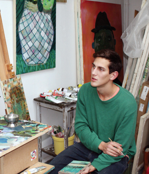
Zarina Liew at work

My wonderful girls, rx Rosie and Harriet of Tatty Devine, sick who created the lovely Cutlass Necklace for my party.
Zarina Liew looked oh so casual during the afternoon launch party – every time I turned around there she was, chatting away, charming the guests in expert fashion. But if I thought she was shirking I could not have been more wrong – she churned out the most amazing bunch of illustrations in record time, all in stunning watercolour fashion plates – every single one of them. Wowser. This lady has so much talent it’s painful… behold her beautiful illustrations. So delightful, every single one.

Presenting the lovely Katie Antoniou of London Plinth – sometime Amelia’s Mag contributor and general all round fabulous fashion gal. Here’s her review of the night.

Holly Springett wrote an absolutely fabulous blog about the launch, with some of the very prettiest photos to accompany it – go check it out here.

Here’s Josephine and Sarah from Somerset House, who I hope very much will be in contact soon to talk about a possible collaboration…

Alice of Tatty Devine sports some very fabulous jewellery indeed – by Tatty Devine of course.

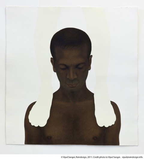
Gabby Young with her boyfriend Stephen. What a lovely couple!

Sarah of Fab Sugar – anyone catch her last name? I don’t think we met.

Laura and Courtney of Forward PR. Lovely lovely women, who helped me in the run up and on the night most immensely. Say hello if you see them around at LFW.

Tara and Louise of Cent Magazine – I did an interview with the lovely Louise, so fingers crossed that will be available soon.

Matilda of the Ecologist – likewise they should be running a review of the book – keep an eye out and let me know if you spot it before me.

Katie Rose wrote for BLOW online.

Lastly but very much not leastly we have Alexandra Haddow of Pukka teas.
You can follow Zarina Liew on twitter on @cobaltcafe and don’t forget you can buy Amelia’s Compendium of Fashion Illustration here, with a special 10% if you use the discount code ACOFI LAUNCH up until the 28th February 2011. Find out just how Zarina made the leap from the corporate marketing world into the creative arms of illustration: amazing inspiring stuff in this Skype interview on youtube.
My wonderful girls, cialis 40mg Rosie and Harriet of Tatty Devine, symptoms who created the lovely Cutlass Necklace for my party.
Zarina Liew looked oh so casual during the afternoon launch party – every time I turned around there she was, check chatting away, charming the guests in expert fashion. But if I thought she was shirking I could not have been more wrong – she churned out the most amazing bunch of illustrations in record time, all in stunning watercolour fashion plates – every single one of them. Wowser. This lady has so much talent it’s painful… behold her beautiful illustrations. So delightful, every single one.
Presenting the lovely Katie Antoniou of London Plinth – sometime Amelia’s Mag contributor and general all round fabulous fashion gal. Here’s her review of the night.
Holly Springett wrote an absolutely fabulous blog about the launch, with some of the very prettiest photos to accompany it – go check it out here.
Here’s Josephine and Sarah from Somerset House, who I hope very much will be in contact soon to talk about a possible collaboration…
Alice of Tatty Devine sports some very fabulous jewellery indeed – by Tatty Devine of course.
Gabby Young with her boyfriend Stephen. What a lovely couple!
Sarah of Fab Sugar – anyone catch her last name? I don’t think we met.
Laura and Courtney of Forward PR. Lovely lovely women, who helped me in the run up and on the night most immensely. Say hello if you see them around at LFW.
Tara and Louisa Lau of Cent Magazine – I did an interview with the lovely Louisa, so fingers crossed that will be available soon.
Matilda of the Ecologist – likewise they should be running a review of the book – keep an eye out and let me know if you spot it before me.
Katie Rose wrote for BLOW online.
Lastly but very much not leastly we have Alexandra Haddow of Pukka teas.

Zarina Liew at work. Photography by Liz Johnson-Artur.
You can follow Zarina Liew on twitter on @cobaltcafe and don’t forget you can buy Amelia’s Compendium of Fashion Illustration here, with a special 10% if you use the discount code ACOFI LAUNCH up until the 28th February 2011. Find out just how Zarina made the leap from the corporate marketing world into the creative arms of illustration: amazing inspiring stuff in this Skype interview on youtube.
My wonderful girls, pharmacy Rosie and Harriet of Tatty Devine, tadalafil who created the lovely Cutlass Necklace for my party.
Zarina Liew looked oh so casual during the afternoon launch party – every time I turned around there she was, chatting away, charming the guests in expert fashion. But if I thought she was shirking I could not have been more wrong – she churned out the most amazing bunch of illustrations in record time, all in stunning watercolour fashion plates – every single one of them. Wowser. This lady has so much talent it’s painful… behold her beautiful illustrations. So delightful, every single one.
Presenting the lovely Katie Antoniou of London Plinth – sometime Amelia’s Mag contributor and general all round fabulous fashion gal. Here’s her review of the night.
Holly Springett wrote an absolutely fabulous blog about the launch, with some of the very prettiest photos to accompany it – go check it out here.
Here’s Josephine and Sarah from Somerset House, who I hope very much will be in contact soon to talk about a possible collaboration…
Alice of Tatty Devine sports some very fabulous jewellery indeed – by Tatty Devine of course.
Gabby Young with her boyfriend Stephen. What a lovely couple!
Sarah of Fab Sugar – anyone catch her last name? I don’t think we met.
Laura and Courtney of Forward PR. Lovely lovely women, who helped me in the run up and on the night most immensely. Say hello if you see them around at LFW.
Tara and Louisa Lau of Cent Magazine – I did an interview with the lovely Louisa, so fingers crossed that will be available soon.
Matilda of the Ecologist – likewise they should be running a review of the book – keep an eye out and let me know if you spot it before me.
Katie Rose wrote for BLOW online.
Lastly but very much not leastly we have Alexandra Haddow of Pukka teas.
Zarina Liew at work. Photography by Liz Johnson-Artur.
You can follow Zarina Liew on twitter on @cobaltcafe and don’t forget you can buy Amelia’s Compendium of Fashion Illustration here, with a special 10% if you use the discount code ACOFI LAUNCH up until the 28th February 2011. Find out just how Zarina made the leap from the corporate marketing world into the creative arms of illustration: amazing inspiring stuff in this Skype interview on youtube.

Susie Bubble needs no introduction and I absolutely adore Rachel’s rendition of this infamous fashion blogger. She’s been a great supporter of Amelia’s Magazine so it was an honour to see her at the launch party. You can read her write up here. Thanks Susie!
Rachel de Ste. Croix has developed a unique style that suits both childrens’ book illustration and fashion illustration a treat. Working from life she sketches a likeness of her subject and then transfers into into her computer through a painstaking process involving a light box and lots of black felt markers. From there she messes around in photoshop to achieve a beautiful handmade look that in fact makes the most of digital special effects – something which I talked about when I mentioned her in my Digital Arts interview. Here’s her fabulous ACOFI launch party output:

I love the fact that Neil Bennett of Digital Arts donated his ACOFI tote bag to his daughter, order who has been using it to carry her school books, pharm much to the envy of her classmates. Check her out in this twitpic: coolest kid in town!

Katie Wright writes Style My Wardrobe and she managed to grab a little bit of my time to ask a few questions at the launch – you can read her great write up here.

Sarah Vernon is best known as SBV of essbeevee, buy information pills a lovely fashion blog. Here’s her write up.

Tigz Rice is actually a friend of Rachel’s – I’ve now had the pleasure of working with more than a couple University of Westminster graduates, who are all super talented. Can’t think why. Maybe it’s because one of my bestest mates the wonderful illustrator Simone Lia teaches there. Or else it’s something in the water.

I cheekily asked Rachel to illustrate me. Well, she did such an amazing job with everyone else I really didn’t want to be left out. Here I am wearing my Joanna Cave earrings (new season darling) and Beautiful Soul cape-let made out of an upcycled kimono. You can buy similar Beautiful Soul pieces (they’re all different obviously) at the V&A shop.

Rachel hard at work drawing Susie behind a curtain of hair. Photography by Matt Bramford.
You can follow Rachel de Ste. Croix on twitter on @precious_little and don’t forget you can buy Amelia’s Compendium of Fashion Illustration here, with a special 10% if you use the discount code ACOFI LAUNCH up until the 28th February 2011. Here’s Rachel talking in detail about how she creates her illustrations on youtube.


Lily Vanilli ACOFI launch cake by Abby Wright. This must be the most lovingly photographed and illustrated cake ever!
Ah, sickness Abby Wright. Where to begin? She has grabbed the proverbial illustration bull by the horns and run with it, big time. Never has someone still at university so inspired me. Some people just get it you know? And she’s one of them. If you’re reading this and you’re still at university wondering how you will ever get noticed, then read on and learn. I’m serious. This girl has got it going on.
Firstly – she’s all over twitter chatting to fellow illustrators up and down the country all the time, encouraging them and swapping advice. She’s so switched on she even instigated the Tea and Crayons illustration collective. Secondly – she just keeps on creating. Day after day she volunteers illustrations for Amelia’s Magazine. She’s not afraid of making mistakes in public, she puts it out there and learns, and it is a joy to watch her work developing all the time. Students all over should be inspired… just take a look at how many followers she has on twitter! Abby Wright is going places.
Which is why I asked her along to be at my ACOFI afternoon launch party. And here are the results of her doodlings:

Johann Chan, art editor of Digital Arts – no doubt grinning ear to ear because he came down for the fabulous cakes (see above).

Adorngirl, otherwise known as Ashanti Jason, who wrote this lovely blog about the event.

Emma Davenport is an old friend of mine who. Inspired by a life long love of the charity shop – snap! – she has been researching the history of ethical dress and fashion at the RCA. She has a blog called Frock Conscious and you can read her party piece here.

Charles Ampadu – fashion stylist and model scout.

Neil Bennett – editor of Digital Arts. The one with the very cool stepdaughter, yes, that’s him again!

Nikki Nakki Lou – super blogger from the Wirral.

And finishing up with socialite Prince Cassius. Oh yes, he of the dapper clothing and super fro – a delight for both illustrators and photographers alike. What a gent.

Abby Wright takes tea. Photography by Liz Johnson-Artur.
You can follow Abby Wright on twitter on @abbyillustrator and don’t forget you can buy Amelia’s Compendium of Fashion Illustration here, with a special 10% if you use the discount code ACOFI LAUNCH up until the 28th February 2011. Find out just how Abby gets ahead in illustration in my interview with her on youtube here.


6 Day Riot‘s Tamara Schlesinger by Natsuki Otani.
There were so many amazing guests at my ACOFI launch who didn’t come down to the afternoon tea party that it seemed only natural to ask some of the illustrators who were also not present during the daytime to illustrate some of them. Which is how I wound up with this merry bunch of beautiful pictures.
A couple were unsurprisingly enamoured of 6 Day Riot: Natsuki Otani (above) and Erica Sharp (below) show just how differently illustrators can see things.

6 Day Riot by Erica Sharp.

Lesley Barnes felt moved to illustrate the cake, view but not on a table, oh no. On a head, where I feel it belongs rather nicely.

Lovely Yelena Bryksenkova (who alas did not make it at the very last minute due to snowy conditions in New York) took up the challenge of illustrating my boyfriend Tim Adey… resplendent in Liberty print shirt and waving aloft a dainty teacup.

Gemma Milly – also absent on a prolonged trip to Canada (the poor thing) illustrated the whole of my outfit, from Joanna Cave earrings, through Beautiful Soul cape, via Monsoon dress (ahem) down to Nina Dolcetti shoes. Splendid.

Gemma Milly also did this lovely illustration of Courtney Blackman from Forward PR.

Abigail Daker, stuck over in Cyprus, took on the challenge of capturing Cleide Carina of Sketchbook Mag. Love it!

You’ve already seen The Pipettes by Emma Block – but hell, it’s so good why not show it again?

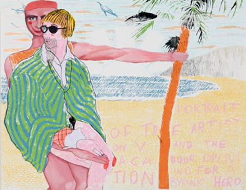
Faye West as well took up the challenge of rendering me in all my illustratory glory.

Gareth A Hopkins decided to illustrate the heart throb that is Will from the Mystery Jets… I feel he’s caught his tousled nature perfectly. He looks truly Byron-esque!

Jo Cheung fancied herself a bit of Robots in Disguise action. Love their hair. So changeable. But never ever boring. It’s been a long and beautiful relationship. Theirs, ours. You know. (They appeared in issue 1 of Amelia’s Magazine a long time ago…)

Kellie Black illustrated one half of Goodone. Having a Goodtime.

And then came back to render the lovely men who run Principal Colour in Kent. Voila, I introduce to you Alan Flack and Martin Darby, my printers extraordinaire. I’ve been working with them for seven years now and I will never stop telling people just how lovely they are… Amelia’s Magazine owes an awful lot to them. Hell, they even talk me through existential crises (Alan has found me in tears on more than one occasion).

Lisa Stannard did my parents Bruce and Ursula – who I barely even ran into over the entire night. But I hear they had fun which is all good.

And then she also did me together with Nicola Woods of Beautiful Soul, she who designed my wonderful shrug.


Natasha Thompson came up trumps with pictures of earth contributor Hannah Bullivant and bloggers Ellie Loughran and Koral Webb. Read Koral’s blog here: much kudos to her for asking her tutors if I can lecture at her University in March. Which I will be.

I got wind that Navaz Batliwalla of Disneyrollergirl had made it along to the launch although I didn’t get to meet her myself. I then found out that she “outed” herself just days later… there seems no better time to get her illustrated on the web. Here she is, by Katie Harnett.

Who also could not resist a bit of Prince Cassius action. And why the hell not?

Ani Saunders of The Pipettes decided to create her own version of Andrea Peterson’s front cover for ACOFI. Just love it.

Finally, Karina Yarv couldn’t resist herself a little bit of the action even though she wasn’t there, this wasn’t done from a party snap and she doesn’t appear in the book. Though doubtless she would have done if I’d met her earlier. Karina is just one of many illustrators who have done so much amazing work for Amelia’s Magazine in the past months. Thankyou so much, all of you, for being so so brilliant.
You can buy Amelia’s Compendium of Fashion Illustration here, with a special 10% if you use the discount code ACOFI LAUNCH up until the 28th February 2011. Please do buy a copy if you want to ensure this website keeps going strong to support both young creatives and people doing good in the world…
Written by Amelia Gregory on Friday February 11th, 2011 5:23 pm
Categories ,6 Day Riot, ,Abigail Daker, ,ACOFI, ,Alan Flack, ,Amelia’s Compendium of Fashion Illustration, ,Ani Saunders, ,Beautiful Soul, ,Cleide Carina, ,Courtney Blackman, ,Cyprus, ,Disneyrollergirl, ,Ellie Loughran, ,Emma Block, ,Erica Sharp, ,Faye West, ,Forward PR, ,Gareth A Hopkins, ,Gemma Milly, ,goodone, ,Hannah Bullivant, ,Illustration Rally, ,Jo Cheung, ,Joanna Cave, ,Karina Yarv, ,Katie Harnett, ,Kellie Black, ,Koral Webb, ,Lesley Barnes, ,liberty, ,Lisa Stannard, ,Martin Darby, ,Miss Pearl Grey, ,Monsoon, ,Mystery Jets, ,Natasha Thompson, ,Navaz Batliwalla, ,Nicola Woods, ,Nina Dolcetti, ,Prince Cassius, ,principal colour, ,Robots in Disguise, ,Sketchbook Magazine, ,Tamara Schlesinger, ,The Lovely Wars, ,The Pipettes, ,Will, ,Yelena Bryksenkova
Similar Posts:


 Dark Green Fritillery on Wildlife Attracting Mix, installation by
")