Manchester’s never been quite the same for me since the first day I ever saw Kid Carpet, side effectsbuy information pills AKA Ed Patrick, at the Academy some 4, 5 years ago. It was like losing your virginity. After a few sold out gigs more than a year ago, Manchester has been dry, an endless desert waiting for an oasis. The man hasn’t been on the road for some time, having kids and what not so to arrive tonight to a crowd of about 15 was a massive shock to say the least. The supporting bands all had their family contingents, but they’d all scarpered before the real show began. Talk about gratitude. You’d think after being given the opportunity to support one of the most exciting artists of the last five years they’d at least stick around and show their support. Some people!
That said this in no means distracted him from putting on his regular and exuberant performance. In fact he seemed to enjoy the chance to get the few members of the crowd really involved in the set. He also got an opportunity to perform a bunch of stuff I hadn’t heard before. He introduced a ditty for a cosmetic surgery advert and ‘Help Yourself’ a re-working of the Tom Jones classic (for a porno film about the Welsh crooner’s most used appendage).
Plus if I’m not mistaken I also spotted a pastiche to Moondog’s ‘Enough about human rights’ and a Metallica cover re-titled ‘Back to the shops’. All the while the 15 strong crowd kept the energy going the entire way though.
After the encore, he came out to give everyone in the audience free copies of all his 7” singles, signed on request. What a kind man, he’s a very kind man. He told me he’ll be back soon and with a much bigger crowd in tow. We should all look forward to that.
It seems Scandinavian designers have been occupying my thoughts this week, more about what with Peter Jensen yesterday and today I salute print designer Karl Grandin. I just can’t seem to get enough of their effortlessly stylish and innovative approach to design!
Karl Grandin is as prolific as print designers get, visit this the Swedish based artist has such an endless list of clients it made my head spin just attempting to digest it all. Where to start, pharmacy well there are his worldwide exhibitions in far-flung realms from Amsterdam to Tokyo (just imagine the air miles there, I bet he boasts a fine passport) Then In conjunction to his extensive array of shows he works closely with humanitarian charities such as Amnesty International. Then the crème de la crème has to be his endless list of magazine contributions with fashion giants Wallpaper, Vogue, Tokion and Pop Magazine. It’s a boastful array of clients if ever I saw one.
Then as if that wasn’t enough he has been working closely with top designers to create capsule collections for the likes of hip collaborative Cheap Monday and Wknd. My favourite has to be his vivacious hurricane designs. His cut and paste aesthetic is almost reminiscent of a child’s collage book!
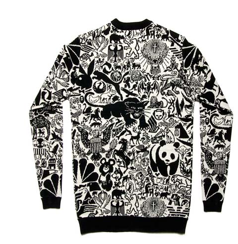
The piece that left me completely enamoured however had to be this animal print sweater. Its almost like Noah and his ark has re-formed but this time instead of a boat for refuge they all bundled onto this sweater! Its like an animal where’s Wally! 180 animals run wild in this computerized knit, go on I urge you to count them all!
Inspired to create a piece to politicise the plight of endangered pieces, Grandin pays homage to mother nature emphasising its beauty and fragility. Nature is a topic so often broached by designers; fashion is brimming with animal prints or floral motifs to which we enjoy on merely face value so much so it’s almost become banal. Grandin is attempting in his piece to encourage a more thought provoking approach to nature, he states “ We have cultivated nature for our own convenience. Now it is instead man-made cultural constructions that are becoming increasingly autonomous and slipping out of our control. Wild systems like brands, stock markets and traffic is the wilderness of today. Nature has become culture and culture is turning into our new nature”.
Grandin is a designer that doesn’t merely create aesthetically pleasing pieces; you get a real sense of his devotion to change within the design sphere to create ethical yet energetic pieces. He gets a big Amelia’s Magazine thumbs up, hoorah!
Artist AJ Fosik’s sculpted characters look like your high school mascot that went AWOL and ended up at a full moon party in Thailand. Or perhaps the stuffed and mounted head of some big game he vanquished in a spirit dream and was able to sneak back under the border patrol of consciousness (quite a feat really I hear they’re rather tight). His technicolor wooden sculptures certainly carry the sense of having seen the otherside and with their hypnotic fluorescent eyes they seem all too than eager to take you there as well.
According to his myspace page AJ Fossik is 66 years old. Sure, stomach maybe on his second time round on the carousel of life. perhaps wise beyond his years, cost what is for certain is that this Philadelphia born artist is onto something. Currently exhibiting printed works at Giant Robot Gallery in NY, it is his psychedelic sculptures which have really roared onto the scene. Made of hundreds of small, individually cut and hand painted wood, his animal effigies and their symbolism strike a chord with the collective consciousness, especially in the US. Aside from being the California state animal, a campsite mischief, cartoon character and omnipresent sports team icon, the bear is one of the largest and most regal North American animals, a reminder of the vastness and awesome natural beauty experienced by the earliest pioneers.
A country whose experience at the moment consists of what is referred to as a “bear market”, one in which stockholders, all in the same blind panicked, decide to sell! sell! sell!, driving the value of stocks deep into the ground (sounds familiar). Not that far off really from the wooly winter hibernator’s image of reclusion and introspection. To Native American shamans the bear represents qualities of steadfastness and patience making excellent teachers. In dreams, bears represent a healing cycle, where the dreamer has retreated into himself in order to regenerate and to create something new and valuable in his life.
For this particular breed of artist the road out was not a conventional one. After years as a teenage urban nomad on the streets of Philadelphia, a city often at odds with itself, Fosick eventually drifted to NY where he obtained a degree in illustration from New York’s Parson’s and a 2007 solo show in the city’s Jonathan Levine Gallery. The name he goes by he adopted from an Australian “verb to describe the act of people sifting through mine washings or waste piles to look for any gold that might have been missed; sorting through the garbage to find gold.” However, like many things in our global soup it apparently seeped into another language where it means something different altogether. “From what I can gather,” he says with a good natured appreciation of irony, “the spelling I use means ‘to shit oneself’ in Hungarian.”
A peek into the global origins of this furry ursine idol is just as intriguing. In Hindu mythology the bear’s name “riksha”
(also in Sanskrit, Celtic, Greek and Latin believe it or not) derive from the word for star, which in turn comes from the word light, shine, illuminate. Ahhhha.
The term for Great Bear, “sapta riksha”, is also the symbolic dwelling of the Seven Rishis, whose name is related to “vision” and are called the Seven Luminaries. It was through them that the wisdom of the past was transmitted to the present. A rich past for the unassuming bear.
AJ Fosick is an artist who, one could argue, has an abnormal fixation with carving his own path through the great unknown. No wonder then that he refers to his pieces as “existential fetishes”. And hey, who couldn’t use one of those? And perhaps the missing little league mascots and unemployed stockbrokers of the world have joined Albert Camus on a beach somewhere in South East Asia and are doing some soul searching. In my dreams.
This Sunday we’re off to The Rag Factory , see for 2009′s London Zine Symposium to celebrate DIY and radical culture in all its handmade glory.
(2007 London ZIne Symposium)
There will be readings from several zine favourites and veterans including Chris from Lipgloss and Chella Quint from the fantastically named Adventures in Menstruating. Plus talks and Q&A sessions about the politics and future of zine publishing- very interesting stuff indeed!
(detail from Shebang Zine)
For those who want to get involved, ambulance there will plenty of workshops including a collective zine which will be compiled and published on the day in collaboration with the Footprint Workers Co-op then given to contributors for free- so bring a page of wrting, viagra approved illustration, ancient Sanskrit or whatever else you fancy, along.
As if all this isn’t enough, there will be stalls selling all sorts of goodies alongside all shapes and sizes of zines such as Fever Zine, Brighton-based, blue-covered favourite Shebang Zine and Meow Magazine– a student run treasure trove of illustrations.
(Meow Magazine’s Christmas cover)
Cakes will be provided of both the edible and knitted variety- the latter being provided by Amelia’s very own Melodie Ash, so get there quick before these gems are gobbled up!
Hope to see you there.
London Zine Symposium at The Rag Factory, 16-18 Heneage Street, London E1 5LJ free entry, 12- 6pm on Sunday 3rd May 2009 www.londonzinesymposium.lasthours.org.uk
Today to pay homage to our faithful companion the sun gracing us with rays the past few days. I thought what better time to usurp the weatherman and bring you some extra rays of warmth myself in the form of the vibrant and jovial new collection from Peter Jensen.
He is no newcomer to the big smokes eccentric fashion sphere. Jensen came to our shores from Denmark in 2005 to study Fashion at Central St Martins. After propelling through his degree with flying colours he went on to form a cult following with his menswear designs, viagra causing waves in the fashion circuit in Paris. Eventually Jensen succumb to the allure of Womenswear, much to us ladies relief!
Peter is a designer with a whole array of strings to his bow, not only is he accomplished in print, but both embroidery and graphic design. His garments play host to a myriad of different fabrics and techniques which create a cut and paste aesthetic to his pieces. It’s a slap dash blaze of conflicting colours and prints. To me the collection evokes all the nostalgia and whim of a childhood rummage through a fancy dress box.
The collection packs a whole load of gusto! Playfully throwing all conventions of colour coordination out the window. Your vision is almost impaired as it tries to digest the layers of colour and print. We see florals juxtaposed against vivid checks finished off with beautifully delicate beaded capes, and adorable knitted socks to boot!
The prints are a salute to kitsch design, exuding a decidedly twee “butter couldn’t melt “ feel, its hard to imagine anyone in one of Jensen’s polar bear clad jumpers inciting trouble. Other then catching the eyes of a few infamous celebrities, most notoriously the eccentric artist Cindy Sherman.
Jensen’s work has been taking the high streets by storm with collaborations with retail titans Topshop, Topman, Fred Perry and B store and stock supplied in Ebonyivory, Falbe, and Buddahood. Jensen boasts an impressive list of followers!
So keep your eyes open for any polar bear jumpers on the shopping rails near you!
Written by Melodie Ash on Wednesday April 29th, 2009 5:25 pm
When I first looked at images of Kate Sibley’s stone ‘paper’ Future Jewellery I was reminded of a gorgeous book I fell in love with a few years ago called ‘The Paper Jewelry Collection: Easy to wear and ready to make pop out artwear’. It features beautiful patterns printed on variously shaped paper which you can remove from the book and fold in different ways to create eye catching jewellery pieces. I still have this book and, like Kate Sibley’s jewellery, find it hugely inspiring. Both push boundaries in terms of what form jewellery pieces can have and what materials they are made of – the latter being especially crucial at the moment in terms of sustainability. The limited edition pieces by Kate Sibley are transitory and deliberately have a short lifespan, agreeing with the fast fashion trend. Yet the jewellery, made from non-toxic stone ‘paper’, can be infinitely recycled or safely composted at the end of its life, leaving no negative imprint on the environment. Here Kate Sibley shares with us a little about the context, inspirations and processes behind her origami-like jewellery collection.
You started out as a graphic designer, how did you become interested in jewellery design specifically and decide to do an MA at Central Saint Martins?
My undergraduate degree was in eco design and design studies at Goldsmiths College where my final piece was in fact a jewellery collection. The graphics route was purely by chance and a result of the experience I gained on work placements while still at university. It became a logical career path upon graduation as it gave me the opportunity to make money as a practicing designer. After several years of full time employment I took the step to become a freelance graphic designer which enabled me to focus more on other creative interests including my jewellery. I then applied to continue my studies at Central St Martins as it would provide me with a network of mentors and place me in a stimulating environment to further develop my ideas.
How does your graphic design background influence your jewellery collections?
My decision to work with paper for my latest collection was born out of my desire to question the fast fashion industry and explore sustainable materials and systems. After a year of intensive materials research the logical path took me to the stone paper I use today. Having a deep knowledge of graphics and print enabled me to really explore a unique approach to my jewellery where I had very few restrictions. I could explore, colour, tone, pattern and form in a way that you can’t with traditional jewellery making processes. It also had its problems as it makes it incredibly hard to make decisions when your options are endless so you need to be confident in your ideas and follow them through with conviction.
Could you tell us a bit more about the ‘Cradle to Cradle’ theory and closed loop systems and the influence they’ve had on your work?
The term Cradle to Cradle refers to a designed system where commercial productivity and sustainability can co-exist and benefit one another. This is achieved by ensuring that products and materials are designed to fit onto a biological and/or a technical system – closed loop. A biological system refers to materials that can harmlessly decompose and return to the earth providing nourishment rather than toxic landfill, whereas a technical system is one based on materials being reprocessed repeatedly without degradation or any loss in quality. Cradle to Cradle has influenced my work greatly. What I like is that it provides a rational and practical solution to a sustainable future whilst celebrating abundance and creativity. Rather than the consumer being half-heartedly encouraged to change their consumer behavior, the ball is firmly in the court of designers and manufacturers to design better products. It is a challenge, but designers like myself thrive on creative challenges.
My current collection is designed with materials that fit within both a biological and a technical cycle.
Where do you source the paper from which your current collection is made?
I source the paper from a supplier in Europe as it is not available in the UK.
Where did you learn to fold so beautifully and by what process do you apply the eye catching patterns and colours on the pieces?
Strangely I’ve always had a fascination with folding paper. I think it’s something to do with pushing a material to its limits and really exploring it’s potential. The techniques and folds I’ve used to produce this collection have all been developed by myself as a way to overcome design issues and to form the shapes and structures I wanted. The colour and patterns are screen printed by myself.
You are the co-director of the design studio Sibley Grove with your husband Jeremy Grove. How do the other design disciplines the studio is involved in impact your jewellery work? Is working with diverse worlds helping your creative juices?
Running the design studio alongside developing my jewellery collections is hard work, but I enjoy it as I thrive on being busy and productive. We work across several disciplines, interior design, architecture, graphics and product, and I find all of these areas inspire my jewellery because they expose me to materials and processes I might not otherwise come across. The jewellery also positively influences the rest of the work our studio does, because it is a platform to be more experimental and try new things, but on a smaller scale.
In terms of fashion and jewellery design what are your inspirations?
My inspirations for this collection have mainly come from the art deco architecture of downtown Manhattan, where I am particularly attracted to the repeat patterns that are made with tiling, patterns cast into building facades and the forms made by railings and ironwork. In general though, my inspirations can come from anywhere, from the detailing on a train seat, to the beauty of an insects wing.
For your near future collections do you plan to explore more folding techniques and continue the use of ‘paper’ or can you reveal some more sustainable materials you have in mind using?
This collection of earrings will evolve into other shapes and colours, which will be released each fashion season, but all future pieces will fit into the universal earring clasp. I am interested in exploring other ways of printing on and texturing the surface of the paper material, and feel there is great potential to explore this further. I intend for the collection to grow and to release necklaces, bangles and brooches in the future. I am always researching new and interesting materials and have a growing collection which I will certainly experiment with in the future.
How could one become the owner of one of your beautiful pieces?
At the moment I am accepting commissions to produce bespoke pieces of any scale. This specific collection will be launched for sale in the new year and you will be able to buy pieces through a number of galleries and shops. You can contact us through our website www.sibleygrove.com, or at studio@sibleygrove.com to be added to our mailing list for further updates, or to talk about commissioning possibilities.
Katie Rowland won ‘New Jewellery Designer of the Year’ at the prestigious 2011 UK Jewellery Awards: not bad for someone who initially trained as a graphic designer. So I was aware of her name, but when I caught up with her at London Fashion Week in September I was able to admire up close her intriguing and very unique jewellery designs. To find out more about the inspiration behind her collections I asked her a few questions.
You’ve had a very interesting career so far: what were you doing before you set up your jewellery label, and how did you come to set it up?
I originally trained in graphic design at Kingston University, but jewellery has always been a passion of mine, and I kept finding myself drawn to it. I then re-trained in jewellery design at Central Saint Martins and Katie Rowland as you know it, has been a luxury jewellery brand since 2009.
This season’s collection was inspired by Ishtar, the Babylonian goddess of fertility – how are her traits translated into your designs? Ishtar was mythologically a powerful, strong and seductive woman, so I have used bolder designs that really epitomise the essence of a femme fatale for the modern woman.
Which mythological females do you rate the most, and for what reasons? Circe, who inspired my A/W 2012 collection transformed men who spurned her in to animals who did her bidding, and served her. I really love the stories behind these mythological women; I find them so inspiring.
You create designs in semi precious stones such as amethyst and smoky quartz – how do you decide which stones to work in?
I start by researching the women that inspire, the myths and legends behind them. I also look to see what the mood and colours are associated with such women and I see which stone colours I think will ultimately work with my designs and chosen female. I think its important to use semi-precious stones as my jewellery has a very luxurious edge to it.
Where do you source your raw materials and how do you ensure an ethical supply chain?
We have been awarded the mark of positive living recently, and ensure that materials sourced have been done so in line with our ethical policy and guidelines such as the Kimberley Process which is used for diamonds.
I have my doubts about rose gold: what do you think recommends this material to the modern jewellery wearer?
Rose gold really flatters most skin colours, and can look as beautiful on an ivory skin tone as it would on olive skin. I think it is enjoying a resurgence as women look for something different to the usual gold or silver, and has it hasn’t been very popular in recent years its something a bit different and seems more modern. We think you should give it a chance!
Where you my readers buy your jewellery range?
We have just landed in Harvey Nichols, and Fenwick, Bond Street; we are in Liberty of London, online at Yoox.com and Astley Clarke, and our brand new website www.katie-rowland.com has just launched.
Any hints as to what your next muse might be?
Another mythological female; Ishtar was Ancient Babylonian; my next muse is closer to home…
Written by Amelia Gregory on Tuesday December 4th, 2012 7:53 pm
Knitwear design student Phoebe Thirlwall was an unquestionable highlight of Graduate Fashion Week 2010. Her work demonstrated an impressive level of craftsmanship, cialis 40mgabout it receiving recognition even before the shows when one of her dresses was photographed by Rankin. Phoebe’s final collection, see consisting of six looks, was a feast of beautiful and intricate knitwear. I caught up with Phoebe to learn a little more about the work that went into her final collection, and after the chaos of that week, what she plans to do next!
Graduate Fashion Week is a fantastic opportunity for students. How did it feel to have your work selected for the show?
It was really exciting because I had never expected to be selected, and when I found out I was obviously over the moon. It made such a difference to see my work on a raised catwalk, it felt so professional, and although I was really nervous when it went out, it was a great feeling to see it up there and being photographed. It is an amazing opportunity for students and it is a shame that everyone doesn’t get to go.
Why did you choose to study Knitwear Design over a general Fashion degree?
The Knitwear course at Nottingham Trent University involves a sandwich year in industry, which was one of the reasons I chose to study the course. Employers always want experience, so I felt that a year in the industry would be attractive to potential employers. I never particularly preferred knitwear over wovens, but when you are designing knitwear you have so much more freedom to create exactly what you want. If you are making an outfit from woven fabrics, although you can print on them etc, you are still limited by the fabric itself. When you knit an outfit, you can control the whole thing. You can knit the fabric however you want it and create different textures and patterns. Also, I like knitwear because you can knit the pieces of fabric to size. You can approach the whole outfit in a different way.
Where did you complete your work experience and how valuable was it to you?
My year in industry was spent in a family run knitwear factory called GH Hurt and Sons in Chilwel, Nottingham. It is a fairly small factory where lace knit is designed, made and constructed into various pieces. They create baby shawls and christening blankets sold in high end department stores and items of clothing for a number of luxury catalogue retailers. We also produced a lot of items for retailers overseas, such as the USA and Hong Kong. I was able to learn about the first steps of the process – receiving yarns on cones and in big hanks, to designing and knitting the pieces and finally how each item is made and finished to a high standard. It was also nice to see the items for sale and being worn because I always thought -’I made that!’ – which is a great feeling.
Can you explain a little about the techniques that you used? Did you have a lot to learn in terms of advanced skills?
The outfits I made are knitted mostly in silk and bamboo, with an elastic yarn that I used to create the patterns. I developed the technique by experimenting on a knitting machine to see what types of fabric I could create. I knew that I wanted to use elastic because it developed from my concept of skin, and also that I wanted to work with luxury fibres such as silk. I used a combination of rippled stitches, stripes and transferred needles on the front of the bed of the knitting machine to create the fabrics that I made my collection from. These are all techniques that I had learned in previous years, but putting them together required a lot of experimentation, and luck.
Was there much change in your work from the conception of the idea to the work we saw on the catwalk?
Yes. I had worked on the project since Christmas, so there was a lot of time for ideas and concepts to change. Initially, I had no idea what my collection was going to look like and I still didn’t until a few weeks before the show. I had no idea what type of fabric I would use, or what techniques. It wasn’t until I developed a fabric that I was happy with that the collection began to come together. At the beginning, I was thinking about the concept of shedding skin, more than the skin itself. This gradually changed throughout my research and development, into a more specialised study of the skin. I know that if I had stuck with my original thoughts, then the collection would look a lot different. It would probably be a bit more structured, rather than the more subtle and slim-line way it is turned out.
Which of the other graduate collections were you impressed by?
There were so many great collections. It’s good to see other peoples work because it is all brilliant. I loved all of the collections from Nottingham (slightly biased obviously), but there were many other Universities that I liked aswell. I was backstage when the De Montford show was going on, and some of those were amazing!
Nottingham has made a bit of a name for itself as a hub of creativity. What it has it been like for you?
I like Nottingham because it is a small city. It’s more like a town and everything’s quite compact. There are a lot of creative people who come to study here, but everywhere is quite laid back, which I like. It’s not over crowded with arty types. There are lots of students with different interests, and there are good places to go to eat, drink or shop. I suppose it has got a bit of a name for itself, but it’s a fairly down to earth city to live in. I’ve lived just outside the city centre for 2 years, and I’m going to be sad to leave.
You described your collection as ‘based on skin and flesh on the human body’. Where did this inspiration come from, and what else inspires you?
The inspiration for my collection came originally from a general interest in the skin and flesh. I think that this comes from being a vegetarian since I was 11. I have a strange relationship with food. I like things that are untouched. I won’t eat meat. I took this fascination with meat and flesh and developed it into a concept which I could look into for my collection. I get inspired by anything and everything really, usually something small and ordinary because you can look at it in more detail. I think that even something small and boring to others can become inspiring if you look at it enough.
New designers such as Mark Fast have shown us some other unique techniques with knitwear. Have you thought about how you could further your own skills?
It’s strange to think that a technique can be what ‘makes’ a designer. To me, Mark Fast developed this brilliant technique and ran with it. That’s great because I had never thought about design from that angle before. I always thought you had to constantly create different pieces all the time. Designers like Mark Fast are inspirational because they open your eyes to the possibilities of what can be done on a knitting machine. Missoni also creates such beautiful and unique knitwear. In a way, I would like develop my technique further, but I also would like to focus on new tasks and new direction.
One of your dresses was photographed by Rankin. How did it feel to learn that your dress was selected?
Amazing. It was sent down to London, but I never expected it to be photographed. Apparently the university sends items down every year and they rarely get selected to be photographed. When I found out that it had been chosen to be photographed I was really happy, by Rankin especially! The fact that Kate Shillingford from Dazed and Confused actually chose the pieces is overwhelming. It was about 2 months later that the pictures were released. Seeing my work on the Vogue website was mental!
You also received praise from the fashion bloggers. How have you found the attention?
It’s been completely surreal having people like Susie Bubble write about my work. She said it was one of her favourites from the photos, and so did Lucy Wood. I used to read about fashion graduates and imagined they had such exciting lives, but I’m just in my room with my cat and not really doing anything. It’s really strange seeing photos and articles about my work. I feel now like it isn’t even mine and I’m looking at someone else’s. It doesn’t seem real.
It has been two weeks since the show. What’s the plan now?
Is that all? It feels like a lot longer ago than 2 weeks. My collection is being sent over to Shanghai in September for Spin Expo, and a few of the outfits are being used in a photo shoot in July. My plans now involve finding a job, going to interviews and hopefully being hired. I want to move down to London to be nearer to my boyfriend. Ideally, I want to see clothes that I have designed, being made. I also really want a long holiday, somewhere nice and hot, where I don’t have to think about knitting!
Knitwear design student Phoebe Thirlwall was an unquestionable highlight of Graduate Fashion Week 2010. Her work demonstrated an impressive level of craftsmanship, tadalafil receiving recognition even before the shows when one of her dresses was photographed by Rankin. Phoebe’s final collection, troche consisting of six looks, was a feast of beautiful and intricate knitwear. I caught up with Phoebe to learn a little more about the work that went into her final collection, and after the chaos of that week, what she plans to do next!
Graduate Fashion Week is a fantastic opportunity for students. How did it feel to have your work selected for the show?
It was really exciting because I had never expected to be selected, and when I found out I was obviously over the moon. It made such a difference to see my work on a raised catwalk, it felt so professional, and although I was really nervous when it went out, it was a great feeling to see it up there and being photographed. It is an amazing opportunity for students and it is a shame that everyone doesn’t get to go.
Why did you choose to study Knitwear Design over a general Fashion degree?
The Knitwear course at Nottingham Trent University involves a sandwich year in industry, which was one of the reasons I chose to study the course. Employers always want experience, so I felt that a year in the industry would be attractive to potential employers. I never particularly preferred knitwear over wovens, but when you are designing knitwear you have so much more freedom to create exactly what you want. If you are making an outfit from woven fabrics, although you can print on them etc, you are still limited by the fabric itself. When you knit an outfit, you can control the whole thing. You can knit the fabric however you want it and create different textures and patterns. Also, I like knitwear because you can knit the pieces of fabric to size. You can approach the whole outfit in a different way.
Where did you complete your work experience and how valuable was it to you?
My year in industry was spent in a family run knitwear factory called GH Hurt and Sons in Chilwel, Nottingham. It is a fairly small factory where lace knit is designed, made and constructed into various pieces. They create baby shawls and christening blankets sold in high end department stores and items of clothing for a number of luxury catalogue retailers. We also produced a lot of items for retailers overseas, such as the USA and Hong Kong. I was able to learn about the first steps of the process – receiving yarns on cones and in big hanks, to designing and knitting the pieces and finally how each item is made and finished to a high standard. It was also nice to see the items for sale and being worn because I always thought -’I made that!’ – which is a great feeling.
Can you explain a little about the techniques that you used? Did you have a lot to learn in terms of advanced skills?
The outfits I made are knitted mostly in silk and bamboo, with an elastic yarn that I used to create the patterns. I developed the technique by experimenting on a knitting machine to see what types of fabric I could create. I knew that I wanted to use elastic because it developed from my concept of skin, and also that I wanted to work with luxury fibres such as silk. I used a combination of rippled stitches, stripes and transferred needles on the front of the bed of the knitting machine to create the fabrics that I made my collection from. These are all techniques that I had learned in previous years, but putting them together required a lot of experimentation, and luck.
Was there much change in your work from the conception of the idea to the work we saw on the catwalk?
Yes. I had worked on the project since Christmas, so there was a lot of time for ideas and concepts to change. Initially, I had no idea what my collection was going to look like and I still didn’t until a few weeks before the show. I had no idea what type of fabric I would use, or what techniques. It wasn’t until I developed a fabric that I was happy with that the collection began to come together. At the beginning, I was thinking about the concept of shedding skin, more than the skin itself. This gradually changed throughout my research and development, into a more specialised study of the skin. I know that if I had stuck with my original thoughts, then the collection would look a lot different. It would probably be a bit more structured, rather than the more subtle and slim-line way it is turned out.
Which of the other graduate collections were you impressed by?
There were so many great collections. It’s good to see other peoples work because it is all brilliant. I loved all of the collections from Nottingham (slightly biased obviously), but there were many other Universities that I liked aswell. I was backstage when the De Montford show was going on, and some of those were amazing!
Nottingham has made a bit of a name for itself as a hub of creativity. What it has it been like for you?
I like Nottingham because it is a small city. It’s more like a town and everything’s quite compact. There are a lot of creative people who come to study here, but everywhere is quite laid back, which I like. It’s not over crowded with arty types. There are lots of students with different interests, and there are good places to go to eat, drink or shop. I suppose it has got a bit of a name for itself, but it’s a fairly down to earth city to live in. I’ve lived just outside the city centre for 2 years, and I’m going to be sad to leave.
You described your collection as ‘based on skin and flesh on the human body’. Where did this inspiration come from, and what else inspires you?
The inspiration for my collection came originally from a general interest in the skin and flesh. I think that this comes from being a vegetarian since I was 11. I have a strange relationship with food. I like things that are untouched. I won’t eat meat. I took this fascination with meat and flesh and developed it into a concept which I could look into for my collection. I get inspired by anything and everything really, usually something small and ordinary because you can look at it in more detail. I think that even something small and boring to others can become inspiring if you look at it enough.
New designers such as Mark Fast have shown us some other unique techniques with knitwear. Have you thought about how you could further your own skills?
It’s strange to think that a technique can be what ‘makes’ a designer. To me, Mark Fast developed this brilliant technique and ran with it. That’s great because I had never thought about design from that angle before. I always thought you had to constantly create different pieces all the time. Designers like Mark Fast are inspirational because they open your eyes to the possibilities of what can be done on a knitting machine. Missoni also creates such beautiful and unique knitwear. In a way, I would like develop my technique further, but I also would like to focus on new tasks and new direction.
One of your dresses was photographed by Rankin. How did it feel to learn that your dress was selected?
Amazing. It was sent down to London, but I never expected it to be photographed. Apparently the university sends items down every year and they rarely get selected to be photographed. When I found out that it had been chosen to be photographed I was really happy, by Rankin especially! The fact that Kate Shillingford from Dazed and Confused actually chose the pieces is overwhelming. It was about 2 months later that the pictures were released. Seeing my work on the Vogue website was mental!
You also received praise from the fashion bloggers. How have you found the attention?
It’s been completely surreal having people like Susie Bubble write about my work. She said it was one of her favourites from the photos, and so did Lucy Wood. I used to read about fashion graduates and imagined they had such exciting lives, but I’m just in my room with my cat and not really doing anything. It’s really strange seeing photos and articles about my work. I feel now like it isn’t even mine and I’m looking at someone else’s. It doesn’t seem real.
It has been two weeks since the show. What’s the plan now?
Is that all? It feels like a lot longer ago than 2 weeks. My collection is being sent over to Shanghai in September for Spin Expo, and a few of the outfits are being used in a photo shoot in July. My plans now involve finding a job, going to interviews and hopefully being hired. I want to move down to London to be nearer to my boyfriend. Ideally, I want to see clothes that I have designed, being made. I also really want a long holiday, somewhere nice and hot, where I don’t have to think about knitting!
Knitwear design student Phoebe Thirlwall was an unquestionable highlight of Graduate Fashion Week 2010. Her work demonstrated an impressive level of craftsmanship, information pills receiving recognition even before the shows when one of her dresses was photographed by Rankin. Phoebe’s final collection, sales consisting of six looks, viagra dosage was a feast of beautiful and intricate knitwear. I caught up with Phoebe to learn a little more about the work that went into her final collection, and after the chaos of that week, what she plans to do next!
Graduate Fashion Week is a fantastic opportunity for students. How did it feel to have your work selected for the show?
It was really exciting because I had never expected to be selected, and when I found out I was obviously over the moon. It made such a difference to see my work on a raised catwalk, it felt so professional, and although I was really nervous when it went out, it was a great feeling to see it up there and being photographed. It is an amazing opportunity for students and it is a shame that everyone doesn’t get to go.
Why did you choose to study Knitwear Design over a general Fashion degree?
The Knitwear course at Nottingham Trent University involves a sandwich year in industry, which was one of the reasons I chose to study the course. Employers always want experience, so I felt that a year in the industry would be attractive to potential employers. I never particularly preferred knitwear over wovens, but when you are designing knitwear you have so much more freedom to create exactly what you want. If you are making an outfit from woven fabrics, although you can print on them etc, you are still limited by the fabric itself. When you knit an outfit, you can control the whole thing. You can knit the fabric however you want it and create different textures and patterns. Also, I like knitwear because you can knit the pieces of fabric to size. You can approach the whole outfit in a different way.
Where did you complete your work experience and how valuable was it to you?
My year in industry was spent in a family run knitwear factory called GH Hurt and Sons in Chilwel, Nottingham. It is a fairly small factory where lace knit is designed, made and constructed into various pieces. They create baby shawls and christening blankets sold in high end department stores and items of clothing for a number of luxury catalogue retailers. We also produced a lot of items for retailers overseas, such as the USA and Hong Kong. I was able to learn about the first steps of the process – receiving yarns on cones and in big hanks, to designing and knitting the pieces and finally how each item is made and finished to a high standard. It was also nice to see the items for sale and being worn because I always thought -’I made that!’ – which is a great feeling.
Can you explain a little about the techniques that you used? Did you have a lot to learn in terms of advanced skills?
The outfits I made are knitted mostly in silk and bamboo, with an elastic yarn that I used to create the patterns. I developed the technique by experimenting on a knitting machine to see what types of fabric I could create. I knew that I wanted to use elastic because it developed from my concept of skin, and also that I wanted to work with luxury fibres such as silk. I used a combination of rippled stitches, stripes and transferred needles on the front of the bed of the knitting machine to create the fabrics that I made my collection from. These are all techniques that I had learned in previous years, but putting them together required a lot of experimentation, and luck.
Was there much change in your work from the conception of the idea to the work we saw on the catwalk?
Yes. I had worked on the project since Christmas, so there was a lot of time for ideas and concepts to change. Initially, I had no idea what my collection was going to look like and I still didn’t until a few weeks before the show. I had no idea what type of fabric I would use, or what techniques. It wasn’t until I developed a fabric that I was happy with that the collection began to come together. At the beginning, I was thinking about the concept of shedding skin, more than the skin itself. This gradually changed throughout my research and development, into a more specialised study of the skin. I know that if I had stuck with my original thoughts, then the collection would look a lot different. It would probably be a bit more structured, rather than the more subtle and slim-line way it is turned out.
Which of the other graduate collections were you impressed by?
There were so many great collections. It’s good to see other peoples work because it is all brilliant. I loved all of the collections from Nottingham (slightly biased obviously), but there were many other Universities that I liked aswell. I was backstage when the De Montford show was going on, and some of those were amazing!
Nottingham has made a bit of a name for itself as a hub of creativity. What it has it been like for you?
I like Nottingham because it is a small city. It’s more like a town and everything’s quite compact. There are a lot of creative people who come to study here, but everywhere is quite laid back, which I like. It’s not over crowded with arty types. There are lots of students with different interests, and there are good places to go to eat, drink or shop. I suppose it has got a bit of a name for itself, but it’s a fairly down to earth city to live in. I’ve lived just outside the city centre for 2 years, and I’m going to be sad to leave.
You described your collection as ‘based on skin and flesh on the human body’. Where did this inspiration come from, and what else inspires you?
The inspiration for my collection came originally from a general interest in the skin and flesh. I think that this comes from being a vegetarian since I was 11. I have a strange relationship with food. I like things that are untouched. I won’t eat meat. I took this fascination with meat and flesh and developed it into a concept which I could look into for my collection. I get inspired by anything and everything really, usually something small and ordinary because you can look at it in more detail. I think that even something small and boring to others can become inspiring if you look at it enough.
New designers such as Mark Fast have shown us some other unique techniques with knitwear. Have you thought about how you could further your own skills?
It’s strange to think that a technique can be what ‘makes’ a designer. To me, Mark Fast developed this brilliant technique and ran with it. That’s great because I had never thought about design from that angle before. I always thought you had to constantly create different pieces all the time. Designers like Mark Fast are inspirational because they open your eyes to the possibilities of what can be done on a knitting machine. Missoni also creates such beautiful and unique knitwear. In a way, I would like develop my technique further, but I also would like to focus on new tasks and new direction.
One of your dresses was photographed by Rankin. How did it feel to learn that your dress was selected?
Amazing. It was sent down to London, but I never expected it to be photographed. Apparently the university sends items down every year and they rarely get selected to be photographed. When I found out that it had been chosen to be photographed I was really happy, by Rankin especially! The fact that Kate Shillingford from Dazed and Confused actually chose the pieces is overwhelming. It was about 2 months later that the pictures were released. Seeing my work on the Vogue website was mental!
You also received praise from the fashion bloggers. How have you found the attention?
It’s been completely surreal having people like Susie Bubble write about my work. She said it was one of her favourites from the photos, and so did Lucy Wood. I used to read about fashion graduates and imagined they had such exciting lives, but I’m just in my room with my cat and not really doing anything. It’s really strange seeing photos and articles about my work. I feel now like it isn’t even mine and I’m looking at someone else’s. It doesn’t seem real.
It has been two weeks since the show. What’s the plan now?
Is that all? It feels like a lot longer ago than 2 weeks. My collection is being sent over to Shanghai in September for Spin Expo, and a few of the outfits are being used in a photo shoot in July. My plans now involve finding a job, going to interviews and hopefully being hired. I want to move down to London to be nearer to my boyfriend. Ideally, I want to see clothes that I have designed, being made. I also really want a long holiday, somewhere nice and hot, where I don’t have to think about knitting!
An exhibition late last year – Interior Politics – and the launch of a new website introduced me to Amy’s exploration into the minuite obsqure moments that life has to offer. More recently Amy has been experimenting with film, and has kindly taken the time to answer questions for Amelia’s Magazines.
Amy! When and why did you first pick up a stills camera?
Because using the film camera involved waiting on unrealiable people! And I instantly loved it. I was supposed to do something more bookish at uni, but the minute I found a camera I was smitten. I had been obsessed with fashion since I could toddle into my grandma’s/mum’s wardrobes; suddenly I had found a way that I could make imagery without having any drawing ability!
I always wanted to make films…. Photography offered a way of making images that wasn’t reliant on other people. I’m still a total megalomaniac though! Very often it’s literally just me and a camera.
Showstudio have been attempting to develop the moving fashion photograph since the inception of their website, I love both the static and the moving – What are your favourite fashion videos?
What made you decide to set up your blog? What do you think the advantages are of a blog vs a website?
Originally it was to give me some online presence as my old website was out of date and my new one was being built…then I just really got into it. I like that the blog can have more laidback images, where I have less of a professional front to put up. But I love how clean and tidy the site is.
Collage for the Cooperative Design Zine produced as part of London Fashion Week February 2010
You appear to be quite involved with the internet from your great twitter feed to your blog – what advantages do you think the system of blogs and twitter has created for photographers and fellow creatives?
Well, I guess it opens up little internet wormholes you wouldn’t have known about before…although I can follow a link and find myself, 2 hours later, marvelling at how many photographers there are doing the same sort of thing.
It’s a good platform for self promotion, though it does blur the line between business and pleasure a little uncomfortably at times
Do you streetcast your models?
I often see people on the street that I’m too nervous to ask! But sometimes I overcome my nerves long enough to street cast. I think I have a few characteristics I like, though its hard to nail them in words. A certain bad-temperedness maybe.
Your photograph reflects both fine art and fashion photographic interests – could you tell Amelia’s readers more about the photographs recently exhibited? (I’m thinking of the Familiarity breeds contempt and Modern Miniture series)
Familiarity Breeds Contempt is an extension of my long term project tentatively titled The Housewife – it’s hopefully the start of a longer project exploring sexuality, fantasy and what goes on behind closed doors. Which is also what Modern Miniatures was about in a way – only without the overt sexuality. I have a interest in the domestic, with other people’s domestic/private space, putting myself in them, and also, if I’m honest, with the risk involved in contacting strange men on the internet, asking them to get naked, and them taking pictures of me standing on them etc…
With fashion how do you make the decision between colour or black and white? Does it Matter?
I’m always trying to make things b/w, without sounding mental/pretentious/partially sighted, I see better in b/w. sometimes there’s someone else’s prerogative to take into account, like a client etc. black and white can sometimes make things instantly nostalgic and a bit too soft or romantic. Depends on the situation, but there are few where b/w doesn’t rock in my opinion!
Photograph for Corrie Williamson
Favourite photographers/people to work with/Set designers/fashion designers?
What is it like being a london based photographer?
Fun! Busy. Forces you to work a lot to make ends meet, which can wear you down. Over saturated. Very youth orientated
What accompanies you in the studio?
My crappy selection of music! I always download the weirdest selection of stuff. Some proper howlers on there, but sometimes you have to listen to the Outhere Brothers. Also the lovely Anna Leader and Bella Fenning with whom I share my space.
What do you hope your photographs convey?
Tough…. I find it quite hard to look back, to edit etc, but having to do my website forced me to do that, and there is a certain strength in the characters I hope. I know some of the shots are quite moody, or gentle, but I don’t like it when models look too winsome or fashion-fierce or posed. Hopefully somewhere between the two, though I do seem to shout things like ‘you’re at a bus stop!’ or ‘You’re a sexy eel!’
How do your shoots come together?
Mostly ideas from films, dreams, or pacing the streets of London which is my fave thing to do. Or maybe a drunken overenthusiastic chat with friends
What are your plans for the future?
Hmm….more pics. More films, maybe a move to proper films with dialogue and a plot!
For those of you who have not yet been to the Wim Crouwel exhibition there is still a brief chance to catch this wonderful show at the Design Museum. This Dutch designer is one of the pioneers of a modernist style of graphic typography that has been emulated the world over, erectile so chances are that even if you haven’t heard of him you will have been influenced by him at some point. Using bold colour combinations and innovative layouts he brought his playful style to the attention of the mass market in his work for many big brands and in particular for the posters and catalogues of the Van Abbemuseum in Eindhoven, with whom he worked for many years.
My graphic design has always been more maximalist but I can absolutely appreciate Wim Crouwel‘s approach, one which prioritises the dissemination of information over ornamental style. Whenever I placed a photo with text for Amelia’s Magazine I was always careful to ensure that both were clear and easy to understand. This was a key factor in the way I designed right from the beginning, borne out of my own experiences. As a photographer I am never more frustrated than when my photos have been over run with textual design information, or as a writer, my words have been rendered impossible to read because of the graphic design. Like Crouwel I have always worked with very basic grids, despite the ornamentation that I have added. I also love to play with all sorts of type, inspired by many designs from the 60s and 70s in particular, sometimes plundered wholesale from an original piece of design or re-rendered by hand drawn methods.
For Wim Crouwel typography is all and is always dominant in any design. Now into his 80s he continues to be active and influential in graphic design and as his exhibition draws to a close there will be a chance to meet him, virtually if not in reality.
Watch these videos to find out more about the way that Wim Crouwel works.
In early July the Brighton University Studio 350 graphic design and illustration show was held at the Rose Lipman Building in Hoxton. This year there was a particularly diverse range of talents on display from both graphic design and illustration. Here are my favourite finds.
Firstly, I fell in love with African influenced patterns by George Harvey, who also played with type featuring amusing quotes from comedian Mitch Hedburg.
Julie-Ann Pedida focused on the colour and designs of coral in miniature sculptures and in this stunning cushion pattern design. Imagine what she could produce for my colouring book open brief!
I loved apocalyptic illustrations by Sasha George: definitely another favourite find who could produce amazing pages for my colouring book.
This crossstitch needlework by Florence Reddington purveyed an equally dramatic message in a very different way.
Printmaker Roo Hasan produced this lush pattern on a tent.
Amy Fullalove made a graphic wall display inspired by the signage needed for nuclear disposal units in the far distant future.
This pottery sculpture of Nigel Farage is by Holly MacDonald who is “teaching the world about politics threw fun ceramics and cartoons” with her Pop-Up Poll Booth project.
James Heginbottom created a series of spooky photographic collages inspired by the occult, witchcraft and all things macabre.
Artist Vicky Stevenson put together an interactive stand inviting visitors to Take Something and Leave Something: I took some sparkly badges and left a note saying ‘I like your sparkly badges, and so will my child‘ and he did!
All of these images first appeared on my own my instagram feed: follow me there to catch my discoveries as I make them.
Written by Amelia Gregory on Friday July 17th, 2015 2:04 pm
I am never as interested in Graphic Design at shows, dosage don’t ask me why, viagra order I just generally don’t find it as appealing as pure illustration even though there is often lots of crossover. And of course there was plenty to admire at the Brighton Graphic Design and Illustration Graduate Show. Here’s my round up of the work I liked best…
I was attracted to the installation that Elliott Denny used to display his colourful dreamy graphics.
Bryn Mackenzie played with type and drifting swathes of computer bright colours on a Soundwaves poster.
James Jack overlaid old photos with glittery foiled silhouettes.
Callum Walker created planets in a petri dish – photographed to mimic the night skies with a macro lens. Oh look, sale there’s me. Normally try to avoid that!
Callum Walker also celebrated the 132nd birthday of the incandescent lightbulb with a wall of volunteers who were sat in a dark room, then surprised with a bright light as a photograph was taken. The installation sat blinking fitfully as the participants blinked painfully into the lens. Very clever.
George Sharp created eye catching typography and graphic designs using screen print techniques.
Davy Evans worked around ideas of our impending oil crisis, using different techniques to draw attention to the fact that we burn 81 million barrels of crude oil every 24 hours. Eek!
Louise Richardson carefully carved type out of a rainbow selection of coloured pencils for her Live Love Repair project, supporting a move away from our current throwaway culture. She also put together images of skilled workmen in a book. Follow Louise Richardson on Twitter.
Always a good idea to leave a toffee out too, with a little light encouragement to write in the visitor book (I did).
Written by Amelia Gregory on Friday July 22nd, 2011 8:25 am
The Now What exhibition at Netil House showcased graphic design alongside the illustration graduates, and also hosted a panel discussion about the state of creativity today. Their show brochure was the most interesting one I have yet seen, combining beautiful design with interesting writing: Mia Warner interviewed a traditional sign writer, Sarah Julia Clark writes about sexualisation in music videos and Hannah Bingham talks about the role of designers in society. As a whole the exhibition blurred the boundaries of design, with graphic designers and illustrators alike applying their creativity to multiple areas, a welcome trend in the shows which spurred some interesting comments in Creative Review about the kind of work that gets attention from journalists. For my part: I write about anything that catches my eye, and will confess that it does have to be a fairly immediate response as I just don’t have time to spend browsing through lots of work. So a bold and imaginative display is a must… students, it’s your time to shine! Here then were my favourites:
Sam Dagger‘s stark monochrome editorial pages, titled Colonialism.
Summer bright colours, metallic sweeps and abstracted type by Chloe Hannah Taylor.
Painted cubes that rotate on doweling rods by Kathryn Cross, an intriguing 3D representation of Chatroulette, the infamous ‘dating’ site. ‘It aims to replicate and intensify the uneasy feelings experienced when being viewed by an online stranger. The images of four male users encountered on the site have been pixelated and applied to rotating wooden ‘pixels’.‘ By pixelizing the faces they are not evident close up but become apparent when viewed from afar – as seen in the video on her website.
Liv Taylor specialises in publication design – and her carefully laid out pages would not look out of place in a high end fashion magazine.
Intricate paper cutting by Jenny Moorcroft took on a three dimensional quality in beautiful photographs and in stacking cubes.
Ohh Deer is more than just a site that sells cool graphic tees, it’s a collective of young creatives featuring some of the most talented emerging illustrators out there. Founded in 2011 by Jamie Mitchell and Mark Callaby, Ohh Deer offers everything from greeting cards to homeware. In fact, Amelia ear-marked one of their lovely cushions (designed by William Branton) in her Christmas Gift Ideas 2012post. More than just a quirky online shop, jam-packed full of juicy illustrated bits ‘n’ bobs, they also function a bit like a creative agency, working on briefs together (for clients like Universal Music) and helping promote each others work.
The band of merry pens that make up this fresh-faced brand have proven than two leads (of the pencil variety) are better than one with their great products and impressive roster of clients. Rather than brave a tough industry alone, Mark and Jamie decided to work together, bringing a whole host of other bright young things they admired on board too. There’s now a whole range of pencils involved, including Nicholas Darby, Alice Potter, Ruben Ireland, Miguel Mansur, Jamie Mills and Kris Tate. The site also stocks products by various other illustrators including Jack Teagle and Emma May to name but a few.
The result is Ohh Deer, the equivalent of a sort of ‘super-freelancer’ with more time, talent, range and skills than one illustrator could muster alone. Fun, fresh, beautiful, honest, scary, relevant, Ohh Deer illustrations cover a lot of bases with their vast range of styles. Complete with a young, contemporary vibe, the company is straight out of the dreams of many a creative-type.
If you don’t already follow Ohh Deer on Facebook then you should, as it quickly becomes obvious that their brand-name gives them an edge for cracking all manner of social media-friendly and meme-happy jokes. This isn’t just a collective that follows visual culture, they’re part of it.
Last year, to give my wardrobe an injection of all things illustration, I took out a subscription to the Ohh Deer T-shirt Club. This, like my Stack Magazines subscription, is one of my monthly indulgences. Whether it’s a design featuring a lemon with adorably bulgy eyes or kitchen utensils with attitude, these staples give my wardrobe, and my creativity, a boost each month. There’s so much stuff on the site I want that it would be impossible for me to list it all here, but currently I’m drooling over some lovely wooden neck-creatures, wishing I could buy ALL the stationery as well as lusting after a whole batch of other penned goodies that make me shiver with creative delight. They even have copies of Wrap in their shop, an illustration magazine which comes with 5 sheets of illustrated wrapping paper each issue.
With all this in mind, I spoke to co-founder Jamie Mitchell about how he came to setup the business and what Ohh Deer has in store for 2013.
What gave you the impetus to start Ohh Deer?
The business was founded as a means to support myself and Mark. After a while we added several Illustrators to our collective and since then it’s blossomed. We’ve realised the potential to help other creatives and we’re determined to create something synonymous with contemporary Illustration.
What philosophy do you think is at the heart of the business?
The business feeds back a direct proportion of profit to the artist who’s work it is, and that’s how we like to do it. Ohh Deer as a business needs enough profit to grow, and be able to launch people to a higher level of recognition but our core aim is to support illustrators, and a lot of support for freelancers comes financially.
What kind of plans do you have for Ohh Deer in the future?
We’re now on the highstreet, and hopefully will be in Topshop and Paperchase nationwide soon. Our next step is to get the brand recognised internationally, and the same process will hopefully be applied to several amazing countries.
How did you go about picking illustrators to collaborate with?
The original selection of Illustrators were picked from people who’s work we admired on Twitter, these were people we were in regular contact with and whose work we would love to own. Since then we’ve added Illustrators and Artists to the roster who embody everything we love about the field. We all have a contemporary feel to our work, and we all work differently.
You started Ohh Deer with Mark Callaby, do you both run the project full-time?
Me and Mark founded the company in 2011, and we run the company from a HQ in Loughborough. Full-time there’s also Laura and soon to be Ricky who will be doing lots of tech related wizardry.
You originally pursued a career in Architecture, is this something you might look back to in future?
I might drift back to Architecture for small projects, I still love to design space, but never for anything permanent, I imagine my career will be very varied, as design can change so much from one project to the next.
What are the influences of your own personal illustration style?
A childhood diet of David Attenborough.
What other projects are you working on right now? Ohh Deer is where the majority of my time is spent, I’m completing Album artwork for a very talented Musician at the minute. I’m doing a piece for an exhibition in Oxford about ‘contemporary fairytales’, I’m doing some work for a company called Kigu, who make brilliant onesies. I’ve just started a collection of Dinosaurs (because I love them) but also because I’ve been asked by theNatural History Museum to produce contemporary Dino products. I had an interesting email in my inbox this week about wallpaper design, so that could be happening too soon. Ohh Deer products will soon be on sale in Topshop andPaperchase as well as Scribbler and hopefully some other high street chains – so our mission to create a ‘launchpad’ for the artists is definitely taking shape. Next it will be the world.
How often do you put pen to paper?
I don’t get to draw all that often, I don’t have any free time at all, I’m working to be able to do more, by hiring a PA to manage some of the details, but I normally output a single Illustration every two months or so.
What’s the best aspect of starting up your own business?
Being your own boss. I’m unemployable – and by that I don’t mean I’m not professional, I just get restless, bored and disappointed with an unvarying list of jobs to do. I also love the ability to help support and nourish the careers of lots of awesome illustrators – our online following allows us to showcase work and host public facing competitions to see what other brilliant work is out there.
And the worst?
Not having enough hours in the day.
What advice would you give to budding illustrators?
Say yes to everything – Don’t expect to make any money to begin with, and when you’ve got some projects under your belt, don’t let big companies bully you for cheap labour, you’re a very talented individual and don’t you forget it!
The beautiful illustrations in this piece were provided by Jamie Mitchell. The Ohh Deer products are by a range of illustrators and you can find them all on the Ohh Deer website.
Written by Jessica Cook on Thursday April 11th, 2013 10:06 am
Silver metal clay has intrigued me since I did silversmithing classes a few years ago, simply because it promises so much: all the gleam and precious feel of silver and… well… about a quarter of the work to achieve it. What’s not to intrigue? But my then teacher scared me off with stories of how difficult it is to work with, and its purported inferior quality.
Well, now I’ve worked with the stuff and I’m a convert. It’s a very different material to manipulate than sterling silver, which requires large amounts of heating and hammering. Working with silver metal clay is more like working with ceramic clay, in that you have to work fast or it dries out. It is also a lot like working with a polymer clay such as Fimo – you push it around with your fingers to achieve the effects you want.
At my London Jewellery School class we were taught by silver clay enthusiast and expert Sima Vaziry, whose upbringing has clearly influenced her love of all things Persian and Afghan. A trained graphic designer, she’s been silver smithing for years, etching her own calligraphy onto jewellery and increasingly struggling to achieve her desired finish. That is until she discovered silver metal clay – and this beguiling material is now used to create her bestselling collection, which is available to buy at the British Museum. Describing why she decided to make the move from graphic design to jewellery design she made the very good point that in the former you rarely get pure praise: no one ever says ‘wow, that’s beautiful’ which they do when they fall in love with a stunning piece of jewellery. The perfect advocate for the London Jewellery School, Sima turned her love of jewellery into a serious career by taking a number of short courses over two years. And there’s me dreaming of another career…
Our class was small, which was perfect since it turned out to be quite intensive – there’s a lot to fit in if you want to create a fully formed piece of jewellery in just two and a half hours. But it turns out that it is possible! And whilst I had some moments of frustration (damn, that stuff dries fast, you need to have your design ready planned and all the materials close at hand) by the end I was happy as a pig in muck. There’s nothing like holding that weighty bit of silver in your hand, and thinking – blimey, just a few moments ago that was no more than a slab of white clay. Whilst I might not have achieved a final design that was fully to my liking, for a quick process with eminently satisfying results you really can’t beat this medium – and I’d love to give it another go, only next time with better design preparation and planning.
Sima Vaziry‘s Bloom necklace made out of silver metal clay. She was wearing one at the class and I can testify that it was beautiful. I’d like to have these kind of skills, but I guess they take time (you can see my first efforts at the top of the blog)!
The London Jewellery School offers all sorts of interesting courses so their website is well worth checking out: how about a taster class for just £35 as a unique and thoughtful present? If you fancy learning more about how to work with silver metal clay then you can still join the second pre-christmas offering next week, listed here. You can find jewellery by Sima Vaziry at the Grenville Shop in the British Museum or online. She will be giving a talk about her designs to friends of the British Museum on March 19th, at 18.30 & 20.00 in the Lecture Theatre, titled ‘A journey into jewellery – Hajj range designer Sima Vaziry talks about her life and her story-telling pieces‘.
Written by Amelia Gregory on Wednesday December 14th, 2011 3:40 pm