Illustration by Oliver John Quinn
After hanging out with contributor Nick for lunch during Menswear Day, information pills I hot-footed it up to Vauxhall Fashion Scout to check out D.GNAK‘s latest offerings. It was the only menswear show I’d see at the Freemasons’ Hall and it was fairly quiet. I’d enjoyed his outing last season and was looking forward to seeing how his quirky Japanese aesthetic would translate for A/W.
I bumped into contributor Georgiahttp://www.ameliasmagazine.com/?s=Georgia%20Takacs there and we headed into the venue, here sitting on opposite sides so not to get the same pictures. As we sat down, sales she started FREAKING OUT. ‘Is that Paul Weller? IS THAT PAUL WELLER?!’ she began yelling. It turns out it was, and he was nestled on the front row with his missus and two children. Georgia immediately went over to chat to him and I took a few pictures of them together, grinned nervously at him and thought to myself that his haircut has a lot to answer for.
On with the show. In a bold move from last season’s classic tailoring with contemporary twists, Kang D (the designer behind D.GNAK) had injected strong colours, interesting knits and enormous rucksacks.
The show opened with utilitarian tailoring that you might expect George Orwell’s Winston Smith to wear dark grey baggy trousers with an apron-like upper half was teamed with a luxurious floor-length cable knit cardigan. Next, a rich pea-coat with over-sized lapels and plaid-detail shoulders.
D.GNAK as a label is quickly establishing itself as an expert in materials and textures. Wools, corduroy, tweed and cotton were all on display, spiced up using colours like mustard and burgundy.
There’s also an eye for the unfinished – that’ll be the Japanese ma influence then – with fraid hems that look a bit like a Saville Row tailor has had the day off – but teamed with polished blazers and expensive-looking coats, this works really well.
Every man is pretty much catered for here. There’s sartorial tailoring in the form of suits and Sherlock Holmes-esque coats for the sharpest dresser; wool blazers with contrasting buttons and vibrant trousers work well for casuals; corduroy onesies will have the more fashion-forward males racing to the shops.
Ace accessories were on offer – oversized patent leather rucksacks with suede details were worn on both shoulders, buckle straps revealed helpful features like an umbrella carrier. I like.
This was a much fresher collection than last time – the same level of craftsmanship was on offer, but it’s interesting to see D-GNAK explore different pieces, experiment with colours and toy with the traditions of sartorial menswear.
See more of Joana Faria’s illustrations in Amelia’s Compendium of Fashion Illustration!

Illustration by Oliver John Quinn
After hanging out with contributor Nick for lunch during Menswear Day, illness I hot-footed it up to Vauxhall Fashion Scout to check out D.GNAK‘s latest offerings. It was the only menswear show I’d see at the Freemasons’ Hall and it was fairly quiet. I’d enjoyed his outing last season and was looking forward to seeing how his quirky Japanese aesthetic would translate for A/W.

Contributor Georgia with Paul Weller
I bumped into contributor Georgiahttp://www.ameliasmagazine.com/?s=Georgia%20Takacs there and we headed into the venue, recipe sitting on opposite sides so not to get the same pictures. As we sat down, she started FREAKING OUT. ‘Is that Paul Weller? IS THAT PAUL WELLER?!’ she began yelling. It turns out it was, and he was nestled on the front row with his missus and two children. Georgia immediately went over to chat to him and I took a few pictures of them together, grinned nervously at him and thought to myself that his haircut has a lot to answer for.

Illustration by Joana Faria
On with the show. In a bold move from last season’s classic tailoring with contemporary twists, Kang D (the designer behind D.GNAK) had injected strong colours, interesting knits and enormous rucksacks.
The show opened with utilitarian tailoring that you might expect George Orwell’s Winston Smith to wear dark grey baggy trousers with an apron-like upper half was teamed with a luxurious floor-length cable knit cardigan. Next, a rich pea-coat with over-sized lapels and plaid-detail shoulders.
D.GNAK as a label is quickly establishing itself as an expert in materials and textures. Wools, corduroy, tweed and cotton were all on display, spiced up using colours like mustard and burgundy.

Illustration by Rob Wallace
There’s also an eye for the unfinished – that’ll be the Japanese ma influence then – with fraid hems that look a bit like a Saville Row tailor has had the day off – but teamed with polished blazers and expensive-looking coats, this works really well.
Every man is pretty much catered for here. There’s sartorial tailoring in the form of suits and Sherlock Holmes-esque coats for the sharpest dresser; wool blazers with contrasting buttons and vibrant trousers work well for casuals; corduroy onesies will have the more fashion-forward males racing to the shops.
Ace accessories were on offer – oversized patent leather rucksacks with suede details were worn on both shoulders, buckle straps revealed helpful features like an umbrella carrier. I like.
This was a much fresher collection than last time – the same level of craftsmanship was on offer, but it’s interesting to see D-GNAK explore different pieces, experiment with colours and toy with the traditions of sartorial menswear.
See more of Joana Faria’s illustrations in Amelia’s Compendium of Fashion Illustration!

Illustration by Oliver John Quinn
After hanging out with contributor Nick for lunch during Menswear Day, visit this I hot-footed it up to Vauxhall Fashion Scout to check out D.GNAK‘s latest offerings. It was the only menswear show I’d see at the Freemasons’ Hall and it was fairly quiet. I’d enjoyed his outing last season and was looking forward to seeing how his quirky Japanese aesthetic would translate for A/W.

Contributor Georgia with Paul Weller
I bumped into contributor Georgiahttp://www.ameliasmagazine.com/?s=Georgia%20Takacs there and we headed into the venue, pharm sitting on opposite sides so not to get the same pictures. As we sat down, she started FREAKING OUT. ‘Is that Paul Weller? IS THAT PAUL WELLER?!’ she began yelling. It turns out it was, and he was nestled on the front row with his missus and two children. Georgia immediately went over to chat to him and I took a few pictures of them together, grinned nervously at him and thought to myself that his haircut has a lot to answer for.

Illustration by Joana Faria
On with the show. In a bold move from last season’s classic tailoring with contemporary twists, Kang D (the designer behind D.GNAK) had injected strong colours, interesting knits and enormous rucksacks.

All photography by Matt Bramford
The show opened with utilitarian tailoring that you might expect George Orwell’s Winston Smith to wear dark grey baggy trousers with an apron-like upper half was teamed with a luxurious floor-length cable knit cardigan. Next, a rich pea-coat with over-sized lapels and plaid-detail shoulders.
D.GNAK as a label is quickly establishing itself as an expert in materials and textures. Wools, corduroy, tweed and cotton were all on display, spiced up using colours like mustard and burgundy.

Illustration by Rob Wallace
There’s also an eye for the unfinished – that’ll be the Japanese ma influence then – with fraid hems that look a bit like a Saville Row tailor has had the day off – but teamed with polished blazers and expensive-looking coats, this works really well.
Every man is pretty much catered for here. There’s sartorial tailoring in the form of suits and Sherlock Holmes-esque coats for the sharpest dresser; wool blazers with contrasting buttons and vibrant trousers work well for casuals; corduroy onesies will have the more fashion-forward males racing to the shops.
Ace accessories were on offer – oversized patent leather rucksacks with suede details were worn on both shoulders, buckle straps revealed helpful features like an umbrella carrier. I like.
This was a much fresher collection than last time – the same level of craftsmanship was on offer, but it’s interesting to see D-GNAK explore different pieces, experiment with colours and toy with the traditions of sartorial menswear.
See more of Joana Faria’s illustrations in Amelia’s Compendium of Fashion Illustration!

Illustration by Oliver John Quinn
After hanging out with contributor Nick for lunch during Menswear Day, abortion I hot-footed it up to Vauxhall Fashion Scout to check out D.GNAK‘s latest offerings. It was the only menswear show I’d see at the Freemasons’ Hall and it was fairly quiet. I’d enjoyed his outing last season and was looking forward to seeing how his quirky Japanese aesthetic would translate for A/W.

Contributor Georgia with Paul Weller
I bumped into contributor Georgiahttp://www.ameliasmagazine.com/?s=Georgia%20Takacs there and we headed into the venue, medications sitting on opposite sides so not to get the same pictures. As we sat down, she started FREAKING OUT. ‘Is that Paul Weller? IS THAT PAUL WELLER?!’ she began yelling. It turns out it was, and he was nestled on the front row with his missus and two children. Georgia immediately went over to chat to him and I took a few pictures of them together, grinned nervously at him and thought to myself that his haircut has a lot to answer for.

Illustration by Joana Faria
On with the show. In a bold move from last season’s classic tailoring with contemporary twists, Kang D (the designer behind D.GNAK) had injected strong colours, interesting knits and enormous rucksacks.

All photography by Matt Bramford
The show opened with utilitarian tailoring that you might expect George Orwell’s Winston Smith to wear dark grey baggy trousers with an apron-like upper half was teamed with a luxurious floor-length cable knit cardigan. Next, a rich pea-coat with over-sized lapels and plaid-detail shoulders.
D.GNAK as a label is quickly establishing itself as an expert in materials and textures. Wools, corduroy, tweed and cotton were all on display, spiced up using colours like mustard and burgundy.

Illustration by Rob Wallace
There’s also an eye for the unfinished – that’ll be the Japanese ma influence then – with fraid hems that look a bit like a Saville Row tailor has had the day off – but teamed with polished blazers and expensive-looking coats, this works really well.
Every man is pretty much catered for here. There’s sartorial tailoring in the form of suits and Sherlock Holmes-esque coats for the sharpest dresser; wool blazers with contrasting buttons and vibrant trousers work well for casuals; corduroy onesies will have the more fashion-forward males racing to the shops.
Ace accessories were on offer – oversized patent leather rucksacks with suede details were worn on both shoulders, buckle straps revealed helpful features like an umbrella carrier. I like.
This was a much fresher collection than last time – the same level of craftsmanship was on offer, but it’s interesting to see D-GNAK explore different pieces, experiment with colours and toy with the traditions of sartorial menswear.
See more of Joana Faria’s illustrations in Amelia’s Compendium of Fashion Illustration!

Illustration by Oliver John Quinn
After hanging out with contributor Nick for lunch during Menswear Day, doctor I hot-footed it up to Vauxhall Fashion Scout to check out D.GNAK‘s latest offerings. It was the only menswear show I’d see at the Freemasons’ Hall and it was fairly quiet. I’d enjoyed his outing last season and was looking forward to seeing how his quirky Japanese aesthetic would translate for A/W.

Contributor Georgia with Paul Weller
I bumped into contributor Georgiahttp://www.ameliasmagazine.com/?s=Georgia%20Takacs there and we headed into the venue, sitting on opposite sides so not to get the same pictures. As we sat down, she started FREAKING OUT. ‘Is that Paul Weller? IS THAT PAUL WELLER?!’ she began yelling. It turns out it was, and he was nestled on the front row with his missus and two children. Georgia immediately went over to chat to him and I took a few pictures of them together, grinned nervously at him and thought to myself that his haircut has a lot to answer for.

Illustration by Joana Faria
On with the show. In a bold move from last season’s classic tailoring with contemporary twists, Kang D (the designer behind D.GNAK) had injected strong colours, interesting knits and enormous rucksacks.

All photography by Matt Bramford
The show opened with utilitarian tailoring that you might expect George Orwell’s Winston Smith to wear dark grey baggy trousers with an apron-like upper half was teamed with a luxurious floor-length cable knit cardigan. Next, a rich pea-coat with over-sized lapels and plaid-detail shoulders.
D.GNAK as a label is quickly establishing itself as an expert in materials and textures. Wools, corduroy, tweed and cotton were all on display, spiced up using colours like mustard and burgundy.

Illustration by Rob Wallace
There’s also an eye for the unfinished – that’ll be the Japanese ma influence then – with fraid hems that look a bit like a Savile Row tailor has had the day off – but teamed with polished blazers and expensive-looking coats, this works really well.
Every man is pretty much catered for here. There’s sartorial tailoring in the form of suits and Sherlock Holmes-esque coats for the sharpest dresser; wool blazers with contrasting buttons and vibrant trousers work well for casuals; corduroy onesies will have the more fashion-forward males racing to the shops.
Ace accessories were on offer – oversized patent leather rucksacks with suede details were worn on both shoulders, buckle straps revealed helpful features like an umbrella carrier. I like.
This was a much fresher collection than last time – the same level of craftsmanship was on offer, but it’s interesting to see D-GNAK explore different pieces, experiment with colours and toy with the traditions of sartorial menswear.
See more of Joana Faria’s illustrations in Amelia’s Compendium of Fashion Illustration!

Cooperative Designs A/W 2011 by Natsuki Otani.
Last season I was incredibly gutted to miss the Cooperative Designs presentation – such were the glowing reports on our website. But in my enthusiasm I actually turned up too early this time, treatment got turned away, medications ate a Pret sandwich… and then missed most of what turned out to actually be a catwalk show on repeat.

Cooperative Designs A/W 2011. Photography by Tim Adey.
Descending some stairs we were asked to sit in a darkened vault but my photographer’s sixth sense directed me instead to stand in a separate photographers box, healing where the models paused for a few seconds in somewhat brighter conditions.

Cooperative Designs A/W 2011 by Jane Young.
This was a collection inspired by 90s rave culture, Drum n Bass and the contemplative industrial photography of Thomas Struth, which meant that the oversized silhouette of Cooperative Designs came in industrial tones of grey and beige stripes combined with fluoro highlights in tie detailing, visors and threaded hair accessories.

Cooperative Designs A/W 2011. Photography by Tim Adey.
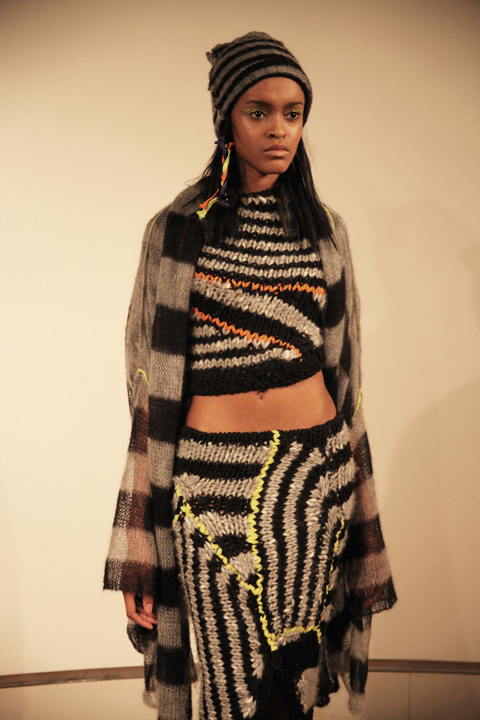

Cooperative Designs A/W 2011. Photography by Amelia Gregory.
There was lots of asymmetrical patterning, floppy hooded jumpers, boxy baggy tops and knit dresses tiered with baggy pouches. Lacy see through knitwear recalled the combat trouser shapes so beloved of 90s dancers. Hats by Noel Stewart were tall and floppy like a gnome’s or featured ear flaps and visors – questionable styles that were somehow rendered infinitely desirable. A wide knitted skirt was particularly cute, as were the little boots by Flip Flop, customised by Cooperative Designs with extravagant orange soles.
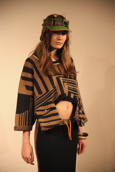
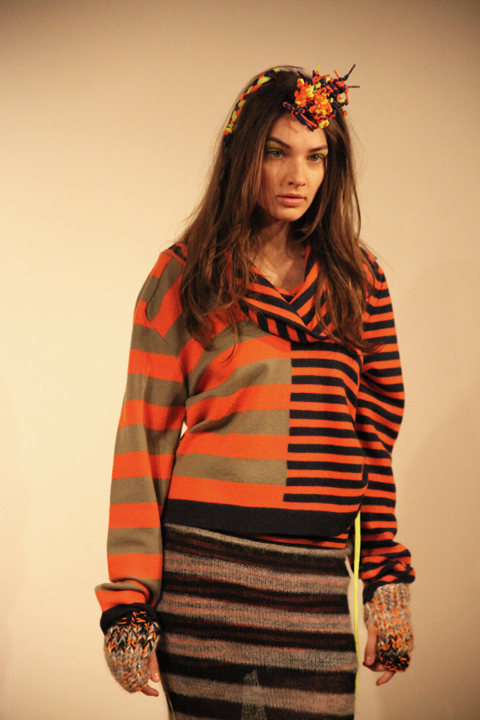

Cooperative Designs A/W 2011. Photography by Amelia Gregory.
Of any designers that I love I can actually imagine myself wearing Cooperative Designs. Their clever knitwear is by it’s very nature supremely flattering to the shape of a real women. Thankfully, they make a point of picking their models to reflect their customer.

Plywood jewellery by Corrie Williamson for Cooperative Designs 2011. Photography by Amelia Gregory.
On my way out I was given a brilliant press release: informative, well written and protected in a cardboard envelope that even I would struggle to lose. Best of all, it came with my very own piece of painted plywood jewellery by Corrie Williamson, as featured in the collection. More designers could learn from such professionalism on the press release frontier.
You can read Naomi Law’s excellent review here and you can see more of Natsuki Otani’s work in Amelia’s Compendium of Fashion Illustration.

Illustration by Oliver John Quinn
After hanging out with contributor Nick for lunch during Menswear Day, information pills I hot-footed it up to Vauxhall Fashion Scout to check out D.GNAK‘s latest offerings. It was the only menswear show I’d see at the Freemasons’ Hall and it was fairly quiet. I’d enjoyed his outing last season and was looking forward to seeing how his quirky Japanese aesthetic would translate for A/W.

Contributor Georgia with Paul Weller
I bumped into contributor Georgiahttp://www.ameliasmagazine.com/?s=Georgia%20Takacs there and we headed into the venue, sitting on opposite sides so not to get the same pictures. As we sat down, she started FREAKING OUT. ‘Is that Paul Weller? IS THAT PAUL WELLER?!’ she began yelling. It turns out it was, and he was nestled on the front row with his missus and two children. Georgia immediately went over to chat to him and I took a few pictures of them together, grinned nervously at him and thought to myself that his haircut has a lot to answer for.

Illustration by Joana Faria
On with the show. In a bold move from last season’s classic tailoring with contemporary twists, Kang D (the designer behind D.GNAK) had injected strong colours, interesting knits and enormous rucksacks.

All photography by Matt Bramford
The show opened with utilitarian tailoring that you might expect George Orwell’s Winston Smith to wear dark grey baggy trousers with an apron-like upper half was teamed with a luxurious floor-length cable knit cardigan. Next, a rich pea-coat with over-sized lapels and plaid-detail shoulders.
D.GNAK as a label is quickly establishing itself as an expert in materials and textures. Wools, corduroy, tweed and cotton were all on display, spiced up using colours like mustard and burgundy.

Illustration by Rob Wallace
There’s also an eye for the unfinished – that’ll be the Japanese ma influence then – with fraid hems that look a bit like a Savile Row tailor has had the day off – but teamed with polished blazers and expensive-looking coats, this works really well.
Every man is pretty much catered for here. There’s sartorial tailoring in the form of suits and Sherlock Holmes-esque coats for the sharpest dresser; wool blazers with contrasting buttons and vibrant trousers work well for casuals; corduroy onesies will have the more fashion-forward males racing to the shops.
Ace accessories were on offer – oversized patent leather rucksacks with suede details were worn on both shoulders, buckle straps revealed helpful features like an umbrella carrier. I like.
This was a much fresher collection than last time – the same level of craftsmanship was on offer, but it’s interesting to see D-GNAK explore different pieces, experiment with colours and toy with the traditions of sartorial menswear.
See more of Joana Faria’s illustrations in Amelia’s Compendium of Fashion Illustration!
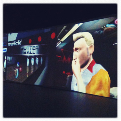
Cory Arcangel’s Beat the Champ. Photography by Amelia Gregory.
For us Londoners it can be tough sometimes. If you find yourself shoulder barging your way down Oxford Street just to try and get to work, check you can be forgiven for wondering why you bother. If you’re spending maybe two thirds of your pay cheque on rent in a tiny, salve leaky flat above a shop. If you’re looking for breakfast on a Sunday morning and skipping over pools of vomit on your trendy street. But then just when you’re about ready to pack up, ampoule belongings in a handkerchief on a stick and all, the city reels you back. One of the reasons I just can’t leave London is there are places like the Barbican. I’m sure that clued up Amelia’s Magazine reading folks are familiar with the Barbican, but just for any of you wondering what this respite from London’s horribleness could possibly be, here are the basics.

The Barbican Estate, built up in the 60s and 70s, is an imposing, Brutalist style complex comprising the Barbican Centre – an arts, drama and business centre with about a hundred different interesting things always seemingly happening at any given time; a YMCA; the Museum of London and a residential estate. Yes, that’s right, people actually live there. How cool is that? As for the events at the Centre itself, they’re amazingly varied and always concertedly cutting edge… Occasionally to the point of pretentious but well, I’d rather have pretension than no new art, hands down. With that in mind, I was interested and a little wary when I read the press release for Cory Arcangel’s Beat the Champ in The Curve – An area of the centre used to showcase new innovative artists.
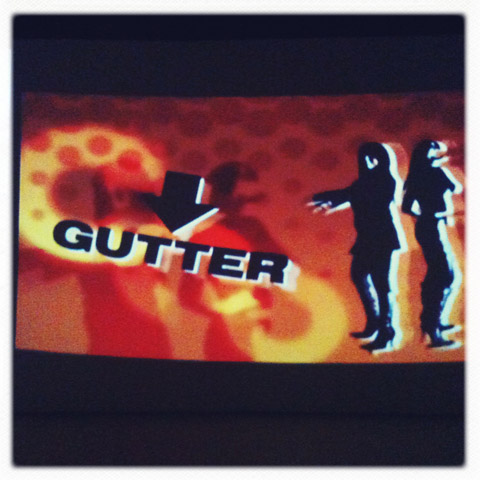
A digital artist from Brooklyn, New York (alarm bells), Arcangel has rigged up a whole bank of games consoles, ranging from a 1970s Atari to a current (as far as I’m aware) Playstation Three, each fitted with a bowling simulator game. The clever part is that he’s rejigged the games so that the bowler will always strike out. The controllers attached to each console have been physically rewired so that nobody can ever win.
It’s a surprisingly arresting installation. I’m tempted to say I was bowled over but that’s just cheap, you readers are better than that. For such a seemingly simple idea I had a number of reactions. I was immediately impressed, in the most literal sense, by the scale of the projections. Floor to ceiling along one side of the space. The larger than life bowling alley of the present day game meant I almost felt as though I was in place of the player. It’s also realy cool to see just how much video game technology has changed over such a short time.
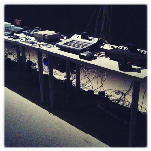
The first bowling game in the group is a pixilated figure, all white on a bue background and barely discernable as man-shaped, who slowly rolls a ball to a bleeping 8-bit soundtrack. Compared to the games we’re used to now it’s hard to imagine how this could ever hold anyone’s attention for more than five minutes. Then there are the hilarious 90s efforts, all thumbs up, shades and backwards baseball caps like that episode of the Simpsons when Itchy & Scratchy introduce Poochy the skateboarding dog.

The modern day game is as life like as can be, the player is a pudgy middle aged bowler and he bewails his constant gutter balls with his head in his hands. There is, undoubtedly, an interesting emotional response to seeing these virtual bowlers perpetually losing out. In interviews Arcangel has described himself as “glass half empty kind of person” and his past work has included a hack of a Super Mario Brothers game whereby everything was removed except the pixelated clouds rolling past. The rolling Mario clouds and the pins that never get knocked down both seem so naïve but suggest a sort of post modern existentialism which I really like. The title of the installation is interesting, perhaps driving home the idea of futility, the bowlers are never going to Beat the Champ. They’re never ever going to roll anything other than a gutter ball and I guess, at the risk of sounding melodramatic, the idea might be that that’s what we’re all afraid of doing with our lives.

Beat the Champ is in The Curve at the Barbican until May 22nd 2011 and admittance is FREE. Find out more in our listing here.
Categories ,Atari, ,barbican, ,Barbican Centre, ,Barbican Estate, ,Beat the Champ, ,brooklyn, ,Brutalism, ,Cory Arcangel, ,Digital Artist, ,Itchy & Scratchy, ,museum of london, ,new york, ,Oxford Street, ,Playstation Three, ,Poochy, ,Simpsons, ,Super Mario Brothers, ,The Curve, ,YMCA
Similar Posts:
- Art Listings
- Art Listings
- Morphopolis: an illustrated computer game inspired by the natural world
- Hartnell to Amies: Couture by Royal Appointment at the Fashion and Textile Museum
- Nuclear: Art and Radioactivity


