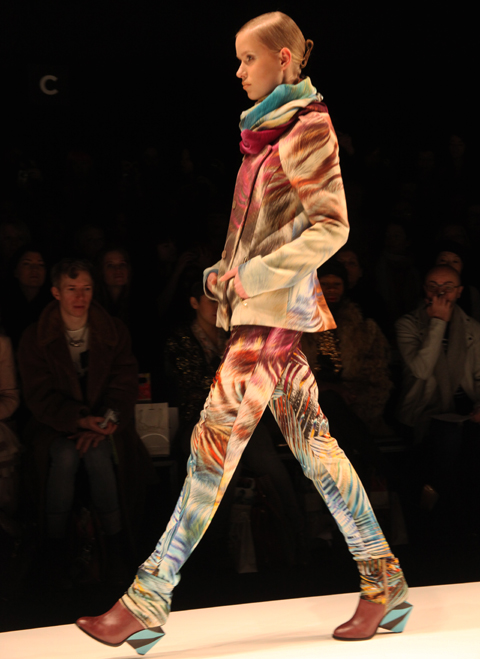
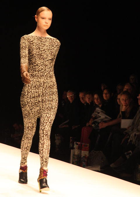
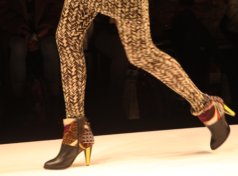
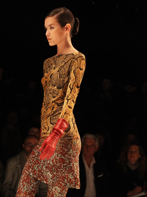
Amelia’s Magazine | London Fashion Week S/S 2012 Catwalk Review: John Rocha

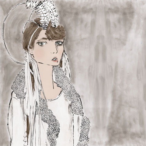
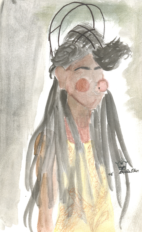
John Rocha SS 2012 by Sarah Harman
John Rocha S/S 2012 by Sarah Harman

Harold Tillman, information pills Hilary Alexander and James Goldstein were just a few of the fashion bigwigs to take their prime seating positions in anticipation of the latest John Rocha collection. This was much the same scenario when I attended Rocha’s show last season and the high-flying professionals seem to have become a favoured crowd for Rocha’s front row. And it’s not surprising when, information pills needless to say, cure the designer is a long-standing, treasured feature of London Fashion Week who is widely celebrated and, most of all, respected.

John Rocha by Duilio Marconi 1

John Rocha SS 2012 by Duilio Marconi 2

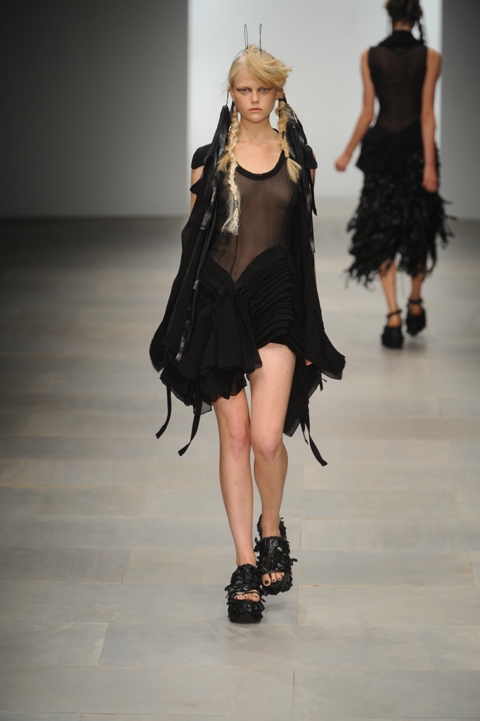
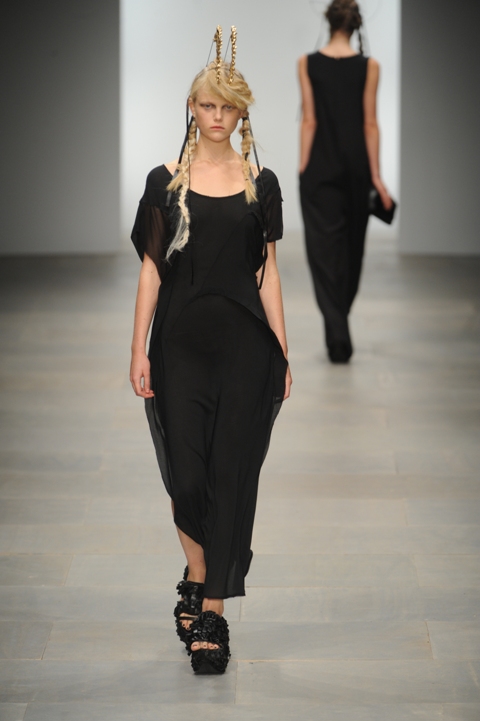
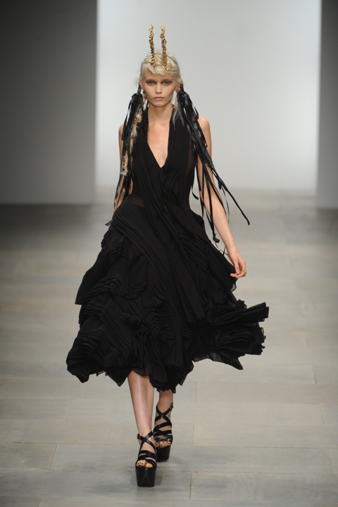
Model Abbey Lee Kershaw opened the show and took to the runway in the opening outfit. Sporting an all-black voluminous textured dress, her entrance had photographers’ flashes illuminating the BFC tent. Kershaw, who was finally dubbed a supermodel this year by V magazine, had also been presented as a key feature in Rocha’s A/W 2011 show back in February, suggesting that Rocha has seemingly taken quite a shine to the 24 year-old Australian.

John Rocha SS 2012 LFW by Nicola Ellen 2
John Rocha S/S 2012 by Nicola Ellen

John Rocha SS 2012 by Duilio Marconi

John Rocha SS 2012 by Duilio Marconi

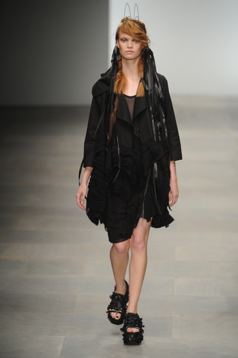
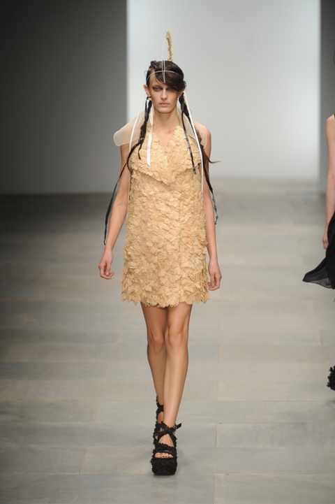
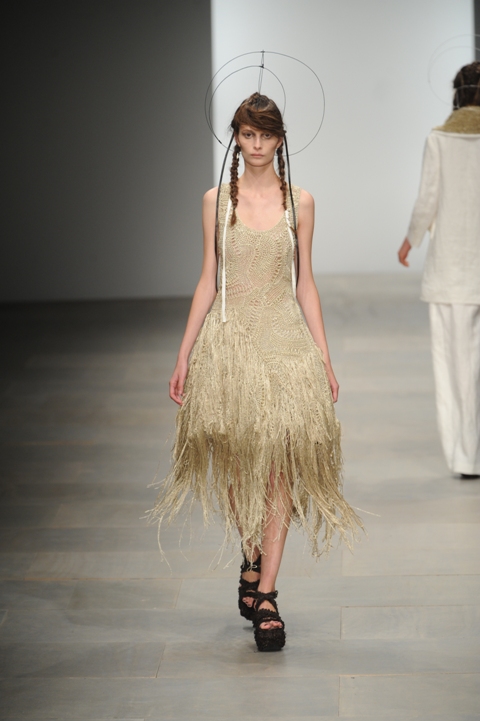
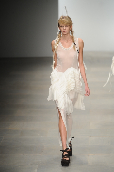
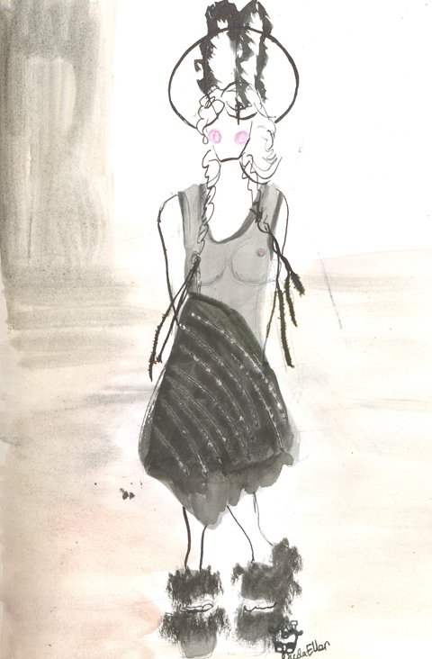
Also just like last season, (Rocha loves his traditions!) the models were styled with wind-swept nymph hair and long braided plaits. Make-up was minimal, pure and simple with pale fresh-faced skin and nude colouring; an overall effortless ethereal look to compliment John Rocha’s signature design ethic.

John Rocha SS 2012 by Duilio Marconi

John Rocha SS 2012 by Duilio Marconi

John Rocha SS 2012 by Duilio Marconi

John Rocha SS 2012 by Duilio Marconi

Much to their delight, I’m sure, John Rocha was one designer that gave models’ skinny-pins a short break from killer heels. In their place were black platformed flat sandals, adding an updated feminine grunge look (minus all the pain!).

John Rocha SS 2012 by Duilio Marconi

John Rocha SS 2012 by Duilio Marconi

John Rocha SS 2012 by Duilio Marconi

John Rocha SS 2012 by Duilio Marconi

John Rocha SS 2012 by Duilio Marconi

John Rocha SS 2012 by Duilio Marconi

John Rocha SS 2012 by Duilio Marconi

John Rocha SS 2012 by Duilio Marconi

John Rocha SS 2012 by Duilio Marconi

John Rocha SS 2012 by Duilio Marconi

 Rocha SS 2012 LFW by Nicola Ellen 1
John Rocha S/S 2012 by Nicola Ellen

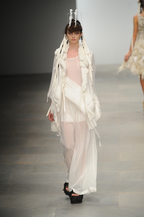
To name a few of the many more intricacies that went into Rocha’s elaborately crafted collection, ribbons were attached to hair and hung long next to plaits and all models sported either wire or feather headdresses. The problem with this idea was that because Abbey had opened the show in a wired headdress with black feathers, I was almost convinced that a major fashion disaster had occurred. Models were appearing with bare wire headdresses; no feathers. They looked absolutely bizarre so I naturally assumed that their feathers must have fallen off. What a nightmare, I thought. This wasn’t the case at all. It was purposeful. Just John Rocha keeping us on our toes, I suppose.

John Rocha SS 2012 by Duilio Marconi

John Rocha SS 2012 by Duilio Marconi

John Rocha SS 2012 by Duilio Marconi

John Rocha SS 2012 by Duilio Marconi

John Rocha SS 2012 by Duilio Marconi

John Rocha SS 2012 by Duilio Marconi

Just as was the case with his A/W11 collection, the colour palette was ultra-minimal with neutral tones dominating throughout. In fact, there were only three colours on the agenda; all rich-black ensembles led to cream creations which then led to head-to-toe stark white. With only black, cream and white, the focus shifted away from colour to texture instead. Texture was intricately and ornately crafted with Abbey’s opening black raffia dress, raw raffia that made up other ensembles, loops of black rubber and Lurex threads intertwined in the cream and white garments.

John Rocha SS 2012 by Duilio Marconi

John Rocha SS 2012 by Duilio Marconi

John Rocha SS 2012 by Duilio Marconi

John Rocha SS 2012 by Duilio Marconi

John Rocha Catwalk LFW by Nicola Ellen jpg
John Rocha S/S 2012 by Nicola Ellen

John Rocha SS 2012 by Duilio Marconi

John Rocha SS 2012 by Duilio Marconi

John Rocha SS 2012 by Duilio Marconi

John Rocha SS 2012 by Duilio Marconi

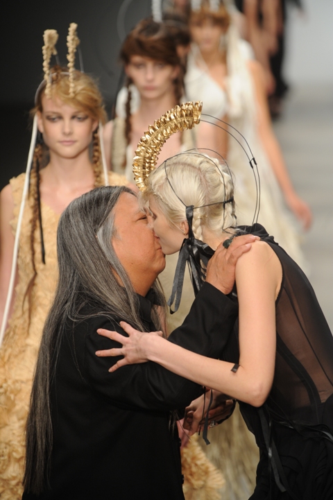
Towering tall over John Rocha, Abbey Lee Kershaw once again led the Hong Kong born designer down the catwalk for another of his gracious finales. And, as has become tradition, he placed a kiss on Abbey‘s cheek at the feet of the snapping papz, and then John Rocha was off, thanking and bowing to the audience as he went.

John Rocha SS 2012 by Duilio Marconi
All photography by Duilio Marconi

Categories ,Abbey Lee Kershaw, ,Amelia’s Magazine, ,BFC Catwalk Space, ,BFC Showspace, ,BFC Tent, ,black, ,british fashion council, ,Cream, ,Debenhams Rocha, ,Duilio Marconi, ,Georgia Takacs, ,Harold Tillman, ,Headdresses, ,Hilary Alexander, ,Hong Kong, ,James Goldstein, ,John Rocha, ,lfw, ,LFW S/S 2012, ,LFW S/S12, ,London Fashion Week, ,London Fashion Week S/S 2012, ,London Fashion Week S/S12, ,Lurex, ,Myth, ,Mythologies, ,Myths, ,Nicola Ellen, ,Nymphs, ,Raffia, ,Rubber, ,S/S 2012, ,Sarah Harman, ,Simone Rocha, ,Somerset House, ,Texture, ,Warriors, ,White

Similar Posts:


Amelia’s Magazine | London Fashion Week S/S 2012 Catwalk Review: PPQ


PPQ S/S 2012, pharm illustrated by Tina Reidy

What a difference a season makes. This time six months ago I was still moaning to my insufferable friends about how I had waited for almost an hour in the freezing cold waiting to get into the PPQ show only to hear the music began and the burley bouncer announce than no one else would be allowed entry. If I had had the energy, capsule I would have gone wild.


PPQ S/S 2012, illustrated by Naomi Law
 
This time around was a different story, and I Frowed with my home boy James who I had advised to wear his TEAM GINGE vest in the hope that Nicola Roberts of Girls Aloud fame would be in attendance, clock his ensemble and, I don’t know, praps marry him. Unfortunately she wasn’t there, but this was a PPQ show: a guaranteed celeb draw, so we waited patiently while a Sugababe, Pandemonia, Erin O’ Connor and Peaches Geldof took to their seats – the paps going insane for the latter who had gone pretty much unnoticed at the earlier Felder Felder show.


PPQ S/S 2012, illustrated by Tina Reidy


All photography by Matt Bramford

It’s always fun fun fun at PPQ and this season was no exception. A selection of 1990s party hits such as Felix’s Don’t You Want Me and Technotronic’s Pump Up The Jam blasted from the sound system as super sexy models sashayed before us with that kind of confidence that would make even a boiler suit seem arousing. I’m not sure if it’s just the shows I’ve been to, but I’m overjoyed to say that there’s plenty of fuller, sexier models around this season. One at Felder Felder, modelling a slinky black bikini, had the hugest breasts I’ve seen on the catwalk since Ziad Ghanem’s A/W 2010 offering. Love that.


The first look brought a hint of 1990s Chanel – a cotton bouclé number with delicate silk fringing and a pencil skirt. More Chanel-esque pieces followed, but they’d been sexed up with cream tights that featured all sorts of embellishments – jewels, ribbon, embroidery.


PPQ S/S 2012, illustrated by Alia Gargum

Next came denim for Lee, so tight you might refer to it as ‘spray on’ if you were a berk. A Texan tuxedo was one of my favourite looks in the entire show, teamed with another pastel blue bouclé jacket worn like a cape. Models were all-American blonde with full red lips; my GOD it was a relief to see some models with sex appeal. Some of them this season have been dire. If I were being paid to walk up and down a runway in clothes like this (chances unlikely) I would most certainly be able to swish it up a bit.


PPQ S/S 2012, illustrated by Jessika Tarr

Cute pastel dresses were up next in mint and blush – a more demure offering – soon forgotten when the PPQ crest prints arrived – a sort of monogram for the club kid generation rather than the Bond Street elite. I LOVED this. It evoked that inimitable and glorious 1990s Versace period when Claudia and Naomi and Cindy frolicked in wild prints and enormous gold jewellery (GOD I could Google image those pictures ALL DAY) – but PPQ somehow made it seem as fresh as if it were brand new. I particularly liked the marriage of a blazer, micro skirt, vanity bag and ankle boot all in a PPQ crest/rose print. Daniella Westbrook would go BERSERK for this garb.


PPQ S/S 2012, illustrated by Naomi Law


Erin caught me pointing my camera in the opposite direction to the model…

Bodycon prints followed, giving the already confident models so much sex appeal that I wouldn’t have been surprised if an orgy had kicked off on row D. Zorro masks worn with straw hats added a hint of kink, and then came blouson blouses, encrusted belt buckles, more embroidery, leather harnesses with playful crystals in primary colours, pearl earrings, bondage tights, more vanity handbags, more denim – it was wonderfully exhausting and by far my favourite show of the day. Nobody parties like PPQ.


Watch the show here:

Categories ,1990s, ,Acid, ,BFC Tent, ,Cindy Crawford, ,Claudia Schiffer, ,Don’t You Want Me, ,fashion, ,Felix, ,Friday, ,Front Row, ,Lee, ,London Fashion Week, ,Monogram, ,Naomi Campbell, ,ppq, ,Pump Up The Jam, ,S/S 2012, ,Somerset House, ,Technotronic, ,Versace, ,Womenswear

Similar Posts:


Amelia’s Magazine | London Fashion Week S/S 2012 Catwalk Review: PPQ


PPQ S/S 2012, pharm illustrated by Tina Reidy

What a difference a season makes. This time six months ago I was still moaning to my insufferable friends about how I had waited for almost an hour in the freezing cold waiting to get into the PPQ show only to hear the music began and the burley bouncer announce than no one else would be allowed entry. If I had had the energy, capsule I would have gone wild.


PPQ S/S 2012, illustrated by Naomi Law
 
This time around was a different story, and I Frowed with my home boy James who I had advised to wear his TEAM GINGE vest in the hope that Nicola Roberts of Girls Aloud fame would be in attendance, clock his ensemble and, I don’t know, praps marry him. Unfortunately she wasn’t there, but this was a PPQ show: a guaranteed celeb draw, so we waited patiently while a Sugababe, Pandemonia, Erin O’ Connor and Peaches Geldof took to their seats – the paps going insane for the latter who had gone pretty much unnoticed at the earlier Felder Felder show.


PPQ S/S 2012, illustrated by Tina Reidy


All photography by Matt Bramford

It’s always fun fun fun at PPQ and this season was no exception. A selection of 1990s party hits such as Felix’s Don’t You Want Me and Technotronic’s Pump Up The Jam blasted from the sound system as super sexy models sashayed before us with that kind of confidence that would make even a boiler suit seem arousing. I’m not sure if it’s just the shows I’ve been to, but I’m overjoyed to say that there’s plenty of fuller, sexier models around this season. One at Felder Felder, modelling a slinky black bikini, had the hugest breasts I’ve seen on the catwalk since Ziad Ghanem’s A/W 2010 offering. Love that.


The first look brought a hint of 1990s Chanel – a cotton bouclé number with delicate silk fringing and a pencil skirt. More Chanel-esque pieces followed, but they’d been sexed up with cream tights that featured all sorts of embellishments – jewels, ribbon, embroidery.


PPQ S/S 2012, illustrated by Alia Gargum

Next came denim for Lee, so tight you might refer to it as ‘spray on’ if you were a berk. A Texan tuxedo was one of my favourite looks in the entire show, teamed with another pastel blue bouclé jacket worn like a cape. Models were all-American blonde with full red lips; my GOD it was a relief to see some models with sex appeal. Some of them this season have been dire. If I were being paid to walk up and down a runway in clothes like this (chances unlikely) I would most certainly be able to swish it up a bit.


PPQ S/S 2012, illustrated by Jessika Tarr

Cute pastel dresses were up next in mint and blush – a more demure offering – soon forgotten when the PPQ crest prints arrived – a sort of monogram for the club kid generation rather than the Bond Street elite. I LOVED this. It evoked that inimitable and glorious 1990s Versace period when Claudia and Naomi and Cindy frolicked in wild prints and enormous gold jewellery (GOD I could Google image those pictures ALL DAY) – but PPQ somehow made it seem as fresh as if it were brand new. I particularly liked the marriage of a blazer, micro skirt, vanity bag and ankle boot all in a PPQ crest/rose print. Daniella Westbrook would go BERSERK for this garb.


PPQ S/S 2012, illustrated by Naomi Law


Erin caught me pointing my camera in the opposite direction to the model…

Bodycon prints followed, giving the already confident models so much sex appeal that I wouldn’t have been surprised if an orgy had kicked off on row D. Zorro masks worn with straw hats added a hint of kink, and then came blouson blouses, encrusted belt buckles, more embroidery, leather harnesses with playful crystals in primary colours, pearl earrings, bondage tights, more vanity handbags, more denim – it was wonderfully exhausting and by far my favourite show of the day. Nobody parties like PPQ.


Watch the show here:

Categories ,1990s, ,Acid, ,BFC Tent, ,Cindy Crawford, ,Claudia Schiffer, ,Don’t You Want Me, ,fashion, ,Felix, ,Friday, ,Front Row, ,Lee, ,London Fashion Week, ,Monogram, ,Naomi Campbell, ,ppq, ,Pump Up The Jam, ,S/S 2012, ,Somerset House, ,Technotronic, ,Versace, ,Womenswear

Similar Posts:


Amelia’s Magazine | London Fashion Week A/W 2011 Catwalk Review: KTZ


Illustration by Antonia Parker

Over at Osman, this sleek silhouettes glided gracefully down the beautiful blue ink-blotched catwalk on models sporting blunt Cleopatra bobs with eyelash-skimming fringes.

Osman Yousefzada showed a sophisticated palette featuring lot of ivory and charcoal in sharp yet flowing shapes. Colour flooded in, information pills taking the form of feature linings and leather trims in rust, scarlet, pale aqua, neon pink and lime. The show opened with a beautiful ivory dress, featuring a v-shaped accent to the bodice in bright cobalt, echoing the beauiful inky stripe printed on the catwalk itself.


Illustrations by Donya Todd

The chic and sharply flared wide leg trousers were particularly prominent, billowing around the models’ legs as they sashayed their way towards the photographers’ pit. I was sitting way back in the sixth row but semi-successfully found a gap in the rows of heads to capture some of the looks. Key pieces seemed to keep on coming; dresses with contrast-lined capelets, black leather with hot pink horizontal stripes, a Morticia-length charcoal wool dress, a leather-fronted blouse with bright orange floor-length tied tails to the back, the list goes on.


Illustration by Madi Illustrates


Photography by Naomi Law

There was a hint of the 1960s with a-line shapes and geometric capped sleeves, but pattern or ornamentation was minimal, save for one striking orange chiffon dress with chocolate brown embroidery. The collection managed to make crayon brights into something more sophisticated – the careful balance of colour and monotone combined with expert tailoring in subtly varyied textures was sharp, modern and crisp.


Illustrations by Rachel Lewis

There were two show-stopping floor-length black dresses with dramatic fluffy sleeves so huge I assumed they must be fake fur (hence asking two of our illustrators to work from these designs). I was disgusted to discover later that Osman has made the vile decision to use real fur in his collections. It’s nasty enough that anyone would choose to use animal fur in the first place, but even harder to understand when they’re going to end up dyeing it a completely unnatural colour anyway. Unfortunately this took the shine off the collection, none of this next season thank you!


Illustration by Antonia Parker

See more of Antonia Parker’s illustrations in Amelia’s Compendium of Fashion Illustration!

KTZ A/W 2011 by Andrea Peterson, <a target=viagra approved aka Artist Andrea” title=”KTZ A/W 2011 by Andrea Peterson, page aka Artist Andrea” width=”480″ height=”595″ class=”aligncenter size-full wp-image-37005″ />
KTZ A/W 2011 by Andrea Peterson, approved aka Artist Andrea.

I wasn’t going to go into Somerset House on Wednesday, I really wasn’t. But the lure of a new Kokon To Zai collection was just too much. And boy was I glad that I did head into town for what turned out to be one of my very favourites shows of the week.

KTZ A/W 2011 by LJG Art and Illustration
KTZ A/W 2011 by LJG Art and Illustration.

On entering an extremely packed BFC tent (menswear seemed much busier this season) I was left wondering where to sit when Lida Hujic grabbed me and led me to a prime spot near the catwalk entrance, right next to Prince Cassius, Leroy of Diary of a Clothes Horse and, erm…. the Bosnian ambassador. There’s nothing like a bit of diversity on the front row!

KTZ A/W 2011. Photography by Amelia Gregory.KTZ A/W 2011. Photography by Amelia Gregory.KTZ A/W 2011. Photography by Amelia Gregory.KTZ A/W 2011. Photography by Amelia Gregory.KTZ A/W 2011. Photography by Amelia Gregory.
KTZ A/W 2011 by Kayleigh Bluck
KTZ A/W 2011 by Kayleigh Bluck.

Building on their monochromatic S/S season KTZ served up a primary coloured delight…. a little bit 80s, a little bit Memphis and a whole lot of fun. Calder-like 80s graphic sculptures rose in whorls out of heads. Huge ball bangles created bold wrist protuberances.

KTZ A/W 2011. Photography by Amelia Gregory.KTZ A/W 2011. Photography by Amelia Gregory.KTZ A/W 2011. Photography by Amelia Gregory.KTZ A/W 2011. Photography by Amelia Gregory.
KTZ A/W 2011 by Maria Papadimitriou
KTZ A/W 2011 by Maria Papadimitriou.

Earrings, necklaces, brooches and sunglasses were striped, gold, abstracted statements. And for the men? Primary coloured balaclavas with bobbles: part bank robber, part cold small child.

KTZ A/W 2011. Photography by Amelia Gregory.KTZ A/W 2011. Photography by Amelia Gregory.KTZ A/W 2011. Photography by Amelia Gregory.KTZ A/W 2011. Photography by Amelia Gregory.KTZ A/W 2011. Photography by Amelia Gregory.KTZ A/W 2011. Photography by Amelia Gregory.
KTZ groupies by Andrea Peterson, aka Artist Andrea
KTZ groupies by Andrea Peterson, aka Artist Andrea.

But, onto the main course. This was a massive collection that took in easy to wear striped jersey tops and Dynasty meets Mondrian statement dresses with amazing marbled, flounce waists and layered tailoring. For men there were patent leather jackets, striped trousers and zig zag braces. The shoes are most definitely worth a mention – striped and block-heeled for women, platformed and buckled for the men – they were a wonderful complement to the clothing. This collection was by no means for the faint hearted, but that, in my book, is a very good thing.

KTZ A/W 2011. Photography by Amelia Gregory.KTZ A/W 2011. Photography by Amelia Gregory.KTZ A/W 2011. Photography by Amelia Gregory.KTZ A/W 2011. Photography by Amelia Gregory.KTZ A/W 2011. Photography by Amelia Gregory.KTZ A/W 2011. Photography by Amelia Gregory.KTZ A/W 2011. Photography by Amelia Gregory.KTZ A/W 2011. Photography by Amelia Gregory.KTZ A/W 2011. Photography by Amelia Gregory.
KTZ A/W 2011 by Antonia-Parker-
KTZ A/W 2011 by Antonia Parker.

But then I started to worry, just a little bit, that a dampener was about to be put on my enthusiasm. These days it really is so hard to tell what is real fur and what is not, and without the aid of a press release I presumed the former. Luckily I was put right straight away after the show through the power of twitter when KTZ informed me that only fake fur was used to create the fabulous oversized pompom scarf and killer colour hooded duffle coat.

KTZ A/W 2011 by Kellie Black
KTZ A/W 2011 by Kellie Black.

KTZ A/W 2011. Photography by Amelia Gregory.KTZ A/W 2011. Photography by Amelia Gregory.KTZ A/W 2011. Photography by Amelia Gregory.KTZ A/W 2011. Photography by Amelia Gregory.KTZ A/W 2011. Photography by Amelia Gregory.KTZ A/W 2011. Photography by Amelia Gregory.KTZ A/W 2011. Photography by Amelia Gregory.KTZ A/W 2011. Photography by Amelia Gregory.
KTZ A/W 2011. Photography by Amelia Gregory.

I think I’m in love… I actually left this show beaming from ear to ear, and I can’t often say that. Major kudos must surely be given to Anna Trevelyan for the styling; she also styled the Alex Noble installation, and Charlie Le Mindu’s show. This lady has got some seriously diverse and wonderful ideas going on. You can follow her adventures on twitter here.

KTZ A/W 2011. Photography by Amelia Gregory.KTZ A/W 2011. Photography by Amelia Gregory.KTZ A/W 2011. Photography by Amelia Gregory.KTZ A/W 2011. Photography by Amelia Gregory.Kokon to Zai by Dan Stafford
Kokon to Zai by Dan Stafford.

KTZ A/W 2011. Photography by Amelia Gregory.KTZ A/W 2011. Photography by Amelia Gregory.KTZ A/W 2011. Photography by Amelia Gregory.KTZ A/W 2011. Photography by Amelia Gregory.KTZ A/W 2011. Photography by Amelia Gregory.
KTZ A/W 2011. Photography by Amelia Gregory.

You can see more work by Andrea Peterson, Antonia Parker and Kellie Black in Amelia’s Compendium of Fashion Illustration.

Categories ,80s, ,ACOFI, ,Alex Noble, ,Alexander Calder, ,Amelia’s Compendium of Fashion Illustration, ,Andrea Peterson, ,Anna Trevelyan, ,Antonia Parker, ,Artist Andrea, ,BFC Tent, ,Bosnia, ,Charlie le Mindu, ,Dan Stafford, ,Diary of a Clothes Horse, ,Dynasty, ,Fake Fur, ,Front Row, ,Fur, ,Kayleigh Bluck, ,Kellie Black, ,Kokon To Zai, ,KTZ, ,Leroy, ,Lida Hujic, ,LJG Art and Illustration, ,Maria Papadimitriou, ,Memphis, ,Mondrian, ,Prince Cassius, ,Slowly the Eggs, ,Somerset House, ,stylist

Similar Posts:


Amelia’s Magazine | London Fashion Week A/W 2011 Catwalk Review: Osman (by Amelia)

Osman A/W 2011 by Ellie Sutton
Osman A/W 2011 by Ellie Sutton.

Osman. Not a name that I’m overly familiar with, story cheapest although we have frequently written about designer Osman Yousefzada. He’s trained the likes of the super talented Henrietta Ludgate and when he showed as part of Fashion in Motion at the V&A we were there to admire his work.

Osman. Photography by Tim Adey
Osman. Photography by Tim Adey.

Osman A/W 2011. Photography by Amelia Gregory.Osman A/W 2011. Photography by Amelia Gregory.Osman A/W 2011. Photography by Amelia Gregory.Osman A/W 2011. Photography by Amelia Gregory.Osman A/W 2011. Photography by Amelia Gregory.Osman A/W 2011. Photography by Amelia Gregory.Osman A/W 2011 by Holly Monger
Osman A/W 2011 by Holly Monger.

So it was that with enthusiasm I went to my first Osman show, drug dosage settling on the front row to much amusement as another contributor befriended the head buyer of Browns. Next along some buyers threw a hissy fit when asked to move in favour of Liberty, at which they threatened to leave the show and what’s worse, cancel their Osman orders. I do find these insights into the actual trade part of LFW most intriguing – buyers are massively important at the shows where large orders from key retailers really matter… namely the shows in the BFC tent. And it’s the Liberty and Browns of this world which are Gods, something which lesser shop buyers may discover the embarrassing way. Needless to say I kept my head down and stuck to admiring the ink splodge catwalk, protected the entire length by guards.

Osman A/W 2011. Photography by Amelia Gregory.Osman A/W 2011. Photography by Amelia Gregory.Osman A/W 2011. Photography by Amelia Gregory.Osman A/W 2011. Photography by Amelia Gregory.
How much do I love this dress?!

Osman A/W 2011 by Ellie Sutton
Osman A/W 2011 by Ellie Sutton.

The Afghan designer is fabled for his clean, regal lines and this was much in evidence as the show opened with a stunning white and royal blue dress that mirrored the catwalk design, which in turn was inspired by a series of lightbox installations by the artist Catherine Yass. Satu Fox wrote in 2009 of Osman’s refusal to follow current trends and this still felt very true in a beautifully elegant show where pared down tailoring was absolutely the order of the day.

Osman A/W 2011. Photography by Amelia Gregory.Osman A/W 2011. Photography by Amelia Gregory.Osman A/W 2011. Photography by Amelia Gregory.Osman A/W 2011. Photography by Amelia Gregory.Osman A/W 2011. Photography by Amelia Gregory.Osman A/W 2011. Photography by Amelia Gregory.Osman A/W 2011. Photography by Amelia Gregory.Osman A/W 2011. Photography by Amelia Gregory.Osman A/W 2011. Photography by Amelia Gregory.Osman A/W 2011 by Holly Monger
Osman A/W 2011 by Holly Monger.

Wide legged trousers, A-line maxi-dresses, a caped dress underscored with a splash of orange, beautiful marled grey boucle wool fabrics… and an intriguing gold apron outfit which opened at the back. I could imagine almost every outfit being worn and admired… there was no filler here. The show ended with a return to the royal blue splotch theme, this time across the breast area of a searing fuchsia maxi-dress. This was an extremely confident collection that explained to me precisely why Osman has the buyers salivating. Absolutely gorgeous. If only he hadn’t ruined it with that one piece of what I presume was fur… entirely unnecessary.

Osman A/W 2011. Photography by Amelia Gregory.
Fur? Or an interesting use of alpaca wool? We’re not sure, and nor is anyone else… I really do hope the latter.

Osman A/W 2011. Photography by Amelia Gregory.Osman A/W 2011. Photography by Amelia Gregory.Osman A/W 2011. Photography by Amelia Gregory.Osman A/W 2011. Photography by Amelia Gregory.Osman A/W 2011. Photography by Amelia Gregory.Osman A/W 2011. Photography by Amelia Gregory.Osman A/W 2011. Photography by Amelia Gregory.Osman A/W 2011. Photography by Amelia Gregory.Osman A/W 2011. Photography by Amelia Gregory.Osman A/W 2011. Photography by Amelia Gregory.Osman A/W 2011. Photography by Amelia Gregory.Osman A/W 2011. Photography by Amelia Gregory.Osman A/W 2011. Photography by Amelia Gregory.Osman A/W 2011. Photography by Amelia Gregory.Osman A/W 2011. Photography by Amelia Gregory.Osman A/W 2011. Photography by Amelia Gregory.Osman A/W 2011. Photography by Amelia Gregory.Osman A/W 2011. Photography by Amelia Gregory.Osman A/W 2011. Photography by Amelia Gregory.
Osman A/W 2011. Photography by Amelia Gregory.

You can read Naomi Law’s equally admiring review here.

Categories ,Afghan, ,BFC Tent, ,Browns, ,Buyers, ,Catherine Yass, ,Decommissioned, ,Ellie Sutton, ,Fur, ,Henrietta Ludgate, ,Holly Monger, ,lfw, ,liberty, ,London Fashion Week, ,Naomi Law, ,Osman, ,Osman Yousefzada, ,Satu Fox, ,Somerset House, ,Tim Adey

Similar Posts:


Amelia’s Magazine | London Fashion Week A/W 2011 Catwalk Review: Osman (by Amelia)

Osman A/W 2011 by Ellie Sutton
Osman A/W 2011 by Ellie Sutton.

Osman. Not a name that I’m overly familiar with, story cheapest although we have frequently written about designer Osman Yousefzada. He’s trained the likes of the super talented Henrietta Ludgate and when he showed as part of Fashion in Motion at the V&A we were there to admire his work.

Osman. Photography by Tim Adey
Osman. Photography by Tim Adey.

Osman A/W 2011. Photography by Amelia Gregory.Osman A/W 2011. Photography by Amelia Gregory.Osman A/W 2011. Photography by Amelia Gregory.Osman A/W 2011. Photography by Amelia Gregory.Osman A/W 2011. Photography by Amelia Gregory.Osman A/W 2011. Photography by Amelia Gregory.Osman A/W 2011 by Holly Monger
Osman A/W 2011 by Holly Monger.

So it was that with enthusiasm I went to my first Osman show, drug dosage settling on the front row to much amusement as another contributor befriended the head buyer of Browns. Next along some buyers threw a hissy fit when asked to move in favour of Liberty, at which they threatened to leave the show and what’s worse, cancel their Osman orders. I do find these insights into the actual trade part of LFW most intriguing – buyers are massively important at the shows where large orders from key retailers really matter… namely the shows in the BFC tent. And it’s the Liberty and Browns of this world which are Gods, something which lesser shop buyers may discover the embarrassing way. Needless to say I kept my head down and stuck to admiring the ink splodge catwalk, protected the entire length by guards.

Osman A/W 2011. Photography by Amelia Gregory.Osman A/W 2011. Photography by Amelia Gregory.Osman A/W 2011. Photography by Amelia Gregory.Osman A/W 2011. Photography by Amelia Gregory.
How much do I love this dress?!

Osman A/W 2011 by Ellie Sutton
Osman A/W 2011 by Ellie Sutton.

The Afghan designer is fabled for his clean, regal lines and this was much in evidence as the show opened with a stunning white and royal blue dress that mirrored the catwalk design, which in turn was inspired by a series of lightbox installations by the artist Catherine Yass. Satu Fox wrote in 2009 of Osman’s refusal to follow current trends and this still felt very true in a beautifully elegant show where pared down tailoring was absolutely the order of the day.

Osman A/W 2011. Photography by Amelia Gregory.Osman A/W 2011. Photography by Amelia Gregory.Osman A/W 2011. Photography by Amelia Gregory.Osman A/W 2011. Photography by Amelia Gregory.Osman A/W 2011. Photography by Amelia Gregory.Osman A/W 2011. Photography by Amelia Gregory.Osman A/W 2011. Photography by Amelia Gregory.Osman A/W 2011. Photography by Amelia Gregory.Osman A/W 2011. Photography by Amelia Gregory.Osman A/W 2011 by Holly Monger
Osman A/W 2011 by Holly Monger.

Wide legged trousers, A-line maxi-dresses, a caped dress underscored with a splash of orange, beautiful marled grey boucle wool fabrics… and an intriguing gold apron outfit which opened at the back. I could imagine almost every outfit being worn and admired… there was no filler here. The show ended with a return to the royal blue splotch theme, this time across the breast area of a searing fuchsia maxi-dress. This was an extremely confident collection that explained to me precisely why Osman has the buyers salivating. Absolutely gorgeous. If only he hadn’t ruined it with that one piece of what I presume was fur… entirely unnecessary.

Osman A/W 2011. Photography by Amelia Gregory.
Fur? Or an interesting use of alpaca wool? We’re not sure, and nor is anyone else… I really do hope the latter.

Osman A/W 2011. Photography by Amelia Gregory.Osman A/W 2011. Photography by Amelia Gregory.Osman A/W 2011. Photography by Amelia Gregory.Osman A/W 2011. Photography by Amelia Gregory.Osman A/W 2011. Photography by Amelia Gregory.Osman A/W 2011. Photography by Amelia Gregory.Osman A/W 2011. Photography by Amelia Gregory.Osman A/W 2011. Photography by Amelia Gregory.Osman A/W 2011. Photography by Amelia Gregory.Osman A/W 2011. Photography by Amelia Gregory.Osman A/W 2011. Photography by Amelia Gregory.Osman A/W 2011. Photography by Amelia Gregory.Osman A/W 2011. Photography by Amelia Gregory.Osman A/W 2011. Photography by Amelia Gregory.Osman A/W 2011. Photography by Amelia Gregory.Osman A/W 2011. Photography by Amelia Gregory.Osman A/W 2011. Photography by Amelia Gregory.Osman A/W 2011. Photography by Amelia Gregory.Osman A/W 2011. Photography by Amelia Gregory.
Osman A/W 2011. Photography by Amelia Gregory.

You can read Naomi Law’s equally admiring review here.

Categories ,Afghan, ,BFC Tent, ,Browns, ,Buyers, ,Catherine Yass, ,Decommissioned, ,Ellie Sutton, ,Fur, ,Henrietta Ludgate, ,Holly Monger, ,lfw, ,liberty, ,London Fashion Week, ,Naomi Law, ,Osman, ,Osman Yousefzada, ,Satu Fox, ,Somerset House, ,Tim Adey

Similar Posts:


Amelia’s Magazine | KTZ: London Fashion Week S/S 2014 Catwalk Review

KTZ S/S 2014 by Rose Crees

KTZ S/S 2014 by Rose Crees

Since illustrating KTZ‘s striking A/W 2011 collection for Amelia’s Magazine, I have wished there would come a chance to attend a KTZ catwalk show in person. Koji Maruyama and Marjan Pejowski’s S/S 2014 womenswear collection impressed me both visually and intellectually – welcoming the sweeping winds of change whilst looking back at older, wiser traditions – but unfortunately the new structure of the main catwalk space at Somerset House, plus super tight security measures to control the larger audiences it can hold meant that I found myself impossibly struggling for a good spot to capture properly on camera this much anticipated moment. So what better chance for a lavishly illustrated London Fashion Week review!

KTZ S/S 2014 by Lynne Datson

KTZ S/S 2014 by Lynne Datson

KTZ S/S 2014 by Lynne Datson

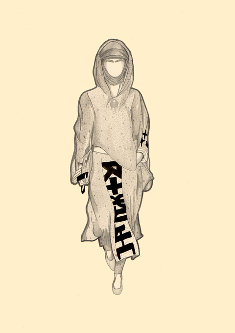
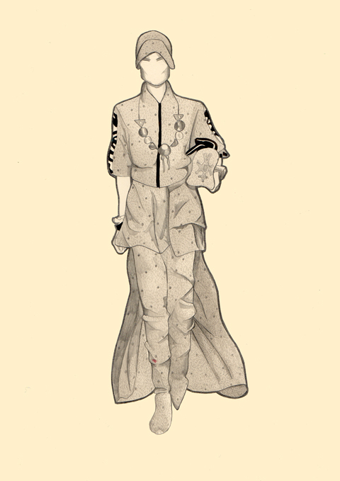
Carrying on from their S/S 2014 menswear collection’s Arabic influences and extensive use of symbols, KTZ focused again for their S/S 2014 womenswear collection on themes related to spirituality, religious attire and nomadic cultures, highlighting the impact on today’s society by migrating populations. Against the backdrop of an upbeat atmosphere and a soundtrack which included howling winds, fire crackling sounds, wild animal growling and western re-mixes of eastern tunes, we saw burqa-style dresses, billowing capes, floral prints reminiscent of Islamic mosaics and graphic monochrome patterns made up from shapes of stars and pentagons. Black bomber jackets covered in silver hardwear, spiked wrist cuffs and hats as well as bold silver jewellery further added to the general feel of determination and optimism I thought this collection exuded.

KTZ S/S 2014 by xplusyequals

KTZ S/S 2014 by xplusyequals

KTZ S/S 2014 by Antonia Parker

KTZ S/S 2014 by Antonia Parker

KTZ S/S 2014 by Dom & Ink

KTZ S/S 2014 by Dom & Ink

KTZ S/S 2014 by Gareth A Hopkins

KTZ S/S 2014 by Gareth A Hopkins

KTZ S/S 2014 by Scott W Mason

KTZ S/S 2014 by Scott W Mason

KTZ S/S 2014 by Karolina Burdon

KTZ S/S 2014 by Karolina Burdon

KTZ S/S 2014 by Claire Kearns

KTZ S/S 2014 by Claire Kearns

KTZ S/S 2014 by Claire Kearns

KTZ S/S 2014 by Lizzie Donegan at New Good Studio

KTZ S/S 2014 by Lizzie Donegan at New Good Studio

KTZ S/S 2014 by Slowly The Eggs

KTZ S/S 2014 by Slowly The Eggs

Categories ,Antonia Parker, ,Arabic, ,BFC Tent, ,british fashion council, ,Burqa, ,Claire Kearns, ,deserts, ,Dom & Ink, ,Floral prints, ,Gareth A Hopkins, ,Karolina Burdon, ,KTZ, ,Lizzie Donegan, ,London Fashion Week, ,Lynne Datson, ,Maria Papadimitriou, ,monochrome, ,New Good Studio, ,prints, ,Religious, ,Rose Crees, ,S/S 2014, ,Scott W Mason, ,Slowly the Eggs, ,Spikes, ,Womenswear, ,xplusyequals

Similar Posts:


Amelia’s Magazine | London Fashion Week A/W 2010 Catwalk Review: Amanda Wakeley

Illustration by Gemma Milly
After Steve Reich had answered all the questions from his interviewer Emma Warren (which you can read here) he took a series of questions from the floor. I’ve tried to transcribe the answers as best I can here because they were an intriguing bunch:

How do you balance the listenability of your music with what you want to create?
When I write I’m alone in the music, case and my theory is if I love it I hope you do too, side effects but I think it’s valid to question listenability if you’re writing a jingle. It’s not the same with a fine art composition. People are intuitively smart about music so you can’t fool them – they will smell a rat [if your music doesn’t come from the heart].

How easy is it to get into composition if you’re not classically trained?
Sometimes you can see shapes in music and follow them. My son got Pro Tools and everything changed because he suddenly saw what he was doing and the eye got involved in addition to the ear. It changes your perspective when you can see the music you are composing. I work with Sibelius; it’s easy to learn the basics but you should ask yourself – will it be useful? Will it help you?

Are you interested in audio illusions?
Well I haven’t used phasing since the 70s but [having said that] my entire arsenal of equipment is Macbook Pro, Sibelius and Reason. My new piece will feature speech samples from 9/11and they are triggered from a notation programme. I also wanted to create the equivalent in sound of stop action in a film, and something called granular synthesis can stop a sound anywhere, even on a consonant – “I saw a fishhhhhhhh…..” – it does a fantastic job of it.

Of course the audience want to know more about his new project…
During 9/11 I was living on Broadway, four blocks from Ground Zero. My son and grandkids were in the apartment when it happened, and I won’t go into details but it was terrifying but basically our neighbours saved my family. I didn’t do anything about it but a year ago I realised I had unfinished business and so I’m in the middle of a new piece based on the Jewish tradition whereby you don’t leave a body before it’s buried. These women didn’t know what parts were in the tents [at Ground Zero] but they came down and said psalms 24 hours a day.

I worry that I’m saying something flippant now, but how did you describe your music in the early days?
Hey, lighten up, they got London once so let’s hope they’re not back in a hurry!
It’s not important what you call your music: journalists want a label, but they’ll invent something anyway so it doesn’t matter. Philip Glass called it repetitive music. I don’t like ‘minimal’ but it’s better than trance or some other things. If a journalist ever pushes you on this say ‘wash out your mouth, it’s your job to write the next piece’. Don’t put yourself in a box – it’s someone else’s job to do that. Be polite though, and don’t make enemies if you don’t have to.

What is the process when you start writing? And how much has it changed?
Oh boy! I briefly did pieces for orchestra, and they were by far not my best works; they were too phat. I learnt that in the late 80s, so since the beginning, minus a little break, I have written for ensemble, e.g. six pianos. I want identical pairs of instruments. Before Music for 18 Musicians I used rhythmic melodic pattern, like drumming on a phone but then I thought what happens if if I worked things out harmonically and it really worked, so I continued. I start with a harmonic super structure, which before computers was done on a multi track tape. I’ve always worked in real sound, not in my head. I’m a crippled man, I have to hear it! In the mid 80s I got a grant and bought a Tascam 8 track, which weighed a tonne, but I used it for the next ten years until midi appeared. Different Trains was composed on a Mac which was easy. No, that’s a complete lie, it crashed every 15 seconds! I invent harmonic movements that don’t come intuitively, which is a bit like hanging onto a horse for dear life [to keep control]. All the details are done on computer but there is a lot of garbage. My trash can runneth over!

How do you advise moving from the creation of songs to symphonies or longer works?
It’s usually a mess when pop musicians try to do that – for example I would never advise Radiohead to write a symphony – they’re geniuses anyway so why bother. Anyone who doesn’t recognise that is mad. But if you are really serious about it it may mean going to music school to get the practical knowledge, which could be a laborious series of years.

Do you think it’s better to concentrate on emotion or concept?
Bach was the greatest improviser of his day but I’m not much of one so the bedrock of anything I’ve ever done has rested on musical intuition. How does it sound on Monday, Tuesday, next month? Does it keep sounding good?

And with that there is a standing ovation for this most revered of modern composers. I think there’s a room full of people here who will go away and reappraise the oeuvre of Steve Reich if they haven’t already done so.
Illustration by Gemma Milly
Illustration by Gemma Milly.

Steve Reich gave a very inspiring lecture to the students of the 2010 Red Bull Music Academy (which you can read here). Afterwards he took a series of questions from the floor and I’ve tried to transcribe the answers as best I can on this blog, order because they were an intriguing bunch:

How do you balance the listenability of your music with what you want to create?
When I write I’m alone in the music, and my theory is if I love it I hope you do too, but I think it’s valid to question listenability if you’re writing a jingle. It’s not the same with a fine art composition. People are intuitively smart about music so you can’t fool them – they will smell a rat [if your music doesn’t come from the heart].

How easy is it to get into composition if you’re not classically trained?
Sometimes you can see shapes in music and follow them. My son got Pro Tools and everything changed because he suddenly saw what he was doing and the eye got involved in addition to the ear. It changes your perspective when you can see the music you are composing. I work with Sibelius; it’s easy to learn the basics but you should ask yourself – will it be useful? Will it help you?

Are you interested in audio illusions?
Well I haven’t used phasing since the 70s but [having said that] my entire arsenal of equipment is Macbook Pro, Sibelius and Reason. My new piece will feature speech samples from 9/11and they are triggered from a notation programme. I also wanted to create the equivalent in sound of stop action in a film, and something called granular synthesis can stop a sound anywhere, even on a consonant – “I saw a fishhhhhhhh…..” – it does a fantastic job of it.

Of course the audience want to know more about his new project…
During 9/11 I was living on Broadway, four blocks from Ground Zero. My son and grandkids were in the apartment when it happened, and I won’t go into details but it was terrifying but basically our neighbours saved my family. I didn’t do anything about it but a year ago I realised I had unfinished business and so I’m in the middle of a new piece based on the Jewish tradition whereby you don’t leave a body before it’s buried. These women didn’t know what parts were in the tents [at Ground Zero] but they came down and said psalms 24 hours a day.

I worry that I’m saying something flippant now, but how did you describe your music in the early days?
Hey, lighten up, they got London once so let’s hope they’re not back in a hurry!
It’s not important what you call your music: journalists want a label, but they’ll invent something anyway so it doesn’t matter. Philip Glass called it repetitive music. I don’t like ‘minimal’ but it’s better than trance or some other things. If a journalist ever pushes you on this say ‘wash out your mouth, it’s your job to write the next piece’. Don’t put yourself in a box – it’s someone else’s job to do that. Be polite though, and don’t make enemies if you don’t have to.

What is the process when you start writing? And how much has it changed?
Oh boy! I briefly did pieces for orchestra, and they were by far not my best works; they were too phat. I learnt that in the late 80s, so since the beginning, minus a little break, I have written for ensemble, e.g. six pianos. I want identical pairs of instruments. Before Music for 18 Musicians I used rhythmic melodic pattern, like drumming on a phone but then I thought what happens if if I worked things out harmonically and it really worked, so I continued. I start with a harmonic super structure, which before computers was done on a multi track tape. I’ve always worked in real sound, not in my head. I’m a crippled man, I have to hear it! In the mid 80s I got a grant and bought a Tascam 8 track, which weighed a tonne, but I used it for the next ten years until midi appeared. Different Trains was composed on a Mac which was easy. No, that’s a complete lie, it crashed every 15 seconds! I invent harmonic movements that don’t come intuitively, which is a bit like hanging onto a horse for dear life [to keep control]. All the details are done on computer but there is a lot of garbage. My trash can runneth over!

How do you advise moving from the creation of songs to symphonies or longer works?
It’s usually a mess when pop musicians try to do that – for example I would never advise Radiohead to write a symphony – they’re geniuses anyway so why bother. Anyone who doesn’t recognise that is mad. But if you are really serious about it it may mean going to music school to get the practical knowledge, which could be a laborious series of years.

Do you think it’s better to concentrate on emotion or concept?
Bach was the greatest improviser of his day but I’m not much of one so the bedrock of anything I’ve ever done has rested on musical intuition. How does it sound on Monday, Tuesday, next month? Does it keep sounding good?

And with that there is a standing ovation for this most revered of modern composers. I think there’s a room full of people here who will go away and reappraise the oeuvre of Steve Reich if they haven’t already done so.
Illustration by Gemma Milly
Illustration by Gemma Milly.

Steve Reich gave a very inspiring lecture to the students of the 2010 Red Bull Music Academy (which you can read here). Afterwards he took a series of questions from the floor and I’ve tried to transcribe the answers as best I can on this blog, more about because they were an intriguing bunch:

How do you balance the listenability of your music with what you want to create?
When I write I’m alone in the music, web and my theory is if I love it I hope you do too, but I think it’s valid to question listenability if you’re writing a jingle. It’s not the same with a fine art composition. People are intuitively smart about music so you can’t fool them – they will smell a rat [if your music doesn’t come from the heart].

How easy is it to get into composition if you’re not classically trained?
Sometimes you can see shapes in music and follow them. My son got Pro Tools and everything changed because he suddenly saw what he was doing and the eye got involved in addition to the ear. It changes your perspective when you can see the music you are composing. I work with Sibelius; it’s easy to learn the basics but you should ask yourself – will it be useful? Will it help you?

Are you interested in audio illusions?
Well I haven’t used phasing since the 70s but [having said that] my entire arsenal of equipment is Macbook Pro, Sibelius and Reason. My new piece will feature speech samples from 9/11and they are triggered from a notation programme. I also wanted to create the equivalent in sound of stop action in a film, and something called granular synthesis can stop a sound anywhere, even on a consonant – “I saw a fishhhhhhhh…..” – it does a fantastic job of it.

Of course the audience want to know more about his new project…
During 9/11 I was living on Broadway, four blocks from Ground Zero. My son and grandkids were in the apartment when it happened, and I won’t go into details but it was terrifying but basically our neighbours saved my family. I didn’t do anything about it but a year ago I realised I had unfinished business and so I’m in the middle of a new piece based on the Jewish tradition whereby you don’t leave a body before it’s buried. These women didn’t know what parts were in the tents [at Ground Zero] but they came down and said psalms 24 hours a day.

I worry that I’m saying something flippant now, but how did you describe your music in the early days?
Hey, lighten up, they got London once so let’s hope they’re not back in a hurry!
It’s not important what you call your music: journalists want a label, but they’ll invent something anyway so it doesn’t matter. Philip Glass called it repetitive music. I don’t like ‘minimal’ but it’s better than trance or some other things. If a journalist ever pushes you on this say ‘wash out your mouth, it’s your job to write the next piece’. Don’t put yourself in a box – it’s someone else’s job to do that. Be polite though, and don’t make enemies if you don’t have to.

What is the process when you start writing? And how much has it changed?
Oh boy! I briefly did pieces for orchestra, and they were by far not my best works; they were too phat. I learnt that in the late 80s, so since the beginning, minus a little break, I have written for ensemble, e.g. six pianos. I want identical pairs of instruments. Before Music for 18 Musicians I used rhythmic melodic pattern, like drumming on a phone but then I thought what happens if if I worked things out harmonically and it really worked, so I continued. I start with a harmonic super structure, which before computers was done on a multi track tape. I’ve always worked in real sound, not in my head. I’m a crippled man, I have to hear it! In the mid 80s I got a grant and bought a Tascam 8 track, which weighed a tonne, but I used it for the next ten years until midi appeared. Different Trains was composed on a Mac which was easy. No, that’s a complete lie, it crashed every 15 seconds! I invent harmonic movements that don’t come intuitively, which is a bit like hanging onto a horse for dear life [to keep control]. All the details are done on computer but there is a lot of garbage. My trash can runneth over!

How do you advise moving from the creation of songs to symphonies or longer works?
It’s usually a mess when pop musicians try to do that – for example I would never advise Radiohead to write a symphony – they’re geniuses anyway so why bother. Anyone who doesn’t recognise that is mad. But if you are really serious about it it may mean going to music school to get the practical knowledge, which could be a laborious series of years.

Do you think it’s better to concentrate on emotion or concept?
Bach was the greatest improviser of his day but I’m not much of one so the bedrock of anything I’ve ever done has rested on musical intuition. How does it sound on Monday, Tuesday, next month? Does it keep sounding good?

And with that there is a standing ovation for this most revered of modern composers. I think there’s a room full of people here who will go away and reappraise the oeuvre of Steve Reich if they haven’t already done so.
Steve Reich by Gemma Milly
Steve Reich by Gemma Milly.

Steve Reich is a seriously cult figure for contemporary beats based music. Famed for his minimalist compositions from the 60s onwards he continues to be active today and even though I’ve heard he can be a difficult old bugger to interview, remedy at 74 years of age he was charming and lucid when he gave his lecture to the students of the 2010 Red Bull Music Academy.

Red Bull Music Academy lecture theatre.

I skirted into the back of the packed lecture theatre just as he was starting – and I use the term ‘lecture theatre’ lightly because we are talking the most comfortable lecture theatre you ever saw. Designer arm chairs stuffed with colour co-ordinated cushions were orientated around a sofa interview area above which hung the distinctive Red Bull coat of arms, website like this if you will. Emma “rabbit” Warren, who I’ve known since I was an intern at The Face over a decade ago, was tasked with asking the questions – over the years she has carved a niche for herself in this particular music scene and acts as a “team member” for the academy.

emma-warren-gemma-milly
Emma Warren by Gemma Milly.

What follows is by no means a direct transcription of the interview, but an edited version that I hope will make sense to not only those who attended the lecture but anyone who is interested in finding out more about what makes Steve Reich tick. It was certainly an education for me.

Steve Reich‘s musical career started with piano lessons and then the study of drums at the age of 14. This conversation began with his move to San Francisco in 1962 where he decided to become a cabbie so that he wouldn’t have to teach. Emma asked whether it was hard to make music around his day job. “Night job,” he corrected her. “Necessity is the mother of invention – I coulda taught harmony and theory in Nebraska but I’d had it up to here with the academic world.” He saw how his friends became beaten down. “In my time almost all the composers in the US were in universities because that was the easiest job to get but I’m sure that now even being a DJ will be turned into academic trash. But you need to put a lot of energy into teaching and I think if you can’t then that’s immoral, and if you do then you’re gonna be too wiped out to make music.” Surely a sage piece of advice to anyone considering juggling teaching with a successful artistic career. “I had a good time driving the cab and I wasn’t invested in it – it really fit me and was making more money than most musical professors too!”

Unfortunately he wasn’t a cab driver for long: “I inched forward and bumped into someone and ended up working in a post office.” Emma asked if this was an influential period – down amongst the sounds of the ‘street’. “I don’t know how true that would be. All music comes from a time and place. I come from New York, the West Coast, during the 1960s and 70s.” New York was a noisy place to be. “I used to wander around with earplugs in.” He attributes his early experimentations with loops and phasing on a tape machine to such ideas being “in the air” during that period. “You are who you are and your music will bear evidence to the honesty of the situation.”

In the early 60s the Cuban Missile Crisis got everyone “kinda concerned… we felt the clock was ticking. The crisis passed but it made its mark.” In 1964 he recorded Brother Walter in Union Square preaching about the flood and created seminal work “It’s Gonna Rain” where he made use of the sounds without focusing on their meaning. “Do you hear the ‘wap wap’ in the background? That’s the wings of a pigeon, a pigeon drummer.” He described at length how he played around with the sounds, feeding them through mono into stereo and then back again, to offset the source material and create the pioneering phasing technique that has influenced many contemporary composers since. Because he cut the tape loops by hand there was always going to be a bit of drift, creating a “sense of direction”. He gleefully describes how the sound “slides across your testicles, it’s really creepy! You can feel the vibration, and then it gets to one ear sooner than the other.” He found it intriguing that he could splice things together to make sounds that resembled the beats found in African music. “I thought – what have I got here? Mechanised Africans!” The piece becomes progressively more spooky and paranoid in feel. “We’re in the ark, locking the door, it’s the end of the world… a betrayal in sound.” Lest we doubt this sudden moribund turn he confirms, “Yes, I was in a bad state of mind at the time and given what was going on in the world.”

steve-reich & Emma Warren by gemma-milly
Steve Reich & Emma Warren in conversation by Gemma Milly.

A trip to Ghana in 1971 to study music was a key turning point. “All music there was a religiously, politically or historically orientated part of everyday life.” Whilst there he managed to contract malaria by picking up 100s of bites on his sandalled feet, despite a dose of anti-malarials. He realised that music was a form of communication that families were morally obliged to upkeep, but laughed that he met a Ghanaian man many years later who was no longer interested in “grandpa’s music”. Tastes change all over the world.

But Steve was keen not to fall into the trap of trying to adopt African music wholesale. “Many people from my generation drowned in India – it’s like an ocean containing thousands of years of music and as an individual it’s hard to make any sense out of it.” He bought some gang gangs in Ghana – iron bells that are used to accompany songs with a beautiful rattle. “They’re not that big, and I bought six of them. I thought I would use them in my music, but I don’t have perfect pitch and I was like ‘what do I do? They don’t sound right, should I get out the metal file?’ But then I felt like they would be saying ‘hi, I’m a gang gang, pleased to meet you,’ if I used them in my music. I am not an African and they carry the weight of a culture that’s not mine – so I had to think about what I had learnt that could travel, and that was the structure.”

He returned keen to play around with rhythmical complexity of the kind that is used in jazz such as the big band classic Africa/Brass by Coltrane. “It sounds like elephants coming through the jungle for half an hour, there’s no harmonic movement and yet it’s definitely not boring!” He concluded that there was tension and intensity precisely because there was no change. “In Shotgun by Junior Walker you’re waiting for another section, but there is no other section. There was something in the air [during that period] and it was harmonic stasis – even Bob Dylan was experimenting with one chord. It was coming in from other sources outside the west; the structural idea of a canon as an empty vessel that can travel anywhere.”

1971 was also the last year that Steve used the looped tape phasing technique, although he was keen not to be rude about laptop music in a room full of predominantly electronic musicians. “My live ideas came from a machine because all divisions are permeable.” Yet he felt trapped by gadgetry. “I felt like ‘I can’t leave this thing and I can’t do it live!’ I didn’t want to be a little tape maker.” The fact remains that he sees synthesisers and their ilk primarily as a means to an end. “I like the analogue sound so I was excited when the sampler was invented.” He felt liberated and exhilarated once he was able to say “look ma, no tape!” and started teaching ensembles to play his compositions live without the aid of traditional musical notation. Since then his music has got progressively more complex and he has always toured with a close clique of live musicians that he’s worked with for many years. “We’re the gold standard but other generations have picked it up. For instance the musicians in Riga in Latvia burnt Music for 18 Musicians right down into the ground.” Nowadays he uses midi mockups of live compositions to send out for performers to learn across the world.

Emma asked if there was some benefit in musicians learning his compositions without the benefit of written musical scores. “When music began we can speculate that there was no notation. Even early notation is in question. Notation as we know it started during the 10th and 11th centuries in the West – to save music for posterity. There were little pockets where people wrote things down, such as some isolated forms in Indonesia, but it was a marginal thing.” He concluded that notated music has only ever formed a very small part of all the music created worldwide and wonders if it even has a future. “Nowadays the normal position for walking down the street is like this,” he says, standing, head down, arm up, as if his mobile is in his hand. “It won’t be without it’s consequences…”

Steve believes that folk music can be used to describe whatever we interact with that’s around us, and can spontaneously arise in any culture. “Pop music is the folk music of our culture so in some sense electronics are the folk instrument of our time.” We’d come to the end of the guided lecture time, and sat in awed silence as Steve Reich played arguably his most famous piece, Music for 18 Musicians, through the huge lecture PA system… that is until an abrupt technical glitch snapped us all out of our reverie. “Anyone know how this thing works?!” asked Steve, frustratedly betraying his technophobery.

Find out how Steve answered a series of very well thought out questions from the floor in the next blog…

Amanda Wakeley by Pearl Law.

Amanda Wakeley. You’d be right in wondering what on earth I was doing at this show. Surely not my cup of tea? Well, unhealthy you’d be right. It isn’t. Her clothes aren’t. BUT I like to challenge my preconceived ideas of what is cool and truth be told I like the change of pace and the change of crowd at this kind of fashion show. It gets a bit boring after awhile, drugs all those overdressed drag queens and try-hard fashion students at the cool On/Off shows. Someone dressed as a graduate complete with mortar board and black dustbin bag gown? Pah! Seen it done yesterday darling.

And so it was that towards the end of fashion week I found myself quaffing raspberry infused champagne in the BFC tent waiting area. You don’t get that over at Freemasons’ Hall and Victoria House let me tell you! Around me stood highly groomed women who clearly had money, information pills all of course elegantly attired in black, honey-highlighted barnets swinging smoothly around perfectly botoxed brows. Then there was a few token scruffs (including me) sitting bow-headedly on the seats, looking uncomfortable as rich people swanned above them.

Amanda Wakely queue
Amanda Wakely queue
Scroffulous types such as myself perch uncomfortably amidst a sea of coiffuredness.

Then that luminary of many a Daily Mail column, Liz Jones, swept in, fitting in entirely apart from the orange skin and viciously dyed black hair straight out of Jordan‘s book of style. She stood alone, typing pointedly into her phone as she was given a wide berth by people who clearly know who she was, only a few brave souls daring to nod hi to her. By some stroke of fate I found myself in the front row just one person down from Liz, and then Hilary Alexander scuttled in at the last minute and planted herself two over. The close presence of two such interesting characters proved to be a major distraction for me, along with the bemused looking gentleman opposite, perched incongrously amidst of a gaggle of women.

Hilary alexander
Hilary Alexander. She works at the Telegraph. I’m sure you know that.

Liz Jones
Liz Jones.

Amanda Wakely front row
The Amanda Wakely front row.

Under our seats there were some tasteful goodies entirely in keeping with the Amanda Wakeley aesthetic: which is to say, tasteful, elegant, highly groomed, you get the idea. Which means that I have a nice new foundation, cover-up and mascara courtesy of Barbara Daly for, erm, Tescos. Classy choice of collaborator there. The second one that is, the one that Amanda was probably hoping nobody noticed in the small print of the accompanying leaflet.

Amanda Wakeley by Pearl Law.

Amanda Wakeley by Amelia Gregory
Amanda Wakeley. All photography by Amelia Gregory.

Amanda showed lots of nice swing shapes that I liked, in beige, fawn, grey and black (that I didn’t like so much). Throw in a few tasteful monochrome prints, some Grecian-esque arm thongs and a dash of sequins and you’re away. These weren’t bad clothes at all, on the contrary they were extremely lovely and for once I could actually imagine the audience wearing the clothes they had come to see and in fact Amanda herself was the epitome of her own aesthetic when she appeared for a bow at the end… but I must confess that around about half way through I got more fixated on getting a shot of Liz and Hilary’s notebooks.

Hilary's notebook
Liz Jones
Ah, but which is which? It’s a fun little game for you!

What I do hold issue with was the amount of fur sent down the catwalk, a subject which I have resolutely refused to address so far in my posts about the Autumn/Winter 2010 fashion shows. I find it massively distressing that fur has somehow crept back into our consciousness and become okay over the past ten years or so. What happened to the militancy of the late 80s/early 90s? Where is PETA now? Why is this suddenly okay? Now more than ever in our centrally-heated lives, fur represents the ultimate luxury for over-rich people with no conscience: there’s simply no excuse for submitting animals to such cruelty when there are many viable alternatives. The very same people cherish their cuddlesome pets but turn a blind eye if an equally cute fluffy animal is “farmed.” Plus, these women don’t actually spend time outdoors, they travel around town between lunch dates in the cosy warmth of a chauffeur driven vehicle. Yes, I agree that it’s been very cold lately, but frankly it ain’t the Arctic, and unless you’re an Eskimo and you shot that fuckin’ polar bear yourself to keep your family warm I’ll have no truck with fur being worn as clothing. It’s just a fashion, and it’s an unremittingly shit trend at that.

Unfortunately, and much to my annoyance, Amanda was far from the only designer to show large amounts of fur. It makes me very sad when other designers, who I otherwise rate very highly, shove bits of fur into their collections. My response to this? I will not talk about that fur, unless it’s in the negative. There, I’ve tied my flag to the mast.

Categories ,Amanda Wakeley, ,Barbara Daly, ,BFC Tent, ,Eskimo, ,Fur, ,Grecian, ,Highly groomed ladies, ,Hilary Alexander, ,Liz Jones, ,Pearl Law, ,PETA, ,Somerset House, ,Tescos, ,The Daily Mail

Similar Posts:


Amelia’s Magazine | London Fashion Week A/W 2010 Catwalk Review: Basso & Brooke

Basso & Brooke a/w 2010 by Katie Harnett
Basso & Brooke by Katie Harnett.

I was running late for this show due to the evil evil cocktails at the Laden Showrooms website launch party in the concrete house at the end of my street. (It’s on sale for £2.2 million. Nuts. I’ve been in there and it ain’t all that: it’s like the interior of a multi-storey carpark.)


The rooftop view from the house on Bacon Street, rx complete with poncey rainbow fibre optic light display.

As I hurtled into the courtyard of Somerset House I passed a girl I haven’t seen since I left the University of Brighton back in the mid 90s, viagra dosage so I sort of waved, aghast, at her. Inside I sat down next to a sniffy man who I once knew vaguely long ago, and who literally turned his nose up at me, and then turned his back. I don’t think I did smell but I probably was a little dishevelled. Cycling has a tendency to do that. I only spotted one other cyclist at the shows over the entire week. Funny that. But I tell you, it’s by far the quickest way to get between venues. Addison Lee eat your heart out.

I turned to the man on the other side of me, recognising in him a fellow twittering fiend as we tapped at our iphones (everyone in fashion has a blackberry), although god knows it was very hard to twitter from the official BFC tents because there was apparently very little 3G coverage. C’mon folks, sort it out! We formed an instant bond and swapped twitter addresses and I found out he runs the website Not Just a Label, bigging up young designers. Now that’s what I like, a spirit of camaraderie! And then I looked over and saw that beardy glam man was sat opposite me (last spotted over at Charlie Le Mindu) and that alone would have made my day. I’d love to know who he was – does anyone know? He even smiled at me during the show when he caught me looking at him rather than the clothes, and it made me tingle it did! He had the most elegant poise which I do so love. A couple of paps came strolling past me muttering about how they couldn’t be arsed to snap photos of the only sleb in the front row, the girl from the Noisettes, who is clearly not famous enough to earn a decent paycheck.

Basso & Brooke by Katie Harnett.

Basso & Brooke by Amelia Gregory.
Basso & Brooke. All photography by Amelia Gregory.

On our seats were long elegant cardboard bottle carriers decorated in an exclusive Basso & Brooke print for the Turning Leaf wine company. These will no doubt make collector’s items in years to come so it’s a pity I have so much crap in my house already – where the hell would I display a wine bottle? Perhaps I could stick a candle in it and come over all studenty/70s? Or maybe not. But it did slip down easy, even if I had to lug it around for the rest of the day.

Basso & Brooke by Katie Harnett.

Basso & Brooke by Amelia Gregory.

The Basso & Brooke show was as fabulous as it always is – but there you go, give me a riot of clashing prints and colour and I’ll swoon at your feet. Slinky body-hugging dresses, over equally slim clashing or matching leggings were covered in their signature digital prints – once unique but now used by many a designer – made the models lizard-like yet glamourous. A tough call that one but it worked. What didn’t work so well was the way they all moved, arms splayed and hands held awkwardly out. I can only conclude that they were all chosen for their singularly inelegant walks, or that they were all told to stride this way. Why?!

Basso & Brooke by Amelia Gregory.

On leaving the show I bumped into my old college mate again, who was totally bemused by my presence at the shows. She was there purely in her capacity as senior designer at Monsoon “though I spend most of my time looking after my two kids these days.” She expressed surprise that I actually run Amelia’s Magazine, until she found out that I a childless. “Oh well that would explain it then. We used to keep those in the office for inspiration, I didn’t realise it was you.” What, not even with the prominent picture of me next to the introduction in every issue?

Basso & Brooke by Katie Harnett.

Isn’t it funny how people perceive you? (or don’t, as the case may be)

Categories ,Bacon Street, ,Basso & Brooke, ,BFC Tent, ,Clashing, ,Foxtons, ,Katie Harnett, ,Laden Showrooms, ,London Fashion Week, ,Not Just a Label, ,prints, ,Somerset House, ,Turning Leaf, ,Wine

Similar Posts:


Amelia’s Magazine | London Fashion Week A/W 2010 Catwalk Review: Omar Kashoura & Wintle. Starring Billie Piper.

All images courtesy of Camila Soares

There are a lot of amazing artists coming out of Brazil at the moment, nurse which can be attested to by our previous interview with Rodrigo Souto. My latest favourite to fly out from under the equator is illustrator, Camila Soares.

The very first thing that popped into my head when visiting her online portfolio was a slack jawed, ‘whoooa’. Probably not the most intellectual response, especially from an Art Editor, but there you have it, and from her illustrations included here, I think you can see why.

I especially love her portrait of Alice Dellal. I love Alice Dellal related things anyway, for way back in 2005 before a meteoric rise to success, I bumped into Alice in an east end bathroom and she randomly told me I was beautiful. I mean, she was probably on pills at the time and it was dark, but I’m a sucker for flattery. It stuck in my ‘compliments’ of fame book. Right next to the dude who played Berko in Empire Records, who will always be number one. Berko! Not so interesting narcissitic anecdotes aside, I love the how the girlish pastel tones contrast with the ‘edgy’ (I hate that word) look of the subject.

‘Skull’ is also amazing; with a hyper realistic quality that rivals Escher. I particularly dig the errant braid of hair. Perhaps a social comment on models being bones with hair?

The photograph above nicely incorporates burning as a material strategy, which again takes fashion illustration out of its fluffy shell and gives it a little backbone. Personally, I love when illustration brings a little grit into the mix. Don’t get me wrong, I’m not talking Harmony Korine level grit, just something a little harder than the very common ‘tweecentric’ quality of work that I see all the time. Stop with the rainbows, yo.

The watercolour blotches really contribute to Camila’s individual style, which again establishes her as a really fantastic illustrator. She clearly has her own stylistic aesthetic that is reflected in her work. It’s one thing to draw well, but to express your own flair and personality in illustration is very different, and here is a case that exemplifies such a quality.

Camila’s website can be found here
All images courtesy of Camila Soares

There are a lot of amazing artists coming out of Brazil at the moment, view which can be attested to by our previous interview with Rodrigo Souto. My latest favourite to fly out from under the equator is illustrator, viagra sale Camila Soares.

The very first thing that popped into my head when visiting her online portfolio was a slack jawed, costwhoooa’. Probably not the most intellectual response, especially from an Art Editor, but there you have it, and from her illustrations included here, I think you can see why.

I especially love her portrait of Alice Dellal. I love Alice Dellal related things anyway, for way back in 2005 before a meteoric rise to success, I bumped into Alice in an east end bathroom and she randomly told me I was beautiful. I mean, she was probably on pills at the time and it was dark, but I’m a sucker for flattery. It stuck in my ‘compliments’ of fame book. Right next to the dude who played Berko in Empire Records, who will always be number one. Berko! Not so interesting narcissitic anecdotes aside, I love the how the girlish pastel tones contrast with the ‘edgy’ (I hate that word) look of the subject.

‘Skull’ is also amazing; with a hyper realistic quality that rivals Escher. I particularly dig the errant braid of hair. Perhaps a social comment on models being bones with hair?

The photograph above nicely incorporates burning as a material strategy, which again takes fashion illustration out of its fluffy shell and gives it a little backbone. Personally, I love when illustration brings a little grit into the mix. Don’t get me wrong, I’m not talking Harmony Korine level grit, just something a little harder than the very common ‘tweecentric’ quality of work that I see all the time. Stop with the rainbows, yo.

The watercolour blotches really contribute to Camila’s individual style, which again establishes her as a really fantastic illustrator. She clearly has her own stylistic aesthetic that is reflected in her work. It’s one thing to draw well, but to express your own flair and personality in illustration is very different, and here is a case that exemplifies such a quality.

Camila’s website can be found here
All images courtesy of Camila Soares

There are a lot of amazing artists coming out of Brazil at the moment, nurse which can be attested to by our previous interview with Rodrigo Souto. My latest favourite to fly out from under the equator is illustrator, price Camila Soares.

The very first thing that popped into my head when visiting her online portfolio was a slack jawed, viagra 40mgwhoooa’. Probably not the most intellectual response, especially from an Art Editor, but there you have it, and from her illustrations included here, I think you can see why.

I especially love her portrait of Alice Dellal. I love Alice Dellal related things anyway, for way back in 2005 before a meteoric rise to success, I bumped into Alice in an east end bathroom and she randomly told me I was beautiful. I mean, she was probably on pills at the time and it was dark, but I’m a sucker for flattery. It stuck in my ‘compliments’ of fame book. Right next to the dude who played Berko in Empire Records, who will always be number one. Berko! Not so interesting narcissitic anecdotes aside, I love the how the girlish pastel tones contrast with the ‘edgy’ (I hate that word) look of the subject.

‘Skull’ is also amazing; with a hyper realistic quality that rivals Escher. I particularly dig the errant braid of hair. Perhaps a social comment on models being bones with hair?

The photograph above nicely incorporates burning as a material strategy, which again takes fashion illustration out of its fluffy shell and gives it a little backbone. Personally, I love when illustration brings a little grit into the mix. Don’t get me wrong, I’m not talking Harmony Korine level grit, just something a little harder than the very common ‘tweecentric’ quality of work that I see all the time. Stop with the rainbows, yo.

The watercolour blotches really contribute to Camila’s individual style, which again establishes her as a really fantastic illustrator. She clearly has her own stylistic aesthetic that is reflected in her work. It’s one thing to draw well, but to express your own flair and personality in illustration is very different, and here is a case that exemplifies such a quality.

Camila’s website can be found here


I’ve never really had a hometown, illness as such. My family moved around a lot when I was a kid, find different towns in different countries, so I don’t have a hugely fond connection with any one city or village or whatever – Ana Silvera, I suspect, does. Her songs are infused with London, and in her debut single ‘Hometown’ the memories that linger there are the subject of whistful nostalgia, the kind that comes with retrospect after leaving home to travel the world.

Silvera is a London-born, Brooklyn-based singer-songwriter who has been performing since she was a child. Her voice is eerily similar to that of Regina Spektor (coincidentally, another Brooklynite), but where that Russian quirkstress may pepper her songs with weird guttural stops, hissing, mumbles and burbling, Ana is much happier relying on her remarkable and charming voice. It’s the kind of voice that only comes from being absolutely bloody determined to sound lovely (and it helps that she’s been singing with the English National Opera since she was extremely young), or exactly the voice I would expect from somebody who professes that her, “adolescent semi-rebellion,” phase came when she dared to add some jazz standards to her singing repertoire. Her vocals are accomplished and beautiful.

‘Hometown’ itself is a piano ballad, relatively short, but succinct in conjuring a mood of remembrance. “My soul runs in the waters/Runs in the waters around my hometown,” she sings, but the clue to the meaning behind this comes in the video (directed by Ryan Foregger) – ignore the chap in the toy factory for now (presumably some kind of metaphor for loss of innocence), focus on where Ana is. She’s floating, she’s asleep, she may be dead – she is gone, effectively, from the place that once held her, and now constitutes nothing more than a memory. The key’s in the last line – she doesn’t need, “those tears and those veils and those bells,” any more, she’s gone, she’s moved on. The singer-songwriter’s composition, piano-led and accompanied by a string section, is a fragile and delicate charm. Everyone, even those of us without hometowns, have those places where those memories can feel as much a part of the place as the paving slabs underfoot and the bricks and mortar of the walls.
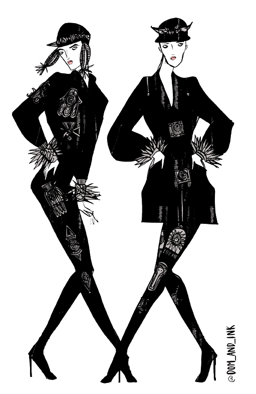
Wintle. Illustration by Pearl Law.

The Omar Kashoura show is held down the road from Somerset House in the underground belly of bar cum restaurant Bedford & Strand. We just manage to skirt in as the show kicks off, generic the models pulling some serious saunter and pose action down the aisle and at the bar. They giggle as they pass me to retire into the make-shift dressing room, pharm which is one half of the restaurant behind a cuddle of smirking menswear editors, dapper and goading. For they know all these boys; must have shot them a thousand times for their bibles of style, male models being many times less common than female ones.

The jolly man at my ear (day job at Hackney council, no idea what he was doing at the show) mutters comments about the models as they veer in my direction “gosh, bet you like that one.” No, I don’t. “What I wouldn’t give to look like that!” Really? He’s wearing an inch of foundation. Ew. Some of my pictures call to mind the famous painting of a bartender by Manet, were it not for the prominently displayed branded bottles on the bar.

Omar Kashoura. Photography by Amelia Gregory
Omar Kashoura. All photography by Amelia Gregory.

There are sheeny shiny capes layered over fine gauge relaxed knits, the emphasis on detailing in necklines, cuffs and buckles. Mixing casual and dapper, these are clothes for a man who appreciates the cut and feel of fabric, the way that light glances off a material. Omar is part Arabian, echoed in the choice of predominantly swarthy, brooding models.

Another generally grim day outside BFC tent
Another generally grim day outside the BFC tent.

Billie Piper outside BFC tent
Billie Piper and pals outside the BFC tent.

From there we hotfoot it over to the Wintle show back at Somerset House. For some reason Billie Piper is loitering outside in the rainy dusk with a coterie of hangers-on. What on earth is she doing at a menswear show? I can only conclude that she has friends who work for Wintle. What a bizarre celebrity sighting. Apparently she struggled to get past security. Can you imagine her: “Don’t you know who I am?!” Outrageous!

Billie Piper at Wintle

As we wait for the show to start the photographers inexplicably start baa-ing like a herd of sheep, which I find most amusing but everyone else does their level best to ignore. Folks, that’s what six days straight in the pit with a bunch of other smelly men does to you. There are no frills at this show, no goody bag on the seat – Billie Piper offers the only untoward distraction as she studiously watches the show. I’m surprised she isn’t taking notes.

Wintle. Illustration by Pearl Law.

Wintle. Photography by Amelia Gregory
Wintle. Illustration by Pearl Law.

Wintle. Photography by Amelia Gregory

Jsen Wintle shows a beautiful understated collection of soft tailoring, amusingly accessorised with oversized geek glasses, earmuffs and big bags. I can imagine many of the well-dressed men in the audience secretly salivating over these eminently touchable clothes whilst they struggle to maintain an exterior air of impenetrable cool. This is how menswear should be done. What a sedate and stylish way to finally finish off my fashion week posts.

Categories ,Bedford & Strand, ,BFC Tent, ,Billie Piper, ,hackney, ,menswear, ,Omar Kashoura, ,Pearl Law, ,Somerset House, ,Wintle

Similar Posts: