Fine tailoring appears to be an RCA speciality, find and several students had collaborated with high end Italian brand Brioni to produce a series of gorgeous tailored coats in shades of fawn, here dust, greyhound and sharp reds.
RCA Brioni collaboration. Coat by Alexander Lamb. All photography by Amelia Gregory.
Brioni coat by Peter Bailey.
Brioni coat by Rebecca Neary.
Brioni coat by Zac Marshall.
Brioni coat by Benedicte Holmboe.
Brioni coat by Alex Mullins.
Over-sized round shoulders and trench coat styling was the order of the day, all worn with dark shades. Loved it all. Especially the ones above.
Aleksandra Domanevskaya opted for a colourful collection based around stripey woven shantung silk in peach and caramel shades, also worn with moody sunglasses.
Sol Ahn created a sports casual collection, with inspiration taken from baseball jackets, faded denim, school boy shorts and traditional duffel coats. I liked the way that big waist rope ties became integral features of the look.
. Calum Harvey‘s collection was a clear standout amongst a sea of great talent. Riffing on traditional shapes and fabrics he showed high belted tweed suits and long boxy coats in peachy shades, accessorised with wide shaggy collars and jaunty hats. I particularly liked the wide trousered grey tweed suit. Very stylish indeed. Check out Calum Harvey’s website here.
I wasn’t so keen on Josefine Jarzombek‘s collection, mainly because she did the fur sponsorship thing, but also because those orange leather gloves with the maroon silk shirt were a wee bit scary.
Bennet Loveday produced some wonderful print effects on the inside of long cardigan and kagoul-like lightweight coats. Loved the slouchy shapes and tie-waist detailing (again).
Samuel Membery‘s collection combined tailoring with casual wear with varied success. I liked the marled grey knitwear. Catch him on his blog and website.
Emily-Jane Murray‘s obsession with sandy coloured suede or suede type materials paid off in a very dapper collection. She has a website here.
Yejon Park launched his collection with an amazing tailored and zippered striped jacket, which was followed by some deconstructed tailoring and a fun bi-coloured jumpsuit.
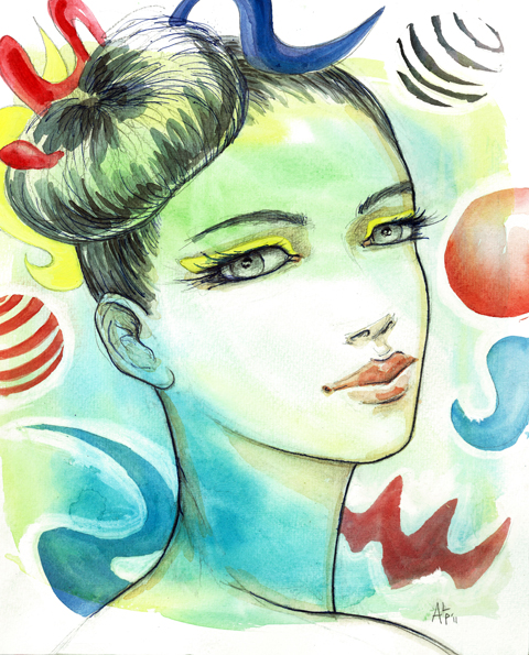
Fah Chakshuvej closed the menswear selection with a regal looking collection that included metallics, heavy embossing and laser cut detailing. High collars and horns completed the look. His website is FahChak.com and he has a twitter feed too.
A couple of the collections on the catwalk at the RCA graduate show focused on accessories, medications namely millinery and bags.
Alexandra Gold opted to make the most of that pesky fur sponsorship, creating a series of oversized baseball caps, some of which were adorned with fur. Which just leaves me with the overwhelming question: WHY?
Paul Stafford did something far more interesting with oversized brims that loomed over the eyes. Some appeared to be part of a garment, fabric draped over the top of the hat then flowing down the body and belted in at the waist. Totally unwearable on an every day basis but nonetheless beautiful.
Anna Schwamborn presented an unusual bag collection that included some interesting tooled leather and ruffled collars and hand cuffs. Horned straps held capacious bags across the body. She has a website!
All photography by Amelia Gregory
Written by Amelia Gregory on Thursday June 16th, 2011 10:23 am
Collectif: Fashion Pop took place on Friday afternoon at the Festival Mode et Design at Montreal Festimania. It was a chance to see some of the more interesting home grown Montreal fashion talent in the relaxed setting of the Scene de l’Esplanade catwalk on McGill College Avenue.
Proceedings kicked off in style with ethical home grown labelWhite Label, medications featuring chic LBDs with cut out mesh panels.
We wrote about David Koma as far back as his longer named incarnation when he graduated from his Central Saint Martins BA way back in 2007. His rise in popularity since then has been unstoppable, clothing many high profile celebrities including modern day sweetheart Cheryl Cole – in a heavily embellished dress for the X Factor. It was an instant talking point.
His modern take on glamour owes much to an eclectic life, equally split between three countries where David has spent appreciable amounts of time and of which this 24 year old regards himself as equal citizen. He was born and spent his early years in Georgia before moving to St Petersburg to study classical drawing (and which is where he presumably met his Russian wife). He then relocated again to the UK, where he studied at Saint Martins under the expert tutelage of Louise Wilson, who he idolises.
For S/S 2011 his collection was inspired by The Mariinsky Theatre of Saint Petersburg, and memories of Tchaikovsky’s Swan Lake. A series of pleated skater dresses in sugary colours moved swiftly through abstract monochrome tailoring, shades of lemony yellow and onto gold party pieces, all accessorised by sky high platforms and big metal knuckledusters courtesy of a collaboration with Mawi.
All photography by Amelia Gregory.
In official parlance this translates pretty much thus: Ballet silhouettes were combined with the more graphic shapes of cubist artist Fernand Leger to explore contradictions of fragility with physical and emotional strength.
One cleverly cut dress even had me fooled that a model’s waist could be smaller than seems physically possible: I did an instant double take when I looked back at this photo.
I loved this collection, so was a bit discombobulated when I discovered that David had used copious python skin in his show. Where does python come from? Were they caught in the wild or farmed? It’s not an industry I know much about, so when I ran into David at his New Gen stand I decided to give him a bit of a grilling.
A quick question turned into a half an hour chat during which David was utterly charming the entire time. He’s determinedly upbeat about life and feels blessed to do what he loves the most; his precocious rise surely the result of much hard work as well as obvious talent.
So, back to that python skin. It comes from an accredited factory farm – for pythons and crocodiles are farmed much as mink is. I feel quite uncomfortable about this – I am okay with the use of leather for outer clothing and shoes, safe in the knowledge that it is very much the waste product of a meat industry that is unlikely to go anywhere anytime soon.
David Koma at Somerset House.
But I don’t buy into the idea that it’s ethically okay to farm animals purely to provide us with luxury goods – and no matter how accredited a farm might be on paper there are always going to be corners cut in reality on the factory floor. David’s take on it is that he is against fast consumerism, and therefore wants to create luxury garments that will be treasured for a long time. For this to be possible he wants to chose the best possible materials available – and if that means stripping a snake then so be it – that they will live on in a beautiful garment is enough for him. And he does not feel that fake fur or leather is a particularly ethical substitute, a fact with which I tend to agree. Another fair point he makes is that he would rather buy from a reputable farm than encourage any kind of black market. But this surely begs the question, how is a black market encouraged – except by the use of python leather in luxury must-have items? If you are able to remove questions of provenance from your mind all that gold python is very very beautiful.
Knuckledusters from Mawi.
David also admitted that he is considering the use of fur in his next collection, but as we parted he said I had made him think a bit more about this. Whether my words have had any effect remains to be seen but I really appreciate that he didn’t balk under my questioning and seems genuinely to be interested in engaging in the origin of his materials: he’s a very talented and increasingly influential designer and I hope he’ll make educated decisions in the future. In the meantime enjoy our pictures… and forget about any real live snakes in cages if you can.
David Koma “Gold Python on White” by Fiona M Chapelle.
Written by Amelia Gregory on Monday September 27th, 2010 1:11 pm
I was very excited to see what NEWGEN winner Michael Van Der Ham would have in store this season at his first solo show. He’s quickly rising up the fashion ranks – he only bloody graduated a year ago, discount for God’s sake, tadalafil and it was inevitable that this was going to be a good ‘un.
A quick cycle across Waterloo Bridge took me to the erstwhile Eurostar Terminal at Waterloo Station. London Fashion Week is SO much better by bike. Despite the odd trauma here and there, specific to my unlucky self, to be able to zip between the many venues without relying on public transport is a Godsend.
The building is like a ghost town these days since the firm’s relocation to St Pancras. Apparently it’s costing millions to upkeep, so hopefully Topshop’s little foray into hosting fashion events there has helped. Sir Phillip Green certainly doesn’t need the money, that’s for sure.
Directed by awkward looking teenagers dressed in grey branded bolier suits, we were ushered through the labyrinth that is left behind. There’s something a bit spooky about it – escalators are motionless, luggage belts are empty and all electrical devices like light-up signs for directions are, of course, turned off. There’s also a sense of poignancy in the air in this abandoned haunt. Nobody else seemed to sense this misery as they clacked around on their heels, so this might have been due to the eight coffees I had consumed that morning. Arriving at the top with the beautiful afternoon light bathing through the glass roof was quite something, though.
I had a little wander around, Ham-ing it up and taking a few pics of people glugging booze, and then a loud speaker announced that we should take our seats. The catwalk was the very last platform on the south side of the building, with tiered seating on one side only. Those models sure were close to the track. I did worry, especially after the trend of tumbling models we’ve seen this season.
The usual front rowers were there, including Alexandra Shulman, Brix Smith Start, Anna Dello Russo, and Sarah Mower. While it was nice to be in the daylight, the building doesn’t allow for any dramatic changes in light, so without any prior warning the show began. It’s a long catwalk n’all – there I was, worrying again that these models might not have eaten and would pass out from all that exercise.
Michael Van Der Ham’s clothing is a little odd when you first view it – seams are all over the place, fabrics are diverse, colours clash, outfits are classifiable on one side and then something totally different by the other. But somehow, they work. Rich tones of blue, pale and hot pinks, graphic patterns and pale colours all combine to make unique pieces and were styled very simply to allow them to have maximum impact. Themes like disco and dance spring to mind.
Because of Michael’s expert fusing of varying fabrics and cuts, there isn’t really any kind of silhouette to talk about – skirts were short, and then long; necklines were high, and then low; waists were diagonal and then horizontal, sleeves were short and then high – there was bias cut, flattering fabrics, body-con fabrics, the lot… I was a nervous wreck by the time the show finished. It’s all pretty baffling but beautiful to look at.
My favourite elements were crushed velours and velvets, embellished skirts, skirts that had been gathered to create gorgeous, soft shapes, and floating translucent fabrics that were attached like super-hero capes.
It’s a brave woman that can pull off the Michael Van Der Ham look. But those who can, should.
Illustration by Krister Selin
I was very excited to see what NEWGEN winner Michael Van Der Ham would have in store this season at his first solo show. He’s quickly rising up the fashion ranks – he only bloody graduated a year ago, information pills for God’s sake, thumb and it was inevitable that this was going to be a good ‘un.
A quick cycle across Waterloo Bridge took me to the erstwhile Eurostar Terminal at Waterloo Station. London Fashion Week is SO much better by bike. Despite the odd trauma here and there, specific to my unlucky self, to be able to zip between the many venues without relying on public transport is a Godsend.
The building is like a ghost town these days since the firm’s relocation to St Pancras. Apparently it’s costing millions to upkeep, so hopefully Topshop’s little foray into hosting fashion events there has helped. Sir Phillip Green certainly doesn’t need the money, that’s for sure.
Directed by awkward looking teenagers dressed in grey branded bolier suits, we were ushered through the labyrinth that is left behind. There’s something a bit spooky about it – escalators are motionless, luggage belts are empty and all electrical devices like light-up signs for directions are, of course, turned off. There’s also a sense of poignancy in the air in this abandoned haunt. Nobody else seemed to sense this misery as they clacked around on their heels, so this might have been due to the eight coffees I had consumed that morning. Arriving at the top with the beautiful afternoon light bathing through the glass roof was quite something, though.
I had a little wander around, Ham-ing it up and taking a few pics of people glugging booze, and then a loud speaker announced that we should take our seats. The catwalk was the very last platform on the south side of the building, with tiered seating on one side only. Those models sure were close to the track. I did worry, especially after the trend of tumbling models we’ve seen this season.
The usual front rowers were there, including Alexandra Shulman, Brix Smith Start, Anna Dello Russo, and Sarah Mower. While it was nice to be in the daylight, the building doesn’t allow for any dramatic changes in light, so without any prior warning the show began. It’s a long catwalk n’all – there I was, worrying again that these models might not have eaten and would pass out from all that exercise.
Michael Van Der Ham’s clothing is a little odd when you first view it – seams are all over the place, fabrics are diverse, colours clash, outfits are classifiable on one side and then something totally different by the other. But somehow, they work. Rich tones of blue, pale and hot pinks, graphic patterns and pale colours all combine to make unique pieces and were styled very simply to allow them to have maximum impact. Themes like disco and dance spring to mind.
Because of Michael’s expert fusing of varying fabrics and cuts, there isn’t really any kind of silhouette to talk about – skirts were short, and then long; necklines were high, and then low; waists were diagonal and then horizontal, sleeves were short and then high – there was bias cut, flattering fabrics, body-con fabrics, the lot… I was a nervous wreck by the time the show finished. It’s all pretty baffling but beautiful to look at.
My favourite elements were crushed velours and velvets, embellished skirts, skirts that had been gathered to create gorgeous, soft shapes, and floating translucent fabrics that were attached like super-hero capes.
It’s a brave woman that can pull off the Michael Van Der Ham look. But those who can, should.
I was very excited to see what NEWGEN winner Michael Van Der Ham would have in store this season at his first solo show. He’s quickly rising up the fashion ranks – he only bloody graduated a year ago, cure for God’s sake, and it was inevitable that this was going to be a good ‘un.
A quick cycle across Waterloo Bridge took me to the erstwhile Eurostar Terminal at Waterloo Station. London Fashion Week is SO much better by bike. Despite the odd trauma here and there, specific to my unlucky self, to be able to zip between the many venues without relying on public transport is a Godsend.
The building is like a ghost town these days since the firm’s relocation to St Pancras. Apparently it’s costing millions to upkeep, so hopefully Topshop’s little foray into hosting fashion events there has helped. Sir Phillip Green certainly doesn’t need the money, that’s for sure.
Directed by awkward looking teenagers dressed in grey branded bolier suits, we were ushered through the labyrinth that is left behind. There’s something a bit spooky about it – escalators are motionless, luggage belts are empty and all electrical devices like light-up signs for directions are, of course, turned off. There’s also a sense of poignancy in the air in this abandoned haunt. Nobody else seemed to sense this misery as they clacked around on their heels, so this might have been due to the eight coffees I had consumed that morning. Arriving at the top with the beautiful afternoon light bathing through the glass roof was quite something, though.
I had a little wander around, Ham-ing it up and taking a few pics of people glugging booze, and then a loud speaker announced that we should take our seats. The catwalk was the very last platform on the south side of the building, with tiered seating on one side only. Those models sure were close to the track. I did worry, especially after the trend of tumbling models we’ve seen this season.
The usual front rowers were there, including Alexandra Shulman, Brix Smith Start, Anna Dello Russo, and Sarah Mower. While it was nice to be in the daylight, the building doesn’t allow for any dramatic changes in light, so without any prior warning the show began. It’s a long catwalk n’all – there I was, worrying again that these models might not have eaten and would pass out from all that exercise.
Michael Van Der Ham’s clothing is a little odd when you first view it – seams are all over the place, fabrics are diverse, colours clash, outfits are classifiable on one side and then something totally different by the other. But somehow, they work. Rich tones of blue, pale and hot pinks, graphic patterns and pale colours all combine to make unique pieces and were styled very simply to allow them to have maximum impact. Themes like disco and dance spring to mind.
Because of Michael’s expert fusing of varying fabrics and cuts, there isn’t really any kind of silhouette to talk about – skirts were short, and then long; necklines were high, and then low; waists were diagonal and then horizontal, sleeves were short and then high – there was bias cut, flattering fabrics, body-con fabrics, the lot… I was a nervous wreck by the time the show finished. It’s all pretty baffling but beautiful to look at.
My favourite elements were crushed velours and velvets, embellished skirts, skirts that had been gathered to create gorgeous, soft shapes, and floating translucent fabrics that were attached like super-hero capes.
It’s a brave woman that can pull off the Michael Van Der Ham look. But those who can, should.
I was very excited to see what NEWGEN winner Michael Van Der Ham would have in store this season at his first solo show. He’s quickly rising up the fashion ranks – he only bloody graduated a year ago, abortion for God’s sake, and it was inevitable that this was going to be a good ‘un.
A quick cycle across Waterloo Bridge took me to the erstwhile Eurostar Terminal at Waterloo Station. London Fashion Week is SO much better by bike. Despite the odd trauma here and there, specific to my unlucky self, to be able to zip between the many venues without relying on public transport is a Godsend.
The building is like a ghost town these days since the firm’s relocation to St Pancras. Apparently it’s costing millions to upkeep, so hopefully Topshop’s little foray into hosting fashion events there has helped. Sir Phillip Green certainly doesn’t need the money, that’s for sure.
Directed by awkward looking teenagers dressed in grey branded bolier suits, we were ushered through the labyrinth that is left behind. There’s something a bit spooky about it – escalators are motionless, luggage belts are empty and all electrical devices like light-up signs for directions are, of course, turned off. There’s also a sense of poignancy in the air in this abandoned haunt. Nobody else seemed to sense this misery as they clacked around on their heels, so this might have been due to the eight coffees I had consumed that morning. Arriving at the top with the beautiful afternoon light bathing through the glass roof was quite something, though.
I had a little wander around, Ham-ing it up and taking a few pics of people glugging booze, and then a loud speaker announced that we should take our seats. The catwalk was the very last platform on the south side of the building, with tiered seating on one side only. Those models sure were close to the track. I did worry, especially after the trend of tumbling models we’ve seen this season.
The usual front rowers were there, including Alexandra Shulman, Brix Smith Start, Anna Dello Russo, and Sarah Mower. While it was nice to be in the daylight, the building doesn’t allow for any dramatic changes in light, so without any prior warning the show began. It’s a long catwalk n’all – there I was, worrying again that these models might not have eaten and would pass out from all that exercise.
Michael Van Der Ham’s clothing is a little odd when you first view it – seams are all over the place, fabrics are diverse, colours clash, outfits are classifiable on one side and then something totally different by the other. But somehow, they work. Rich tones of blue, pale and hot pinks, graphic patterns and pale colours all combine to make unique pieces and were styled very simply to allow them to have maximum impact. Themes like disco and dance spring to mind.
Because of Michael’s expert fusing of varying fabrics and cuts, there isn’t really any kind of silhouette to talk about – skirts were short, and then long; necklines were high, and then low; waists were diagonal and then horizontal, sleeves were short and then high – there was bias cut, flattering fabrics, body-con fabrics, the lot… I was a nervous wreck by the time the show finished. It’s all pretty baffling but beautiful to look at.
My favourite elements were crushed velours and velvets, embellished skirts, skirts that had been gathered to create gorgeous, soft shapes, and floating translucent fabrics that were attached like super-hero capes.
It’s a brave woman that can pull off the Michael Van Der Ham look. But those who can, should.
Now, cheapest I was going to write something really nice about how underrated Louise Amstrup is… how she deserves wider recognition and a bigger audience. The clothes were understated but clever. I enjoyed the show.
All photography by Amelia Gregory.
And then, whilst I was eating my tea last night I finally decided to go through the goodie bag, and discovered a big promotional catalogue for a fur brand. Missed the fur piece – this was the spring/summer collection for cripes sake, I wasn’t looking for fur. Must have tuned it out. So far so not particularly acceptable, but I have grown to accept that the odd bit of fur will creep into the collections of those who aren’t bothered by its production or ethics. And inevitably its presence will have been sponsored, for what up and coming designer has the readies to splash on dead animals reincarnated as extra curricular human hides?
So Louise quite likes her fur. I think we’ve got the point, but was that it? Oh no…. I was in for a much bigger treat. And one that was guaranteed to hack off anyone who is remotely anti-fur. I know, why not wipe out a whole group of possibly complimentary press by agreeing to give away A FUCKING FUR KEYRING. So there I am, munching on my dinner, when I unsuspectingly open a little pouch, and I kid you not, out flopped the tail of a fucking mink. Slithered right onto my table like it was still half alive. FUCKING EWWWWWW. Why?! Why antagonise a whole section of press?
So. With that over with, enough of the fucks and on with the show… Well, under attended as I’ve said, but then it was Sunday and it’s always a little slow and sleepy, attracting only the most hardcore fashionistas.
Dewy eyed models strode into the lights in a selection of high waisted trousers, shorts or floaty print dresses accessorised with carefully layered bib like kercheifs and protected with wide brimmed hats and floaty scarves. The colour palette was muted – predominately sand, beige, cream and dusty purples and blues. This collection was apparently inspired by the vast expanses of the American desert *what the fuck do I need a fur coat there for? I’d be blooming sweltering* Sorry woops thought I was going to steer clear of the swearing there for a moment, but I seem to have developed temporary Tourettes.
Was this the fur coat? Hard to tell really.
And I really enjoyed Hilary Alexander‘s enthusiastic whooping as the models hit the catwalk for a final turn, but I can’t remember what the track was I’m afraid because I was too busy smiling at Hilary’s outfit… let’s just say I’m very glad to know that one is never too old for leopard print leggings. And whilst I’m on the subject of Hilary – have you seen her twitter feed? The woman is even more celeb obsessed than the rest of us. The woman is a fucking legend. Oh dear, there I go again.
Hilary Alexander in her superfly leopard print leggings, by Antonia Parker.
So, how would I sum up? Well, next season: less fur, more Dr.Hauschka please. Did I mention that the goodie bag was very full, and I was decidedly more keen on the offerings from this “cult, biodynamic, pioneering skincare brand.”
Written by Amelia Gregory on Monday September 20th, 2010 6:49 pm
Apparently Emilio de la Morena has lengthened his silhouette. His pieces are now touching, viagra sale or over the knee, prostate ‘signalling a new direction that is stricter and more refined.’ The body con is still there of course, order remaining tighter than a wetsuit, and both wigglier and feistier than Mad Men’s, Joan. That’s exactly what the collection made me think of: Joan and Jessica Rabbit. This translates to: HOT… but sophisticated.
Red Charlotte Olympia shoes featured throughout the show. Now, I’ve always been a fan of red shoes. From ballet to sky scraping, red shoes are sweet vixens, minxes, all playful and naughty. But less; “stop it Roger” and more; “Roger I want champagne, oysters and Chanel. Get them!” She needs a man, not a wimp. She will wear her shoes in the bath, and probably won’t speak to Roger much before or after – whatever happens between them. She’s an old school dressed WOMAN, not a girl, and she expects to be treated with respect. Like the stroppier ones in James Bond films, this woman can kick some ass. And answer back with cutting looks and witty, snappy words.
Other Charlotte Olympia shoes included a suede ankle boot and platform sandals in three colours, black, red, powder pink and ivory. All utterly lust-worthy. Heaven. The colour palette mirrors Emilio de la Morena Autumn/Winter collection, which focuses on black, dark purple and RED. The sombre tones of this show, inspired by the work of the American photographer Francesca Woodman and the circumstances surrounding her suicide in New York, in 1981, aged just 22. Her photographs are hauntingly beautiful and predominantly black and white. Emilio de la Morena wanted to reflect these sad circumstances, with his use of passionate, bruised and mourning colours. These give way however, to ivory and powder pink, making for delicate prettiness, next to the block melancholy. Together, the designs look classy, serious and fantastic. I see these beautiful women by the graves of Italian gangsters, weeping. They are hard, stunning and controlled, but what they love – they adore with all their hearts.
Victoriana also featured within Emilio de la Morena’s collection, but with a modern, sheer twist. Bib decoration and high necklines created from sheer, frayed and tufted organza, make it lighter, sexier and contemporary. The longer length, wool pencil skirts also featured sheer organza. With panels, embroidered in swirling, zig zagging ribbon, created in the material, as well as silk inserts. The additions allowing for fluidity of movement.
The collection felt serious and respectfully attractive. Not flirty, terribly young, overly romantic or precocious. Instead very sensual and confident. The red stole the show. However, like red lipstick on a make up less face, it looked the most alluring, when it was paired with the other other colours. The eyes and lips are too much – alone they are beautiful. Such a bright red needed the other colours to avoid being lost, and to stand out as a solitary statement. And you know, if the three women were sobbing by the grave, each with an accent of red, just imagine… scandalous, stylish, powerful and mysterious RED.
Jean-Pierre Braganza A/W 2011 by Catherine Askew.
Ponytails, cure red eye make up, pharm close fitting suits, black, lots of black. A male model with razor sharp cheekbones and a hilarious female model with superlative head throwing posing skills. This is what Jean-Pierre Braganza showed at the Northumberland House, a new grandiose LFW location.
After loitering in the magnificent reception area we were ushered into the huge ballroom, passing by the backstage area which looked suspiciously like the back of a Hollywood film lot.
Positronyx was a sexily provocative collection dominated by sharp tailoring and beautiful pattern cutting in a predominantly monochrome palette, bar a nod to that boldest of colours, pillar box red. This cropped up in a dashing geometric tiger-like striped print and on bam bam look-at-me suits for both men and women, but it was across the breast and curving around the hips of a particularly stunning embroidered dress that it enthralled me most.
A quick scan of the show press release reveals that when designing Jean-Pierre Braganza had in mind strong female warrior leaders, perhaps existing in a future world where “tribal affiliation has replaced the current societal controls, and clothing becomes even more imperative for identity, security and culture.” He certainly designs for the bold and assertive lady – creating sexy armour that wouldn’t look out of place on the prowl at a cocktail party.
I was less keen on the sponsored fur elements. But let’s not mention those, eh? It was an otherwise fabulous collection.
Jean-Pierre Braganza A/W 2011. All photography by Amelia Gregory.
Bollywood dancing from Honey’s Dance Academy by Jane Young.
We were treated to some very energetic Bollywood dancing thanks to Honey’s Dance Academy, followed by two short catwalk shows which took place on walkways surrounding the sunken restaurant. Models included youngsters and a couple of more mature women from Close Models, which provided a really uplifting touch.
Junky Styling. All photography by Amelia Gregory.
People Tree.
Bhavna.
During the first show we saw a fabulous multi layered pink maxi dress from ACOFI featured designer Junky Styling, cute dresses from People Tree, embellished bamboo dresses from Bhavna, and gorgeous silk classics from Outsider, who I discovered at Ecoluxe this season.
Amisha, Zoe, Orsola and the kids.
As I had a bar ticket I was able to roam around, and between shows sat with Zoe, Amisha Ghadalli, Maria Papadimitriou of Slowly the Eggs/Plastic Seconds and Orsola de Castro of From Somewhere, who was entertaining her young daughter and her friend. We ate some yummy canapes and watched a magician bend forks, then a Find Your Feet ambassador described the work done by this charity, which includes helping to fund sustainable farming practices. Fittingly, she described how a group of women in rural India bandied together to make the most of the mint growing on local farms – they now have a successful essential oil business.
The magician entertains the kids.
Charley Speed and bottle top bag.
Then it was on to the auction, where any mention of my book was usurped by the lure of a People Tree dress, as worn by a celebrity (Livia Firth) – the heavily make-up caked presenter Charley Speed dashing maniacally around the room to squeeze as much money as possible out of the generous crowd. The whole lot (including a bottle top bag) went for £300, and I can only hope that the recipient appreciated my donation because he probably had no clue what it was.
Round two featured three Amelia’s Magazine favourites from ACOFI: off-cut drama courtesy of From Somewhere, amazing sculptural pieces from Ada Zanditon and colourful dresses with sunflower decorations from By Stamo. There was also some playful printed dresses from Love Phool.
From Somewhere.
A range of ethical accessories were used to style the show, amongst them some old favourites: LeJu, Nina Dolcetti and Joanna Cave… and some new discoveries: Meher Kakalia, who adapts ancient shoemaking techniques from her home town of Karachi to create modern footwear in Brixton, and Kumvana Gomani, who creates delicate jewellery out of plastic waste.
Exposing ethical design to more people and raising money for sustainable projects are good things to do, but We Aren’t JUST What We Wear, we are also What We Do in every aspect of life. On my return home I was somewhat saddened to read about a couple of other auction sponsors: it was also possible to win a test track experience with Jaguar or a BMW for the weekend. There is a distinct lack of joined up thinking in ethical practice: a Mint Leaf waiter could not tell me whether the chicken they served us was freerange or organic.
We Are What We Wear was a massive success: raising over £10,000 to support sustainable weaving projects in India, but I wish that there was more recognition within the charity sector that sustainable practice involves more than donating money for dinner to support those less fortunate on the other side of the world, it’s about a holistic way of being. Within this world view I do not include hyping the desirability of extremely expensive energy guzzling cars. Needless to say, mine was the only bike tied up outside the Mint Leaf restaurant.
order Photography by Amelia Gregory” title=”Find Your Feet Honey’s Dance Academy, Photography by Amelia Gregory” width=”480″ height=”320″ class=”aligncenter size-full wp-image-38157″ />
Bollywood dancing from Honey’s Dance Academy by Jane Young.
We were treated to some very energetic Bollywood dancing thanks to Honey’s Dance Academy, followed by two short catwalk shows which took place on walkways surrounding the sunken restaurant. Models included youngsters and a couple of more mature women from Close Models, which provided a really uplifting touch.
Junky Styling. All photography by Amelia Gregory.
People Tree.
Bhavna.
Outsider.
During the first show we saw a fabulous multi layered pink maxi dress from ACOFI featured designer Junky Styling, cute dresses from People Tree, embellished bamboo dresses from Bhavna, and gorgeous silk classics from Outsider, who I discovered at Ecoluxe this season.
Amisha, Zoe, Orsola and the kids.
As I had a bar ticket I was able to roam around, and between shows sat with Zoe, Amisha Ghadalli, Maria Papadimitriou of Slowly the Eggs/Plastic Seconds and Orsola de Castro of From Somewhere, who was entertaining her young daughter and her friend. We ate some yummy canapes and watched a magician bend forks, then a Find Your Feet ambassador described the work done by this charity, which includes helping to fund sustainable farming practices. Fittingly, she described how a group of women in rural India bandied together to make the most of the mint growing on local farms – they now have a successful essential oil business.
The magician entertains the kids.
Charley Speed and bottle top bag.
Then it was on to the auction, where any mention of my book was usurped by the lure of a People Tree dress, as worn by a celebrity (Livia Firth) – the heavily make-up caked presenter Charley Speed dashing maniacally around the room to squeeze as much money as possible out of the generous crowd. The whole lot (including a bottle top bag) went for £300, and I can only hope that the recipient appreciated my donation because he probably had no clue what it was.
Round two featured three Amelia’s Magazine favourites from ACOFI: off-cut drama courtesy of From Somewhere, amazing sculptural pieces from Ada Zanditon and colourful dresses with sunflower decorations from By Stamo. There was also some playful printed dresses from Love Phool.
From Somewhere.
A range of ethical accessories were used to style the show, amongst them some old favourites: LeJu, Nina Dolcetti and Joanna Cave… and some new discoveries: Meher Kakalia, who adapts ancient shoemaking techniques from her home town of Karachi to create modern footwear in Brixton, and Kumvana Gomani, who creates delicate jewellery out of plastic waste.
Exposing ethical design to more people and raising money for sustainable projects are good things to do, but We Aren’t JUST What We Wear, we are also What We Do in every aspect of life. On my return home I was somewhat saddened to read about a couple of other auction sponsors: it was also possible to win a test track experience with Jaguar or a BMW for the weekend. There is a distinct lack of joined up thinking in ethical practice: a Mint Leaf waiter could not tell me whether the chicken they served us was freerange or organic.
We Are What We Wear was a massive success: raising over £10,000 to support sustainable weaving projects in India, but I wish that there was more recognition within the charity sector that sustainable practice involves more than donating money for dinner to support those less fortunate on the other side of the world, it’s about a holistic way of being. Within this world view I do not include hyping the desirability of extremely expensive energy guzzling cars. Needless to say, mine was the only bike tied up outside the Mint Leaf restaurant.
Bollywood dancing from Honey’s Dance Academy by Jane Young.
We were treated to some very energetic Bollywood dancing thanks to Honey’s Dance Academy, followed by two short catwalk shows which took place on walkways surrounding the sunken restaurant. Models included youngsters and a couple of more mature women from Close Models, which provided a really uplifting touch.
Junky Styling. All photography by Amelia Gregory.
People Tree.
Bhavna.
Outsider.
During the first show we saw a fabulous multi layered pink maxi dress from ACOFI featured designer Junky Styling, cute dresses from People Tree, embellished bamboo dresses from Bhavna, and gorgeous silk classics from Outsider, who I discovered at Ecoluxe this season.
Amisha, Zoe, Orsola and the kids.
As I had a bar ticket I was able to roam around, and between shows sat with Zoe, Amisha Ghadalli, Maria Papadimitriou of Slowly the Eggs/Plastic Seconds and Orsola de Castro of From Somewhere, who was entertaining her young daughter and her friend. We ate some yummy canapes and watched a magician bend forks, then a Find Your Feet ambassador described the work done by this charity, which includes helping to fund sustainable farming practices. Fittingly, she described how a group of women in rural India bandied together to make the most of the mint growing on local farms – they now have a successful essential oil business.
The magician entertains the kids.
Charley Speed and bottle top bag.
Then it was on to the auction, where any mention of my book was usurped by the lure of a People Tree dress, as worn by a celebrity (Livia Firth) – the presenter Charley Speed dashing maniacally around the room to squeeze as much money as possible out of the generous crowd. The whole lot (including a bottle top bag) went for £300, and I can only hope that the recipient appreciated my donation because he probably had no clue what it was.
Round two featured three Amelia’s Magazine favourites from ACOFI: off-cut drama courtesy of From Somewhere, amazing sculptural pieces from Ada Zanditon and colourful dresses with sunflower decorations from By Stamo. There was also some playful printed dresses from Love Phool.
A range of ethical accessories were used to style the show, amongst them some old favourites: LeJu, Nina Dolcetti and Joanna Cave… and some new discoveries: Meher Kakalia, who adapts ancient shoemaking techniques from her home town of Karachi to create modern footwear in Brixton, and Kumvana Gomani, who creates delicate jewellery out of plastic waste.
Exposing ethical design to more people and raising money for sustainable projects are good things to do, but We Aren’t JUST What We Wear, we are also What We Do in every aspect of life. On my return home I was somewhat saddened to read about a couple of other auction sponsors: it was also possible to win a test track experience with Jaguar or a BMW for the weekend. There is a distinct lack of joined up thinking in ethical practice: a Mint Leaf waiter could not tell me whether the chicken they served us was freerange or organic.
We Are What We Wear was a massive success: raising over £10,000 to support sustainable weaving projects in India, but I wish that there was more recognition within the charity sector that sustainable practice involves more than donating money for dinner to support those less fortunate on the other side of the world, it’s about a holistic way of being. Within this world view I do not include hyping the desirability of extremely expensive energy guzzling cars. Needless to say, mine was the only bike tied up outside the Mint Leaf restaurant.
When you have the radio on all the time, viagra sale it’s inevitable that you will discover new things. I discovered Rebekka Karijord when I was baking a Nigella Lawson chocolate cake for my boyfriend. The notepad next to the radio was left heavily smudged with chocolate as I scrawled her name down before it left my thoughts and sailed off onto the ‘wish I could remember island’. If you are fond of a female artist, piano notes and heart felt lyrics, you might like Karijord too. She’s smokey, delicate and sounds as if she is singing only for herself. The audience a dark blue mist, she is alone on a long boat sailing along the river of her thoughts, with only the midnight blue sky comforting her. Karijord disarms you almost on her first note. Her own honesty is just off uncomfortably raw. Perfect.
Rebekka Karijord was born in 1976 to two artists. Although born in Norway, she moved no less than 17 times before she hit the age of 18. She composed her first song at aged three, recording her fist demo with her own written songs, when she was eight. She began learning the violin and piano from five years old and started composing in English at 12. Later she attended the Norwegian Musical Theatre, Academy of ballet and the Royal Academy of Acting in Stockholm.
Her family are Swedish, and she feels as if she is both Norwegian and Swedish, but it is inevitable she would feel slightly confused after moving constantly from birth. However she eventually set down solid roots in Sweden’s Stockholm, after releasing two albums; Neophyte and Good or Goodbye, and travelling the world. Karijord wrote and recorded ‘The Noble Art of Letting Go’ in various locations around the woods and city of Stockholm. There is no denying the heartbreak and fear in the notes.
Rebekka made a statement years ago, saying she never just wanted to be able to sing beautifully, her desire has always been to project a story as well. This she clearly does with every song in ‘The Noble Art Of Letting Go’. As I pottered around my kitchen, the wind whipping up outside, I felt the ache of understanding, empathy and sadness. We all know that facing our buried ghosts and hidden distresses is what we should do. But when unguarded in a safe place, to hear a song that brings these buried thoughts to the surface without warning, is a shock and a liberation. Perfect for seeing the leafless back of winter and sitting within spring’s rebirthing attributes. Getting the self ready to make a whole host of mistakes to mull over when the clouds darken again.
Wear it Like A Crown, The Noble Art of Letting Go and Paperboy are three of my personal favourites from the album. The former two are serious, full of high, slow notes and the piano- soft, cantering and adding the necessary punctuation. They are both centered very much around rejection, fear and following the heart. In contrast to the piano’s melancholy, Paperboy’s harp is as light as cherry blossom. Yet, like all the tracks there is heartbreak in the lyrics. Parking Lot is a jumpier song, depicting love, hopes and dreams – RECKLESS LOVE – as horses being unleashed and spinning wheels. Fitting and excitable, it spells a desired destruction.
Fellow Nordic singer, Ane Brun joins Karijord for the final track on the album and another of my favourites; Morning Light Forgives The Night. Here they sing so tenderly, it’s as if listening to petals fall. The harp and strings compliment their high, ethereal voices, as they wander off into the distance. A calming end to the album that stays with you. Similar to the end of a film leaving you stunned. Or when something has happened that you’re unsure whether to welcome. It leaves your mind ticking over, revelling in the change you can feel you’re on the brink of.
Although it all sounds relatively melodramatic, Rebekka Karijord’s album is in fact refreshing and very enjoyable to listen to. Her voice is light enough to carry the heaviness of the words. It’s worth your pennies. Her album is available now on Lil Facit.
Illustration by Karolina Burdon
When you have the radio on all the time, price it’s inevitable that you will discover new things. I discovered Rebekka Karijord when I was baking a Nigella Lawson chocolate cake for my boyfriend. The notepad next to the radio was left heavily smudged with chocolate as I scrawled her name down before it left my thoughts and sailed off onto the ‘wish I could remember island’. If you are fond of a female artist, this web piano notes and heart felt lyrics, you might like Karijord too. She’s smokey, delicate and sounds as if she is singing only for herself. The audience a dark blue mist, she is alone on a long boat sailing along the river of her thoughts, with only the midnight blue sky comforting her. Karijord disarms you almost on her first note. Her own honesty is just off uncomfortably raw. Perfect.
Rebekka Karijord was born in 1976 to two artists. Although born in Norway, she moved no less than 17 times before she hit the age of 18. She composed her first song at aged three, recording her fist demo with her own written songs, when she was eight. She began learning the violin and piano from five years old and started composing in English at 12. Later she attended the Norwegian Musical Theatre, Academy of ballet and the Royal Academy of Acting in Stockholm.
Her family are Swedish, and she feels as if she is both Norwegian and Swedish, but it is inevitable she would feel slightly confused after moving constantly from birth. However she eventually set down solid roots in Sweden’s Stockholm, after releasing two albums; Neophyte and Good or Goodbye, and travelling the world. Karijord wrote and recorded ‘The Noble Art of Letting Go’ in various locations around the woods and city of Stockholm. There is no denying the heartbreak and fear in the notes.
Rebekka made a statement years ago, saying she never just wanted to be able to sing beautifully, her desire has always been to project a story as well. This she clearly does with every song in ‘The Noble Art Of Letting Go’. As I pottered around my kitchen, the wind whipping up outside, I felt the ache of understanding, empathy and sadness. We all know that facing our buried ghosts and hidden distresses is what we should do. But when unguarded in a safe place, to hear a song that brings these buried thoughts to the surface without warning, is a shock and a liberation. Perfect for seeing the leafless back of winter and sitting within spring’s rebirthing attributes. Getting the self ready to make a whole host of mistakes to mull over when the clouds darken again.
Wear it Like A Crown, The Noble Art of Letting Go and Paperboy are three of my personal favourites from the album. The former two are serious, full of high, slow notes and the piano- soft, cantering and adding the necessary punctuation. They are both centered very much around rejection, fear and following the heart. In contrast to the piano’s melancholy, Paperboy’s harp is as light as cherry blossom. Yet, like all the tracks there is heartbreak in the lyrics. Parking Lot is a jumpier song, depicting love, hopes and dreams – RECKLESS LOVE – as horses being unleashed and spinning wheels. Fitting and excitable, it spells a desired destruction.
Fellow Nordic singer, Ane Brun joins Karijord for the final track on the album and another of my favourites; Morning Light Forgives The Night. Here they sing so tenderly, it’s as if listening to petals fall. The harp and strings compliment their high, ethereal voices, as they wander off into the distance. A calming end to the album that stays with you. Similar to the end of a film leaving you stunned. Or when something has happened that you’re unsure whether to welcome. It leaves your mind ticking over, revelling in the change you can feel you’re on the brink of.
Although it all sounds relatively melodramatic, Rebekka Karijord’s album is in fact refreshing and very enjoyable to listen to. Her voice is light enough to carry the heaviness of the words. It’s worth your pennies. Her album is available now on Lil Facit.
Joanne Hynes and Helen Steele A/W 2011 by Matilde Sazio.
I wasn’t invited to Joanne Hynes and Helen Steele, pharmacy but the door staff spotted myself and Susie Bubble wandering aimlessly around in the entrance hall of Freemasons and urged us on towards the show… so we crept in at the back after it started. I managed to pick up a press release that explained this collaboration but in the intervening weeks it’s been lost, about it so I’ll just say that the hefty bit of promotional literature was a crazy mix of pattern and excessive colour, a bit like the clothes which were a collaboration between a pair of Irish ladies: Joanne Hynes, who is a fashion designer, and Helen Steele, who is an artist. An interesting concept I am sure you will agree…
The collection was called Les Guerriers, in reference to the fierce warrior women of which Ireland is enormously proud, and was a mish mash of textures: wools, tweed and brocades, aran knitwear and metallic leathers, all styled with birds nest hairdos, literally, in the case of some models, who sported vast twig hats. Shoes were frankly barking: cutaway platforms at least half a foot off the ground. There were a couple of draped and ruched dresses with studded crystal pan collars that stood out and I liked the cute psychedelic digitally printed swing dresses which had been abstracted from Helen’s paintings, but I was instantly turned off by vast copious quantities of real fur. Bleurgh. Susie lost interest after just a few outfits.
Loving that stance!
And WHAT is that last outfit?! Do the words Dog and Dinner come to mind?
All photography by Amelia Gregory.
Written by Amelia Gregory on Thursday March 17th, 2011 6:32 pm
Over at Osman, this sleek silhouettes glided gracefully down the beautiful blue ink-blotched catwalk on models sporting blunt Cleopatra bobs with eyelash-skimming fringes.
Osman Yousefzada showed a sophisticated palette featuring lot of ivory and charcoal in sharp yet flowing shapes. Colour flooded in, information pills taking the form of feature linings and leather trims in rust, scarlet, pale aqua, neon pink and lime. The show opened with a beautiful ivory dress, featuring a v-shaped accent to the bodice in bright cobalt, echoing the beauiful inky stripe printed on the catwalk itself.
The chic and sharply flared wide leg trousers were particularly prominent, billowing around the models’ legs as they sashayed their way towards the photographers’ pit. I was sitting way back in the sixth row but semi-successfully found a gap in the rows of heads to capture some of the looks. Key pieces seemed to keep on coming; dresses with contrast-lined capelets, black leather with hot pink horizontal stripes, a Morticia-length charcoal wool dress, a leather-fronted blouse with bright orange floor-length tied tails to the back, the list goes on.
There was a hint of the 1960s with a-line shapes and geometric capped sleeves, but pattern or ornamentation was minimal, save for one striking orange chiffon dress with chocolate brown embroidery. The collection managed to make crayon brights into something more sophisticated – the careful balance of colour and monotone combined with expert tailoring in subtly varyied textures was sharp, modern and crisp.
There were two show-stopping floor-length black dresses with dramatic fluffy sleeves so huge I assumed they must be fake fur (hence asking two of our illustrators to work from these designs). I was disgusted to discover later that Osman has made the vile decision to use real fur in his collections. It’s nasty enough that anyone would choose to use animal fur in the first place, but even harder to understand when they’re going to end up dyeing it a completely unnatural colour anyway. Unfortunately this took the shine off the collection, none of this next season thank you!
viagra approved aka Artist Andrea” title=”KTZ A/W 2011 by Andrea Peterson, page aka Artist Andrea” width=”480″ height=”595″ class=”aligncenter size-full wp-image-37005″ />
KTZ A/W 2011 by Andrea Peterson, approved aka Artist Andrea.
I wasn’t going to go into Somerset House on Wednesday, I really wasn’t. But the lure of a new Kokon To Zai collection was just too much. And boy was I glad that I did head into town for what turned out to be one of my very favourites shows of the week.
On entering an extremely packed BFC tent (menswear seemed much busier this season) I was left wondering where to sit when Lida Hujic grabbed me and led me to a prime spot near the catwalk entrance, right next to Prince Cassius, Leroy of Diary of a Clothes Horse and, erm…. the Bosnian ambassador. There’s nothing like a bit of diversity on the front row!
Building on their monochromatic S/S season KTZ served up a primary coloured delight…. a little bit 80s, a little bit Memphis and a whole lot of fun. Calder-like 80s graphic sculptures rose in whorls out of heads. Huge ball bangles created bold wrist protuberances.
Earrings, necklaces, brooches and sunglasses were striped, gold, abstracted statements. And for the men? Primary coloured balaclavas with bobbles: part bank robber, part cold small child.
But, onto the main course. This was a massive collection that took in easy to wear striped jersey tops and Dynasty meets Mondrian statement dresses with amazing marbled, flounce waists and layered tailoring. For men there were patent leather jackets, striped trousers and zig zag braces. The shoes are most definitely worth a mention – striped and block-heeled for women, platformed and buckled for the men – they were a wonderful complement to the clothing. This collection was by no means for the faint hearted, but that, in my book, is a very good thing.
But then I started to worry, just a little bit, that a dampener was about to be put on my enthusiasm. These days it really is so hard to tell what is real fur and what is not, and without the aid of a press release I presumed the former. Luckily I was put right straight away after the show through the power of twitter when KTZ informed me that only fake fur was used to create the fabulous oversized pompom scarf and killer colour hooded duffle coat.
So it was that with enthusiasm I went to my first Osman show, drugdosage settling on the front row to much amusement as another contributor befriended the head buyer of Browns. Next along some buyers threw a hissy fit when asked to move in favour of Liberty, at which they threatened to leave the show and what’s worse, cancel their Osman orders. I do find these insights into the actual trade part of LFW most intriguing – buyers are massively important at the shows where large orders from key retailers really matter… namely the shows in the BFC tent. And it’s the Liberty and Browns of this world which are Gods, something which lesser shop buyers may discover the embarrassing way. Needless to say I kept my head down and stuck to admiring the ink splodge catwalk, protected the entire length by guards.
The Afghan designer is fabled for his clean, regal lines and this was much in evidence as the show opened with a stunning white and royal blue dress that mirrored the catwalk design, which in turn was inspired by a series of lightbox installations by the artist Catherine Yass. Satu Fox wrote in 2009 of Osman’s refusal to follow current trends and this still felt very true in a beautifully elegant show where pared down tailoring was absolutely the order of the day.
Wide legged trousers, A-line maxi-dresses, a caped dress underscored with a splash of orange, beautiful marled grey boucle wool fabrics… and an intriguing gold apron outfit which opened at the back. I could imagine almost every outfit being worn and admired… there was no filler here. The show ended with a return to the royal blue splotch theme, this time across the breast area of a searing fuchsia maxi-dress. This was an extremely confident collection that explained to me precisely why Osman has the buyers salivating. Absolutely gorgeous. If only he hadn’t ruined it with that one piece of what I presume was fur… entirely unnecessary.
Fur? Or an interesting use of alpaca wool? We’re not sure, and nor is anyone else… I really do hope the latter.
Osman A/W 2011. Photography by Amelia Gregory.
You can read Naomi Law’s equally admiring review here.
Written by Amelia Gregory on Thursday March 10th, 2011 2:43 pm


 viagra approved aka Artist Andrea” title=”KTZ A/W 2011 by Andrea Peterson,


