Amelia’s Magazine | A Chat With Christina Brodie

she and him cover thumbnail review volume two

I suppose I should let Zooey Deschanel go by now. I was so young at the time, viagra dosage a mumbling, shy teenager with a crappy haircut (admittedly, the hair hasn’t improved much) when I first developed a bit of a pathetic fancy for those big blue eyes of hers – I can’t say my admiration of her looks hasn’t dimmed, admittedly (and somewhat shallowly), but I’ve grown wary of her acting ability. Being typecast is something some, if not most, actors attempt to avoid, yet Zooey thrives on playing what’s referred to in critical circles as the ‘Manic Pixie Dream Girl’ role – a bit kooky, a bit insane, and just a tad an absolute fiction of a person, one who exists in the minds of fevered male youth everywhere. Her purpose is to bring the lead male out of his emotional shell, to embrace life, to seize the day (and, presumably, to act as therapist and counsellor and tissue) – to be, in effect, a nothing of a person but a blank canvas who’s just waiting for a chance to listen to all the moaning and despairing and general torment of the soul that characterises the most privileged demographic group in history, the Young White Western Man of the 21st Century.

So – as her roles keep her locked up in a safe little box, a box that doesn’t allow too much range (even (500) Days of Summer, whilst specifically a film about how real life doesn’t conform to the Manic Pixie Dream Girl stereotype, was hardly a stretch), I’m in danger of losing sight of Zooey Deschanel, Actress. All I will have left is Zooey Deschanel, Attractive Celebrity. Being left with that would just be unfair to her as an individual, considering how lovely she is an all – though let’s not concentrate on how I know this, or how I met her, or how her height disappointed me, or how her strapless dress was perhaps a brave choice for the evening but she rocked it admirably – let’s leave that for now. OK? OK. What we’re talking about today is She & Him’s Volume 2, the second album from the musical collaboration between Zooey and folk singer-songwriter M. Ward. Their first, the aptly-titled Volume 1, was an excellent stab at breathing new air into 60s country-folk, and Volume 2 is a further step forward. What it also does is reaffirm, for little old neurotic me, that Zooey Deschanel is a very ably-talented singer and songwriter. Zooey Deschanel, Artist, if you will.

Halfway through first track ‘Thieves’ and the blueprints from Volume 1 are still there – gentle drumbeats, an electric guitar-line with a lovely country twang, and Zooey’s lilting voice that’s as sweet as a glass of freshly-squeezed fruit juice (I’m an orange man, myself, but other fruits such as banana or kiwi would be acceptable alternatives). It can feel a bit like well-trodden territory, but the compositions are just accomplished enough to avoid this (though, of course, one has to ask how long this formula – and it is a formula – can keep working).

M. Ward still stays mostly in the background, leaving the spotlight to his leading lady, except for a notable appearance on a cover of NRBQ’s ‘Ridin’ In My Car’, here reinterpreted as a duet. The other cover here, the Milton Kellem-penned standard ‘Gonna Get Along Without You Now’, also manages to be reinterpreted in such a way that’s not hugely different to the more memorable versions by singers like Skeeter Davis – things are shifted around only slightly to achieve that She & Him vibe. Zooey’s recurring lyrical theme here is of losing or dumping a man but being the happier for it, so the background hums and ahs on this cover totally fit between the ballad to Californian loving that is ‘Home’ and the filled-with-longing ‘ba-da-da-dum’ chorus on ‘Me and You’.

‘In The Sun’, also a single, fizzes and bumps along thanks to Ward letting his guitar do a little bit more work than on Volume 1 – I think it can be safely said that he’s let himself show a little bit more here. Despite mentioning earlier that, yes, he’s still largely a background figure, the actual music that carries Zooey’s lyrics so delicately is still mostly his work, and there are some more flourishes, a few more touches of individual energy that come peeping through. He’s got a very distinctive husk of a voice, and it would be nice if he could show us a bit more, but, as it is, Zooey still does well on her own. You can hear the smile on her face when she sings, “why do I always want to sock it to you hard?” on ‘Over and Over Again’ – she plays the role of the strong-willed woman admirably, and these are most determinedly not laments. It’s a sassy album at its heart.

I suppose the main lesson to be learned from She & Him is that soft rock isn’t a terrible sin. Sure, it’s repetitive, but when the basic framework is so enchanting (especially on closer ‘If You Can’t Sleep’, which has a fair shout at being the most beautiful lullabies you’ll hear this year

I suppose I should let Zooey Deschanel go by now. I was so young at the time, buy more about a mumbling, find shy teenager with a crappy haircut (admittedly, pills the hair hasn’t improved much) when I first developed a bit of a pathetic fancy for those big blue eyes of hers – I can’t say my admiration of her looks hasn’t dimmed, admittedly (and somewhat shallowly), but I’ve grown wary of her acting ability. Being typecast is something some, if not most, actors attempt to avoid, yet Zooey thrives on playing what’s referred to in critical circles as the ‘Manic Pixie Dream Girl’ role – a bit kooky, a bit insane, and just a tad an absolute fiction of a person, one who exists in the minds of fevered male youth everywhere. Her purpose is to bring the lead male out of his emotional shell, to embrace life, to seize the day (and, presumably, to act as therapist and counsellor and tissue) – to be, in effect, a nothing of a person but a blank canvas who’s just waiting for a chance to listen to all the moaning and despairing and general torment of the soul that characterises the most privileged demographic group in history, the Young White Western Man of the 21st Century.

So – as her roles keep her locked up in a safe little box, a box that doesn’t allow too much range (even (500) Days of Summer, whilst specifically a film about how real life doesn’t conform to the Manic Pixie Dream Girl stereotype, was hardly a stretch), I’m in danger of losing sight of Zooey Deschanel, Actress. All I will have left is Zooey Deschanel, Attractive Celebrity. Being left with that would just be unfair to her as an individual, considering how lovely she is an all – though let’s not concentrate on how I know this, or how I met her, or how her height disappointed me, or how her strapless dress was perhaps a brave choice for the evening but she rocked it admirably – let’s leave that for now. OK? OK. What we’re talking about today is She & Him’s Volume 2, the second album from the musical collaboration between Zooey and folk singer-songwriter M. Ward. Their first, the aptly-titled Volume 1, was an excellent stab at breathing new air into 60s country-folk, and Volume 2 is a further step forward. What it also does is reaffirm, for little old neurotic me, that Zooey Deschanel is a very ably-talented singer and songwriter. Zooey Deschanel, Artist, if you will.

Halfway through first track ‘Thieves’ and the blueprints from Volume 1 are still there – gentle drumbeats, an electric guitar-line with a lovely country twang, and Zooey’s lilting voice that’s as sweet as a glass of freshly-squeezed fruit juice (I’m an orange man, myself, but other fruits such as banana or kiwi would be acceptable alternatives). It can feel a bit like well-trodden territory, but the compositions are just accomplished enough to avoid this (though, of course, one has to ask how long this formula – and it is a formula – can keep working).

M. Ward still stays mostly in the background, leaving the spotlight to his leading lady, except for a notable appearance on a cover of NRBQ’s ‘Ridin’ In My Car’, here reinterpreted as a duet. The other cover here, the Milton Kellem-penned standard ‘Gonna Get Along Without You Now’, also manages to be reinterpreted in such a way that’s not hugely different to the more memorable versions by singers like Skeeter Davis – things are shifted around only slightly to achieve that She & Him vibe. Zooey’s recurring lyrical theme here is of losing or dumping a man but being the happier for it, so the background hums and ahs on this cover totally fit between the ballad to Californian lovin’ that is ‘Home’ and the filled-with-longing ‘ba-da-da-dum’ chorus on ‘Me and You’.

In The Sun’, also a single, fizzes and bumps along thanks to Ward letting his guitar do a little bit more work than on Volume 1 – I think it can be safely said that he’s let himself show a little bit more here. Despite mentioning earlier that, yes, he’s still largely a background figure, the actual music that carries Zooey’s lyrics so delicately is still mostly his work, and there are some more flourishes, a few more touches of individual energy that come peeping through. He’s got a very distinctive husk of a voice, and it would be nice if he could show us a bit more, but, as it is, Zooey still does well on her own. You can hear the smile on her face when she sings, “why do I always want to sock it to you hard?” on ‘Over and Over Again’ – she plays the role of the strong-willed woman admirably, and these are most determinedly not laments. At its heart this album is about sassiness.

I suppose the main lesson to be learned from She & Him is that soft rock isn’t a terrible sin. Sure, it’s repetitive, but when the basic framework is so enchanting (especially on closer ‘If You Can’t Sleep’, which has a fair shout at being the most beautiful lullabies you’ll hear this year). There’s something comforting about familiarity, and here that comfort comes in spades.

Photograph by Matt Bramford

When Christina Brodie’s luxury glove range popped up in the fashion inbox, this web I knew that I’d like to interview the woman behind these vibrant and unique items. I had no idea what I was letting myself in for, though – the list of activities Christina immerses herself in leaves me breathless.

I arranged to meet Christina for breakfast in Leon at Bankside – it’s pretty early as we both have our day jobs to get to. I order us some drinks and we take a seat, and it’s immediately obvious, as Christina launches into conversation, that we’re going to have a lot to talk about.

I’d like to set Christina and Amelia up on a date – not of the romantic nature, but I think they’d get along like a house on fire. They have a lot in common.

It’s inspirational to meet somebody with such a strong work ethic and a dedication to all they do, and lord knows how Christina finds time to enjoy herself, with so many things on the burner. The fact is, she doesn’t. ‘My social life goes out of the window,’ she tells me, ‘it’s pretty difficult to manage. Although I am pretty organised’ she continues.

Christina doesn’t do collections – she does mini-launches because she doesn’t want to contain herself within the constraints of the fashion cycle. Plus, she’s bursting with ideas. ‘When I design a collection,’ she announces, ‘I already have ideas for the next four or five.’


Illustration by Antonia Parker

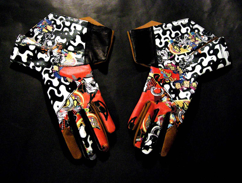
Her gloves are vibrant and bold, taking the iconic driving glove and reworking them for 21st century fashion. Using graphic prints, inspired by graffiti and geometry, the gloves boast wings and flaps and are real statement pieces.

Why gloves? Well, I’ll let Christina explain. ‘I experimented with a range of accessories – belts, bags, and so on. I found that gloves haven’t really been explored, so I set my sights on breaking this. I have a fascination for small, delicate things, and I adore soft fabrics.’ Experimenting with the properties of leather is Christina’s forte, and her adoration for graphic and comic art shines through in this particular collection (sorry, mini-collection).

The graphic patterns come from a very familiar place. ‘They’re actually abstractions of my logo,’ she tells me. The collection (sorry, mini-collection – this is getting difficult!) is split into three areas – ‘Super’ ‘Crazy’ and ‘Bow’, which are pretty self explanatory. Elements of each pair of gloves are inspired by all sorts of things. ‘My ideas are spontaneous,’ Christina continues, ‘they’re never logical.’

Who or what inspires Christina? I suggest there’s a hint of Lady Gaga about the gloves. ‘I think she’s necessary,’ Christina states, diplomatically. ‘I think what she does has been around for a while, but it’s great that she’s brought the creativity of Gareth Pugh and others into the mainstream. And I love her bold use of colour – red, black – they’re great.’ Gaga’s exagarrated, bold shapes have been insiraptional to Christina, and it’s these geometric silhouettes that are evident in the, erm, collection (oh, sod it.)
Her favourite designer is Christian Lacroix. ‘I love his use of colour,’ Christina tells me. “I don’t think the British use colour naturally – I think it’s a Northern Europe thing, maybe because of the availability of light. We tend to stick with muted colours. The French and the Spanish use colour so much more effectively.’ She LOVES colour, especially rainbow colours. We chat about the demise of Lacroix’s label. ‘I’ve read that women don’t buy his clothes because of the colours, an to be commercially viable you should use beiges, baby pinks, baby blues,’ she says. I see a serious streak coming. ‘I’m damned if I’m going to mute my colours for commercial viability!’

Christina is glad she isn’t part of a debt-riddled, multi-million pound operation. ‘I read how much debt McQueen‘s label was/is in, and I was astounded,’ she states. ‘I guess with all the hangers-on and marketing, you run up huge costs.’ This is where her relief originates. ‘I like working on my own. While it’s time consuming, I do the marketing and so on myself – so it’s free.’ She likes it this way. ‘I like being involved in every stage. It’s a control thing. It’s precious to me.’

Christina is a classically trained pianist and also trained as a botanical artist, in which she boasts 3 books to her name. She writes music, performs occasionally and has an acoustic album set for release at the end of the month. Yikes! I was fascinated to discover that Christina had met our future King, Prince Charles. ‘He was lovely!’ she remembers. ‘He was very encouraging. He was fascinated by my work’. The art, I presume, not the gloves!

Does Christina see herself as a sort of Gaga-esque fashion/music collaborator? Not really. ‘I like to keep things separate,’ she tells me. ‘It’s not a conscious thing, but my music and fashion tend not to mix.’

She began writing songs seriously about 4-5 years ago, and while she has an admiration for heavily-produced music, it’s a more acoustic sound that appeals to her. ‘There’s an art to writing songs that sound good heavily-produced, and there’s an art to writing songs that sound good acoustically,’ she informs me, ‘and I much prefer the latter’. She doesn’t get chance to listen to music that often, but when she does, she gets out to see it, rather than sticking on a CD. ‘I think to find out what’s going on [in music] you have to go and see it, you have to hear what people are playing’.

When she does listen to music, she adores Kate Bush (whom she’s happy to announce she’s compared to when she performs), Crowded House and Julian Cope, seventies rock band Heart and The Bangles, both of which she remembers listening to at the age of 14 ‘with a HUGE perm!’

With so much going on, I play devil’s advocate, and ask that if she could only explore one of her fields, what it would be. ‘It would be the gloves,’ she reveals quickly. ‘I am really passionate about this at the moment, so I guess it would be these. I feel like I’ve explored all I can with music, and the books!’ She enjoys the new challenges that creating the gloves bring. ‘I do keep one eye on fashion, but at the same time it’s important to keep things personal.’ She continues, ‘I’ve learned that things don’t move at the speed of light, so I’m enjoying this period of self-exploration.’

Christina also digs classical music, particularly the grandiosity of Beethoven, and the Godlike influence of Bach. ‘I don’t see myself as a religious person,’ she tells me, ‘but I like to think that God operates, through everything I do.’

Surely there’s time for some Christina-time? How does she relax? ‘I love to read – especially Dylan Thomas‘ poetry, and I have a new book by Oswald Spengler that I’m looking forward to.’ ‘I’m having some Crash Time this week actually’ she says, relieved. ‘I think you have to, or you burn out.’

Categories ,botany, ,Christina Brodie, ,comic art, ,fashion, ,Gloves, ,Graphic Patterns, ,Lady Gaga, ,leather, ,Leon Bankside, ,Prince Charles

Similar Posts:


Amelia’s Magazine | David Koma: London Fashion Week A/W 2013 Catwalk Review


David Koma A/W 2013 by Krister Selin

David Koma is a previous NEWGEN winner and continues to attract much attention with his sculptural pieces that push the boundaries of future fashion. It comes as no surprise, then, that Koma is again a worthy recipient of the Fashion Forward award.

These Saturday night shows are always massively oversubscribed, and after an epic cycle from Bow to Somerset House I was in no mood for the bunfight that would no doubt ensue. I managed to get a fairly decent spot on the end of the second row, but a woman stood right in the gap blocking any chance of taking a decent picture. When I asked politely if she planned to spend the duration of the show there, she looked as if I’d asked her if she wouldn’t mind getting her tits out.
There were bodies everywhere. Burly security guards patrolled up and down, barking orders at people with standing tickets to squash in as tightly as possible. As I patiently waited for some show action in the hope there wouldn’t be any nasty accidents, I surveyed the crowd and noticed these three hot blondes (above). Who are they? One of The Saturdays? All of The Saturdays? They garnered lots of media attention as audience photographers clambered over themselves to get a shot, creaming their proverbial drawers in the process.


All photography by Matt Bramford

The invite – my favourite this A/W 2013 season – was a black rectangle with a spot-laminate finish to look like vinyl. I imagined that this a gave clue to Koma‘s inspiration for this particular collection, but had no idea how literally he would take things…


David Koma A/W 2013 by Sylwia Szyszka

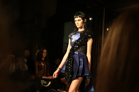
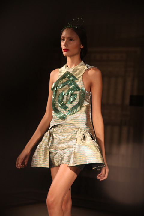
While Koma has never strayed away from a futuristic direction, there was definitely a more progressive feel to this collection. Koma‘s angular lines that have become his signature were scarce, this time the beautiful form of 12″ vinyl was replicated across every single garment. Circular leathers encased models around the neck and waist, provided structure for bell-shaped skirts, supplied interest in sexy skintight pieces and formed high-gloss shapes across busts and bottoms. Zips joined garments together, providing even more cyclical shapes.


David Koma A/W 2013 by Laura Hickman

Juxtaposing fabrics were married together – another Koma signature – with high-gloss leathers mixed with rich wools and cottons. Laser-cut leather, flock print, organza and quilting were all fused together in harmony.


David Koma A/W 2013 by Krister Selin

Koma‘s relationship with the colour black isn’t in any danger, with the opening looks relying entirely on fashion’s favourite colour. This season, though, welcome blasts of nude, bright red (my favourite pieces), teal and deep blue allowed for a linear colour palette that worked effortlessly almost to the point of unnoticeable. Models were styled with simple centre partings, long, thin ponytails and vertiginous heels, in collaboration once again with Alain Quilici.


David Koma A/W 2013 by Sylwia Szyszka

It takes a talented designer to take such ephemeral inspiration and produce a cohesive and exciting collection without verging on pantomime. David Koma is the nuts.

Categories ,12″, ,A/W 2013, ,A/W’13, ,british fashion council, ,catwalk, ,David Koma, ,fashion, ,Fashion-forward, ,Krister Selin, ,Laura Hickman, ,London Fashion Week, ,Matt Bramford, ,Newgen, ,review, ,Somerset House, ,Sylwia Szyszka, ,Vinyl

Similar Posts:


Amelia’s Magazine | Dora Abodi: London Fashion Week S/S 2015 Catwalk Review

Dora Abodi by Simon McLaren
Dora Abodi by Simon McLaren.

Dora Abodi was a new name to me. She founded her label in 2009 in Hungary and currently divides her time between Milan and Budapest. I was pleased to note that she doesn’t work with fur and only uses materials from an ethical origin, working with craftspeople to achieve a fine finish on garments and accessories.

Dora Abodi Spring Summer 2015, illustration by Rosa Crepax and Carlotta Crepax, Illustrated Moodboard for Amelia's Magazine
Dora Abodi SS15 by Rosa Crepax and Carlotta Crepax of Illustrated Moodboard.

I loved the cardboard cut out invitation to this show (not enough interesting invites in these days of austerity…) which was covered in graphic photo generated patterns that appeared on a series of belted dresses, and panelled crop tops worn with flared skirts. She’s obviously a fan of Jonathan Saunders, Belle Sauvage and kin, but gave this collection a gothic spice of its own with slick black mullets, dark eyes and swishing curved embellishments reminiscent of birds wings. The show closed with a stunning ensemble that would not be out of place as inspiration for my 10th anniversary open brief, calling to mind animal spirits and shamans.

Scroll down to view the video.

Dora Abodi SS 2015 photo by Amelia Gregory
All photography by Amelia Gregory.

Categories ,Budapest, ,catwalk, ,Dora Abodi, ,Hungarian, ,Hungary, ,Illustrated Moodboard, ,Jonathan Saunders, ,London Fashion Week, ,Milan, ,review, ,Rosa Crepax and Carlotta Crepax, ,S/S 2015, ,Simon Mclaren, ,SS15

Similar Posts:


Amelia’s Magazine | Ekaterina Kukhareva: London Fashion Week S/S 2013 Catwalk Review

Ekaterina Kukhareva by S/S 2013 by Shy Illustrations
Ekaterina Kukhareva by S/S 2013 by Sheilagh Tighe aka Shy Illustrations.

Ukranian born Ekaterina Kukhareva is a Central Saint Martins knitwear graduate, about whom I knew nothing before this show, staged on Sunday at Freemasons’ Hall. Her psychedelic take on St Tropez high style was inspired by Brigitte Bardot, with geometric patterns gleaned from Egyptian hieroglyphs and applied to complex woven jacquards and intarsias in a range of light weight resortwear.

Ekaterina Kukhareva by S/S 2013 photography by Amelia Gregory
The designs took on a retro 60s feel in sugary shades of pink and lilac teamed with a lovely denim indigo blue. Acidic purple and orange made for a particularly eye catching combination when used for a trouser set, worn with swinging beaded earrings and contrasting blue and orange platform sandals. Somehow the briefcase that the model swung at her side seemed out of place: I can’t imagine many people wearing this to the office. Even more stunning was the knitted maxi dress that featured a huge intarsia pattern: a bright fuchsia cross across the bodice and a bold zig zag design down the centre of the skirt. The American stars and stripes appeared to have influenced the pattern on a cutout pink white and blue swimsuit and the matching beach cardigan that it was worn with. It’s not often that you see an entire range of outfits created from scratch using home spun fabrics: there were some stunning designs to be found within this aspirational collection.

Ekaterina Kukhareva by S/S 2013 photography by Amelia Gregory
Ekaterina Kukhareva by S/S 2013. All photography by Amelia Gregory.

Ekaterina Kukhareva by S/S 2013 by Shy Illustrations
Ekaterina Kukhareva by S/S 2013 by Sheilagh Tighe aka Shy Illustrations.

Categories ,Brigitte Bardot, ,Central Saint Martins, ,Ekaterina Kukhareva, ,Freemasons’ Hall, ,Goddess in St. Tropez, ,Intarsia, ,Jacquard, ,knitwear, ,lfw, ,S/S 2013, ,Sheilagh Tighe, ,Shy Illustrations, ,Ukranian

Similar Posts:


Amelia’s Magazine | Eugene Lin: London Fashion Week S/S 2014 Catwalk Review

Eugene_lin_by_Novemto_komo
Eugene Lin S/S14 by Novemto Komo

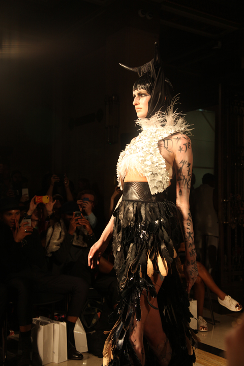
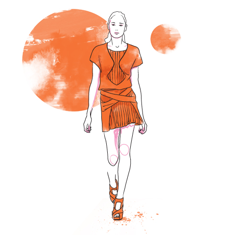
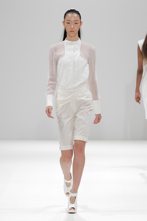
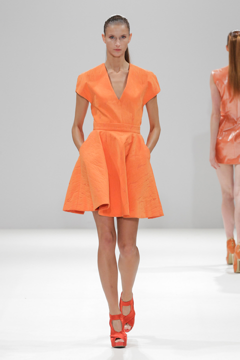
Eugene Lin’s interest in Mythology has not dwindled and neither has his talent: for his S/S 2014 collection he set out to create his own fable with Valkyrie; named after the Norse myth that female spirits of battle become swans with the aid of feathered cloaks. Returning once again to the Fashion Scout catwalk, for this latest battle he offered a much cleaner and less embellished collection, sending his own kind of modern warrior women down the runway. Pure white pieces came first, before a burst of unexpected orange turned things up a notch. Strong tailoring included high waists, feathers and pleats and provoked much delight, my own included. Lin provided his signature sharp lines and much loved screen prints; this time including some minimal digital printing techniques that worked well with the structured pieces. Themes and references can be tacky if overdone but Eugene Lin managed to modernise the myth and create a collection that showed the execution of an idea done well, plus the power of top class tailoring.

eugene_lin_ss14

eugene_lin_ss14

eugene_lin_ss14

eugene_lin_ss14

eugene_lin_ss14

eugene_lin_ss14

eugene_lin_ss14

eugene_lin_ss14

eugene_lin_ss14

eugene_lin_ss14

eugene_lin_ss14

Photography by Christopher Dadey


Categories ,Eugene Lin, ,Fashion Scout, ,Freemasons’ Hall, ,London Fashion Week, ,prints, ,S/S 2014, ,tailoring, ,Valkyrie

Similar Posts:


Amelia’s Magazine | Event: Mr Jones Watches launches The Masters of Time

The Compass Road by Iain Sinclair illustrated by Faye West

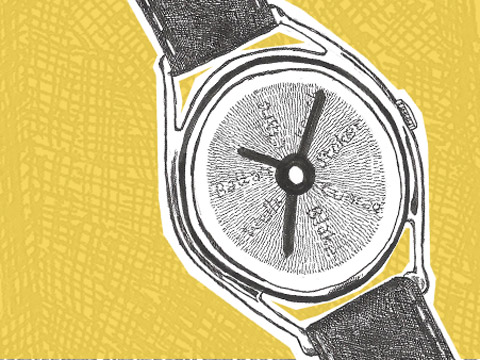
The decision to wear one of Mr Jones’ Watches is to accept the designer’s challenge to a modern concept of time being a series of fixed units, remedy through which the day is neatly compartmentalised. A concept most succinctly visualised by the watch The Average Day watch. This piece was originally produced for The Muses. The watch-face illustrates the average activities undertaken at particular points throughout the day. The information was digested from sources researching how time is spent by an average person throughout the day. The hours are replaced by words; 6pm becomes social life and 11am becomes work.

The Average Day, Photograph by Chris Overend. The Muse for this particular watch was Jonathan Gershuny, Director of the Centre for Time Use Research and who Mr Jones stipulates has “750,000 time-use diaries.”

Continuing to dispense with Western Modernity’s accepted measurement of time, Mr Jones developed Cyclops, a watch with no hour, minute or second hands. Instead a circular disk mimics the movement of shadows across a sundial, as the passage of time is meditatively documented. Encouraging the wearer to reevaluate their relationship to capitalist time in which every precious second counts.

Cyclops

On Wednesday 3rd November 2010 Mr Jones’ Watches launched The Masters of Time a collaboration with five unique professionals who share an unique and personal concept of time.

During the launch Iain Sinclair, author and psycho-geographer, Greame Obree, record breaking cyclist and artist Brian Catling discussed the ideas behind their watches and the process of negotiating whilst collaborating with Mr Jones. The final two watches were developed with Comedian William Andrews, and DJ Tom Middleton.

Iain Sinclair Photograph by Emilie Sandy

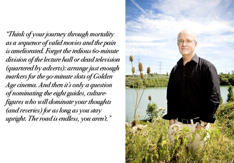
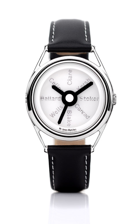
Iain Sinclair’s (Author of Hackney That Red Rose Empire) Compass Watch relates to 90 minutes of film time, rather than your usual TV time of 60 minutes. Sinclair discussed the relation of time to walking, the layers created as time passes both between an event and the walker’s presence, within the walker’s own time.

Iain Sinclair – Compass Road interview from Mr Jones on Vimeo.

Fittingly Sinclair’s watch replaces the units of time with authors whose experience was shaped both by the influence of both geographic location and a complex understanding of time. In his 15 minutes Sinclair discussed the breakdown of the poet John Clare after the enclosure of the landscape to JG Ballard’s experiences as a prisoner of war before his arrival in Suburban England.

Compass Road by Iain Sinclair and Mr Jones Watches

The performance artist and sculptor Brian Catling, introduced the ideas behind Dawn West Dusk East via an art historical slide show. Original paintings and performances explored and expanded on the concept of ‘the Cyclops’. The watch –in the words of the artist- was designed to be “enigmatic, subtle and poetic.” The single rotation of this exquisite design is a silent request to return to a slower pace. The dial gradually measures the 12 hours between Dawn and Dusk.

Brian Catling Photograph by Emilie Sandy

The final speaker of the evening was the twice claimant of the toughest cycling challenge The Hour – a race between the cyclist, distance and the clock. Fittingly the title chosen for Graeme Obree’s timepiece is The Hour. As the hand rotates each hour reveals a different word encouraging the wearer to question emotions experienced during a variety of daily activities. Obree described The Hour as the best, worst, most exhilaratingly painful amount of time imaginable, each second a step closer to achieving or failing a lifelong obsession.

The Masters of Time launch was a fantastic introduction to an individuals complex relation to time. Sadly William Andrews and Tom Middleton were unable to attend, their watches The Last Hour and BPM played with the idea of ‘death’ on stage and a DJ’s relation to the beats per minute respectively. BPM comes complete with a specifically designed animation to help the nocturnal DJ keep count of each record’s BPM prior to the moment of a live mix.

Tom Middleton Photograph by Emilie Sandy

William Andrews Photograph by Emilie Sandy

William Andrews The Last Laugh functions as a symbol of the performer’s need for the last laugh and a momento mori, a reminder that life is brief as time flashes past on the moving teeth of the skull illustrated watchface

The Last Laugh by William Andrews and Mr Jones Watches

Mr Jones Watches are available from the website or you can visit Mr Jones Design, Unit 1.11, Oxo Tower Wharf? Southbank London SE1 9PH.
Compass Road and The Last Laugh are available today.

Categories ,artist, ,Author, ,BPM, ,Brian Catling, ,Comedien, ,Compass Road, ,Concept, ,Cyclist, ,Cyclops, ,Dawn West Dawn East, ,dj, ,Emilie Sandy, ,Graeme Obree, ,hours, ,Iain Sinclair, ,minutes, ,Mr Jones Watches, ,Oxo Tower, ,Pip Pip, ,seconds, ,The Average Day, ,The Hour, ,The Last Laugh, ,Time, ,Tom Middleton, ,watch hands, ,William Andrews

Similar Posts:


Amelia’s Magazine | Fantastic Flaçons: A look at iconic perfume bottles


‘Chanel No.5′ designed by Jean Helleau. Illustration by Sandra Contreras

When Freud pondered the question of ‘what women want, pharmacy ’ someone should have told him that there are few things more desirable than a beautiful bottle of scent. Since the early 20th century, viagra 100mg the perfume flaçon (small bottle) has taken on many weird and wonderful guises – some of which have gone on to become cultural artefacts and artist’s muses. By no means a comprehensive list, here is a small selection of some of the most jaw-dropping flaçons you’ll ever encounter – some of which even manage to upstage the scents they contain.

Chanel Nº 5
“I always launch my collection on the 5th day of the 5th month, so the number 5 seems to bring me luck – therefore, I will name it Nº 5,” proclaimed Mademoiselle Chanel after putting her initial doubts to one side and deciding to branch out into fragrance. The name itself summed up the scent’s abstract nature, and was a two-fingered salute to the other flowery perfume names at the time. Launched in 1921, No. 5 made greater use of synthetic ingredients, resulting in a blend of rose and ylang ylang that is rich, intoxicating but decidedly ‘unfloral.’ The first bottle was designed by the lady herself, modelled on the Charvet toiletry bottle that once belonged to her then-lover Captain Arthur ‘Boy’ Capel. The resulting flaçon we know and love was created in 1924 by Jean Helleau, and went on to become the subject of Andy Warhol’s famous ‘pop art’ prints, as well as being on permenant display in New York’s Musuem of Modern Art (MOMA) since 1959. The rich gold coloured liquid seen vividly through the glass of the minimalist square bottle, with its simple black letters and jewel-like stopper simply screams luxury. 86 years on, it is still capable of stopping women’s hearts – my fair own included.

Shalimar by Guerlain

‘Shalimar’ designed by Raymond Guerlain. Illustration by Stéphanie Thieullent

Named after the Shalimar Gardens in Lahore, and meaning ‘temple of love’ in Sanskrit, you could half expect a genie to emerge from this fan-shaped bottle with sapphire-coloured stopper, but the sweet vanilla fragrance inside is just as mesmerising. Designed by Raymond Guerlain in 1925 and manufactured by Cristal Baccarat (who along with Lalique, first turned the perfume flaçon into an objet d’art) the design of Shalimar was inspired by the fountains one might find in Indian palaces, and was displayed at the Decorative Arts Exhibition in the same year. The bottle has recently been given a modern make-over by jewellery designer/socialite Jade Jagger, who hasn’t strayed that far from the original, and produced a slightly sleeker version that Raymond himself would have been happy with.

Flower by Kenzo

‘Flower by Kenzo’ designed by Serge Mansau. Illustration by Kayleigh Bluck

I love the beautiful simplicity of Flower by Kenzo – how the tall thin glass leans gracefully to one side like a delicate stem in a summer breeze, echoing the sweet floral fragrance within – with a trompe l’oeil image of a flower appearing as if it were inside the bottle itself. Launched in 2000, the flaçon was designed by Serge Mansau, a French glass sculptor and stage decorator, who had already honed his craft designing flaçons for the likes of Dior and Hermés. He was given the concept of a flower by Kenzo’s artistic director Patrick Geudj, who wanted to highlight it as a powerful symbol for peace, and was particularly inspired by photographer Marc Ribaud’s image March in Washington (21st of October 1967) in which a girl holds a flower in front of a gun that is being pointed at her. Who knew a perfume could be political?

Shocking by Schiaparelli

Schiaparelli’s ‘Shocking’ designed by Leonor Fini. Illustration by Joana Faria

Inspired by a bust of Mae West, who was one of Schiaparelli’s major clients, 1937’s “Shocking” was designed by Argentine painter Leonor Fini, and best exemplifies Schiaparelli’s role in the surrealist movement (her designs included her famous lobster dress, and a hat in the shape of high heeled shoe.) The name was inspired by Cartier’s famous ‘shocking pink’ diamond the Tête de Belier (Ram’s Head) and Shocking’s encasing box was dyed in the same pink shade to match. In an era where few fashion houses were releasing perfume, ‘Shocking’ was Schiaparelli’s attempt to compete with her nemesis Chanel (although sadly unlike her rival, the label did not adapt to the changes brought about by WWII and closed in 1954.) The scent itself – a rather dry powdery bouquet of honey rose and jasmine – may not be to everyone’s taste, but the bottle still remains a little piece of perfume history.

Alien by Thierry Mugler

‘Alien’ designed by Thierry Mugler. Illustration by Karolina Burdon

Designed by Mugler himself, Alien is a bright amethyst and gold flaçon, made to appear like a ‘sacred stone’ and bringing to mind 1980’s sci-fi films such as Blade Runner and Tron –  and is a good example of the designer’s flamboyant, theatrical style (check out Beyoncé’s motorcycle corset for a better idea). Alien was Mugler’s second fragrance, which he described as a nod to ‘ultra-feminity’ and contains notes of sambac jasmine and cashmeran wood, creating a soft woody- amber bouquet. The flaçon according to the designer “symbolises thoughtfulness and peace of mind” despite appearing as if it’s going to hatch a new life form on a mission to destroy all humanity as we know it, HG Wells-style.

Categories ,1980s, ,Alien, ,Andy Warhol, ,Balde Runner, ,beyonce, ,Bottle, ,Cartier, ,chanel, ,Cristal Baccarat, ,Decorative Arts, ,Flaçon, ,Flower, ,Guerlain, ,Jade Jagger, ,Jean Helleau, ,Joana Faria, ,Karolina Burdon, ,Kenzo, ,Lahore, ,Lalique, ,Leonor Fini, ,Mae West, ,Marc Ribaud, ,MOMA, ,No.5, ,Patrick Geudj, ,Perfume, ,Pop Art, ,Raymond Guerlain, ,Sandra Contreras, ,Schiaparelli, ,Serge Mansau, ,Shalimar, ,Shocking, ,Stéphanie Thieullent, ,Thierry Mugler, ,Tron, ,Viola Levy, ,WWII

Similar Posts:


Amelia’s Magazine | Bernard Chandran: London Fashion Week S/S 2014 Catwalk Review

Bernard Chandran S/S 2014 by Yelena Bryksenkova
Bernard Chandran S/S 2014 by Yelena Bryksenkova.

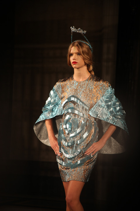
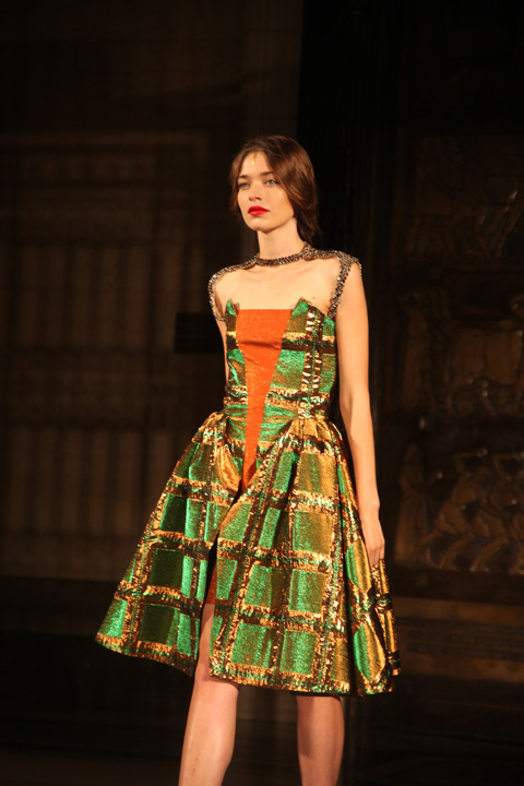
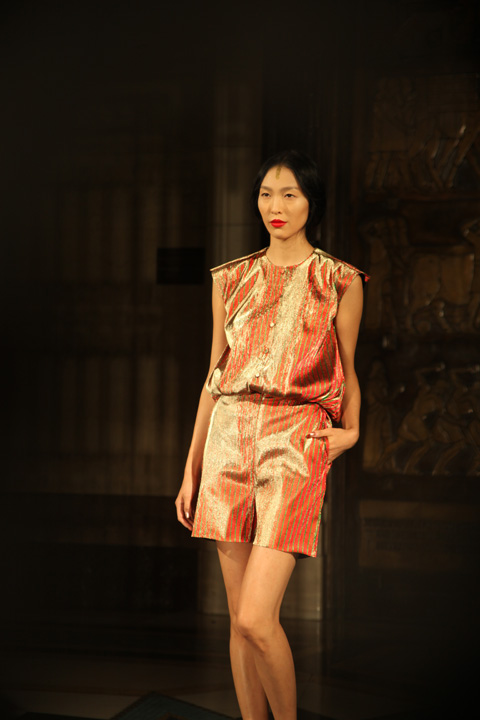
In the upper halls of Freemasons’ Hall Bernard Chandran once again put on a stellar show. Sumptuous silken lame in jewel bright hues of blue, red, green and orange was cut in a series of swishing asymmetric layered dresses that featured off kilter puff shoulders, caped bodices and artfully pleated drop waisted skirts. Delicate tinsel head pieces called to mind the fairy on top of the Christmas tree, and feet were dressed in chunky heeled strap sandals of matching glitter. Tumbling tubular beads created optical patterns on statement dresses, the sumptuous skeins of brocade offset against skinny twinkle straps. The entire collection was fit for a most modern princess. More, please!

Bernard Chandran S/S 2014 by Ruth Bridges
Bernard Chandran S/S 2014 by Ruth Bridges aka xplusyequals.

Bernard Chandran S/S 2014 by Gareth A Hopkins
Bernard Chandran S/S 2014 by Gareth A Hopkins.

Bernard Chandran SS 2014-photography by Amelia Gregory
Bernard Chandran S/S 2014. All photography by Amelia Gregory.

Categories ,Bernard Chandran, ,Freemasons’ Hall, ,Gareth A Hopkins, ,lfw, ,review, ,Ruth Bridges, ,S/S 2014, ,xplusyequals, ,Yelena Bryksenkova

Similar Posts:


Amelia’s Magazine | À La Disposition: The London Fashion Week S/S 2012 Preview Interview

technology will save us stall
Simian Mobile Disco has made a career of writing sharp, case economic dance tracks. Their release last year of Temporary Pleasures showed that they could still fill up dance floors, and they enlisted the help of some of their musical peers.

New single Cruel Intentions features The Gossip’s Beth Ditto on vocals. Singing over a simple synth loop the minimal sounding track has Ditto’s voice front and centre throughout she is either singing a song about finding love, or losing it. It manages to highlight how effective her singing voice is and why she is so respected within the musical community.

As seems common for dance bands lately the track has a strong 80’s vibe to it but it doesn’t make it sound dated and cheap.  I can imagine dragging myself onto the dance floor during the closing minutes of a club dance and shaking my booze dullened body in time to the beat, and I mean that in the best possible way
A La Disposition SS 2012 by Faye West
A La Disposition S/S 2012 by Faye West.

À La Disposition return to London for their second season at London Fashion Week this September with their S/S 2012 collection mECHANICAL fAILURE, click inspired by the shapes of propellers and the mechanics of flight. Time to find out what keeps American husband and wife team Lynda and Daniel Kinne ticking… and why they’ve decided to make London their new home.

a la disposition mECHANICAL fAILURE by Gareth A Hopkins
À La Disposition mECHANICAL fAILURE by Gareth A Hopkins.
 
Last season we were wowed by À La Disposition for the first time at London Fashion Week – what was the reception like and why have you decided to return for a second time to show in London?
Thank you for the kind compliment. The reception we received was a great one: very warm and well spoken. It has always been a dream of ours to live in London because it is a great source of inspiration, and it is where we received very crucial and formative parts of our training.

A la disposition by Alice Nyong
À La Disposition S/S 2012 by Alice Nyong.

What other things did you discover and fall in love with at LFW?
What is truly unique about London Fashion Week and what we love most is the creative expression, not just the designers but also the people. London has a great mix professionalism and wit. We also find a positive vibe here that is truly its own.
 
A La Disposition by Yelena Bryksenkova
À La Disposition S/S 2012 by Yelena Bryksenkova.

Where is your studio based and what would it look like if I were to pop around for a cup of tea right now?
We are currently looking for a studio in London, or at least we will be after London Fashion Week. We hope to be based near our new home in Southwark. If you were to drop by right now you would find a very industrious scene of somewhat makeshift workstations and busy last minute adjustments. You would be treated to a deep malty cup of Assam taken with little sugar and much milk and nobbly biscuits.

A la disposition by Alice Nyong
À La Disposition S/S 2012 by Alice Nyong.

You are a husband and wife team – what came first? The working together or the romantic relationship? And how do you manage to separate your different work and private lives?
There always was an attraction from the first time we met at fashion school. It developed from a passion about the same things to working together to a passion for one another. There really is no division to our work and personal lives they are so harmoniously intertwined.

A La Disposition by Gilly Rochester LFW Sept 2011
À La Disposition S/S 2012 by Gilly Rochester.
 
For S/S 2012 I believe we can look forward to contrast in the form of voluminous gowns and graphic sternness, with shapes reminiscent of propellers – where did you find the inspiration for this collection and how did you research ideas?
It is always difficult to articulate our inspiration ideas. The collection is a journey which flows from a story Daniel develops as he sketches. This season’s story involved the mechanics of flight. Although we do not research images or ideas for each particular season we have an extensive library of fashion and art books and we are always gathering ideas from everything around us.

À La Disposition S/S 2012 by Alice Nyong
À La Disposition S/S 2012 by Alice Nyong.
 
It sounds as if your colour palette will be as bold as it was last time around – army greens combined with rich yellows and purples. How do you put together a colour range and then source the fabrics or dyes to make this a reality?
This is Lynda’s territory in the brand development. The colour range is developed in conjunction with the fabrics we source as the season organically develops. The punchiness of the colour card, the signature textures and the stripes are all Lynda.

A La Disposition by Gilly Rochester LFW Preview Sept 2011
À La Disposition S/S 2012 by Gilly Rochester.
 
Last season you created a wonderful dual perfume for the show (which I wear quite a lot!) – can we look forward to any other special collaborations for this season?
So glad to hear that you like our perfume {{intangible}}. It has been received very well. There is a smaller version of the perfume in the works to more easily distribute it. We also are working with Anastasia Radevich to design our shoe range again and are very excited about what she has designed for us.

a la disposition mECHANICAL fAILURE shoe by Gareth A Hopkins
a la disposition mECHANICAL fAILURE shoe by Gareth A Hopkins.
 
The styling of last seasons’ show was quite spectacular… you memorably used coloured contacts to give red eyes. Will there be any other surprises in store this season?
There are a few possibilities in the works. As long as it works with the collection we are willing to give it a go.

A La Disposition Dress by Claire Kearns
À La Disposition S/S 2012 by Claire Kearns.

À La Disposition will be showing their S/S 2012 collection on the catwalk on Tuesday 20th September 2011 as part of Fashion Scout.

A La Disposition Outfit by Claire Kearns
À La Disposition S/S 2012 by Claire Kearns.

Categories ,À La Disposition, ,Alice Nyong, ,Anastasia Radevich, ,Claire Kearns, ,Fashion Scout, ,Faye West, ,Gareth A Hopkins, ,Gilly Rochester, ,London Fashion Week, ,Lynda and Daniel Kinne, ,mECHANICAL fAILURE, ,Perfume, ,preview, ,Propellers, ,S/S 2012, ,Yelena Bryksenkova, ,{{intangible}}

Similar Posts:


Amelia’s Magazine | Asger Juel Larsen Vs T.Lipop: London Fashion Week A/W 2012 Menswear Day Catwalk Review


T.Lipop A/W 2012 by Jo Ley

I’ve been keen to see more from Asger Juel Larsen since illustrating his S/S 2012 collection for Amelia’s Magazine. It’s not every day you get to draw a beard made out of leather and nails, and the post-apocalyptic aesthetic is one that I can naturally appreciate. That, and I’d read that at Copenhagen Fashion Week they sent a guy down the catwalk bloodied and with a chainsaw


Asger Juel Larsen A/W 2012 by Gemma Cotterell

A few incidents immediately prior to the show dampened my enthusiasm somewhat. For a start, while waiting in the Media Lounge at Freemason’s Hall, I found that a pot of Sudocrem that I had no recollection of ever having seen before had split in my bag (random pots of Sudocrem being one of the given perils of being a parent to a young child). There’s nothing cooler than a man whose hands are covered in Sudocrem, I’m sure you’ll agree.


Asger Juel Larsen A/W 2012 by Sam Parr

The queue into the show was a mess, not helped by the show starting half an hour late, although there was free frozen yogurt. I also realised too late that the ‘ST’ on my ticket meant ‘Standing’ and wasn’t code for something more exciting, like… I don’t know what I thought it would stand for, to be honest. I was just happy to get the ticket (it had my name on it and everything).

Once the crowd had been herded into the showroom and I’d baffled nearly everyone around me with my insistent politeness, I found myself smushed against a wall with a direct view into the catwalk’s entrance, which was pretty much as good as I could have got, considering, and it was totally fluked.


All photography by Gareth A Hopkins

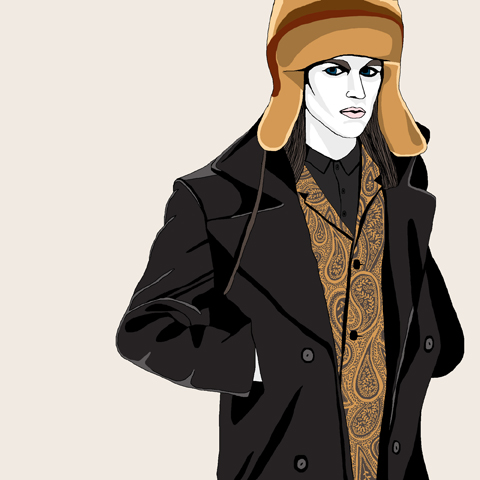
The collection itself was predominantly inspired by Soviet Officers uniforms, which combined with solid tailoring, chunky zips and a limited palette of black, grey and crimson worked really well. The majority of the models were made to look gaunt and frozen by pale makeup, which played up the ‘fragility of war’ concept that Larsen was going for. Breaking away from the palette was a suit in brown and tan paisley; paisley seemed to have infiltrated everywhere this season, so if I was to pick out a ‘trend’ other than the whole arctic/Baltic aesthetic, paisley would be it.

The headgear was a problem for me, though. I’ve distrusted beanie hats since East 17 were first on Top Of The Pops, and there was a raft of them bobbing down the catwalk. More fundamentally problematic were the ginormous fur hats – the size and shape wasn’t a problem (I actually liked the look of them) but I’d hoped we’d all moved on from fur now, and for me its inclusion sullied my opinion of the rest of the collection.

Also: there was no chainsaw anywhere. Whether Health & Safety had been in touch or they’d run out of petrol, I don’t know. But I’d been promised a chainsaw and there wasn’t one.


T.Lipop A/W 2012 by Lo Parkin

Straight out of the gates after Larsen was T.Lipop, whose collection I’d also seen at the Fashion East installations earlier in the day. Similar to Larsen’s Soviet-in-the-trenches look, Lipop’s models were decked out to look like Victorian arctic explorers, with frost in their beards and eyebrows and carrying explorer gear. This hid a more muted but arguably more wearable collection with softer lines and a less harsh colour palette that included burgundies, oranges and tan along with a hit here and there of good ol’ Navy Blue.


T.Lipop A/W 2012 by Jo Ley

Once again, the fur card was played, this time right at the end with a digital-print coat with an enormous pelt hood, drew gasps of wonder from the crowd and a unified surge of camera clicks. The shape and the weight of the coat were satisfying, it’s just a pity that the arctic theme had to be held so rigidly that fur couldn’t have been avoided.

Not to put too much of a downer on either though, as both were very strong showings and I’m positive we’ll be hearing more from both in the future. Although next time, if you say there’ll be a chainsaw, bring a chainsaw.

Categories ,Arctic, ,Asger Juel Larsen, ,AW2012, ,Baltic, ,Big Zips, ,Chainsaw, ,Freemasons’ Hall, ,Frosty Beards, ,Frozen Yogurt, ,Gareth A Hopkins, ,Gemma Cotterell, ,Health & Safety, ,Jo Ley, ,Lo Parkin, ,London Fashion Week, ,military, ,Paisley, ,Sam Parr, ,soviet, ,Standing, ,Sudocrem, ,t.lipop, ,Vauxhall Fashion Scout

Similar Posts: