Amelia’s Magazine | Lug Von Siga: London Fashion Week A/W 2013 Catwalk Review

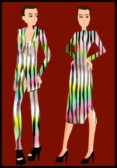
Luc Von Siga by Louise Smith
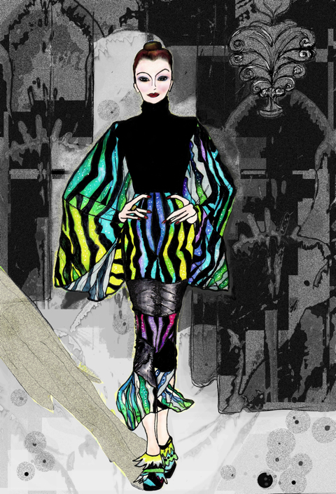
Lug Von Siga LFW A/W 2013 by Louise Smith

At first I stand, then I kneel, and by the time the show starts, I’m sitting on the floor. Hardly the most elegant of positions, but comfortable and as an added bonus; clean-view camera shots can be achieved through this little-known ‘crouching tiger’ catwalk-reporting technique.

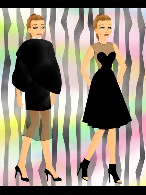
Luc von Siga by Louise Smith
Lug Von Siga LFW A/W 2013 by Louise Smith

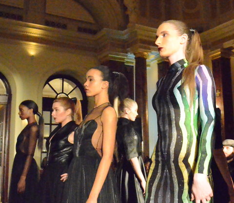
I’m hooked from the moment the orchestral song starts playing at Lug Von Siga‘s A/W 2013 LFW show in Freemasons’ Hall. The music reminds me of listening to the Peter and the Wolf audiotape as a kid. Unnervingly, what drew me in comes back to haunt me and within minutes it sounds more like the distinctive shower-dagger scene from Alfred Hitchcock’s Psycho. I suppose they do say you’d have to be crazy to be a designer…

Lug Von Siga AW 2013
All photography by Amelia Gregory

The clothes have a story-time feel to them; modernized fairytale-wear updated for the current era with a lashing of chic and well-cut to add some sophistication. What would a 2013 Little Red Riding Hood wear under her cape? What would a modern day Cap ‘o’ Rushes put on for work? There’s definitely an Upper East Side fairytale Queen among these outfits. A chain-mail like use of silver on one piece feels very knight in shining armour too; female of course.

Lug Von Siga AW 2013-photo by Amelia Gregory
Lug Von Siga AW 2013

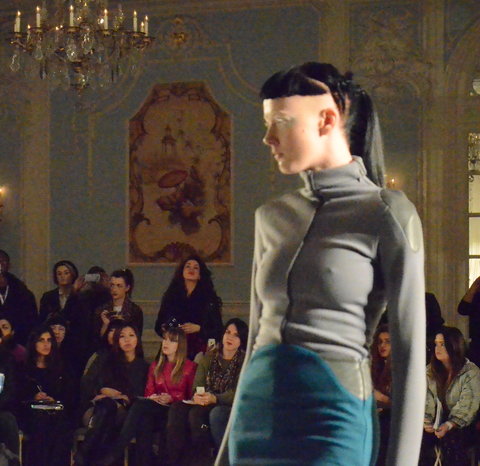
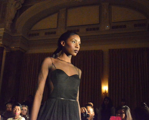
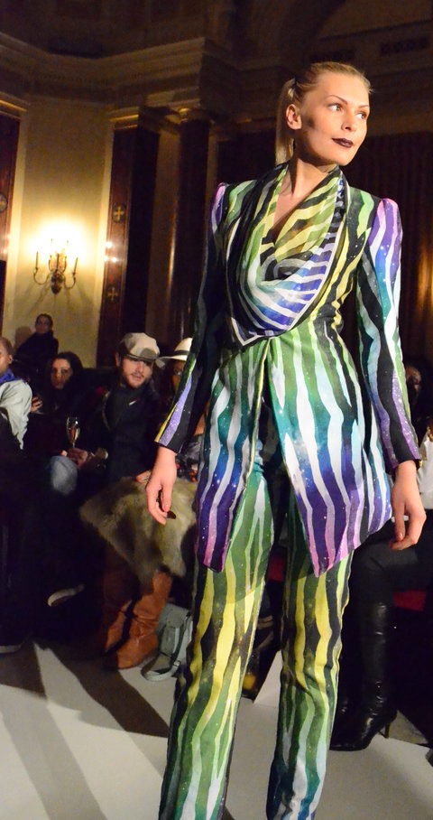
Turkish designer Lug Von Siga offers this stylish collection on the opening day of LFW A/W 2013. An outfit is even complete with shards of mirror, seemingly confirming my suspicions that the collection is nodding to Snow White, although I soon discover they are actually inspired by Ottoman Empire superstitions. This ancient influence expresses itself through a futuristic look and there’s a hint of 1940s in the block shapes. Elegance is maintained throughout with long gloves and trilby hats. The colours are surprising, with magenta and gold popping up unexpectedly. A shiny jacket with a tinge of astronaut reminds me of Midas and his golden touch as well as hinting at 80s influences. The cherry on top of all this is some rich plum pieces. Combined with the unnerving soundtrack, this magenta makes me think of a certain Cluedo professor and gives the collection an air of mystery. “It was Lug Von Siga’s collection in Freemasons’ Hall with the monochrome that did it for me,” I think to myself.

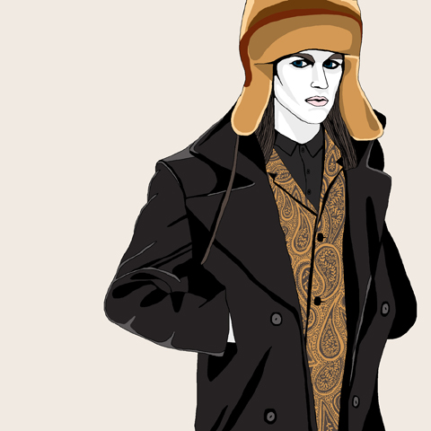
Lug Von Siga by Rosemary Kirton
Lug Von Siga A/W 2013 by Rosemary Kirton

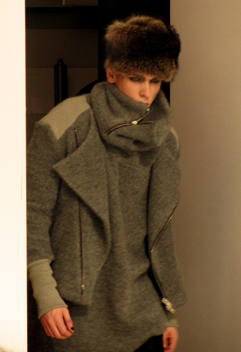
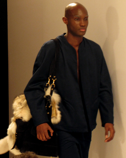
Lasalle Academy graduate Lug Von Siga has come up with a solid collection; high detatchable collars and androgynous styling define the look. Wool is contrasted against loose fitted jackets and faux-fur is brought into the mix. The pieces are notably well-tailored and there’s a large number of sleeveless garments.

Lug Von Siga AW 2013
Lug Von Siga AW 2013-photo by Amelia Gregory
Lug Von Siga AW 2013

I notice a boy in the audience has an almost identical hat to one of the models. I brush the dust-bunnies from my skirt as I move to get a better view. I’m sitting next to the press photographers. All hunched up together, sitting, standing, crouching; an android with two dozen eyes. What would Charlie Brooker say if he saw them, eh?! I imagine he would roll his eyes deliberately. There’s nothing as annoying as the snapping of the pappa’ during a show. The cameras are so loud they actually create an additional soundtrack, like some sort of rogue percussion instrument. I’m desperate to turn my camera on them and start taking pictures, it feels as though there’s something to document just in the press section. I decide this would be an act of defiance of epic proportions and refrain from listening to the itch of my camera. I look at the audience around me and there are cameras everywhere. iPhones, Nikons, even iPads are held up towards the models.

I put my own SLR down guiltily.

Categories ,A/W 2013, ,Fairytale, ,Fashion Scout, ,Freemasons’ Hall, ,Jessica Cook, ,lfw, ,London Fashion Week, ,Louise Smith, ,Lug Von Siga, ,monochrome, ,Orchestral, ,Rosemary Kirton

Similar Posts:


Amelia’s Magazine | Liz Black: London Fashion Week A/W 2013 Presentation Review

Liz Black: London Fashion Week A/W 2013 by Louise Smith
Illustration of Liz Black‘s A/W 2013 LFW Presentation by Louise Smith

I’m late, I’m late!” I shout as a rock up to Fashion Scout venue Freemasons’ Hall. With no white rabbit to guide me, the entrance to Wonderland was harder to locate than anticipated. As I walk up the staircase on the left to Central Saint Martins graduate Liz Black‘s show, an usher climbs the staircase on the right-hand side and to both my and his extreme embarrassment, he falls up the stairs and face-plants onto the steps. I check he’s ok and go into the show with my feet firmly planted in reality.

Ever wondered what the spread would look like at the Mad Hatter’s Tea Party? Liz Black’s presentation is the perfect way to discover the delights of Wonderland. Cupcakes by Cutesy Cakes paired with Campari Soda cocktails make this a tea party in true LFW style.

Liz Black A/W 2013 LFW

Liz Black AW 2013 LFW

Liz Black A/W 2013 LFW
Liz Black A/W 2013 Presentation Photos by Jessica Cook

Liz Black’s presentation is packed with Marie Antoinette-like decadence and I can’t help but be a little disappointed that no one is dressed like a teapot or a Cheshire cat, although a bulbous heart-shaped outfit does get my pulse racing and I spot blogger Intrinsically Florrie wearing a beautiful and fun dress that has a vague resemblance to the cupcakes around us.

Liz Black A/W 2013 LFW Presenation by Claire Kearns

Liz Black's A/W 2013 Presentation by Claire Kearns

Illustrations of Liz Black‘s A/W 2013 Presentation by Claire Kearns

An army of mannequins stand at the sides, reminding me of a Dr Who episode. These are sporting practical clothes with a smidge of elegance. Smart and stylish, there are mainly red, black and blue pieces finished off with a bit of white for good measure. This is where it gets curiouser and curiouser: in the centre there are three models having tea, munching on icing and acting out a rehearsed silent show. A white dress with large angular shoulders resembles the white rabbit, a fancy-dress heart costume with big shoulders gives off a Queen of Hearts vibe and a chess-board shaded monochrome piece screams style. The models are handing out flowers, sipping tea and posing for the cameras. The audience walk around them like stray dandelion seeds, floating aimlessly.

Liz Black AW 2013 LFW

Liz Black AW 2013 LFW

Liz Black AW 2013 LFW

Liz Black AW 2013 LFW

Liz Black AW 2013 LFW
Liz Black A/W 2013 Presentation Photos by Jessica Cook

It would be difficult to cover London Fashion Week without bringing up the tinge of jealousy; my green eyed monster could eat a model whole at the best of times, but here I feel my bitterness fall back in check. Having worried that I would feel like an oversized Alice with her body so gargantuan that her feet arms are sticking out of the windows and doors, my fears and my hunger are laid to rest by the presence of scrumptious cakes. The models are beautiful and ethereal, like live art exhibits in a gallery, and I feel my green eyed monster curl up for a nap as I munch on a cupcake, happy to escape from the busy streets of Covent Garden for an hour or two.

Sculpted-heart and elaborate white rabbit costumes aside, the dresses are elegant and chic, with a dash of good old-fashioned style thrown in for good measure. Having glimpsed a previous Alice-themed collection by Liz on the web which featured at Fashioning the Future way back in 2008, I know that her dresses have matured since her last foray into Alice-land. Cakes and cocktails are a winning combination and her presentation adds a little sweetness into my day of back-to-back shows. Ultimately Liz Black masters sophistication with this presentation in which the dresses proclaim “wear me”.

Liz Black A/W 2013 LFW Presentation by Rukmunal Hakim
Liz Black‘s A/W 2013 London Fashion Week Presentation by Rukmunal Hakim.

You can buy Liz Black‘s clothes at various outlets and visit her website at www.lizblack.net/ for more information.

Categories ,A/W 2013, ,Alice in Wonderland, ,Claire Kearns, ,Cocktails, ,cupcakes, ,Dresses, ,Fashion Design, ,Fashion Scout, ,Freemasons’ Hall, ,Intrinsically Florrie, ,Jessica Cook, ,lfw, ,Liz Black, ,London Fashion Week, ,Louise Smith, ,Presentation, ,Rukmunal Hakim

Similar Posts:


Amelia’s Magazine | Gyunel: London Fashion Week A/W 2013 Catwalk Review

Gyunel AW 2013 by May van Millingen
Gyunel LFW A/W 2013 by May van Millingen

I am distracted by a wedding dress photoshoot on my way to Gyunel‘s show at The Savoy and veer in via the wrong entrance, barely making it in time for the show. When I do finally enter, out of breath, it’s to the sound of crackling flames. The Savoy is a fancy venue with a fresco feel (Sistine Chapel as opposed to al) and Gyunel‘s Demi-Couture show is at home in this opulent location, where the clothes are complimented by chandeliers and a luxurious egg-shell blue decor. Supermodel Jodie Kidd is one of the well-known faces in the front row and the circular catwalk makes for a refreshing change to the usual straight up, straight down.

Gyunel AW 2013 by May van Millingen
Gyunel LFW A/W 2013 by May van Millingen

The collection is kicked off with a feather-covered gown in dark blue modeled by Erin O’ Connor. There are some futuristic haircuts and revealing leather, which feel a little Fifth Element, although none of the models sport the giveaway tangerine mop. A Pantone style selection of blues, a dash of white, a dab of purple and some striking cream hoods make up some of the glorious colours in this show. I can’t help but think the dresses have the feel of another era, and the leather-bound models with their billowing train dresses gives me an aftertaste of steam-punk.

Gyunel AW 2013 by Hannah Smith
Gyunel A/W 2013 by Hannah Smith

My street-side wedding-dress encounter must have been an omen as there’s a traditional, white, flowing matrimony dress in the collection too. This virginal piece is a strong contrast to the sexuality exuded by some of the other frocks, and some of the models are, what my boyfriend would (with a mischievous grin) call, ‘smuggling peanuts’.

Gyunel LFW AW 2013
Gyunel LFW AW 2013

The series of white hoods are unexpected and add an aura of mystique to the show. The make-up, provided by AOFM graduates gives the models dramatic, white, metallic eyes; right up to the brow, making them seem simultaneously as though they could be from Narnia and outer space.

Gyunel‘s collection is a well-used deployment of contrasts; leather mixed with chiffon makes for an interesting look, as does the presence of ready-to-wear garments alongside couture. With the strong underlying blue tones and a generous show of skin, the models remind me of Jason’s sirens effortlessly luring men to sea. Perhaps this influence is something I’ve imagined though, as sea salt hairspray is one of the goodie-bag freebies I managed to nab from an earlier show.

Gyunel LFW AW 2013

Gyunel LFW AW 2013

Gyunel LFW AW 2013

You can tell almost everything you need to know about someone from their walk. There is a world of difference between a prance and a skip, a mooch and a stride. I prefer those who amble, and I do a good mosey myself. Models tend to strut, but these catwalk beauties have a stride of their own; they glide. Combined with the make-up and the clothes, the effect is otherworldly. The braids that hold the hair back from their faces adds to the effect and has a trace of Princess Leia making the whole effect, not just of the clothes, but of the entire experience, pretty impressive. Whether it’s the surroundings or the dresses, I feel like I’m in a different universe for the duration of Gyunel’s fresh, varied and fantabulous show at The Savoy.

Gyunel A/W LFW 2013 By Maya Beus
Gyunel A/W 2013 by Maya Beus

Categories ,A/W 2013, ,AOFM, ,chandeliers, ,couture, ,Demi-Couture, ,Dress, ,Erin O’ Connor, ,Feathers, ,Futuristic, ,Gyunel, ,Hannah Smith, ,Jessica Cook, ,Jodie Kidd, ,lfw, ,London Fashion Week, ,Luxury, ,May van Millingen, ,Maya Beus, ,The Savoy, ,Wedding

Similar Posts:


Amelia’s Magazine | Hellen Van Rees: London Fashion Week A/W 2013 Catwalk Preview Interview

Hellen Van Rees
Helen Van Rees A/W 2013 by Claire Kearns

Up-and-coming Dutch fashion and textile designer Hellen van Rees is presenting her independent collection SQUARE3 ANGLE: THE TRANSFORMATION at London Fashion Week A/W 2013 this weekend. Hellen graduated from the MA in Fashion at Central Saint Martins’ back in February 2012 and then packed her suitcase and moved to the Netherlands to start her own fashion label. Her first collection at LFW was pegged as a ‘One to Watch’ by Fashion Scout and Lady Gaga has since been spotted donning her clobber. She’s known for her hand-made tweed fabrics which are created using factory remnants and recycled threads, and her work has 3-dimensional, sculpture-like elements, as well as a futuristic feel. Complete with a brand-spanking new video to promote her new Chanel-inspired collection, it’s likely that her pieces will receive a lot of interest in the coming weeks.

London Fashion Week
Helen Van Rees A/W 2013 by RoshniBA

Hellen Van Rees is still exploring the ideas from her graduate collection which she developed on in her last show Square2: Exploring Excitement. Although you might expect a sprinkling of déjà vu, this collection puts a tangy new twist on her hallmark tweeds. I spoke to Hellen about her shiny new collection and her plans for the future in advance of her (second) London Fashion Week show.


Video collaboration between Hellen van Rees and Evelien Gerrits of EveMedia

What can we expect from your upcoming collection at LFW A/W’13?
Lots of tweed and colours, contrasting black & white rubber and beautiful quality wool and silk; all arty but wearable.

You released a promo video for your show, how did this project come about?
I was trying to think of a way, other than a catwalk show, to present the new collection; to show the collection moving and in a nice atmosphere so the complete image comes across, as well as the details. This seemed like an exciting way to achieve that.

London Fashion Week

London Fashion Week

Hellen Van Rees

London Fashion Week

Photography by Kim Buckard

You started your own label in February 2012, what are your greatest achievements of the last year?
The fact that I was able to show my very first independent collection during London and Paris fashion week; and that I am able to do so again.

Do you have a favourite piece in this show?
I like the pieces with the new multi-coloured tweed a lot: the long dress with shiny black sleeves especially. It’s got strange contrasts but is also very elegant and wearable as well.

Do you wear your own pieces?
Not when I work (because it can get messy!) but for presentations, interviews and special occasions, yes.

Hellen Van Rees
Helen Van Rees A/W 2013 by Victoria Haynes

You’re also exhibiting at Paris Fashion Week; do you think the reactions to your show will differ between London and Paris?
I think it will because it attracts a different crowd. London has lots of bloggers and people who are generally interested in fashion that want to absorb new things, so it’s a very excitable crowd. Paris is more serious business, people there are generally looking for something more specific.

You studied the MA in Fashion at Central Saint Martins; did this prepare you for setting up your own label?
CSM was very good for me, to bring out my strong points and help me develop a clear direction within my designs. It doesn’t really prepare you for the whole business side of how it works, for example, how to sell your clothes, but I’m finding out along the way, which is fine.

Hellen Van Reees

London Fashion Week

Hellen Van Rees

Photography by Kim Buckard

You were chosen to be part of Ones to Watch as part of Vauxhall Fashion Scout’s prestigious platform for new design talent; do you think this has helped you?
Yes it has! It has made it possible for me to show my work in a professional way to large number of professionals and I’ve been supported with advice as well. They’ve done all this again for this season, which is great!

Hellen van Rees LFW
Helen Van Rees A/W 2013 by Maya Beus

You’re known for your use of tweed and sustainable materials: is this something you’ve always been interested in?
Sustainability is very important to me because I think it makes sense. I make high-end handmade garments; it makes sense that not only the outside is nice looking, but also that the story behind it is strong. The tweed and the weaving method is something I developed about a year and a half ago, but I keep getting new ideas for it so I’ll keep going with it for a while.

3D shapes are a big part of your work, where do you get your inspiration?
Contemporary art installations mostly, like the cube installations by Rachel Whiteread.

London Fashion Week
Helen Van Rees A/W 2013 by BlackEyed Jack

What is the process behind each of your collections?
I continue with the previous collection, reinterpret it, change colours, look at art and pictures, make fabrics and then make garments. I don’t really sketch; I just start making one thing and from it comes another new idea. Halfway through I do a fitting see what I have and what’s missing. I make more, and in the end there’s suddenly a collection

LFW aside, is there anything else in the year ahead that you’re really looking forward to?
Yes! I’m doing a TED talk in March at TEDx Zwolle.

London Fashion Week

London Fashion Week

London Fashion Week

Hellen Van Rees

Hellen Van Rees’ collection can be seen in the Fashion Scout London & Paris Showroom. London 15.02 -19.02 & Freemasons Hall, 60 Great Queen Street. Paris 28.02 – 05.03, 23 Rue du Roi de Sicile, Paris. You can buy her pieces at her store here

Categories ,3D, ,A/W’13, ,BlackEyed Jack, ,Central Saint Martins, ,Claire Kearns, ,collection, ,CSM, ,designer, ,Eve Media, ,Futuristic, ,Hellen van Rees, ,interview, ,Jessica Cook, ,Kim Buckard, ,lfw, ,London Fashion Week, ,Maya Beus, ,Ones To Watch, ,OwlandAccordion, ,Paris Fashion Week, ,recycled, ,RoshniBA, ,sculpture, ,Square2: Exploring Excitement, ,SQUARE3 ANGLE: THE TRANSFORMATION, ,sustainable, ,TED, ,Tweed, ,University of Arts London, ,vauxhall, ,Victoria Haynes

Similar Posts:


Amelia’s Magazine | Josh & Nicol: London Fashion Week A/W 2013 Catwalk Review

Josh & Nicol LFW A/W 2013 by Sam Parr
Josh & Nicol, LFW A/W 2013 by Sam Parr

Somewhere over the rainbow, namely at Charing Cross Hotel, Josh & Nicol presented their LFW A/W 2013 collection. The Promise of the Rainbow is a colourful collection with inspirations including birds of paradise and the Wizard of Oz. A distinctive rainbow-style fabric dominated the collection and in my mind, the pieces are split into two camps: black, elegant, gothic garments contrasting against bright, green-palette, rainbow prints with a tribal feel. The black pieces sport conspicuous zips with sections of floaty, translucent fabric. In some of the garments these two different threads meet and the fresh, colourful print is mixed with the sexier black, tying the pieces together.

Josh & Nicol LFW AW 2013

Josh & Nicol LFW AW 2013

Josh & Nicol LFW AW 2013

Held in the Betjeman Suite of the Charing Cross Hotel, the venue was, although a day too late, Valentine’s Day appropriate, with candles leading the way through the corridor and up the stairs. Named after a former Poet Laureate the room came complete with chandeliers, marble pillars and a sculpted ceiling, which provided a stark contrast to the goth-rock feel of the black garments and the flamboyant prints of the rainbow inspired togs that made up this collection.

Josh & Nicol LFW AW 2013 by Louise Smith
Josh & Nicol, LFW A/W 2013 by Louise Smith

Josh & Nicol is a luxury fashion brand established in 2010, Ufuoma Ekpecham is the brands’ Creative Director and believes that “there is nothing more beautiful and sophisticated than a woman that dresses to suit her body shape.” The designer went on to start the label after winning the Planet Africa Red Carpet Dress Challenge in Toronto.

Josh & Nicol LFW AW 2013

Josh & Nicol LFW AW 2013

There is free champagne, orange juice and wine, which is handed to me in my front row seat. After a day of queues and bobbing heads blocking my view, this is a welcome change. The show starts late, and the atmosphere is relaxed and friendly. I chat to a friend of the designer who has made her way all the way from Brussels to attend, and will leave the next day. This show feels much more personal to me, close-knit friends and family seems to make up the audience, as well as journalists.

Josh & Nicol LFW AW 2013

Josh & Nicol LFW AW 2013

There are references to Baum‘s The Wonderful Wizard of Oz in the program and although initially I couldn’t see any sign of Dorothy, the yellow brick road, or red glittery pumps, I speculate that the collection has drawn inspiration from other elements of the story. The green print is perhaps a nod to the Emerald City and the green-tinted glasses that the characters must wear to enter. If I remember correctly, in the original novel, the Wizard and Dorothy fashion a balloon from green silk, which perhaps could be something the designer has taken inspiration from for the colourful print design. Or maybe, the film version with Judy Garland‘s rendition of Over the Rainbow was part of the inspiration to inject colour and life into the fabrics Either way, this collection whisked me away from the bustling streets of London, like the cyclone whisked away Dorothy. Sadly though, reciting, “there’s no place like home,” didn’t work for me, and after this show finished, I had an hour and a half train journey to get back to Bath, my first day of London Fashion Week over with a colourful and stylish bang.

Josh & Nicol LFW AW 2013 by Louise Smith
Josh & Nicol, LFW A/W 2013 by Louise Smith

All photography by Jessica Cook

Categories ,A/W 2013, ,Betjeman Suite, ,bright prints, ,Catwalk review, ,Charing Cross, ,gothic, ,Jessica Cook, ,Josh & Nicol, ,lfw, ,London Fashion Week, ,Louise Smith, ,Sam Parr, ,Tribal, ,Ufuoma Ekpecham

Similar Posts:


Amelia’s Magazine | An Interview with Jewellery Designer Rosita Bonita

Rosita Bonita portrait by<strong> Laura Gill</strong>” title=”Rosita Bonita portrait by Laura Gill” width=”480″ height=”571″ class=”aligncenter size-full wp-image-69903″ /></a><br />
<strong><a target=Rowenna Harrison portrait by Laura Gill

Working under the name Rosita Bonita, Camberwell illustration graduate Rowenna Harrison makes beautiful jewellery that would be at home in any trinket lovers dressing-up box. Her pieces celebrate all things vintage glamour and have a whole host of other influences from the mythical to the historical. We’ve mentioned Rosita Bonita before as Amelia stumbled across her work at Wilderness Festival 2011 and her stuff is still just as inspiring.

Rosita Bonita

Her pieces are gaining a following and she has recently been shortlisted to win a stand at Treasure Jewellery Show by Professional Jeweller Magazine (you can vote for her here). She’s a busy girl and a few days ago had a stall at the Secret Emporium Pop Up Shop in Boxpark, Shoreditch where she launched her latest collection Siren ’13.

Rosita Bonita by Louise Smith
Rosita Bonita by Gareth A Hopkins Top illustration of Rosita Bonita jewellery by Louise Smith, bottom illustration by Gareth A Hopkins.

More than just pretty pieces, her hand-crafted beauties are keep-sakes rather than regular old fashion knickknacks. I especially love the heart necklaces from her Sweet Black Heart collection, but all of her pieces are real treasures and her latest collection is sure to bring out your inner ’30s pin-up gal as well as rekindling your (my) childhood dreams of one day becoming Ariel the little mermaid. Siren is a collection of necklaces, earrings and more, which explore the sea-side feel from era’s past, as well as hinting at more magical influences. Looking at these treasures, I can’t help but think of the tongue twister we would recite on the playground: “she sells sea shells on the sea shore,” and be reminded of the feel of sand between my wiggling toes on British summer beach vacations.

I spoke to the lovely Ro Harrison, the face behind Rosita Bonita, about the launch of her new collection, her plans for the future and why she switched from illustration to jewellery design.

Rosita Bonita Siren Collection
Rosita Bonita Siren CollectionRosita Bonita Siren Collection Rosita Bonita Siren Collection

How did you decide on the name Rosita Bonita?
The first product I made to sell commercially was pasties (nipple tassels). This came about after making a pair for a friend to replace ones she’d lost at a fancy dress party, then making a few more as birthday presents. They quickly evolved into brooch versions, for those (like me) that don’t tend to have the occasion to wear the originals! I’ve always hated selling my work, so I wanted to create a brand name to create a degree of separation; to make it easier for me to go out and find shops to sell to. I starting experimenting with variations of my name and Rosita Bonita just kind of popped out. I had a vision of her being a ’50s Mexican burlesque dancer, it just felt right!

Rosita Bonita by Victoria Haynes

Illustration of Rosita Bonita jewellery by Victoria Haynes.

What made you choose to take the jump from illustration to jewellery design?
For as long as I can remember I have been drawing and making. I love both and don’t see a huge difference between the two. Illustration and jewellery (for me) are both about decoration, engaging with materials and creating characters and fantastical worlds. After graduating I struggled to find enough work as an illustrator (I was never very good at trying to sell myself), so I spent years working in what were supposed to be temporary jobs, in a cafe and managing a vintage shop. All the time I was drawing and making and waiting to be ‘discovered’. In the end, I had the idea to take my drawings and put them onto a physical product that people would want to buy. I had done a lot of screen-printing at college, and I had made various accessories (jewellery, purses, fascinators) out of leather, so it seemed like the next logical step to combine to two. Leather is so tactile and a joy to work with and it seemed to be a great surface to print on, so I did some tests, liked what happened and out came my first collection (Orchard).

Rosita Bonita Siren Collection

How do the two skills influence each other in your work?
All my pieces begin as drawings, and the pieces are often formed from a combination of separate 2D elements, so assembling them into the finished product is a bit like collage. Having had no training in jewellery, I suppose my whole approach is influenced by image-making; having said that, with each new collection, I am adding more metal elements and playing with different construction techniques. For my next collections I am working on a few more sculptural touches.

Rosita Bonita Siren Collection

You worked as part of design duo Dirty Drawers with artist Laura Gill, how did this relationship come about?
My best friend from my Foundation course went on to do a degree at Central Saint Martins and I met Laura there. She’s such an inspirational character. She has tremendous energy, a really positive outlook, a carefree demeanour, and a brilliant imagination, which all come out in her work. Laura met a group of artists who were squatting a big house in Peckham and were turning it into a gallery to show their work. She’d been allocated a room in there to use as a studio and exhibition space, and she asked me if I wanted to show there too. It was all quite short notice and I didn’t have anything prepared, so she gave me some drawings she had been working on and asked me to add to them. We had a pile of books of documentary photography, full of inspiring characters and began drawing from them. The process worked like a game of exquisite corpse (which became the name of the series). We would draw sections and cover them up before swapping and continuing to draw. It was more to amuse ourselves than anything else, but we liked the results and kept working and exhibiting together for years to come.
[Jessica: You can see one of Laura’s illustrations in this article as she provided the beautiful portrait of Rowenna]

Rosita Bonita Siren Collection

Do you feel Camberwell prepared you for entrepreneurship?
One highlight I remember from my course at Camberwell was a talk from Tatty Devine. They didn’t come from a jewellery background and didn’t have financial investment, and seemed like genuinely lovely people, so their success story was (and still is) a huge business inspiration. In my final year I did a number of work placements. The first was a short stint at an Illustration agency (CIA). They kindly took me under their wing and showed me a glimpse of the goings on. Then I was lucky enough to work for my 3 heroes of the time; Marmalade Magazine, Shona Heath (Art Director) and Julie Verhoeven [Jessica: I recently mentioned Julie in a Bath in Fashion 2013 Listing which you can read here] They were all hugely inspirational learning experiences and gave me the opportunity to use my craft skills, and feel valued for them. They also supplied me with bits of freelance work after I graduated. However I still didn’t feel I had the confidence to go out hunting for my own work in the real world. The course itself felt like a bit of a bubble. Because I got a 1st, I just stupidly assumed that people would come to my degree show and offer me work. When I graduated, the bubble popped.

Rosita Bonita Siren Collection

What’s been the biggest challenge so far of setting up shop?
The biggest challenge in setting up shop is money. I started Rosita Bonita when I was still working four days a week managing a vintage shop. I didn’t have much cash (or time) to spare, so I have always made things according to the material costs I could run to and the skills I had to make things myself. It’s really frustrating as I have so many ideas of things I would love to make, but am very limited by costs. As things have been going better and better, these frustrations are highlighted more and more. Ideally I wouldn’t be producing everything myself. I would love to just be designing and making samples, then getting the bulk manufactured, and it would be great to have PR, but this is just not possible yet. The business is growing, but very slowly! The further it goes, the more you realise how much you need money. Designing, manufacturing, selling, promoting, building websites, taking photos, and doing accounts and admin all by yourself is not ideal. I’ve also just had one of my designs copied (by someone who does have money for manufacturing, sales & PR), but I can’t afford to take them to court.

Rosita Bonita Siren CollectionRosita Bonita Siren Collection

What are the main inspirations of your work?
My inspiration comes mainly from the past. I’m obsessed with vintage photography and graphic design, anything from the Victorian era through to the ‘50s. I look a lot at Hollywood studio shots from, particularly from the ‘30s. The sets and costumes are mind-blowing. I love watching movies from that time too. The characters are so glamorous and almost cartoon like. I am always amazed at how little we’ve artistically progressed since then. I’m not excited by realism and the mundane. I also love to look at the history of jewellery and the social meanings attached to it. I want people to put on my pieces and feel like they are becoming a fantastical character, or that the jewellery is bringing them luck or special powers.

Rosita Bonita Siren Collection

Your new collection Siren has a seaside theme, what made you choose this?
The Siren collection came out of my research into amulets. There was too much material in there for one collection (it’s actually now spawned 3 – Amulet, She’s my witch & Siren). Mermaids and seahorses, as well as certain types of shell, have been used as charms or amulets. I wanted to take these motifs, but treat them in a different way to the previous collection, which was quite dark and magical. They seemed to be perfect for a light summery collection. There is a still from a lost George Méliès film from c1905 which I had photocopied when I was at Camberwell and had always wanted to use somehow. It was a shot of six ‘mermaids’ posing in this great stage set in a star formation, with solid tails. I tend to visualise the photoshoot/video for the collection before I design the actual pieces (usually including which models/friends and which music to use), and knew I wanted something like this, but with a brighter, more ‘30s seaside resort feel to it. I drew my own version of this (which I’ve since printed on framed glass and t shirts), and that became the basis of the collection. I also looked at loads of other mermaid imagery, from ancient myths, fairytales, figureheads, movie stills, tattoo designs and carnival exhibits. I wanted to capture girlhood escapist fantasies of being a mermaid.

Rosita Bonita Siren CollectionRosita Bonita Siren Collection

Your jewellery has been featured in places like Nylon and Elle, how does it feel to see your work in mainstream mags?
It’s very rewarding to see my work in magazines, of any kind. I Google myself every few months and usually find some new mention in a blog or something. It keeps me going. More please!

What plans do you have for the future?
I’m not very good at planning ahead and managing my time. I have the next two collections designed in my head (just need to grab a moment to get them on paper and to develop the samples), but beyond that I’m never sure exactly what is to come. I will be working on finding some new stockists, so more people can discover me. I have three new international ones in the pipelines, which is all very exciting.

How would a reader go about purchasing one of your pieces?
I have a shop on my website . I don’t discontinue previous collections, as I don’t like the disposable nature of fashion, so most pieces are still available to order, if they are not in stock, and certain pieces can be made in custom colours. I’m also open to illustration, design, bespoke accessory/costume commissions and collaborations, so feel free to get in touch!

Rosita Bonita by Maya Beus
Illustration of piece from Rosita Bonita Siren collection by Maya Beus

All unreferenced illustrations and photography were provided by the lovely Rowenna Harrison.

Categories ,50s, ,amulets, ,Camberwell, ,Collaborations, ,Costume, ,custom, ,design, ,designer, ,Dirty Drawers, ,fairytales, ,fashion, ,framed glass, ,graduate, ,graduation, ,illustration, ,interview, ,Jessica Cook, ,jewellery, ,Julie Verhoeven, ,Laura Gill, ,leather, ,Louise Smith, ,magical, ,Mermaids, ,Myths, ,Rosita Bonita, ,Rowenna Harrison, ,seahorses, ,Shell, ,Shona Heath, ,Siren, ,special powers, ,T-shirts, ,Victoria Haynes, ,Victorian era, ,vintage, ,‘30s seaside resort

Similar Posts:


Amelia’s Magazine | Asger Juel Larsen Vs T.Lipop: London Fashion Week A/W 2012 Menswear Day Catwalk Review


T.Lipop A/W 2012 by Jo Ley

I’ve been keen to see more from Asger Juel Larsen since illustrating his S/S 2012 collection for Amelia’s Magazine. It’s not every day you get to draw a beard made out of leather and nails, and the post-apocalyptic aesthetic is one that I can naturally appreciate. That, and I’d read that at Copenhagen Fashion Week they sent a guy down the catwalk bloodied and with a chainsaw


Asger Juel Larsen A/W 2012 by Gemma Cotterell

A few incidents immediately prior to the show dampened my enthusiasm somewhat. For a start, while waiting in the Media Lounge at Freemason’s Hall, I found that a pot of Sudocrem that I had no recollection of ever having seen before had split in my bag (random pots of Sudocrem being one of the given perils of being a parent to a young child). There’s nothing cooler than a man whose hands are covered in Sudocrem, I’m sure you’ll agree.


Asger Juel Larsen A/W 2012 by Sam Parr

The queue into the show was a mess, not helped by the show starting half an hour late, although there was free frozen yogurt. I also realised too late that the ‘ST’ on my ticket meant ‘Standing’ and wasn’t code for something more exciting, like… I don’t know what I thought it would stand for, to be honest. I was just happy to get the ticket (it had my name on it and everything).

Once the crowd had been herded into the showroom and I’d baffled nearly everyone around me with my insistent politeness, I found myself smushed against a wall with a direct view into the catwalk’s entrance, which was pretty much as good as I could have got, considering, and it was totally fluked.


All photography by Gareth A Hopkins

The collection itself was predominantly inspired by Soviet Officers uniforms, which combined with solid tailoring, chunky zips and a limited palette of black, grey and crimson worked really well. The majority of the models were made to look gaunt and frozen by pale makeup, which played up the ‘fragility of war’ concept that Larsen was going for. Breaking away from the palette was a suit in brown and tan paisley; paisley seemed to have infiltrated everywhere this season, so if I was to pick out a ‘trend’ other than the whole arctic/Baltic aesthetic, paisley would be it.

The headgear was a problem for me, though. I’ve distrusted beanie hats since East 17 were first on Top Of The Pops, and there was a raft of them bobbing down the catwalk. More fundamentally problematic were the ginormous fur hats – the size and shape wasn’t a problem (I actually liked the look of them) but I’d hoped we’d all moved on from fur now, and for me its inclusion sullied my opinion of the rest of the collection.

Also: there was no chainsaw anywhere. Whether Health & Safety had been in touch or they’d run out of petrol, I don’t know. But I’d been promised a chainsaw and there wasn’t one.


T.Lipop A/W 2012 by Lo Parkin

Straight out of the gates after Larsen was T.Lipop, whose collection I’d also seen at the Fashion East installations earlier in the day. Similar to Larsen’s Soviet-in-the-trenches look, Lipop’s models were decked out to look like Victorian arctic explorers, with frost in their beards and eyebrows and carrying explorer gear. This hid a more muted but arguably more wearable collection with softer lines and a less harsh colour palette that included burgundies, oranges and tan along with a hit here and there of good ol’ Navy Blue.


T.Lipop A/W 2012 by Jo Ley

Once again, the fur card was played, this time right at the end with a digital-print coat with an enormous pelt hood, drew gasps of wonder from the crowd and a unified surge of camera clicks. The shape and the weight of the coat were satisfying, it’s just a pity that the arctic theme had to be held so rigidly that fur couldn’t have been avoided.

Not to put too much of a downer on either though, as both were very strong showings and I’m positive we’ll be hearing more from both in the future. Although next time, if you say there’ll be a chainsaw, bring a chainsaw.

Categories ,Arctic, ,Asger Juel Larsen, ,AW2012, ,Baltic, ,Big Zips, ,Chainsaw, ,Freemasons’ Hall, ,Frosty Beards, ,Frozen Yogurt, ,Gareth A Hopkins, ,Gemma Cotterell, ,Health & Safety, ,Jo Ley, ,Lo Parkin, ,London Fashion Week, ,military, ,Paisley, ,Sam Parr, ,soviet, ,Standing, ,Sudocrem, ,t.lipop, ,Vauxhall Fashion Scout

Similar Posts:


Amelia’s Magazine | STACK Magazine Subscription Service: an interview with founder Steve Watson

Stack Magazines by Jo Cheung

There is something about print magazines; the aroma of them, sometimes thick and woody, sometimes fresh and glossy. There is something undeniably comforting about holding a magazine in your hands, the texture: solid and reassuring beneath your fingers. A magazine is something real and tangible that your eyes and tips can really get to grips with. There’s no feeling in world like getting your mitts on a virgin mag, previously unopened, your eye-balls the first to drink in the words and pictures of that copy. Even the ink-dust that sticks to your fingers on some mags; that’s something that I love, to have words physically rub off on my fingers. What could be better than that?

Little White Lies

For all these reasons, subscribing to Stack, a magazine subscription service which sends out a different independent magazine to its customers each month, is one of my indulgences. Every 30 days or so, I get an envelope in the mail. I collect it from the welcome mat and I bring it upstairs to digest. I open it like a kid at Christmas, cheeks flushed with excitement. I love the smell of magazines in the morning.

Stack Magazines

In the last year they’ve sent out: Boat, a magazine which transports itself to a new city for each issue; The Ride Journal, a magazine which weaves together the anecdotes of cyclists the world over; your new friend Oh Comely, a mag that wants to keep your curiosity alive. Old favourites such as Anorak, the kid’s magazine with a difference, make an appearance too. These are the mags that cross the divide between zine and art and with cover prices as high as £10.50 you’re likely to get your money’s worth if you subscribe.

Stack Magazines

With June came sun, and also Port Magazine, food lover’s heaven. Stylish and chic, it has a hint of glossy men’s mag about it. Kicking off with an open letter to Old Fulton Fish Market and complete with a pinch of Nigella Lawson, this mag will whet your appetite for future issues.

The July delivery brought me the music edition of Wooden Toy Quarterly, which not only came inside album-like packaging but also had little sister typography mag Lyrics and Type tucked inside. Put together by Kaleidoscope Festival co-founder Timba Smits, WTQ is a visual delight.

WTQ Music Issue Cover

Wooden Toy Quarterly Music Issue

Lyrics and Type

September brought issue 4 of Juke. With some of the adverts made in collaboration between brand and mag, this music magazine (with a side of fashion) takes a walk on the wild side. The editorial informs me that “it’s time to get your weird on” and it’s hard not to follow Juke through to obscurity and beyond.

Stack Magazines by Karen Brotherton

Very Nearly Almost, a Stack staple, came one chilly October. Issue 20 was so devoted to its main subject matter: graffiti, that I initially thought that the name of the mag was Retna, one of the graffiti artists it covered. This mag caught hold of my imagination, filled with street art, this is an urban art mag at its best and strong visuals made up a large bulk of this publication.

VNA

These are just a few of the mags that have been sent to me in the post since I subscribed. August presented an issue of Rouleur packed to the rafters with “the world’s finest cycle racing reportage”, and Delayed Gratification, “the slow journalism” magazine also made an appearance in my mailbox around Xmas.

Delayed Gratification

Stack really is revolutionary. Each magazine comes with a letter which explains why the mag was picked and what it has to offer. In one side of A4 it tells you a bit about the contents, whether it’s some info about the mag creators, or how Stack stumbled across the mag. This gives the service a personal element and really helps you connect with the issue in-hand as well as get to know the team over at Stack headquarters. Most letters also make you privy to the ‘message’ of the mag, meaning that you have a little insight before you crick its back.

The founder of Stack, Steven Watson is a guy with a real lust for magazines; “magazines are constellations of ideas,” he says. He had the brainwave to start Stack in September 2008; merging the t-shirt subscription model with a blog post he read about consuming different independent magazines as a way to stay interesting. Stack was launched pretty soon after and was up-and-running by December 2008.

Rouleur

Steve‘s love for mags stems from their ability to display the bigger picture, “with a print mag you can glance at a spread and focus in on a small detail. They’re read in a different way…they haven’t quite got this with iPad and tablet mags yet.” He’s a passionate printy himself “I love the fact some of these are mags being made by people not getting paid, sometimes not even breaking even; they are just hugely passionate about the subject matter.”

Stack Magazines

He identifies a Stack Magazine as, “a mag with something to say, with a distinctive point of view and a stylish way of saying it”. He goes on to elaborate further saying the mags they choose are “niche but welcoming”.

His passion for the print stuff started when he was off sick from school and his mum got him a copy of Smash Hits. During his teens this progressed to a love for FHM and Steve currently works for The Church of London, the Creative Agency which makes Little White Lies (which coincidentally began life in Amelia’s house when publisher Danny Miller lived there.)

He notes that over time a lot has changed and Stack now have around 1,200 subs and hope to break 2,000 by the end of 2013. He explains that they sometimes send out additional mags “but it mainly depends on the weight. When we started, we had 300 or so subscribers and it was ok, but now our circulation’s higher, it’s harder to convince mags to send us more than a thousand copies for free.”

DogEar
These additional mags are varied and include DOGEAR, which is both a magazine and a bookmark, and boasts illustration, poetry and fiction in its miniature pages. Each instalment comes on a different shade of pastel coloured card and the pieces in this nifty little bookmark are often short and pithy and many even take advantage of the mag’s small stature with their layout.

Your Days Are Numbered

I’ve also received a visually striking issue of Your Days Are Numbered which featured an interview in French which I think (although my French is a little rusty) is with Bastien Vives. This little mag is a real gem with a comic book slant and one of the pages gets up-close and personal with a member of the Judge Dredd team.

Shellsuit Zombie

Issue 3 of Shellsuit Zombie opens with a Trainspotting-style speech, and does not shy away from a well-placed profanity or two. A healthy shot of illustration and a young creative vibe give this mag its edge, making me draw comparisons to The Skinny because of both its colour newspaper format and street-savvy tone. These are just some of the mags which have been included with the main mag gratuit.

It’s been around a year since I subscribed to Stack. It’s been an emotional journey for me, whether it’s pulling apart a magazine and using the sheets to wrap my Christmas presents, as with the November 2012 delivery, issue 6 of Wrap magazine, or ohhing and ahhing over the vinyl like cover of Wooden Toy Quarterly, subscribing to Stack has been one of my highlights of the last 12 months.

Wrap

Each month with the service is a surprise and all you know before you get the tell-tale envelope in the post is that you’ll be getting one of the best independent English-language mags out there. I can’t recommend it enough, whether you’re a word lover, a design fanatic, an illustrator looking for inspiration, or you just want something interesting to get your teeth into each month; this is the best purchase I’ve made in years. If you want a fresh perspective or you just want to make sure that your coffee table is the most beautiful of them all, then Stack is for you. Sign up on their website here.

The Ride Journal

People have been throwing round the phase lately that ‘print is dead’. And while it might be declining, I like to think that it will rise up in pulp zombie form and take on digital in a fight to the death. Stack is part of the changing evolution of print distribution and evidence that the last rasping gasp the papers have been shouting about might in fact have just been a yawn, while it waited for something like Stack to come along and shake it up a little. (Amelia: If only STACK had existed before I decided to stop producing Amelia’s Magazine in print: distribution through the usual channels was an absolute nightmare and one of the reasons I decided to pull out of print back in 2008.)

Steven Watson by Rosemary Kirton
Steve Watson illustration by Rosemary Kirton

Categories ,Amelia’s Magazine, ,Church of London, ,circulation, ,Danny Miller, ,design, ,DOGEAR, ,illustration, ,Jessica Cook, ,Jo Cheung, ,journalism, ,Juke, ,Karen Brotherton, ,Little White Lies, ,Love Letter to Print Magazines, ,Magazines, ,Oh Comely, ,Port, ,print, ,Rosemary Kirton, ,Shellsuit Zombie, ,Stack Magazines, ,Steve Watson, ,Subscription, ,Very Nearly Almost, ,Wrap

Similar Posts:


Amelia’s Magazine | Secret Garden Party 2011: Festival Review


The Secret Garden Party, buy illustrated by Sam Parr

A playground for all ages, ed The Secret Garden Party boasts a reputation as a festival where you can temporarily seek refuge from the hassles of real life and indulge in a few days of crazy creativity in a temporary community where a surprise lurks around every corner.

In my estimation, medical The Secret Garden Party is the closest you can ever get to Wonderland without reading Alice Through the Looking-Glass (It even has croquet). Held in the Cambridgeshire countryside just outside Huntingdon, this festival occurs on the grounds of Abbots Ripton Hall, home of Lord de Ramsey. These days the festival is a pretty badly kept secret and as many as 26,000 people attended this year, compared to the more petite 1000 or so that partied there back when it was begotten in 2004.

The grounds, as well as the festival goers, function as an impromptu art exhibit with fancy dress encouraged and contributing to the surreal ambience. Although marketed as both an arts and music festival, the lack of well-known bands means that more often than not the attendees are lured to the festival on the premise of the experience itself.


Illustrations by Lilly Allen

Festivals rest in the perilous hands of the weather and although our entrance to the festival was marked by the rain, an ominous start to the weekend, it was hot enough by Friday that we could mosey to the lake and go swimming with hoards of other eager beavers, desperate to wash off the glitter and UV paint from last night’s exploits. The lake is a vital part of the festival atmosphere, not only because you can swim and row across it, but because there is also a temporary stage in the centre that you can only get to by boat. This stage, in the shape of a dragonfly, was burnt on the Saturday night.


Blondie, illustrated by Sam Parr

This is a festival where you go with the flow, whether you choose to follow the trail of glow sticks being left by a person in the distance in the hope that it leads you somewhere, or you want to sit in front of the sand stage and relax burning marshmallows on the bonfire. Each festival experience is unique and as well as being handed some snacks by someone in a Kindness Initiative tabard we were approached by someone who presented us with a piece of paper reading “switch off your alarm clock”; SGP is a hands-on festival if ever there was one.

There are an impossible number of things to do. They say that curiosity killed the cat, but this is a place to satiate your interest, taking advantage of what’s on offer, whether that is life drawing or an introduction to fetishes: in a tent filled with pillows where you are required to take your shoes off at the entrance and a small make shift cinema (complete with popcorn). Forming just a sample of the odd attractions on offer, you’re guaranteed never to be bored. Other more mainstream activities to pep you up during the day include miniature golf and yoga. If you want to watch someone in a wasp spray costume chase a bee around, or throw paint at people you don’t know in the annual paint fight, then this is the place to do it. With so much on offer its impossible to sample everything in one visit and this festival will undoubtedly leave you wanting more.

We got more than we bargained by watching mud wrestling, the climax of the show being impromptu nudity as well as a Mission Impossible style drop for items located in the mud pit. We also checked out Shitfaced Shakespeare, a performance of Romeo and Juliet for which the actors are completely and utterly trollied. Both of which made for unique experiences.

We were totally sheltered from the real world here: with no plug sockets, the news of Amy Winehouse and the Norway massacre filter through the crowds with shock, reminding us that we have to go back to our lives on Monday.


Married to the Sea, illustrated by Nicola Ellen

The majority of bands playing at SGP are relatively unknown and reading down the list makes me feel suddenly lacking in hipster knowledge. There are big names, too: Leftfield, Martha Reeves and the Vandellas, Mystery Jets and of course Blondie. We watched rising stars like Cosmo Jarvis and relative unknowns like Married to the Sea, wandering through the various stages in search of the best tunes. But mostly, we weaved in and out of the tents soaking up the atmosphere, picking up the phone of the random call box that lets you talk to strangers somewhere else on the festival and being glad that we were lucky enough to get tickets.


Cosmo Jarvis, illustrated by Rosemary Kirton
.
There is more to SGP than the music. This is the festival to end all festivals and has a certain je ne sais quoi that other festivals fail to achieve. If you want to dress up as a different animal every day then this is the place for you. It’s an art gallery with its visitors welcome to become part of the exhibit. The Secret Garden Party is one of the few experiences in life when the reality of the festival will no doubt outstrip your expectations.

All photography by Jessica Cook

Categories ,Abbots Ripton Hall, ,Alice in Wonderland, ,amy winehouse, ,art, ,blondie, ,dragonfly, ,festival, ,Glitter, ,Glow sticks, ,Golf, ,Jessica Cook, ,leftfield, ,Lilly Allen, ,Lord de Ramsey, ,Martha Reeves, ,Mission Impossible, ,music, ,Mystery Jets, ,Nicola Ellen, ,review, ,Romeo and Juliet, ,Rosemary Kirton, ,Sam Parr, ,Shitfaced Shakespeare, ,The Secret Garden Party, ,The Vandellas, ,UV paint, ,Yoga

Similar Posts:


Amelia’s Magazine | An interview with Japanese embroidery artist Kaoru Hirota of HIPOTA

Lobster by Hipota

It wasn’t that long ago that I watched The Secret World of Arrietty (2010), the Japanese, Studio Ghibli refresh of Mary Norton’s The Borrowers, and looking at Hipota‘s petite, crafted edibles and teenie-tiny animals, I can’t help but be reminded of the film. These artworks are so real, and so little that they have a Honey, I Shrunk the Kids element to them.

Pineapple by Hipota Banana by Hipota

33 year old Japanese craft artist Kaoru Hirota makes intricate embroidery pieces under the name Hipota. Having stumbled across her creations on the web, I was completely captivated with the detail and lifelike feel of her embroidery, especially the bite-size fruit and vegetables, which bear a strong resemblance to the real thing. With some pieces doubling as purses and brooches, these are the ultimate twee fashion accessory and the pinnacle of hand-made craft items. Dinner-table yummies, including peppers that bear beads instead of seeds, make my eyes water, not with hunger, but with fascination. Alice in Wonderland style pansies and blood-red lobster are all part of the foray into a thread-composed natural world that you encounter when you look at Hipota’s unique work. The detail of the pieces is striking and they have a cartoon-esque quality which gives them an extra pizzazz. Kaoru has a real talent for bringing thread to life and each of her pieces has its own personality.

Hipota Illustration by Jo Cheung Hipota by Freddy Thorn
Kaoru Hirota illustrations by Jo Cheung (top) and Freddy Thorn (bottom)

Initially these pieces look like crochet and the dexterity of Kaoru‘s fingers and the imagination of these works, really give her crafts their own stamp. The beauty is in the meticulousness of these small and lovable creations. Hipota‘s works range from tiny, delicate flowers to adorable little toadstools and I can’t wait to see what she comes up with next! With swans donning regal, fingernail sized crowns and character-full monkeys, these are the equivalent of soft toys for adults. More importantly, many of then are fun pieces that could give a real hand-made addition to any ensemble, or make a statement home-ware piece.

Avocado by Hipota
Brocolli by Hipota Hipota's Peas by May van Millingen
Hipota's Peppers by May van Millingen
Illustrations of Hipota‘s peas and peppers by May Van Millingen

Hipota‘s work is more than just embroidery, it’s like crawling into a craft created world where everything is carved from thread. Avocados, frogs, zebras, her range is startling and the pieces themselves are captivating. The only real pitfall of writing this piece, is that I’m dangling an (embroidery) carrot in front of you that’s out of reach as these little gems are only available from stores in Japan.

Tiger Purse by Hipota Hipota by Levi Bunyan Shark Purse by Hipota Illustration of Hipota zebra purse by Levi Bunyan

Although Kaoru Hirota, the needle behind Hipota proved hard to get hold of, and there was a bit of a language barrier, it was worth the challenge to get a quick insight into her lovely, dwarf artworks.

How long have you been embroidering?
For seven years.

Why did you choose the name Hipota?
My name is Kaoru Hirota so I thought that I would use the brand name Hirota. I was learning Russian at the time, and in Russian, p expresses r. I thought this was really interesting. Therefore, I used the brand name of not Hirota but Hipota. The right pronunciation is actually “Hirota”. However, people often call me “Hipota”. Incidentally, in Russian Hipota is хи pota.

Monkey by Hipota
Guerilla by Hipota

How do you choose the subject of a new project?
I like to use embroidery to express well-known forms, for example: animals, vegetables, and the often seen thing.

Do you use any other crafts to make pieces?
I only embroider, I can’t knit!

Leeks by Hipota
Onion by Hipota
Hipota Pea Brooches by Sam Parr Hipota pea brooches by Sam Parr

A lot of your work is fruit, vegetables, animals and flowers, is there a reason you focus on nature?
As in nature, results differ, so I can’t make the same thing twice. For example, if two strawberries are made, both strawberries would be completely different. I think that we can say the same thing about vegetables and animals!

What are your plans for the future?
I will continue only with embroidery from now on.

Hipota by Jo Cheung
Strawberry by Hipota
Hipota by Suky Goodfellow Illustration of Hipota strawberry by Jo Cheung and illustration of Hipota toadstools by Suky Goodfellow

How do you make the pieces so small? In such detail?
I observe things intently and I strive to express a colour and a form as it is. It’s mainly through trial and error that I learnt to do it. If you look at the work I did seven years ago you would be surprised!

What needle do you use?
It is a very ordinary needle. It is a thing called “nuibari” in Japanese.

Where can people buy your products?
I don’t have a webshop but you can buy my work in some stores in Japan. At Bazar et Garde-Manger and Tote.

Sea creatures by Claire Kearns
Illustration of Hipota‘s sea creatures by Claire Kearns

When I was little my grandmother would knit cuddly toys for me. These inanimate friends were different to my other soft companions, not because they were knitted, but because they had been made with love. Looking at Hipota‘s creations makes me feel a genuine sense of wonder at the power of human creativity that I thought was all but lost with childhood. Not just that, but I feel she really manages to put a part of herself into her art, especially as she mentions that each piece is unique. Just like the lovely, loyal cuddlies my grandma knitted for me as a kid, these pieces have stolen my heart, and hopefully, yours too.

Crab by Hipota
Seahorse by Hipota
Fish by Hipota

All photography courtesy of Kaoru Hirota

Categories ,animals, ,Bazar et Garde-Manger, ,Brooches, ,craft, ,crochet, ,embroidery, ,Freddy Thorn, ,Fruit, ,handmade, ,Hipota, ,Honey, ,I Shrunk the Kids, ,japan, ,japanese, ,Jessica Cook, ,Jo Cheung, ,Kaoru Hirota, ,knit, ,Levi Bunyan, ,nature, ,Purses, ,Russian, ,sea creatures, ,sewing, ,Suky Goodfellow, ,The Borrowers, ,The Secret World of Arrietty, ,thread, ,Tiny, ,Tote, ,vegetables

Similar Posts: