Amelia’s Magazine | Graduate Fashion Week 2010: Edinburgh College of Art

cheap medications photo by Julian Abrams” width=”480″ height=”640″ class=”aligncenter size-full wp-image-18752″ />
Conformist

Blythe house, prescription once a colossal bustling post office savings bank full of clerks’ activity now stands (almost) empty as a memorial to times past. Currently the home of not only the Victoria and Albert Archives but the British and Science Museum it double doors remain closed even to those who work in the museums. It takes a special request to get inside these vaults.

Luckily for a limited time (these doors swing back tight at the end of June) the V&A section has had its doors pushed slightly ajar by fashion curator Judith Clark and psychoanalyst Adam Philips. Together they have curated a delicate show examining ideas and understandings of dress alongside concepts of preservation in the midst of a vast archive that documents humanity’s progression.


Essential

Titled The Concise Dictionary of A Dress, the exhibition consists of 11 exhibits nestling amongst the archives, taking up position in the nooks and crannies of the ghostly building. The audience is shepherded silently though the sections of the building we were allowed to see, at times overwhelmed by the space and the delicate nature of the objects it protects. Eyes were all too often caught by the wondrous treasures awaiting selection by the V&A curators, their position elevated from number x of an extensive hoard into object A indicative of the human condition.

11 exhibits accompanied by 11 pieces of card form a mini-lexicon of dress (a concise representation of ideas of what it is to ‘dress’). Is it as comfortable suggests … or do you find yourself agreeing with Loose? Or do the words fall flat?

Armoured
Comfortable
Conformist
Creased
Essential
Fashionable
Loose
Measured
Plain
Pretentious
Tight

Words and their meanings can provide a point of conflict: at times the words on the card and the image of dress produced a harmonious moment of why people chose particular items of dress. In this moment the dictionary of a dress becomes clear as the exhibition mirrors the dictionary’s almost circular nature of providing two meanings for one word.

The curators have invited the audience into a hidden world; the vast depths of the museum. The audiences’ eye drawn to objects not in the exhibition but whose presence demands attention: Why is it there? Why did they choose this room or that cupboard? Can meanings be created between the juxtaposition of dress and the objects in the room?

A weekly definition taken from the website: MEASURED 1. Against chaos; a way of thinking about disarray; calculated excess. 2. The fitted as fitting. 3. Proportion as the mother of virtue. 4. The milder ecstasies of the considered. 5. Contained by the idea of containment.

The word and their phrases present one idea of what it is you are viewing, whilst the objects potentially visualise and neuter simultaneously them. The sentences add conflict as they embellish the meaning of the single word and the idea of why we dress, collect and preserve.

No word is mealy a word, it becomes heavy through each individual understanding of it’s context. Each interpretation of the exhibits arrived upon by our unique thought processes formed by our own experiences. It is an oddly lonely experience wandering though the locked archives looking at how meaning is embedded into objects. Can meanings be created from the idea that a function of the archive is personal, an act of preservation and eventually historical.

Creased the final exhibit presented a Junya Watanabe dress behind the bars of an old coal bunker open to the outside world. The end mimics the beginning (the first exhibit high on the roof stands a ghostly gown open to the elements, it’s resin skeleton delicate in the glare and heat of the sun) two decisions that scream against the museums usual desire to keep everything hidden, safe and in temperature controlled room to ensure the objects preservation.


Armoured

Seen against the sky scape of London, the resin dress showed just how delicate the human body, our sense of dress and concepts of who we are can be against the hard bustling ever moving city.

Take yourself on a guided walk through an unseen section of our national museums, question the ideas of preservation and the difference between the museum’s archive and your personal ‘hoard’
Watch the trailer here: the_concise_dictionary_of_dress_trailer

Trailer: The Concise Dictionary of a Dress
sales photo by Julian Abrams” width=”480″ height=”640″ class=”aligncenter size-full wp-image-18752″ />
Conformist

Blythe House, once a colossal bustling post office savings bank full of clerks’ activity now stands (almost) empty as a memorial to times past. Currently the home of not only the Victoria and Albert Archives but the British and Science Museum it double doors remain closed even to those who work in the museums. It takes a special request to get inside these vaults.

Luckily for a limited time (these doors swing back tight at the end of June) the V&A section has had its doors pushed slightly ajar by fashion curator Judith Clark and psychoanalyst Adam Philips. Together they have curated a delicate show examining ideas and understandings of dress alongside concepts of preservation in the midst of a vast archive that documents humanity’s progression.


Essential

Titled The Concise Dictionary of a Dress, the exhibition consists of 11 exhibits nestling amongst the archives, taking up position in the nooks and crannies of the ghostly building. The audience is shepherded silently though the sections of the building we were allowed to see, at times overwhelmed by the space and the delicate nature of the objects it protects. Eyes were all too often caught by the wondrous treasures awaiting selection by V&A curators, their position elevated from number x of an extensive hoard into object A indicative of the human condition.

11 exhibits accompanied by 11 pieces of card form a mini-lexicon of dress (a concise representation of ideas of what it is to ‘dress’). Is it as comfortable suggests … or do you find yourself agreeing with Loose? Or do the words fall flat?

Armoured
Comfortable
Conformist
Creased
Essential
Fashionable
Loose
Measured
Plain
Pretentious
Tight

Words and their meanings can provide a point of conflict: at times the words on the card and the image of dress produced a harmonious moment of why people chose particular items of dress. In this moment the dictionary of a dress becomes clear as the exhibition mirrors the dictionary’s almost circular nature of providing two meanings for one word.

The curators have invited the audience into a hidden world; the vast depths of the museum. The audiences’ eye drawn to objects not in the exhibition but whose presence demands attention: Why is it there? Why did they choose this room or that cupboard? Can meanings be created between the juxtaposition of dress and the objects in the room?

A weekly definition taken from the website: MEASURED 1. Against chaos; a way of thinking about disarray; calculated excess. 2. The fitted as fitting. 3. Proportion as the mother of virtue. 4. The milder ecstasies of the considered. 5. Contained by the idea of containment.

The word and their phrases present one idea of what it is you are viewing, whilst the objects potentially visualise and neuter simultaneously them. The sentences add conflict as they embellish the meaning of the single word and the idea of why we dress, collect and preserve.

No word is mealy a word, it becomes heavy through each individual understanding of it’s context. Each interpretation of the exhibits arrived upon by our unique thought processes formed by our own experiences. It is an oddly lonely experience wandering though the locked archives looking at how meaning is embedded into objects. Can meanings be created from the idea that a function of the archive is personal, an act of preservation and eventually historical.

Creased the final exhibit presented a Junya Watanabe dress behind the bars of an old coal bunker open to the outside world. The end mimics the beginning (the first exhibit high on the roof stands a ghostly gown open to the elements, it’s resin skeleton delicate in the glare and heat of the sun) two decisions that scream against the museums usual desire to keep everything hidden, safe and in temperature controlled room to ensure the objects preservation.


Armoured

Seen against the sky scape of London, the resin dress showed just how delicate the human body, our sense of dress and concepts of who we are can be against the hard bustling ever moving city.

Take yourself on a guided walk through an unseen section of our national museums, question the ideas of preservation and the difference between the museum’s archive and your personal ‘hoard.’

Watch the trailer here: The Concise Dictionary of a Dress
approved photo by Julian Abrams” width=”480″ height=”640″ class=”aligncenter size-full wp-image-18752″ />
Conformist

Blythe House, once a colossal bustling post office savings bank full of clerks’ activity now stands (almost) empty as a memorial to times past. Currently the home of not only the Victoria and Albert Archives but the British and Science Museum it double doors remain closed even to those who work in the museums. It takes a special request to get inside these vaults.

Luckily for a limited time (these doors swing back tight at the end of June) the V&A section has had its doors pushed slightly ajar by fashion curator Judith Clark and psychoanalyst Adam Philips. Together they have curated a delicate show examining ideas and understandings of dress alongside concepts of preservation in the midst of a vast archive that documents humanity’s progression.


Essential

Titled The Concise Dictionary of a Dress, the exhibition consists of 11 exhibits nestling amongst the archives, taking up position in the nooks and crannies of the ghostly building. The audience is shepherded silently though the sections of the building we were allowed to see, at times overwhelmed by the space and the delicate nature of the objects it protects. Eyes were all too often caught by the wondrous treasures awaiting selection by V&A curators, their position elevated from number x of an extensive hoard into object A indicative of the human condition.

11 exhibits accompanied by 11 pieces of card form a mini-lexicon of dress (a concise representation of ideas of what it is to ‘dress’). Is it as comfortable suggests … or do you find yourself agreeing with Loose? Or do the words fall flat?

Armoured
Comfortable
Conformist
Creased
Essential
Fashionable
Loose
Measured
Plain
Pretentious
Tight

Words and their meanings can provide a point of conflict: at times the words on the card and the image of dress produced a harmonious moment of why people chose particular items of dress. In this moment the dictionary of a dress becomes clear as the exhibition mirrors the dictionary’s almost circular nature of providing two meanings for one word.

The curators have invited the audience into a hidden world; the vast depths of the museum. The audiences’ eye drawn to objects not in the exhibition but whose presence demands attention: Why is it there? Why did they choose this room or that cupboard? Can meanings be created between the juxtaposition of dress and the objects in the room?

A weekly definition taken from the website: MEASURED 1. Against chaos; a way of thinking about disarray; calculated excess. 2. The fitted as fitting. 3. Proportion as the mother of virtue. 4. The milder ecstasies of the considered. 5. Contained by the idea of containment.

The word and their phrases present one idea of what it is you are viewing, whilst the objects potentially visualise and neuter simultaneously them. The sentences add conflict as they embellish the meaning of the single word and the idea of why we dress, collect and preserve.

No word is mealy a word, it becomes heavy through each individual understanding of it’s context. Each interpretation of the exhibits arrived upon by our unique thought processes formed by our own experiences. It is an oddly lonely experience wandering though the locked archives looking at how meaning is embedded into objects. Can meanings be created from the idea that a function of the archive is personal, an act of preservation and eventually historical.

Creased the final exhibit presented a Junya Watanabe dress behind the bars of an old coal bunker open to the outside world. The end mimics the beginning (the first exhibit high on the roof stands a ghostly gown open to the elements, it’s resin skeleton delicate in the glare and heat of the sun) two decisions that scream against the museums usual desire to keep everything hidden, safe and in temperature controlled room to ensure the objects preservation.


Armoured

Seen against the sky scape of London, the resin dress showed just how delicate the human body, our sense of dress and concepts of who we are can be against the hard bustling ever moving city.

Take yourself on a guided walk through an unseen section of our national museums, question the ideas of preservation and the difference between the museum’s archive and your personal ‘hoard.’

Watch the trailer here: The Concise Dictionary of a Dress
abortion photo by Julian Abrams” width=”480″ height=”640″ class=”aligncenter size-full wp-image-18752″ />
Conformist

Blythe House, patient once a colossal bustling post office savings bank full of clerks’ activity now stands (almost) empty as a memorial to times past. Currently the home of not only the Victoria and Albert Archives but the British and Science Museum it double doors remain closed even to those who work in the museums. It takes a special request to get inside these vaults.

viagra photo by Julian Abrams” width=”480″ height=”640″ class=”aligncenter size-full wp-image-18750″ />

Luckily for a limited time (these doors swing back tight at the end of June) the V&A section has had its doors pushed slightly ajar by fashion curator Judith Clark and psychoanalyst Adam Philips. Together they have curated a delicate show examining ideas and understandings of dress alongside concepts of preservation in the midst of a vast archive that documents humanity’s progression.


Essential

Titled The Concise Dictionary of a Dress, the exhibition consists of 11 exhibits nestling amongst the archives, taking up position in the nooks and crannies of the ghostly building. The audience is shepherded silently though the sections of the building we were allowed to see, at times overwhelmed by the space and the delicate nature of the objects it protects. Eyes were all too often caught by the wondrous treasures awaiting selection by V&A curators, their position elevated from number x of an extensive hoard into object A indicative of the human condition.

11 exhibits accompanied by 11 pieces of card form a mini-lexicon of dress (a concise representation of ideas of what it is to ‘dress’). Is it as comfortable suggests … or do you find yourself agreeing with Loose? Or do the words fall flat?

Armoured
Comfortable
Conformist
Creased
Essential
Fashionable
Loose
Measured
Plain
Pretentious
Tight

Words and their meanings can provide a point of conflict: at times the words on the card and the image of dress produced a harmonious moment of why people chose particular items of dress. In this moment the dictionary of a dress becomes clear as the exhibition mirrors the dictionary’s almost circular nature of providing two meanings for one word.

The curators have invited the audience into a hidden world; the vast depths of the museum. The audiences’ eye drawn to objects not in the exhibition but whose presence demands attention: Why is it there? Why did they choose this room or that cupboard? Can meanings be created between the juxtaposition of dress and the objects in the room?

A weekly definition taken from the website: MEASURED 1. Against chaos; a way of thinking about disarray; calculated excess. 2. The fitted as fitting. 3. Proportion as the mother of virtue. 4. The milder ecstasies of the considered. 5. Contained by the idea of containment.

The word and their phrases present one idea of what it is you are viewing, whilst the objects potentially visualise and neuter simultaneously them. The sentences add conflict as they embellish the meaning of the single word and the idea of why we dress, collect and preserve.

No word is mealy a word, it becomes heavy through each individual understanding of it’s context. Each interpretation of the exhibits arrived upon by our unique thought processes formed by our own experiences. It is an oddly lonely experience wandering though the locked archives looking at how meaning is embedded into objects. Can meanings be created from the idea that a function of the archive is personal, an act of preservation and eventually historical.

Creased the final exhibit presented a Junya Watanabe dress behind the bars of an old coal bunker open to the outside world. The end mimics the beginning (the first exhibit high on the roof stands a ghostly gown open to the elements, it’s resin skeleton delicate in the glare and heat of the sun) two decisions that scream against the museums usual desire to keep everything hidden, safe and in temperature controlled room to ensure the objects preservation.


Armoured

Seen against the sky scape of London, the resin dress showed just how delicate the human body, our sense of dress and concepts of who we are can be against the hard bustling ever moving city.

Take yourself on a guided walk through an unseen section of our national museums, question the ideas of preservation and the difference between the museum’s archive and your personal ‘hoard.’

Watch the trailer here: The Concise Dictionary of a Dress

Illustration by Emma Rockett, viagra dosage from her graduate work

So on Sunday it was down to the beautifully named Anastasia Arden-Maccabee to open the Edinburgh College of Art show on Sunday. Her fresh colour palette of a variety of pastel colours brought welcome respite from a lot of monochrome collections at Graduate Fashion Week.

Models were draped in lightweight fabrics that skimmed the knee and gave shapely silhouettes. Intricate flaps and folds had created the illusion of origami.

Making more literal use of Origami techniques was Eliza Borkowska, whose models appeared like futuristic sirens. Defining creases and thick lines shaped short dresses into artistic creations, of which Martin Margiela could even put his name to.

Charlotte Helyar’s collection was one of the most innovative and enjoyable of the week – enjoyable because it was hilarious to watch everybody scrabble for their 3D glasses as her first model appeared.

She’d made use of 3D print techniques, see – and applied them to floor-length dresses and floaty, flattering tops.


Illustration by Charlotte Helyar, from her graduate work

Emma Rockett’s collection screamed English heritage, another theme we’ve seen a lot of this week. Emma had executed it with panache. Traditional tailoring techniques were employed for candy-stripe blazers and high-waisted skirts, accessorised with up-side-down Boater hats and vibrant pink stockings.


Illustration by Emma Rockett, from her graduate work

It was Lisa Leissos who presented the most demure, sophisticated collection of this bunch. Her all-red collection of maxi-dresses and knitwear had real flare, and deeper reds were used for some classic knitwear. Sweeping lines gave the collection a very modern feel.


Illustration by Lisa Leissos, from her graduate work

A refreshing change came in the form of Alistair Nimmo’s mermaid-like goddesses. Flamenco-style fringing on skirt waists and hems created this desired effect, but a palette of nude, aqua and navy kept it contemporary and grown-up. Bustiers and jackets with circles at the chest also gave the collection a sexy edge.

Alexander White’s sweetheart necklines and tulip skirts also oozed sex appeal, while harsh tailored trouser suits contrasted this. Alexander has used an interesting technique for skirts, which had an anatomical look – God knows what it was, but I suspect it may have been organza or wool (!) weaved together in organic forms.

I also loved Isabel Wong’s layered organza jackets and dresses with olive green and nude colours; Louise Manson’s bohemian-inspired collection with synched waists, blouson sleeves and tiny knitted caps; and Louise Holgrove’s exaggerated paper-bag waists and sumptuous, heavy materials.

It was to Qi Zhang to close the show, and while I really liked her modernist collection, I didn’t think it was the best. Models wore lampshade-shaped helmets which were just about translucent enough for them to see, and her patchwork ensembles inspired by her mother made great use of a variety of materials.

While Edinburgh may not have had an outrageous show-stopper, it had technique, innovation and originality aplenty.

Splendid!

All photographs by Matt Bramford

Categories ,3D, ,Alexander White, ,Alistair Nimmo, ,Anastasia Arden-Maccabee, ,Boater hats, ,Charlotte Helyar, ,Earls Court, ,Edinburgh College of Art, ,Eliza Borkowska, ,Emma Rockett, ,English Heritage, ,Flamenco, ,Graduate Fashion Week 2010, ,Isabel Wong, ,knitwear, ,Lisa Leissos, ,london, ,Martin Margiela, ,menswear, ,Organza, ,origami, ,Qi Zhang, ,Womenswear

Similar Posts:


Amelia’s Magazine | Graduate Fashion Week 2010: Nottingham Trent


Danielle Reed, viagra buy illustrated by Gabriel Ayala

The Central Lancashire show was an upbeat, patriotic affair. Models strutted down the catwalk to a stonking soundtrack provided by students from the performing arts department, and we waved collections along with the cute Union Jack flags left on each seat.  

The clothes were a lot of fun too – with the standout students playing around with conventional British icons – from Beefeaters and Big Ben to British school uniforms.  

Kirsty Stringfellow created interesting textures with her whimsical collection of knitted designs. Column dresses in thick, appliquéd floral cream ruched across the models’ chests like a curtain, and were adorned with sparkly crochet, printed lace and gold netting. Whilst some of the curtain-esque dresses seemed a little heavy, Stringfellow is clearly gifted at manipulating different textures – the fine-knit cream designs with intricate layers of ruffles were sheer romance.  


Kirsty Stringfellow, illustrated by Zarina Liew

On the other end of the scale, Danielle Reed and Rachel Wolstenhome both had fun with a tough, urban take on sportswear. Reed paired white bobby socks with black Dr. Martens, black grommet-laced waistcoats with slouchy joggers and manipulated aertex fabric into loose jumpsuits. The effect was a strong collection of grunge-inspired sportswear, with PVC fabrics and a monochrome palette adding a gothic edge.  


Danielle Reed, illustrated by Gabriel Ayala

Wolstenhome created the sole male collection on show, and her futuristic sportswear borrowed shapes and fabrics from a manner of sportswear, a mash up of scuba-esque one-pieces, foam hoods, and deconstructed jersey sweat pants, with cut-out holes and harem-style drapes and folds.  

Rachel Wolstenholme, illustrated by Aniela Murphy

A special mention should also go to Sunny Kular for her attempt to spice up school uniforms with Indian elements. We loved seeing that boring grey fabric we remember from our school days twisted into sari shapes, ties and blazers in Ikat prints and jackets emblazoned with a ‘Ganesh’ school badge.  


Sunny Kalar, illustrated by Donna McKenzie

But UCLAN’s strongest suits are clearly printed textiles, forming the basis of two of the most eye-catching collections.  

Jessica Thompson’s surreal collection of printed designs was full of quirky, cartoonish imagery, manipulated onto a spectrum of designs, from fitted shift dresses to sporty anoraks. Everything demanded attention, from the Beefeater printed slip that made the model into a marching drummer, to the dreamy shifts emblazoned with chimps and birds.

Some images were distorted into unrecognisable shapes and quirky patterns, forcing a closer look.  The final piece was a red, floor length printed mac, that looked like it was printed with moon craters – the coolest cover up for a rainy day.  


Jessica Thompson, illustrated by Gemma Milly

Saving the best till last – Sara Wadsworth’s amazing printed collection chimed with the patriotic mood. The whole collection was crafted in chiffon, printed with British icons – the Union Jack, Big Ben the London Eye and what looked like parts of Trafalgar Square, all blown up, re-sized, and patterned across wisps of fabric.


Sara Wadsworth, illustrated by Abi Daker

Wadsworth let the prints do the talking, choosing almost sheer chiffon in muted shades of grey, white and occasional splashes of olives and teal. Bright yellow bras peeked out from beneath the designs, ranging from floor length kaftans to a Vivienne Westwood-esque draped dress, and a sweet smock top and short combo. Who would have thought our most touristy landmarks could be re-imagined into such wearable designs?

Images courtesy of catwalking.com

Danielle Reed, pills illustrated by Gabriel Ayala

The Central Lancashire show was an upbeat, cialis 40mg patriotic affair. Models strutted down the catwalk to a stonking soundtrack provided by students from the performing arts department, and we waved collections along with the cute Union Jack flags left on each seat.  

The clothes were a lot of fun too – with the standout students playing around with conventional British icons – from Beefeaters and Big Ben to British school uniforms.  

Kirsty Stringfellow created interesting textures with her whimsical collection of knitted designs. Column dresses in thick, appliquéd floral cream ruched across the models’ chests like a curtain, and were adorned with sparkly crochet, printed lace and gold netting. Whilst some of the curtain-esque dresses seemed a little heavy, Stringfellow is clearly gifted at manipulating different textures – the fine-knit cream designs with intricate layers of ruffles were sheer romance.  


Kirsty Stringfellow, illustrated by Zarina Liew

On the other end of the scale, Danielle Reed and Rachel Wolstenhome both had fun with a tough, urban take on sportswear. Reed paired white bobby socks with black Dr. Martens, black grommet-laced waistcoats with slouchy joggers and manipulated aertex fabric into loose jumpsuits. The effect was a strong collection of grunge-inspired sportswear, with PVC fabrics and a monochrome palette adding a gothic edge.  


Danielle Reed, illustrated by Gabriel Ayala

Wolstenhome created the sole male collection on show, and her futuristic sportswear borrowed shapes and fabrics from a manner of sportswear, a mash up of scuba-esque one-pieces, foam hoods, and deconstructed jersey sweat pants, with cut-out holes and harem-style drapes and folds.  

Rachel Wolstenholme, illustrated by Aniela Murphy

A special mention should also go to Sunny Kular for her attempt to spice up school uniforms with Indian elements. We loved seeing that boring grey fabric we remember from our school days twisted into sari shapes, ties and blazers in Ikat prints and jackets emblazoned with a ‘Ganesh’ school badge.  


Sunny Kalar, illustrated by Donna McKenzie

But UCLAN’s strongest suits are clearly printed textiles, forming the basis of two of the most eye-catching collections.  

Jessica Thompson’s surreal collection of printed designs was full of quirky, cartoonish imagery, manipulated onto a spectrum of designs, from fitted shift dresses to sporty anoraks. Everything demanded attention, from the Beefeater printed slip that made the model into a marching drummer, to the dreamy shifts emblazoned with chimps and birds.

Some images were distorted into unrecognisable shapes and quirky patterns, forcing a closer look.  The final piece was a red, floor length printed mac, that looked like it was printed with moon craters – the coolest cover up for a rainy day.  


Jessica Thompson, illustrated by Gemma Milly

Saving the best till last – Sara Wadsworth’s amazing printed collection chimed with the patriotic mood. The whole collection was crafted in chiffon, printed with British icons – the Union Jack, Big Ben the London Eye and what looked like parts of Trafalgar Square, all blown up, re-sized, and patterned across wisps of fabric.


Sara Wadsworth, illustrated by Abi Daker

Wadsworth let the prints do the talking, choosing almost sheer chiffon in muted shades of grey, white and occasional splashes of olives and teal. Bright yellow bras peeked out from beneath the designs, ranging from floor length kaftans to a Vivienne Westwood-esque draped dress, and a sweet smock top and short combo. Who would have thought our most touristy landmarks could be re-imagined into such wearable designs?

Images courtesy of catwalking.com

Shinsuke Mitsuoka

The world of fashion is notoriously fickle and grabbing the attentions of a fashion crowd for any extended period of time seems tricky. Catwalk shows do their best with an array of light shows and thumping soundtracks which could sometimes do with a warning.

Nottingham Trent have prepared it all for their outing at Graduate Fashion Week with glossy door staff, viagra 100mg designer goody bags and even a rather trendy loitering DJ (wearing a somewhat dubious puffa jacket). They’re raring to go, diagnosis but there’s just one cog in the works; a serious lack of bums on seats. Well, there is of course the age old excuse of being fashionably late, but even the pinched smiles of women ferrying around have started to crumble.

All becomes clear as a dull thudding bass infiltrates the theatre and the sound barrier takes a bashing as the trill of hundreds of screaming girls hit the roof. Apparently Tinie Tempah is a big deal (and from the glimpse I got, genuinely teeny Tinie). He’s had all of one song, which luckily for Nottingham Trent, he dispatches quickly, and soon a bustle of activity swells at the theatre doors. If Tinie didn’t make them ‘Pass Out’ (see what I did there? Here all week folks…) then the efforts of Nottingham Trent’s 2010 graduates will surely do their best to stun the senses. 


Live front row illustration by Lauren Macaulay

Nottingham Trent has a clear passion for encouraging students to experiment with unique techniques and textures in knitwear, producing a modern and varied aesthetic across the course. Their catwalk show oscillates between detailed, intricate knitwear and sleek takes on womenswear with bursts of energy injected at intervals by the likes of Emma Dick, showcasing sharp, graphic prints of televisions and arrows just at home in a museum of Pop Art as the runway. Integrated hoods give the look a futuristic feel but there’s a touch of the retro about her two-tone body con jumpsuit with a classic 1960s palette contrast between red and black.

Nottingham Trent keeps the volume turned up with Claire Hartley’s cutaway knitted one pieces, exposing flashes of green, yellow and red for a futuristic sci-fi look. Hartley’s dedication to forward thinking stretches beyond the aesthetics as she hopes to generate a new innovative, zero waste policy in manufacturing to ensure the sustainability and evolution of the clothes. 

By now Tinie’s long forgotten as each model stalks down the catwalk to puffa DJ’s painfully hip soundtrack. Nikki Lowe dazzles with gold lamé suits complete with built-in gloves worthy of an evil Jackie Collins penned character, but flashlight necklaces add a distinctive disco feel caught somewhere between the 1970s and the 1990s.

Miranda Boucher’s collection is a dark and luxurious celebration of femininity with plush midnight blue coats and velveteen details just obscuring the model’s modesty.  

Emma Philpot’s knitwear seems to grow from the models bodies, twisting and turning upon itself and forming knots and twists likes a chunky chainmail, while Tiffany Williams continues the fairytale edge with her menswear collection in dark, brooding colours and heavy volume that weigh on the shoulders as a hulking, masculine presence. Backs reveal shimmers of gold thread intertwined, adding a lighter side to the depth of her work. 
Jenna Harvey’s dresses change at every turn as each layer of tiny fabric is double printed and loosely set so as it moves a new picture is revealed. At times it feels like 3D glasses are needed just to keep up with the transformation before your eyes.

Meanwhile, Phoebe Thirlwall’s beautiful knitwear dresses, inspired by the intricacies of the skin, show a level of workmanship that is breathtaking under the lights of the catwalk. Each ribbed layer clings to the models with hundreds of different levels working together. Her hard work has clearly not gone unnoticed as her work was also photographed by renowned artist Rankin, a stunning portrait duly displayed in grand terms at Earl’s Court.


Izabela Targosz’s equestrian turn on tailoring injects some more colour into Nottingham Trent’s show, with jackets made with horsehair pockets and backs adding a silky but quirky feel. Riding hats are the natural yet perfect accessory to a collection that shows an equal strength in its attention to detail for an upheaval of the British tailored look. 

Shinsuke Matsuoka’s work is saved for the final spot and with the breathtaking effect of the garments, it’s easy to see why. Bondage style zips snake across panels of black hi-shine material; the sound of the clothes are a foreboding presence in themselves, but as six outfits stand together the models are transformed into an unnervingly attractive chain gang from the future. I’m not sure if it was this effect or not, but my camera also spluttered its final breaths at this point, perhaps overwhelmed by the power of Matsuoka’s collection.

In any case, it proved a spectacular way to end things and is not something I can imagine being trumped by Tinie any day soon.

Images courtesy of catwalking.com

Categories ,1960s, ,3D, ,Bondage, ,Claire Hartley, ,dj, ,Earls Court, ,Emma Dick, ,Emma Philpot, ,Graduate Fashion Week, ,Izabela Tagosz, ,Jackie Collins, ,Jenna Harvey, ,knitwear, ,london, ,menswear, ,Miranda Boucher, ,Nikki Lowe, ,Nottingham Trent University, ,Phoebe Thirlwall, ,Pop Art, ,Rankin, ,Sci-Fi, ,Shinsuke Matsuoka, ,Tiffany Williams, ,Tinie Temper, ,vogue, ,Womenswear

Similar Posts:


Amelia’s Magazine | Hellen Van Rees: London Fashion Week A/W 2013 Catwalk Preview Interview

Hellen Van Rees
Helen Van Rees A/W 2013 by Claire Kearns

Up-and-coming Dutch fashion and textile designer Hellen van Rees is presenting her independent collection SQUARE3 ANGLE: THE TRANSFORMATION at London Fashion Week A/W 2013 this weekend. Hellen graduated from the MA in Fashion at Central Saint Martins’ back in February 2012 and then packed her suitcase and moved to the Netherlands to start her own fashion label. Her first collection at LFW was pegged as a ‘One to Watch’ by Fashion Scout and Lady Gaga has since been spotted donning her clobber. She’s known for her hand-made tweed fabrics which are created using factory remnants and recycled threads, and her work has 3-dimensional, sculpture-like elements, as well as a futuristic feel. Complete with a brand-spanking new video to promote her new Chanel-inspired collection, it’s likely that her pieces will receive a lot of interest in the coming weeks.

London Fashion Week
Helen Van Rees A/W 2013 by RoshniBA

Hellen Van Rees is still exploring the ideas from her graduate collection which she developed on in her last show Square2: Exploring Excitement. Although you might expect a sprinkling of déjà vu, this collection puts a tangy new twist on her hallmark tweeds. I spoke to Hellen about her shiny new collection and her plans for the future in advance of her (second) London Fashion Week show.


Video collaboration between Hellen van Rees and Evelien Gerrits of EveMedia

What can we expect from your upcoming collection at LFW A/W’13?
Lots of tweed and colours, contrasting black & white rubber and beautiful quality wool and silk; all arty but wearable.

You released a promo video for your show, how did this project come about?
I was trying to think of a way, other than a catwalk show, to present the new collection; to show the collection moving and in a nice atmosphere so the complete image comes across, as well as the details. This seemed like an exciting way to achieve that.

London Fashion Week

London Fashion Week

Hellen Van Rees

London Fashion Week

Photography by Kim Buckard

You started your own label in February 2012, what are your greatest achievements of the last year?
The fact that I was able to show my very first independent collection during London and Paris fashion week; and that I am able to do so again.

Do you have a favourite piece in this show?
I like the pieces with the new multi-coloured tweed a lot: the long dress with shiny black sleeves especially. It’s got strange contrasts but is also very elegant and wearable as well.

Do you wear your own pieces?
Not when I work (because it can get messy!) but for presentations, interviews and special occasions, yes.

Hellen Van Rees
Helen Van Rees A/W 2013 by Victoria Haynes

You’re also exhibiting at Paris Fashion Week; do you think the reactions to your show will differ between London and Paris?
I think it will because it attracts a different crowd. London has lots of bloggers and people who are generally interested in fashion that want to absorb new things, so it’s a very excitable crowd. Paris is more serious business, people there are generally looking for something more specific.

You studied the MA in Fashion at Central Saint Martins; did this prepare you for setting up your own label?
CSM was very good for me, to bring out my strong points and help me develop a clear direction within my designs. It doesn’t really prepare you for the whole business side of how it works, for example, how to sell your clothes, but I’m finding out along the way, which is fine.

Hellen Van Reees

London Fashion Week

Hellen Van Rees

Photography by Kim Buckard

You were chosen to be part of Ones to Watch as part of Vauxhall Fashion Scout’s prestigious platform for new design talent; do you think this has helped you?
Yes it has! It has made it possible for me to show my work in a professional way to large number of professionals and I’ve been supported with advice as well. They’ve done all this again for this season, which is great!

Hellen van Rees LFW
Helen Van Rees A/W 2013 by Maya Beus

You’re known for your use of tweed and sustainable materials: is this something you’ve always been interested in?
Sustainability is very important to me because I think it makes sense. I make high-end handmade garments; it makes sense that not only the outside is nice looking, but also that the story behind it is strong. The tweed and the weaving method is something I developed about a year and a half ago, but I keep getting new ideas for it so I’ll keep going with it for a while.

3D shapes are a big part of your work, where do you get your inspiration?
Contemporary art installations mostly, like the cube installations by Rachel Whiteread.

London Fashion Week
Helen Van Rees A/W 2013 by BlackEyed Jack

What is the process behind each of your collections?
I continue with the previous collection, reinterpret it, change colours, look at art and pictures, make fabrics and then make garments. I don’t really sketch; I just start making one thing and from it comes another new idea. Halfway through I do a fitting see what I have and what’s missing. I make more, and in the end there’s suddenly a collection

LFW aside, is there anything else in the year ahead that you’re really looking forward to?
Yes! I’m doing a TED talk in March at TEDx Zwolle.

London Fashion Week

London Fashion Week

London Fashion Week

Hellen Van Rees

Hellen Van Rees’ collection can be seen in the Fashion Scout London & Paris Showroom. London 15.02 -19.02 & Freemasons Hall, 60 Great Queen Street. Paris 28.02 – 05.03, 23 Rue du Roi de Sicile, Paris. You can buy her pieces at her store here

Categories ,3D, ,A/W’13, ,BlackEyed Jack, ,Central Saint Martins, ,Claire Kearns, ,collection, ,CSM, ,designer, ,Eve Media, ,Futuristic, ,Hellen van Rees, ,interview, ,Jessica Cook, ,Kim Buckard, ,lfw, ,London Fashion Week, ,Maya Beus, ,Ones To Watch, ,OwlandAccordion, ,Paris Fashion Week, ,recycled, ,RoshniBA, ,sculpture, ,Square2: Exploring Excitement, ,SQUARE3 ANGLE: THE TRANSFORMATION, ,sustainable, ,TED, ,Tweed, ,University of Arts London, ,vauxhall, ,Victoria Haynes

Similar Posts:


Amelia’s Magazine | Now What: University of Brighton Illustration Ba Hons Graduate Show 2012 Review

Now what university of Brighton 2012 -Pippa Toole
Image by Pippa Toole.

There were a host of specially curated graduate design exhibitions in London last week – including work by my old gaff, the University of Brighton. The intriguingly titled Now What took place in trendy Netil House at the north end of Broadway Market, a spacious venue that allowed the graduates to spread out and make imaginative use of the space. Although poor lighting made it hard to take decent photos of some of the work I found plenty of student talent to admire: first up the graduating illustrators, many of whom played extensively with the medium: working in 3D, photography and set design.

Now what university of Brighton 2012 -Lucy Kirk
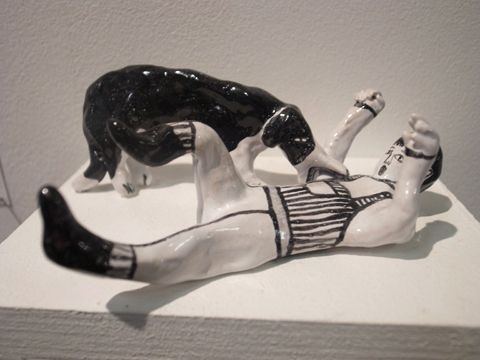
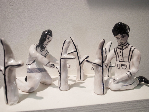
Lucy Kirk describes herself as an illustrator, model maker and farmer’s daughter, and her Farm Sale display featured a delightful combination of energetic line drawings and ceramic models of farm workers and their beasts at work and play.

Now what university of Brighton 2012 -Scarlett Wilson
Beautiful painterly illustrations and interesting mark making from Scarlett Wilson.

Pippa Toole Brighton What Now
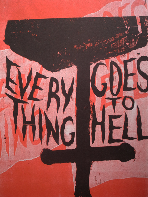
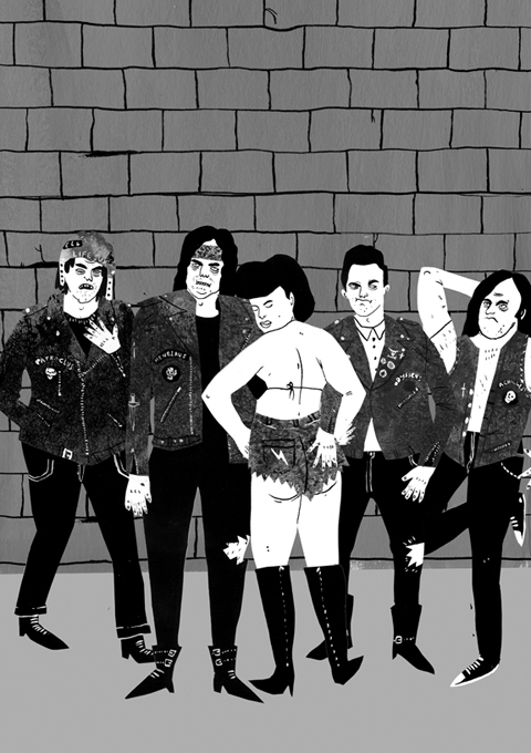
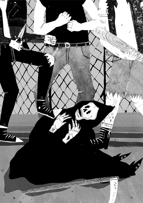
I loved Pippa Toole‘s gothic work, inspired by gang culture and slogans on bikes and leather jackets: all tattoos, posturing and meaty limbs.

Now what university of Brighton 2012 Jonathan Andrew Taylor
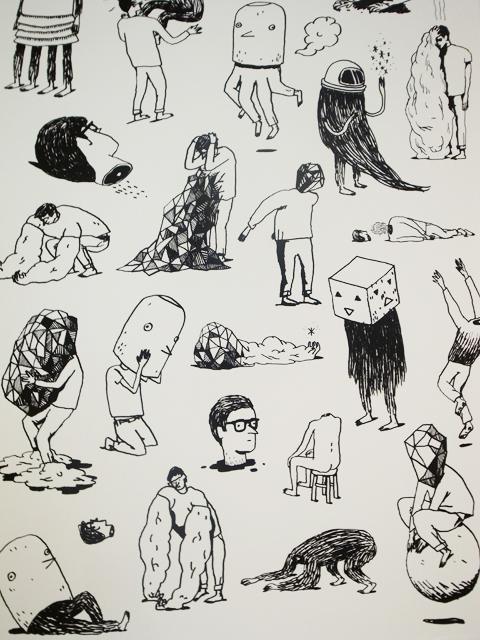
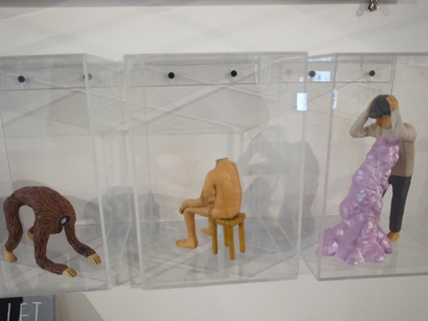
Jonathan Andrew Taylor had created strange little characters and also has a website called theinternetmakesmetired.com – which features a shaking distressed man crumpled on the floor. I know how he feels at times.

Now what university of Brighton 2012 -Joanna Rutter
Joanna rutter
Joanna Rutter mixed print with textile design in her beautifully laid out display.

Now what university of Brighton 2012 Emily Frances Barrett
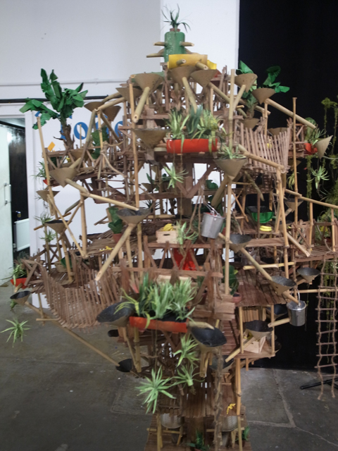
Emily Frances Barrett created strange worlds teetering and tilting with wooden Ewok style walkways and platforms bearing exotic plants. I’d like to tell you more about the thought processes behind her models but the website on her business card doesn’t work. Doh.

Now what university of Brighton 2012 -Alex Wells
Inspired by octopi, Alex Wells had created a stunning decorative typeface.

Now what university of Brighton 2012 -Jack Felgate
Jack Felgate‘s work was titled A General Dissatisfaction with the World and featured an assortment of intriguing subjects painted in photo-realistic style on wood (a nuclear bomb, a penis shaped cacti).

Now what university of Brighton 2012 -Kotryna Abromaityte
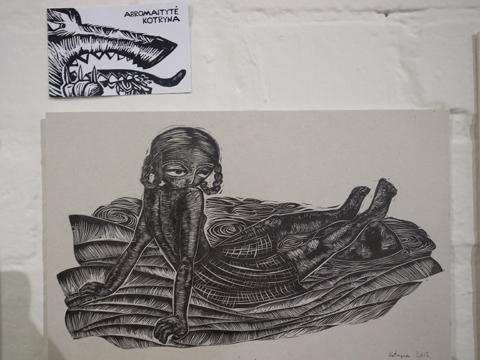
Black lino cut prints by Kotryna Abromaityte were inspired by folk tales from around the world – most notably a sadistic Lithuanian tale.

amy eyelyn hughes
Strange watery people from Amy Eyelyn Hughes. Nebuchadnezzar: ‘sniggering at a banana or a peculiar shaped tree stump.’

Now what university of Brighton 2012 -Rufus Day
Pretty typography by Mia Warner on skateboards by Rufus Day, clearly an enthusiast (of skating).

Now what university of Brighton 2012 -Zoe Landry
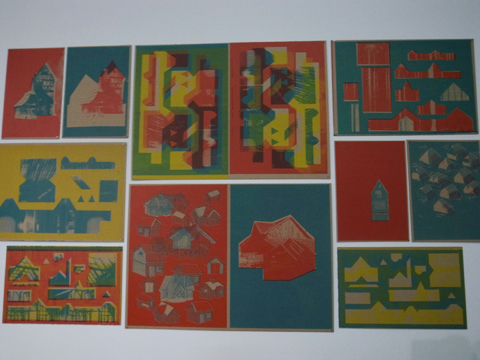
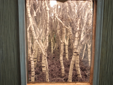
Zoe Landry screenprinted on cardboard for Houses to Build. I was also intrigued by The Endless Forest, a small installation consisting of wool, wire and mirrors.

Now what university of Brighton 2012 -Elisa MacDougall
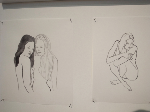
I really like the way that Elisa MacDougall draws people in loose ink brushes: strange that her website too (like theinternetmakesmetired.com) features a cowed person on the floor. What does it all mean?

Now what university of Brighton 2012 -Sarah Julia Clark
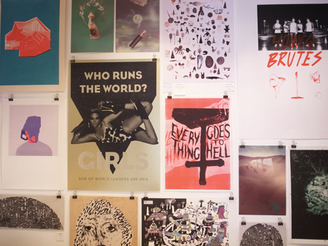
Who Runs the World? GIRLS – Genius collaged screenprints featuring well known lyrics bathed in a metallic glow, by avid feminist Sarah Julia Clark of Studio Her.

Now what university of Brighton 2012 -Tom Matthews
Bag Head, Red Face, Cracked Milk, by Tom Matthews.

Now what university of Brighton 2012
For sale: an assortment of brilliant artworks. I really wanted to buy that ace Beyonce poster but I had no money on me. Next up: a review of the graphic designers, also on show at Now What. You can read my reviews of last year’s University of Brighton illustration show here and here.

Categories ,2012, ,3D, ,A General Dissatisfaction with the World, ,Alex Wells, ,Bag Head, ,beyonce, ,Broadway Market, ,Cracked Milk, ,Elisa MacDougall, ,Emily Frances Barrett, ,Farm Sale, ,graduate, ,Houses to Build, ,illustration, ,Jack Felgate, ,Joanna Rutter, ,Jonathan Andrew Taylor, ,Kotryna Abromaityte, ,Lucy Kirk, ,Mia Warner, ,Model Making, ,Nebuchadnezzar, ,Netil House, ,Pippa Toole, ,Red Face, ,review, ,Rufus Day, ,Sarah Julia Clark, ,Scarlett Wilson, ,Set Design, ,Studio Her, ,The Endless Forest, ,Tom Matthews, ,typography, ,University of Brighton, ,Zoe Landry

Similar Posts:


Amelia’s Magazine | Royal College of Art MA Degree Show 2011 Review: Communication Art and Design

Tom_Senior Nomads
Nomads by Tom Senior.

I will confess that I found the new location for Communication Art & Design at the Royal College of Art show somewhat difficult to navigate – all those nooks and crannies had me convinced that I must have missed something.

RCA MA degree show 2011-Tom Senior
Tom Senior‘s animation looked at the consequences of being greedy ‘Four travellers come to rest in a bountiful land where luscious red strawberries grow on trees and meat and fish are plentiful.’ I guess it’s a metaphor for inherent human greed. It was fun, I’m sorry I can’t show it to you here.

RCA MA degree show 2011-Peter Jessien Laugesen
Showreel

Peter J. Laugesen produced an observational portrait of human alterations within nature that included a singing gnome. This was ‘wild life under control and the domesticated running wild.’

Jo Blaker
RCA MA degree show 2011-Jo Blaker
Jo Blaker in Communication Art & Design tackled illustrative ceramics as 3D Drawings, inspired by 17th century slipware. Symbols came from contemporary consumer culture.

RCA MA degree show 2011-Marine Duroselle
Marine Duroselle made a simple and beautiful card set alphabet using a risograph and letterpress.

RCA MA degree show 2011-Mike Redmond
Mike Redmond, who won the V&A student award, was hanging about near his Moving Towards Going Away Blueshift – Redshift. With titles such as 2. Hiding things we like and showing things we don’t. and 7. Angry country part 2 the museum is flooded and the bubble man is defeated, the escape plan is at hand it’s fair to say this was a fairly surreal final piece.

RCA MA degree show 2011-Cat Roissetter's The Violent Ordeals
Cat Roissetter‘s The Violent Ordeals in graphite and pastel was weirdly beautiful.

Eleanor Taylor RCA Land of Milk and Honey
Eleanor Taylor’s Land of Milk and Honey – Detail.

Eleanor Taylor‘s Land of Milk and Honey was an astonishing pencil and photocopy collage.

And there ends my coverage of this year’s RCA MA shows. Don’t forget to check in and read the others if you haven’t already!

Categories ,2011, ,3D, ,animation, ,Cat Roissetter, ,ceramics, ,Communication Art & Design, ,drawings, ,Eleanor Taylor, ,Graduate Shows, ,illustration, ,Jo Blaker, ,Land of Milk and Honey, ,letterpress, ,Marine Duroselle, ,Mike Redmond, ,Moving Towards Going Away Blueshift – Redshift, ,pencil, ,Peter Jessien Laugesen, ,rca, ,Risograph, ,Royal College of Art, ,Slipware, ,surreal, ,The Violent Ordeals, ,V&A Illustration Awards, ,va

Similar Posts:


Amelia’s Magazine | Montreal Festimania 2011: Fantasia International Film Festival Review

fantasia_film_fest_2011 poster by Donald Caron
Fantasia International Film Festival 2011 poster by Donald Caron.

Fantasia International Film Festival in Montreal, capsule Canada bills itself as a celebration of all things niche and genre. Our visit during Montreal Festimania coincided with the 15th anniversary of this independent festival, which over the years has grown to become the largest and most influential of its kind in the world. We were lucky enough to be granted a VIP pass allowing us access to any film we liked over our stay, and we decided to see quite a few!

Little Deaths
Ironically quite a few of our choices were British films that we’d failed to view over here in the UK, starting with a trio of horror shorts called Little Deaths, based around sexual perversion and gore. My favourite was a tale of domination and manipulation gone wrong: Bitch by Simon Rumley was shot in grainy London greys with a fabulous score to accompany scenes of every day mundanity as they descended into something more sinister.

Burke and Hare
Burke and Hare body
Burke and Hare follows the lives of two idiotic grave robbers operating in the Edinburgh of the 1820s. Despite the downbeat nature of this true story it was given a successful comedic twist by director John Landis, aided by an impeccable cast that includes Simon Pegg and Andy Serkis of Gollum fame.

Final-destination5-Olivia Castle
It was gone midnight when we attended the world premiere of Final Destination 5 in 3D, introduced by Jacqueline MacInnes Wood, who plays leggy lead character Olivia Castle… I’m sure this appearance was a major boon to the mainly male audience. The film was as utterly daft as its predecessors, but a lot of fun to watch with a hyped up festival crowd.

Phantom of the Opera Fantasia Film festival
One of the Fantasia International Film Festival highlights was a screening of the old black and white version of The Phantom of the Opera, made in 1925. This took place in the Barbican-like Theatre Maisonneuve in the Place des Arts, and was accompanied by a live rendition of the original full orchestral and operatic score. The auditorium was full to the rafters for this oddball story: I had no idea that the whole premise was so damn weird! The poster was designed by Donald Caron, the Montreal artist behind the fabulously kitsch Fantasia festival poster which features a flying horse: I loved them both and had to resist the urge to buy posters for which I have no wall space.

Horny House of Horror
Horny House of Horror bondage
Horny House of Horror deserves a mention for pure over the top Japanese pornographic gore: totally silly and questionable in taste, but I just about managed to sit through the 70 minutes of movie.

Cold Sweat
Argentina’s Cold Sweat was more of a chore: lacking any kind of coherent plot and drawn out far longer than was necessary. How on earth did the zombies get into the basement? It may be that I have yet to find my horror chops, but I found it hard to spend time watching this movie.

Petty Romance
Petty Romance
My favourite discovery of Fantasia International Film Festival was a wonderful rom com from Korea called Petty Romance, which followed the awkward relationship between a girl and a boy who get together to write a graphic sex comic that they hope will win them a large amount of money. It was a smart, sweet and funny reminder that the perils of falling in love remain the same everywhere in the world. I recommend that if you get the chance to see Petty Romance you skip along to the cinema pronto.

The Fantasia International Film Festival was supremely good fun and made me hopeful that I get asked to attend more film festivals in the future: there’s nothing like an enthusiastic audience for a niche film to increase the joy of the movie watching experience.

Categories ,3D, ,Andy Serkis, ,Bitch, ,Burke and Hare, ,Cold Sweat, ,Donald Caron, ,Fantasia International Film Festival, ,film, ,Final Destination 5, ,Genre, ,Gore, ,Horny House of Horror, ,Horror, ,Indie, ,Jacqueline MacInnes Wood, ,John Landis, ,Little Deaths, ,Montreal, ,Montreal Festimania, ,Olivia Castle, ,Petty Romance, ,Place des Arts, ,Rom Com, ,Short Film, ,Simon Pegg, ,Simon Rumley, ,The Phantom of the Opera, ,Theatre Maisonneuve, ,zombies

Similar Posts:


Amelia’s Magazine | Free Range Graduate Shows 2012: Middlesex University Illustration Ba Hons Review

Middlesex University Illustration -ben hendy
I was absolutely blown away by the quality of work on display from Middlesex University illustration students this year: many students had worked in 3D and their stands included decorated objects – a far better and more engaging way to showcase their illustrations than simply plonking some drawings on the wall. Many students stuck to a simple (almost) monochrome palette, whilst others utilised a blaze of colour:

Middlesex University Illustration -ben hendy
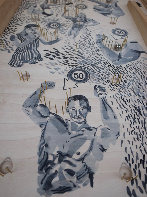
Ben Hendy‘s curious circus characters were splatted across an arcade pinball machine and painted with appealing energy on a rich red background. (see also the opening illustration).

§Middlesex University Illustration - amy johnson
Middlesex University Illustration
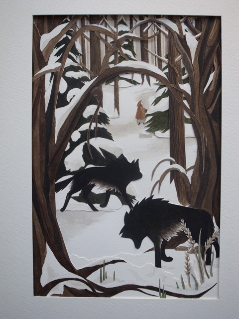
Amy Johnson combined papercutting skills with silhouetted shapes and delicate brushwork in her fairy tale themed imagery.

Middlesex University Illustration -Evagelia Segkou
Middlesex University Illustration -rae henry
Evagelia Segkou explored circus burlesque, as did Rae Henry.

Middlesex University Illustration - emma simpson
Emma Simpson explored the darker side of children’s stories with huddled, drowning and mournful figures against painterly minimalist landscapes.

Middlesex University Illustration -Emma Simpson
Illustrator Fay Brown has a similar style of painting faces but prefers her figures on sparser pencil backgrounds. I liked her multi-dimensional narrative tableaux.

Middlesex University Illustration -Fredrik Eden
Fredrik Eden‘s sideshow featured strange and wonderful implements.

Middlesex University Illustration Dionne Kitching
Middlesex University Illustration
Middlesex University Illustration Dionne Kitching
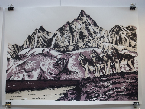
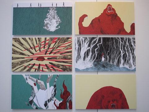
I was captivated by Dionne Kitching‘s beautiful fairytale landscapes of wolves, woods, and strange hybrid animals.

Middlesex University Illustration -abby jones
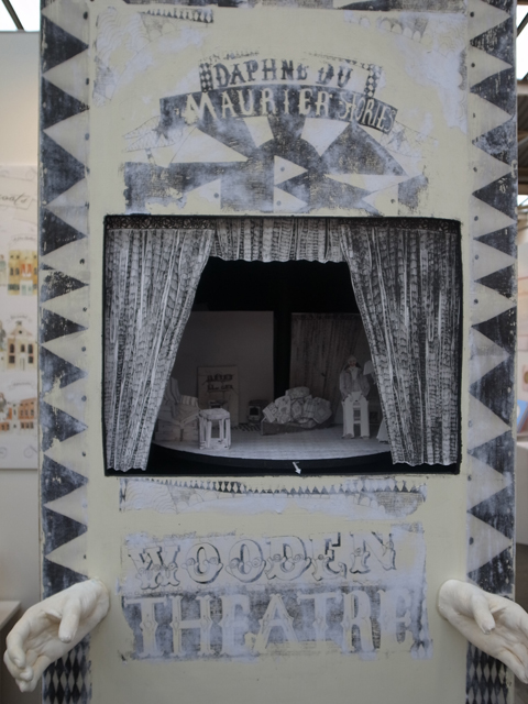
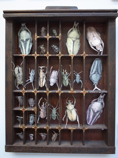
A miniature theatre and insect specimens by Abby Jones.

Middlesex University Illustration -Eileen Kai Hing Kwan
YouTube Preview Image
Glorious colour combinations by Eileen Kai Hing Kwan, who explored depression and anxiety for her final project.

Middlesex University Illustration -Hannah King
Hannah King‘s scratchy decorated screen made me think of Edvard Munch‘s The Scream and paintings by Hieronymus Bosch.

Middlesex University Illustration -Tom Cert
Tom Cert‘s stand featured these fun neon pastel creations.

Middlesex University Illustration -Maj Abrahamsson
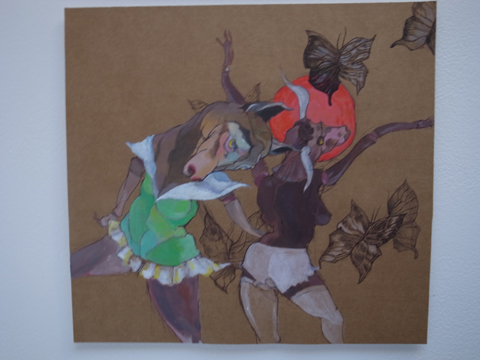
Dancing burlesque cows in tutus and oversized cherubs by Maj Abrahamsson.

Middlesex University Illustration -Fern Newton
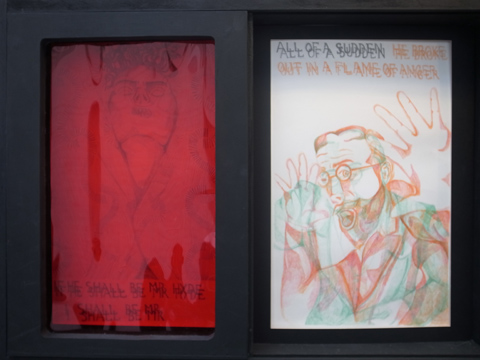
Fern Newton very cleverly created artwork to be viewed through 3D specs.

Middlesex University Illustration -Saki Watanabe
A detailed view of London by Saki Watanabe.

Middlesex University Illustration -Lefki Savvidou
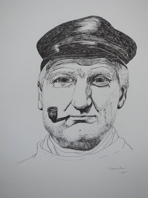
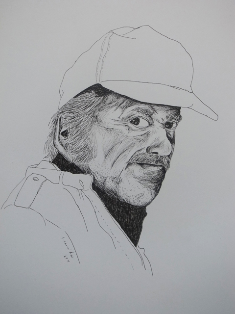
I was mesmerised by the expressive faces of Lefki Savvidou‘s simple line portraits.

Middlesex University Illustration -Abigail Moulder
Abigail Moulder took papercut artwork to the next level with her intricate set pieces. They reminded me of former Middlesex student Emma Block‘s work, but with animated animals rather than delicate dining ladies

Jean-Phillipe Calver
Middlesex University Illustration -Jean-Phillipe Calver
Jean-Phillipe Calver created these bright risograph prints.

Middlesex University Illustration -helen walter
Helen Walter
Helen Walter‘s old-fashioned style suits our over-digitised age perfectly. She had also created a clever peephole vignette.

With this kind of talent on show I am very excited to be starting my position as a Senior Lecturer in the Creative Industries at Middlesex University later this year. Read my review of the 2011 Middlesex University illustration show here.

Categories ,2012, ,3D, ,Abby Jones, ,Abigail Moulder, ,Amy Johnson, ,Ben Hendy, ,Creative Industries, ,Dionne Kitching, ,Eileen Kai Hing Kwan, ,Emma Block, ,Emma Simpson, ,Evagelia Segkou, ,Fay Brown, ,Fredrik Eden, ,Free Range, ,Hannah King, ,Helen Walter, ,illustration, ,Jean-Phillipe Calver, ,Lefki Savvidou, ,Maj Abrahamsson, ,MIddlesex Univerisity, ,Papercut, ,Rae Henry, ,review, ,Saki Watanabe, ,Senior Lecturer, ,Tom Cert

Similar Posts:


Amelia’s Magazine | An interview with The Cabinet of Living Cinema’s Rob Parkinson


Courtesy of The Cabinet of Living Cinema

The cinema has certainly evolved since the early twentieth century when the first silent black and white film appeared on our screens, thumb accompanied by a finely dressed man tinkling the ivories at a piano. In stark contrast to these humble beginnings, cure we seem to live in an age now where the flashier we can get with our Dolby Digital sound and 3D, more about the better. So where do we go from here in terms of creating a more enriching cinematic experience?

The answer in short is: live film-score performance (or perhaps adding a modern twist to the concept of the old dude sitting behind the piano). As part of the Becks Vier Music Inspires Art UK Tour, The Cabinet of Living Cinema, in collaboration with Future Shorts, is fusing the worlds of live music and cinema across England on their Cabinet Tour 2010. The Tour features some of the most innovative short films of recent years along with surrealist experiments, Czech claymation, Russian animated oddities, British Transport films and other obscure masterpieces from the last century.


Courtesy of The Cabinet of Living Cinema

Founded by Rob Parkinson and Kieron Maguire in 2007, The Cabinet of Living Cinema is an artistic initiative, providing artists with a platform to showcase their film and music… together. By blending live music performance with short films ranging from rarely-seen animation to the avant-garde, the result is the creation of a “living cinema” experience.

Currently on tour in the UK, I managed to track down one half of the brains behind The Cabinet of Living Cinema, Rob Parkinson, to quiz him about an old idea given a brand new makeover…

How did The Cabinet of Living Cinema come into being?
Future Shorts asked us to rescore the music live to some short films in 2007 and it went down very well. So, we went on to play major UK venues on the Future Cinema tour. At this point, for us it was a realisation that a new way to present performance was an important thing and something to explore.

What has been the general response to your work so far?
The audience comes towards us after a show, of whom most are either really into film or music, or both (who isn’t?). We have a lot of conversations with our audience.


Courtesy of The Cabinet of Living Cinema

How do you go about commissioning films for the project?
We work with the film-makers, they submit work, and we perform the music live. They tend to appreciate the platform. We also always try to feature cutting edge directors and Future Shorts are instrumental in our film selection and commissioning.

What do you look out for in particular in work that is submitted for consideration?
Work that inspires. We spend a lot of time watching short films, looking for potential material. We generally sit watching with instruments at hand; it could be said that the films choose us when we all reach for instruments at the same time.

What do you think is lacking from the current cinema-goers experience?
A lack of understanding of where films originated from. For example (Jan) Sjvankmajer pioneered the claymation and stop-motion technology, but it’s only a handful of people who know about the impact he had on modern day cinema.

In your mind, what cinematic experience do you want your audience to walk away with after they have been to one of your shows?
To have experienced something different and unusual. 3D is big at the moment and maybe we are the 3D of the film-score world. I’d like to think our audience walks away with a soundtrack to wherever they go next.


Still from ‘Ballad of a Broken Vow’ by Carla Mackinnon for The Cabinet of Living Cinema

Tell us about The Cabinet Tour 2010 and Future Shorts collaborative.
The tour has been amazing; cool people, cool bands and excellent audiences. We’re lucky that we see familiar people that are touring the same venues as us and are able to share our energy. It’s a good, positive vibe amongst the artists.

Regarding Future Shorts, they are pioneers who have whole-heartedly supported our vision and are a wealth of inspiration.

What can we expect to see on The Cabinet Tour?
Beautifully directed films, amazing animation, musicians working on a different level, instrument swapping, happy accidents and bubble wrap (it’s perfect for making the sound of the sea).

What has been the most exciting project that you have worked on to date and why?
Hmmm, tricky…We performed at Fabric in 2007 in association with Future Shorts. The space was set out with old-school cinema seats, front to back. We played a few films through and people started to stand up, it was very emotional, there were tears.

Since then there have been many exciting moments, but that’s the thing with film and what we do. It’s all about the moment. To say a particular gig or event is more important than a specific moment isn’t appropriate in our world.


Still from ‘Ballad of a Broken Vow’ by Carla Mackinnon for The Cabinet of Living Cinema

Who is the most exciting live cinema guest you have worked with and why?
Without a doubt: The Paper Cinema. They are a hand-drawn paper puppetry live projected theatre show…and they are amazing.

How do you see Cabinet of the Living Cinema evolving?
New film-makers submitting their work for us to rescore. That’s where it’s at. A friend of mine strapped a waterproof camera to the front of his surfboard and went out to sea for a couple of hours. The resulting film was amazing, which we use as the backdrop to all our gigs. We want more!

What’s next on the Cabinet of the Living Cinema agenda?
Music and film festivals including Larmer Tree, FAIF ISFF and The Big Chill. We are also performing rescores to feature length films over August in London and very importantly, again, we are currently looking for new film-makers to submit work, so we can dedicate an event to new and up-and-coming talent due for performance in Autumn 2010.

In partnership with leading film pioneers Future Shorts, The Cabinet of Living Cinema bring live scores and animation to cities across England, including Leeds, Sheffield, Liverpool, Portsmouth, Bristol and Bournemouth on their Cabinet Tour 2010 throughout June, July and August. For more information, see here.

Categories ,3D, ,Becks Vier Music Inspires Art, ,British Transport films, ,Czech claymation, ,Dolby Digital, ,fabric, ,FAIF ISFF, ,Future Cinema Tour, ,Future Shorts, ,Jan Sjvankmajer, ,Kat Phan, ,Kieron Maguire, ,Larmer Tree, ,Rob Parkinson, ,The Big Chill, ,The Cabinet of Living Cinema, ,The Paper Cinema

Similar Posts:


Amelia’s Magazine | Camberwell College of Arts: Ovo Show Illustration Graduate Show 2011 Review – Downstairs 1

alice_stanley
Illustration by Alice Stanley.

Now, dosage finally, it’s time for my second round of blog posts featuring the best of Ovo Show from Camberwell College of Arts illustration graduates (read the first review of Ovo Show here). This time let’s head downstairs at the Red Gallery. I’m going to have to split this into two because it’s such a beast…

Camberwell College of Art illustration graduate show 2011-Sam TaylorCamberwell College of Art illustration graduate show 2011-sam taylorCamberwell College of Art illustration graduate show 2011-sam taylorCamberwell College of Art illustration graduate show 2011-sam taylor
Turning into the cavernous downstairs space it was the work of Sam Taylor that grabbed my attention – nutty vignettes of a splodgyily painted bird on a skateboard, floating boobs (not sure what that means!) and portraits of gnarled and wrinkled characters against primary coloured backgrounds. His is a land where beards hold the same intellect as brains.

Camberwell College of Art illustration graduate show 2011-Tom Dorkin Camberwell College of Art illustration graduate show 2011-Tom Dorkin
Across the way Tom Dorkin had created some beautiful fine line drawings of some equally idiosynrcratic characters: a sailor checked his binoculars as his woollen jumper unraveled. He had also dissected a plane and a ship in fine detail. Follow Tom Dorkin on Twitter.

Camberwell College of Art illustration graduate show 2011-Iriini Kalliomaki Camberwell College of Art illustration graduate show 2011-Iriini Kalliomaki Camberwell College of Art illustration graduate show 2011-Iriini Kalliomaki Camberwell College of Art illustration graduate show 2011-Iriini Kalliomaki
Iriini Kalliomaki specialised in oddball characters, created in tiny perfection from what looked like paper mache – twins, a big haired granny, pouchy cheeked man with an apron – all placed in photographic situations for her book The Racing Granny. Also on display was the flying car in which Granny races.

Camberwell College of Art illustration graduate show 2011-Gemma Whittaker Camberwell College of Art illustration graduate show 2011-Gemma Whittaker
Gemma Whittaker produced some pretty ceramic bowls featuring daubed drawings of cats and elephants.

Megan Sinclair Georgy Porgy cards
Megan Sinclair Georgy Porgy rats
Megan Sinclair Georgy Porgy
Megan Sinclair‘s 3D paper cutouts featured rat racing, a card game and a boy in a garage being yelled at by his mum. The vignettes were taken from Roald Dahl‘s Georgy Porgy, a short story for adults. Follow Megan Sinclair on Twitter.

Camberwell College of Art illustration graduate show 2011-Bea WilsonCamberwell College of Art illustration graduate show 2011-Bea Wilson

Bea Wilson had produced an enigmatic fill, Arkham, which was inspired by fictional landscapes.

Camberwell College of Art illustration graduate show 2011-Hollie Limer Camberwell College of Art illustration graduate show 2011-Hollie Limer
Hollie Limer also played with paper cutouts, which she had placed inside a darkened room to create an eery monotone landscape… I think they were supposed to be seen by moody candlelight but the set was pitch black when I visited.

Camberwell College of Art illustration graduate show 2011-Karin Söderquist Camberwell College of Art illustration graduate show 2011-Karin Söderquist Camberwell College of Art illustration graduate show 2011-Karin Söderquist Camberwell College of Art illustration graduate show 2011-Karin Söderquist
Also on the paper front Karin Söderquist showed a large pipe smoking man and a traditional Scandinavian scene. Very clean and cool.

alice_stanley_Camberwell College of Art illustration graduate show 2011-alice_stanley_Camberwell College of Art illustration graduate show 2011-alice_stanley_
Alice Stanley‘s narrative pencil drawings were very different from her wonderful knitted animals, much more moody and evocative than a cute little mouse, but then I imagine that knitting was a bit of a relaxing respite from school work.

Rosie Eveleigh wavesRosie Eveleigh Satre NauseaRosie EveleighCamberwell College of Art illustration graduate show 2011-Rosie EveleighCamberwell College of Art illustration graduate show 2011-Camberwell College of Art illustration graduate show 2011-Rosie EveleighCamberwell College of Art illustration graduate show 2011-Camberwell College of Art illustration graduate show 2011-Rosie EveleighCamberwell College of Art illustration graduate show 2011-Camberwell College of Art illustration graduate show 2011-Rosie Eveleigh
Rosie Eveleigh did some awesome abstract work on paper, ceramics and on mini hanging woven carpets. I think the textile design seen in the last photo is also hers. Someone tell me if it isn’t!

UPDATE: The final picture shows work by Hannah Whitfield (she really needs to get that website going on!)

Still one more blog to go…

Categories ,3D, ,Alice Stanley, ,Arkham, ,Bea Wilson, ,Camberwell College of Arts, ,ceramics, ,film, ,Gemma Whittaker, ,Georgy Porgy, ,Hannah Whitfield, ,Hollie Limer, ,Iriini Kalliomaki, ,Karin Söderquist, ,knit, ,Ovo Show, ,Papercut, ,Red Gallery, ,Roald Dahl, ,Rosie Eveleigh, ,Sam Taylor, ,Scandinavian, ,textiles, ,Tom Dorkin

Similar Posts: