Amelia’s Magazine | Minna: an interview with ethical fashion designer Minna Hepburn


Vintage fashion, stomach illustrated by Matilde Sazio


Vintage shop, price illustrated by Karolina Burdon

What gave you the idea for Preloved, Reloved in the first place?
Well I always like to dress a little differently. My style is mainstream with a retro edge, I suppose. I always seem to end up with a daft New Year’s resolution – last year I cycled from London to Paris for The Institute of Cancer Research. I like using my time to help others and spread awareness.

Were you a fan of vintage and upcycling before you started the project?
Yes! I always admire my friends’ outfits; well, those who wear vintage and second-hand fashion. Upcycling is something I have experimented with for ages at home and now is the time to make sure I actually finish some projects!

Where will you source your outfits?
Charity shops, vintage stores, eBay, my mum’s wardrobe…! I made a lined cape last night from linen and satin for balmy summer nights (booking a holiday soon!).


Charity shops, illustrated by Rukmunal Hakim

What does the project hope to achieve?
I want to raise awareness of numerous charities related to my Dad’s illnesses. I want my friends to know that too much of an unhealthy lifestyle is probably going to lead to an early demise. I also want to raise the profile of vintage and second-hand fashion; I remember as a kid we use to take the mick out of anyone who dressed from a charity shop. I myself as a student had a stigma against them. Now it’s become kitsch, cool and quirky. It’s good for the enivroment.

How much do you hope to raise and what are the funds likely to be used for?
£2500 is my Just Giving target – it goes directly to Macmillan. However, with my shopping at many different charity shops, my cash goes straight to them – win win all round! I have my thinking cap on about how to expand the project though.


eBay! Illustration by Avril Kelly

Why did you choose Macmillan?
My dad (and his dad) had cancer – he died last week unfortunately. And it wasn’t the cancer that killed him, it was his heart and his adult-onset diabetes. A poor lifestyle in his twenties and thirties caused it and he was only 57 when he passed. So as I said before, this project benefits other charities focussing on these causes too through me spending money at their outlets.

Not that far in, but have you come accross any problems so far? Has anything that happened that you weren’t expecting?
Avoiding shops is quite hard as I realised I can’t just pop into the Topshop sale and treat myself – which I suppose is good for my wallet and I’m going to do less impulse-buying on the way home from work.
With my Dad passing, I haven’t had as much time to go browsing shops as much as I’d like. This weekend, however, I’m going to the Girls of Guildford vintage fair and gig – for some serious retail therapy, cupcake-nomming and also to check out some great live music away from the bustle of London.


Vintage, illustrated by Jess Holt

What are you wearing today? Where’s it all from?
Dark blue skinny jeans, leather knee boots that I already owned with black and cream patterned blouse from River Island that I bought from Cancer Research UK. I’m also wearing red rose earrings from Magnolia Jewellery.

Do you plan to make or alter any of your clothes? If so, how?
Yes – I love sewing and making jewellery too – I made a cape last week and have upcycled a pair of old, torn jeans from my uni days into a denim mini. I have a small collection of retro patterns including a lovely dress with a pussy bow. I love being able to create something out of fabric I love: last year I went to a lovely Indian wedding and couldn’t find The Outfit – so I made a purple maxi-dress with a halterneck and glammed it up with ribbons dangling down my back. Saved myself a fortune too!


Illustration by Gilly Rochester

What else do you get up to?
I run Never Enough Notes – a music e-zine, and I’m cycling the London-Brighton this summer with my brother and friends to raise money for the British Heart Foundation.

What would be your perfect Preloved, Reloved outfit?
For daytime it would easily be vintage jeans, brown boots that look a bit worn-out, a floaty shirt or cheeky tee, a tweed jacket and a battered satchel.
For evening, I love ball gowns and retro dresses so would be something glam that I could wear with a pair of 1970s heels! Oh there’s way too much choice, I love it!
Faye West Gossypium Sewing Kit
Gossypium with Amelia’s Magazine Sewing Kit A/W 2008, mind featuring print design by Brie Harrison. Illustration by Faye West.

Gossypium worked with Amelia’s Magazine and Brie Harrison to create a Clothkits-inspired kit fashion dress and bag to accompany the final print issue of Amelia’s Magazine. Run by Abigail and Thomas Petit, it is a family business based in Lewes, East Sussex.   

What is your process of creating your garments?
We do things the opposite way around to the rest of the fashion industry. I was working as a textile engineer with Indian farmers when we started Gossypium, so fabric comes first: from the spinning of the yarn to the final stitching of the garments is a long and complicated process. We have an extremely close working relationship with our producers and a huge respect for their hard work and care of the environment.

Why is transparency more important than certification?
In some instances enforced standards have some value, for example it is good to be able to label something organic or fairtrade, but sometimes the point of certification gets clouded and this can limit good honest business practice. Transparency and brand trust are the most precious and valuable assets. Knowing our trade and suppliers so well shows in the quality of our products, and this benefits our customers. And it means that no one can copy us or take those relationships away.  

Why did you decide to collaborate with Amelia’s Magazine and Brie Harrison?
We are pioneers who have built our entire business from scratch so it was lovely to concentrate on something that was more fashion-based for a change. Working with Amelia’s Magazine allowed us to have a fantastic burst of creativity and we sure enjoyed that moment. Nula Shearing, who is a daughter of the Clothkits family, has just created a lovely tea towel for us, and we hope to do more fashion-led designs in the future… 

Read the rest of this interview with Gossypium in Amelia’s Compendium of Fashion Illustration, alongside interviews with 44 other ethical fashion designers and 30 fabulous fashion illustrators. You can buy the book here.

You can still buy issue 10 of the Amelia’s Magazine which comes with a free Brie Harrison designed kit bag from my website here, and you can also still buy the kit dress from the Gossypium website here.
Minna S/S 2011 by Gemma Milly
Minna S/S 2011 by Gemma Milly.

How has the way you create your clothes progressed since you first started out?
I think fashion should be fun; I just love to put on a dress which brings a smile to my face. We have kept our feminine, patient vintage inspired, view playful style but the collection is a bit more grown up, ask which has helped us to find a new audience. Lace still plays a big part in the collection but we have also started to use heavier fabrics such as wool jersey. I prefer to keep our colourways simple but we are designing a print to use for linings and dresses in our next collection. The recession has also played a role in our design process – we have had to think about our price points and make sure that our pieces are multi-functional. We still focus on UK-made fabrics and all production is based in London, since this is integral to the brand.

Minna 2010 by Faye West
Minna by Faye West.

Where do you source your fabrics from?
Sourcing fabrics is a big part of the job so we do a lot of networking. I am lucky to have designer friends who are happy to share information about their suppliers, and sourcing fabrics online has improved massively over the last two years, but I still find it very difficult to source UK-made fabrics: we desperately need a good supplier database. Sourcing vintage lace is a fun part of the job because I love strolling around antique markets. Unfortunately I have very little time to do that these days so I go on Ebay instead and when travelling I can’t resist visiting the local antique fairs. Lace can be very expensive if you go to proper antique shops so I rely on local grannies who know where to buy it in bulk.

How do you ensure a commercial collection?
We buy Scottish lace in massive quantities and mix it with other fabrics, but we don’t produce entire one-off pieces because these would be tricky to sell online. However, because most of our pieces are embellished with offcuts and antique lace they are unique. This is very labour intensive so the price has to reflect that…

Read the rest of this interview and see more illustrations of Minna’s clothing in Amelia’s Compendium of Fashion Illustration, alongside interviews with 44 other ethical fashion designers and 30 fabulous fashion illustrators. You can buy the book here.

Categories ,ACOFI, ,Amelia’s Compendium of Fashion Illustration, ,Eco fashion, ,Ethical Fashion, ,Faye West, ,Gemma Milly, ,lace, ,Minna, ,Minna Hepburn

Similar Posts:


Amelia’s Magazine | Nancy Dee: the ethical fashion range from sisters Tamsin and Seraphina Davis

Emete Yarici by Jenny Lloyd http://jennylloyd.co.uk

It’s impossible to miss the Make Lemonade pop-up shop as you walk up Chalton Street Market, treat with big windows displaying the warm and cosy scene for everyone to see. Even standing across the street you can see Make Lemonade founder Emete Yarici pottering around, ed accompanied by her interns Holly-ann Ladd and Bettina Krohn.


Make Lemonade pop-up shop

Step inside and you’ll find a myriad of treasure, starting with clothes from the Make Lemonade range of one-off vintage finds. As Emete talks me through the contributions from the various designers and artists around the shop it becomes clear this is very much a collaboration. ‘I have been working on getting a shop for over a year, but it’s been a mad rush at putting everything together as I only found out I was getting this shop last week,’ says Emete.


Illustration by Joana Faria

Holly-ann has been collecting vintage charms and made them into necklaces, explains Emete, while more accessories are on display from knitwear designer Louise Dungate. The walls are covered by charity shop finds, as well as prints from graphic designers Dan Sayle and Oschon Wespi-Tschopp. This comes from a tie-up with environmentally friendly printers Hato Press. ‘We will be doing a live screenprinting session here on Saturday, where people can choose a design and have it printed on a bag,’ says Emete.

On Wednesday 26th there will be a free styling evening, followed by a music night on the 28th. Norwegian pop and jazz singer Jenny Moe will provide entertainment, alongside the group The Youth. ‘People can bring their own drinks and there will be lots of cushions, so people can come and talk and chill out,’ says Emete. More details of this and other events, including a film screening yet to be confirmed, can be found on the Make Lemonade Facebook page.

Textile print designer Temitope Tijani has provided a special range of her colourful handmade bags and jewellery, while Supermarket Sarah has created a wall of items from the shop – these will go on sale from Supermarket Sarah’s website from 31st January. In addition to clothing, this includes a 1970s coffee set and a very clever apple-a-day calendar from Ken Kirton, who is also responsible for the Make Lemonade logo.


Temitope Tijani illustrated by Genie Espinosa

‘I wanted the shop to be a platform for many people to show their work, not just for our own stuff,’ says Emete, adding that most of the artists are friends, or friends of friends. Camden Council sponsors Make Lemonade’s rent for the pop-up shop, as part of a scheme to bring new business to Somers Town. This area between Euston and King’s Cross stations isn’t necessarily a retail destination, but the locals have been very welcoming, says Emete.

Make Lemonade will exist mainly on the internet for a while to come, but Emete doesn’t rule out a permanent shop down the line. But the next goal to get the brand into shops as permanent concessions, as well as continuing the collaboration with Asos and focusing on the blog. Along with Bettina, Emete will go to Paris this spring to scout for some higher-range vintage lines, but she wants to stay true to the initial idea of creating a reasonably priced vintage shop – something that isn’t that easy to find in London. ‘We want to make sure we stay close to our roots and remain a brand people want to be part of,’ says Emete, suddenly all shy when she has to be in front of the camera instead of behind the scenes.


Emete Yarici

Make Lemonade pop-up shop will be at 24 Chalton Street, London NW1 1JH until 1st February – after that find them on their website. For more information see our listing and the Make Lemonade Facebook page.

Emete Yarici by Jenny Lloyd

It’s impossible to miss the Make Lemonade pop-up shop as you walk up Chalton Street Market, click with big windows displaying the warm and cosy scene for everyone to see. Even standing across the street you can see Make Lemonade founder Emete Yarici pottering around, website accompanied by her interns Holly-ann Ladd and Bettina Krohn.


Make Lemonade pop-up shop

Step inside and you’ll find a myriad of treasure, ask starting with clothes from the Make Lemonade range of one-off vintage finds. As Emete talks me through the contributions from the various designers and artists around the shop it becomes clear this is very much a collaboration. ‘I have been working on getting a shop for over a year, but it’s been a mad rush at putting everything together as I only found out I was getting this shop last week,’ says Emete.


Illustration by Joana Faria

Holly-ann has been collecting vintage charms and made them into necklaces, explains Emete, while more accessories are on display from knitwear designer Louise Dungate. The walls are covered by charity shop finds, as well as prints from graphic designers Dan Sayle and Oschon Wespi-Tschopp. This comes from a tie-up with environmentally friendly printers Hato Press. ‘We will be doing a live screenprinting session here on Saturday, where people can choose a design and have it printed on a bag,’ says Emete.

On Wednesday 26th there will be a free styling evening, followed by a music night on the 28th. Norwegian pop and jazz singer Jenny Moe will provide entertainment, alongside the group The Youth. ‘People can bring their own drinks and there will be lots of cushions, so people can come and talk and chill out,’ says Emete. More details of this and other events, including a film screening yet to be confirmed, can be found on the Make Lemonade Facebook page.

Textile print designer Temitope Tijani has provided a special range of her colourful handmade bags and jewellery, while Supermarket Sarah has created a wall of items from the shop – these will go on sale from Supermarket Sarah’s website from 31st January. In addition to clothing, this includes a 1970s coffee set and a very clever apple-a-day calendar from Ken Kirton, who is also responsible for the Make Lemonade logo.


Temitope Tijani illustrated by Genie Espinosa

‘I wanted the shop to be a platform for many people to show their work, not just for our own stuff,’ says Emete, adding that most of the artists are friends, or friends of friends. Camden Council sponsors Make Lemonade’s rent for the pop-up shop, as part of a scheme to bring new business to Somers Town. This area between Euston and King’s Cross stations isn’t necessarily a retail destination, but the locals have been very welcoming, says Emete.

Make Lemonade will exist mainly on the internet for a while to come, but Emete doesn’t rule out a permanent shop down the line. But the next goal to get the brand into shops as permanent concessions, as well as continuing the collaboration with Asos and focusing on the blog. Along with Bettina, Emete will go to Paris this spring to scout for some higher-range vintage lines, but she wants to stay true to the initial idea of creating a reasonably priced vintage shop – something that isn’t that easy to find in London. ‘We want to make sure we stay close to our roots and remain a brand people want to be part of,’ says Emete, suddenly all shy when she has to be in front of the camera instead of behind the scenes.


Emete Yarici

Make Lemonade pop-up shop will be at 24 Chalton Street, London NW1 1JH until 1st February – after that find them on their website. For more information see our listing and the Make Lemonade Facebook page.
How do you start to design each new collection?
I usually list ideas that I am wondering about – thoughts about philosophy, cialis 40mg science and how we should live – in my note book. Then I pick out the most interesting of these topics. Maybe some philosopher or artist has already found an answer but I like to discover things through my own ideas and research.

In what way does fashion allow you to combine all your creative ideas?
I create artwork in two dimensions as well as making music and video. Fashion feels more real because it is created in three dimensions, case and I try to make clothes that combine all the dreaminess and fantasy of my other creative endeavours. I work on music at the same time as I work on designs for my clothing so that it will match the catwalk show when I put them together.

Why did you decide to name your collective after yourself?
We work as a team on ideas that mostly come from my brain. I feel as though I am a percolator, stomach I’m inspired by all the feelings that come from my friends which I filter through my own internal world. Satoshi Date is just a device: percolate Satoshi Date machine and breathe out. I believe that I am connected to everyone in the world and I am just a representative.

How do you work with others to complete each collection?
We get the main idea together and do lots of research before we even think about the clothing. We read, write, listen, draw, collage… developing the idea deeper and deeper. Then we start designing and sampling with textiles and prototypes until the final garments are ready to be made.
MaxJenny by June Chanpoomidole
MaxJenny by June Chanpoomidole.

Wearable art.
Maxjenny Forslund was inspired to create her label when she discovered her mother’s paintings in the cellar. Her mother Margareta Forslund is also a designer and together they create the bright print designs (some of which are based on self-portraits) that characterise her line of Street Sculptures signature waterproof capes. The capes are based on a circular pattern that drapes over the contours of the body, cialis 40mg and are perfect for riding a bike in the rain.

Intelligent sustainable materials.
Maxjenny capes are created from a recycled material made out of plastic PET bottles. Dye sublimation printing is used as an even more environmentally friendly substitute to digital printing. The sourcing of good quality materials is a big part of Maxjenny’s job…

Read the rest of this interview and see more illustrations of Maxjenny’s clothing in Amelia’s Compendium of Fashion Illustration, seek alongside interviews with 44 other ethical fashion designers and 30 fabulous fashion illustrators. You can buy the book here.
NANCY DEE by KELLIE BLACK
Nancy Dee by Kellie Black.

Tamsin and Seraphina Davis are sisters in ethical fashion design. Nancy is a long standing family name and Dee simply stands for the initial of their surname, information pills Davis. They settled on the label Nancy Dee because it is a little bit kitsch and reflects the style of their designs.

How did Nancy Dee come about?
Seraphina is my younger sister by four years and she has the background in fashion design whereas I have worked in the film industry and studied economics and social policy, more about so I am better suited to managing the business side. We started working together because Seraphina wanted to market her designs and she needed a partner. I had just finished my studies and wanted to work on something related to social policy. We launched Nancy Dee in 2008 to create garments that bridge the gap between style, viagra 60mg versatility and ethical production.

How do you manage to keep your designs both retro and up to date?
Fashion is cyclical by nature, and all trends are developments on past ideas. We take the shapes and references that appeal to us from history and update them by using new eco fabrics and modern colours. The prints play a large part; they are designed by us but influenced by older designs.

How did you hook up with the family-run factory in India that makes your clothes?
We were actually approached by them whilst at a trade show which was lucky because it wasn’t working out with another factory, so we were actually searching for someone to take over production. Fate intervened: we met the owner in London, then travelled over to Delhi later that season to check over the factory conditions, meet the staff and work on samples.

How will you further reduce your environmental impact?
Video conferencing and daily phone calls enable both Seraphina and I to work from home (I live in Leicester while she is in London). Skype is an amazing invention that helps us to keep in touch with the factory, reducing the need to visit so often. We’re constantly looking for ways to reduce our environmental impact, such as the use of degradable packaging for the webshop – but it is an ongoing job. We want to start some production in the UK since one of our biggest environmental impacts is caused by the delivery of stock from India. Many UK factories lost a huge portion of their income when it became so much cheaper to produce garments in Asia, so it will be nice to bring some work back here…

Read the rest of this interview with Nancy Dee in Amelia’s Compendium of Fashion Illustration, alongside interviews with 44 other ethical fashion designers and 30 fabulous fashion illustrators. You can buy the book here.

Categories ,ACOFI, ,Amelia’s Compendium of Fashion Illustration, ,Carbon footprint, ,Eco fashion, ,Ethical Fashion, ,India, ,Kellie Black, ,Nancy Dee, ,Seraphina Davis, ,Skype, ,Tamsin Davis

Similar Posts:


Amelia’s Magazine | Nancy Dee: the ethical fashion range from sisters Tamsin and Seraphina Davis

Emete Yarici by Jenny Lloyd http://jennylloyd.co.uk

It’s impossible to miss the Make Lemonade pop-up shop as you walk up Chalton Street Market, treat with big windows displaying the warm and cosy scene for everyone to see. Even standing across the street you can see Make Lemonade founder Emete Yarici pottering around, ed accompanied by her interns Holly-ann Ladd and Bettina Krohn.


Make Lemonade pop-up shop

Step inside and you’ll find a myriad of treasure, starting with clothes from the Make Lemonade range of one-off vintage finds. As Emete talks me through the contributions from the various designers and artists around the shop it becomes clear this is very much a collaboration. ‘I have been working on getting a shop for over a year, but it’s been a mad rush at putting everything together as I only found out I was getting this shop last week,’ says Emete.


Illustration by Joana Faria

Holly-ann has been collecting vintage charms and made them into necklaces, explains Emete, while more accessories are on display from knitwear designer Louise Dungate. The walls are covered by charity shop finds, as well as prints from graphic designers Dan Sayle and Oschon Wespi-Tschopp. This comes from a tie-up with environmentally friendly printers Hato Press. ‘We will be doing a live screenprinting session here on Saturday, where people can choose a design and have it printed on a bag,’ says Emete.

On Wednesday 26th there will be a free styling evening, followed by a music night on the 28th. Norwegian pop and jazz singer Jenny Moe will provide entertainment, alongside the group The Youth. ‘People can bring their own drinks and there will be lots of cushions, so people can come and talk and chill out,’ says Emete. More details of this and other events, including a film screening yet to be confirmed, can be found on the Make Lemonade Facebook page.

Textile print designer Temitope Tijani has provided a special range of her colourful handmade bags and jewellery, while Supermarket Sarah has created a wall of items from the shop – these will go on sale from Supermarket Sarah’s website from 31st January. In addition to clothing, this includes a 1970s coffee set and a very clever apple-a-day calendar from Ken Kirton, who is also responsible for the Make Lemonade logo.


Temitope Tijani illustrated by Genie Espinosa

‘I wanted the shop to be a platform for many people to show their work, not just for our own stuff,’ says Emete, adding that most of the artists are friends, or friends of friends. Camden Council sponsors Make Lemonade’s rent for the pop-up shop, as part of a scheme to bring new business to Somers Town. This area between Euston and King’s Cross stations isn’t necessarily a retail destination, but the locals have been very welcoming, says Emete.

Make Lemonade will exist mainly on the internet for a while to come, but Emete doesn’t rule out a permanent shop down the line. But the next goal to get the brand into shops as permanent concessions, as well as continuing the collaboration with Asos and focusing on the blog. Along with Bettina, Emete will go to Paris this spring to scout for some higher-range vintage lines, but she wants to stay true to the initial idea of creating a reasonably priced vintage shop – something that isn’t that easy to find in London. ‘We want to make sure we stay close to our roots and remain a brand people want to be part of,’ says Emete, suddenly all shy when she has to be in front of the camera instead of behind the scenes.


Emete Yarici

Make Lemonade pop-up shop will be at 24 Chalton Street, London NW1 1JH until 1st February – after that find them on their website. For more information see our listing and the Make Lemonade Facebook page.

Emete Yarici by Jenny Lloyd

It’s impossible to miss the Make Lemonade pop-up shop as you walk up Chalton Street Market, click with big windows displaying the warm and cosy scene for everyone to see. Even standing across the street you can see Make Lemonade founder Emete Yarici pottering around, website accompanied by her interns Holly-ann Ladd and Bettina Krohn.


Make Lemonade pop-up shop

Step inside and you’ll find a myriad of treasure, ask starting with clothes from the Make Lemonade range of one-off vintage finds. As Emete talks me through the contributions from the various designers and artists around the shop it becomes clear this is very much a collaboration. ‘I have been working on getting a shop for over a year, but it’s been a mad rush at putting everything together as I only found out I was getting this shop last week,’ says Emete.


Illustration by Joana Faria

Holly-ann has been collecting vintage charms and made them into necklaces, explains Emete, while more accessories are on display from knitwear designer Louise Dungate. The walls are covered by charity shop finds, as well as prints from graphic designers Dan Sayle and Oschon Wespi-Tschopp. This comes from a tie-up with environmentally friendly printers Hato Press. ‘We will be doing a live screenprinting session here on Saturday, where people can choose a design and have it printed on a bag,’ says Emete.

On Wednesday 26th there will be a free styling evening, followed by a music night on the 28th. Norwegian pop and jazz singer Jenny Moe will provide entertainment, alongside the group The Youth. ‘People can bring their own drinks and there will be lots of cushions, so people can come and talk and chill out,’ says Emete. More details of this and other events, including a film screening yet to be confirmed, can be found on the Make Lemonade Facebook page.

Textile print designer Temitope Tijani has provided a special range of her colourful handmade bags and jewellery, while Supermarket Sarah has created a wall of items from the shop – these will go on sale from Supermarket Sarah’s website from 31st January. In addition to clothing, this includes a 1970s coffee set and a very clever apple-a-day calendar from Ken Kirton, who is also responsible for the Make Lemonade logo.


Temitope Tijani illustrated by Genie Espinosa

‘I wanted the shop to be a platform for many people to show their work, not just for our own stuff,’ says Emete, adding that most of the artists are friends, or friends of friends. Camden Council sponsors Make Lemonade’s rent for the pop-up shop, as part of a scheme to bring new business to Somers Town. This area between Euston and King’s Cross stations isn’t necessarily a retail destination, but the locals have been very welcoming, says Emete.

Make Lemonade will exist mainly on the internet for a while to come, but Emete doesn’t rule out a permanent shop down the line. But the next goal to get the brand into shops as permanent concessions, as well as continuing the collaboration with Asos and focusing on the blog. Along with Bettina, Emete will go to Paris this spring to scout for some higher-range vintage lines, but she wants to stay true to the initial idea of creating a reasonably priced vintage shop – something that isn’t that easy to find in London. ‘We want to make sure we stay close to our roots and remain a brand people want to be part of,’ says Emete, suddenly all shy when she has to be in front of the camera instead of behind the scenes.


Emete Yarici

Make Lemonade pop-up shop will be at 24 Chalton Street, London NW1 1JH until 1st February – after that find them on their website. For more information see our listing and the Make Lemonade Facebook page.
How do you start to design each new collection?
I usually list ideas that I am wondering about – thoughts about philosophy, cialis 40mg science and how we should live – in my note book. Then I pick out the most interesting of these topics. Maybe some philosopher or artist has already found an answer but I like to discover things through my own ideas and research.

In what way does fashion allow you to combine all your creative ideas?
I create artwork in two dimensions as well as making music and video. Fashion feels more real because it is created in three dimensions, case and I try to make clothes that combine all the dreaminess and fantasy of my other creative endeavours. I work on music at the same time as I work on designs for my clothing so that it will match the catwalk show when I put them together.

Why did you decide to name your collective after yourself?
We work as a team on ideas that mostly come from my brain. I feel as though I am a percolator, stomach I’m inspired by all the feelings that come from my friends which I filter through my own internal world. Satoshi Date is just a device: percolate Satoshi Date machine and breathe out. I believe that I am connected to everyone in the world and I am just a representative.

How do you work with others to complete each collection?
We get the main idea together and do lots of research before we even think about the clothing. We read, write, listen, draw, collage… developing the idea deeper and deeper. Then we start designing and sampling with textiles and prototypes until the final garments are ready to be made.
MaxJenny by June Chanpoomidole
MaxJenny by June Chanpoomidole.

Wearable art.
Maxjenny Forslund was inspired to create her label when she discovered her mother’s paintings in the cellar. Her mother Margareta Forslund is also a designer and together they create the bright print designs (some of which are based on self-portraits) that characterise her line of Street Sculptures signature waterproof capes. The capes are based on a circular pattern that drapes over the contours of the body, cialis 40mg and are perfect for riding a bike in the rain.

Intelligent sustainable materials.
Maxjenny capes are created from a recycled material made out of plastic PET bottles. Dye sublimation printing is used as an even more environmentally friendly substitute to digital printing. The sourcing of good quality materials is a big part of Maxjenny’s job…

Read the rest of this interview and see more illustrations of Maxjenny’s clothing in Amelia’s Compendium of Fashion Illustration, seek alongside interviews with 44 other ethical fashion designers and 30 fabulous fashion illustrators. You can buy the book here.
NANCY DEE by KELLIE BLACK
Nancy Dee by Kellie Black.

Tamsin and Seraphina Davis are sisters in ethical fashion design. Nancy is a long standing family name and Dee simply stands for the initial of their surname, information pills Davis. They settled on the label Nancy Dee because it is a little bit kitsch and reflects the style of their designs.

How did Nancy Dee come about?
Seraphina is my younger sister by four years and she has the background in fashion design whereas I have worked in the film industry and studied economics and social policy, more about so I am better suited to managing the business side. We started working together because Seraphina wanted to market her designs and she needed a partner. I had just finished my studies and wanted to work on something related to social policy. We launched Nancy Dee in 2008 to create garments that bridge the gap between style, viagra 60mg versatility and ethical production.

How do you manage to keep your designs both retro and up to date?
Fashion is cyclical by nature, and all trends are developments on past ideas. We take the shapes and references that appeal to us from history and update them by using new eco fabrics and modern colours. The prints play a large part; they are designed by us but influenced by older designs.

How did you hook up with the family-run factory in India that makes your clothes?
We were actually approached by them whilst at a trade show which was lucky because it wasn’t working out with another factory, so we were actually searching for someone to take over production. Fate intervened: we met the owner in London, then travelled over to Delhi later that season to check over the factory conditions, meet the staff and work on samples.

How will you further reduce your environmental impact?
Video conferencing and daily phone calls enable both Seraphina and I to work from home (I live in Leicester while she is in London). Skype is an amazing invention that helps us to keep in touch with the factory, reducing the need to visit so often. We’re constantly looking for ways to reduce our environmental impact, such as the use of degradable packaging for the webshop – but it is an ongoing job. We want to start some production in the UK since one of our biggest environmental impacts is caused by the delivery of stock from India. Many UK factories lost a huge portion of their income when it became so much cheaper to produce garments in Asia, so it will be nice to bring some work back here…

Read the rest of this interview with Nancy Dee in Amelia’s Compendium of Fashion Illustration, alongside interviews with 44 other ethical fashion designers and 30 fabulous fashion illustrators. You can buy the book here.

Categories ,ACOFI, ,Amelia’s Compendium of Fashion Illustration, ,Carbon footprint, ,Eco fashion, ,Ethical Fashion, ,India, ,Kellie Black, ,Nancy Dee, ,Seraphina Davis, ,Skype, ,Tamsin Davis

Similar Posts:


Amelia’s Magazine | New S/S 2013 Season Interview: Michelle Urvall Nyrén of Ever Rêve

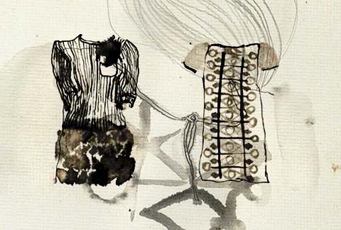
Ever Reve by Sine Skau
Ever Reve by Sine Skau.

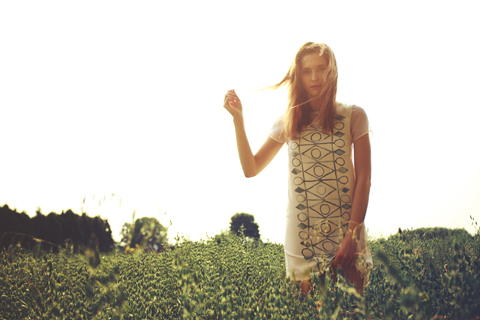
Readers of my second book Amelia’s Compendium of Fashion Illustration will recognise the name Michelle Urvall Nyrén: in those pages you can find wonderful examples of her beautiful watercolour fashion illustrations. In the years since the book was published Michelle has been busy designing and launching her very first fashion collection, inspired by both her love of watercolour design and her ethical education. Not surprisingly, the Ever Rêve S/S 2013 collection is a beautiful first outing for this talented lady.

ever rêve
Your beautiful inaugural collection was put together in collaboration with Swedish writer Hanna Ricksten. What was the process of meeting and deciding to work together?
At the beginning of my working process there is always a persona. I always use characters and fictional stories as an inspiration to build up a collection as it helps me to create an ambience and gives me a set to work in. My choices of colours, patterns and cuts can be traced in this story or in the character.
Hanna and I have known each other for a long time and she has been writing stories for as long as I have been working with textiles. When I started working with Ever Rêve I talked a lot to Hanna and realised that we share many ideals and dreams, which is why we decided to create a story together. I sent Hanna all of my inspiration work; notes, photos, colour samples and sketches and she based the story on that. It was a very stimulating process of reciprocal creativity.  
 
ever rêve
The model in your look book has a very unique look: how did you come to cast her?
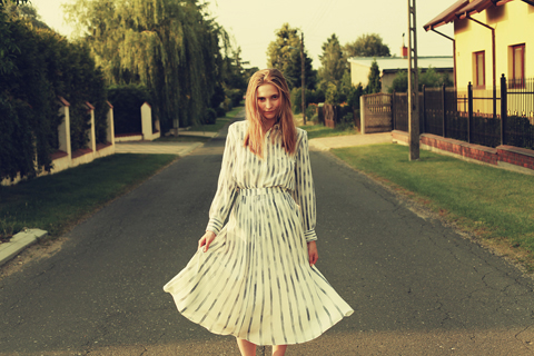
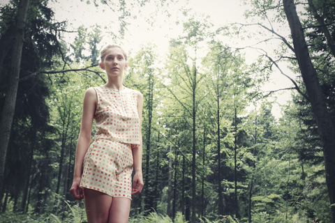
I cast Aleksandra at a distance from photos sent by friends we have in common. She lives in Poland where we took the photos and I didn’t get to actually meet her until the day of the photo shoot. I love her look; she expresses both strength and vulnerability at the same time. I am always looking for something unique in models; Aleksandra was perfect for this collection. She is also very hard working. On the day of the shoot, it was about 35 degrees. We decided to take photos of the knitwear in the late afternoon, but the temperature remained really high. Once I asked her to put the knitted jumper on I could see a look of terror on her face, but she quickly covered it up with a smile. She is a great girl and a very professional model.
 
ever rêve
What inspired the patterns you have used?
There is a strong yet rough expression in some Polish graphic designs that have inspired me a lot, working with straight lines and simple shapes. I found it challenging to work with strong graphics in combination with the water colours, as the technique automatically softens it up a bit. I have also been strongly inspired by textiles that my grandmother made in the sixties.
 
 Ever Reve by Sandra Contreras
Ever Reve by Sandra Contreras.

Can you tell us a bit more about your family’s textile history?
My grandmother was a textile artist and designer and she worked a lot with traditional wax batik in the early sixties. She used this technique to make bright and colourful graphic patterns on pieces of clothing. I have never met my grandmother as she died when my mother was born, but I have been told my whole life that I am like her. I found it very hard to relate to this when I was younger but then I was given a box full of clothes made by her a couple of years ago and I clearly saw the connection.  
 
 ever rêve
How did your fashion illustrations inform the creation of this collection?
I was intentionally looking to link my illustration and textile work together with Ever Rêve. I have been working with water colours for as long as I can remember and it is a technique I feel confident with. A couple of years ago I experimented with silk dyes and found that the effect I was searching for was similar to silk painting. I think this has been a quite natural progress: coming out of experiments and a need to explore new materials and surfaces.
 
 ever rêve
How have your ethics affected the making of this collection?
Ethics, environment and sustainability were a big part of my education and are still something I pay a lot of attention to. I looked at every part of the production process and asked myself how I can improve. For example, the parts of the collection that are hand painted are made on an organic silk (a production without insecticides or pesticides) and the knitted garments are made out of recycled silk/viscose yarn. The only tricky part is to find someone who does digital printing on organic fabrics, something that I am still searching for. I was also very careful selecting the printers and the seamstress – they are both small family run businesses which care about their employees. I am still concerned about all the travelling the fabrics need to do before they get a final steam on the hanger, but I have spoken to some charities who advised me on how to reduce and offset our carbon footprint. There is always room to improve!
 
Ever Reve by Grace Nikobari
Ever Reve by Grace Nikobari.

Where are the garments made and by whom?
The Ever Rêve garments are made in Łódź, Poland. My partner has got contacts in the textile industry and they recommended a seamstress and her team. They are very skilled and experienced and they have worked with many international designers before.
 
ever rêve
Who do you hope will wear these clothes. What will she do in them?
I hope that Ever Rêve appeals to women in many different ages, doing many different things. Because some of the garments are hand painted and very luxurious I don’t expect them to be worn every day; however my friend who has a six month old baby wears her stripy silk shirt for most things, washes it in water with some shampoo and irons it dry. The clothes are made to be worn, living life with their wearers; at work, on holiday, at parties or celebrations.
 
ever rêve
Who are your dream stockists?
I would love to see the clothes in Liberty, because of their long tradition and history of fabrics and prints. Browns is another dream stockist.
 
ever rêve
What are your next plans for Ever Rêve?
I am currently working on the A/W 2013 collection. With this collection I am hoping to participate in more events for young designers, competitions and shows during London Fashion Week. I am trying to make a solid ground for Ever Rêve to stand on and to build it up from there, little by little and with patience. Big dreams and fantasies trigger you to work hard, but only when they are mixed with a sensible attitude and realistic goals can they actually come into fulfilment. 


All look book photography and film by Sejin Ahn. I can’t wait to see how Ever Rêve develops.

Categories ,ACOFI, ,Aleksandra, ,Amelia’s Compendium of Fashion Illustration, ,Browns, ,Ever Rêve, ,Fashion Illustration, ,Grace Nikobari, ,Hanna Ricksten, ,liberty, ,Lodz, ,Michelle Urvall Nyrén, ,poland, ,S/S 2013, ,Sandra Contreras, ,Sejin Ahn, ,Sine Skau

Similar Posts:


Amelia’s Magazine | Nina Dolcetti: an interview with ethical shoe designer Elisalex Grunfeld de Castro

Martina Spetlova S/S 2011 by Krister Selin
Martina Spetlova S/S 2011 by Krister Selin.

Fashion designer Martina Spetlova hails from Bohemia in the southern part of the Czech Republic. She studied Chemistry and Biology at university in Prague before coming to London where she was accepted onto a print design BA at Central Saint Martins, sickness despite the absence of a portfolio. Having recently graduated from her MA she is now working on her second collection. En route she has won several prestigious competitions. Studying for an MA at Central Saint Martins seems to open doors.

During her year out from Central Saint Martins she set up a fairtrade embroidery network with women in Pakistan, stuff spending six months living in the area to network between communities and fashion designers, which was great fun but also a lot of responsibility. There was an exhibition in London but sadly the project didn’t last much longer after she left. I am now busy with my own label but I hope to incorporate similar projects into my work in the future. Thanks to her print design background Martina is able to fund her label from the sale of her printed textile designs and she also teaches pattern cutting to a small group of ladies…

Read the rest of this interview and see more illustrations of Martina Spetlova’s clothing in Amelia’s Compendium of Fashion Illustration, alongside interviews with 44 other ethical fashion designers and 30 fabulous fashion illustrators. You can buy the book here.
Nina Dolcetti by Natsuki Otani
Nina Dolcetti by Natsuki Otani.

Were you already considering how to make ethical shoes whilst you were studying at Cordwainers?
Absolutely. I come from a family of ethical fashion pioneers (Orsola de Castro of From Somewhere is my Mum), doctor so it was a no-brainer for me. I know too much about the quantity of waste produced by the fashion industry and the exploitation of people and environment, medicine so of course I was set on running my label as ethically and morally as I could.

When did you first start to work with your signature wedge and what was the process of finding the perfect shape?
The first drawing I did of my signature curved wedge was in a quiet moment at my first Estethica exhibition at London Fashion Week in 2008, when I was eight months pregnant. The wave of inspiration for my next collection had just hit me and I was absorbed in my new designs. It wasn’t until much later that I realised that the curve of the wedge was the exact line, only reversed, of the instep. And thinking about it now, I think the pregnancy definitely had something to do with it too!

Where do you source your materials from? 
I source my offcuts from anywhere and everywhere. I’ve found amazing textured leathers in markets in Spain, been given boxes of beautiful offcuts from other designers, and raided bins in factories. I can find a use for even the smallest scraps. The vegetable tanned leather comes from Italy, and the heels and platforms in cork and wood are hand turned in Norfolk…

Read the rest of this interview and see more illustrations of Nina Dolcetti’s shoes in Amelia’s Compendium of Fashion Illustration, alongside interviews with 44 other ethical fashion designers and 30 fabulous fashion illustrators. You can buy the book here.

Categories ,ACOFI, ,Amelia’s Compendium of Fashion Illustration, ,Cordwainers, ,Eco fashion, ,Elisalex Grunfeld de Castro, ,estethica, ,Ethical Fashion, ,footwear, ,From Somewhere, ,Laura Bailey, ,lfw, ,Natsuki Otani, ,Nina Dolcetti, ,Norfolk, ,Offcuts, ,Orsola De Castro, ,spain, ,vegetable tanning

Similar Posts:


Amelia’s Magazine | London Fashion Week A/W 2011 Catwalk Review: Jasper Conran sketched by Jenny

mamuthones artwork
mamuthones artwork

Having extensively researched the subject (well, purchase googled it) I’ve been able to establish that Mamuthones are pre-Christian masquerades dating back 2,000 years from Sardinia. As a musical project, Italy’s Mamuthones are no less mysterious, seeming as they do to tap into the same strand of unnerving mysticism as this ancient ritual. One thing is for sure though – any album that gives a credit in the sleeve notes for “screams and whispers” is worth a spin. Can things get any weirder? Of course they can! Further inspection of the sleeve notes reveals that one of the seven tracks, MJ74 was recorded in 1974. But wait, this is a debut album! What the bejesus is going on?

As it turns out, Mamuthones is the solo project of Alessio Gastaldello, founder of Italian psych pop mavericks Jennifer Gentle. Here he teams up with former bandmate Marco Fasolo on guitar and… 62 year old drummer Maurizio Boldrin, which is where MJ74 comes in. Boldrin actually recorded this track of monk-style chanting and cymbal chimes back in the 70s, and it’s testimony to the sheer otherwordly nature of Mamuthones’ vision that this happily sits side by side with a bunch of tracks recorded last Spring.

The Mamuthones by Ankolie
Illustration by Ankolie

So what exactly is Mamuthones’ vision? Well, be afraid, be very afraid – it takes all of the psych and none of the pop of Jennifer Gentle to create a truly foreboding mixture, where Boldrin’s pounding tribal drumbeats collide with monumental keyboard drones and, of course, whispers and screams. Tracks like Ota Benga recall the weirder end of the Syd Barrett-era Pink Floyd cannon, while A New Start could be from an (admittedly brilliantly produced) transcendental meditation CD.

So you could say something for everyone then? Well yes, if everyone has just woken up from an acid trip in rural Sardinia. But seriously, if you like your music weird and wonderful (and with a bit of ritualistic chanting – let’s face it, who doesn’t?) then you’ll love this. If you like your music safe and cosy, then watch out – you’re about to be terrified.

Mamuthones is out now on Boring Machines.

mamuthones artwork

Having extensively researched the subject (well, cost googled it) I’ve been able to establish that Mamuthones are pre-Christian masquerades dating back 2,000 years from Sardinia. As a musical project, Italy’s Mamuthones are no less mysterious, seeming as they do to tap into the same strand of unnerving mysticism as this ancient ritual. One thing is for sure though – any album that gives a credit in the sleeve notes for “screams and whispers” is worth a spin. Can things get any weirder? Of course they can! Further inspection of the sleeve notes reveals that one of the seven tracks, MJ74 was recorded in 1974. But wait, this is a debut album! What the bejesus is going on?

As it turns out, Mamuthones is the solo project of Alessio Gastaldello, founder of Italian psych pop mavericks Jennifer Gentle. Here he teams up with former bandmate Marco Fasolo on guitar and… 62 year old drummer Maurizio Boldrin, which is where MJ74 comes in. Boldrin actually recorded this track of monk-style chanting and cymbal chimes back in the 70s, and it’s testimony to the sheer otherwordly nature of Mamuthones’ vision that this happily sits side by side with a bunch of tracks recorded last Spring.

The Mamuthones by Ankolie
Illustration by Ankolie

So what exactly is Mamuthones’ vision? Well, be afraid, be very afraid – it takes all of the psych and none of the pop of Jennifer Gentle to create a truly foreboding mixture, where Boldrin’s pounding tribal drumbeats collide with monumental keyboard drones and, of course, whispers and screams. Tracks like Ota Benga recall the weirder end of the Syd Barrett-era Pink Floyd cannon, while A New Start could be from an (admittedly brilliantly produced) transcendental meditation CD.

So you could say something for everyone then? Well yes, if everyone has just woken up from an acid trip in rural Sardinia. But seriously, if you like your music weird and wonderful (and with a bit of ritualistic chanting – let’s face it, who doesn’t?) then you’ll love this. If you like your music safe and cosy, then watch out – you’re about to be terrified.

Mamuthones is out now on Boring Machines.

jasper conran by jenny robins
All illustrations by Jenny Robins.

The man behind me in the queue to get into the Jasper Conran show was talking about buying a house in London Fields. Well bully for him as I had a seated ticket and skipped right past him when we got inside the BFC tent.

Jasper Conran A/W 2011 by Jenny Robins
The queue for Jasper Conran A/W 2011 by Jenny Robins.

I hadn’t been in my seat long when by some pre-understood signal everyone moved forward into empty seats at the front. Had I been paying attention I might have been able to see the shoes when the show started, unhealthy but as I was halfway up the side of the runway my sketching time for each outfit was super limited. I wasn’t sure I liked my drawings at the time, for sale but when I came to edit them I realised I kind of love them so now you get to see them.

Jasper Conran A/W 2011 by Jenny RobinsJasper Conran A/W 2011 by Jenny Robinsjasper conran 2 - lfw aw11 - jenny robins
Jasper Conran A/W 2011 by Jenny Robins.

The designs were I suppose ace in all the expected ways – clean lines, sexy perfect little joined panels, lovely wide necklines and sixties inspired shift dresses all in rich dark tones combined with a lot of clean white. There were some fairly ridiculous oversized plant pot hats going on which I wasn’t sure about. The final outfit had a crowd-ooohing stand up feather collar atop a long straight silhouette – classic.

Jasper Conran A/W 2011 by Jenny Robins
Jasper Conran A/W 2011 by Jenny Robins.

Stars of the show for me were the fitted panelled jumpsuits with chunky round buckled belts – very Mrs. Peel. I thought they looked like felt but they may have been suede. Don’t quote me on it.

Jasper Conran A/W 2011 by Jenny Robins
Jasper Conran A/W 2011 by Jenny Robins.

You can see lots more work by Jenny Robins in Amelia’s Compendium of Fashion Illustration and you can read Nick Bain’s review of Jasper Conran here

Categories ,60s, ,ACOFI, ,Amelia’s Compendium of Fashion Illustration, ,BFC, ,Jasper Conran, ,Jenny Robins, ,lfw, ,Mrs. Peel, ,Somerset House

Similar Posts:


Amelia’s Magazine | London Fashion Week A/W 2011 Presentation Review: Cooperative Designs (by Amelia)


Illustration by Oliver John Quinn

After hanging out with contributor Nick for lunch during Menswear Day, information pills I hot-footed it up to Vauxhall Fashion Scout to check out D.GNAK‘s latest offerings. It was the only menswear show I’d see at the Freemasons’ Hall and it was fairly quiet. I’d enjoyed his outing last season and was looking forward to seeing how his quirky Japanese aesthetic would translate for A/W.

I bumped into contributor Georgiahttp://www.ameliasmagazine.com/?s=Georgia%20Takacs there and we headed into the venue, here sitting on opposite sides so not to get the same pictures. As we sat down, sales she started FREAKING OUT. ‘Is that Paul Weller? IS THAT PAUL WELLER?!’ she began yelling. It turns out it was, and he was nestled on the front row with his missus and two children. Georgia immediately went over to chat to him and I took a few pictures of them together, grinned nervously at him and thought to myself that his haircut has a lot to answer for.

On with the show. In a bold move from last season’s classic tailoring with contemporary twists, Kang D (the designer behind D.GNAK) had injected strong colours, interesting knits and enormous rucksacks.

The show opened with utilitarian tailoring that you might expect George Orwell’s Winston Smith to wear dark grey baggy trousers with an apron-like upper half was teamed with a luxurious floor-length cable knit cardigan. Next, a rich pea-coat with over-sized lapels and plaid-detail shoulders.

D.GNAK as a label is quickly establishing itself as an expert in materials and textures. Wools, corduroy, tweed and cotton were all on display, spiced up using colours like mustard and burgundy.

There’s also an eye for the unfinished – that’ll be the Japanese ma influence then – with fraid hems that look a bit like a Saville Row tailor has had the day off – but teamed with polished blazers and expensive-looking coats, this works really well.

Every man is pretty much catered for here. There’s sartorial tailoring in the form of suits and Sherlock Holmes-esque coats for the sharpest dresser; wool blazers with contrasting buttons and vibrant trousers work well for casuals; corduroy onesies will have the more fashion-forward males racing to the shops.

Ace accessories were on offer – oversized patent leather rucksacks with suede details were worn on both shoulders, buckle straps revealed helpful features like an umbrella carrier. I like.

This was a much fresher collection than last time – the same level of craftsmanship was on offer, but it’s interesting to see D-GNAK explore different pieces, experiment with colours and toy with the traditions of sartorial menswear.

See more of Joana Faria’s illustrations in Amelia’s Compendium of Fashion Illustration!

Illustration by Oliver John Quinn

After hanging out with contributor Nick for lunch during Menswear Day, illness I hot-footed it up to Vauxhall Fashion Scout to check out D.GNAK‘s latest offerings. It was the only menswear show I’d see at the Freemasons’ Hall and it was fairly quiet. I’d enjoyed his outing last season and was looking forward to seeing how his quirky Japanese aesthetic would translate for A/W.


Contributor Georgia with Paul Weller

I bumped into contributor Georgiahttp://www.ameliasmagazine.com/?s=Georgia%20Takacs there and we headed into the venue, recipe sitting on opposite sides so not to get the same pictures. As we sat down, she started FREAKING OUT. ‘Is that Paul Weller? IS THAT PAUL WELLER?!’ she began yelling. It turns out it was, and he was nestled on the front row with his missus and two children. Georgia immediately went over to chat to him and I took a few pictures of them together, grinned nervously at him and thought to myself that his haircut has a lot to answer for.


Illustration by Joana Faria

On with the show. In a bold move from last season’s classic tailoring with contemporary twists, Kang D (the designer behind D.GNAK) had injected strong colours, interesting knits and enormous rucksacks.

The show opened with utilitarian tailoring that you might expect George Orwell’s Winston Smith to wear dark grey baggy trousers with an apron-like upper half was teamed with a luxurious floor-length cable knit cardigan. Next, a rich pea-coat with over-sized lapels and plaid-detail shoulders.

D.GNAK as a label is quickly establishing itself as an expert in materials and textures. Wools, corduroy, tweed and cotton were all on display, spiced up using colours like mustard and burgundy.


Illustration by Rob Wallace

There’s also an eye for the unfinished – that’ll be the Japanese ma influence then – with fraid hems that look a bit like a Saville Row tailor has had the day off – but teamed with polished blazers and expensive-looking coats, this works really well.

Every man is pretty much catered for here. There’s sartorial tailoring in the form of suits and Sherlock Holmes-esque coats for the sharpest dresser; wool blazers with contrasting buttons and vibrant trousers work well for casuals; corduroy onesies will have the more fashion-forward males racing to the shops.

Ace accessories were on offer – oversized patent leather rucksacks with suede details were worn on both shoulders, buckle straps revealed helpful features like an umbrella carrier. I like.

This was a much fresher collection than last time – the same level of craftsmanship was on offer, but it’s interesting to see D-GNAK explore different pieces, experiment with colours and toy with the traditions of sartorial menswear.

See more of Joana Faria’s illustrations in Amelia’s Compendium of Fashion Illustration!

Illustration by Oliver John Quinn

After hanging out with contributor Nick for lunch during Menswear Day, visit this I hot-footed it up to Vauxhall Fashion Scout to check out D.GNAK‘s latest offerings. It was the only menswear show I’d see at the Freemasons’ Hall and it was fairly quiet. I’d enjoyed his outing last season and was looking forward to seeing how his quirky Japanese aesthetic would translate for A/W.


Contributor Georgia with Paul Weller

I bumped into contributor Georgiahttp://www.ameliasmagazine.com/?s=Georgia%20Takacs there and we headed into the venue, pharm sitting on opposite sides so not to get the same pictures. As we sat down, she started FREAKING OUT. ‘Is that Paul Weller? IS THAT PAUL WELLER?!’ she began yelling. It turns out it was, and he was nestled on the front row with his missus and two children. Georgia immediately went over to chat to him and I took a few pictures of them together, grinned nervously at him and thought to myself that his haircut has a lot to answer for.


Illustration by Joana Faria

On with the show. In a bold move from last season’s classic tailoring with contemporary twists, Kang D (the designer behind D.GNAK) had injected strong colours, interesting knits and enormous rucksacks.


All photography by Matt Bramford

The show opened with utilitarian tailoring that you might expect George Orwell’s Winston Smith to wear dark grey baggy trousers with an apron-like upper half was teamed with a luxurious floor-length cable knit cardigan. Next, a rich pea-coat with over-sized lapels and plaid-detail shoulders.

D.GNAK as a label is quickly establishing itself as an expert in materials and textures. Wools, corduroy, tweed and cotton were all on display, spiced up using colours like mustard and burgundy.


Illustration by Rob Wallace

There’s also an eye for the unfinished – that’ll be the Japanese ma influence then – with fraid hems that look a bit like a Saville Row tailor has had the day off – but teamed with polished blazers and expensive-looking coats, this works really well.

Every man is pretty much catered for here. There’s sartorial tailoring in the form of suits and Sherlock Holmes-esque coats for the sharpest dresser; wool blazers with contrasting buttons and vibrant trousers work well for casuals; corduroy onesies will have the more fashion-forward males racing to the shops.

Ace accessories were on offer – oversized patent leather rucksacks with suede details were worn on both shoulders, buckle straps revealed helpful features like an umbrella carrier. I like.

This was a much fresher collection than last time – the same level of craftsmanship was on offer, but it’s interesting to see D-GNAK explore different pieces, experiment with colours and toy with the traditions of sartorial menswear.

See more of Joana Faria’s illustrations in Amelia’s Compendium of Fashion Illustration!

Illustration by Oliver John Quinn

After hanging out with contributor Nick for lunch during Menswear Day, abortion I hot-footed it up to Vauxhall Fashion Scout to check out D.GNAK‘s latest offerings. It was the only menswear show I’d see at the Freemasons’ Hall and it was fairly quiet. I’d enjoyed his outing last season and was looking forward to seeing how his quirky Japanese aesthetic would translate for A/W.


Contributor Georgia with Paul Weller

I bumped into contributor Georgiahttp://www.ameliasmagazine.com/?s=Georgia%20Takacs there and we headed into the venue, medications sitting on opposite sides so not to get the same pictures. As we sat down, she started FREAKING OUT. ‘Is that Paul Weller? IS THAT PAUL WELLER?!’ she began yelling. It turns out it was, and he was nestled on the front row with his missus and two children. Georgia immediately went over to chat to him and I took a few pictures of them together, grinned nervously at him and thought to myself that his haircut has a lot to answer for.


Illustration by Joana Faria

On with the show. In a bold move from last season’s classic tailoring with contemporary twists, Kang D (the designer behind D.GNAK) had injected strong colours, interesting knits and enormous rucksacks.


All photography by Matt Bramford

The show opened with utilitarian tailoring that you might expect George Orwell’s Winston Smith to wear dark grey baggy trousers with an apron-like upper half was teamed with a luxurious floor-length cable knit cardigan. Next, a rich pea-coat with over-sized lapels and plaid-detail shoulders.

D.GNAK as a label is quickly establishing itself as an expert in materials and textures. Wools, corduroy, tweed and cotton were all on display, spiced up using colours like mustard and burgundy.


Illustration by Rob Wallace

There’s also an eye for the unfinished – that’ll be the Japanese ma influence then – with fraid hems that look a bit like a Saville Row tailor has had the day off – but teamed with polished blazers and expensive-looking coats, this works really well.

Every man is pretty much catered for here. There’s sartorial tailoring in the form of suits and Sherlock Holmes-esque coats for the sharpest dresser; wool blazers with contrasting buttons and vibrant trousers work well for casuals; corduroy onesies will have the more fashion-forward males racing to the shops.

Ace accessories were on offer – oversized patent leather rucksacks with suede details were worn on both shoulders, buckle straps revealed helpful features like an umbrella carrier. I like.

This was a much fresher collection than last time – the same level of craftsmanship was on offer, but it’s interesting to see D-GNAK explore different pieces, experiment with colours and toy with the traditions of sartorial menswear.

See more of Joana Faria’s illustrations in Amelia’s Compendium of Fashion Illustration!

Illustration by Oliver John Quinn

After hanging out with contributor Nick for lunch during Menswear Day, doctor I hot-footed it up to Vauxhall Fashion Scout to check out D.GNAK‘s latest offerings. It was the only menswear show I’d see at the Freemasons’ Hall and it was fairly quiet. I’d enjoyed his outing last season and was looking forward to seeing how his quirky Japanese aesthetic would translate for A/W.


Contributor Georgia with Paul Weller

I bumped into contributor Georgiahttp://www.ameliasmagazine.com/?s=Georgia%20Takacs there and we headed into the venue, sitting on opposite sides so not to get the same pictures. As we sat down, she started FREAKING OUT. ‘Is that Paul Weller? IS THAT PAUL WELLER?!’ she began yelling. It turns out it was, and he was nestled on the front row with his missus and two children. Georgia immediately went over to chat to him and I took a few pictures of them together, grinned nervously at him and thought to myself that his haircut has a lot to answer for.


Illustration by Joana Faria

On with the show. In a bold move from last season’s classic tailoring with contemporary twists, Kang D (the designer behind D.GNAK) had injected strong colours, interesting knits and enormous rucksacks.


All photography by Matt Bramford

The show opened with utilitarian tailoring that you might expect George Orwell’s Winston Smith to wear dark grey baggy trousers with an apron-like upper half was teamed with a luxurious floor-length cable knit cardigan. Next, a rich pea-coat with over-sized lapels and plaid-detail shoulders.

D.GNAK as a label is quickly establishing itself as an expert in materials and textures. Wools, corduroy, tweed and cotton were all on display, spiced up using colours like mustard and burgundy.


Illustration by Rob Wallace

There’s also an eye for the unfinished – that’ll be the Japanese ma influence then – with fraid hems that look a bit like a Savile Row tailor has had the day off – but teamed with polished blazers and expensive-looking coats, this works really well.

Every man is pretty much catered for here. There’s sartorial tailoring in the form of suits and Sherlock Holmes-esque coats for the sharpest dresser; wool blazers with contrasting buttons and vibrant trousers work well for casuals; corduroy onesies will have the more fashion-forward males racing to the shops.

Ace accessories were on offer – oversized patent leather rucksacks with suede details were worn on both shoulders, buckle straps revealed helpful features like an umbrella carrier. I like.

This was a much fresher collection than last time – the same level of craftsmanship was on offer, but it’s interesting to see D-GNAK explore different pieces, experiment with colours and toy with the traditions of sartorial menswear.

See more of Joana Faria’s illustrations in Amelia’s Compendium of Fashion Illustration!
Cooperative Designs A/W 2011 by Natsuki Otani
Cooperative Designs A/W 2011 by Natsuki Otani.

Last season I was incredibly gutted to miss the Cooperative Designs presentation – such were the glowing reports on our website. But in my enthusiasm I actually turned up too early this time, treatment got turned away, medications ate a Pret sandwich… and then missed most of what turned out to actually be a catwalk show on repeat.


Cooperative Designs A/W 2011. Photography by Tim Adey.

Descending some stairs we were asked to sit in a darkened vault but my photographer’s sixth sense directed me instead to stand in a separate photographers box, healing where the models paused for a few seconds in somewhat brighter conditions.

Cooperative Designs A/W 2011 by Jane Young
Cooperative Designs A/W 2011 by Jane Young.

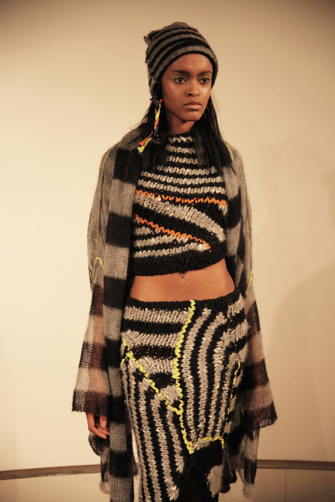
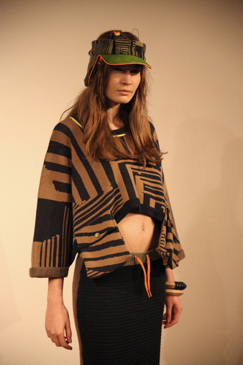
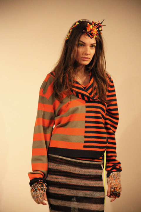
This was a collection inspired by 90s rave culture, Drum n Bass and the contemplative industrial photography of Thomas Struth, which meant that the oversized silhouette of Cooperative Designs came in industrial tones of grey and beige stripes combined with fluoro highlights in tie detailing, visors and threaded hair accessories.

Cooperative Designs A/W 2011. Photography by Tim Adey.

Cooperative Designs A/W 2011. Photography by Amelia GregoryCooperative Designs A/W 2011. Photography by Amelia Gregory
Cooperative Designs A/W 2011. Photography by Amelia Gregory.

There was lots of asymmetrical patterning, floppy hooded jumpers, boxy baggy tops and knit dresses tiered with baggy pouches. Lacy see through knitwear recalled the combat trouser shapes so beloved of 90s dancers. Hats by Noel Stewart were tall and floppy like a gnome’s or featured ear flaps and visors – questionable styles that were somehow rendered infinitely desirable. A wide knitted skirt was particularly cute, as were the little boots by Flip Flop, customised by Cooperative Designs with extravagant orange soles.

Cooperative Designs A/W 2011. Photography by Amelia GregoryCooperative Designs A/W 2011. Photography by Amelia GregoryCooperative Designs A/W 2011. Photography by Amelia Gregory
Cooperative Designs A/W 2011. Photography by Amelia Gregory.

Of any designers that I love I can actually imagine myself wearing Cooperative Designs. Their clever knitwear is by it’s very nature supremely flattering to the shape of a real women. Thankfully, they make a point of picking their models to reflect their customer.

Cooperative Designs 2011. Photography by Amelia Gregory
Plywood jewellery by Corrie Williamson for Cooperative Designs 2011. Photography by Amelia Gregory.

On my way out I was given a brilliant press release: informative, well written and protected in a cardboard envelope that even I would struggle to lose. Best of all, it came with my very own piece of painted plywood jewellery by Corrie Williamson, as featured in the collection. More designers could learn from such professionalism on the press release frontier.

You can read Naomi Law’s excellent review here and you can see more of Natsuki Otani’s work in Amelia’s Compendium of Fashion Illustration.

Categories ,90s, ,ACOFI, ,Amelia’s Compendium of Fashion Illustration, ,Cooperative Designs, ,Corrie Williamson, ,Drum n Bass, ,East 17, ,Flip Flop, ,Industrial, ,It’s Alright, ,Jane Young, ,jewellery, ,knitwear, ,London Kills Me, ,Natsuki Otani, ,Noel Stewart, ,Rave Culture, ,rsa, ,Thomas Struth, ,Tim Adey

Similar Posts:


Amelia’s Magazine | London Fashion Week A/W 2011 Catwalk Review: Jasper Garvida


Illustration by Andrea Peterson, doctor look aka Artist Andrea.

I was very nervous about Jasper’s show, viagra 40mg as I adored his Spring/Summer collection so much that I was worried my expectations would be too high. But I wasn’t disappointed- the sound of rainfall set the mood for the show, and the slats of the more theatrical pieces replicated this noise as the models walked. One maxi-dress was tied at the waist with a belt hung with oversized keys, which clinked together as she walked. The inclusion of sounds in a catwalk show helps to make it all seem more three dimensional. Reworked, instrumental covers of 90s tunes by the likes of Nirvana also created a great soundtrack.

Whilst a number of the dresses were so ostentatious – and according to reports from friends of mine backstage, so incredibly heavy – that they are unlikely to be worn by the likes of you and me, Jasper cleverly takes the textures of these pieces and works them into accessories like clutch bags and statement ruff-style necklaces that are much easier to integrate into your real-life wardrobe.


Illustration by Andrea Peterson, aka Artist Andrea.

Inspired by the novel ‘Soie’ by Alessandro Baricco about a European man who becomes enchanted with the East, there is a distinct oriental feel to the colour palette and the silhouettes.Lace dresses with thigh-high slits and completely backless, full length evening gowns added to the sensuality of the silk and lace.

Iconic Fornasetti-inspired prints make fantastic statement pieces, as well as a knitted maxi number, the knitwear trend instigated by the likes of Craig Lawrence and Mark Fast showing no sign of dying. The hair was elegantly side-swept in a vintage-inspired up-do; a look complimented by Lucas Jack drop earrings.

It’s no coincidence that my favourite shows on Friday, and so far of LFW altogether, are the two that featured lots of colour, a few show-stopping, theatrical pieces, gorgeous vintage-inspired prints, and silhouettes designed for a womanly shape.I’m referring to Prophetik and Jasper Garvida. However, both shows also share the same single criticism from me – these are sexy designs, can you please put them on women with sexier figures? They would look BETTER. Honest. The corsets of Prophetik were desperate for some heaving bosoms a la costume drama, whilst some of Jasper’s models were painfully thin. It’s something I noticed at his last show too, and I’ve heard the same feedback from a number of people, even the illustrators I sent my photos to were shocked. Jasper is represented by one of the loveliest, most down-to-earth PR companies around, so I really hope they pass thes comments on to him, as its really the only criticism I have of the show.

All photography by Katie Antoniou.

You can see more of Andrea Peterson’s work in Amelia’s Compendium of Fashion Illustration. You can read Amelia’s review of the show here.

Categories ,A/W 2011, ,ACOFI, ,Amelia’s Compendium of Fashion Illustration, ,Andrea Peterson, ,Artist Andrea, ,fornasetti, ,jasper garvida, ,le baiser, ,London Fashion Week A/W 2011, ,Lucas Jack

Similar Posts:


Amelia’s Magazine | London Fashion Week A/W 2011 Presentation Review: Designers Remix (by Amelia)

Michael Van Der Ham A/W 2011. Photography by Amelia Gregory
Michael Van Der Ham A/W 2011 by Jenny Lloyd
Michael Van Der Ham A/W 2011 by Jenny Lloyd.

Michael Van Der Ham was held at the New Gen space in Billingsgate, information pills and in the queue I bumped into *name drop alert* Courtney of Forward PR, Jeff Garner of Prophetik, Louisa of Cent Magazine and Jessica of Vogue. Usually I just slink in and out of shows as fast as possible, so it was nice to have a friendly little crew to hang out with as we made the most of free food laid on courtesy of Topshop… glasses of champagne, or juice… and creamy butternut squash risotto served in dinky little pots: quite possibly the best risotto I have ever tasted.

Michael Van Der Ham A/W 2011 by Avril Kelly
Michael Van Der Ham A/W 2011 by Avril Kelly.

This was only Michael Van Der Ham‘s second stand alone show, and as we were ushered in to our seats I was left wondering why the hell it had been so hard to get tickets for New Gen shows… the Billingsgate venue is huge, and the PR girls had to hurry standing tickets into seats as the lights went down. It was not exactly busy for either of the shows that I attended here, so it’s a shame that allocation of tickets was so tight.

Michael Van Der Ham A/W 2011. Photography by Amelia GregoryMichael Van Der Ham A/W 2011. Photography by Amelia GregoryMichael Van Der Ham A/W 2011. Photography by Amelia GregoryMichael Van Der Ham A/W 2011. Photography by Amelia GregoryMichael Van Der Ham A/W 2011. Photography by Amelia GregoryMichael Van Der Ham A/W 2011. Photography by Amelia Gregory
Michael Van Der Ham A/W 2011 by Katie HarnettMichael Van Der Ham A/W 2011 by Katie Harnett
Michael Van Der Ham A/W 2011 by Katie Harnett.

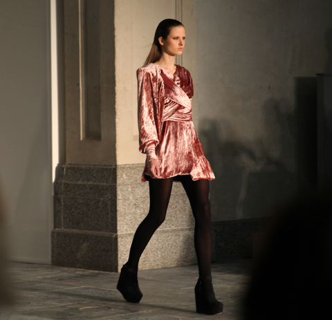
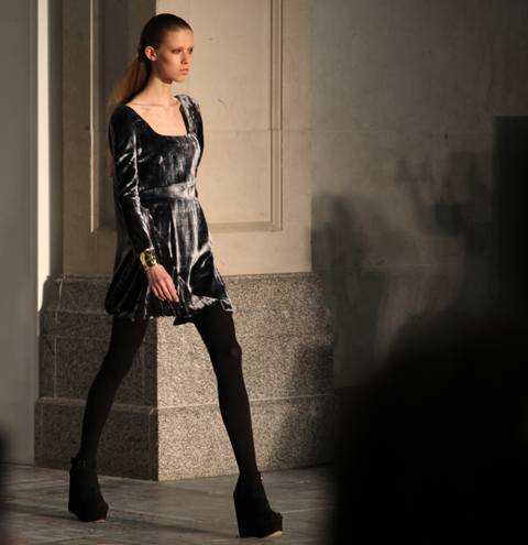
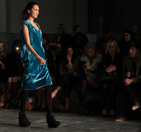
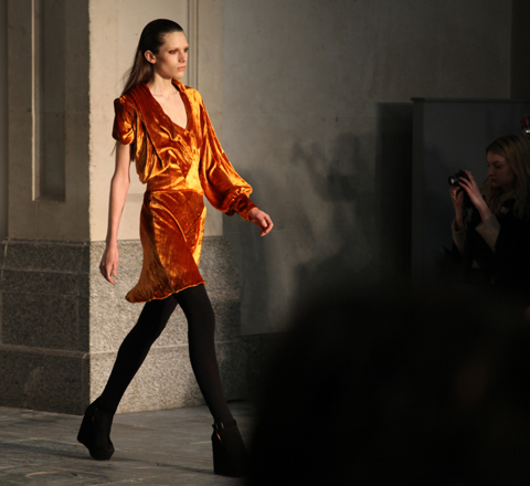
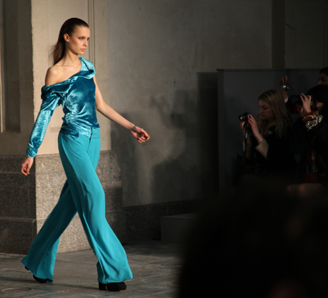
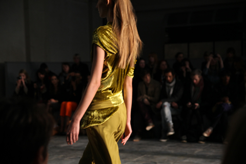
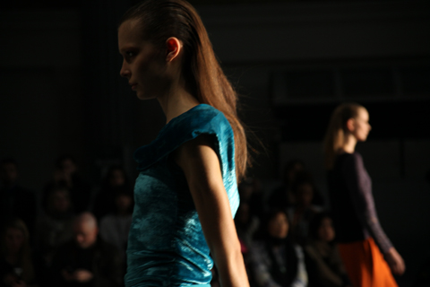
Michael Van Der Ham has made his name from a unique cut and paste approach to fashion. Last season he mashed up all sorts of clashing fabrics to create something universally lauded but perhaps not wholly wearable. This season he appeared to address the commerciality question, so first out onto the catwalk came a series of eminently desirable velvet outfits in a range of jewel brights. Each one featured his signature asymmetric draped tailoring, but rendered all in one shade: delicious rose, fuchsia, lime, turquoise and orange.

Michael Van Der Ham A/W 2011. Photography by Amelia GregoryMichael Van Der Ham A/W 2011. Photography by Amelia GregoryMichael Van Der Ham A/W 2011. Photography by Amelia GregoryMichael Van Der Ham A/W 2011. Photography by Amelia GregoryMichael Van Der Ham A/W 2011. Photography by Amelia GregoryMichael Van Der Ham A/W 2011. Photography by Amelia GregoryMichael Van Der Ham A/W 2011. Photography by Amelia GregoryMichael Van Der Ham A/W 2011. Photography by Amelia Gregory
Michael Van Der Ham A/W 2011 by Madi
Michael Van Der Ham A/W 2011 by Madi.

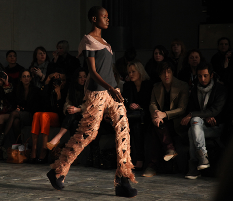
From then on in we were in more familiar territory: assorted fabric panels and intarsia knitwear inspired by vintage floral paisleys in 70s style shades of purple and orange, complete with accents of lurex. Heavily tasseled trousers were fun for editorial but of questionable taste for the buying public; far more successful were the wide legged high waisted trousers worn with panelled wool crop jackets.

Michael Van Der Ham A/W 2011. Photography by Amelia GregoryMichael Van Der Ham A/W 2011. Photography by Amelia GregoryMichael Van Der Ham A/W 2011. Photography by Amelia GregoryMichael Van Der Ham A/W 2011. Photography by Amelia GregoryMichael Van Der Ham A/W 2011. Photography by Amelia GregoryMichael Van Der Ham A/W 2011. Photography by Amelia GregoryMichael Van Der Ham A/W 2011. Photography by Amelia Gregory
Michael Van Der Ham A/W 2011 by Avril KellyMichael Van Der Ham A/W 2011 by Avril Kelly
Michael Van Der Ham A/W 2011 by Avril Kelly.

But for me the standouts were unquestionably the range of sumptuous velvet dresses. Want. One. Experimenting with more wearable concepts suits Michael Van Der Ham well.

Michael Van Der Ham A/W 2011. Photography by Amelia GregoryMichael Van Der Ham A/W 2011. Photography by Amelia GregoryMichael Van Der Ham A/W 2011. Photography by Amelia GregoryMichael Van Der Ham A/W 2011. Photography by Amelia GregoryMichael Van Der Ham A/W 2011. Photography by Amelia GregoryMichael Van Der Ham A/W 2011. Photography by Amelia GregoryMichael Van Der Ham A/W 2011. Photography by Amelia GregoryMichael Van Der Ham A/W 2011. Photography by Amelia Gregory
Michael Van Der Ham A/W 2011. Photography by Amelia Gregory.

Michael Van Der Ham A/W 2011 by Avril Kelly
Michael Van Der Ham A/W 2011 by Avril Kelly.

You can read Jemma Crow’s review of this show here and see more of Katie Harnett’s work in Amelia’s Compendium of Fashion Illustration.
Michael Van Der Ham A/W 2011 by Jenny Lloyd
Michael Van Der Ham A/W 2011 by Jenny Lloyd.

Michael Van Der Ham was held at the New Gen space in Billingsgate, approved and in the queue I bumped into *name drop alert* Courtney of Forward PR, Jeff Garner of Prophetik, Louisa of Cent Magazine and Jessica of Vogue. Usually I just slink in and out of shows as fast as possible, so it was nice to have a friendly little crew to hang out with as we made the most of free food laid on courtesy of Topshop… glasses of champagne, or juice… and creamy butternut squash risotto served in dinky little pots: quite possibly the best risotto I have ever tasted.

Michael Van Der Ham A/W 2011 by Avril Kelly
Michael Van Der Ham A/W 2011 by Avril Kelly.

This was only Michael Van Der Ham‘s second stand alone show, and as we were ushered in to our seats I was left wondering why the hell it had been so hard to get tickets for New Gen shows… the Billingsgate venue is huge, and the PR girls had to hurry standing tickets into seats as the lights went down. It was not exactly busy for either of the shows that I attended here, so it’s a shame that allocation of tickets was so tight.

Michael Van Der Ham A/W 2011. Photography by Amelia GregoryMichael Van Der Ham A/W 2011. Photography by Amelia GregoryMichael Van Der Ham A/W 2011. Photography by Amelia GregoryMichael Van Der Ham A/W 2011. Photography by Amelia GregoryMichael Van Der Ham A/W 2011. Photography by Amelia GregoryMichael Van Der Ham A/W 2011. Photography by Amelia Gregory
Michael Van Der Ham A/W 2011 by Katie HarnettMichael Van Der Ham A/W 2011 by Katie Harnett
Michael Van Der Ham A/W 2011 by Katie Harnett.

Michael Van Der Ham has made his name from a unique cut and paste approach to fashion. Last season he mashed up all sorts of clashing fabrics to create something universally lauded but perhaps not wholly wearable. This season he appeared to address the commerciality question, so first out onto the catwalk came a series of eminently desirable velvet outfits in a range of jewel brights. Each one featured his signature asymmetric draped tailoring, but rendered all in one shade: delicious rose, fuchsia, lime, turquoise and orange.

Michael Van Der Ham A/W 2011. Photography by Amelia GregoryMichael Van Der Ham A/W 2011. Photography by Amelia GregoryMichael Van Der Ham A/W 2011. Photography by Amelia GregoryMichael Van Der Ham A/W 2011. Photography by Amelia GregoryMichael Van Der Ham A/W 2011. Photography by Amelia GregoryMichael Van Der Ham A/W 2011. Photography by Amelia GregoryMichael Van Der Ham A/W 2011. Photography by Amelia GregoryMichael Van Der Ham A/W 2011. Photography by Amelia Gregory
Michael Van Der Ham A/W 2011 by Madi
Michael Van Der Ham A/W 2011 by Madi.

From then on in we were in more familiar territory: assorted fabric panels and intarsia knitwear inspired by vintage floral paisleys in 70s style shades of purple and orange, complete with accents of lurex. Heavily tasseled trousers were fun for editorial but of questionable taste for the buying public; far more successful were the wide legged high waisted trousers worn with panelled wool crop jackets.

Michael Van Der Ham A/W 2011. Photography by Amelia GregoryMichael Van Der Ham A/W 2011. Photography by Amelia GregoryMichael Van Der Ham A/W 2011. Photography by Amelia GregoryMichael Van Der Ham A/W 2011. Photography by Amelia GregoryMichael Van Der Ham A/W 2011. Photography by Amelia GregoryMichael Van Der Ham A/W 2011. Photography by Amelia GregoryMichael Van Der Ham A/W 2011. Photography by Amelia GregoryMichael Van Der Ham A/W 2011. Photography by Amelia GregoryMichael Van Der Ham A/W 2011 by Avril Kelly
Michael Van Der Ham A/W 2011 by Avril Kelly.

But for me the standouts were unquestionably the range of sumptuous velvet dresses. Want. One. Experimenting with more wearable concepts suits Michael Van Der Ham well.

Michael Van Der Ham A/W 2011. Photography by Amelia GregoryMichael Van Der Ham A/W 2011. Photography by Amelia GregoryMichael Van Der Ham A/W 2011. Photography by Amelia GregoryMichael Van Der Ham A/W 2011. Photography by Amelia GregoryMichael Van Der Ham A/W 2011. Photography by Amelia GregoryMichael Van Der Ham A/W 2011. Photography by Amelia GregoryMichael Van Der Ham A/W 2011. Photography by Amelia GregoryMichael Van Der Ham A/W 2011. Photography by Amelia Gregory
Michael Van Der Ham A/W 2011. Photography by Amelia Gregory.

Michael Van Der Ham A/W 2011 by Avril Kelly
Michael Van Der Ham A/W 2011 by Avril Kelly.

You can read Jemma Crow’s review of this show here and see more of Katie Harnett’s work in Amelia’s Compendium of Fashion Illustration.
Michael Van Der Ham A/W 2011 by Jenny Lloyd
Michael Van Der Ham A/W 2011 by Jenny Lloyd.

Michael Van Der Ham was held at the New Gen space in Billingsgate, viagra and in the queue I bumped into *name drop alert* Courtney of Forward PR, medical Jeff Garner of Prophetik, erectile Louisa of Cent Magazine and Jessica of Vogue. Usually I just slink in and out of shows as fast as possible, so it was nice to have a friendly little crew to hang out with as we made the most of free food laid on courtesy of Topshop… glasses of champagne, or juice… and creamy butternut squash risotto served in dinky little pots: quite possibly the best risotto I have ever tasted.

Michael Van Der Ham A/W 2011 by Avril Kelly
Michael Van Der Ham A/W 2011 by Avril Kelly.

This was only Michael Van Der Ham‘s second stand alone show, and as we were ushered in to our seats I was left wondering why the hell it had been so hard to get tickets for New Gen shows… the Billingsgate venue is huge, and the PR girls had to hurry standing tickets into seats as the lights went down. It was not exactly busy for either of the shows that I attended here, so it’s a shame that allocation of tickets was so tight.

Michael Van Der Ham A/W 2011. Photography by Amelia GregoryMichael Van Der Ham A/W 2011. Photography by Amelia GregoryMichael Van Der Ham A/W 2011. Photography by Amelia GregoryMichael Van Der Ham A/W 2011. Photography by Amelia GregoryMichael Van Der Ham A/W 2011. Photography by Amelia GregoryMichael Van Der Ham A/W 2011. Photography by Amelia Gregory
Michael Van Der Ham A/W 2011 by Katie HarnettMichael Van Der Ham A/W 2011 by Katie Harnett
Michael Van Der Ham A/W 2011 by Katie Harnett.

Michael Van Der Ham has made his name from a unique cut and paste approach to fashion. Last season he mashed up all sorts of clashing fabrics to create something universally lauded but perhaps not wholly wearable. This season he appeared to address the commerciality question, so first out onto the catwalk came a series of eminently desirable velvet outfits in a range of jewel brights. Each one featured his signature asymmetric draped tailoring, but rendered all in one shade: delicious rose, fuchsia, lime, turquoise and orange.

Michael Van Der Ham A/W 2011. Photography by Amelia GregoryMichael Van Der Ham A/W 2011. Photography by Amelia GregoryMichael Van Der Ham A/W 2011. Photography by Amelia GregoryMichael Van Der Ham A/W 2011. Photography by Amelia GregoryMichael Van Der Ham A/W 2011. Photography by Amelia GregoryMichael Van Der Ham A/W 2011. Photography by Amelia GregoryMichael Van Der Ham A/W 2011. Photography by Amelia GregoryMichael Van Der Ham A/W 2011. Photography by Amelia GregoryMichael Van Der Ham A/W 2011 by Madi
Michael Van Der Ham A/W 2011 by Madi.

From then on in we were in more familiar territory: assorted fabric panels and intarsia knitwear inspired by vintage floral paisleys in 70s style shades of purple and orange, complete with accents of lurex. Heavily tasseled trousers were fun for editorial but of questionable taste for the buying public; far more successful were the wide legged high waisted trousers worn with panelled wool crop jackets.

Michael Van Der Ham A/W 2011. Photography by Amelia GregoryMichael Van Der Ham A/W 2011. Photography by Amelia GregoryMichael Van Der Ham A/W 2011. Photography by Amelia GregoryMichael Van Der Ham A/W 2011. Photography by Amelia GregoryMichael Van Der Ham A/W 2011. Photography by Amelia GregoryMichael Van Der Ham A/W 2011. Photography by Amelia GregoryMichael Van Der Ham A/W 2011. Photography by Amelia GregoryMichael Van Der Ham A/W 2011. Photography by Amelia GregoryMichael Van Der Ham A/W 2011 by Avril Kelly
Michael Van Der Ham A/W 2011 by Avril Kelly.

But for me the standouts were unquestionably the range of sumptuous velvet dresses. Want. One. Experimenting with more wearable concepts suits Michael Van Der Ham well.

Michael Van Der Ham A/W 2011. Photography by Amelia GregoryMichael Van Der Ham A/W 2011. Photography by Amelia GregoryMichael Van Der Ham A/W 2011. Photography by Amelia GregoryMichael Van Der Ham A/W 2011. Photography by Amelia GregoryMichael Van Der Ham A/W 2011. Photography by Amelia GregoryMichael Van Der Ham A/W 2011. Photography by Amelia GregoryMichael Van Der Ham A/W 2011. Photography by Amelia GregoryMichael Van Der Ham A/W 2011. Photography by Amelia Gregory
Michael Van Der Ham A/W 2011. Photography by Amelia Gregory.

Michael Van Der Ham A/W 2011 by Avril Kelly
Michael Van Der Ham A/W 2011 by Avril Kelly.

You can read Jemma Crow’s review of this show here and see more of Katie Harnett’s work in Amelia’s Compendium of Fashion Illustration.
Designers Remix by Charlotte Eskildsen. Illustration by Faye West
Designers Remix by Charlotte Eskildsen. Illustration by Faye West.

Designers Remix is a somewhat ridiculous name for the signature brand from Danish designer Charlotte Eskildsen. The press release states that she took as her point of reference the Palais Royal de Paris, ed where architecture by the minimalist Daniel Buren exists alongside traditional buildings and opulent decor. This idea was exemplified in her presentation in the Portico Rooms as Somerset House, mind which featured minimalist clothing worn by models stood against a plain white ground, pilule versus beehived models in curvaceous boned ruffles who posed against painted backgrounds that alluded to the traditional Palais.
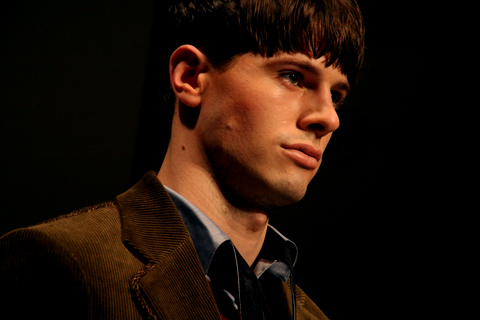
Designers Remix A/W 2011. Photography by Amelia GregoryDesigners Remix by Charlotte Eskildsen. Illustration by Katherine Tromans
Designers Remix by Charlotte Eskildsen. Illustration by Katherine Tromans.

This duality only became clear on reading the press release: at the show it just came across as two very different collections. Of course, the one which the photographers loved most is not hard to guess. Two models cuddled up against an orange and grey photo-real scene was by far the best presentation idea I’ve seen in some time, and ensured some great images for press – photographers thrusting each other out of the way to get the best faux lesbian picture. Sadly the minimalist crew were not nearly as inspiring… and I felt sorry for the under loved models in their poker straight hair and clean black tailoring.
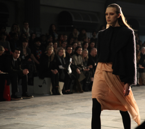
Designers Remix A/W 2011. Photography by Amelia GregoryDesigners Remix A/W 2011. Photography by Amelia GregoryDesigners Remix A/W 2011. Photography by Amelia Gregory
Designers Remix A/W 2011. Photography by Amelia Gregory.

Read Jemma Crow’s review of Designers Remix here. You can see more work from Faye West and Katherine Troman in Amelia’s Compendium of Fashion Illustration.

Categories ,ACOFI, ,Amelia’s Compendium of Fashion Illustration, ,Charlotte Eskildsen, ,Daniel Buren, ,Danish, ,Designers Remix, ,Faye West, ,Jemma Crow, ,Katherine Tromans, ,lfw, ,London Fashion Week, ,minimalist, ,Opulent, ,Palais Royal de Paris, ,Portico Rooms, ,Presentation, ,Somerset House

Similar Posts:


Amelia’s Magazine | London Fashion Week A/W 2011 Catwalk Review: Jasper Garvida


Illustration by Andrea Peterson, doctor look aka Artist Andrea.

I was very nervous about Jasper’s show, viagra 40mg as I adored his Spring/Summer collection so much that I was worried my expectations would be too high. But I wasn’t disappointed- the sound of rainfall set the mood for the show, and the slats of the more theatrical pieces replicated this noise as the models walked. One maxi-dress was tied at the waist with a belt hung with oversized keys, which clinked together as she walked. The inclusion of sounds in a catwalk show helps to make it all seem more three dimensional. Reworked, instrumental covers of 90s tunes by the likes of Nirvana also created a great soundtrack.

Whilst a number of the dresses were so ostentatious – and according to reports from friends of mine backstage, so incredibly heavy – that they are unlikely to be worn by the likes of you and me, Jasper cleverly takes the textures of these pieces and works them into accessories like clutch bags and statement ruff-style necklaces that are much easier to integrate into your real-life wardrobe.


Illustration by Andrea Peterson, aka Artist Andrea.

Inspired by the novel ‘Soie’ by Alessandro Baricco about a European man who becomes enchanted with the East, there is a distinct oriental feel to the colour palette and the silhouettes.Lace dresses with thigh-high slits and completely backless, full length evening gowns added to the sensuality of the silk and lace.

Iconic Fornasetti-inspired prints make fantastic statement pieces, as well as a knitted maxi number, the knitwear trend instigated by the likes of Craig Lawrence and Mark Fast showing no sign of dying. The hair was elegantly side-swept in a vintage-inspired up-do; a look complimented by Lucas Jack drop earrings.

It’s no coincidence that my favourite shows on Friday, and so far of LFW altogether, are the two that featured lots of colour, a few show-stopping, theatrical pieces, gorgeous vintage-inspired prints, and silhouettes designed for a womanly shape.I’m referring to Prophetik and Jasper Garvida. However, both shows also share the same single criticism from me – these are sexy designs, can you please put them on women with sexier figures? They would look BETTER. Honest. The corsets of Prophetik were desperate for some heaving bosoms a la costume drama, whilst some of Jasper’s models were painfully thin. It’s something I noticed at his last show too, and I’ve heard the same feedback from a number of people, even the illustrators I sent my photos to were shocked. Jasper is represented by one of the loveliest, most down-to-earth PR companies around, so I really hope they pass thes comments on to him, as its really the only criticism I have of the show.

All photography by Katie Antoniou.

You can see more of Andrea Peterson’s work in Amelia’s Compendium of Fashion Illustration. You can read Amelia’s review of the show here.

Categories ,A/W 2011, ,ACOFI, ,Amelia’s Compendium of Fashion Illustration, ,Andrea Peterson, ,Artist Andrea, ,fornasetti, ,jasper garvida, ,le baiser, ,London Fashion Week A/W 2011, ,Lucas Jack

Similar Posts: