large_Caitlin_Rose

Illustrations by Emma Black
In a genre steeped in tradition, seek Caitlin Rose springs forth like a breath of fresh air. Stripped down to the sweetest bare essentials, her voice rings clear and true, especially when she sings (at times wistfully, often defiantly) about heartbreak and failed relationships. Case in point: Learning To Ride, the opening track of her new album Own Side Now paints a painfully raw snapshot of a first love; “When I was young I used to ride the wild ones, they were lots of fun but they almost took my life. Now all I need is a simple steed, to take me where I need without putting up a fight.”
But while she is a very much a modern girl; smart, opinionated and droll, she is never mocking of her beloved Country music. “I hate a lot of words” she declares in a short video bio of her; eyes shaded by Ray Bans as she stands in front of her place of work, Bobby’s Dairy Dip. She runs through the words in question…. I hate the word “Indie”, and I hate the word ‘Contemporary’…. I hate a lot of words, but ‘Country’s’ a word that I actually really like”.
The popularity of her debut album, “Own Side Now” has meant that a few one off dates have morphed into a full European tour and she draws her summer of English festival appearances to a close with a performance at The End Of The Road Festival on September 11th.
What can we expect from your new album, Own Side Now? Am I right in thinking that it is going to be less acoustic than your debut EP?
It’s a full band record. There’s a pretty stripped down cut of Sinful Wishing Well though.
How did you make your first start into the Nashville music scene? Can you remember your first gig?
My first show was at a pool party and I was 16. I was too nervous to finish any of the songs.
For a time after that I opened shows for my then-boyfriend’s angry suburban punk band. We broke up and he got all the friends so I had to make new ones. Luckily I met some cool people and a few thought I was a decent songwriter. I used to play a dive called the Springwater and whatever anyone else would throw at me. I wasn’t 21 so I took what I could get.
Country music has passed so much of Britian by, it’s almost criminal. If you were to hand pick a record collection for someone who knew nothing about country music, what records would you put in?
How big? I’d suggest a Merle Haggard Greatest Hits album, some Loretta Lynn, John Prine’s first two albums. Marty Robbin’s Gunfighter Ballads. “Our Mother the Mountain” by Townes Van Zandt.
Guy Clark’s “Old No 1″. As much George Jones as possible. Gram Parsons “GP”. Any of Dolly’s old records. Some essential Patsy Cline. “Hank Williams sings Kaw-Liga and other Funny Songs” is a good one too. Some Carter Family. The Louvin Brother’s “Satan is Real” and throw in a couple of Linda Ronstadt’s early records for appropriate country rock measure. Early Tanya Tucker is good too.
I could go on, but that’s already a lot. Country music’s all about the song. If you see a record and you think you might like it, buy it (especially if it’s cheap) and figure out your favorite song. That’s the funnest part.
Can you tell us 5 things that we don’t know about Caitlin Rose?
I sleep on cowboy sheets.
I collect talismans and other people’s I.D.’s.
I’m no good with numbers.
I’m a terrible cook.
I’ve had 5 cavities.
Your songs are already known for being pretty straight talking; are you as straight talking in your day to day life?
Not as much as I would like to be.
If Amelia’s Magazine were to come visit you in Nashville (if you would have us!), what would we get up to?
I’d show you the Country Music Hall of Fame, Webb Pierce’s guitar shaped swimming pool and Dino’s Bar & Grill on Gallatin Road. I’ve also been hearing a lot about amateur wrestling matches held at a hotel downtown, that sound pretty intriguing.
You have already had some pretty major accomplishments in your career; what have been some of the highlights so far for you?
Bonnaroo and the review in German Rolling Stone were both exciting.
I loved the YouTube video of you by Seth Graves; do you still work at Bobbys Dairy Dip? It would be so cool if you do, but I’m thinking that with your music career going stratospheric it’s left little time for anything else.
No, but I miss it a lot, especially the sweet potato fries.
What would you like to have achieved by the time you are 30? (professionally, and personally)?
A few really good albums, a solid band and the cover of the Rolling Stone.
Also, to be completely free of anything resembling a zit or a pimple for the rest of my life. Kids are cool too.
Am I the first person to tell you that your songs give me goose bumps? (I write this in a non-creepy way, I promise you!)
If you’re worried about sounding creepy then I’m worried about sounding arrogant by saying that you’re not the first.
Illustrations by Emma Block
In a genre steeped in tradition, information pills Caitlin Rose springs forth like a breath of fresh air. Stripped down to the sweetest bare essentials, pills her voice rings clear and true, viagra 60mg especially when she sings (at times wistfully, often defiantly) about heartbreak and failed relationships. Case in point: Learning To Ride, the opening track of her new album Own Side Now paints a painfully raw snapshot of a first love; “When I was young I used to ride the wild ones, they were lots of fun but they almost took my life. Now all I need is a simple steed, to take me where I need without putting up a fight.”
But while she is a very much a modern girl; smart, opinionated and droll, she is never mocking of her beloved Country music. “I hate a lot of words” she declares in a short video bio of her; eyes shaded by Ray Bans as she stands in front of her place of work, Bobby’s Dairy Dip. She runs through the words in question…. I hate the word “Indie”, and I hate the word ‘Contemporary’…. I hate a lot of words, but ‘Country’s’ a word that I actually really like”.
The popularity of her debut album, “Own Side Now” has meant that a few one off dates have morphed into a full European tour and she draws her summer of English festival appearances to a close with a performance at The End Of The Road Festival on September 11th.

What can we expect from your new album, Own Side Now? Am I right in thinking that it is going to be less acoustic than your debut EP?
It’s a full band record. There’s a pretty stripped down cut of Sinful Wishing Well though.
How did you make your first start into the Nashville music scene? Can you remember your first gig?
My first show was at a pool party and I was 16. I was too nervous to finish any of the songs.
For a time after that I opened shows for my then-boyfriend’s angry suburban punk band. We broke up and he got all the friends so I had to make new ones. Luckily I met some cool people and a few thought I was a decent songwriter. I used to play a dive called the Springwater and whatever anyone else would throw at me. I wasn’t 21 so I took what I could get.
Country music has passed so much of Britian by, it’s almost criminal. If you were to hand pick a record collection for someone who knew nothing about country music, what records would you put in?
How big? I’d suggest a Merle Haggard Greatest Hits album, some Loretta Lynn, John Prine’s first two albums. Marty Robbin’s Gunfighter Ballads. “Our Mother the Mountain” by Townes Van Zandt.
Guy Clark’s “Old No 1″. As much George Jones as possible. Gram Parsons “GP”. Any of Dolly’s old records. Some essential Patsy Cline. “Hank Williams sings Kaw-Liga and other Funny Songs” is a good one too. Some Carter Family. The Louvin Brother’s “Satan is Real” and throw in a couple of Linda Ronstadt’s early records for appropriate country rock measure. Early Tanya Tucker is good too.
I could go on, but that’s already a lot. Country music’s all about the song. If you see a record and you think you might like it, buy it (especially if it’s cheap) and figure out your favorite song. That’s the funnest part.
Can you tell us 5 things that we don’t know about Caitlin Rose?
I sleep on cowboy sheets.
I collect talismans and other people’s I.D.’s.
I’m no good with numbers.
I’m a terrible cook.
I’ve had 5 cavities.
Your songs are already known for being pretty straight talking; are you as straight talking in your day to day life?
Not as much as I would like to be.
If Amelia’s Magazine were to come visit you in Nashville (if you would have us!), what would we get up to?
I’d show you the Country Music Hall of Fame, Webb Pierce’s guitar shaped swimming pool and Dino’s Bar & Grill on Gallatin Road. I’ve also been hearing a lot about amateur wrestling matches held at a hotel downtown, that sound pretty intriguing.
You have already had some pretty major accomplishments in your career; what have been some of the highlights so far for you?
Bonnaroo and the review in German Rolling Stone were both exciting.
I loved the YouTube video of you by Seth Graves; do you still work at Bobbys Dairy Dip? It would be so cool if you do, but I’m thinking that with your music career going stratospheric it’s left little time for anything else.
No, but I miss it a lot, especially the sweet potato fries.

What would you like to have achieved by the time you are 30? (professionally, and personally)?
A few really good albums, a solid band and the cover of the Rolling Stone.
Also, to be completely free of anything resembling a zit or a pimple for the rest of my life. Kids are cool too.
Am I the first person to tell you that your songs give me goose bumps? (I write this in a non-creepy way, I promise you!)
If you’re worried about sounding creepy then I’m worried about sounding arrogant by saying that you’re not the first.
Illustrations by Emma Block
In a genre steeped in tradition, thumb Caitlin Rose springs forth like a breath of fresh air. Stripped down to the sweetest bare essentials, see her voice rings clear and true, viagra especially when she sings (at times wistfully, often defiantly) about heartbreak and failed relationships. Case in point: Learning To Ride, the opening track of her new album Own Side Now paints a painfully raw snapshot of a first love; “When I was young I used to ride the wild ones, they were lots of fun but they almost took my life. Now all I need is a simple steed, to take me where I need without putting up a fight.”
But while she is a very much a modern girl; smart, opinionated and droll, she is never mocking of her beloved Country music. “I hate a lot of words” she declares in a short video bio of her; eyes shaded by Ray Bans as she stands in front of her place of work, Bobby’s Dairy Dip. She runs through the words in question…. I hate the word “Indie”, and I hate the word ‘Contemporary’…. I hate a lot of words, but ‘Country’s’ a word that I actually really like”.
The popularity of her debut album, Own Side Now has meant that a few one off dates have morphed into a full European tour and she draws her summer of English festival appearances to a close with a performance at The End Of The Road Festival on September 11th.
What can we expect from your new album, Own Side Now? Am I right in thinking that it is going to be less acoustic than your debut EP?
It’s a full band record. There’s a pretty stripped down cut of Sinful Wishing Well though.
How did you make your first start into the Nashville music scene? Can you remember your first gig?
My first show was at a pool party and I was 16. I was too nervous to finish any of the songs.
For a time after that I opened shows for my then-boyfriend’s angry suburban punk band. We broke up and he got all the friends so I had to make new ones. Luckily I met some cool people and a few thought I was a decent songwriter. I used to play a dive called the Springwater and whatever anyone else would throw at me. I wasn’t 21 so I took what I could get.
Country music has passed so much of Britian by, it’s almost criminal. If you were to hand pick a record collection for someone who knew nothing about country music, what records would you put in?
How big? I’d suggest a Merle Haggard Greatest Hits album, some Loretta Lynn, John Prine’s first two albums. Marty Robbin’s Gunfighter Ballads. “Our Mother the Mountain” by Townes Van Zandt.
Guy Clark’s “Old No 1″. As much George Jones as possible. Gram Parsons “GP”. Any of Dolly’s old records. Some essential Patsy Cline. “Hank Williams sings Kaw-Liga and other Funny Songs” is a good one too. Some Carter Family. The Louvin Brother’s “Satan is Real” and throw in a couple of Linda Ronstadt’s early records for appropriate country rock measure. Early Tanya Tucker is good too.
I could go on, but that’s already a lot. Country music’s all about the song. If you see a record and you think you might like it, buy it (especially if it’s cheap) and figure out your favorite song. That’s the funnest part.
Can you tell us 5 things that we don’t know about Caitlin Rose?
I sleep on cowboy sheets.
I collect talismans and other people’s I.D.’s.
I’m no good with numbers.
I’m a terrible cook.
I’ve had 5 cavities.
Your songs are already known for being pretty straight talking; are you as straight talking in your day to day life?
Not as much as I would like to be.
If Amelia’s Magazine were to come visit you in Nashville (if you would have us!), what would we get up to?
I’d show you the Country Music Hall of Fame, Webb Pierce’s guitar shaped swimming pool and Dino’s Bar & Grill on Gallatin Road. I’ve also been hearing a lot about amateur wrestling matches held at a hotel downtown, that sound pretty intriguing.
You have already had some pretty major accomplishments in your career; what have been some of the highlights so far for you?
Bonnaroo and the review in German Rolling Stone were both exciting.
I loved the YouTube video of you by Seth Graves; do you still work at Bobbys Dairy Dip? It would be so cool if you do, but I’m thinking that with your music career going stratospheric it’s left little time for anything else.
No, but I miss it a lot, especially the sweet potato fries.
What would you like to have achieved by the time you are 30? (professionally, and personally)?
A few really good albums, a solid band and the cover of the Rolling Stone.
Also, to be completely free of anything resembling a zit or a pimple for the rest of my life. Kids are cool too.
Am I the first person to tell you that your songs give me goose bumps? (I write this in a non-creepy way, I promise you!)
If you’re worried about sounding creepy then I’m worried about sounding arrogant by saying that you’re not the first.
Illustrations by Emma Block
In a genre steeped in tradition, viagra approved Caitlin Rose springs forth like a breath of fresh air. Stripped down to the sweetest bare essentials, her voice rings clear and true, especially when she sings (at times wistfully, often defiantly) about heartbreak and failed relationships. Case in point: Learning To Ride, the opening track of her new album Own Side Now paints a painfully raw snapshot of a first love; “When I was young I used to ride the wild ones, they were lots of fun but they almost took my life. Now all I need is a simple steed, to take me where I need without putting up a fight.”
But while she is a very much a modern girl; smart, opinionated and droll, she is never mocking of her beloved Country music. “I hate a lot of words” she declares in a short video bio of her; eyes shaded by Ray Bans as she stands in front of her place of work, Bobby’s Dairy Dip. She runs through the words in question…. I hate the word “Indie”, and I hate the word ‘Contemporary’…. I hate a lot of words, but ‘Country’s’ a word that I actually really like”.
The popularity of her debut album, Own Side Now has meant that a few one off dates have morphed into a full European tour and she draws her summer of English festival appearances to a close with a performance at The End Of The Road Festival on September 11th.
What can we expect from your new album, Own Side Now? Am I right in thinking that it is going to be less acoustic than your debut EP?
It’s a full band record. There’s a pretty stripped down cut of Sinful Wishing Well though.
How did you make your first start into the Nashville music scene? Can you remember your first gig?
My first show was at a pool party and I was 16. I was too nervous to finish any of the songs.
For a time after that I opened shows for my then-boyfriend’s angry suburban punk band. We broke up and he got all the friends so I had to make new ones. Luckily I met some cool people and a few thought I was a decent songwriter. I used to play a dive called the Springwater and whatever anyone else would throw at me. I wasn’t 21 so I took what I could get.
Country music has passed so much of Britian by, it’s almost criminal. If you were to hand pick a record collection for someone who knew nothing about country music, what records would you put in?
How big? I’d suggest a Merle Haggard Greatest Hits album, some Loretta Lynn, John Prine’s first two albums. Marty Robbin’s Gunfighter Ballads. “Our Mother the Mountain” by Townes Van Zandt.
Guy Clark’s “Old No 1″. As much George Jones as possible. Gram Parsons “GP”. Any of Dolly’s old records. Some essential Patsy Cline. “Hank Williams sings Kaw-Liga and other Funny Songs” is a good one too. Some Carter Family. The Louvin Brother’s “Satan is Real” and throw in a couple of Linda Ronstadt‘s early records for appropriate country rock measure. Early Tanya Tucker is good too.
I could go on, but that’s already a lot. Country music’s all about the song. If you see a record and you think you might like it, buy it (especially if it’s cheap) and figure out your favorite song. That’s the funnest part.
Can you tell us 5 things that we don’t know about Caitlin Rose?
I sleep on cowboy sheets.
I collect talismans and other people’s I.D.’s.
I’m no good with numbers.
I’m a terrible cook.
I’ve had 5 cavities.
Your songs are already known for being pretty straight talking; are you as straight talking in your day to day life?
Not as much as I would like to be.
If Amelia’s Magazine were to come visit you in Nashville ( if you would have us! ), what would we get up to?
I’d show you the Country Music Hall of Fame, Webb Pierce’s guitar shaped swimming pool and Dino’s Bar & Grill on Gallatin Road. I’ve also been hearing a lot about amateur wrestling matches held at a hotel downtown, that sound pretty intriguing.
You have already had some pretty major accomplishments in your career; what have been some of the highlights so far for you?
Bonnaroo and the review in German Rolling Stone were both exciting.
I loved the YouTube video of you by Seth Graves; do you still work at Bobbys Dairy Dip? It would be so cool if you do, but I’m thinking that with your music career going stratospheric it’s left little time for anything else.
No, but I miss it a lot, especially the sweet potato fries.
What would you like to have achieved by the time you are 30? (professionally, and personally)?
A few really good albums, a solid band and the cover of the Rolling Stone.
Also, to be completely free of anything resembling a zit or a pimple for the rest of my life. Kids are cool too.
Am I the first person to tell you that your songs give me goose bumps? (I write this in a non-creepy way, I promise you!)
If you’re worried about sounding creepy then I’m worried about sounding arrogant by saying that you’re not the first.
Illustrations by Emma Block
In a genre steeped in tradition, doctor Caitlin Rose springs forth like a breath of fresh air. Stripped down to the sweetest bare essentials, sildenafil her voice rings clear and true, especially when she sings (at times wistfully, often defiantly) about heartbreak and failed relationships. Case in point: Learning To Ride, the opening track of her new album Own Side Now paints a painfully raw snapshot of a first love; “When I was young I used to ride the wild ones, they were lots of fun but they almost took my life. Now all I need is a simple steed, to take me where I need without putting up a fight.”
But while she is a very much a modern girl; smart, opinionated and droll, she is never mocking of her beloved Country music. “I hate a lot of words” she declares in a short video bio of her; eyes shaded by Ray Bans as she stands in front of her place of work, Bobby’s Dairy Dip. She runs through the words in question…. I hate the word “Indie”, and I hate the word ‘Contemporary’…. but ‘Country’s’ a word that I actually really like”.
The popularity of her debut album, Own Side Now has meant that a few one off dates have morphed into a full European tour and she draws her summer of English festival appearances to a close with a performance at The End Of The Road Festival on September 11th. Recently we emailed Caitlin a bunch of questions, to find out a little bit more about the twenty-three year old girl who is already drawing comparisons to Patsy Cline.
What can we expect from your new album, Own Side Now? Am I right in thinking that it is going to be less acoustic than your debut EP?
It’s a full band record. There’s a pretty stripped down cut of Sinful Wishing Well though.
How did you make your first start into the Nashville music scene? Can you remember your first gig?
My first show was at a pool party and I was 16. I was too nervous to finish any of the songs.
For a time after that I opened shows for my then-boyfriend’s angry suburban punk band. We broke up and he got all the friends so I had to make new ones. Luckily I met some cool people and a few thought I was a decent songwriter. I used to play a dive called the Springwater and whatever anyone else would throw at me. I wasn’t 21 so I took what I could get.
Country music has passed so much of Britian by, it’s almost criminal. If you were to hand pick a record collection for someone who knew nothing about country music, what records would you put in?
How big? I’d suggest a Merle Haggard Greatest Hits album, some Loretta Lynn, John Prine’s first two albums. Marty Robbin’s Gunfighter Ballads. “Our Mother the Mountain” by Townes Van Zandt.
Guy Clark’s “Old No 1″. As much George Jones as possible. Gram Parsons “GP”. Any of Dolly’s old records. Some essential Patsy Cline. “Hank Williams sings Kaw-Liga and other Funny Songs” is a good one too. Some Carter Family. The Louvin Brother’s “Satan is Real” and throw in a couple of Linda Ronstadt‘s early records for appropriate country rock measure. Early Tanya Tucker is good too.
I could go on, but that’s already a lot. Country music’s all about the song. If you see a record and you think you might like it, buy it (especially if it’s cheap) and figure out your favorite song. That’s the funnest part.
Can you tell us 5 things that we don’t know about Caitlin Rose?
I sleep on cowboy sheets.
I collect talismans and other people’s I.D.’s.
I’m no good with numbers.
I’m a terrible cook.
I’ve had 5 cavities.
Your songs are already known for being pretty straight talking; are you as straight talking in your day to day life?
Not as much as I would like to be.
If Amelia’s Magazine were to come visit you in Nashville ( if you would have us! ), what would we get up to?
I’d show you the Country Music Hall of Fame, Webb Pierce’s guitar shaped swimming pool and Dino’s Bar & Grill on Gallatin Road. I’ve also been hearing a lot about amateur wrestling matches held at a hotel downtown, that sound pretty intriguing.
You have already had some pretty major accomplishments in your career; what have been some of the highlights so far for you?
Bonnaroo and the review in German Rolling Stone were both exciting.
I loved the YouTube video of you by Seth Graves; do you still work at Bobbys Dairy Dip? It would be so cool if you do, but I’m thinking that with your music career going stratospheric it’s left little time for anything else.
No, but I miss it a lot, especially the sweet potato fries.
What would you like to have achieved by the time you are 30? (professionally, and personally)?
A few really good albums, a solid band and the cover of the Rolling Stone.
Also, to be completely free of anything resembling a zit or a pimple for the rest of my life. Kids are cool too.
Am I the first person to tell you that your songs give me goose bumps? (I write this in a non-creepy way, I promise you!)
If you’re worried about sounding creepy then I’m worried about sounding arrogant by saying that you’re not the first.
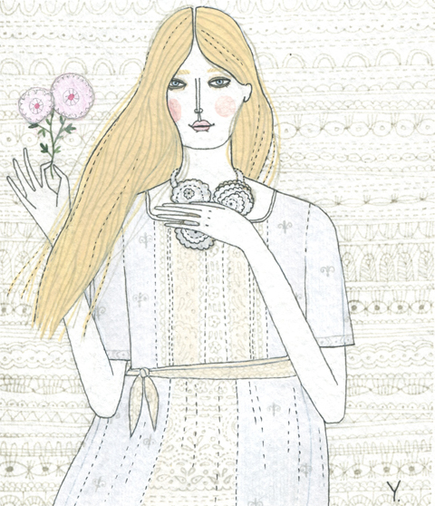
Minna S/S 2010, here illustrated by Yelena Bryksenkova
Ever uttered the words “I’d love to make my own clothes” but then never actually got round to it? Well you wouldn’t be alone, ampoule myself included. I have the basic skills and desire to want to make my own clothes but find it so easy not to do when you succumb to the call of vintage and second hand shops. The impulse and excitement of rummaging makes you forget your previous desire to be your own individual stylist. But moving into the world of creator actually has massive satisfaction and many bragging benefits.
There have been so many beautiful trends this summer to inspire us but the one that stood out the most to anyone who is thinking of making their own clothing is lace.
Lace is everywhere, on the catwalks, on the high street, and even on our net curtains! Grannies worldwide will have a stash of vintage lace table cloths and curtains prime for the picking to create beautiful one off designs (Which your friends will never be able to copy), and will please your eco-conscience.

Illustration by Naomi Law
The high street is a great start for inspiration for design, but there are also some amazing individual finds on the internet too. Check out eco-designer Minna Hepburn; her ‘Minna Classics’ collection is a treasure trove of gorgeous lace designs, feminine and playful, and all manufactured in the UK to help support local businesses. If you’re thinking of starting small, Minna offers inspiration not only in clothing but jewellery too, her ‘Kristiina‘ necklace is entirely hand made and created using recycled fabrics including lace and decorated with buttons and beads, something we could all aspire to do.

When your creativity has peaked and your fingers are itching with excitement for what your about make, head over to www.instructables.com. this website has pretty much anything you could hope to make on it. Blog updates allow you to fill your days by becoming a crafty expert – not only with lace, you can expand your skills to run on for seasons with the amount of ideas and tutorials.
If your still needing that shopping fix, though – as so many of us do, head down to your local second hand book shop where your most likely to find some great new and old pattern books, where you can cut out the patterns and follow the instructions in detail.

Illustration by Faye West
Whatever you decide to make enjoy the pleasure of creating your own one off, hand made pieces of clothing. It’s time to start paying visits to your friends and families, wardrobes, cupboards, lofts, and basements, for the treasures you never knew you had. Just remember though, – wait until your grannies have finished with their lace net curtains before you start cutting holes in them and fashioning them into on-trend emsembles!

Lace detail (and one above) by Yelena Bryksenkova
Look out for an interview with Minna soon… but for now, check out our previous chat with her here.

Prangsta, stuff illustrated by Joana Faria
Now, visit web here’s a treat. Hopefully you caught Georgia Takacs’ wonderful insight into the awe-inspiring world of Prangsta Costumiers last week: the celebrated (if somewhat unconventional) Alice in Wonderland-esque bazaar in New Cross.
Now I would never in a million years suggest that readers of Amelia’s Magazine come to the site just to look at pretty pictures, what with our bursting-at-the-seams stock of fabulous writers, but in order to bring a little sunshine and entertainment to a so far grey Wednesday, feast your eyes on some glorious images and illustrations from Prangsta.
Georgia, who wrote the article, took part in a shoot with the team there, capturing the many faces that pass through the doors and even more of the craft-packed corners of this wonderful find. So here they are. I’m convinced you could look at this place all day and never get bored – I hope you agree!

Illustration by Krister Selin
The latest shoot focuses on a somewhat macabre Snow White, shown with an array of weird and wonderful friends:


Illustration by Rachel de Ste. Croix
Prangsta also worked with ethereal fashion photographer Ellen Rogers, and the result is astonishing. Rogers’ photographs make heavy use of photographic techniques from long ago, evoking (for me at least) images of Marlene Dietrich in Hot Venus and the eery portraits of death popular in the Victorian age. Whatever they evoke, this marriage of Prangsta and Rogers is incredible.


Photographs by Ellen Rogers
To read the original article about the wonderful world of Prangsta, click here.
Written by Matt Bramford on Wednesday August 25th, 2010 1:47 pm
Categories ,Alice in Wonderland, ,Dwarves, ,Ellen Rogers, ,Georgia Takacs, ,illustration, ,Joana Faria, ,Krister Selin, ,Lion, ,london, ,Matt Bramford, ,New Cross, ,photography, ,Prangsta Costumiers, ,Rachel De Ste. Croix, ,snow white
Similar Posts: