Amelia’s Magazine | Prophetik: London Fashion Week A/W 2012 Catwalk Review


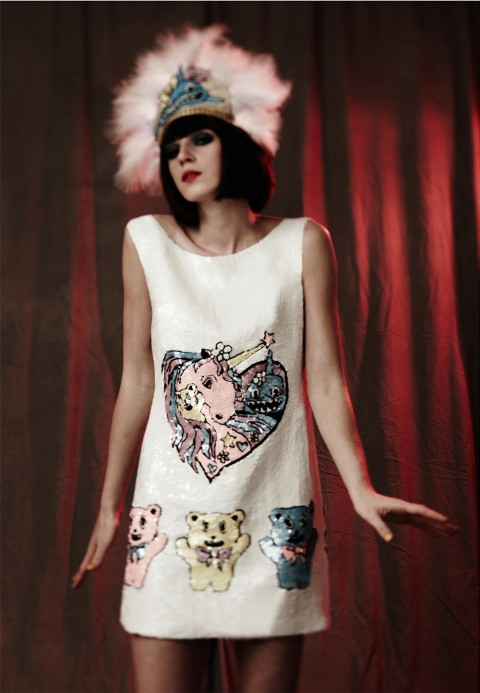
Prophetik A/W 2012 by Faye West

My fashion week hadn’t got off to the best of starts this season. I skipped day one, and arrived on day two rather worse for wear. I’d been out boozing the night before and hadn’t predicted to feel quite so dreadful the next morning. I managed the Spijkers show, but on my way to see my faces, Teatum Jones, I was spinning out so badly that I just had to return home. Spending the day on the sofa sorted me out, and so I leapt out of bed on a bright, Spring-like morning on Sunday (day three) to catch Prophetik, back after a hiatus last season, to see what Jeff Gardner could offer fashion fans at 10.30am.


Prophetik A/W 2012 by Claire Kearns

Seating was easy peasy thanks to the glorious gals at Forward PR, and the show began only a few minutes late. This season, Jeff’s charity of choice is the Lawrence Anthony Foundation, committed to protecting endangered rhinos. Well, I certainly didn’t expect to see photographs of rhinos mutilated at such an early hour, but the provocative images hit home the crisis the species face. It costs £30,000 to protect one rhino for a year – a terrifying amount of money – because the only way to keep them alive is by guarding them 24 hours a day. You can read more about the cause here.


All photography by Matt Bramford

So it was on with the show. True to form, a vibrant violinist opened the proceedings, galavanting up and down the catwalk as she played. A live band then accompanied music that blasted from the sound system and the first model appeared.

This collection was called ‘Courtly Love‘, which for a brief moment made me imagine Prophetik‘s staple frocks with Courtney Love-esque make-up. Alas, this wasn’t the case. The theme was more of a reference to Princess Grace, archetypal dandies and an age-old way of dressing reinvented with a surge of modernity. The collection brought Prophetik‘s inimitable style back to the catwalk – romance, drama and sophistication neatly packaged into one collection.


Prophetik A/W 2012 by Gilly Rochester

Layers of lace were built up on dresses, blouson sleeves met with tight cuffs, swooping necklines were decorated with ruffled trims and sashes around waists provided flattering silhouettes.

This season saw a shorter hemline on some pieces that came as a bit of a surprise; I’m used to Jeff’s floor-sweeping numbers but cuter frocks cut above the knee made the collection seem more wearable and playful.

Menswear was exemplary as per: this season brought cropped tuxedos with jazzy gold buttons and baggy knits; pillow-shaped sleeves appeared on shirts. I spent more time than was necessary fancying two frock coats, the first with beautiful embroidery that looked like a V&A exhibit, the second made from luxurious velvet with heavy brocade detailing.

I don’t see myself hanging around Bethnal Green in either, but I’ve since fantasised about wearing the latter around the house, pretending I’m from another era.


Prophetik A/W 2012 by Gabriel Ayala

The finale created gasps across the room: a dress, black on bottom, white on top, featured one of Jeff’s grandmother’s original blankets (he must be running out) covered in black feathers – a real red carpet number if ever I saw one; one that will likely have Livia Firth on the phone faster than you can say green carpet. Gasps of another kind came when Whitney Houston’s ‘I Wanna Dance With Somebody’ emerged from the speakers – an unorthadox choice at a Prophetik show, but one that had guests bouncing up and down in their seats.


Finale at Prophetik A/W 2012 by Faye West

While Prophetik isn’t my favourite type of fashion – I prefer the more contemporary, print-based designers – I’m never disappointed, as I’m sure the hopeless romantics won’t be either.

Categories ,A/W 2012, ,AW12, ,catwalk, ,Claire Kearns, ,Courtly Love, ,Dandy, ,fashion, ,Faye West, ,Forward PR, ,Freemasons’ Hall, ,Gabriel Ayala, ,Gilly Rochester, ,Jeff Garner, ,Lawrence, ,London Fashion Week, ,Matt Bramford, ,menswear, ,Prophetik, ,review, ,Vauxhall Fashion Scout, ,Whitney Houston, ,Womenswear

Similar Posts:


Amelia’s Magazine | Putting optical illusions on homeware: an interview with designer maker Dionne Sylvester

Dionne Sylvester plate designs
I first discovered the striking homeware of designer maker Dionne Sylvester at Spitalfields Market earlier this year, where they immediately caught my attention. Her colourful designs give traditional teacups, plates and upholstery a zingy modern update inspired by the play of light on the Caribbean sea and a fascination with optical illusions. I love them!

Dionne Sylvester portrait
Where do you find inspiration for the combinations of colours that you put together?
My inspiration first came from looking at different menswear books, which led to researching the phenomenon of British Dandies and the collections of Ozwald Boateng in particular. I like the smart appearance of the Dandies and the extravagant colour clashes so beloved of Boateng, who uses unexpected shades for the inner lining as his signature look. My shocking colour ways are also influenced by Caribbean culture. You can see these references running through my range because it is both fun and traditional.

Dionne Sylvester designs Meadow
How do you create the feel of optical illusions within your artwork?
I use a combination of simple techniques to create illusions. The main image is often created in a prominent colour so that your eye is led to it, even though it has been well hidden in the final design. Sometimes other colours further distract the eye from the original image. When your eye detects a form your mind will then create logic from the whole pattern. It’s really nice to hear what people see in my designs: birds, dancing people, faces and just about anything you can think of. Everyone sees something different in my work.

Dionne Sylvester bolster cushion
What was the best thing you learnt during your degree in fashion design in Falmouth?
The best thing I learnt was digital printing, I was really lucky that I had the best technicians and I was taught so much about the practical uses of the equipment because I was in the first year to do the fashion degree. This meant that the technicians had a bit more time to give us tips on using everything and it was all new. I completed the first year on a Contemporary Crafts degree before I changed over to Fashion, which is funny since I have now gone back full circle and my work could be included under the umbrella of ‘craft’. My studies enabled me to pick up a real fusion of different skills.

Dionne Sylvester teacup designs
Why did you decide to crossover into the production of homewares, and what has been the easiest and hardest things about the transition?
I’m still not sure how it happened! But, I knew I wanted to do something of my own and I love making and being creative. I bought the same equipment that I used at uni to do digital printing for fabric and it started from there when I began to experiment with the equipment boundaries. The first products I produced were sets of teacups which I got into a shop in Margate a week later, and the original prints on those are still being used on products which I sell.

Dionne Sylvester designs mugs
The easiest part of all of this is how creative I can be and I am basically making, designing, painting and producing pretty things on most days. But the hardest transition is that I’m learning as I go along. I didn’t know anything about homewares or the craft business. From production to location of selling and keeping accounts, I am constantly learning. But it is still fun and I have met lovely people on the journey.

Where and how are your products made?
I source all my products locally or from within the UK, and I produce all my products from my home studio in Kent. It’s a bit crazy and gets messy, but it works at the moment. I’m looking into getting the ceramics made by a specialist outsource as I want to expand my ceramic range.

White Horses Whitstable art sails
How did you get involved with the White Horses Whitstable project and what inspired the final design that appeared on a sail? (see Dionne’s sail on the far left)
I got involved with White Horses when I saw their advertisement for local artists and I wanted to be part of the project because it sounded very unusual and I have never been involved with producing public art before. The print that was featured on my sail is called A Water Dance and was inspired by my travels to the Caribbean – inspiration came from looking at how the sea reflects the different colours around it, changing the tone and creating movement and textures. I thought that would fit in well with the theme and it is also one of my favourite designs that is featured on my range of cushions.

White Horses Whitstable 2013
White Horses Whitstable 2013. Photo courtesy of Leo Mason.

Whom do you produce fashion prints for, and how do these complement your own range?
I have sold to Bally, Gap and straight to textiles houses. My designs for fashion are very different as they tend to feature hand drawn illustrations in pen and ink and use a lot less colour than in my own work. I make mini collections of prints around themes such as decaying nature, the human body and creepy animals.

Dionne Sylvester- a water dance
Dionne Sylvester – A Water Dance.

How has the Prince’s Trust enabled your business to grow?
The Prince’s Trust has been brilliant! I went to them when I was unsure of what I wanted to do, and my mentor made me think about the possibilities of my small idea. She made me realise how much I had learnt from my studies and what an enormous love of art, craft and design I have. Taking part gave me the confidence to use all the skills I have.

Dionne Sylvester designs cushions
Where can interested readers find you in the run up to Christmas?
With the run up to Christmas, I’m going to be selling in Style Market on Saturdays at Spitalfields Market, at Handmade Christmas in the O2 on 15th December and at the Of Cabbage of Kings Christmas Market in Stoke Newington on 15th December.

Lastly, I believe you now live in Chatham in Kent – can you share with us what is happening creatively in the area? I’d love to know…
I have always worked and socialised in London but it has been three years since I left uni and I’ve kind of settled in Chatham now. There is a really creative buzz going on in Medway with lots of artists and designers hosting interesting events. This is not just because of the different arts universities in the area – it feels as if the local people are coming together to make a creative community, which is growing very quickly. It will be interesting to see how Medway artists affect the local landscape in the coming years.

You can find Dionne Sylvester‘s etsy shop right here. Photography by Caroline Wenham.

Categories ,A Water Dance, ,Bally, ,Caribbean, ,Caroline Wenham, ,Chatham, ,colour, ,Contemporary Crafts, ,craft, ,Dandy, ,designer, ,Dionne Sylvester, ,Falmouth, ,fashion, ,Fashion Print, ,Gap, ,Handmade Christmas, ,Homeware, ,kent, ,Leo Mason, ,Maker, ,Margate, ,Medway, ,Medway Towns, ,O2, ,Of Cabbage of Kings, ,Optical Illusion, ,Ozwald Boateng, ,Sail, ,Spitalfields Market, ,Stoke Newington, ,Style Market, ,textile, ,The Prince’s Trust, ,White Horses Whitstable

Similar Posts:


Amelia’s Magazine | An Interview with illustrator Hattie Stewart

Hattie Stewart

London-based Hattie Stewart, a ‘professional doodler’, originally from Essex, is taking the fashion world by storm with her ‘doodle-bombed’ magazine covers. Not just limited to putting her mark on mags, she’s also done a whole range of stuff from shop-fronts to call-girl cards. Youthful, quirky and comic book-esque, Hattie pens a place where all things happy, cartooney, dark and urban make an appearance. This exuberance with a tint of dark humour reminds me a little of Bart‘s beloved Itchy & Scratchy. Bold colours, unique characters, a wink and some swag all form part of her signature style. She’s a busy girl and Amelia recently mentioned Hattie in a review of Pick Me Up Graphic Arts Festival 2013.

Hattie Stewart

Having graduated from Kingston University, Hattie Stewart has worked on projects with House Of Holland, Marc Jacobs and Adidas to name a few. Her work is proving popular across the globe and has been exhibited in Miami, New York, Berlin and London. I spoke to this young illustration idol about graduation, her personal pen preference and how doodling her mark on the world is getting her eye-marked for great things to come.

Hattie Stewart

How do you get the ideas for your doodles?
I have no idea! Sometimes I like to pore over copies of Craphound to get ideas for motifs, but mostly I just start drawing. The best ideas always come from practice and the simple act of just drawing.

Do you feel like London is tied to your identity as an illustrator?
I guess so, I think the fun-loving attitude of my work with certain levels of underlying sarcasm is definitely an identity I would characterise with London.

Hattie Stewart
Hattie Stewart

Your style has a comic book feel, what comics did you read as a kid?
I was obsessed with Dandy and Beano comics but especially Beryl the Peril. She ruled. My interest in strong comic book styles and larger than life characters definitely began at a young age. My uncle’s always drawn comic book characters and taught me a lot about developing a style.

How did the reality of life after graduation compare to your expectations?
It kind of went more or less as I’d imagined. I knew work wasn’t necessarily going to happen straight after uni and I’d have to work really hard and have many part-time jobs before things started kicking off. Because I’ve been fortunate in that I’ve always wanted to draw, I had a feeling that if I worked as hard as I could and tried to maintain a good attitude things would eventually happen for me. It’s wasn’t easy and I definitely kept looking for many different opportunities and work.

Hattie Stewart
Hattie Stewart

Do you think your degree was an important part of your development as an illustrator?
Yes, definitely. It taught me what I wanted as an artist and who I wanted to be and the people I met helped form my character and became so valuable to me. I do think it’s an experience everyone should have – sometimes defining your character helps develop your work, and then you have an amazing wealth of facilities and experienced tutors to help your work grow. You definitely have to have faith in yourself though and listen to yourself and follow your instincts as much as you listen to and accept the advice offered, there always needs to be a balance.

Hattie Stewart

Hattie Stewart

Hattie Stewart

How did you get the idea to start doodling on mag covers?
I was watching telly and a copy of Dazed and Confused was sat in front of me. Like so many people I just started aimlessly doodling on the cover and when I’d finished thought it looked pretty cool – it all developed from there!

You’ve had some big clients, like Urban Outfitters, Luella, Diesel and Adidas, are there any big names you really want to work with in the future?
I’m not sure really. I know I’d love to do some set design and big 3D set pieces/ props! There are so many things I want to do with my work it really depends on who will let me do it rather than who it is I do it for.

Hattie Stewart
Hattie Stewart

I saw that you did an awesome project for Soda Pop illustrating call girl cards, how did this come about?
There is a magazine called Gypse Eyes and they were excepting contributions for their ‘Food + Sex’ issue, then the idea of the call girl cards popped into my head! My friend Jessica Abou Nassar who runs Soda Pop and the amazing Ghetto Nailz wanted to collab with me and I suggested using these – she agreed and the t-shirts were created! It was a great project.

Hattie Stewart
Hattie Stewart

You describe your style as ‘cheeky’, do you think that you like to take risks as an illustrator?
Absolutely. It’s important taking risks in all sides of life – How else does anything change? All the best ideas and opportunities come from moving outside of your comfort zone and as an artist that is extremely important.

Colour is an important feature of your work, what are your favourite shades?
Pink, especially fluro pink. In fact anything fluro. Right now though I’m loving primary colours! Especially red, always red.

Hattie Stewart
Hattie Stewart

What type of pen do you use?
Posca! The only pens I use and they go on every surface. I would never recommend any other but then again that’s just my preference.

Do you think the internet has made visual culture a vital part of everyday life?
Oh absolutely. It’s also made things move and grow very quickly, which can be thrilling but also exhausting. Trying to make and keep yourself relevant and motivated when there is so much talent and ideas constantly on show in front of you, it can be inspiring and demoralising at the same time. Ultimately though knowledge and learning and the immediacy of connecting to people you wouldn’t otherwise be able to contact is amazing.

Hattie Stewart

All the images in this post were provided by Hattie Stewart. You can see more of Hattie’s work on her portfolio and you can find her on Tumblr and Twitter too.

Categories ,Adidas, ,Beano, ,Beryl the Peril, ,cartoons, ,cheeky, ,comic books, ,Craphound, ,Dandy, ,Dazed and Confused, ,Diesel, ,doodle, ,doodle-bomb, ,draw, ,drawing, ,Gypse Eyes, ,Hattie Stewart, ,House of Holland, ,Jessica Abou Nassar, ,jessicasrcook, ,Kingston University, ,london, ,Luella, ,Marc Jacobs, ,Neon, ,pens, ,pink, ,Posca, ,Soda Pop, ,Urban Outfitters

Similar Posts: