
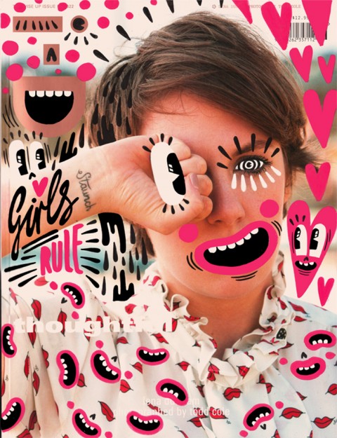
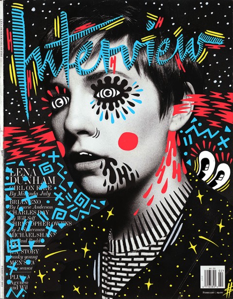
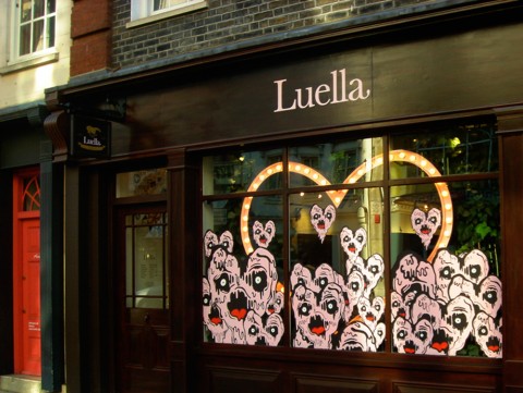
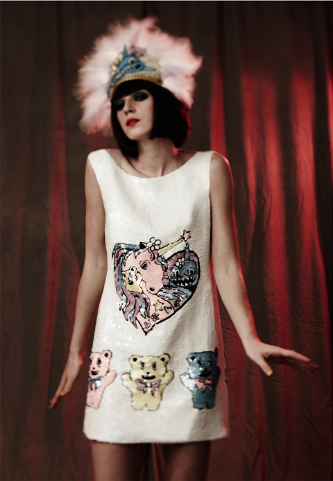
London-based Hattie Stewart, a ‘professional doodler’, originally from Essex, is taking the fashion world by storm with her ‘doodle-bombed’ magazine covers. Not just limited to putting her mark on mags, she’s also done a whole range of stuff from shop-fronts to call-girl cards. Youthful, quirky and comic book-esque, Hattie pens a place where all things happy, cartooney, dark and urban make an appearance. This exuberance with a tint of dark humour reminds me a little of Bart‘s beloved Itchy & Scratchy. Bold colours, unique characters, a wink and some swag all form part of her signature style. She’s a busy girl and Amelia recently mentioned Hattie in a review of Pick Me Up Graphic Arts Festival 2013.
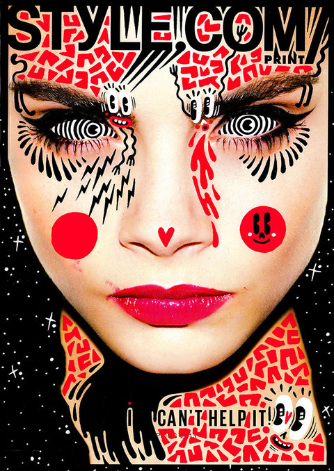
Having graduated from Kingston University, Hattie Stewart has worked on projects with House Of Holland, Marc Jacobs and Adidas to name a few. Her work is proving popular across the globe and has been exhibited in Miami, New York, Berlin and London. I spoke to this young illustration idol about graduation, her personal pen preference and how doodling her mark on the world is getting her eye-marked for great things to come.
How do you get the ideas for your doodles?
I have no idea! Sometimes I like to pore over copies of Craphound to get ideas for motifs, but mostly I just start drawing. The best ideas always come from practice and the simple act of just drawing.
Do you feel like London is tied to your identity as an illustrator?
I guess so, I think the fun-loving attitude of my work with certain levels of underlying sarcasm is definitely an identity I would characterise with London.


Your style has a comic book feel, what comics did you read as a kid?
I was obsessed with Dandy and Beano comics but especially Beryl the Peril. She ruled. My interest in strong comic book styles and larger than life characters definitely began at a young age. My uncle’s always drawn comic book characters and taught me a lot about developing a style.
How did the reality of life after graduation compare to your expectations?
It kind of went more or less as I’d imagined. I knew work wasn’t necessarily going to happen straight after uni and I’d have to work really hard and have many part-time jobs before things started kicking off. Because I’ve been fortunate in that I’ve always wanted to draw, I had a feeling that if I worked as hard as I could and tried to maintain a good attitude things would eventually happen for me. It’s wasn’t easy and I definitely kept looking for many different opportunities and work.

Do you think your degree was an important part of your development as an illustrator?
Yes, definitely. It taught me what I wanted as an artist and who I wanted to be and the people I met helped form my character and became so valuable to me. I do think it’s an experience everyone should have – sometimes defining your character helps develop your work, and then you have an amazing wealth of facilities and experienced tutors to help your work grow. You definitely have to have faith in yourself though and listen to yourself and follow your instincts as much as you listen to and accept the advice offered, there always needs to be a balance.


How did you get the idea to start doodling on mag covers?
I was watching telly and a copy of Dazed and Confused was sat in front of me. Like so many people I just started aimlessly doodling on the cover and when I’d finished thought it looked pretty cool – it all developed from there!
You’ve had some big clients, like Urban Outfitters, Luella, Diesel and Adidas, are there any big names you really want to work with in the future?
I’m not sure really. I know I’d love to do some set design and big 3D set pieces/ props! There are so many things I want to do with my work it really depends on who will let me do it rather than who it is I do it for.

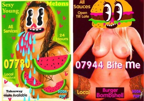
I saw that you did an awesome project for Soda Pop illustrating call girl cards, how did this come about?
There is a magazine called Gypse Eyes and they were excepting contributions for their ‘Food + Sex’ issue, then the idea of the call girl cards popped into my head! My friend Jessica Abou Nassar who runs Soda Pop and the amazing Ghetto Nailz wanted to collab with me and I suggested using these – she agreed and the t-shirts were created! It was a great project.
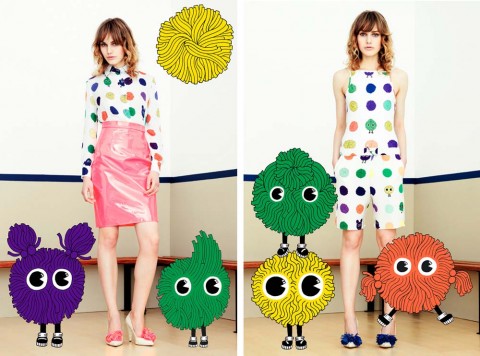
You describe your style as ‘cheeky’, do you think that you like to take risks as an illustrator?
Absolutely. It’s important taking risks in all sides of life – How else does anything change? All the best ideas and opportunities come from moving outside of your comfort zone and as an artist that is extremely important.
Colour is an important feature of your work, what are your favourite shades?
Pink, especially fluro pink. In fact anything fluro. Right now though I’m loving primary colours! Especially red, always red.
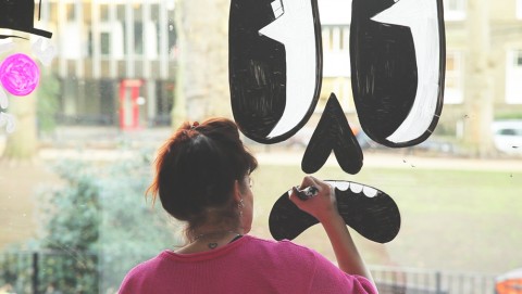

What type of pen do you use?
Posca! The only pens I use and they go on every surface. I would never recommend any other but then again that’s just my preference.
Do you think the internet has made visual culture a vital part of everyday life?
Oh absolutely. It’s also made things move and grow very quickly, which can be thrilling but also exhausting. Trying to make and keep yourself relevant and motivated when there is so much talent and ideas constantly on show in front of you, it can be inspiring and demoralising at the same time. Ultimately though knowledge and learning and the immediacy of connecting to people you wouldn’t otherwise be able to contact is amazing.

All the images in this post were provided by Hattie Stewart. You can see more of Hattie’s work on her portfolio and you can find her on Tumblr and Twitter too.
Categories ,Adidas, ,Beano, ,Beryl the Peril, ,cartoons, ,cheeky, ,comic books, ,Craphound, ,Dandy, ,Dazed and Confused, ,Diesel, ,doodle, ,doodle-bomb, ,draw, ,drawing, ,Gypse Eyes, ,Hattie Stewart, ,House of Holland, ,Jessica Abou Nassar, ,jessicasrcook, ,Kingston University, ,london, ,Luella, ,Marc Jacobs, ,Neon, ,pens, ,pink, ,Posca, ,Soda Pop, ,Urban Outfitters
Similar Posts:
- Made You Look Kickstarter Campaign
- An Interview with Illustrator Jordan Andrew Carter
- Dan Stanley and Fluffy Thoughts
- Año Uña – impossible romance in still-frame photographs
- Competition time! The Pickled Award for new character illustration.
