Amelia’s Magazine | Putting optical illusions on homeware: an interview with designer maker Dionne Sylvester

Dionne Sylvester plate designs
I first discovered the striking homeware of designer maker Dionne Sylvester at Spitalfields Market earlier this year, where they immediately caught my attention. Her colourful designs give traditional teacups, plates and upholstery a zingy modern update inspired by the play of light on the Caribbean sea and a fascination with optical illusions. I love them!
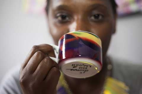
Dionne Sylvester portrait
Where do you find inspiration for the combinations of colours that you put together?
My inspiration first came from looking at different menswear books, which led to researching the phenomenon of British Dandies and the collections of Ozwald Boateng in particular. I like the smart appearance of the Dandies and the extravagant colour clashes so beloved of Boateng, who uses unexpected shades for the inner lining as his signature look. My shocking colour ways are also influenced by Caribbean culture. You can see these references running through my range because it is both fun and traditional.

Dionne Sylvester designs Meadow
How do you create the feel of optical illusions within your artwork?
I use a combination of simple techniques to create illusions. The main image is often created in a prominent colour so that your eye is led to it, even though it has been well hidden in the final design. Sometimes other colours further distract the eye from the original image. When your eye detects a form your mind will then create logic from the whole pattern. It’s really nice to hear what people see in my designs: birds, dancing people, faces and just about anything you can think of. Everyone sees something different in my work.

Dionne Sylvester bolster cushion
What was the best thing you learnt during your degree in fashion design in Falmouth?
The best thing I learnt was digital printing, I was really lucky that I had the best technicians and I was taught so much about the practical uses of the equipment because I was in the first year to do the fashion degree. This meant that the technicians had a bit more time to give us tips on using everything and it was all new. I completed the first year on a Contemporary Crafts degree before I changed over to Fashion, which is funny since I have now gone back full circle and my work could be included under the umbrella of ‘craft’. My studies enabled me to pick up a real fusion of different skills.

Dionne Sylvester teacup designs
Why did you decide to crossover into the production of homewares, and what has been the easiest and hardest things about the transition?
I’m still not sure how it happened! But, I knew I wanted to do something of my own and I love making and being creative. I bought the same equipment that I used at uni to do digital printing for fabric and it started from there when I began to experiment with the equipment boundaries. The first products I produced were sets of teacups which I got into a shop in Margate a week later, and the original prints on those are still being used on products which I sell.

Dionne Sylvester designs mugs
The easiest part of all of this is how creative I can be and I am basically making, designing, painting and producing pretty things on most days. But the hardest transition is that I’m learning as I go along. I didn’t know anything about homewares or the craft business. From production to location of selling and keeping accounts, I am constantly learning. But it is still fun and I have met lovely people on the journey.

Where and how are your products made?
I source all my products locally or from within the UK, and I produce all my products from my home studio in Kent. It’s a bit crazy and gets messy, but it works at the moment. I’m looking into getting the ceramics made by a specialist outsource as I want to expand my ceramic range.

White Horses Whitstable art sails
How did you get involved with the White Horses Whitstable project and what inspired the final design that appeared on a sail? (see Dionne’s sail on the far left)
I got involved with White Horses when I saw their advertisement for local artists and I wanted to be part of the project because it sounded very unusual and I have never been involved with producing public art before. The print that was featured on my sail is called A Water Dance and was inspired by my travels to the Caribbean – inspiration came from looking at how the sea reflects the different colours around it, changing the tone and creating movement and textures. I thought that would fit in well with the theme and it is also one of my favourite designs that is featured on my range of cushions.

White Horses Whitstable 2013
White Horses Whitstable 2013. Photo courtesy of Leo Mason.

Whom do you produce fashion prints for, and how do these complement your own range?
I have sold to Bally, Gap and straight to textiles houses. My designs for fashion are very different as they tend to feature hand drawn illustrations in pen and ink and use a lot less colour than in my own work. I make mini collections of prints around themes such as decaying nature, the human body and creepy animals.

Dionne Sylvester- a water dance
Dionne Sylvester – A Water Dance.

How has the Prince’s Trust enabled your business to grow?
The Prince’s Trust has been brilliant! I went to them when I was unsure of what I wanted to do, and my mentor made me think about the possibilities of my small idea. She made me realise how much I had learnt from my studies and what an enormous love of art, craft and design I have. Taking part gave me the confidence to use all the skills I have.

Dionne Sylvester designs cushions
Where can interested readers find you in the run up to Christmas?
With the run up to Christmas, I’m going to be selling in Style Market on Saturdays at Spitalfields Market, at Handmade Christmas in the O2 on 15th December and at the Of Cabbage of Kings Christmas Market in Stoke Newington on 15th December.

Lastly, I believe you now live in Chatham in Kent – can you share with us what is happening creatively in the area? I’d love to know…
I have always worked and socialised in London but it has been three years since I left uni and I’ve kind of settled in Chatham now. There is a really creative buzz going on in Medway with lots of artists and designers hosting interesting events. This is not just because of the different arts universities in the area – it feels as if the local people are coming together to make a creative community, which is growing very quickly. It will be interesting to see how Medway artists affect the local landscape in the coming years.

You can find Dionne Sylvester‘s etsy shop right here. Photography by Caroline Wenham.

Categories ,A Water Dance, ,Bally, ,Caribbean, ,Caroline Wenham, ,Chatham, ,colour, ,Contemporary Crafts, ,craft, ,Dandy, ,designer, ,Dionne Sylvester, ,Falmouth, ,fashion, ,Fashion Print, ,Gap, ,Handmade Christmas, ,Homeware, ,kent, ,Leo Mason, ,Maker, ,Margate, ,Medway, ,Medway Towns, ,O2, ,Of Cabbage of Kings, ,Optical Illusion, ,Ozwald Boateng, ,Sail, ,Spitalfields Market, ,Stoke Newington, ,Style Market, ,textile, ,The Prince’s Trust, ,White Horses Whitstable

Similar Posts:


Amelia’s Magazine | An interview with illustrator Petra Börner

EMMA Jane Austen Petra borner
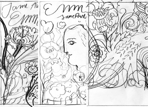
I have long admired the work of Swedish born illustrator Petra Börner, who brilliantly mixes Scandinavian and Arts and Crafts influences to create a style all her own. Her book cover for Emma by Jane Austen (artwork above) is nominated for the 2012 V&A illustration awards so I thought I’d find out what makes her tick. Be very inspired…

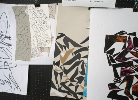
Petra Borner -studio
You have a very distinctive style – what are your greatest influences?
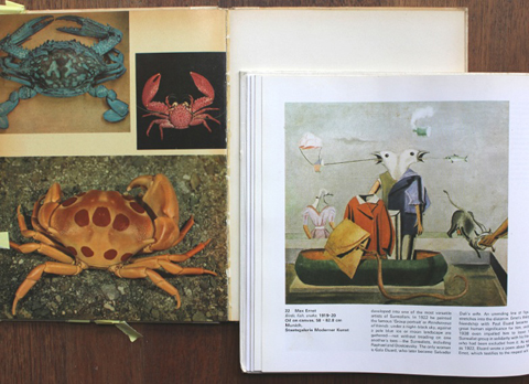
I still draw inspiration from objects and books I’ve collected since I was a teenager, books on school posters and photographic references on anatomy and plants and DIY books form the 70’s.
I like studying LP covers, especially ‘classical’ ones and browsing antique shops and I like drawing in public and from life.
I’ve been taught to be hands-on and ‘do’ from my family and I’ve learnt creative skills from my mother.
I like work by Max Ernst, Niki De Saint Phalle, Carl Johan De Geer and Katja of Sweden.
 
Petra Borner -studio
How long did it take you to come up with your look – was it a gradual process or were you always attracted to working in this way? 
I can’t remember a time when I wasn’t really into drawing and making things.
It’s taken me a roundabout way to get to a place where drawing is central and a means to living though.
I suppose it’s good to pack many things in your bag along the way.
A friend of mine sent me a drawing I did when I was 18 and it looks just like my current work – that was quite shocking!
 
Petra Borner -studio
You trained as a fashion designer and had your own label until 2004 – why did you decide that your heart was in illustration and was it a hard decision to make? Any regrets?
It wasn’t a very hard choice to make at all.
I’ve always wanted to be an artist and my experience from the fashion helped build my drive.
I had quite a few tough and interesting years creating my label with partner Tove Johansson, but it felt right to finally focus on my goal.
In fashion I felt like a cowboy, a strange fish in a big pond!
 
Petra Borner -studio
Petra Borner -field print for Cacherel SS 2007
Petra Borner – field print for Cacharel SS 2007

In terms of moving across industries, did you have to develop a new set of contacts for illustration or was there a lot of crossover?
I’d illustrated a little for magazines parallel to my work in fashion, so I had a few contacts.
But generally, I had to start a fresh and it took a while to generate an interest.
With a fashion angle I broadened my chances and managed to bridge fashion and illustration into an interesting mix of commissions.
 
Petra Borner -studio
You’ve been based in London since 1994 – what brought you here and what keeps you here?
I came here to study Fashion whilst improving my English during a one- year foundation course.
It turned out to be an intense and exciting year leading onto a degree in Fashion at Central St Martins and my London roots grew deeper.
I lived in NY for a while which was great fun, but I seldom contemplate moving anywhere else now.
Having family ties here and in Sweden at times makes for an ambivalent longing for ‘home’.
London always keeps me on my toes.
 
Petra Borner -studio
Petra Borner -partridge bowl for Seto Seikei
Petra Borner – partridge bowl for Seto Seikei.

When you are working on illustration in a decorative capacity (on 3D objects etc.) what has been your favorite project to date? And why?
It’s amazing to be able to work on projects with open briefs, but with technical support to maximize the result.
I often wish I had more knowledge and skills of many crafts to increase the level of intricacy and open possibilities within a project, but sometimes it’s good not to know all the limitations before you start.
Collaborating with Studiothomson, Clements Ribeiro, Bally, Aquascutum, Seto Seikei and Jonathan Adler has also been interesting.
 
Petra Borner -studio
Petra Borner -gift box for systemet
Petra Borner – gift box for Systemet.

If we were to take a peek inside your inspiration library what would we find?
Books, paper scraps, comic books, postcards and photocopies on arts and crafts, design, pottery, folklore, nature, portraits, travelling and maps,  anatomy, animals, foods and eating, antiques, DIY books, interior design and architecture, rubbings and sculpture.
 
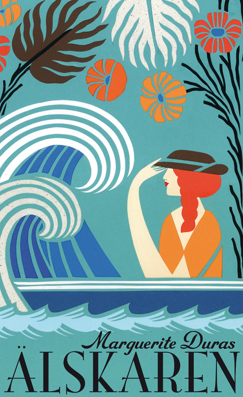
THE_LOVER petra borner
You have illustrated lots of book covers – which was the best book you had to read for a job?
I love ‘The Lover’ by Marguerite Duras.
 
How do you balance looking after a toddler with work? You are incredibly busy!
She’s managing me.
 
Petra Borner -summer papercut for Harper Collins
Petra Borner – summer papercut for Harper Collins.

Your logo adopts your father’s signature – do you come from a creative family and if so what do they do?
On my mums side of the family there is an army of hands on, inspiring creativity, a well of skills within all sorts of arts and crafts.
My father’s side holds many in a row of painters, a photographer and a composer.
Most of the paintings are portraits, still life’s and scenes from the sea, as we come from an island.
Most of my family members prosper academically and save their creativity for relaxation.
 
Petra Borner -studio
Petra Borner -greetings card for Habitat
Petra Borner – greetings card for Habitat.

Can you tell us about your new product range in collaboration with Studiothomson, aimed at encouraging writing and correspondence?
I’ve always been a keen letter writer and as a teenager I’d spend hours decorating envelops before posting them.
I like the time and thought that goes into handwritten letters and though it it’s ‘out-of-date’ as soon as it’s posted, it ‘s magical to receive them.
We are currently developing the prototypes for a range of bold products, which will make staying in touch with your friends a treat.
We are launching the collection early autumn 2012.
 
Petra Borner -studio
What kind of imagery can we expect in your new range of hand tufted fair trade rugs for the Design Museum?
This is an early collaboration and my designs are in the making.
The project is directed by Chris Haughton for Design Museum and involves a group of artists including Sanna Annukka, Donna Wilson, Jon Klassen and Neasden Control Centre, so the rugs should be a striking collection!
The limited edition rugs will be handmade in Nepal according to Fair Trade regulations and will be on display at the Design Museum this autumn.
 
Petra Borner -studio
You are also writing your own book about collectables – tell us more! What do you collect?
This is exciting!
Having been a keen flea-marketeer and collector since I was five, I am now in contrast ruthless about what I keep.
What I’ve kept has a real value (to me!) and I am assembling these objects into a journey of sorts.
 
Petra Borner -studio
Finally and not least you are nominated for the V&A illustration awards, and the winners will be announced tonight – what inspired the Emma artwork?
The first ideas for the cover of ‘Emma’ by Jane Austen, was sketched in the V&A.
I aimed to create a bold and lush interpretation of the novel in contrast to it often soft and feminine covers.
I decided to let her hand symbolize elements of the story.

Petra Borner -studio
Petra Börner sells her book cover artwork and much more on big cartel – so you can own your very own piece! See what else she’s up to on her website. I hope you win tonight Petra!

Read my review of the 2011 V&A Illustration Awards here.

Categories ,Aquascutum, ,Arts and Crafts, ,Bally, ,Cacharel, ,Carl Johan De Geer, ,Chris Haughton, ,Clements Ribeiro, ,Design Museum, ,Donna Wilson, ,Fair Trade, ,fashion, ,Habitat, ,Harper Collins, ,Jon Klassen, ,Jonathan Adler, ,Katja of Sweden, ,Made by Node, ,Marguerite Duras, ,Max Ernst, ,Neasden Control Centre, ,Niki De Saint Phalle, ,Petra Borner, ,rugs, ,Sanna Annukka, ,Scandinavian, ,Seto Seikei, ,Studiothomson, ,Systemet, ,Tove Johansson, ,V&A Illustration Awards

Similar Posts: