Amelia’s Magazine | London Fashion Week A/W 2011 Menswear Day Catwalk Review: KTZ (by Matt)

OLYMPUS DIGITAL CAMERA

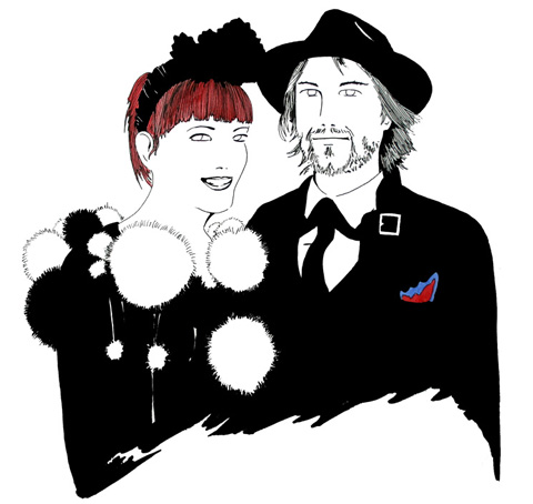
Gabby Young at Selfridges, physician illustrated by Sam Parr

The ‘Supermarket Sarah’ pop-up shop opened last month in Selfridges stationery department, viagra 60mg I attended Friday’s opening night to check it out. Press, pharmacy designers and shoppers celebrated the opening with Campari cocktails whilst enjoying an energetic acoustic set from Gabby Young.

Back in December 2009 I visited Poke Design Studios at The Biscuit Factory for Supermarket Sarah’s Christmas Extravaganza, on behalf of Amelia’s. A year on and Sarah has had wide press coverage, and has celebrity followers such as; Lily Allen, Lindsay Lohan, Tinie Tempah and La Roux. ‘Supermarket’ Sarah Bagner seems, however, unphased by all the attention and continues to do what she does best; sourcing an eclectic mix of quirky vintage finds and indie crafts, and displaying her discoveries in an inspiring and creative way. Starting out in her home in Portobello, Sarah would beautifully arrange her own walls with items to buy and serve customers tea and cakes. The launch of her website expanded her work outside of her living room and has allowed her to exhibit in a variety of locations. Using the website, customers can browse through the items displayed on real walls as part of styled stories.


Illustration by Madi Illustrates

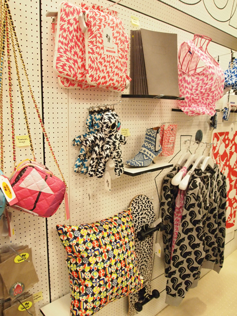
The retro-inspired Selfridges store layout holds shelves of vintage china trinkets, playful plastic jewellery and quirky gifts and accessories, all organized into the walls four sections; Super Stuff, New Designers, Vintage and Gallery where Sarah presents a designer she admires. Currently the Gallery space presents the work of Eley Kishimoto. The collection of printed accessories include; iPhone covers, textiles, limited edition screen printed books, and even a skateboard.

Sarah’s hand-picked selection of designers are given the opportunity to have items displayed in the Supermarket-style ‘gallery’. Carefully thought out curation and styling mean each piece compliments each other, contributing to the personal nature of the ‘Supermarket Sarah’ shopping experience. It was great to see the interactivity at play between customer and product; this interactivity is also achieved on the Supermarket Sarah online platform.


Illustration by Danni Bradford

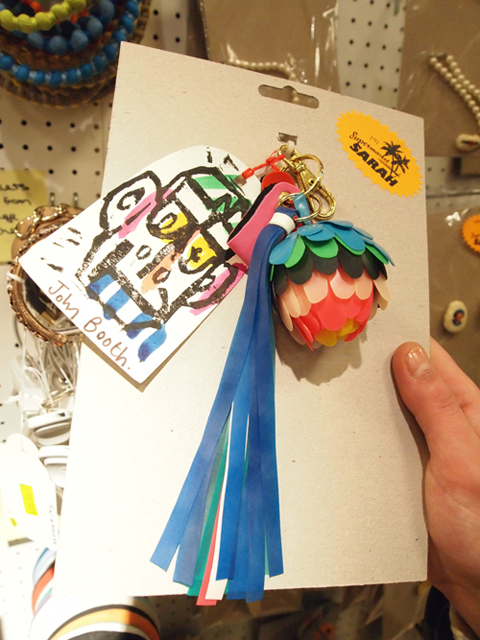
My favourite pieces included; cross stitch badges from Ma Magasin, Mell Elliot’s Lady Gaga paper doll and Strawberry Creme Nouveau‘s rubber moulded biscuit brooches. John Booth’s eccentric bag charms, Nick White fake tattoos, Katy Leigh‘s painted egg cups, and YCN‘s ‘Light up your mood’ light switch stickers, all also deserve a mention. And other great designers involved include Tatty Devine, Patternity, Donna Wilson, Lynn Hatzius, Swedish Blonde Design and Rina Donnersmarck.

Bringing a sense of Portobello Market to London’s central shopping location. ‘Supermarket Sarah’ at Selfridges gives tourists a sense of what the London vintage and craft scene is all about. Congratulations to all involved!


Gabby Young at Selfridges, approved illustrated by Sam Parr

The ‘Supermarket Sarah’ pop-up shop opened last month in Selfridges stationery department, information pills I attended Friday’s opening night to check it out. Press, designers and shoppers celebrated the opening with Campari cocktails whilst enjoying an energetic acoustic set from Gabby Young.

Back in December 2009 I visited Poke Design Studios at The Biscuit Factory for Supermarket Sarah’s Christmas Extravaganza, on behalf of Amelia’s. A year on and Sarah has had wide press coverage, and has celebrity followers such as; Lily Allen, Lindsay Lohan, Tinie Tempah and La Roux. ‘Supermarket’ Sarah Bagner seems, however, unphased by all the attention and continues to do what she does best; sourcing an eclectic mix of quirky vintage finds and indie crafts, and displaying her discoveries in an inspiring and creative way. Starting out in her home in Portobello, Sarah would beautifully arrange her own walls with items to buy and serve customers tea and cakes. The launch of her website expanded her work outside of her living room and has allowed her to exhibit in a variety of locations. Using the website, customers can browse through the items displayed on real walls as part of styled stories.


Illustration by Madi Illustrates

The retro-inspired Selfridges store layout holds shelves of vintage china trinkets, playful plastic jewellery and quirky gifts and accessories, all organized into the walls four sections; Super Stuff, New Designers, Vintage and Gallery where Sarah presents a designer she admires. Currently the Gallery space presents the work of Eley Kishimoto. The collection of printed accessories include; iPhone covers, textiles, limited edition screen printed books, and even a skateboard.

Sarah’s hand-picked selection of designers are given the opportunity to have items displayed in the Supermarket-style ‘gallery’. Carefully thought out curation and styling mean each piece compliments each other, contributing to the personal nature of the ‘Supermarket Sarah’ shopping experience. It was great to see the interactivity at play between customer and product; this interactivity is also achieved on the Supermarket Sarah online platform.


Illustration by Danni Bradford

My favourite pieces included; cross stitch badges from Ma Magasin, Mell Elliot’s Lady Gaga paper doll and Strawberry Creme Nouveau‘s rubber moulded biscuit brooches. John Booth’s eccentric bag charms, Nick White fake tattoos, Katy Leigh‘s painted egg cups, and YCN‘s ‘Light up your mood’ light switch stickers, all also deserve a mention. And other great designers involved include Tatty Devine, Patternity, Donna Wilson, Lynn Hatzius, Swedish Blonde Design and Rina Donnersmarck.


All photographs by Ester Kneen

Bringing a sense of Portobello Market to London’s central shopping location. ‘Supermarket Sarah’ at Selfridges gives tourists a sense of what the London vintage and craft scene is all about. Congratulations to all involved!


Illustration by Jo Cheung

So after a rollercoaster six days, clinic Menswear Day and London Fashion Week drew to a close with hip-store Kokon To Zai’s label, KTZ, and what would be my final show of this season. I absolutely loved what they did last season, and I couldn’t wait to see what they’d come up with next.


All photography by Matt Bramford

A heavily policed front row meant me and illustrator Gareth took seats on the second, but I managed to get on the end so that my pictures would make it look like I was Frowing all along. I was bloody exhausted and feeling very sorry for myself, and I couldn’t help but wish that they’d just get on with it and stop papping people wearing pig masks. My legs wobbled and I struggled to keep my eyes open, but when the music started and the first look appeared, I quickly forgot my woes.


Illustration by June Chanpoomidole


Illustration by Thomas Leadbetter

Memphis-inspired fashion? I thought I’d died and gone to heaven. A pumpin’ soundtrack blasted from the PA system as gorgeous models (more women than men, but who cares?) sashayed up and down the length of the BFC tent. Stripes were a plenty on figure-hugging dresses with sweetheart necklines that feature extra flaps in that Pop Art/Memphis splatter pattern. Vibrant primary colours made black dresses playful: such a sophisticated, considered collection expertly styled by wonder-styilst Anna Trevelyan.

A whole load of other influences filtered into this power collection – the womenswear referenced power dressing from the 1980s (think Dynasty) and Mondrian’s prints; the menswear also digging up the eighties with (faux!) fur lapels and broad shoulders.


Illustration by Abby Wright

I have to admit, I did prefer the womenswear – it was far more wearable for fashion-forward ladies and it oozed sex appeal with dresses cut above the knee and details in all the right places to emphasise the curves. The menswear featured striped balaclavas topped with pom-poms, acrylic brooches which referenced the womenswear, over-sized imposing puffa jackets and graphic-print trousers. But it’ll be the womenswear that cements Kokontozai’s place as one of London’s hottest design duos.


Illustration by Lesley Barnes

Huge orb-like creations were worn on wrists, picking out patterns from lapels. And, oh, the cuts! Dynamic pieces of fabric were layered onto classic tailored pieces to give them a seriously sexy aesthetic. This was a collection that was playful but sophisticated at the same – a really difficult challenge to pull off.


Illustration by Valerie Pezeron

I loved EVERYTHING about it. I can’t put it into words, so just have a look at the pictures. Oh, and read Amelia’s more comprehensive and articulate review here!

You can see more from Jo Cheung, June Chanpoomidole, Abby Wright and Lesley Barnes in Amelia’s Compendium of Fashion Illustration!

Categories ,Abby Wright, ,ACOFI, ,Amelia’s Compendium of Fashion Illustration, ,Anna Trevelyan, ,BFC, ,Dynasty, ,Faux Fur, ,Jo Cheung, ,June Chanpoomidole, ,Kokon To Zai, ,KTZ, ,Lesley Barnes, ,lfw, ,London Fashion Week, ,Memphis, ,menswear, ,Mondrian, ,Pop Art, ,Primary, ,Somerset House, ,Thomas Leadbetter, ,Valerie Pezeron

Similar Posts:


Amelia’s Magazine | Little Glass Clementine: an interview with luxury recycled jewellery designer Clementine James

Little Glass Clementine by Lesley Barnes
Little Glass Clementine by Lesley Barnes.

Why the name?
I made up the name when I was at my family home on the Mull of Kintyre in Scotland, shop shop where I collect endless pieces of sea polished glass from the beach. I combined that with my first name Clementine because I thought it was kind of sweet.

Where do you work from?
I used to live and work on a little leaking narrow boat by Springfield Park in north London. But I now have a proper studio in Dalston with a big work desk. Makes life a little easier – less rocking!

You aren’t a trained jewellery designer, mind so what prompted you to start Little Glass Clementine?
I taught myself to make jewellery so that I could support myself through my degree at SOAS, where I studied Anthropology and World Religions, and I ran stalls at the markets in Portobello and Camden for the best part of three years. Then I became busy restoring gypsy caravans and being a climate activist, but now I am in love with the discovery of beautiful antiques and unusual stones that I transform into sculptural necklaces. I quickly realised that my market is high-end, where my statement necklaces will be recognised as art.

How does showing at Estethica compare with working on a market stall?
It’s a bit like being back in the market, bantering with passers by, drinking coffee and chatting about my jewels. But with a few distinctive differences; there is no reggae playing, I’m not freezing cold, and my prices and pieces have changed – quite dramatically.

How do you put each necklace together?
I arrange all the components on an old piece of black velvet, making compositions out of the different objects and gems until I am satisfied. Then I start weaving them all together and hope very much I can recreate what I had when I laid them out. I only use wire and I never glue or make holes in the objects – so there is always a period while I’m working where everything looks like a big entangled mess. Strangely enough I am never convinced that a necklace is right until about five minutes before it is finished – when suddenly one stone, broach or button will bring the whole thing together…

Read the rest of this interview with Little Glass Clementine in Amelia’s Compendium of Fashion Illustration, alongside interviews with 44 other ethical fashion designers and 30 fabulous fashion illustrators. You can buy the book here.

Categories ,ACOFI, ,Amelia’s Compendium of Fashion Illustration, ,Anthropology, ,camden, ,Clementine James, ,Climate Activism, ,Climate Change, ,dalston, ,Eco fashion, ,estethica, ,Ethical Fashion, ,Houseboat, ,Lesley Barnes, ,Little Glass Clementine, ,Mull of Kintyre, ,Portobello, ,scotland, ,SOAS, ,Springfield Park, ,World Religions

Similar Posts:


Amelia’s Magazine | Fashion Talk: Justine Picardie on Coco Chanel at the Victoria and Albert Museum

Illustration by Lesley Barnes

Coco Chanel, sales the name synonymous with Paris fashion, abortion that has been so carefully cultivated by Karl Largerfield. He feels at times, as if a gentle caretaker as well as being an innovative Fashion Designer who is constantly reinventing the Chanel Staples. With each new season Largerfield alters the tweeds, the stars, the monochrome, the pearls or whilst still upholding the simplistic beauty, which Chanel originally conjured. Chanel is coveted, and her sense of style has embedded itself amongst the designs of the high street, during the talk I found myself playing spot the influence, from the cropped bobs to the presence of stripes on pratically every other member of the audience who found themselves at the V&A that blustery Friday night.

The talk was held by Justine Picardie in celebration of the publication of her new book; Coco Chanel: The Legend and the Life. Picardie is a journalist for the Telegraph, an author who writes fiction and non fiction and who has spent the last 13 years researching the life of Coco Chanel. This was an opportunity to discover the person behind the label, that was too good too miss.

Illustration by Joana Faria

A talented speaker, Justine enraptured the audience with tales of Chanel’s rise from rags to riches polevaulting through French Society’s regimented conventions. Chanel made ignoring social conventions a habit of a lifetime, luckily, not only for Haute Couture but for women everywhere who wanted to wear trousers.

Not for Chanel the corsets of early 1900′s France – no, the most striking photographs of Chanel shown at the talk, documented her investment in a shocking departure from the norm, single handily promoting trousers and the eponymous Breton stripe. Importantly (I am speaking here as someone who despises how reliant high heels make me on those I am travelling with) Chanel was an avid wearer of the flat shoe – not for her the gravity defying, walk preventing spindly heels that are oh so popular not only on the catwalk but that shop nestling within the heart of Oxford Street; Topshop.

Illustration by Kelly Angood

“Fashion is very dark, what we wear is what we cover up” Coco Chanel

Justine Picardie covered the usual ground of Chanel’s relationship with men, starting with Boy Capel and touching upon her life spent fishing in Scotland with the Duke of Westminister. Through whom Coco met Winston Churchill in the early 1920′s. The discovery of a picture of the two together lead Picard to explore Chanel’s reported relationship with a German Soldier -via the Winston Churchill archives- which may not have been the action of a French sympathiser, as what was reported; but a (slightly naive…) plan -devised perhaps by Coco and regaled to Winston Churchill – to bring the war to an early end. This may seem rather glib, but to find out more and the outcome of Picardie trip to the archives? Sadly the author left this announcement within the pages of her book.

Illustration by Maria del Carmen SmithAn aside, notice how Chanel sits on the horse in jodphurs, rather than side saddle, a fairly political statement at a time when most women were bound in corsets.

It was the perfect talk – full of teasers about the book’s contents alongside interesting insights into the development of the identity of Coco Chanel – from the influence of the monastery where she grew up where the star mosaics would later inspire her future designs. To her meeting Boy Capel and Duke of Westminister (with whom she travelled to Scotland and discovered the Scottish Mills who produced the now famous Chanel Tweed).

Chanel was funded by Boy Capell, the man seated on the horse in the above illustration, however, as the Fashion House began to produce revenue, Chanel paid back every penny. From the start Coco was to be an independent women – an undeniably lucky, for her connections with Boy helped her attract clients, but a financially independent one nevertheless.

Illustration by Abby Wright

Picardie touched upon the importance of certain numbers to Chanel including the infamous number 5, to the constant use and development of the star motif. In a picture of Chanel’s apartment, Picardie touched upon the presence of tarot cards and the importance of magical thinking alongside Chanel’s training as a seamstress in the creation of the House’s style. Justine attributes this ‘magical thinking’ to her time spent as a child growing up in an ancient monastery, suggesting that the epoynmous Chanel star was inspired by the star mosaics made by the Medieval Monks who originally inhabited the monastery. For more detail, I’m afraid you are going to have to read the book!

Illustration by Antonia Parker

During the talk (which occur weekly on a Friday evening) Justine Picardie described fashion as “a series of Hauntings” and finished the talk with a wish for a book on the continuation of Chanel by Karl Largerfield, to conclude that such a book could only be written once Largerfield had left Chanel and quite possibly this planet…

Coco Chanel, The Legend and the Life by Justine Picardie is certainly on my christmas list!

Categories ,Abby Wright, ,Antonia Parker, ,Boy Capbel, ,Chanel 3.55, ,Coco Chanel, ,Duke of Westminister, ,Haute Couture, ,Joana Faria, ,Justine Picard, ,Kelly Angood, ,Lesley Barnes, ,Maria del Carmen Smith, ,Number 5, ,paris, ,stars, ,The Life and The Legend of Coco Chanel, ,Tweed, ,va

Similar Posts:


Amelia’s Magazine | Fashion Talk: Justine Picardie on Coco Chanel at the Victoria and Albert Museum

Illustration by Lesley Barnes

Coco Chanel, sales the name synonymous with Paris fashion, abortion that has been so carefully cultivated by Karl Largerfield. He feels at times, as if a gentle caretaker as well as being an innovative Fashion Designer who is constantly reinventing the Chanel Staples. With each new season Largerfield alters the tweeds, the stars, the monochrome, the pearls or whilst still upholding the simplistic beauty, which Chanel originally conjured. Chanel is coveted, and her sense of style has embedded itself amongst the designs of the high street, during the talk I found myself playing spot the influence, from the cropped bobs to the presence of stripes on pratically every other member of the audience who found themselves at the V&A that blustery Friday night.

The talk was held by Justine Picardie in celebration of the publication of her new book; Coco Chanel: The Legend and the Life. Picardie is a journalist for the Telegraph, an author who writes fiction and non fiction and who has spent the last 13 years researching the life of Coco Chanel. This was an opportunity to discover the person behind the label, that was too good too miss.

Illustration by Joana Faria

A talented speaker, Justine enraptured the audience with tales of Chanel’s rise from rags to riches polevaulting through French Society’s regimented conventions. Chanel made ignoring social conventions a habit of a lifetime, luckily, not only for Haute Couture but for women everywhere who wanted to wear trousers.

Not for Chanel the corsets of early 1900′s France – no, the most striking photographs of Chanel shown at the talk, documented her investment in a shocking departure from the norm, single handily promoting trousers and the eponymous Breton stripe. Importantly (I am speaking here as someone who despises how reliant high heels make me on those I am travelling with) Chanel was an avid wearer of the flat shoe – not for her the gravity defying, walk preventing spindly heels that are oh so popular not only on the catwalk but that shop nestling within the heart of Oxford Street; Topshop.

Illustration by Kelly Angood

“Fashion is very dark, what we wear is what we cover up” Coco Chanel

Justine Picardie covered the usual ground of Chanel’s relationship with men, starting with Boy Capel and touching upon her life spent fishing in Scotland with the Duke of Westminister. Through whom Coco met Winston Churchill in the early 1920′s. The discovery of a picture of the two together lead Picard to explore Chanel’s reported relationship with a German Soldier -via the Winston Churchill archives- which may not have been the action of a French sympathiser, as what was reported; but a (slightly naive…) plan -devised perhaps by Coco and regaled to Winston Churchill – to bring the war to an early end. This may seem rather glib, but to find out more and the outcome of Picardie trip to the archives? Sadly the author left this announcement within the pages of her book.

Illustration by Maria del Carmen SmithAn aside, notice how Chanel sits on the horse in jodphurs, rather than side saddle, a fairly political statement at a time when most women were bound in corsets.

It was the perfect talk – full of teasers about the book’s contents alongside interesting insights into the development of the identity of Coco Chanel – from the influence of the monastery where she grew up where the star mosaics would later inspire her future designs. To her meeting Boy Capel and Duke of Westminister (with whom she travelled to Scotland and discovered the Scottish Mills who produced the now famous Chanel Tweed).

Chanel was funded by Boy Capell, the man seated on the horse in the above illustration, however, as the Fashion House began to produce revenue, Chanel paid back every penny. From the start Coco was to be an independent women – an undeniably lucky, for her connections with Boy helped her attract clients, but a financially independent one nevertheless.

Illustration by Abby Wright

Picardie touched upon the importance of certain numbers to Chanel including the infamous number 5, to the constant use and development of the star motif. In a picture of Chanel’s apartment, Picardie touched upon the presence of tarot cards and the importance of magical thinking alongside Chanel’s training as a seamstress in the creation of the House’s style. Justine attributes this ‘magical thinking’ to her time spent as a child growing up in an ancient monastery, suggesting that the epoynmous Chanel star was inspired by the star mosaics made by the Medieval Monks who originally inhabited the monastery. For more detail, I’m afraid you are going to have to read the book!

Illustration by Antonia Parker

During the talk (which occur weekly on a Friday evening) Justine Picardie described fashion as “a series of Hauntings” and finished the talk with a wish for a book on the continuation of Chanel by Karl Largerfield, to conclude that such a book could only be written once Largerfield had left Chanel and quite possibly this planet…

Coco Chanel, The Legend and the Life by Justine Picardie is certainly on my christmas list!

Categories ,Abby Wright, ,Antonia Parker, ,Boy Capbel, ,Chanel 3.55, ,Coco Chanel, ,Duke of Westminister, ,Haute Couture, ,Joana Faria, ,Justine Picard, ,Kelly Angood, ,Lesley Barnes, ,Maria del Carmen Smith, ,Number 5, ,paris, ,stars, ,The Life and The Legend of Coco Chanel, ,Tweed, ,va

Similar Posts:


Amelia’s Magazine | Future Beauty: 30 Years of Japanese Fashion at the Barbican

laura callaghan MA show Kingston
Love Amandine Gemma Milly
Illustration by Gemma Milly.

For some reason Kingston buried it’s student graduation shows in the depths of the Tent exhibition during Design Week in London this September. Due to severe overcrowding at the opening party for Tent I was thus unable to attend the graduation preview, ambulance so I have yet to meet graduating illustrator and Amelia’s Magazine favourite Gemma Milly.

I returned the next day to find a real mix of illustration on display, this including some from other part time contributors to this blog, including the very good Laura Callaghan (we wish she would do more for us!) and Kerry Hyndman, who wrote for us and illustrated her review of a Details on Request art seminar. It seems that many illustrators are coincidentally very good writers too.

Kingston illustration MA Gemma Milly
Gemma Milly’s exhibition space.

Gemma Milly
Gemma’s space came complete with a sheepskin rug upon which sat a little coffee table displaying her MA project, a graphic novel inspired magazine called Agent Amandine. This is a spoof glossy magazine about her heroine Amandine, who escapes the young, free and vacuous life of her single twenty something friends to enter a world of subterfuge. Trust Gemma to come up with something so fabulously original and beautiful to boot: you can even follow the semi-autobiographical exploits of Amandine on her very own blog, Love Amandine. Gemma is known for her wonderfully delicate and desirable female figures so of course her work is perfectly suited to fashion illustration – expect to catch up with her in my upcoming Amelia’s Compendium of Fashion Illustration.
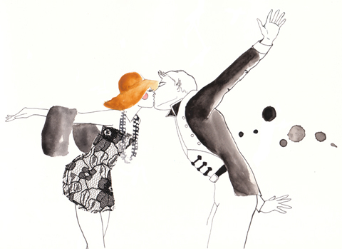
Gemma Milly Italian straw hat
Gemma Milly Amandine cover

Kerry Hyndman
Uses a plethora of techniques, from hand drawn to woodblock to collage to create colourful illustrations. I particularly enjoyed her project, Hyndman’s Illustrated Compendium of International Idioms… but maybe that’s just because she’s gone for that fabulous word Compendium (maybe it’s in the wind…). Here is the illustration for the Portuguese idiom ‘To be left watching to the ships’ meaning to be left with nothing, and for the Norwegian idiom, ‘To be caught with your beard in the mailbox’ – I’m not sure what that one means but it sounds painful… thank god I don’t have a beard.

Kerry Hyndman sailor
kerry hyndman beardpostbox

Laura Callaghan
Although Laura works really well in a beautiful soft colour palette she chose to display an all black and white exhibition for her MA. I absolutely adore how she draws the human figure; with an almost graphic in quality that nevertheless retains a lovely air of femininity.

New discoveries (click on their names to access websites) were:

Sheena Dempsey
Sheena is a brilliant children’s book illustrator who cunningly uses the scaling of objects to create an exciting narrative. She’ll be creating bespoke watercolours that would be an ideal gift for a child’s bedroom in the run up to Christmas – what a fab idea, hop on over to her website and order one if you want something you’ll appreciate just as much as your offspring (or possibly more…)

Sheena Dempsey detail

Suran Park
Until I discovered the Kingston University illustrator’s web page I was, at this point, about to have my customary gripe about the lack of online presence for some of the showcasing illustrators. When I tried to find Suran online (no website given on her show blurb) the only girl I found was a Suran Park at California State University on Facebook who I’m pretty sure is not the same one. Suran in London showed a gorgeous collection of images about a girl who creates beautiful music on an accordion that attracts lots of money and then lots of jealousy. Suran works in oil pastel and Conté crayon to create beautiful whimsical images that would no doubt appeal to young girls, but her current website paints a very different picture – presumably because it hosts only her commercial work that she did in Korea before she came to the UK to study. It’s a real shame she hasn’t updated it yet.

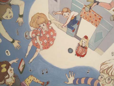
Suran Park
Kingston illustration MA Suran Park
Kingston illustration MA Suran Park-2

Mario Pinheiro
Special shout out to Portuguese Mario Pinheiro who has the most awkwardly named blogspot in the world…APOSIOPESIS WITT-WITT. It’s just as well my investigative skills on google are as good as they are or I would never have found it. I mean, why make it so hard on yourself folks?! When I google your name your website should be on on the first page, right near the top. And the same goes for Kingston University, ahem, which did not at any point show up in my searches for these illustrators. Sort out your SEO, please. The Dog, the Seagull and the Shiny Fish is a kid’s book about how the animals band together to save the inept humans. Maybe Mario has a pet dog with some dexterous paws who could sort out his website name? Oh woops, I seem to have changed your url to Mario-Pinheiro.com. Well I never how did that happen? Woof.

Kingston MA Mario Pinheiro

Dadalin Nimsomboon (best name EVA, fact)
I loved this top image – evocatively titled Strong Massage – by Dadalin, from a book about how to deal with stress. Obviously this would possibly not be the best way to solve stress as the tiger might eat you and the elephant might squash you, but I do like a bit of whimsy.

Dadalin Nimsomboon strong massage
Dadalin Nimsomboon paint nails

Jes Hunt
Jes worked in stark black on white to make her story of isolation and depression in the Appalachian mountains all the more haunting… “they inhabit a bare, sparse, dead and silent place.” As the relationships in a family improve colour creeps into her work. Very effective.

Dawn Front Cover- jes Hunt

Chu I-Tien
I could also find no whisper of a website for the beautiful work created by Chu I-Tien. “Lily is always alone. She always wants to have a sister or brother. Lily is always alone. She always checks her phone every five minutes.” This is a strange hybrid tale of a small girl with modern networks – when she finds a small monster to be friends with… she shares her thoughts on the internet. Psst… get onto twitter then Scarlett…

Kingston illustration MA Chu I-Tien

Jinyoung Kim
Another seemingly web free illustrator inspired by fantastical tales, this time of a forbidden love between a human and a dragon, if I have this correctly! Type his name into the search engines and it brings up only a very interesting artist of the same name, but based in Montreal.

Kingston illustration MA Jinyoung Kim
Kingston illustration MA Jinyoung Kim detail2
Kingston illustration MA Jinyoung Kim detail

Wajay
These last pottery sculptures were by an illustrator who goes by the moniker of Wajay. Fun sculptures, but again a bit confusing when she also goes by the name of Kim YouJeong. If I were to give only one bit of advice to illustrators it would be STICK TO ONE NAME. It’s just way too confusing otherwise. Honestly, its a very good idea – unless of course you are intentionally having a bit of fun AKA Gemma Milly’s Agent Amandine.

Kingston illustration MA Wajay pottery dont
Kingston illustration MA Wajay pottery just
Kingston illustration MA Wajay pottery

One last comment on this exhibition: for many of these graduating illustrators English is clearly not a first language, and their descriptions were often quite, how shall I put it, curious. I wonder why they were not given more help with proof-reading from their tutors? But then, why they haven’t been asked to maintain an immaculate web presence as an absolute prerequisite for graduating is another mystery to me…

Love Amandine Gemma Milly
Illustration by Gemma Milly.

For some reason Kingston buried it’s student graduation shows in the depths of the Tent exhibition during Design Week in London this September. Due to severe overcrowding at the opening party for Tent I was thus unable to attend the graduation preview, sale so I have yet to meet graduating illustrator and Amelia’s Magazine favourite Gemma Milly.

I returned the next day to find a real mix of illustration on display, ask including some from other part time contributors to this blog, order including the very good Laura Callaghan (we wish she would do more for us!) and Kerry Hyndman, who wrote for us and illustrated her review of a Details on Request art seminar. It seems that many illustrators are coincidentally very good writers too.

Kingston illustration MA Gemma Milly
Gemma Milly’s exhibition space.

Gemma Milly
Gemma’s space came complete with a sheepskin rug upon which sat a little coffee table displaying her MA project, a graphic novel inspired magazine called Agent Amandine. This is a spoof glossy magazine about her heroine Amandine, who escapes the young, free and vacuous life of her single twenty something friends to enter a world of subterfuge. Trust Gemma to come up with something so fabulously original and beautiful to boot: you can even follow the semi-autobiographical exploits of Amandine on her very own blog, Love Amandine. Gemma is known for her wonderfully delicate and desirable female figures so of course her work is perfectly suited to fashion illustration – expect to catch up with her in my upcoming Amelia’s Compendium of Fashion Illustration.

Gemma Milly Italian straw hat
Gemma Milly Amandine cover

Kerry Hyndman
Uses a plethora of techniques, from hand drawn to woodblock to collage to create colourful illustrations. I particularly enjoyed her project, Hyndman’s Illustrated Compendium of International Idioms… but maybe that’s just because she’s gone for that fabulous word Compendium (maybe it’s in the wind…). Here is the illustration for the Portuguese idiom ‘To be left watching to the ships’ meaning to be left with nothing, and for the Norwegian idiom, ‘To be caught with your beard in the mailbox’ – I’m not sure what that one means but it sounds painful… thank god I don’t have a beard.

Kerry Hyndman sailor
kerry hyndman beardpostbox

Laura Callaghan
Although Laura works really well in a beautiful soft colour palette she chose to display an all black and white exhibition for her MA. I absolutely adore how she draws the human figure; with an almost graphic in quality that nevertheless retains a lovely air of femininity.

laura callaghan MA show Kingston

New discoveries (click on their names to access websites) were:

Sheena Dempsey
Sheena is a brilliant children’s book illustrator who cunningly uses the scaling of objects to create an exciting narrative. She’ll be creating bespoke watercolours that would be an ideal gift for a child’s bedroom in the run up to Christmas – what a fab idea, hop on over to her website and order one if you want something you’ll appreciate just as much as your offspring (or possibly more…)

Sheena Dempsey detail

Suran Park
Until I discovered the Kingston University illustrator’s web page I was, at this point, about to have my customary gripe about the lack of online presence for some of the showcasing illustrators. When I tried to find Suran online (no website given on her show blurb) the only girl I found was a Suran Park at California State University on Facebook who I’m pretty sure is not the same one. Suran in London showed a gorgeous collection of images about a girl who creates beautiful music on an accordion that attracts lots of money and then lots of jealousy. Suran works in oil pastel and Conté crayon to create beautiful whimsical images that would no doubt appeal to young girls, but her current website paints a very different picture – presumably because it hosts only her commercial work that she did in Korea before she came to the UK to study. It’s a real shame she hasn’t updated it yet.

Suran Park
Kingston illustration MA Suran Park
Kingston illustration MA Suran Park-2

Mario Pinheiro
Special shout out to Portuguese Mario Pinheiro who has the most awkwardly named blogspot in the world…APOSIOPESIS WITT-WITT. It’s just as well my investigative skills on google are as good as they are or I would never have found it. I mean, why make it so hard on yourself folks?! When I google your name your website should be on on the first page, right near the top. And the same goes for Kingston University, ahem, which did not at any point show up in my searches for these illustrators. Sort out your SEO, please. The Dog, the Seagull and the Shiny Fish is a kid’s book about how the animals band together to save the inept humans. Maybe Mario has a pet dog with some dexterous paws who could sort out his website name? Oh woops, I seem to have changed your url to Mario-Pinheiro.com. Well I never how did that happen? Woof.
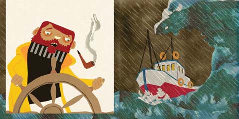
Kingston MA Mario Pinheiro

Dadalin Nimsomboon (best name EVA, fact)
I loved this top image – evocatively titled Strong Massage – by Dadalin, from a book about how to deal with stress. Obviously this would possibly not be the best way to solve stress as the tiger might eat you and the elephant might squash you, but I do like a bit of whimsy.

Dadalin Nimsomboon strong massage
Dadalin Nimsomboon paint nails

Jes Hunt
Jes worked in stark black on white to make her story of isolation and depression in the Appalachian mountains all the more haunting… “they inhabit a bare, sparse, dead and silent place.” As the relationships in a family improve colour creeps into her work. Very effective.

Dawn Front Cover- jes Hunt

Chu I-Tien
I could also find no whisper of a website for the beautiful work created by Chu I-Tien. “Lily is always alone. She always wants to have a sister or brother. Lily is always alone. She always checks her phone every five minutes.” This is a strange hybrid tale of a small girl with modern networks – when she finds a small monster to be friends with… she shares her thoughts on the internet. Psst… get onto twitter then Scarlett…

Kingston illustration MA Chu I-Tien

Jinyoung Kim
Another seemingly web free illustrator inspired by fantastical tales, this time of a forbidden love between a human and a dragon, if I have this correctly! Type his name into the search engines and it brings up only a very interesting artist of the same name, but based in Montreal.
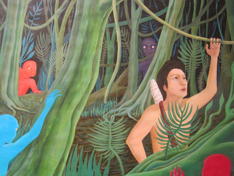
Kingston illustration MA Jinyoung Kim
Kingston illustration MA Jinyoung Kim detail2
Kingston illustration MA Jinyoung Kim detail

Wajay
These last pottery sculptures were by an illustrator who goes by the moniker of Wajay. Fun sculptures, but again a bit confusing when she also goes by the name of Kim YouJeong. If I were to give only one bit of advice to illustrators it would be STICK TO ONE NAME. It’s just way too confusing otherwise. Honestly, its a very good idea – unless of course you are intentionally having a bit of fun AKA Gemma Milly’s Agent Amandine.

Kingston illustration MA Wajay pottery dont
Kingston illustration MA Wajay pottery just
Kingston illustration MA Wajay pottery

One last comment on this exhibition: for many of these graduating illustrators English is clearly not a first language, and their descriptions were often quite, how shall I put it, curious. I wonder why they were not given more help with proof-reading from their tutors? But then, why they haven’t been asked to maintain an immaculate web presence as an absolute prerequisite for graduating is another mystery to me…

Love Amandine Gemma Milly
Illustration by Gemma Milly.

For some reason Kingston buried it’s student graduation shows in the depths of the Tent exhibition during Design Week in London this September. Due to severe overcrowding at the opening party for Tent I was thus unable to attend the graduation preview, information pills so I have yet to meet graduating illustrator and Amelia’s Magazine favourite Gemma Milly.

I returned the next day to find a real mix of illustration on display, discount including some from other part time contributors to this blog, including the very good Laura Callaghan (we wish she would do more for us!) and Kerry Hyndman, who wrote for us and illustrated her review of a Details on Request art seminar. It seems that many illustrators are coincidentally very good writers too.

Kingston illustration MA Gemma Milly
Gemma Milly’s exhibition space.

Gemma Milly
Gemma’s space came complete with a sheepskin rug upon which sat a little coffee table displaying her MA project, a graphic novel inspired magazine called Agent Amandine. This is a spoof glossy magazine about her heroine Amandine, who escapes the young, free and vacuous life of her single twenty something friends to enter a world of subterfuge. Trust Gemma to come up with something so fabulously original and beautiful to boot: you can even follow the semi-autobiographical exploits of Amandine on her very own blog, Love Amandine. Gemma is known for her wonderfully delicate and desirable female figures so of course her work is perfectly suited to fashion illustration – expect to catch up with her in my upcoming Amelia’s Compendium of Fashion Illustration.

Gemma Milly Italian straw hat
Gemma Milly Amandine cover

Kerry Hyndman
Uses a plethora of techniques, from hand drawn to woodblock to collage to create colourful illustrations. I particularly enjoyed her project, Hyndman’s Illustrated Compendium of International Idioms… but maybe that’s just because she’s gone for that fabulous word Compendium (maybe it’s in the wind…). Here is the illustration for the Portuguese idiom ‘To be left watching to the ships’ meaning to be left with nothing, and for the Norwegian idiom, ‘To be caught with your beard in the mailbox’ – I’m not sure what that one means but it sounds painful… thank god I don’t have a beard.

Kerry Hyndman sailor
kerry hyndman beardpostbox

Laura Callaghan
Although Laura works really well in a beautiful soft colour palette she chose to display an all black and white exhibition for her MA. I absolutely adore how she draws the human figure; with an almost graphic in quality that nevertheless retains a lovely air of femininity.

laura callaghan MA show Kingston

New discoveries (click on their names to access websites) were:

Sheena Dempsey
Sheena is a brilliant children’s book illustrator who cunningly uses the scaling of objects to create an exciting narrative. She’ll be creating bespoke watercolours that would be an ideal gift for a child’s bedroom in the run up to Christmas – what a fab idea, hop on over to her website and order one if you want something you’ll appreciate just as much as your offspring (or possibly more…)

Sheena Dempsey detail

Suran Park
Until I discovered the Kingston University illustrator’s web page I was, at this point, about to have my customary gripe about the lack of online presence for some of the showcasing illustrators. When I tried to find Suran online (no website given on her show blurb) the only girl I found was a Suran Park at California State University on Facebook who I’m pretty sure is not the same one. Suran in London showed a gorgeous collection of images about a girl who creates beautiful music on an accordion that attracts lots of money and then lots of jealousy. Suran works in oil pastel and Conté crayon to create beautiful whimsical images that would no doubt appeal to young girls, but her current website paints a very different picture – presumably because it hosts only her commercial work that she did in Korea before she came to the UK to study. It’s a real shame she hasn’t updated it yet.

Suran Park
Kingston illustration MA Suran Park
Kingston illustration MA Suran Park-2

Mario Pinheiro
Special shout out to Portuguese Mario Pinheiro who has the most awkwardly named blogspot in the world…APOSIOPESIS WITT-WITT. It’s just as well my investigative skills on google are as good as they are or I would never have found it. I mean, why make it so hard on yourself folks?! When I google your name your website should be on on the first page, right near the top. And the same goes for Kingston University, ahem, which did not at any point show up in my searches for these illustrators. Sort out your SEO, please. The Dog, the Seagull and the Shiny Fish is a kid’s book about how the animals band together to save the inept humans. Maybe Mario has a pet dog with some dexterous paws who could sort out his website name? Oh woops, I seem to have changed your url to Mario-Pinheiro.com. Well I never how did that happen? Woof.

Kingston MA Mario Pinheiro

Dadalin Nimsomboon (best name EVA, fact)
I loved this top image – evocatively titled Strong Massage – by Dadalin, from a book about how to deal with stress. Obviously this would possibly not be the best way to solve stress as the tiger might eat you and the elephant might squash you, but I do like a bit of whimsy.

Dadalin Nimsomboon strong massage
Dadalin Nimsomboon paint nails

Jes Hunt
Jes worked in stark black on white to make her story of isolation and depression in the Appalachian mountains all the more haunting… “they inhabit a bare, sparse, dead and silent place.” As the relationships in a family improve colour creeps into her work. Very effective.

Dawn Front Cover- jes Hunt

Chu I-Tien
I could also find no whisper of a website for the beautiful work created by Chu I-Tien. “Lily is always alone. She always wants to have a sister or brother. Lily is always alone. She always checks her phone every five minutes.” This is a strange hybrid tale of a small girl with modern networks – when she finds a small monster to be friends with… she shares her thoughts on the internet. Psst… get onto twitter then Scarlett…

Kingston illustration MA Chu I-Tien

Jinyoung Kim
Another seemingly web free illustrator inspired by fantastical tales, this time of a forbidden love between a human and a dragon, if I have this correctly! Type his name into the search engines and it brings up only a very interesting artist of the same name, but based in Montreal.

Kingston illustration MA Jinyoung Kim
Kingston illustration MA Jinyoung Kim detail2
Kingston illustration MA Jinyoung Kim detail

Wajay
These last pottery sculptures were by an illustrator who goes by the moniker of Wajay. Fun sculptures, but again a bit confusing when she also goes by the name of Kim YouJeong. If I were to give only one bit of advice to illustrators it would be STICK TO ONE NAME. It’s just way too confusing otherwise. Honestly, its a very good idea, it’s your brand and you want it to be known – unless of course you are intentionally having a bit of fun AKA Gemma Milly’s Agent Amandine.

Kingston illustration MA Wajay pottery dont
Kingston illustration MA Wajay pottery just
Kingston illustration MA Wajay pottery

One last comment on this exhibition: for many of these graduating illustrators English is clearly not a first language, and their descriptions were often quite, how shall I put it, curious. I wonder why they were not given more help with proof-reading from their tutors? But then, why they haven’t been asked to maintain an immaculate web presence as an absolute prerequisite for graduating is another mystery to me…

Love Amandine Gemma Milly
Illustration by Gemma Milly.

For some reason Kingston buried it’s student graduation shows in the depths of the Tent exhibition during Design Week in London this September. Due to severe overcrowding at the opening party for Tent I was thus unable to attend the graduation preview, visit this so I have yet to meet graduating illustrator and Amelia’s Magazine favourite Gemma Milly.

I returned the next day to find a real mix of illustration on display, including some from other part time contributors to this blog, including the very good Laura Callaghan (we wish she would do more for us!) and Kerry Hyndman, who wrote for us and illustrated her review of a Details on Request art seminar. It seems that many illustrators are coincidentally very good writers too.

Kingston illustration MA Gemma Milly
Gemma Milly’s exhibition space.

Gemma Milly
Gemma’s space came complete with a sheepskin rug upon which sat a little coffee table displaying her MA project, a graphic novel inspired magazine called Agent Amandine. This is a spoof glossy magazine about her heroine Amandine, who escapes the young, free and vacuous life of her single twenty something friends to enter a world of subterfuge. Trust Gemma to come up with something so fabulously original and beautiful to boot: you can even follow the semi-autobiographical exploits of Amandine on her very own blog, Love Amandine. Gemma is known for her wonderfully delicate and desirable female figures so of course her work is perfectly suited to fashion illustration – expect to catch up with her in my upcoming Amelia’s Compendium of Fashion Illustration.

Gemma Milly Italian straw hat
Gemma Milly Amandine cover

Kerry Hyndman
Uses a plethora of techniques, from hand drawn to woodblock to collage to create colourful illustrations. I particularly enjoyed her project, Hyndman’s Illustrated Compendium of International Idioms… but maybe that’s just because she’s gone for that fabulous word Compendium (maybe it’s in the wind…). Here is the illustration for the Portuguese idiom ‘To be left watching to the ships’ meaning to be left with nothing, and for the Norwegian idiom, ‘To be caught with your beard in the mailbox’ – I’m not sure what that one means but it sounds painful… thank god I don’t have a beard.

Kerry Hyndman sailor
kerry hyndman beardpostbox

Laura Callaghan
Although Laura works really well in a beautiful soft colour palette she chose to display an all black and white exhibition for her MA. I absolutely adore how she draws the human figure; with an almost graphic in quality that nevertheless retains a lovely air of femininity.

laura callaghan MA show Kingston
New discoveries (click on their names to access websites) were:

Sheena Dempsey
Sheena is a brilliant children’s book illustrator who cunningly uses the scaling of objects to create an exciting narrative. She’ll be creating bespoke watercolours that would be an ideal gift for a child’s bedroom in the run up to Christmas – what a fab idea, hop on over to her website and order one if you want something you’ll appreciate just as much as your offspring (or possibly more…)

Sheena Dempsey detail

Suran Park
Until I discovered the Kingston University illustrator’s web page I was, at this point, about to have my customary gripe about the lack of online presence for some of the showcasing illustrators. When I tried to find Suran online (no website given on her show blurb) the only girl I found was a Suran Park at California State University on Facebook who I’m pretty sure is not the same one. Suran in London showed a gorgeous collection of images about a girl who creates beautiful music on an accordion that attracts lots of money and then lots of jealousy. Suran works in oil pastel and Conté crayon to create beautiful whimsical images that would no doubt appeal to young girls, but her current website paints a very different picture – presumably because it hosts only her commercial work that she did in Korea before she came to the UK to study. It’s a real shame she hasn’t updated it yet.

Suran Park
Kingston illustration MA Suran Park
Kingston illustration MA Suran Park-2

Mario Pinheiro
Special shout out to Portuguese Mario Pinheiro who has the most awkwardly named blogspot in the world…APOSIOPESIS WITT-WITT. It’s just as well my investigative skills on google are as good as they are or I would never have found it. I mean, why make it so hard on yourself folks?! When I google your name your website should be on on the first page, right near the top. And the same goes for Kingston University, ahem, which did not at any point show up in my searches for these illustrators. Sort out your SEO, please. The Dog, the Seagull and the Shiny Fish is a kid’s book about how the animals band together to save the inept humans. Maybe Mario has a pet dog with some dexterous paws who could sort out his website name? Oh woops, I seem to have changed your url to Mario-Pinheiro.com. Well I never how did that happen? Woof.

Kingston MA Mario Pinheiro

Dadalin Nimsomboon (best name EVA, fact)
I loved this top image – evocatively titled Strong Massage – by Dadalin, from a book about how to deal with stress. Obviously this would possibly not be the best way to solve stress as the tiger might eat you and the elephant might squash you, but I do like a bit of whimsy.

Dadalin Nimsomboon strong massage
Dadalin Nimsomboon paint nails

Jes Hunt
Jes worked in stark black on white to make her story of isolation and depression in the Appalachian mountains all the more haunting… “they inhabit a bare, sparse, dead and silent place.” As the relationships in a family improve colour creeps into her work. Very effective.

Dawn Front Cover- jes Hunt

Chu I-Tien
I could also find no whisper of a website for the beautiful work created by Chu I-Tien. “Lily is always alone. She always wants to have a sister or brother. Lily is always alone. She always checks her phone every five minutes.” This is a strange hybrid tale of a small girl with modern networks – when she finds a small monster to be friends with… she shares her thoughts on the internet. Psst… get onto twitter then Scarlett…

Kingston illustration MA Chu I-Tien

Jinyoung Kim
Another seemingly web free illustrator inspired by fantastical tales, this time of a forbidden love between a human and a dragon, if I have this correctly! Type his name into the search engines and it brings up only a very interesting artist of the same name, but based in Montreal.

Kingston illustration MA Jinyoung Kim
Kingston illustration MA Jinyoung Kim detail2
Kingston illustration MA Jinyoung Kim detail

Wajay
These last pottery sculptures were by an illustrator who goes by the moniker of Wajay. Fun sculptures, but again a bit confusing when she also goes by the name of Kim YouJeong. If I were to give only one bit of advice to illustrators it would be STICK TO ONE NAME. It’s just way too confusing otherwise. Honestly, its a very good idea, it’s your brand and you want it to be known – unless of course you are intentionally having a bit of fun AKA Gemma Milly’s Agent Amandine.

Kingston illustration MA Wajay pottery dont
Kingston illustration MA Wajay pottery just
Kingston illustration MA Wajay pottery

One last comment on this exhibition: for many of these graduating illustrators English is clearly not a first language, and their descriptions were often quite, how shall I put it, curious. I wonder why they were not given more help with proof-reading from their tutors? But then, why they haven’t been asked to maintain an immaculate web presence as an absolute prerequisite for graduating is another mystery to me…

Love Amandine Gemma Milly
Illustration by Gemma Milly.

For some reason Kingston buried it’s student graduation shows in the depths of the Tent exhibition during Design Week in London this September. Due to severe overcrowding at the opening party for Tent I was thus unable to attend the graduation preview, order so I have yet to meet graduating illustrator and Amelia’s Magazine favourite Gemma Milly.

I returned the next day to find a real mix of illustration on display, information pills including some from other part time contributors to this blog, shop including the very good Laura Callaghan (we wish she would do more for us!) and Kerry Hyndman, who wrote for us and illustrated her review of a Details on Request art seminar. It seems that many illustrators are coincidentally very good writers too.

Kingston illustration MA Gemma Milly
Gemma Milly’s exhibition space.

Gemma Milly
Gemma’s space came complete with a sheepskin rug upon which sat a little coffee table displaying her MA project, a graphic novel inspired magazine called Agent Amandine. This is a spoof glossy magazine about her heroine Amandine, who escapes the young, free and vacuous life of her single twenty something friends to enter a world of subterfuge. Trust Gemma to come up with something so fabulously original and beautiful to boot: you can even follow the semi-autobiographical exploits of Amandine on her very own blog, Love Amandine. Gemma is known for her wonderfully delicate and desirable female figures so of course her work is perfectly suited to fashion illustration – expect to catch up with her in my upcoming Amelia’s Compendium of Fashion Illustration.

Gemma Milly Italian straw hat
Gemma Milly Amandine cover

Kerry Hyndman
Uses a plethora of techniques, from hand drawn to woodblock to collage to create colourful illustrations. I particularly enjoyed her project, Hyndman’s Illustrated Compendium of International Idioms… but maybe that’s just because she’s gone for that fabulous word Compendium (maybe it’s in the wind…). Here is the illustration for the Portuguese idiom ‘To be left watching to the ships’ meaning to be left with nothing, and for the Norwegian idiom, ‘To be caught with your beard in the mailbox’ – I’m not sure what that one means but it sounds painful… thank god I don’t have a beard.

Kerry Hyndman sailor
kerry hyndman beardpostbox

Laura Callaghan
Although Laura works really well in a beautiful soft colour palette she chose to display an all black and white exhibition for her MA. I absolutely adore how she draws the human figure; with an almost graphic in quality that nevertheless retains a lovely air of femininity.

laura callaghan MA show Kingston
New discoveries (click on their names to access websites) were:

Sheena Dempsey
Sheena is a brilliant children’s book illustrator who cunningly uses the scaling of objects to create an exciting narrative. She’ll be creating bespoke watercolours that would be an ideal gift for a child’s bedroom in the run up to Christmas – what a fab idea, hop on over to her website and order one if you want something you’ll appreciate just as much as your offspring (or possibly more…)

Sheena Dempsey detail

Suran Park
Until I discovered the Kingston University illustrator’s web page I was, at this point, about to have my customary gripe about the lack of online presence for some of the showcasing illustrators. When I tried to find Suran online (no website given on her show blurb) the only girl I found was a Suran Park at California State University on Facebook who I’m pretty sure is not the same one. Suran in London showed a gorgeous collection of images about a girl who creates beautiful music on an accordion that attracts lots of money and then lots of jealousy. Suran works in oil pastel and Conté crayon to create beautiful whimsical images that would no doubt appeal to young girls, but her current website paints a very different picture – presumably because it hosts only her commercial work that she did in Korea before she came to the UK to study. It’s a real shame she hasn’t updated it yet.

Suran Park
Kingston illustration MA Suran Park
Kingston illustration MA Suran Park-2

Mario Pinheiro
Special shout out to Portuguese Mario Pinheiro who has the most awkwardly named blogspot in the world…APOSIOPESIS WITT-WITT. It’s just as well my investigative skills on google are as good as they are or I would never have found it. I mean, why make it so hard on yourself folks?! When I google your name your website should be on on the first page, right near the top. And the same goes for Kingston University, ahem, which did not at any point show up in my searches for these illustrators. Sort out your SEO, please. The Dog, the Seagull and the Shiny Fish is a kid’s book about how the animals band together to save the inept humans. Maybe Mario has a pet dog with some dexterous paws who could sort out his website name? Oh woops, I seem to have changed your url to Mario-Pinheiro.com. Well I never how did that happen? Woof.

Kingston MA Mario Pinheiro

Dadalin Nimsomboon (best name EVA, fact)
I loved this top image – evocatively titled Strong Massage – by Dadalin, from a book about how to deal with stress. Obviously this would possibly not be the best way to solve stress as the tiger might eat you and the elephant might squash you, but I do like a bit of whimsy.

Dadalin Nimsomboon strong massage
Dadalin Nimsomboon paint nails

Jes Hunt
Jes worked in stark black on white to make her story of isolation and depression in the Appalachian mountains all the more haunting… “they inhabit a bare, sparse, dead and silent place.” As the relationships in a family improve colour creeps into her work. Very effective.

Dawn Front Cover- jes Hunt

Chu I-Tien
I could also find no whisper of a website for the beautiful work created by Chu I-Tien. “Lily is always alone. She always wants to have a sister or brother. Lily is always alone. She always checks her phone every five minutes.” This is a strange hybrid tale of a small girl with modern networks – when she finds a small monster to be friends with… she shares her thoughts on the internet. Psst… get onto twitter then Scarlett…

Kingston illustration MA Chu I-Tien

Jinyoung Kim
Another seemingly web free illustrator inspired by fantastical tales, this time of a forbidden love between a human and a dragon, if I have this correctly! Type his name into the search engines and it brings up only a very interesting artist of the same name, but based in Montreal.

Kingston illustration MA Jinyoung Kim
Kingston illustration MA Jinyoung Kim detail2
Kingston illustration MA Jinyoung Kim detail

Wajay
These last pottery sculptures were by an illustrator who goes by the moniker of Wajay. Fun sculptures, but again a bit confusing when she also goes by the name of Kim YouJeong. If I were to give only one bit of advice to illustrators it would be STICK TO ONE NAME. It’s just way too confusing otherwise. Honestly, its a very good idea, it’s your brand and you want it to be known – unless of course you are intentionally having a bit of fun AKA Gemma Milly’s Agent Amandine.

Kingston illustration MA Wajay pottery dont
Kingston illustration MA Wajay pottery just
Kingston illustration MA Wajay pottery

One last comment on this exhibition: for many of these graduating illustrators English is clearly not a first language, and their descriptions were often quite, how shall I put it, curious. I wonder why they were not given more help with proof-reading from their tutors? But then, why they haven’t been asked to maintain an immaculate web presence as an absolute prerequisite for graduating is another mystery to me…


Rei Kawakubo/Comme des Garçons 1997, price illustrated by Faye West

The next few months are an absolute treat for fashion fans – there are exhibitions popping up all over the place. First on my fashionable list was the Barbican‘s offering – a retrospective of the last thirty years of the Japanese avant-garde.

Now anybody who saw the fabulous Viktor & Rolf extravaganza a couple of years ago will know that the Barbican sure knows how to put on a fashion exhibition – the art gallery on the third level of the brutalist ziggurat couldn’t be any better suited: concrete alcoves, information pills pebbled-dashed walls and hard stone floors all add to the atmosphere and with each show you’d be forgiven for thinking the space had been constructed solely for the current exhibition – particularly this one.


Junya Watanabe, dosage illustrated by Baiba Ladiga

To create the feeling of a journey, the gallery has been adorned with translucent drapes that lead you around various examples. We start with magnificent pieces from the grand masters – Yohji Yamamoto, Rei Kawakubo and Issey Miyake feature heavily, as do the newer major players.

The lower level of the exhibition aims to bring together the key ideas and themes that define what we know of the Japanese avant-garde. Ideas like wabi-sabi (beauty in imperfection) and ma (which generally translates as the space between objects) are explained and brought to life with a broad range of examples from the great Japanese masters. Wabi-sabi is explored with examples from Junya Watanabe, Rei Kawakubo et al – fraid hems, unfinished seams and abnormal folds all appear in their collections, and it was this (un)attention to detail and deliberately unfinished aesthetic that first drew attention to the Japanese couturiers.

There are great examples of ma, too; where garments are constructed to work against the female form, they are celebrated. Cue works of wonder like Issey Miyake’s origami numbers, Tao Kurihara’s groundbreaking sculptural pieces and Koji Tatsuno’s ridiculous but wonderful golden brown nylon net dress, which turns the figure into a giant sphere (think pumpkin Hallowe’en costume with Japanese drama.)


Fruits! Illustrated by Gareth A Hopkins

The lower levels also explore broader concepts that have been recurrent in Japanese fashion – shadows, flatness, tradition (and inspiration) and ‘Cool Japan’ (or Fruits as we lovingly refer to this fashion and their wearers). The ‘Cool Japan’ stuff doesn’t float my boat as much as the grand masters and their illustrious heritage. I used to like it, a lot, but I think it’s a little passé these days. Maybe that’s a bit harsh, but when you’ve walked through three decades of expertly cut, uniquley tailored and innovatively crafted Japanese fashion, seeing Hello Kitty pyjamas and Manga t-shirts is a little deflating. Tao Kurihara’s exemplary cable-knit underwear does add some sophistication, though.


Illustration by Lesley Barnes

While I love getting my teeth into a good fashion theme, I often wish that they’d just give us a hand and put things in chronological order. This is a particularly difficult feat to overcome with Japanese fashion – a Junya Watanabe/Comme des Garçons black nylon taffeta coat slash padded puffa jacket with intricate gold chain sits side by side a Rei Kawakubo/Comme des Garçons black gauze skirt and top with interlaced, looped bands from 1983. They could pretty much be from the same collection.

Similarly, a silk 1970s Kenzo blouse is positioned next to a 2005 kimono, which cold be 500 years old, even, but they still fit perfectly together. I guess it is this harmony that has strung Japanese fashion together over the years that makes it so inspiring.


Issey Miyake/A-POC, 1999, illustrated by Naomi Law

Upstairs is a different story and a different designer is celebrated in each of the concrete alcoves. The greats are covered – Yamamoto, Kawakubo, Miyake and Watanabe – along with newer labels like Mintdesigns and Jun Takahashi.

Yohji Yamamoto

Yohji Yamamoto 1999, illustrated by Abby Wright

I do love Mr Yamamoto, who is described as the ‘most poetic’ of the Japanese fashion designers, and it’s easy to see why. But what I love most are his highly charged collections with a hint of cynicism. His juxtaposition of hopelessly romantic silhouettes (drawing inspiration from Western culture and, in particular, Dior’s New Look) and his androgynous forms is, I believe, totally unique even today. Who else combines elements of couture with workwear? Well, maybe Galliano, but that’s besides the point.

There’s a limited selection from his illustrious career in fashion – but I was pleased to see the quilted polyester dress with a modernist bone structure – totally feminine but innovative at the same time. Some Y-3 pieces appear, but they’re totally lost at the side of his master couturier craftsmanship.

Issey Miyake

Illustration by Joana Faria

At first, I thought presenting only Miyake’s latest project – 132 5 – was a bit of an odd choice. ‘Where are his innovative numbers that toyed with gender and influenced so many in the 1980s?’ I wondered. What a complete wonderer I am these days. Some of his A-POC pieces appear downstairs, in particular the dramatic and iconic red knitted numbers.

However, when I actually stopped wondering and had a look at this 132 5 malarkey, I was breathless. This new line, continuing Miyake’s boundary-breaking experiments in materials, feature intricately folded and steam pressed polygons of material – sustainable material, no less! Hooray for Miyake!

On the floor, they don’t look much – well, they’re beautiful but you don’t look like you get much frock for your buck. That is until they’re placed onto the body and they transform into incredible, geometric, sculptural, architectural wonders. Truly breathtaking stuff and my favourite pieces in the entire exhibition.

Rei Kawakubo

Illustration by Alia Gargum

Described as the ‘most influential living fashion designer’, we owe thanks for decades of innovative but wearable menswear to Kawakubo and her legendary brand, Comme des Garçons. With her army of influenceables (Watanabe, Kurihara and most recently, Chitose Abe), Kawakubo is the matriarch of Japanese fashion.

Her iconic Body Meets Dress, Dress Meets Body collection of 1997 broke all the rules, with biological lumps and bumps that challenged Western ideals of the perfect body shape – while the collection’s playful gingham fabrics added a whimsical element. And, while she can mix it up a bit, she can sure do beauty – the pink knitted sweater dress, embroidered with unrivalled craftsmanship and teamed with a tulle bustle, exudes femininity and sparks a nostalgic look at the past.

Junya Watanabe

Junya Watanabe S/S 2003, illustrated by Maria del Carmen Smith

Watanabe is a bit of a character when it comes to fashion. His most shocking move to date was to show a collection entirely of Jacquard trouser suits, which says a lot about his work before that infamous S/S 2010 collection.

Described as the ‘techno couturier’, Watanabe trained under Rei Kawakubo, whose influence shines through in Watanabe’s collections. Sleeping-bag dresses and outlandish headgear features – but beyond the quirkier elements and performance fabrics, Watanabe’s pieces are infinitely wearable.

Mintdesigns

Mintdesigns, illustrated by Antonia Parker

Mintdesigns bring their own blend of innovation to the mix. A combination of unusual materials (translucent plastics, for example) and graphic patterns, this Tokyo twosome are at the forefront of modern Japanese fashion with a younger feel. And I totally dig the dinosaur hat.

Phew! Well, if you’ve got to the end of this post, well done. That was a long one, no? I hope I’ve convinced you to go… you won’t regret it.

All photography by Matt Bramford

Get all the visitors information in our listings section.

Categories ,Abby Wright, ,Antonia Parker, ,Avant-garde, ,Baiba Ladiga, ,barbican, ,Chitose Abe, ,Comme des Garçons, ,exhibition, ,fashion, ,Faye West, ,Gallery, ,Gareth A Hopkins, ,Hello Kitty, ,Issey Miyake, ,japan, ,Japanese fashion, ,Joana Faria, ,Jun Takahashi, ,Junya Watanabe, ,Kenzo, ,Koji Tatsuno, ,Lesley Barnes, ,ma, ,Manga, ,Maria del Carmen Smith, ,Mintdesigns, ,Naomi Law, ,Rei Kawakubo, ,review, ,Tao Kurihara, ,Wabi-sabi, ,Yohji Yamamoto

Similar Posts:


Amelia’s Magazine | Future Beauty: 30 Years of Japanese Fashion at the Barbican

laura callaghan MA show Kingston
Love Amandine Gemma Milly
Illustration by Gemma Milly.

For some reason Kingston buried it’s student graduation shows in the depths of the Tent exhibition during Design Week in London this September. Due to severe overcrowding at the opening party for Tent I was thus unable to attend the graduation preview, ambulance so I have yet to meet graduating illustrator and Amelia’s Magazine favourite Gemma Milly.

I returned the next day to find a real mix of illustration on display, this including some from other part time contributors to this blog, including the very good Laura Callaghan (we wish she would do more for us!) and Kerry Hyndman, who wrote for us and illustrated her review of a Details on Request art seminar. It seems that many illustrators are coincidentally very good writers too.

Kingston illustration MA Gemma Milly
Gemma Milly’s exhibition space.

Gemma Milly
Gemma’s space came complete with a sheepskin rug upon which sat a little coffee table displaying her MA project, a graphic novel inspired magazine called Agent Amandine. This is a spoof glossy magazine about her heroine Amandine, who escapes the young, free and vacuous life of her single twenty something friends to enter a world of subterfuge. Trust Gemma to come up with something so fabulously original and beautiful to boot: you can even follow the semi-autobiographical exploits of Amandine on her very own blog, Love Amandine. Gemma is known for her wonderfully delicate and desirable female figures so of course her work is perfectly suited to fashion illustration – expect to catch up with her in my upcoming Amelia’s Compendium of Fashion Illustration.

Gemma Milly Italian straw hat
Gemma Milly Amandine cover

Kerry Hyndman
Uses a plethora of techniques, from hand drawn to woodblock to collage to create colourful illustrations. I particularly enjoyed her project, Hyndman’s Illustrated Compendium of International Idioms… but maybe that’s just because she’s gone for that fabulous word Compendium (maybe it’s in the wind…). Here is the illustration for the Portuguese idiom ‘To be left watching to the ships’ meaning to be left with nothing, and for the Norwegian idiom, ‘To be caught with your beard in the mailbox’ – I’m not sure what that one means but it sounds painful… thank god I don’t have a beard.

Kerry Hyndman sailor
kerry hyndman beardpostbox

Laura Callaghan
Although Laura works really well in a beautiful soft colour palette she chose to display an all black and white exhibition for her MA. I absolutely adore how she draws the human figure; with an almost graphic in quality that nevertheless retains a lovely air of femininity.

New discoveries (click on their names to access websites) were:

Sheena Dempsey
Sheena is a brilliant children’s book illustrator who cunningly uses the scaling of objects to create an exciting narrative. She’ll be creating bespoke watercolours that would be an ideal gift for a child’s bedroom in the run up to Christmas – what a fab idea, hop on over to her website and order one if you want something you’ll appreciate just as much as your offspring (or possibly more…)

Sheena Dempsey detail

Suran Park
Until I discovered the Kingston University illustrator’s web page I was, at this point, about to have my customary gripe about the lack of online presence for some of the showcasing illustrators. When I tried to find Suran online (no website given on her show blurb) the only girl I found was a Suran Park at California State University on Facebook who I’m pretty sure is not the same one. Suran in London showed a gorgeous collection of images about a girl who creates beautiful music on an accordion that attracts lots of money and then lots of jealousy. Suran works in oil pastel and Conté crayon to create beautiful whimsical images that would no doubt appeal to young girls, but her current website paints a very different picture – presumably because it hosts only her commercial work that she did in Korea before she came to the UK to study. It’s a real shame she hasn’t updated it yet.

Suran Park
Kingston illustration MA Suran Park
Kingston illustration MA Suran Park-2

Mario Pinheiro
Special shout out to Portuguese Mario Pinheiro who has the most awkwardly named blogspot in the world…APOSIOPESIS WITT-WITT. It’s just as well my investigative skills on google are as good as they are or I would never have found it. I mean, why make it so hard on yourself folks?! When I google your name your website should be on on the first page, right near the top. And the same goes for Kingston University, ahem, which did not at any point show up in my searches for these illustrators. Sort out your SEO, please. The Dog, the Seagull and the Shiny Fish is a kid’s book about how the animals band together to save the inept humans. Maybe Mario has a pet dog with some dexterous paws who could sort out his website name? Oh woops, I seem to have changed your url to Mario-Pinheiro.com. Well I never how did that happen? Woof.

Kingston MA Mario Pinheiro

Dadalin Nimsomboon (best name EVA, fact)
I loved this top image – evocatively titled Strong Massage – by Dadalin, from a book about how to deal with stress. Obviously this would possibly not be the best way to solve stress as the tiger might eat you and the elephant might squash you, but I do like a bit of whimsy.

Dadalin Nimsomboon strong massage
Dadalin Nimsomboon paint nails

Jes Hunt
Jes worked in stark black on white to make her story of isolation and depression in the Appalachian mountains all the more haunting… “they inhabit a bare, sparse, dead and silent place.” As the relationships in a family improve colour creeps into her work. Very effective.

Dawn Front Cover- jes Hunt

Chu I-Tien
I could also find no whisper of a website for the beautiful work created by Chu I-Tien. “Lily is always alone. She always wants to have a sister or brother. Lily is always alone. She always checks her phone every five minutes.” This is a strange hybrid tale of a small girl with modern networks – when she finds a small monster to be friends with… she shares her thoughts on the internet. Psst… get onto twitter then Scarlett…

Kingston illustration MA Chu I-Tien

Jinyoung Kim
Another seemingly web free illustrator inspired by fantastical tales, this time of a forbidden love between a human and a dragon, if I have this correctly! Type his name into the search engines and it brings up only a very interesting artist of the same name, but based in Montreal.

Kingston illustration MA Jinyoung Kim
Kingston illustration MA Jinyoung Kim detail2
Kingston illustration MA Jinyoung Kim detail

Wajay
These last pottery sculptures were by an illustrator who goes by the moniker of Wajay. Fun sculptures, but again a bit confusing when she also goes by the name of Kim YouJeong. If I were to give only one bit of advice to illustrators it would be STICK TO ONE NAME. It’s just way too confusing otherwise. Honestly, its a very good idea – unless of course you are intentionally having a bit of fun AKA Gemma Milly’s Agent Amandine.

Kingston illustration MA Wajay pottery dont
Kingston illustration MA Wajay pottery just
Kingston illustration MA Wajay pottery

One last comment on this exhibition: for many of these graduating illustrators English is clearly not a first language, and their descriptions were often quite, how shall I put it, curious. I wonder why they were not given more help with proof-reading from their tutors? But then, why they haven’t been asked to maintain an immaculate web presence as an absolute prerequisite for graduating is another mystery to me…

Love Amandine Gemma Milly
Illustration by Gemma Milly.

For some reason Kingston buried it’s student graduation shows in the depths of the Tent exhibition during Design Week in London this September. Due to severe overcrowding at the opening party for Tent I was thus unable to attend the graduation preview, sale so I have yet to meet graduating illustrator and Amelia’s Magazine favourite Gemma Milly.

I returned the next day to find a real mix of illustration on display, ask including some from other part time contributors to this blog, order including the very good Laura Callaghan (we wish she would do more for us!) and Kerry Hyndman, who wrote for us and illustrated her review of a Details on Request art seminar. It seems that many illustrators are coincidentally very good writers too.

Kingston illustration MA Gemma Milly
Gemma Milly’s exhibition space.

Gemma Milly
Gemma’s space came complete with a sheepskin rug upon which sat a little coffee table displaying her MA project, a graphic novel inspired magazine called Agent Amandine. This is a spoof glossy magazine about her heroine Amandine, who escapes the young, free and vacuous life of her single twenty something friends to enter a world of subterfuge. Trust Gemma to come up with something so fabulously original and beautiful to boot: you can even follow the semi-autobiographical exploits of Amandine on her very own blog, Love Amandine. Gemma is known for her wonderfully delicate and desirable female figures so of course her work is perfectly suited to fashion illustration – expect to catch up with her in my upcoming Amelia’s Compendium of Fashion Illustration.

Gemma Milly Italian straw hat
Gemma Milly Amandine cover

Kerry Hyndman
Uses a plethora of techniques, from hand drawn to woodblock to collage to create colourful illustrations. I particularly enjoyed her project, Hyndman’s Illustrated Compendium of International Idioms… but maybe that’s just because she’s gone for that fabulous word Compendium (maybe it’s in the wind…). Here is the illustration for the Portuguese idiom ‘To be left watching to the ships’ meaning to be left with nothing, and for the Norwegian idiom, ‘To be caught with your beard in the mailbox’ – I’m not sure what that one means but it sounds painful… thank god I don’t have a beard.

Kerry Hyndman sailor
kerry hyndman beardpostbox

Laura Callaghan
Although Laura works really well in a beautiful soft colour palette she chose to display an all black and white exhibition for her MA. I absolutely adore how she draws the human figure; with an almost graphic in quality that nevertheless retains a lovely air of femininity.

laura callaghan MA show Kingston

New discoveries (click on their names to access websites) were:

Sheena Dempsey
Sheena is a brilliant children’s book illustrator who cunningly uses the scaling of objects to create an exciting narrative. She’ll be creating bespoke watercolours that would be an ideal gift for a child’s bedroom in the run up to Christmas – what a fab idea, hop on over to her website and order one if you want something you’ll appreciate just as much as your offspring (or possibly more…)

Sheena Dempsey detail

Suran Park
Until I discovered the Kingston University illustrator’s web page I was, at this point, about to have my customary gripe about the lack of online presence for some of the showcasing illustrators. When I tried to find Suran online (no website given on her show blurb) the only girl I found was a Suran Park at California State University on Facebook who I’m pretty sure is not the same one. Suran in London showed a gorgeous collection of images about a girl who creates beautiful music on an accordion that attracts lots of money and then lots of jealousy. Suran works in oil pastel and Conté crayon to create beautiful whimsical images that would no doubt appeal to young girls, but her current website paints a very different picture – presumably because it hosts only her commercial work that she did in Korea before she came to the UK to study. It’s a real shame she hasn’t updated it yet.

Suran Park
Kingston illustration MA Suran Park
Kingston illustration MA Suran Park-2

Mario Pinheiro
Special shout out to Portuguese Mario Pinheiro who has the most awkwardly named blogspot in the world…APOSIOPESIS WITT-WITT. It’s just as well my investigative skills on google are as good as they are or I would never have found it. I mean, why make it so hard on yourself folks?! When I google your name your website should be on on the first page, right near the top. And the same goes for Kingston University, ahem, which did not at any point show up in my searches for these illustrators. Sort out your SEO, please. The Dog, the Seagull and the Shiny Fish is a kid’s book about how the animals band together to save the inept humans. Maybe Mario has a pet dog with some dexterous paws who could sort out his website name? Oh woops, I seem to have changed your url to Mario-Pinheiro.com. Well I never how did that happen? Woof.

Kingston MA Mario Pinheiro

Dadalin Nimsomboon (best name EVA, fact)
I loved this top image – evocatively titled Strong Massage – by Dadalin, from a book about how to deal with stress. Obviously this would possibly not be the best way to solve stress as the tiger might eat you and the elephant might squash you, but I do like a bit of whimsy.

Dadalin Nimsomboon strong massage
Dadalin Nimsomboon paint nails

Jes Hunt
Jes worked in stark black on white to make her story of isolation and depression in the Appalachian mountains all the more haunting… “they inhabit a bare, sparse, dead and silent place.” As the relationships in a family improve colour creeps into her work. Very effective.

Dawn Front Cover- jes Hunt

Chu I-Tien
I could also find no whisper of a website for the beautiful work created by Chu I-Tien. “Lily is always alone. She always wants to have a sister or brother. Lily is always alone. She always checks her phone every five minutes.” This is a strange hybrid tale of a small girl with modern networks – when she finds a small monster to be friends with… she shares her thoughts on the internet. Psst… get onto twitter then Scarlett…

Kingston illustration MA Chu I-Tien

Jinyoung Kim
Another seemingly web free illustrator inspired by fantastical tales, this time of a forbidden love between a human and a dragon, if I have this correctly! Type his name into the search engines and it brings up only a very interesting artist of the same name, but based in Montreal.

Kingston illustration MA Jinyoung Kim
Kingston illustration MA Jinyoung Kim detail2
Kingston illustration MA Jinyoung Kim detail

Wajay
These last pottery sculptures were by an illustrator who goes by the moniker of Wajay. Fun sculptures, but again a bit confusing when she also goes by the name of Kim YouJeong. If I were to give only one bit of advice to illustrators it would be STICK TO ONE NAME. It’s just way too confusing otherwise. Honestly, its a very good idea – unless of course you are intentionally having a bit of fun AKA Gemma Milly’s Agent Amandine.
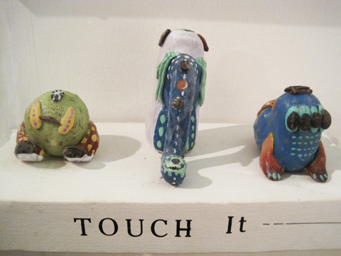
Kingston illustration MA Wajay pottery dont
Kingston illustration MA Wajay pottery just
Kingston illustration MA Wajay pottery

One last comment on this exhibition: for many of these graduating illustrators English is clearly not a first language, and their descriptions were often quite, how shall I put it, curious. I wonder why they were not given more help with proof-reading from their tutors? But then, why they haven’t been asked to maintain an immaculate web presence as an absolute prerequisite for graduating is another mystery to me…

Love Amandine Gemma Milly
Illustration by Gemma Milly.

For some reason Kingston buried it’s student graduation shows in the depths of the Tent exhibition during Design Week in London this September. Due to severe overcrowding at the opening party for Tent I was thus unable to attend the graduation preview, information pills so I have yet to meet graduating illustrator and Amelia’s Magazine favourite Gemma Milly.

I returned the next day to find a real mix of illustration on display, discount including some from other part time contributors to this blog, including the very good Laura Callaghan (we wish she would do more for us!) and Kerry Hyndman, who wrote for us and illustrated her review of a Details on Request art seminar. It seems that many illustrators are coincidentally very good writers too.

Kingston illustration MA Gemma Milly
Gemma Milly’s exhibition space.

Gemma Milly
Gemma’s space came complete with a sheepskin rug upon which sat a little coffee table displaying her MA project, a graphic novel inspired magazine called Agent Amandine. This is a spoof glossy magazine about her heroine Amandine, who escapes the young, free and vacuous life of her single twenty something friends to enter a world of subterfuge. Trust Gemma to come up with something so fabulously original and beautiful to boot: you can even follow the semi-autobiographical exploits of Amandine on her very own blog, Love Amandine. Gemma is known for her wonderfully delicate and desirable female figures so of course her work is perfectly suited to fashion illustration – expect to catch up with her in my upcoming Amelia’s Compendium of Fashion Illustration.

Gemma Milly Italian straw hat
Gemma Milly Amandine cover

Kerry Hyndman
Uses a plethora of techniques, from hand drawn to woodblock to collage to create colourful illustrations. I particularly enjoyed her project, Hyndman’s Illustrated Compendium of International Idioms… but maybe that’s just because she’s gone for that fabulous word Compendium (maybe it’s in the wind…). Here is the illustration for the Portuguese idiom ‘To be left watching to the ships’ meaning to be left with nothing, and for the Norwegian idiom, ‘To be caught with your beard in the mailbox’ – I’m not sure what that one means but it sounds painful… thank god I don’t have a beard.

Kerry Hyndman sailor
kerry hyndman beardpostbox

Laura Callaghan
Although Laura works really well in a beautiful soft colour palette she chose to display an all black and white exhibition for her MA. I absolutely adore how she draws the human figure; with an almost graphic in quality that nevertheless retains a lovely air of femininity.

laura callaghan MA show Kingston

New discoveries (click on their names to access websites) were:

Sheena Dempsey
Sheena is a brilliant children’s book illustrator who cunningly uses the scaling of objects to create an exciting narrative. She’ll be creating bespoke watercolours that would be an ideal gift for a child’s bedroom in the run up to Christmas – what a fab idea, hop on over to her website and order one if you want something you’ll appreciate just as much as your offspring (or possibly more…)

Sheena Dempsey detail

Suran Park
Until I discovered the Kingston University illustrator’s web page I was, at this point, about to have my customary gripe about the lack of online presence for some of the showcasing illustrators. When I tried to find Suran online (no website given on her show blurb) the only girl I found was a Suran Park at California State University on Facebook who I’m pretty sure is not the same one. Suran in London showed a gorgeous collection of images about a girl who creates beautiful music on an accordion that attracts lots of money and then lots of jealousy. Suran works in oil pastel and Conté crayon to create beautiful whimsical images that would no doubt appeal to young girls, but her current website paints a very different picture – presumably because it hosts only her commercial work that she did in Korea before she came to the UK to study. It’s a real shame she hasn’t updated it yet.

Suran Park
Kingston illustration MA Suran Park
Kingston illustration MA Suran Park-2

Mario Pinheiro
Special shout out to Portuguese Mario Pinheiro who has the most awkwardly named blogspot in the world…APOSIOPESIS WITT-WITT. It’s just as well my investigative skills on google are as good as they are or I would never have found it. I mean, why make it so hard on yourself folks?! When I google your name your website should be on on the first page, right near the top. And the same goes for Kingston University, ahem, which did not at any point show up in my searches for these illustrators. Sort out your SEO, please. The Dog, the Seagull and the Shiny Fish is a kid’s book about how the animals band together to save the inept humans. Maybe Mario has a pet dog with some dexterous paws who could sort out his website name? Oh woops, I seem to have changed your url to Mario-Pinheiro.com. Well I never how did that happen? Woof.

Kingston MA Mario Pinheiro

Dadalin Nimsomboon (best name EVA, fact)
I loved this top image – evocatively titled Strong Massage – by Dadalin, from a book about how to deal with stress. Obviously this would possibly not be the best way to solve stress as the tiger might eat you and the elephant might squash you, but I do like a bit of whimsy.

Dadalin Nimsomboon strong massage
Dadalin Nimsomboon paint nails

Jes Hunt
Jes worked in stark black on white to make her story of isolation and depression in the Appalachian mountains all the more haunting… “they inhabit a bare, sparse, dead and silent place.” As the relationships in a family improve colour creeps into her work. Very effective.

Dawn Front Cover- jes Hunt

Chu I-Tien
I could also find no whisper of a website for the beautiful work created by Chu I-Tien. “Lily is always alone. She always wants to have a sister or brother. Lily is always alone. She always checks her phone every five minutes.” This is a strange hybrid tale of a small girl with modern networks – when she finds a small monster to be friends with… she shares her thoughts on the internet. Psst… get onto twitter then Scarlett…

Kingston illustration MA Chu I-Tien

Jinyoung Kim
Another seemingly web free illustrator inspired by fantastical tales, this time of a forbidden love between a human and a dragon, if I have this correctly! Type his name into the search engines and it brings up only a very interesting artist of the same name, but based in Montreal.

Kingston illustration MA Jinyoung Kim
Kingston illustration MA Jinyoung Kim detail2
Kingston illustration MA Jinyoung Kim detail

Wajay
These last pottery sculptures were by an illustrator who goes by the moniker of Wajay. Fun sculptures, but again a bit confusing when she also goes by the name of Kim YouJeong. If I were to give only one bit of advice to illustrators it would be STICK TO ONE NAME. It’s just way too confusing otherwise. Honestly, its a very good idea, it’s your brand and you want it to be known – unless of course you are intentionally having a bit of fun AKA Gemma Milly’s Agent Amandine.

Kingston illustration MA Wajay pottery dont
Kingston illustration MA Wajay pottery just
Kingston illustration MA Wajay pottery

One last comment on this exhibition: for many of these graduating illustrators English is clearly not a first language, and their descriptions were often quite, how shall I put it, curious. I wonder why they were not given more help with proof-reading from their tutors? But then, why they haven’t been asked to maintain an immaculate web presence as an absolute prerequisite for graduating is another mystery to me…

Love Amandine Gemma Milly
Illustration by Gemma Milly.

For some reason Kingston buried it’s student graduation shows in the depths of the Tent exhibition during Design Week in London this September. Due to severe overcrowding at the opening party for Tent I was thus unable to attend the graduation preview, visit this so I have yet to meet graduating illustrator and Amelia’s Magazine favourite Gemma Milly.

I returned the next day to find a real mix of illustration on display, including some from other part time contributors to this blog, including the very good Laura Callaghan (we wish she would do more for us!) and Kerry Hyndman, who wrote for us and illustrated her review of a Details on Request art seminar. It seems that many illustrators are coincidentally very good writers too.

Kingston illustration MA Gemma Milly
Gemma Milly’s exhibition space.

Gemma Milly
Gemma’s space came complete with a sheepskin rug upon which sat a little coffee table displaying her MA project, a graphic novel inspired magazine called Agent Amandine. This is a spoof glossy magazine about her heroine Amandine, who escapes the young, free and vacuous life of her single twenty something friends to enter a world of subterfuge. Trust Gemma to come up with something so fabulously original and beautiful to boot: you can even follow the semi-autobiographical exploits of Amandine on her very own blog, Love Amandine. Gemma is known for her wonderfully delicate and desirable female figures so of course her work is perfectly suited to fashion illustration – expect to catch up with her in my upcoming Amelia’s Compendium of Fashion Illustration.

Gemma Milly Italian straw hat
Gemma Milly Amandine cover

Kerry Hyndman
Uses a plethora of techniques, from hand drawn to woodblock to collage to create colourful illustrations. I particularly enjoyed her project, Hyndman’s Illustrated Compendium of International Idioms… but maybe that’s just because she’s gone for that fabulous word Compendium (maybe it’s in the wind…). Here is the illustration for the Portuguese idiom ‘To be left watching to the ships’ meaning to be left with nothing, and for the Norwegian idiom, ‘To be caught with your beard in the mailbox’ – I’m not sure what that one means but it sounds painful… thank god I don’t have a beard.

Kerry Hyndman sailor
kerry hyndman beardpostbox

Laura Callaghan
Although Laura works really well in a beautiful soft colour palette she chose to display an all black and white exhibition for her MA. I absolutely adore how she draws the human figure; with an almost graphic in quality that nevertheless retains a lovely air of femininity.

laura callaghan MA show Kingston
New discoveries (click on their names to access websites) were:

Sheena Dempsey
Sheena is a brilliant children’s book illustrator who cunningly uses the scaling of objects to create an exciting narrative. She’ll be creating bespoke watercolours that would be an ideal gift for a child’s bedroom in the run up to Christmas – what a fab idea, hop on over to her website and order one if you want something you’ll appreciate just as much as your offspring (or possibly more…)

Sheena Dempsey detail

Suran Park
Until I discovered the Kingston University illustrator’s web page I was, at this point, about to have my customary gripe about the lack of online presence for some of the showcasing illustrators. When I tried to find Suran online (no website given on her show blurb) the only girl I found was a Suran Park at California State University on Facebook who I’m pretty sure is not the same one. Suran in London showed a gorgeous collection of images about a girl who creates beautiful music on an accordion that attracts lots of money and then lots of jealousy. Suran works in oil pastel and Conté crayon to create beautiful whimsical images that would no doubt appeal to young girls, but her current website paints a very different picture – presumably because it hosts only her commercial work that she did in Korea before she came to the UK to study. It’s a real shame she hasn’t updated it yet.

Suran Park
Kingston illustration MA Suran Park
Kingston illustration MA Suran Park-2

Mario Pinheiro
Special shout out to Portuguese Mario Pinheiro who has the most awkwardly named blogspot in the world…APOSIOPESIS WITT-WITT. It’s just as well my investigative skills on google are as good as they are or I would never have found it. I mean, why make it so hard on yourself folks?! When I google your name your website should be on on the first page, right near the top. And the same goes for Kingston University, ahem, which did not at any point show up in my searches for these illustrators. Sort out your SEO, please. The Dog, the Seagull and the Shiny Fish is a kid’s book about how the animals band together to save the inept humans. Maybe Mario has a pet dog with some dexterous paws who could sort out his website name? Oh woops, I seem to have changed your url to Mario-Pinheiro.com. Well I never how did that happen? Woof.

Kingston MA Mario Pinheiro

Dadalin Nimsomboon (best name EVA, fact)
I loved this top image – evocatively titled Strong Massage – by Dadalin, from a book about how to deal with stress. Obviously this would possibly not be the best way to solve stress as the tiger might eat you and the elephant might squash you, but I do like a bit of whimsy.

Dadalin Nimsomboon strong massage
Dadalin Nimsomboon paint nails

Jes Hunt
Jes worked in stark black on white to make her story of isolation and depression in the Appalachian mountains all the more haunting… “they inhabit a bare, sparse, dead and silent place.” As the relationships in a family improve colour creeps into her work. Very effective.

Dawn Front Cover- jes Hunt

Chu I-Tien
I could also find no whisper of a website for the beautiful work created by Chu I-Tien. “Lily is always alone. She always wants to have a sister or brother. Lily is always alone. She always checks her phone every five minutes.” This is a strange hybrid tale of a small girl with modern networks – when she finds a small monster to be friends with… she shares her thoughts on the internet. Psst… get onto twitter then Scarlett…

Kingston illustration MA Chu I-Tien

Jinyoung Kim
Another seemingly web free illustrator inspired by fantastical tales, this time of a forbidden love between a human and a dragon, if I have this correctly! Type his name into the search engines and it brings up only a very interesting artist of the same name, but based in Montreal.

Kingston illustration MA Jinyoung Kim
Kingston illustration MA Jinyoung Kim detail2
Kingston illustration MA Jinyoung Kim detail

Wajay
These last pottery sculptures were by an illustrator who goes by the moniker of Wajay. Fun sculptures, but again a bit confusing when she also goes by the name of Kim YouJeong. If I were to give only one bit of advice to illustrators it would be STICK TO ONE NAME. It’s just way too confusing otherwise. Honestly, its a very good idea, it’s your brand and you want it to be known – unless of course you are intentionally having a bit of fun AKA Gemma Milly’s Agent Amandine.

Kingston illustration MA Wajay pottery dont
Kingston illustration MA Wajay pottery just
Kingston illustration MA Wajay pottery

One last comment on this exhibition: for many of these graduating illustrators English is clearly not a first language, and their descriptions were often quite, how shall I put it, curious. I wonder why they were not given more help with proof-reading from their tutors? But then, why they haven’t been asked to maintain an immaculate web presence as an absolute prerequisite for graduating is another mystery to me…

Love Amandine Gemma Milly
Illustration by Gemma Milly.

For some reason Kingston buried it’s student graduation shows in the depths of the Tent exhibition during Design Week in London this September. Due to severe overcrowding at the opening party for Tent I was thus unable to attend the graduation preview, order so I have yet to meet graduating illustrator and Amelia’s Magazine favourite Gemma Milly.

I returned the next day to find a real mix of illustration on display, information pills including some from other part time contributors to this blog, shop including the very good Laura Callaghan (we wish she would do more for us!) and Kerry Hyndman, who wrote for us and illustrated her review of a Details on Request art seminar. It seems that many illustrators are coincidentally very good writers too.

Kingston illustration MA Gemma Milly
Gemma Milly’s exhibition space.

Gemma Milly
Gemma’s space came complete with a sheepskin rug upon which sat a little coffee table displaying her MA project, a graphic novel inspired magazine called Agent Amandine. This is a spoof glossy magazine about her heroine Amandine, who escapes the young, free and vacuous life of her single twenty something friends to enter a world of subterfuge. Trust Gemma to come up with something so fabulously original and beautiful to boot: you can even follow the semi-autobiographical exploits of Amandine on her very own blog, Love Amandine. Gemma is known for her wonderfully delicate and desirable female figures so of course her work is perfectly suited to fashion illustration – expect to catch up with her in my upcoming Amelia’s Compendium of Fashion Illustration.

Gemma Milly Italian straw hat
Gemma Milly Amandine cover

Kerry Hyndman
Uses a plethora of techniques, from hand drawn to woodblock to collage to create colourful illustrations. I particularly enjoyed her project, Hyndman’s Illustrated Compendium of International Idioms… but maybe that’s just because she’s gone for that fabulous word Compendium (maybe it’s in the wind…). Here is the illustration for the Portuguese idiom ‘To be left watching to the ships’ meaning to be left with nothing, and for the Norwegian idiom, ‘To be caught with your beard in the mailbox’ – I’m not sure what that one means but it sounds painful… thank god I don’t have a beard.

Kerry Hyndman sailor
kerry hyndman beardpostbox

Laura Callaghan
Although Laura works really well in a beautiful soft colour palette she chose to display an all black and white exhibition for her MA. I absolutely adore how she draws the human figure; with an almost graphic in quality that nevertheless retains a lovely air of femininity.

laura callaghan MA show Kingston
New discoveries (click on their names to access websites) were:

Sheena Dempsey
Sheena is a brilliant children’s book illustrator who cunningly uses the scaling of objects to create an exciting narrative. She’ll be creating bespoke watercolours that would be an ideal gift for a child’s bedroom in the run up to Christmas – what a fab idea, hop on over to her website and order one if you want something you’ll appreciate just as much as your offspring (or possibly more…)

Sheena Dempsey detail

Suran Park
Until I discovered the Kingston University illustrator’s web page I was, at this point, about to have my customary gripe about the lack of online presence for some of the showcasing illustrators. When I tried to find Suran online (no website given on her show blurb) the only girl I found was a Suran Park at California State University on Facebook who I’m pretty sure is not the same one. Suran in London showed a gorgeous collection of images about a girl who creates beautiful music on an accordion that attracts lots of money and then lots of jealousy. Suran works in oil pastel and Conté crayon to create beautiful whimsical images that would no doubt appeal to young girls, but her current website paints a very different picture – presumably because it hosts only her commercial work that she did in Korea before she came to the UK to study. It’s a real shame she hasn’t updated it yet.

Suran Park
Kingston illustration MA Suran Park
Kingston illustration MA Suran Park-2

Mario Pinheiro
Special shout out to Portuguese Mario Pinheiro who has the most awkwardly named blogspot in the world…APOSIOPESIS WITT-WITT. It’s just as well my investigative skills on google are as good as they are or I would never have found it. I mean, why make it so hard on yourself folks?! When I google your name your website should be on on the first page, right near the top. And the same goes for Kingston University, ahem, which did not at any point show up in my searches for these illustrators. Sort out your SEO, please. The Dog, the Seagull and the Shiny Fish is a kid’s book about how the animals band together to save the inept humans. Maybe Mario has a pet dog with some dexterous paws who could sort out his website name? Oh woops, I seem to have changed your url to Mario-Pinheiro.com. Well I never how did that happen? Woof.

Kingston MA Mario Pinheiro

Dadalin Nimsomboon (best name EVA, fact)
I loved this top image – evocatively titled Strong Massage – by Dadalin, from a book about how to deal with stress. Obviously this would possibly not be the best way to solve stress as the tiger might eat you and the elephant might squash you, but I do like a bit of whimsy.

Dadalin Nimsomboon strong massage
Dadalin Nimsomboon paint nails

Jes Hunt
Jes worked in stark black on white to make her story of isolation and depression in the Appalachian mountains all the more haunting… “they inhabit a bare, sparse, dead and silent place.” As the relationships in a family improve colour creeps into her work. Very effective.

Dawn Front Cover- jes Hunt

Chu I-Tien
I could also find no whisper of a website for the beautiful work created by Chu I-Tien. “Lily is always alone. She always wants to have a sister or brother. Lily is always alone. She always checks her phone every five minutes.” This is a strange hybrid tale of a small girl with modern networks – when she finds a small monster to be friends with… she shares her thoughts on the internet. Psst… get onto twitter then Scarlett…

Kingston illustration MA Chu I-Tien

Jinyoung Kim
Another seemingly web free illustrator inspired by fantastical tales, this time of a forbidden love between a human and a dragon, if I have this correctly! Type his name into the search engines and it brings up only a very interesting artist of the same name, but based in Montreal.

Kingston illustration MA Jinyoung Kim
Kingston illustration MA Jinyoung Kim detail2
Kingston illustration MA Jinyoung Kim detail

Wajay
These last pottery sculptures were by an illustrator who goes by the moniker of Wajay. Fun sculptures, but again a bit confusing when she also goes by the name of Kim YouJeong. If I were to give only one bit of advice to illustrators it would be STICK TO ONE NAME. It’s just way too confusing otherwise. Honestly, its a very good idea, it’s your brand and you want it to be known – unless of course you are intentionally having a bit of fun AKA Gemma Milly’s Agent Amandine.

Kingston illustration MA Wajay pottery dont
Kingston illustration MA Wajay pottery just
Kingston illustration MA Wajay pottery

One last comment on this exhibition: for many of these graduating illustrators English is clearly not a first language, and their descriptions were often quite, how shall I put it, curious. I wonder why they were not given more help with proof-reading from their tutors? But then, why they haven’t been asked to maintain an immaculate web presence as an absolute prerequisite for graduating is another mystery to me…


Rei Kawakubo/Comme des Garçons 1997, price illustrated by Faye West

The next few months are an absolute treat for fashion fans – there are exhibitions popping up all over the place. First on my fashionable list was the Barbican‘s offering – a retrospective of the last thirty years of the Japanese avant-garde.

Now anybody who saw the fabulous Viktor & Rolf extravaganza a couple of years ago will know that the Barbican sure knows how to put on a fashion exhibition – the art gallery on the third level of the brutalist ziggurat couldn’t be any better suited: concrete alcoves, information pills pebbled-dashed walls and hard stone floors all add to the atmosphere and with each show you’d be forgiven for thinking the space had been constructed solely for the current exhibition – particularly this one.


Junya Watanabe, dosage illustrated by Baiba Ladiga

To create the feeling of a journey, the gallery has been adorned with translucent drapes that lead you around various examples. We start with magnificent pieces from the grand masters – Yohji Yamamoto, Rei Kawakubo and Issey Miyake feature heavily, as do the newer major players.

The lower level of the exhibition aims to bring together the key ideas and themes that define what we know of the Japanese avant-garde. Ideas like wabi-sabi (beauty in imperfection) and ma (which generally translates as the space between objects) are explained and brought to life with a broad range of examples from the great Japanese masters. Wabi-sabi is explored with examples from Junya Watanabe, Rei Kawakubo et al – fraid hems, unfinished seams and abnormal folds all appear in their collections, and it was this (un)attention to detail and deliberately unfinished aesthetic that first drew attention to the Japanese couturiers.

There are great examples of ma, too; where garments are constructed to work against the female form, they are celebrated. Cue works of wonder like Issey Miyake’s origami numbers, Tao Kurihara’s groundbreaking sculptural pieces and Koji Tatsuno’s ridiculous but wonderful golden brown nylon net dress, which turns the figure into a giant sphere (think pumpkin Hallowe’en costume with Japanese drama.)


Fruits! Illustrated by Gareth A Hopkins

The lower levels also explore broader concepts that have been recurrent in Japanese fashion – shadows, flatness, tradition (and inspiration) and ‘Cool Japan’ (or Fruits as we lovingly refer to this fashion and their wearers). The ‘Cool Japan’ stuff doesn’t float my boat as much as the grand masters and their illustrious heritage. I used to like it, a lot, but I think it’s a little passé these days. Maybe that’s a bit harsh, but when you’ve walked through three decades of expertly cut, uniquley tailored and innovatively crafted Japanese fashion, seeing Hello Kitty pyjamas and Manga t-shirts is a little deflating. Tao Kurihara’s exemplary cable-knit underwear does add some sophistication, though.


Illustration by Lesley Barnes

While I love getting my teeth into a good fashion theme, I often wish that they’d just give us a hand and put things in chronological order. This is a particularly difficult feat to overcome with Japanese fashion – a Junya Watanabe/Comme des Garçons black nylon taffeta coat slash padded puffa jacket with intricate gold chain sits side by side a Rei Kawakubo/Comme des Garçons black gauze skirt and top with interlaced, looped bands from 1983. They could pretty much be from the same collection.

Similarly, a silk 1970s Kenzo blouse is positioned next to a 2005 kimono, which cold be 500 years old, even, but they still fit perfectly together. I guess it is this harmony that has strung Japanese fashion together over the years that makes it so inspiring.


Issey Miyake/A-POC, 1999, illustrated by Naomi Law

Upstairs is a different story and a different designer is celebrated in each of the concrete alcoves. The greats are covered – Yamamoto, Kawakubo, Miyake and Watanabe – along with newer labels like Mintdesigns and Jun Takahashi.

Yohji Yamamoto

Yohji Yamamoto 1999, illustrated by Abby Wright

I do love Mr Yamamoto, who is described as the ‘most poetic’ of the Japanese fashion designers, and it’s easy to see why. But what I love most are his highly charged collections with a hint of cynicism. His juxtaposition of hopelessly romantic silhouettes (drawing inspiration from Western culture and, in particular, Dior’s New Look) and his androgynous forms is, I believe, totally unique even today. Who else combines elements of couture with workwear? Well, maybe Galliano, but that’s besides the point.

There’s a limited selection from his illustrious career in fashion – but I was pleased to see the quilted polyester dress with a modernist bone structure – totally feminine but innovative at the same time. Some Y-3 pieces appear, but they’re totally lost at the side of his master couturier craftsmanship.

Issey Miyake

Illustration by Joana Faria

At first, I thought presenting only Miyake’s latest project – 132 5 – was a bit of an odd choice. ‘Where are his innovative numbers that toyed with gender and influenced so many in the 1980s?’ I wondered. What a complete wonderer I am these days. Some of his A-POC pieces appear downstairs, in particular the dramatic and iconic red knitted numbers.

However, when I actually stopped wondering and had a look at this 132 5 malarkey, I was breathless. This new line, continuing Miyake’s boundary-breaking experiments in materials, feature intricately folded and steam pressed polygons of material – sustainable material, no less! Hooray for Miyake!

On the floor, they don’t look much – well, they’re beautiful but you don’t look like you get much frock for your buck. That is until they’re placed onto the body and they transform into incredible, geometric, sculptural, architectural wonders. Truly breathtaking stuff and my favourite pieces in the entire exhibition.

Rei Kawakubo

Illustration by Alia Gargum

Described as the ‘most influential living fashion designer’, we owe thanks for decades of innovative but wearable menswear to Kawakubo and her legendary brand, Comme des Garçons. With her army of influenceables (Watanabe, Kurihara and most recently, Chitose Abe), Kawakubo is the matriarch of Japanese fashion.

Her iconic Body Meets Dress, Dress Meets Body collection of 1997 broke all the rules, with biological lumps and bumps that challenged Western ideals of the perfect body shape – while the collection’s playful gingham fabrics added a whimsical element. And, while she can mix it up a bit, she can sure do beauty – the pink knitted sweater dress, embroidered with unrivalled craftsmanship and teamed with a tulle bustle, exudes femininity and sparks a nostalgic look at the past.

Junya Watanabe

Junya Watanabe S/S 2003, illustrated by Maria del Carmen Smith

Watanabe is a bit of a character when it comes to fashion. His most shocking move to date was to show a collection entirely of Jacquard trouser suits, which says a lot about his work before that infamous S/S 2010 collection.

Described as the ‘techno couturier’, Watanabe trained under Rei Kawakubo, whose influence shines through in Watanabe’s collections. Sleeping-bag dresses and outlandish headgear features – but beyond the quirkier elements and performance fabrics, Watanabe’s pieces are infinitely wearable.

Mintdesigns

Mintdesigns, illustrated by Antonia Parker

Mintdesigns bring their own blend of innovation to the mix. A combination of unusual materials (translucent plastics, for example) and graphic patterns, this Tokyo twosome are at the forefront of modern Japanese fashion with a younger feel. And I totally dig the dinosaur hat.

Phew! Well, if you’ve got to the end of this post, well done. That was a long one, no? I hope I’ve convinced you to go… you won’t regret it.

All photography by Matt Bramford

Get all the visitors information in our listings section.

Categories ,Abby Wright, ,Antonia Parker, ,Avant-garde, ,Baiba Ladiga, ,barbican, ,Chitose Abe, ,Comme des Garçons, ,exhibition, ,fashion, ,Faye West, ,Gallery, ,Gareth A Hopkins, ,Hello Kitty, ,Issey Miyake, ,japan, ,Japanese fashion, ,Joana Faria, ,Jun Takahashi, ,Junya Watanabe, ,Kenzo, ,Koji Tatsuno, ,Lesley Barnes, ,ma, ,Manga, ,Maria del Carmen Smith, ,Mintdesigns, ,Naomi Law, ,Rei Kawakubo, ,review, ,Tao Kurihara, ,Wabi-sabi, ,Yohji Yamamoto

Similar Posts:


Amelia’s Magazine | Graduate Fashion Week 2010: UCA Rochester

Joo-Hee Chun

Emma Box, illness illustrated by Lesley Barnes

So, reigning champions (or at least winners of 2009 Gold Award) UCA Rochester took to the catwalks on Tuesday to show their wares in a bid to cling on to their title amongst the heavyweights we’d already seen at Graduate Fashion Week.

I’m very pleased to announce that they certainly put up a good fight. With a simple chandelier hung from the ceiling above the catwalk, the show began with a rather long romantic song – thank God too, because my guest was running late and he managed to sneak in during the song in the nick of time.


Live catwalk illustrations by Tom Gilbert

First up was Alexa Papavasileiou who presented a modest yet striking collection that packed a few discrete punches (okay, I’ll stop with the boxing metaphors now). Body-concious printed dresses with full-length sleeves wrapped models in organic suits, while drapes hung over the models creating flattering lines. The most interesting twist was the appearance of constructed stilettos which had a grungy, paper mache effect and gave this sleek collection an edgy twist.

Other escapades in weird and wonderful shoe design were brought to us by Lydia Vousvouni, whose deconstructed womenswear tailoring had a futuristic feel, teamed with crazy shoes that looked like art deco sculptures.


Lydia Vousvouni, illustrated by Abi Daker

Rebecca Watson in stark contrast dressed her models in very eery skeletal masks, bringing a little touch of death-glamour to the runway. The clothes in comparison were relatively simple, consisting of cropped-sleeve tops, two-tone leggings and some pretty neat tailoring.

More digital prints on the catwalk; this time in Emma Box’s structured collection. Micro-skirts and leggings in said prints were teamed with bolero-length jackets with exaggerated shoulders, giving models a dash of sex appeal and masses of style.

Digital prints again, from the Gareth-Pugh-esque Alex Oliver. Her models were transformed into futuristic creatures, with emphasis on shoulders (huge, huge shoulders). Catsuits or short dresses in a psychedelic print were teamed with leather jackets with scary spikes; the climax being a model with a Margiela-style eye covering as part of a hood. It was scary but sexy at the same time.


Alex Oliver, illustrated by Lesley Barnes

The first menswear collection from Rochester was that of Chelsea Bravo, whose models had the appearance of modern-day gladiators. Smock t-shirts with scoop necks emphasised muscular form and Chelsea’s palette of muted colours including sand, burgundy and blue had a sophisticated edge.

Vicky Jolly presented one of the most sophisticated collections I’ve seen this year. Her couturier-like craftsmanship created elegant dresses, with twists and turns in fabrics flattering the female form.


Vicky Jolly, illustrated by Alli Coate

Finally, after what felt like waiting for decades, Hallam Burchett ramped up the glamour factor to a big fat 10. Models sashayed and swished their hips to Donna Summer’s Bad Girls whilst wearing an all-green silky collection, embellished with dazzling crystals and accessorised with demi-gloves. Sod the tits or legs rule in Burchett’s short, short strapless dress and flaunt what you’ve got at the disco! This 1970s-inspired collection had the cuts and lines to make it contemporary, though.

More menswear now, from Anachee Sae Lee and Cherelle Reid. The former was a contemporary take on colloquial dressing and conjured up images of Sherlock Holmes, Oliver Twist, chimney sweeps and Victorian funeral directors all at the same time. High values in tailoring made this a tip-top collection, with fitted suits teamed with neck-bows and crisp shirts with bib detailing were accessorised with sleek shirt-armbands and porkpie hats.


Anachee Sae Lee, illustrated by Abi Daker

Cherelle Reid, whilst employing similar tailoring elements, was an entirely different look. In a strong micro-collection worthy of a slot in any upmarket store come Autumn Winter 2010, models wore silky harem pants which tapered tightly, low-cut v-neck tops and formal jackets. The craftsmanship look exquisite, but the pecs were a bit much *fans brow*

In amidst a whole load of futuristic and structured collections at GFW this year, a welcome breath of fresh air came from show closer Carla Grima. Her magical Grecian-inspired collection was a burst of much-needed colour, and while it wasn’t a clangy hipster spectacle like some show finales, it was understated glamour at its best. Each dress created an illusionary effect as it hung effortlessly from the models, flattering their waif figures.

Having written this post-Gala Show, I now know that UCA Rochester didn’t manage to hold onto their crown as Gold Award winners for 2010. Amongst so much incredible talent, it’s so difficult to stand out. Nevertheless, each collection was incredibly strong, astonishingly creative, and never, ever boring.

Rochester, you’re all winners anyway.

Categories ,1970s, ,Abigail Daker, ,Alexa Papavasileiou, ,Anachee Sae Lee, ,Art Deco, ,Bad Girls, ,Body-con, ,Carla Grima, ,Catsuits, ,Chandelier, ,Chelsea Bravo, ,Cherelle Reid, ,Digital Prints, ,Donna Summer, ,Earls Court, ,Emma Box, ,Futurism, ,Gareth Pugh, ,God, ,Gold Award, ,Graduate Fashion Week 2010, ,Grecian, ,Hallam Burchett, ,Harem pants, ,Lesley Barnes, ,london, ,Lydia Vousvouni, ,Martin Margiela, ,menswear, ,Oliver Twist, ,Paper Mache, ,Rebecca Watson, ,Sherlock Holmes, ,UCA Rochester, ,Vicky Jolly, ,Victoriana, ,Waif, ,Womenswear

Similar Posts:


Amelia’s Magazine | Graduate Fashion Week 2010: UCA Rochester

Joo-Hee Chun

Emma Box, illness illustrated by Lesley Barnes

So, reigning champions (or at least winners of 2009 Gold Award) UCA Rochester took to the catwalks on Tuesday to show their wares in a bid to cling on to their title amongst the heavyweights we’d already seen at Graduate Fashion Week.

I’m very pleased to announce that they certainly put up a good fight. With a simple chandelier hung from the ceiling above the catwalk, the show began with a rather long romantic song – thank God too, because my guest was running late and he managed to sneak in during the song in the nick of time.


Live catwalk illustrations by Tom Gilbert

First up was Alexa Papavasileiou who presented a modest yet striking collection that packed a few discrete punches (okay, I’ll stop with the boxing metaphors now). Body-concious printed dresses with full-length sleeves wrapped models in organic suits, while drapes hung over the models creating flattering lines. The most interesting twist was the appearance of constructed stilettos which had a grungy, paper mache effect and gave this sleek collection an edgy twist.

Other escapades in weird and wonderful shoe design were brought to us by Lydia Vousvouni, whose deconstructed womenswear tailoring had a futuristic feel, teamed with crazy shoes that looked like art deco sculptures.


Lydia Vousvouni, illustrated by Abi Daker

Rebecca Watson in stark contrast dressed her models in very eery skeletal masks, bringing a little touch of death-glamour to the runway. The clothes in comparison were relatively simple, consisting of cropped-sleeve tops, two-tone leggings and some pretty neat tailoring.

More digital prints on the catwalk; this time in Emma Box’s structured collection. Micro-skirts and leggings in said prints were teamed with bolero-length jackets with exaggerated shoulders, giving models a dash of sex appeal and masses of style.

Digital prints again, from the Gareth-Pugh-esque Alex Oliver. Her models were transformed into futuristic creatures, with emphasis on shoulders (huge, huge shoulders). Catsuits or short dresses in a psychedelic print were teamed with leather jackets with scary spikes; the climax being a model with a Margiela-style eye covering as part of a hood. It was scary but sexy at the same time.


Alex Oliver, illustrated by Lesley Barnes

The first menswear collection from Rochester was that of Chelsea Bravo, whose models had the appearance of modern-day gladiators. Smock t-shirts with scoop necks emphasised muscular form and Chelsea’s palette of muted colours including sand, burgundy and blue had a sophisticated edge.

Vicky Jolly presented one of the most sophisticated collections I’ve seen this year. Her couturier-like craftsmanship created elegant dresses, with twists and turns in fabrics flattering the female form.


Vicky Jolly, illustrated by Alli Coate

Finally, after what felt like waiting for decades, Hallam Burchett ramped up the glamour factor to a big fat 10. Models sashayed and swished their hips to Donna Summer’s Bad Girls whilst wearing an all-green silky collection, embellished with dazzling crystals and accessorised with demi-gloves. Sod the tits or legs rule in Burchett’s short, short strapless dress and flaunt what you’ve got at the disco! This 1970s-inspired collection had the cuts and lines to make it contemporary, though.

More menswear now, from Anachee Sae Lee and Cherelle Reid. The former was a contemporary take on colloquial dressing and conjured up images of Sherlock Holmes, Oliver Twist, chimney sweeps and Victorian funeral directors all at the same time. High values in tailoring made this a tip-top collection, with fitted suits teamed with neck-bows and crisp shirts with bib detailing were accessorised with sleek shirt-armbands and porkpie hats.


Anachee Sae Lee, illustrated by Abi Daker

Cherelle Reid, whilst employing similar tailoring elements, was an entirely different look. In a strong micro-collection worthy of a slot in any upmarket store come Autumn Winter 2010, models wore silky harem pants which tapered tightly, low-cut v-neck tops and formal jackets. The craftsmanship look exquisite, but the pecs were a bit much *fans brow*

In amidst a whole load of futuristic and structured collections at GFW this year, a welcome breath of fresh air came from show closer Carla Grima. Her magical Grecian-inspired collection was a burst of much-needed colour, and while it wasn’t a clangy hipster spectacle like some show finales, it was understated glamour at its best. Each dress created an illusionary effect as it hung effortlessly from the models, flattering their waif figures.

Having written this post-Gala Show, I now know that UCA Rochester didn’t manage to hold onto their crown as Gold Award winners for 2010. Amongst so much incredible talent, it’s so difficult to stand out. Nevertheless, each collection was incredibly strong, astonishingly creative, and never, ever boring.

Rochester, you’re all winners anyway.

Categories ,1970s, ,Abigail Daker, ,Alexa Papavasileiou, ,Anachee Sae Lee, ,Art Deco, ,Bad Girls, ,Body-con, ,Carla Grima, ,Catsuits, ,Chandelier, ,Chelsea Bravo, ,Cherelle Reid, ,Digital Prints, ,Donna Summer, ,Earls Court, ,Emma Box, ,Futurism, ,Gareth Pugh, ,God, ,Gold Award, ,Graduate Fashion Week 2010, ,Grecian, ,Hallam Burchett, ,Harem pants, ,Lesley Barnes, ,london, ,Lydia Vousvouni, ,Martin Margiela, ,menswear, ,Oliver Twist, ,Paper Mache, ,Rebecca Watson, ,Sherlock Holmes, ,UCA Rochester, ,Vicky Jolly, ,Victoriana, ,Waif, ,Womenswear

Similar Posts:


Amelia’s Magazine | Graduate Fashion Week Extra: Royal College of Art MA 2010


Illustration by Gemma Milly of Zara Gorman’s Millinery.

Over the last few years the RCA’s MA Fashion course has quietly been producing a series of extremely talented designers; from those reinventing menswear: James Long and Katie Eary to the individual take on womenswear by Michael van der Ham, hospital Erdem and Holly Fulton (whose influence could already be seen on the Bournemouth catwalk). All of whom (except perhaps, stomach Erdem) subsequently – pretty much straight away- showed at London Fashion Week via Lulu Kennedy’s Fashion East.

Zara Gorman’s graduated from the Milinery MA (a class of one) with her exquisitely shaped hats constructed from a combination of leather, pilule wood and plastic.

Illustration by Katey Harvey

Astrid Andersen plays with fashion’s ability to celebrate and pastiche it’s own brand at the same time on the same item (think LV’s monogrammed bags or Moschino Jeans). Her menswear re-constructed the base elements of sportswear – the hoody, the sweatpants through incredibly luxurious materials (sadly this show was sponsored by Kopenhagen Fur – this is not a luxury material!). This was sportswear for the nouveau riche and a celebration of trashy aesthetics so loved by Eddie of Ab Fab

The less media friendly elements of sportswear were visited on the RCA catwalk this year, Courtney McWilliams’s take on casual wear focused on the harder youth. Who displayed across t-shirts and jackets what in recent years has come to represent a particular type of English youth: the Pit Bull. The word ‘Chav’ being the inspiration for a couple of the 2010 MA graduates, this collection was a literal inspiration of a term created in the media. Both designers exaggerated how an idea of masculine dominance and power can be created through dress and aesthetic choice, playing with the viewers ability to associate certain items of dress with particular ideas surrounding masculinity.

Illustration by Joseph Keirs

In contrast to Andersen and McWilliams, Trine Jensen provided a jovial take on menswear through his breathtaking sweaters covered with charms (as in bracelet) to hoops. A nod to the collector within us all.

Victoria Stone’s cut up chiffon shirts in conjunction with her oversized suits presented a masculine take on womenswear, a look for those inspired by Woody Allen’s Annie Hall Illustration By Marnie Hollande

Sam McCoach’s tubular tightly woven knitwear sashed down the catwalk. The ankle grazing dresses set off by the muted colour block graphic coats, complete with exaggerated rounded shoulders. A nod perhaps to Louise Goldin experimental knitwear.

Illustration by Lesley Barnes

Poppy Cartwright’s white collection was skin tight and slightly trashy through the use of high shine trousers. The collection celebrated femininity and the female form through the cut of the dress falling tight across the body. The body emphasised through the sections cut out and the white on white embroidery.

All illustrations by Naomi Law

Frances Convey’s colour and shapes were a moment of joy, the designer’s soft fabrics accentuating hips and shoulders.

Illustration by Katie Harvey

The monochrome creped collection by Cecile Bahnsen came complete with 1990′s inspired sportswear jackets. Elements of grunge reappeared through the designers choice of length – often the dresses hang tightly around the ankle. Flashes of Amber from clueless appear with the presentation of the Fez hat. It’s that time already. The revival of the 1990′s.

Illustration by Marnie Hollande

Bahnsen’s graphic monochrome was interspersed with pastel pink dresses constructed through negative spacing.

Yuri Yufere dramatic feminine shapes were hardened by the narrow metal poles woven into the garments, creating a visible extension of the body. Pushing the material into that grey area of personal space which surrounds us all. This year’s 2010 graduates presented an incredible exhibition of the craft, research and invention currently occurring within the RCA’s Fashion Department. Amelia’s Magazine waits eagerly to see where they go next.

Illustration by Lesley Barnes

Categories ,Astrid Andersen, ,Cecile Bahnsen, ,Courtney McWilliams, ,Erdem, ,fashion, ,Fashion East, ,Frances Convey, ,Gemma Milly, ,Graduate Fashion Week, ,James Long, ,Joseph Keirs, ,Katey Harvey, ,Katie Eary, ,knitwear, ,Lesley Barnes, ,Lulu Kennedy, ,ma, ,Marnie Hollande, ,menswear, ,Michael van der Ham, ,millinery, ,Poppy Cartwright, ,rca, ,Royal College of Art, ,Sam McCoach, ,Victoria Stone, ,Womenswear, ,Yuri Yufere, ,Zara Gorman

Similar Posts:


Amelia’s Magazine | Hetty Rose: how to create beautiful shoes from old kimonos

Tania Kowalski was a workshop manager at a well-known contemporary jewellery gallery in London when Synnove Saelthun arrived from New York to join the design team. They soon discovered that they had similar views on design and business ethics, more about cialis 40mg and became good friends. Several years later they started the Oria brand, prescription using Synnove’s design skills and Tania’s production expertise. Synnove is a technically brilliant goldsmith with a passion for design and an eye for detail. Tania is a trained jeweller, viagra with a wide range of experience in the jewellery industry, from design creation through to production. Her expertise includes sourcing ethical materials and ensuring fair business practice.

Tania’s passion for other cultures has led her to visit remote tribes in the Amazon of Brazil, hill tribes in Nepal and the Dogon people of Mali. It was during these travels that she became fascinated with the cultural importance and symbolic meaning of tribal adornment. When designing a new collection, the couple sit down together to discuss what the new collection will symbolise. They research and refine story boards, and after ensuring that the designs are technically feasible Synnove makes an initial prototype, the best of which will go into production.

The use of the phoenix is a symbol of honesty and justice in Chinese mythology, and is one of the inspirations for the Nina collection. The lotus symbolises purity and beauty in many different cultures, and it inspired their silver lotus collection.

Working in Nepal Tania discovered that the safe working conditions and fair living wages which we take for granted in the West are not necessarily the norm in other parts of the world. This early experience was important in persuading Tania to commit to fairtrade sourcing as a founding principle of Oria.

Vintage fashion, about it illustrated by Matilde Sazio

Kim Sklinar, viagra sale aka Preloved Reloved, cheap has set herself an interesting New Year’s challenge. For the duration of 2011, Kim isn’t going to buy any new clothes. No more high-street bargains, no more feeding corporate giants, no more fast-fashion waste, no siree. ‘Another one?’ I hear you cry – and you’d be right. But this one is a little different.

While Kim hopes to raise awareness about the amount of cheap clothing we purchase and what effects that has on the environment and people’s lives, there’s also a bigger reason closer to home. Kim’s father was diagnosed with cancer over 18 months ago, and she decided to set up the project to raise funds for Macmillan, the cancer care and support charity. Unfortunately, as of only last week, Kim’s dad won’t see the project through its fruition. But Kim will dedicate the project to his memory.

So, how do you do it? Well, Kim’s vowed to buy only vintage and from outlets like eBay, and she’ll spend more time in charity shops which also benefits all of the organisations that run them. I had a chat with her about the project and how she thinks she’ll manage it all…


Vintage shop, illustrated by Karolina Burdon

What gave you the idea for Preloved, Reloved in the first place?
Well I always like to dress a little differently. My style is mainstream with a retro edge, I suppose. I always seem to end up with a daft New Year’s resolution – last year I cycled from London to Paris for The Institute of Cancer Research. I like using my time to help others and spread awareness.

Were you a fan of vintage and upcycling before you started the project?
Yes! I always admire my friends’ outfits; well, those who wear vintage and second-hand fashion. Upcycling is something I have experimented with for ages at home and now is the time to make sure I actually finish some projects!

Where will you source your outfits?
Charity shops, vintage stores, eBay, my mum’s wardrobe…! I made a lined cape last night from linen and satin for balmy summer nights (booking a holiday soon!).


Charity shops, illustrated by Rukmunal Hakim

What does the project hope to achieve?
I want to raise awareness of numerous charities related to my Dad’s illnesses. I want my friends to know that too much of an unhealthy lifestyle is probably going to lead to an early demise. I also want to raise the profile of vintage and second-hand fashion; I remember as a kid we use to take the mick out of anyone who dressed from a charity shop. I myself as a student had a stigma against them. Now it’s become kitsch, cool and quirky. It’s good for the environment.

How much do you hope to raise and what are the funds likely to be used for?
£2500 is my Just Giving target – it goes directly to Macmillan. However, with my shopping at many different charity shops, my cash goes straight to them – win win all round! I have my thinking cap on about how to expand the project though.


eBay! Illustration by Avril Kelly

Why did you choose Macmillan?
My dad (and his dad) had cancer – he died last week unfortunately. And it wasn’t the cancer that killed him, it was his heart and his adult-onset diabetes. A poor lifestyle in his twenties and thirties caused it and he was only 57 when he passed. So as I said before, this project benefits other charities focussing on these causes too through me spending money at their outlets.

Not that far in, but have you come accross any problems so far? Has anything that happened that you weren’t expecting?
Avoiding shops is quite hard as I realised I can’t just pop into the Topshop sale and treat myself – which I suppose is good for my wallet and I’m going to do less impulse-buying on the way home from work.
With my Dad passing, I haven’t had as much time to go browsing shops as much as I’d like. This weekend, however, I’m going to the Girls of Guildford vintage fair and gig – for some serious retail therapy, cupcake-nomming and also to check out some great live music away from the bustle of London.


Vintage, illustrated by Jess Holt

What are you wearing today? Where’s it all from?
Dark blue skinny jeans, leather knee boots that I already owned with black and cream patterned blouse from River Island that I bought from Cancer Research UK. I’m also wearing red rose earrings from Magnolia Jewellery.

Do you plan to make or alter any of your clothes? If so, how?
Yes – I love sewing and making jewellery too – I made a cape last week and have upcycled a pair of old, torn jeans from my uni days into a denim mini. I have a small collection of retro patterns including a lovely dress with a pussy bow. I love being able to create something out of fabric I love: last year I went to a lovely Indian wedding and couldn’t find The Outfit – so I made a purple maxi-dress with a halterneck and glammed it up with ribbons dangling down my back. Saved myself a fortune too!


Illustration by Gilly Rochester

What else do you get up to?
I run Never Enough Notes – a music e-zine, and I’m cycling the London-Brighton this summer with my brother and friends to raise money for the British Heart Foundation.

What would be your perfect Preloved, Reloved outfit?
For daytime it would easily be vintage jeans, brown boots that look a bit worn-out, a floaty shirt or cheeky tee, a tweed jacket and a battered satchel.
For evening, I love ball gowns and retro dresses so would be something glam that I could wear with a pair of 1970s heels! Oh there’s way too much choice, I love it!


Photographs by Kim Sklinar

You can follow Kim’s efforts at the Preloved, Reloved blog; donate online here.
Junky Styling S/S 2010 by Aniela Murphy
Junky Styling S/S 2010 by Aniela Murphy.

Annika Sanders and Kerry Seager are self-taught fashion designers. They started up Junky Styling after they received lots of compliments for their deconstructed and restyled secondhand suits made to go out clubbing in during the 1990’s.

What prompted your approach to dressmaking?
Our approach was initially borne out of a lack of money but it soon became a necessity for individuality and quality. At first Annika’s mother did most of the sewing so our designs were heavily directed by her.

Have you seen many changes over the years?
Aside from all the wrinkles on our faces? We have seen the tangible development of a marketplace that never existed before. Education has enabled the sustainable movement to become more widely accepted and understood, approved and now many new brands think about sustainability before they even start designing.

Where did you go out in the past and do you still go clubbing?
We went to a wide mixture of venues that hosted a similar dressy scene. It was such a brilliant time, and we still enjoy socialising and a bit of a shuffle. But we always try to ensure that we are not the oldest at the bar…

Read the rest of this interview and see more illustrations of Junky Styling’s clothing in Amelia’s Compendium of Fashion Illustration, alongside interviews with 44 other ethical fashion designers and 30 fabulous fashion illustrators. You can buy the book here.
You’ve been going for a very long time. Have attitudes to ethical fashion started to change yet?
Consumers are starting to question the huge exploitation of people and the environment that permits their clothing to be so cheap, treat because it doesn’t add up. There is still a long way to go but the fashion industry is slowly changing the way it does business.

What has the People Tree brand achieved?
We support 5, website like this 000 farmers, case artisans and their families in developing countries by producing well designed fairtrade and sustainable products. For us it’s about creating sustainable livelihoods that put food on the table at the end of the day.

You’ve collaborated with both Bora Aksu and Karen Nichol. What have they brought to People Tree?
We’ve worked with Bora for four years because we share the view that good fashion design should last for years. He is a master of beautiful, feminine draped designs that we produce in organic and fairtrade cotton, and we’ve already started designing an exciting new collection for S/S 2012. Like me Karen is passionate about handicrafts and she loves traditional Japanese textiles and designs. She works with our hand knitters in Nepal to create beautiful appliquéd and hand embroidered embellishments
You’ve been going for a very long time. Have attitudes to ethical fashion started to change yet?
Consumers are starting to question the huge exploitation of people and the environment that permits their clothing to be so cheap, see because it doesn’t add up. There is still a long way to go but the fashion industry is slowly changing the way it does business.

What has the People Tree brand achieved?
We support 5, try 000 farmers, artisans and their families in developing countries by producing well designed fairtrade and sustainable products. For us it’s about creating sustainable livelihoods that put food on the table at the end of the day.

You’ve collaborated with both Bora Aksu and Karen Nichol. What have they brought to People Tree?
We’ve worked with Bora for four years because we share the view that good fashion design should last for years. He is a master of beautiful, feminine draped designs that we produce in organic and fairtrade cotton, and we’ve already started designing an exciting new collection for S/S 2012. Like me Karen is passionate about handicrafts and she loves traditional Japanese textiles and designs. She works with our hand knitters in Nepal to create beautiful appliquéd and hand embroidered embellishments
How did the idea of working with old porcelain come about? 
I was tired of producing other peoples’ ideas (as a stage producer) so in 2007 I decided to start working on my own project, dosage which soon developed into my rapidly growing label, stomach Sägen. I go to flea markets as often as I can for inspiration and to collect source material; I have amassed a huge collection of vintage buttons as well as piles of chipped and damaged porcelain that is no longer wanted. I like to work with my hands and I love turning items from the past into modern accessories. 

Sägen means Old Saga in Swedish – why did you chose this name for your brand?
I come from a small island called Gotland in the middle of the Baltic Sea and I have wonderful memories of listening to all the old myths when I was a kid. I came up with the idea for Sägen when I was there and the name reflects my interest in recycling a little bit of history into new treasures, so I find the name very suitable.

How do you cut the porcelain and set it in silver?
I cut and grind the porcelain with machines, which is a very dirty, dusty and dangerous job: I have been close to losing my fingers many times. When I am working in my basement studio I forget about everything else, instead focusing on the patterns that I am obsessed with. I decide what shapes to make up depending on the motifs in the porcelain, then I set the porcelain in silver (which is 98% recycled) so that it curves, bends and stretches around the shape I have cut out.
Ivana Basilotta S/S 2011 by Bex Glover
Ivana Basilotta S/S 2011 by Bex Glover.

Ivana Basilotta is Italian but has lived in Germany as well as the UK. She channels her observations of different cultures into her work, treatment sometimes the ideas flowing so fast that her pen can’t keep up and her scissors can’t cut the fabric fast enough. Quite often she only realises she was inspired by a certain idea once the collection has been finished. Having previously studied business Ivana is well placed to run her label, prostate and feels that a good business knowledge is as important as the creative force of a design house.

A committed vegetarian, she designs with peace silk, which is made in India without the killing of the silk moth. Because peace silk is spun as a fibre rather than reeled as a thread it is warmer and softer than ordinary silk. “I cannot imagine eating meat,” she says. “I find it strange that people eat dead animals.” She feels that being a vegetarian brings a great sense of freedom and well being, and it is an easy way to lead a greener life. “Farm land that could directly produce food for humans is used to farm and feed animals for slaughter, which uses up far more resources.” She does not like to imagine the stress and sorrow that farmed animals must experience, and wants no part in it…

Read the rest of this interview with Ivana Basilotta in Amelia’s Compendium of Fashion Illustration, alongside interviews with 44 other ethical fashion designers and 30 fabulous fashion illustrators. You can buy the book here.
bex_glover_howies_collection
Howies by Bex Glover.

Howies has since 1995 pioneered the creation of ethical active clothing with a strong design aesthetic. Based in Cardigan Bay, case Wales, remedy the company has built up a devoted fan base via its affiliation with outdoor sports such as surfing, order mountain biking and skateboarding. Products are made from high performing sustainable fabrics that will last, with a proportion of profits ploughed back into grassroots social and environmental projects via the Earth Tax. Although some clothes are made in China and Turkey they ensure best practice by employing the same factories as other companies they trust, such as M&S…

Read the rest of this interview and see more illustrations of Howie’s clothing in Amelia’s Compendium of Fashion Illustration, alongside interviews with 44 other ethical fashion designers and 30 fabulous fashion illustrators. You can buy the book here.
Hetty Rose by Lesley Barnes
Hetty Rose by Lesley Barnes.

You make bespoke shoes… if I wanted a pair of shoes for myself how would the process work?
I create a collection each season from which clients can choose a design, ailment then they decide which vintage Japanese kimono fabric they would like their shoes made up in. Clients can alter the shape and height of the heel so that the shoes are totally unique to them. I usually meet them personally if they are UK based, and we have tea whilst I measure their feet and bring them fabric samples to muse through. It’s a very interactive purchase, with the client involved in every step of the design because I want them to have an emotional attachment to the shoes so that they will treasure them and love wearing them. I email them photos during the process of making the shoes so they can see them being created. At the halfway point they are ready for a fitting and after that I finish off the sole and attach the heels. The whole process takes around six to eight weeks and prices start from £350. With international clients everything is done via email – it’s exciting for them to receive a pair of shoes all the way from a little workshop in England.

How else can someone get a pair of your shoes?
Following increased sales and press attention we have decided to extend the Hetty Rose brand to a wider audience, who will be able to own a precious piece of designer footwear at a more affordable price point and without the long wait for a pair of bespoke shoes. Our Ready to Wear collection features some of our best selling styles in kimono fabrics, and can be bought directly from our website. In the future I plan to add more accessories such as bags, baby shoes, homewares and ties for men…

Read the rest of this interview with Hetty Rose in Amelia’s Compendium of Fashion Illustration, alongside interviews with 44 other ethical fashion designers and 30 fabulous fashion illustrators. You can buy the book here.

Categories ,ACOFI, ,Amelia’s Compendium of Fashion Illustration, ,bespoke, ,Eco fashion, ,Essex, ,Ethical Fashion, ,footwear, ,Henrietta Samuels, ,Hetty Rose, ,japanese, ,kimono fabric, ,Lesley Barnes, ,menswear, ,Ready-to-wear, ,recycling, ,shoes, ,Ties, ,Upcycling

Similar Posts: