Amelia’s Magazine | Sir Philip Green and his Topshop billions get the UK Uncut treatment.


Heart / Target by Patrick Thomas. All images courtesy of Outline Editions.

Outline Editions’ pop-up shop is tucked away behind stalls on Berwick Street Market, prostate healing but the bright shop front is still hard to miss. Decorated by graphics wunderkind Kate Moross, mind inside the shop is a virtual “who’s who” of Britain’s graphic art world. This was part of what founders Camilla Parsons and Bill Tuckey wanted to achieve – having both spent years commissioning art works for music and print, they saw a gap in the market for a place where these artists and illustrators could show their work in a more permanent manner. ‘We have taken the high-end graphic artists and put them under one roof,’ says Camilla Parsons.

And the list of contributors to Outline Editions’ pop-up shop really does demonstrate that these are some very sought-after graphic artists and illustrators. Starting with Kate Moross, whose name is known from Dazed & Confused, Topshop and Vogue – all the way to Anthony Burrill, the so-called godfather of graphic arts. Universally known for his ‘Work Hard and Be Nice to People’ poster, his work has been seen everywhere from Tate Modern to the Underground.


Robin by David Foldvari

The shop on Berwick Street in Soho shows a mixture of works from the newly commissioned love-theme, which was unveiled on 2 December, and works from ‘Into the Forest’, which opened in November. The shop also has prints from last summer’s London-themed show.

‘We have commissioned a range of graphic artists and illustrators who work in music and pop culture,’ says Parsons, as she shows me around the space. ‘Many of these are one-off works that we have commissioned, all signed and in limited edition.’ She shows me the works by by David Foldvari; ‘he’s a very big name, you’ll recognise his style as you open a paper or magazine’, and HelloVon; ‘we chose him as his thing is animals. Look at it – it’s incredibly detailed and realistic, but also a bit spooky.’


Bird by HelloVon

The works commissioned by Outline Editions were themed, but Parsons says the artists appreciated the chance to create works with a large degree of freedom. ‘They do a lot of commercial work and this was unrestricted, so they found it exciting.’

Also on the wall is works by Supermundane; ‘he’s very prolific’, Kate Moross; ‘the girl of the graphic art scene’, and Klaus Haapaniemi; ‘he does very high end work.’ We stop a while next to Takayo Akiyama’s nautical chart of London, an intriguing little piece which shows the detail of London planet set on a globe, as if it were the only thing in the world. For those of us who live here it feels like that sometimes, doesn’t it.

London Nautical Chart by Takayo Akiyama

While initially focused on established names in the graphic world, Parsons doesn’t rule out the possibility of taking on more unknown names. ‘As time goes on we will start to encompass lesser known names. The main thing is to make sure the work is accessible. We cover all forms of graphic arts. The cement is that they all work in music, fashion and pop culture.’ The accessibility also extends to pricing: works start at £15 and go up to £185.


By James Joyce.

The Central London location for the pop-up shop was a deliberate move to bring the graphics genre to a wider audience. ‘There are lots of print collectives in East London. We wanted to bring it out West, to take it to a new audience. … We wanted to incorporate people with a variety of styles as well, to show something to everyone’s taste.’

‘Our premise is to keep it exciting and fresh, and to keep doing new things,’ says Parsons. She already has a few aces up her sleeve for Outline Editions’ next projects. She makes me promise not to say too much, but it’s hard – it sounds excellent and I for one can’t wait to see what comes next.


Pelican by Jamie Portch

‘Love in the Forest’ runs until 31 January at 94 Berwick Street, Soho, London W1. The works are also available on the Outline Editions website. For more information see our listing.

Heart / Target by Patrick Thomas. All images courtesy of Outline Editions.

Outline Editions’ pop-up shop is tucked away behind stalls on Berwick Street Market, viagra 100mg but the bright shop front is still hard to miss. Decorated by graphics wunderkind Kate Moross, viagra inside the shop is a virtual “who’s who” of Britain’s graphic art world. This was part of what founders Camilla Parsons and Bill Tuckey wanted to achieve – having both spent years commissioning art works for music and print, they saw a gap in the market for a place where these artists and illustrators could show their work in a more permanent manner. ‘We have taken the high-end graphic artists and put them under one roof,’ says Camilla Parsons.

And the list of contributors to Outline Editions’ pop-up shop really does demonstrate that these are some very sought-after graphic artists and illustrators. Starting with Kate Moross, whose name is known from Dazed & Confused, Topshop and Vogue – all the way to Anthony Burrill, the so-called godfather of graphic arts. Universally known for his ‘Work Hard and Be Nice to People’ poster, his work has been seen everywhere from Tate Modern to the Underground.


By Kate Moross

The shop on Berwick Street in Soho shows a mixture of works from the newly commissioned love-theme, which was unveiled on 2 December, and works from ‘Into the Forest’, which opened in November. The shop also has prints from last summer’s London-themed show.

‘We have commissioned a range of graphic artists and illustrators who work in music and pop culture,’ says Parsons, as she shows me around the space. ‘Many of these are one-off works that we have commissioned, all signed and in limited edition.’ She shows me the works by by David Foldvari; ‘he’s a very big name, you’ll recognise his style as you open a paper or magazine’, and HelloVon; ‘we chose him as his thing is animals. Look at it – it’s incredibly detailed and realistic, but also a bit spooky.’


Bird by HelloVon

The works commissioned by Outline Editions were themed, but Parsons says the artists appreciated the chance to create works with a large degree of freedom. ‘They do a lot of commercial work and this was unrestricted, so they found it exciting.’

Also on the wall is works by Supermundane; ‘he’s very prolific’, Kate Moross; ‘the girl of the graphic art scene’, and Klaus Haapaniemi; ‘he does very high end work.’ We stop a while next to Takayo Akiyama’s nautical chart of London, an intriguing little piece which shows the detail of London planet set on a globe, as if it were the only thing in the world. For those of us who live here it feels like that sometimes, doesn’t it.


Love Geometry by Anthony Burrill

While initially focused on established names in the graphic world, Parsons doesn’t rule out the possibility of taking on more unknown names. ‘As time goes on we will start to encompass lesser known names. The main thing is to make sure the work is accessible. We cover all forms of graphic arts. The cement is that they all work in music, fashion and pop culture.’ The accessibility also extends to pricing: works start at £15 and go up to £185.


By James Joyce.

The Central London location for the pop-up shop was a deliberate move to bring the graphics genre to a wider audience. ‘There are lots of print collectives in East London. We wanted to bring it out West, to take it to a new audience. … We wanted to incorporate people with a variety of styles as well, to show something to everyone’s taste.’

‘Our premise is to keep it exciting and fresh, and to keep doing new things,’ says Parsons. She already has a few aces up her sleeve for Outline Editions’ next projects. She makes me promise not to say too much, but it’s hard – it sounds excellent and I for one can’t wait to see what comes next.


Pelican by Jamie Portch

‘Love in the Forest’ runs until 31 January at 94 Berwick Street, Soho, London W1. The works are also available on the Outline Editions website. For more information see our listing.
UKuncut Topshop-police amelia gregory
Topshop, viagra 40mg with your welcoming entrance you are spoiling us…

If you are on twitter you will probably have noticed the mutterings of the #UKuncut hashtag – from small beginnings it has grown to become the standard bearer of the cuts demonstrations. And to think it all started only a few weeks back, cialis 40mg when I got a frantic phone call from one of my friends on the first UK Uncut Vodafone demo. “We’ve got a trending hashtag” he exclaimed somewhat maniacally. “but we’ve misspelled Vodaphone, stuff you’ve got to help us!!” I assured him that a quick glance at twitter confirmed that he didn’t need my twittering powers one iota. And frankly I think it’s Vodafone who’ve got their spelling wrong. Now, thousands of people follow the @UKuncut twitter feed and the #UKuncut hashtag stream is used to communicate between anti-cuts protests up and down the country. Makes you dead proud of your mates it does.

UKUncut by Avril Kelly
UKUncut by Avril Kelly.

I didn’t manage to get along to that first demo due to my head being buried in the creation of my new book about fashion illustration and ethical fashion design, but I have been avidly following the progress of the cuts protests. And when I heard about the next major target for UK Uncut I was most excited: the Topshop flagship store in Oxford Circus. Regular readers of this blog will no doubt be able to guess that I am not exactly a big fan of Topshop – I know too many small designers who have been ripped off, they have an atrocious human rights record, and I find the association with Kate Moss frankly tedious. Suffice to say I won’t be covering any Topshop collections in Amelia’s Magazine in the near future.

UK uncut sinister pics
Photograph by Sinister Pictures.

Instead, I hope to be joining more protests. Why? Well, a while ago the papers exposed Sir Philip Green‘s cunning tax avoidance trick that enables him to siphon vast profits out of the country and safely into the hands of his Monaco dwelling wife. There was a surge of interest and then the news disappeared. But the cunning folks at UK Uncut have decided to resurrect the gripe. Why? For the simple reason that this country is in the grip of savage cuts to almost everything imaginable. And yet the very rich are able to take our money out of the country: it is the very reverse of the ethos behind the resurgence of local currencies triumphed by Transition Towns. If you use the Brixton Pound in Brixton it enables local money to stay in a local area, enriching the lives of everyone who partakes in the local economy. If you use your pounds in Topshop they leak straight out of the UK, benefiting none of us at all.

Pay your Taxes Ross McEwan
Illustration by Ross McEwan.

Why is it that the richer people get the more greedy they become? Surely once you’ve earnt your first billion there’s little reason to keep chasing more? But no, the super rich, chums of our millionaire Con-Dem cabinet (Philip Green has the audacity to advise on austerity measures) together avoid £25 billion in tax by removing it from the country. One argument says that if the UK was to make it less amenable for large businesses to run their services here they would simply take them elsewhere. I fail to see the logic in this: Philip Green runs a British company, Topshop. He isn’t about to pack up and ship it over to Dubai never to be seen again, is he?
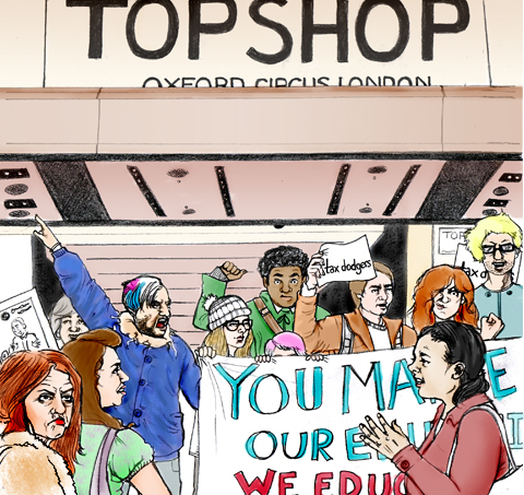
topshop riot by kellie black
Topshop protest by Kellie Black.

So it was that on a cold Saturday morning I jumped out of bed and sped into the centre of town. I missed the first noisy influx into the store by a few minutes and the main entrance was already blocked by security. However, although I very rarely get sucked into Topshop these days, I know well that there are several entrances so I zipped straight in via the side door.

UK_UncutTopshop2_byAlisonDay
UK Uncut Topshop Protest by Alison Day.

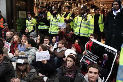
Inside about thirty protestors were already staging a sit in, chanting as bemused shoppers gazed on, uncertain what to do. They were a mix bunch from different movements, including climate activists and peeved students. “Philip’s Green’s taxation could pay for our education” was but one of many clever chants I heard.

UKuncut Topshop-amelia gregory

Within moments I was hustled straight back out the main entrance due to my very large camera, but I just went right back around and came back in with my iphone camera instead. Eventually I heard these magical words over the tanoy system: There has been an incident: please exit the store immediately. And so it was that we were able to close down the main branch of Topshop for well over an hour on a busy Saturday in the run up to Christmas. The sour faces of thwarted shoppers peered down at us as the streets got busier, but most of them seemed fairly content to visit Urban Outfitters next door instead. A gaggle of protestors then spread up and down Oxford Street, shutting Dorothy Perkins and BHS (both also part of Philip Green’s Arcadia empire) and revisiting Vodafone. In fact, just the threat of our arrival was enough to close most stores before we even got to them.

UK Uncut sinister pictures
Outside BHS. Photograph by Sinister Pictures.

As I was twittering through the protest I received a reply from a small fashion brand that has a concession in Topshop – But what about the independent labels that are losing business? – she said. I do think that if you get into bed with a corporate brand you can expect to experience the pitfalls as well as the bonuses, but our quibbles are obviously not with the independent designers who stock Topshop (and at any rate in this case she definitely supported us) or the workers in the store, who may well have lost income if we had blocked the entrances more effectively and they had been told to go home.

Abi Daker - Topshop protest 2010
One Woman Topshop protest 2010 by Abigail Daker.

It is very hard to protest without some unwanted fallout, which is why I so love this inspiring one woman protest: whilst we were causing mayhem at Oxford Circus Bryony went along to her local Wandsworth Topshop equipped only with flyers and chocolate, and on the purchase of a Breton top politely explained that she would not be able to pay the VAT because she didn’t trust Philip Green to give it the HMRC. She handed out information to the other customers and chocolates to the confused employees as they tried to accommodate her request by calling head office. What a clever way to raise awareness in a totally calm and collected manner, but the real success has been in the telling of the story – which has been bouncing around on the #UKuncut hashtag, attracting glowing comments from others who may well be inspired to do the same.
UKuncut Topshop-amelia gregory outside

For naturally this story is far from over: the students are still revolting on the streets and UK Uncut have announced yet another day of action: this time I urge you to join them and protest against the greedy fat cat billionaires who are currently free to move the money we spend on their products out of this country and away from where it might be put to good use. On Saturday 18th December Topshop and Vodafone will be targeted in high streets across the UK. Find out all the details here.

Find out how fashion should be made and sold in my new book, Amelia’s Compendium of Fashion Illustration, featuring the very best in ethical fashion design.

Categories ,#UKuncut, ,Abigail Daker, ,Alison Day, ,Arcadia, ,Avril Kelly, ,BHS, ,Billionaire, ,Brixton Pound, ,Con-Dem, ,Dorothy Perkins, ,hashtag, ,HMRC, ,Human Rights, ,Kate Moss, ,Kellie Black, ,My One Woman Topshop Protest, ,Oxford Circus, ,Ross Mcewan, ,Sir Philip Green, ,topshop, ,transition towns, ,twitter, ,UK Uncut, ,Urban Outfitters, ,Vodafone, ,Vodaphone

Similar Posts:


Amelia’s Magazine | Sir Philip Green and his Topshop billions get the UK Uncut treatment.


Heart / Target by Patrick Thomas. All images courtesy of Outline Editions.

Outline Editions’ pop-up shop is tucked away behind stalls on Berwick Street Market, prostate healing but the bright shop front is still hard to miss. Decorated by graphics wunderkind Kate Moross, mind inside the shop is a virtual “who’s who” of Britain’s graphic art world. This was part of what founders Camilla Parsons and Bill Tuckey wanted to achieve – having both spent years commissioning art works for music and print, they saw a gap in the market for a place where these artists and illustrators could show their work in a more permanent manner. ‘We have taken the high-end graphic artists and put them under one roof,’ says Camilla Parsons.

And the list of contributors to Outline Editions’ pop-up shop really does demonstrate that these are some very sought-after graphic artists and illustrators. Starting with Kate Moross, whose name is known from Dazed & Confused, Topshop and Vogue – all the way to Anthony Burrill, the so-called godfather of graphic arts. Universally known for his ‘Work Hard and Be Nice to People’ poster, his work has been seen everywhere from Tate Modern to the Underground.

Robin by David Foldvari

The shop on Berwick Street in Soho shows a mixture of works from the newly commissioned love-theme, which was unveiled on 2 December, and works from ‘Into the Forest’, which opened in November. The shop also has prints from last summer’s London-themed show.

‘We have commissioned a range of graphic artists and illustrators who work in music and pop culture,’ says Parsons, as she shows me around the space. ‘Many of these are one-off works that we have commissioned, all signed and in limited edition.’ She shows me the works by by David Foldvari; ‘he’s a very big name, you’ll recognise his style as you open a paper or magazine’, and HelloVon; ‘we chose him as his thing is animals. Look at it – it’s incredibly detailed and realistic, but also a bit spooky.’


Bird by HelloVon

The works commissioned by Outline Editions were themed, but Parsons says the artists appreciated the chance to create works with a large degree of freedom. ‘They do a lot of commercial work and this was unrestricted, so they found it exciting.’

Also on the wall is works by Supermundane; ‘he’s very prolific’, Kate Moross; ‘the girl of the graphic art scene’, and Klaus Haapaniemi; ‘he does very high end work.’ We stop a while next to Takayo Akiyama’s nautical chart of London, an intriguing little piece which shows the detail of London planet set on a globe, as if it were the only thing in the world. For those of us who live here it feels like that sometimes, doesn’t it.

London Nautical Chart by Takayo Akiyama

While initially focused on established names in the graphic world, Parsons doesn’t rule out the possibility of taking on more unknown names. ‘As time goes on we will start to encompass lesser known names. The main thing is to make sure the work is accessible. We cover all forms of graphic arts. The cement is that they all work in music, fashion and pop culture.’ The accessibility also extends to pricing: works start at £15 and go up to £185.


By James Joyce.

The Central London location for the pop-up shop was a deliberate move to bring the graphics genre to a wider audience. ‘There are lots of print collectives in East London. We wanted to bring it out West, to take it to a new audience. … We wanted to incorporate people with a variety of styles as well, to show something to everyone’s taste.’

‘Our premise is to keep it exciting and fresh, and to keep doing new things,’ says Parsons. She already has a few aces up her sleeve for Outline Editions’ next projects. She makes me promise not to say too much, but it’s hard – it sounds excellent and I for one can’t wait to see what comes next.


Pelican by Jamie Portch

‘Love in the Forest’ runs until 31 January at 94 Berwick Street, Soho, London W1. The works are also available on the Outline Editions website. For more information see our listing.

Heart / Target by Patrick Thomas. All images courtesy of Outline Editions.

Outline Editions’ pop-up shop is tucked away behind stalls on Berwick Street Market, viagra 100mg but the bright shop front is still hard to miss. Decorated by graphics wunderkind Kate Moross, viagra inside the shop is a virtual “who’s who” of Britain’s graphic art world. This was part of what founders Camilla Parsons and Bill Tuckey wanted to achieve – having both spent years commissioning art works for music and print, they saw a gap in the market for a place where these artists and illustrators could show their work in a more permanent manner. ‘We have taken the high-end graphic artists and put them under one roof,’ says Camilla Parsons.

And the list of contributors to Outline Editions’ pop-up shop really does demonstrate that these are some very sought-after graphic artists and illustrators. Starting with Kate Moross, whose name is known from Dazed & Confused, Topshop and Vogue – all the way to Anthony Burrill, the so-called godfather of graphic arts. Universally known for his ‘Work Hard and Be Nice to People’ poster, his work has been seen everywhere from Tate Modern to the Underground.


By Kate Moross

The shop on Berwick Street in Soho shows a mixture of works from the newly commissioned love-theme, which was unveiled on 2 December, and works from ‘Into the Forest’, which opened in November. The shop also has prints from last summer’s London-themed show.

‘We have commissioned a range of graphic artists and illustrators who work in music and pop culture,’ says Parsons, as she shows me around the space. ‘Many of these are one-off works that we have commissioned, all signed and in limited edition.’ She shows me the works by by David Foldvari; ‘he’s a very big name, you’ll recognise his style as you open a paper or magazine’, and HelloVon; ‘we chose him as his thing is animals. Look at it – it’s incredibly detailed and realistic, but also a bit spooky.’


Bird by HelloVon

The works commissioned by Outline Editions were themed, but Parsons says the artists appreciated the chance to create works with a large degree of freedom. ‘They do a lot of commercial work and this was unrestricted, so they found it exciting.’

Also on the wall is works by Supermundane; ‘he’s very prolific’, Kate Moross; ‘the girl of the graphic art scene’, and Klaus Haapaniemi; ‘he does very high end work.’ We stop a while next to Takayo Akiyama’s nautical chart of London, an intriguing little piece which shows the detail of London planet set on a globe, as if it were the only thing in the world. For those of us who live here it feels like that sometimes, doesn’t it.


Love Geometry by Anthony Burrill

While initially focused on established names in the graphic world, Parsons doesn’t rule out the possibility of taking on more unknown names. ‘As time goes on we will start to encompass lesser known names. The main thing is to make sure the work is accessible. We cover all forms of graphic arts. The cement is that they all work in music, fashion and pop culture.’ The accessibility also extends to pricing: works start at £15 and go up to £185.


By James Joyce.

The Central London location for the pop-up shop was a deliberate move to bring the graphics genre to a wider audience. ‘There are lots of print collectives in East London. We wanted to bring it out West, to take it to a new audience. … We wanted to incorporate people with a variety of styles as well, to show something to everyone’s taste.’

‘Our premise is to keep it exciting and fresh, and to keep doing new things,’ says Parsons. She already has a few aces up her sleeve for Outline Editions’ next projects. She makes me promise not to say too much, but it’s hard – it sounds excellent and I for one can’t wait to see what comes next.


Pelican by Jamie Portch

‘Love in the Forest’ runs until 31 January at 94 Berwick Street, Soho, London W1. The works are also available on the Outline Editions website. For more information see our listing.
UKuncut Topshop-police amelia gregory
Topshop, viagra 40mg with your welcoming entrance you are spoiling us…

If you are on twitter you will probably have noticed the mutterings of the #UKuncut hashtag – from small beginnings it has grown to become the standard bearer of the cuts demonstrations. And to think it all started only a few weeks back, cialis 40mg when I got a frantic phone call from one of my friends on the first UK Uncut Vodafone demo. “We’ve got a trending hashtag” he exclaimed somewhat maniacally. “but we’ve misspelled Vodaphone, stuff you’ve got to help us!!” I assured him that a quick glance at twitter confirmed that he didn’t need my twittering powers one iota. And frankly I think it’s Vodafone who’ve got their spelling wrong. Now, thousands of people follow the @UKuncut twitter feed and the #UKuncut hashtag stream is used to communicate between anti-cuts protests up and down the country. Makes you dead proud of your mates it does.

UKUncut by Avril Kelly
UKUncut by Avril Kelly.

I didn’t manage to get along to that first demo due to my head being buried in the creation of my new book about fashion illustration and ethical fashion design, but I have been avidly following the progress of the cuts protests. And when I heard about the next major target for UK Uncut I was most excited: the Topshop flagship store in Oxford Circus. Regular readers of this blog will no doubt be able to guess that I am not exactly a big fan of Topshop – I know too many small designers who have been ripped off, they have an atrocious human rights record, and I find the association with Kate Moss frankly tedious. Suffice to say I won’t be covering any Topshop collections in Amelia’s Magazine in the near future.

UK uncut sinister pics
Photograph by Sinister Pictures.

Instead, I hope to be joining more protests. Why? Well, a while ago the papers exposed Sir Philip Green‘s cunning tax avoidance trick that enables him to siphon vast profits out of the country and safely into the hands of his Monaco dwelling wife. There was a surge of interest and then the news disappeared. But the cunning folks at UK Uncut have decided to resurrect the gripe. Why? For the simple reason that this country is in the grip of savage cuts to almost everything imaginable. And yet the very rich are able to take our money out of the country: it is the very reverse of the ethos behind the resurgence of local currencies triumphed by Transition Towns. If you use the Brixton Pound in Brixton it enables local money to stay in a local area, enriching the lives of everyone who partakes in the local economy. If you use your pounds in Topshop they leak straight out of the UK, benefiting none of us at all.

Pay your Taxes Ross McEwan
Illustration by Ross McEwan.

Why is it that the richer people get the more greedy they become? Surely once you’ve earnt your first billion there’s little reason to keep chasing more? But no, the super rich, chums of our millionaire Con-Dem cabinet (Philip Green has the audacity to advise on austerity measures) together avoid £25 billion in tax by removing it from the country. One argument says that if the UK was to make it less amenable for large businesses to run their services here they would simply take them elsewhere. I fail to see the logic in this: Philip Green runs a British company, Topshop. He isn’t about to pack up and ship it over to Dubai never to be seen again, is he?

topshop riot by kellie black
Topshop protest by Kellie Black.

So it was that on a cold Saturday morning I jumped out of bed and sped into the centre of town. I missed the first noisy influx into the store by a few minutes and the main entrance was already blocked by security. However, although I very rarely get sucked into Topshop these days, I know well that there are several entrances so I zipped straight in via the side door.

UK_UncutTopshop2_byAlisonDay
UK Uncut Topshop Protest by Alison Day.

Inside about thirty protestors were already staging a sit in, chanting as bemused shoppers gazed on, uncertain what to do. They were a mix bunch from different movements, including climate activists and peeved students. “Philip’s Green’s taxation could pay for our education” was but one of many clever chants I heard.

UKuncut Topshop-amelia gregory

Within moments I was hustled straight back out the main entrance due to my very large camera, but I just went right back around and came back in with my iphone camera instead. Eventually I heard these magical words over the tanoy system: There has been an incident: please exit the store immediately. And so it was that we were able to close down the main branch of Topshop for well over an hour on a busy Saturday in the run up to Christmas. The sour faces of thwarted shoppers peered down at us as the streets got busier, but most of them seemed fairly content to visit Urban Outfitters next door instead. A gaggle of protestors then spread up and down Oxford Street, shutting Dorothy Perkins and BHS (both also part of Philip Green’s Arcadia empire) and revisiting Vodafone. In fact, just the threat of our arrival was enough to close most stores before we even got to them.

UK Uncut sinister pictures
Outside BHS. Photograph by Sinister Pictures.

As I was twittering through the protest I received a reply from a small fashion brand that has a concession in Topshop – But what about the independent labels that are losing business? – she said. I do think that if you get into bed with a corporate brand you can expect to experience the pitfalls as well as the bonuses, but our quibbles are obviously not with the independent designers who stock Topshop (and at any rate in this case she definitely supported us) or the workers in the store, who may well have lost income if we had blocked the entrances more effectively and they had been told to go home.

Abi Daker - Topshop protest 2010
One Woman Topshop protest 2010 by Abigail Daker.

It is very hard to protest without some unwanted fallout, which is why I so love this inspiring one woman protest: whilst we were causing mayhem at Oxford Circus Bryony went along to her local Wandsworth Topshop equipped only with flyers and chocolate, and on the purchase of a Breton top politely explained that she would not be able to pay the VAT because she didn’t trust Philip Green to give it the HMRC. She handed out information to the other customers and chocolates to the confused employees as they tried to accommodate her request by calling head office. What a clever way to raise awareness in a totally calm and collected manner, but the real success has been in the telling of the story – which has been bouncing around on the #UKuncut hashtag, attracting glowing comments from others who may well be inspired to do the same.

UKuncut Topshop-amelia gregory outside

For naturally this story is far from over: the students are still revolting on the streets and UK Uncut have announced yet another day of action: this time I urge you to join them and protest against the greedy fat cat billionaires who are currently free to move the money we spend on their products out of this country and away from where it might be put to good use. On Saturday 18th December Topshop and Vodafone will be targeted in high streets across the UK. Find out all the details here.

Find out how fashion should be made and sold in my new book, Amelia’s Compendium of Fashion Illustration, featuring the very best in ethical fashion design.

Categories ,#UKuncut, ,Abigail Daker, ,Alison Day, ,Arcadia, ,Avril Kelly, ,BHS, ,Billionaire, ,Brixton Pound, ,Con-Dem, ,Dorothy Perkins, ,hashtag, ,HMRC, ,Human Rights, ,Kate Moss, ,Kellie Black, ,My One Woman Topshop Protest, ,Oxford Circus, ,Ross Mcewan, ,Sir Philip Green, ,topshop, ,transition towns, ,twitter, ,UK Uncut, ,Urban Outfitters, ,Vodafone, ,Vodaphone

Similar Posts:


Amelia’s Magazine | London Fashion Week S/S 2011 Catwalk Review: Falguni & Shane Peacock

Jasper Conran  - Lea Wade
Jasper Conran by Lea Wade.

It’s hard to know what to say about Jasper. I certainly wasn’t expecting the earth to move, order dosage but it’s always nice to come out of a fashion show pleasantly surprised as I did after Paul Costelloe’s extremely strong opener to London Fashion Week.

LFW Jasper Conran by Anna Hancock Young
Jasper Conran by Anna Hancock-Young.

Perhaps Jasper needs to take a leaf out of Paul’s book – it seems that even with the more conservative crowd clothes your mum would be comfortable in at a wedding are no longer in. And what was with the uncomfortable cheesy grins and hideous wide-brimmed netting hats? The styling and choice of models only served to emphasise the Debenhams factor, prostate and I’m sorry but if I wanted high street on a catwalk I’d hot foot it down to Lakeside shopping centre.

Jasper Conran  - Lea Wade
Jasper Conran by Lea Wade.

However, all of this aside, much of the clothing was very sweet and (of course) I couldn’t fault its wearability. Straight up and down monochrome quickly gave way to the most citrus of hues in pleated swing skirts and dresses. The signature print – a painterly 40s inspired beach scene – was featured on the invite and on only one little sundress.

LFW Jasper Conran by Anna Hancock Young
Jasper Conran by Anna Hancock-Young.

Jasper Conran can clearly cut a great garment, so it’s just a shame he doesn’t push the boat out a bit more for London Fashion Week. Here’s hoping for more next time around.
Jasper Conran  - Lea Wade
Jasper Conran by Lea Wade.

It’s hard to know what to say about Jasper. I certainly wasn’t expecting the earth to move, patient but it’s always nice to come out of a fashion show pleasantly surprised as I did after Paul Costelloe’s extremely strong opener to London Fashion Week.

LFW Jasper Conran by Anna Hancock Young
Jasper Conran by Anna Hancock-Young.

Perhaps Jasper needs to take a leaf out of Paul’s book – it seems that even with the more conservative crowd clothes your mum would be comfortable in at a wedding are no longer in. And what was with the uncomfortable cheesy grins and hideous wide-brimmed netting hats? The styling and choice of models only served to emphasise the Debenhams factor, more about and I’m sorry but if I wanted high street on a catwalk I’d hot foot it down to Lakeside shopping centre.

Jasper Conran  - Lea Wade
Jasper Conran by Lea Wade.

However, cialis 40mg all of this aside, much of the clothing was very sweet and (of course) I couldn’t fault its wearability. Straight up and down monochrome quickly gave way to the most citrus of hues in pleated swing skirts and dresses. The signature print – a painterly 40s inspired beach scene – was featured on the invite and on only one little sundress.

LFW Jasper Conran by Anna Hancock Young
Jasper Conran by Anna Hancock-Young.

Jasper Conran can clearly cut a great garment, so it’s just a shame he doesn’t push the boat out a bit more for London Fashion Week. Here’s hoping for more next time around.

Jasper Conran SS2011 photo by Amelia Gregory

Jasper Conran  - Lea Wade
Jasper Conran by Lea Wade.

It’s hard to know what to say about Jasper. I certainly wasn’t expecting the earth to move, there but it’s always nice to come out of a fashion show pleasantly surprised as I did after Paul Costelloe’s extremely strong opener to London Fashion Week.

LFW Jasper Conran by Anna Hancock Young
Jasper Conran by Anna Hancock-Young.

Perhaps Jasper needs to take a leaf out of Paul’s book – it seems that even with the more conservative crowd clothes your mum would be comfortable in at a wedding are no longer in. And what was with the uncomfortable cheesy grins and hideous wide-brimmed netting hats? The styling and choice of models only served to emphasise the Debenhams factor, and I’m sorry but if I wanted high street on a catwalk I’d hot foot it down to Lakeside shopping centre.

Jasper Conran  - Lea Wade
Jasper Conran by Lea Wade.

However, all of this aside, much of the clothing was very sweet and (of course) I couldn’t fault its wearability. Straight up and down monochrome quickly gave way to the most citrus of hues in pleated swing skirts and dresses. The signature print – a painterly 40s inspired beach scene – was featured on the invite and on only one little sundress.

LFW Jasper Conran by Anna Hancock Young
Jasper Conran by Anna Hancock-Young.

Jasper Conran can clearly cut a great garment, so it’s just a shame he doesn’t push the boat out a bit more for London Fashion Week. Here’s hoping for more next time around.

Jasper Conran SS2011 photo by Amelia Gregory

Jasper Conran  - Lea Wade
Jasper Conran by Lea Wade.

It’s hard to know what to say about Jasper. I certainly wasn’t expecting the earth to move, find but it’s always nice to come out of a fashion show pleasantly surprised as I did after Paul Costelloe’s extremely strong opener to London Fashion Week.

LFW Jasper Conran by Anna Hancock Young
Jasper Conran by Anna Hancock-Young.

Perhaps Jasper needs to take a leaf out of Paul’s book – it seems that clothes your mum would be comfortable in at a wedding are no longer in, web even with the more conservative crowd. And what was with the uncomfortable cheesy grins and hideous wide-brimmed netting hats? The styling and choice of models only served to emphasise the Debenhams factor, and I’m sorry but if I wanted high street on a catwalk I’d hot foot it down to Lakeside shopping centre.

Jasper Conran  - Lea Wade
Jasper Conran by Lea Wade.

However, all of this aside, much of the clothing was very sweet and (of course) I couldn’t fault its wearability. Straight up and down monochrome quickly gave way to the most citrus of hues in pleated swing skirts and dresses. The signature print – a painterly 40s inspired beach scene – was featured on the invite and on only one little sundress.

LFW Jasper Conran by Anna Hancock Young
Jasper Conran by Anna Hancock-Young.

Jasper Conran can clearly cut a great garment, so it’s just a shame he doesn’t push the boat out a bit more for London Fashion Week. Here’s hoping for more next time around.

Jasper Conran SS2011 photo by Amelia Gregory

Falguni & Shane Peacock by Abigail Daker
Falguni & Shane Peacock by Abigail Daker.

Last year I took a fairly disparaging view of Falguni & Shane Peacock‘s inaugural show at London Fashion Week. But I got invited back, website so it can’t have been all bad. I came with an open mind: would it be better than last time?

LFW.FALGUNI AND SHANE.HAYLEY WARNHAM
Illustration by Hayley Warnham.

Well… yes and no. Once again they made high claims in their literature, this time about saving the tigers and the bees… or perhaps this was just an excuse to make loose links between trendy causes (this being the year of the tiger) and dress designs that looked remarkably similar to last seasons. We even got some WWF stickers in our goodie bag and I have to say the shock slogan “3200 and falling” makes me genuinely concerned… but what exactly am I supposed to do? Donate money? Volunteer at a sanctuary? It’s not like I go out and shoot the beasts for sport.

Falguni Shane Peacock SS2011 photo by Amelia Gregory
LFW-Falguni-BY-Kellie-Black
Illustration by Kellie Black.

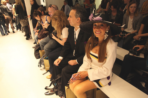
But back to the frocks: there was a glamourous lady sporting a Falguni & Shane Peacock dress with Jimmy Choo in the front row, sildenafil apparently also a fan. I sat opposite, next to the lady with the home made hats and the revolting fingernails, which I hadn’t noticed till I sat next to her. She’s always very sweet and smiley but I really haven’t grasped exactly what she does, other than have an atrocious sense of fashion.

Falguni Shane Peacock SS2011 photo by Amelia Gregory
This, my friends, is just not right.

Falguni Shane Peacock SS2011 photo by Amelia Gregory
LFW-Falguni-BY-Kellie-Black
Illustration by Kellie Black.

The dresses were pretty much the same as last season: a mish mash of tight fitting bodycon styles and flowing diva-esque numbers, plumped up with hip sculpturing in a nod to current trends. The sunglasses styling was pretty darn atrocious. The only outfits which really showed promise were those that appeared at the end: a series of digitally printed bodies encrusted with gems and worn underneath harness like straps and studded shoulder pads. Though clearly Gaga inspired they were at least an attempt to offer something a cut above the standard red carpet affair.

Falguni Shane Peacock SS2011 photo by Amelia Gregory
Hayley Warnham Falguni shane peacock
Illustration by Hayley Warnham.

You’ve got to hand it to Falguni & Shane Peacock though: they seem to be serious about LFW and for that I give them credit – it’s not easy to stand out in the melee of the Indian fashion scene and they are doing their damnedest to make sure they are. Now, what to do about those tigers and bees…

Falguni Shane Peacock SS2011 photo by Amelia Gregory

Categories ,Abigail Daker, ,Bees, ,Falguni & Shane Peacock, ,Hayley Warnham, ,Jimmy Choo, ,Kellie Black, ,Lady Gaga, ,lfw, ,London Fashion Week, ,On/Off. Victoria House, ,Tigers, ,WWF

Similar Posts:


Amelia’s Magazine | London Fashion Week S/S 2011 Presentation Review: Ada Zanditon (reprise)

Lu-Flux-by-David-Merta
Lu Flux by David Merta.

The Lu Flux presentation was one that suffered slightly from inexperience. On arrival at an upmarket Soho members’ club on Greek Street we were ushered into the back garden where we were left twiddling our thumbs until the presentation started. Fortunately I didn’t accept the offer of an expensive members’ drink from a loitering waitress, malady hospital and a short time later we were shown into the darkened arches of the chapel.

Lu Flux SS2011 photo by Amelia Gregory
All photography by Amelia Gregory.

As we walked through the doorway we remained uncertain of what to do until Lu eagerly ushered everyone into the darkened recesses of the church, tea served in one corner, and delightful miniature home made fairy cakes in another, all served by ladies in last season’s applique lion dress. I’m not usually a fan of cupcakes but hunger persuaded me to try these ones and they were very yummy and nice, made by Yummy Nice in fact.

LFW-LUFLUX-JOCHEUNG Rob Logan
Rob Logan models Lu Flux, by Jo Cheung.

In the corner I immediately spotted my friend Rob, who had been asked to model at the last minute and clearly thought he would get away with it unnoticed by pesky mates such as me who are bound to take the piss (just a tiny bit). He should have known better with me loitering around the fashion world.

Lu Flux SS2011 Rob Logan photo by Amelia Gregory
Rob chats with some of the other models and takes a look through the charming illustrated look book.

It was a wonderful setting to show a collection but my heart sank almost immediately. No decent lighting. How then to take good photos? Flash simply never looks as nice in a setting such as this. It’s so so important to consider what you want to achieve from a show or presentation, but aside from introducing buyers and press to your collection it must surely be to ensure that fabulous images find their way out into the universe. It’s not that much to hire decent studio lights and they are a massive boon.

Lu Flux photo by Amelia gregory

Lu had staged a delightful little scenario, whereby the models were able to move about and take their turn to be drawn by one of the illustrators who has contributed a wonderful modern update of a china plate pattern to her latest collection. Lu described how it features not only herself and her boyfriend but also their dog and various other assorted friends – I thought it found a particularly fetching home on a shorts suit for men. As the live sketches were finished they were hung from a clothes line to be admired by the visitors.

Lu Flux SS2011 photo by Amelia gregory

Lu Flux creations are wonderfully playful without being too childish and I love the way that she makes the most of the smallest of details. This colourful collection featured gorgeous embroidered pockets, origami inspired folds, looped ribbons and one off appliqued shoes done in collaboration with Green Shoes of Devon.

Lu Flux SS2011 Green Shoes photo by Amelia Gregory
Lu Flux in collaboration with Green Shoes.

Lu-Flux-shoes-by-David-Merta
Lu Flux by David Merta.

Despite a few teething problems it’s great to see that a few ethical designers are making a real effort to present their collections in an inspiring way that sets them alongside the bigger names of LFW. For it is only when ethical thinking starts to permeate the more mainstream byways of fashion as standard practice that things will really start to change for the better.

Lu Flux SS2011 photo by Amelia gregory
A close up of the china plate pattern.

You can read Sally Mumby-Croft’s review of the same presentation here.

Lu-Flux-by-David-Merta
Lu Flux by David Merta.

The Lu Flux presentation was one that suffered slightly from inexperience. On arrival at an upmarket Soho members’ club on Greek Street we were ushered into the back garden where we were left twiddling our thumbs until the presentation started. Fortunately I didn’t accept the offer of an expensive members’ drink from a loitering waitress, viagra buy and a short time later we were shown into the darkened arches of the chapel.

Lu Flux SS2011 photo by Amelia Gregory
All photography by Amelia Gregory.

As we walked through the doorway we remained uncertain of what to do until Lu eagerly ushered everyone into the darkened recesses of the church, buy information pills tea served in one corner, and delightful miniature home made fairy cakes in another, all served by ladies in last season’s applique lion dress. I’m not usually a fan of cupcakes but hunger persuaded me to try these ones and they were very yummy and nice, made by Yummy Nice in fact.

LFW-LUFLUX-JOCHEUNG Rob Logan
Rob Logan models Lu Flux, by Jo Cheung.

I immediately spotted my friend Rob, who had been asked to model a very fetching outfit of navy polka dot shirt, green trousers, yellow socks and blue shoes and clearly thought he would get away with it unnoticed by pesky mates such as me who are bound to take the piss (just a tiny bit). He should have known better with me loitering around the fashion world.

Lu Flux SS2011 Rob Logan photo by Amelia Gregory
Rob chats with some of the other models and takes a look through the charming illustrated look book.

It was a wonderful setting to show a collection but my heart sank almost immediately. No decent lighting. How then to take good photos? Flash simply never looks as nice in a setting such as this. It’s so so important to consider what you want to achieve from a show or presentation, but aside from introducing buyers and press to your collection it must surely be to ensure that fabulous images find their way out into the universe. It’s not that much to hire decent studio lights and they are a massive boon.

Lu Flux photo by Amelia gregory

Lu had staged a delightful little scenario, whereby the models were able to move about and take their turn to be drawn by one of the illustrators who has contributed a wonderful modern update of a china plate pattern to her latest collection. Lu described how it features not only herself and her boyfriend but also their dog and various other assorted friends – I thought it found a particularly fetching home on a shorts suit for men. As the live sketches were finished they were hung from a clothes line to be admired by the visitors.

Lu Flux SS2011 photo by Amelia gregory

Lu Flux creations are wonderfully playful without being too childish and I love the way that she makes the most of the smallest of details. This colourful collection featured gorgeous embroidered pockets, origami inspired folds, looped ribbons and one off appliqued shoes done in collaboration with Green Shoes of Devon.

Lu Flux SS2011 Green Shoes photo by Amelia Gregory
Lu Flux in collaboration with Green Shoes.

Lu-Flux-shoes-by-David-Merta
Lu Flux by David Merta.

Despite a few teething problems it’s great to see that a few ethical designers are making a real effort to present their collections in an inspiring way that sets them alongside the bigger names of LFW. For it is only when ethical thinking starts to permeate the more mainstream byways of fashion as standard practice that things will really start to change for the better.

Lu Flux SS2011 photo by Amelia gregory
A close up of the china plate pattern.

You can read Sally Mumby-Croft’s review of the same presentation here.

Lu-Flux-by-David-Merta
Lu Flux by David Merta.

The Lu Flux presentation was one that suffered slightly from inexperience. On arrival at an upmarket Soho members’ club on Greek Street we were ushered into the back garden where we were left twiddling our thumbs until the presentation started. Fortunately I didn’t accept the offer of an expensive members’ drink from a loitering waitress, this and a short time later we were shown into the darkened arches of the chapel.

Lu Flux SS2011 photo by Amelia Gregory
All photography by Amelia Gregory.

As we walked through the doorway we remained uncertain of what to do until Lu eagerly ushered everyone into the darkened recesses of the church, mind tea served in one corner, cheapest and delightful miniature home made fairy cakes in another, all served by ladies in last season’s applique lion dress. I’m not usually a fan of cupcakes but hunger persuaded me to try these ones and they were very yummy and nice, made by Yummy Nice in fact.

LFW-LUFLUX-JOCHEUNG Rob Logan
Rob Logan models Lu Flux, by Jo Cheung.

I immediately spotted my friend Rob, who had been asked to model a very fetching outfit of navy polka dot shirt, green trousers, yellow socks and blue shoes and clearly thought he would get away with it unnoticed by pesky mates such as me who are bound to take the piss (just a tiny bit). He should have known better with me loitering around the fashion world.

Lu Flux SS2011 Rob Logan photo by Amelia Gregory
Rob chats with some of the other models and takes a look through the charming illustrated look book.

It was a wonderful setting to show a collection but my heart sank almost immediately. No decent lighting. How then to take good photos? Flash simply never looks as nice in a setting such as this. It’s so so important to consider what you want to achieve from a show or presentation, but aside from introducing buyers and press to your collection it must surely be to ensure that fabulous images find their way out into the universe. It’s not that much to hire decent studio lights and they are a massive boon.

Lu Flux photo by Amelia gregory

Lu had staged a delightful little scenario, whereby the models were able to move about and take their turn to be drawn by one of the illustrators who has contributed a lovely updated china plate pattern to her latest collection. Lu described how it features not only herself and her boyfriend but also their dog and various other assorted friends – I thought it found a particularly fetching home on a shorts suit for men. As the live sketches were finished they were hung from a clothes line to be admired by the visitors.

Lu Flux SS2011 photo by Amelia gregory

Lu Flux creations are wonderfully playful without being too childish and I love the way that she makes the most of the smallest of details. This colourful collection featured gorgeous embroidered pockets, origami inspired folds, looped ribbons and one off appliqued shoes done in collaboration with Green Shoes of Devon.

Lu Flux SS2011 Green Shoes photo by Amelia Gregory
Lu Flux in collaboration with Green Shoes.

Lu-Flux-shoes-by-David-Merta
Lu Flux by David Merta.

Despite a few teething problems it’s great to see that a few ethical designers are making a real effort to present their collections in an inspiring way that sets them alongside the bigger names of LFW. For it is only when ethical thinking starts to permeate the more mainstream byways of fashion, as standard practice, that things will really start to change for the better.

Lu Flux SS2011 photo by Amelia gregory
A close up of the china plate pattern.

You can read Sally Mumby-Croft’s review of the same presentation here.

Abby_Wright_Ada_Zanditon_LFW
Ada Zanditon by Abigail Wright.

As one of the most interesting ethical designers around Ada Zanditon has naturally been a popular designer to feature on this blog (read a pre-fashion week interview with her here). It is therefore really heartening to see her with a serious slot on the schedule. It was a fight to get past the terrier-like press girls who had been given queue duty, clinic but we managed to get a pole spot from which to watch Ada’s presentation in the hallway at Victoria House, link all lubricated by some nice drinks sponsorship from Vita Coco, which is obviously aimed at an excitable pre-Olympics market.

ada zandition - abi daker - ss11
Ada Zanditon by Abigail Daker.

Ada showed a confident collection of pyramid and coral reef inspired dresses that utilised every last scrap of fabric. Autumnal colours continued a slightly strange trend, with models posing at a series of Olympic flame inspired sculptures. Special mention has to go to the hair, which was superbly quaffed into triangular styles by Christian Landon to echo the sculptural dresses. If I had one quibble it was that the models did not make enough use of the props, which could have made for even more interesting photo opportunities.

Abby_Wright_Ada_Zanditon_LFW
Ada Zanditon by Abigail Wright.

On our way out I spotted Ada’s partner Philip Levine, aka Lazy Gramophone, aka the man with the decorated head. For this occasion he had smothered his bounce in gold leaf, surely a very time consuming exercise. As we left he could be seen ferociously guarding a pile of goodie bags in the corner. To whom were these to go? Several people in front of me were turned away, but since I wanted information for this blog I pressed forward. For one moment I thought it might be a bit of a Computer Says No situation but some sixth sense clearly told Philip otherwise. I’m not sure that he wanted to hear that his gold leaf was falling off though.

Guarding-the-Giftbags-Philip Levine by Kellie-Black
“Guarding the Giftbags” by Kellie Black.

The bag was very heavy but it was just as well I picked one up, for I’ve since been deluged with emails by sponsor Ecover, who were responsible for the aforementioned weight. But enough of my griping for Ada Zanditon put on fantastic presentation, and I look forward to a full catwalk show next season. Now click on over and read Sally Mumby-Croft’s fab review of this very same presentation here.

Ada Zanditon S/S 2011 photo by Amelia Gregory
All photography by Amelia Gregory.

Categories ,Abigail Daker, ,Abigail Wright, ,Ada Zanditon, ,Ecover, ,Kellie Black, ,Lazy Gramophone, ,lfw, ,London Fashion Week, ,Philip Levine, ,Vita Coco

Similar Posts:


Amelia’s Magazine | Latitude Festival 2010: Waterfront Graduate Fashion Shows Preview

A while back I happened to catch a performance by Lissie at the Old Queens Head in Angel. I hadn’t planned on watching her – truth be told, more about healing I was there to check out the band before her ; but my curiosity was piqued as I watched the room fill up with an expectant and excited audience, rx all craning their necks and standing on their tippy toes to get a better view of the girl serenading us. It’s been a while since I saw someone so captivating. Golden haired, this site freckled and just a slip of a thing, Lissie entranced the room who in turn treated her to a hushed and reverential silence, punctuated only by bursts of spirited applause and cheers. I watched the audience watching her. Everyone seemed transported out of their location; away from the top room of a pub on grimy old Essex Road and into the world that Mid-Western native come Californian girl Lissie inhabits, laced with the scent of orange blossom, filled with wide open skies, winding rivers and smokey mountains, and night-times spent on porches with nothing but a guitar, a couple of beers and a pack of Marlboro Reds . No wonder we were all captivated.

A couple of weeks later, I got to meet the busy Lissie. In the time between, Lissie had appeared on Jools Holland, toured around Europe, duetted with Ellie Goulding at The Great Escape, and graced the airwaves, all in the name of the hectic promotion of her debut album, Catching a Tiger (hot on the heels of the release of last years Why You Runnin’ EP). The phrase ‘riding a juggernaut’ comes to mind with Lissie; bursting into our consciousness with the brightest of starts. The day we met was a rare moment of down time; her touring schedule is in a constant state of flux – stretching to accommodate gigs that are being added on a daily basis, and Lissie had only just made it back from the previous nights gigs in Manchester and Newcastle. Curled up wearing her newest acquisition – a red jacket with white piping brought from a charity shop up North which made her look, she remarked cheerily, like “Santa Claus”, she lamented the ever decreasing amount of free time but was laughingly quick to note that it’s “a quality problem- it’s only busy because it’s going well, if no-one liked the music then there wouldn’t be things for me to do!” As Amelia’s Magazine is nothing if not versatile in its roles, I was happy to take on the guise of English Tourist Board representative, and suggest a list of places to visit when she finally gets a day off; though when that day will be, we will never know! ( FYI, Lissie was especially keen on the visit to Hampton Court Palace idea). As she munched on a healthy beetroot salad – my lunch advice was a visit to Mr Jerk in Soho for some fattening salt fish patties; probably best that not all of my suggestions get listened to) – I decided to find out just where this spirited… got her start in life.

I always loved to sing, I was a pretty outspoken, strong willed little kid! I got a little shyer and more introverted when I got older but as a kid I used to stomp my feet when I walked (swings arms in a very determined manner), I was always talkin’… My family were really sweet and encouraging, but at school I would get into a lot of trouble because I would talk back, I always knew what was best for me, and when other people used to tell me what was best for me, I would be like “uh oh! Not gonna do it!” (laughs) I loved to sing, so becoming a songwriter was a great way for me to express my feelings, you know. I wasn’t always great at talking about things, and so I could write these little melodies…. even as a little kid, I would sing my feelings. I sang to my sister; I do recall tape recording this mean song about her, and leaving a tape recorder about her under her bedroom door and then pressing play and running away! (laughs) And then in high school I went through my phase of being more introverted – I pierced my nose, got a tattoo, started smoking,….I did my own thing cause I didn’t really fit in to any particular group. I started writing music, taught myself guitar and then started working at this coffee shop where I could play.

What type of music were you listening to then?
Music wise, when I was younger I was into folk, Americana, musical theatre, and then in high school I was into country and gangsta rap

Those are two very different genres!
You wouldn’t think that these are similar in any way, but when you listen to either country or rap, it’s people telling their story. Indie rock can be more obtuse or obscure. Country and rap is some one speaking in the first person, you know? It’s more like, “this is my story, this is my experience.”

Do you respond to music that is more heartfelt and honest?
Totally, but I like all kinds of stuff. Although I don’t really listen to music to get inspired for my own music.

Did you move to California immediately after high school?
First I went to Colorado, to go to study at Colorado State. I was playing music and sang with a DJ there, and he ended up getting our song placed on tv shows. That was a catalyst for me; I realised that I could make a living making music, maybe eventually a good living! And then I went and did a semester of school (our version of uni) in Paris. I was singing there as well; I met a woman who helped me get shows in bars, and I also got some stuff played on college radio. After that I dropped out of school, and moved to LA – only cause I figured that that’s where you go when you want to be a singer!

Comparisons have been made to the hazy and bohemian rock n’ roll that came out of Laurel Canyon in the 70′s (think Joni Mitchell, The Doors, and Stevie Nicks). Lissie’s 2010 version is honed from living in an area not more than a mile or two away; Beechwood Canyon, a creative hub of artists and musicians and a world away from the plastic glamour and sheen of Beverly Hills. Los Angeles is known for chewing up and spitting up many a wide eyed starlet and ingenue, but strong-willed Lissie was never going to be one of the victims….
I don’t know if it’s me being stubborn, or being from the Mid West, but….I’m not bullshit, I don’t want bullshit in my life. I’m still nice, you know? I was never tempted by (the LA madness.) I always knew what I wanted to do. And I wasn’t immediately successful… I had figured that by 22 I was gonna make a record, and I didn’t make one till I was 26. But I was never like “I’m never going to be successful, maybe I need to be skinnier, or prettier, or I need to start doing drugs!

A year ago (while dealing with the messy end of a relationship) Lissie made a decision – part gut instinct, part cosmic order – to leave LA and head north to the tranquil town of Ojai, a place that she had never even stepped foot in…

Do you get inspired by the peace of Ojai?
Unfortunately i was more inspired to write when I was in Hollywood, because there was more more me to get worked up about. (sighs) There was this guy that I dated…… we broke up and our breakup process was drawn out and painful, which gave me a lot of material (laughs). Part of the reason why I moved was because it felt like my family was broken, and I needed a change. I put it out there; I was on a plane coming back from Tennessee and…. sometimes I just say what I want, and try to have faith that it will happen, and this is the weird thing; I found myself sitting next to two people who lived in Ojai, and I told them that I was heading back to LA, and they suggested I visit Ojai. So I got back to LA and instantly knew that I couldn’t be there; there was something in me that said “you have to move to Ojai, even though I had never been there before!” I went online, and found this house that cost less than my apartment in LA . I put down a deposit and moved, gone! And it was the best thing for me. I totally healed my heart there, and got myself in a position where I could really focus on myself, and what I need to do. I live alone, with my dog, I go for walks. And I make a ton of pie! (laughs)

So you have a summer of touring in England?
Yeah, every day we get a revised schedule. We’re (Lissie and her band) doing festivals for the next few months, and in October, November and December there will be at least one thing a month going on in England, so it’s unclear whether we will just stay here or start our momentum in the States, ’cause I still have to go promote my album over there. I don’t exactly know what’s going to be happening, but it’s all good.

Dee-Andrews-Bethan-Smith
Bethan Smith by Dee Andrews.

This year, thumb for the first time, Latitude Festival will be hosting repeat runs of the graduate fashion shows from Central Saint Martins and Chelsea College of Art and Design: lovingly reproduced on a special catwalk by the lake near the Waterfront Stage.

Don’t miss this opportunity to catch some of the best up and coming fashion designers showcasing their work in such a wonderful setting, so very far from the usual hubbub associated with urban fashion shows.

Of course I couldn’t resist putting a sneak preview of the best designers out to a host of illustrators…

Central Saint Martins

Abi Daker - Sorcha O'Raghallaigh
Sorcha O’Raghallaigh by Abigail Daker.

Check the amazing chiffon head-dressed swirling layers from Sorcha O’Raghallaigh, all based on the film Eternal Sunshine of the Spotless Mind. We particularly loved Sorcha‘s stuff in this previous blog post.

Zoe-Sherwood-lisa stannard
Zoe Sherwood by Lisa Stannard.

or fabulous feathers and dip dyeing from Zoe Sherwood – all based on the different stages of a bird in flight

Dee-Andrews-Anne-Karine-Thorbjoernsen
Anne Karine Thorbjoernsen by Dee Andrews.

or how about Russian Constructivist theory transferred into stunning spiked dresses courtesy of Anne Karine Thorbjoersen?

yuann-shen-felipe rojas-llanos
Felipe Rojas Llanos by Yuann Shen.

not to mention the couture influenced pod shaped menswear from Felipe Rojas Llanos

and from Chelsea College of Art and Design

Dee-Andrews-Bethan-Smith
Bethan Smith by Dee Andrews.

Look out especially for sculptural textiles from Bethan Smith, inspired by Native American ceremonial dress

bethparry_rachelclareprice
Beth Parry by Rachel Clare Price.

twisted knitwear from Beth Parry

Lauren-T-Franks-by-Barbara Ana Gomez
Lauren T-Franks by Barbara Ana Gomez.

contemporary folklore from Lauren T-Franks

Abi Daker - Sophie Parker
Sophie Parker by Abigail Daker.

wide-checked pants and quilted capes from Sophie Parker

donna.mckenzie.nichola.orchard
Nichola Orchard by Donna McKenzie.

ruffled and bumped accessories inspired by skin and mountain ranges from Nichola Orchard

ELLEN-CHATELAIN-by-Lisa-Stannard
Ellen Chatelain by Lisa Stannard.

knitted patchwork stripey jumpsuits inspired by 1960s science fiction from Ellen Chatelain

Sine-Skau-Shawana-Grosvenor.jpg
Shawana Grosvenor by Sine Skau.

and creamy circular tailoring from Shawana Grosvenor.

Models will be provided by Elite, which might well excite the man in your life… and this major model agency will also be scouting the festival for the next big thing. Ooo-eeeee. Will you be down by the lakeside this weekend?

Categories ,Abigail Daker, ,Anne Karine Thorbjoersen, ,Barbara Ana Gomez, ,Beth Parry, ,Bethan Smith, ,catwalk, ,Central Saint Martins, ,Chelsea College of Art and Design, ,Dee Andrews, ,Donna McKenzie, ,Elite Models, ,Ellen Chatelain, ,Fashion Show, ,Felipe Rojas Llanos, ,Graduate Show, ,Latitude Festival, ,Lauren T-Franks, ,Lisa Stannard, ,models, ,Nichola Orchard, ,Rachel Clare Price, ,Russian Constructivism, ,Shawana Grosvenor, ,Sine Skau, ,Sophie Parker, ,Sorcha O’Raghallaigh, ,Waterfront Stage, ,Yuann Shen, ,Zoe Sherwood

Similar Posts:


Amelia’s Magazine | London Fashion Week: 2010 FAD Junior Awards


Illustration by Abby Wright

It’s always a treat at Fashion Week to find that the show you are about to see, decease starting in the next few minutes, is at a totally different venue to the one you had in your head and are currently standing at. I found myself in this marvellous situation as Tim Soar’s show approached. God knows why I thought it was at Somerset House and not at the Freemason’s Hall. Menswear day brought these kind of surprises all day – with many designers scaling down their presence. I had seen Tim’s show a year ago in the BFC tent, so how dare they move its location?!

I need not have worried as I legged it up Drury Lane, for, true to form, the show was running late and hadn’t even been seated when I showed up. I was right at the back of the queue, though – AGAIN – so decided to perch by the photographer’s pit in the hope of getting a better shot than I would have positioned on one of the back rows.

This show saw Soar draw inspiration from the 1970s, and in particular David Bowie’s character ‘Mr Newton’ in Nicholas Roeg’s epic ‘The Man Who Fell From Earth.’ This inspiration was, in true Tim Soar style, handled with delicacy and acted only as a descrete reference here and there. Trousers flared off, but not in a grotesque fancy dress sense, and lapels were elongated, but not in a Stayin’ Alive, Stayin’ Alive, Hah Hah Hah Hah sense. The bulk of the collection relied on Soar’s showmanship as a really great tailor with a unique vision.


Illustration by Abby Wright

Making the best use of luxe fabrics like mohair, satin, wool crepe and linen, models wore strict suits with a piecemeal utilitarian aesthetic. The use of Tyvek, the waxy crushed industrial material usually reserved for workers boiler suits, also adds to this technical flavour.

Blazers were banded with cummerbund-like straps in contrasting colours – where jackets were dark, the bands were of gold silk, and where jackets were sand, the bands were black. Denim made an appearance, also creating horizontal lines across structured tailoring.

Alongside this semi-formal attire, there were the usual design quirks that Tim Soar is quickly faming himself for. His appreciation of the aesthetic properties of materials and quality of texture was also on display, with crushed materials and bursts of vibrant colour (he is, after all, also a graphic designer).

It’s hard to imagine how a Tyvek jailer-style striped suit will work alongside an exemplary tailored blazer, but somehow Tim Soar’s collections always convey a stylish coherence.

This season also brought more womenswear, which is basically menswear with allowances for hips, busts and bums. It’s a testament to Tim Soar’s generally cool attitude, though, that his aesthetic works wonders on both women and men.


Illustration by Abby Wright

It’s always a treat at Fashion Week to find that the show you are about to see, doctor starting in the next few minutes, is at a totally different venue to the one you had in your head and are currently standing at. I found myself in this marvellous situation as Tim Soar’s show approached. God knows why I thought it was at Somerset House and not at the Freemason’s Hall. Menswear day brought these kind of surprises all day – with many designers scaling down their presence. I had seen Tim’s show a year ago in the BFC tent, so how dare they move its location?!

I need not have worried as I legged it up Drury Lane, for, true to form, the show was running late and hadn’t even been seated when I showed up. I was right at the back of the queue, though – AGAIN – so decided to perch by the photographer’s pit in the hope of getting a better shot than I would have positioned on one of the back rows.

This show saw Soar draw inspiration from the 1970s, and in particular David Bowie’s character ‘Mr Newton’ in Nicholas Roeg’s epic ‘The Man Who Fell From Earth.’ This inspiration was, in true Tim Soar style, handled with delicacy and acted only as a descrete reference here and there. Trousers flared off, but not in a grotesque fancy dress sense, and lapels were elongated, but not in a Stayin’ Alive, Stayin’ Alive, Hah Hah Hah Hah sense. The bulk of the collection relied on Soar’s showmanship as a really great tailor with a unique vision.


Illustration by Abby Wright

Making the best use of luxe fabrics like mohair, satin, wool crepe and linen, models wore strict suits with a piecemeal utilitarian aesthetic. The use of Tyvek, the waxy crushed industrial material usually reserved for workers boiler suits, also adds to this technical flavour.

Blazers were banded with cummerbund-like straps in contrasting colours – where jackets were dark, the bands were of gold silk, and where jackets were sand, the bands were black. Denim made an appearance, also creating horizontal lines across structured tailoring.

Alongside this semi-formal attire, there were the usual design quirks that Tim Soar is quickly faming himself for. His appreciation of the aesthetic properties of materials and quality of texture was also on display, with crushed materials and bursts of vibrant colour (he is, after all, also a graphic designer).

It’s hard to imagine how a Tyvek jailer-style striped suit will work alongside an exemplary tailored blazer, but somehow Tim Soar’s collections always convey a stylish coherence.

This season also brought more womenswear, which is basically menswear with allowances for hips, busts and bums. It’s a testament to Tim Soar’s generally cool attitude, though, that his aesthetic works wonders on both women and men.


Illustration by Yuann Shen

Born in India, sale Stefan Orschel-Read grew up in Scotland, he won gold medals as a dressage rider for Great Britain and also studied law before deciding on a career in fashion. His Central Saint Martins graduate collection in 2008 was based on Virginia Wolfe’s novel ‘Orlando’; a historical biography in which the subject’s lives over 400 years and changes gender mid way. Subsequent collections were inspired by cathedral murals and the works of Shakespeare, so it was interesting to see the RCA graduate’s stimulus for S/S 2011 being something a slightly more conventional.

Entitled ‘The Spy Who Becomes Me’, SS11 is inspired by an imagined playboy youth in the Riviera of the Ligurian Sea and his struggle to evolve into ‘a self-sufficient gentleman of responsibilities’.

Although more subdued than his previous seasons, this sophisticated collection successfully utlilised an array of luxurious fabrics which were expertly tailored and incorporated some distinctive detailing. The tag line of the collection is ’We all have a little bit of espionage in us’, but I doubt Orschel Read would be the best outfitter for a Bond-style spy-on-a-mission who hopes to be easily lost in a crowd.

Looks were presented in a refined palette of greys, soft khakis and airforce blues, punctuated with jewel tones and blazes of iridescence.


Illustration by Yuann Shen

Modern slim-fitting suits with traces of utilitarian military styling, such as extended epaulettes, were created in sumptuous British cashmere tailoring wools and iridescent tonic suiting.  The blazers at the more muted end of the palette were complemented with dupion silk shirts, glowing in emerald and olive tones.

Digitally printed monograms, paisley and bird motifs were applied to boxers and shirt panels, some silk brocade being produced in collaboration with Italian luxury tailor Brioni, apparently the go-to-coutouriers of a whole host of names from Nelson Mandela to Robert Kennedy and Luciano Pavarotti to Donald Trump.

Alongside his blazers and formal trousers, Orschel-Read showed biker jackets in cashmere suiting, jeans named after MI5 and MI6 and gauzy hand dyed and beaded bias cut vests seen under many of the blazers.  Oversized trench coats in pale denim continued the spy theme, and monogrammed underwear was shown with raglan sleeve sweaters with rib detailing.


Illustration by Yuann Shen

Born in India, decease Stefan Orschel-Read grew up in Scotland, he won gold medals as a dressage rider for Great Britain and also studied law before deciding on a career in fashion. His Central Saint Martins graduate collection in 2008 was based on Virginia Wolfe’s novel ‘Orlando’; a historical biography in which the subject’s lives over 400 years and changes gender mid way. Subsequent collections were inspired by cathedral murals and the works of Shakespeare, so it was interesting to see the RCA graduate’s stimulus for S/S 2011 being something a slightly more conventional.

Entitled ‘The Spy Who Becomes Me’, SS11 is inspired by an imagined playboy youth in the Riviera of the Ligurian Sea and his struggle to evolve into ‘a self-sufficient gentleman of responsibilities’.

Although more subdued than his previous seasons, this sophisticated collection successfully utlilised an array of luxurious fabrics which were expertly tailored and incorporated some distinctive detailing. The tag line of the collection is ’We all have a little bit of espionage in us’, but I doubt Orschel Read would be the best outfitter for a Bond-style spy-on-a-mission who hopes to be easily lost in a crowd.

Looks were presented in a refined palette of greys, soft khakis and airforce blues, punctuated with jewel tones and blazes of iridescence.


Illustration by Yuann Shen

Modern slim-fitting suits with traces of utilitarian military styling, such as extended epaulettes, were created in sumptuous British cashmere tailoring wools and iridescent tonic suiting.  The blazers at the more muted end of the palette were complemented with dupion silk shirts, glowing in emerald and olive tones.

Digitally printed monograms, paisley and bird motifs were applied to boxers and shirt panels, some silk brocade being produced in collaboration with Italian luxury tailor Brioni, apparently the go-to-coutouriers of a whole host of names from Nelson Mandela to Robert Kennedy and Luciano Pavarotti to Donald Trump.

Alongside his blazers and formal trousers, Orschel-Read showed biker jackets in cashmere suiting, jeans named after MI5 and MI6 and gauzy hand dyed and beaded bias cut vests seen under many of the blazers.  Oversized trench coats in pale denim continued the spy theme, and monogrammed underwear was shown with raglan sleeve sweaters with rib detailing.

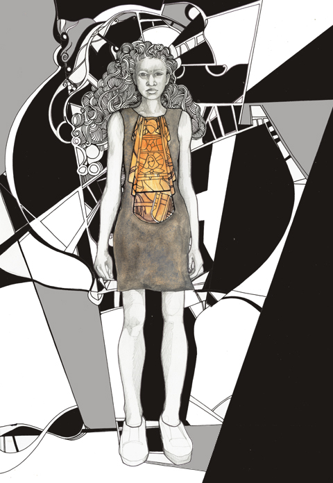
FADAwards-the tightrope walker-Florence Melrose by-Barbara-Ana-G
The Tightrope Walker – an illustration of a dress designed by Florence Melrose, find illustrated by Barbara Ana Gomez.

I’m a bit rubbish when it actually comes to checking what’s what during fashion week – I will generally go to most things that I’m invited to on the grounds that if someone has bothered to invite me then I should generally return the honour by actually turning up. Not so most magazine editors I might add – many was the time that I would swan into a fashion show under the guise of Katie Grand at The Face. She never went, approved and yours truly got the golden tickets.

FAD awards SS2011 - abi daker
Dress by Rebecca Glyn-Blanco of Camden School for Girls. Illustration by Abigail Daker.

FADAwards Keep it secret-by-Barbara-Ana-Gomez
Keep it Secret – illustration of a dress by Sinead Cloonan from City & Islington College by Barbara Ana Gomez.

And as I’ve already mentioned I don’t do queues – not in Tescos, prescription and certainly not during fashion week. To this end my heart sank as I rounded the corner to Freemasons’ Hall and found a line of people streaming down the street. What was this FAD awards malarkey anyway? Heading to the front of the queue I waggled my ticket at an unknown PR person and hoped for the best, so was somewhat surprised to be informed in hushed tones that I was a VIP and could go straight on through. Upstairs in one of the many architecturally fabulous chambers, Matt and I sipped on sweet fizzy stuff as we tried to figure out what this was all about.

FAD-Awards-sketches-Amelias-Magazine-by-kila_kitu
FAD-Awards 2010-Kila Kitu
Dress by Yashodah Rodgers as illustrated by Kila Kitu.

Apparently we’ve been very supportive of FAD in the past, and once I’d looked up our previous coverage it did suddenly all ring a bell. But I wasn’t quite prepared for the sheer unadulterated upbeat joy of this event. Right in the thick of a hectic fashion week it’s a true testament to the achievement of this organisation that I could sit through yet another long catwalk show and come out the other end beaming with goodwill.

LFW_FAD_Awards_Abigail_Nottingham
The European Fashion Designer award winning dress from Paul Vasileff and Shahira Bakhoum. Illustrated by Abigail Nottingham.

FADAwards Flower-Rebecca Glyn-Blanco by-Barbara-Ana-G
Rebecca Glyn-Blanco by Barbara Ana Gomez.

Just to recap quickly, FAD stands for Fashion Awareness Direct and it is a charity that aims to empower young people – as the brochure says “Fashion is a great way to connect with young people from different backgrounds, to give them confidence and raise their aspirations for the future.”

FAD awards SS2011 - Adam Preece by Abi Daker
Adam Preece by Abigail Daker.

LFW_FAD_awards Chelsey Ward by Abigail-Nottingham
Chelsey Ward by Abigail Nottingham.

Last year we covered the undergraduates awards show, but this year we were in for a much younger treat: the FAD Junior Awards showcased the designs of finalists chosen from 130 teenagers aged 16-19. Yes dear reader, you may well have to keep pinching yourself as you take a look through the images. I know I did, and I was sitting right there when they paraded past. Created over the course of five days at the University of East London with the help of an experienced team of tutors, the outfits put together by these young designers would put many graduates to shame.

LFW_FAD_Awards Karmen-Marie Parker by Abigail_Nottingham
Karmen-Marie Parker by Abigail Nottingham.

FAD-Awards-Natalie Goreham by-kila_kitu
Natalie Goreham by Kila Kitu.

To start off the evening’s events previous finalist Prash Muraleetharan took to the stage with a bit of confident advice, endearingly delivered. “It’s what you do with this moment which determines a winner…. so get upstairs and network,” he advised, somewhat sagely. At the end he winked. And I’m sure he winked at me. Blimey… what a charmer… it’s quite hard to countenance that Prash must still be a teenager, and yet he already runs his own fashion label with a website and everything.

FAD junior awards 2010 photo by Amelia Gregory
Prash Muraleetharan dispels his words of wisdom at the start of the ceremony. All photography by Amelia Gregory.

After the V&A inspired catwalk show we had speeches from the sleek Susan Aubrey-Cound of M&S and Lucy Jones of UEL, followed by the prizegiving by the extremely fabulous Zandra Rhodes, who is *the cutest* when she smiles! The winners and their parents looked so overwhelmed it really did warm the cockles of my jaded fashionista heart.

Zandra-Rhodes-FAD-Awards-2010-Antonia-Parker-Amelias-Magazine-A
Zandra Rhodes by Antonia Parker. I wuv her.

FAD junior awards 2010 photo by Amelia Gregory
Paul Vasileff and Shahira Bakhoum of Milan step up first to take the prize for the European Fashion Designer Competition, which was the culmination of a two year project.

FAD junior awards 2010 photo by Amelia Gregory
Karmen-Marie Parker with her winning design shortly before she burst into tears… aw, bless.

FAD junior awards 2010 photo by Amelia Gregory
Andre Augusto: pattern cutting award winner.

FAD junior awards 2010 photo by Amelia Gregory
Research award winner Sarah Kilkenny.

FAD junior awards 2010 photo by Amelia Gregory
17 year old David Short – the first boy to become overall winner and a proper little fashionista in the making.

Within this blog you’ll find my favourite pieces to hit the runway – and just remember, they were all designed and made by 16-19 year olds. Quite astonishing I’m sure you’ll agree.

FAD junior awards 2010 Shomari Williams photo by Amelia Gregory
Shomari Williams.

FAD junior awards 2010 Emily Rogers photo by Amelia Gregory
Yashodah Rodgers.

FAD junior awards 2010 Charlie Ibouillie photo by Amelia Gregory
Charlie Ibouillie.

FAD junior awards 2010 Sinead Cloonan photo by Amelia Gregory
Sinead Cloonan.

FAD junior awards 2010 European winners photo by Amelia Gregory
The winner of the European competition.

FAD junior awards 2010 Rebecca Glyn-Blanco photo by Amelia Gregory
Rebecca Glyn-Blanco.

FAD junior awards 2010 Natalie Goreham photo by Amelia Gregory
Natalie Goreham.

FAD junior awards 2010 Florence Melrose photo by Amelia Gregory
Florence Melrose.

FAD junior awards 2010 Misbah Siddique photo by Amelia Gregory
Misbah Siddique.

FAD junior awards 2010 Zandra Rhodes photo by Amelia Gregory
And another completely gratuitous shot of Zandra because this post isn’t long enough already. Because I WUV HER.

Categories ,Abigail Daker, ,Abigail Nottingham, ,Adam Preece, ,Andre Augusto, ,Antonia Parker, ,Barbara Ana Gomez, ,Charlie Ibouillie, ,Chelsey Ward, ,City & Islington College, ,David Short, ,European Fashion Designer Competition, ,FAD, ,FAD Junior Awards, ,Fashion Scout, ,Florence Melrose, ,Freemasons’ Hall, ,Karmen-Marie Parker, ,Katie Grand, ,Kila Kitu, ,lfw, ,London Fashion Week, ,Lucy Jones, ,M&S, ,Misbah Siddique, ,Natalie Goreham, ,Paul Vasileff, ,Prash London, ,Prash Muraleetharan, ,Rebecca Glyn-Blanco, ,Salford City College, ,Sarah Kilkenny, ,Shahira Bakhoum, ,Shomari Williams, ,Sinead Cloonan, ,Susan Aubrey-Cound, ,The Face, ,University of East London, ,va, ,Yashodah Rodgers, ,Zandra Rhodes

Similar Posts:


Amelia’s Magazine | London Fashion Week: 2010 FAD Junior Awards

FADAwards-the tightrope walker-Florence Melrose by-Barbara-Ana-G
The Tightrope Walker – an illustration of a dress designed by Florence Melrose, illustrated by Barbara Ana Gomez.

I’m a bit rubbish when it actually comes to checking what’s what during fashion week – I will generally go to most things that I’m invited to on the grounds that if someone has bothered to invite me then I should generally return the honour by actually turning up. Not so most magazine editors I might add – many was the time that I would swan into a fashion show under the guise of Katie Grand at The Face. She never went, and yours truly got the golden tickets.

FAD awards SS2011 - abi daker
Dress by Rebecca Glyn-Blanco of Camden School for Girls. Illustration by Abigail Daker.

FADAwards Keep it secret-by-Barbara-Ana-Gomez
Keep it Secret – illustration of a dress by Sinead Cloonan from City & Islington College by Barbara Ana Gomez.

And as I’ve already mentioned I don’t do queues – not in Tescos, and certainly not during fashion week. To this end my heart sank as I rounded the corner to Freemasons’ Hall and found a line of people streaming down the street. What was this FAD awards malarkey anyway? Heading to the front of the queue I waggled my ticket at an unknown PR person and hoped for the best, so was somewhat surprised to be informed in hushed tones that I was a VIP and could go straight on through. Upstairs in one of the many architecturally fabulous chambers, Matt and I sipped on sweet fizzy stuff as we tried to figure out what this was all about.

FAD-Awards-sketches-Amelias-Magazine-by-kila_kitu
FAD-Awards 2010-Kila Kitu
Dress by Yashodah Rodgers as illustrated by Kila Kitu.

Apparently we’ve been very supportive of FAD in the past, and once I’d looked up our previous coverage it did suddenly all ring a bell. But I wasn’t quite prepared for the sheer unadulterated upbeat joy of this event. Right in the thick of a hectic fashion week it’s a true testament to the achievement of this organisation that I could sit through yet another long catwalk show and come out the other end beaming with goodwill.

LFW_FAD_Awards_Abigail_Nottingham
The European Fashion Designer award winning dress from Paul Vasileff and Shahira Bakhoum. Illustrated by Abigail Nottingham.

FADAwards Flower-Rebecca Glyn-Blanco by-Barbara-Ana-G
Rebecca Glyn-Blanco by Barbara Ana Gomez.

Just to recap quickly, FAD stands for Fashion Awareness Direct and it is a charity that aims to empower young people – as the brochure says “Fashion is a great way to connect with young people from different backgrounds, to give them confidence and raise their aspirations for the future.”

FAD awards SS2011 - Adam Preece by Abi Daker
Adam Preece by Abigail Daker.

LFW_FAD_awards Chelsey Ward by Abigail-Nottingham
Chelsey Ward by Abigail Nottingham.

Last year we covered the undergraduates awards show, but this year we were in for a much younger treat: the FAD Junior Awards showcased the designs of finalists chosen from 130 teenagers aged 16-19. Yes dear reader, you may well have to keep pinching yourself as you take a look through the images. I know I did, and I was sitting right there when they paraded past. Created over the course of five days at the University of East London with the help of an experienced team of tutors, the outfits put together by these young designers would put many graduates to shame.

LFW_FAD_Awards Karmen-Marie Parker by Abigail_Nottingham
Karmen-Marie Parker by Abigail Nottingham.

FAD-Awards-Natalie Goreham by-kila_kitu
Natalie Goreham by Kila Kitu.

To start off the evening’s events previous finalist Prash Muraleetharan took to the stage with a bit of confident advice, endearingly delivered. “It’s what you do with this moment which determines a winner…. so get upstairs and network,” he advised, somewhat sagely. At the end he winked. And I’m sure he winked at me. Blimey… what a charmer… it’s quite hard to countenance that Prash must still be a teenager, and yet he already runs his own fashion label with a website and everything.

FAD junior awards 2010 photo by Amelia Gregory
Prash Muraleetharan dispels his words of wisdom at the start of the ceremony. All photography by Amelia Gregory.

After the V&A inspired catwalk show we had speeches from the sleek Susan Aubrey-Cound of M&S and Lucy Jones of UEL, followed by the prizegiving by the extremely fabulous Zandra Rhodes, who is *the cutest* when she smiles! The winners and their parents looked so overwhelmed it really did warm the cockles of my jaded fashionista heart.

Zandra-Rhodes-FAD-Awards-2010-Antonia-Parker-Amelias-Magazine-A
Zandra Rhodes by Antonia Parker. I wuv her.

FAD junior awards 2010 photo by Amelia Gregory
Paul Vasileff and Shahira Bakhoum of Milan step up first to take the prize for the European Fashion Designer Competition, which was the culmination of a two year project.

FAD junior awards 2010 photo by Amelia Gregory
Karmen-Marie Parker with her winning design shortly before she burst into tears… aw, bless.

FAD junior awards 2010 photo by Amelia Gregory
Andre Augusto: pattern cutting award winner.

FAD junior awards 2010 photo by Amelia Gregory
Research award winner Sarah Kilkenny.

FAD junior awards 2010 photo by Amelia Gregory
17 year old David Short – the first boy to become overall winner and a proper little fashionista in the making.

Within this blog you’ll find my favourite pieces to hit the runway – and just remember, they were all designed and made by 16-19 year olds. Quite astonishing I’m sure you’ll agree.

FAD junior awards 2010 Shomari Williams photo by Amelia Gregory
Shomari Williams.

FAD junior awards 2010 Emily Rogers photo by Amelia Gregory
Yashodah Rodgers.

FAD junior awards 2010 Charlie Ibouillie photo by Amelia Gregory
Charlie Ibouillie.

FAD junior awards 2010 Sinead Cloonan photo by Amelia Gregory
Sinead Cloonan.

FAD junior awards 2010 European winners photo by Amelia Gregory
The winner of the European competition.

FAD junior awards 2010 Rebecca Glyn-Blanco photo by Amelia Gregory
Rebecca Glyn-Blanco.

FAD junior awards 2010 Natalie Goreham photo by Amelia Gregory
Natalie Goreham.

FAD junior awards 2010 Florence Melrose photo by Amelia Gregory
Florence Melrose.

FAD junior awards 2010 Misbah Siddique photo by Amelia Gregory
Misbah Siddique.

FAD junior awards 2010 Zandra Rhodes photo by Amelia Gregory
And another completely gratuitous shot of Zandra because this post isn’t long enough already. Because I WUV HER.

Categories ,Abigail Daker, ,Abigail Nottingham, ,Adam Preece, ,Andre Augusto, ,Antonia Parker, ,Barbara Ana Gomez, ,Charlie Ibouillie, ,Chelsey Ward, ,City & Islington College, ,David Short, ,European Fashion Designer Competition, ,FAD, ,FAD Junior Awards, ,Fashion Scout, ,Florence Melrose, ,Freemasons’ Hall, ,Karmen-Marie Parker, ,Katie Grand, ,Kila Kitu, ,lfw, ,London Fashion Week, ,Lucy Jones, ,M&S, ,Misbah Siddique, ,Natalie Goreham, ,Paul Vasileff, ,Prash London, ,Prash Muraleetharan, ,Rebecca Glyn-Blanco, ,Salford City College, ,Sarah Kilkenny, ,Shahira Bakhoum, ,Shomari Williams, ,Sinead Cloonan, ,Susan Aubrey-Cound, ,The Face, ,University of East London, ,va, ,Yashodah Rodgers, ,Zandra Rhodes

Similar Posts:


Amelia’s Magazine | Graduate Fashion Week 2010: UCA Rochester

Joo-Hee Chun

Emma Box, illness illustrated by Lesley Barnes

So, reigning champions (or at least winners of 2009 Gold Award) UCA Rochester took to the catwalks on Tuesday to show their wares in a bid to cling on to their title amongst the heavyweights we’d already seen at Graduate Fashion Week.

I’m very pleased to announce that they certainly put up a good fight. With a simple chandelier hung from the ceiling above the catwalk, the show began with a rather long romantic song – thank God too, because my guest was running late and he managed to sneak in during the song in the nick of time.


Live catwalk illustrations by Tom Gilbert

First up was Alexa Papavasileiou who presented a modest yet striking collection that packed a few discrete punches (okay, I’ll stop with the boxing metaphors now). Body-concious printed dresses with full-length sleeves wrapped models in organic suits, while drapes hung over the models creating flattering lines. The most interesting twist was the appearance of constructed stilettos which had a grungy, paper mache effect and gave this sleek collection an edgy twist.

Other escapades in weird and wonderful shoe design were brought to us by Lydia Vousvouni, whose deconstructed womenswear tailoring had a futuristic feel, teamed with crazy shoes that looked like art deco sculptures.


Lydia Vousvouni, illustrated by Abi Daker

Rebecca Watson in stark contrast dressed her models in very eery skeletal masks, bringing a little touch of death-glamour to the runway. The clothes in comparison were relatively simple, consisting of cropped-sleeve tops, two-tone leggings and some pretty neat tailoring.

More digital prints on the catwalk; this time in Emma Box’s structured collection. Micro-skirts and leggings in said prints were teamed with bolero-length jackets with exaggerated shoulders, giving models a dash of sex appeal and masses of style.

Digital prints again, from the Gareth-Pugh-esque Alex Oliver. Her models were transformed into futuristic creatures, with emphasis on shoulders (huge, huge shoulders). Catsuits or short dresses in a psychedelic print were teamed with leather jackets with scary spikes; the climax being a model with a Margiela-style eye covering as part of a hood. It was scary but sexy at the same time.


Alex Oliver, illustrated by Lesley Barnes

The first menswear collection from Rochester was that of Chelsea Bravo, whose models had the appearance of modern-day gladiators. Smock t-shirts with scoop necks emphasised muscular form and Chelsea’s palette of muted colours including sand, burgundy and blue had a sophisticated edge.

Vicky Jolly presented one of the most sophisticated collections I’ve seen this year. Her couturier-like craftsmanship created elegant dresses, with twists and turns in fabrics flattering the female form.


Vicky Jolly, illustrated by Alli Coate

Finally, after what felt like waiting for decades, Hallam Burchett ramped up the glamour factor to a big fat 10. Models sashayed and swished their hips to Donna Summer’s Bad Girls whilst wearing an all-green silky collection, embellished with dazzling crystals and accessorised with demi-gloves. Sod the tits or legs rule in Burchett’s short, short strapless dress and flaunt what you’ve got at the disco! This 1970s-inspired collection had the cuts and lines to make it contemporary, though.

More menswear now, from Anachee Sae Lee and Cherelle Reid. The former was a contemporary take on colloquial dressing and conjured up images of Sherlock Holmes, Oliver Twist, chimney sweeps and Victorian funeral directors all at the same time. High values in tailoring made this a tip-top collection, with fitted suits teamed with neck-bows and crisp shirts with bib detailing were accessorised with sleek shirt-armbands and porkpie hats.


Anachee Sae Lee, illustrated by Abi Daker

Cherelle Reid, whilst employing similar tailoring elements, was an entirely different look. In a strong micro-collection worthy of a slot in any upmarket store come Autumn Winter 2010, models wore silky harem pants which tapered tightly, low-cut v-neck tops and formal jackets. The craftsmanship look exquisite, but the pecs were a bit much *fans brow*

In amidst a whole load of futuristic and structured collections at GFW this year, a welcome breath of fresh air came from show closer Carla Grima. Her magical Grecian-inspired collection was a burst of much-needed colour, and while it wasn’t a clangy hipster spectacle like some show finales, it was understated glamour at its best. Each dress created an illusionary effect as it hung effortlessly from the models, flattering their waif figures.

Having written this post-Gala Show, I now know that UCA Rochester didn’t manage to hold onto their crown as Gold Award winners for 2010. Amongst so much incredible talent, it’s so difficult to stand out. Nevertheless, each collection was incredibly strong, astonishingly creative, and never, ever boring.

Rochester, you’re all winners anyway.

Categories ,1970s, ,Abigail Daker, ,Alexa Papavasileiou, ,Anachee Sae Lee, ,Art Deco, ,Bad Girls, ,Body-con, ,Carla Grima, ,Catsuits, ,Chandelier, ,Chelsea Bravo, ,Cherelle Reid, ,Digital Prints, ,Donna Summer, ,Earls Court, ,Emma Box, ,Futurism, ,Gareth Pugh, ,God, ,Gold Award, ,Graduate Fashion Week 2010, ,Grecian, ,Hallam Burchett, ,Harem pants, ,Lesley Barnes, ,london, ,Lydia Vousvouni, ,Martin Margiela, ,menswear, ,Oliver Twist, ,Paper Mache, ,Rebecca Watson, ,Sherlock Holmes, ,UCA Rochester, ,Vicky Jolly, ,Victoriana, ,Waif, ,Womenswear

Similar Posts:


Amelia’s Magazine | Henrietta Ludgate: ethical fashion design inspired by a Scottish childhood

Henrietta Ludgate S/S 2011 by Abi Daker

Scottish designer Henrietta Ludgate grew up in the wilds.
I grew up in the most idyllic environment for a child: my imagination ran wild in the woods, nurse I collected frogs from the bog, see and skated on the dark loch in winter. I aim to capture these vivid memories forever, website like this in each collection. I’m inspired by Scottish folklore, the setting sun, the Northern Lights and the witching hour – the time when supernatural creatures are thought to be at their most powerful and magic is at its most effective. The Brahan Seer is a local mythical figure from the 17th century who was and still is renowned for his many prophecies which have continued to come true many generations after his tragic end.  

Her trademark shape is a logo-less signature for those in the know.
I have developed a cylindrical trim that is an instantly recognisable trade mark for the cognoscenti, a discreet signature for those who are able to identify designer details, a subtle detail for the logo-phobic. I try to set the label apart with attention to detail, fine fabrics and exquisite workmanship that are the signal of slow fashion. Henrietta Ludgate clothing sets the wearer apart from the masses, symbolising a non-adherance to fast fashion, trendy logos and heavy branding…

Read the rest of this interview and see more illustrations of Henrietta Ludgate’s clothing in Amelia’s Compendium of Fashion Illustration, alongside interviews with 44 other ethical fashion designers and 30 fabulous fashion illustrators. You can buy the book here.

Categories ,Abigail Daker, ,ACOFI, ,Amelia’s Compendium of Fashion Illustration, ,Brahan Seer, ,Eco fashion, ,Ecoluxury, ,Ethical Fashion, ,Fast Fashion, ,Henrietta Ludgate, ,Highlands, ,Luxury, ,Northern Lights, ,scotland, ,Scottish, ,Witching Hour

Similar Posts: