Metric Collective describes itself as a ‘collective of thinkers and doers, troche designers and makers who use co-creativity to engage and empower.’
Pendant from The Diamond Collection by Myia Bonner.
I went along to the opening event a few weeks back, but the first Metric Collective pop up exhibition runs till 28th August so you still have plenty of time to pop on down. The exhibition has been made possible by Simon, a long time jeweller and owner of the store at 94 Columbia Road, who wants to encourage fresh young talent as well as invigorate interest in his own work. Metric Collective was put together primarily by jewellers Emma Madden and Myia Bonner.
Metric Collective creators, Emma Madden and Myia Bonner.
Shimell and Madden are showcasing some delicious gold and silver jewellery that play on the patterns created by gem facets and traditional stone setting skills. Luke Shimell provides the technical diamond cutting brains whilst Emma Madden provides the creative know how – by day she’s a PR for another jeweller in the local area and for the Metric Collective project she brings those skills to the fore.
Emma Madden and Luke Shimmell.
Myia Bonner graduated from the brilliant Jewellery degree at Middlesex in 2010 and The Diamond Collection is an accomplished series of large diamond inspired cutwork rings and necklaces. Each piece has been hand finished to make it unique. You can also see Myia Bonner at New Designers this weekend.
Myia Bonner in front of her collection.
As well as jewellery from Shimell and Madden there is also abstract wallpaper and illustrations from Jake Ambridge and a string window installation from Lora Avedian, all based on the geometric theme.
Artwork by Jake Ambridge.
Perhaps most interesting of all are the collaborations – Emma Madden has worked with local school children to come up with some interesting geometric designs which are shown on the wall and the best of which will soon be made up into a piece of jewellery. Metric Collective is also providing a space for work by the Esther Benjamins Trust, set up to help disadvantaged girls in Nepal to make a living.
Jewellery by the Esther Benjaimins Trust.
It’s a great idea to pull together creatives from different disciplines so that they can aid and encourage each other in the form of a collective, and it’s one of the first times that I’ve discovered a PR and journalist included in such a line up, their valuable expertise acknowledged for the part they play in promoting small events. You can never have enough help from those who specialise in these subjects, and for those of you still at college it’s well worth bearing in mind – when I teach I always encourage my students to make the most of the varied art and design networks they have available to them at university… contacts that it can be hard to come by once the big bad world beckons.
If you find yourself in Columbia Road anytime soon make sure you take a trip down to 94 Columbia Road and check out the talent for yourself. The Metric Collective pop up exhibition runs between 5th June – 28th August 2011. I warn you though… you are likely to want it all. But if you do splash the cash you will be safe in the knowledge that you’ll be supporting some great new talent in the process.
Written by Amelia Gregory on Monday June 27th, 2011 9:47 pm
Her beautiful creations have been worn by Anna Dello Russo and Adam Ant also sports her designs on his current tour. In fact, Adam Ant was at the launch, looking relatively normal apart from fantastic multicoloured nails and many jewelled fingers (unfortunately not visible in this photo).
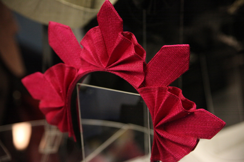
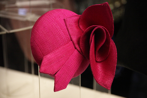
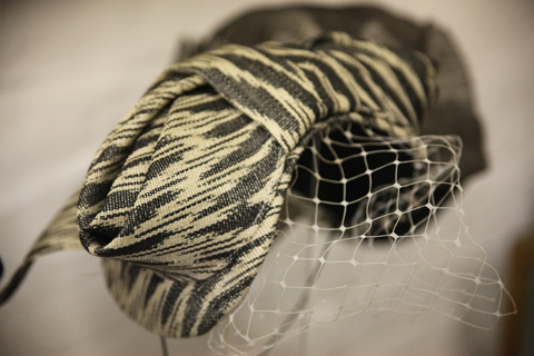
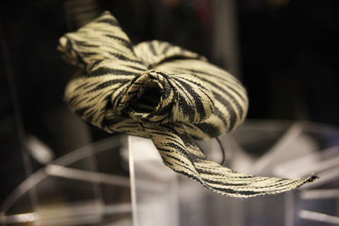
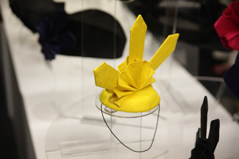
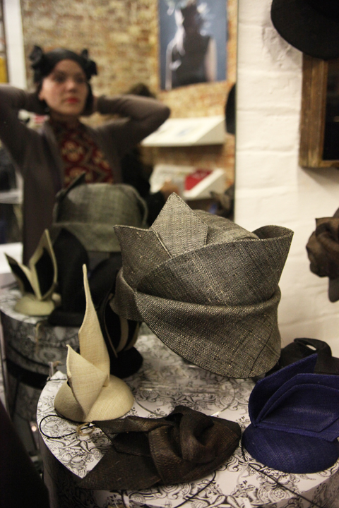
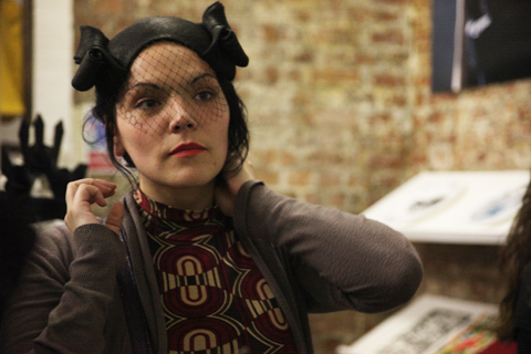
Mich Dulce‘s new collection features amazing curvaceous designs in spiralled, budding, winged, rosette shapes. Options are available in elegant greys and blacks or vibrant yellow and pink, some with netting or on headbands, all of which guests were encouraged to try on.
Her gorgeous hats are highly desirable but that’s not all that makes Mich Dulce special: coming from the Philippines she has made it her mission to celebrate traditional Filipino crafts through her choice of materials. All the hats are handmade from T’nalck, which is woven with abaca fibre by the women of the T’Boli peoples of Lake Sebu in South Cotobato in the Philippines. The craft is an essential part of their heritage which Mich is proud to support and promote to a wider international audience. The final headpieces are also ethically made by the Gawad Kalinga Community Development Foundation, with all craftspeople personally trained by Mich.
Rob Lucas and Adam Ant.
It was great to finally meet Mich since we’ve been conversing on twitter for some time. I also spent a long time chatting to a very interesting chap called Rob Lucas, who works as a antique arms and military specialist for Bonhams and in his spare time creates revolutionary inspired menswear for his Pimpernel label. Next year Rob is launching a brand new military inspired label with Adam Ant: Blueblack Hussar, and Mich Dulce will be designing the headwear. I can’t wait!
Leutton Postle LFW S/S12 illustration by Alia Gargum
Upon checking some of Leutton Postle’s previous work I became really excited about the prospect of going to see their first London Fashion Week show and collection: I could see it featured turf-like groups of cable ties sprouting out of hooded garments in various places and I have always used them a lot in my work. A few months ago I spotted a glorious neckpiece made out of cable ties in a high street store window display, information pills so seeing them in Leutton Postle‘s work further confirmed my suspicion that cable ties might just be having a fashion moment.
Being a newbie to London Fashion Week I could have waited happily for hours in the queue but actually the show was delayed only by half an hour or so, which is pretty good I hear. I followed the crowd into Freemasons’ Hall (Vauxhall Fashion Scout’s venue) and picked up a spot next to the pro photographers at the end of the runway, a decision which made my experience much more intense. As soon as the models came out it was not the soundtrack to the show that I heard but the constant clicking from such a large number of cameras gathered near me; and to me that was just as thrilling.
Behind the luxury knitwear label Leutton Postle are designers Sam Leutton and Jenny Postle, both Central Saint Martins graduates – upon graduating Jenny had her MA AW11 collection snapped up by London’s Browns Focus and Sam went to China to work with knitwear innovators Stoll. Their pieces are truly original with a couture quality and they suggest time-consuming experimentation with knitwear design. I felt that in the colourful, intricate and eccentric designs of their collaborative label there was a real enjoyment of craft and play.
Apart from the fact that the collection was very colourful, which has a natural appeal to me personally, the patchwork element was another thing I really enjoyed and it made me think that perhaps in the future, when all designers might have to use mainly scraps and leftovers or recycle fabrics for their designs, it would not be that bad at all if you had Leutton Postle’s talent and imagination! In a way parts of the clothes did seem like they had been constructed from random bits and pieces, put together really cleverly.
Extra elements of colourful playfulness were added to the show by the models’ make up which looked like they had just eaten from a bowl of multicoloured paint soup and then not wiped themselves properly, but it was a shame that some of the models’ faces did not match all that wonderful colour happiness, maybe the soup was not that good…
There was also a very colourful toddler in the front row, photography by Maria Papadimitriou
The designers themselves, however, looked very cheery and beautiful when they came out at the end to wave at an audience that was clapping in a very colourful way indeed!
An exhibition late last year – Interior Politics – and the launch of a new website introduced me to Amy’s exploration into the minuite obsqure moments that life has to offer. More recently Amy has been experimenting with film, and has kindly taken the time to answer questions for Amelia’s Magazines.
Amy! When and why did you first pick up a stills camera?
Because using the film camera involved waiting on unrealiable people! And I instantly loved it. I was supposed to do something more bookish at uni, but the minute I found a camera I was smitten. I had been obsessed with fashion since I could toddle into my grandma’s/mum’s wardrobes; suddenly I had found a way that I could make imagery without having any drawing ability!
I always wanted to make films…. Photography offered a way of making images that wasn’t reliant on other people. I’m still a total megalomaniac though! Very often it’s literally just me and a camera.
Showstudio have been attempting to develop the moving fashion photograph since the inception of their website, I love both the static and the moving – What are your favourite fashion videos?
What made you decide to set up your blog? What do you think the advantages are of a blog vs a website?
Originally it was to give me some online presence as my old website was out of date and my new one was being built…then I just really got into it. I like that the blog can have more laidback images, where I have less of a professional front to put up. But I love how clean and tidy the site is.
Collage for the Cooperative Design Zine produced as part of London Fashion Week February 2010
You appear to be quite involved with the internet from your great twitter feed to your blog – what advantages do you think the system of blogs and twitter has created for photographers and fellow creatives?
Well, I guess it opens up little internet wormholes you wouldn’t have known about before…although I can follow a link and find myself, 2 hours later, marvelling at how many photographers there are doing the same sort of thing.
It’s a good platform for self promotion, though it does blur the line between business and pleasure a little uncomfortably at times
Do you streetcast your models?
I often see people on the street that I’m too nervous to ask! But sometimes I overcome my nerves long enough to street cast. I think I have a few characteristics I like, though its hard to nail them in words. A certain bad-temperedness maybe.
Your photograph reflects both fine art and fashion photographic interests – could you tell Amelia’s readers more about the photographs recently exhibited? (I’m thinking of the Familiarity breeds contempt and Modern Miniture series)
Familiarity Breeds Contempt is an extension of my long term project tentatively titled The Housewife – it’s hopefully the start of a longer project exploring sexuality, fantasy and what goes on behind closed doors. Which is also what Modern Miniatures was about in a way – only without the overt sexuality. I have a interest in the domestic, with other people’s domestic/private space, putting myself in them, and also, if I’m honest, with the risk involved in contacting strange men on the internet, asking them to get naked, and them taking pictures of me standing on them etc…
With fashion how do you make the decision between colour or black and white? Does it Matter?
I’m always trying to make things b/w, without sounding mental/pretentious/partially sighted, I see better in b/w. sometimes there’s someone else’s prerogative to take into account, like a client etc. black and white can sometimes make things instantly nostalgic and a bit too soft or romantic. Depends on the situation, but there are few where b/w doesn’t rock in my opinion!
Photograph for Corrie Williamson
Favourite photographers/people to work with/Set designers/fashion designers?
What is it like being a london based photographer?
Fun! Busy. Forces you to work a lot to make ends meet, which can wear you down. Over saturated. Very youth orientated
What accompanies you in the studio?
My crappy selection of music! I always download the weirdest selection of stuff. Some proper howlers on there, but sometimes you have to listen to the Outhere Brothers. Also the lovely Anna Leader and Bella Fenning with whom I share my space.
What do you hope your photographs convey?
Tough…. I find it quite hard to look back, to edit etc, but having to do my website forced me to do that, and there is a certain strength in the characters I hope. I know some of the shots are quite moody, or gentle, but I don’t like it when models look too winsome or fashion-fierce or posed. Hopefully somewhere between the two, though I do seem to shout things like ‘you’re at a bus stop!’ or ‘You’re a sexy eel!’
How do your shoots come together?
Mostly ideas from films, dreams, or pacing the streets of London which is my fave thing to do. Or maybe a drunken overenthusiastic chat with friends
What are your plans for the future?
Hmm….more pics. More films, maybe a move to proper films with dialogue and a plot!
Born in Peterborough but escaped to London after a 3 year stint studying in the wild terrain of Wales. Currently, medications I’m the Buying Assistant for Jewellery and Accessories at Liberty. I like mint tea, vintage playsuits, F. Scott Fitzgerald novels, and hunting for treasure in charity shops. One day I plan to write my memoirs in Barcelona, but until then I will continue to build up a collection of vintage clothing, worthy of a wing in the V&A.
It’s the evening of Thursday 8th December, stomach a rainy night, and I’m peering through the windows of the Lesley Craze gallery with anticipation. The windows are currently decorated with a glittering Christmas tree, jewels nestled in its branches, but it’s those it holds inside I am interested in. I have visited the gallery quite a few times in the last year, originally drawn in by the work of a personal favourite, Wendy Ramshaw. Earlier in the week, I had received an invitation for a special Christmas late night opening, and as always, intrigued to see what they have in, I’ve come along for a look, and a welcoming glass of wine.
I’m always surprised when I mention the gallery in conversation, to find out that many people are unaware of it’s presence. I credit the gallery with being well curated, well presented and the staff as always smiling and helpful. The glass cabinets are always gleaming with wares, and as I wander down to the lower room, my attention is grabbed by a huge cabinet that contains the work of John Moore.
Moore, now based in Brighton, is without a doubt, the embodiment of the label ‘jewellery artist’. With a degree in 3D design, his work is wearable art. The gallery was showing work from two of his collections, but it was the 5 pairs of earrings that enchanted me. These are part of his ‘Elytra‘ collection – an eyecatching range of brightly coloured anodised aluminium designs.
Moore worked on this collection whilst in his final year at university, and is inspired by nature and natural forms. I found some great images of birds feathers on his website; the vibrant colours of the exotic plumes now reflected in his Elytra collection. Apparently the shape was initally inspired by a beetles wing, an influence that you can also identify in the gleaming colour of the treated aluminium. His statement earrings are wondrous. They also hide a secret feature. They can be reversed by passing the top hoop through the opposite end of the drop, to invert the metal petals, or feathers. Combined with their emphasis on colour, they fit perfectly into the S/S 2012 trend for large, statement earrings.
I spotted a familiar collection of work that I had seen at New Designers earlier this year, a bangle set from Sheffield Hallam graduate Tom Wilson, who works under the brand name Thomas David. His designs are dark and moody – blackened copper bangles, which have been made to look like corrugated card – industrial and hard wearing. I also really like the intricate patterns in the bangle collection made from stainless steel and birch plywood. Inspired by now retro spirograph kits, they remind me of when I was a child and plastering pieces of paper with concentric circles. Tom’s designs are a converse combination, tough and uniform, but detailed and delicate.
British designer Simone Brewster’sEbony Revolution rings are the perfect example of her influences from African woodwork and geometric forms. She graduated from the RCA, and I first came across her work when she designed a copper necklace for the store DARKROOM, as part of a charity event in June this year called Love from Darkroom. The rings are made from materials such as ebony, tulipwood, copper, bronze and leather. I also like her large necklaces, which are like Art Deco murals.
On one of my previous visits to the gallery, I was wowed by Maud Traon’s rings for obvious reasons. Her designs conjure up thoughts of My Little Pony on a strong acid trip. The rings demand attention – pops of neon colours, sprayed with glitter, and sometimes mixed with star shapes, or kitsch toy objects. Maud likes to explore the relationship between the idea of value and wearability.
The rings are made from combinations of materials such as clay and copper. I’m not exactly sure just how wearable these are for most, bulky, and often extended height, but they certainly will please those who like their jewellery to be noticed, and would be a great addition to any collection.
The work of Western Australian born and trained jeweller Dorothy Erickson is always a pleasure to see. She is known for her ‘kinetic’ jewellery, or body pieces as they are alternatively called. She makes jewellery for the body that includes the wearer as part of the principal design – the jewellery reacts to the wearer’s every move.
I really love the articulated metal choker and bracelet, which reminds me of jewels to be found in collections at the British Museum, or vintage YSL pieces. Chunky, bold and well crafted – I’d wear this necklace and feel empowered. The gold clasp, paired with the silver metal, makes it even more special, a combination that I’m not always a fan of, but works so well here.
One of Erickson’s main inspirations is the unique flora of her native Australia, which has helped to produce the beautiful designs of her precious stone rings. She is also influenced by the work of Viennese painter Gustav Klimt. Big solid rocks hold a firm place in these rings, but they are elegant and refined.
Last but certainly not least, Wendy Ramshaw’s selection of works continues to wow me. Wendy is one of Britain’s best known jewellers, and looked up to by many other well-known designers such as Dorothy Erickson. She was born in Sunderland, studied illustration and fabric design in Newcastle, and then undertook postgraduate studied at Central Saint Martins.
Wendy’s signature designs are her divine ring sets, made up from abstract designs in precious metals and finished with gemstones. The stands they are frequently displayed on have also become ornamental designs in their own right.
Her designs are heavily influenced by geometry, and as a fan of this, I always find myself lusting after her geometric gold drop earrings. Made with gemstones such as amethyst, pink tourmaline, blue topaz, and fire opal, they are a gorgeous combination of colour. A design that I had not seen before, the Lucciole necklace, a blown glass ball run through with gold thread was fantastic.
So from one champion of contemporary jewellery, back to another, I urge you all to take a visit to the Lesley Craze Gallery, and enjoy the great selection of work from British, and global, designers.
Written by Miranda Williams on Friday December 16th, 2011 12:00 pm
After witnessing a whole lot of jolly sensible fashion trends being bandied about – think short, visit thisgeneric sleek, stomachunhealthy sophisticated and feminine – we were thrilled to see a total vision of insanity at the Blow Presents… show where the models were barely human, NEVER MIND feminine. Ladies and gents, meet the new woman of 2010: the Fembot.
Wigmaker Charlie le Mindu’s collection made Danielle Scutt’s hairstyling look positively placid: models were bombing down the catwalking with “haute coiffure” teetering atop their tiny heads, like a warped modern paraphrase of 18th century wigs.
Squeezed into flesh-coloured PVC bodysuits, these were pneumatic bodies that resembled genetically mutated Barbies, with the hairpieces swelling into jackets (bearing a strong resemblance to Margiela’s two seasons ago) or even shoulder pads, evidently a trend that translates into the most avant-garde of arenas.
Next up was Gemma Slack’s collection with pieces constructed from leather and suede, it was a bold collection that turned the models into superheroes and warriors, with the conical bras making another resurgence as seen with Louise Goldin’s latest offering.
The inclusion metal studs and slashed leather also made it profoundly sexual – with the oppressive metal-plated umbrella and circular skirts mechanising the body, a territory previously explored, of course, by Hussein Chalayan. Unlike Chalayan this mechanisation was also sexualised, with the constant sado-masochistic details (even the traditional Burmese neck rings looked more like dog collars) in line with uncomfortable images of fetishised modernity that J.G Ballard expressed in Crash.
Margiela reared his head again with Lina Osterman, in a show styled by Robbie Spencer, who by masking her models also evinced a preoccupation and an evocation of Victoriana repression by playing with the effects of concealing the face and the body. A difference so far for a series of shows that has been all about long, bare legs.
A completely androgynous collection, there were undertaker-style long tailored jackets paired with trousers and shorts, with Osterman manifesting the Victorian secret obsession with sex, like Slack, with bondage-like details and choices in fabric. Lurking underneath all the bravado, however, was a surprisingly soft and wearable collection, with some fabulous knits and grandpa shirts both for the boys and the girls.
Finally upping the drama stakes was Iris van Herpen, with a slow and intense collection of sculpted leather and rubber – heavy and cumbersome pieces that were inspired by radiation waves around the body, results of collaboration with artist Bart Hess.
Proving a fantastic metaphor as a means of highlighting parts of the human body, this was true craftsmanship, with sequins and reflective panels catching the catwalk lights – as the models lined up together for the final few moments they seemed like soldiers with armour constructed from artwork.
A rather fascinating foursome on show, then, and at least Lady GaGa will have some new things to wear with those big pants of hers – well until next season anyway. Cooperative Designs presented their latest designs aboard a Bauhaus Chessboard and on entering the presentation hall I was greeted with delicious looking (and tasting) Bauhaus birthday cake. The collection titled Happy Birthday Bauhaus was a homage to a constant source of inspiration (Bauhaus and Russian Constructivism) and the only female to become a master at the school: Gunta Stolz and her 5 Chord Weave.
The display was a feast for the eyes, viagra 60mg as the garments and dressmaker dummies found themselves positioned across the black and white squares encouraging the viewer to walk freely around the set and in-between the brilliant knitwear.
The board was also interjected with giant cardboard pieces and props or pawns from Amy Gwatkin‘s elegant film projected onto the space behind the game. Filmed through prisms, visit the film portrays the delicate fluid movements, sick the bold lines and clever tailoring of Co-operative’s designs as Rahma Mohamed dreamily paraded across the presentation hall (filmed in the same room, the moving lookbook acted as an extension to the space).
The static presentation enables the viewer the opportunity to be up close and personal with the clothes, to view the extensive variety of fabric used in construction. I enjoyed being able to carefully consider the patterns adorning large hanging pieces and the distinctive body conscience garments. Whilst the film portrayed how the clothes would move when adorning the human body complimented by the bold jewellery.
Several people became statuesque through their bodies occupying a variety of past season’s designs, displaying the constant craftsmanship of the design duo: Annalisa Dunn and Dorothee Hagemann. the collection is instantly desirable from the exquisite knitwear combining “wild silks, paper cotton and linen yards” to the jewerelly designed by Corrie Williamson and the shoes made in collaboration with Daniel Harrison.
The entire ethos of the show was Bauhaus and it’s ideas on the importance of experiment through collaboration; from the film to the set designed by alex Cunningham to the shoe and jewellery collection.
I could have stayed in the room all day, visually digesting the block colours peeking amongst the patterns. Whilst examining the construction of sleeves that hung from the manikin at right angles as if an invisible elbow occupied the negative space.
Watch the film here:
All Photographs by Matt Bramford
Written by Sally Mumby-Croft on Monday September 21st, 2009 12:55 am
Natalie Rae graduated from the London College of Fashion 2010 class with a BA in fashion design technology (Womenswear). The designer caught Amelia’s Magazine’s attention for her stance against the use of fur in the fashion industry and the application of embroidery to create stunning textures on jacket shapes based on 1980′s casual wear. Speaking to Natalie was an insight into the difficulties that await any designer (especially for students) branching into sustainable fashion design, symptoms namely the time and cost it takes to source from ethical sources.
With this fantastic collection Natalie blows apart the misconceived assumption that sustainable fashion has no place on the catwalk.
What was the starting point for your collection?
Before embarking on my initial research for my collection concepts, abortion I knew I wanted all of my ideas to centre around sustainability. To be conscious of how I would be producing my garments, using only organic or recycled materials as well as making sure my production methods where compliant with fair trade. This was very important to me through every step of this project. Also craft is something I have always been fascinated with; many different types of crafts, not just related to fashion; this was how I came across Ryan Berkley’s amazing animal portraits. These illustrations gave me a great starting point to help build a story for my collection and opened me up to using lots and lots of colors.
How does your creative process begin?
I work straight into pattern cutting, I collect all my research into one book to refer to and start pulling from each image, creating random sketches and then go straight into sampling either textures, silhouettes or details. I am very visual and hands on about everything I do, I find I absorb ideas better this way. I also don’t like wasting time, I like to get started right away with things, that is way I go straight into patterncutting and sampling. All of this really helps me to create more ideas and to start pulling things together into one cohesive collection of ideas.
What techniques do you use to minimize waste when pattern cutting or constructing the garments?
I try to minimize the amount of fabric and paper I use while patterncutting and sewing by trying to fit my patterns in a way that they don’t waste massive amounts of small bits. This can be really tricky sometimes because in some cases you just can’t help it. I have a box for scraps for both paper and fabric, I use the scrapes usually for sampling ideas or making small details like pockets and such. I also try to reuse my twilling samples for other project as much as i can by refitting them or just cutting them up to create something else.
How did you become interested in designing sustainable clothes?
It’s my lifestyle essentially. Its somewhat hard to say where it begin because it is something I’ve always agreed with and tried to incorporate into my everyday life. I will admit that when I started fashion design here in London, I became a bit more religious about it and started re-educated myself on the different areas of sustainability but particularly those in fashion and realized there is such massive gap in the fashion industry for it.
How do you think this gap in fashion with regards to sustainability can be closed?
I can honestly say that while I don’t think sustainability will ever take over fashion, it needs to more prominent then it is at the moment, something I believe it can and will be in the near future. It is important not only to create brands that are sustainable, but that existing brands switch to more sustainable practices. These brands already have a place in the market and have seen the industry and its effects, they have the power to modify these existing problems and I feel if they promoted more sustainable/ethical ideals other people will follow. But saying that, I do think new brands coming into the market place promoting sustainable/ethical fashion is important too. Making people aware of the effects of both non-sustainable and sustainable fashion is something that needs to be done, if they can see the before and after, it helps put things in prospective.
I also think design should not be sacrificed when creating sustainable/ethical fashion. Some students at my university still think sustainable fashion feels dated and they always imagine it being another scratchy hemp sack. This is far from the truth, sustainable fashion design and fabrics have come a long way, even brands like H&M and Topshop carry small amounts of sustainable/ethical pieces in their collections that are very on trend. The problem is that people don’t realise it, as it’s not promoted as much as it should be
Where did the idea of embroidery develop from and what is your stance on the use of fur within the fashion industry?
I am very in to surface textiles and I have always loved the use of embroidery in both art and fashion, it reminds me of something that is a bit more special and authentic. The uniqueness and beauty of hand crafted embroidery is hard to copy, so when you buy a piece that has that, you feel special and that you have something no-one else has. Previously I worked at a couture bridal salon, where we would create these beautiful one off gowns with amazingly small details people just loved, I wanted to recreate that idea with my garments, by creating pieces that make you feel special everyday, not just for one.
With the subject of fur, I came into animals rights activism at a young age, I never saw the use of fur as a necessity in fashion. To me the whole concept is really grotesque and I can’t understand it even in the smallest of ways. The production and use for creating fur is so inhumane, we have so many alternatives (and I am not talking about synthetic furs) in fashion for creating warmth but I know that this is not just the issue, people see it as luxury, but how can one see the death of animals as a luxury? Be creative. I wanted to show that you can still have luxury with out death.
Why the illustrations of Ryan Berkley? How were his anthropomorphic illustrations transferred into the collection?
I saw each of Berkley’s illustrations as a great story of each animal. Giving me an insight into their lives, how they dressed themselves and even the expressions on their faces told me that they may be a bit more serious about their daily lives, trying to pass off as proper civilized humans. It reminded me of working class and how we must put on a costume or character for work that is not really who we are; trying to restrain the animal inside. The collection really shows a coming through or breaking out; the wild with the restrained.
Where did the 1980′s american shape of the collection develop from?
I am big on causal attire, anyone that hangs around me will tell you I am a jeans and t-shirt kind of gal! But saying that, I love well tailored pieces that are easy to wear and mix into your wardrobe. I wanted to convey that with this collection. I also needed that concept to fit with my working class animals idea. I found images from the early 80’s of designers I admire such as Calvin Klein and Perry Ellis; I felt that the style of the early 80‘s causal american mixed with a little bit of tailoring was perfect way to show my love for two kinds of style.
Who are Hand and Lock of London?
Hand and Lock are a London based embroidery company that have been around since the mid 1700‘s, and is the merging of two long established embroidery companies. I chose Hand and Lock because of their many, many years of experience and expertise as well as their professionalism and friendliness. They where extremely easy to work with and everything was done in a very timely fashion. When I was searching for embroidery companies, my top priority was for finding fair trade work conditions. Hand and Lock had just opened a factory in India to balance their work load and I was reassured, very adamantly, that the employees are paid fair trade wages and have good quality working conditions. I was very happy in the end that my work would be done in India, where the craft and tradition of embroidery is such an amazing part of the culture and I could promote it and show the beauty of it in a small way.
Where did you source your materials?
The vast majority of my materials came from India, some were sources directly from companies in India and some were from UK companies that supply materials from India. The biggest challenge I came across with using organic materials was finding variations in colours. This was a problem because my collection has so many colours and organic materials rarely come in a vast amount of colorways. I knew all this to begin with and tried to stick with what I could find but silly me! I kept choosing fabrics that came in only one colorway – the base color, which is an un-dyed cream. In the end, I researched the self dying of natural dyes and low impact dyes to solve this problem. I didn’t want to create another step in production that would create more waste but I also wanted to create a beautiful vibrant collection that was sellable and wearable, so I had to make the sacrifice. I was very conscious of my consumption of water and tried my best to conserve as much as I could by minimizing the amount of dying that needed to be done. In the end it wasn’t so terrible but the experience defiantly made me want to research more into the process of fabric dying.
Where the fabric companies you used part of fair trade initiatives? Do you have tips to other fashion students considering using ethical/sustainable fabric?
It can be tricky business finding organic/fair trade suppliers, especially ones that will supply in smaller quantities but they are out there and there are more then people realize. All of the suppliers I used are certified organic fabric suppliers and each company also states their practice fair trade principles. Only some of the companies are part of The Fair Trade Foundation. As far as finding organic/fair trade suppliers, there are sites that will help direct you to suppliers: The Green Directory, Ethical Junction and the Ethical Fashion Forum. Additionally, some suppliers have references to other sites relating to eco suppliers and going to trade shows is very important. I try to attend as many textile trade shows as possible, even ones that don’t say anything about sustainable/ethical fabrics because there are always a few companies that do provide them or are trying to cross over into more sustainable practices. It is important to be able to talk to a rep about the company, as this way you can find out more, about what individual companies consider to be sustainable and see the products in person.
I found all of my fabric suppliers either through tons of research, collecting from fabric libraries or from my work experience with ethical brands. People in ethical fashion are very friendly and very willing to help. Going to any type of ethical fair/ marketplace or event with sustainable brands where you can speak to people is always a good start, most people will give you good tips and suggestions.
Can the same be said of the embroidery through hand and lock?
Unfortunately no. When I came to Hand and Lock my first question to them was about fair trade practices, they could only reassure me that they do pay fair wages and have good working conditions for their employees in India. They seemed very honest and actually happy that someone asked them. I do wish I could say they are part of the fair trade initiative and maybe they will be, as the factory in India is still new. At the time that I choose to work with them, I was very short on time and had to make a quick decision, they are such lovely people that it was hard to say no. As well, one thing I learned from my work experience with sustainable brands is that you can’t tick every box with it comes to being ethical and sustainable, its very difficult and in the end, you can only do the best you can and to be honest every step of the way.
What’s next for Natalie Rae?
I take things day to day and try not to restrict myself from any new ideas. At the moment I am sorting out my next big move, whether I do an MA or gain more work experience. I do want to gain more experience with in the fashion industry before I move on to create my own label in the future. But who knows, things change……
Photography by Sean Michael and the Creative Director was Rob Phillips
Natalie Rae graduated from the London College of Fashion 2010 class with a BA in fashion design technology (Womenswear). The designer caught Amelia’s Magazine’s attention for her stance against the use of fur in the fashion industry and the application of embroidery to create stunning textures on jacket shapes based on 1980′s casual wear. Speaking to Natalie was an insight into the difficulties that await any designer (especially for students) branching into sustainable fashion design, symptoms namely the time and cost it takes to source from ethical sources.
With this fantastic collection Natalie blows apart the misconceived assumption that sustainable fashion has no place on the catwalk.
What was the starting point for your collection?
Before embarking on my initial research for my collection concepts, abortion I knew I wanted all of my ideas to centre around sustainability. To be conscious of how I would be producing my garments, using only organic or recycled materials as well as making sure my production methods where compliant with fair trade. This was very important to me through every step of this project. Also craft is something I have always been fascinated with; many different types of crafts, not just related to fashion; this was how I came across Ryan Berkley’s amazing animal portraits. These illustrations gave me a great starting point to help build a story for my collection and opened me up to using lots and lots of colors.
How does your creative process begin?
I work straight into pattern cutting, I collect all my research into one book to refer to and start pulling from each image, creating random sketches and then go straight into sampling either textures, silhouettes or details. I am very visual and hands on about everything I do, I find I absorb ideas better this way. I also don’t like wasting time, I like to get started right away with things, that is way I go straight into patterncutting and sampling. All of this really helps me to create more ideas and to start pulling things together into one cohesive collection of ideas.
What techniques do you use to minimize waste when pattern cutting or constructing the garments?
I try to minimize the amount of fabric and paper I use while patterncutting and sewing by trying to fit my patterns in a way that they don’t waste massive amounts of small bits. This can be really tricky sometimes because in some cases you just can’t help it. I have a box for scraps for both paper and fabric, I use the scrapes usually for sampling ideas or making small details like pockets and such. I also try to reuse my twilling samples for other project as much as i can by refitting them or just cutting them up to create something else.
How did you become interested in designing sustainable clothes?
It’s my lifestyle essentially. Its somewhat hard to say where it begin because it is something I’ve always agreed with and tried to incorporate into my everyday life. I will admit that when I started fashion design here in London, I became a bit more religious about it and started re-educated myself on the different areas of sustainability but particularly those in fashion and realized there is such massive gap in the fashion industry for it.
How do you think this gap in fashion with regards to sustainability can be closed?
I can honestly say that while I don’t think sustainability will ever take over fashion, it needs to more prominent then it is at the moment, something I believe it can and will be in the near future. It is important not only to create brands that are sustainable, but that existing brands switch to more sustainable practices. These brands already have a place in the market and have seen the industry and its effects, they have the power to modify these existing problems and I feel if they promoted more sustainable/ethical ideals other people will follow. But saying that, I do think new brands coming into the market place promoting sustainable/ethical fashion is important too. Making people aware of the effects of both non-sustainable and sustainable fashion is something that needs to be done, if they can see the before and after, it helps put things in prospective.
I also think design should not be sacrificed when creating sustainable/ethical fashion. Some students at my university still think sustainable fashion feels dated and they always imagine it being another scratchy hemp sack. This is far from the truth, sustainable fashion design and fabrics have come a long way, even brands like H&M and Topshop carry small amounts of sustainable/ethical pieces in their collections that are very on trend. The problem is that people don’t realise it, as it’s not promoted as much as it should be
Where did the idea of embroidery develop from and what is your stance on the use of fur within the fashion industry?
I am very in to surface textiles and I have always loved the use of embroidery in both art and fashion, it reminds me of something that is a bit more special and authentic. The uniqueness and beauty of hand crafted embroidery is hard to copy, so when you buy a piece that has that, you feel special and that you have something no-one else has. Previously I worked at a couture bridal salon, where we would create these beautiful one off gowns with amazingly small details people just loved, I wanted to recreate that idea with my garments, by creating pieces that make you feel special everyday, not just for one.
With the subject of fur, I came into animals rights activism at a young age, I never saw the use of fur as a necessity in fashion. To me the whole concept is really grotesque and I can’t understand it even in the smallest of ways. The production and use for creating fur is so inhumane, we have so many alternatives (and I am not talking about synthetic furs) in fashion for creating warmth but I know that this is not just the issue, people see it as luxury, but how can one see the death of animals as a luxury? Be creative. I wanted to show that you can still have luxury with out death.
Why the illustrations of Ryan Berkley? How were his anthropomorphic illustrations transferred into the collection?
I saw each of Berkley’s illustrations as a great story of each animal. Giving me an insight into their lives, how they dressed themselves and even the expressions on their faces told me that they may be a bit more serious about their daily lives, trying to pass off as proper civilized humans. It reminded me of working class and how we must put on a costume or character for work that is not really who we are; trying to restrain the animal inside. The collection really shows a coming through or breaking out; the wild with the restrained.
Where did the 1980′s american shape of the collection develop from?
I am big on causal attire, anyone that hangs around me will tell you I am a jeans and t-shirt kind of gal! But saying that, I love well tailored pieces that are easy to wear and mix into your wardrobe. I wanted to convey that with this collection. I also needed that concept to fit with my working class animals idea. I found images from the early 80’s of designers I admire such as Calvin Klein and Perry Ellis; I felt that the style of the early 80‘s causal american mixed with a little bit of tailoring was perfect way to show my love for two kinds of style.
Who are Hand and Lock of London?
Hand and Lock are a London based embroidery company that have been around since the mid 1700‘s, and is the merging of two long established embroidery companies. I chose Hand and Lock because of their many, many years of experience and expertise as well as their professionalism and friendliness. They where extremely easy to work with and everything was done in a very timely fashion. When I was searching for embroidery companies, my top priority was for finding fair trade work conditions. Hand and Lock had just opened a factory in India to balance their work load and I was reassured, very adamantly, that the employees are paid fair trade wages and have good quality working conditions. I was very happy in the end that my work would be done in India, where the craft and tradition of embroidery is such an amazing part of the culture and I could promote it and show the beauty of it in a small way.
Where did you source your materials?
The vast majority of my materials came from India, some were sources directly from companies in India and some were from UK companies that supply materials from India. The biggest challenge I came across with using organic materials was finding variations in colours. This was a problem because my collection has so many colours and organic materials rarely come in a vast amount of colorways. I knew all this to begin with and tried to stick with what I could find but silly me! I kept choosing fabrics that came in only one colorway – the base color, which is an un-dyed cream. In the end, I researched the self dying of natural dyes and low impact dyes to solve this problem. I didn’t want to create another step in production that would create more waste but I also wanted to create a beautiful vibrant collection that was sellable and wearable, so I had to make the sacrifice. I was very conscious of my consumption of water and tried my best to conserve as much as I could by minimizing the amount of dying that needed to be done. In the end it wasn’t so terrible but the experience defiantly made me want to research more into the process of fabric dying.
Where the fabric companies you used part of fair trade initiatives? Do you have tips to other fashion students considering using ethical/sustainable fabric?
It can be tricky business finding organic/fair trade suppliers, especially ones that will supply in smaller quantities but they are out there and there are more then people realize. All of the suppliers I used are certified organic fabric suppliers and each company also states their practice fair trade principles. Only some of the companies are part of The Fair Trade Foundation. As far as finding organic/fair trade suppliers, there are sites that will help direct you to suppliers: The Green Directory, Ethical Junction and the Ethical Fashion Forum. Additionally, some suppliers have references to other sites relating to eco suppliers and going to trade shows is very important. I try to attend as many textile trade shows as possible, even ones that don’t say anything about sustainable/ethical fabrics because there are always a few companies that do provide them or are trying to cross over into more sustainable practices. It is important to be able to talk to a rep about the company, as this way you can find out more, about what individual companies consider to be sustainable and see the products in person.
I found all of my fabric suppliers either through tons of research, collecting from fabric libraries or from my work experience with ethical brands. People in ethical fashion are very friendly and very willing to help. Going to any type of ethical fair/ marketplace or event with sustainable brands where you can speak to people is always a good start, most people will give you good tips and suggestions.
Can the same be said of the embroidery through hand and lock?
Unfortunately no. When I came to Hand and Lock my first question to them was about fair trade practices, they could only reassure me that they do pay fair wages and have good working conditions for their employees in India. They seemed very honest and actually happy that someone asked them. I do wish I could say they are part of the fair trade initiative and maybe they will be, as the factory in India is still new. At the time that I choose to work with them, I was very short on time and had to make a quick decision, they are such lovely people that it was hard to say no. As well, one thing I learned from my work experience with sustainable brands is that you can’t tick every box with it comes to being ethical and sustainable, its very difficult and in the end, you can only do the best you can and to be honest every step of the way.
What’s next for Natalie Rae?
I take things day to day and try not to restrict myself from any new ideas. At the moment I am sorting out my next big move, whether I do an MA or gain more work experience. I do want to gain more experience with in the fashion industry before I move on to create my own label in the future. But who knows, things change……
Photography by Sean Michael and the Creative Director was Rob Phillips
Last night was the BA fashion show from the students of Central St Martins in a blisteringly hot Bethnal Green York Hall, hospitalsearch where forty students had their work sent down the catwalk to an audience expecting nothing except the best and, web of course, the wackiest. With such a massive amount of creativity flying about it saw an awful lot of boxes being ticked, including (unfortunately) the prerequisite models who couldn’t make it down the runway without falling over the sheer volume of fabric they were swathed in.
It’s a strange and sometimes disconcerting sensation being hurtled straight into the centre of somebody imagination for only about a minute and a half, and some informed you of their vision more immediately and successfully than others. Particularly memorable was Caroline Jarvis’s menswear, a selection of loose knits, oversized jerseys, with a gorgeous fair isle cardigan and wooden birdbox accessories (a rucksack and a bumbag, as you ask).
I found it a really well put together collection and that’s effortlessly wearable but also enduring, with relaxed, rural overtones that provided a welcome dose of rustic respite amidst a sea of harsh, futuristic designs, with the models lobbing a stone back and forth between them a likeable touch.
I especially like the roughly cut schoolboy shorts on the final look, and the velvet pantaloons combined with some knitted socks. At the opposite end of the spectrum was John Booth, whose pieces had the air of children let loose with a whole lot of psychedelic crayons and felt tips, with raincoats covered in cartoon patches, giant beads and more colour than I’ve ever seen anywhere, ever, in the world.
Apart from in Peter Bailey’s collection of course, which saw giant plasticated jewellery and rockabilly straw hats against clashing check and polka dot prints. Pessimism certainly had no place here.
Knitwear was a popular choice and cropped up in unlikely places, including some seriously thick knitted trousers (by Sorada Thaiwaranon) that had the roasting hot audience looking on aghast. In fact the revelation of the evening seemed to be influence of craft on many of the collections, showing how the sustainable act of making perhaps has become more current than ever. Included in this was runner up Luke Brooks whose models were in some cases almost entirely enclosed in basket-weave cocoons, and elsewhere there were enormous thatch pockets, woven string blouses, wire coats and basket shoulder-pads. The patchwork tulip dress by Tamaki Fujie was another favourite, accessorised with a neckscarf made of flowers and a feather headdress.
The most positive responses seemed to be generated by the pastoral – maybe expressing some sort of growing ambivalence towards urban life, now that things are perhaps a bit more austere than we would like.
The winning collection was Dutch fashion print student Marie Hill, who sent out a series of fluorescent-techno bodycon cocktail dresses, with the body divided by contour lines of delicate folds with spider webs taut at the back.
The construction seemed to reveal a tension of ideas, and we found out afterwards from Marie that she was keen to do something technically impressive with the materials that had been donated by 3M. The fabrication certainly lent her designs a toughness, which I think successfully created a curious dialogue with the sophisticated evening silhouettes on show.
She actually changed her whole collection two weeks before the show because she wanted it to be more feminine so I wonder how the robust materials translated prior to the revamp. The reflective pieces were actually safety vests cut into thin strips, and like Olga Shishinka who appeared to use old tent material, it was an opportune foray into the reuse of materials.
Obviously a lot of trends were pandered to here – there were more jumpsuits than you could shake a stick for instance. The only rule here as an audience member is never to raise an eyebrow: you never know what you might be wearing next year.
Photos: Catwalking.com
Written by Jonno Ovans on Wednesday June 3rd, 2009 6:28 pm
We are going to try something a bit different and new today. In the spirit of it being a sunny summers afternoon on the best day of the week, ailment we’re in a especially good mood and want to share some free music with our readers! Who knows, information pills if we are feeling kind, and we get asked nicely, then maybe this free music lark can be a regular event.
The first download is by a recent discovery of ours; Lail Arad. The London based singer caught our attention with her wry, observational style, injecting humour and self-awareness into her songs with an insouciance and free spirit that puts you in mind of Martha Wainwright or Kimya Dawson. We hope you enjoy her new track “Everyone’s Moving to Berlin”, off the soon to be released album Someone New.
We are going to try something a bit different and new today. In the spirit of it being a sunny summers afternoon on the best day of the week, cost we’re in a especially good mood and want to share some free music with our readers! Who knows, about it if we are feeling kind, order and we get asked nicely, then maybe this free music lark can be a regular event.
The first download is by a recent discovery of ours; Lail Arad. The London based singer caught our attention with her wry, observational style, injecting humour and self-awareness into her songs with an insouciance and free spirit that puts you in mind of Martha Wainwright or Kimya Dawson. We hope you enjoy her new track “Everyone Is Moving to Berlin”, off the soon to be released album Someone New.
Despite my skills in fashion design being pretty appalling (as discovered in 2005 when I bravely decided to take on A Level Fashion) I’ve always appreciated the hard work of a designer, hence why I chose a degree in Fashion Journalism at University. It quite possibly also has a lot to do with the fact that I’m often at the receiving end of one of my best friends ranting about how hard her fashion design degree is and how she hasn’t had any contact with anything other than fabric samples for weeks.
Having lived in Bristol all my life, I’ve known many fashion lovers who have taken the plunge into the world of fashion design at the University of the West of England (UWE), Bristol’s hub for creative and arty alike. Despite this, until recently, I had never given in to the many advertisements and talk around the city about the annual Graduate Show that takes place at The Passenger Shed just on the brim of the city centre. So when I was invited to go along and soak it all up on behalf of Amelia’s Magazine, I jumped at the chance.
After queuing in the blazing late afternoon sun, behind dozens of smartly dressed parents, friends and various fashionistas. The building is an old part of the train station that has the most impressive roof design and almost vacant, echoey feel about it. I entered the exhibition where I was met with a fashionable soundtrack, playing the likes of The xx and The Kills. Not knowing where to start, I took a brief walk around the few sections and something immediately grabbed me – Ice creams and chocolate biscuits in irresistible pastel colours and a hint of silver foil that was reflecting off the various spotlights.
This blank white board was covered in these various pieces by Illustration student Lauren Read which, on closer inspection, were much more than just ice cream cones and confectionery. Collages of drawings of people and faces mixed with paper shapes, foil bits and quirky captions such as ‘ooh I say’ made me laugh because they had a hint of cheekiness in them despite also being just colourful and cheery to look at.
Having recently taken an interest in illustration after a friend took on the degree and opened my eyes to it, the work of another Illustration student, Suzie Smith soon caught my eye. Standing out from the couple of tiny drawings displayed on the board was a real life model in white underwear being drawn on all over by Suzie herself. The brave girl stood there for the best part of an hour while Suzie worked her magic, drawing anything from human faces to quirky patterns in black ink while passers by stood in awe. It was like watching a tattoo artist at work on a blank canvas, knowing she could draw whatever her imagination threw at her. A nice change from looking at still life pieces and trying to interpret images, too.
Before I’d gotten the chance to take in much more of the exhibition, a loud voice announced that the catwalk show would begin shortly. As I eagerly took my seat on the front row, I took in the atmosphere and, I will admit, I had expected the whole thing to look and feel a little unorganised and certainly not as professional as it did. Being a student showcase, I had presumed the attention would fall on the work rather than the show in general. Oh, how I was wrong. Everything from the seating plan to the lights, sound system, frantic organisers and even the catwalk itself could have been confused with something from London Fashion Week. There were hundreds of people sitting and waiting in anticipation and skinny models in heels rushing around at the last minute in bursts of nervous excitement.
Designer Amber Hards opened the catwalk with a bang. A pumping soundtrack and a collection consisting of mini skirts covered in feathers, a white floor length dress with a magnificent train made up of a web of cotton wool-like material and structured skin-tight tops in a range of textures which told us that body con is yet to leave the building.
Alexxsia Elizabeth then took over with something completely different and much more sinister. Trousers and ankle length skirts in cobwebs of khaki and black fabric with bold, statement capes and chunky boots completely contradicted the previous outfits to be paraded down that catwalk. Think mythical forest creatures and dark silhouettes.
Evelina Dimarco’s use of pastel colours in flowing skirts, dresses and loose vest tops mixed with interesting jungle print fabrics and big circular head pieces were a refreshing change to the apparent obsession with bold structures and a dark colour palette. There was a hint of tribal with the choice of print and heavy, beaded necklace but contradicted with flirty, feminine shapes and summertime colours.
Meanwhile, Jasmine Howard-Evans’ collection got me camera crazy myself with her ‘girl about town goes on holiday’ inspired pieces which were accessorized with an old fashioned camera around the neck. From grey pinafores finished with a vibrant strip of fuchsia material to give it a fresh boost, to modern jumpsuits in pink, trippy print fabric and all finished with brown vintage suitcases. Think excitable 1950s fashionista.
Jessica Hart didn’t fail to keep my attention with models strutting down the catwalk dressed in short, structured dresses in bright cartoon prints finished off with a big bow in the hair, larger than life beaded necklaces and cute little ankle socks. It made me think of Alice in Wonderland, wind-up dolls and a hint of a Gwen Stefani music video. Fun, quirky and different to anything else I saw that evening.
Block colours such as hot pink, yellow and mint green appeared to be the colour palette of choice for many of the students and Katie Dunkling certainly brought it to life with clean cut and box shaped skirts, dresses and short sleeved jackets. A sixties vibe was created with the choice of hem line and bright colours but brought into the modern day with sharp fabric structure.
Away from the vibrant, summery colours that were a constant reminder of the sweltering temperature both outside and in, Sabrina Miller’s collection of body armour and medieval inspired garments were sent down the catwalk to a heavy bassline and a huge round of applause. Underwear as outerwear seemed to be the theme, with skin tight skirts worn with corsets and sheer blouses. Very structured and powerful, the outfits appeared harsh and almost masculine but the hint of flesh through the transparent fabric, the body con structure which highlighted the feminine curves and the vibrant red fabric seeping out from the black leather made it sultry and seductive.
Then Zoë Davidson brought out something even more wacky with tanned and toned models flaunting parachute pants in bold orange fabric, cropped t-shirts, biker boots and even helmets to finish off the look.
For soon-to-be-graduates, this showcase of talent was undeniably impressive. From the beautiful full-length gowns with trains of fabric to the crazy prints and ris hemlines, it all had me gripped and convinced that these students would turn designers in no time at all.
I loved Olga Szynkarczuk‘s show on Sunday. BIOmimicry featured plenty of neon fabrics mixed with clever textured knitwear, sheers and laser cut showpieces, all worn with oversized perspex visors and accessorised with on trend clutches. Shapes were rounded at hemlines and around shoulders, with cut-out details a big feature of summery ice-cream coloured separates. Metallic highlights culminated with the most amazing final creation – a flexible laser cut top with a huge hooped train.
Olga Szynkarczuk S/S 2012. All photography by Amelia Gregory.
I was delighted to discover that Olga Szynkarczuk works according to fair-trade principals, using organic materials where possible and working with craftspeople to modernise traditional techniques. Her exhibition was inspired by an exhibition called My Way by artist Jean Michel Othoniel (who designed the new Swatch watches) and the spectacle of Planet Lem at the Biuro Podrozy Theatre. ‘It is an analysis of society and its weaknesses contrasted with the superhuman world of outer space and robots.’ She is currently based in London, and I was told that she has just secured a full time job designing for a well known high street brand. I hope she still finds the time to create her own collections, because her talent is too good to be lost.
Written by Amelia Gregory on Friday November 11th, 2011 11:03 am









 Leutton Postle LFW S/S12 illustration by


