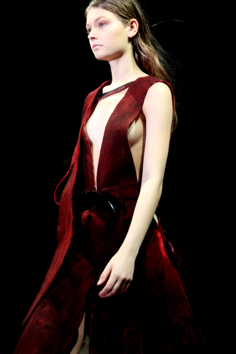
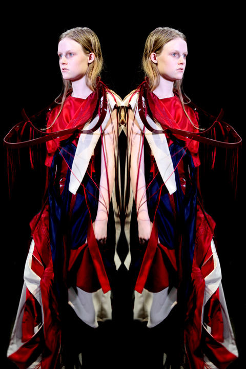
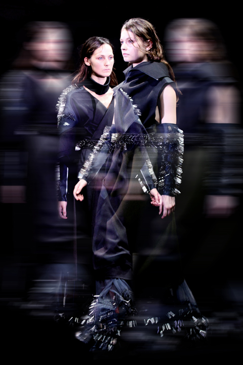
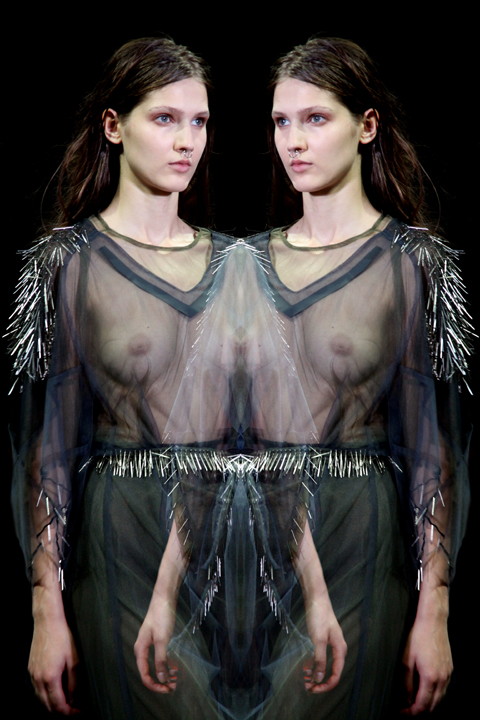
Natalie Rae graduated from the London College of Fashion 2010 class with a BA in fashion design technology (Womenswear). The designer caught Amelia’s Magazine’s attention for her stance against the use of fur in the fashion industry and the application of embroidery to create stunning textures on jacket shapes based on 1980′s casual wear. Speaking to Natalie was an insight into the difficulties that await any designer (especially for students) branching into sustainable fashion design, symptoms namely the time and cost it takes to source from ethical sources.
With this fantastic collection Natalie blows apart the misconceived assumption that sustainable fashion has no place on the catwalk.
What was the starting point for your collection?
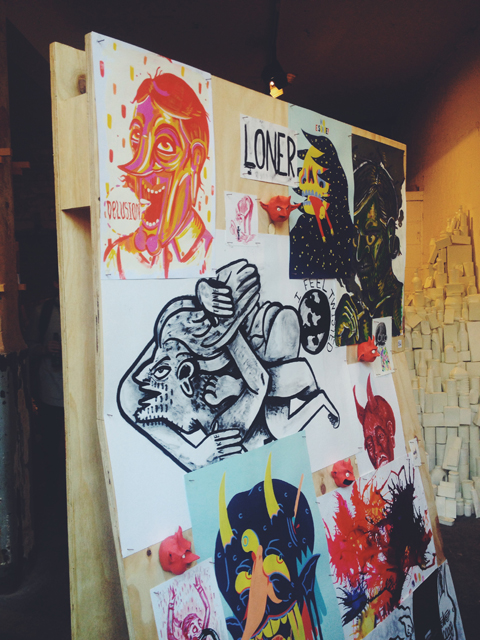
Before embarking on my initial research for my collection concepts, abortion I knew I wanted all of my ideas to centre around sustainability. To be conscious of how I would be producing my garments, using only organic or recycled materials as well as making sure my production methods where compliant with fair trade. This was very important to me through every step of this project. Also craft is something I have always been fascinated with; many different types of crafts, not just related to fashion; this was how I came across Ryan Berkley’s amazing animal portraits. These illustrations gave me a great starting point to help build a story for my collection and opened me up to using lots and lots of colors.

How does your creative process begin?
I work straight into pattern cutting, I collect all my research into one book to refer to and start pulling from each image, creating random sketches and then go straight into sampling either textures, silhouettes or details. I am very visual and hands on about everything I do, I find I absorb ideas better this way. I also don’t like wasting time, I like to get started right away with things, that is way I go straight into patterncutting and sampling. All of this really helps me to create more ideas and to start pulling things together into one cohesive collection of ideas.
What techniques do you use to minimize waste when pattern cutting or constructing the garments?
I try to minimize the amount of fabric and paper I use while patterncutting and sewing by trying to fit my patterns in a way that they don’t waste massive amounts of small bits. This can be really tricky sometimes because in some cases you just can’t help it. I have a box for scraps for both paper and fabric, I use the scrapes usually for sampling ideas or making small details like pockets and such. I also try to reuse my twilling samples for other project as much as i can by refitting them or just cutting them up to create something else.

How did you become interested in designing sustainable clothes?
It’s my lifestyle essentially. Its somewhat hard to say where it begin because it is something I’ve always agreed with and tried to incorporate into my everyday life. I will admit that when I started fashion design here in London, I became a bit more religious about it and started re-educated myself on the different areas of sustainability but particularly those in fashion and realized there is such massive gap in the fashion industry for it.

How do you think this gap in fashion with regards to sustainability can be closed?
I can honestly say that while I don’t think sustainability will ever take over fashion, it needs to more prominent then it is at the moment, something I believe it can and will be in the near future. It is important not only to create brands that are sustainable, but that existing brands switch to more sustainable practices. These brands already have a place in the market and have seen the industry and its effects, they have the power to modify these existing problems and I feel if they promoted more sustainable/ethical ideals other people will follow. But saying that, I do think new brands coming into the market place promoting sustainable/ethical fashion is important too. Making people aware of the effects of both non-sustainable and sustainable fashion is something that needs to be done, if they can see the before and after, it helps put things in prospective.
I also think design should not be sacrificed when creating sustainable/ethical fashion. Some students at my university still think sustainable fashion feels dated and they always imagine it being another scratchy hemp sack. This is far from the truth, sustainable fashion design and fabrics have come a long way, even brands like H&M and Topshop carry small amounts of sustainable/ethical pieces in their collections that are very on trend. The problem is that people don’t realise it, as it’s not promoted as much as it should be

Where did the idea of embroidery develop from and what is your stance on the use of fur within the fashion industry?
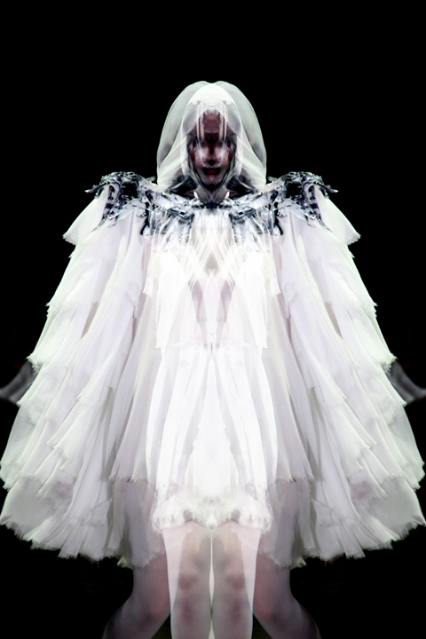
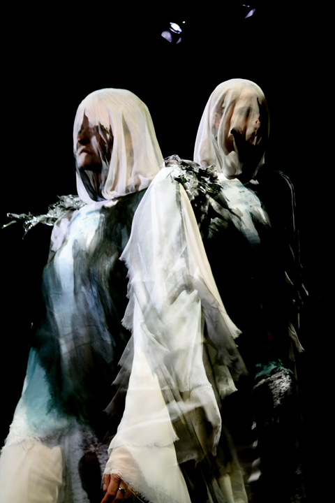
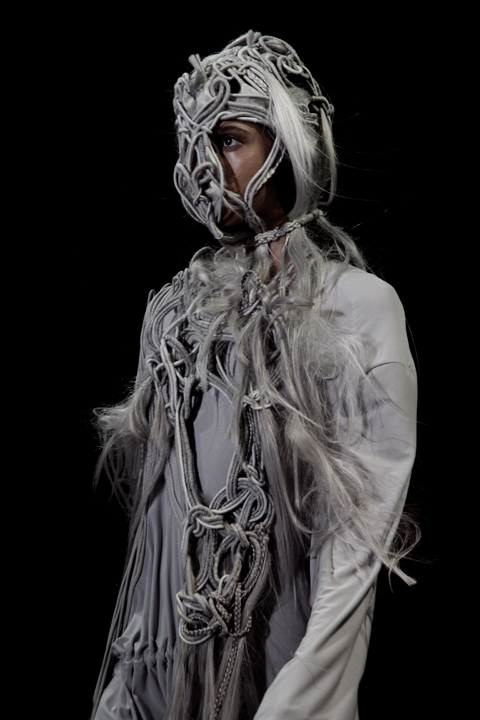
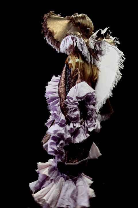
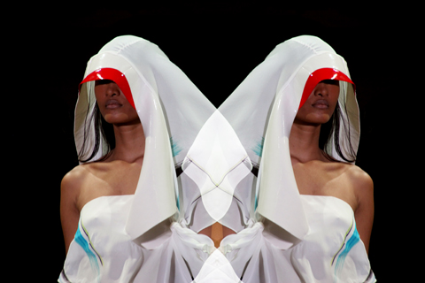
I am very in to surface textiles and I have always loved the use of embroidery in both art and fashion, it reminds me of something that is a bit more special and authentic. The uniqueness and beauty of hand crafted embroidery is hard to copy, so when you buy a piece that has that, you feel special and that you have something no-one else has. Previously I worked at a couture bridal salon, where we would create these beautiful one off gowns with amazingly small details people just loved, I wanted to recreate that idea with my garments, by creating pieces that make you feel special everyday, not just for one.
With the subject of fur, I came into animals rights activism at a young age, I never saw the use of fur as a necessity in fashion. To me the whole concept is really grotesque and I can’t understand it even in the smallest of ways. The production and use for creating fur is so inhumane, we have so many alternatives (and I am not talking about synthetic furs) in fashion for creating warmth but I know that this is not just the issue, people see it as luxury, but how can one see the death of animals as a luxury? Be creative. I wanted to show that you can still have luxury with out death.

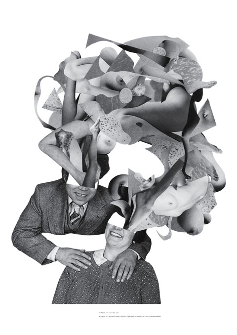
Why the illustrations of Ryan Berkley? How were his anthropomorphic illustrations transferred into the collection?
I saw each of Berkley’s illustrations as a great story of each animal. Giving me an insight into their lives, how they dressed themselves and even the expressions on their faces told me that they may be a bit more serious about their daily lives, trying to pass off as proper civilized humans. It reminded me of working class and how we must put on a costume or character for work that is not really who we are; trying to restrain the animal inside. The collection really shows a coming through or breaking out; the wild with the restrained.

Where did the 1980′s american shape of the collection develop from?
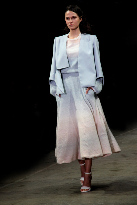
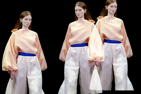
I am big on causal attire, anyone that hangs around me will tell you I am a jeans and t-shirt kind of gal! But saying that, I love well tailored pieces that are easy to wear and mix into your wardrobe. I wanted to convey that with this collection. I also needed that concept to fit with my working class animals idea. I found images from the early 80’s of designers I admire such as Calvin Klein and Perry Ellis; I felt that the style of the early 80‘s causal american mixed with a little bit of tailoring was perfect way to show my love for two kinds of style.

Who are Hand and Lock of London?
Hand and Lock are a London based embroidery company that have been around since the mid 1700‘s, and is the merging of two long established embroidery companies. I chose Hand and Lock because of their many, many years of experience and expertise as well as their professionalism and friendliness. They where extremely easy to work with and everything was done in a very timely fashion. When I was searching for embroidery companies, my top priority was for finding fair trade work conditions. Hand and Lock had just opened a factory in India to balance their work load and I was reassured, very adamantly, that the employees are paid fair trade wages and have good quality working conditions. I was very happy in the end that my work would be done in India, where the craft and tradition of embroidery is such an amazing part of the culture and I could promote it and show the beauty of it in a small way.

Where did you source your materials?
The vast majority of my materials came from India, some were sources directly from companies in India and some were from UK companies that supply materials from India. The biggest challenge I came across with using organic materials was finding variations in colours. This was a problem because my collection has so many colours and organic materials rarely come in a vast amount of colorways. I knew all this to begin with and tried to stick with what I could find but silly me! I kept choosing fabrics that came in only one colorway – the base color, which is an un-dyed cream. In the end, I researched the self dying of natural dyes and low impact dyes to solve this problem. I didn’t want to create another step in production that would create more waste but I also wanted to create a beautiful vibrant collection that was sellable and wearable, so I had to make the sacrifice. I was very conscious of my consumption of water and tried my best to conserve as much as I could by minimizing the amount of dying that needed to be done. In the end it wasn’t so terrible but the experience defiantly made me want to research more into the process of fabric dying.

Where the fabric companies you used part of fair trade initiatives? Do you have tips to other fashion students considering using ethical/sustainable fabric?
It can be tricky business finding organic/fair trade suppliers, especially ones that will supply in smaller quantities but they are out there and there are more then people realize. All of the suppliers I used are certified organic fabric suppliers and each company also states their practice fair trade principles. Only some of the companies are part of The Fair Trade Foundation. As far as finding organic/fair trade suppliers, there are sites that will help direct you to suppliers: The Green Directory, Ethical Junction and the Ethical Fashion Forum. Additionally, some suppliers have references to other sites relating to eco suppliers and going to trade shows is very important. I try to attend as many textile trade shows as possible, even ones that don’t say anything about sustainable/ethical fabrics because there are always a few companies that do provide them or are trying to cross over into more sustainable practices. It is important to be able to talk to a rep about the company, as this way you can find out more, about what individual companies consider to be sustainable and see the products in person.
I found all of my fabric suppliers either through tons of research, collecting from fabric libraries or from my work experience with ethical brands. People in ethical fashion are very friendly and very willing to help. Going to any type of ethical fair/ marketplace or event with sustainable brands where you can speak to people is always a good start, most people will give you good tips and suggestions.

Can the same be said of the embroidery through hand and lock?
Unfortunately no. When I came to Hand and Lock my first question to them was about fair trade practices, they could only reassure me that they do pay fair wages and have good working conditions for their employees in India. They seemed very honest and actually happy that someone asked them. I do wish I could say they are part of the fair trade initiative and maybe they will be, as the factory in India is still new. At the time that I choose to work with them, I was very short on time and had to make a quick decision, they are such lovely people that it was hard to say no. As well, one thing I learned from my work experience with sustainable brands is that you can’t tick every box with it comes to being ethical and sustainable, its very difficult and in the end, you can only do the best you can and to be honest every step of the way.
What’s next for Natalie Rae?
I take things day to day and try not to restrict myself from any new ideas. At the moment I am sorting out my next big move, whether I do an MA or gain more work experience. I do want to gain more experience with in the fashion industry before I move on to create my own label in the future. But who knows, things change……
Photography by Sean Michael and the Creative Director was Rob Phillips
Written by Sally Mumby-Croft on Wednesday June 16th, 2010 1:51 pm
Categories ,BA, ,Calvin Klein, ,craft, ,Creative Director Rob Phillips, ,Embroidary, ,Ethical Fashion, ,Ethical Fashion Forum, ,Ethical Junction, ,Fair Trade, ,Fur is Murder, ,Graduate Fashion Week 2010, ,Hand and Lock, ,India, ,London College of Fashion, ,Natalie Rae, ,Perry Ellis, ,photography Sean Michael, ,Research, ,Ryan Berkley, ,Sketchbooks, ,Sourcing the Global Market Place, ,Sustainable Fashion
Similar Posts: