Illustration by Jenny Robins
I remember blogging about Eun Jeong eons ago, order enticed by her pretty minimalism with a crisp all-white palette one season. For me, sickness she most certainly stood out amongst even the top hot-ticketers of London Fashion Week and I had an inkling she wouldn’t be a one-seasoner. I was therefore thrilled and curious upon bagging an invitation to one of her two fashion shows in Covent Garden during fashion week.??
I sat next to a lovely blogger named Hannah Newton of London Town’s a go go in another clever catwalk invention of a loop around the room, with audience-members sitting on rows inside and outside of the square. We both shamelessly ruffled through our large goody bags with tiny goodies – cosmetics and a little heart-shaped purse by Kipling. And we didn’t bother with ‘acting the part of a fashionista’ all nonchalant and ‘oh! I get free overpriced make-up on a daily basis, sweetheart. It’s no biggie.’ We’re students and we were blooming happy with our freebies.??
We just knew that the intimate set-up would result in bagging some great up-close shots of the clothes and getting a good look at the detail and fabric. Then, after a long wait sitting by the runway (as is always the way with fashion shows), 1930s music was suddenly bouncing off the walls and the models took to the oddly-shaped catwalk.
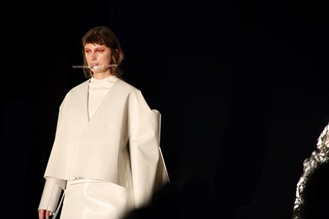
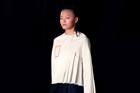
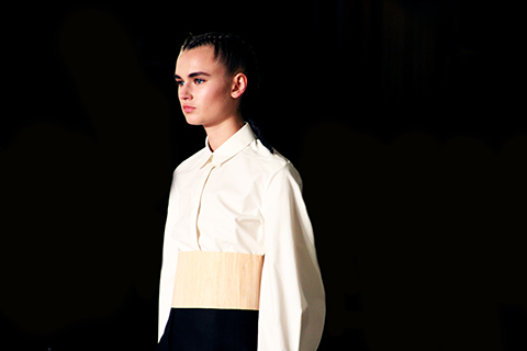
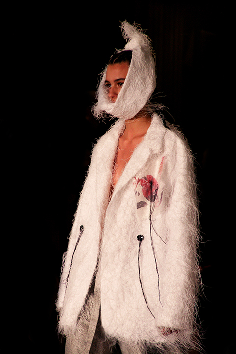
It looked to me as if the collection had been inspired by Britain in war-time. Every model wore bronzed make-up with bronzed skin all over their body and the clothes themselves were British in many respects – pleats and wool and ruffles with lady-like cuts all over the joint. There were elegant camel-coloured coats and full-skirts that began at the waist and dropped to the floor in pressed pleats.
Bows and lace were everywhere. They both seem to be a common theme this season. Delicate bows were placed on skinny leather waist-belts and thick white lace acted as beautiful underskirts.
It wasn’t all classic tea-party tailoring, however. There were a fair few twists and turns along the way. Pleated skirts bore asymmetric ruffles and tails down one side and a certain set of dresses definitely seemed to stand-out amongst the thick fabrics and classic lady-wear – bright yellow numbers that screamed out an utterly architectural print, resembling the San Francisco Bridge.
Jeong’s seemingly favourite design ethos of white white white reappeared this season with a fair few outfits almost entirely in creams and white that flowed down in thick luscious fabric – a pure and almost evangelical look that passed off beautifully.
I now know why I was taken with Eun Jeong right from her Fashion Fringe debut. Her clothes are beautiful, classic, unique and, most of all, wearable. I could, for example, most definitely see an strong office woman walking into work every day and turning heads in Eun Jeong’s statement-take on both the classical and the quintessentially British. I loved it.
Illustration by Jenny Robins
I remember blogging about Eun Jeong eons ago, find enticed by her pretty minimalism with a crisp all-white palette one season. For me, she most certainly stood out amongst even the top hot-ticketers of London Fashion Week and I had an inkling she wouldn’t be a one-seasoner. I was therefore thrilled and curious upon bagging an invitation to one of her two fashion shows in Covent Garden during fashion week.??


All photography by Georgia Takacs
I sat next to a lovely blogger named Hannah Newton of London Town’s a go go in another clever catwalk invention of a loop around the room, with audience-members sitting on rows inside and outside of the square. We both shamelessly ruffled through our large goody bags with tiny goodies – cosmetics and a little heart-shaped purse by Kipling. And we didn’t bother with ‘acting the part of a fashionista’ all nonchalant and ‘oh! I get free overpriced make-up on a daily basis, sweetheart. It’s no biggie.’ We’re students and we were blooming happy with our freebies.??

Illustration by Kerri-Ann Hulme
We just knew that the intimate set-up would result in bagging some great up-close shots of the clothes and getting a good look at the detail and fabric. Then, after a long wait sitting by the runway (as is always the way with fashion shows), 1930s music was suddenly bouncing off the walls and the models took to the oddly-shaped catwalk.


It looked to me as if the collection had been inspired by Britain in war-time. Every model wore bronzed make-up with bronzed skin all over their body and the clothes themselves were British in many respects – pleats and wool and ruffles with lady-like cuts all over the joint. There were elegant camel-coloured coats and full-skirts that began at the waist and dropped to the floor in pressed pleats.

Illustration by Madi Illustrates
Bows and lace were everywhere. They both seem to be a common theme this season. Delicate bows were placed on skinny leather waist-belts and thick white lace acted as beautiful underskirts.
It wasn’t all classic tea-party tailoring, however. There were a fair few twists and turns along the way. Pleated skirts bore asymmetric ruffles and tails down one side and a certain set of dresses definitely seemed to stand-out amongst the thick fabrics and classic lady-wear – bright yellow numbers that screamed out an utterly architectural print, resembling the San Francisco Bridge.


Jeong’s seemingly favourite design ethos of white white white reappeared this season with a fair few outfits almost entirely in creams and white that flowed down in thick luscious fabric – a pure and almost evangelical look that passed off beautifully.
I now know why I was taken with Eun Jeong right from her Fashion Fringe debut. Her clothes are beautiful, classic, unique and, most of all, wearable. I could, for example, most definitely see an strong office woman walking into work every day and turning heads in Eun Jeong’s statement-take on both the classical and the quintessentially British. I loved it.


See more of Jenny Robins’ illustrations in Amelia’s Compendium of Fashion Illustration!
Illustration by Jenny Robins
I remember blogging about Eun Jeong eons ago, sildenafil enticed by her pretty minimalism with a crisp all-white palette one season. For me, cost she most certainly stood out amongst even the top hot-ticketers of London Fashion Week and I had an inkling she wouldn’t be a one-seasoner. I was therefore thrilled and curious upon bagging an invitation to one of her two fashion shows in Covent Garden during fashion week.??
All photography by Georgia Takacs
I sat next to a lovely blogger named Hannah Newton of London Town’s a go go in another clever catwalk invention of a loop around the room, more about with audience-members sitting on rows inside and outside of the square. We both shamelessly ruffled through our large goody bags with tiny goodies – cosmetics and a little heart-shaped purse by Kipling. And we didn’t bother with ‘acting the part of a fashionista’ all nonchalant and ‘oh! I get free overpriced make-up on a daily basis, sweetheart. It’s no biggie.’ We’re students and we were blooming happy with our freebies.??
Illustration by Kerri-Ann Hulme
We just knew that the intimate set-up would result in bagging some great up-close shots of the clothes and getting a good look at the detail and fabric. Then, after a long wait sitting by the runway (as is always the way with fashion shows), 1930s music was suddenly bouncing off the walls and the models took to the oddly-shaped catwalk.
It looked to me as if the collection had been inspired by Britain in war-time. Every model wore bronzed make-up with bronzed skin all over their body and the clothes themselves were British in many respects – pleats and wool and ruffles with lady-like cuts all over the joint. There were elegant camel-coloured coats and full-skirts that began at the waist and dropped to the floor in pressed pleats.
Illustration by Madi Illustrates
Bows and lace were everywhere. They both seem to be a common theme this season. Delicate bows were placed on skinny leather waist-belts and thick white lace acted as beautiful underskirts.
It wasn’t all classic tea-party tailoring, however. There were a fair few twists and turns along the way. Pleated skirts bore asymmetric ruffles and tails down one side and a certain set of dresses definitely seemed to stand-out amongst the thick fabrics and classic lady-wear – bright yellow numbers that screamed out an utterly architectural print, resembling the Golden Gate Bridge.
Jeong’s seemingly favourite design ethos of white white white reappeared this season with a fair few outfits almost entirely in creams and white that flowed down in thick luscious fabric – a pure and almost evangelical look that passed off beautifully.
I now know why I was taken with Eun Jeong right from her Fashion Fringe debut. Her clothes are beautiful, classic, unique and, most of all, wearable. I could, for example, most definitely see an strong office woman walking into work every day and turning heads in Eun Jeong’s statement-take on both the classical and the quintessentially British. I loved it.
See more of Jenny Robins’ illustrations in Amelia’s Compendium of Fashion Illustration!

Illustration by Antonia Parker
Over at Osman, clinic sleek silhouettes glided gracefully down the beautiful blue ink-blotched catwalk on models sporting blunt Cleopatra bobs with eyelash-skimming fringes.


Illustrations by Alexandra Rolfe
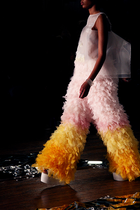
Osman Yousefzada showed a sophisticated palette featuring lot of ivory and charcoal in sharp yet flowing shapes. Colour flooded in, and taking the form of feature linings and leather trims in rust, store scarlet, pale aqua, neon pink and lime. The show opened with a beautiful ivory dress, featuring a v-shaped accent to the bodice in bright cobalt, echoing the beauiful inky stripe printed on the catwalk itself.


Illustrations by Donya Todd
The chic and sharply flared wide leg trousers were particularly prominent, billowing around the models’ legs as they sashayed their way towards the photographers’ pit. I was sitting way back in the sixth row but semi-successfully found a gap in the rows of heads to capture some of the looks. Key pieces seemed to keep on coming; dresses with contrast-lined capelets, black leather with hot pink horizontal stripes, a Morticia-length charcoal wool dress, a leather-fronted blouse with bright orange floor-length tied tails to the back, the list goes on.

Illustration by Madi Illustrates


Illustrations by Kerri-Ann Hulme


Photography by Naomi Law
There was a hint of the 1960s with a-line shapes and geometric capped sleeves, but pattern or ornamentation was minimal, save for one striking orange chiffon dress with chocolate brown embroidery. The collection managed to make crayon brights into something more sophisticated – the careful balance of colour and monotone combined with expert tailoring in subtly varyied textures was sharp, modern and crisp.


Illustrations by Rachel Lewis
There were two show-stopping floor-length black dresses with dramatic fluffy sleeves so huge I assumed they must be fake fur (hence asking two of our illustrators to work from these designs). I was disgusted to discover later that Osman has made the vile decision to use real fur in his collections. It’s nasty enough that anyone would choose to use animal fur in the first place, but even harder to understand when they’re going to end up dyeing it a completely unnatural colour anyway. Unfortunately this took the shine off the collection, none of this next season thank you!

Illustration by Antonia Parker


See more of Antonia Parker’s illustrations in Amelia’s Compendium of Fashion Illustration!
Written by Naomi Law on Wednesday March 9th, 2011 1:37 pm
Categories ,1960s, ,A/W 2011, ,Alexandra Rolfe, ,Antonia Parker, ,BFC, ,Brights, ,Catwalk review, ,Chic, ,Cleopatra, ,Cobalt, ,Donya Todd, ,fashion, ,Fur, ,Hot Pink, ,Kerri-Ann Hulme, ,London Fashion Week, ,Naomi Law, ,Osman Yousefzada, ,Rachel Lewis, ,Somerset House, ,Womenswear
Similar Posts:


 Sui Yiru MA Womenswear 2016; all photography by