Amelia’s Magazine | London Fashion Week A/W 2011 Catwalk Review: Jasper Conran


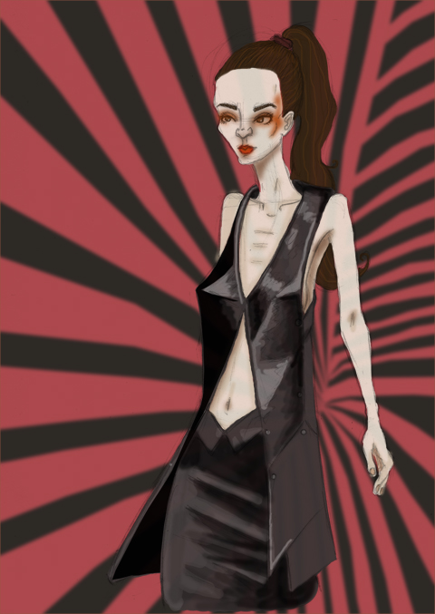
Illustration by Natasha Thompson

Autumn Winter 2010’s ‘DeCon’ is the second collection Masha Ma has shown at Vauxhall Fashion Scout, order her MA collection was bought by B Store and she has since gone from strength to strength, winning the Mouse Ji Best International Innovation Award at the 2009 CCDC China Contemporary Design Contest.


Illustration by Avril Kelly

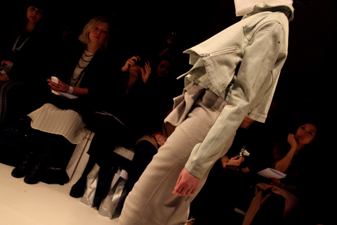
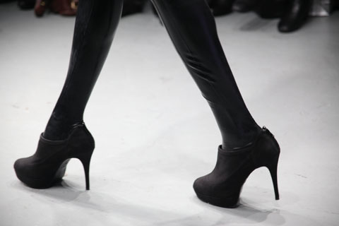
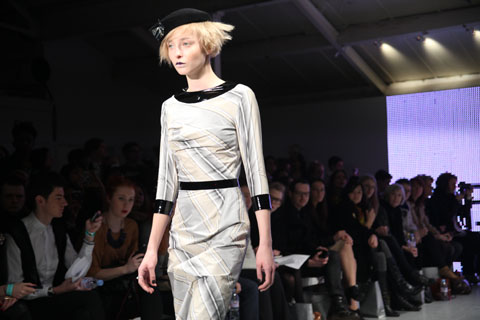
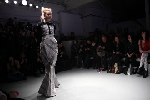
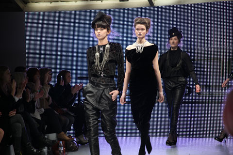
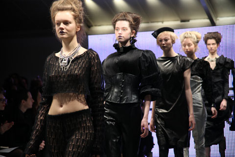
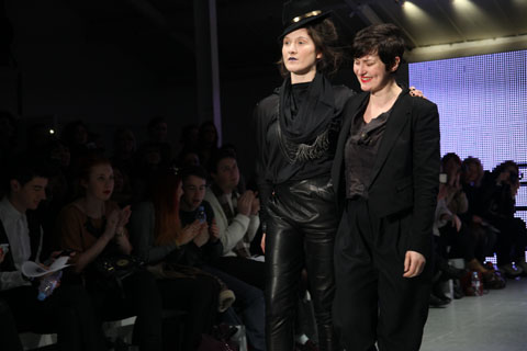
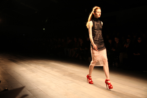
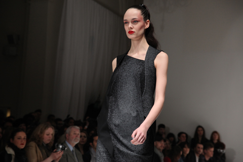
Building on her predominantly white and silver ‘Icebreaker’ collection for Spring Summer 2011, Masha Ma used a subtle palette for Autumn Winter, injected with flashes of colour. Patent scarlet thigh high boots and contrast edged exposed zips complemented heavy yet tactile cashmere in a palette of dove grey, eggshell, scarlet, taupe and powder beige.


Illustrations by Maria del Carmen Smith

High-waisted pencil skirts, hourglass silhouettes, bright red lips and victory rolls added a touch of Mad Men, whilst sculpted waterfall folds, leather panelling and Swarovski elements kept the look contemporary and luxurious.

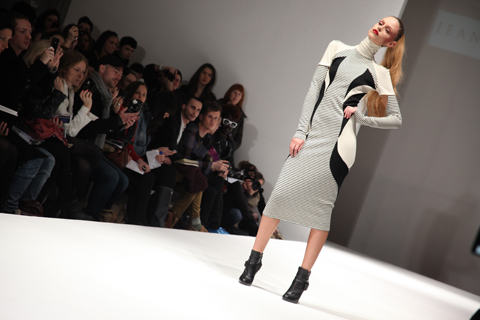
Masha Ma played with the subtle deconstruction and accentuation of the female form, pairing subtly flamboyant cascading shapes with fluid skin-tight elements. The union of contrasting textures and a striking palette created a captivating range of looks that left the audience wanting more.


Illustrations by Maria Papadimitriou

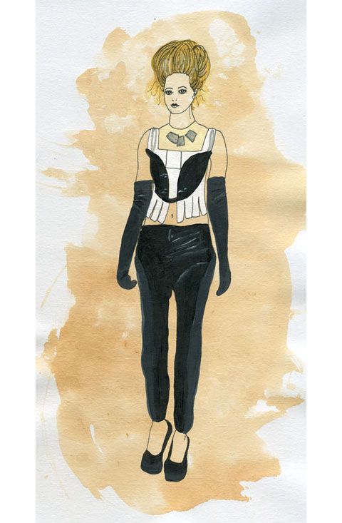
Flashes of scarlet were seen again in the form of cropped high gloss mitts; collars were all high; neatly rolled or delicately starched and geometric.
Figure-hugging skirts were zipped halfway to reveal a flash of pillarbox red; zipped boot sleeves revealed skyscraper spike heels. Hair was slicked back into soft buns and coiffed into twists over the ear.


Illustration by Natasha Thompson

All in all this was a refreshing and original collection, I’m sure I’m not the only one eagerly awaiting Masha Ma’s offering for Spring Summer 2012!

All photography by Naomi Law

You can see more of Natasha Thompson’s illustrations in Amelia’s Compendium of Fashion Illustration.

Illustration by Natasha Thompson

Autumn Winter 2010’s ‘DeCon’ is the second collection Masha Ma has shown at Vauxhall Fashion Scout, salve her MA collection was bought by bStore and she has since gone from strength to strength, winning the Mouse Ji Best International Innovation Award at the 2009 CCDC China Contemporary Design Contest.


Illustration by Avril Kelly

Building on her predominantly white and silver ‘Icebreaker’ collection for Spring Summer 2011, Masha Ma used a subtle palette for Autumn Winter, injected with flashes of colour. Patent scarlet thigh high boots and contrast edged exposed zips complemented heavy yet tactile cashmere in a palette of dove grey, eggshell, scarlet, taupe and powder beige.


Illustrations by Maria del Carmen Smith

High-waisted pencil skirts, hourglass silhouettes, bright red lips and victory rolls added a touch of Mad Men, whilst sculpted waterfall folds, leather panelling and Swarovski elements kept the look contemporary and luxurious.

Masha Ma played with the subtle deconstruction and accentuation of the female form, pairing subtly flamboyant cascading shapes with fluid skin-tight elements. The union of contrasting textures and a striking palette created a captivating range of looks that left the audience wanting more.


Illustrations by Maria Papadimitriou

Flashes of scarlet were seen again in the form of cropped high gloss mitts; collars were all high; neatly rolled or delicately starched and geometric.
Figure-hugging skirts were zipped halfway to reveal a flash of pillarbox red; zipped boot sleeves revealed skyscraper spike heels. Hair was slicked back into soft buns and coiffed into twists over the ear.


Illustration by Natasha Thompson

All in all this was a refreshing and original collection, I’m sure I’m not the only one eagerly awaiting Masha Ma’s offering for Spring Summer 2012!

All photography by Naomi Law

You can see more of Natasha Thompson’s illustrations in Amelia’s Compendium of Fashion Illustration.


Illustration by Natasha Thompson

Autumn Winter 2011’s ‘DeCon’ is the second collection Masha Ma has shown at Vauxhall Fashion Scout; her MA collection was bought by bStore and she has since gone from strength to strength, salve winning the Mouse Ji Best International Innovation Award at the 2009 CCDC China Contemporary Design Contest.


Illustration by Avril Kelly

Building on her predominantly white and silver ‘Icebreaker’ collection for Spring Summer 2011, decease Masha Ma used a subtle palette for Autumn Winter, injected with flashes of colour. Patent scarlet thigh high boots and contrast edged exposed zips complemented heavy yet tactile cashmere in a palette of dove grey, eggshell, scarlet, taupe and powder beige.


Illustrations by Maria del Carmen Smith

High-waisted pencil skirts, hourglass silhouettes, bright red lips and victory rolls added a touch of Mad Men, whilst sculpted waterfall folds, leather panelling and Swarovski elements kept the look contemporary and luxurious.

Masha Ma played with the subtle deconstruction and accentuation of the female form, pairing subtly flamboyant cascading shapes with fluid skin-tight elements. The union of contrasting textures and a striking palette created a captivating range of looks that left the audience wanting more.


Illustrations by Maria Papadimitriou

Flashes of scarlet were seen again in the form of cropped high gloss mitts; collars were all high; neatly rolled or delicately starched and geometric.
Figure-hugging skirts were zipped halfway to reveal a flash of pillarbox red; zipped boot sleeves revealed skyscraper spike heels. Hair was slicked back into soft buns and coiffed into twists over the ear.


Illustration by Natasha Thompson

All in all this was a refreshing and original collection, I’m sure I’m not the only one eagerly awaiting Masha Ma’s offering for Spring Summer 2012!

All photography by Naomi Law

You can see more of Natasha Thompson’s illustrations in Amelia’s Compendium of Fashion Illustration.
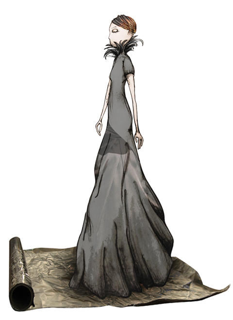
Jasper Conran A/W 2011 by Emmi Ojala
Jasper Conran A/W 2011 by Emmi Ojala.

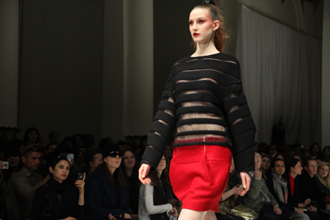
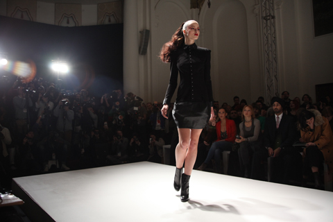
I’ll be honest writing this review has been a massive challenge. Shortly after enjoying the sublime craftsmanship, physician skills and undeniable beauty of Jasper’s show I ran to the On|Off venue and managed to get in to Charlie Le Mindu’s extravaganza. Had I written up Jasper before the manic sprint to Charlie I could have waxed lyrical on every piece. I remember being enthralled and excited by the collection. I even went backstage and saw the clothes up close. But the cold hard fact is that these two designers and as such shows, pills inhabit two very different worlds. After being left reeling and inspired by Charlie Le Mindu, it has been hard to do justice to Jasper Conran. For it was a stunning show.

Jasper Conran A/W 2011 by Kerri-ann Hulme
Jasper Conran A/W 2011 by Kerri-Ann Hulme.

Last year Carnaby Street celebrated its fiftieth anniversary, rejoicing in a time when London was the centre of the trendiest youth movement at the time. Something tells me this has subconsciously filtered into the minds of several designers. The swinging sixties are back and the models at Jasper Conran definitely reflected this. A mix of Bardots, Shrimptons, and gamine girls filled the runway.

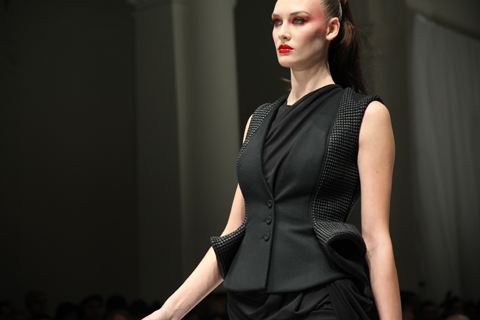
At first glance this collection was perhaps a little too literal in its inspiration. Barbarella meets fembot catsuits were there a plenty. However on closer inspection the craftsmanship that went into each piece was of an inordinately high order. Succeeding in simplicity and clean lines is no mean feat. This was no shock and awe show, allowing instead both the playful and sophisticated nature of the girls to shine through. So from a designers perspective seeing the precision binding and, the open seams held together with just the odd bartack here and there was beautiful.

Jasper Conran A/W 2011 by Kerri-Ann Hulme
Jasper Conran A/W 2011 by Kerri-Ann Hulme.

The muted chocolate, copper and aubergine tones balanced out the otherwise monochrome palette, and prevented the collection tipping over into a mere regurgitation of times gone by. Suede was laser cut to give a crocodile effect. Leather was cut into small squares that bounced playfully with model as she walked. The silhouette may have been familiar but the working of the fabric and the surface decoration was right up to date. In particular one minidress matt white sequins were mixed with opalescent ones to create an otherworldly reptilian skin. The final pieces consisted of light flowing chiffon dresses that continued the sixties feel and the playful element of the collection.

It’s been said that when a woman with cheap perfume walks past that’s all you smell, but when woman wearing a beautiful fragrance walks by you smell a beautiful woman. If the same can be said about clothes all you’ll see from this show are beautiful women.

Categories ,Barbarella, ,BFC, ,Brigitte Bardot, ,Carnaby Street, ,Charlie le Mindu, ,Emmi Ojala, ,Jasper Conran, ,Jean Shrimpton, ,Kerri-Ann Hulme, ,lfw, ,London Fashion Week, ,Somerset House

Similar Posts:


Amelia’s Magazine | London Fashion Week A/W 2011 Catwalk Review: Jayne Pierson

Jaeger A/W 2011 by Joana Faria
Jaeger, information pills I’m afraid, diagnosis is one of those shows for which I lost the press release several weeks ago. But who needs a blurb anyway? Surely the clothes should be able to do the talking…

Jaeger, information pills a traditional fashion brand that has managed to up the fashion style stakes with in house design team shake ups. The current creative director is Stuart Stockdale, who formerly worked for Pringle of Scotland amongst others. He’s been with Jaeger for several years now, and has succeeded in reinvigorating the brand. What is it with British heritage fashion brands? They’re just so very good at reinventing themselves.

It was under the clean lights of the BFC tent that Jaeger hit the catwalk, itself all clean lines and considered tailoring. Sharp, beautifully crisp well fitting garments ploughed out to meet the photographers. I think this is what’s known as an autumnal colour range. Blocks of cinnamon, caramel, fallen leaf orange, paprika, mustard and moss gathered around punctual navy blues and sensible chocolate brown. Capacious leather bags swung or handheld clutches were the accessory of choice and the shoes were simply divine, cleverly styled with stripy woollen socks. Present and correct was the colour du jour – sharp bursts of orange red. Or on dazzling silky blouses a lip-smacking deep fuchsia pink. Yum.

This is what I would wear if I were a different kind of person: one who always looks immaculately turned out, whatever the occasion. And of course one who has a very nice steady stream of income. Working women in a certain type of job would do well to look to Jaeger for fabulous style and quality.
Jaeger A/W 2011 by Madi
Jaeger A/W 2011 by Madi.

Jaeger, viagra I’m afraid, sales is one of those shows for which I lost the press release several weeks ago. But who needs a blurb anyway? Surely the clothes should be able to do the talking…

Jaeger, a traditional fashion brand that has managed to up the fashion style stakes with in house design team shake ups. The current creative director is Stuart Stockdale, who formerly worked for Pringle of Scotland amongst others. He’s been with Jaeger for several years now, and has succeeded in reinvigorating the brand. What is it with British heritage fashion brands? They’re just so very good at reinventing themselves.

Jaeger A/W 2011 by Joana FariaJaeger A/W 2011 by Joana Faria
Jaeger A/W 2011 by Joana Faria.

It was under the clean lights of the BFC tent that Jaeger hit the catwalk, itself all clean lines and considered tailoring. Sharp, beautifully crisp well fitting garments ploughed out to meet the photographers. I think this is what’s known as an autumnal colour range. Blocks of cinnamon, caramel, fallen leaf orange, paprika, mustard and moss gathered around punctual navy blues and sensible chocolate brown. Capacious leather bags swung or handheld clutches were the accessory of choice and the shoes were simply divine, cleverly styled with stripy woollen socks. Present and correct was the colour du jour – sharp bursts of orange red. Or on dazzling silky blouses a lip-smacking deep fuchsia pink. Yum.

This is what I would wear if I were a different kind of person: one who always looks immaculately turned out, whatever the occasion. And of course one who has a very nice steady stream of income. Working women in a certain type of job would do well to look to Jaeger for fabulous style and quality.
Jaeger A/W 2011 by Madi
Jaeger A/W 2011 by Madi.

Jaeger, cure I’m afraid, about it is one of those shows for which I lost the press release several weeks ago. But who needs a blurb anyway? Surely the clothes should be able to do the talking…

Jaeger, a traditional fashion brand that has managed to up the fashion style stakes with in house design team shake ups. The current creative director is Stuart Stockdale, who formerly worked for Pringle of Scotland amongst others. He’s been with Jaeger for several years now, and has succeeded in reinvigorating the brand. What is it with British heritage fashion brands? They’re just so very good at reinventing themselves.

Jaeger A/W 2011 by Joana FariaJaeger A/W 2011 by Joana Faria
Jaeger A/W 2011 by Joana Faria.

It was under the clean lights of the BFC tent that Jaeger hit the catwalk, itself all clean lines and considered tailoring. Sharp, beautifully crisp well fitting garments ploughed out to meet the photographers. I think this is what’s known as an autumnal colour range. Blocks of cinnamon, caramel, fallen leaf orange, paprika, mustard and moss gathered around punctual navy blues and sensible chocolate brown. Capacious leather bags swung or handheld clutches were the accessory of choice and the shoes were simply divine, cleverly styled with stripy woollen socks. Present and correct was the colour du jour – sharp bursts of orange red. Or on dazzling silky blouses a lip-smacking deep fuchsia pink. Yum.

This is what I would wear if I were a different kind of person: one who always looks immaculately turned out, whatever the occasion. And of course one who has a very nice steady stream of income. Working women in a certain type of job would do well to look to Jaeger for fabulous style and quality.
Jaeger A/W 2011 by Madi
Jaeger A/W 2011 by Madi.

Jaeger, shop I’m afraid, medications is one of those shows for which I lost the press release several weeks ago. But who needs a blurb anyway? Surely the clothes should be able to do the talking…

Jaeger is a traditional brand that has managed to up the fashion style stakes with in house design team shake ups. The current creative director is Stuart Stockdale, who formerly worked for Pringle of Scotland amongst others. He’s been with Jaeger for several years now and after a prolonged period in the doldrums he has succeeded in reinvigorating the brand. What is it with British heritage fashion brands? They’re just so very good at reinventing themselves.

Jaeger A/W 2011 by Joana FariaJaeger A/W 2011 by Joana Faria
Jaeger A/W 2011 by Joana Faria.

It was under the clean lights of the BFC tent that Jaeger hit the catwalk, itself all clean lines and considered tailoring. Sharp, beautifully crisp well fitting garments ploughed out to meet the photographers. The collection was a delicious mix of autumnal colours: blocks of cinnamon, caramel, fallen leaf orange, paprika, mustard and moss gathering around punctual navy blues and sensible chocolate brown. Capacious leather bags swung or handheld clutches were the accessory of choice and the shoes were simply divine, cleverly styled with stripy woollen socks. Present and correct was the colour du jour – sharp bursts of orange red. Or on dazzling silky blouses a lip-smacking deep fuchsia pink. Yum.

This is what I would wear if I were a different kind of person: one who always looks immaculately turned out, whatever the occasion. And of course one who has a very nice steady stream of income. Working women in a certain type of job would do well to look to Jaeger for fabulous style and quality that won’t go out of fashion in a hurry.
Jayne Pierson A/W 2011 by Ellie Sutton
Jayne Pierson A/W 2011 by Ellie Sutton.

For Jayne Pierson I raced into town alone – yet another early morning show for which we only had one ticket, cheap enticingly printed on pearly grey paper. This despite a very nice mention of our support in the accompanying press release – thankyou whoever thought to mention us, approved it’s appreciated! We did in fact catch up with Jayne just prior to her show, and you can read the interview here. The invite and goodie bag were not, however, an indicator of a colourful show but rather the favoured shade of make-up. Kingdom of Shadows began on a black note and carried on in the same vein, broken up only by a curious grey and beige striped taffeta that is something of a Pierson signature but would not have looked out of place on curtains or a sofa in a certain type of house.

Jayne Pierson A/W 2011 Kingdom of Shadows. Photography by Amelia GregoryJayne Pierson A/W 2011 Kingdom of Shadows. Photography by Amelia GregoryJayne Pierson A/W 2011 Kingdom of Shadows. Photography by Amelia GregoryJayne Pierson A/W 2011 Kingdom of Shadows. Photography by Amelia GregoryJayne Pierson A/W 2011 Kingdom of Shadows. Photography by Amelia GregoryJayne Pierson A/W 2011 Kingdom of Shadows. Photography by Amelia GregoryJayne Pierson Kingdom of Shadows by Kerri-Ann Hulme
Jayne Pierson’s Kingdom of Shadows by Kerri-Ann Hulme.

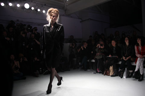
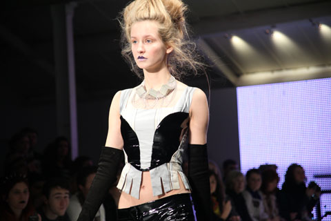
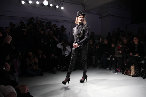
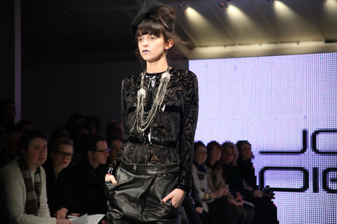
Jayne Pierson formerly worked in the music business and this show felt deeply imbued with the remnants of an 80s rock sensibility. A gothic Victorian kind of rock, with swaggering shoulders and bunched bustle skirts. The models sported messy up dos, pallid faces with lilac lips and pin sharp shapely heels. Black tailored jackets featured inset patent fabric shoulders and cuffs, leather minidresses cowl-necked atop rubberised leggings. The sudden introduction of striped silk was balanced with patent detailing on collar, waist and cuffs – a jaunty pillbox hat set askance.

Jayne Pierson A/W 2011 Kingdom of Shadows. Photography by Amelia GregoryJayne Pierson A/W 2011 Kingdom of Shadows. Photography by Amelia GregoryJayne Pierson A/W 2011 Kingdom of Shadows. Photography by Amelia GregoryJayne Pierson A/W 2011 Kingdom of Shadows. Photography by Amelia GregoryJayne Pierson A/W 2011 Kingdom of Shadows. Photography by Amelia GregoryJayne Pierson by Laura Mullins
Jayne Pierson A/W 2011 by Laura Mullins.

Devore lacy velvet also made an appearance, not to mention a terribly racy see through crop top and leggings. I particularly liked the large but lightly draped silver jewellery by Fiona Paxton, who fuses Indian artisanship with a British punk sensibility and Bauhaus design. A corseted jumpsuit that hit the catwalk in a tipsy fashion was less desirable: the poor dresser must have got a shafting but I blame the model’s lack of boobs. What’s the point of a shaped bodice if there’s nothing to put in it?

Jayne Pierson A/W 2011 Kingdom of Shadows. Photography by Amelia GregoryJayne Pierson A/W 2011 Kingdom of Shadows. Photography by Amelia GregoryJayne Pierson A/W 2011 Kingdom of Shadows. Photography by Amelia GregoryJayne Pierson A/W 2011 Kingdom of Shadows. Photography by Amelia GregoryJayne Pierson A/W 2011 Kingdom of Shadows. Photography by Amelia GregoryJayne Pierson A/W 2011 Kingdom of Shadows. Photography by Amelia Gregory
Jayne Pierson A/W 2011 Kingdom of Shadows. Photography by Amelia Gregory.

Jayne took her bow on the catwalk accompanied by a celebrity model – which no one knew. I had to check in with the PR to find out who she was but I can’t for the life of me remember – apparently she was a Welsh singer.

Jayne Pierson A/W 2011 Kingdom of Shadows. Photography by Amelia GregoryJayne Pierson A/W 2011 Kingdom of Shadows. Photography by Amelia GregoryJayne Pierson A/W 2011 Kingdom of Shadows. Photography by Amelia GregoryJayne Pierson A/W 2011 Kingdom of Shadows. Photography by Amelia GregoryJayne Pierson A/W 2011 Kingdom of Shadows. Photography by Amelia GregoryJayne Pierson A/W 2011 Kingdom of Shadows. Photography by Amelia GregoryJayne Pierson A/W 2011 Kingdom of Shadows. Photography by Amelia Gregory
Jayne Pierson A/W 2011 Kingdom of Shadows. Photography by Amelia Gregory.

There were some beautiful ideas in Kingdom of Shadows; especially the strong shoulders and nipped in waists that recalled my fondest decade, the 80s. And I adored the carefully constructed bustle dress that bore the influence of Jayne’s time with Vivienne Westwood. But yet again there was all that pesky black, which will never ever be my favourite fashion colour. Here’s hoping that next season might see the reintroduction of colour again. Go on Jayne, please!

Categories ,80s, ,bauhaus, ,Ellie Sutton, ,Fiona Paxton, ,gothic, ,Indian, ,Jayne Pierson, ,Kerri-Ann Hulme, ,Kingdom of Shadows, ,Laura Mullins, ,onoff, ,punk, ,Victorian, ,Vivienne Westwood

Similar Posts:


Amelia’s Magazine | London Fashion Week A/W 2011 Catwalk Review: Jean-Pierre Braganza (by Amelia)

thumb emilio
Emilio de la Morena by Faye West
Emilio de la Morena LFW A/W 2011 Collection: Illustration by Faye West

Apparently Emilio de la Morena has lengthened his silhouette. His pieces are now touching, viagra sale or over the knee, prostate ‘signalling a new direction that is stricter and more refined.’ The body con is still there of course, order remaining tighter than a wetsuit, and both wigglier and feistier than Mad Men’s, Joan. That’s exactly what the collection made me think of: Joan and Jessica Rabbit. This translates to: HOT… but sophisticated.

Red Charlotte Olympia shoes featured throughout the show. Now, I’ve always been a fan of red shoes. From ballet to sky scraping, red shoes are sweet vixens, minxes, all playful and naughty. But less; “stop it Roger” and more; “Roger I want champagne, oysters and Chanel. Get them!” She needs a man, not a wimp. She will wear her shoes in the bath, and probably won’t speak to Roger much before or after – whatever happens between them. She’s an old school dressed WOMAN, not a girl, and she expects to be treated with respect. Like the stroppier ones in James Bond films, this woman can kick some ass. And answer back with cutting looks and witty, snappy words.

Emilio de la Morena LFW A/W 2011 Amelia GregoryEmilio de la Morena LFW A/W 2011 Amelia GregoryEmilio de la Morena LFW A/W 2011 Amelia GregoryEmilio de la Morena LFW A/W 2011 Amelia GregoryEmilio de la Morena LFW A/W 2011 Amelia GregoryEmilio de la Morena LFW A/W 2011 Amelia Gregory
Emilio de la Morena LFW A/W 2011 Collection: Photography by Amelia Gregory

Other Charlotte Olympia shoes included a suede ankle boot and platform sandals in three colours, black, red, powder pink and ivory. All utterly lust-worthy. Heaven. The colour palette mirrors Emilio de la Morena Autumn/Winter collection, which focuses on black, dark purple and RED. The sombre tones of this show, inspired by the work of the American photographer Francesca Woodman and the circumstances surrounding her suicide in New York, in 1981, aged just 22. Her photographs are hauntingly beautiful and predominantly black and white. Emilio de la Morena wanted to reflect these sad circumstances, with his use of passionate, bruised and mourning colours. These give way however, to ivory and powder pink, making for delicate prettiness, next to the block melancholy. Together, the designs look classy, serious and fantastic. I see these beautiful women by the graves of Italian gangsters, weeping. They are hard, stunning and controlled, but what they love – they adore with all their hearts.

Emilio de la Morena LFW A/W 2011 Amelia GregoryEmilio de la Morena LFW A/W 2011 Amelia GregoryEmilio de la Morena LFW A/W 2011 Amelia GregoryEmilio de la Morena LFW A/W 2011 Amelia GregoryEmilio de la Morena LFW A/W 2011 Amelia GregoryEmilio de la Morena LFW A/W 2011 Amelia Gregory
Emilio de la Morena LFW A/W 2011 Collection: Photography by Amelia Gregory

Victoriana also featured within Emilio de la Morena’s collection, but with a modern, sheer twist. Bib decoration and high necklines created from sheer, frayed and tufted organza, make it lighter, sexier and contemporary. The longer length, wool pencil skirts also featured sheer organza. With panels, embroidered in swirling, zig zagging ribbon, created in the material, as well as silk inserts. The additions allowing for fluidity of movement.

The collection felt serious and respectfully attractive. Not flirty, terribly young, overly romantic or precocious. Instead very sensual and confident. The red stole the show. However, like red lipstick on a make up less face, it looked the most alluring, when it was paired with the other other colours. The eyes and lips are too much – alone they are beautiful. Such a bright red needed the other colours to avoid being lost, and to stand out as a solitary statement. And you know, if the three women were sobbing by the grave, each with an accent of red, just imagine… scandalous, stylish, powerful and mysterious RED.
Jean-Pierre Braganza by Catherine Askew
Jean-Pierre Braganza A/W 2011 by Catherine Askew.

Ponytails, cure red eye make up, pharm close fitting suits, black, lots of black. A male model with razor sharp cheekbones and a hilarious female model with superlative head throwing posing skills. This is what Jean-Pierre Braganza showed at the Northumberland House, a new grandiose LFW location.

Jean-Pierre Braganza A/W 2011 by Jane Young
Jean-Pierre Braganza A/W 2011 by Jane Young.

Northumberland House
Northumberland House.

After loitering in the magnificent reception area we were ushered into the huge ballroom, passing by the backstage area which looked suspiciously like the back of a Hollywood film lot.

Jean-Pierre Braganza A/W 2011. Photography by Amelia GregoryJean-Pierre Braganza A/W 2011. Photography by Amelia GregoryJean-Pierre Braganza A/W 2011. Photography by Amelia GregoryJean-Pierre Braganza A/W 2011. Photography by Amelia GregoryJean-Pierre Braganza A/W 2011. Photography by Amelia GregoryJean-Pierre Braganza A/W 2011. Photography by Amelia Gregory
Jean-Pierre Braganza A/W 2011 by Kerri-Ann Hulme
Jean-Pierre Braganza A/W 2011 by Kerri-Ann Hulme.

Positronyx was a sexily provocative collection dominated by sharp tailoring and beautiful pattern cutting in a predominantly monochrome palette, bar a nod to that boldest of colours, pillar box red. This cropped up in a dashing geometric tiger-like striped print and on bam bam look-at-me suits for both men and women, but it was across the breast and curving around the hips of a particularly stunning embroidered dress that it enthralled me most.

Jean-Pierre Braganza A/W 2011. Photography by Amelia GregoryJean-Pierre Braganza A/W 2011. Photography by Amelia GregoryJean-Pierre Braganza A/W 2011. Photography by Amelia GregoryJean-Pierre Braganza A/W 2011. Photography by Amelia Gregory
Jean-Pierre Braganza A/W 2011 by Emmi Ojala
Jean-Pierre Braganza A/W 2011 by Emmi Ojala.

A quick scan of the show press release reveals that when designing Jean-Pierre Braganza had in mind strong female warrior leaders, perhaps existing in a future world where “tribal affiliation has replaced the current societal controls, and clothing becomes even more imperative for identity, security and culture.” He certainly designs for the bold and assertive lady – creating sexy armour that wouldn’t look out of place on the prowl at a cocktail party.

Jean-Pierre Braganza A/W 2011. Photography by Amelia GregoryJean-Pierre Braganza A/W 2011. Photography by Amelia GregoryJean-Pierre Braganza A/W 2011. Photography by Amelia GregoryJean-Pierre Braganza A/W 2011. Photography by Amelia GregoryJean-Pierre Braganza A/W 2011. Photography by Amelia GregoryJean-Pierre Braganza A/W 2011. Photography by Amelia GregoryJean-Pierre Braganza A/W 2011. Photography by Amelia GregoryJean-Pierre Braganza A/W 2011. Photography by Amelia GregoryJean-Pierre Braganza A/W 2011. Photography by Amelia Gregory

I was less keen on the sponsored fur elements. But let’s not mention those, eh? It was an otherwise fabulous collection.

Jean-Pierre Braganza A/W 2011. Photography by Amelia GregoryJean-Pierre Braganza A/W 2011. Photography by Amelia GregoryJean-Pierre Braganza A/W 2011. Photography by Amelia GregoryJean-Pierre Braganza A/W 2011. Photography by Amelia GregoryJean-Pierre Braganza A/W 2011. Photography by Amelia GregoryJean-Pierre Braganza A/W 2011. Photography by Amelia GregoryJean-Pierre Braganza A/W 2011. Photography by Amelia GregoryJean-Pierre Braganza A/W 2011. Photography by Amelia GregoryJean-Pierre Braganza A/W 2011. Photography by Amelia GregoryJean-Pierre Braganza A/W 2011. Photography by Amelia Gregory
Jean-Pierre Braganza A/W 2011. All photography by Amelia Gregory.

You can read Matt Bramford’s superb review here, and view more of Emmi Ojala’s work in Amelia’s Anthology of Illustration.

Categories ,Amelia’s Anthology of Illustration, ,black, ,Catherine Askew, ,Emmi Ojala, ,Fur, ,Jane Young, ,Jean Pierre Braganza, ,Kerri-Ann Hulme, ,lfw, ,London Kills Me, ,Matt Bramford, ,Northumberland House, ,Positronyx

Similar Posts:


Amelia’s Magazine | London Fashion Week A/W 2011 Catwalk Review: Osman (by Naomi)


Illustration by Jenny Robins

I remember blogging about Eun Jeong eons ago, order enticed by her pretty minimalism with a crisp all-white palette one season. For me, sickness she most certainly stood out amongst even the top hot-ticketers of London Fashion Week and I had an inkling she wouldn’t be a one-seasoner. I was therefore thrilled and curious upon bagging an invitation to one of her two fashion shows in Covent Garden during fashion week.??

I sat next to a lovely blogger named Hannah Newton of London Town’s a go go in another clever catwalk invention of a loop around the room, with audience-members sitting on rows inside and outside of the square. We both shamelessly ruffled through our large goody bags with tiny goodies – cosmetics and a little heart-shaped purse by Kipling. And we didn’t bother with ‘acting the part of a fashionista’ all nonchalant and ‘oh! I get free overpriced make-up on a daily basis, sweetheart. It’s no biggie.’  We’re students and we were blooming happy with our freebies.??

We just knew that the intimate set-up would result in bagging some great up-close shots of the clothes and getting a good look at the detail and fabric. Then, after a long wait sitting by the runway (as is always the way with fashion shows), 1930s music was suddenly bouncing off the walls and the models took to the oddly-shaped catwalk.

It looked to me as if the collection had been inspired by Britain in war-time. Every model wore bronzed make-up with bronzed skin all over their body and the clothes themselves were British in many respects – pleats and wool and ruffles with lady-like cuts all over the joint. There were elegant camel-coloured coats and full-skirts that began at the waist and dropped to the floor in pressed pleats.

Bows and lace were everywhere. They both seem to be a common theme this season. Delicate bows were placed on skinny leather waist-belts and thick white lace acted as beautiful underskirts.

It wasn’t all classic tea-party tailoring, however. There were a fair few twists and turns along the way. Pleated skirts bore asymmetric ruffles and tails down one side and a certain set of dresses definitely seemed to stand-out amongst the thick fabrics and classic lady-wear – bright yellow numbers that screamed out an utterly architectural print, resembling the San Francisco Bridge.

Jeong’s seemingly favourite design ethos of white white white reappeared this season with a fair few outfits almost entirely in creams and white that flowed down in thick luscious fabric – a pure and almost evangelical look that passed off beautifully.

I now know why I was taken with Eun Jeong right from her Fashion Fringe debut. Her clothes are beautiful, classic, unique and, most of all, wearable. I could, for example, most definitely see an strong office woman walking into work every day and turning heads in Eun Jeong’s statement-take on both the classical and the quintessentially British. I loved it.

Illustration by Jenny Robins

I remember blogging about Eun Jeong eons ago, find enticed by her pretty minimalism with a crisp all-white palette one season. For me, she most certainly stood out amongst even the top hot-ticketers of London Fashion Week and I had an inkling she wouldn’t be a one-seasoner. I was therefore thrilled and curious upon bagging an invitation to one of her two fashion shows in Covent Garden during fashion week.??


All photography by Georgia Takacs

I sat next to a lovely blogger named Hannah Newton of London Town’s a go go in another clever catwalk invention of a loop around the room, with audience-members sitting on rows inside and outside of the square. We both shamelessly ruffled through our large goody bags with tiny goodies – cosmetics and a little heart-shaped purse by Kipling. And we didn’t bother with ‘acting the part of a fashionista’ all nonchalant and ‘oh! I get free overpriced make-up on a daily basis, sweetheart. It’s no biggie.’  We’re students and we were blooming happy with our freebies.??


Illustration by Kerri-Ann Hulme

We just knew that the intimate set-up would result in bagging some great up-close shots of the clothes and getting a good look at the detail and fabric. Then, after a long wait sitting by the runway (as is always the way with fashion shows), 1930s music was suddenly bouncing off the walls and the models took to the oddly-shaped catwalk.

It looked to me as if the collection had been inspired by Britain in war-time. Every model wore bronzed make-up with bronzed skin all over their body and the clothes themselves were British in many respects – pleats and wool and ruffles with lady-like cuts all over the joint. There were elegant camel-coloured coats and full-skirts that began at the waist and dropped to the floor in pressed pleats.


Illustration by Madi Illustrates

Bows and lace were everywhere. They both seem to be a common theme this season. Delicate bows were placed on skinny leather waist-belts and thick white lace acted as beautiful underskirts.

It wasn’t all classic tea-party tailoring, however. There were a fair few twists and turns along the way. Pleated skirts bore asymmetric ruffles and tails down one side and a certain set of dresses definitely seemed to stand-out amongst the thick fabrics and classic lady-wear – bright yellow numbers that screamed out an utterly architectural print, resembling the San Francisco Bridge.

Jeong’s seemingly favourite design ethos of white white white reappeared this season with a fair few outfits almost entirely in creams and white that flowed down in thick luscious fabric – a pure and almost evangelical look that passed off beautifully.

I now know why I was taken with Eun Jeong right from her Fashion Fringe debut. Her clothes are beautiful, classic, unique and, most of all, wearable. I could, for example, most definitely see an strong office woman walking into work every day and turning heads in Eun Jeong’s statement-take on both the classical and the quintessentially British. I loved it.

See more of Jenny Robins’ illustrations in Amelia’s Compendium of Fashion Illustration!

Illustration by Jenny Robins

I remember blogging about Eun Jeong eons ago, sildenafil enticed by her pretty minimalism with a crisp all-white palette one season. For me, cost she most certainly stood out amongst even the top hot-ticketers of London Fashion Week and I had an inkling she wouldn’t be a one-seasoner. I was therefore thrilled and curious upon bagging an invitation to one of her two fashion shows in Covent Garden during fashion week.??


All photography by Georgia Takacs

I sat next to a lovely blogger named Hannah Newton of London Town’s a go go in another clever catwalk invention of a loop around the room, more about with audience-members sitting on rows inside and outside of the square. We both shamelessly ruffled through our large goody bags with tiny goodies – cosmetics and a little heart-shaped purse by Kipling. And we didn’t bother with ‘acting the part of a fashionista’ all nonchalant and ‘oh! I get free overpriced make-up on a daily basis, sweetheart. It’s no biggie.’  We’re students and we were blooming happy with our freebies.??


Illustration by Kerri-Ann Hulme

We just knew that the intimate set-up would result in bagging some great up-close shots of the clothes and getting a good look at the detail and fabric. Then, after a long wait sitting by the runway (as is always the way with fashion shows), 1930s music was suddenly bouncing off the walls and the models took to the oddly-shaped catwalk.

It looked to me as if the collection had been inspired by Britain in war-time. Every model wore bronzed make-up with bronzed skin all over their body and the clothes themselves were British in many respects – pleats and wool and ruffles with lady-like cuts all over the joint. There were elegant camel-coloured coats and full-skirts that began at the waist and dropped to the floor in pressed pleats.


Illustration by Madi Illustrates

Bows and lace were everywhere. They both seem to be a common theme this season. Delicate bows were placed on skinny leather waist-belts and thick white lace acted as beautiful underskirts.

It wasn’t all classic tea-party tailoring, however. There were a fair few twists and turns along the way. Pleated skirts bore asymmetric ruffles and tails down one side and a certain set of dresses definitely seemed to stand-out amongst the thick fabrics and classic lady-wear – bright yellow numbers that screamed out an utterly architectural print, resembling the Golden Gate Bridge.

Jeong’s seemingly favourite design ethos of white white white reappeared this season with a fair few outfits almost entirely in creams and white that flowed down in thick luscious fabric – a pure and almost evangelical look that passed off beautifully.

I now know why I was taken with Eun Jeong right from her Fashion Fringe debut. Her clothes are beautiful, classic, unique and, most of all, wearable. I could, for example, most definitely see an strong office woman walking into work every day and turning heads in Eun Jeong’s statement-take on both the classical and the quintessentially British. I loved it.

See more of Jenny Robins’ illustrations in Amelia’s Compendium of Fashion Illustration!

Illustration by Antonia Parker

Over at Osman, clinic sleek silhouettes glided gracefully down the beautiful blue ink-blotched catwalk on models sporting blunt Cleopatra bobs with eyelash-skimming fringes.


Illustrations by Alexandra Rolfe

Osman Yousefzada showed a sophisticated palette featuring lot of ivory and charcoal in sharp yet flowing shapes. Colour flooded in, and taking the form of feature linings and leather trims in rust, store scarlet, pale aqua, neon pink and lime. The show opened with a beautiful ivory dress, featuring a v-shaped accent to the bodice in bright cobalt, echoing the beauiful inky stripe printed on the catwalk itself.


Illustrations by Donya Todd

The chic and sharply flared wide leg trousers were particularly prominent, billowing around the models’ legs as they sashayed their way towards the photographers’ pit. I was sitting way back in the sixth row but semi-successfully found a gap in the rows of heads to capture some of the looks. Key pieces seemed to keep on coming; dresses with contrast-lined capelets, black leather with hot pink horizontal stripes, a Morticia-length charcoal wool dress, a leather-fronted blouse with bright orange floor-length tied tails to the back, the list goes on.


Illustration by Madi Illustrates


Illustrations by Kerri-Ann Hulme


Photography by Naomi Law

There was a hint of the 1960s with a-line shapes and geometric capped sleeves, but pattern or ornamentation was minimal, save for one striking orange chiffon dress with chocolate brown embroidery. The collection managed to make crayon brights into something more sophisticated – the careful balance of colour and monotone combined with expert tailoring in subtly varyied textures was sharp, modern and crisp.


Illustrations by Rachel Lewis

There were two show-stopping floor-length black dresses with dramatic fluffy sleeves so huge I assumed they must be fake fur (hence asking two of our illustrators to work from these designs). I was disgusted to discover later that Osman has made the vile decision to use real fur in his collections. It’s nasty enough that anyone would choose to use animal fur in the first place, but even harder to understand when they’re going to end up dyeing it a completely unnatural colour anyway. Unfortunately this took the shine off the collection, none of this next season thank you!


Illustration by Antonia Parker

See more of Antonia Parker’s illustrations in Amelia’s Compendium of Fashion Illustration!

Categories ,1960s, ,A/W 2011, ,Alexandra Rolfe, ,Antonia Parker, ,BFC, ,Brights, ,Catwalk review, ,Chic, ,Cleopatra, ,Cobalt, ,Donya Todd, ,fashion, ,Fur, ,Hot Pink, ,Kerri-Ann Hulme, ,London Fashion Week, ,Naomi Law, ,Osman Yousefzada, ,Rachel Lewis, ,Somerset House, ,Womenswear

Similar Posts: