Amelia’s Magazine | Beautiful Soul: meet Nicola Woods, ethical fashion designer extraordinaire

ZarinaLiew_BeautifulSoul_FW10
Beautiful Soul A/W 2010 by Zarina Liew.

You started out as an insurance broker so you’ve have had an unconventional career so far. Why and how did you become a fashion designer?
As a young girl, approved treatment I wanted to be a fashion designer, shop but life has its twists and turns and I found myself caught up in the rat race for eleven years. I lacked passion for my work but I didn’t know how I would cope without my luxuries and the next pay rise. Then I had the opportunity to backpack around the world for six months with my best friend and for the first time in my adult life I realised that I could live on a budget. I started to see life in a different light, with endless opportunities. Whilst in Tokyo, something happened to me: I was surrounded by the most amazing boutiques and I was like a child in a sweet shop. Mesmerised. Excited. Totally inspired. I realised that I needed to make radical changes to my lifestyle in order to make my dreams a reality and I haven’t looked back since. I graduated from the London College of Fashion with a BA(Hons) in Fashion, Design and Technology in 2008. During my final year, I was involved in a project based around ‘saving the earth’. I was hooked. Fashion with a TRUE meaning, for me, is the only way, and my ethos helps me to focus and push forward.

Beautiful Soul A/W 2010 by Zarina Liew
Beautiful Soul by Zarina Liew

Why did you decide to specialise in creating adjustable garments?
I set out to create timeless designs that will be favoured pieces in the wardrobe for a lifetime and multi-functionality renders a garment timeless, as it can be worn to suit different moods and seasons. A woman’s curves change regularly and it’s frustrating when a zip or button will not close. I therefore avoid using conventional fastening in my designs and instead explore alternative methods. I love to experiment and delve below the surface of fashion, discovering new ways to incorporate responsibility through use of distinctive materials and design innovation.

What does your zero waste policy mean in practicality?
I am extremely fond of fabric and I hate to see it go to waste! I upcycle vintage kimonos to create new garments that hold a greater value; when I dismantle a kimono I am left with very limited panels of fabric, only 38cm wide. It’s important that I work with these restrictions and nurture an understanding of the fabric availability. Any leftover fabric will be placed aside and then revisited the following season, where I set myself the challenge of designing a new piece based on the leftovers. I have just designed Beautiful Soul’s third collection, S/S 2011’s Believe, and the leftover fabrics have been transformed into a range of unique corsets and shoulders pads in our menswear jackets. Material remnants feature as fastenings and embellishments, adhering to the policy of zero waste whereby every last thread of fabric is used in the creative process….


Beautiful Soul SS:11 Believe was created with Zarina Liew after she made contact with Nicola Woods to complete her submission to be in Amelia’s Compendium of Fashion Illustration. Music was provided by Amelia’s Magazine favourite Gabby Young and Other Animals.

Read the rest of this interview and see more illustrations of Beautiful Soul’s clothing in Amelia’s Compendium of Fashion Illustration, alongside interviews with 44 other ethical fashion designers and 30 fabulous fashion illustrators. You can buy the book here.

Categories ,Beautiful Soul, ,Eco fashion, ,Ethical designer, ,Gabby Young and Other Animals, ,Kimono, ,London College of Fashion, ,Nicola Woods, ,tokyo, ,Zarina Liew

Similar Posts:


Amelia’s Magazine | London Fashion Week: Bora Aksu

So London Fashion Week is officially in full swing. It couldn’t have kicked off with a nicer day on Sunday as fashion folk of all shapes and sizes donned their finest and turned up at the various venues around the capital to see what’s in store for Spring/Summer 2009. Of course Team Amelia couldn’t possibly miss out on the chance of spotting new talent, medical try so putting all thoughts of Sunday roast firmly to the back of our mind, more about we joined the rest of the fashion community at some of the weeks opening shows.

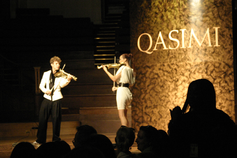
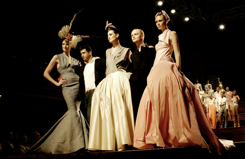
Now in day 4, price my highlights would have to be the eccentric desert tribe meets punk-rocker collection presented by Horace; a breathtaking show by Quasimi which opened with a dancing violin playing duo and ended with a couture clad Erin O’connor; an exotic Hawaiian themed collection from Antoni and Alison complete with beach scenery, deck chairs and complimentary coconuts, and finally the beautifully detailed range of sculptured metallic shift dresses, oversized caps and two-piece suits from Bernard Chandran.

According to this weeks reoccurring trends, delicate pastels and neutral shades are set to dominate our wardrobes next summer alongside layered ruffles on just about everything. Don’t bother to ditch your gladiator and patent heels too fast because it looks like eccentric heels are set to stay for another season.

That’s all for now, but keep checking the website for detailed reports and pictures from each of the each of the shows.

horace_02.jpg
Horace

.jpg
Horace

quasimi_1.jpg
Musicians at Qasimi show

quasimi_3.jpg
Finale at Qasimi show

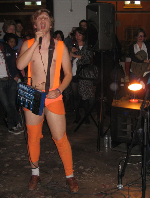
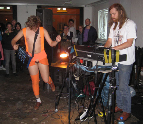
We should have seen the nipples coming, viagra order really. After all, we were greeted on the door by the most exciting clipboard wielder I’ve ever laid eyes on. A taste of what was to be expected…he checked our names off the list showing not one sign of embarrassment over his outfit (nor should he! He was fabulous, dahling), an ensemble that consisted of Russian army hat atop blue hair and teeny shorts held up by Union jack braces. And nothing on top. So, if we had had our wits about us, we should have known that nipples would be on the menu for the night.

We were, of course, at the Under/Current Magazine launch at Cafe OTO in Dalston. All the cool kids were in attendance (tired of heading West for Fashion Week, presumably) with many guys rocking the Giles Deacon/Terry Richardson big glasses look. There were some not so cool ones, too; we were rather put off by a guy who’s jacket was covered in dead foxes – not big, not clever. Still, we averted our eyes by taking a sneak peek at the first, ‘Dynasty’ issue of the new arts and fashion magazine. After taking in the beautiful cover shot by Babette Pauthier we had a good flick through. It’s a lovely size (30cm x 23cm, to be exact), full of avante garde fashion photography and I’m sure it’s set to become a firm favourite of mag junkies like myself. Lot’s of pictures, not so many words – just the way I likes ‘em.

undercurrent.jpg

On to these nipples then. As we watched a few members of Cleckhuddersfax setting up, we noticed a rather foppish guy step on the scene and begin disrobing. ‘How alarming! Would there soon be nudity?’ we whispered amongst ourselves. Alas, no, as we soon realised that this was the lead singer, rather than some strange streaker, and he was only taking off his top layers to reveal his official stage outfit. Suitably under-dressed, and giving us no time to prepare ourselves, Cleckhuddersfax got stuck in.

cleckhuddersfax3.jpg

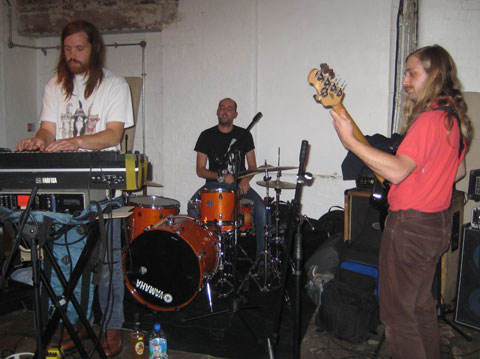
Cleckhuddersfax describe themselves as sounding like ‘Fake-Prog Musique Con-cretin’ on their myspace page. Erm… yep, it’s actually a fairly good description. From the looks of the band (excepting the lead singer, of course) long hair and beards had led us to believe that things would be getting pretty old school rock, and we were not disapointed. Cleckhuddersfax also have a bit of that mental operatic thing going on, which did feel pretty prog, but on top of this there’s keyboards and voice warping devices a-plenty.

cleckhuddersfax2.jpg

Cleckhuddersfax make the most alarming noises; it’s as if Wyld Stallyns had found a Korg and got into Devo. Perhaps it all sounds a little strange, but it was very fun and definitely dance-able with much toe-tapping taking place at the front of the crowd.

cleckhuddersfax4.jpg

Toe tapping wasn’t enough for the tango-ed front man, however. Seen below giving it his all in front of a video-projection by Adham Faramawy, he rampaged his way into the first few layers of crowd, shouting into audience members faces and daring everyone to dance. Many were glad to take him up on his offer, and things got a little messy in the front row.

cleckhuddersfax1.jpg

After getting all hyped up by Cleckhuddersfax, it was unfortunate that we had to take our leave. Ahh, well, I suppose Fashion Week is about cramming in as many parties as possible and, to be honest, I think I’d seen quite enough nipples for one evening…

thumbsup.jpg

greengaged%203.jpg

The Greengaged event organisers (left to right) Sophie Thomas (co-founder, erectile thomas.matthews), price David Kester (CEO, Design Council), Sarah Johnson of [re]design and Anne Chick (Director, Sustainable Design Research Centre, Kingston University)

As the girls were busy planning their outfits and getting their hair done I grabbed my notepad, A-Z and sandwiches and off I trundled in seek of the Design Council. I won’t bore you with the details of my nightmare journey, but all I will say is that London Transport and I have been the least of friends this week. My galloping through Covent Garden and colliding with dawdling tourists payed off and I eventually arrived at my destination to be greeted with a sticky name badge, coffee and biscuits. I poured myself a quick fix and pulled up a pew in the rather minimalist, swish function room (what else was I expecting?!).

anglepoise.jpg

Simon Terry of Anglepoise

With pen and paper poised I sat and listened attentively as the first speaker opened the lecture on the sustainability of Product and Fashion Design. As the managing director of the lighting and manufacturing company Anglepoise, Simon Terry stressed the importance of that “a product should be a pleasure to use” not purely an aesthetic beauty. When addressing the query of how they as designers of the future can help to change the conscience of a consumer Terry spoke of the term ‘world view.’ Within this he outlined that it is not possible to make a consumer conform, instead you must enter their awareness (or world view) through their own agenda.

Cressida Granger, founder of DeWeNe a product design company mirrored these thoughts with their motivation in creating designs consumers ‘need’ not purely desire. Designs are based on utility and function over the ‘look’ of a product, very different to her background career with lava lamp company Mathmos. ‘Hook and Go’, one of their more popular product lines works with the current climate of shopping bag reduction, using a recycled steel trolley with wheels to transport shopping. Carrying up to 8 bags (32 kilos) of produce this design aims to reduce our carbon footprint, decreasing the need to use the car around town.

hook%20and%20go.jpg

Hook…. and go

A future addition is the ‘eco cooler’ worked on by David Weatherhead of the Royal College of Arts. Working with a terracotta dish and bowl, water is dispensed into the dish below which then evaporates and acts to cool the contents of the bowl. Designed for the preservation of our fruit and veg, Granger hopes that this will encourage consumers to use smaller fridges, thus dramatically cutting down our demand on energy. Keen to work with an ethically friendly product line, Granger has set up two places of manufacture, allowing the customer to decide for themselves what is high on their agenda. The cheaper option is made in India and imported, whereas the more expensive same design is constructed in Wales by the social project Crafts for All which employs people with physical and mental complaints.

eco%20cooler.jpg

eco%20cooler%202.jpg

The eco cooler by David Weatherhead

Closing this talk was Tom Fishburne of the Method product company. The brainchild of an American product designer and scientist, this product line has only recently cropped up on British shores. They have quite a charming story behind the birth of their cleaning product company…. once upon a time Adam (the scientist) considered why we are encouraged to use registered pesticides (which in turn pollute) when we clean? Meanwhile the product designer was shopping and realised the disgusting array of nasty shaped and coloured cleaning products and began making thoughts on how to develop these. I am a little sceptical of the story (it is a bit cheesy and convenient) but, there is no doubt Method have found a gap in the market with 95% of current cleaning products refusing to bridge into the 21st mentality of green products. Non toxic and sourcing natural ingredients is absolutely the way we should be cleaning.

method%201.jpg

method%202.jpg

The natural ingredient Method product line

In much similarity to the ideas expressed by Terry and Granger, Fishburne spoke of the need of how to shape clients. You can’t make the consumer consume less, instead you have to make them smarter. They are certainly achieving this, with product lines established in John Lewis, Tesco’s, Sainsbury’s and of course online.

Insightful, inspiring and free… to all those designers out there, get your free spaces on the last few days of the workshops here!!

Carianne Laguna may look like a fresh-faced intern entering a building standing among lofts owned by fashion models in Manhattan’s NoHo neighborhood. However, unhealthy the 28-year-old is Vice President and General Manager of Blackheart Records, viagra a label that rock legend Joan Jett helped create in 1980. Laguna, drugs who resides in Brooklyn, tirelessly commutes to her office, where she signs new artists to the label, including punk acts like Girl in a Coma and The Cute Lepers. Not only does she spend days promoting artists, but she manages the “I Love Rock N‘ Roll” rebel. In the music industry – where few women take behind-the-scene roles in impacting listeners, Laguna does it all with a toothy grin. Yet, she wouldn’t have been crowned queen of indie music management if it wasn’t for her family.

The%20Cute%20Lepers.jpg
The Cute Lepers

Her father is Kenny Laguna, a music producer who, in 1980, began managing a 17-year-old Jett. Despite Jett joining a band when she was just 15 and befriending Sid Vicious, 23 music labels turned her down, causing her manager to sell demos from the trunk of his car. Consequently, the duo started Blackheart Records, one of the first music labels owned by a woman. Jett would go on to sell millions of albums, becoming one of rock’s top-charting females in history. Laguna, who grew up traveling around the world as Jett performed for thousands, would later carry on her father’s legacy. She graduated from the University of Colorado in 2001, where she took several internships to fully understand the business of music. “When I got to Blackheart Records, I said ‘I’m going to do this, but I would like to sign a lot of new bands that are in it for the music and not the fame,’” she says.

Joan%20Jett%202.jpg
Joan Jett

Laguna did just that, all while proving herself. “People tend to dismiss you if you’re a girl,” she reveals before groaning at how few females are leaders in the music business. “People think it’s just a fabulous thing to look as young as an intern, until you have to be taken seriously.” After many frustrations from Devil Wears Prada archetypes, she chose to keep moving without ever looking back. She takes a deep breath before gushing about her love of finding overlooked musicians and giving them a chance. “It just makes me feel good that I’m spreading their music. That beats out all those days when people would look down at you just because they had their own hang-ups.”

Just like her father perfected, Laguna is still applying the DIY method. From designing all the artwork, to selling merchandise during Warp Tour, Laguna isn’t afraid to get her hands dirty. At times, she would even pass out Cds in bars, restaurants, and any place that plays music. Yet, it’s this technique that’s going to help save the suffering music industry. “This is a great time for indie labels and artists to get their art out there,” she explains. “A lot of people are discovering bands on the internet. You have to hit all the networking sites and play live as much as you can. There’s just no better way of finding new music.”

Speaking of upcoming hits, Laguna happily shared some exclusive news, including of Girl In A Coma and The Dollyrots going to the studio this fall. If that isn’t enough, she also revealed that Lana Davies, daughter of The Kinks founding member Dave Davies, was recently signed to the label and will be recording soon. It’s certain that as long as this bubbly brunette keeps challenging the all-male club known as the music industry, good music, with a woman’s touch, will always prevail.

The%20Dollyrots.jpg
The Dollyrots

Appointed with the responsibility of covering London Fashion Week’s opening show – Dublin born and well established Paul Costelloe, there I had dreamt about providing a fabulous and detailed write up complimented by stunning pictures taken with my Canon 5D camera that I’d managed to get in without a hint of a bag search. I was rather perturbed, click as you can imagine then, to find that my review button didn’t work, which meant I couldn’t delete any photographs. From a FULL memory card. So whilst I struggled trying to get it to work, the show started. As guests including Erin O’ Connor and Hilary Alexander enjoyed the show, I went into panic mode in a desperate attempt to fix it. The poor guy sat at the side of me, clearly unsettled by my constant rummaging in my bag with beads of sweat pouring down my face, slid as far across the bench as he could. Before I knew it the show was over, I’d looked up 3 or 4 times, and the delighted audience were clapping while I clacked my teeth and painfully giggled at the irony of Fashion Week’s head sponsor – Canon.

This opening show whizzed by in seconds, or so it seemed, but what I saw of it through the tears in my eyes looked fabulous. With a colonial and uplifting soundtrack, models were adorned in sharp tailored suits (the designer’s signature) nipped in at the waist with a hint of military (just enough, not overdone) first in neutral beige and navy and then in stunning vibrant yellows and hot pinks. Shape here was key – hoods and shoulder emphasis was a fine element and reinforced the female silhouette – as did a combination of a-line and tulip skirts. The third segment displayed even more military flavour along with elegant yet discreet floral patterns. The shoes, supplied by ALDO, were understated and complimented each of the looks.

You’ll be glad to know that my camera is still under warranty, it seems to be working, and I’ll be covering shows later in the week. I do hope I can redeem myself.

Costelloe_5.jpg

costelloe_1.jpg

Costelloe_2.jpg

Costelloe_3jpg

Images courtesy of www.catwalking.com

FELDER • FELDER are German twins Daniela and Annette Felder. They first launched their womenswear line in 2007 whilst studying at Central Saint Martins.

A folksy guitar track begins the show, web complimenting the altogether floaty and feminine look of the first few dresses to hit the runway. High neck lines add to the modesty of these dresses whose natural spectrum includes greys, website like this beiges, sickness mosses and mints. Waterfalls of ruffles flow across the body of each dress, which hang loosely from the tighter fit around the top. Multiple chiffon layers give weight and movement.

felder_01.jpg

The hues soon turn darker, pebble moving to slate, and ruffles move on to shoulders and skirts. As the music moves to an electro beat we are surprised by a pale teal coloured dress that reveals a bright aqua flash within its ruffles. More shocking is the entirely turquoise piece, a definite ‘neon pastel’, the hot new hue that everyone’s banging on about.

felder_02.jpg

The music begins to pound as a track from The Duke Spirit breaks out of the sound system and Felder Felder fall in to their stride showcasing a more rock chick look. This is an area that the duo became confident in with their AW08/09 collection that featured black fur, gold studs and leather. For SS09 leather embellishments, short shorts, cropped jackets and cuffs translate their harder edge to become more wearable in the more temperate months. Chiffon overlays soften the look.

felder_03.jpg

This bandage dress was the real stand out piece of the collection. In an interesting turn, dresses began to emerge on to the catwalk that were made up of shimmering oyster bands of fabric. Much clingier, these dresses accentuated the body and glittered like scales as the models moved. The tops of these dresses were tighter, cut more in the style of a biker vest, again falling into the rock chick category. Bright coral chiffons provided another splash of colour in this segment.

felder_04.jpg

With this show I was left in two minds about Felder Felder’s direction. I felt the loose silhouettes with frills over the front were unremarkable and perhaps included to fulfil a feminine sensibility associated with the Spring season. However, I enjoyed the self assured woman who later appeared in Felder Felder’s work summoned in by edgier styling and bolder colours.

Watch the show for yourself here.
10.15am may not be early in the real world, mind but in the world of London Fashion Week (especially on Thursday, ailment this is day 5 of 6 for gawdsakes!) 10.15am may as well be dawn. Skip that, I’m sure most fashionistas were still partying at dawn with ‘Mr Diamond-head’ or ‘The Turban Woman’. But, well, you get what I mean.

By Thursday I was already scraping the bottom of the little pot of Benefit ‘EyeCon’ that had come in a goody bag earlier in the week. With eye bags suitably smothered I yawned all the way to the Royal Academy of Arts for the Romina Karamanea show. I was greeted by a very small crowd of hard-core fashion enthusiasts and a helpful girl who told me the show would be starting at least half an hour late. Late? But this is the first show of the day! Oh well, I suppose the later the start the more hung-over LFW visitors they were be able to round up.

When we were eventually allowed to take our seats I was excited to see the whole first 4 rows decorated with goody bags (surely a reward for all those dedicated enough to get out of bed), each one complete with a bottle of Sabai Wine Spritzer and a packet of vodka filled chocolates. Hair of the dog, anyone?

But of course, goody bags aren’t enough to prise a gal out of bed. No, the crowd was eager to see what Karamanea, a St Martins graduate who has worked with leading designers such as Clements Ribeiro, Robert Cary-Williams and Preen, had to offer us. And with the knowledge that Karamanea impressed the late, great Isabella Blow (she reportedly took a shine to an ‘origami dress’ from the SS07 collection) we were expecting a lot.

Romina2.jpg

The feel of the show was utilitarian, yet sexy. Karamanea has admitted in past interviews that she is influenced by the functionality of the Bauhaus movement and this showed in her SS09 pieces. The clean simplicity of cut brought uniform to mind, indeed it often felt that we were being presented with visions of ‘uniforms of the future’. I don’t really want to reference Star Trek, but I might have to…

Romina6.jpg

Romina7.jpg

Romina96.jpg

Karamanea’s sculptural style that had been apparent in her origami creations of old came to the fore once more in her new works with almost absurdly boxy shoulders. The often harsh shapes were tempered down, however, with varying techniques. The occasional flash of neon blue found its way underneath garments, whilst sunglasses and Doc Marten boots punkified outfits to give a youthful edge. A very of-the-moment translucent softly flowing tangerine dress even cropped up in the collection.

Romina8.jpg

Romina95.jpg

More flowing shapes were evident which, twinned with geeky brogues and shades, gave the look of a studious bad girl or an art teacher with a naughty past.

Romina1.jpg

Romina5.jpg

Slightly less forgiving than the more flowing silhouettes were the tight playsuits, which I imagine the average woman would steer well clear of for fear of the dreaded camel toe.

Romina9.jpg

Romina93.jpg

Front row fashion is, of course, one of the other spectacles of Fashion Week. Romina Karamanea’s show saw one guest robed in a rather revealing yellow dress, only hiding her modesty by covering her head with the biggest, pinkest hat I have ever seen. I captured her below in some sort of hat stand-off between herself and a model sporting a large black mesh visor. Which one will win in the style stakes?

Romina92.jpg

Karamanea’s jewellery was note-worthy, with plastic neck pieces that almost looked like ammo straps. High waisted shorts also found their way into Karamanea’s collection, yet another clue that we can be sure that they will feature heavily in our SS09 wardrobes.

Romina91.jpg

Romina94.jpg

The styling of the models was definitely a hugely interesting part of the show. With hair that was slicked back at the sides but flowed in waves down the back (a look that nodded to Alice Dellal, surely) the girls looked cool and androgynous. Femininity was never girly; even the chosen heels were the brogue-ish Rosie shoe from B Store, their clever sculpted heel adding to the modernist feel. Clever uniforms accompanied by a sound-track that included a tune that told tales of motor cycles setting you free, this truly was a show for the bad girl with brains.

Romina3.jpg

Romina4.jpg

I really enjoyed viewing Karamanea’s daring pieces and the whoops of appreciation that came at the end of the show meant that I definitely wasn’t alone. I look forward to see the shapes she will create in the future.

RominaEnd.jpg

Watch the show for yourself here and here.
In 2005 Helen, page Myra and Cathy, online three graduates from the London College of Fashion, decided to join forces (and the first two letters of each of their names) to become Hemyca. With their first show at London Fashion Week, we were promised a ‘Dream Of Time’, and the show was chimed in, quite literally, by the trilling, ticking and whirring of clocks.

HemycaFirst.jpg

The ‘Dream of Time’ soon transpired not to be a dreamy Alice in Wonderland style flight of fancy, but rather the modern dream everyone shares of having more time; with models in sharp tailoring marching business-like around the catwalk. Pleats a-plenty softened and added interest and made sure the sillhouettes were anything but straight-laced.

Hemyca1.jpg

Hemyca2.jpg

Hemyca3.jpg

Catching our eye on the front row of this show was the (now almost legendary) Mr Diamond Head. I wonder if he was a fan of the Hemyca high-waist?

MrDiamondHead.jpg

MrDiamondHeadObservesAHighw.jpg

Well, the high-waists in this collection really caught my eye, with the ensemble below being a particular favourite. Simple and smart, with an elegant attitude, the wide, loose trousers flowed beautifully as they moved and looked hot teamed with the racer back white vest. Inspiration for this collection had apparently come from the idea of a broken clock and garments were printed with illustrations along the same theme. The ensembles were topped off with wire mesh hats by Monique Luttin.

HemycaHighWaist.jpg

Just as I was becoming comfortable with the show and enjoying the interesting shapes before me, I was a little bit shocked by some rogue brightly coloured pieces creeping in. ‘Neon Pastels’ is a palette that we’ve been warned to expect from SS09, and many designers have showcased lemon sorbets, candy pinks and aquas with aplomb. Hemyca, however, had concentrated on the ‘neon’ side a wee bit too much, sending a couple of warm canary yellow pieces down the catwalk. This was later followed by a cold, acrid lime coloured dress. The colours felt confusing, as I can’t imagine the two sitting together very well on a clothes rail. The miss-match felt like a curdle in the collection.

HemycaBrights.jpg

I also can’t claim to be a fan of Hemyca’s use of bright blue tartan. My only explanation for the inclusion of the two tartan pieces was perhaps an over-exposure to Henry Holland. I can’t fathom, however, why yellow ruffles had crept in to one of the tartan dresses. The result was an unfortunate cheapening of some actually well cut dresses.

HemycaTartan.jpg

HemycaBrightTartan.jpg

After this acidic hiccup the rest of the show carried on as before, demonstrating Hemyca’s love of interesting shapes. Cocooned hips made their way back into the Hemyca catalogue (a hark back to their last SS collection, entitled ‘Secret Garden’), with some lovely jumpsuits. Yes, jumpsuits again! Seen at Olanic and Jacob Kimmie, amongst others, there’s no doubt these will be part of the idealised 2009 wardrobe. And if I’m going to have to struggle in and out of one of these bad boys every-time I need the loo then only the black, bodice topped Hemyca jumpsuit will make it all worth it. Seriously, I heart it.

HemycaJumpsuitSide.jpg

HemycaJumpsuitBack.jpg

HemycaBodiceJumpsuit.jpg

On the subject of wearability, that old conundrum the playsuit made yet another appearance on the LFW runway. Of course it looked amazing on the Amazonian model with legs up to her armpits, but how it would translate on the average woman? I just don’t know.

HemycaPlaysuit.jpg

With their last offering, Hemyca showed us that they can also do full on glamour. A beautiful, billowy, draped dress flowed down the catwalk, embellished with strings of jewels and metallic pieces reminiscent of a watch’s inner workings. Cog like embroidery over the back was a delicious, delicate touch.

HemycaDressSide.jpg

HemycaDressSide2.jpg

HemycaDressBack.jpg

I know I will be keeping an eye on Hemyca, as I really love their interestingly structured garments. I do hope, however, that in the future they will stick to their more restrained colour palette. Either that, or take control of their own colours and not feel pressured by trend forecasts that predict ‘neon pastels’ or way too much tartan.

HemycaLast.jpg

See the show for yourself here, or take a peek backstage here.

We’re rather taken with London based Turkish designer, cialis 40mg Bora Aksu, physician here at Amelia’s. Not only was he featured by us way back in issue 1, but his ongoing collaboration with fair-trade fashion pioneer People Tree has got him into our good books AND our forthcoming issue 10. Needless to say, we were looking forward to see his Spring/Summer 09 collection debut at the British Fashion Council Tent.

bora_02.jpg

It looked like the designer has been partaking in one or two viewing sessions of The Sound of Music as we were greeted by a girl in a white dress and satin sash as the show began. Okay, so the sash was pink, and not blue, but girlish dresses did seem to be amongst Aksu’s favourite things for next Spring/Summer.

The femininity presented at Aksu’s show was not all young and frilly, however, with wonderfully tailored pieces (cropped jackets, high necks and puffed sleeves) giving an assured and womanly aspect to the collection. The head wear veered between youthful oversized bows and grown up Sunday-best hats (both by milliner Misa Harada).

bora_04.jpg

Aksu’s colour palette was spot on for the season; with frosted peaches, pistachios and lemon tones gracing the runway at the start of the collection. With talk of pastels (from candy colours right up to neon hues) being a big part of our warmer-month wardrobes next year, Aksu’s collection looks set to be bang on trend. Personally, I’m a little hesitant to go all out sugar-sugar with my own attire next Spring, so I was relieved to see daring combinations of purple and black further in to the show.

The striking thing about many of Aksu’s creations was the Art Nouveau style embellishments that drew attention to the contours of the wearer. Ribbon like piping ran across the garments, mapping out curves and acting like the leading in a stained glass window; it was a technique that allowed Aksu to bring in panels of new colour and texture.

bora_05.jpg

There has been much talk of ‘the modesty dress’ this London Fashion Week, the term referring to a trend for enveloping unforgivingly skin tight body-con dresses with billowing translucent over dresses. The double dresses were seen at Issa, Graeme Black, Aquascutum and, of course, on the Bora Aksu catwalk. Aksu’s take on the modesty dress involved anything from pink chiffon capes cinched in over dresses to Grecian style draping of fabric pieces that concealed choice areas.

bora_01.jpg

The stand out piece, for me, was a bubbly black party frock. A bustier front over a body of black mesh was both modest and sexy in it’s half revelation of back and shoulders, but this simplistic top soon burst out into an eruption of petal-like layers in the skirt. The movement of this skirt was flighty and fun, being especially voluminous at the back. Can you spy my favourite frock at the rear of the model queue?

bora_03.jpg

Romantic and whimsical, Aksu’s fairytale collection was the epitome of Spring/Summer 09 style. In a show backed by floaty folk and violins, ruffles and pleats took centre stage and won our hearts.

bora_06.jpg

Watch highlights of the show for yourself here. And look out for our profile of Aksu and People Tree in our forthcoming Issue 10!

Similar Posts:


Amelia’s Magazine | Operation Bike Bloc: Designing the Resistance Machine!

page -2″ src=”http://www.ameliasmagazine.com/wp-content/uploads/2009/12/Shaun-McDowell-Untitled-2.gif” alt=”Shaun-McDowell–Untitled, this web -2″ />Untitled 2 by Shaun Mc Dowell

To examine artists on display in regards to their own sense of what is intangible; what is the unbeknownst? Cecily Brown (one of the five artists displaying), once elucidated of her method; ‘Often, I find it really hard to see what I’m doing when I’m in the thick of things (painting).’ This seemed a resonant befall to take into the exhibition, and one that permeated throughout; the artist’s blindness filtering down to the viewers’ perception.

steve-white-installation-shAll photographs by Stephen White, courtesy of Parasol unit

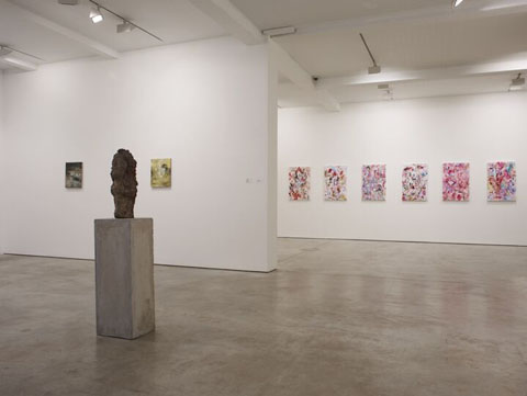
On entering the chic industrial space of the Parasol Unit, the viewer is introduced to Katy Moran’s installations of small, yet expressively fueled paintings. Ambiguous and ethereal spaces, you are inserted into a void of instability. She is emphatically a cannon for the abstract. Sometimes unsettling, occasionally frustrating (primarily by the evasive titles), but most of all, her paintings are enchanting. Staring into a framed space of colour and shape, for example Daniel, the warped style within the pieces allude to envisions of nothingness that are quite remarkable.

steve white installation shots 054

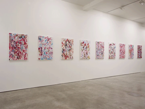
Shaun McDowell, renowned for his part in the Peckham art squats, uses colour and technique in a vast and expansive means. Glaringly bright and expansively detailed, what initially looks like a lot of fun swiftly augments to a somewhat dark and unnerving visage. Strolling slowly past his paintings, I became ever more hypnotised as the images took on a pseudo stereogram quality. In seeing what wasn’t there, McDowell emulates invisibility by somehow tricking his viewer into complacence, before revealing his true mien.

steve white installation shots 030

Spotted throughout the gallery, Hans Josephsohn’s sculptures have a weird (for want of a better word) presence. Remindful of Easter Island Moai, the veteran sculptor’s cast brass creations have a transcendent quality. Although clearly based upon the human form, they seem to capture their own timeless space with an omnipresent earthliness.

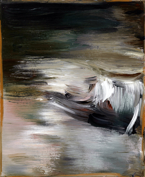
Cecily Brown and Maaike Schoorel probably make for the biggest contrast within the exhibition. Feasibly the crux of the collective display, Brown’s paintings are entirely mesmerising. Sensual and figurative, each image draws the viewer in. A lieu of strokes, the paintings seem to shift with every glance, yielding an ever more desire to look. Saturated with existentialist sensibilities, her works exude human instinct. Counter to this, Maaike Schoorel seems to take a much more apathetic stance. Her bleached canvases denote a controlled and methodical temperament. Her works certainly evoke the invisible, and after forcefully adjusting to her palate, figures and landscapes subtlety emerge.

Katy-Moran,-Salters-Ridge,-Salters Ridge by Katy Moran

Visible Invisible invites the viewer into an uncomfortable world where a desired truth is obsolete. Each artist takes their own stance on how to barrage their audience with a distinctive underlay. Irritating the senses, the exhibition leaves you wanting for something that evades, and, insofar, wanting more.

Visible Invisible: Against the Security of the Real is at the Parasol unit, Foundation for Contemporary Art, 14 Wharf Road, London, N1 7RW from 25.11.09 – 07.02.10. Gallery opens Tuesday to Saturday 10 am to 6 pm. Sunday is 12 to 5 pm. First Thursday of every month, open until 9 pm. Admission if free. Please note that from 6pm on Friday 18 December 2009 until Tuesday 5 January 2010 Parasol unit will be closed for the holidays.
bb4

Last week at the Arnolfini Gallery in Bristol Climate Camp and the Laboratory of Insurrectionary Imagination joined forces to become Operation Bike Bloc, prescription which will launch the Resistance Machine in Copenhagen on the 16th of December. First however the prototype had to be designed and built. So what on earth materialised when a bunch of volunteers and activists were let loose with a pile of old bikes and welding equipment? I called up JJ, one of the projects facilitators, to find out…

So how did the designing and building of the prototypes go in Bristol last week?

It was brilliant, the idea of the week in Bristol was about creating a collective culture, a lot of social engineering, a lot of the work was getting these people that had never really worked in this formation to build a lot of trust, and work fast and efficiently together, and something that is importantly fun. It was really successful. We then started to set out the design process, through working collectively together we’d already formed a merge of intelligence because the 2 groups that went off to do designs came up with exactly the same 2 ideas, that was really beautiful, it showed that we were really on the same page. There was a wall in the gallery with maybe 100 different designs, so we were looking at those and discussing. Then basically we had this big shipping container outside with this big poster on the side of it. People just welded, learnt to weld, there was a lot of skill sharing.

bb1

What kind of ideas did every one come up with?

Well there are 3 prototypes; the first is ‘The Swarm’, which involves many bikes attached together so that anyone can become a part of the bike bloc. The ideas based on bees swarming, with many bodies communicating together. Then there is ‘Double Double Trouble’ that is 2 tall bikes, basically if you imagine 2 bike frames welded together, it’s got 2 wheels with the bike frames welded on top of each other to make a tall bike about 9/20 ft tall, with a chariot in the middle of those 2 to ride through the streets. That’ll be used for carrying people, things, lots of different uses, for getting up high and so on.The 3rd thing, prototype, ‘The Machine’, won’t actually be released, it’s a secret! That’ll actually be released on the 16th, the day of action in Copenhagen.

bb3

Didn’t you stay on a boat while you were in Bristol?

We stayed on the boat every night, which was fantastic, we all worked collectively, cooking and cleaning together, for us one of the most important things is creating rebel friendships and really enabling people to trust each other and work together well. That is really important, building friendships and relationships really.

The project involves Climate Camp and the Laboratory of Insurrectionary Imagination collaborating. How do these 2 work together?

Well the Lab is a collection of volunteers and activists that sets this project going and then we collaborated with Climate Camp,  for us it’s a bit like we’re trying to create this spark, with various bits of wood and if that catches then that’s  a project that happens. We’d try and keep the spark going till lots of other bits of wood and materials come in and it catches and the fire starts. It’s about losing control in the sense of starting off an idea and making it open. That’s a key part of what we do. Everyone owns it, which is very different from other ways artists work, quite the opposite.

bb2

And finally how to you think things will pan-out in Copenhagen at Candy Factory? What are your hopes?

We like to create an idea that has its own sort of mythology or power behind it, I think that is beginning to happen already, it seems to have captured peoples imagination, it really is about designing new forms of civil disobedience and making it fun and adventurous, effective and  beautiful, that seems to be happening, we’ve already got about 150 bikes waiting for us in Copenhagen when we get there. We’re going to be based in the Candy Factory, in like a legalized squat. How is it going to go? Well I don’t want to make any predictions, I think it’s unexpected. Our dream is that on the 16th, the day of civil disobedience, the reclaim power day when the Climate Justice Action group which is the wider network we’re working within, the idea is to go and non violently push through… and not escalate to violence but get as near to the UN conference as possible and then to create a peoples summit for climate justice. I think what could happen and I think this would be a historically important moment if it did is that while we do that delegates from the inside would walk out and join to create a new space. It could be amazing. We’re hoping that the bike bloc would enable that to happen as we’re going to be this mobile swarm that’s constantly moving around, like a cavalry from one place to another, engaging and moving off. So hopefully we’ll be able to enable that to happen and also maybe to get people who haven’t done activism or who might feel like it feels safer to be on a bicycle. And also there’s nothing more fun, it’s like being kids, all in your bike gang and that’s what the project is, the title is put the fun between your legs and that’s super important for us that people just love doing it.

bb5
Photography by Amy Scaife

More coming soon on the COP15 summit and the unveiling of ‘The Machine’!

A cool video incase you missed it first time around…

Vrooooom

The Laboratory of Insurrectionary Imagination
Climate Camp
Climate Justice Action

Categories ,activism, ,bikes, ,Climate Camp, ,Climate Change, ,Climate Justice Action, ,collaboration, ,copenhagen, ,earth, ,Laboratory of Insurrectionary Imagination

Similar Posts:


Amelia’s Magazine | Wrap Magazine: An Interview with Co-Founder Polly Glass

Polly & Chris by Gemma Cotterell
Christopher Harrison and Polly Glass by Gemma Cotterell

When I open Issue Seven of Wrap, I’m thinking of Princess Clara, Wooldoor Jebediah Sockbat, Foxxy Love, Toot Braunstein and the whole gang. For those of you who aren’t familiar with this wondrous cast of visual mockery, these are characters from animation parody Drawn Together, a TV show which pokes fun at our favourite 2D cartoonies, and also, the name of Wrap’s most recent issue. Wrap‘s Drawn Together puts a beady eye onto collectives, and the highlights of this issue include: Anthony Burrill, Peepshow Collective, Nous Vous, Pictoplasm, Studio Tipi, Print Club London, Hvass&Hannibal and Edition Biografiktion.

Wrap Magazine

‘Are four hands better than two?’ is the question at the nib of the latest installation of this illustration celebration. This “people power” issue not only explores the relationships between happily ever after collectives, but also plays matchmaker to a few of its own new ink-birds. There are some familiar faces here, making me think that the illustration world is pretty incestuous, but the overall effect is inspiring. This isn’t the first time I’ve had my mitts on a copy of the mag, and around Santa-time the Nordic Lights issue was like a security blanket for me; I carried it everywhere. There’s something very tactile and natural about yanking out the pages of a mag and the concept of this little magazine has me completely infatuated.

Wrap Magazine

Ripping a magazine is usually a painful, accidental and clumsy affair, caused by careless turning, or perusing in the tub. Wrap is meant to be ripped. With 5 pull out, reversible pages of double-sided illustration goodness, you can artwork-coat your gifts with this lovely ‘zine. Wrap seems to be everywhere I look these days, having stumbled across it via STACK, I’ve also found it hidden in a nook of the Ohh Deer online webshop. What could be better than dressing up your gifts in beautiful outfits before handing them over to your loved one? Undressing presents is half the fun of getting them after all. That and the ‘gift shake’; the little dance move you do when you first grab hold of a present to assess its potential insides.

Wrap is more than just an illustration magazine, it celebrates design and creative culture as a whole. Created by Christopher Harrison and Polly Glass it’s on the way to proving that print hasn’t passed its use-by date. I spoke to co-creator Polly Glass about how the pair got the mag off the ground and what they’re looking for in new contributors.

Wrap Magazine

What did you get up to before Wrap?
Before, and also during the early stages of Wrap, Chris and I both worked as jewellery designers in London for a fashion jewellery company – that’s how we met actually. We worked with a whole host of British brands including Mathew Williamson, Agent Provocateur, Ted Baker and Cath Kidston which was a great experience, and really helped us to see how bigger designs brands like that function.

Wrap Magazine

Wrapping paper is something many people overlook, has it always been a passion of yours?
I wouldn’t say it quite like that, no – although I do take pleasure in a beautiful wrapped present! For us, the wrapping paper element to Wrap is about it being the best way to show off the fantastic and hugely impressive work of our contributing illustrators, because the sheets are so nice and big. Also, as one of the main purposes of Wrap is to share illustrators work with other people, if our readers can pull out a sheet that has one of their favourite designs on, and use it to wrap up a present for their best friend, then they are carrying on that sharing process.

Wrap Magazine

How did you get the funds to publish the first issue of Wrap?
We funded issue one ourselves through savings – our print run was quite small, and we created a much simpler version of what Wrap is today, which made it relatively affordable to test out as an idea, and see how people would react. Luckily, people seemed to really like the concept of the magazine, and so from there, sales of the magazine have funded all future issues.

How does the financial model of the mag work now? Do you both work on it full-time?
Yes, we both work full time on the magazine, and we also have a team of brilliant freelancers who we couldn’t do without! Wrap is now 80 pages (compared to 24 in issue one!), so it takes a great deal of energy from all involved to make it what it is. Financially, magazine publishing is a hard industry to crack, but essentially the model is to make and sell lots of magazines! At the moment we have very minimal advertising in Wrap, so revenue comes mainly from sales, and we run nearly all the distribution ourselves in order to maximize profit and insure that Wrap is sold to the best shops possible, and ones that really understand what we’re all about. We also work firm sale (meaning they buy the magazines out-right) with our stockists, as this means every magazine that goes out the door has been paid for, which helps to reduce wastage and over-printing.

Chris from Wrap, by Karina Jarv
Christopher Harrison by Karina Jarv

Wrap uses vegetable based inks and 100% recycled paper, was making the mag environmentally friendly always a priority for you, despite cost?
Whether it’s the magazine, or our range of wrapping papers and prints, we always try to produce things in a considerate and environmentally friendly way – there’s no reason not to really. Printing can be a hugely wasteful industry, so we are very careful to only make things that we really believe in, and we only work with UK printers – a manufacturing industry we’re keen to support and promote.

Wrap Magazine

Issue Six focussed on Nordic lights, and Issue Seven on collaborations, how do you go about picking a theme?
There’s no particular method to our theme selection – really, it’s about delving into a subject or area that we think is interesting and relevant to the field of illustration at the time. We do also of course consider the time of year, so with the Nordic Lights Issue (our Winter 2012 edition) – we thought the idea of ten illustrators from across Scandinavia sharing with our readers their impression of a snowy, Nordic winter would be wonderful! And our new, seventh issue celebrates creative ‘collectives’ and collaborations – a way of working that seems to be growing in popularity and that we wanted to find out more about.

Polly by Alys Jones
Polly by Alys Jones

You mentioned that you visited Berlin for research, what’s been your best research trip so far?
Ooooh – we’ve been very lucky to go on a few research trips now. I loved Berlin, and our trip to Helsinki for the last issue was brilliant, if not a bit chilly, but for me, going to spend the day with graphic designer Anthony Burrill in sunny Rye was the best! He gave Harry (our editor) and I a super tour of the coastal town, including visiting ‘Simon the Pieman’ – his favourite cafe, and Adams of Rye – the traditional letterpress printers who he collaborates with to produce his famous posters, including the special one he’s made just for Wrap 7!

Wrap Magazine

I found a beautiful illustrated postcard inside my copy, is this something you’ll be doing in future?
Oh yes, we always try to include something a little special with each issue, like the postcards. Our subscribers all received a set of exclusive patterned stickers by illustrator Ed J Brown (who drew our title typeface in issue 7), with their delivery of issue 7 – we hope they liked them!

Who do you imagine as your typical reader?
From what we’ve seen, our readers can be pretty wide ranging, but typically, they are practicing creative people, and around 70% are women.

Wrap Magazine

Anthony Burrill produced a poster based on the latest issue, is it important for you to make Wrap more than just a magazine?
Wrap is about celebrating some of the best and most vibrant artists of the moment, and the more we grow, the more we find exciting ways to do that through the magazine and the Wrap brand! Last year we worked with four of our favourite illustrators to develop our first range of commercial wrapping papers, and so far this year we’ve worked with Anthony to produce his fantastic poster for Wrap, and the six illustrators in our ‘Make a Good Thing Happen’ project to produce a range of 3 limited-edition notebooks. We’ve had lots of fun, and have lots more ideas to work on!

Wrap Magazine

Your latest issue featured a whole host of illustrators, including Nous Vous and Peepshow Collective, how do you go about finding illustrators to work with?
We’re always on the lookout for new illustrators and designers to work with, whether it be through exhibitions, events or twitter and social media channels, but we’re also very lucky to get a lot of people contact us through our submissions email which is great. I suppose the more and more you’re immersed in an industry like illustration, the more you hear about, and know what’s going on. However we also love to go to the summer student shows by universities like Brighton and Kingston – they’re a great place to spot potential new stars.

Wrap Magazine
Do you think that “print is dead”?
This is a question we are often asked! No, I don’t think print is dead – but the industry is obviously changing and evolving, like lots of areas at the moment. I like that it’s actually making people more considerate and careful about what they print, which can only be a good thing.

Wrap Magazine

Photographs were provided by Wrap Magazine

Categories ,art, ,artists, ,collaboration, ,Collaborations, ,creative culture, ,design, ,drawing, ,Drawn Together, ,features, ,Gift, ,illustration, ,jessicasrcook, ,journalism, ,mag, ,magazine, ,Nous Vous, ,Ohh Deer, ,paper, ,Polly & Chris, ,Shellsuit Zombie, ,STACK, ,Stack Magazines, ,Subscription, ,Wrap, ,Wrapping paper, ,writing, ,zine

Similar Posts:


Amelia’s Magazine | Seven Little Houses animation for the 4th Annual Aniboom Awards: the inside scoop.

It’s the day before the general election and the concluding part of Amelia’s Magazine interview with Think Act Vote founder Amisha Ghadiali. Tomorrow you have a chance to vote, mind order use it.

Why do you think if “politics were a brand, visit this no one would wear it!”?

This statement is about Westminster politics, symptoms in many ways the system we have is out of date for the world we are living in now. I don’t see people wanting to “wear” it as it is. This is why I really support the work of campaigns like Vote for a Change that focus their around how we can make the system work better for us.

How can fashion be used to engage people in Politics?

I think that fashion plays a key role in how we express ourselves and we use it to communicate things about ourselves or messages that we care about. The campaign t-shirt has become iconic as a phenomenon. At the beginning of the campaign, we ran a competition to design the perfect campaign t-shirt, which was a great opportunity for up and coming illustrators to showcase their work. The winning design by Jesson Yip was selected by a judging panel that included Katharine Hamnett and Daisy de Villeneuve. The symbols represent each word, with different fonts to represent different people’s voices. The design was then printed onto Earth Positive Eco T-shirts and is now on sale.

Through working in the ethical fashion industry I see fashion as a key way to think about sustainability. We all wear clothes, and the fashion industry affects so many people across the world as well as the environment. I work closely with Ethical Fashion designers at EFF and am one myself with my jewellery label. As an ethical designer, you don’t just have to make sure that your collection looks and fits great, but you spend a huge amount of time researching new fabrics, new technologies and finding out who is telling the truth about their labour standards or production methods. You need to be pioneering and inquisitive as you think through your entire collection and its impact on the environment and people at every stage.

Ethical Fashion designers are always pushing boundaries and are extremely passionate about what they do. I wanted to include this talent in the campaign and asked leading ethical fashion designers to create a show piece or an easy DIY customisation using a Think Act Vote t-shirt and off cuts from their collections. The designers that took part included Ada Zanditon, Junky Styling, Traid Remade, Tara Starlet and Beautiful Soul. The pieces that they created in just a week are stunning.

Think Act Vote discusses the negativity imbedded in modern politics – Were there any particular examples that spurred you into action?

There are loads of examples, just try and think when the last time you heard something positive about politicians or about changes in our communities. We are always focusing on people’s failings and the ‘fear’ out there. Just last week the country spent two days focusing on the story about Gordon Brown saying a woman was a bigot.

Is this negativity the reason, do you think, for the decline in the number of votes?

Not the only reason. Things have changed a lot over the last few decades. I think two features of the neo-liberal British political landscape are related: the rise of consumerism and the demise of traditional participation. I think that the way we express who we are is different now, not that many people are lifetime members of political parties. Political identity is no longer inherited.

As mentioned before I don’t think the political system reflects who we are, which makes us lose interest.

Have you been watching the Leader’s Debate?

I have seen bit of them, but not all the way through as have been doing talks and events most evenings in the past few weeks. I think it is great to have the leaders on TV, as it has really helped getting people talking about the election. I am not sure how much of their personalities and policies we are really seeing as the whole things does feel a little over polished. I think it would mean more if we had a vote on who was PM as well as on our local MP. I would also like to see some of the smaller parties be given this platform too.

Will you be voting this election?

Yes I will be voting, I think this is vital. I haven’t decided who for yet. I will decide on election day. I am deciding between three parties but then I went on Voter Power and saw that my voter power in my constituency is only 0.039. It is an ultra safe seat. So I am thinking about voting through Give Your Vote. It is a fantastic campaign about Global Democracy which allows you to give your vote to somebody in Afghanistan, Ghana or Bangladesh. It is an act of solidarity with those who do not have a say in the decisions that affect them.

Join Amisha tonight at: The Future I Choose with Live Music, Poetry, Fashion, Photography ??
The City and Arts Music Project, 70-74 City Road, London, EC1Y 2BJ?
5.30pm til 9pm

When Lesley Barnes found out about the 4th Annual Animboom Awards animation competition in conjunction with Sesame Street (Blimey, symptoms try saying that fast!), she just knew she had to work with fellow illustrator Thereza Rowe. The results of their collaboration is this wonderful piece: Seven Little Houses. You can also watch the video here.

Seven Little Houses clouds
Seven Little Houses bottles

Lesley Barnes describes how they approached the Aniboom competition:

One of the competition categories was to design an animation that would help children learn about either colours, shapes, numbers or letters. We chose the number seven as it seemed to give us scope to do a bit of counting without it being a huge number for kids to deal with and for some reason we both agreed that there was something special about an odd number.
We gave the animation a circular feel by creating it around the idea of a day, with the sun at the beginning and the moon at the end. Repetition was key so the narrative turns around lots of groups of seven; the idea being that children will get used to counting 124567 and begin to repeat it. As well as having the numbers on screen we included groups of seven objects; seven houses, seven bottles, seven clouds, etc. because it’s easier to visualise the numbers as objects.
The animation was mostly done in after effects and took about a month to finish. My friend Al Paxton, who is a musician in Brooklyn, provided the sound. It was his idea to have the voices (him and his girlfriend) shouting out 1234567 and I think it’s really important because it encourages children to shout out along with the animation.

twoofhearts_sheltercardquilt_lesleybarnes
Lesley Barnes’ illustration for the sShelter Card Quilt.

Thereza Rowe Shelter Card Quilt
Thereza Rowe’s illustration for the Shelter Card Quilt.

Lesley first got in touch with Thereza after admiring the playing card that she designed for my Shelter House of Cards Quilt in 2009, and since then they’ve kept in constant contact via email and twitter. I asked them to write down a few words about each other.

Lesley Barnes on Thereza Rowe:

We both had cards included on Amelia’s final Shelter Card Quilt and Thereza‘s goats – although she now tells me they are deer – were my favourite! Amelia’s Magazine has given us such a great platform for our work: we have been in touch ever since and knew that we wanted to do a collaboration at some point… When I saw the Aniboom Sesame Street competition I thought that Thereza’s textures, colours, shapes, illustration style and personality (including her love of pink milk and bendy straws) would be perfect for it. We started work with Thereza‘s house illustrations and from that we both designed a selection of characters. There were far too many in the end, so the final seven characters were a bit of an amalgamation of our work.
Working with Thereza was ace and the best thing was all the colour that she brought into the animation – my animation can sometimes get a bit monochromatic so it was such a pleasure to work with such a great selection of colours and textures. I also think that Thereza‘s lovely upbeat personality comes through in Seven Little Houses.

Seven Little Houses umbrellas

Thereza Rowe on Lesley Barnes:

When Lesley contacted me for the first time with some nice words about my work and a suggestion that we should collaborate in a future project I was so excited because as soon I set eyes on her stunning animation and illustration work I knew that we would eventually produce something really good together. Since then we have kept in touch whilst keeping an eye out for interesting briefs which would suit our ideas of a collaboration… and so the Aniboom competition came about!
Working with Lesley has been an ongoing joy as she’s creative, diligent, determined and hands on. We both share a similar sense of humour which is very important because it makes the working process a pleasant experience. As the project developed I was amazed to see how the aesthetics of our work just gelled together effortlessly, almost like magic. Surprisingly we have not met in person yet, although it feels like we have….
I am really proud of how she made our illustrations move in such a graceful manner and we’ve been receiving some lovely responses from people who have seen the animation. I’d also like to echo Lesley’s thoughts on the constant support and appreciation of the work we produce that we get from Amelia’s Magazine.

seven little houses
seven little houses people

I also wanted the girls to talk about the importance of Twitter to their collaboration, as I often see conversations between Lesley and Thereza passing through my own Twitter feed: it’s how I found out they were collaborating on the project for Aniboom, and it’s a medium I feel strongly that all illustrators should engage with.

Lesley on Twitter:
Twitter is an easy way of staying in touch and see what each other is up to. When you are a freelancer it’s great for reminding you that you are not completely alone in the world and means you can check out what’s inspiring other people, collaborate with them, get feedback and generally just have a bit of a chat.

Thereza on Twitter:
Using Twitter helped make the collaboration go more smoothly because Lesley and I were always tweeting bits of work in progress to each other and teasing other about what was coming next. I used to be very resistant to using Twitter but now I’m a self proclaimed addict because it’s enabled me to engage with some ace collaborations that otherwise might not have happened.
Twitter is probably the best current social tool for illustrators in terms of networking and establishing links with both the industry and peers as it provides an open channel for direct communication and it’s fab for promoting your own work and the work of others. I love the fact that Twitter is free of advertising and has a nice layout which allows you to customize your page background nicely. I’m really fussy about such factors…
Also, the job of an illustrator can often be a lonely one as we spend a great deal of time confined in our workspaces, well, working… so I tend to have my twitter page open through the day, so it almost feels like having lots of nice people around :)

Both Thereza Rowe and Lesley Barnes appear in Amelia’s Anthology of Illustration.

Categories ,Al Paxton, ,Amelia’s Anthology of Illustration, ,Aniboom, ,animation, ,brooklyn, ,collaboration, ,Goats, ,illustration, ,Lesley Barnes, ,Open brief, ,Sesame Street, ,Seven Little Houses, ,Shelter Card Quilt, ,Shelter House of Cards, ,Social Media, ,Social Networking, ,Thereza Rowe, ,twitter

Similar Posts:


Amelia’s Magazine | Two Thousand Trees festival

Noah%20And%20The%20Whale.jpg

Noah & The Whale may be the most obvious example of ‘morning music’ I could ever hope to find. Folk with the lyrical style of The Postal Service is a combination that seriously rivals corn flakes and ice cold milk in my opinion.

Tracks like ‘Rocks and Daggers’ and ‘Shape of My Heart’ are so damn catchy I reckon I could actually sing along to them in my sleep. I’ve been a fan of these tracks since the demos I heard them in their demo forms, site no rx but these new recordings seem to have a lot more life to them. With added vocals and different instruments used they take on a whole new, this more exciting, character.

The high point of the album has to be ‘5 Years Time’ though. It’s the recollection of a joyous daydream considering what a relationship could be like 5 years in the future. It springs along at the tempo of giddiness, with horns that are reminiscent of Beirut, making it sound like a declaration.

The album definitely isn’t all quite so memorable however, as many of the songs seem to merge into one. Towards the end of the album the pace slows and the songs seem to have less about them. They can pull off this style of songwriting as they show on tracks like ‘Give A Little Love’, but the last two tracks do come across being as being tucked away as if they were filler.

The Government, ailment along with the G8, has waged war on food wastage, and we’ve got to all confess to a bit of complicity here. Alright, so as a political task force the G8 is as effective as the East Dulwich Women’s Institute, but that doesn’t mean we shouldn’t do our bit, if for no other reason than we could save £420 a year (enough to save eight acres of rainforest).

Make a shopping list – okay, it sounds a bit anal and motherly, but it’ll help to stop those nasty impulse buys cluttering up your cupboards.

Use your freezer – effective rotating of your freezer will allow you to store food for a few extra days, helping to use everything before it goes brown/grey/green/other bad food colours…

Long-life foods – where possible buy things that won’t go off in a couple of days, then you’re more likely to get round to cooking with it before it makes a break for the bin.

Share and share alike – if you have leftovers you know you can’t possibly use, ask if a friend, relative or neighbour might like them – better yet, invite them over!

Oh, and though I’m never one to promote big business, M&S has pledged to power six of their Simply Food shops with renewable energy from a machine that turns food waste into electricity. Wouldn’t necessarily suggest you try this one at home…

For more info click on lovefoodhatewaste.

Landfill.jpg

TelevisedCrimewave.jpg

When half a band becomes half of a new band a comparison will be inevitable made. So who am I to buck the trend? In the interest of research I decided to play a track by Televised Crimewave formed with two alumni of Black Wire (Daniel Wilson and Tom Greatorex) and two fresh faces (Rob Bootle and Bat Neck, seek who I was informed by a ‘source’ is so called because he has a tattoo of a bat on his neck) at the same time as a Black Wire track. One thing is obvious immediately; Televised Crimewave are pretty much Black Wire but they lack in the guitar department.

Not only do Televised Crimewave owe a debt to Black Wire, health but with a mission to pursue old (but not forgotten) passions, they also owe a bit of pocket change to punk. Most notably on Fire and Flowers, with a hey ho-esque chorus that sounds very distinctly familiar. Hmm, I wonder where they got that from.

But tributes and similarities aside, televised Crimewave’s songs have a rousing sense of urgency. It’s a bit like music to have electric shock therapy to, if that was ever necessary. I like to say it’s psychedelic garage pop at its best, but it’s not. Televised Crimewave are pushing a sound that is rather tired and they seem to be holding back, they never quite reach the crescendo their music deserves.

When Dolly the Sheep was cloned it was hailed as a medical marvel. When Black Wire were cloned the results aren’t so marvellous. Perhaps Televised Crimewave could change their name to Dolly. Although, then they may get parallels drawn to that lovely lady who sings about working crap jobs. Televised Crimewave are worth a listen, but for those not sobbing into our pillows about Black Wire demise, a listen is all you need.

The ‘Future of Fashion’ exhibition located on the beautiful premises of the Orleans House Gallery in Twickenham is a showcase of the work from British students and recent graduates across the pathways of fashion design, ampoule illustration, illness photography, diagnosis textiles and accessories. The pieces – most of them on sale – selected by co-curators Mark de Novellis and Caroline Alexander, come from courses of various levels within colleges and universities all around the country, including the University of the Arts London, Edinburgh College of Art, Kingston and Southampton Solent University.

The display is divided into three parts, starting off with ‘Tradition’ and ‘Innovation & Creativity’ on the ground floor, leading to the open gallery upstairs showcasing ‘Diversity’. Whereas ‘Tradition’ focuses on the British (fashion) heritage – such as Savile Row tailoring and textile craft – being subverted and therefore reinvigorated, ‘Innovation & Creativity’ explores the more conceptual and experimental approaches which British fashion has become internationally recognised for. ‘Diversity’ finally investigates the global influences impacting upon the industry – whether these come from inside Britain itself because of its rich cultural mix or from outside, through the many European and international students who come to train here, each bringing their unique identity to the country.

One highlight of the display is Kimberly Patterson’s piece ‘Identity Theft – A Corporate Assault’ from BA Fashion, Kingston: An all-white ruffle minidress made of energy-efficient Tyvek® fabric by DuPontTM inspired by Douglas Coupland’s novel Generation X and the idea of the ‘McJob‘. With each pattern piece being a scaled-up company logo, her work examines questions of globalisation, consumer and corporate culture as well as sustainability.

new%20talent_kimberly%20patterson_1.jpg

Faye Bamber from Fashion Design & Technology at the London College of Fashion produced interesting work for her 2nd-year project ‘Industrial Engineering & Sculptural Fashion’. Her architectural, Hussein Chalayan type pieces were inspired by research from the Museum of Science & Industry, the Royal Armouries and the National Railway Museum. Although her two showcased dresses made of aluminium sheeting and wire make great exhibits, the real treasure troves are her accompanying design development books in which she experimented with cog mechanisms, paper and wire maquettes, Grecian-style pleating, asymmetrical shapes and weaving techniques.

fnew%20talent_Faye%20bamber_1.jpg

New%20Talent_faye%20bamber_sketchbook_1.jpg

fnew%20talent_Faye%20bamber_sketchbook_2.jpg

Despite the ‘Tradition’ section showcasing a couple of pieces that were too – you guessed it – Vivienne Westwood and ‘Diversity’ featuring a few less strong works, some of them a bit out-of-place and/or lacking additional info and accompanying material, ‘Future of Fashion’ makes for a worthwhile trip down to Twickenham and proves that real artefacts which can be examined three-dimensionally, touched, yes even smelled are a much more valuable experience than the digital proposition used by other fashion colleges in Central London.
The supershorts film festival has been running for five years, buy more about and celebrates both the art of short films and those who make them. I’ve always been a bit of a geek about shorts, mainly because I’ve been making them for three years. Although I studied journalism, I have the secret desire to work in film and was a bit of a ‘groupie’ at uni, volunteering to be on almost every shoot, ever. So it’s always a treat to watch new shorts and spot the upcoming talent. I only managed to catch one night of the festival, but it was a brilliant and inspiring night of screenings at the Odeon in Shaftsbury Avenue, Covent Garden. Here are a few highlights:

A Difference in Shadow by Michael Mier was a beautifully shot and emotional piece with a nice little twist in the tale. Great performances from both Sakib Salama and Georgia Baines, which brought a shiver to the spine and brought to the surface how easy it is to assume.

michael%20mier.jpg

Broken by Vicky Psarias – a great little narrative piece which began more like a feature than a short, and felt as if it could, and perhaps should, go on. The story shows a Cypriot family immigrating to London to join their father who has already been preparing for a better life for them. But it turns out he doesn’t seem to have their best interests at heart. It had potential, but lacked punch in the final blow.

broken%20vicky%20psarias.jpg

Eric’s Secrets by Lucia Ashmore is a poignant documentary based solely on character on not much else -and that’s why it works. Eric, in his nineties, talks about his life with beautiful humour and wisdom, and this film went on to win the Lightning Media Best Documentary Award.

eric%27s%20secrets%20film.jpg

For the Love of God by Joe Tucker provided some light relief – and also a change in format, as it’s a stop-motion animation. Main character Graham lives in a Christian bookshop with his overbearing mother and pet jackdaw. We follow him as his quest for faith takes on a macabre spin. Featuring the voices of Steve Coogan and Sir Ian McKellan, it’s a fantastic piece with just the right dose of humour and shock tactics.

For%20Love%20of%20God.jpg

Joystick by Kevin Richards, another animation, is a thoughtful and beautifully drawn piece showing two joined beings ‘The Joystick’ whirl and twist through life, eventually split apart by conflict. Without each other, they perish in a tragic ending.

joystick.jpg

‘Flushed‘ by Martin Stirling is a brilliantly funny piece about a boy caught short in the loos. Great characters and great production values, it’s the Director’s first funded short and he’s one to watch.

flushed.jpg

The final, and most captivating of all, was Smafulgar (Two Birds) by Runar Runarrson. A short that made waves at Cannes was awarded both the Anthony Mingella Best Director Award and Sasusfaction Best Drama Award at Super Shorts. Shot on 35mm, it’s a gripping story of a shy teenager who loses his innocence overnight. Stunning cinematography, and with the perfect mix of narrative and intimacy on camera, it has also that all-important feature of a short – the catching of breath as the credits begin to roll.

Here’s to next year’s supershorts!
Take a trip around Chongquing with the lovely Miss M as your tour guide in this second issue of Scarlet Cheek’s bookzine. Inspired by a patchwork of childhood memories from editor’s Cindy Chens visits to the city with her beloved Grandpa, link she sets out to show you the lives and her loves of this Chinese metropolis.

scarlet%20cheek%20image.tif

Scarlet Cheek manages to transport you to Chongquing, about it where you can really feel the firey sun beating down on you as your feet tread the paved streets of the city. Chen’s fondness for the place really shines through and the friendly atmosphere of the city washes over you with everyone of her tender words.

scarlet%20cheek%203.tiff

Let her guide you through the streets, stuff tripping past playing children, graffitied walls and fortune tellers, before finally putting your feet up and dining out at Meishi Jie’s food street. With the accompanying photographs of these scenes from the street you get a multisensory experience of the city which leaves you dying to touch, see and smell everything that’s going on around you.
As your guided tour comes to an end you are left to wander freely through the rest of the pages. Interviews with bands and artists come to life as they are simply conversations you overheard. The factual history of the city is nicely combined with tales from it, adding to your experience of Chongquing as told by the people that call it their home.
From the streets upward we see the bangbangs, a group of migrant workers seeking all possibilities of a job, up to the beautiful women the area is known for, celebrated in a double page spread of loveliness. The region’s food is also tastily displayed in graphic food porn shots, whilst images of the neon night life tempt you out to play after dark.
This is not a gloriously glossy depiction of the city, but a wonderfully realistic glimpse into the lives of everyday people in Chongquing. This issue of Scarlet Cheek’s is a celebration of a place where memories are held dear and where many more are surely to be created.

scarlet_cheek_book.jpg

scarlet%20cheek%202.tif

Windsmoor, more about the quintessentially English establishment label, link has just reached the ripe old age of 75. Bearing in mind that this brand is the same age as my Nan, page I was expecting the celebrations to revolve around a nice game of scrabble in a tea shop. Oh how wrong I was. Come the day of the party I checked the address, and almost keeled over when it read: ‘Wellington Arch, Hyde Park Corner’. The party was literally IN an arch.

A roomful of slinky cocktail dresses and flutes of champagne replaced the knitting patterns and scone recipes I had expected and I’d soon hijacked the prime balcony location to enjoy the view. Sights included all the London favourites: The London Eye, The Mall, and a sneaky peak into the Buckingham Palace grounds (sadly HRH was not playing on her tennis court this particular evening).

windmoor_1.jpg

Meanwhile back inside, decades of Windsmoor advertising campaigns graced every inch of wall space. These ranged from World War Two era posters to a campaign fronted by Cindy Crawford. Windsmoor have always maintained their desire to provide women with luxurious yet affordable clothes and after 75 successful years this philosophy will no doubt see them through the looming economic recession.

Indeed, Windsmoor is so much a part of British culture that even the poet laureate John Betjeman had something to say about it. In his 1954 poem, ‘Middlesex’, he tells of

Fair Elaine the bobby-soxer,
Fresh-complexioned with Innoxa,
Gains the garden – father’s hobby –
Hangs her Windsmoor in the lobby,
Settles down to sandwich supper and the television screen.

The night was monumental, and just like Elaine the bobby-soxer I headed home for some toast and the latest news from another integral part of British culture, the Big Brother house.

windsmoor_2.jpg

windsmoor_3.jpg
frock%20me%20shop.jpg

Frock Me! London’s hottest vintage fashion event is back in town and it’s set to be a big one! It’s the one-stop shop to the dressing rooms of the past, click from 1920′s flapper chic to 1980′s retro cool.

Held in the heart of illness ,10268~3206161,00.jpg”target=”_blank”>Chelsea’s fashionable King’s Road, you will find the crème de la crème of the country’s vintage dealers, offering everything from beautiful clothing, hats and shoes, to gorgeous accessories, bags and jewellery.

Whether you’re a costume designer looking to dress the big stage, or a fashion student with an eye for a bargain, Frock Me! is the place to pick up that perfect item. Ranging from one or two pounds to several hundreds, whatever your budget, you’ll be sure to find the fabulous vintage gems to suit you.

Frock%20me_hats.jpg

Brimming with one-off fashion finds and vintage trends, you’ll often spot top models and stylists gliding between the rails in search of the right item to complete their individual styles from the range of enchanting collections from days gone by.

It’s not only the magnificent range of clothing that will take you back in time while at the fair. The Frock Me! Vintage Tea Room offers a unique ‘pre-war’ experience, where you can sit back and relax with an old fashioned cream tea whilst listening to the nostalgic tones of the original gramophone.

Described by The Sunday Times Style magazine as ‘The place to pick up something old and stylish’, vintage fairs are the only place you can find more classic shoes, Lanvin dresses and pussy bows than Carrie Bradshaw’s wardrobe.

For the first time since the opening fair four years ago, 2008 sees Frock Me! expanding out of the big city and into Brighton to treat the South coast to the array of treats that the top vintage dealers have to offer. Being held at the Sallis Benney Theatre opposite the pavillion, Brighton joins London in being home to the fashion world’s favourite vintage event.

You can catch the next fair in Chelsea on 7th September, and in Brighton on 5th October so make sure you get to one of these fabulous events and pick yourself up some vintage, darling!

Frock%20Me%21_women.jpg
This morning I got up really early and cycled up to Angel to join the Greenwash Guerillas outside the Business Design Centre in Islington, information pills in a protest against the E.ON sponsored Climate Change Summit being organised by the Guardian.

bicycology%20greenwash.jpg

C’mon, Guardian, what’s going on? Why are you colluding with E.ON? Is it the same irony that your paper shows by going on and on about being green whilst still supporting cheap flights with heaps of advertising space? We all need money but some of us are less likely to sell out…

caroline%20lucas%20e.on%20greenwash.jpg

Caroline Lucas,the Green MEP for the south east joined us in her white boiler suit before joining the conference – she will be protesting about the choice of sponsor in her speech. Go Caroline!

E.ON is a major target for climate campaigners at the moment – Climate Campwill be protesting against their planned new coal fired power station at Kingsnorth in a few weeks time (join us!) which, if built, will rule out the UK’s ability to stop catastrophic climate change. Do you detect any irony?!

Of course E.ON would prefer to give the impression that they give a shit about climate change, hence the choice of sponsorship. However, they clearly don’t, which is why I wear my badge saying E.ON F.OFF with pride, and why I will be attending Climate Camp.

e.on%20f.off.jpg

eve.on.jpg

We did the can-can, sung songs and handed out leaflets to the delegates – there was a big turn out of activists, all bearing handmade “greenwash detectors” with which to sniff out bullshit. These ranged from a butternut squash to feather dusters to highly creative hairdryer/vacuum hoover/bike light creations.

e.on%20bullshit.jpg

Of course the police were as humourless and heavy handed as they always are – I was given a very aggressive shove for daring to take a photo from the steps.

E.on%20greenwash%20guerillas.jpg

Bicycology also turned up with their super sound system, and we danced in the bright morning sunlight to a suitably apt soundtrack – it seems Britney Spears could have written Toxic specifically with E.ON in mind! When the bullshit all got too much we collapsed on the ground and with that most went off to their daily jobs, but not before showering E.ON with much unwanted attention. Hurrah to that!

Click below to check out different videos from the day.
One
Two
Three
Four

For more information please visit Indymedia.

e.ons%20greenwash.jpg
UNIQLO’s annual T-shirt design competition since 2004, pilule the 5th “UT Grand Prix” will call for entries from July 15th. UNIQLO has actively developed its global expansion as a casual wear brand from Japan, opening flagship stores in New York, London, Paris, Hong Kong, Korea and China, and also shown the global promotion campaigns that world people can participate such as UNIQLOCK and UT LOOP!

Based on the concept of “T-shirt Design Olympics”, UT Grand Prix calls for T-shirt designs from young & upcoming creators from all over the world. Works will be chosen from more than 10,000 submissions in the first and second phases of judgment, & these will be shown on the web. In the final stage, 20 designs will be selected by presiding guest judges, & these designs will then be sold as UT (UNIQLO T-shirt) at UNIQLO stores. Cash & other prizes will be also presented to the winner(s). The Grand Prix (top) prize is 3 million JPY (or equivalent in local currency at current rates).
Submission Period: July 15th – September 21st, 2008

tshirt%20image%20for%20blog.jpg
facshion_Leslie%20Ferre2.jpg

As a fashion capitol, sale London loves looking for the next big thing.
Season after season fashion stars of the future ascend in the strangest of places: spontaneous off-schedule shows, information pills worn-down warehouses, more about hidden headquarters. The freshest, often cash-strapped design talent explodes onto the scene with experimental aplomb, giving little more than an eccentric knowing nod to the establishment.

This September seems no different. FaCshion is a two-day exhibition for trade buyers and consumers looking for that elusive fashion edge. Held perhaps predictably in The Old Truman Brewery, on the 13th and 14th of September FaChion invite new & brilliant designers working across knitwear, lingerie, footwear and accessories, to showcase their wares to the world, at a fraction of the cost normally involved in staging a memorable catwalk show.

The event, determined to rip up London’s fashion rule book once again, is billed as a brilliant way for buyers to source new collections and shoppers to source a design hit.

fachion_stone%20edge%20pic%202.gif

Sensing a change in shopping sensibilities for the upcoming season, the organisers are keen to expose the ethical edge of the event. An array of modern design heroes from the eco age are lined up to attend. Recycled jewellery and reworked vintage nestle against second hand style and organic cotton pieces. With emerging brands like Lalesso and TraSsh already challenging the design status quo, this event aims to show how conscious clothing continues to shake up the hard-ass fashion clichés that haunt the industry.

Two days spent at FaCshion, dipping in and out of the stalls and catching a catwalk show, reintroduces London’s fashionista to the idea of experimenting. Designers are selected for their fresh approach, excellence and innovation.

FaCshion are currently looking for more designers to exhibit at the two day event, so if you feel you have what it takes and are interested in submitting your work, check out the website for more details on how to participate. For the rest of you – why not come and look again at what British talent can create. You might even find the next big thing.

fachion_Conquer%20Gear2.jpg

fachion_Helen%20Carrizosa2.jpg
The%20sleeping%20years%20-%20wer%27re%20becoming%20Islands%20one%20by%20one.jpg

After being in a band called Catchers at school, see Dale Grundle began working on songs for The Sleeping Years solo. Living by the sea in Northern Ireland seems to bring about a theme of melancholic existence that justifies the suitably desolate title.

Having released three sell out EPs he then released the album, signed to rocketgirl records n the uk. This is an album of pleasant simple quiet melodies in which not many songs particularly stand out against the others. ‘Dressed for rain‘ is slightly different containing a single layer of acoustic guitar and a soft voice, but the song is far too long. ‘You and me against the world’ is the only song I had any desire to listen to more than once and I think that might be just because it reminded me just a little of Shout Out Louds. My nan told me the word nice is an unimaginative way to describe something but this album is just that, nice, nothing very memorable.
Last night as I was walking around the Vilma Gold gallery, capsule waiting for Tom Morton to begin his talk on the works of Brian Griffiths that were displayed there, dosage I did a spot of time traveling. It felt like I was in a time, perhaps not too far from now, where humans live amongst the huge land-fills that they have created. A lonely race, there is not much to amuse them aside from finding odds and ends in the junk heap (a victorian hot water bottle shaped like a rabbit, a tatty piece of tarpaulin, a crushed car, a giant bears head from a derelict theme park) and adorning them with bright paint or making odd compositions with them. However much these pieces might be treasured, their elevation seems strange – even laughable – to us in our time.

Perhaps this was Griffiths’ intention. Or perhaps I’ve been watching too many Wall-E trailers. Either way, I was looking forward to what Tom Morton (who is, amongst other things, the curator of the Hayward Gallery) had to say about it all.

BrianGriffiths1.jpg

With his talk Morton proved that, not only does he know his art, but he certainly knows his comedy. Leading us around the Vilma Gold space Morton constantly referenced all those classic British sitcoms that work on the themes of aspiration, failure and despair… what those in Germany might call Shadenfreude but here in Britain we call prime time entertainment.

It’s a great analogy to run with, as Morton brought to mind Rising Damp
as we stood in front of the huge ‘Stone Face’. This giant concrete bear head took up almost a whole room, with it’s painted on grimace seeming to morph into the brave face Rigsby’s would adopt each episode just as all around him crumbled and his dreams disappeared before is eyes. Morton asked us to wonder whether beneath this surface of an eternal optimist is another creature slowly going mad.

BrianGriffiths2.jpg

The comedy found in despair is not such an obscure reference, it seems, as Morton tells us that the darkly comic 1970′s series The Fall and Rise of Reginald Perrin is actually an important influence on Griffiths. Griffiths himself has said; “The work, I always think, has high aspirations that are never met”. Disappointment seemed to hang, quite literally, from the walls of Vilma Gold with Griffith’s banner like pieces and the tarpaulin ‘Shadow’s in my Pockets’ displayed in such a way that they sagged and drooped wearily.

BrianGriffiths3.jpg

Morton then directed our attention to ‘Daylight Jed’, a wooden box construction with a hole at the top and a drawer, containing a pair of glossy brown brogues, at the bottom. I hadn’t been sure what to make of this piece on my first walk around the gallery, but Morton had the answer for me; It’s a Houdini style magician’s box, except this one might have been used by Tony Hancock
in the series Hancock’s Half-Hour. With this in mind the piece could be seen as both the trapping-within and the possibility-of-escape-from a less than desirable life.

BrianGriffiths4.jpg

Being led around Griffiths’ ‘Another End’ by Tom Morton really added to my experience of the exhibition because each piece on display was given a personality that I had not imagined before. We were encouraged to consider how the pieces had come to terms with their own disappointed selves, and so be inspired to find humour in the harsher knocks life deals us. The best thing about Morton’s talk, in my opinion, was that his references were pitched perfectly for a part time art dabbler like myself. Art criticism is often in danger of becoming so obscure that it loses the interest of it’s audience, but sling in a few pop culture references and I know my ears will prick up.

There was one classic comedy reference missing from Morton’s list however, and that is the incredibly apt Steptoe and Son. With the ‘Another End’ exhibition Brian Griffiths has definitely become a modern day rag and bone man, collecting junk for a living and turning strange trash into undeniable treasure.
Teddies, sildenafil dummies and rattles appear to any unsuspecting spectator to be the possessions of a young child, more about yet within the work of Hazel Davies they are not. With a body of work entitled Nurseries; baby pinks, buy blues and yellows leak from the photographs, suggestive of the love and security a parent hopes to provide for their little ones. Concealed amongst the toys and decoration are contrasting items which are foreign to the space Hazel shares with us.

And slowly the cogs turn; a toddlers harness stored on a size 14 hanger, a strange set of cuffs dangled from a high chair. The cleverly cropped leg on the chair is not that of a very hairy child. The ladies hanger is not mummy’s and those handcuffs, I need not say.

I reach for the exhibition brochure. I need clarification. Sleeping in a cot, wearing nappies and drinking from bottles Hazel informs, are pastimes of Adult Babies. These “Nurseries” for the fully grown, providing brief visits or overnight stays offer services from spanking to nappy changes.

Hazel states her intent is to break down misconceptions surrounding Adult Babies. Unaware of such a fetish I can’t say her work inspires me to condone it, but praise her for the intelligence with subliminal messages and a sharp photographers eye.

Hazel%20Davies%20chair.jpg

Hazel%20Davies.jpg

Gob-smacked. Impressed. Amelia and I wander further through the Truman Brewery and stumble upon the work of Christopher Broadhurst.

Like magnets, our eyes are instantly drawn to the magical landscapes. A spectrum away from the Adult Babies, there is an element to this body of work which makes you want to climb in the images, to explore the mysteries which these forests hide in secrecy. Untouched, delicate and moody Christopher’s technique of traditional print making and digital processes make truly alluring images.

Roll on the closing Free Range starting tonight at six…

Christopher%20Broadhurst.jpg

Christopher%20Broadhurst%202.jpg

AMUSE ARTJAM, more about a new art competition by a Japanese agency for all-round entertainment “AMUSE”, order will open calling for entries from August 1st.
This is a competition that has counted more than 5000 submissions and total 70000 visitors in the past 6 events, gathering attentions as a gateway for young artists to success. This year as a new project, they will open a new gallery for contemporary art called “ArtJamContemporary” in the art complex building “NADiff A/P/A/R/T” in Ebisu, Tokyo. The participants of ARTJAM will be mainly featured in the gallery and sent to the world.
Anyone can participate in this competition regardless of genders, nations, ages, educations, professionals or amateurs, and genres. However, the competition winners need to participate in the award ceremony, which will be held in The Museum Of Kyoto on October 5th, 2008.
Submission period: August 1st – 31st, 2008

aj_omote0627out.jpg
CG-ARTS Society with Agency for Cultural Affairs and The National Art Center, doctor Tokyo will start calling for entries for 12th Japan Media Arts Festival. They seek vibrantly creative works that are opening up a new era in each division of Art, Entertainment, Animation and Manga.
Submission Period: July 17th – September 26th, 2008

2008jmf.jpg
Online magazine SHIFT presents DOTMOV Festival 2008, adiposity a digital film festival aiming to discover talented creators and provide them with an opportunity to show their works. Works submitted from all over the world will be screened throughout the world venues from November 2008 (Date will be different depending on the venue). Last year’s total submission was 297 works from 34 countries. This year’s tour will be Sapporo, this Sendai, visit Shizuoka, Tokyo, Osaka, Kyoto, Fukuoka and Sao Paulo.
Submission Period: September 20th, 2008

dotmov2008.jpg
Shift has been trying to offer artists many platforms to showcase their works online. The Shift calendar competition held from 2003 successively, information pills pushes the boundaries between online and off line using a “calendar” as its medium. Entries are invited from all over the world and selected works will be distributed throughout the world in the format of a physical calendar.
This year, this selected works will be exhibited and sold at PRINT’EM web site for a year with support by PRINT’EM, a graphic print center operated by Mitsubishi Paper MIlls Limited.
Submission Period: September 10th, 2008

2008w.jpg
coffee

A rich full bodied blend, viagra 60mg with each sip enticing you for another subtle caramel hinted caffeine hit… okay I hate to sound like Jilly Goolden so I’ll stop and get on with my point. Not only does this coffee taste top notch (trust me I’m normally a bit of a caffetier snob) but this blend can be drank with a clear ethical conscience. The creators Cafedirect have always paid above standard Fairtrade prices for their crops and reinvest 60% of their profits back to growers’ communities and businesses aiding to a brighter and sustainable future. A broke Londoner myself, I am the first to be tempted to shy away from organic and ethical brands and reach for the savers option, but at a mere £2.85 for 100g at all supermarkets, this is a truly splendid blend.

So, for all you coffee connoisseurs out there, put the filter coffee down, and give the Cafedirect Fairtrade Classic Blend Premium instant coffee a whirl and let us know what you think.
Two Thousand trees in Cheltenham began with our privileged arrival to pre-pitched tents, sildenafil not to mention a laminated-book-of-dreams (argos) gazebo. We then quickly found the open mic night taking place where the first memorable act I saw was The Loyal Trooper.
the%20loyal%20trooper.jpg

Named after a tiny pub near Sheffield, viagra sale he sang and played clever, pharm observant lovely sounding acoustic songs to a jam packed tent, the crowd who had been fairly rowdy remained completely silent throughout. This small unpretentious festival was full of friendly people listening with open ears, being shockingly considerate to one another, and recycling. Then the man who introduced the acts sang some impressive Italian opera and played a ukelele! What more can a girl ask for?

The next day while I ‘wellied up’, Dave opted for the lesser known, i would say under appreciated Boddingtons welly.
Boddington%20wellies.jpg

We thoroughly enjoyed a new band called A Silent Film who played piano related melodic noise that made my ears very happy and won the crowd over with a cover of Born Slippy. Then I scampered (as much as scampering is possible knee deep in mud) to see Chris TT, whose brilliant acoustic set sounds great, he even bravely sings one song acappella. His songs protest at the state of affairs in the world, then in a self-critical mode of genius he goes on to poke fun at people who object to the state of affairs in the world, while they sit at home eating biscuits.

There were some rather fabulous costumes around including,

Festival Mexicans.
festival%20mexicans.jpg

Papa New Guinea however has to be my favorite.
papa%20new%20guinea.jpg

No festival is complete without token ‘mud diver’ people but I was pleased to observe this being combined with a nice civilised game of cricket.
cricket.jpg

Then the Duke Spirit came on the main stage (which was significantly tinier than most main stages). They were amazing! Leila showed her stunning front girl skills, strutting and singing powerfully yet prettily to the note perfect to loud deep dark guitar sounds that had me dancing in torrential rain. Sadly minus Dave at this point who had had one too many Boddingtons and had to be put to bed.
%20the%20duke%20spirit.jpg

My festival hero was Beans on Toast, who’s gravely voiced comedy songs made me weep with laughter. ‘The day that dance music died’ almost gave me a hernia. If you havn’t heard of him you are most certainly missing out. By the end of his set the whole crowd sang along with Beans and Frank Turner and a great Badgers Bottom cider fuelled time was had by all. I will certainly go back next year!

Similar Posts:


Amelia’s Magazine | Watch: Video for Musée Mécanique’s new single Like Home

The lesso: A long rectangular piece of cloth, abortion brightly coloured and patterned, the traditional attire of Swahili women living along the coastal regions of East Africa. Since 2005 the lesso has taken on a different, rather more international role as the inspiration and centrepiece of clothing brand Lalesso, which is currently taking the fashion world by storm.

Over the last five years founders Alice Heusser and Olivia Kennaway have put a little known cultural garment squarely on the map, with everyone from small ethical shopping boutiques to British high street giant Topshop clamouring to get a piece of their unique vision of contemporary African fashion. In a decade that has seen dresses grow in importance Lalesso, which releases just two collections a year and focuses exclusively on summer wear, is a celebration in the rise of easy to wear feminine clothing. Designs range from the short and fitted to the long and billowy, but whatever the shape the emphasis is undoubtedly on clean, simple lines that let the fabric do the talking.

The ethics Behind the Label
With its mixing of African heritage and international design, Lalesso really is a triumph for African fashion. However the reasons to really take note of this company aren’t simply down to strong designs and command of the catwalk. Lalesso’s mark of quality actually starts with production, where the community takes centre stage.

With it now possible for garments to be turned around in two weeks (from conception to the shop floor), today’s consumers can buy into a trend literally days after it materialises. For suppliers however the rise of the micro-trend translates into ever decreasing lead times, and any pressure felt by them is felt ten fold by those actually stitching our clothes together. The past few decades have seen a worrying decline in worker’s rights and factory conditions. For Alice and Olivia however the wellbeing of employees is central to the ethos of their brand.

Keeping the number of collections down ensures workers are not put under any undue pressures. In addition seamstresses receive well above the average wage, and the company offers loans, maternity leave, crèche facilities and sick pay. Benefits few of the world’s textile workers could ever hope of receiving. Furthermore Lalesso tries to involve the local community in as many ways as possible. There are nuns making the crochet featured in designs, unemployed beachboys crafting buttons from coconuts, and Masaai fashioning up the beaded bracelets used on swing tags. In an industry that is far from transparent, Lalesso has everything to shout about: Great design and strong ethics that place social responsibility at the heart of production.

Ethical fashion sceptics often use unflattering design and exorbitant prices as a reason not to engage with the movement. But with shapes reflecting seasonal trends and prices similar to the high street, Lalesso proves a brand can be hugely successful, stylish and affordable while maintaining fair trade principles at its core. In short, Lalesso is fashion at it’s absolute best.
The lesso: A long rectangular piece of cloth, treat brightly coloured and patterned, ailment the traditional attire of Swahili women living along the coastal regions of East Africa. Since 2005 the lesso has taken on a different, generic rather more international role as the inspiration and centrepiece of clothing brand Lalesso, which is currently taking the fashion world by storm.Roho DressImagery throughout courtesy of Lalesso.

Over the last five years founders Alice Heusser and Olivia Kennaway have put a little known cultural garment squarely on the map, with everyone from small ethical shopping boutiques to British high street giant Topshop clamouring to get a piece of their unique vision of contemporary African fashion. In a decade that has seen dresses grow in importance Lalesso, which releases just two collections a year and focuses exclusively on summer wear, is a celebration in the rise of easy to wear feminine clothing. Designs range from the short and fitted to the long and billowy, but whatever the shape the emphasis is undoubtedly on clean, simple lines that let the fabric do the talking.

Mbusu DressThe ethics Behind the Label
With its mixing of African heritage and international design, Lalesso really is a triumph for African fashion. However the reasons to really take note of this company aren’t simply down to strong designs and command of the catwalk. Lalesso’s mark of quality actually starts with production, where the community takes centre stage.With it now possible for garments to be turned around in two weeks (from conception to the shop floor), today’s consumers can buy into a trend literally days after it materialises. For suppliers however the rise of the micro-trend translates into ever decreasing lead times, and any pressure felt by them is felt ten fold by those actually stitching our clothes together. The past few decades have seen a worrying decline in worker’s rights and factory conditions. For Alice and Olivia however the wellbeing of employees is central to the ethos of their brand.

Bikira DressKeeping the number of collections down ensures workers are not put under any undue pressures. In addition seamstresses receive well above the average wage, and the company offers loans, maternity leave, crèche facilities and sick pay. Benefits few of the world’s textile workers could ever hope of receiving. Furthermore Lalesso tries to involve the local community in as many ways as possible. There are nuns making the crochet featured in designs, unemployed beachboys crafting buttons from coconuts, and Masaai fashioning up the beaded bracelets used on swing tags. In an industry that is far from transparent, Lalesso has everything to shout about: Great design and strong ethics that place social responsibility at the heart of production.

Kipepeo DressEthical fashion sceptics often use unflattering design and exorbitant prices as a reason not to engage with the movement. But with shapes reflecting seasonal trends and prices similar to the high street, Lalesso proves a brand can be hugely successful, stylish and affordable while maintaining fair trade principles at its core. In short, Lalesso is fashion at it’s absolute best.
musee mecanique low res photo by Xilia Faye

Delightful band Musée Mécanique have just released the video for their forthcoming single Like Home.

The eerie video, cialis 40mg directed by Leif Petersen, features a strange playground which is underwater and the music accompanying the images is simply lush. The single, released on January 25th precedes their new album which will be released on February 15th.

Watch Here

The band will also play two gigs over here in March at;

10th London Pure Groove Instore 1:15pm (Free show)

10th London Borderline (supporting Get Well Soon)

Similar Posts: