This Saturday, information pills pill The Land Is Ours collective will occupy some disused land near Hammersmith. An eco-village will take root, viagra sale peacefully reclaiming land for a sustainable settlement, and getting in touch with the local community about its aims. In a year when nearly 13,000 Britons lost their homes to repossessions in the first three months, eco-villages point the way to a more down-to-earth lifestyle.
Back in May 1996, the same collective took over a spot on the banks of the Thames in Wandsworth, in a land rights action that grew up over five and a half months into the Pure Genius community, based on sustainable living and protesting the misuse of urban land. Here are some photos from that project.

The Land Is Ours channel the spirit of the Diggers , a group of 17-century radicals who picked out and dug over a patch of common land in St George’s Hill in Walton-upon-Thames back in the day. They were led by Gerard Winstanley, who thought any freedom must come from free access to the land.
Here’s a little more from ‘Gerard Winstanley’ about this weekend:
What’s the first thing you’ll do when you get there?
Have a meeting. One of the first priorities is to leaflet the local area in order to inform the local people of what we are doing. Another priority is the construction of compost toilets.
Do you have lots of plans for sheds, vegetable patches and compost toilets?
Yes. Due to the nature of the site (ex-industrial) we will likely be using raised beds to grow vegetables and buckets for potatoes. It being London, there should be a good supply of thrown away materials from building sites and in skips. Compost toilets are pretty essential.
?What kinds of people are you expecting to turn up?
All sorts. Hopefully a mixture of those keen to learn and those willing to teach. ??
?I read the Chapter 7 manifesto. Have you notified the council or planning authority of your plans, or are you keeping to the idea that once you’re there, with homes under construction, it’s difficult to evict?
We haven’t notified the council yet- but we have a liaison strategy in place for when we’re in.
On that note, how long do you hope to be there?
The longevity of the Eco-village depends on how committed its residences and just as crucially how the local urban populus respond to our presence. If we receive the support we need, the council will likely think twice before embarking on an unpopular eviction (at least that’s the theory!).

Could this realistically become a permanent residence, or is it more likely to be valuable simply as campaigning?
Hopefully it can be both. There is no reason why this site cannot sustain a core group of committed individuals and serve as a brilliant awareness raiser to the issue of disused urban land, lack of affordable housing and the a sustainable way of living that is friendly to people and planet and liberating.

?Can I come along?
Of course, we are meeting at Waterloo Station at 10AM this Saturday (underneath the clock).
What might I need to do?
Bring a tent, sleeping bag and some food and water. You may be interested to read an article written by a journalist from the Guardian concerning the eco-village.

So dig yourself out of bed this Saturday, and go discover the beginnings of London’s newest eco-village.
If the dark shades of under-duvet hideouts dominate the colour of your Sundays then you need to wake up and get greened. Arcola Theatre in East London hopes to be the first carbon neutral theatre in the world and has been appointed as the secretariat for the Mayor of London’s Green Theatre plan, this which aims to deliver 60 percent cuts in theatre carbon emissions by 2025.

Illustration by Faye Katirai
As part of this environmental drive, the first Sunday of every month is a Green Sunday at Arcola Theatre. June’s event is part of Love London, the biggest green festival in Europe and looks at ethical consumption, promising ‘entertainment and inspiration for the ecologically curious’. From 3pm there’s a swap shop market plus cakes and tea to take you through the evening of Senegalese percussion, cool short and feature-length films, starting from 4.30pm. As the afternoon turns to evening, there will be a discussion with Neil Boorman, author of Bonfire Of The Brands, an account of his journey from shopping and brand addiction to a life free from labels. As part of the project, Neil destroyed every branded product in his possession, incinerating over £20,000 worth of designer gear in protest of consumer culture. This will be chaired by Morgan Phillips.
Neil and Morgan will later be joined by Richard King from Oxfam to talk about their 4-a-week campaign- encouraging shoppers to do their bit for sustainability each week.
Then at 7pm – Feature length film presented by Transition Town Hackney–
A Crude Awakening: The Oil Crash

I spoke to the sustainability projects manager at Arcola Theatre, Anna Beech, to find out more about Arcola’s arts world-changing philosophies:
All at Arcola must be extremely proud that a theatre founded only 9 years ago – and on credit cards! – is well on the way to becoming the first carbon neutral theatre in the world. Can you tell us a bit about how and why you made the decision to lead the green theatre movement?
Since 2007, Arcola has launched many high-profile green initiatives (including the pioneering use of LEDs and the on-site installation of a fuel cell to power bar and stage lighting). There are a number of reasons for this – because it contributes to reducing Arcola’s carbon emissions and resource use, because it makes financial sense – reducing energy bills; because it supports funding applications; because it integrates Arcola into the local community; allows Arcola to reach a wider audience and stakeholder base; and provides an effective platform upon which to publicise the name ‘Arcola’ – as a hub of creativity and sustainability.
Sustainability is part of Arcola’s core unique business model, alongside professional theatre and our youth and community programme.
Have you found that arts and science professionals are eager to integrate and come up with exciting ideas and actions or has it been difficult to bring the two fields together?
Arcola’s ArcolaEnergy has had considerable interest from technology companies and brokers, including the Carbon Trust. As a reocgnised innovator in sustainability in the arts, Arcola has been able to broker extremely advantageous relationships with private sector companies – who have provided the theatre with free green products, including LED lights – as well as other theatres and arts organisations (National Theatre, Arts Council, Live Nation, The Theatres Trust), and Government bodies like the DCMS and Mayor of London’s Office. Arcola’s reputation as a sustainable charity has created these partnerships and allowed them to grow and develop into mutually advantageous relationships. So this demonstrates that the arts and sustainability worlds can come together to form mutually advanteous relationships. However, there is plenty of work to be done.
So far, what has been the most successful pioneering energy practice you’ve introduced?
The installation of Arcola’s fuel cell in February 2008 made the venue the first theatre in the world to power its main house shows and bar/café on hydrogen. The Living Unknown Soldier gained reverence as London’s most ecologically sustainable show, with the lighting at a peak power consumption of 4.5kW, a reduction of 60 per cent on comparable theatre lighting installations.


Previous Green Sunday events at the Arcola Theatre
Arcola’s ‘greening’ goes from the stage to the box office. Among other things, we produce ‘green’ newsletters for staff, we recycle, we provide free tap water to audiences (to lessen use of bottled water), we serve fairtrade, organic and local produce wherever possible (including organic vodka and whiskey!), we host Transition Town meetings, we installed a cycle enclosure for staff in 2009 and try to incentivise both staff and audiences to use public transport more and their cars less.
How do you think the technical creativity of sustainability has significantly shaped any of the plays Arcola has produced?
One example of the ‘greening’ of Arcola’s shows and working closely with production companies took place during the pre-production and staging of ‘Living Unknown Soldier‘ in 2008. The production explored the use of more energy efficient lanterns, including LED moving heads and batons (see Fig. 1) florescent tubes and some other filament lanterns such as low wattage source 4′s and par 16s. The crew tried to travel by public transport wherever possible, use laptops rather than PCs, limit phone use, source sustainable materials and managed to keep energy requirements low in order to use Arcola’s fuel cell to power the show.
‘‘The idea is that once you expose people to this stuff and they know you for doing it, they’ll gravitate towards you. Ultimately we should end up with some really good art about sustainability and some really good ideas about how to do art sustainably.” – Ben Todd, Executive Director and Founder of Arcola Energy.

Illustration by David Elsley
Why do you think its particularly important for the arts to become more involved in green issues?
Because the arts have the power to influence behaviour change. Whilst the theatre industry itself has a relatively small carbon footprint (2% of total carbon emissions in London), and thus its capacity to deliver direct carbon emission reductions is relatively small; the power of theatre and the wider arts/cultural sectors to rapidly and effectively influence public behaviour and policy makers to drive significant indirect carbon emission reductions is very large (entertainment related activity accounts for up to 40% of travel emissions).
However, theatres and other arts venues must first address the ‘greening’ of their venues and practices in order to communicate climate change and environmental messages to audiences effectively and with impact.
Green Sundays is a great idea, how do you hope to see it develop in the future months?
We have a variety of themes in mind for future events, including a focus on the climate talks in Copenhagen in December, a water theme, ethical business, natural history and a Green Sunday programme tailored to children and young people.
So get over your hangover, get on your bike and cycle down to Dalston on Sunday to help spread the word about arts and sustainability coming together to communicate environmental messages to your local community.
To find out more about Green Sundays and the Arcola Theatre go to:
www.arcolatheatre.com
Continuing our odyssey of festival previews, page I bring you the amazing Green Man!
I don’t keep it secret that I’ve had a crush on Jarvis Cocker since I was 10 and first heard Common People, I suppose announcing it on a blog was just the next logical step in my snowballing lust for the bespectacled one. Imagine my delight when I saw he was headlining as a solo outfit at this year’s Green Man Festival.

Green Man 2006

Jarvis Cocker
All the other festivals will be green with envy over Green Man’s line-up, one of the most exciting and diverse of the summer. Alongside Jarv, Animal Collective will also be headlining and having seen them a couple of times over the past few years they are really not to be missed live, their shows can only be described as being in an underwater topsy-turvy world where you can feel the rhythm wash over you in waves.

Animal Collective
Green Man is in no short supply of indie darlings and big names, with Wilco, Bon Iver, Gang Gang Dance, the delicious Beach House and Grizzly Bear; who I’m gagging to see live after finally getting a copy of their amazing second album Veckatimest. Not to be transatlantically out down; Green Man boasts an impressive array of home-grown talent- including Four-Tet, national treasures British Sea Power, and to woo the romantic in you; Camera Obscura.
Ex- member of my favourites Gorky’s Zygotic Mynki Euros Childs, Andrew Bird, 6 Day Riot and James Yuill also stand out as bands (as well as the above mentioned) not to be missed.

Beach House
Whilst Green Man has managed to pull in such an awesome line-up, it has a reputation for a boutique-y intimacy and a friendly atmosphere. Green Man is most definitely a festival for music lovers, and one that I won’t be missing!

Green Man Festival 2007
Green Man Festival takes place amidst the Breacon Beacons from 21st to 23rd August. Click here for ticket information.
Thumbnail by Roisin Conway
Some people have the knack for discovering those amazing pieces in charity shops – it’s generally the preserve of both the patient and the fashion-savvy who are content to rummage away until they emerge with some designer find that leaves you flapping your arms and wondering why it wasn’t you.
Now ten minutes in Topshop – that’s a quick fix. Why bother buying something old when you can buy something new? If last week’s Style Wars was only a half-formed idea, generic intent to float and suggest a concept, but not to follow through, TRAID (Textile Recycling for Aid and International Development) has articulated the remaking and reselling of used clothes as an ethical necessity. Citing the whopping £46 billion spent on clothes and accessories every year, TRAID highlights the colossal wastage resultant of constantly changing trends that are both cheap and easily available. The ease of shopping on the high street seems to problematise the feeling that the act of recycling is an almost paradoxical idea for an industry that is by name and nature grounded in an obsession with the new and the innovative.
Here lies the problem in normal charity shop shopping. The dowdy and stale image affixed to them is arguably (however unfortunately) justifiable, and TRAID has been taking the steps to rebrand the public perception of recycled clothing by actually joining the dots between the environment, recycling and fashion itself. Charity and fashion are practically mutually alienating concepts in most people’s minds. In short, charity shops aren’t trendy, so how do you turn that around? Chief Executive Maria TRAID recognises the problem and goes straight to the heart of it, saying “we have worked incredibly hard to change the face of charity retail by ensuring that our shops are stylish and affordable”, two words you might associate with the high street.

TRAID has 900 textile recycling banks across the UK, and the company take the donations and sort by quality and style to then sell in one of their charity shops – clothes that are stained or torn are deconstructed and redesigned into a bespoke garment by the company’s own fashion label TRAIDremade.

In a way it’s an absolute no-brainer: to take things people don’t want and make them something they do, especially as they follow high street trends, crafting sexy asymmetric dresses, bags cut from old leathers, signature hand printed tees and flirty dresses.


Two weeks ago TRAID opened their tenth shop in their tenth year in Camden, which as well as being an area that’s a promising resource in terms of fashionable finds, is a landmark for a really inspirational company. To date TRAID has donated £1.4 million to help fight global poverty, supporting charities by funding projects in Malawi and Kenya amongst others. TRAID has ten shops located across London and Brighton, and TRAIDremade is available on getethical.co.uk.
Monday 8th June
The End of the Line
Imagine a world without fish. Released in cinemas across the country to coincide for World Ocean Day, medical an inconvenient truth about the devastating effect of overfishing.
Opens today, check your local cinema for screenings.

Lambeth Green Communities Open Evening
Organised in partnership with Transition Town Brixton, Hyde Farm CAN and ASSA CAN, this is a chance to celebrate Lambeth’s Green Communities and be inspired to reduce your community’s environmental impact.
18.30-21.00 drop-in to Lambeth Town Hall, Brixton
Contact – Susan Sheehan, Ssheehan (at) lambeth.gov.uk
Tuesday 9th June
The Great British Refurb
Housing for a low carbon energy future – a talk at the The Royal Society
A talk by Professor Tadj Oreszczyn, chaired by Professor Chris Rapley. Theoretical carbon reductions have often been slow to materialise, new buildings can use up to twice the energy predicted, and energy use can actually go up when efficiency increases. This lecture will look at the possibilities for new building, and whether technology can solve our energy use problems. Tadj Oreszczyn is Professor of Energy and Environment and Director of the Energy Institute at UCL.

This lecture is free – no ticket or booking required. Doors open at 5.45pm and seats are first-come first-served. Lecture starts at 6.30pm, The Royal Society
This lecture will be webcast live and available to view on demand within 48 hours of delivery at royalsociety.tv
Wednesday 10th June

Illustration by Kerry Lemon
GM Crops and the Global Food Crisis
Dominic Glover, Erik Millstone, Peter Newell talk about possible solutions to the encroaching global food crisis – how will GM crops fit in to the struggle to raise yields, and could they be part of a truly sustainable answer?
6pm, Committee Room 10, Palace of Westminster.
Contact – c.matthews (at) ids.ac.uk
Thursday 11th June
Walking on the Edge of the City
Join a popular walking group on a stroll around this fascinating part of London. There’s no charge and no need to book. Do get there ten minutes before the start time, wear comfortable shoes and bring a small bottle of water.
11am – 12.15pm, meeting at St Luke’s Centre, 90 Central Street, London, EC1V
Clothes Swap at Inc Space
Daisy Green Magazine and ethical stylist Lupe Castro have teamed up to host what is hoped to be the UK’s biggest ever clothes swap. Nicola Alexander, founder of daisygreenmagazine.co.uk, said, “It’s like a fashion treasure hunt!”
The evening will kick off at 6.30 and, as well as the swish (apparently the ‘scene’ word for a clothes swap), it will feature an ethical styling demonstration by Lupe Castro, music from top green band, The Phoenix Rose, burlesque dancing and shopping opportunities from ethical fashion brands including Bochica, Makepiece, Bourgeois Boheme, and natural beauty company, Green People.
Tickets are £10 in advance and £15 on the door.
More information can be found on our facebook page
From 18:30 at INC Space in Grape Street, London WC2

Illustration by David Elsley.
Friday 12th June
Compost Clinic and Recycling Roadshow
Redbridge Recycling Group are running a friendly information stand all day. Want to bin the bags and green your shopping habits? Fancy making your own compost or confused about packaging labels? Pop along any time of day to have your questions answered and find out how to make the future waste free.
11am – 4pm, Ilford High Road, opposite the Town Hall/Harrison Gibson
Saturday 13th June
World Naked Bike Ride
Taking place all over the country, all over the world, the World Naked Bike Ride protests against oil dependency and car culture, celebrating the power of our bikes and bodies. Every June, more than a thousand cyclists gather in London to take part. The easy 10 km route passes through London’s busiest and best known streets. Bring your bike and body (decorate both of these ahead of time)

Assemble from 3pm in Hyde Park (South East section, near Hyde Park Tube) – east of the Broad Walk, south of the Fountain of Joy, and north of the Achilles Statue.
Saturday 13th and Sunday 14th June

Sustainability Weekend
Celebrate the Love London, Love Your Planet Festival 2009 at the London Wetland Centre this weekend. Check out TFL’s new hybrid bus, see the Richmond shire horses and get a load of green tips and tricks. There will also be face painting for the kids, the Richmond cycling campaign and other environmentally friendly organisations.
11am-4pm, Saturday and Sunday
WWT London Wetland Centre, SW13 9WT

Maaaan, pilule those bloomers are HOT!
My morning started bright and early on Monday 1st June: called upon as I was to document a Climate Rush action at Chatham House just as the E.ON sponsored conference began: Coal: An Answer to Energy Security? (like, drug duh… NO!)
As I was sitting in the very pleasant St James Square to avoid undue police annoyance (there were vehicles parked right outside the entrance) I found my eyes drawn to the undergrowth in the thicket of vegetation at the edge of the park. I should have been looking for activity outside the venue, but instead I found myself engaged in a dance between two Robins. I always thought Robins were solitary birds, but a quick google ascertains my reasoning that this pair must have been mates, although I’m fairly sure Robins don’t scavenge at ground level. There was also a young Blackbird, happily scrabbling around in the undergrowth for some nice tasty worms (I’m guessing… but that sounds like the perfect breakfast for a Blackbird) As I sat there wondering what was to pass in the street beyond I felt my heart sing. Here, even in the centre of our grubby and concreted capital city – nature finds a way. This is what I’m fighting for, I thought! The sheer joy of the natural world.

a Blackbird in the undergrowth
And then, I noticed two coppers striding towards me. Would they find my Climate Rush badges? And pre-emptively arrest me for possible crimes against cotton with a badge pin? Asking why I was acting suspiciously by peering into the bushes I replied, “why, I’m taking photos of the birds” and showed the officers the photos on my camera playback. But they weren’t having it, and asked for my ID, which I refused. It’s not illegal to refuse to show your ID, but they took this as admission of guilt – a typical ploy of the police and one which I must check up on the legality of. They then searched me “because you must have something to hide if you don’t want to give us your name Angela Gregory” Ah!!! Clever officer! He’s been reading his little FIT watch spotter card and cribbing up on Climate Rush central. Only the trouble is, I’m not Angela Gregory – clever but not so clever officer. I’d love to see what they use as my mugshot – I hope it’s flattering.

When I questionned the validity of their reason to search me, one officer told me that “you are believed to be a member of a group called Climate Action, no that’s not it… Climate Rush, and they have committed criminal damage on buildings.” Wrong again Mr. Officer! Our parliament gluers have been bailed away to return to charges of possible criminal damage, for one drop of glue that fell on the statue in parliament. Glue that washes away with one dab of a damp cloth. Like that’s got a rat’s chance in hell of standing up in court.
Still – they got my name right after a cursory search of my camera bag, which revealed an old business card that had been lurking in a side pocket for at least three years. But they didn’t find the badges, even though they were rattling like bastards. I knew they wouldn’t, the MET not being the brightest cookies in the biscuit jar. Oh, I will be in trouble the next time we meet! Woops! If they had discovered the badge stash they would have found not only climate rush badges but also E.ON F.OFF ones from the Climate Camp campaign – that would have got them very excited no doubt, given the sponsor of said Coal Conference.

As usual I’ve gone off on a tangent… not long after the police accosted me there was a loud commotion the other side of the St James nature reserve, and the police and I were off like a flash to find out what was going on. Across the road a bunch of white clad people were trying to hold onto a bike sculpture, as the police tried to tussle it off them. Within moments the police had gained the upper hand, and instead the eleven protesters were trying to pull sashes from Deeds Not Words bags, and unfurl a lovely red banner reading No New Coal, before the police frogmarched them across the road and threw them into the “pen”.

I dashed off home in the hopes of getting some images into the London papers – alas my speed was not rewarded with any success, but our actions did reach the attendees of the conference – one academic at the conference apparently spoke with a protester, and agreed that direct action was pushing matters in the right direction (he was a specialist in CCS, but held out little hope for it’s implementation, given the probable massive costs) Score one massive point to us! I hope that E.ON and their cronies were suitably rattled, even if the press didn’t feel see fit to publicise the action. In the end five activists were arrested but most were released within hours. One brave Climate Rusher was refused bail after glueing herself onto the Chatham House railings (you go girl!) and the judge at her hearing the next morning allegedly told her that our protest had been pointless, since it had not garnered any press – before slapping a massive 40 hours community service on her for aggravated trespass. We think not…

the bike sculpture lies forlorn on the pavement
In recent weeks we’ve attracted a lot of interest from film makers, and by the time I arrived at Tamsin’s house to get ready for the Bike Rush that afternoon (and to hastily knock up one more pair of bloomers) there were cameras everywhere I turned. It’s not a sensation I particularly like, and have thus far managed to stay out of the current crop of films – leaving it to the more exhibitionist members of Climate Rush to hog the limelight. I worry that it is easy to manipulate our actions in the editing suite, and portray us in a way with which we will ultimately be unhappy and out of our control. But I guess it’s a situation that I need to grow used to – many of our sort – as well as being involved with an undoubtedly exciting group – are very attractive, garrulous and media savvy – an irresistable combination to a film maker. Me? I much prefer to stay behind the lens…
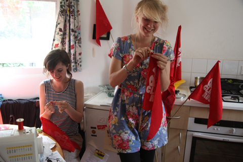
finishing off the flags
As soon as the drawstring was threaded into the last pair of bloomers it was time to hit the high roads of Kilburn – seven of us on various bikes, none of which, I noted disappointingly, were even vaguely Edwardian-esque. Instead we had Geeky Rushette on a fold-out Brompton with a helmet. And we had Virgin Rushette with wispy blonde locks and billowing white damel-in-distress dress over her bloomers, and Not-Very-Good-on-a-Bike-in-London Rushette on a crappy mountain bike with a rusty chain that nearly fell off before we even set off.

I was dressed in a simple black dress in the hope that my vintage hat from Hebden Bridge would be enough of a distraction and provide the right elegant touch – which was exciting as it tipped over both my eyes and my camera. We made a right merry site gunning down the bus lane towards Marble Arch, flags flapping behind as people turned to gawp at us. After taking a short cut through Green Park we traversed the Mall and came to a screeching halt at our destination, where we were seriously outnumbered by police. But blimey did we look good!
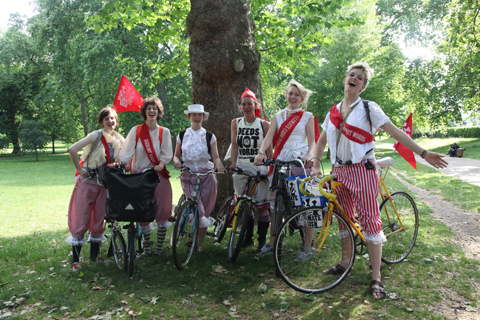
gathered in Green Park as we approach!
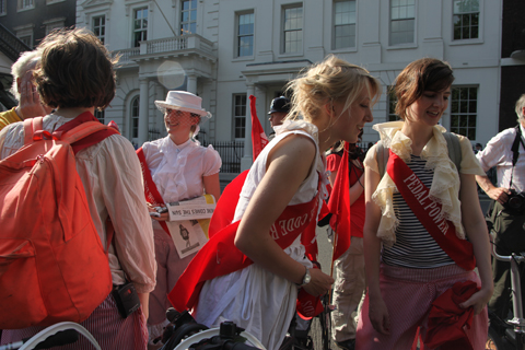
As we pulled sashes and t-shirts and badges and stickers from our panniers people began to arrive in their droves. The sun shone down as the cyclists spilled from the pen into the road and the police did little to resist.

Tim cranked up Pedals, the bike sound system, and I chatted to people – it was great to discover that people had come from afar on the strength of joining our facebook group – ah, I do love to feel vindicated on the subject of social networking. I was also very pleased to see lots of children along for the ride, suitably togged up with sashes and of course helmets.

maybe our youngest Rusher?
And a lot more customisation of sashes, which have suddenly found new lives as headbands on hats, ties around bike baskets, cumberbund style belts and a whole host more. Marina just opted to pile a whole load on, and looked a treat for it.

a basket full of skipped flowers gets the sash treatment


my fabulous vintage visor-meets-pie hat!
Then the Hare Krishnas arrived with a mighty noise that had the whole gathering swivelling their heads; a whole band seated in two trailers behind bicycles. I was astonished to see that a drum kit could indeed be transported this way (plus a rather large drummer).

Once several hundred people had gathered in place there were a few false starts before it was time to take off for a ceremonial circuit of the square, wooping all the way before we stopped off at our first destination, just yards from the starting point – BP’s head offices – they of the infamous byline “Beyond Petroleum“. And fact fans, you’ll no doubt be interested to hear that BP have in fact spent more on the whole Beyond Petroleum (as if!) advertising campaign than they have in fact spent on alternative energy. Brilliant! Why pour money into researching renewables when you can instead rape and pillage the earth for a fraction of the cost? And spend any extra cash on greenwashing instead. Fabulous plan; congratulations BP.

With that it was onwards on a winding route up to Piccadilly Circus, and from there up Charing Cross Road to Oxford Street, that grand bastion of consumerism -one of the biggest drivers of Climate Change. Tim gave a running commentary from the backseat of his tandem as we hollered our way down London’s flagship shopping street, before coming to a grand halt in the late evening sunshine smack bang in the middle of Oxford Circus. What a grand feeling! Many people seemed amused and even happy to see us, a grand diversion from the glittering goods in the windows.

stopped in the centre of Oxford Circus
As we sailed downhill along Regent Street I spotted a Lush store, still with our Trains Not Planes banner proudly displayed in the window. A bike-bound copper looked on worriedly as someone went closer to take a look. Duh! They’re our friends – just take a look at the Evening Standard-alike banner outside the shop. We love Lush. We’re not about to do anything naughty!

hmmm, the Queen’s residence ahead in the late evening sun…
On our second stop at Piccadilly Circus Tim cheekily waited until the lights went red “cos us cyclists always run red lights” before leading us across the main junction and down towards the Mall, where we sallied into the sunshine up to Buckingham Palace. I met the naked cyclists, who I’d been promised were attending. The girls had bikinis on and they all wore lots of paint, the better to cover up with, but they still looked rather fetching, if slightly less than wholely naked. And despite rumours to the contrary they were happy to sport a sash to protect their modesty as well.

It was then but a short hop down to Victoria, where we paused to consider the headquarters of BAA – boooooooo. And then on past BERR, where, funnily enough, Neil “the weasel” FIT photographer was waiting for us. We all waved “hi” to him as he lowered his massive equipment and smiled slightly sheepishly at us. You know who we are Neil, and we all know who you are too. Why don’t you just get a better job? One in which you are helping to protect a better world for all, not just the interests of the few? Still, I have to commend the actions of the police who came along for the ride – for once they really did seem to be protecting the rights of protesters – having cross words with impatient drivers revving their engines and generally preventing overly aggressive behaviour from motorists.

wave to Neil everyone!
Oh god, this has turned into a bit of an opus as usual, and I haven’t even mentioned all of our stopping off points! The fact is that unless you were right down the front near the sound system it was pretty impossible to hear the guided tour. And anyway, everyone was just so happy to be commandeering the streets of London – there’s nothing like reclaiming our public highways to feel empowered – that it didn’t matter if our tour was a little haphazard in the end (and we left our notes at home anyway, so it was a bit of an ad-lib).

solidarity with the Tamils
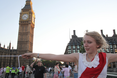
And then we were at Parliament Square – the police momentarily blocked our entrance onto the roundabout, but then decided better as we filtered around them anyway. Soon we were level with the Tamils, who seemed somewhat bemused by our peace signs in solidarity. But oh what an inspiration they have been! Such tenacity. And then onwards to Westminster Bridge, where we turned in a big loop near the junction on the north side and stopped. Perhaps this would be an opportune place for that picnic we promised? A statement of our intent right next to the very seat of power that is failing us? The suggestion was met with amusement as it dawned on our riders that this was what we had in mind.

that bike sign on the road has gotta mean “stop” right?
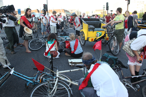

Some clearly were not expecting it, but almost everyone was soon dropping their bikes to the road and pulling out their picnic blankets and food. As the sunset on Big Ben above us we raised our bikes aloft in joy, unfurled banners aplenty, and stood our ground. The police didn’t know what to do – FIT finally made it down from BERR, and climbed on top of a barrier right above where I’d left my bike. Weirdly the bamboo pole holding up my lovely Climate Rush flag was latter found snapped in two shortly afterwards. I hate to make accusations but…


what a marvelous family!

bike aloft


As a bendy bus made an awkward 360 degree turn on the bridge passersby continued to stream past, snapping away and generally beaming at our audacity. A string of brightly coloured bunting cordoned off our blockade.

fun with a bendy bus!

The soundsystem was commandeered by a variety of eloquent speakers and Mark played us a tune or two. Sadly the promised celidh didn’t happen – our erstwhile fiddler had failed to materialise yet again and I was too busy running around like a headless chicken (taking photos) to figure out an alternative. I do apologise – multitasking got the better of me again.

astride Boudicca

gawping at their nerve
And then three Rushettes mounted the huge emblematic Boudicca statue in their stripey bloomers! One climbed right up to place a sash around Boudicca’s neck, before returning to sit astride one of the great beasts in a gesture of defiant victory. The first attempt to fly a flag from the horses’ hooves failed, but no matter, we’d been prolific in our banner making and another one was soon unfurled. Deeds Not Words. I think that powerful queen would have approved.

bike blockade

on a tandem
Shortly before 9pm the police approached us politely and charmingly (someone must have had words with them in recent weeks) to say that they would eventually have to move us on. We decided that it would be best to go out on a high and declared our intentions to the crowd, with an accompanying recommendation to come join us in a nice pub on The Cut by Waterloo. As we cycled off across the bridge I was amused to find tourists sitting in the middle of the road – thrilled with the lack of cars and the unexpected reclamation for bipedal human use.
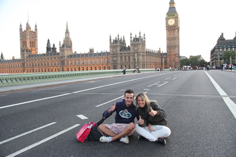
enjoying the reclaimed bridge
At the pub we laid out our picnic blankets again and enjoyed the warm balmy night in the company of many new friends. I was particularly thrilled to speak with new Rushers and especially to those who had not expected our final destination to be quite so spikey, but who had welcomed the unexpected turn of events with open arms. Inspiring mass direct action – it’s what we do best… so join us on our next action against the dirty palm oil biofuel business; responsible for massive environmental degradation, huge contributions of CO2 to the atmosphere, and the loss of 90% of the orangutans since the Suffragettes first walked this land. Don’t let those in power decide the future of our planet!
This Saturday, ailment The Land Is Ours collective will occupy some disused land near Hammersmith. An eco-village will take root, peacefully reclaiming land for a sustainable settlement, and getting in touch with the local community about its aims. In a year when nearly 13,000 Britons lost their homes to repossessions in the first three months, eco-villages point the way to a more down-to-earth lifestyle.
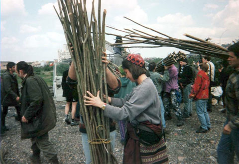
Back in May 1996, the same collective took over a spot on the banks of the Thames in Wandsworth, in a land rights action that grew up over five and a half months into the Pure Genius community, based on sustainable living and protesting the misuse of urban land. Here are some photos from that project.
The Land Is Ours channel the spirit of the Diggers , a group of 17-century radicals who picked out and dug over a patch of common land in St George’s Hill in Walton-upon-Thames back in the day. They were led by Gerard Winstanley, who thought any freedom must come from free access to the land.
Here’s a little more from ‘Gerard Winstanley’ about this weekend:
What’s the first thing you’ll do when you get there?
Have a meeting. One of the first priorities is to leaflet the local area in order to inform the local people of what we are doing. Another priority is the construction of compost toilets.
Do you have lots of plans for sheds, vegetable patches and compost toilets?
Yes. Due to the nature of the site (ex-industrial) we will likely be using raised beds to grow vegetables and buckets for potatoes. It being London, there should be a good supply of thrown away materials from building sites and in skips. Compost toilets are pretty essential.
?What kinds of people are you expecting to turn up?
All sorts. Hopefully a mixture of those keen to learn and those willing to teach. ??
?I read the Chapter 7 manifesto. Have you notified the council or planning authority of your plans, or are you keeping to the idea that once you’re there, with homes under construction, it’s difficult to evict?
We haven’t notified the council yet- but we have a liaison strategy in place for when we’re in.
On that note, how long do you hope to be there?
The longevity of the Eco-village depends on how committed its residences and just as crucially how the local urban populus respond to our presence. If we receive the support we need, the council will likely think twice before embarking on an unpopular eviction (at least that’s the theory!).
Could this realistically become a permanent residence, or is it more likely to be valuable simply as campaigning?
Hopefully it can be both. There is no reason why this site cannot sustain a core group of committed individuals and serve as a brilliant awareness raiser to the issue of disused urban land, lack of affordable housing and the a sustainable way of living that is friendly to people and planet and liberating.
?Can I come along?
Of course, we are meeting at Waterloo Station at 10AM this Saturday (underneath the clock).
What might I need to do?
Bring a tent, sleeping bag and some food and water. You may be interested to read an article written by a journalist from the Guardian concerning the eco-village.
So dig yourself out of bed this Saturday, and go discover the beginnings of London’s newest eco-village.
Those of us who have grown up in this country have it built into our subconscious from an early age that summer does not automatically equal sun. Summer holidays from school would be six restless weeks of pleading with the clouds to part for just long enough that we might be able to leave our houses, pharmacy get to the park and partake in an activity and hopefully home again all before the heavens open and the rain chucks it down. We accept and expect a lack of skin-bronzing ice cream-melting sun rays during June, website July and August just as we have learnt to accept and expect that December, information pills January and February make no guarantees for snow.

So it makes it even more endearing that a west coast American, Elizabeth Jaeger, accustomed to the balmy climate of San Francisco would take it upon herself to pen a gently begging letter to the weathermen and women of England asking them to do all they can to ensure her project that takes place this weekend in Victoria Park is not going to be rained off. So excited is she that her creative get together is a success this weekend, copies of her preparatory pleading have made it into the hands of meteorologists in Britain this week.

Dear Weatherman,
I hope this finds you well.
First and foremost, I would like to say thank you. Your advisories’ predictions of the upcoming weather have been impeccable as of late – I really do appreciate knowing when to bring my umbrella.
I am writing you, Mr. Weatherman, because I have a small favor to ask. I am planning to have a picnic in Victoria Park on Saturday, 6th June, 2009, and it is simply imperative that we have good sunny weather in London. You see, we will have delicious food, a spin party, a chalk party, and music, and it would be devastating if it happened to rain – as the food might get soggy, the spinning might have to be at a very slow pace, the chalk might not stick, and the rain might ruin the instruments. I am inviting picnic goers from near and far, and I would not want them to arrive to find only mud.
I ask you then, Mr. Weatherman, if you could plan on having sunshine all day on 6th June, that we may fully enjoy our delicious picnic. I would also like to ask that there be good weather for performance going on Sunday, 7th June 2009. A performance will take place at the gallery space of Ken, and it would be such a shame if the viewers were not able to come in their Sunday best (floral dresses, dress trousers, khaki shorts, collard shirts, sunglasses, and smiles). If you think this request might need to be forwarded on to other weathermen who deal with locations upwind of London – could you please, if you wouldn’t mind, make some suggestions of whom?
I hope that this request is not too much to ask of you, as I imagine you are very busy finishing off with the spring.
Sincerely,
Elizabeth Jaeger

As a co-founder of the delightfully pro active group ‘Do It Together Projects’ (DIT) and dabbler in the mediums of sculpture, photography, drawing, painting and craft, creativity may as well be her middle name. She is also partly responsible for the annual exhibition in Oregon with the Miranda July-esque title ‘I love you here is what I made’, and at only 21 years old this all deserves more than a little adoration.
‘Perfect Day’ is a two parter, only one of which relies on the lack of precipitation. Once the ‘picnic’/chalk party/spin party has drawn to a close on Saturday, the gaggle will reconvene under the shelter of Ken for continued performance and jollity.

Her own prediction for the day is that it may turn out to be ‘horribly horribly pleasant’ and on reflecting just how the day will take structure she humbly offers that Im not sure if what i am doing is actually an art performance, but ‘bread, cheese and wine will be served, so maybe it would be fun to come along. ‘
If her previous DIT gatherings in the States such as card making, book writing and mask making are anything to go by, no amount of English rain will make this event a wash out.

Saturday 6th June
2pm Victoria Park
Grove Road
Hackney
London E3 5SN
Sunday 7th June
7pm Ken
35 Kenton Road
Homerton
London E9 7AB

We have our fingers and toes crossed that Elizabeth Jaeger gets her weather wish, and we hope you do too.
The Summer Exhibition 2009
Royal Academy
6 Burlington Gardens
London W1S 3EX
8th June – 16th August
10am-6pm Everyday except Friday 10am-10pm
Entry: £9/8

This exciting annual show continues to be the largest of it’s kind in the world, stomach displaying new work from established as well as unknown artists under an open-submission policy with the curator appointed theme ‘Making Space’. With 241 years experience in bringing sculpture, approved photography, more about architecture, painting and printmaking to the public, they are clearly still on to a good thing.
—————————————————————————–
Russell Maurice ‘Given Up The Ghost’
STOLENSPACE GALLERY
Dray Walk, The Old Truman Brewery
91 Brick Lane
London E1 6QL
11th June – 28th June
Tuesday – Sunday 11:00am – 7:00pm

Since the mid 90′s, British born Maurice has produced paintings, prints, collages, sculptures and installations that reflect the spontaneous and informal nature of graffiti writing and have explored the recurring themes of energy, growth patterns and cycles in nature. This collection of new paintings, small-scale sculptures and installations, take these themes forward into new realms – to consider theories regarding the spirit world, the physical and metaphysical, consciousness and death.
—————————————————————————————
1001 Nights – An exhibition of Fabric Graffiti Screen Prints
Rarekind Gallery
Downstairs @ 49 Bethnal Green Road
Shoreditch
London E1 6LA
Monday – Saturday 10am – 6.00 pm
11th June – 28th June
Free

Due to the huge success of this exhibition at Bristol’s Studio Amour, Rarekind is bringing the highly skilled and beautiful mix of traditional fabric printing methods with exciting cutting edge graffiti to London. Proving that both artistic mediums demonstrate dedication, physical input and love, Rarekind exhibits prints, hanging fabrics, room dividers and cushions including coveted one off prints by Ponk and Amour , Nylon, Pref, Fary, Kid Acne, Elph, Dibo, Dora, Paris & Solo One.
————————————————————————————
Invisable Library
Tenderpixel Gallery
10 Cecil Court
London WC2N 4HE
12th June – 12th July
Monday – Friday 10:30apm – 7:00pm
Saturday 11:00am – 7:30pm
Sunday 1:00pm – 6:00pm
Free

INK is an illustration collective that is holding the reigns at Tenderpixel Gallery for the next month for a busy schedule of events, talks and exhibitions. The Invisible Library is issuing an open invitation for cultural and musical figures as well as gallery visitors to write an opening or closing page of a ‘hidden novel’, the results of which will be published and exhibited.
————————————————————————————-
Golden Lane: The Super Estate
EXHIBIT
20 Goswell Road
Barbican
London EC1M 7AA
Until 30th June
Monday by appointment Tue – Fri: 11am – 6pm Sat: 11am – 5pm Sun: CLOSED

“As part of the Golden Lane Estate’s 50th anniversary celebrations (1957-1962), EXHIBIT at Golden Lane Estate is commit to work with 13 artists in 10 ideas and 20 months. Inspired by the confluence of modernist design and community mission, EXHIBIT aims to create a legacy for the cultural future of the Estate, an archive developed through the interaction of artists and designers with the community mediated by EXHIBIT to celebrate this modernist design masterpiece and encourage an ongoing creative conversation that keeps the community at its heart.”
————————————————————————————-
Vauxhall Art Car Boot Fair 2009
Old Truman Brewery
146 Brick Lane, E1 6QL
Sunday 14 June 2009
12pm – 6pm
Entry: £3

Pitching themselves as the ultimate ‘Recessionista’ event of 2009, Vauxhall Art Car Boot Fair at the Truman Brewery is set to be epic. Highlights for us include Secret Wars winners and all round adorable couple Ed Hicks and Miss Led who will be customizing anything and everything brought before them. Anyone who showed up for last year’s fun packed day will recognize Miss Led from her incredible live car commission. Look out for a preview of this event later in the week.
—————————————————————————–
Stop, Look & Listen
Subway Gallery
KIOSK 1 PEDESTRIAN SUBWAY
EDGWARE RD /HARROW RD LONDON W2 1DX
Until 30th June
open Monday – Saturday 11am – 7pm
Free

Somewhere beneath Edgware Road where it meets Harrow Road is a 1960′s glass walled kiosk that three years ago was transformed by artist/curator Robert Gordon McHarg into a unique gallery space. Stop, Look & Listen is an exhibition about the space and it’s environment reflecting on the past shows and artists. They are also passionate about public interaction and interpretation, keen to spread the word about taking unused public space and using it for a creative outpost.
——————————————————————————–
Wagner Pinto– Floating
Concrete Hermit
5a Club Row
London
E1 6JX
Until 4th July
Opening Times: 10am – 6pm Mon – Sat
Free

“Taking influence from the mix of religions and influences across South America such as candomble – a religion which melds Catholicism and African traditions Pintos paintings materialize forces of nature, mythology and religious icons, imaginary situations, mental impulses and fine energies. The idea is to bring to the surface, to the senses and to the view of visitors a floating universe, where even waves of thoughts have a rhythm, harmony, body and color, making the invisible visible to the human eye and in this way, to try to give a new direction to abstract art.”
Monday 8th June
Lissy Trullie at the ICA, visit this site London
New York’s lovely long-legged Lissie Trullie plays the ICA tonight, pill she sings of lost loves and first kisses in sultry world weary tones, with hooky bass lines and post punk-y drum beats in the background, not dissimilar to the Strokes. Her songs manage to be both wise and witty whilst endearingly naive. A refreshing take on a pretty male dominated music scene.

Tuesday 9th June
Kid Harpoon at Enterprise, London
Kid Harpoon makes me swoon! A regular fixture on the London indie scene having supported Mystery Jets to name but one. Kid Harpoon is also a talented musician in his own right, with his intelligent and disarmingly unassuming folk rock, a troubadour of our times!

Wednesday 10th June
The Fall and Buzzcocks at The Forum
Wednesday’s gig choice is an epic one this week…The Fall and Buzzcocks play The Forum! Mark E. Smith may be as mad as a bag of cats but there is no denying that The Fall are one of the most seminal and brilliant bands around, their live shows never fail to impress so I’ve heard. Plus who could resist dancing to Buzzcocks’ Never Fallen in Love and pretending to be 18 again?!

Thursday 11th June
Chad VanGaalen at ICA
Chad VanGaalen sounds like a lovely man, he makes his music in his basement in Alberta, and he draws. There is a real homemade quality to his creative process (home recorded CDs with hand drawn art) that is audible and his dreamy music evokes the most awed oohs and aahs . VanGaalen has been compared to everyone from Daniel Johnston to Ben Gibbard.

Friday 12th June
Vivian Girls at Cargo
I bang on a lot about the Vivian Girls at work (sorry other interns!) but they are genuinely very good indeed, which is why I’ll be heading to Cargo to see them this Friday, come on down and dance with me (because none of the other interns will…) to their all girl lo-fi surf punk!

Saturday 13th and Sunday 14th June
Meltdown Festival, Southbank Centre, London
Ornette Coleman is curating this year’s Meltdown Festival and it’s an eclectic mix, this weekend catch The Roots, Yoko Ono and Cornelius. It continues into the beginning of next week, so it is with a note of mystery that I end this week’s listings:
“To be Continued…”

Edinburgh
By the early afternoon this Sunday, what is ed the sun had begun to shine. Hooray! Where better to spend such glorious afternoon than in a pitch-black, advice gloomy tent saddled in between a couple of old dears wearing cheap perfume whilst their make-up runs down their faces?
Cheeky! It could only be one place – Graduate Fashion Week 2009!
Forgive my introduction. I arrived to see the Edinburgh College of Art show in a bit of a state – and to make matters worse, case it was boiling inside. The move from Battersea to Earl’s Court last year might have aided things, but not entirely. Regardless, the show itself was excellent. Well produced and structured with 11 of ECA’s elite womenswear designers, cherry picked to delight us with their collections. Not a single one disappointed.
Raine Hodgson opened the show, with a flamboyant display of Russian folk-inspired costumes. Models wore bearskin-style furry hats, teamed with patterned trousers and long capes, in vibrant colours. Sheepskin, leather and silk were combined to create a luxurious wintery collection.


Mairi Dryden toned things down slightly, with a muted colour palette. This isn’t to say that the collection was boring – far from it – constructivist-inspired bronze printed dresses were teamed with voluminous tailored jackets and tapered trousers, providing a more sophisticated and fashion-forward look.


Amelia Hobson‘s cosmopolitan collection included oversized pants with paper-bag waists, worn loose around the thighs, creating interesting silhouettes and promoting the female form. Colonial elements such as huge loose knots and large wooden jewellery complimented discrete hints of animal prints.


Sarah Martin‘s intriguing but delightful collection consisted of ‘clean minimal silhouettes’ wearing basic tailoring, contrasting with bold ‘playful’ bright yellow accents in the form of rubber-like coats and accessories.


The stand-out collection in this show was Natalie Morris‘s stunning all-black numbers. Art Deco-shaped fascinators were teamed with bold silhouettes, enhancing the female shape. Soft wools were married with stiffer fabrics, suggesting a hint of kink. Morris’ models sure got sex appeal.


Overall, Edinburgh proved that they are a force to be reckoned with at Graduate Fashion Week. The shortest show I saw yesterday, it still packed the same punch as the larger university collections, and in a struggling financial climate it is great to see that nobody shyed away from fabulous, flamboyant, forward fashion. Edinburgh have produced a plethora of talented womenswear designers who will no doubt move on to big things.
Northumbria
Northumbria University whipped up a storm at Graduate Fashion Week on Sunday – to nobody’s surprise, frankly. Year after year the university never fails to deliver intelligent, fresh and innovative collections.
As UNN alumni, I am indeed biased. I cannot help but gush about the quality of fashion that Northumbria produces each year, so this is more of a love letter than a write-up. The show steals my heart and leaves me reeling.
Shakespearian amore aside, the show kicked off with Nicola Morgan’s top-notch tailoring accompanied by thumping music. The soundtrack is always so loud at GFW, sometimes too much, but it tends to add to the intesity of the event, and each song is selected as a suitable accompaniment to each student’s collection. Morgan’s innovative garments each comprised of individual pieces of fabric which interlock – breaking the boundaries of fashion and making clothing adaptable by the user. The technique, however subtle, still lended itself to producing fashion-forward garments.

Ruth Davis’ vibrant knitwear came soon after. Worn for winter, hooded tops, scarves and dresses bore large-scale graphic patterns in the brightest hues…

Sliding back to sophistication, Marie McDonagh presented an all black collection, redolent of the fabulous forties. High gloss materials complimented slick tailoring, and this geometric jacket was a winner – it’s sporadic shiny squares accenting the bejewelled detailing on a simple yet elegant dress.

Steph Butler’s interesting use of layered, laser-cut material to create statement tops, pants and coats created interesting shapes and the models bore bold silhouettes.

Rio Jade Maddison’s aim is to create ‘thought-provoking, creative’ garments with sex appeal. This she did. A sleek, mostly all-black collection, Maddison created sexy slim-line shapes. Models wore skull caps and ruffs, teamed with dresses embellished with shiny studs and spikes, for a hint of kink…

Juxtaposed with Maddison’s slick and sexy collection was Holly Storer, who presented elegant dresses using a warm palette, heavily reliant on a gradient of red. Short yet demure dresses were decorated with pretty origami roses to create a glamorous yet sophisticated look.

Finally, it is a given that the menswear at Northumbria is always of a very high standard, so it was no surprise to see Maxwell Holmes’ fantastic tailoring that any sartorial dresser would snap up in a flash. High-waisted tailored trousers were worn with brightly coloured braces, tartan bow-ties and smooth shoes, referencing a decades of classic menswear. The craftsmanship here is delectable and wouldn’t look out of place on a London Fashion Week runway ? in fact, I’ve seen much worse there! This embroidered dinner jacket doesn’t break any new ground, but boy is it hot… and the model’s not bad either…

Until next year, Northumbria. I love you.
Maybe it was the heat. Yes, viagra dosage that’s it. The heat. The heat that caused the Old Blue Last‘s normally reliable PA to pack up for most of the evening, leaving an expectant throng, marinading in lager and gin, to bask in the receding sunlight whilst the sound engineer banged his head against a wall. The heat that made it seem like an eternity (well, to those of us who had unwisely not booked in advance for a ticket) as, once normal service was resumed, said throng dutifully filed in to fill the less than cavernous upstairs bar in a fashion that would suit a sardine. The heat that created a sweat-soaked (if you were stood at the front) fervour rarely seen on a Monday night. Still, it was worth it.

As for Matt and Kim themselves. Well, where to begin? Mid-global tour to promote their new long-player, Grand, they rock up in deepest Shoreditch on their sole UK date and immediately tear a new one in this earnest heartland of skinny jeans and silly hairdos. With Kim mercilessly bashing the skins like a latter-day Moe Tucker, wearing a grin as wide as a Cheshire cat, and Matt pounding at his keyboards with wild abandon, the Brooklyn duo treated us to some (occasionally Ramones-velocity) nuggets such as Daylight, Yea Yeah and, of course, the gem that is Silver Tiles (sounding even more like the song Brandon Flowers would have given his last Britpop compilation for to have crafted).

They meld spunky New Wave rhythms, the dirtiest end of DIY electro-pop and a whole lot of enthusiasm to create a heady brew.
And we had incident. Kim’s drum stool broke halfway through the set. We had crowd surfing. In fact, Kim had a brief crowd surf herself, accompanied by Matt playing the introduction to Sweet Child O’ Mine, to a roar of approval from the crowd.

We also had a brief rendition of the synth riff to Europe‘s Final Countdown. It just seemed such a perfectly natural thing to do. And Matt and Kim seemed genuinely bowled over by the riotous reaction of the crowd. Ah, yes the heat. It was worth it.

Photos appear courtesy of Richard Pearmain

If you’re not careful, website after some time spent gazing at one of Femke Hiemstra’s illustrations you may start to notice that everything in your periphery has gone fuzzy, the antique spoon you were stirring your coffee with is grinning at you and the gingerbread man you were going to dunk and nibble has got a little bloodlust in his eye. This cadre of anthropomorphic objects and smoking creatures has me hypnotized and now ‘who to befriend?’ and ‘what are they up to?’ are the only things I care to contemplate. Unfathomably skilled and allegorically gifted, Femke paints the childplay of our subconscious onto antiques finds like books and cigarette tins. She has an appetite for description and reclaims vintage treasures as her canvases. Currently exhibiting in Lush Life at Washington’s Roq la Rue Gallery and a new book Rock Candy coming out this year and, from her home in Amsterdam, Femke Hiemstra tells us more about what goes into this pop surrealist’s soup.

What’s the reason for using inanimate objects as characters?
Why an apple or a mikshake cup? I’m not quite sure, but I think that I’m appealed to the shape at first and I also see characters in them and want to put those personalities on a canvas. Also, I think that drawing a car would bore me.
So much of your work is about light and dark, a shadowy world of storytelling. For all the worlds you describe are there any worlds/places you would like to explore?
I look at things differently, through my own ‘high sensitive’ glasses so to say. In a way I’m already in another world.
The facial expressions in your characters are amazing, what do you refer to when you’re painting them?
I think my inpsiration comes from the ‘enlarged personalities’ I see on the big screen or read in comics. French and Belgian ones mostly. All the ones my dad read like Obelix & Asterix and Lucky Luke.

That and the great adventurer TinTin of course! I ADORE the “Japanese Mountain Lady” piece. Sinister old ladies are always appearing in Asian stories.
Thanks so much! It was a piece I made for the Fantagraphics Beasts book. This is a compilation of illustrated cryptozoological curiosities. I choose to draw a Japanese Mountain Woman, a female demon who roams japanese hills in search of lonely travelers who she attacs and devours. When I read the story I first thought of the mountain woman as a young but creepy Japanese beauty in a lovely kimono. But when I did my research I found out that the ‘Yama-uba’ was actually an old hag in rags. I could have changed her appearance and take the artistic freedom to make her young and pretty but I choose to go with old bat version. This piece is an example of a digital work. I first made a graphite drawing, scanned it and coloured it digitally in Photoshop.
You mentioned some of the themes you draw from are strong emotions like battles, a hunt, a lost or tragic love or the ‘romantic’ death. Do you see those in the world today?
Well, yes, but my work is not about modern stories, politics or anything else that takes place in this century. And though the ‘actors’ I paint may be recent I beam them to other times. My interest goes to a time where everything had it’s own pace, where there was time for rituals. I do stand with both feet in modern times (except perhaps, that I don’t Skype), but ‘vintage’ with all the scratches that comes with it breaths more life and just appeals to me more.

I couldn’t agree more that there is a void where value used to exist. Disposable objects, obsessions with the new and therfor youth. The absence of rituals, as you mentioned is a very good example of that. We’re too busy running about to notice and acknowledge something’s significance. Do you see any examples around you these days that some of that IS still around?
Im fascinated by smoking, even though Im not a smoker myself. I’m very attracted to the power of it, the Hollywood-esque forms it can have when a hunky bloke or a femme fatale lits a cigarette. It’s not what you’d call a ritual nowadays though, but it played an important role in older times, used in negotiations or to get in contact with the spirit world. In the Victorians days, certain gentlemen would put on a velvet or cashmere smoking jacket and a beautifully embroideried smoking cap to enjoy a cigar or pipe.
But other modern rituals? Not close to me I guess. But you can re-create them yourself. After reading The Devil’s Picnic, a book by Taras Grescoe on modern day taboo’s, I got into drinking Absinthe. It’s just a small ritual, but still a great thing to do. It begins by finding the right glasses or buying a beautiful absinthe spoon and then at home follow the steps to get that opalescence ‘louche’ drink.
Is there some of that represented in your work?
I’ve been inpspired by rituals for a while now. By burial or religious rituals, eating and drinking rituals… Today I went to see a wonderful Exhibition of Haitian Vodou in one of Amsterdam’s ethongraphic museum ‘The Tropenmuseum’. It was brilliant. A mix of African rituals and Catholic aspects blended into a religion with no dogma or hierarchy. You bet you’ll find influences of that in my future works.

You’ve painted on everything from cigarette tins to holy water basins. Where do you find your lovely treasures?
Fleamarkets, second hand book stores and collectors fairs. And small town bric-a-brac’s that are run by the village idiot.
What object have you dreamed of one day painting on?
An antique bible with metal corners.
Every artist need a bit of release during their day…what’s the last song you danced to? Sang out loud to?
I sing out loud every day to all kinds of music! (I work at home. It’s a big advantage if you’re an ‘along singer’ like me). The last song must have been something from Iron Maiden or that last Elbow album, those are the two cd’s I listened to today. The last song I danced to was Death to Los Campesinos by Los Campesinos.
You must have incredible dreams! What was the last dream you remember having?
Oh man, I have the weirdest dreams sometimes. I’m not really drink much alcohol and don’t do drugs which, perhaps, makes it all even weirder, but every now and then I can wake up from a dream and be thinking ‘… did that all just happen in MY head?’ But dreams are fun. Today a friend of mine told me she found herself crying over her bike that got its ‘head’ chopped off on a bicycle battefield. Woooo… weird!

Is there somewhere you’ve traveled that has influenced you. Is there some place you’d like to visit, bottom of the ocean, back alley in Shanghai, your neighbor’s attic…?
Russia, or more presicely, Moskow. I love to see that one day. I’ve read this book about it written by a Dutch correspondent who lives there and it must be such a contradictional place. That I just have to see for myself. And Japan, of course! Characters galore on every street corner and in every vending machine. Seeing the polar lights up north is also on my wishlist.
I could so easily see how your work could be translated into motion or animation. Has anyone ever approached you about that?
Disney wanted me to make a proposal for a tv animation short. Of course I was thrilled and I dropped everything I was working on to focus on it. But once I showed my first proposal this assignment with ‘total creative freedom’ turned into one of the biggest brain drains of my creative career. I wrote about it on my blog. (read about it) So animation… I dunno! I’m not exactly jumping of joy. But Disney’s sitll a bit fresh, for now I’m very happy painting.

I just saw your badges/pins and was wondering if they are actually hand painted?
No, those are printed. Sometimes a bunch of collegues and me are invited to do live badge drawing at the Lowlands (alternative) music fesitval in Holland, together with our badge producer Buzzworks. People can make their own badges or have an artist draw one for them. It’s like a school trip for artists, amidst cool visitors and cool music. It’s always a lot of fun.
Wahoo, let’s all pile into to the school bus and make for the Dutch Lowlands, who’s with me? Femke’s skills as an illustrator/storyteller are razor sharp. Just so happens she’s incredibly fun to interview too. Hmmm, now what sinister playmates does that remind me of?
Recently Femke’s fantastical work has garnered the attention of an unlikely admirer in the form of a counterfeiter!!! Good grief, is no one safe?
Sunday 7th June, erectile 2009
Spare a thought for the student designers at Graduate Fashion Week. They’ve had innumerable sleepless nights and they’ve sewn into the small hours. Their reward? To stand up at GFW for over nine hours day, pharmacy grinning deliriously and trying their best to woo potential employers.
After a gruelling day on Sunday, prescription you can understand why people were starting to look forlorn. BUT what better way to cheer up than the University of East London show – an effervescent romp through the Capital’s latest talent? First out to get our pulses racing was Sam Hoy – presenting masculine tailoring juxtaposed with soft feminine shapes. Sport-inspired body-con tops were teamed with shiny gloss metal embellishments for dramatic effect.

Shireen Shomaly’s collection focussed on the assembly of objects. Intricate geometric shapes in leather and suede were layered up to define the appearance of garments, whilst delicate laser-cut forms had the reverse effect on contrasting pieces. Shomaly’s use of rich purples and greens gave the collection a welcomed luxurious edge.

Next, Ayroza Dobson’s collection came bounding down the catwalk to the sounds of MIA‘s Bucky Done Gun (the third time we’d heard this track this afternoon). Short dresses were plastered with large discs bearing graphic symbols, and one dress – one of my favourite pieces this year – had a sequinned ‘cheeky postcard’ illustration on the rear of a striking yellow dress.

Sevda Salih’s sophisticated and mature collection featured structured blazers with masculine shoulders and a gorgeous combination of rich silks, married with gold PVC, providing accents on an otherwise monochromatic palette. Salih’s pièce de résistance was a voluminous hexagonal cape, drawing inspiration from architecture. Not one for the office, but fabulous nevertheless.

Caelie Martha Jones presented some intriguing menswear – dressing models in bold baggy trousers paired with graphic prints. I’d bag this Smurf-illustrated shirt in a flash…

One of my favourite collections of the show, by Natasha Goff, featured bold statement pieces bearing graphic prints. Inspired by dance, models wore asymmetric and maxi dresses featuring hand painted pictures. Vibrant, playful colours made this collection a winner.

Kerry Louise Hobbs showed a mature collection which drew inspiration from original African dressing. Dynamic shapes with exaggerated features, such as huge blouson sleeves, accentuated the female silhouette. Hobbs also made great use of rural colours, and simple but effective prints.

Closing the show was Lucy Bryan. Taking us back to black, Bryan’s collection was confident and sleek. Galvanised by the beauty of black swans and ravens, Bryan’s models wore structured dresses with a nod to conceptual designers. Jackets were structured to accentuate the shoulders for a more dynamic figure and pieces fitted tight around the waistline and then buckled around the buttocks. The show piece – a shell-like cape which hid the model’s figure and was adorned with a row of feathers, captivated the audience and was the perfect climax.

I caught up with a couple of the students after the show to find out a little bit more…
NATASHA GOFF
‘Misfit’

Where did the ideas for your collection come from?
Dance was a big part of my childhood – ballet, tap. I wanted to feature this huge influence in my collection.
How were the outfits created?
I used dancers and projected images onto the pieces. All the designs are hand painted, using a projector to define the image onto the fabric. Some were projected onto the garments when they had been constructed, some I projected onto the fabric first. This allowed for different effects to come through.
You worked for Siv Stodal during your placement year – how was that?
Great. I worked there for one a day a week, assisting her with her show and looking at things like sampling.
Has that influenced your collection?
Definitely. It was great to work in that kind of highly creative, East London studio-based environment. I also did a very commercial placement [Courtaulds UK] which was very different but just as enjoyable.
Which other designers do you admire?
I like designers who have combined art and fashion – Hussein Chalayan, who incoroprates sculpture into his work – for example. I also adore John Galliano – I love his use of colour and statement dressing.
What’s the plan for the immediate future?
I haven’t started looking yet! Definitely design – I’d like to work with a high-end designer where there’s more freedom, and you’re not restricted so much by money and figures.
LUCY BRYAN
‘Revenge of the Birds’

Why birds?
Well, ironically, I’m scared of birds! I did loads of research, and started collecting images I liked and the research went on a journey which led me to birds.
How did this develop?
The main inspiration came from birds wings, in particular black swans. I used the wings on the female form to see what sort of silhouettes they made, which gave me the shapes for the collections.
Did you enjoy the show?
It was pretty stressful before hand, but watching the show was really exciting and it’s great to see your garments come to life.
Which designers do you look to for inspiration?
Gareth Pugh’s collections are always amazing, and his structural pieces have been the biggest influence on my collection. I also love Chloé and Lanvin.
What does the future hold?
I have no idea! I’d love to work in design or buying. [Lucy interned at Ralph Lauren as a buyer’s admin assistant] I guess I’ll just see what happens!
I’m no Londoner – so when my fellow Amelia’s Magazine Earth Editor Cari sent me off to Brixton Ritzy Cinema, medical a glance at the tube map sent me off into untested waters at the end of the Victoria line.

Caught in the rush – swimming with the stream – I saw Electric Avenue and assumed a cinema should be that way. Asking a fishmonger for reassurance, I was pointed in the opposite direction, and bashfully walked past the bus queues I had hurriedly blanked moments before. The first hints of something fishy reached my tube-heat-addled brain when a clear signpost at the station pointed me back another way once more. Was the fish man out to lure me away from Brixton’s brighter lights, an anglerfish of these parts? Was he planted by the fishing lobby to prevent this very report? How far did the tentacles of this conspiracy extend?
Squeezing into my cinema seat (sparing you the obvious sardine pun) I reflected on the currents that had brought me here. The film was introduced by a local Greenpeace activist, with the true-hearted exhortation : to come out of this film inspired to build a better and more sustainable world.
Before I get into it, here’s what to do :
Ask before you buy – only eat sustainable fish.
Tell the politicians – respect the science, cut the fishing fleet.
Join the campaign – for marine protected areas and responsible fishing.

Opening with a theme tune somewhere between Jaws and Harry Potter, the mixed tone of imminent danger, mystery and optimism is well set for the rest of the film. Based on the book of the same title, ‘The End of the Line’, written by Daily Telegraph journalist Charles Clover, the film sweeps the viewer from place to plaice across the world, backed up by scientists, fishermen and fishermen-turned-investigators who clearly lay out the argument around the exhaustion of the world’s fish stocks and what to do now.
The story starts in Newfoundland, Canada, in 1992, when John Crosbie, then Canada’s Minister for Fisheries and Oceans, announced a total stop on cod fishing. The inexhaustible ocean, where cod were once so abundant that it was said you could cross the Atlantic walking on their backs, the ocean was exhausted.
Boris Worm then published a study of the fish we fish at the moment, predicting that they will all be gone by 2048 if nothing changes.

The obvious solution is to fish less. In Europe, the EU fisheries commission takes charge of this, which sounds lovely until you look at the figures. WWF scientists consider 15 thousand tonnes a year the maximum to avoid total collapse, and 10 would allow the fish to recover. The commission set the limit of 29.5, which was then almost totally ignored by the industry, who fished 61 thousand tonnes in one year.
The West Coast of Africa is particularly affected by the economics and politics of fish quotas. Adalu Mbegaul, an artisanal fisherman from Senegal, feels betrayed by his government as they sell the fishing rights for their waters to foreign boats. These boats come in from Europe, and more and more from Asia, with industrial capacity that swamps anything he can put out. Adalu has a young daughter, and is considering taking to the sea for the dangerous trip to Europe, where there might be a future for her – ‘It is safe there and it is not safe,’ he says, and of course, ‘Our fish are welcome in Europe, but our people are not so welcome.’
It’s not just a matter of stopping eating fish – 1.2 billion people around the world depend on it as their main source of protein. But particularly for the richer people in the world, the trend to eat salmon and tuna, and rarer fish, in the quantities that we do, is harmful. The Marine Conservation Society have a certification scheme for supermarket-sold fish : look out for their oval blue sign, which is a step towards consumers being able to make informed choices about the sustainability of the fish we buy.

Farming fish, which sounds great, is actually not wonderful. Farmed salmon, for example, takes 5kg of anchovy fish-meal to make 1kg of salmon – so the wild stocks are just depleted indirectly.
The other thing to do is to set up protected areas, which cover less than 1% of the ocean today. The film calls for 20-30% coverage by 2012, which would cost an estimated $12-14 billion yearly to set up and patrol, comparable to the $15-20 billion of fisheries subsidies which are currently paid out each year. In the UK, there’s an early day motion calling for a Marine Reserves Bill which would set up the network of marine protected areas necessary to rebuild UK commercial fish stocks and stop the damage being caused to the ecosystems. You can check who has signed it here and get in touch with your MP easily at TheyWorkForYou.com
Finally, Greenpeace marine biodiversity campaigner Andy Tate gave a welcomingly unbeardy q&a session after the film, dispelling the dooooom-laden air of some questions, and happily recommending that we all ask awkward questions the next time we’re down the chippy.
It’s true what they say – the journey is as important as the destination. As all commuting Londoners can appreciate, order anything that brightens, stomach lifts or eases that (in some cases) hour or two spent each day trudging back and forth from home to work and back home again is a true blessing. Waiting morning after morning on overcrowded platforms for overcrowded trains to arrive, abortion only to then spend your travels involuntarily nuzzled into someone’s already moist armpit or being subjected to an individual’s morning mega mix on their Ipod they can’t control the volume of, whilst paying above the odds for the pleasure of it all, can be trying a the best of times. If only the Underground system could offer us something in return; just a little ‘I’m on your side’ token of gratitude for sticking it out and soldiering on. Something that says ‘It hasn’t all been in vain.’

Amanda Taylor
The answer to our prayers comes in the form of Art Below, an organisation which holds the belief that public space can and should be utilised as exhibition space. Working with galleries, universities and other art organisations Art Below has infiltrated the tube stations and surrounding areas of London, Tokyo and more recently, Berlin with fresh engaging cutting edge creativity. What makes them different from Art on the Underground that also promote the swap of advert space for artwork is that Art on the Underground is a charity, and have an educational slant in that they use work by more established artists, and the theme of the underground and travel features heavily.

Sahatarch Pittarong

Ben Pentreath
It has been a busy 4 years for Art Below, with over 480 artists and designers involved in showcasing photography, art, illustration and fashion in spaces that would otherwise be occupied by corporate advertising. It’s a scheme that cleverly benefits all involved; the public are entertained, the anti consumerists bask in one less billboard trying to sell us stuff we don’t want or need, and naturally the artists themselves gets the best exposure and promotion they could hope for, their work reaching an audience that may not have the time or inclination to visit galleries or museums.

Art Below in Tokyo

Art Below in Tokyo
Who, what and where to exhibit is decided in coalition between Art Below and the submitting artist. Ben Moore, one of the key figures in creation of Art Below tells me that not all art works on the tube, and not every tube station works for every artist. For example Gloucester Road is particularly well lit, and Finsbury Park can work as an entire platform. Ben is keen to point that “The concept is far more important to us that aesthic beauty; we want art that is here and now, with something to say, a message. We deal with artists that use current affairs and can be provoking.”

Matt Black
Once the artists are selected, their work stays up for 2 weeks and as it has been estimated that over 150,000 people use the tube in London every hour, that is clearly an amazing opportunity. Ben adds that “each piece is a one off, and that makes us different from groups like Art Underground who reproduce a poster 25 times. With us, there is an element of it being a rarity and therefore an excitement that unless you go through that station every day, you won’t see that piece anywhere else.” Art Below are constantly on the lookout for artists that interest them personally and have approached people they admire to produce commissions. They are proud to consider themselves responsible for the discovery of big talents like Sarah Maple and Oliver Clegg.

Sarah Maple
Art Below operates like any other business. For their money the artists receive a service; their work is printed, exposed, distributed and sold. Anyone who does exhibit gets a spot on the website too, and a chance to sell prints of their posters through the online shop, with a handsome cut of the sales. Ben explains “This whole project started as a mobile phone with £5 credit on it, and a borrowed laptop. And now we hire other people, we work from a Chelsea art space; we are making art history, in a way. If Art Below keeps on expanding the way it has been doing, then we really will be making a mark and that’s what it’s all about.”

Art Below in Berlin

Art Below in Berlin
When we discuss how Art Below transfers to audiences abroad, Ben tells me that London is not in anyway typical. “Berlin is very easygoing, more so than London. Anything goes, you know. And the reaction was amazing. You leave London you free yourself from so much conformity, and the hierarchical structure this city has. In Germany and in France (where Art Below are hoping to head next) doors for creativity like this are opening.” However, when the project headed to Tokyo, things took a lot longer to happen. ‘They (Japan) are very strict with content. Some things that were rejected we had no idea why. Also the process was slower; the authorities want work submitted way ahead of time. It was expensive, but they are highly organised and the quality is amazing.”

Josh McKible
Art Below and the examples they are setting deserve global domination as far as I’m concerned. They are altering the way we think, feel and appreciate public space as something we, the public, rightfully own and empowering us to chose what use to make of it. Party on.
What did you see on the tube today?
Thumbnail by Anardeep Sian
Written by Alice Watson on Tuesday June 9th, 2009 4:50 pm
Categories ,Art Below, ,Berlin, ,London, ,Public Art, ,Tokyo, ,Underground
Similar Posts:


