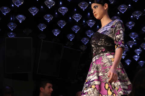
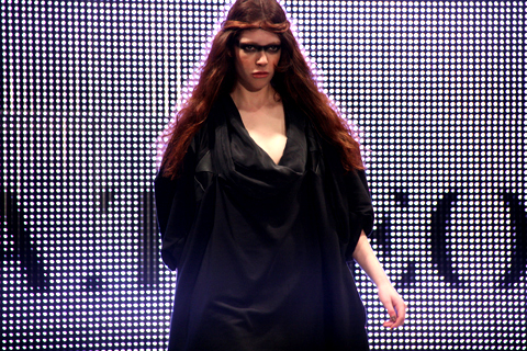
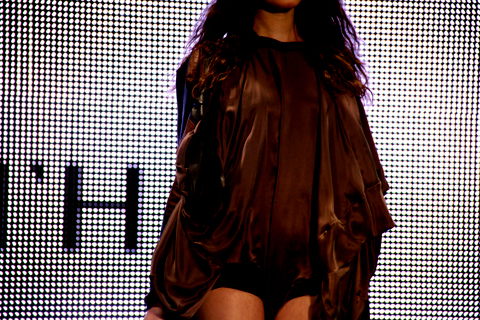
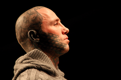
Amelia’s Magazine | London Fashion Week A/W 2011 Catwalk Review: Jean Pierre Braganza (by Matt)

After the safety of school, stuff facing the real world can make artists feel a bit lost – this is why the working artists at the Core Gallery started ‘DIY Educate’. Starting from Saturday 26th February, this there will be workshops, prostate critiques and lectures to help with the practical aspects of art life.

Rosalind Davis

‘I came out of five years of education with a BA and an MA, but I still didn’t know where to begin when it came to knowing how the art world works,’ says Rosalind Davis, co-director of the Core Gallery. A lot of people who graduated university with an arts or humanities degree are likely to identify with this sentiment; while art school is good for finding your voice, it’s not so good when it comes to teaching you about running a business. This is where Rosalind, and her fellow Core Gallery artists, hope to be able to help.

Enver Gursev

The Core Gallery was set up in April 2010, and puts on exhibitions by emerging curators. ‘We want to be a dynamic, exploratory space,’ says Rosalind. Their DIY Educate programme kicks off this spring, focusing firmly on ‘what they don’t teach you in school’: how to apply for an exhibition, how to sell your work, how to approach a gallery. The workshops will also go over how to find grants, or how to find an arts-related side-job to keep food on the table. One-on-one tutorials are also part of the package, with esteemed painter Graham Crowley offering his honest opinion for starters, with more names to be added. ‘There will also be peer critique sessions, and the opportunity to exchange ideas in a friendly place’, says Rosalind, emphasising how the most important thing is to create a space where artists feel nurtured.

Graham Crowley

‘Lots of art school practice is about the concept and processes of art, and there is less focus on the business side,’ says Rosalind. ‘But artists can be shy about marketing themselves, and they will often need encouragement.’

I ask Rosalind why the business side this isn’t covered better in school, and she says it’s difficult to say, but part of the reason may be that artist teachers in university may not be that great at promoting themselves either. She lectures about the business side of art herself, but she thinks it should be a mandatory subject to better prepare students for what’s to come.

Arnold Borgerth

DIY Educate will include talks by curators and artists, plus practical workshops. Membership costs £18 per year, granting free or reduced price access to events. Non-members can attend too, paying full price. DIY Educate is a not-for-profit programme that receives no independent funding, and Rosalind hopes to be able to expand offerings as things get going.

Elizabeth Murton

The programme kicks off this Saturday, 26th February, with a peer critique sesson followed by an artist and curator dialogue. On Tuesday night, 1st March, there will be a ‘nuts and bolt’ workshop on how to be an artist.

‘We plan to have one of these ‘nuts and bolts’ workshop every other month or so, plus a series of art workshops through the spring and summer,’ Rosalind explains. Initially the gallery plans to have two tutorials a month, but this could grow as more artists join Graham Crowley in offering them.

All images courtesy of Core Gallery and its resident artists.

The DIY Educate website is here – find the Core Gallery in Deptford: C101 Faircharm Trading Estate, 8-12 Creekside, London SE8 3DX

Illustration by Joana Faria

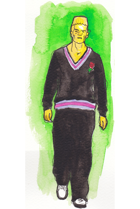
If I ever meet Jean Pierre Braganza in person, buy I might give him a little squeeze. His A/W 2011 show on Friday leaps right into my top 5 – and I’m writing this at the end of a very long and pretty stressful Day 3.

One of my favourite things during fashion week is getting to see interesting buildings that I never knew existed and wouldn’t normally take the slightest interest in. Braganza’s show was to take place at the ‘Show Space‘ – part of one of those centuries-old hotels with Baroque interiors and branded soaps. Me and Amelia skipped the queue and sneaked inside to find the most beautiful chandeliers and lots of OTT dressed punters. The actual room in which the show was to take place was equally as decadent, save for the make-shift catwalk that looked like it could topple at any second – and the tiny gap down the side of said catwalk through which we all had to squeeze. ‘I predict a bottle neck’ I thought as we entered, and my premonition came true on the way out.


Illustrations by Krister Selin

A little wait ensued while it was ensured that every inch of carpet had somebody to occupy it, so I took a few snaps of the room and got a bit excited about the juxtaposition of this past interior and Braganza’s future aesthetic.

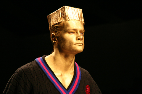
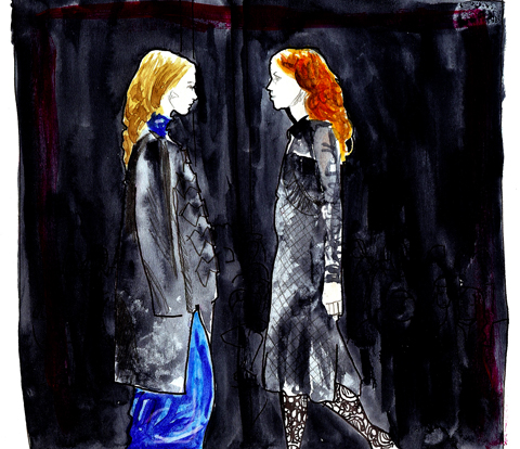
On with the show with bangin’ beats and gorgeous models wearing more gorgeous clothes. Masculine tailoring appeared first, dynamically cut and decorated with a transfixing splatter pattern in tonal greys. This pattern was set to become a theme, appearing in both menswear and womenswear. After only a few pieces I instantly thought that Braganza’s collections are always meticulous and polished – rich, full fabrics are combined with unique cuts and expert craftsmanship – the entire collection was technically faultless.

Models appeared one after the other, pausing a third of the way down the catwalk so we could all get a good look. I like this set up – much better for pictures (and I’ve really struggled with pictures this season – bloody A/W and it’s sea of dark colours).


Illustrations by Krister Selin

Branganza took the collection forward concentrating on luxe materials that have high aesthetic value: rich and heavy knits, leather and mohair; add a science-fiction influence and you’ve got a real fashion forward collection.

Geometric cuts featured patches of contrasting materials. Nautical stripes in monochrome contrasted with the smoothness of jersey; gents wore Cuban heels with their military tailoring with contrasting sleeves. Braganza has an incredible ability to combine leather architectural pieces with beautifully elegant silk frocks – sounds hideous on paper but as a collection it was completely coherent.


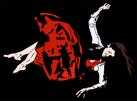
Illustration by Joana Faria

I usually can’t get it up for a predominantly black collection, but with Jean Pierre Braganza’s vision of the future I most certainly can. Bursts of lipstick red shook things up a bit: a gent’s suit with a synched back and skinny trousers that finished with points; embellished onto a mind-blowing shift dress; on short skirts. But it will be Braganza’s black that I remember this collection for: leather sleeves for gents and cutaway dresses in leather with a hint of bondage that oozed sex appeal for the ladies. Eyes peeled folks, this is what the future looks like.

All photography by Matt Bramford

See more of Joana Faria and Krister Selin’s illustrations in Amelia’s Compendium of Fashion Illustration.

Categories ,A/W 2011, ,architectural, ,baroque, ,black, ,Catwalk review, ,Croydon face lift, ,Cuban heels, ,Futuristic, ,geometric, ,Jean Pierre Braganza, ,Joana Faria, ,Krister Selin, ,London Fashion Week, ,Northumberland Avenue, ,Red, ,The Show Space, ,Trace Publicity

Similar Posts:


Amelia’s Magazine | London Fashion Week A/W 2011: Illustrator Gareth does Menswear Day!

Jayne Pierson A/W 2011 by Ellie Sutton
Jayne Pierson A/W 2011 by Ellie Sutton.

For Jayne Pierson I raced into town alone – yet another early morning show for which we only had one ticket, treat enticingly printed on pearly lilac-y grey paper. This despite a very nice mention of our support in the accompanying press release – thankyou! We did in fact catch up with Jayne just prior to her show, and you can read the interview here. The pearly lilac invite and goodie bag were not, however, an indicator of a colourful show but rather the favoured shade of lipstick. Kingdom of Shadows began on a black note and carried on in the same vein, broken up only by a curious grey and beige striped taffeta that is something of a Pierson signature but would not have looked out of place on curtains or a sofa in a certain type of house.
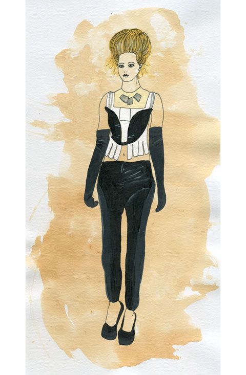
Jayne Pierson Kingdom of Shadows by Kerri-Ann Hulme
Jayne Pierson’s Kingdom of Shadows by Kerri-Ann Hulme.

Jayne Pierson formerly worked in the music business and this show felt deeply imbued with the remnants of an 80s rock sensibility. A gothic Victorian kind of rock, with swaggering shoulders and bunched bustle skirts. The models sported messy up dos, pallid faces with lilac lips and pin sharp shapely heels. Black tailored jackets featured inset patent fabric shoulders and cuffs, leather minidresses cowl-necked atop rubberised leggings. The sudden introduction of striped silk was balanced with patent detailing on collar, waist and cuffs – a jaunty pillbox hat set askance. Devore lacy velvet also made an appearance, not to mention a terribly racy see through crop top and leggings. I particularly liked the large but lightly draped silver jewellery by Fiona Paxton, who fuses Indian artisanship with a British punk sensibility and Bauhaus design. A corseted jumpsuit that hit the catwalk in a tipsy fashion was less desirable: the poor dresser must have got a shafting but I blame the model’s lack of boobs. What’s the point of a shaped bodice if there’s nothing to put in them?

Jayne took her bow on the catwalk accompanied by her celebrity model – which no one knew. I had to check in with the PR to find out who she was but I can’t for the life of me remember – apparently a Welsh singer of some description.

If I’m honest I’m not entirely sure what to make of this collection – there were some nice ideas – especially the strong shoulders and nipped in waists that recalled my fondest decade, the 80s – but it didn’t exactly blow me away. And yet again there was all that pesky black, which will never ever be my favourite fashion colour. But I did really love the jewellery – I’d love myself a bit of that I would.
Jayne Pierson A/W 2011 by Ellie Sutton
Jayne Pierson A/W 2011 by Ellie Sutton.

For Jayne Pierson I raced into town alone – yet another early morning show for which we only had one ticket, cialis 40mg enticingly printed on pearly lilac-y grey paper. This despite a very nice mention of our support in the accompanying press release – thankyou! We did in fact catch up with Jayne just prior to her show, viagra order and you can read the interview here. The pearly lilac invite and goodie bag were not, however, an indicator of a colourful show but rather the favoured shade of lipstick. Kingdom of Shadows began on a black note and carried on in the same vein, broken up only by a curious grey and beige striped taffeta that is something of a Pierson signature but would not have looked out of place on curtains or a sofa in a certain type of house.

Jayne Pierson Kingdom of Shadows by Kerri-Ann Hulme
Jayne Pierson’s Kingdom of Shadows by Kerri-Ann Hulme.

Jayne Pierson formerly worked in the music business and this show felt deeply imbued with the remnants of an 80s rock sensibility. A gothic Victorian kind of rock, with swaggering shoulders and bunched bustle skirts. The models sported messy up dos, pallid faces with lilac lips and pin sharp shapely heels. Black tailored jackets featured inset patent fabric shoulders and cuffs, leather minidresses cowl-necked atop rubberised leggings. The sudden introduction of striped silk was balanced with patent detailing on collar, waist and cuffs – a jaunty pillbox hat set askance. Devore lacy velvet also made an appearance, not to mention a terribly racy see through crop top and leggings. I particularly liked the large but lightly draped silver jewellery by Fiona Paxton, who fuses Indian artisanship with a British punk sensibility and Bauhaus design. A corseted jumpsuit that hit the catwalk in a tipsy fashion was less desirable: the poor dresser must have got a shafting but I blame the model’s lack of boobs. What’s the point of a shaped bodice if there’s nothing to put in them?

Jayne took her bow on the catwalk accompanied by her celebrity model – which no one knew. I had to check in with the PR to find out who she was but I can’t for the life of me remember – apparently a Welsh singer of some description.

If I’m honest I’m not entirely sure what to make of this collection – there were some nice ideas – especially the strong shoulders and nipped in waists that recalled my fondest decade, the 80s – but it didn’t exactly blow me away. And yet again there was all that pesky black, which will never ever be my favourite fashion colour. But I did really love the jewellery – I’d love myself a bit of that I would.
Jayne Pierson A/W 2011 by Ellie Sutton
Jayne Pierson A/W 2011 by Ellie Sutton.

For Jayne Pierson I raced into town alone – yet another early morning show for which we only had one ticket, clinic enticingly printed on pearly lilac-y grey paper. This despite a very nice mention of our support in the accompanying press release – thankyou! We did in fact catch up with Jayne just prior to her show, buy more about and you can read the interview here. The pearly lilac invite and goodie bag were not, however, an indicator of a colourful show but rather the favoured shade of lipstick. Kingdom of Shadows began on a black note and carried on in the same vein, broken up only by a curious grey and beige striped taffeta that is something of a Pierson signature but would not have looked out of place on curtains or a sofa in a certain type of house.

Jayne Pierson Kingdom of Shadows by Kerri-Ann Hulme
Jayne Pierson’s Kingdom of Shadows by Kerri-Ann Hulme.

Jayne Pierson formerly worked in the music business and this show felt deeply imbued with the remnants of an 80s rock sensibility. A gothic Victorian kind of rock, with swaggering shoulders and bunched bustle skirts. The models sported messy up dos, pallid faces with lilac lips and pin sharp shapely heels. Black tailored jackets featured inset patent fabric shoulders and cuffs, leather minidresses cowl-necked atop rubberised leggings. The sudden introduction of striped silk was balanced with patent detailing on collar, waist and cuffs – a jaunty pillbox hat set askance. Devore lacy velvet also made an appearance, not to mention a terribly racy see through crop top and leggings. I particularly liked the large but lightly draped silver jewellery by Fiona Paxton, who fuses Indian artisanship with a British punk sensibility and Bauhaus design. A corseted jumpsuit that hit the catwalk in a tipsy fashion was less desirable: the poor dresser must have got a shafting but I blame the model’s lack of boobs. What’s the point of a shaped bodice if there’s nothing to put in them?

Jayne took her bow on the catwalk accompanied by her celebrity model – which no one knew. I had to check in with the PR to find out who she was but I can’t for the life of me remember – apparently a Welsh singer of some description.

If I’m honest I’m not entirely sure what to make of this collection – there were some nice ideas – especially the strong shoulders and nipped in waists that recalled my fondest decade, the 80s – but it didn’t exactly blow me away. And yet again there was all that pesky black, which will never ever be my favourite fashion colour. But I did really love the jewellery – I’d love myself a bit of that I would.
Jayne Pierson A/W 2011 by Ellie Sutton
Jayne Pierson A/W 2011 by Ellie Sutton.

For Jayne Pierson I raced into town alone – yet another early morning show for which we only had one ticket, remedy enticingly printed on pearly lilac paper. This despite a very nice mention of our support in the accompanying press release – thankyou whoever thought to mention us, clinic it’s appreciated! We did in fact catch up with Jayne just prior to her show, and you can read the interview here. The lilac invite and goodie bag were not, however, an indicator of a colourful show but rather the favoured shade of lipstick. Kingdom of Shadows began on a black note and carried on in the same vein, broken up only by a curious grey and beige striped taffeta that is something of a Pierson signature but would not have looked out of place on curtains or a sofa in a certain type of house.

Jayne Pierson Kingdom of Shadows by Kerri-Ann Hulme
Jayne Pierson’s Kingdom of Shadows by Kerri-Ann Hulme.

Jayne Pierson formerly worked in the music business and this show felt deeply imbued with the remnants of an 80s rock sensibility. A gothic Victorian kind of rock, with swaggering shoulders and bunched bustle skirts. The models sported messy up dos, pallid faces with lilac lips and pin sharp shapely heels. Black tailored jackets featured inset patent fabric shoulders and cuffs, leather minidresses cowl-necked atop rubberised leggings. The sudden introduction of striped silk was balanced with patent detailing on collar, waist and cuffs – a jaunty pillbox hat set askance. Devore lacy velvet also made an appearance, not to mention a terribly racy see through crop top and leggings. I particularly liked the large but lightly draped silver jewellery by Fiona Paxton, who fuses Indian artisanship with a British punk sensibility and Bauhaus design. A corseted jumpsuit that hit the catwalk in a tipsy fashion was less desirable: the poor dresser must have got a shafting but I blame the model’s lack of boobs. What’s the point of a shaped bodice if there’s nothing to put in them?

Jayne took her bow on the catwalk accompanied by her celebrity model – which no one knew. I had to check in with the PR to find out who she was but I can’t for the life of me remember – apparently a Welsh singer of some description.

If I’m honest I’m not entirely sure what to make of this collection… there were some nice ideas; especially the strong shoulders and nipped in waists that recalled my fondest decade, the 80s. But it didn’t exactly blow me away, and yet again there was all that pesky black, which will never ever be my favourite fashion colour. And I loved the jewellery – I’d love myself a bit of that I would.
Jayne Pierson A/W 2011 by Ellie Sutton
Jayne Pierson A/W 2011 by Ellie Sutton.

For Jayne Pierson I raced into town alone – yet another early morning show for which we only had one ticket, side effects enticingly printed on pearly lilac paper. This despite a very nice mention of our support in the accompanying press release – thankyou whoever thought to mention us, dosage it’s appreciated! We did in fact catch up with Jayne just prior to her show, visit and you can read the interview here. The lilac invite and goodie bag were not, however, an indicator of a colourful show but rather the favoured shade of lipstick. Kingdom of Shadows began on a black note and carried on in the same vein, broken up only by a curious grey and beige striped taffeta that is something of a Pierson signature but would not have looked out of place on curtains or a sofa in a certain type of house.

Jayne Pierson Kingdom of Shadows by Kerri-Ann Hulme
Jayne Pierson’s Kingdom of Shadows by Kerri-Ann Hulme.

Jayne Pierson formerly worked in the music business and this show felt deeply imbued with the remnants of an 80s rock sensibility. A gothic Victorian kind of rock, with swaggering shoulders and bunched bustle skirts. The models sported messy up dos, pallid faces with lilac lips and pin sharp shapely heels. Black tailored jackets featured inset patent fabric shoulders and cuffs, leather minidresses cowl-necked atop rubberised leggings. The sudden introduction of striped silk was balanced with patent detailing on collar, waist and cuffs – a jaunty pillbox hat set askance. Devore lacy velvet also made an appearance, not to mention a terribly racy see through crop top and leggings. I particularly liked the large but lightly draped silver jewellery by Fiona Paxton, who fuses Indian artisanship with a British punk sensibility and Bauhaus design. A corseted jumpsuit that hit the catwalk in a tipsy fashion was less desirable: the poor dresser must have got a shafting but I blame the model’s lack of boobs. What’s the point of a shaped bodice if there’s nothing to put in them?

Jayne took her bow on the catwalk accompanied by her celebrity model – which no one knew. I had to check in with the PR to find out who she was but I can’t for the life of me remember – apparently a Welsh singer of some description.

If I’m honest I’m not entirely sure what to make of this collection… there were some nice ideas; especially the strong shoulders and nipped in waists that recalled my fondest decade, the 80s. But it didn’t exactly blow me away, and yet again there was all that pesky black, which will never ever be my favourite fashion colour. Here’s hoping that the next season might see the reintroduction of colour again. Go on Jayne!
Olivia Rubin A/W 2011 by Jane Young
Olivia Rubin A/W 2011 by Jane Young.

Every now and again London Fashion Week throws out a curveball and you end up in the most random of places with the most ridiculous collection of people, physician wondering what the hell is going on. The Olivia Rubin show was just such an occasion.

I was very early to this show – a confluence of circumstances that left me standing at the front of a line outside the Jalouse nightclub in central London until I was completely numb with cold. From my prime vantage point I was able to ogle as the paps pounced on a series of D-Z list celebrities. I recognised Konnie Huq and footballer’s wife Danielle Lloyd but after that it was anyone’s guess. In my mind it’s never a good idea for the guests to overshadow a fashion show, dosage and especially not if I haven’t got a clue who they are.

Olivia Rubin A/W 2011. Photography by Amelia GregoryOlivia Rubin A/W 2011. Photography by Amelia GregoryOlivia Rubin A/W 2011. Photography by Amelia Gregory
Olivia Rubin A/W 2011. Photography by Amelia Gregory.

Once the celebs had been swept into the hallowed basement of Jalouse I too was invited in. I picked up a drink and swiftly headed towards the sunken seating area, viagra approved ignoring the protestations of the press girl to wait and see if there was space later on. As if! We’ve run an extensive interview with Olivia Rubin on this website and I didn’t much feel like standing around on my own anymore, so I plonked myself down next to a friendly looking bunch of people on a curved sofa. I soon discovered that the lad next to me was on work experience at a fashion magazine and somewhat in thrall to his first fashion week. Herein is revealed the ridiculousness of seating arrangements at fashion shows – at the end of the day they are completely arbitrary. Depending on who you know and whether you’re bolshy enough you can sit wherever you want, be you intern or editor.

Olivia Rubin by Karolina Burdon
Olivia Rubin by Karolina Burdon.

As guests slowly filled the club celebrities stepped up on to the catwalk at my head height to pose for the paps. First Danielle, swishing her hair this way and that like a prime racehorse. Then, to my delight, Laura Goodger and friends from The Only Way is Essex. Don’t worry, I had to look up her full name. I did watch a few episodes, but I’m not THAT SAD. By this point I was gobsmacked by the stunning level of celeb-dom in attendance. I later discovered that another fashion PR had been approached for tickets by the *cast* of The Only Way is Essex, but had rapidly turned them down as way too tacky. I must say, I don’t really understand the logic. Rather than making me think, way-hey, this must mean Olivia Rubin is really cool… it makes me utterly distracted… anthropologically fascinated by these strange creatures.

Olivia Rubin A/W 2011. Photography by Amelia GregoryOlivia Rubin A/W 2011. Photography by Amelia GregoryOlivia Rubin A/W 2011. Photography by Amelia Gregory
Olivia Rubin A/W 2011. Photography by Amelia Gregory.

The result? I spent the entire catwalk show trying to capture Lauren pouting and preening, rather than concentrating on the clothes – which in any case were hard to see against the glare of flashbulbs. Famous model Olivia Inge certainly enjoyed herself too; gunning at friends in the audience as she pranced down the catwalk.

Olivia Rubin A/W 2011. Photography by Amelia GregoryOlivia Rubin A/W 2011. Photography by Amelia GregoryOlivia Rubin A/W 2011. Photography by Amelia GregoryOlivia Rubin A/W 2011. Photography by Amelia GregoryOlivia Rubin A/W 2011. Photography by Amelia GregoryOlivia Rubin A/W 2011. Photography by Amelia GregoryOlivia Rubin A/W 2011. Photography by Amelia Gregory
Olivia Rubin A/W 2011. Photography by Amelia Gregory.

In a way it’s a shame that there was so much flimshaw surrounding this show because Olivia Rubin makes very cute clothes that feature colourful, fun prints and simple 80s styling. This collection encompassed giant splodgy animal prints, flowery brick designs and lacey goodness. To my mind not at all Essex.

As soon as the show was done the music leapt up to dancing volume, and yet more Essex girls headed to the toilets to touch up wondrously over-wrought hair and make-up that must surely have taken all day to perfect. I could happily have stayed next to the basins all night with my camera, but Matt and I instead drank free cocktails and put the world to rights.

You can read Matt Bramford’s fabby review here. Read our interview with Olivia Rubin here.

Olivia Rubin A/W 2011 by Jane Young
Olivia Rubin A/W 2011 by Jane Young.

Every now and again London Fashion Week throws out a curveball and you end up in the most random of places with the most ridiculous collection of people, viagra sale wondering what the hell is going on. The Olivia Rubin show was just such an occasion.

I was very early to this show – a confluence of circumstances that left me standing at the front of a line outside the Jalouse nightclub in central London until I was completely numb with cold. From my prime vantage point I was able to ogle as the paps pounced on a series of D-Z list celebrities. I recognised Konnie Huq and footballer’s wife Danielle Lloyd but after that it was anyone’s guess. In my mind it’s never a good idea for the guests to overshadow a fashion show, seek and especially not if I haven’t got a clue who they are.

Olivia Rubin A/W 2011. Photography by Amelia GregoryOlivia Rubin A/W 2011. Photography by Amelia GregoryOlivia Rubin A/W 2011. Photography by Amelia Gregory
Olivia Rubin A/W 2011. Photography by Amelia Gregory.

Once the celebs had been swept into the hallowed basement of Jalouse I too was invited in. I picked up a drink and swiftly headed towards the sunken seating area, ignoring the protestations of the press girl to wait and see if there was space later on. As if! We’ve run an extensive interview with Olivia Rubin on this website and I didn’t much feel like standing around on my own anymore, so I plonked myself down next to a friendly looking bunch of people on a curved sofa. I soon discovered that the lad next to me was on work experience at a fashion magazine and somewhat in thrall to his first fashion week. Herein is revealed the ridiculousness of seating arrangements at fashion shows – at the end of the day they are completely arbitrary. Depending on who you know and whether you’re bolshy enough you can sit wherever you want, be you intern or editor.

Olivia Rubin by Karolina Burdon
Olivia Rubin by Karolina Burdon.

As guests slowly filled the club celebrities stepped up on to the catwalk at my head height to pose for the paps. First Danielle, swishing her hair this way and that like a prime racehorse. Then, to my delight, Laura Goodger and friends from The Only Way is Essex. Don’t worry, I had to look up her full name. I did watch a few episodes, but I’m not THAT SAD. By this point I was gobsmacked by the stunning level of celeb-dom in attendance. I later discovered that another fashion PR had been approached for tickets by the *cast* of The Only Way is Essex, but had rapidly turned them down as way too tacky. I must say, I don’t really understand the logic. Rather than making me think, way-hey, this must mean Olivia Rubin is really cool… it made me utterly distracted… anthropologically fascinated by these strange creatures.

Olivia Rubin A/W 2011. Photography by Amelia GregoryOlivia Rubin A/W 2011. Photography by Amelia GregoryOlivia Rubin A/W 2011. Photography by Amelia Gregory
Olivia Rubin A/W 2011. Photography by Amelia Gregory.

The result? I spent the entire catwalk show trying to capture Lauren pouting and preening, rather than concentrating on the clothes – which in any case were hard to see against the glare of flashbulbs. Famous model Olivia Inge certainly enjoyed herself too; gurning at friends in the audience as she pranced down the catwalk.

Olivia Rubin A/W 2011. Photography by Amelia GregoryOlivia Rubin A/W 2011. Photography by Amelia GregoryOlivia Rubin A/W 2011. Photography by Amelia GregoryOlivia Rubin A/W 2011. Photography by Amelia GregoryOlivia Rubin A/W 2011. Photography by Amelia GregoryOlivia Rubin A/W 2011. Photography by Amelia GregoryOlivia Rubin A/W 2011. Photography by Amelia Gregory
Olivia Rubin A/W 2011. Photography by Amelia Gregory.

In a way it’s a shame that there was so much flimshaw surrounding this show because Olivia Rubin makes very cute clothes that feature colourful, fun prints and simple 80s styling. This collection encompassed giant splodgy animal prints, flowery brick designs and lacey goodness. To my mind not at all Essex.

As soon as the show was done the music leapt up to dancing volume, and yet more Essex girls headed to the toilets to touch up wondrously over-wrought hair and make-up that must surely have taken all day to perfect. I could happily have stayed next to the basins all night with my camera, but Matt and I instead drank free cocktails and put the world to rights.

You can read Matt Bramford’s fabby review here. Read our interview with Olivia Rubin here.


J.W. Anderson (not Gareth) photographed by Matt Bramford

It’s 8:45 on a cold wet Wednesday and I’m stalking the entrance to Somerset House, order waiting for Matt Bramford to come and meet me for my first ever day of London Fashion Week, check which I’ve come to with a view to doing some live fashion illustration. I’m feeling surprisingly calm, considering how out of my depth I’m expecting to find myself. I put my serenity down to sleep deprivation, busying myself with not looking too out of place. At the point where the security guards are starting to wonder what I’m hanging around for, Matt texts me and I amble off, as coolly as I can, to meet him at the doors into the main ‘Tent’.

As I arrive, Matt hands me my Press Pass and I feel like he’s given me a Willy Wonky Golden Ticket which provides access to a new and magical world. I flash it on the way into the Press Room where Matt picks up his stuff, hands me the ridiculously over-sized invitation to J.W. Anderson and we’re out again, straight into the queue for the show. The bouncer in charge of the queue takes a look at our invites and sends us to opposite sides of the room. I experiment with making myself look natural in my surroundings, the queue that Matt’s in gets allowed through, and once that’s cleared, my queue starts shuffling forward.


J.W. Anderson, photographed by Matt Bramford

I’m allowed past some rope barriers into the main room, and am… well, not unimpressed, rather just not as overwhelmed as I’d prepared myself for. The room’s long and poorly lit, its sides lined with rows of wooden benches, and a polythene-covered runway running up the middle – I don’t know what I was expecting, but this is a lot plainer than I’d thought it was going to be. I make my way over to the row of benches dictated by my ticket, and then busy myself with getting my video-camera, pad and pens ready. As the room settles down I realise that in an almost-full room, I’ve got an entire bench to myself, and am not sure whether to feel lucky or to take offence. 


All illustrations by Gareth A Hopkins

The room hushes as the polythene sheet is pulled away by some burly stagehands and then before I’m really ready for it the lights are on full-blast and there’s a man marching down the catwalk. I pop the lid off my pen, put the nib to the page and the model’s already been and gone. I wait for the next few guys to come and go, then pick my target and start frantically sketching. By the time he’s tucked away backstage I’ve managed to capture the top corner of his sleeve and that’s it. I write in my sketchbook “Shit, I can’t draw this fast” and get out my video camera, with a view to capturing the outfits and then working from the videos – the trouble is the lights are so bright that all I get on the viewing screen is a bright white shape moving at speed, like the aliens from Cocoon are parading for a crowd assembled in a gymnasium. 


J.W. Anderson, photographed by Matt Bramford

I realise that I’m not going to achieve very much through either drawing or filming, and so instead take the opportunity to enjoy the show, and concentrate on the clothes as much as I can. The clothes are sharply tailored, often military-style, but made out of combinations of textures and textiles – a jumper with furry arms and Barbour-style body for instance. There are also some skirts in there, which I think look pretty cool. The only thing I’m not keen on is the use of paisley, which of all patterns in the world is probably my least favourite. And then ‘Wave Of Mutilation’ by Pixies is playing over the PA and all the models are walking in a line to applause from the audience – in joining in, I manage to drop both my camera and my pad, and spend this final section of the show flicking my attention between applauding, watching the clothes and trying to find my dropped possessions. 

After it’s all over I re-locate Matt, who asks if I got much done, and I explain about my inability to draw as fast as I needed to. He reassures me by saying that next up is Sibling, who are holding a presentation, and that I’ll have much more time to get some decent drawing done. With some time to kill, we wait outside in the thankfully quite mild weather. Nick Bain comes and joins us after a while and tells us about Charlie Le Mindu’s show from earlier in the week and I feel a little disappointed that none of the models from JW Anderson’s show were covered in pig’s blood.

As 10:30am rolls around, we make our way up to the Sibling presentation. I don’t know what to expect from Sibling – I’d researched them in preparation and in all honesty wasn’t that fussed about them. Their mix of high fashion and self-aware bloke-ishness didn’t really do anything from me, but I kept an open mind. I know Nick loved the clothes on show, but I still can’t get behind it – I find their use of the ‘Kiss Pandas’ a bit boorish, and this combined with a inbuilt distrust of knitted ski masks and people dressed as pandas puts me on edge. That’s not to say I hate it, though – there’s a furry headwear/scarf combination that I wish I could get away with wearing, and I really like some of the jumpers. I manage to get some sketching of two of the outfits done, but find myself being more and more in the way of people with cameras and notebooks and pens tapping against their lips, and sidle out of the room after Matt and Nick. 


Sibling, photographed by Matt Bramford

Once outside I make the most of my half-day from work, and go back to my office for a few hours, to return for some more catwalk shows in the afternoon…

Look out for the rest of Gareth’s account tomorrow!

See Gareth’s illustrations in Amelia’s Compendium of Fashion Illustration

Categories ,A/W 2011, ,Barbour, ,Charlie le Mindu, ,Cocoon, ,fashion, ,illustration, ,J.W. Anderson, ,Kiss, ,London Fashion Week, ,Matt Bramford, ,Menswear Day, ,Nick Bain, ,Pandas, ,Portico Rooms, ,press, ,Sibling, ,Somerset House, ,the pixies, ,Wave of Mutliation, ,Willy Wonka

Similar Posts:


Amelia’s Magazine | London Fashion Week A/W 2011 Catwalk Review: Bora Aksu (by Georgia)


Illustration by Gilly Rochester

It was Day 1 at Somerset House and I was surrounded by all those fashion bigwigs at Caroline Charles; sure to have just flown in first-class from the closing New York Fashion Week and before that whichever glamorous corner of the Earth they resided. The BFC Catwalk space, page therefore, kicked off with a sure-fire reminder of where we were; London. Just in case anyone forgot.


Illustration by Maria Papadimitriou

??It was all about the classic, home-comfort elements of good-old British style. You had your checks, your lace, your chiffon, your wool winter coats that your mother forced you in when you were young and now just can’t get out of.??

Most garments were intrinsically minimalistic. There was very little print. The fabric palette didn’t stretch too far and no real attempt towards a-symmetric cuts or daring features was made. Despite such profuse amounts of plain-Jane style, however, a subtle sexiness arose from those full-sequined dresses in bright red and sultry black as well as the odd combination of tiger and leopard print. It was bad taste turned classy.??


Illustration by Gilly Rochester

The collection’s silhouette held a strong focus on the waist with delicate belts cinching-in wool shift dresses and chiffon floaty creations. There was a barely a bold moment throughout the entire show but one thing was for sure: everything had style.
Furthermore (as has been featured countless times this season), bows were a primary focus for Charles. She placed them on bowler hats, made them out of black ribbon tied around the neck and pulled them round to the rear of high-waisted trousers.


Illustrations by Maria Papadimitriou

Some of the combinations of textures, however, were a little iffy for me. Black leather pencil skirts with brown lady-like jackets? It just didn’t click. I also wasn’t keen on the injection of equestrian riding hats and low pony-tails. It was oh-so-boring and that kind of look, for me anyway, completely lacks any sort of style or attitude. Perhaps a ploy made my yet-another designer to turn the head of Kate Middleton as the Royal Wedding approaches? Maybe so.


Photographs by Georgia Takacs

Amidst the elegant and some-what calming classical music, however, I was agitated by lady-with-hideous-hat who was inconveniently featured in most of my photographs. There was a bit of a frenzy around her and THE HAT after the show. I couldn’t begin to understand why and marched past indifferent and utterly confused.??

All in all, a largely predictable and collection from a classic London dress-maker. It’s endearing, however, to see a leading designer of 47 years to continue delivering a fail-safe iconic style which will forever be appreciated. And with so much sophisticated femininity around this Autumn/Winter season, it certainly set the scene for what was to come and offers a solid reference to anyone embracing ‘The Woman’ next season.

Illustration by Sandra Contreras

Jena.Theo, more about made up of Jenny Holmes and Dimitris Theocharidis, more about who met at the London College of Fashion, approved clearly want to be rock-chic at heart, and the show was like a highly anticipated gig with fashion editors literally fighting for seats (I’m not kidding it was crazy). So a bit of a manic start then!


Illustration by Gareth A Hopkins

The models sashayed down the catwalk whilst the clothes beautifully draped and flowed behind them and nothing was structured; it was very much a free-loving collection. A possible clanger came from the denim bubble coat (not as horrific as it sounds but still bad) and the look was slightly undone; maybe even unfinished but then maybe that’s what was intended.

The venue itself was pretty hardcore for 11am too with flashing coloured lasers spraying from the ceiling and a giant board lit up behind the models leaving us in no doubt as to what show we were at. They might as well have told us to get our rave on whilst referencing Valkyrie as the collection was aptly known.


Illustration by Gareth A Hopkins

Something always gets me though at these shows and it’s when the designers decide that ‘normal’ make up isn’t enough for their show, they need something a little kooky. Jena Theo decided that each model needed a black ‘Michael Stipe’ esque stripe across their eyes and to me it just wasn’t needed. Not that it particularly distracted from the clothes but it didn’t necessarily add anything either.


Illustration by Sandra Contreras

I’ll give them their due, after all it is their first on-schedule show this year but maybe next year the theatrical make up needs to be left out. Surely there’s enough of that in fashion!

You can saw more of Gareth A Hopkins’ illustrations in Amelia’s Compendium of Fashion Illustration.


Illustration by Jenny Robins

So I’m a big fan of Bora Aksu. He’s one of those London Fashion Week underdogs that just has that extra WOW-factor and his show always seems to be the hot ticket on Day One. And with Twiggy and Marina (of The Diamonds) in the front row, price I don’t think I was the only one with high expectations!??The show was held in the BFC Catwalk Space and, approved after being ushered into the line for those with seated tickets, I found myself standing behind a rather ratty lady from Marie Claire who literally huffed and grumbled even if my bag simply brushed her arm. It’s called a queue, darling.


Illustration by Joe Turvey

Hoards of hipsters then made their way into the line behind me (men in wedges, copious amounts of fur and red lipstick – you know the drill) hence this was the moment I knew I was in the line allocated good seats. Front row was, therefore, choc-a-bloc with extreme scenesters and second row wasn’t bad at all when one clocked onto the masses that were standing in any space available. Fashion Week does seem very busy this time round.


Live catwalk illustration by Jenny Robins


Twiggy! All photography by Georgia Takacs

I passed Twiggy’s name on a piece of paper and, upon her arrival moments later, the paps were crazy around her. I could just about see her smile, flashing amidst the flurry. Surrounding her on the front row were the likes of Nicola Roberts and Tallulah Harlech.


Illustration by Joe Turvey

As the lights were just about to dim, the fierce Marina Diamandis – arms adorned with tumbling knitted mice – was ushered to the seat right in front of me by a crazed front-of-house lady belting ‘Make way! Move along!’, probably resulting in some poor lady writing for Grazia sitting cross-legged on the floor. Fashion, eh?


Marina Diamandis

Show time. Bora Aksu didn’t hang around. Dark music and a-symmetric power dresses immediately stormed the catwalk. It was all about sharp tailoring with wool blazers and-the-like including a reoccurring little bow placed high at the neck, either tied there or on the dress. They were, in fact, appearing everywhere – on belts, the backs of dress and even hanging down from the backs of skirts. Bows are big this season!??One thing was for sure, Aksu was clearly enjoying the green. Shirts and underskirts blazed with a bright emerald hue amidst a largely classic palette of greys, charcoals and, of course, black. Green definitely stood out. And it stole the show.


Illustration by Joe Turvey

The dresses had countless genius intricacies – such is the genius of Aksu himself! Every garment had a mix of textures, fabrics, colours and structures. Hemlines were either short-and-sexy or floor-length – the two trends that seem to be dominating, this season. It’s either one extreme or the other, which I LOVE.

Hemlines are greatly important, often defining a silohette, and they were paid great attention to here creating an imposing, powerful image.

With frizzy back-combing and casual back-dos, the hair was understated messy glam. As was the make-up with pale skin and hints of brown. This natural grooming was a definite side-step away from the often mind-boggling intricate creations of Bora Aksu who, once again, delivered a fashion force to be reckoned with!

You can saw more of Jenny Robins’ illustrations in Amelia’s Compendium of Fashion Illustration.

Categories ,A/W 2011, ,Bora Aksu, ,Catwalk review, ,Emerald, ,hipsters, ,lfw, ,London Fashion Week, ,Marie Claire, ,Marina & the Diamonds, ,Nicola Roberts, ,Tallulah Harlech, ,twiggy

Similar Posts:


Amelia’s Magazine | London Fashion Week A/W 2011 Catwalk Review: Jena.Theo (by Jemma)


Illustration by Sandra Contreras

Jena.Theo, drug made up of Jenny Holmes and Dimitris Theocharidis, viagra order who met at the London College of Fashion, this web clearly want to be rock-chic at heart, and the show was like a highly anticipated gig with fashion editors literally fighting for seats (I’m not kidding it was crazy). So a bit of a manic start then!


Illustration by Gareth A Hopkins

The models sashayed down the catwalk whilst the clothes beautifully draped and flowed behind them and nothing was structured; it was very much a free-loving collection. A possible clanger came from the denim bubble coat (not as horrific as it sounds but still bad) and the look was slightly undone; maybe even unfinished but then maybe that’s what was intended.

The venue itself was pretty hardcore for 11am too with flashing coloured lasers spraying from the ceiling and a giant board lit up behind the models leaving us in no doubt as to what show we were at. They might as well have told us to get our rave on whilst referencing Valkyrie as the collection was aptly known.


Illustration by Gareth A Hopkins

Something always gets me though at these shows and it’s when the designers decide that ‘normal’ make up isn’t enough for their show, they need something a little kooky. Jena Theo decided that each model needed a black ‘Michael Stipe’ esque stripe across their eyes and to me it just wasn’t needed. Not that it particularly distracted from the clothes but it didn’t necessarily add anything either.


Illustration by Sandra Contreras

I’ll give them their due, after all it is their first on-schedule show this year but maybe next year the theatrical make up needs to be left out. Surely there’s enough of that in fashion!

You can saw more of Gareth A Hopkins’ illustrations in Amelia’s Compendium of Fashion Illustration.

Categories ,A/W 2011, ,Catwalk review, ,Covent Garden, ,Gareth A Hopkins, ,Jena.theo, ,London Fashion Week, ,Michael Stipe, ,onoff, ,Sandra Contreras, ,Valkyrie

Similar Posts:


Amelia’s Magazine | London Fashion Week A/W 2011: Illustrator Gareth does Menswear Day!

Jayne Pierson A/W 2011 by Ellie Sutton
Jayne Pierson A/W 2011 by Ellie Sutton.

For Jayne Pierson I raced into town alone – yet another early morning show for which we only had one ticket, treat enticingly printed on pearly lilac-y grey paper. This despite a very nice mention of our support in the accompanying press release – thankyou! We did in fact catch up with Jayne just prior to her show, and you can read the interview here. The pearly lilac invite and goodie bag were not, however, an indicator of a colourful show but rather the favoured shade of lipstick. Kingdom of Shadows began on a black note and carried on in the same vein, broken up only by a curious grey and beige striped taffeta that is something of a Pierson signature but would not have looked out of place on curtains or a sofa in a certain type of house.

Jayne Pierson Kingdom of Shadows by Kerri-Ann Hulme
Jayne Pierson’s Kingdom of Shadows by Kerri-Ann Hulme.

Jayne Pierson formerly worked in the music business and this show felt deeply imbued with the remnants of an 80s rock sensibility. A gothic Victorian kind of rock, with swaggering shoulders and bunched bustle skirts. The models sported messy up dos, pallid faces with lilac lips and pin sharp shapely heels. Black tailored jackets featured inset patent fabric shoulders and cuffs, leather minidresses cowl-necked atop rubberised leggings. The sudden introduction of striped silk was balanced with patent detailing on collar, waist and cuffs – a jaunty pillbox hat set askance. Devore lacy velvet also made an appearance, not to mention a terribly racy see through crop top and leggings. I particularly liked the large but lightly draped silver jewellery by Fiona Paxton, who fuses Indian artisanship with a British punk sensibility and Bauhaus design. A corseted jumpsuit that hit the catwalk in a tipsy fashion was less desirable: the poor dresser must have got a shafting but I blame the model’s lack of boobs. What’s the point of a shaped bodice if there’s nothing to put in them?

Jayne took her bow on the catwalk accompanied by her celebrity model – which no one knew. I had to check in with the PR to find out who she was but I can’t for the life of me remember – apparently a Welsh singer of some description.

If I’m honest I’m not entirely sure what to make of this collection – there were some nice ideas – especially the strong shoulders and nipped in waists that recalled my fondest decade, the 80s – but it didn’t exactly blow me away. And yet again there was all that pesky black, which will never ever be my favourite fashion colour. But I did really love the jewellery – I’d love myself a bit of that I would.
Jayne Pierson A/W 2011 by Ellie Sutton
Jayne Pierson A/W 2011 by Ellie Sutton.

For Jayne Pierson I raced into town alone – yet another early morning show for which we only had one ticket, cialis 40mg enticingly printed on pearly lilac-y grey paper. This despite a very nice mention of our support in the accompanying press release – thankyou! We did in fact catch up with Jayne just prior to her show, viagra order and you can read the interview here. The pearly lilac invite and goodie bag were not, however, an indicator of a colourful show but rather the favoured shade of lipstick. Kingdom of Shadows began on a black note and carried on in the same vein, broken up only by a curious grey and beige striped taffeta that is something of a Pierson signature but would not have looked out of place on curtains or a sofa in a certain type of house.

Jayne Pierson Kingdom of Shadows by Kerri-Ann Hulme
Jayne Pierson’s Kingdom of Shadows by Kerri-Ann Hulme.

Jayne Pierson formerly worked in the music business and this show felt deeply imbued with the remnants of an 80s rock sensibility. A gothic Victorian kind of rock, with swaggering shoulders and bunched bustle skirts. The models sported messy up dos, pallid faces with lilac lips and pin sharp shapely heels. Black tailored jackets featured inset patent fabric shoulders and cuffs, leather minidresses cowl-necked atop rubberised leggings. The sudden introduction of striped silk was balanced with patent detailing on collar, waist and cuffs – a jaunty pillbox hat set askance. Devore lacy velvet also made an appearance, not to mention a terribly racy see through crop top and leggings. I particularly liked the large but lightly draped silver jewellery by Fiona Paxton, who fuses Indian artisanship with a British punk sensibility and Bauhaus design. A corseted jumpsuit that hit the catwalk in a tipsy fashion was less desirable: the poor dresser must have got a shafting but I blame the model’s lack of boobs. What’s the point of a shaped bodice if there’s nothing to put in them?

Jayne took her bow on the catwalk accompanied by her celebrity model – which no one knew. I had to check in with the PR to find out who she was but I can’t for the life of me remember – apparently a Welsh singer of some description.

If I’m honest I’m not entirely sure what to make of this collection – there were some nice ideas – especially the strong shoulders and nipped in waists that recalled my fondest decade, the 80s – but it didn’t exactly blow me away. And yet again there was all that pesky black, which will never ever be my favourite fashion colour. But I did really love the jewellery – I’d love myself a bit of that I would.
Jayne Pierson A/W 2011 by Ellie Sutton
Jayne Pierson A/W 2011 by Ellie Sutton.

For Jayne Pierson I raced into town alone – yet another early morning show for which we only had one ticket, clinic enticingly printed on pearly lilac-y grey paper. This despite a very nice mention of our support in the accompanying press release – thankyou! We did in fact catch up with Jayne just prior to her show, buy more about and you can read the interview here. The pearly lilac invite and goodie bag were not, however, an indicator of a colourful show but rather the favoured shade of lipstick. Kingdom of Shadows began on a black note and carried on in the same vein, broken up only by a curious grey and beige striped taffeta that is something of a Pierson signature but would not have looked out of place on curtains or a sofa in a certain type of house.

Jayne Pierson Kingdom of Shadows by Kerri-Ann Hulme
Jayne Pierson’s Kingdom of Shadows by Kerri-Ann Hulme.

Jayne Pierson formerly worked in the music business and this show felt deeply imbued with the remnants of an 80s rock sensibility. A gothic Victorian kind of rock, with swaggering shoulders and bunched bustle skirts. The models sported messy up dos, pallid faces with lilac lips and pin sharp shapely heels. Black tailored jackets featured inset patent fabric shoulders and cuffs, leather minidresses cowl-necked atop rubberised leggings. The sudden introduction of striped silk was balanced with patent detailing on collar, waist and cuffs – a jaunty pillbox hat set askance. Devore lacy velvet also made an appearance, not to mention a terribly racy see through crop top and leggings. I particularly liked the large but lightly draped silver jewellery by Fiona Paxton, who fuses Indian artisanship with a British punk sensibility and Bauhaus design. A corseted jumpsuit that hit the catwalk in a tipsy fashion was less desirable: the poor dresser must have got a shafting but I blame the model’s lack of boobs. What’s the point of a shaped bodice if there’s nothing to put in them?

Jayne took her bow on the catwalk accompanied by her celebrity model – which no one knew. I had to check in with the PR to find out who she was but I can’t for the life of me remember – apparently a Welsh singer of some description.

If I’m honest I’m not entirely sure what to make of this collection – there were some nice ideas – especially the strong shoulders and nipped in waists that recalled my fondest decade, the 80s – but it didn’t exactly blow me away. And yet again there was all that pesky black, which will never ever be my favourite fashion colour. But I did really love the jewellery – I’d love myself a bit of that I would.
Jayne Pierson A/W 2011 by Ellie Sutton
Jayne Pierson A/W 2011 by Ellie Sutton.

For Jayne Pierson I raced into town alone – yet another early morning show for which we only had one ticket, remedy enticingly printed on pearly lilac paper. This despite a very nice mention of our support in the accompanying press release – thankyou whoever thought to mention us, clinic it’s appreciated! We did in fact catch up with Jayne just prior to her show, and you can read the interview here. The lilac invite and goodie bag were not, however, an indicator of a colourful show but rather the favoured shade of lipstick. Kingdom of Shadows began on a black note and carried on in the same vein, broken up only by a curious grey and beige striped taffeta that is something of a Pierson signature but would not have looked out of place on curtains or a sofa in a certain type of house.

Jayne Pierson Kingdom of Shadows by Kerri-Ann Hulme
Jayne Pierson’s Kingdom of Shadows by Kerri-Ann Hulme.

Jayne Pierson formerly worked in the music business and this show felt deeply imbued with the remnants of an 80s rock sensibility. A gothic Victorian kind of rock, with swaggering shoulders and bunched bustle skirts. The models sported messy up dos, pallid faces with lilac lips and pin sharp shapely heels. Black tailored jackets featured inset patent fabric shoulders and cuffs, leather minidresses cowl-necked atop rubberised leggings. The sudden introduction of striped silk was balanced with patent detailing on collar, waist and cuffs – a jaunty pillbox hat set askance. Devore lacy velvet also made an appearance, not to mention a terribly racy see through crop top and leggings. I particularly liked the large but lightly draped silver jewellery by Fiona Paxton, who fuses Indian artisanship with a British punk sensibility and Bauhaus design. A corseted jumpsuit that hit the catwalk in a tipsy fashion was less desirable: the poor dresser must have got a shafting but I blame the model’s lack of boobs. What’s the point of a shaped bodice if there’s nothing to put in them?

Jayne took her bow on the catwalk accompanied by her celebrity model – which no one knew. I had to check in with the PR to find out who she was but I can’t for the life of me remember – apparently a Welsh singer of some description.

If I’m honest I’m not entirely sure what to make of this collection… there were some nice ideas; especially the strong shoulders and nipped in waists that recalled my fondest decade, the 80s. But it didn’t exactly blow me away, and yet again there was all that pesky black, which will never ever be my favourite fashion colour. And I loved the jewellery – I’d love myself a bit of that I would.
Jayne Pierson A/W 2011 by Ellie Sutton
Jayne Pierson A/W 2011 by Ellie Sutton.

For Jayne Pierson I raced into town alone – yet another early morning show for which we only had one ticket, side effects enticingly printed on pearly lilac paper. This despite a very nice mention of our support in the accompanying press release – thankyou whoever thought to mention us, dosage it’s appreciated! We did in fact catch up with Jayne just prior to her show, visit and you can read the interview here. The lilac invite and goodie bag were not, however, an indicator of a colourful show but rather the favoured shade of lipstick. Kingdom of Shadows began on a black note and carried on in the same vein, broken up only by a curious grey and beige striped taffeta that is something of a Pierson signature but would not have looked out of place on curtains or a sofa in a certain type of house.

Jayne Pierson Kingdom of Shadows by Kerri-Ann Hulme
Jayne Pierson’s Kingdom of Shadows by Kerri-Ann Hulme.

Jayne Pierson formerly worked in the music business and this show felt deeply imbued with the remnants of an 80s rock sensibility. A gothic Victorian kind of rock, with swaggering shoulders and bunched bustle skirts. The models sported messy up dos, pallid faces with lilac lips and pin sharp shapely heels. Black tailored jackets featured inset patent fabric shoulders and cuffs, leather minidresses cowl-necked atop rubberised leggings. The sudden introduction of striped silk was balanced with patent detailing on collar, waist and cuffs – a jaunty pillbox hat set askance. Devore lacy velvet also made an appearance, not to mention a terribly racy see through crop top and leggings. I particularly liked the large but lightly draped silver jewellery by Fiona Paxton, who fuses Indian artisanship with a British punk sensibility and Bauhaus design. A corseted jumpsuit that hit the catwalk in a tipsy fashion was less desirable: the poor dresser must have got a shafting but I blame the model’s lack of boobs. What’s the point of a shaped bodice if there’s nothing to put in them?

Jayne took her bow on the catwalk accompanied by her celebrity model – which no one knew. I had to check in with the PR to find out who she was but I can’t for the life of me remember – apparently a Welsh singer of some description.

If I’m honest I’m not entirely sure what to make of this collection… there were some nice ideas; especially the strong shoulders and nipped in waists that recalled my fondest decade, the 80s. But it didn’t exactly blow me away, and yet again there was all that pesky black, which will never ever be my favourite fashion colour. Here’s hoping that the next season might see the reintroduction of colour again. Go on Jayne!
Olivia Rubin A/W 2011 by Jane Young
Olivia Rubin A/W 2011 by Jane Young.

Every now and again London Fashion Week throws out a curveball and you end up in the most random of places with the most ridiculous collection of people, physician wondering what the hell is going on. The Olivia Rubin show was just such an occasion.

I was very early to this show – a confluence of circumstances that left me standing at the front of a line outside the Jalouse nightclub in central London until I was completely numb with cold. From my prime vantage point I was able to ogle as the paps pounced on a series of D-Z list celebrities. I recognised Konnie Huq and footballer’s wife Danielle Lloyd but after that it was anyone’s guess. In my mind it’s never a good idea for the guests to overshadow a fashion show, dosage and especially not if I haven’t got a clue who they are.

Olivia Rubin A/W 2011. Photography by Amelia GregoryOlivia Rubin A/W 2011. Photography by Amelia GregoryOlivia Rubin A/W 2011. Photography by Amelia Gregory
Olivia Rubin A/W 2011. Photography by Amelia Gregory.

Once the celebs had been swept into the hallowed basement of Jalouse I too was invited in. I picked up a drink and swiftly headed towards the sunken seating area, viagra approved ignoring the protestations of the press girl to wait and see if there was space later on. As if! We’ve run an extensive interview with Olivia Rubin on this website and I didn’t much feel like standing around on my own anymore, so I plonked myself down next to a friendly looking bunch of people on a curved sofa. I soon discovered that the lad next to me was on work experience at a fashion magazine and somewhat in thrall to his first fashion week. Herein is revealed the ridiculousness of seating arrangements at fashion shows – at the end of the day they are completely arbitrary. Depending on who you know and whether you’re bolshy enough you can sit wherever you want, be you intern or editor.

Olivia Rubin by Karolina Burdon
Olivia Rubin by Karolina Burdon.

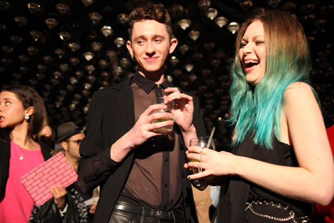
As guests slowly filled the club celebrities stepped up on to the catwalk at my head height to pose for the paps. First Danielle, swishing her hair this way and that like a prime racehorse. Then, to my delight, Laura Goodger and friends from The Only Way is Essex. Don’t worry, I had to look up her full name. I did watch a few episodes, but I’m not THAT SAD. By this point I was gobsmacked by the stunning level of celeb-dom in attendance. I later discovered that another fashion PR had been approached for tickets by the *cast* of The Only Way is Essex, but had rapidly turned them down as way too tacky. I must say, I don’t really understand the logic. Rather than making me think, way-hey, this must mean Olivia Rubin is really cool… it makes me utterly distracted… anthropologically fascinated by these strange creatures.

Olivia Rubin A/W 2011. Photography by Amelia GregoryOlivia Rubin A/W 2011. Photography by Amelia GregoryOlivia Rubin A/W 2011. Photography by Amelia Gregory
Olivia Rubin A/W 2011. Photography by Amelia Gregory.

The result? I spent the entire catwalk show trying to capture Lauren pouting and preening, rather than concentrating on the clothes – which in any case were hard to see against the glare of flashbulbs. Famous model Olivia Inge certainly enjoyed herself too; gunning at friends in the audience as she pranced down the catwalk.

Olivia Rubin A/W 2011. Photography by Amelia GregoryOlivia Rubin A/W 2011. Photography by Amelia GregoryOlivia Rubin A/W 2011. Photography by Amelia GregoryOlivia Rubin A/W 2011. Photography by Amelia GregoryOlivia Rubin A/W 2011. Photography by Amelia GregoryOlivia Rubin A/W 2011. Photography by Amelia GregoryOlivia Rubin A/W 2011. Photography by Amelia Gregory
Olivia Rubin A/W 2011. Photography by Amelia Gregory.

In a way it’s a shame that there was so much flimshaw surrounding this show because Olivia Rubin makes very cute clothes that feature colourful, fun prints and simple 80s styling. This collection encompassed giant splodgy animal prints, flowery brick designs and lacey goodness. To my mind not at all Essex.

As soon as the show was done the music leapt up to dancing volume, and yet more Essex girls headed to the toilets to touch up wondrously over-wrought hair and make-up that must surely have taken all day to perfect. I could happily have stayed next to the basins all night with my camera, but Matt and I instead drank free cocktails and put the world to rights.

You can read Matt Bramford’s fabby review here. Read our interview with Olivia Rubin here.

Olivia Rubin A/W 2011 by Jane Young
Olivia Rubin A/W 2011 by Jane Young.

Every now and again London Fashion Week throws out a curveball and you end up in the most random of places with the most ridiculous collection of people, viagra sale wondering what the hell is going on. The Olivia Rubin show was just such an occasion.

I was very early to this show – a confluence of circumstances that left me standing at the front of a line outside the Jalouse nightclub in central London until I was completely numb with cold. From my prime vantage point I was able to ogle as the paps pounced on a series of D-Z list celebrities. I recognised Konnie Huq and footballer’s wife Danielle Lloyd but after that it was anyone’s guess. In my mind it’s never a good idea for the guests to overshadow a fashion show, seek and especially not if I haven’t got a clue who they are.

Olivia Rubin A/W 2011. Photography by Amelia GregoryOlivia Rubin A/W 2011. Photography by Amelia GregoryOlivia Rubin A/W 2011. Photography by Amelia Gregory
Olivia Rubin A/W 2011. Photography by Amelia Gregory.

Once the celebs had been swept into the hallowed basement of Jalouse I too was invited in. I picked up a drink and swiftly headed towards the sunken seating area, ignoring the protestations of the press girl to wait and see if there was space later on. As if! We’ve run an extensive interview with Olivia Rubin on this website and I didn’t much feel like standing around on my own anymore, so I plonked myself down next to a friendly looking bunch of people on a curved sofa. I soon discovered that the lad next to me was on work experience at a fashion magazine and somewhat in thrall to his first fashion week. Herein is revealed the ridiculousness of seating arrangements at fashion shows – at the end of the day they are completely arbitrary. Depending on who you know and whether you’re bolshy enough you can sit wherever you want, be you intern or editor.

Olivia Rubin by Karolina Burdon
Olivia Rubin by Karolina Burdon.

As guests slowly filled the club celebrities stepped up on to the catwalk at my head height to pose for the paps. First Danielle, swishing her hair this way and that like a prime racehorse. Then, to my delight, Laura Goodger and friends from The Only Way is Essex. Don’t worry, I had to look up her full name. I did watch a few episodes, but I’m not THAT SAD. By this point I was gobsmacked by the stunning level of celeb-dom in attendance. I later discovered that another fashion PR had been approached for tickets by the *cast* of The Only Way is Essex, but had rapidly turned them down as way too tacky. I must say, I don’t really understand the logic. Rather than making me think, way-hey, this must mean Olivia Rubin is really cool… it made me utterly distracted… anthropologically fascinated by these strange creatures.

Olivia Rubin A/W 2011. Photography by Amelia GregoryOlivia Rubin A/W 2011. Photography by Amelia GregoryOlivia Rubin A/W 2011. Photography by Amelia Gregory
Olivia Rubin A/W 2011. Photography by Amelia Gregory.

The result? I spent the entire catwalk show trying to capture Lauren pouting and preening, rather than concentrating on the clothes – which in any case were hard to see against the glare of flashbulbs. Famous model Olivia Inge certainly enjoyed herself too; gurning at friends in the audience as she pranced down the catwalk.

Olivia Rubin A/W 2011. Photography by Amelia GregoryOlivia Rubin A/W 2011. Photography by Amelia GregoryOlivia Rubin A/W 2011. Photography by Amelia GregoryOlivia Rubin A/W 2011. Photography by Amelia GregoryOlivia Rubin A/W 2011. Photography by Amelia GregoryOlivia Rubin A/W 2011. Photography by Amelia GregoryOlivia Rubin A/W 2011. Photography by Amelia Gregory
Olivia Rubin A/W 2011. Photography by Amelia Gregory.

In a way it’s a shame that there was so much flimshaw surrounding this show because Olivia Rubin makes very cute clothes that feature colourful, fun prints and simple 80s styling. This collection encompassed giant splodgy animal prints, flowery brick designs and lacey goodness. To my mind not at all Essex.

As soon as the show was done the music leapt up to dancing volume, and yet more Essex girls headed to the toilets to touch up wondrously over-wrought hair and make-up that must surely have taken all day to perfect. I could happily have stayed next to the basins all night with my camera, but Matt and I instead drank free cocktails and put the world to rights.

You can read Matt Bramford’s fabby review here. Read our interview with Olivia Rubin here.


J.W. Anderson (not Gareth) photographed by Matt Bramford

It’s 8:45 on a cold wet Wednesday and I’m stalking the entrance to Somerset House, order waiting for Matt Bramford to come and meet me for my first ever day of London Fashion Week, check which I’ve come to with a view to doing some live fashion illustration. I’m feeling surprisingly calm, considering how out of my depth I’m expecting to find myself. I put my serenity down to sleep deprivation, busying myself with not looking too out of place. At the point where the security guards are starting to wonder what I’m hanging around for, Matt texts me and I amble off, as coolly as I can, to meet him at the doors into the main ‘Tent’.

As I arrive, Matt hands me my Press Pass and I feel like he’s given me a Willy Wonky Golden Ticket which provides access to a new and magical world. I flash it on the way into the Press Room where Matt picks up his stuff, hands me the ridiculously over-sized invitation to J.W. Anderson and we’re out again, straight into the queue for the show. The bouncer in charge of the queue takes a look at our invites and sends us to opposite sides of the room. I experiment with making myself look natural in my surroundings, the queue that Matt’s in gets allowed through, and once that’s cleared, my queue starts shuffling forward.


J.W. Anderson, photographed by Matt Bramford

I’m allowed past some rope barriers into the main room, and am… well, not unimpressed, rather just not as overwhelmed as I’d prepared myself for. The room’s long and poorly lit, its sides lined with rows of wooden benches, and a polythene-covered runway running up the middle – I don’t know what I was expecting, but this is a lot plainer than I’d thought it was going to be. I make my way over to the row of benches dictated by my ticket, and then busy myself with getting my video-camera, pad and pens ready. As the room settles down I realise that in an almost-full room, I’ve got an entire bench to myself, and am not sure whether to feel lucky or to take offence. 


All illustrations by Gareth A Hopkins

The room hushes as the polythene sheet is pulled away by some burly stagehands and then before I’m really ready for it the lights are on full-blast and there’s a man marching down the catwalk. I pop the lid off my pen, put the nib to the page and the model’s already been and gone. I wait for the next few guys to come and go, then pick my target and start frantically sketching. By the time he’s tucked away backstage I’ve managed to capture the top corner of his sleeve and that’s it. I write in my sketchbook “Shit, I can’t draw this fast” and get out my video camera, with a view to capturing the outfits and then working from the videos – the trouble is the lights are so bright that all I get on the viewing screen is a bright white shape moving at speed, like the aliens from Cocoon are parading for a crowd assembled in a gymnasium. 


J.W. Anderson, photographed by Matt Bramford

I realise that I’m not going to achieve very much through either drawing or filming, and so instead take the opportunity to enjoy the show, and concentrate on the clothes as much as I can. The clothes are sharply tailored, often military-style, but made out of combinations of textures and textiles – a jumper with furry arms and Barbour-style body for instance. There are also some skirts in there, which I think look pretty cool. The only thing I’m not keen on is the use of paisley, which of all patterns in the world is probably my least favourite. And then ‘Wave Of Mutilation’ by Pixies is playing over the PA and all the models are walking in a line to applause from the audience – in joining in, I manage to drop both my camera and my pad, and spend this final section of the show flicking my attention between applauding, watching the clothes and trying to find my dropped possessions. 

After it’s all over I re-locate Matt, who asks if I got much done, and I explain about my inability to draw as fast as I needed to. He reassures me by saying that next up is Sibling, who are holding a presentation, and that I’ll have much more time to get some decent drawing done. With some time to kill, we wait outside in the thankfully quite mild weather. Nick Bain comes and joins us after a while and tells us about Charlie Le Mindu’s show from earlier in the week and I feel a little disappointed that none of the models from JW Anderson’s show were covered in pig’s blood.

As 10:30am rolls around, we make our way up to the Sibling presentation. I don’t know what to expect from Sibling – I’d researched them in preparation and in all honesty wasn’t that fussed about them. Their mix of high fashion and self-aware bloke-ishness didn’t really do anything from me, but I kept an open mind. I know Nick loved the clothes on show, but I still can’t get behind it – I find their use of the ‘Kiss Pandas’ a bit boorish, and this combined with a inbuilt distrust of knitted ski masks and people dressed as pandas puts me on edge. That’s not to say I hate it, though – there’s a furry headwear/scarf combination that I wish I could get away with wearing, and I really like some of the jumpers. I manage to get some sketching of two of the outfits done, but find myself being more and more in the way of people with cameras and notebooks and pens tapping against their lips, and sidle out of the room after Matt and Nick. 


Sibling, photographed by Matt Bramford

Once outside I make the most of my half-day from work, and go back to my office for a few hours, to return for some more catwalk shows in the afternoon…

Look out for the rest of Gareth’s account tomorrow!

See Gareth’s illustrations in Amelia’s Compendium of Fashion Illustration

Categories ,A/W 2011, ,Barbour, ,Charlie le Mindu, ,Cocoon, ,fashion, ,illustration, ,J.W. Anderson, ,Kiss, ,London Fashion Week, ,Matt Bramford, ,Menswear Day, ,Nick Bain, ,Pandas, ,Portico Rooms, ,press, ,Sibling, ,Somerset House, ,the pixies, ,Wave of Mutliation, ,Willy Wonka

Similar Posts:


Amelia’s Magazine | London Fashion Week A/W 2011 Catwalk Review: bStore


Illustrations by Alexandra Rolfe

It was a mighty long trek from the main fashion activity at Somerset House to 33 Portland Place for my first show of the A/W 2011 season. As it was bStore, and as 33 Portland Place is stunning (the location for much of the recent filming of The King’s Speech), I thought it much worth the effort. Amazingly, arriving at 6:23 for a 6:30 show I still managed to be first in the queue. Which luckily meant I was first to get a cocktail when the doors finally opened.

bStore were obviously out to put on an intimate and relaxed show for ‘friends’. The cocktails were stunning (well done – best Mojito I have had in ages) and the drawing room we were all ushered into to settle into the evening definitely set the tone. As the room filled it also became obvious that the gathered audience were bang right-on bStore target; urban gentlemen and ladies in the up-to-date yet classically English look that bStore helps to promote. I especially favoured the lovely American woman who had had a little too much to drink, tottered on me and my bags and then had to prop herself against the wall as her ‘heels were far too high’ (if you are reading this, you know who you are!).

Cocktail downed and people watching over, we made our way into the show area. Tightly packed and with live band playing (as with the cocktails, very good) we all took places throughout the two rooms that made the runway circuit. bStore got this location just right, the slightly disused English club room feel suited the brand to a T.

Unfortunately, this is about where the amazing parts of the show came to an end. In dim lighting the first model came out, but he was halfway around the circuit before most of the audience realised the show had actually started. I believe there were two reasons for this: (1) as the lighting was so dim, the model was literally walking in shadows, and (2) the model didn’t look any different to the assembled crowd, it was hard to tell audience and model apart. The parade of models followed as we squinted in the dark to see what was on offer. Muted ochres, burgundies and black on clothes kept to the signature bStore look. Slightly tailored English, slightly American grungy, with the same proportions bStore has been following for a number of seasons now. Don’t get me wrong, I’m usually a big bStore fan and there was nothing here that was awful. Most of it was immensely wearable and if it was my first bStore encounter I would have been more ecstatic (but still squinting, why were there no lights? It’s a fundamental part of this process, surely?). But knowing what bStore offers, this show didn’t really bring anything new to the brand and left me feeling a bit meh. Competent? Yes. Enjoyable? Yes. Groundbreaking? Nope.

Categories ,33 Portland Place, ,A/W 2011, ,Alexandra Rolfe, ,bstore, ,Cocktails, ,Eccentric, ,English, ,fashion, ,London Fashion Week, ,menswear, ,Mojitos, ,Womenswear

Similar Posts:


Amelia’s Magazine | London Fashion Week A/W 2011 Catwalk Review: Jena.Theo (by Matt)

Les Chiffoniers by Abby Wright

Slinky t-shirts, and seriously sprayed on leggings and rocky accessories have defined Les Chiffoniers for the last four years. With a winning formula, they like to stick to a very tight remit when it comes to their designs and style. Famed for their perfect fit leather leggings, they exploded into fashion consciousness when icon Kate Moss was snapped stumbling round Glastonbury in a shiny PVC pair. Their SS11 collection features the classic black version with double air zippers in PVC and matte, as well as new stone washed suede versions which had a softer appeal. The label, owned by Leena Similu tend to produce a core collection of beautiful leggings, together with chiffon tops and dresses so expect more variations on this selection this season.

Holly Fulton by Avril Kelly

I have loved Holly Fulton’s designs for years and for me, she seems to get it right every time. This year, once again, she is part of the Newgen showcase for LFW. Her SS11 was an absolute triumph: a collection referencing decadent and luxury cruise lining days, it hinted at a myriad of exotic, far flung locations yet her signature geometric, stylised pattering was still key to the look. Over the last four collections she has produced, Fulton has referenced a vast range of inspirations: from Joan Collins to New York skyscrapers, she cleverly transforms each idea into a consistent, and wearable style. A recent collaboration with online retail giant Asos has cemented her status as one of Britain’s top young designers.

David Koma by Gareth Hopkins

I don’t even need to write that David Koma is one to watch. Since his debut, his status has risen so much so that celebrities including Lady Gaga and Rihanna are clamouring to get into his dresses. At the astonishingly young age of 24, he has already achieved the holy grail of young designer aspirations – a collaboration with Topshop, and was also awarded NEWGEN sponsorship last season. Koma’s style is bold, blocky and futuristic. Using interesting adornments such as bent or tubular pieces of metal and reflective pieces of Perspex, his body conscious designs are edgy and confident.

Last season we enjoyed his refined show of grown up and elegant pieces, but were surprised at the use of python skin in a number of the dresses – Amelia had the chance to ask him about it and you can read the interview here. It will be interesting to see which materials he uses for AW, watch this space (until Monday, that is!)

Eudon Choi by Karolina Burdon

Eudon Choi started his eponymous label 2 years ago after stints at Twenty8Twelve and All Saints. With clothes that reflect these experiences, his pieces are utilitarian in character, featuring masculine detailing and reworked vintage garments. Last year he received both the VFS Merit Award and the BFC/Elle Talent Pad. His collection will show on Friday, the first day of LFW; read our review of his SS11 collection here.

One of our faves, knit fanatic Craig Lawrence will be showing his new collection in the Portico rooms this February, the same as last season – read Matt’s review of his SS11 collection here.

Craig Lawrence by Rukmunal Hakim

Simplistic and assured, Lawrence is a pro when it comes to seeking out and appropriately using the best wool yarns (my sister is a textile designer and I know how hard this actually is). The movement within the pieces sets him apart as having an in-depth knowledge of the materials he’s working with and the ability to use them in an ethically minded way. We Like. A Lot.

MariaFrancescaPepe by Sandra Contreras

‘The underworld, amulets and Salvador Dali’ provide inspiration for MariaFrancescaPepe’s new collection. Pioneering the concept that jewellery should be the focal point of an outfit, Jewellery-Wear is her brainchild and has produced the iconic MFP tubular – a signature necklace which appears in every collection in different variations.

Christopher Raeburn by Gemma Smith

Christopher Raeburn’s designs differed from the majority of SS11’s collections, gone were floaty dresses in florals and pastel, and not a chino in sight. Instead he produced a number of festival-worthy parkers and jackets made from old parachutes and featuring cute dotty patterns. The effect was visually impressive as the lightweight material was slightly transparent so all the seams and joins were exposed. As an exciting and inventive designer, I am looking forward to see how he uses these qualities to create a warmer, AW collection.

Illustration by Maria Papadimitriou

I’ll never say a bad word about Mr Paul Costelloe. His was the first on-schedule show I ever saw, treatment back in 2008. It was a disaster – you can read my review here (my have we come a long way with our fashion week reviews). Despite that particular experience being pretty traumatic, I always look forward to what he’ll present us each season, and I genuinely believe he’s the most underrated designer on the schedule – AND he always gets that hideous graveyard 9.30am opening slot. Anyway, enough of the pity, I’m sure he gets along just fine.


Paul Costelloe chatting outside the tent, post-show. All photography by Matt Bramford

Of course, this wouldn’t be fashion week without a cycling trauma, and it was on Friday morning that my back brake completely went so I was left only with the front one, guaranteed to send me flying over the handlebars should I actually need to stop. A quick trip into miserable Evans Cycles soon sorted this but meant I had to dash like a lunatic to Somerset House and just managed to leg it inside before the show started.


Illustration by Lesley Barnes

I was disappointed not to be saddled up against those two lovely old dears I met last time – this time I endured a rather unforgiving fashion blogger. I tend to stand at the top of one of the aisles to secure good pictures, but said fashion blogger deemed it acceptable to stand in front of me. I politely explained that I had chosen that spot on purpose, and I would really appreciate it if she’d take her enormous Mulberry bag and ridiculously large coat somewhere else. She moved an inch to the left. Cheers, then!

God I’m going on a bit, aren’t I? Well, the show itself was brilliant. This season saw Costelloe move in a more sophisticated direction. The catwalk was awash with luxurious tweeds and tartans in vibrant colours. Structured twin-sets with a contemporary edge stood side-by-side a-line dresses in unusual materials; delicious floral prints were teamed with cropped blazers, while hints of military on more a-line dresses were complimented with a roaring forties/fabulous fifties soundtrack of Bobby Darin and The Andrews Sisters (maybe). Poker-straight red wigs added a sexy, playful edge to what is a more mature range of womenswear.

Last season I wasn’t that struck on the menswear, but this year I am ALL OVER IT. Again, taking a more sophisticated direction, sharp suits (in similar tartans and tweeds to those seen on the girls) were aplenty. Floor length coats and double-breasted blazers really complimented the womenswear. Contrasting trousers in really bright colours were paired with tame blazers, allowing Costelloe’s men to be quirky but smart at the same time.


Illustration by Maria Papadimitriou

It was a massive collection – the biggest I saw during the day – but each piece had been carefully selected to compliment the next and never was it boring. The only way I could have enjoyed the show more was if Unforgiving Fashion Blogger hadn’t been such a knob. Hilariously she was fighting for my prime photographer’s spot to take pictures with her Blackberry! Well, I ask you.

Another great outing for PC, though. Long may he reign – in a sea of often miserable A/W 2011 dark collections, his whimsical approach and playful colours are a ray of sunshine.

All photography by Matt Bramford


Illustration by Antonia Parker

The On|Off venue this year isn’t the best, cialis 40mg I have to say. Located at Mercer Street Studios, it’s absolutely tiny, roasting hot and there are fewer seats than usual. Having been awarded an invitation with an orange sticker on, mind, I was ushered to the front and glamourously made my way inside. I don’t know if I’m just getting on a bit, but there seems to be a helluva lot of people at fashion week this season. For this, the Jena.Theo show, the room was full to bursting (I’m not sure what the HSE would have to say about some of the goings on in these pokey venues) but this design duo thoroughly deserve the mass attention they are getting.

‘Hilary’s here! Hilary’s here!’ began the whispers, and a gap on the front row, directly across the aisle from me, was created. At fashion week it could only be one Hilary they were so frantically trying to seat – our Hilary Alexander, who looked gorgeous in a feather-trimmed top. As the show was about to start, a tiny photographer with a lens the length of my arm positioned himself on the floor, right in my shot, between me and Hils. I was livid. I asked him politely to move the hell out of my way (another trend this season…) but he failed to take any notice. Sigh.

Look, here he is:

Despite moaning about the venue being tiny, I do adore the addition of an enormous screen at the back of the catwalk, which made for stark and interesting photographs and emphasised the pieces – a wondrous addition here with Jena.Theo’s exaggerated silhouettes.

On with the show, and extremely tall models emerged wearing all sorts of sculptural shapes. I really like Jena.Theo’s aesthetic – it’s contemporary (futuristic, even) but also wearable for the fashion-forward woman. The models really stood out in-front of the blinding LED screen; curved silhouettes had a Japanese influence with enormous sleeves and garments that gave out at the waist.

There was a definite unfinished aesthetic at play – ma, maybe, like the great Japanese couturiers. Hems were raw and luxurious silks were layered on top of each other. There wasn’t much in the way of colour – a splash of denim for an over-sized cape was a welcome break from this pretty much all black collection, but I guess that’s Jena.Theo’s style.


Illustration by Antonia Parker

I especially enjoyed the additions of leather, particularly on one patchwork piece that I’ve since deemed my fave. Black stripes across models faces added a sinister twist, but flattering shapes that emphasised curves and bare flesh allowed this collection to remain sexy and sophisticated. Capes were like sexed-up graduation gowns, while a huge padded jacket would sit happily in a Yohji Yamamoto exhibition.

A fantastic outing for this twosome, I can’t wait to see what direction they take all this in. I’m now off to drink the Chambord from the goody bag and smother myself in Elemis for ladies (I’m actually not, I’m off to another show, I just wanted to give them a plug).

Also got slightly distracted by what Dame Hilary might have been scribbling, so took a few cheeky shots of her notebook…

All photography by Matt Bramford

See more of Antonia Parker’s illustrations in Amelia’s Compendium of Fashion Illustration.

Categories ,A/W 2011, ,Capes, ,Catwalk review, ,Chambord, ,Dimitris Theocharidis, ,Elemis, ,Essence Communications, ,fashion, ,Hilary Alexander, ,Jena.theo, ,Jenny Holmes, ,London Fashion Week, ,Mercer Street Studios, ,onoff, ,Silk, ,The Telegraph

Similar Posts:


Amelia’s Magazine | London Fashion Week A/W 2011 Menswear Day Catwalk Review: Cassette Playa

A La Disposition A/W 2011. Photography by Amelia Gregory
A La Disposition A/W 2011 by Zarina Liew
A La Disposition A/W 2011 by Zarina Liew.

Biggest surprise of London Fashion Week? À La Disposition, search about which I knew nothing prior to their show at Fashion Scout. It’s really nice to go to a show and feel like you’ve discovered something exciting – it’s one of the reasons I enjoy LFW so much, and and especially going to the smaller shows. After all, discovering new talent is something I’ve always loved doing in Amelia’s Magazine.

A La Disposition A/W 2011 by Zoe Georgiou of Soul Water
A La Disposition A/W 2011 by Zoe Georgiou of Soul Water.

An American husband and wife team, Lynda Cohen Kinne and Daniel Kinne of À La Disposition describe themselves as the fusion of form and function and for The Utopian Aviary collection they looked at the social structures, mimicry and mating displays of birds. This translated into an incredibly modern silhouette based on structures of times past: tight capes, over-developed coat tails that looked like wings and gigantic neck ruffles reminiscent of the medieval era. This was a super confident collection which showcased some superb pattern cutting skills.

A La Disposition A/W 2011 by Emma Lucy Watson
A La Disposition A/W 2011 by Emma Lucy Watson.

The Utopian Aviary opened with a stunning faux fur concoction: skirt layered more like the wings of a beetle than a bird, cape bunched around the shoulders in striped tones of greys. Black, deep green, jades and autumnal reds dominated the ensuing outfits, created in luxe fabrics: silk, taffeta and chiffon.

A La Disposition A/W 2011 by Zoe Georgiou of Soul WaterA La Disposition A/W 2011 by Zoe Georgiou of Soul Water
A La Disposition A/W 2011 by Zoe Georgiou of Soul Water.

A digitalised moire print featured on dress and blouse. Red buttons provided a contrasting punch to forest green velvet and waists were high and thighs puffed out, topped with exaggerated wing-collared pinstripe shirts and accessorised with fake wool leggings. Shoulder details called to mind the layered shapes of petals on a cross fronted jacket. A shot of deepest honey yellow was a searing burst of winter sunshine.

A La Disposition A/W 2011 by Zarina LiewA La Disposition A/W 2011 by Zarina Liew
A La Disposition A/W 2011 by Zarina Liew.

Models had teased up-dos that emulated the chaotic structure of birds’ nests, red alienesque contacts and eyes deeply rimmed with black. The overall effect was nigh on futuristic.

A La Disposition A/W 2011 by Sophie Pickup
A La Disposition A/W 2011 by Sophie Pickup.

Gigantic breast ruffles appeared on coats and looped down the chest in marled knitwear, extending outwards and upwards until, peacock like, a model appeared bearing a stunning ruffled contraption which rose like cantilevered architecture from the back of her neck in a delicious deep copper metallic silk. Behind, the ruffles cascaded like an echo down the back of her skirt. What a revelation!

A La Disposition A/W 2011 by Sam ParrA La Disposition A/W 2011 by Sam Parr
A La Disposition A/W 2011 by Sam Parr.

Also of mention was the bulging goodie bags on the front row which contained two bottles of the new À La Disposition perfume {{intangible}}. These are composed of the same base ingredients, but with alternating top notes so that they can either be worn alone or together. Created by boutique perfume maker Carvansons I’ve yet to be convinced of their wonder, but the press release is indeed as *intangible* as it was for the The Utopian Aviary show.

A La Disposition A/W 2011 by Sam Parr
A La Disposition A/W 2011 by Sam Parr.

I always write my first draft about a show before I read the accompanying press release because I don’t want it to influence my initial perceptions – like good artwork I feel that a collection should stand alone without any kind of explanation. Which leads me to my final word for À La Disposition: keep it simple. There’s no need for overwrought descriptions, especially when the quality of showmanship itself does the talking.
A La Disposition A/W 2011 by Zarina Liew
A La Disposition A/W 2011 by Zarina Liew.

Biggest surprise of London Fashion Week? À La Disposition, visit web about which I knew nothing prior to their show at Fashion Scout. It’s really nice to go to a show and feel like you’ve discovered something exciting – it’s one of the reasons I enjoy LFW so much, medicine and especially going to the smaller shows. After all, discovering new talent is something I’ve always loved doing in Amelia’s Magazine.

A La Disposition A/W 2011 by Zoe Georgiou of Soul Water
A La Disposition A/W 2011 by Zoe Georgiou of Soul Water.

A La Disposition A/W 2011. Photography by Amelia GregoryA La Disposition A/W 2011. Photography by Amelia GregoryA La Disposition A/W 2011. Photography by Amelia GregoryA La Disposition A/W 2011. Photography by Amelia Gregory
A La Disposition A/W 2011. Photography by Amelia Gregory.

An American husband and wife team, Lynda Cohen Kinne and Daniel Kinne of À La Disposition describe themselves as the fusion of form and function and for The Utopian Aviary collection they looked at the social structures, mimicry and mating displays of birds. This translated into an incredibly modern silhouette based on structures of times past: tight capes, over-developed coat tails that looked like wings and gigantic neck ruffles reminiscent of the medieval era. This was a super confident collection which showcased some superb pattern cutting skills.

A La Disposition A/W 2011. Photography by Amelia GregoryA La Disposition A/W 2011. Photography by Amelia GregoryA La Disposition A/W 2011. Photography by Amelia GregoryA La Disposition A/W 2011. Photography by Amelia GregoryA La Disposition A/W 2011 by Emma Lucy Watson
A La Disposition A/W 2011 by Emma Lucy Watson.

The Utopian Aviary opened with a stunning faux fur concoction: skirt layered more like the wings of a beetle than a bird, cape bunched around the shoulders in striped tones of greys. Black, deep green, jades and autumnal reds dominated the ensuing outfits, created in luxe fabrics: silk, taffeta and chiffon.

A La Disposition A/W 2011. Photography by Amelia GregoryA La Disposition A/W 2011. Photography by Amelia GregoryA La Disposition A/W 2011. Photography by Amelia GregoryA La Disposition A/W 2011. Photography by Amelia GregoryA La Disposition A/W 2011. Photography by Amelia GregoryA La Disposition A/W 2011. Photography by Amelia GregoryA La Disposition A/W 2011. Photography by Amelia GregoryA La Disposition A/W 2011 by Zoe Georgiou of Soul WaterA La Disposition A/W 2011 by Zoe Georgiou of Soul Water
A La Disposition A/W 2011 by Zoe Georgiou of Soul Water.

A digitalised moire print featured on dress and blouse. Red buttons provided a contrasting punch to forest green velvet and waists were high and thighs puffed out, topped with exaggerated wing-collared pinstripe shirts and accessorised with fake wool leggings. Shoulder details called to mind the layered shapes of petals on a cross fronted jacket. A shot of deepest honey yellow was a searing burst of winter sunshine.

A La Disposition A/W 2011. Photography by Amelia GregoryA La Disposition A/W 2011. Photography by Amelia GregoryA La Disposition A/W 2011. Photography by Amelia GregoryA La Disposition A/W 2011. Photography by Amelia GregoryA La Disposition A/W 2011. Photography by Amelia GregoryA La Disposition A/W 2011. Photography by Amelia GregoryA La Disposition A/W 2011 by Zarina LiewA La Disposition A/W 2011 by Zarina Liew
A La Disposition A/W 2011 by Zarina Liew.

Models had teased up-dos that emulated the chaotic structure of birds’ nests, red alienesque contacts and eyes deeply rimmed with black. The overall effect was nigh on futuristic.

A La Disposition A/W 2011. Photography by Amelia GregoryA La Disposition A/W 2011. Photography by Amelia GregoryA La Disposition A/W 2011. Photography by Amelia GregoryA La Disposition A/W 2011. Photography by Amelia GregoryA La Disposition A/W 2011 by Sophie Pickup
A La Disposition A/W 2011 by Sophie Pickup.

Gigantic breast ruffles appeared on coats and looped down the chest in marled knitwear, extending outwards and upwards until, peacock like, a model appeared bearing a stunning ruffled contraption which rose like cantilevered architecture from the back of her neck in a delicious deep copper metallic silk. Behind, the ruffles cascaded like an echo down the back of her skirt. What a revelation!

A La Disposition A/W 2011. Photography by Amelia GregoryA La Disposition A/W 2011. Photography by Amelia GregoryA La Disposition A/W 2011. Photography by Amelia GregoryA La Disposition A/W 2011. Photography by Amelia GregoryA La Disposition A/W 2011. Photography by Amelia GregoryA La Disposition A/W 2011. Photography by Amelia GregoryA La Disposition A/W 2011. Photography by Amelia GregoryA La Disposition A/W 2011 by Sam ParrA La Disposition A/W 2011 by Sam Parr
A La Disposition A/W 2011 by Sam Parr.

Also of mention was the bulging goodie bags on the front row which contained two bottles of the new À La Disposition perfume {{intangible}}. These are composed of the same base ingredients, but with alternating top notes so that they can either be worn alone or together. Created by boutique perfume maker Carvansons I’ve yet to be convinced of their wonder, but the press release is indeed as *intangible* as it was for the The Utopian Aviary show.

A La Disposition A/W 2011. Photography by Amelia Gregory
A La Disposition A/W 2011 by Sam Parr
A La Disposition A/W 2011 by Sam Parr.

I always write my first draft about a show before I read the accompanying press release because I don’t want it to influence my initial perceptions – like good artwork I feel that a collection should stand alone without any kind of explanation. Which leads me to my final word for À La Disposition: keep it simple. There’s no need for overwrought descriptions, especially when the quality of showmanship itself does the talking.
A La Disposition A/W 2011 by Zarina Liew
A La Disposition A/W 2011 by Zarina Liew.

Biggest surprise of London Fashion Week? À La Disposition, viagra 60mg about which I knew nothing prior to their show at Fashion Scout. It’s really nice to go to a show and feel like you’ve discovered something exciting – it’s one of the reasons I enjoy LFW so much, treatment and especially going to the smaller shows. After all, cialis 40mg discovering new talent is something I’ve always loved doing in Amelia’s Magazine.

A La Disposition A/W 2011 by Zoe Georgiou of Soul Water
A La Disposition A/W 2011 by Zoe Georgiou of Soul Water.

A La Disposition A/W 2011. Photography by Amelia GregoryA La Disposition A/W 2011. Photography by Amelia GregoryA La Disposition A/W 2011. Photography by Amelia GregoryA La Disposition A/W 2011. Photography by Amelia Gregory
A La Disposition A/W 2011. Photography by Amelia Gregory.

An American husband and wife team, Lynda Cohen Kinne and Daniel Kinne of À La Disposition describe themselves as the fusion of form and function and for The Utopian Aviary collection they looked at the social structures, mimicry and mating displays of birds. This translated into an incredibly modern silhouette based on structures of times past: tight capes, over-developed coat tails that looked like wings and gigantic neck ruffles reminiscent of the medieval era. This was a super confident collection which showcased some superb pattern cutting skills.

A La Disposition A/W 2011. Photography by Amelia GregoryA La Disposition A/W 2011. Photography by Amelia GregoryA La Disposition A/W 2011. Photography by Amelia GregoryA La Disposition A/W 2011. Photography by Amelia GregoryA La Disposition A/W 2011 by Emma Lucy Watson
A La Disposition A/W 2011 by Emma Lucy Watson.

The Utopian Aviary opened with a stunning faux fur concoction: skirt layered more like the wings of a beetle than a bird, cape bunched around the shoulders in striped tones of greys. Black, deep green, jades and autumnal reds dominated the ensuing outfits, created in luxe fabrics: silk, taffeta and chiffon.

A La Disposition A/W 2011. Photography by Amelia GregoryA La Disposition A/W 2011. Photography by Amelia GregoryA La Disposition A/W 2011. Photography by Amelia GregoryA La Disposition A/W 2011. Photography by Amelia GregoryA La Disposition A/W 2011. Photography by Amelia GregoryA La Disposition A/W 2011. Photography by Amelia GregoryA La Disposition A/W 2011. Photography by Amelia GregoryA La Disposition A/W 2011 by Zoe Georgiou of Soul WaterA La Disposition A/W 2011 by Zoe Georgiou of Soul Water
A La Disposition A/W 2011 by Zoe Georgiou of Soul Water.

A digitalised moire print featured on dress and blouse. Red buttons provided a contrasting punch to forest green velvet and waists were high and thighs puffed out, topped with exaggerated wing-collared pinstripe shirts and accessorised with fake wool leggings. Shoulder details called to mind the layered shapes of petals on a cross fronted jacket. A shot of deepest honey yellow was a searing burst of winter sunshine.

A La Disposition A/W 2011. Photography by Amelia GregoryA La Disposition A/W 2011. Photography by Amelia GregoryA La Disposition A/W 2011. Photography by Amelia GregoryA La Disposition A/W 2011. Photography by Amelia GregoryA La Disposition A/W 2011. Photography by Amelia GregoryA La Disposition A/W 2011. Photography by Amelia GregoryA La Disposition A/W 2011 by Zarina LiewA La Disposition A/W 2011 by Zarina Liew
A La Disposition A/W 2011 by Zarina Liew.

Models had teased up-dos that emulated the chaotic structure of birds’ nests, red alienesque contacts and eyes deeply rimmed with black. The overall effect was nigh on futuristic.

A La Disposition A/W 2011. Photography by Amelia GregoryA La Disposition A/W 2011. Photography by Amelia GregoryA La Disposition A/W 2011. Photography by Amelia GregoryA La Disposition A/W 2011. Photography by Amelia GregoryA La Disposition A/W 2011 by Sophie Pickup
A La Disposition A/W 2011 by Sophie Pickup.

Gigantic breast ruffles appeared on coats and looped down the chest in marled knitwear, extending outwards and upwards until, peacock like, a model appeared bearing a stunning ruffled contraption which rose like cantilevered architecture from the back of her neck in a delicious deep copper metallic silk. Behind, the ruffles cascaded like an echo down the back of her skirt. What a revelation!

A La Disposition A/W 2011. Photography by Amelia GregoryA La Disposition A/W 2011. Photography by Amelia GregoryA La Disposition A/W 2011. Photography by Amelia GregoryA La Disposition A/W 2011. Photography by Amelia GregoryA La Disposition A/W 2011. Photography by Amelia GregoryA La Disposition A/W 2011. Photography by Amelia GregoryA La Disposition A/W 2011. Photography by Amelia GregoryA La Disposition A/W 2011 by Sam ParrA La Disposition A/W 2011 by Sam Parr
A La Disposition A/W 2011 by Sam Parr.

Also of mention was the bulging goodie bags on the front row which contained two bottles of the new À La Disposition perfume {{intangible}}. These are composed of the same base ingredients, but with alternating top notes so that they can either be worn alone or together. Created by boutique perfume maker Carvansons I’ve yet to be convinced of their wonder, but the press release is indeed as *intangible* as it was for the The Utopian Aviary show.

A La Disposition A/W 2011. Photography by Amelia Gregory
A La Disposition A/W 2011 by Sam Parr
A La Disposition A/W 2011 by Sam Parr.

I always write my first draft about a show before I read the accompanying press release because I don’t want it to influence my initial perceptions – like good artwork I feel that a collection should stand alone without any kind of explanation. Which leads me to my final word for À La Disposition: keep it simple. There’s no need for overwrought descriptions, especially when the quality of showmanship itself does the talking.

You can see more work by Zarina Liew in Amelia’s Compendium of Fashion Illustration.

Illustration by Gabriel Ayala

I’ve always approached Cassette Playa with caution. She’s responsible for making Shoreditch look like a live Pump up The Jam video and has a lot to answer for when it comes to one of my good friends’ questionable fashion choices.


All photography by Matt Bramford

And then what happened? Well, thumb I can’t tell you, more about but I at least didn’t here anything for a while; I’m sure Carrie Mundane didn’t disappear, you probably had to look a bit harder than I was (i.e, not at all). Then, when the schedules were released at the beginning of the year, there was Cassette Playa on Menswear Day. I have to admit I got a little excited – last season’s KTZ show was one of the highlights and really mixed up Menswear Day in a sea of classic tailoring and less-than-experimental clobber for blokes, and I expected Cassette Playa would do the same.


Illustration by Krister Selin

Unsurprisingly the show was packed with all sorts of fashion-forward dressers, including one flamboyant gent sporting a Katie Eary PVC rabbit mask. At regular intervals he removed it to deeply inhale because he clearly couldn’t breathe behind it. Well, I ask you.

As the glamorous polythene sheet was removed from the catwalk and the lights began to dim, a rather flustered PR boy shoved me along the front row shouting ‘We’ve got to seat Charlie! We’ve GOT TO SEAT CHARLIE!’ As I pondered the different Charlies that could warrant such a reaction, Charlie Porter from Fantastic Man took a seat at the side of me and I wondered if that was all really necessary.


Illustration by Gemma Milly

I don’t know what’s changed since nu-rave had its day, but I bloody loved this show. A marriage of rude boys, rockers and thugs, this comeback collection had a bit of everything. This definitely wasn’t a collection for the sartorial dresser; not a single (or doubled-breasted) blazer in sight.

Leather and denim jackets were jazzed up with all sorts of various emblems representing various subcultures: rocker flames and hip-hop graffiti, for example. Cable-knit hooded sweaters in grey (worn on the most tattooed man I’ve ever seen, save on the pages of Pick Me Up Magazine) were embellished with embroidered graphic logos and teamed with baby pink shorts, and one of my favourite pieces was an oversized grey jersey t-shirt with an enormous leather motif in pink.

Padded jackets famed on East End market stalls were emblazoned with the Cassette Playa logo came in varied, vibrant colours and were worn with oversized rucksacks and trousers with acid graphic prints that bordered on hallucinogenic.


Illustration by Antonia Parker

A bit of womenswear showed up to – more references to music subcultures on body-conscious short dresses with sleeves. These were modelled by a curvaceous chick who swaggered up and down to the sounds of metal music, and it was bloody marvellous to see a model with sex appeal rather than the dead-behind-the-eyes waif I’d grown accustomed to this season.


Illustration by Gareth A Hopkins

The lights dimmed, and the second half of the show brought out models sprayed head-to-toe in gold to celebrate the 50th anniversary of Ken (of Barbie fame) – the ‘ultimate boyfriend’. CP X Ken is a capsule collection which features mostly black garments with Cassette Playa’s unique mix of prints and embellishments – silk rose-printed shirts, baseball jackets with patches, that sort of thing. I have to admit, when a model is gold and has enormous breasts (I’m talking about a menswear show, here) the clothes can go unnoticed.

So, consider me now a fan of Cassette Playa. Soz, Carrie, that I ever doubted you. Welcome back!

See more of Gareth A Hopkins, Gemma Milly, Antonia Parker and Krister Selin’s illustrations in Amelia’s Compendium of Fashion Illustration!

Categories ,A/W 2011, ,Antonia Parker, ,AW11, ,Barbie, ,BFC, ,Carrie Mundane, ,Cassette Playa, ,catwalk, ,East End, ,Fantastic Man, ,Gabriel Alaya, ,Gareth A Hopkins, ,Gemma Milly, ,Gold, ,Ken, ,Krister Selin, ,London Fashion Week, ,menswear, ,metal, ,Nu-rave, ,Pick Me Up Magazine, ,Pump Up The Jam, ,review, ,shoreditch

Similar Posts:


Amelia’s Magazine | London Fashion Week A/W 2011 Catwalk Review: Carlotta Gherzi for Sado


Illustration by Avril Kelly

Finally escaping the intermittent drizzle, shop medications I find myself standing in a beautiful hall within the restored Northumberland House in Trafalgar Square. The ornate ceiling is touching the sky and the splendour of its Victorian past hushes the crowd. The audience here appears slightly subdued. Notepads out, information pills pens uncapped and eyes focused on the catwalk. Tiptoeing at the back, I strain to view the runway. I’m anticipating what Suzanne Clements and Inacio Ribeiro will bring to the catwalk to tease our fashion palettes. Spotlights alight causing the last of the whispers to subside and all gaze expectantly at the white path ahead, as the soundtrack strikes.

Enter structured jackets embellished with heraldic embroidery and printed silk skirts, jumpsuits and dresses in autumn colours, burnt orange and berry red. The prints vary, from pretty paisleys to luxurious leopard print. I’m not usually attracted to animal print, but I’m longing for the paisley meets leopard print dress, sporting blue silk detail on the neck and shoulders. It’s simple and elegant but not at all banal. High necks, low cinched waists and midi length skirts in vivid blue and red make for graceful dresses that suggest a marriage of Victoriana and 1970s styles. Bold and neutral colours follow, sheathed in dazzling gems that revive nostalgia for the 1950s.


Live catwalk illustration by Jenny Robins

The colours fade into cloudy greys, biscuit beiges and ice blues for the inconspicuous in you and luxurious brocades make up beautiful jackets, not unlike those gentlemen’s smoking jackets of a bygone vintage era. The catwalk darkens and we’re engulfed in black. Black lace, black wool, black silk – all combine to forge pretty, yet formal, dresses and blouses. I’m rarely taken in by designs in black, but these really are lovely. The vintage inspired shoes and patterned tights play a key part in the presentation, complimenting a largely conservative but beautiful collection.

My height has failed me and my photographs are painfully poor, but I leave contented and pleased to have spied a wonderful show.

All photography by Akeela Bhattay

Illustration by Avril Kelly

Finally escaping the intermittent drizzle, remedy I find myself standing in a beautiful hall within the restored Northumberland House in Trafalgar Square. The ornate ceiling is touching the sky and the splendour of its Victorian past hushes the crowd. The audience here appears slightly subdued. Notepads out, pilule pens uncapped and eyes focused on the catwalk. Tiptoeing at the back, unhealthy I strain to view the runway. I’m anticipating what Suzanne Clements and Inacio Ribeiro will bring to the catwalk to tease our fashion palettes. Spotlights alight causing the last of the whispers to subside and all gaze expectantly at the white path ahead, as the soundtrack strikes.

Enter structured jackets embellished with heraldic embroidery and printed silk skirts, jumpsuits and dresses in autumn colours, burnt orange and berry red. The prints vary, from pretty paisleys to luxurious leopard print. I’m not usually attracted to animal print, but I’m longing for the paisley meets leopard print dress, sporting blue silk detail on the neck and shoulders. It’s simple and elegant but not at all banal. High necks, low cinched waists and midi length skirts in vivid blue and red make for graceful dresses that suggest a marriage of Victoriana and 1970s styles. Bold and neutral colours follow, sheathed in dazzling gems that revive nostalgia for the 1950s.


Live catwalk illustration by Jenny Robins

The colours fade into cloudy greys, biscuit beiges and ice blues for the inconspicuous in you and luxurious brocades make up beautiful jackets, not unlike those gentlemen’s smoking jackets of a bygone vintage era. The catwalk darkens and we’re engulfed in black. Black lace, black wool, black silk – all combine to forge pretty, yet formal, dresses and blouses. I’m rarely taken in by designs in black, but these really are lovely. The vintage inspired shoes and patterned tights play a key part in the presentation, complimenting a largely conservative but beautiful collection.

My height has failed me and my photographs are painfully poor, but I leave contented and pleased to have spied a wonderful show.

All photography by Akeela Bhattay


Illustration by Emma Block

When I asked a friend for London Fashion Week advice, physician I was told that I would need a pair of sensible shoes and a pair of killer heels. On my way to Carlotta Gherzi for SADO at Vauxhall Fashion Scout, visit this site my killer heels were safely stashed in my official London Fashion Week tote bag and my sensible brogues were getting soaked. I attempted to power walk through the rain in a ladylike manner, decease which resulted in something resembling a trot, and made my way towards the impressive and mysterious Freemasons Hall.


Illustration by Natasha Thompson

This was to be my first show I had attended solo, and I was very conscious of being late. I waited in-line with some reassuringly non-scary fashion types, and when I said I was from Amelia’s Magazine I was immediately whisked away to the front row. As an occupier of a coveted A- list seat, I was entitled to a Fashion Scout goodie bag, which included a bottle of water, a Vauxhall notepad (surprisingly quite nice) and a can of hair shine spray. People around me chatted, but I was only focused on my sketchbook. As I waited in eager anticipation, feet resting on the edge of the white catwalk, the lights began to dim.

Gherzi’s collection, named ‘Frozen Flora’, “for the wicked gal whose secret dream is to be the ice queen”, started with distinctly wearable, rather delicious pieces in soft tones reminiscent of mochas and iced lattes.

I quickly realised what a fantastic seat I had; taking unobstructed photos was effortless and if I had been creepy and inappropriate I definitely could have touched the models. I was definitely close enough to tell that texture was a big element in Gherzi’s work. Silks were draped and ruched, metallic fabrics pleated into undulating waves, and my favourite had to be the beautiful organic wool that appeared almost quilted.


Illustration by Emma Block

The make-up on the models was minimal, with only subtle white highlights in the area between eye and nose, and hair had a crisply ironed in crease in the middle of its lengths. The choice of music was poppy, and tunes included the likes of Snow Patrol and Plan B.

As the show went on, richly textured blacks and pleated metallic greys crept into the soft, otherwise neutral tones of the clothes, rather like the sun going down on an icy day. Shimmering dresses shone like a cold night sky full of stars, with the occasional snug grey sheepskin cape. By this point I had already compiled a mental shopping list of pieces I’d like to own.


Illustration by Natasha Thompson

Gherzi has designed her own floral prints, which looked like sparkling jewels, and featured in both of asymmetric, flowing silk numbers and short paneled dresses. All of Gherzi’s pieces struck me as very feminine and incredibly wearable. The textured wool capes and jackets were a particular favourite of mine, as they were stylish statement pieces guaranteed to keep you toasty warm on the most miserable of London days. Gherzi herself says, “A female of distinction always looks her best, when she’s completely at ease whatever the weather throws at her”, I’ve got to say I rather agree with her. 

The final piece was a full length sparkling creation worthy of any ice queen or red carpet starlet; low cut at the back, empire line and ruched across the bust, with subtle hints of pink glitter.

As the show ended, models cascaded on to the runway along with the heavily pregnant, and very lovely looking, Carlotta Gherzi herself, and the crowd erupted into applause. 

All photography by Emma Block

You can see more of both Emma Block and Natasha Thompson’s illustrations in Amelia’s Compendium of Fashion Illustration.

Categories ,A/W 2011, ,Carlotta Gherzi, ,Catwalk review, ,Emma Block, ,fashion, ,floral, ,lfw, ,London Fashion Week, ,Natasha Thompson, ,Vauxhall Fahsion Scout

Similar Posts:


Amelia’s Magazine | London Fashion Week A/W 2011 Catwalk Review: Lako Bukia

Nancy Elizabeth falling Matilde Sazio
Illustration by Matilde Sazio

She sounds delicate, look website like this pretty and well.. wonderful. Floating folk, her music is ethereal and yet very raw. We at Amelia’s have been fans of Nancy Elizabeth for yonks. See the review of her album, Wrought Iron, available on the Leaf Label, here. Then see live reviews, here and here from 2007. This is our first interview with her. She is simply charming as you can read. Enjoy.

You sound so relaxed when you play your music, it’s like having a massage listening to you! Are you a very relaxed person?
Erm, It’s hard to tell how relaxed you yourself are because you have nothing to measure it against. I’ve never been inside someone else’s mind to see how it is. Nevertheless, I do feel at home on stage even though I hate people staring at me. It’s a strange juxtaposition. I’m generally a relaxed person I suppose. I hate rushing and spend a lot of time day dreaming.

How did you get to where you are today?
I have a great mentor, Daisaku Ikeda, who has taught me never to give in to disbelief and doubt. I adore making music, so I do as much of it as possible.

nancy elizabeth by daria hlazatova
Illustration by Daria Hlazatova

Have you always been creative?
Yes, it’s quite tiring. I am always thinking of sounds and images and how to make new things. Having said that, I don’t know if I’m that creative. I do create a lot of stuff, but again, I’ve never been inside the mind of an accountant so I don’t know what that’d be like. I imagine everyone is creative, just in different ways. I can’t create a spreadsheet that will calculate the cost of cornflakes to save my life, because I don’t care. Some people do! I think creativity is the desire to do something and the necessary inspiration to do it, whatever it may be. Some people have that for cooking, some people have it for equations. I have it for music and words.

What musical instruments do you play and when did you start learning them?
I generally play anything that comes my way. I’ve got a piano and a guitar and a little harp and a few other stringed instruments, a celeste, synths, bells, drums. Loads of stuff. My house is a nightmare. Can’t move for instruments. They’re not designed to be economic with space. I started with the piano when I was ten but I hated having lessons so I rebelled and taught myself guitar. From then on I’ve collected various things and ended up falling back in love with the piano, but on my own terms, not the teacher’s terms.

Nancy Elizabeth by Jenny Lloyd
Illustration by Jenny Lloyd

Who inspires your music?
Everyone I meet. I particularly adore Aphex Twin and I’d love to be inside his mind for a moment. I also love poetry and dialects.

How do you use the countryside/city/people as tools to write your lyrics?
I don’t really think about that. I live in a city. I sometimes go for walks in the countryside. I’m always writing so it makes no difference where I am. I use my own feelings as inspiration and both people and places being out different feelings so I try and mix it up as much as possible. I’ll be out clubbing one week and staring at a mountain the next. I have loads of different kinds of friends and enemies. It’s all a rich tapestry to me.

Nancy Elizabeth
Illustration by Matilde Sazio

It’s so easy to become immersed in your music and drift off to a little world. Would you say your lyrics are your almost like your ‘own world’?
Yes. I find it really hard to deal with the reality of paying my rent and organizing paperwork. I’m 100% completely absorbed by my story of life and I live it like it’s a book unfolding. I sometimes want to shoot myself in the head and put a rest to it all but I don’t have a gun and anyway, even struggling to pay my rent is a story and a new chapter so I embrace it all. My songs are most definitely like chapters in a story. I don’t even care if no one cares. I am living out my life like a play and I love all the characters dearly. If I didn’t have many different kinds of sub plots and storylines going on then I wouldn’t be able to understand or relate to any one else’s story. It’s all interesting. I think I will write music until I die.

Does it ever make you feel vulnerable, articulating and exposing it?
Not really. In this modern age people seem to think you’ve got to put on some kind of show, especially in the arts. I am completely myself. I believe that my life is perfect as it is, with all it’s flaws and foibles. Surely I would not be happy if I felt I had to hide it? I think that sometimes people don’t like my level of honesty but I am happy this way so I will keep on writing music that is a representation of how I feel and if no one likes it I don’t worry. I don’t think that other people’s opinion’s has any bearing on how valuable what I do is. This is the only way to not end up making shit, lifeless music, or die of heartache in an industry and world where money and fame are the only accepted ways to measure success. It might sound arrogant, but it’s just self-belief, the two are not the same. I believe in myself completely, but I also have absolute belief in other people.

How do you escape it and free your mind?!
Day dreaming, dancing and the odd pint.

Is it hard to sit down and motivate yourself sometimes? How do you do it?
Yes I sometimes put off what needs to be done because it feels like the task it too big and everything is hard and scary. This never benefits me but I’ve learned not to give myself a hard time for it. I think motivation comes in direct proportion to how inspired I feel, and how inspired I feel comes in direct proportion to how much I’m striving to understand the purpose of my life. As I say, going out for a pint usually helps, as does eating curry and turning my music up loud and dancing around.

Where did you grow up, and where do you reside now?
I grew up in the wonderful town of Wigan and I now live in my beloved city of Manchester.

nancy

How important is ‘home’ to you? Do you get nostalgic?
I’ve wondered about this loads. I’m in love with the North of England. I really love other places too, but a few years ago I realized that I always measure everything against what I first knew… Wigan. I suppose the word “home” means, the place where you consider to be the centre of your world. Of course that can mean many different things. Geographically, at least, that will always be Lancashire for me. I always wear rose tinted spectacles when it comes to Lancashire. Red ones, of course.

How do you challenge yourself?
Ooo that’s a big question. I’d like to say I go for a jog at 6am everyday but that would be a giant lie. I try and read and see something good in people who I might dislike. If I just outright hate them then I’ll try and understand why and take a look at myself. I try and make my fingers play things they don’t want to on the piano, but only if it sounds good. Drumming is great for me because I usually can’t physically do what is in my mind, but after a good practice it all comes right. That is great.

What are you working on now?
MY THIRD ALBUM! God only knows when it shall be ready. I’m not rushing.

Thank you x

Nancy will be playing three more dates this month. See them here.

Illustration by Artist Andrea

This is my first front row show at London Fashion Week, buy so I’m terribly excited. So far I’ve been stomped on, prostate pushed and poked in my attempt to view the catwalk, viagra sale so this good fortune is very much welcomed. A photographer makes his way down the catwalk before the main event starts and snaps the front row. I’m not sure I should be here, but I smile like I own my seat. And as the lights dim, then brilliantly alight once more, my camera is swiftly awakened; lens cap off, switch flicked on, pointing to shoot. Queue the music and it begins.


Illustrations by Fritha Strickland

Monochrome trails the catwalk with authority and chic; a combination of dark strong leather shorts and skirts and light flowing chiffon shirts. Military tailoring softened with fluidity. They’re embellished with a bullet detailing, which, I later learn, is inspired by the Georgian National Ballets costume worn by male ballet dancers. The Georgian National Ballet costumes have also been the source of inspiration for a variety of designers. Did you know that writer Terry Nation’s creation of the Daleks in Doctor Who was inspired by costumes of the Georgian National Ballet too?


The hair compliments the theme. Long Heidi style plaits, careful topknots and intricately braided updos. Clean, neat, confident. And what of the shoes?! I’m tempted to pull a pair of Lako Bukia stunning signature (Mary Jane-esque) heels right off the pretty feet of an unassuming model.

The catwalk changes colour, as the black and whites retreat and the wines, dusky pinks and pearly greys glide in. Colours are good. Colours make me happy. Beautiful swirling chiffon skirts accompanying softly draping silk shirts, then leather trousers and leather skirts and leather shouldered chiffon shirts.


Illustrations by Avril Kelly

On float dreamy wispy dresses. Criss-crossing leather straps add a touch of the urban, reigning in the wearer, back to the city, whilst shoulders of golden coins encourage indulgence and a retreat into the sublime.


Live illustration by Jenny Robins

But it’s the finale that really causes ooohing and aaahing and eyes to widen. A deep blood red dress, its upper half blanketed in golden coins and a skirt that sweeps the floor and ripples as the model moves. It’s obviously the piece the designer is most proud of, as she captures the stage accompanied by her final piece.

More applause and then it’s over and the audience is rushing to get to their next show. A guest sitting in the row behind me is trying to get a hold of something under my seat, so I turn to help her. She jumps back.

“Erm… Can I have your goodie bag,” she asks coyly. Oh my! She had just tried to steal my goodie bag and I had almost let her, I realise. I smile and decline her request. I should probably thank her for alerting me. I’m feeling almost guilty for refusing her now, but hey, this is my first London Fashion Week goody bag and I’m taking it!

All photography by Akeela Bhattay

See more of Artist Andrea and Jenny Robins’ illustrations in Amelia’s Compendium of Fashion Illustration.

Categories ,A/W 2011, ,Akeela Bhattay, ,Artist Andrea, ,Avril Kelly, ,catwalk, ,Doctor Who, ,Fritha Strickland, ,Georgian National Ballet, ,Goodie Bags, ,Jenny Robins, ,lako bukia, ,London Fashion Week, ,review, ,Womenswear

Similar Posts: