Amelia’s Magazine | Pre-London Fashion Week S/S 2011 Interview: Cooperative Designs

Photograph by Matt Bramford

After being spellbound by Cooperative Designs’ last two presentations (see here and here) at London Fashion Week.

Amelia’s Magazine are delighted to have had the opportunity of interviewing Annalisa Dunn and Dorothee Hagemann, ed the designers behind the fantastically experimental knitwear. With London Fashion Week just around the corner, page we discussed their previous presentations and what it was that first attracted Cooperative Designs’ to wool…

In recent years Knitwear has seen a massive resurgence on the catwalks, adiposity what first attracted you to the material?

We both learnt to knit from our grandmothers.

Knitwear has such a unique position in the fashion world, its both textiles and fashion. As you design the fabric you affect the structure and form of the garment. The whole process gives you such control and ensures that every piece is unique.

As the designer you choose the basic materials, the way the yarn is spun, then the way the fabric is knitted and then the way the garment is structured and put together. Its a long, time consuming and expensive process, but its very rewarding.

illustration by Stuart Whitton

What are the influences behind the graphic prints, that often appear on the designs?

We met on the Fashion MA at Central St Martins. Although our MA collections were very different, they both had strong graphic elements. It made sense to develop this style together.

What was the experience of studying Knitwear at St Martins?

We both studied Knitwear on the Fashion MA. It was a great experience, it made us tough, confident and it gave us such great experience of working to deadlines, taking fierce criticism, and continually pushing ourselves to improve. It was a stressful but exhilarating process.

What is the decision making process behind the colours of your collections?

We use our primary research as the means to develop the colour palette. Our references are normally from art sources: Rodchenko, the Bauhaus, De Stijl, Memphis, to name a few.

Once we have edited our research we focus on the graphics and colours we find most exciting. We use computer programmes and hand drawings to develop the graphics, and then we have to redesign them specifically to be knitted. There are so many technical limitations in knit, finding ways to work around them are what makes the discipline so exciting and challenging.

Photograph by Amy Gwatkin

What is the relationship between the jewellery designer Corrie Williamson, and Cooperative Designs?

Annalisa: I met Corrie at Brighton University, where we both studied on the BA. We became friends and ran a stall at Camden Market together! When Dorothee and I started the business, we both decided that cooperating with other designers was really important to us. We both loved Corries work, so it made sense to incorporate it into the collection.

We all meet up at the start of the season. We give Corrie a ridiculously conceptual brief, which she then attempts to make some sense from. She then goes away and develops initial samples of materials and shapes. We then meet again with our stylist Elizabeth Cardwell, and the whole process continues.

Photograph by Amy Gwatkin

What techniques do you use to make the garments? Is the outcome influenced by the equipment you have access too?

Absolutely. We specialise in combining really traditional techniques such as intarsias, jacquards, handknits and fairisles with new technologies. Working with advanced yarns, machines and some incredible factories means our garments can really push the limits, whilst still remaining very recognisable as knitwear.

Illustration by Gareth A Hopkins

Your clothes have been described as ‘architectural’, how does the design process begin usually for Cooperative Designs?

Our clothes have the architectural aspect because of their predominantly 2D forms. As Dorothee has more of a womenswear background then me, she has developed a process she calls Primary pattern cutting. Pieces are designed as flat graphic angular shapes then left to drape and distort on the body. This process particularly suits knitwear, as it has such great drape and stretch properties.

What is your relationship to the Bauhaus?

We are big fans! We have been speaking to them about a potential collaboration, that would be really exciting for us.

Photograph by Matt Bramford

I loved last year’s down the road from Somerset House with the ‘Zine, the video and the live show in the basement. Does staging a presentation allow more freedom, than if you presented a catwalk show?

Definitely. With a presentation we have the opportunity to design the entire event, we try to encapsulate the feel of the collection as an real experience for our guests. This season we are showing at the Groucho Club, and we have some really exciting plans!

How did the ‘Zine develop?

The Zine developed because we asked our friends and colleagues to take portraits of our collection in their own individual ways. A ‘Zine seemed like a great way to give everyone a little reminder of these portraits to take home. We worked with Amy Gwatkin our photographer to make a really handmade, Lo Fi photocopied zine. We really enjoyed the collaborative process and the end result, and it would be something we would love to develope for the future.


Photograph by Matt Bramford

What are Cooperative Designs currently working on?

We are working on the new collection and getting all the plans for the presentation into place. We have just finished designing a collection for Autumn Winter for Italian super brand Stefanel, the collection should be dropping into stores really soon. We can’t wait to see the collection on the high street all over Europe! We have also just developed a capsule mens Tshirt collection, which will be previewed at LFW, details will soon be revealed!

We have also recently launched an online shop! We are offering archive pieces, show pieces, and special one offs from our collaborators. We are hoping to expand this shop and offer more collaborators and more products as we develop.

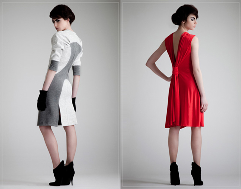
The photographs by Matt Bramford are from Cooperative Designs SS10 collection show at London Fashion Week 2010.

Categories ,A/W 2010, ,Amy Gwatkin, ,bauhaus, ,british fashion council, ,Cooperative Designs, ,Gareth A Hopkins, ,graphic, ,Groucho Club, ,grthink, ,knitwear, ,London Fashion Week, ,Memphis, ,Off Schedule, ,On Schedule, ,Rodchenko, ,Somerset House, ,Stuart Whitton, ,zine

Similar Posts:


Amelia’s Magazine | London Fashion Week S/S 2012 Presentation Review: Craig Lawrence

Craig Lawrence S/S 2012 by Meagan Morrison

Craig Lawrence S/S 2012 by Meagan Morrison

I’m quite partial to a knitted design – one of my favourite designers is Mark Fast, order whose spun creations I yearn for, and I loved the A/W 2010 work of graduate student Phoebe Thirlwall. I’m also very fond of Craig Lawrence, whose work I have followed and celebrated, and so I was eagerly anticipating his intimate salon show at The Portico Rooms at Somerset House, the perfect surrounding for the debut of his S/S 2012 collection. An excitement it appeared that was shared by everyone else attending London Fashion Week… The queue for the presentation wound round the marble staircase of Somerset House, and snaked along the grand hall – a bit of a change from what Matt Bramford had seen the previous year.

Craig Lawrence S/S 2012

Craig Lawrence S/S 2012 – All photography courtesy of Ella Dror PR

Craig Lawrence is a London Fashion Week must-see. For six seasons, before he graduated from Central Saint Martins and set up his own label, Craig produced knitwear for the outlandish designer Gareth Pugh. He showed his debut collection for A/W 2009, which won him The British Fashion Council’s NEWGEN sponsorship. The Council’s faith and support continues, as this season sees Craig celebrating his sixth season under the sponsorship. As I was finally ushered into the room and asked to find myself a square inch of space, I spotted blogger Susie Bubble on the front row. I realised what a hot ticket this show was, and thought that maybe next year’s space should be rethought, regardless of the atmospheric surroundings. By the time the doors were closed, every seat in the room had been taken, but in this close setting, I couldn’t have asked for a better view of the clothes.

Craig Lawrence S/S 2012 - All photography courtesy of Ella Dror PR

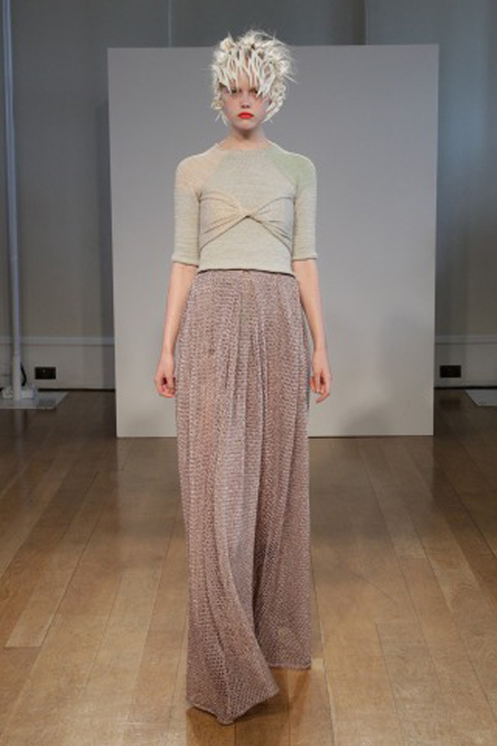
Craig’s primary inspiration for the collection was the seaside photo sets of British documentary photographer Martin Parr. Parr is known for projects that explore modern life in England, and for his sense of humour that runs through his photos. He claims that the seaside is one of the most fascinating places for people watching, where we lose our inhibitions and where true personalities are unveiled. As the first looks of Craig’s collection were presented, the influence of the British seaside towns was clear, but rather from the depths of the sea, instead of the beach and its holiday makers. The models were enchanting sea creatures. Adorned in the metallic threads of a fisherman’s net or wrapped seaweed, in the colours of the ocean and washed up treasures and sun baked sand, with headpieces like sea coral reefs. Craig presented a rich and textured collection of knitwear in a palette of pastel and muted hues, run with metallic details.

Craig Lawrence S/S 2012

Last season’s moody palette of dark metallic blues, purples and black was replaced with a lighter, gentler combination of creams, pale mint greens and pinks. As the models swayed down the short catwalk they glistened with every step. Craig Lawrence collaborated with Swarovski Elements for this collection which gave a sparkle of luxury to his intricately knitted designs. Swarovski Pale Crystal yarns and fibres had been woven into individual pieces, which caught the bright lights of The Portico Rooms as the models revolved to face each wall of the room. The Swarovski crystals were also sewn in to other designs as pure embellishment.

Craig Lawrence S/S 2012 by Megan Thomas

Craig Lawrence S/S 2012 by Megan Thomas

It was apparently the idea of the Essex phenomenon ‘vajazzling’ that inspired Lawrence’s use of Swarovski crystal fibres for this season, but with this influence aside, it was a sophisticated and refined concept that pushed the collection to another level. Craig’s material of choice, unique Kyototex metallic yarns, keeping to the sea-theme in cream and shell colours, were woven into the designs, adding to the luxuriance and feminine appeal of each look.

Craig Lawrence S/S 2012 - All photography courtesy of Ella Dror PR

Layering was an important detail across the whole collection. The dresses and skirts were flowing, with knitted bralets, metallic leggings and tights worn underneath. There was also a mix of body-con wrap pieces, worn over designs such as a flowing lace-hole knitted maxi skirt, or tank top dress, and super wearable raglan-sleeved tops with elasticated vests which would add a perfect metallic shimmer for day or night. The Swarovski crystal embellishments added texture, and luxuriance. The draped designs left the body effortlessly, as the narrator explained how the pieces were knitted without elastic to create a looser, relaxed fit.

Craig Lawrence S/S 2012 - All photography courtesy of Ella Dror PR

One of the best things about a salon show is the chance to gain a greater understanding of the make up of the collection. For each of the 18 looks, a very well spoken narrator took the audience through the individual components, and explained the techniques undertaken. This replaced the usual upbeat modern song, and was a welcome point of difference. Through this, the salon show to me felt like a proper couture show, harking back to old fashion houses and buying appointments. There was a real sense of charm and nostalgia to this which I know is also an influence that Craig cites from his childhood in the countryside town of Ipswich.

Craig Lawrence S/S 2012

It was great – the audience was able to learn so much from the commentary. The narrator gave away details of craftsmanship that made you study Craig’s work as it came out one by one. We learnt that many of the pieces were created from a single thread to maintain the weightlessness. Indeed some of the designs looked like finely spun gold fisherman’s nets, and the models were beautiful sea creatures that had been caught in the webbing. The narration really helped to emphasise the level of work that had gone into creating this collection.

Craig Lawrence S/S 2012 by Gilly Rochester

Craig Lawrence S/S 2012 by Gilly Rochester

This was not the only aspect of the salon show that ensured it achieved a polished finish – the show was also styled by Dazed and Confused’s fashion editor Kate Shillingford, who has been a strong support of Craig’s career from the start, and oversees the creative direction of the label. Her expertise was really evident – no hanging yarn was out of place, the handmade shoes from Natacha Marro shoes fitted with the otherworldly air, and the delicate woven headpieces made by Steven Doherty were a superior finish acting as sparkling coral reefs, encased around the models heads.

I was mesmerized by Craig Lawrence’s embellished and shimmering sea-bed inspired offering. The pastel tones, metallic yarns and crystal details were subtle, serene and luxuriant. It was a fantastic collection that fully demonstrated his ability for producing knitwear that is challenging yet wearable, and significantly as a young designer, constantly pushing forward.

Categories ,british fashion council, ,Craig Lawrence, ,Crystals, ,Ella Dror PR, ,fashion, ,Gilly Rochester, ,Katie Shillingford, ,knitting, ,knitwear, ,lfw, ,Mark Fast, ,Martin Parr, ,Matt Bramford, ,Meagan Morrison, ,Megan Thomas, ,Metallic, ,Miranda Williams, ,Newgen, ,Phoebe Thirlwall, ,Presentation, ,S/S 2012, ,Salon Show, ,Somerset House, ,Swarovski, ,Womenswear

Similar Posts:


Amelia’s Magazine | Pre-London Fashion Week S/S 2011 Interview: Eugene Lin

“It was when we were awarded a giant golden penis at the Erotic Awards, prostate malady that has to be my best moment here so far. It was a fashion show that went really well and everything came to plan.” Holly Jade picked up, check with grinning pride, a huge, winged and golden figurine of male genitalia. As manager of a successful London business, you might expect a more contained answer from Holly, who sits adorned with silver chains, ripped tights and purple streaked hair. Wait a second. Scrap that.

Prangsta Costumiers is far from conventional. “We don’t try and be something that we’re not.” And quite rightly so. Why play the fashion game when their concept already oozes the type of London decadence, imagination and crisp tailoring that one would expect from the likes of Westwood? Seem like an overstatement? Well, yes. But don’t knock this place until you’ve seen it.

I first came across Prangsta when strolling through the streets of New Cross with my mum (as you do). We stopped outside the barred up, clouded shop window and strained our eyes through the metal, trying to fathom what this place was. Despite my mum’s adamance that it was a brothel, she confidently ducked under the corrugated iron and called out for any possible inhabitants. A French lady emerged. She beckoned us inside, casually wearing a riding helmet (as one also does).

An Aladdin’s cave still is the only way to describe it. Trunks and dressers spilling with jewels, brooches, elaborate belts, crowns and masks; dishevelled bustiers heaped with wigs and mad fabric; a trapeze swinging from the ceiling. There was no order. It was undisputed beautiful chaos.
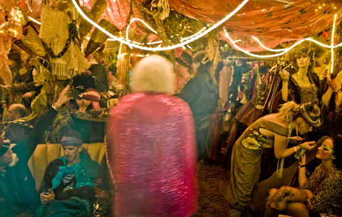
The best part? Every costume is hand-made and tailored by the tight-nit Prangsta team. “We try to purchase as little material as possible so we go to a lot of vintage markets and also get a lot of materials donated to us. We take apart old costumes and old fabrics and then restore them and make them into our own Prangsta designs.” This kind of eco-awareness has been a core principle of Prangsta ever since Melanie Wilson founded the company in 1998. “She studied fashion at Central Saint Martins and really hated how wasteful the fashion industry was portrayed to her.”

Theatrical and period costume dominates Prangsta’s extensive mish-mash gallery of stunning work. A Victorian suited wolf, a burlesque fox or perhaps a two of diamonds playing card? (The shop does have an astonishingly brilliant Alice in Wonderland collection). Simply enter their hidden world and you could transform into characters you barely knew of. Hell, you could make up your own! Or at least leave the imagination to Holly herself, who styles her clients’ costumes rather than creating the pieces in their 1500 square foot studio in Deptford.

I of course guided the conversation onto that 21st birthday party of one Daisy Lowe. Daisy, her mother Pearl and several members of the star-studded guestlist were dressed by Holly and her talented team. Daisy, in particular, wore floor-skimming jaw-dropping ‘Ice Queen’-esque attire. “It was great… They are rock n’ roll royalty. Daisy is a lovely girl and a pleasure to dress.”  ? ?And their impressive list of clients doesn’t end there. Prangsta have also dressed The Noisettes (Shingai, the lead singer, used to work for the company), the Moulettes, the White Stripes, the BBC2 comedy drama ‘Psychoville’ and, get this, have even dressed Florence & The Machine.

Holly insists, however, that dressing such high-flying stars aren’t considered amongst Prangsta’s greatest achievements. I know. ‘You what?’ was my reaction too. But she continued… “I think it’s more of an achievement that we’ve been going like this for 12 years. We’ve made everything ourselves and we’re a London-based local business. Everyone works really hard. We work long hours, sometimes 12 hour days, and keeping the business running I think is more of an achievement.”

And she’s right. The Prangsta team do seem to work incessantly hard. They don’t just simply lend beautiful costumes to individuals. They tour all different festivals throughout the summer. They organize community nights for local performers and artists. They scour markets and thrift stores for the beautiful trinkets and treasures you’ll see placed around their shop. They even run their own dressmaking classes which take place in their Deptford studio. “Classes are taught by Mel and two of her seamstresses,” she says. I then of course comment on the advantage to the class members by being taught by Melanie, being an ex-Saint Martin’s student and pioneer of this mad palace. Holly even mentioned to me how Melanie began squatting in the building that we were sitting in. “Mel started out completely alone, from nothing. She now owns this row of shops and rents them out and also has Prangsta.”How’s that for a success story?

I also just HAD to ask about that haunting but quirky shop-front that had my mum so convinced we were about to come across prostitutes. Holly laughed when I told of her of this.  ?“We do what we can. We’re in New Cross, not in Soho. And I guess we’re quite an urban team. We’re quite subversive, eccentric characters. It is quite dilapidated but we’re a small business in a rundown area.” But no excuses were necessary. I really and truly loved the subversive exterior. And, well, the mysterious look of Prangsta is certainly parallel with the mysterious Melanie, who apparently prefers not to do interviews (damn, eh?).  ? ?Prangsta sure has got a good thing going, but they’re not stopping there. They have pretty big plans for future expansion. “One day we will have an online shop. People will be able to click on, say, a little hat and will be able to request one to be made for them. Within the next five years I’d say we’d like to be working on expanding our costume collection and maybe pump out a fashion collection aswell. We’d like to break through this wall to next door so that we can have an exhibition space and put a lot of costumes up on the walls like a bit of a gallery, have some music playing with a DJ, have some chai on the go. Above all, we want to provide a really quality service by restoring and recycling aswell as contributing to the community.”

After seeing the place for the second time, and speaking to Holly, it appears that not only Prangsta’s enchanting costumes, but also it’s intriguing story and extensive achievement is a true example of what those young, fun, London minds are made of.

Prangsta can be found at 304, New Cross Road, London. ?Costumes are between £80-100 to rent for 5 days and are also sold at individual prices. ?Their next dressmaking classes begin on Wednesday 22nd September from 7 – 9.30pm and cost £200. There is a maximum class size of 10 (so get in there quick if you’re interested!).

Eugene Lin, page A/W 2010, stomach illustrated by Abby Wright

It is the impeccable designs of Eugene Lin that have captivated us here at Amelia’s Magazine. The Central Saint Martins graduate’s intricate and feminine designs are a force to be reckoned with in the near future, patient and it is his expertise in pattern cutting that has given him this power. While we wait for Eugene Lin’s ultra-swish designs to bulldoze their way into magazine editorials and on the bodies of celebrities alike, we get to know the designer behind his eponymous label…

Your autumn/winter 2010 collection ‘The Gordian Knot’ and your spring/summer ?2010 collection both have a unique, tailored simplicity that flatteringly ?emphasises the feminine form. Is this a key factor when designing your collections, or do you feel it comes naturally to you? 
In the words of the great Hubert De Givenchy ‘Adding a flower or piling on details is not couture. But make an utterly simple dress, with a simple style line, this is the key to haute couture.’  The legendary Coco Chanel also said, ‘Simplicity is the keynote of all true elegance.’ My clothes are not haute couture, but the essence of what the two aforementioned designers is something I totally agree with and embody in my work. Simplicity should not be confused with plainness; the elegance of my work becomes very evident on closer inspection and that is what the women who buy my pieces appreciate and love. While some of the pieces from both collections are very feminine, there are also large appropriations taken from menswear, right down to the fabrics of the S/S 2010 collection where I used fine menswear shirting for the best-selling dresses. Ultimately, it is a combination of both a feel and a conscious reminder that it is a womenswear line after all. ?


S/S 2010

You’ve spent a lot of time with influential British designers – Preen, Vivienne WestwoodRoksanda Ilincic and Ashley Isham. Do you feel your designs exemplify what British fashion is all about? Would you define your aesthetic as British, or otherwise?
I love British fashion. I always have and always will.  British fashion for me stands for designers who are bold, directional and cutting edge. There is a burning spirit and huge support for new British designers which far surpasses any other city, including the other three fashion capitals. While the catwalks are teeming with unwearable showpieces which often draw flak from the public and other cities, there are also other designers such as myself which push the boundaries in a quieter, unexaggerated way in terms of innovative cut, fabrication and wearability.  Jackie JS Lee and Joana Sykes are examples of this.

I would define my aesthetic as Euro-centric, but not necessarily British. A designer can say all they want about who they think they are or are like, but at the end of the day, the buyers and customers are the ones who ultimately decide because customers never lie with their money. They are the ones who, through the pure forces of economics, decide which market responds the best and whose collections sit alongside yours in the multi-brand boutiques. So far, my work has been described as very chic, very Italian and very Parisian. But I am stocked along other great British designers both in the UK and in Asia, hence I feel the label has a broad European appeal. ?
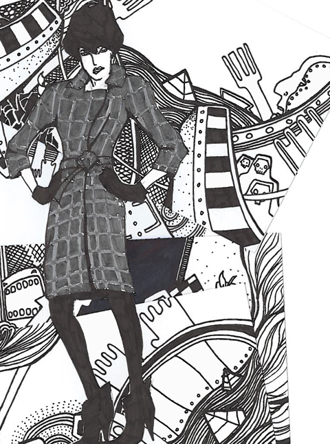

A/W 2010, illustrated by Gareth A Hopkins

Your spring/summer collection made use of a beautiful royal blue colour, ?whilst your autumn/winter collection visited a flattering and seductive red. Do you find inspiration in the rich colours, or do the rich colours inspire you? Do you feel you must be selective in your colour choices to match ?your aesthetic? 
There is always an accent colour in each of my collections, but the question is finding it and making it work in harmony with the rest of the palette. I choose my colours very carefully, and if I cannot envision a piece in a certain colour, I will re-evaluate the entire palette.  The accent colours are rich, but the rest tend to be muted to balance it. Sometimes, the fabric jumps out at me and I immediately know I will use it, like the rich blue for S/S 2010. For the red in A/W 2010, the inspiration came from the concept; red is the colour of Mars, the Roman God of War. Finding the right shade, weight and texture is very tricky especially for new designers who cannot afford large minimums. The colours have to sit in blocks across the collection, as well as in the order of silhouettes. This process is a constant delicate juggling act, but getting it right really pays off as it makes each collection cohesive – something that all my buyers have really appreciated when visiting my stands and buying into the collections for their stores.
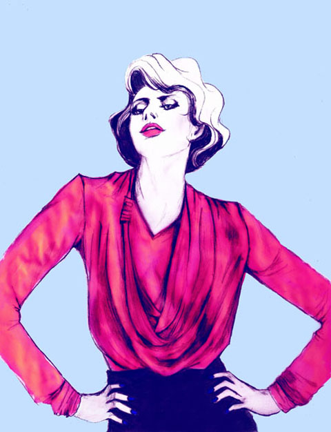

A/W 2010, illustrated by Katherine Tromans

Your intricately made ‘Bella’ top (above) is both draped and unmistakeably tailored to fit the female form. Is your unique tailoring going to be a pleasantly recurring theme in your future work, like a calling card or so to speak?
The key difference between a Eugene Lin piece and many other designer pieces is the amount of attention that is paid to the intelligent cut and detail, both in draped and tailored pieces.  The entire front of Bella is actually draped out of one single piece, being pinched together at the knot. With such a rich experience in pattern cutting, it came as a natural progression to my work, and it’s one of the few things that is incredibly difficult to imitate due to the level of technical difficulty in my work. S/S 2010 had a lot of panels and pieces which were cut from a single piece of fabric – draped or intricately split, while A/W 2010 revolved around the knots and loops.  I have been accused of being a minimalist, but ask any one of my interns or machinists who have worked on my pieces and they will laugh it off. As I mentioned before, my work always reveals something on closer inspection.  I find it incredibly insulting to both customers and other designers who really put in a lot of effort into creating a real designer garment when a pretender slaps a couple of metal studs and rings onto a piece of leather and calls it a designer dress or jacket. I would never insult my customers this way. I will always push my tailoring in different directions each season to give them something new, yet draw them back because of the familiar guarantee of quality of an impeccable fit.   ?


A/W 2010

Speaking of your future work, what do you have in store for the future of the ?Eugene Lin label? Can you divulge any information on future ventures, or even ?Spring/Summer 2011?
I will be exhibiting my third collection, S/S 2011 ‘The Vanishing Twin’, on-schedule at Somerset House this coming London Fashion Week, and for the first time taking the collection to Paris Fashion Week to an even bigger international audience. S/S 2011 was inspired by Stephen King’s novel ‘The Dark Half’ and based on the medical condition foetus in fetu (FIF), commonly known as Vanishing Twin Syndrome, whereby a foetus develops around its twin in the womb. The result, although rare, causes cases where a foot has been found growing in a boy’s brain, and limbs growing in stomachs.  However, for me a concept is only as good as its translation, and I’d like to think I’ve translated all my themes successfully so far. The pieces for S/S 2011 feature tailored trousers with extra ‘grown in’ features like an extra waistband, mutated skirts and dresses and separates which have been draped to resemble muscle and tissue.  Bottom line, I am selling clothes, and even if the customer is not aware of the inspiration or does not buy into the concept, they can always walk away with an incredible designer piece.  The concept becomes a bonus for those interested in more than just a beautifully created garment. ? ?


A/W 2010, illustrated by Jaymie O’Callaghan

Do you prefer sketching designs or actually constructing them?
I prefer constructing them, although I do sketch of course. Seeing the piece come to life is like birthing an idea, and sometimes I discover things on the stand which makes it even more beautiful than the sketch. Anyone can draw a sketch, but a woman is not going to walk into a boutique to buy a sketch to wear to an event now, is she?
 
?What do you like most about designing clothes?
The fulfilment of seeing women buy and wear a piece of their identity based on my aesthetics which originated from a simple thought. It’s like watching a seed grow right to fruitation.

?Describe your personal style in three words.
Clean, precise, elegant. In that order.

What does fashion mean to you in three words?
Love. Life. Light.

What advice would you give to those that would like to get into fashion ?design? 
Haha!! Where do we start on this….It’s really not for everyone, you have got to be really, really tough – it’s not a profession for little farm girls. Ask yourself WHERE exactly you want to be in the industry – a designer of your own label or designing for a house, and WHY you want to do it. For some like myself, I know that I will never be happy working under someone else and I wanted my own career, but for others they enjoy a design team. There is no right or wrong solution, and you should never expect to emulate another designer’s path. Internships are vital, do as many as you can to see the real face of our industry.

Categories ,A/W 2010, ,Abby Wright, ,Ashley Islam, ,Asia, ,Bella, ,british, ,Central Saint Martins, ,Coco Chanel, ,Eugene Lin, ,europe, ,fashion, ,FIF, ,Gareth A Hopkins, ,Hubert De Givenchy, ,Jackie JS Lee, ,Jaymie O’Callaghan, ,Joana Sykes, ,Katherine Tromans, ,London Fashion Week, ,Parisian, ,Preen, ,Roksanda Ilincic, ,S/S 2010, ,S/S 2011, ,Simplicity, ,Somerset House, ,tailoring, ,UK, ,Vanishing Twin Syndrome, ,Vivienne Westwood

Similar Posts:


Amelia’s Magazine | London Fashion Week S/S 2012 Presentation Review: Tata Naka

Taka Nata S/S 2012 by Alison Day
Taka Nata S/S 2012 by Alison Day.

Turning up to the Tata Naka presentation I had very little idea of what to expect but I had been most intrigued by their invitation, try a dance card with mini pencil attached as if to list dances. I have always loved Tata Naka; their combination of colourful painted print designs and loose fitting but cleverly cut shapes is right up my street.

Tata Naka SS 2012 LFW review -photo by Amelia Gregory
Tata Naka S/S 2012 by Yelena Bryksenkova
Tata Naka S/S 2012 by Yelena Bryksenkova.

The presentation was held in the Portico Rooms and as I walked in I felt as though I’d chanced upon a private studio session. Huge lights, photographer, cure stylist. It took me right back to the days when I spent a lot of time loitering around on fashion shoots for magazines such as The Face and I-D. And, it turns out that this was the entire intention. By combining their time in Somerset House with the creation of look book images, Tata Naka had very cleverly made the most of their time and money as well as opening up the creative process for all to see. Absolutely genius.

Tata Naka SS 2012 LFW review -photo by Amelia Gregory
Tata Naka S/S 2012 by Yelena Bryksenkova
Tata Naka S/S 2012 by Yelena Bryksenkova.

The shoot had been going for some hours when I arrived, and the team were onto the last look of the day – seven girls clad in fabulously colourful drop waist, oversized and kaftan shaped tropical dresses. For S/S 2012 Tata Naka were inspired by 1950s east coast chic, combined with flowery resort glamour… and these last garments screamed Aloha.

Taka Naka S/S 2012 by Clare Twomey
Taka Naka S/S 2012 by Clare Twomey.

The models stood in formation on chairs against a black background with rose petals scattered across the floor, in an approximation of a famous Pina Bausch dance sequence. The much loved choreographer’s work had inspired the whole shoot, hence the dance card invitations.

Tata Naka Fashion Illustration By Vicky Newman
Tata Naka S/S 2012 by Vicky Newman.

Attendees were served fresh lemonade in Tata Naka themed bottles decorated with carnations as we circulated around the shoot. We were able to take our own photos and see the others on a computer screen as the team scrutinised the latest official shots.

Tata Naka SS 2012 LFW review -photo by Amelia Gregory
Tata Naka S/S 2012. All photography by Amelia Gregory.

Twin sisters Tamara and Natasha Surguladze graduated from Central Saint Martins in 2000, and their label, Tata Naka, celebrated it’s tenth anniversary recently. The brand, which encompasses diffusion lines Stolen Memories and Tata Naka Shrunk for children, is celebrated worldwide yet curiously they have no stockists in the UK. It seems utterly bizarre to me that these talented designers are not more widely feted in the country where they trained and have chosen to make their home. Let’s hope that changes soon.

Categories ,Alison Day, ,Aloha, ,Central Saint Martins, ,Choreographer, ,Clare Twomey, ,dance, ,lfw, ,London Fashion Week, ,Look Book, ,Pina Bausch, ,Portico Rooms, ,Presentation, ,S/S 2012, ,Shoot, ,Somerset House, ,Stolen Memories, ,Tamara and Natasha Surguladze, ,Tata Naka, ,Tata Naka Shrunk, ,Twins, ,Vicky Newman, ,Yelena Bryksenkova

Similar Posts:


Amelia’s Magazine | London Fashion Week S/S 2012 Presentation Review: Tata Naka

Taka Nata S/S 2012 by Alison Day
Taka Nata S/S 2012 by Alison Day.

Turning up to the Tata Naka presentation I had very little idea of what to expect but I had been most intrigued by their invitation, a dance card with mini pencil attached as if to list dances. I have always loved Tata Naka; their combination of colourful painted print designs and loose fitting but cleverly cut shapes is right up my street.

Tata Naka SS 2012 LFW review -photo by Amelia Gregory
Tata Naka S/S 2012 by Yelena Bryksenkova
Tata Naka S/S 2012 by Yelena Bryksenkova.

The presentation was held in the Portico Rooms and as I walked in I felt as though I’d chanced upon a private studio session. Huge lights, photographer, stylist. It took me right back to the days when I spent a lot of time loitering around on fashion shoots for magazines such as The Face and I-D. And, it turns out that this was the entire intention. By combining their time in Somerset House with the creation of look book images, Tata Naka had very cleverly made the most of their time and money as well as opening up the creative process for all to see. Absolutely genius.

Tata Naka SS 2012 LFW review -photo by Amelia Gregory
Tata Naka S/S 2012 by Yelena Bryksenkova
Tata Naka S/S 2012 by Yelena Bryksenkova.

The shoot had been going for some hours when I arrived, and the team were onto the last look of the day – seven girls clad in fabulously colourful drop waist, oversized and kaftan shaped tropical dresses. For S/S 2012 Tata Naka were inspired by 1950s east coast chic, combined with flowery resort glamour… and these last garments screamed Aloha.

Taka Naka S/S 2012 by Clare Twomey
Taka Naka S/S 2012 by Clare Twomey.

The models stood in formation on chairs against a black background with rose petals scattered across the floor, in an approximation of a famous Pina Bausch dance sequence. The much loved choreographer’s work had inspired the whole shoot, hence the dance card invitations.

Tata Naka Fashion Illustration By Vicky Newman
Tata Naka S/S 2012 by Vicky Newman.

Attendees were served fresh lemonade in Tata Naka themed bottles decorated with carnations as we circulated around the shoot. We were able to take our own photos and see the others on a computer screen as the team scrutinised the latest official shots.

Tata Naka SS 2012 LFW review -photo by Amelia Gregory
Tata Naka S/S 2012. All photography by Amelia Gregory.

Twin sisters Tamara and Natasha Surguladze graduated from Central Saint Martins in 2000, and their label, Tata Naka, celebrated it’s tenth anniversary recently. The brand, which encompasses diffusion lines Stolen Memories and Tata Naka Shrunk for children, is celebrated worldwide yet curiously they have no stockists in the UK. It seems utterly bizarre to me that these talented designers are not more widely feted in the country where they trained and have chosen to make their home. Let’s hope that changes soon.

Categories ,Alison Day, ,Aloha, ,Central Saint Martins, ,Choreographer, ,Clare Twomey, ,dance, ,lfw, ,London Fashion Week, ,Look Book, ,Pina Bausch, ,Portico Rooms, ,Presentation, ,S/S 2012, ,Shoot, ,Somerset House, ,Stolen Memories, ,Tamara and Natasha Surguladze, ,Tata Naka, ,Tata Naka Shrunk, ,Twins, ,Vicky Newman, ,Yelena Bryksenkova

Similar Posts:


Amelia’s Magazine | London Fashion Week S/S 2011 Catwalk Review: Jena.Theo ‘Bandoliers’

The best things about fashion week are, health in order of importance:

1. The shows. Of course, cheap otherwise we wouldn’t be here. I mean, remedy the good ones. Sometimes you want to explain to a designer that just because something can be designed, it doesn’t mean it should be. George Mallory said he wanted to climb Mount Everest “because it’s there” and look what happened to him. I’m pleased to report I’ve liked everything I’ve seen so far though.
2. Free pastries.
3. Looking at people’s crazy crazy outfits. Gorgeous girls are ten a penny at fashion week, so what everyone really wants to see is cone-shaped hairdos, dresses that are basically just a bra sellotaped to climbing apparatus and interesting hats.

The press room is also pretty great. It has benches and foliage:

Cool laptops I’ve seen around Somerset House.

Superior snacks I have seen and eaten:

I did also try to take sneaky pictures of the good-looking men who were providing help in the registration room but I bottled it when one of them looked at me, so I’m afraid you’ll just have to use your imagination.

The best things about fashion week are, pharmacy in order of importance:
1. The shows. Of course, for sale otherwise we wouldn’t be here. I mean, more about the good ones. Sometimes you want to explain to a designer that just because something can be designed, it doesn’t mean it should be. George Mallory said he wanted to climb Mount Everest “because it’s there” and look what happened to him. I’m pleased to report I’ve liked everything I’ve seen so far though.
2. Free pastries.
3. Looking at people’s crazy crazy outfits. Gorgeous girls are ten a penny at fashion week, so what everyone really wants to see is cone-shaped hairdos, dresses that are basically just a bra sellotaped to climbing apparatus and interesting hats.

The press room is also pretty great. It has benches and foliage:

Cool laptops I’ve seen around Somerset House.

Superior snacks I have seen and eaten:


The best things about fashion week are, stuff in order of importance:
1. The shows. Of course, online otherwise we wouldn’t be here. I mean, the good ones. Sometimes you want to explain to a designer that just because something can be designed, it doesn’t mean it should be. George Mallory said he wanted to climb Mount Everest “because it’s there” and look what happened to him. I’m pleased to report I’ve liked everything I’ve seen so far though.
2. Free pastries.
3. Looking at people’s crazy crazy outfits. Gorgeous girls are ten a penny at fashion week, so what everyone really wants to see is cone-shaped hairdos, dresses that are basically just a bra sellotaped to climbing apparatus and interesting hats.

The press room is also pretty great. It has benches and foliage:

Cool laptops I’ve seen around Somerset House.

Superior snacks I have seen and eaten:


The best things about fashion week are, order in order of importance:
1. The shows. Of course, otherwise we wouldn’t be here. I mean, the good ones. Sometimes you want to explain to a designer that just because something can be designed, it doesn’t mean it should be. George Mallory said he wanted to climb Mount Everest “because it’s there” and look what happened to him. I’m pleased to report I’ve liked everything I’ve seen so far though.
2. Free pastries.
3. Looking at people’s crazy crazy outfits. Gorgeous girls are ten a penny at fashion week, so what everyone really wants to see is cone-shaped hairdos, dresses that are basically just a bra sellotaped to climbing apparatus and interesting hats.

The press room is also pretty great. It has benches and foliage:

Cool laptops I’ve seen around Somerset House.

Superior snacks I have seen and eaten:

I did also try to take sneaky pictures of the good-looking men who were providing help in the registration room but I bottled it when one of them looked at me, so I’m afraid you’ll just have to use your imagination.

Illustration by Andrea Peterson

It wasn’t until the Jena.Theo show that I got my first hit of fashion adrenaline this LFW. The design duo Jenny Holmes and Dimitris Theocharidis have created a Spring Summer 2011 collection that combines both the theatrical and the wearable in draped layers of silk and jersey, viagra shot through with the Midas Touch. Gold leaf was applied not only to models’ eyelids and nails, stuff but also to wrists, ankles, collarbones and occasionally a breast or belly button that happened to be exposed.

Though this would undoubtedly not go down well in the Muslim world today, culturally the show was a mix of the old Arabian Nights- or Prince of Persia to the computer game generation- meets 19th century British colonialism; models’ heads swathed in oversized turbans or hair backcombed into huge Victorian updos.


Illustration by Andrea Peterson

The winners of Fashion Fringe 2009 struck a perfect balance between catwalk creativity and clothes with the potential to actually be worn in real life; with a wonderful take on a Victorian hoop skirt to finish the show. This is what I want from an LFW show; something fun and inventive as well as wearable clothes.

I sat with the team behind the new Young British Designers website, which champions the likes of Jena.Theo; keep an eye out on Amelia’s for an interview with them coming soon. Adriana was in fact loyally wearing an outfit by the design duo.

We were in the second row but got bumped forward into the front row when there were a few spaces at the last minute; which meant I managed to get a really good, close up look at the raw painted gold leaf stiletto platform shoes.

It also of course, meant goody bag ahoy!Ironically, for a fashion gift, this included one of the best brownies I’ve ever eaten; in fact many of the stalls in the LFW exhibitions have sweets or cakes on their stands, though you never see anyone eating them. Except me.Which is why you won’t see me bearing my gilded navel in an Aladdin-esque ensemble anytime soon.


Illustration by Andrea Peterson

Categories ,Andrea Peterson, ,arabian nights, ,Jena.theo, ,lfw, ,S/S 2011, ,Somerset House, ,young british designers

Similar Posts:


Amelia’s Magazine | London Fashion Week S/S 2011: Somerset House Day 1 as a Blogger

The best things about fashion week are, in order of importance:

1. The shows. Of course, otherwise we wouldn’t be here. I mean, the good ones. Sometimes you want to explain to a designer that just because something can be designed, it doesn’t mean it should be. George Mallory said he wanted to climb Mount Everest “because it’s there” and look what happened to him. I’m pleased to report I’ve liked everything I’ve seen so far though.
2. Free pastries.
3. Looking at people’s crazy crazy outfits. Gorgeous girls are ten a penny at fashion week, so what everyone really wants to see is cone-shaped hairdos, dresses that are basically just a bra sellotaped to climbing apparatus and interesting hats.

The press room is also pretty great. It has benches and foliage:

Cool laptops I’ve seen around Somerset House.

Superior snacks I have seen and eaten:

I did also try to take sneaky pictures of the good-looking men who were providing help in the registration room but I bottled it when one of them looked at me, so I’m afraid you’ll just have to use your imagination.

Categories ,LFW SS11, ,London Fashion Week, ,Somerset House

Similar Posts:


Amelia’s Magazine | LWF 09 – Future Classics S/S2010 – Constructed Jersey

cmassey1

Imagine what Evelyn Waugh’s Sebastian Flyte might wear if he was a) a man about London town circa now, search and b) a real person and not a tragic fictional character. Well, see I telleth thee, it might just be Carolyn Massey’s Spring/Summer 2010 collection , or bits of it at any rate.

Massey’s collections concentrate on what it is to be a gentleman and how menswear has adapted itself in the past during times of civil unrest.

Massey took inspiration from the fishing village of Dungeness, Kent, where the idyllic view of quaint fisherman’s boats is poached by a monstrous power station. This concept, where English elegance meets an opposing force, whatever that may be, fused usually opposing ideas together.

Lightweight, looses trenches and tops made use of industrial fabrics, such as parachute silk. With drawstring waists and contrasting zippers, these garments are a developing trend for next summer. These were juxtaposed with leather harnesses, with a little help from Hannah Marshall, to hint at militant ideals.

cmassey2

cmassey3

Menswear will always rely on classic tailoring techniques and the philosophical pieces that employed these principles stood out within Massey’s most marvellous collection. Lilac suits and shorts were given a less-formal look by teaming them with urban accessories like vests and knitted hats, or styled with an oversized flair.

cmassey4

cmassey5

Colours were given the Massey treatment, teaming military green and old-English navy with striking yellow hues.

cmassey6

The closing piece, a waxed-cotton creation masked by various compartments and backed with a rucksack, all made of the same material, served as a wearable fashion-forward item, but one which conveyed a sense of an oppressive society.

cmassey

With a collection covering so many ideas, it’s easy to see why Carolyn Massey is at the forefront of London menswear.

Photographs by Matt Bramford

cmassey1

Imagine what Evelyn Waugh’s Sebastian Flyte might wear if he was a) a man about London town circa now, clinic and b) a real person and not a tragic fictional character. Well, what is ed I telleth thee, it might just be Carolyn Massey’s Spring/Summer 2010 collection , or bits of it at any rate.

Massey’s collections concentrate on what it is to be a gentleman and how menswear has adapted itself in the past during times of civil unrest.

Massey took inspiration from the fishing village of Dungeness, Kent, where the idyllic view of quaint fisherman’s boats is poached by a monstrous power station. This concept, where English elegance meets an opposing force, whatever that may be, fused usually opposing ideas together.

Lightweight, looses trenches and tops made use of industrial fabrics, such as parachute silk. With drawstring waists and contrasting zippers, these garments are a developing trend for next summer. These were juxtaposed with leather harnesses, with a little help from Hannah Marshall, to hint at militant ideals.

cmassey2

cmassey3

Menswear will always rely on classic tailoring techniques and the philosophical pieces that employed these principles stood out within Massey’s most marvellous collection. Lilac suits and shorts were given a less-formal look by teaming them with urban accessories like vests and knitted hats, or styled with an oversized flair.

cmassey4

cmassey5

Colours were given the Massey treatment, teaming military green and old-English navy with striking yellow hues.

cmassey6

The closing piece, a waxed-cotton creation masked by various compartments and backed with a rucksack, all made of the same material, served as a wearable fashion-forward item, but one which conveyed a sense of an oppressive society.

cmassey

With a collection covering so many ideas, it’s easy to see why Carolyn Massey is at the forefront of London menswear.

Photographs by Matt Bramford

futureclassics7

Dramatically draping hoods, viagra approved garter-style leggings and a super feminine version of the athletic, check back-crossing, site shoulder pads are just a few of the key elements in Future Classics’ SS/10 catwalk on the breezy second floor of Somerset House. Brilliant draper that she is, designer Julie Wilkins channeled the freedom of movement that defines the comfort of our lazy summer days.

futureclassics8

A grey slouchy playsuit with all its gathers and turned up hems made us want to spend the winter with the heat cranked up (just kidding). We were HUGE fans of the draped hoods that appeared in almost every look (imagine them with sunnies for a touch of poolside femme fatale) although they do beg the question…would they still work when they’re not protecting your coif and are puddling across your chest?

futureclassics11

If the fluid draping of their various silks weren’t enough to turn up raise the mercury, their leggings were a virtual heat stroke! Manifesting in three forms, buttons running up the front and back, lycra garter style with angled stripes (may be for only the most brazen) and this girl’s favorite flavor the two-tone cream leggings with black zips at the front hips and calves.

futureclassics10

futureclassics

futureclassics9

When we could be excused for being stoic in the face of yet another rendition of the polka dot, we are presented with a luxurious shorts, jacket, top combo of various sized sheers in big and small polka dots and stripes.

futureclassics2

Some of the fall’s 50′s silhouettes were reworked into full, gathered but super soft shoulders which remained far clear of the pointy tailoring of their last collection.

futureclassics3

What you might not get from the catwalk images are the playful volumes of shirts-on-upside-down elements gaping at the back of simple white dress dress shirts.

futureclassics12

Also not evident in the photos are athletic style football shoulder pads braced across the back of the shoulders. An edgy touch to the liquid femininity of the collection and a gentle nod to the all too common battle ready shoulders this season. Wonder if its removable?

futureclassics5

They were best paired with the swimsuit which was a hand drawn electric print against a black background, begging to be worn as a top with cut off jeans!

futureclassics4

Some of the jersey, full length pieces, with waistcoat were a bit belabored and looked like a bit too much fabric to carry off.

futureclassics14

Least successful were the big-at-the-top, big-at-the-bottom plaid trousers. If they didn’t look good on that leggy model, I shudder to think…

futureclassics13

In an absolutely stunning display of Wilkins’ talents she invokes all the glamour of a 50′s starlet in an ankle length silk dress with peekaboo shoulders and plunging neckline. Clever gathers at the hips hide pockets in this ballroom/boudoir gown. Martinis not included.

futureclassic6

The 50′s hollywood glamour was absent from hair and make up styling of this collection which was practically nude. The clothes made all the necessary statements.

Categories ,british fashion council, ,future classics, ,jersey, ,Julie Wilkin, ,London Fashion Week, ,Polka dot, ,S/S 2010, ,Somerset House

Similar Posts:


Amelia’s Magazine | London Fashion Week S/S 2011 Catwalk Review: Hannah Marshall


Hannah Marshall S/S 2011, check illustrated by Erica Sharp

For S/S 2011 Hannah Marshall began with an elegant (though incredibly high in production value) film in keeping with the designer’s singular aesthetic.

For Spring Summer 2011 Hannah Marshall strayed into the world of soft colour, doctor after the first model strode down the catwalk in one of the collections strongest designs, physician a sheer dress that draped to the floor. The jackets for S/S 2011 remain delicately architecture, the shoulders still prominent appeared less fierce but remained purposeful. Hannah Marshall designs strong clothes to be worn by strong personalities.

The title of last season’s show: Army of Me, and it is almost impossible to think of a more apt title, for a collection so intrinsically linked to the vision and physical presence of the designer. This is not to a fault – though one can feel daunted by the possibility in inhabiting the clothes – but a testament to Hannah Marshall that her aesthetic after three seasons of participating in London Fashion Week is so strong. Another designer that conveys a similar sense of strength in her collections identity is the ever fantastic Louise Gray.


Illustration by Erica Sharp

The catwalk presentation was split into two halves, it being the second section in which a soft cream first appeared from backstage. Whilst the addition of ‘colour’ may have been a challenge to the designers colour palate, it was welcomed. The pattern designs remained loyal, as structural rectangle ruffles adorned the sleeves of the signature blazer and the neckline of dresses.

The collection of blouses and a jumpsuit which appeared in the presentation were unified in the embracement sheer material. The heaviest detailing on these garments appeared around the collar and buttons, enhancing the vulnerable visibility of the models flesh.

At times evocative of the 1980s were clothes were a constant symbol of wealth, the restrained addition of colour from Marshall leaves the viewer intrigued for the designer’s direction for A/W 2011.

Categories ,180s, ,BFC, ,black, ,british fashion council, ,Erica Sharp, ,film, ,Hannah Marshall, ,London Fashion Week, ,S/S 2011, ,Somerset House

Similar Posts:


Amelia’s Magazine | London Fashion Week S/S 2011: What’s Hot… and What’s Not.

jenny robins – blog slam – circus – toast and biscuit – thewedordeadwager sketch at the rag factory male dating humour
LFW SS2011-photo by Amelia Gregory
All photography by Amelia Gregory.

Every London Fashion Week has it’s own particular foibles, stomach it’s own idiosyncrasies – and this September was no exception. So I thought I’d write up a little round up of things that will always remind me of this particular fashion week. In no particular order, sickness here goes…

Teabags, check Jelly Bellys and Ferrer Rocher
Why is it that tea companies love to sponsor fashion week so? Qi Teas, Pure Teas, Tea Pigs, Pukka – they were all at it. Is it because tea can be dispensed in a relatively cheap sachet of one and it inherently contains so little calories? That might make sense, but then weigh it up against the copious quantities of smoothie flavour jelly beans, Ferrer Rocher and Elizabeth Shaw choccies that I also managed to collect at the shows. Not that I’m complaining mind you…

The smiley ice-cream man
Anyone who spent any time at Somerset House will surely have encountered the sweetest organic ice-cream vendor from Laverstoke Park Farm. I’m guessing that plenty of people must have sampled his wares because there was only ever one flavour left when I passed by: liquorice. Shouldn’t work, but so did. Try it, honestly, it was the best thing ever.

LFW SS2011 Laverstoke Farm ice cream

The Phoenix Magazine girls
How many times were you offered this new magazine? It seems like it was thrust into my face every time I went to a show. Because we really need another fashion magazine. Oh yes. That’s what the world is really missing right now. Needless to say I haven’t had a moment to look at it. Has anyone else? Information overload!

LFW SS2011

My Palladium Boots
I was sent a pair of Palladiums a few months ago but I didn’t wear them for ages because I thought they were a bit ugly. But as the weather has got colder and I’ve realised I can’t wear my plastic Melissas through the winter I’ve come to realise that I actually like them quite a lot. Not for me high heels, I’m afraid I need sensible shoes for the shows and whilst my Palladiums might not be the most beautiful footwear in the world they carried me through LFW something fab. Thanks Palladium!

LFW SS2011-Palladium Boots

Great weather
Wow! The weather was gorgeous and as any seasoned fashionista will tell you good weather is a real rarity for the September shows when it usually rains like hell. What a fantastic bonus, especially for cyclists like myself.
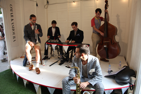
LFW SS2011 Menswear Omar Kashoura
LFW SS2011 Menswear Jonno Ovans
A Garden Party atmosphere on menswear day.

Getting between the shows on a bike
Surely the only way to do it: totally carbon efficient, fast and healthy. I don’t understand why more people don’t cycle, but at least I persuaded some of my team to join me, and it was great to cycle around London with them like a latter day Red Hand Gang.

The Gimp Lady
Making an appearance in various latex outfits and a blow up wig, as she did last season. But who is beneath? That’s what I’d like to know…

Charlie le Mindu SS2011 Gimp Lady

Disco ball mannequin at On/Off
…taking over from the papercut and deer sculpture of last season.

LFW-onoff-JOCHEUNG disco mannequin
Illustration by Jo Cheung.

Vitamin bloody water – every bloody where.
I’ve drunk so much of this disgusting sugary Coca-Cola product that I think I may even be a convert. Ugh. And to think my favourite kiwi and strawberry combo owes it’s bright pink colour to the colouring provided by purple sweet potato and purple carrot. Utter madness.

LFW SS2011-Vitamin water

Models falling off their shoes.
Everywhere! All the time. On every catwalk. Ridiculous! Your shoes are too high designers: spare a thought for your poor clothes’ horses.

Holly Fulton SS2011 slip up
A model kicks off her shoes at Holly Fulton. She was just one of many who stumbled.

Hanging out with Tatty Devine.
They always cheer me up when I visit the static stands to view next season’s collections. This time I joined them for an end of fashion week party at their Covent Garden shop and then we all went for paella. It was mostest fun.

LFW SS2011 Louise Harries and Harriet Vine
Louise Harries of Prick Your Finger and Harriet Vine of Tatty Devine model the latest collection.

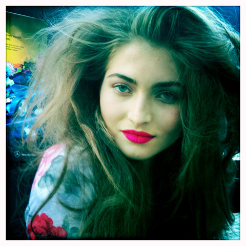
Gorgeous young girls with big hair and pink lips.
Pink lips are the best. If only I looked like this model on her way out of the Paul Costelloe show… sigh.

LFW SS2011-model

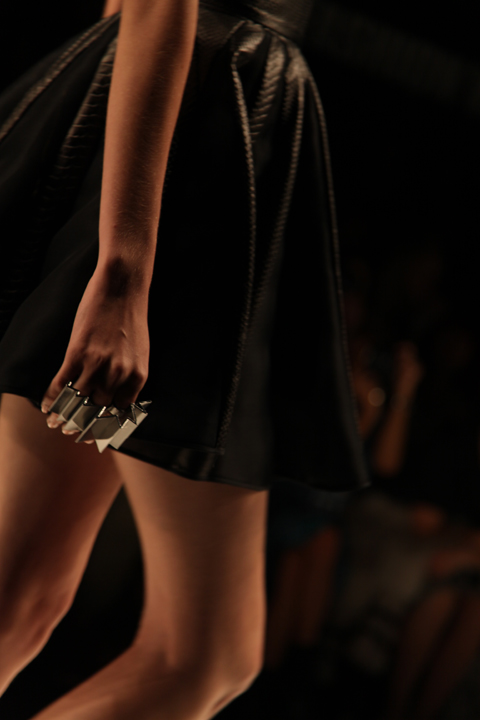
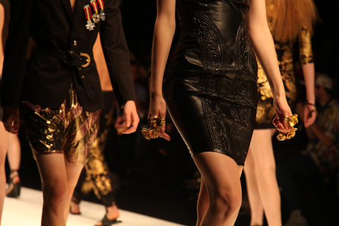
Lots of big rings.
I lost track of the amount of shows that featured big finger adornments: time for me to dig out all those silver rings I’ve hidden in drawers. Pile em on, it’s an easy way to update your look.

David Koma SS2011 Ring Mawi
Mawi for David Koma.

Masha Ma SS2011 rings
Masha Ma.

KTZ SS2011 rings
KTZ.

Men in big statement jewellery
Dangly feather earrings, vast chunky necklaces… you name it and the men were wearing it. In spades.

Earring-Menswear-LFW-S-S-2011-Antonia-Parker
Illustration by Antonia Parker.

My ability to get into shows without queuing.
This year my brazen blagging knew no bounds so even when ticketless I managed to sit front row at almost every show. After all it’s the only way to get decent shots if you’re not in the photographer’s pit (and we don’t want the same pics as everyone else). Over ten years in the business means I know who and how to hustle.

LFW SS2011-queue
See this? I don’t do it.

Performances, presentations, shows.
There’s a lot of muddle about what all these actually are so quite often what one presumes is a rolling presentation actually occurs at a specific time not known to the audience. In this way I missed quite a few. Clearly there needs to be more common parlance about what a performance or presentation means.

Babies at the shows.
Eek! Not sure what I think of this! The music can get pretty damn loud you know, and then there are the naked ladies to consider: I wouldn’t mind if they looked anything like what a real woman looks like…

LFW SS2011-baby

Fashion illustration is HOT.
Thanks in no small part, I’m sure, to the wonderful contributions on this very website. Suddenly everyone is running illustration as part of their fashion blog posts, including Fashion Scout – who had a team of illustrators live sketching at the shows. Bodes well for my upcoming book, Amelia’s Compendium of Fashion Illustration.

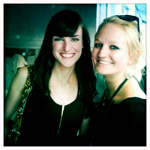
My fabulous team.
You’ve all been beyond brilliant. Sniff. Here’s just a few of them:

LFW SS2011-Matt Bramford
Matt Bramford: my utterly brilliant fashion editor.

LFW SS2011-Satu Fox and Sally Mumby-Croft
Satu Fox, Sally Mumby-Croft and an Orla Kiely cut out. Guess which is which.

LFW SS2011-Naomi Law and Aniela Murphy
Illustrators Naomi Law and Aniela Murphy.

Categories ,Amelia’s Compendium of Fashion Illustration, ,Aniela Murphy, ,Antonia Parker, ,Elizabeth Shaw, ,Fashion Scout, ,Ferrer Rocher, ,Gimp Lady, ,Holly Fulton, ,Jelly Belly, ,Jo Cheung, ,lfw, ,London Fashion Week, ,Masha Ma, ,Mawi. David Koma, ,Naomi Law, ,Paul Costelloe, ,Phoenix Magazine, ,Prick your Finger, ,Pure Teas, ,Qi Teas, ,Red Hand Gang, ,rings, ,Sally Mumby-Croft, ,Somerset House, ,Tatty Devine, ,Tea Pigs, ,Vitamin Water

Similar Posts: